Decorating Around a Statement Art Piece: Your Guide to Building Its World
Fell in love with a bold piece of art and now don't know what to do? This is your practical, personal guide to decorating around a statement piece, from color palettes to furniture.

So, You Fell for a Statement Art Piece. Now What? Your Ultimate Guide to Decorating Around Bold Art
Have you ever found yourself captivated by a piece of art, only to bring it home and realize your space feels entirely unprepared for its grandeur? I certainly have! This article isn't just about hanging a painting; it's your definitive handbook for designing an entire room around a singular, impactful work of art. From understanding its hidden language to perfecting its placement, selecting complementary furnishings, and mastering the nuances of lighting, I'll guide you through every step of transforming your home into a cohesive masterpiece that allows your chosen art to truly sing.
The Evolution of Art in Interior Design: From Grand Salons to Modern Minimalist
Before we dive into the nitty-gritty of decorating around your statement piece, let's take a quick historical detour. It's fascinating to see how the role of art in our homes has evolved over centuries, shaping the very idea of interior design itself. Understanding this lineage, I think, gives us a richer appreciation for our own design choices today.
- Renaissance & Baroque Eras: Art wasn't just decoration; it was power. Wealthy patrons commissioned grand frescoes, elaborate tapestries, and opulent sculptures to demonstrate their status, piety, and cultural sophistication. Rooms were designed around the art, with architecture serving as its magnificent frame. Think of the sprawling palaces and gilded ceilings—every surface was an opportunity for artistic expression.
- 18th Century & Rococo: The focus shifted slightly towards intimacy and playfulness. Art became more integrated, with delicate pastels, curvilinear forms, and smaller, more personal paintings adorning salons and boudoirs. The art and decor blended seamlessly, creating a lighter, more whimsical atmosphere.
- Victorian Era: Clutter was king! Homes were filled to the brim with art, objects, and textiles, reflecting a passion for collecting and a desire for comfort. Gallery walls, often floor-to-ceiling, were common, showcasing family portraits, landscapes, and curiosities from around the world. It was a true maximalist dream.
- Modernism & Bauhaus: The pendulum swung dramatically. Functionalism, clean lines, and a rejection of ornamentation became the mantra. Art still played a role, but it was often abstract, minimalist, and carefully chosen to complement the stark, utilitarian aesthetic of the architecture and furniture. Less was definitely more.
- Mid-Century Modern: Art became a focal point again, but with a sense of relaxed sophistication. Bold abstract pieces, graphic prints, and sculptural forms often anchored spaces, working in harmony with iconic furniture designs and open-plan layouts. It was about creating intentional moments of beauty without overwhelming the space.
Today, we stand at a beautiful crossroads, able to draw inspiration from all these eras. My take? It's about finding what resonates with you and allowing your chosen art to be the guiding star in your own unique design narrative. It’s less about strict adherence to a historical style and more about conscious curation. If you want to dive deeper into this fascinating journey, there's a fantastic resource on the evolution of art in interior design that I highly recommend.
I've been there. That electric jolt. You walk into a gallery, or you’re scrolling online, and BAM. There it is. That singular piece of art that doesn't just catch your eye; it grabs you by the collar and says, “You’re taking me home, and I'm bringing all my personality with me.” It’s big, it’s bold, it’s... everything you never knew your space was missing. You buy it, get it home, lean it against the wall, and suddenly your perfectly nice room looks like a beige, terrified mouse. Panic sets in, right? Because you didn't just buy a decoration; you adopted the main character, and now your room needs to rise to the occasion.
That feeling of delightful overwhelm? It’s completely normal, I promise. It's the beginning of a beautiful design journey—a chance to truly make your space sing. Your glorious new task is to elevate your entire room to be worthy of the art. Think of your artwork as the electrifying lead singer, the undeniable star of the show. Your furniture, paint, lighting, and decor? They’re the incredibly talented, cohesive band, all there to make the star shine brighter. This article is your ultimate, comprehensive guide to mastering that transformation. I'll walk you through every step of this rewarding design challenge, ensuring your room transforms into a harmonious stage where your statement art can truly sing, creating an unforgettable atmosphere that reflects your unique vision. From deciphering its inherent style and understanding its subtle messages to strategic placement, thoughtful furnishing, perfect illumination, and even considering how the art influences your well-being, we'll cover it all. Let's make your space a masterpiece.
Step 1: Listen to Your Art—It's Trying to Tell You Something
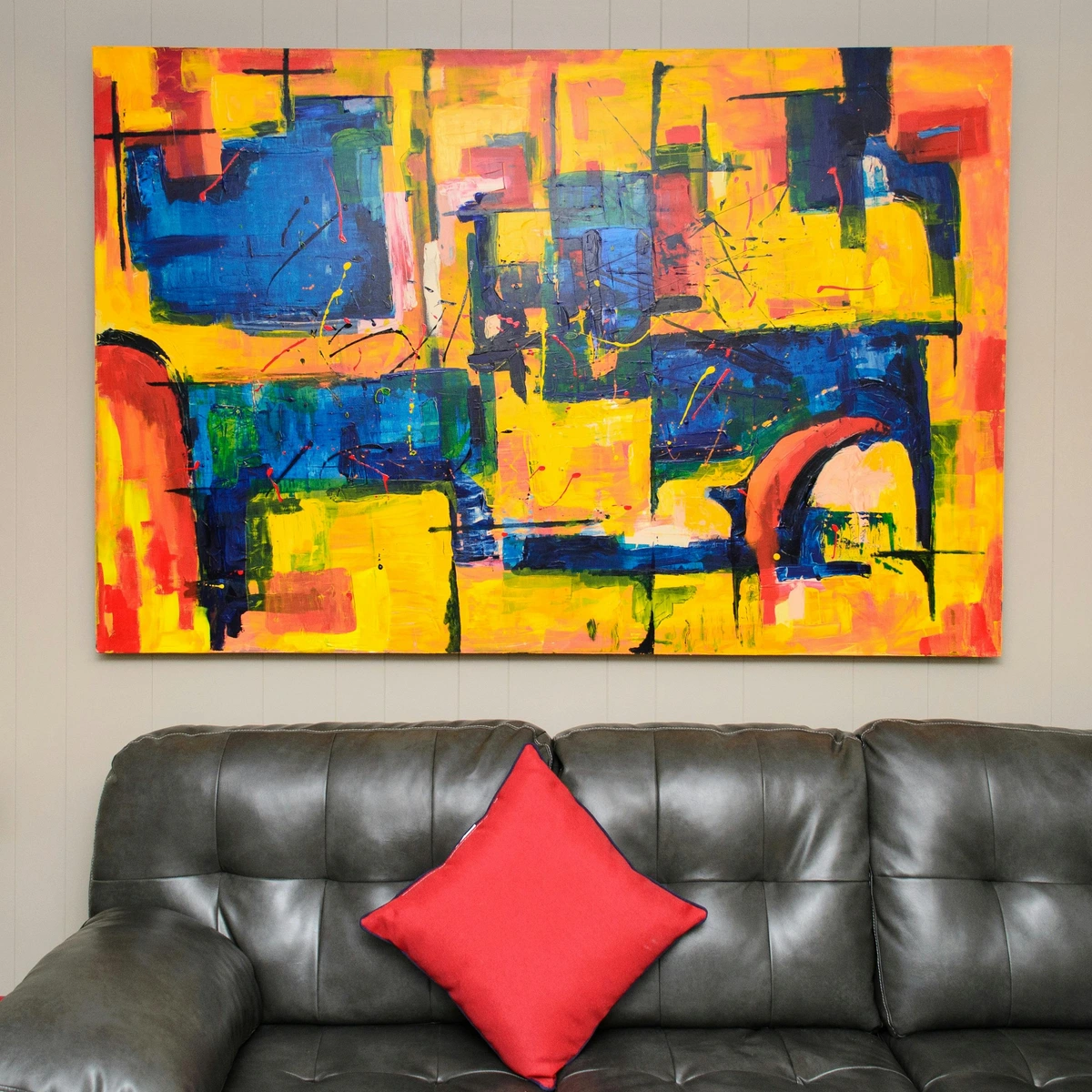
Before you do anything else, just sit with the piece. Seriously. Grab a coffee, sit on the floor, and just look at it. What is it communicating? You’re not just looking at colors; you're deciphering a mood. This is your blueprint for the entire room.
The Language of Color Theory: A Quick Primer
Beyond just aesthetics, colors whisper to our subconscious, influencing our moods and energy levels. I’ve found that truly understanding the emotional weight of hues transforms mere decoration into intentional design. Before we dive too deep, let's establish a common language for colors. Understanding basic color theory isn't just for painters; it's your secret weapon for creating harmonious (or dynamic!) interiors. I always think of it like learning the notes before you compose a symphony.
- Primary Colors: Red, blue, and yellow. These are the foundational hues from which all other colors are mixed. You can't create them by combining other colors.
- Secondary Colors: Orange (red + yellow), green (yellow + blue), and purple (blue + red). These are created by mixing two primary colors.
- Tertiary Colors: These are formed by mixing a primary and a secondary color (e.g., red-orange, blue-green).
- Complementary Colors: Colors directly opposite each other on the color wheel (e.g., red and green, blue and orange). They create high contrast and visual excitement when used together. A pop of a complementary color from your art can be incredibly impactful in a room!
- Analogous Colors: Colors next to each other on the color wheel (e.g., blue, blue-green, green). They create a serene, harmonious, and sophisticated feel, as they naturally blend.
- Monochromatic Palette: Variations in lightness and saturation of a single color. This creates a very cohesive and elegant look.
Understanding these relationships will empower you to consciously choose furniture, textiles, and decor that either subtly support your art or provide a thrilling, intentional contrast.
Beyond Hues: The Story and Style of Your Art
Sometimes, a piece speaks through its literal imagery, telling a clear story or depicting a specific scene. Other times, especially with abstract art, the story is more about the gesture, the movement, or the feeling it evokes. I always encourage people to consider not just what they see, but how it makes them feel, and what kind of art it is. Is it a minimalist masterpiece, a chaotic abstract expression, a serene landscape, a bold Pop Art statement, or a richly textured mixed-media piece? The inherent style of the art informs every design choice you make around it, guiding everything from furniture choices to ambient lighting. It’s the compass that guides your entire design journey. This is where your deep dive begins, connecting the art to broader design principles and ensuring a cohesive narrative. It's about understanding the foundational elements that make your art tick. For example, understanding how color theory applies to your piece can unlock a whole new dimension of design possibilities. We’re not just hanging a painting; we’re curating an experience, a conversation, and setting the stage for emotional resonance. Trust me, it’s less daunting than it sounds, and far more rewarding than simply matching a throw pillow. This article will be your comprehensive guide to designing a room that truly sings with your statement art, making it the undeniable star of your home.
The Subtlety of Scale within the Art Itself
Beyond the art's physical size, consider the internal scale and visual weight of its elements. Are the forms within the artwork monumental and grand, or delicate and intricate? Does it feature vast, open spaces, or is it densely packed with detail? This internal scale impacts how the art feels—expansive, intimate, bustling, or serene—and should subtly inform the scale of your surrounding decor. For instance, a piece with sweeping, large-scale internal elements might pair beautifully with substantial, clean-lined furniture, while a work filled with delicate, intricate details could find its complement in finer, more nuanced decorative objects. This is where the concept of 'less is more' truly shines around the artwork. When there's too much going on directly adjacent to the piece, your eye doesn't know where to land, and the art loses its power. A clean, uncluttered space around your statement piece acts like a frame itself, enhancing its presence and allowing its message to resonate more clearly. It’s about giving the art room to breathe, to truly be the star it was meant to be. I sometimes think of it as the quiet anticipation before a big performance—the empty stage makes the entrance of the lead singer even more impactful.
Subject Matter and Composition: Deeper Dives
Beyond just colors and general style, consider the subject matter and composition of your art. A sprawling landscape with a low horizon line will evoke a different sense of space than a tightly cropped portrait or a dynamic, diagonal abstract composition. Does the art feature figures, animals, still life, or pure abstraction? These elements, subtle as they may seem, carry inherent energy and meaning. For instance, an artwork with prominent vertical lines can create a sense of height and formality, while horizontal lines suggest calm and stability. Diagonal lines, on the other hand, inject dynamism and movement. A piece with a clear central focal point will naturally draw the eye, while an all-over composition might encourage a more meditative gaze. This deeper understanding of what the art depicts and how it's arranged offers even more threads to weave into your interior design tapestry. It’s like discovering hidden layers of meaning, which then inform every subtle design choice you make around it. It’s about creating an echo, a subtle visual conversation between your chosen art and its surroundings. You're not just decorating; you're building a visually coherent narrative.
To make this practical, consider these common compositional elements and their potential impact:
Compositional Element  | Visual Effect / Mood Evoked | Design Implications for the Room |
|---|---|---|
| Horizontal Lines | Stability, calm, breadth, restfulness. | Can be echoed with low-slung furniture, long console tables, or expansive rugs to reinforce tranquility. |
| Vertical Lines | Height, formality, grandeur, strength, aspiration. | Use tall elements like floor-to-ceiling curtains, bookcases, or sleek, upright furniture to enhance this sense of elevation. |
| Diagonal Lines | Dynamism, movement, energy, tension, drama. | Introduce angled furniture, bold patterns, or dynamic lighting to create an exciting, energetic flow. |
| Central Focal Point | Directs the eye immediately, creates clear hierarchy, strong presence. | Arrange seating to face the art directly; keep surrounding elements minimal to avoid competition. |
| All-Over Composition | Meditative, immersive, textural, can feel unbounded. | Allows for more diffuse lighting and a relaxed furniture arrangement, encouraging lingering contemplation. |
| Geometric Shapes | Order, precision, modernity, structure, logic. | Pair with clean-lined furniture, minimalist decor, and a structured layout to reinforce a contemporary aesthetic. |
| Organic Shapes | Softness, nature, fluidity, comfort, spontaneity. | Complement with rounded furniture, natural materials, and flowing textiles for a more relaxed, biophilic feel. |
| Repetition / Rhythm | Harmony, pattern, visual beat, predictability, unity. | Echo recurring motifs in subtle patterns on fabrics or wallpaper, or repeat decorative objects to create cohesion. |
Form and Line: The Unseen Language of Your Art
Beyond the obvious subject matter, the subtle interplay of form (the three-dimensional aspect of shapes) and line (the path of a moving point) profoundly influences how your art is perceived and how it interacts with its surroundings. Think about it: a piece dominated by bold, straight lines (like a city skyline) will convey a sense of structure and modernity, while flowing, organic curves (like a serene landscape or a biomorphic abstract) will suggest softness, movement, and a connection to nature. Geometric forms evoke order and precision, whereas irregular, free-form shapes feel more dynamic and spontaneous. Understanding these fundamental visual elements allows you to echo them in your furniture choices, architectural details, and even the textiles you select, creating a truly harmonious visual rhythm throughout your space. It's about translating the art's silent language into your room's design.
From a psychological perspective, sharp, angular lines can feel assertive and energetic, sometimes even aggressive, making them ideal for spaces where dynamism is desired. Conversely, soft, curved lines tend to promote relaxation and approachability, perfect for creating a more nurturing environment. I always encourage you to observe how these elements in your chosen art make you feel and then intentionally echo or contrast them in your decor. It’s like composing a visual melody for your room.
Understanding Art Mediums: Beyond the Surface
Before we delve into movements and colors, it's worth taking a moment to appreciate the medium itself. The materials an artist uses are not just tools; they fundamentally shape the art's character, texture, and how it interacts with light and space. I often think of it as the art's DNA—it dictates so much of its personality.
- Oil Paintings: Known for their rich, vibrant colors, deep luminosity, and often visible brushstrokes (impasto). Oils dry slowly, allowing for blending and layering, resulting in a luxurious, timeless feel. They often demand frames that enhance their gravitas.
- Acrylic Paintings: Versatile and fast-drying, acrylics can mimic oils or watercolors. They often have a flatter, more graphic finish but can also achieve bold textures. They tend to be more resilient than oils and offer incredible color intensity.
- Watercolors: Characterized by their transparency, delicate washes, and ethereal quality. Watercolors often evoke lightness, softness, and a fluid, organic feel. They require careful framing under glass to protect their delicate surface.
- Prints (Lithographs, Etchings, Screenprints, Giclée): These are original artworks created in editions. Each printmaking technique offers a distinct texture and visual quality. Understanding the type of print can inform how you display it – a crisp screenprint might call for a sleek frame, while a textured etching could be enhanced by a wider mat.
- Photography: From crisp, high-definition digital prints to grainy, atmospheric film photographs, the medium itself sets a mood. Glossy finishes can add vibrancy, while matte finishes offer a softer, more contemplative feel. Think about how the light plays on the surface.
- Sculptures: Three-dimensional works in materials like bronze, marble, wood, or mixed media. Sculptures demand space and interact profoundly with light and shadow. They add a whole new tactile dimension to a room, inviting you to move around them.
- Mixed Media/Collage: These pieces combine various materials—paper, fabric, found objects, paint—creating rich textures and layers. They often tell complex stories and can be incredibly dynamic. Shadow box frames are often ideal for these multi-dimensional works.
- Textile/Fiber Art: Woven tapestries, quilts, and fabric installations bring softness, warmth, and intricate patterns. They can also significantly impact a room's acoustics.
- Digital Art/NFTs: While the world of digital art and NFTs is still rapidly evolving and often speculative, these pieces represent a significant contemporary movement. Displayed on high-resolution screens or as printed editions, they offer unique possibilities for dynamism, animation, and interaction. I often find it fascinating how technology pushes the boundaries of what we consider "art," though I always recommend a cautious approach to the more volatile aspects of the NFT market.
Knowing the medium helps you appreciate the artist's craft and guides your choices in framing, lighting, and how you echo its characteristics in your surrounding decor. It’s about acknowledging the very fabric of the art itself.
Decoding Art Movements and Eras: A Quick Primer
Understanding the broad strokes of art history can give you a powerful lens through which to view your statement piece and, subsequently, your room. Is your art a vibrant splash of Abstract Expressionism, demanding energetic and uninhibited pairings? Or perhaps a sleek, understated Minimalist work that calls for clean lines and a serene backdrop? Maybe it's a nostalgic Pop Art print, inviting playful retro elements, or a timeless Classical piece that whispers of grandeur and tradition. Knowing its lineage helps you speak its language. If your piece leans abstract, you might find a deeper connection by exploring the ultimate guide to abstract art movements. For example, a piece reminiscent of Andy Warhol's Campbell's Soup Cans clearly suggests a different aesthetic approach than an Edvard Munch woodcut like 'Angst'. This isn't about rigid adherence to rules, but about informed decision-making.
Here are a few more movements to consider, and how they might influence your design:
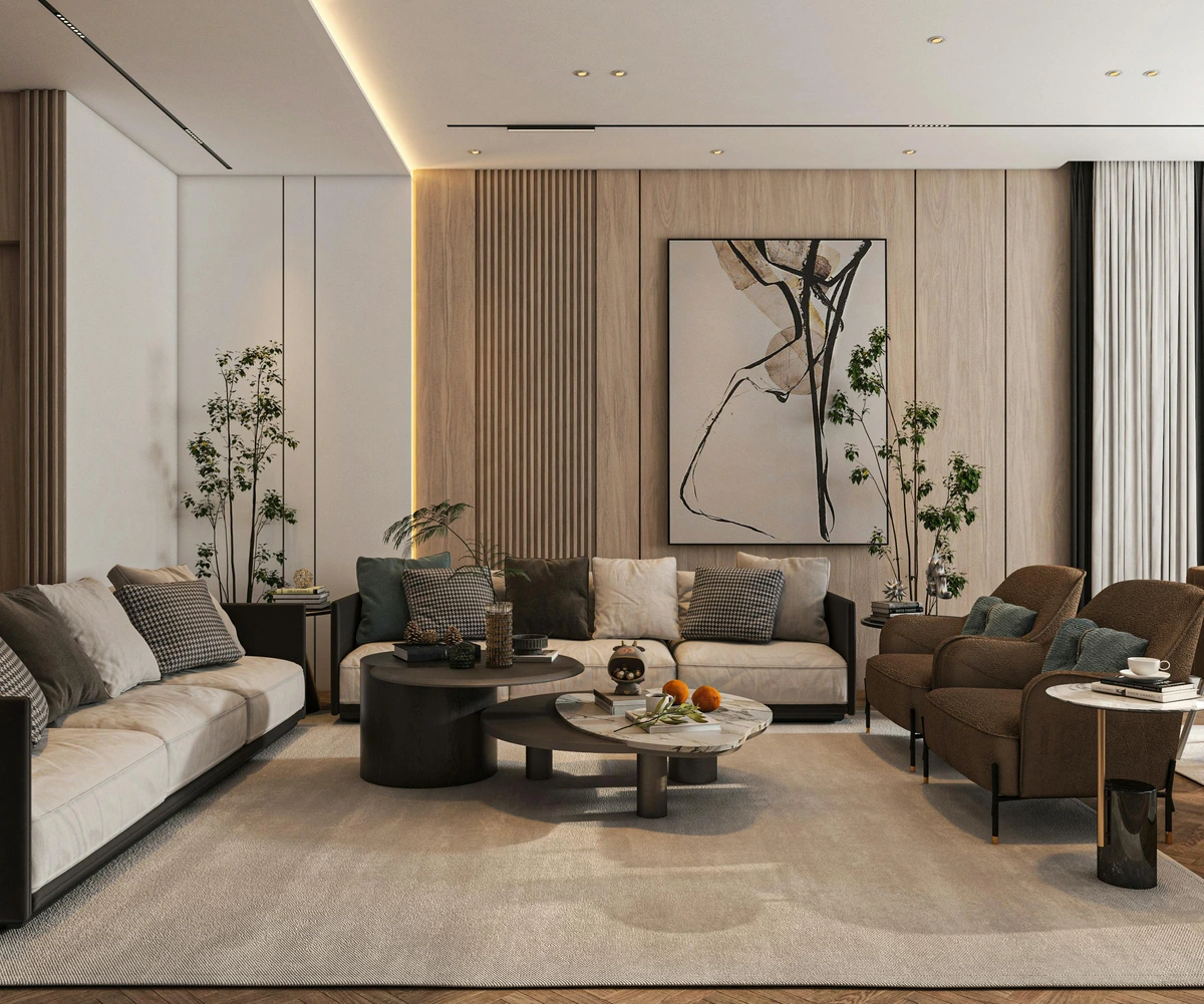
- Cubism: Fragmented, geometric forms (think Picasso or Braque) challenge traditional perspective. Pair with angular furniture, textured surfaces, and a palette that respects the art's often muted tones, allowing its complex structure to shine.
- Futurism: Dynamic, energetic depictions of motion and technology (like Giacomo Balla's speed studies). Complement with sleek, industrial elements, bold metallic accents, and a sense of movement in your layout.
- Bauhaus: Emphasizing functionality, clean lines, and geometric shapes. Calls for minimalist furniture, primary colors, and a focus on utility and simple beauty.
- Romanticism: Emotional, dramatic, and often focused on nature or grand historical scenes (Eugène Delacroix comes to mind). Pair with rich, deep colors, luxurious fabrics, and perhaps some ornate, but not overwhelming, detailing to evoke a sense of grandeur and passion.
- Baroque: Ornate, dramatic, and full of movement and intense emotion. This style demands an equally opulent setting, with rich textures, deep colors, and elaborate, traditional furnishings.
- Renaissance: Characterized by realism, perspective, and classical themes. Best complemented by timeless, elegant furniture, symmetrical arrangements, and a refined color palette that respects the art's often muted, natural tones.
- Post-Impressionism: Building on Impressionism but with more emphasis on emotional expression and symbolic content (think Van Gogh's swirling skies or Cézanne's structured landscapes). These pieces often have bolder colors and more distinct brushstrokes. Complement with rich, earthy tones, natural wood, and perhaps a touch of hand-crafted decor to echo the artist's touch.
- Expressionism: Prioritizing emotional impact over objective reality, often characterized by distorted figures, strong colors, and dramatic brushwork (like the haunting imagery of Edvard Munch's 'Angst'). These works demand a setting that can handle intensity, perhaps with deep, saturated wall colors or stark contrasts to let the raw emotion truly resonate.
- Abstract Expressionism: Energetic, non-representational art where the act of painting itself is central (Jackson Pollock's drip paintings, Mark Rothko's color fields). These pieces are pure emotion and often demand space and a minimalist backdrop to truly absorb their power. Find more about its history in the definitive guide to the history of abstract art.
- Post-Modernism: Challenging established norms and often ironic or deconstructive, Post-Modern art encompasses a vast array of styles from the late 20th century onwards. It can be playful, political, or conceptual, often blurring the lines between high and low culture. If your art has a slightly rebellious edge, or makes you question conventions, it might fit here. Pair with decor that embraces eclecticism or subtle wit.
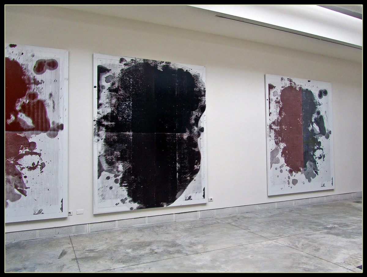
- Surrealism: Dreamlike, often unsettling imagery (like much of Man Ray's work) invites introspection and a sense of wonder. Pair with unexpected elements, muted tones to let the art be the 'dream', or even a touch of whimsical decor.
- Impressionism: Focused on light, color, and fleeting moments, often depicting landscapes or daily life (think Claude Monet). These pieces often bring a sense of calm and natural beauty. Complement with soft, natural light, organic textures, and a gentle color palette.
- Regionalism: Depicting realistic scenes of American rural life (such as Grant Wood's iconic pieces). These works often evoke a sense of nostalgia, tradition, and groundedness. They pair well with natural materials, rustic touches, and a warm, inviting atmosphere.
- Street Art/Graffiti: Bold, often politically charged, and incredibly dynamic (like the unmistakable Banksy or vibrant murals from Lisbon or São Paulo). This style demands attention and can inject a raw, urban energy into a space. Consider pairing with industrial elements, modern furniture, or even a deliberate contrast with classic pieces to create a powerful statement. Street art, whether from Lisbon or São Paulo, brings a unique, contemporary edge.
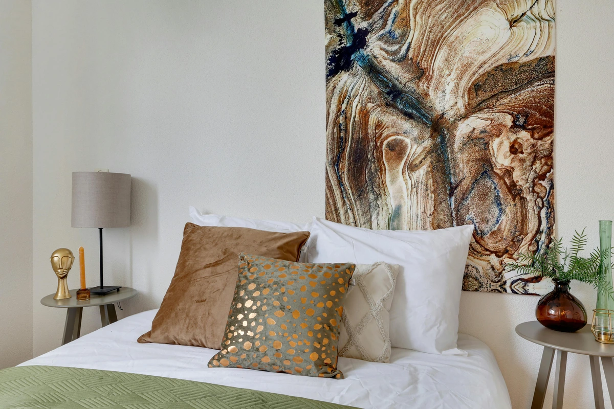
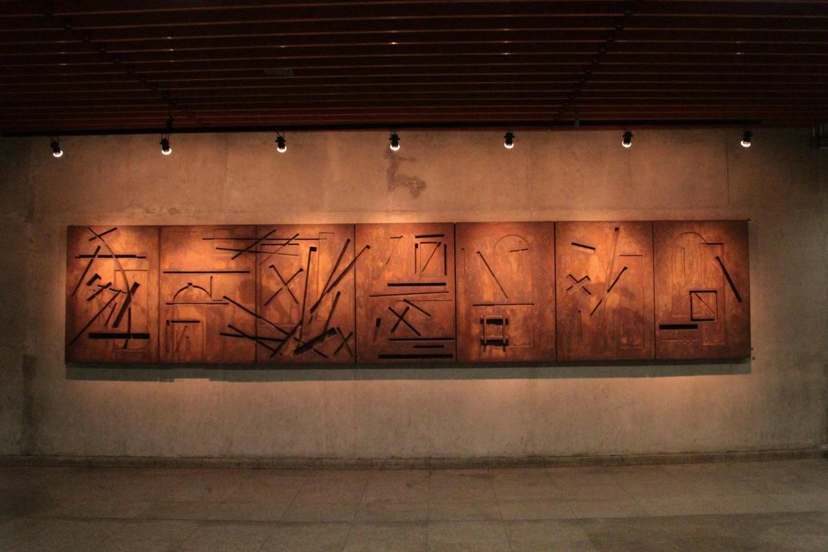
I find it helps to break it down. Ask yourself these questions:
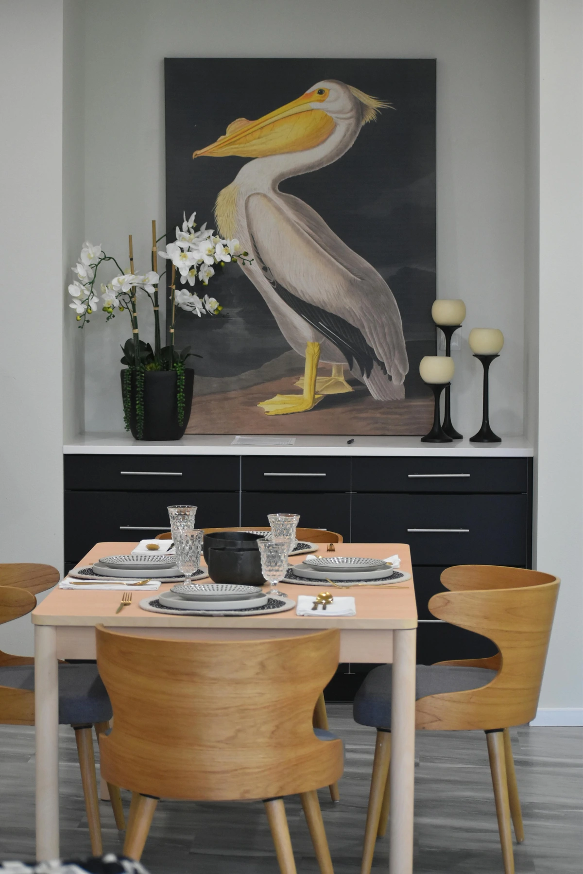
- What are the dominant colors? Pick out the top 2-3 most prominent colors.
- What are the accent colors? Find those little pops of unexpected color. A tiny streak of neon yellow? A dash of deep indigo? That’s your secret weapon.
- What is the mood? Is it calm and serene? Energetic and chaotic? Moody and dramatic? Happy and playful?
- What textures do you see? Are the brushstrokes thick and visible? Is it a smooth, glossy photograph? Is it a woven textile piece?
Understanding these basic elements is your first step to unlocking the art's full potential in your space. And when we talk about colors, it's not just about matching. It's about understanding what those colors do to a room, how they make you feel. It's the powerful psychology of color in abstract art at play, influencing mood, energy, and even the perceived size of a space. For example, a dominant red might invigorate, while a deep blue calms, and a vibrant yellow brings joy. Don't just see the color; feel its potential impact on your daily life within that space. For a quick reference, here’s how different colors typically influence mood:
Dominant Color in Art | Psychological Impact | Suggested Room Pairing / Mood |
|---|---|---|
| Red | Energy, passion, excitement, warmth, can be aggressive | Dining room (stimulates appetite), energetic living room, bold entryway. |
| Blue | Calm, serenity, stability, peace, can be cool or melancholic | Bedrooms, home offices, bathrooms (for tranquility). |
| Yellow | Joy, optimism, creativity, warmth, can be overwhelming in large doses | Creative studios, kitchens, playful children's rooms, cheerful living areas. |
| Green | Nature, harmony, growth, balance, freshness | Any room, especially bedrooms or living rooms for a natural, calming feel. |
| Orange | Enthusiasm, warmth, creativity, vitality, can be stimulating | Dining rooms, creative spaces, vibrant living rooms. |
| Purple | Luxury, royalty, creativity, mystery, spirituality | Bedrooms (deep purples for luxury), creative studios, intimate living rooms. |
| Black | Sophistication, power, drama, elegance, can be somber | Modern minimalist spaces, accent walls, grounding element in any room. Pair with lighter colors for contrast, or deep jewel tones for luxury. |
| White | Purity, cleanliness, freshness, simplicity, can be sterile | Minimalist interiors, bright kitchens, serene bedrooms (as a base). Provides a clean canvas, amplifies light. |
| Grey | Neutrality, balance, sophistication, calm, can be dull | Contemporary living rooms, elegant bedrooms, versatile base for any palette. Excellent as a backdrop to vibrant art, or to create a monochromatic scheme. |
| Brown/Beige | Earthiness, warmth, comfort, natural, reliability | Rustic, bohemian, or traditional spaces. Creates a grounding, cozy atmosphere. |
| Gold/Silver/Metallic | Luxury, glamour, modernity, richness | Contemporary, Art Deco, or opulent interiors. Adds sparkle and a focal point, especially when echoing metallic accents in the art. |
Understanding these nuances helps you choose complementary elements that truly amplify, rather than mute, your art's inherent energy.
The Subtle Art of Symbolism and Narrative
Sometimes, the story your art tells isn't immediately obvious, especially with abstract pieces. But often, even in the most non-representational forms, there's a narrative, a symbolism, or an emotional undercurrent that can profoundly influence your space. Does the artwork evoke a sense of journey, struggle, triumph, or peace? Are there recurring motifs, even abstract ones, that suggest a deeper meaning? Perhaps a specific color combination has personal significance, or the overall composition mirrors a feeling you want to cultivate in your home. By acknowledging and integrating these symbolic layers, you move beyond mere decoration into creating a truly resonant, meaningful environment. Your decor then becomes a subtle echo of the art's deeper message, allowing your room to speak volumes without saying a word. For instance, a repeating geometric motif might suggest order and precision, while organic, swirling shapes could evoke fluidity and the natural world. A single, solitary figure might speak of introspection, whereas a bustling crowd could symbolize connection or chaos. Even a particular color choice can be symbolic: red for passion, blue for tranquility, green for growth. By consciously selecting elements that resonate with these symbolic layers, you transform your room into a richer, more meaningful dialogue with your chosen artwork.
Let’s put this into a practical table. Imagine your art is a vibrant, abstract piece with lots of blue, a touch of orange, and thick, visible texture.
The Importance of Art's Scale to the Room
Before even thinking about where to hang it, let's talk about the initial visual impression your art makes in relation to the overall size of the room. This isn't about specific placement yet, but about the inherent presence of the piece. A monumental artwork in a small room can be incredibly dramatic and intentional, creating an immersive, jewel-box effect, almost like stepping into a private gallery. Conversely, a tiny, delicate piece might get lost in a cavernous space, lacking the impact required to be a truly commanding focal point. The scale profoundly influences the psychological perception of a room: large art can make a small room feel grander or more intimate, while small art in a large room can create quiet moments or feel insignificant. It's about visual balance and intentionality, ensuring your art has the presence it deserves without overwhelming or disappearing. I’ve found that many people instinctively go for a piece that's 'safe' in size, but often, being a little bolder with scale can create a far more impactful and memorable space. It’s a delicate dance, but when executed well, it transforms a room from merely furnished to truly designed. For specific advice on balancing art above a key furniture piece, like your sofa, you might find my guide on art above the sofa: perfect placement and scale incredibly helpful.
Art Style | Dominant Mood/Characteristic | Suggested Room Pairing | Design Elements to Echo |
|---|---|---|---|
| Minimalist Abstract | Serene, clean, thoughtful | Contemporary living rooms, calm bedrooms, home offices | Uncluttered spaces, muted palettes, natural materials (linen, light wood), subtle textures. |
| Vibrant Abstract Expressionism | Energetic, dynamic, bold | Creative studios, modern dining rooms, playful living areas | Strong contrasts, varied textures (chunky knits), metallic accents, simple but impactful furniture. |
| Traditional Landscape/Portrait | Classic, calming, refined | Formal dining rooms, libraries, sophisticated entryways | Rich wood tones, classic fabrics (velvet, silk), antique pieces, symmetrical arrangements. |
| Pop Art/Graphic | Playful, bold, retro | Game rooms, contemporary kitchens, vibrant teen bedrooms | Clean lines, primary or secondary color pops, mid-century modern furniture, graphic patterns. |
| Textural Mixed Media | Earthy, rich, artisanal | Bohemian living areas, rustic studies, cozy reading nooks | Natural fibers (wool, jute), distressed wood, ceramics, abundant plants, layered textiles. |
| Surrealist | Dreamlike, enigmatic, thought-provoking | Creative studios, intimate reading nooks, eclectic living rooms | Juxtaposition of familiar objects, deep rich colors, velvet or mysterious textures, unusual lighting. |
| Impressionist | Ethereal, light-filled, harmonious | Bright living rooms, sunrooms, serene bedrooms | Soft, muted palettes, natural light, sheer fabrics, floral patterns, delicate furniture. |
| Regionalist | Nostalgic, grounded, narrative-rich | Farmhouse kitchens, rustic studies, traditional dining rooms | Sturdy wooden furniture, natural fibers (cotton, wool), warm earthy tones, vintage accents. |
| Street Art/Graffiti | Urban, rebellious, dynamic | Modern lofts, industrial spaces, teen bedrooms, game rooms | Exposed brick, raw concrete, metal accents, bold colors, minimalist or industrial furniture. |
| Conceptual/Installation Art | Thought-provoking, experiential, challenging | Galleries, large open-plan living spaces, creative studios | Minimalist backdrop, subtle lighting, clear pathways for interaction, focus on the idea. This isn't just about what you see, but what you experience and feel. |
| Abstract Geometric | Orderly, modern, precise | Contemporary offices, minimalist living rooms, entryways | Clean lines, sleek materials (metal, glass), monochromatic or limited color palettes, structured furniture. |
| Figurative Expressionism | Emotional, raw, human-centered | Intimate studies, bedrooms, eclectic living areas | Rich textures, deep colors, perhaps vintage or distressed furniture to echo the rawness. |
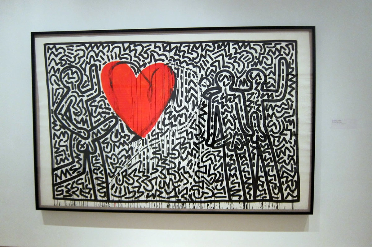
Element in Art | How to Use It in Your Room |
|---|---|
| Dominant Color (e.g., Deep Blue) | A feature wall, a large rug, or your main sofa. Use it in big, confident ways. |
| Secondary Color (e.g., Soft Grey) | Chairs, curtains, or larger decor items. It supports the main color without competing. |
| Accent Color (e.g., Burnt Orange) | Throw pillows, a vase, a book on the coffee table. These are your little winks of color. |
| Mood (e.g., Energetic) | Choose furniture with clean lines and a dynamic feel. Avoid anything too stuffy or traditional. |
| Texture (e.g., Thick Paint) | Echo this with a chunky knit throw, a rough-hewn wooden coffee table, or a textured rug. |
Step 2: Placement is Everything—The Art Chooses Its Throne
Where you hang your statement piece dictates the entire flow and function of the room. It’s not just about finding an empty wall; it’s about creating a focal point, a magnetic north for your interior design compass, drawing the eye and guiding movement through the space. I always tell people, think of it as the ultimate act of hospitality: you're giving your most important guest the best seat in the house. The best spot is usually the first wall you see when you enter a room or the largest, most uninterrupted wall, but there's a subtle art to making it truly impactful, considering both aesthetics and practical living. I often advise my clients to walk through their homes as if they were a guest, noting where their eyes naturally land. That's your prime real estate.

Considering Sightlines and Flow
Before even thinking about a nail, consider how you and others will move through the room and what pathways your eyes will naturally follow. Your statement art should be visible from key vantage points, ideally without obstructions. Avoid placing it where it will be constantly bumped or where glare from a window will obscure it during peak viewing times. Think about the "reveal" – does it slowly come into view, building anticipation, or does it command attention immediately upon entry? This isn't just about static placement; it's about choreographing a visual experience, making the art an integral part of the room's dynamic energy. I often imagine the art as having its own gravitational pull, subtly influencing everything else around it.
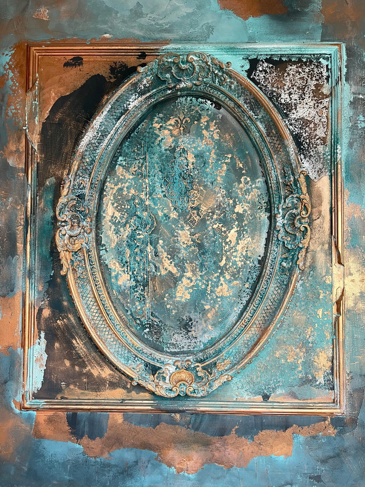
The Art of the Gallery Wall vs. a Solo Statement
While this article champions the single, undeniable statement piece, it's worth a moment to contrast it with the ever-popular gallery wall. A gallery wall, with its curated collection of multiple artworks, photos, and objects, tells a rich, layered story. It's fantastic for personal expression, for filling large walls, or for integrating many smaller pieces you love. However, a gallery wall inherently diffuses focus. A single statement piece, on the other hand, is a singular punch, a clear declaration. It commands attention without competition, allowing its message, colors, and textures to resonate unimpeded. The choice depends entirely on the narrative you wish to create: a complex symphony (gallery wall) or a powerful, unforgettable solo (statement piece). Sometimes, a small, complementary gallery wall on an adjacent wall can even support the main statement piece, acting as a chorus rather than a competing lead. I’ve found that trying to force a gallery wall to host a true 'statement' piece often dilutes the impact of both. Know what you want to achieve before you start hammering nails!
Scale and Proportion: Getting it Just Right
Before we talk about specific locations, let's nail down scale. This is where many well-intentioned decorators stumble, making a room feel either dwarfed or overwhelmed. Your art should feel proportionate to the wall it's on and the furniture below it. A good rule of thumb? Your artwork should generally be about two-thirds the width of the furniture it hangs above (a sofa, console table, or headboard). And when hanging, aim for the center of the art to be at eye-level for an average person (around 57-60 inches from the floor), unless it’s placed specifically above furniture where a 6-8 inch gap between the top of the furniture and bottom of the art is ideal. This creates a visual anchor that feels natural and balanced. For a deep dive into perfecting this, I've written extensively on maximizing impact choosing art for high ceilings and more generally, how to position abstract art to transform any room.
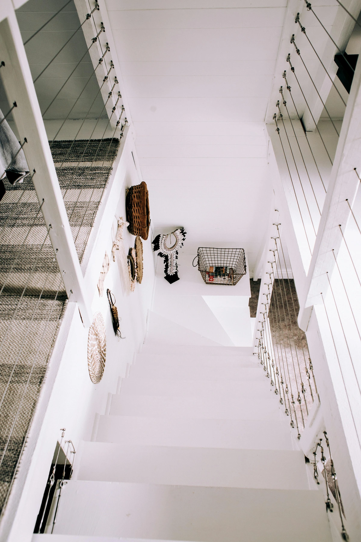
Optimal Hanging Heights: A Quick Reference
Getting the height just right can dramatically impact how your art is perceived. Too high, and it feels disconnected from the furniture; too low, and it can feel cramped. Here's a handy guide:
Placement Scenario | Recommended Height (from floor to center of art) | Key Considerations |
|---|---|---|
| Standalone on a Wall | 57-60 inches (average eye-level for a standing person) | Allows comfortable viewing; feels grounded. |
| Above a Sofa/Headboard | 6-8 inches above the top of the furniture | Creates a cohesive unit; prevents art from floating. |
| Above a Fireplace | 6-12 inches above the mantel | Balances the mantelpiece; ensures it's not obscured. |
| In a Dining Room | Slightly lower than standard eye-level (for seated viewing) | Prioritizes comfort for diners; often 50-55 inches. |
| Gallery Wall (Centerpiece) | Treat the main piece or the center of the grouping as a standalone | Ensures the overall composition is balanced at eye-level. |
| High Ceilings | Can go slightly higher to embrace verticality, but maintain furniture relationship | Use maximizing impact choosing art for high ceilings as a guide; avoid 'floating' art. |
| Art Groupings/Gallery Walls | Eye-level for the central piece or the visual center of the entire arrangement. | Ensures cohesive display, prevents disjointed look, creates a unified visual story. |
Here's how to think about scale for different room sizes:
Room Size | Art Size Recommendation | Impact |
|---|---|---|
| Small Room (e.g., Powder Room, Small Entryway) | One bold, well-scaled piece (e.g., 24x36 inches) can create drama. Avoid multiple small pieces that clutter. | Makes a compact space feel intentional and luxurious, draws the eye, creates depth. |
| Medium Room (e.g., Standard Bedroom, Dining Room) | A larger statement piece (e.g., 40x60 inches) above a key furniture item or on the largest wall. | Anchors the space, provides a clear focal point, ties elements together. |
| Large/Open Concept Room (e.g., Spacious Living Room, Loft) | Very large scale art (e.g., 60x90 inches or larger), or a curated diptych/triptych acting as one large statement. | Defines zones, commands attention, prevents the room from feeling empty or overwhelming. |

Now, with that in mind, let's explore some common 'thrones' for statement art. While the table below gives a quick overview, let me elaborate on some nuanced considerations for specific spaces:
- Living Room: The living room is often the heart of the home, and your statement art here can set the entire tone for relaxation, conversation, and gathering. Above a sofa or fireplace are classic choices, but a prominent wall can also become a powerful focal point. Find more tips on choosing art for your living room.
- Home Office/Workspace: This is a place where focus and inspiration are key. A piece here can energize your work environment or reflect your aspirations. Consider abstract pieces for creative flow or calming landscapes for tranquility, aligning the art with the mood you want to cultivate while working. A well-chosen piece in my own workspace can make all the difference on a challenging day. For more specialized advice, a guide on decorating with art in a home office: boosting creativity and focus can be invaluable.
- Staircase Landing/Wall: Staircases are often overlooked, yet they offer a fantastic opportunity for a dramatic reveal. A statement piece ascending the wall can transform a transitional space into a dynamic gallery, drawing the eye upwards and creating a sense of journey. Always consider the viewing angles as you ascend and descend. For inspiration, explore specific tips on how to choose art for a staircase.
- Child's Room or Playroom: Don't underestimate the power of art for young minds! A bold, imaginative, and colorful piece can spark creativity, encourage storytelling, and foster a love for art from an early age. Choose durable, age-appropriate pieces, perhaps with whimsical themes or vibrant palettes. It's about creating a stimulating and joyful environment.
- Teenager's Room: This is where personality truly explodes! Statement art should reflect their evolving identity and passions. Think bold graphics, pop art, street art, or abstract pieces that speak to their unique taste. It’s an opportunity for self-expression and creating a cool, inspiring hangout. For more ideas, check out how to choose art for a teenagers room: inspiring creativity and self-expression.
- Kitchen: Often overlooked, a kitchen can be transformed by a vibrant piece. Think about materials that can withstand humidity and splashes, perhaps behind glass. A dynamic abstract piece can inject energy into a functional space. For tailored tips, refer to how to choose art for a kitchen.
- Bathroom (especially Powder Rooms): A small powder room is an ideal place to take a bold risk. A statement piece here can create an unexpected moment of luxury and personality. Consider moisture-resistant options. For more specific guidance, explore how to choose art for a bathroom and decorating with art in a powder room: maximizing impact in small spaces.
- Home Gym: What better way to motivate yourself than with inspiring art? A dynamic, energetic abstract piece or a calming landscape can transform a functional workout space into an invigorating or peaceful sanctuary. Choose pieces that withstand high activity and perhaps moisture, considering materials like metal prints. For more insights, delve into how to choose art for a home gym: creating an energizing space.
- For High Ceilings: If you're blessed with soaring ceilings, your art can truly make a grand statement. A very tall, dramatic piece or a carefully curated vertical arrangement can draw the eye upwards, emphasizing the room's spaciousness. This is where you can go really big and bold! Consult maximizing impact choosing art for high ceilings for expert advice.
Here’s a quick overview of how different rooms might welcome your statement piece:
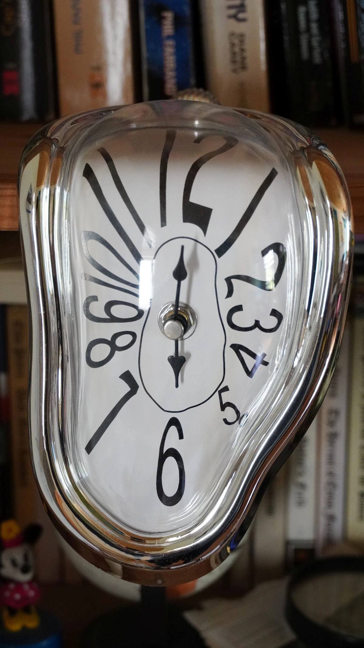
Room Type | Ideal Placement Considerations | Impact | |
|---|---|---|---|
| Living Room | Above the sofa, above a fireplace, or on the largest uninterrupted wall. Consult choosing art for your living room. | Anchors seating, creates conversation, defines the main gathering space. | |
| Dining Room | On a wall visible from the entrance, or opposite a window. See how to choose art for a dining room for more. | Sets mood for meals, encourages dialogue, elevates formality or modern flair. | |
| Bedroom | Centered above the headboard. | Creates a serene or stimulating backdrop, personalizes the retreat. | |
| Entryway/Hallway | End of a long hallway, or main wall in an entryway. | Creates a focal point, draws visitors in, transforms transitional spaces. | |
| Home Office | On a wall behind your desk or visible from your main work area. | Inspires creativity, defines the workspace, reduces visual clutter. | |
| Children's Room/Playroom | At eye-level for a child, or on a wall that inspires play and imagination. | Sparks joy and creativity, fosters early appreciation for art, personalizes their space. | |
| Staircase/Landing | On a prominent wall ascending the stairs or on a landing, considering multiple viewpoints. | Transforms a transitional space, creates visual flow, adds drama and unexpected beauty. | |
| Home Gym | On a wall opposite equipment, or where it can provide motivation/distraction. | Inspires energy and focus, reduces monotony, contributes to overall well-being. For more insights, delve into how to choose art for a home gym. |
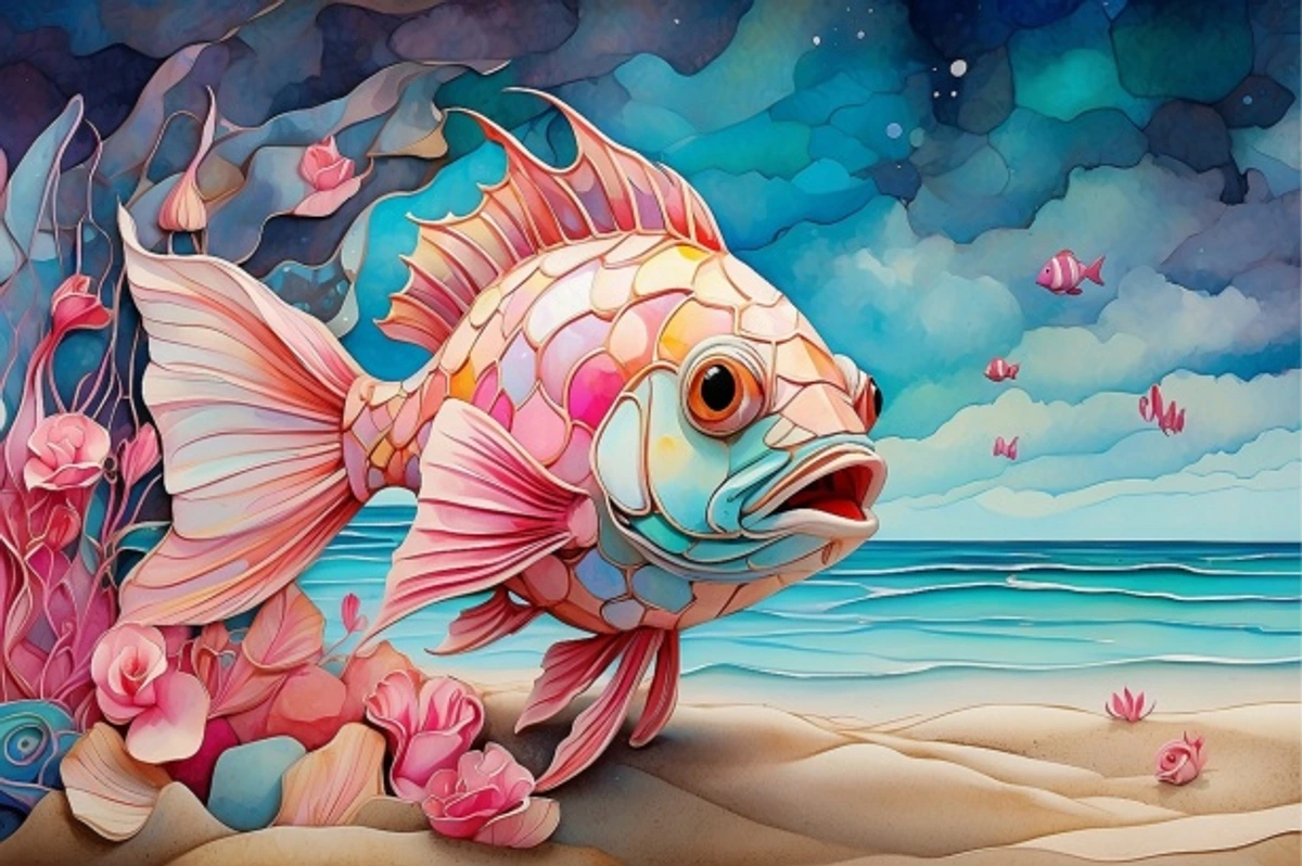
Once it's placed, the rest of your room should orient towards it. Your seating arrangement, for instance, should facilitate a good view of the art. It's the guest of honor; give it the best seat in the house. I often find myself rearranging furniture repeatedly until that perfect sightline is achieved—it's worth the effort, I promise.

The Art of the Feature Wall: A Powerful Backdrop
Before we move to furniture, let's talk about the wall itself. Sometimes, your statement art deserves a stage that's more than just a neutral backdrop. This is where the concept of a feature wall (or accent wall) comes in. It's a deliberate design choice to highlight one wall in a room, often with a different paint color, wallpaper, or even a textured material, to create an impactful backdrop for your art.
- Bold Paint Colors: Choose a deep, rich color from your artwork's palette for the feature wall. This can make your art pop dramatically, creating a sense of depth and luxury.
- Textured Wallpaper: A subtle pattern or a tactile wallpaper (think grasscloth or a delicate geometric print) can add another layer of interest without competing with the art. It provides a visual softness or a sophisticated edge.
- Architectural Elements: Exposed brick, reclaimed wood panels, or even a custom-built alcove can transform a wall into an architectural feature that naturally frames and elevates your artwork.
The key is intentionality. The feature wall should complement and enhance your art, drawing the eye to it, not away from it. It's like adding a dramatic velvet curtain behind the lead singer—it amplifies their presence without stealing the show.
Step 3: Furnishing the Stage—Your Furniture are Supporting Actors
This is where people often go wrong, and it’s a mistake I see all too frequently. They try to make their furniture compete with the art. I’ve seen it countless times – a magnificent, vibrant painting battling it out with a similarly boisterous sofa, and trust me, it’s a battle no one wins. It’s like having two lead singers trying to hit the high notes simultaneously, and the audience (that’s you, trying to relax!) ends up with a headache, unsure where to focus. If your art is a loud, colorful explosion, a bright red sofa is going to be screaming right back at it, creating visual chaos. Your furniture's role isn't to compete, but to create a harmonious stage, a curated backdrop that allows your statement piece to truly resonate. Think of them as the supremely talented, but self-aware, supporting actors who know how to make the star shine, ensuring every element feels intentional and contributes to the overall narrative.
Furniture Layout Strategies around the Art
Beyond merely choosing the right pieces, how you arrange your furniture in relation to your statement art is crucial. The goal is to create an inviting conversation area that naturally directs the eye towards your prized possession. Your furniture's arrangement is an extension of your design intention, actively shaping how the art is experienced. It's a living composition that you get to fine-tune.
Here are some common layouts and considerations:
Layout Strategy | Description | Impact on Art Viewing | Key Considerations |
|---|---|---|---|
| Anchoring the Sofa | Art is centered above a sofa; other seating faces the sofa. | Creates a primary focal point, drawing the eye to the art from across the room. | Ensure sofa is centered; maintain clear sightlines from other seating. |
| Creating a Dialogue | Art on one wall, main seating on an adjacent wall facing it. | Fosters a conversational flow between the art and the seating area. | Arrange seating so viewers can comfortably observe the art without craning necks. |
| Defining Zones (Open Concept) | Use rugs and furniture clusters to delineate distinct areas, each potentially with its own art piece. | Prevents vast spaces from feeling empty; art helps define function of each zone. | Ensure visual harmony between art pieces in different zones; avoid competition. |
| Symmetrical Arrangement | Furniture (e.g., two chairs) flanking the art, creating balance. | Evokes formality, order, and classic elegance; reinforces the art's central importance. | Requires careful measurement to maintain perfect symmetry. |
| Asymmetrical Arrangement | Balance created with different-sized pieces or objects around the art. | More dynamic, modern, and often feels more natural and less rigid. | Achieves balance through visual weight rather than identical components. |
| Maintaining Clear Pathways | Ensure furniture doesn't obstruct the view or access to the art. | Enhances flow, prevents clutter, allows art to be appreciated without impediment. | Test walk paths; avoid placing tall pieces directly in front of the art. |
Creating Visual Vignettes: The Art of Layering
Think beyond just hanging art on a wall and placing furniture in front of it. Consider how your art can be integrated into vignettes – small, thoughtfully arranged groupings of objects and furniture that tell a mini-story. For example, if your statement piece is a vibrant abstract, you might place a sleek console table beneath it, adorned with a minimalist vase echoing an accent color from the art, a stack of art books, and a sculptural object that mirrors a shape within the painting. This layering creates depth and visual interest, drawing the eye in and inviting closer inspection. It makes the entire space feel curated and intentional, rather than simply decorated. For instance, a vintage camera might accompany a black and white photograph, or a collection of smooth river stones could complement a serene landscape. The key is to select objects that are not only aesthetically pleasing but also narratively connected to the artwork, creating a mini-exhibition within your room. Each element within the vignette should contribute to the art's narrative, enhancing its presence without competing for attention.
The Psychology of Furniture Placement: Guiding the Eye
Just as art influences mood, your furniture arrangement subtly directs movement and attention. When designing around a statement piece, think of yourself as a choreographer, guiding the viewer's experience.
- Creating a "Landing Zone": Ensure there's a clear, inviting path towards the art. No obstacle courses! This respects the art and the viewer.
- Framing with Furniture: Use low-slung bookcases, side tables, or even plants to subtly frame the art, drawing the eye inwards without blocking the view.
- The Power of Proximity: Placing a comfortable armchair or chaise lounge near your art invites closer contemplation, creating an intimate viewing experience. I find this creates a wonderful, personal moment with the piece.
Your furniture should complement, not compete. Here’s how:
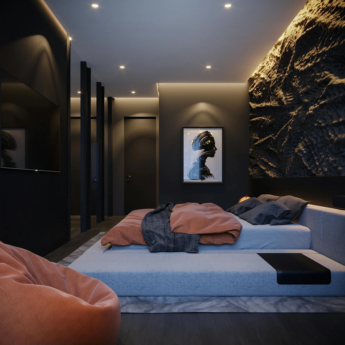
- Pull Colors from the Art: This is your anchor. Your main furniture pieces (sofa, chairs, accent tables) should probably echo one of the more neutral, grounding, or dominant colors found within the artwork. If your painting is a swirling mix of blues, greens, and creams, a cream-colored sofa is a safe, sophisticated, and beautiful bet. If it's a vibrant abstract with a strong yellow, a charcoal grey sofa could provide the perfect grounding contrast, allowing the yellow to truly sing. It allows the art to breathe and truly pop. For smaller accents, like throw pillows, vases, or books, you can be bolder, pulling out those unexpected accent colors from the art, but always keep the big, foundational pieces serene and supportive. This ensures your room feels cohesive, not chaotic. It’s about creating a quiet backdrop that allows your art to truly sing, without yelling over it.
- Mind the Scale: This is about visual equilibrium. A huge, commanding piece of art can completely dwarf small, delicate furniture, making them look like dollhouse toys. Conversely, a massive, chunky sofa can overpower a more subtle or intricately detailed piece of art, making it disappear into the background. It's like trying to hear a whisper over a rock concert! Ensure the visual weight is balanced. If your art is monumental, opt for substantial, well-proportioned furniture—think a robust sectional or a solid wood console. If your art is more delicate, perhaps your furniture can have lighter lines, or you can balance a heavier piece with negative space around the artwork. It's all about creating harmony, not a wrestling match, ensuring every element feels intentional.
- Consider the Style: Your art has a distinct personality and style, and your furniture should at least nod to it, entering the same conversation, if not speaking the exact same language. An ultra-modern, geometric piece might feel completely at odds with rustic farmhouse furniture. They don't have to be a perfect match—sometimes an interesting tension between styles can be quite chic—but they should feel like they belong in the same design narrative. Think about clean lines for modern art, organic shapes for nature-inspired pieces, or classic forms for traditional art. For some great ideas on pairing, especially if your art leans contemporary, see how to pair abstract art with wood furniture. I often consider the 'era' or 'mood' of the art, too. A piece with a strong mid-century vibe, for instance, would be delighted by furniture from the same period, or at least pieces that echo its clean, functional aesthetic.
The Role of Materials and Finishes
The materials and finishes of your furniture are just as crucial as their color and style, contributing immensely to the tactile and visual harmony of the room. A glossy, chrome-legged coffee table will interact very differently with a painting than a distressed, matte wooden one. Think about the sensory experience: how do the materials feel? How do they reflect light? If your art has a lot of visible texture (think impasto, mixed media, or even a woven tapestry), you can echo that with tactile fabrics like chunky knits, raw silk, velvet, or linen on your upholstery and throws. This creates a pleasing repetition of sensory information. If the art is smooth and graphic, sleek leather, polished metals (like brass or chrome), or glass can create a sophisticated synergy, reinforcing a modern aesthetic. Don't underestimate the power of these subtle choices to reinforce the mood and character of your statement piece, adding depth without visual competition and elevating the overall design. I often find myself drawn to natural materials—wood, stone, linen—because they offer an organic grounding that allows almost any art style to truly sing.
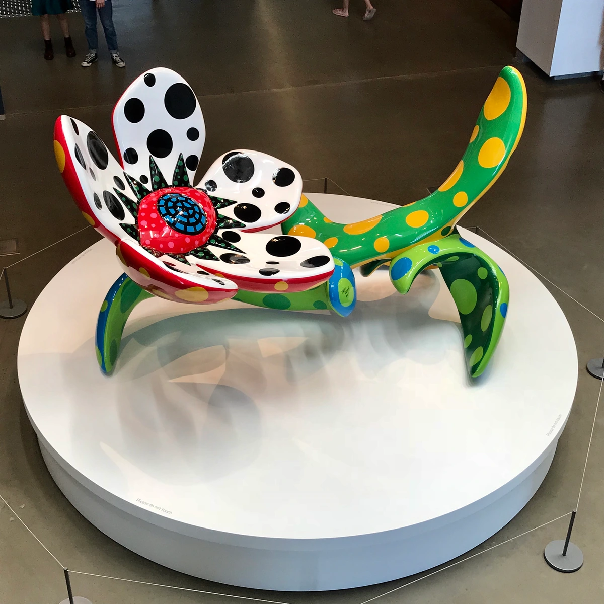
The Power of Negative Space: Letting Your Art Breathe
This is a concept I often emphasize: negative space. It's the empty area around and within your design elements, and it's just as important as the filled space. When arranging furniture around your statement art, consciously create areas of calm and emptiness. Don't push too many pieces up against the artwork. Allow for clear sightlines and visual comfort. I always tell clients to let the art breathe—it needs its personal space to truly command attention, just like we all do!
Art Style/Texture | Furniture Material | Impact |
|---|---|---|
| Heavily Textured Abstract | Chunky knits (wool, bouclé), distressed wood, raw linen, velvet | Enhances tactile experience, creates warmth, grounds the dynamic art. |
| Sleek, Minimalist Graphic Art | Polished chrome, glass, smooth leather, lacquered surfaces | Reinforces modern aesthetic, creates sharp lines, adds sophistication. |
| Traditional Landscape/Portrait | Rich dark woods (mahogany, cherry), tufted leather, brocade fabrics | Complements classic elegance, adds gravitas, creates a sense of history. |
| Traditional Portrait/Figurative Art | Ornate carved wood, velvet upholstery, antique side tables, brass accents | Enhances classic grandeur, evokes a sense of historical narrative, adds sophistication. |
| Bohemian/Eclectic Art | Rattan, woven jute, macrame, reclaimed wood, colorful textiles | Supports a relaxed, earthy vibe, adds global flair, emphasizes natural textures. |
| Industrial/Urban Art | Raw metal (steel, iron), concrete, exposed brick, dark wood | Creates an edgy, modern contrast, highlights the art's urban roots. This style thrives on raw authenticity and unapologetic grit. |
| Mid-Century Modern Art | Teak, walnut, sleek upholstery, brass accents | Complements the clean lines and organic shapes of mid-century furniture, creating a cohesive, retro-chic vibe. |
| Japandi Art | Light wood, rattan, minimalist textiles (linen, cotton), ceramic | Harmonizes with the serene, uncluttered aesthetic of Japandi, emphasizing natural beauty and tranquility. For more inspiration, explore how to choose art for japandi-style home. |
Framing Your Statement: The Finishing Touch
I often get asked about framing, and for a statement piece, it's not just a protective measure; it’s an extension of the art itself, a final flourish that can dramatically alter its presence in a room. Think of it as the perfect bespoke suit for your artwork. A bold, ornate frame can amplify a traditional piece, giving it gravitas and a sense of history, while a sleek, minimalist frame (like a floating frame for a canvas, or a thin metal profile) can enhance the contemporary edge of an abstract work. Sometimes, for a gallery-wrapped canvas, no frame at all makes the most powerful statement, allowing the art to appear as if it's extending directly from the wall and integrating seamlessly with its environment. Consider the materials: natural wood tones can bring warmth, rich espresso finishes can add sophistication, metallics like gold or silver can add glamour, and a simple black or white can provide a crisp, modern boundary. It's a detail that, when done right, truly elevates the entire composition, allowing the art to pop without being contained. It literally frames the conversation, so to speak, dictating how the viewer approaches and perceives the artwork. If you want to dive deeper into the technicalities, there's a fantastic guide on how to frame a canvas painting that covers all the essentials, from choosing the right materials to the actual assembly, ensuring your frame is as impactful as the art it encloses. It's about finding that perfect balance where the frame enhances, not overwhelms, the artwork.

Picture Frame Materials: More Than Just Wood
The material of your frame isn't just about color; it dictates the frame's texture, weight, and overall aesthetic. Each material brings its own unique character to the display.
Frame Material | Common Characteristics | Best Suited For | Aesthetic Impact |
|---|---|---|---|
| Wood (Natural/Stained) | Versatile, warm, classic, comes in many finishes (oak, maple, walnut, distressed). | Almost all art styles, especially traditional, rustic, Scandinavian, and earthy abstracts. | Adds warmth, organic feel, can be refined or casual. |
| Metal (Aluminum, Steel, Brass) | Sleek, modern, industrial, often thin profiles, comes in various metallic finishes. | Contemporary art, photography, minimalist prints, architectural drawings. | Creates a crisp, clean boundary; adds sophistication and an edgy vibe. |
| Polystyrene/MDF | Lightweight, cost-effective, can mimic wood or metal finishes. | Budget-friendly options, temporary displays, large frames where weight is a concern. | Offers variety of looks at a lower price point; can sometimes lack the gravitas of solid materials. |
| Gilded/Ornate Wood | Richly carved, often gold or silver leaf, historical. | Classical paintings, antique portraits, Baroque and Rococo art. | Adds opulence, grandeur, and historical authenticity. |
| Acrylic/Plexiglass | Transparent, lightweight, shatter-resistant, modern, frameless look. | Modern photography, bold graphic prints, where you want minimal visual interruption. | Creates a floating effect, very contemporary and minimalist. |
The Role of Matting: Enhancing Focus and Protection
Beyond the frame itself, matting plays a significant, though often overlooked, role in presenting framed artwork. A mat is that border, usually made of acid-free paper or board, that surrounds the artwork within the frame. It serves a dual purpose: first, it creates visual breathing room around the art, drawing the eye inward and enhancing its focus. It's like giving your art a little stage. Second, it physically separates the artwork from the glass, preventing it from sticking or molding, which is crucial for long-term preservation. A wide, neutral mat can add a sense of grandeur and sophistication, making even a small piece feel more substantial. Conversely, a thinner, colored mat can subtly highlight an accent color within the art. Always opt for archival, acid-free materials to protect your investment. I always think of matting as the 'white space' of framing—it allows the art to truly breathe and command attention without feeling cramped.
Framing and Mounting Considerations for Different Art Forms
While the principles of framing are universal, different art forms have specific needs that demand tailored consideration. It's not a one-size-fits-all world, and understanding these nuances can significantly impact the longevity and presentation of your cherished piece.
Framing/Mounting Considerations | Best Practices | |
|---|---|---|
| Canvas Paintings (Oil/Acrylic) | Can be gallery-wrapped and unframed, or framed with a floating frame or traditional frame. | Floating frames (allows edges to show), traditional frames (for a classic look), ensure adequate space for air circulation behind the canvas if unframed. |
| Works on Paper (Watercolors, Prints, Drawings) | Always require framing behind glass with a mat. | Use acid-free matting and backing to prevent discoloration; UV-protective glass is essential to prevent fading; hinging artwork with archival tape. |
| Photography | Typically framed behind glass with or without a mat, or mounted directly to a substrate (e.g., acrylic, metal). | Anti-reflective glass is highly recommended; consider face-mounting to acrylic for a modern, vibrant look; ensure prints are archival quality. |
| Textile/Fiber Art | Can be stretched, mounted to a board, or hung from a rod. | Needs even support to prevent sagging or distortion; consider a shadow box frame for delicate pieces; avoid direct sunlight for prolonged periods. |
| Mixed Media/Collage | Often benefits from a shadow box frame to accommodate dimensionality and protect fragile elements. | Ensure all elements are securely attached; use archival spacers if framed behind glass to prevent compression; avoid direct contact with glass. |
| Scrolls/Tapestries | Traditional hanging methods with rods or battens. | Ensure even weight distribution; use appropriate hardware for the weight; consider environmental controls for delicate materials. |
By tailoring your framing and mounting choices to the specific medium, you're not just protecting your art; you're also honoring its unique qualities and ensuring it looks its absolute best for years to come.
Frame Type | Ideal For | Aesthetic Impact | Key Considerations |
|---|---|---|---|
| Floating Frame | Canvas art (especially gallery-wrapped), modern abstracts | Creates a sleek, sophisticated, and "unbound" look, allowing the art to breathe. | Works best when the canvas edges are painted/finished. |
| Traditional Ornate Frame | Classical paintings, historical portraits, grand landscapes | Adds gravitas, formality, and a sense of luxury; enhances historical context. | Can overwhelm delicate modern pieces; choose based on art's era. |
| Thin Metal Profile Frame | Photographs, minimalist prints, contemporary graphic art | Provides a crisp, clean boundary; highlights the art without distraction; modern. | Best for flat artworks; can be too stark for very textured pieces. |
| Wide Wood Frame (Natural Finish) | Earthy abstracts, textural art, nature-inspired pieces | Brings warmth, organic feel, grounds the art; enhances rustic or Scandinavian aesthetics. | Match wood tone to room's existing wood elements; can be heavy. |
| Shadow Box Frame | Mixed media, small sculptures, delicate textiles, historical documents | Creates depth and highlights three-dimensional elements; protects fragile pieces. | Requires careful mounting; can be more costly due to custom depth. |
Types of Glass for Framed Art: Protection and Clarity
The glass you choose for your framed artwork is more than just a barrier; it's a critical element in both its presentation and preservation. The right glass can enhance visibility and protect against environmental damage, while the wrong choice can introduce distracting reflections or offer insufficient protection. Honestly, skipping on quality glass is a false economy—it’s like buying a high-performance car and putting cheap tires on it.
Glass Type | Description | Key Benefits | Considerations |
|---|---|---|---|
| Standard Clear Glass | Basic, clear glazing; offers fundamental protection from dust and physical damage. | Affordable, widely available. | High glare, no UV protection, can obscure details. |
| UV-Filtering Glass | Chemically treated to block a significant percentage of harmful UV rays. | Protects artwork from fading and degradation over time. | Can still have some glare, slightly more expensive than standard. |
| Non-Glare/Anti-Reflective Glass | Etched or coated to diffuse reflections, making the artwork easier to see from various angles. | Reduces glare, improves visibility, especially in brightly lit rooms. | Can slightly dull colors or create a hazy effect; offers minimal UV protection. |
| Museum Glass | Combines UV-filtering and anti-reflective properties; provides superior clarity and protection. | Virtually invisible, maximum UV protection, true color rendition. | Most expensive option, often recommended for valuable or delicate pieces. |
Investing in appropriate glazing is a small but mighty step in ensuring your cherished artwork remains vibrant and preserved for years to come.
Step 4: Let There Be (the Right) Light
Lighting is often the most overlooked, yet arguably the most magic ingredient in showcasing your statement art. The wrong lighting can flatten your art, distort its true colors, and completely kill the carefully curated mood of your room. You wouldn't put a harsh, direct spotlight on a shy person at a party, right? The same principle applies here; sensitive, intentional illumination is key. Proper lighting can transform a good piece into a breathtaking focal point, revealing hidden depths and textures you might otherwise miss.

- Avoid Direct Sunlight: It will fade the colors over time. It's a tragedy I've seen happen too many times.
- Use Spotlights: A ceiling-mounted spotlight (or two), or even a discreet picture light mounted directly above the frame, is the professional’s choice. These create a focused beam that makes the art pop, illuminating its colors and textures in a way that truly says, “This is important.” For abstract art, the play of light can reveal hidden depths and movements in the brushstrokes. Just be mindful of glare! We don't want reflections stealing the show.
- Consider Ambient Light: The rest of your room's lighting—floor lamps, table lamps, overhead fixtures, and even candles—should create a soft, welcoming glow that complements, but doesn’t compete with, the focused light on your art. It's about setting a mood, creating an atmosphere that makes the art feel integrated and cherished, rather than isolated. Think layers of light, allowing different sources to contribute to the overall ambiance, rather than relying on a single, harsh illumination. This could mean a soft glow from table lamps, strategic uplighting from floor lamps to highlight architectural features, or even decorative wall sconces that add a gentle wash. The goal is a rich tapestry of light that guides the eye and cradles your statement piece, creating an inviting and dynamic atmosphere. Consider bulbs with a warmer Kelvin temperature (around 2700K-3000K) to create a cozy, inviting feel that enhances most color palettes, especially in living spaces. Cooler temperatures (3500K-4500K) might be suitable for specific modern or industrial aesthetics, but generally, warmth is your friend. For a truly comprehensive approach to illuminating your art, you might find my guide invaluable, helping you master the art of illumination. Also, if your room happens to have a lot of windows, you'll want to carefully manage that natural light to avoid glares and excessive fading. Here's a quick overview of how different general light sources can contribute to your room's overall illumination strategy:
Best Used For | Aesthetic Effect | |
|---|---|---|
| Ceiling Fixtures (e.g., Flush mounts, Chandeliers) | General ambient light, overall room illumination. | Can be decorative or functional; provides widespread light. |
| Floor Lamps | Task lighting, ambient fill, accent lighting for corners. | Adds height, creates pools of soft light, portable. |
| Table Lamps | Task lighting, intimate ambient light, decorative accent. | Adds warmth, can highlight smaller vignettes, versatile. |
| Wall Sconces | Accent lighting, ambient light in hallways or dining rooms. | Creates architectural interest, provides upward/downward wash of light. |
| Dimmable LED Strips | Cove lighting, under-shelf lighting, backlighting for subtle glow. | Modern, concealed lighting, creates dramatic effects and mood. |
The Psychology of Color Temperature: Warmth vs. Coolness
Beyond just brightness, the color temperature of your lighting dramatically influences the mood of a room and how your artwork is perceived. Measured in Kelvin (K), this isn't about physical heat, but the visual warmth or coolness of the light.
| Color Temperature (Kelvin) | Description | Psychological Impact | Best For | | :--- | :--- | :--- | | 2000K - 3000K (Warm White/Soft White) | Mimics incandescent bulbs, yellowish glow. | Cozy, intimate, relaxing, inviting, promotes calm. | Living rooms, bedrooms, dining rooms, traditional art, creating a 'homey' feel. | | 3000K - 4000K (Neutral White/Bright White) | Clearer, less yellow, more like natural daylight. | Energizing, focused, clean, alert, modern. | Home offices, kitchens, bathrooms, contemporary art, workspaces requiring concentration. | | 4000K - 5000K+ (Cool White/Daylight) | Bluish-white, mimics overcast daylight or morning sun. | Crisp, sterile, highly stimulating, sometimes harsh. | Commercial spaces, task lighting where precision is key, rarely ideal for art in homes unless specifically desired for a stark modern aesthetic. |
Choosing the right color temperature for your art lighting is crucial. A warm light can enhance rich, earthy tones in a landscape, while a cooler light might make the blues and greens in a modern abstract pop. I often suggest experimenting with different bulbs to see how they interact with your specific piece, ensuring you're enhancing its inherent character, not fighting against it.
Natural Light vs. Artificial Light: A Dynamic Duo
While we often focus on artificial lighting for art, don't forget the incredible impact of natural light. The way sunlight shifts throughout the day can completely transform a piece, revealing new details and moods with every passing hour. A piece that feels vibrant in the morning light might take on a dramatic, contemplative quality at dusk. The key is to manage it, as direct, unfiltered sunlight can be damaging (as we discussed). Consider sheer curtains or UV-filtering window films to protect your art while still allowing the natural ebb and flow of daylight to play its part. Then, use your artificial lighting to enhance and extend this natural display, ensuring your art remains captivating even after the sun sets. It's about creating a harmonious dance between the two, rather than relying on one over the other. I often suggest observing how natural light interacts with your chosen art throughout a typical day. Does it reveal new textures in the morning? Does a specific detail catch the golden hour light in the afternoon? By understanding these natural shifts, you can then strategically place your artificial lights to mimic or enhance these moments, ensuring your art truly shines, day or night.
Integrating Smart Lighting Solutions
In our increasingly connected homes, smart lighting offers an unparalleled level of control and customization for showcasing your art. Imagine dimming or adjusting the color temperature of your spotlights with a voice command, or setting automated schedules that highlight your art as dusk falls.

- Adjustable Brightness and Color Temperature: Smart bulbs and fixtures allow you to fine-tune the intensity and warmth of the light, ensuring your art always looks its best under varying conditions.
- Scene Setting: Create pre-set lighting scenes for different moods or occasions. A "gallery mode" could softly illuminate your entire collection, while a "focus mode" might spotlight your statement piece with greater intensity.
- Motion and Proximity Sensors: For hallways or less frequently used spaces, lights can automatically illuminate your art as someone approaches, conserving energy and creating a dynamic experience.
- Integration with Home Automation: Link your art lighting with other smart home devices to create seamless transitions – perhaps the lights dim as you start a movie, with your artwork subtly illuminated in the background.
Smart lighting isn't just about convenience; it's about empowering you to control the narrative of your space and elevate your art with precision and ease.

The Psychology of Lighting for Art: Setting the Scene
Beyond mere illumination, lighting profoundly impacts the psychological and emotional experience of viewing art. It can dictate focus, evoke specific moods, and even influence how long someone lingers on a piece. Think of it as sculpting with light:
- Highlighting and Focus: A well-placed spotlight instinctively draws the eye, signaling importance and guiding the viewer's attention to your statement piece. It says, "Look here, this is special."
- Mood and Atmosphere: Warm, dim lighting can create an intimate, contemplative, or cozy atmosphere, perfect for a serene landscape or a deeply personal abstract. Cooler, brighter light might invigorate a vibrant Pop Art piece or a dynamic contemporary sculpture.
- Dramatic Impact: Strategic shadows and contrasts, created by directional lighting, can add drama and depth, making a piece feel more mysterious or powerful. This is particularly effective for highly textured works or sculptures.
- Emotional Connection: The right light can unlock hidden emotional nuances in an artwork, making colors feel richer, details sharper, and the overall message more resonant. It can be the difference between simply seeing a painting and truly feeling it.
By consciously manipulating light, you're not just showcasing art; you're orchestrating an emotional response, transforming passive viewing into an active, immersive experience.
Lighting for Different Art Forms: Tailoring Your Approach
Just as different art forms have unique framing needs, they also respond differently to light. What works for a glossy photograph might not be ideal for a textured oil painting.
- For Oil/Acrylic Paintings: These often have visible brushstrokes that create texture. Directional spotlights (like track or recessed lights) at a 30-degree angle can create beautiful shadows that emphasize this texture, adding depth and drama. Be mindful of direct light on highly glossy varnishes, which can create glare.
- For Watercolors & Works on Paper (under glass): Glare is the biggest enemy here. Use anti-reflective or museum glass, and position lights carefully to avoid direct reflection. Softer, more diffuse lighting can sometimes be better than harsh spotlights.
- For Photography (especially glossy prints): Again, glare is a concern. Anti-reflective glass is crucial. Track lighting or recessed lights angled precisely can work well, ensuring the entire image is evenly lit without hot spots.
- For Sculptures: Lighting becomes an art form in itself! Experiment with multiple light sources from different angles to reveal contours, cast dynamic shadows, and create a sense of movement. Uplighting can create a dramatic, monumental feel, while side lighting can emphasize texture.
- For Textile/Fiber Art: These pieces often have intricate textures and absorb light differently. A soft wall wash can illuminate the entire piece, while subtle accent lighting can highlight specific woven details or embellishments without casting harsh shadows.
Understanding these nuances ensures your lighting truly elevates, rather than diminishes, the inherent beauty of each art form.
Types of Art Lighting: Making Your Piece Shine
Understanding the different ways to light art is crucial. Each method offers a unique effect, and the right choice can dramatically elevate your statement piece.
Lighting Type | Description | Best For | Considerations |
|---|---|---|---|
| Picture Lights | Mounted directly to the frame or wall above the artwork, casting a soft, even glow downwards. | Smaller to medium-sized framed pieces, traditional or classic art, creating an intimate feel. | Can cause glare on glossy surfaces; ensure even light distribution across the artwork. |
| Track Lighting | Adjustable fixtures on a track, allowing multiple lights to be positioned and aimed precisely. | Versatile for galleries, multiple artworks, or irregularly shaped pieces. Excellent for highlighting textures. | Requires ceiling installation; can sometimes feel industrial if not chosen carefully. |
| Recessed Accent Lights | Lights hidden in the ceiling, with adjustable gimbals to aim light directly onto the art. | Seamless, minimalist look, ideal for modern interiors where you want the light source to disappear. | Best installed during construction or major renovation; precise aiming is key to avoid shadows. |
| Wall Washers | Lights that bathe an entire wall in even illumination, often used for architectural features but also effective for large art. | Very large murals or expansive canvases where you want a broad, soft light rather than a spotlight effect. | Can flatten texture if not used in conjunction with other lighting; requires more space from the wall. |
| Floor Spotlights | Discreet lights placed on the floor, aimed upwards at the artwork. | Sculptures, floor-mounted installations, or large pieces where ceiling options are not feasible. Creates dramatic shadows. | Can be a tripping hazard; light can be harsh if not diffused; consider heat output. |
| Picture Rail Lighting | Utilizes a hanging system that allows lights to be positioned anywhere along a rail, often integrated with picture hanging. | Flexible arrangements, ideal for changing art displays, preserves walls by avoiding multiple holes. | Can appear less integrated than recessed lighting; requires specific rail installation. |
For a deep dive, how to choose art for a room with low light is your best friend. It’s all about creating intentional drama and inviting focus, rather than battling the shadows.
Choosing the Right Bulb: Beyond Just Brightness
When it comes to lighting your art, not all bulbs are created equal. The Color Rendering Index (CRI) is paramount here. A high CRI (90+) bulb will reveal the true, vibrant colors of your artwork, making it sing. Low CRI bulbs, on the other hand, can make colors appear dull or distorted. Secondly, consider the beam angle of your spotlights. A narrow beam (10-20 degrees) creates a dramatic, focused highlight, perfect for emphasizing texture or a specific detail. A wider beam (30-45 degrees) offers a softer, more even wash of light, ideal for larger canvases or for blending the art more seamlessly with its surroundings. Finally, dimmability is your secret weapon, allowing you to fine-tune the intensity for different times of day or desired moods. Don't underestimate the power of these technical details to elevate your art's presence!
Common Lighting Mistake | Impact on Artwork | Solution |
|---|---|---|
| Direct Sunlight | Fading of colors, potential damage to artwork. | Relocate art, use UV-filtering glass/film, or install blackout curtains. |
| Glare/Reflections | Obscures the artwork, distracts the viewer. | Adjust light angle (aim at 30 degrees off vertical), use anti-reflective glass, reposition light source. |
| Uneven Illumination | Creates shadows, highlights only parts of the artwork, inconsistent look. | Use multiple spotlights, wider beam angles, or adjust fixture positions for even coverage. |
| Wrong Color Temperature | Distorts colors, changes mood (e.g., cool light on warm art). | Choose bulbs with appropriate Kelvin temperature (2700K-3000K for warmth, 3500K-4500K for neutral). |
| Too Little Light | Art feels lost, details are hard to discern. | Increase wattage (within safe limits), add more light sources, consider a dedicated picture light. |
| Too Much Light (Over-illumination) | Washes out colors, creates harshness, can damage art over time. | Use dimmers, lower wattage bulbs, or soften light with diffusers. |
Preventing and Managing Glare: The Invisible Enemy
Glare and reflections are the invisible enemies of art display. They can obscure details, distort colors, and force viewers to shift uncomfortably to get a clear look. Trust me, I've seen countless incredible pieces diminished by a rogue reflection. Here's how to combat it:
- Angle Your Lights: The sweet spot for art lighting is typically a 30-degree angle from the vertical. This minimizes direct reflection back to the viewer's eye.
- Use Anti-Reflective Glass: For framed pieces, investing in high-quality anti-reflective or museum glass is a game-changer. It makes the glass virtually disappear, allowing the art to shine unimpeded.
- Control Ambient Light: Reduce competing light sources (like unshaded windows or bright overhead fixtures) that might cast reflections onto your artwork. Sheer curtains or smart blinds can be invaluable.
- Strategic Placement: Avoid hanging glossy art directly opposite windows or very bright light sources. Sometimes, a slight shift in the art's position can make all the difference.
- Dimmers are Your Friends: The ability to fine-tune light intensity allows you to dial down glare without sacrificing illumination.
Managing glare is a subtle art in itself, but it’s a crucial step in ensuring your statement piece is seen and appreciated exactly as it was intended.
The Role of Reflection in Art Viewing: Beyond Just Glare
Beyond merely preventing distracting glare, reflections can actually be a subtle element of the art-viewing experience. Think about how a polished floor might subtly mirror the lower portion of a large artwork, extending its presence into the room. Or how a carefully placed mirror on an adjacent wall might offer an unexpected secondary view of the artwork from a different angle. This isn't about uncontrolled reflections that obscure the art, but about thoughtfully integrating reflective surfaces in the room to enhance the overall aesthetic and interaction with your statement piece. It’s an advanced technique, but when executed with intention, it adds a fascinating layer of complexity and depth to your interior design.

Integrating Art with Smart Home Technology
Beyond just lighting, smart home technology offers incredible possibilities for integrating art into your living space. Imagine a motion sensor in a hallway that, upon detecting movement, subtly adjusts the ambient lighting and activates a hidden spotlight on a prized piece, creating a 'mini-gallery' experience as you pass by. Or, consider digital frames that can display a rotating collection of high-resolution digital art, changing with your mood or the season, all controlled from your phone. Even smart sound systems can be integrated, playing music that complements the mood of the artwork you're currently highlighting. This intersection of art and technology isn't about replacing traditional art; it's about enhancing its presentation, making your home a dynamic, responsive, and truly personalized artistic environment. It's the ultimate blend of aesthetics and convenience, allowing your art to be an active participant in your smart home ecosystem.

The Power of Contrast: Making Your Art Sing Louder
I’ve found that true impact often comes from smart contrast, not just seamless blending. While we absolutely want harmony, a little bit of tension, thoughtfully applied, can make your statement art even more powerful, creating a captivating visual dialogue. This isn’t about clashing, but about creating dynamic relationships that elevate both the art and the room. Think about contrasting textures: a raw, industrial concrete wall against a lush, fluid abstract painting, or a smooth, polished sculpture against a textured wallpaper. Or contrasting colors: using a pop of a complementary color from the art in a small accessory to make the primary colors in the artwork feel even more vibrant, creating a sophisticated visual 'zing.' Even contrasting styles can work—a very traditional room with one starkly modern piece can create an unforgettable visual dialogue, speaking to a curated, adventurous aesthetic. It takes a discerning eye and a bit of courage, but the payoff is immense. It transforms your room from merely decorated to truly designed, sparking visual interest and encouraging deeper engagement at every turn.
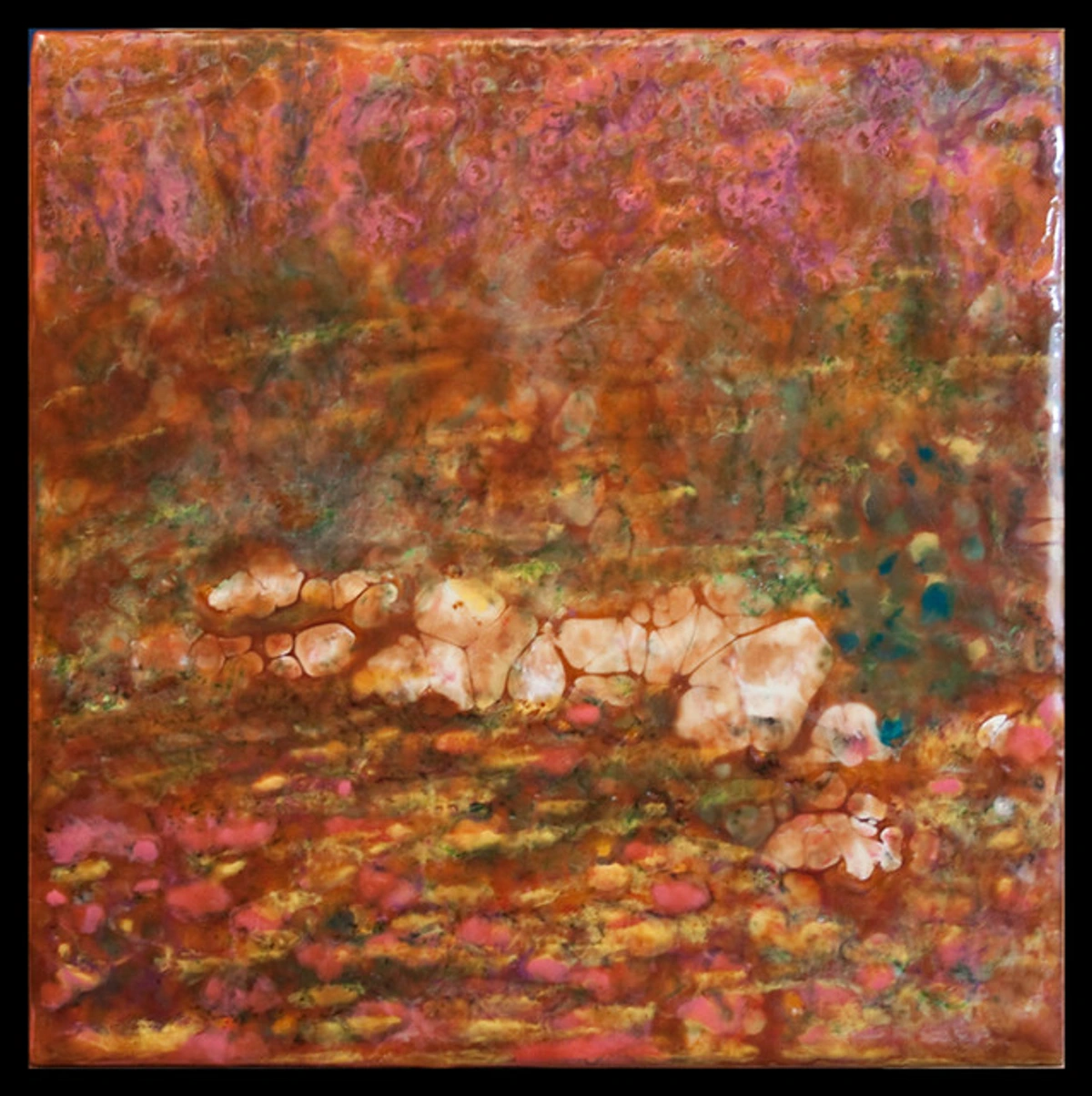
Contrast Technique | Example | Aesthetic Effect |
|---|---|---|
| Color Contrast | Warm-toned art (red, orange) on a cool-toned wall (blue, green) or vice-versa; using complementary accent colors. | Makes colors pop, adds vibrancy, creates visual excitement and depth. |
| Texture Contrast | Smooth, glossy artwork against a rough-hewn brick wall; a delicate sculpture on a chunky wooden pedestal. | Adds tactile interest, emphasizes the material qualities of both art and environment, creates richness. |
| Style Contrast | A starkly modern abstract piece in a traditionally decorated room; a classical portrait in a minimalist setting. | Generates unexpected visual tension, sparks conversation, demonstrates curated taste, prevents monotony. |
| Scale Contrast | A very small, intricate artwork paired with a massive, minimalist wall space; large art dominating a small wall. | Draws immediate attention, can create intimacy or grandeur, challenges perception of space. |
| Shape/Form Contrast | Angular, geometric art paired with soft, rounded furniture; organic sculpture in a room of straight lines. | Creates dynamic visual interest, prevents rigidity, adds fluidity and balance. |
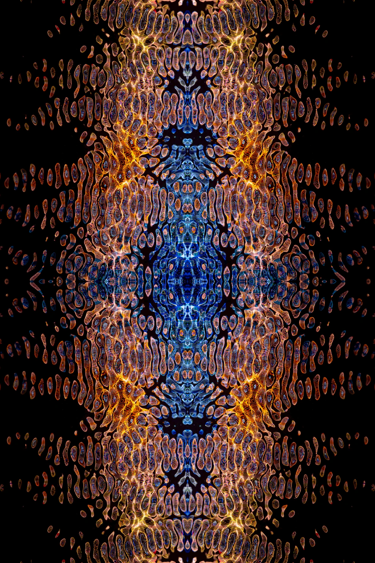
Step 5: The Rest of the Room is a Whisper
Once you have your art, your main furniture, and your lighting precisely positioned, everything else is about adding layers that subtly support the main piece. The other walls? This is where restraint becomes an art form. Keep them simple. A few carefully chosen, smaller, complementary pieces that echo the artwork's mood or color palette can work beautifully. Or, perhaps even nothing at all. Sometimes, negative space is your best friend, allowing the eye to rest and giving your statement piece even more prominence, almost like a thoughtful pause in a symphony. Your decor items—vases, books, plants, decorative objects—should be curated with the same intention, pulling from the accent colors or echoing the textures and shapes found in your artwork. I always tell my clients, every object in the room should justify its presence in relation to the main event. If it doesn’t add to the story, if it doesn’t whisper support, it's just clutter, detracting from your masterpiece.
Curating Accessories: Less is More
In the realm of supporting actors, accessories are the subtle scene-stealers. They're the jewelry of the room, adding personality and polish without dominating.
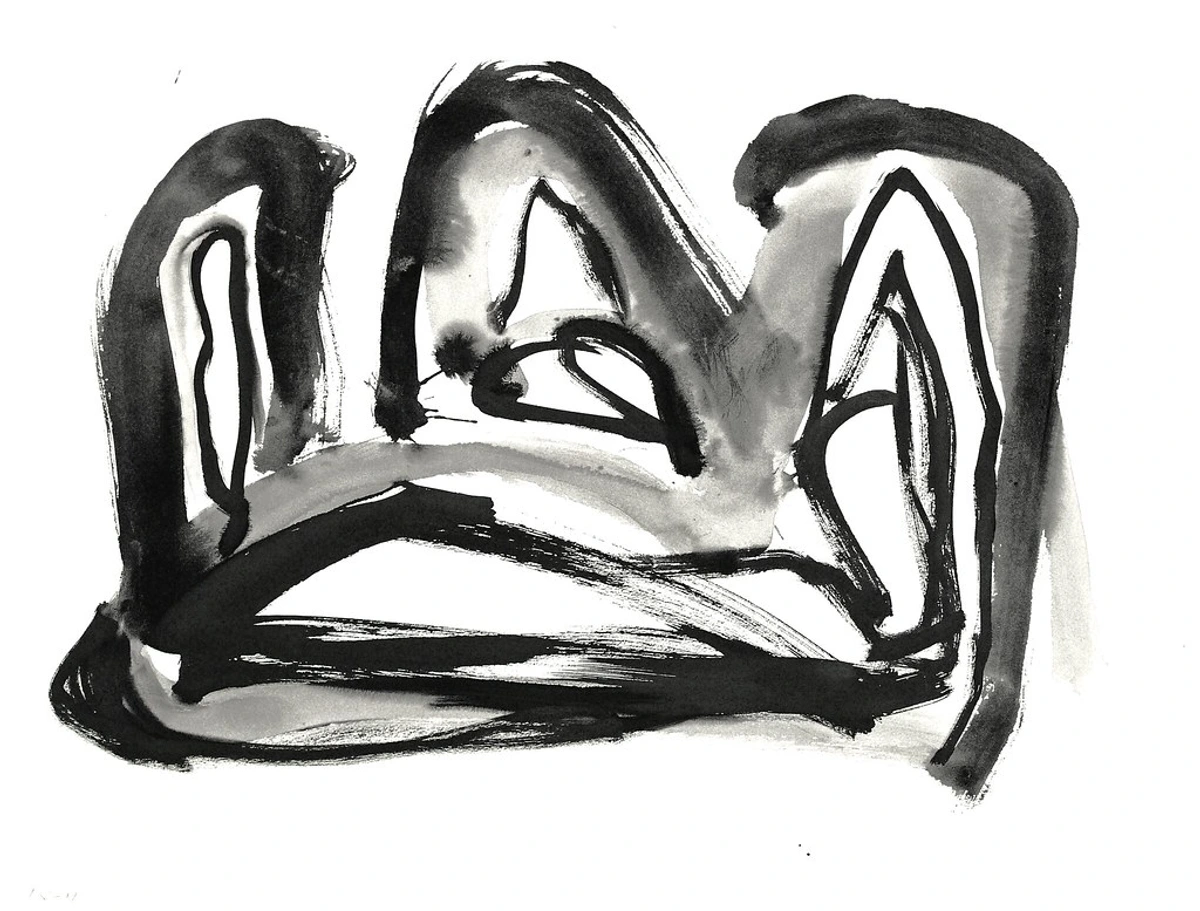
- Echoing Textures: If your art has a strong tactile quality, choose throw pillows in a chunky knit, a ceramic vase with an imperfect glaze, or a raw-edged wooden bowl.
- Pulling Accent Colors: Those "little pops of unexpected color" you identified in Step 1? This is where they come alive. A throw blanket, a stack of art books, or a small decorative sculpture can pick up these hues, creating continuity.
- Strategic Plant Placement: Greenery adds life and softness. Choose plants in pots that complement your art's style – a sleek, modern pot for minimalist art, or a textured terracotta for an organic piece.
- Personal Touches: Integrate personal objects that tell your story, but do so thoughtfully. A souvenir from a trip, a cherished heirloom, or a framed photo can add depth, as long as it doesn't compete with the main artwork.
Remember, each accessory is an opportunity to reinforce the narrative your art has begun, not to start a new one. I often think of accessories as punctuation marks for your design—they provide emphasis, pause, and clarity. They’re the subtle details that elevate the entire composition, like the perfect cufflink or a delicate necklace. A carefully chosen stack of books with spines in your art's accent colors, a sculptural object that echoes a form from the piece, or a simple candle in a complementary hue can all subtly elevate the art's presence without demanding attention themselves.
The Subtle Impact of Textiles and Soft Furnishings
While your large furniture pieces set the stage, textiles and soft furnishings are the unsung heroes that add warmth, texture, and a crucial layer of comfort to your art-infused space. I always tell my clients, these are where you can truly play with sensory experience!
- Rugs: A well-chosen area rug can literally ground your entire design, pulling a dominant or accent color from your art and creating a cohesive zone. Think plush for comfort, natural fibers for an organic feel, or a subtle pattern to add visual interest without competing.
- Curtains & Drapes: Beyond light control, curtains frame your windows and introduce vertical softness. Sheer fabrics can maintain an airy feel, while heavier drapes in rich textures (like velvet or linen) can add drama and sophistication, echoing the gravitas of a powerful artwork.
- Throw Pillows & Blankets: These are your most flexible tools for color and texture pops. Use them to pick up those secondary or accent colors from your art, or introduce a tactile contrast with chunky knits, faux fur, or embroidered details. They're easy to swap out when you want to refresh the look!
- Upholstery: While your main sofa might be neutral, accent chairs or ottomans can introduce a complementary color or texture. Consider performance fabrics for durability, especially in high-traffic areas.
By thoughtfully layering these elements, you create a tactile richness that makes your room feel not just beautiful, but truly inviting and comfortable, enveloping your art in a supportive embrace.
Curating an Art-Inspired Bookshelf: A Visual Symphony
Your bookshelf isn't just for books; it's a prime opportunity to extend your art's narrative through carefully chosen objects. Think of it as a vertical gallery, a micro-exhibition that complements your main statement piece.
- Color-Coordinated Spines: Arrange books by spine color, echoing the dominant or accent hues from your artwork. This creates a visually cohesive and sophisticated look.
- Art Books: Display books on art history, specific artists, or art movements that relate to your statement piece. It adds an intellectual layer and shows your passion.
- Small Sculptural Objects: Introduce small sculptures, ceramics, or decorative objects that echo forms, textures, or styles found in your main artwork.
- Vignettes within Shelves: Create small, curated groupings of objects, leaving plenty of negative space around each. This prevents clutter and allows each piece to be appreciated.
- Plants and Greenery: Soften the rigid lines of a bookshelf with cascading plants or sculptural succulents, adding life and an organic touch.
A thoughtfully arranged bookshelf can be a powerful supporting actor, adding depth and personality to your room while subtly reinforcing the presence of your statement art.

The Grounding Power of Rugs and Flooring
Don't forget the foundation beneath your feet! Your choice of rug and flooring can profoundly influence how your statement art is perceived. A large area rug can anchor a seating arrangement, pulling a dominant or secondary color from your artwork and literally grounding the entire design. A plush, textured rug can soften the impact of a bold, angular piece, while a sleek, minimalist rug can reinforce a modern aesthetic. Similarly, the type of flooring – rich dark wood, polished concrete, or light, airy tiles – sets an immediate tone that either harmonizes with or provides a compelling contrast to your art. It's another layer of texture, color, and style that, when chosen thoughtfully, ensures your art feels perfectly at home.
Accessory Type | How to Complement Art | Example Pairing |
|---|---|---|
| Throw Pillows & Blankets | Pick up accent colors or echo textural qualities from the art. | Vibrant abstract art: solid colored pillows in a secondary art color; textured art: chunky knit throw. |
| Vases & Ceramics | Choose shapes, glazes, or colors that subtly reflect the art's style or palette. | Organic abstract art: handmade, earthy ceramic vase; minimalist art: sleek, geometric glass vase. |
| Books & Coffee Table Decor | Stack art books related to the art's style, use objects that pick up an accent color. | Pop Art: bright, graphic coffee table books; serene landscape: a smooth, natural stone object. |
| Plants & Greenery | Integrate plants in pots that match the art's aesthetic; use their natural forms to soften lines. | Bold, angular art: structural plant in a minimalist planter; soft, fluid art: flowing plant in a textured pot. |
| Area Rugs | Anchor the space, pull a dominant or secondary color from the art, add texture. | Energetic abstract art: a subtle geometric or solid-color rug; traditional art: a Persian or Oushak rug. |
| Curtains & Window Treatments | Frame the view, control light, introduce texture or subtle pattern, echo soft colors. | Light, airy art: sheer linen curtains; moody, dramatic art: rich velvet drapes in a complementary tone. |
| Mirrors | Reflect light, expand perceived space, can act as a secondary focal point or art piece. | Modern abstract: a minimalist, frameless mirror; traditional art: an ornate, gilded mirror in a nearby spot. |
| Sculptural Objects (small) | Echo forms or textures from the art, add three-dimensional interest to vignettes. | Geometric abstract: a metal geometric sculpture; organic art: a smooth, carved wooden figure. These are the graceful exclamation points of your decor. |
| Wall Shelves | Offer curated display space for smaller pieces, plants, or books that complement the main art. | Minimalist art: floating white shelves with simple objects; bohemian art: distressed wood shelves with eclectic finds. |
| Art on Easels | Provides a flexible display option for pieces you want to move or change frequently, adding an artistic touch. | Any art style: a simple wooden or metal easel, allows for dynamic arrangement and layering. |
| Accent Walls (Paint/Wallpaper) | Create a dramatic backdrop for the art, pulling a dominant or accent color, or introducing a subtle texture/pattern. | Bold abstract art: a deep jewel-toned accent wall; traditional art: a subtle textured wallpaper. |
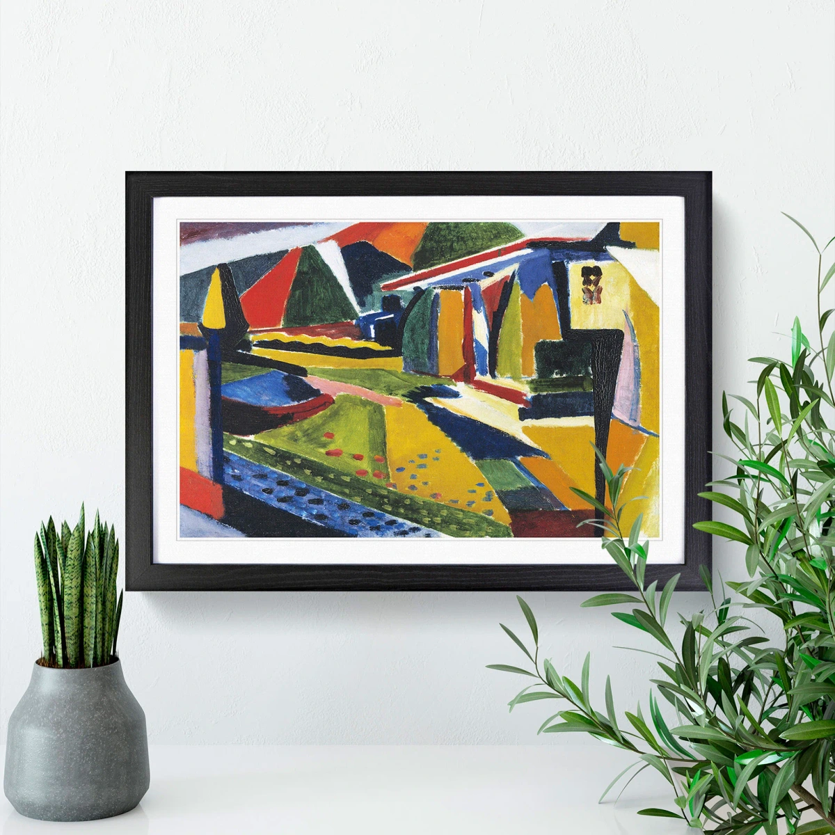
Think of it this way: your statement art is the loudest thing in the room. Everything else should be a whisper, a gentle echo of its colors and mood. You're creating harmony, not a shouting match.

Beyond Walls: Integrating Art in Other Forms
Sometimes, your statement isn't just a two-dimensional piece on a wall. It can be a magnificent sculpture, a dynamic installation, a carefully chosen textile hanging, a thought-provoking conceptual piece, or even a thoughtfully placed floor piece. When you're working with three-dimensional art, the principles shift slightly, requiring a more spatial approach. Now, you're not just considering a flat surface; you're thinking about how the art interacts with the space around it, its relationship to walking paths, sightlines, and even how light casts shadows that become part of the piece itself. A large, abstract sculpture might demand an expansive area, becoming a central axis around which the room's flow is designed, creating an undeniable gravitational pull. Or a smaller, intriguing piece could be nestled on a plinth, inviting closer inspection and interaction, a quiet moment of discovery. It’s a wonderful way to add another layer of artistic expression and truly make your home feel like a curated gallery, a space that evolves with every angle and encourages deeper engagement. Think of it as painting with space itself, an interplay of form, shadow, and light, creating a truly immersive experience. This is where your inner curator truly shines. For more on this, you might explore how to incorporate sculptural art into modern interiors, transforming your home into a dynamic, living exhibition.
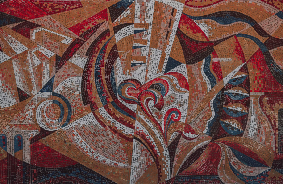
Type of 3D Art | Key Display Considerations | Impact on Room |
|---|---|---|
| Freestanding Sculpture | Requires ample space for viewing from all angles; consider its visual weight and material. | Becomes a central focal point, guides traffic flow, adds a monumental or intimate presence. |
| Pedestal-Mounted Sculpture | Pedestal height should bring the artwork to eye level; material should complement the sculpture. | Elevates smaller pieces, draws attention, creates a sense of importance and deliberate curation. |
| Wall-Mounted Sculpture/Relief | Consider its projection from the wall; lighting can create dramatic shadows. | Adds depth and dimension to walls, breaks up flat surfaces, creates dynamic interplay of light and shadow. |
| Textile/Fiber Art | Ensure proper hanging to prevent sagging; consider material's vulnerability to light/dust. | Introduces softness, texture, and warmth; can absorb sound; adds bohemian or natural aesthetic. |
| Kinetic Art | Needs unobstructed space for movement; consider proximity to air currents (fans, vents). | Adds dynamism, movement, and a playful element; can be mesmerizing and interactive. |
| Conceptual/Installation Art | Often site-specific; requires understanding of artist's intent; can be unconventional. | Challenges perception, sparks intellectual curiosity, transforms the entire space into an experience. |
Maintaining and Protecting Your Investment: A Quick Guide
You've invested in a piece of art that speaks to your soul, so protecting it is paramount. While this guide focuses primarily on design, a word on proper care and preservation is absolutely essential to ensure its longevity. I often remind myself that a little thoughtful care today prevents a lot of heartache tomorrow!
- Environmental Control: Always avoid direct sunlight, which can fade colors, weaken materials, and cause irreparable damage over time. Keep your artwork away from extreme temperature fluctuations (rapid heating/cooling), direct heat sources (like radiators or fireplaces), and high humidity (common in bathrooms or basements), all of which can cause warping, cracking, or mold growth. Aim for stable room temperature and moderate humidity.
- Handling with Care: When moving or adjusting art, always handle framed pieces by the sides and wear clean gloves if touching unframed works, especially prints or photographs, to avoid transferring oils from your skin.
- Cleaning Routine: For dusting, a soft, dry microfiber cloth is usually sufficient for framed pieces and canvases. For glass, use a dedicated glass cleaner sprayed onto the cloth (never directly onto the glass) to avoid liquid seeping into the frame. For more intricate or delicate works, or if you notice any signs of damage, always consult with a professional conservator. Think of it as preventative medicine for your art!
- Pest Prevention: Ensure your home is free from common household pests that can damage artworks, such as silverfish, moths, or rodents. Proper framing and sealing can offer good protection.
Insuring Your Artwork: Protecting Your Tangible Investment
For valuable or cherished pieces, art insurance is a non-negotiable step in maintaining and protecting your investment. Standard homeowner's insurance often has limitations on coverage for fine art, so a separate rider or specialized art insurance policy is crucial. This type of policy can cover a broader range of risks, including accidental damage, theft, and natural disasters, often with "agreed value" clauses that prevent disputes over market value. Documenting your collection with high-quality photographs, detailed descriptions, and appraisals is essential for any insurance claim. Think of it as a comprehensive safety net, offering peace of mind that your treasured piece is protected against unforeseen circumstances, allowing you to enjoy it without constant worry. I always recommend getting a professional appraisal from a reputable source; it’s not just about the monetary value, but about formally acknowledging the significance of your piece. Think of it as an ongoing relationship: a little thoughtful, consistent care goes a long way in preserving the beauty, integrity, and investment value of your cherished statement piece.
The Importance of Art Documentation: Protecting Your Legacy
Beyond insurance, meticulous documentation of your artwork is a crucial step in safeguarding its value, authenticity, and provenance. I always advise my clients to create a comprehensive art inventory—it’s not just for the ultra-wealthy; it’s smart stewardship for any treasured piece.
- High-Quality Photographs: Take clear, well-lit photos of your artwork from various angles, including close-ups of signatures, dates, and any unique features or imperfections.
- Detailed Records: Keep a file (digital and/or physical) with all relevant information: artist name, title, date created, medium, dimensions, purchase date, price, provenance (previous owners), exhibition history, and any relevant conservation reports.
- Certificates of Authenticity (COA): Always request and retain a COA from the artist or gallery at the time of purchase. This is vital for verifying the artwork's authenticity.
- Appraisals: Obtain professional appraisals periodically, especially for valuable pieces, to establish current market value for insurance or potential sale.
- Digital Backups: Store digital records in multiple secure locations (cloud, external hard drive) to prevent loss.
By building a robust documentation file, you’re not just protecting your investment; you’re preserving the narrative of the artwork, ensuring its history is clear for future generations. It’s like creating an autobiography for your art.
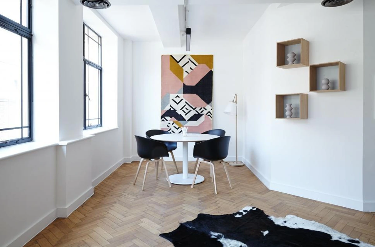
Art Medium | Specific Care Tips | What to Avoid |
|---|---|---|
| Oil & Acrylic Paintings | Dust gently with a soft brush or microfiber cloth. Ensure stable temperature/humidity. | Direct sunlight, harsh cleaners, touching the painted surface, displaying in high humidity. |
| Watercolors & Drawings | Frame under UV-protective, acid-free glass. Keep away from direct light. | Direct sunlight (very prone to fading), high humidity, unframed exposure to air pollutants. |
| Photography & Prints | Frame with archival materials (acid-free matting, UV-glass). Handle by edges. | Direct sunlight, fingerprints, displaying near heat sources, high humidity. |
| Sculptures (Metal, Wood, Ceramic) | Dust regularly with a soft cloth or brush. For delicate pieces, use compressed air. | Harsh chemicals, abrasives, excessive moisture (for wood/ceramic), direct impact. |
| Textile & Fiber Art | Gently vacuum with a screened attachment. Avoid direct sunlight. | Direct sunlight (can fade colors rapidly), pulling threads, displaying in dusty areas. |
| Digital Art (Displayed on Screens) | Keep screens clean with appropriate electronic cleaners. Ensure stable power. | Exposure to extreme temperatures, physical impact, prolonged display of static images (can cause burn-in). |
| Mixed Media/Collage | Dust carefully with a soft, dry brush, avoiding delicate attached elements. Maintain stable environment. | Excessive handling, direct sunlight (especially for paper elements), high humidity, harsh cleaning. |
Frequently Asked Questions (FAQ)
I know you've probably got a few burning questions bubbling up by now, and that's fantastic! It means you're truly engaging with the possibilities. Here are some of the most common questions I get asked, hoping they'll shed even more light on your art-infused journey.
Q: How to use art to define different zones in an open-plan living space?
A: This is where art truly becomes a functional design tool! In an open-plan space, you don't have walls to dictate separation, so art can act as a visual anchor to define distinct zones. For example, a large, dramatic abstract above the dining table can clearly mark the "dining zone," while a more serene landscape above a sofa can delineate the "living area." The key is using scale and style deliberately. A coherent collection of art within each zone can create a sense of intimacy and purpose, even within a large, fluid space. You can also use complementary color palettes across different artworks to subtly link zones while maintaining their individual character. Think of it as painting invisible walls with your art, guiding the eye and creating a sense of order and intention.
Q: Can I have more than one statement piece in a room?
A: It's tricky, to be honest. It's like having two lead singers in a band who both want to sing lead on every song—it can quickly turn into a shouting match! However, it can absolutely work, but with careful consideration and a clear understanding of hierarchy. The key is balance and and intentionality. If the room is very large and can be zoned into distinct areas, each zone might handle its own "star." Alternatively, if the pieces share a very similar color palette, theme, or artistic movement, they can complement each other rather than compete. I always suggest ensuring there's enough visual breathing room between them, allowing each piece to command its own space without fighting for attention. For most rooms, though, one undeniable star is often enough to create maximum impact without overwhelming the senses. If you're considering multiple pieces, here’s how to approach it:
Scenario | Approach | Impact |
|---|---|---|
| Very Large Room / Zoned Areas | Designate a "star" for each distinct zone. Ensure they complement each other in style or color. | Creates multiple focal points, defines different functional areas. |
| Complementary Style/Theme | Choose pieces that share a common thread (e.g., minimalist, abstract, similar palette), even if by different artists. | Creates a cohesive, sophisticated gallery feel without competition. |
| Varying Scale / Visual Weight | Pair a dominant statement piece with one or two significantly smaller, supportive pieces in its orbit. | The smaller pieces enhance the main one, providing depth and layering without stealing focus. |
| Opposite Walls | In a long room, placing two statement pieces on opposing walls can create a dynamic visual tension and flow. | Creates a dialogue between the pieces, encouraging movement through the space. |
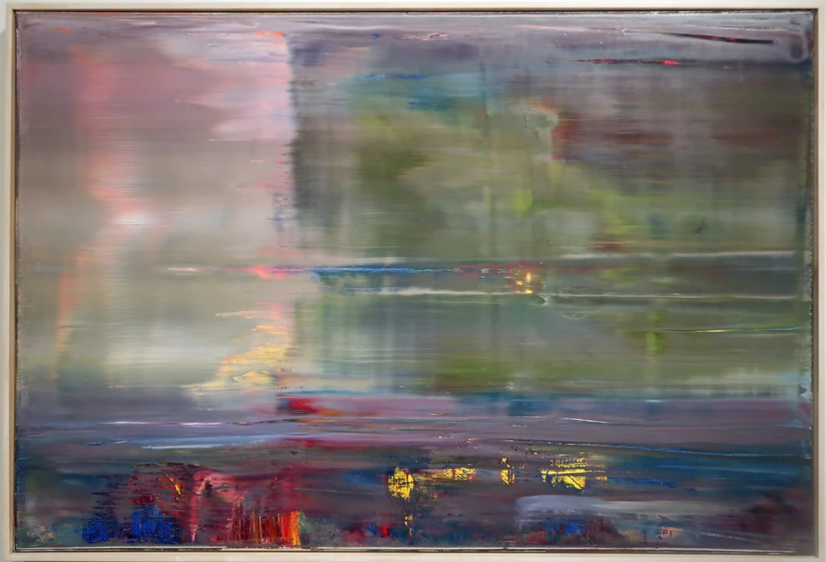
Always ask yourself: does this second piece enhance or detract from the first? If the answer isn't a resounding "enhance," then perhaps one star is enough for this show.
Q: How to choose art for a gallery wall?
A: Ah, the gallery wall! It's a fantastic way to tell a rich, layered story and showcase multiple pieces you love. But a good gallery wall is more than just a random assortment of frames. It requires a thoughtful approach, almost like curating a mini-exhibition within your home.
- Establish a Theme or Color Palette: This is your unifying thread. It could be monochromatic photography, travel mementos, abstract art in a specific color scheme, or a mix of family portraits. This prevents it from looking chaotic.
- Mix & Match Shapes and Sizes: Avoid a rigid grid unless that's your specific aesthetic. Incorporate different frame shapes, sizes, and even objects (mirrors, decorative plates) to create visual interest.
- Plan Your Layout (Seriously!): Before hammering nails, cut out paper templates of your art and arrange them on the floor or tape them to the wall. This lets you experiment with spacing and composition. Aim for consistent spacing between frames (e.g., 2-3 inches).
- Anchor with a Larger Piece: Often, one larger artwork can act as the anchor or centerpiece, with smaller pieces radiating outwards.
- Consider the Wall Shape: Work with the wall, not against it. A tall, narrow wall might suit a vertical stack, while a wide wall can handle a more expansive horizontal arrangement.
- Embrace Imperfection: Don't strive for sterile perfection. A gallery wall should feel lived-in and personal, evolving over time as you collect new pieces.
It's a wonderful way to express your personality and create a dynamic visual display, but remember, the goal is still harmony, even with many voices.
Q: How does art influence mood and well-being in a home?
A: Oh, this is one of my favorite topics! Art is so much more than just decoration; it's a powerful psychological tool. I truly believe that the art we choose for our homes has a profound impact on our daily mood, our sense of well-being, and even our cognitive state. A vibrant, energetic abstract piece can invigorate a living space, sparking conversation and boosting creativity. A serene landscape can bring a sense of calm and escape to a bedroom, aiding relaxation. Art can evoke memories, provide inspiration, challenge perspectives, or simply offer a moment of quiet contemplation. It's an emotional anchor, a visual narrative that constantly interacts with your subconscious. By consciously curating art that resonates with the emotions and feelings you want to cultivate in each space, you transform your home into a personalized sanctuary that actively supports your mental and emotional health. It's truly a form of self-care, and it's why I advocate so strongly for connecting deeply with the art you choose.
Q: What about art in the bedroom?
A: The bedroom is your sanctuary, your personal retreat, so the art here should reflect that! I always suggest choosing pieces that evoke feelings of calm, serenity, inspiration, or deep personal connection. Avoid anything too jarring, chaotic, or overly stimulating unless that's specifically the energy you want for your sleep space (and even then, proceed with caution!).
- Above the Headboard: This is the classic "throne" for bedroom art. A large, horizontal piece or a diptych/triptych can beautifully anchor the bed and create a sense of grandeur or tranquility. Ensure it's not wider than your headboard and leaves adequate space above.
- Calming Palettes: Soft blues, greens, neutrals, or muted tones often work wonders in a bedroom. If you love bold colors, opt for pieces where the vibrancy is balanced with softer elements or where the overall mood is still contemplative.
- Subject Matter: Landscapes, abstract pieces with gentle flow, serene portraits, or art with personal significance are popular choices. Avoid overly busy or aggressive imagery.
- Mood Lighting: Integrate dimmable lighting around your bedroom art to create a soft, inviting glow for winding down.
Your bedroom art should contribute to a space where you feel utterly at peace and truly yourself.
Q: What about art with text or typography?
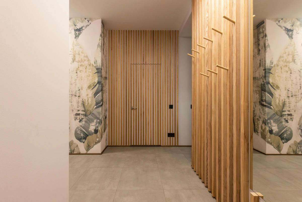
A: Art incorporating text or typography can be incredibly powerful, adding a direct layer of meaning and intellectual engagement that purely visual art might not. When decorating with such pieces, consider the message itself. Is it inspirational, provocative, humorous, or purely aesthetic?

- Legibility and Impact: Ensure the text is readable from a comfortable distance. If the text is the primary "statement," give it ample room to speak.
- Font and Style: The typography itself contributes to the art's mood. A bold, blocky font evokes a different feeling than an elegant script. Echo these stylistic cues in other design elements if desired.
- Integration with Overall Theme: Does the message resonate with the room's purpose or your personal values? A motivational quote might be perfect for a home office, while a playful phrase could suit a living room.
- Balance with Visuals: If the piece combines text with imagery, ensure they work in harmony. Sometimes the text is a subtle layer, other times it's the dominant force.
Ultimately, textual art invites contemplation and dialogue, making your room not just beautiful, but also a space for thought.
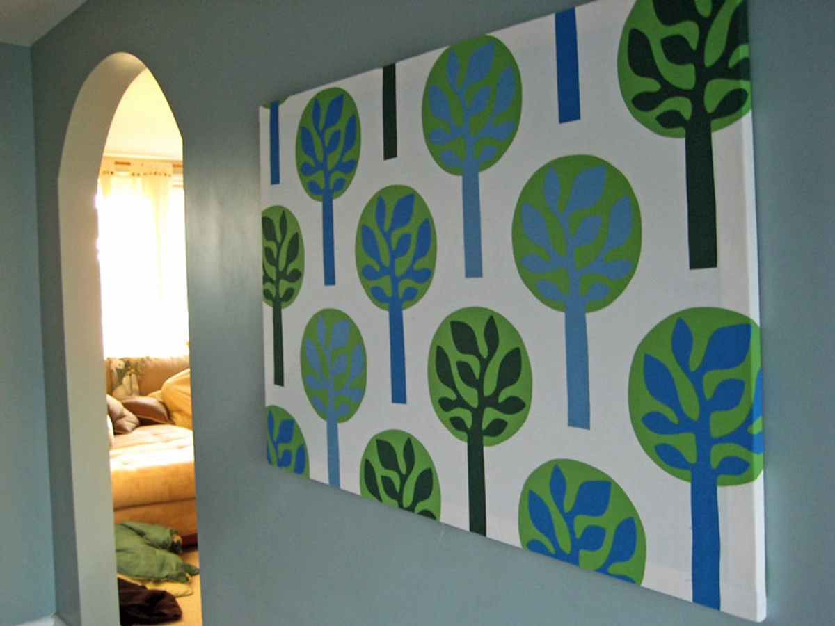
Q: How does art affect productivity and focus in a home office?
A: For me, my home office art is almost as important as my coffee! The right piece can absolutely transform your workspace from merely functional to genuinely inspiring. When choosing art for a home office, I think about what kind of energy I need to cultivate for productive work.
- Stimulating Creativity: Abstract pieces with dynamic lines, vibrant colors, or intriguing compositions can spark new ideas and keep your mind engaged.
- Promoting Focus and Calm: For tasks requiring deep concentration, serene landscapes, minimalist art, or pieces with harmonious, analogous color palettes can reduce mental clutter and promote a sense of calm.
- Inspiration and Aspiration: Art that depicts a scene you aspire to, a motivational abstract, or even a portrait of a historical figure you admire can provide a constant source of inspiration and remind you of your goals.
- Placement is Key: Position art where it's easily visible from your desk without being a distraction. A wall directly in front of or beside your main workspace is ideal.
Ultimately, your home office art should be a visual ally, supporting your mental state and helping you achieve your professional and creative goals. For more in-depth advice, you might want to look at decorating with art in a home office: boosting creativity and focus.
Q: What about commissioning a custom piece of art?
A: Commissioning art can be an incredibly rewarding experience, offering you a piece that is uniquely tailored to your vision, space, and emotional connection. It’s a collaborative journey with an artist, allowing you to define parameters like size, dominant colors, mood, and even subtle thematic elements. I always tell people it’s like having a bespoke suit made – it fits perfectly and expresses exactly what you want. The process can be a little daunting initially, but finding an artist whose style resonates with you and establishing clear communication are key. It allows you to create a truly one-of-a-kind statement piece that is intimately connected to your home and your story, ensuring it’s not just beautiful, but deeply personal. Just be sure to discuss timelines, pricing structures (deposits, payment schedules), and revision processes upfront to ensure a smooth and enjoyable experience.
Q: What if I change my mind about the art?
A: That's the beauty of this approach, and it's a very common concern! If your core furniture pieces are neutral (think creams, greys, soft blues) and you've used inexpensive, easily swappable items like pillows, throws, and small decor objects for your accent colors, then swapping out the art is relatively easy. You simply change your accents to match the new piece's palette and mood. It’s a much more flexible and cost-effective way to decorate a house and keep your interiors fresh and reflective of your evolving tastes without needing a complete overhaul.

Q: How do I choose art for a rental home or temporary spaces?
A: Decorating a rental home presents its own unique set of challenges, mainly centered around limitations on permanent changes. But fear not, your statement art can still absolutely shine! The trick is to focus on solutions that offer impact without permanent alterations.
- Command Strips & Adhesive Hooks: Embrace these non-damaging hanging solutions. They've come a long way and can safely hold surprisingly heavy pieces.
- Lean, Don't Hang: For larger canvases, leaning them against a wall (especially above a console table or dresser) creates a relaxed, contemporary vibe without a single nail.
- Freestanding Sculptures: These are your best friends in a rental, offering significant artistic impact with zero wall intervention.
- Focus on Portable Pieces: Invest in art that you love and can easily take with you when you move. This makes your current space feel like "home" without the commitment. This is crucial—you want to invest in pieces that travel with you, becoming part of your personal story, no matter where you live.
- Temporary Wallpaper Backdrops: If permitted, a removable wallpaper behind your art can create a stunning accent wall that's easy to undo later.
Your art can be the most permanent, personal aspect of your temporary home, making any space feel uniquely yours.
Q: What about art for a home bar or entertainment area?
A: A home bar or entertainment area is all about creating a specific vibe—whether it’s sophisticated, playful, retro, or sleekly modern. Your art should absolutely contribute to this! I often suggest something with a bit of personality here: a vibrant Pop Art print, a moody abstract, or even a vintage-inspired piece that sparks conversation. Consider durable materials like metal prints or art behind acrylic, as these areas can see more activity. The goal is to enhance the atmosphere for socializing and relaxation, making the space feel dynamic and inviting. For a more in-depth exploration, check out how to choose art for a home bar or entertainment area. I find these spaces are perfect for taking a few more risks with color and subject matter; it's all about fun and personality!
Q: What about art for a child's or teenager's room?
A: Designing for younger minds is such a joy because it's an opportunity to truly foster creativity and self-expression! I believe art in these spaces should be vibrant, engaging, and adaptable as they grow.
- For Children's Rooms/Nurseries: Think whimsical, imaginative pieces. Bright colors, playful themes, animal art, or soft, dreamy abstracts can spark wonder and storytelling. Consider durable materials or framed prints that are easy to clean. At eye-level for a child allows for maximum engagement.
- For Teenagers' Rooms: This is where their personality truly explodes! Encourage them to choose pieces that reflect their evolving identity and passions. Bold graphics, street art, pop culture references, or abstract pieces that resonate with their unique taste are often great fits. Durability might still be a consideration! A statement piece here can be a powerful anchor for their personal style. For more specific ideas, check out how to choose art for a teenagers room: inspiring creativity and self-expression.
The art in these rooms isn't just decoration; it's a conversation starter, a source of inspiration, and a canvas for their developing world.
Q: How do I choose art for a small bedroom?
A: Small bedrooms, like any compact space, thrive on intentional design. I love using statement art in a small bedroom because it draws the eye and creates an immediate focal point, making the room feel more curated and often larger than it is. The trick is to ensure the scale is appropriate—a colossal piece might overwhelm, but a well-chosen, substantial artwork above the headboard or on a key wall can anchor the space beautifully. Lighter palettes or pieces with soft, serene imagery can enhance a sense of calm and openness. For detailed guidance, explore how to choose art for a small bedroom: creating a serene retreat.
Q: What if my room is small or has low light?
A: This is a fantastic question, and actually, small spaces benefit immensely from statement art! It draws the eye and creates a focal point, making the room feel more intentional and often larger than it is by providing a strong anchor. Just make sure the scale is appropriate—a colossal piece in a tiny room can feel overwhelming, like a giant in a dollhouse. For tips on maximizing impact in compact areas, check out abstract art for small spaces or collecting art for small apartments: maximizing impact in limited spaces. As for low light, it's not a limitation; it's an opportunity! You can use targeted lighting (as we discussed in Step 4) to highlight the art, turning it into a dramatic, glowing centerpiece that truly pops. You can also explore pieces with lighter palettes or reflective qualities (like art with metallic accents) that naturally brighten a space. There’s a whole guide on how to choose art for a room with low light that can walk you through it, turning a dimly lit corner into a sophisticated showcase.
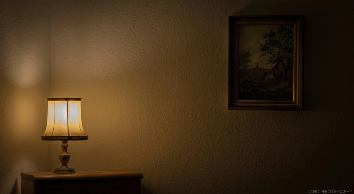
Q: The Role of Art in Creating a 'Flow State' or Mindfulness?
A: I’m constantly fascinated by how art can facilitate deeper mental states. A well-chosen piece in your environment can act as a visual anchor for meditation or focused work, helping you achieve a flow state – that intense feeling of energized focus, full involvement, and enjoyment in an activity. Art with repetitive patterns, serene landscapes, or abstract compositions that invite contemplative gaze can be incredibly effective. It’s about creating a visual cue that subtly guides your mind towards calm and concentration, turning your space into a personal sanctuary for productivity or peace.
Q: Can I mix abstract and figurative art?
A: Absolutely! Mixing abstract and figurative art is one of my favorite ways to add depth, complexity, and intrigue to a space. It creates a dynamic tension and encourages viewers to engage with both the literal and the conceptual.
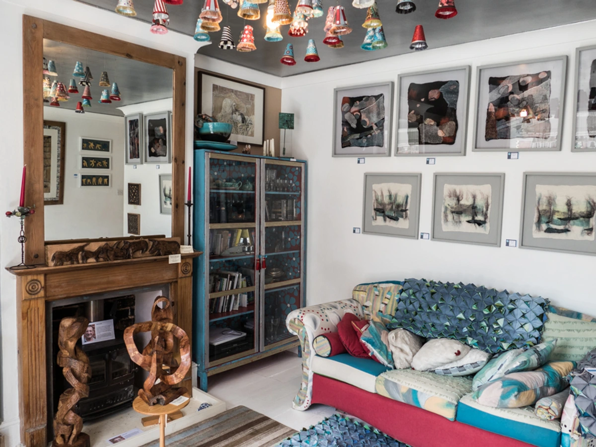
- Find a Common Thread: Look for unifying elements like a shared color palette, a similar emotional tone, or a consistent scale/framing style.
- Balance is Key: Avoid placing two equally dominant pieces right next to each other. Allow one to lead, and the other to complement.
- Create Groupings: Rather than scattering them randomly, consider creating small groupings where abstract and figurative pieces interact within a defined zone.
- Consider the Dialogue: Think about what conversation the two pieces will have. Does the abstract piece offer a contextual mood for the figurative one, or does the figurative piece ground the abstract?
This interplay prevents a room from feeling too sterile or predictable, injecting personality and an element of surprise.
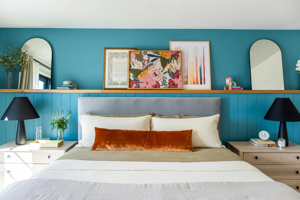
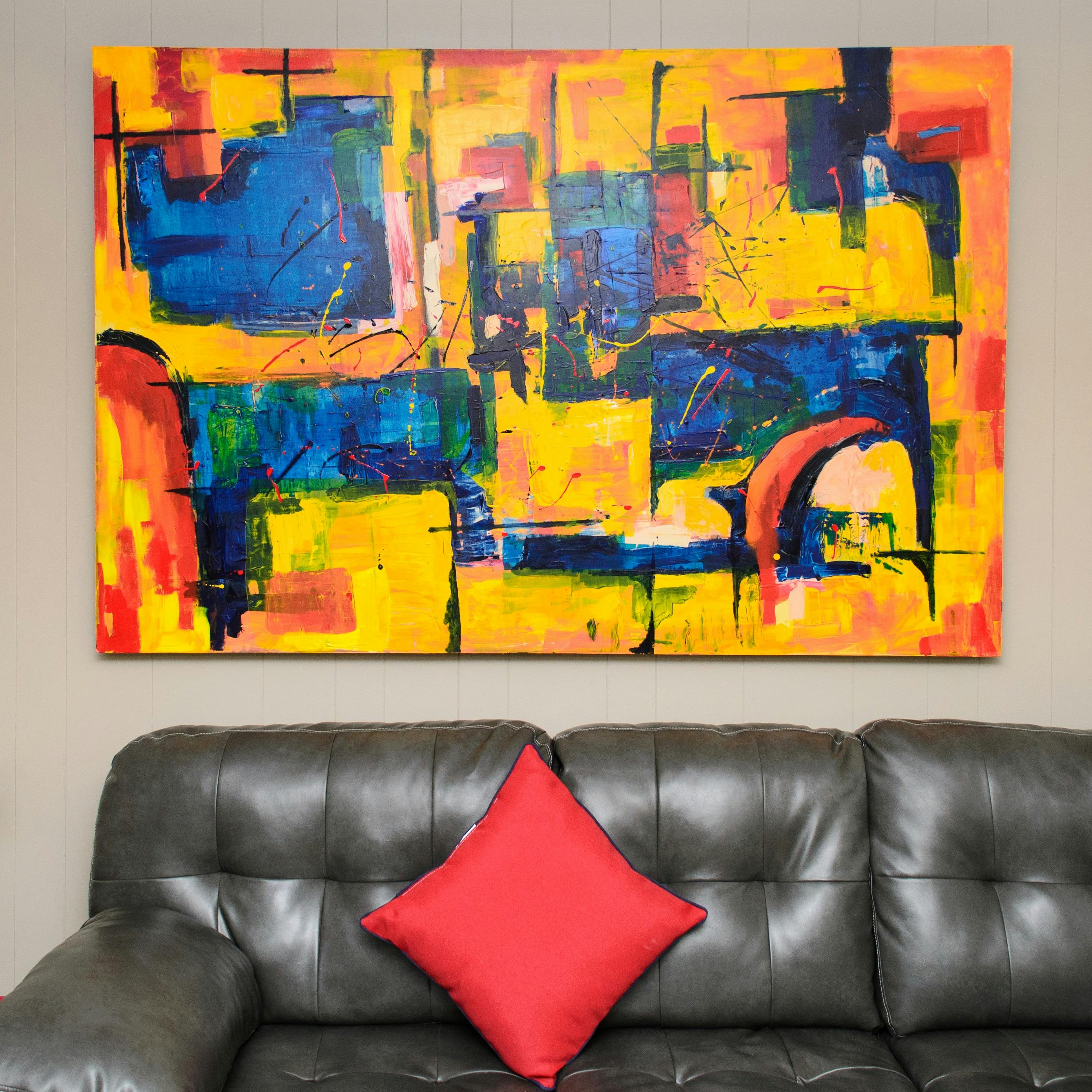
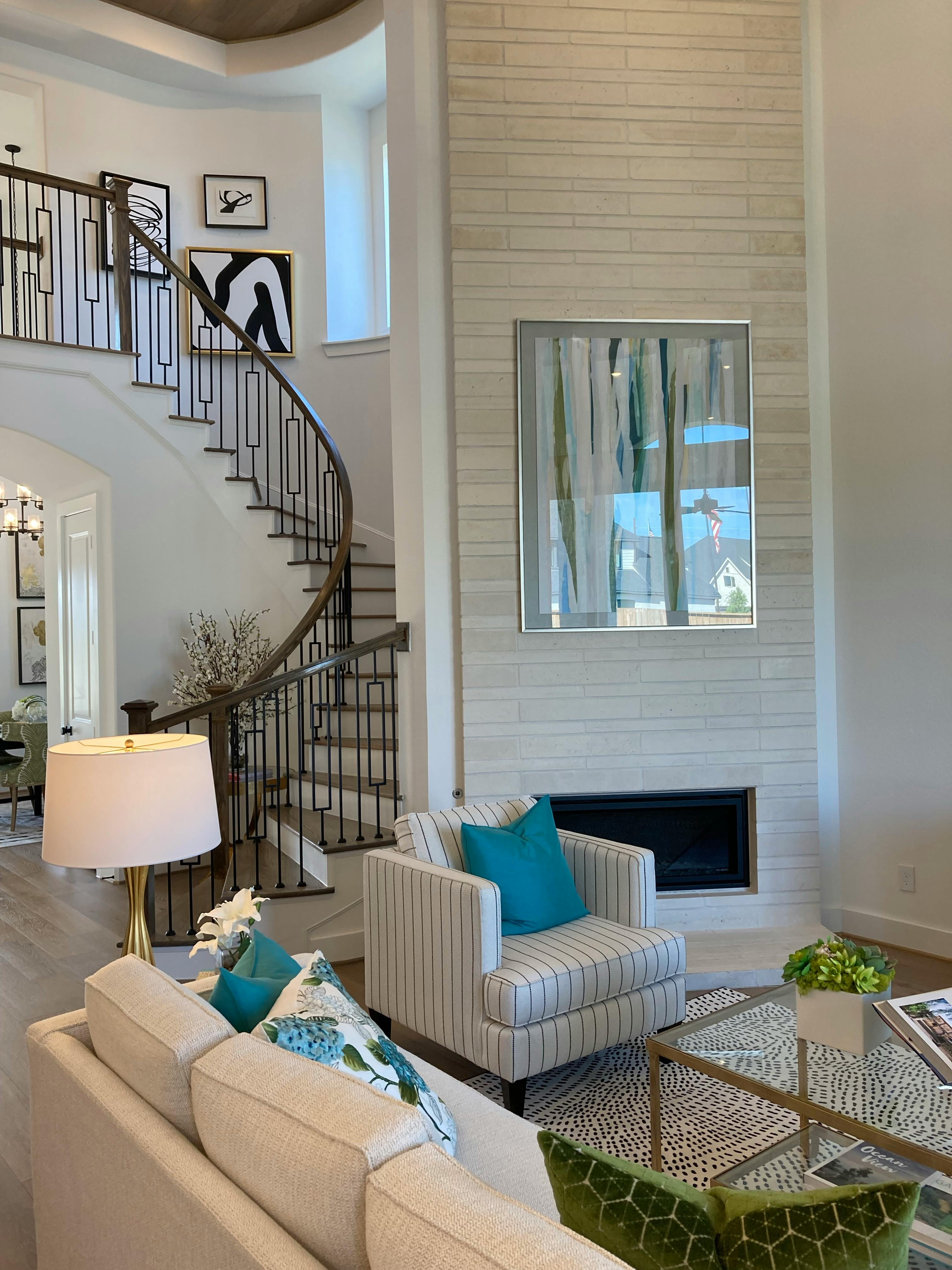
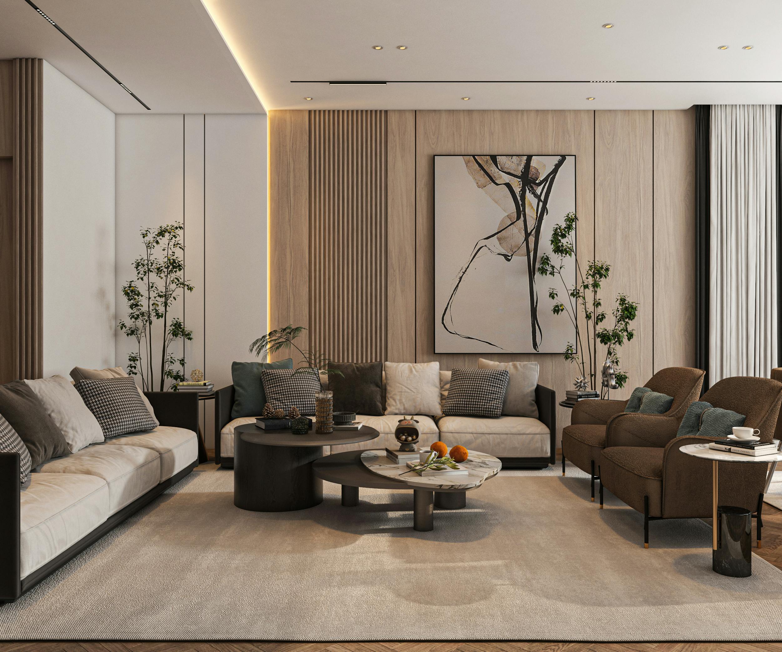


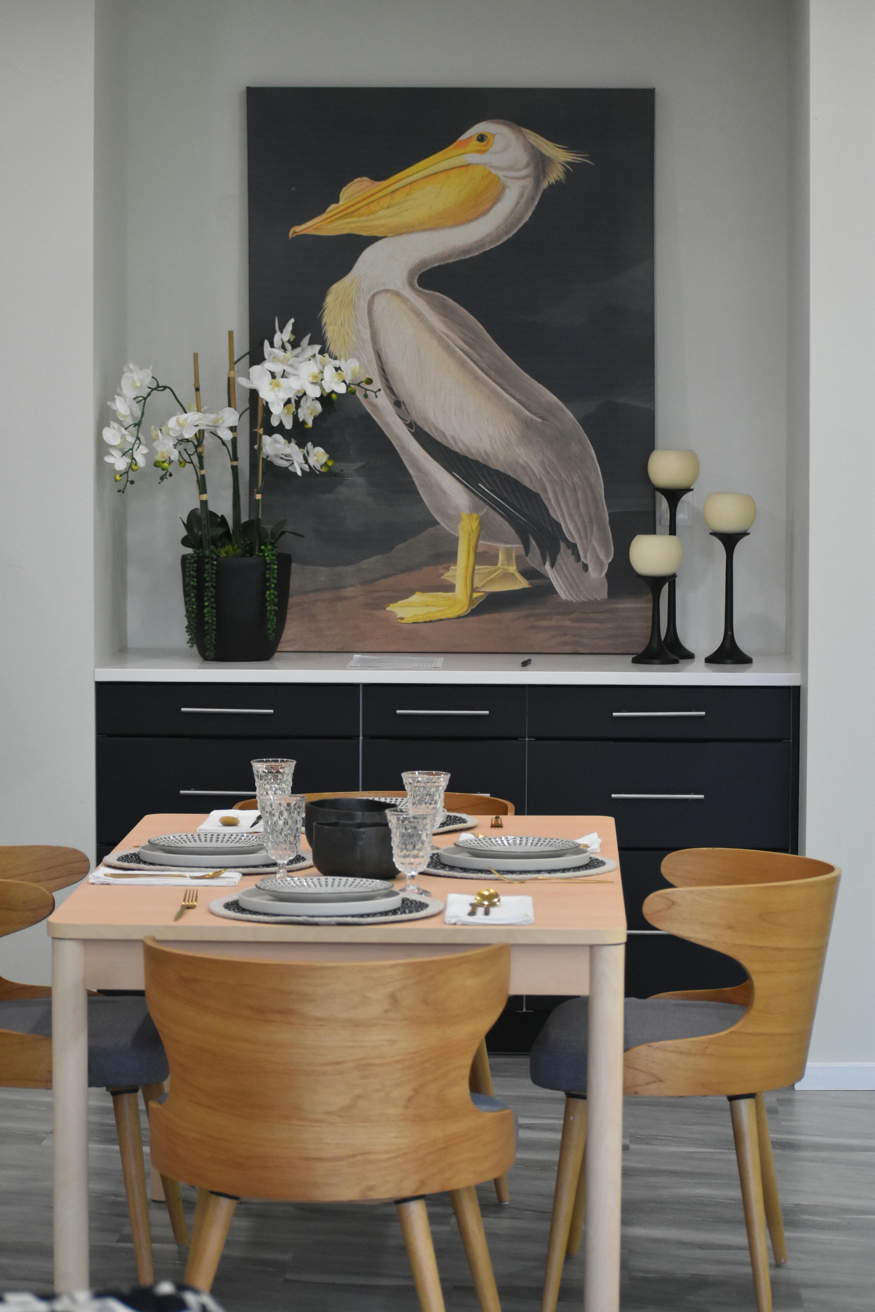


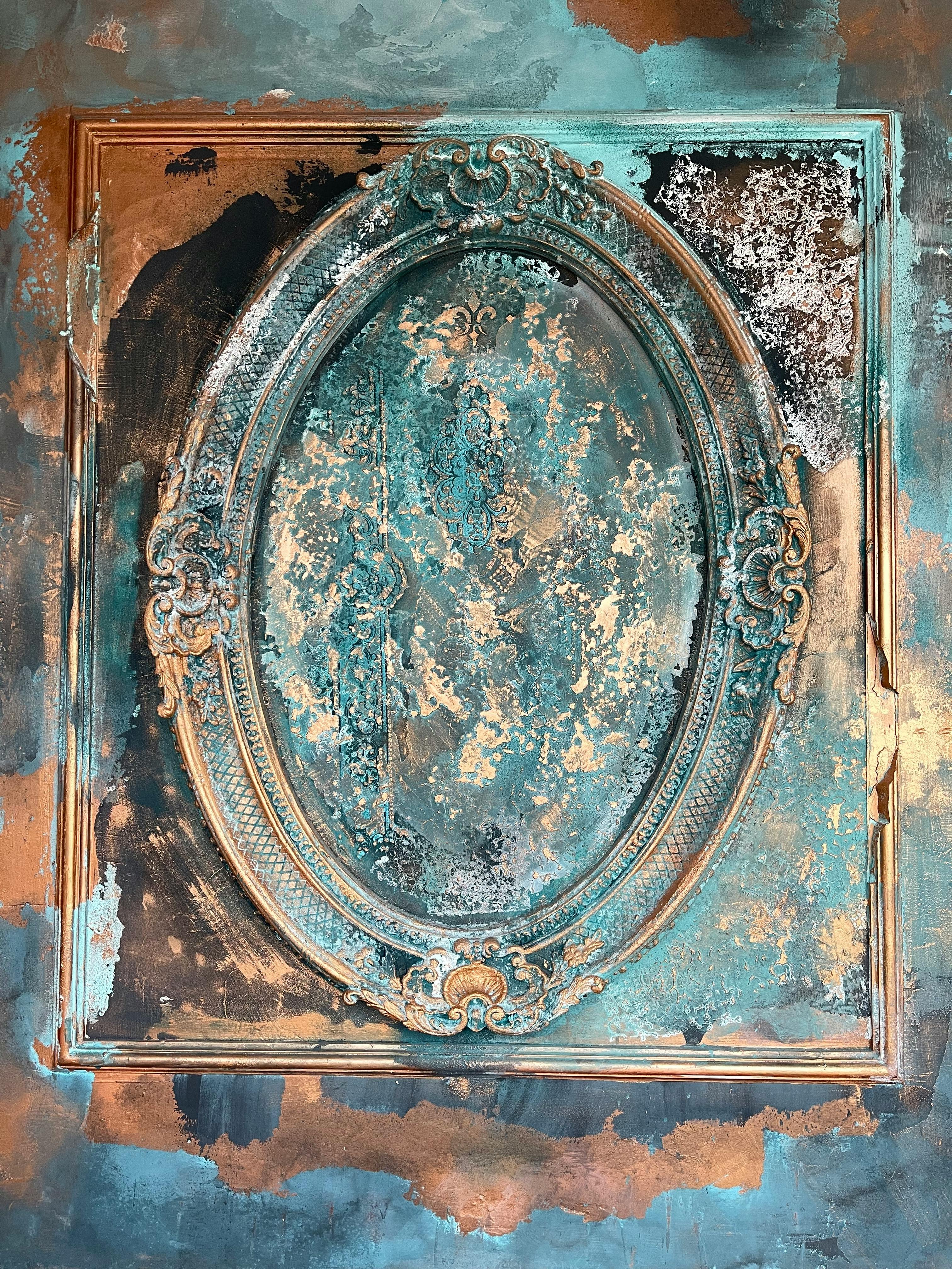
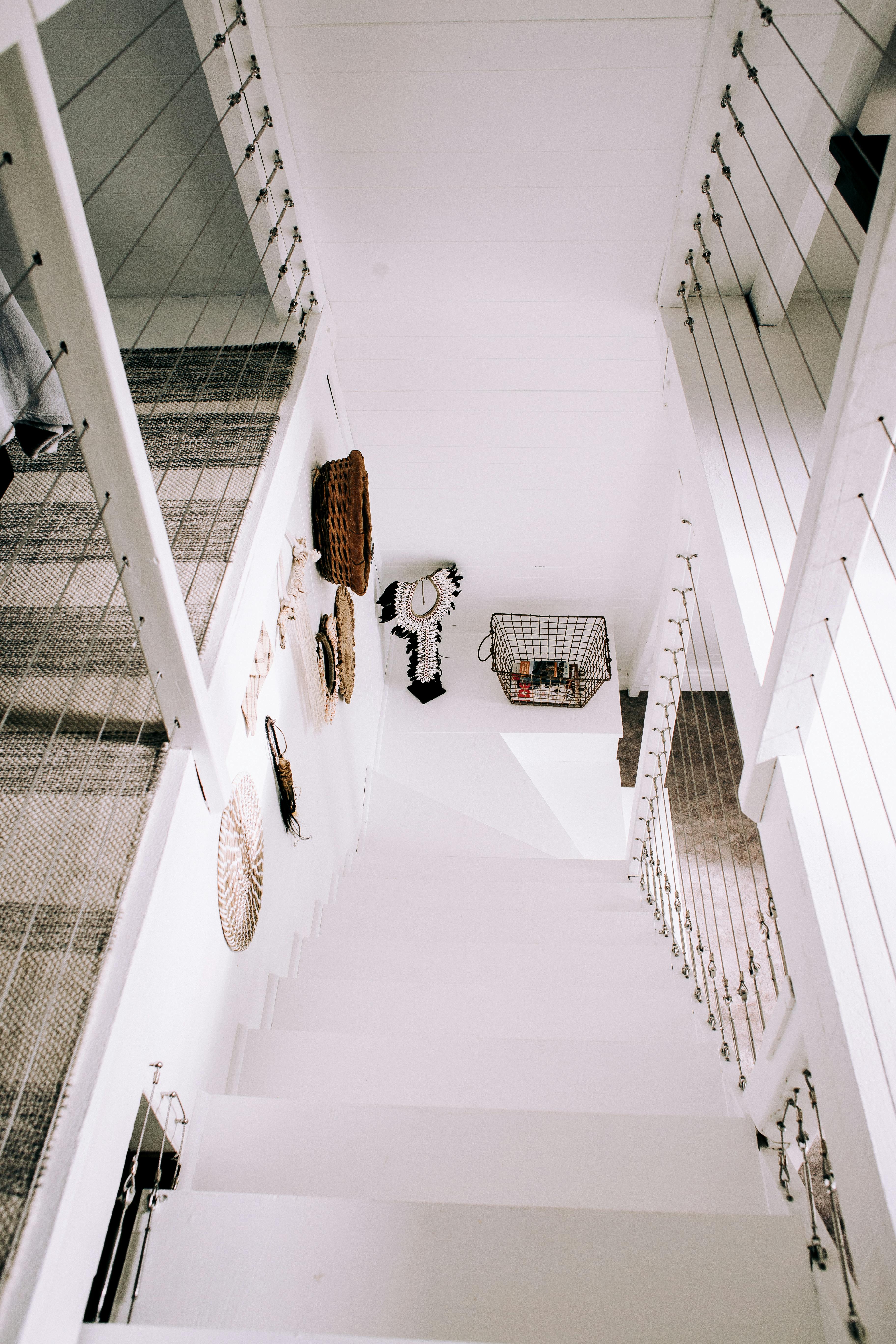

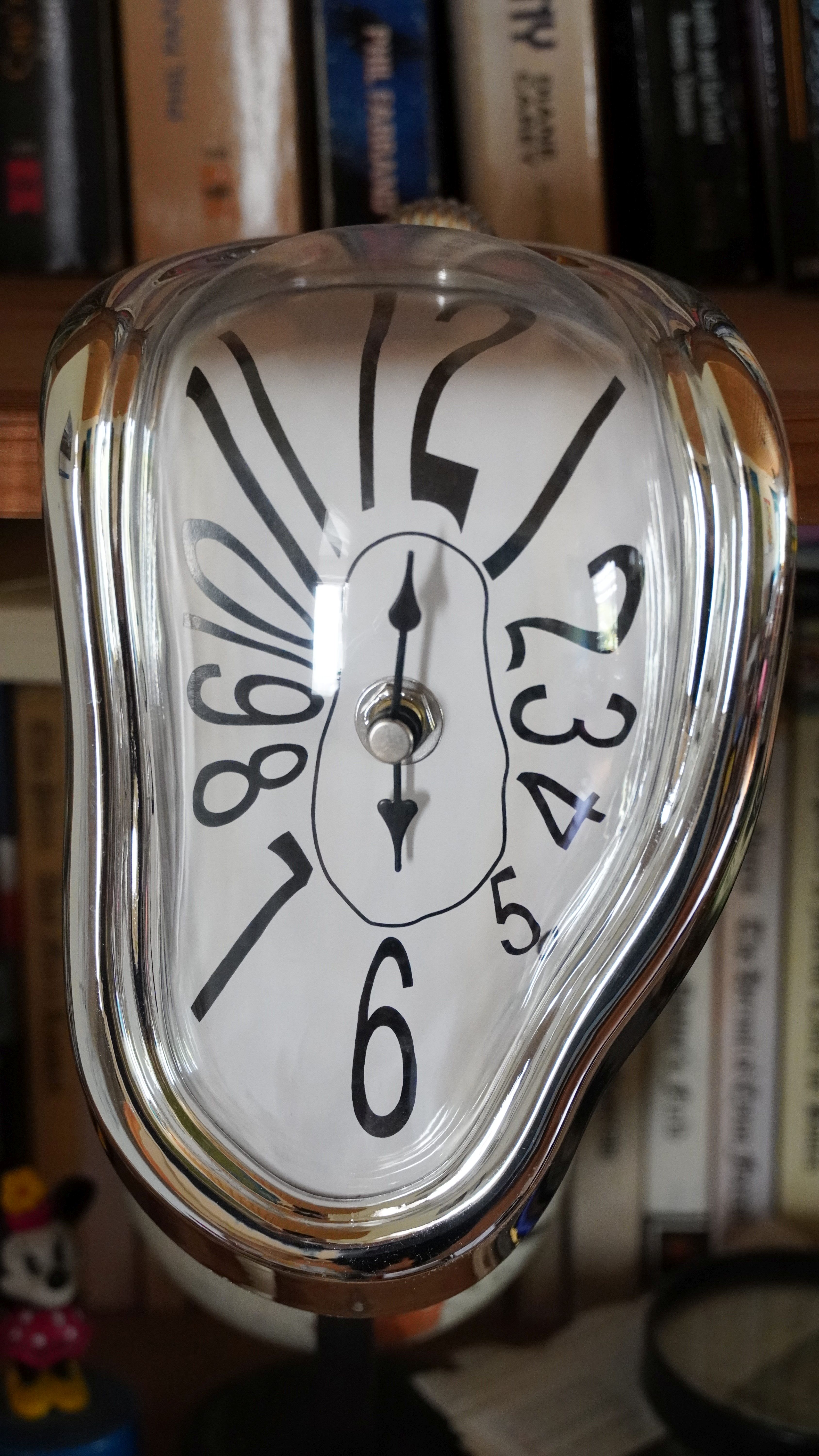


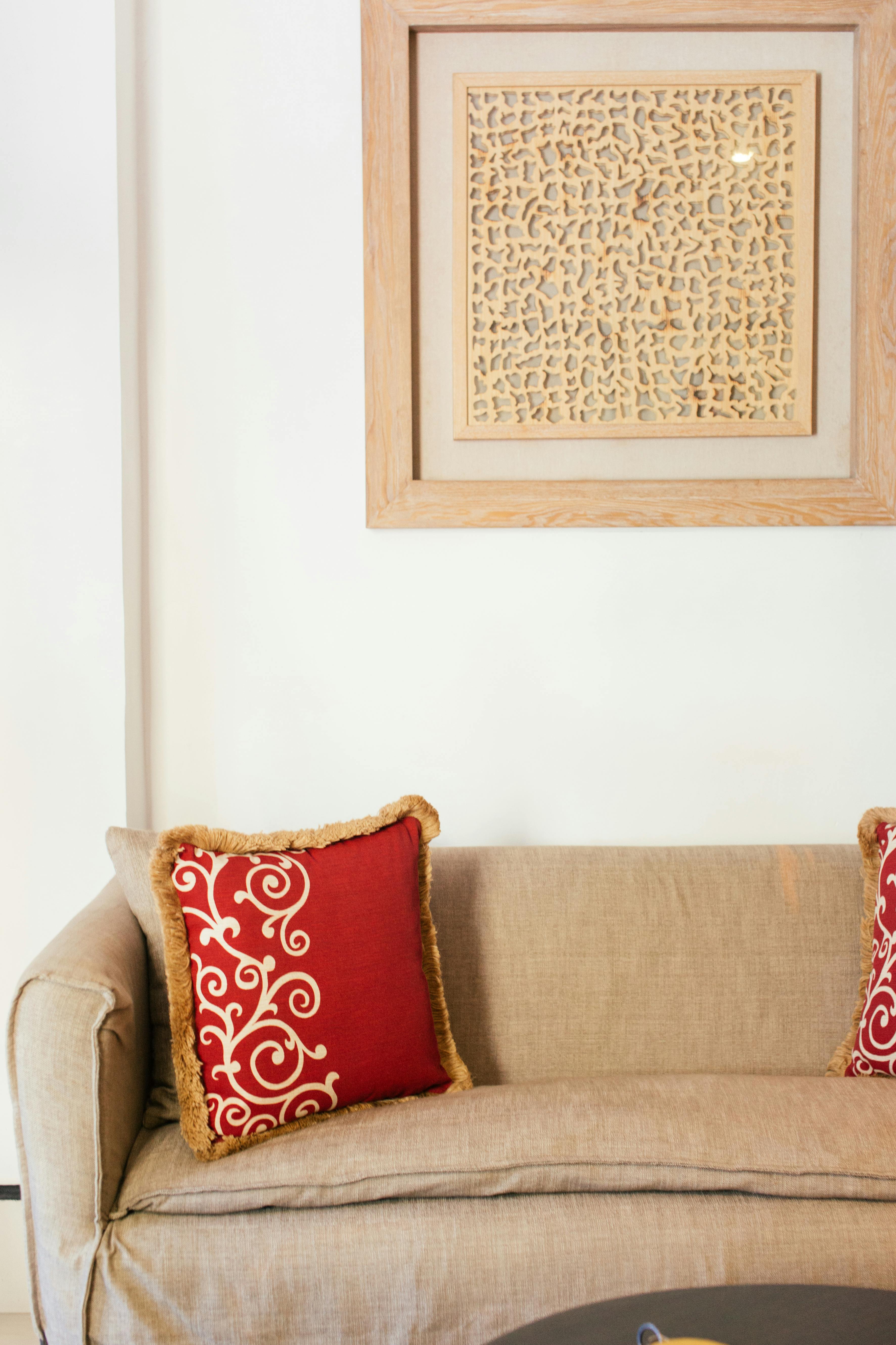








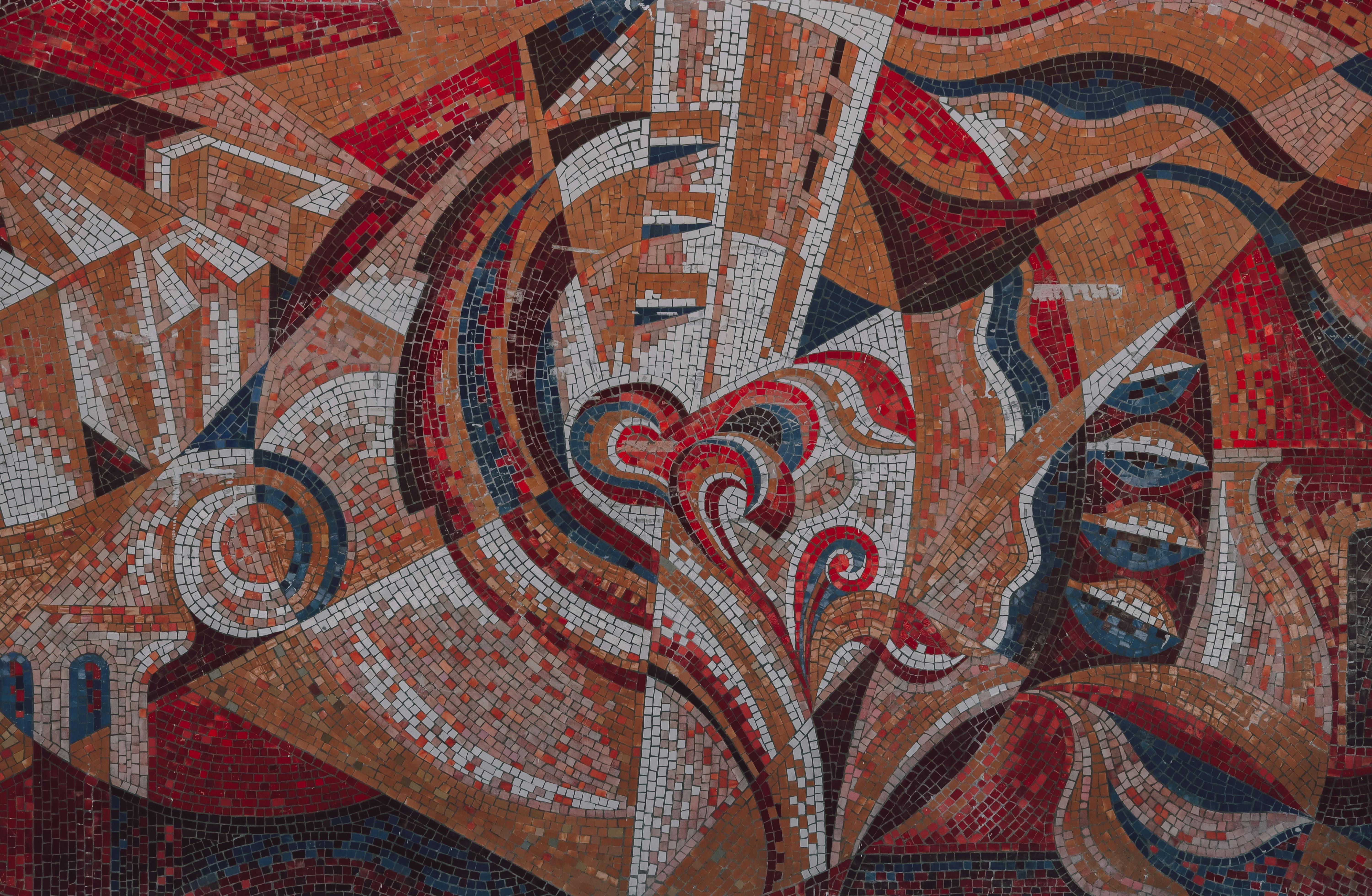


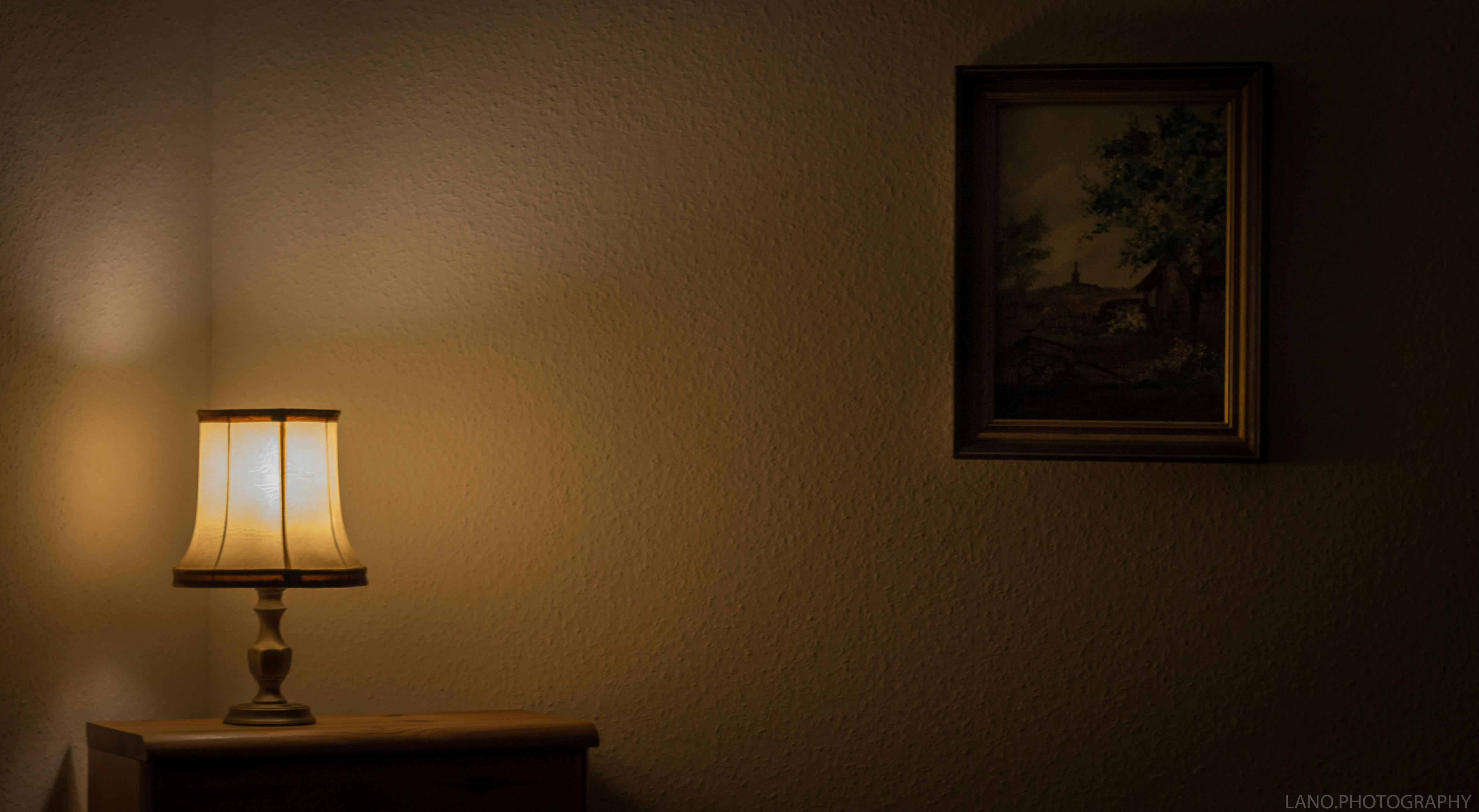
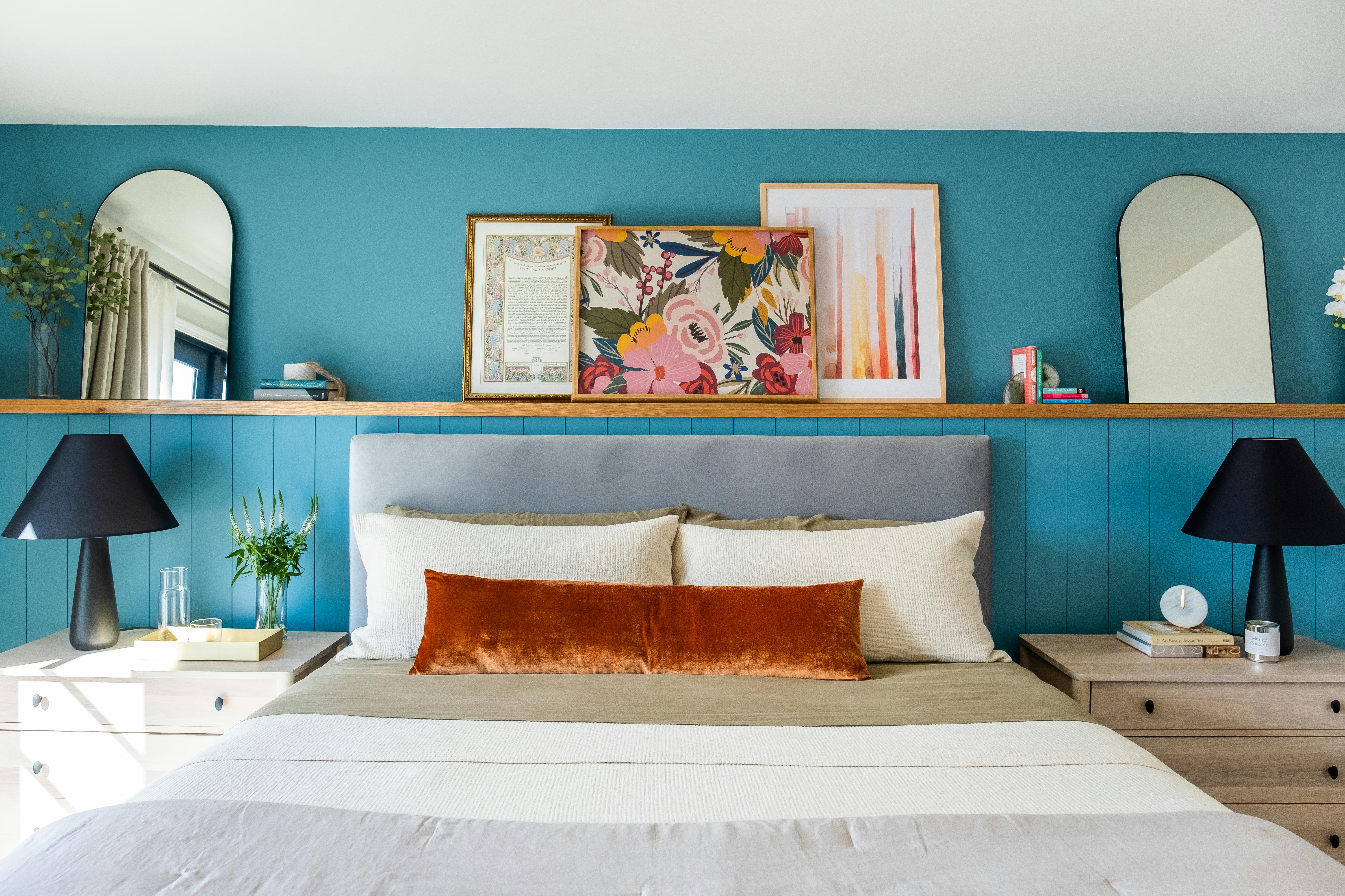
Q: Can art be displayed outdoors?
A: Absolutely! Outdoor art can be a magnificent way to extend your personal aesthetic beyond your interior walls, transforming your garden, patio, or balcony into an open-air gallery. Think sculptures, weather-resistant canvases, or even murals. The key is durability: the piece must be able to withstand the elements – rain, sun, wind, and temperature fluctuations. Look for materials like bronze, stainless steel, specific outdoor-grade paints, treated wood, or ceramics. Positioning is also crucial; consider how the art interacts with natural light, landscaping, and the architecture of your home. It’s an opportunity to create year-round visual interest and a captivating dialogue between nature and artistic expression. Plus, who doesn't love a beautiful piece of art greeting them in their garden? Just remember to secure it properly, especially if you live in a windy area!

Q: How do I choose art for different seasons or holidays?
A: Oh, this is a wonderful way to keep your home feeling fresh and responsive! While your core statement piece might remain a year-round anchor, you can absolutely rotate smaller, complementary pieces or change out accent colors to reflect the seasons or holidays. For instance, in autumn, you might introduce pieces with warmer, earthy tones, or switch out throws and pillows to echo fall foliage. In summer, bright, airy watercolors or vibrant abstract prints can bring a sense of lightness and energy. For holidays, consider adding small, festive works, or incorporating elements like metallics or deep jewel tones that align with the season's decor. It’s like changing the band's setlist—the lead singer stays the same, but the overall performance shifts to match the vibe.
Q: My art has a ton of black in it. Won't that make my room feel dark?
A: Not at all! In fact, black is a fantastic anchor and a designer's secret weapon. Rather than making a room feel dark, black elements in art can add incredible depth, sophistication, and a sense of grounding. Use it in small, deliberate ways throughout your decor: sleek picture frames, the elegant legs of a coffee table, a dramatic lamp base, or subtle patterns in a rug. Paired with plenty of white or light colors from the artwork and the rest of your room, it will look incredibly chic, sophisticated, and grounded, providing contrast that makes other colors sing, rather than making the room feel gloomy.

Q: How do I choose art for specific rooms like a kitchen or bathroom?
A: Each room definitely has its own vibe and practical considerations, almost like each room is a different character! For a kitchen, I often suggest something energetic, abstract, or even subtly food-related (though not necessarily literally) that can withstand a bit of humidity. Think about materials like metal prints or art behind glass, and remember to consider your kitchen’s overall style – a rustic piece for a farmhouse kitchen, or a sleek graphic for a modern one. You can get more tailored advice on how to decorate a kitchen. Don't be afraid to bring art into this functional space—it instantly elevates it. For bathrooms, especially powder rooms, a bold, unexpected piece can create a luxurious jewel-box effect, making a small space feel incredibly special. Durability and moisture resistance are key here, so consider prints behind glass or even outdoor-safe canvases. For in-depth guidance, explore how to choose art for a bathroom and decorating with art in a powder room: maximizing impact in small spaces. Guides like how to choose art for a dining room, how to decorate a kitchen, how to choose art for a bathroom, and decorating with art in a powder room can provide deeper insights for specific spaces. It's about finding art that not only speaks to you but also harmonizes with the room's function and atmosphere, elevating the everyday.
Q: Where can I find good statement art?
A: Everywhere! Seriously, the world is your oyster when it comes to finding that perfect piece. I always recommend starting with local art fairs, open studios, student shows, and independent galleries – you often find incredible talent and unique pieces there, and you're directly supporting artists. Online galleries have also democratized the art world, making original and print pieces accessible from artists around the globe; just be sure to verify authenticity and shipping details. Don't forget flea markets, antique shops, or even commissioning a piece directly from an artist if you have a specific vision and budget. And, of course, if you’re drawn to contemporary, colorful, and often abstract art that truly makes a statement and creates a vibrant conversation in any room, you can always buy my work directly. I pour my heart into creating pieces that are designed to be the electrifying lead singer in your space. For more general advice, consider my guide on how to buy art. I’ve found that the best pieces are often discovered when you least expect them, so keep your eyes open and your heart receptive! It's a journey of discovery, after all, and the most personal art finds you.

Sustainable Art Practices and Eco-Conscious Decorating
In today's world, our choices increasingly reflect our values. Integrating a statement art piece into your home is not just about aesthetics; it can also be an opportunity to embrace sustainability and eco-conscious decorating. I think this is becoming increasingly important, and it’s a conversation we should all be having.
Consider these aspects:
- Locally Sourced Art: Supporting local artists reduces the carbon footprint associated with shipping and transportation, and it strengthens your local art community.
- Recycled or Upcycled Materials: Seek out artists who use recycled, upcycled, or ethically sourced materials in their work. This could be anything from reclaimed wood frames to sculptures made from discarded plastics.
- Eco-Friendly Framing: Choose frames made from sustainably harvested wood, bamboo, or recycled materials, and insist on acid-free, archival mats and backing to ensure longevity without harming the environment.
- Durable, Timeless Pieces: Invest in high-quality, durable art that you'll cherish for years, reducing the need for frequent replacements and contributing to a more sustainable consumption pattern.
- Secondhand & Vintage Art: Explore antique shops, flea markets, and online marketplaces for vintage art. Giving a pre-loved piece a new home is inherently sustainable and adds unique character.
By making conscious choices about the art you bring into your home, you're not just creating beauty; you're also making a statement about your commitment to a healthier planet. It's a powerful way to let your art reflect more than just your taste—it reflects your values.
Designing for Different Aesthetics: Your Art, Your Vision
Beyond the general principles, it's worth considering how your statement art interacts with specific interior design aesthetics. A minimalist abstract piece in a Scandinavian-style home, for instance, would thrive amidst clean lines, natural wood, and muted textiles, emphasizing calm and functionality. In a Bohemian-chic interior, a vibrant, expressive piece could be layered with diverse textures, global patterns, and an abundance of plants, contributing to a rich, eclectic narrative. For a Modern Farmhouse look, a contemporary abstract piece can create an intriguing contrast with rustic elements like reclaimed wood and industrial lighting, providing a fresh, unexpected twist. Even in Traditional settings, a bold piece can break conventions, offering a contemporary counterpoint to classic furnishings and architectural details. For an Industrial interior, a raw, urban abstract or graffiti-inspired piece can perfectly complement exposed brick and metal accents, amplifying its edgy charm. And in a Modern Coastal home, a serene, fluid abstract can echo the tranquility of the ocean without resorting to literal nautical themes. The key is to understand the core elements of your chosen aesthetic and then allow your art to either harmonize with it, or provide a deliberate, thoughtful contrast that elevates both. This intentional interplay is where good design becomes great design, and your home truly reflects your artistic vision.
The Power of Biophilic Design and Art: Connecting with Nature
In our increasingly urbanized world, the desire to connect with nature is more profound than ever, and biophilic design actively seeks to integrate natural elements into our built environments. I’ve found that art offers a powerful, often subtle, way to bring the calming, restorative power of the outdoors, indoors.
- Nature-Inspired Art: Landscapes, seascapes, botanical prints, or abstract pieces that evoke natural forms and textures can bring a sense of tranquility and expansive beauty into your home. Think of serene watercolors or textured, earthy abstracts.
- Organic Forms and Materials: Choose art (and surrounding decor) with organic, flowing lines, natural textures, and earthy color palettes. This mirrors the irregularity and beauty found in the natural world.
- Greenery Integration: Complement your nature-inspired art with actual plants. The vibrant green of foliage not only enhances the biophilic aesthetic but also purifies the air and adds living texture.
- Natural Light Integration: Maximize natural light and ensure your art is displayed to benefit from its changing qualities throughout the day, mimicking the dynamic light of the outdoors.
By consciously incorporating biophilic principles through your art and decor, you’re not just beautifying your home; you’re creating a restorative sanctuary that supports your well-being, fostering a deeper connection to the natural world. It’s about more than just a pretty picture; it’s about creating an ecosystem of calm.
Building Your Art Collection: Beyond the Statement Piece
While this article centers on the impact of a single statement piece, I truly believe that falling in love with one artwork is often the beginning of a much larger, more rewarding journey: building a personal art collection. This isn't about accumulating expensive items; it's about curating a visual diary of your tastes, experiences, and evolving aesthetic.
Curating a Personal Collection: The Joy of Discovery
- Start Small, Think Big: Your initial statement piece can be the anchor of your collection. From there, look for smaller, complementary works that resonate with its style, colors, or mood. Think about what stories you want your collection to tell together.
- Mix & Match: Don't be afraid to mix mediums, styles, and periods. A modern abstract can look stunning next to a vintage photograph, or a delicate drawing can find its voice alongside a bold sculpture. It's all about creating interesting dialogues.
- Trust Your Gut: The most powerful collections are deeply personal. Buy what you love, what speaks to you, and what makes you feel something. Trends come and go, but genuine connection lasts a lifetime.
- Documentation is Key: As your collection grows, keep records of provenance, artist information, and purchase dates. This not only protects your investment but also enriches the story of each piece.
The Impact of Technology on Art Accessibility and Collecting
It’s impossible to talk about art in the modern home without acknowledging the seismic shift brought about by technology. From how we discover art to how we collect and even display it, the digital age has democratized and transformed the art world. I often reflect on how different my own journey would have been without these tools!
- Online Galleries & Marketplaces: The rise of online platforms means you no longer need to live near a major art hub to discover incredible talent. Artists from across the globe can connect directly with collectors, making art more accessible and diverse. It’s a true leveling of the playing field.
- Virtual Exhibitions & Augmented Reality (AR): Imagine "trying out" a piece of art on your wall before you buy it, using your phone's camera. AR apps make this a reality. Virtual museum tours and online exhibitions also allow us to experience art from anywhere in the world, broadening our horizons without leaving home.
- Digital Art & NFTs (with caution): While still a nascent and often speculative realm, digital art and Non-Fungible Tokens (NFTs) have opened new conversations about ownership, authenticity, and value in the digital sphere. While I remain cautious about the hype, I acknowledge the innovation and the platform it provides for digital artists to gain recognition and commercial success. It's an evolving space, to say the least.
- Art Databases & Education: Technology has made art history, artist biographies, and detailed artwork information readily available. This empowers collectors to make more informed decisions and deepen their appreciation.
This technological evolution isn't replacing the magic of seeing art in person, but it's certainly making the art world a more vibrant, connected, and accessible place for everyone. It truly has changed the game for how we find and live with the art that speaks to us, democratizing collecting and enriching our understanding.
Conclusion: Your Home, Your Masterpiece
Ultimately, decorating with a statement art piece is a deeply personal journey—an exhilarating act of self-expression. It’s not just about aesthetics; it’s about infusing your living space with personality, meaning, and a profound reflection of what truly moves you. By letting your chosen artwork lead, by listening intently to its colors, textures, and moods, and by thoughtfully curating everything around it—from the grandest sofa to the smallest throw pillow—you're not just decorating a room; you're composing a living masterpiece. You're creating an environment that feels uniquely, wonderfully you, a space that continually inspires, delights, and serves as a rich, evocative backdrop to your life's unfolding story. Remember, your home is your most intimate canvas, and your art is the boldest, most defining stroke you'll ever make. Have fun with it, be brave, and absolutely trust your instincts. The most compelling rooms are always those that tell a story, and yours is waiting to be told in vivid detail and vibrant hues. So go on, embrace the adventure, and let your art speak volumes.

A Final Thought
Decorating around a statement piece is less a set of rules and more of a dance. You let the artwork lead. It's an intuitive process that starts with falling in love with a piece of art and ends with creating a space that feels uniquely, wonderfully you. Don't be afraid to experiment. The worst that can happen is you have to move a pillow or perhaps re-hang a picture. The best that can happen is you create a room that not only sings but truly resonates, a space that welcomes you, inspires you, and perfectly showcases the art that first captured your heart. It’s worth every thoughtful step. Remember, your space is a reflection of you, and that's a story worth telling with every carefully chosen detail.
Q: What are some common mistakes to avoid when decorating with statement art?
A: Oh, I've seen them all, and honestly, I've probably made a few myself over the years! But learning from them is how we get better. Here are the most common pitfalls I see and how to sidestep them:
- Competing, Not Complementing: The biggest one! Trying to make everything in the room as "loud" as your statement piece. Remember, the art is the star; everything else is the phenomenal supporting band. Aim for harmony, not a shouting match.
- Ignoring Scale and Proportion: Hanging a tiny piece on a huge wall, or a giant piece that swallows a small room. The art should feel just right for its surroundings. Refer back to our scale and proportion guidelines, and always measure twice! This is one of those foundational principles that, when ignored, can really throw off an entire room.
- Bad Lighting: Artwork that's poorly lit is artwork that's half-seen. Glare, shadows, or insufficient light can completely diminish its impact. Invest in proper art lighting – it’s a game-changer.
- Forgetting Flow and Sightlines: Placing furniture where it obstructs the view of the art, or hanging art where it's not visible from key vantage points. Your room's layout should naturally draw the eye towards your masterpiece.
- Too Much Clutter: Surrounding your statement piece with too many small, distracting objects. Give your art room to breathe! Negative space is your friend, allowing the eye to rest and the art to truly pop. This is a common one, and honestly, less really is more when you want your main piece to stand out. Think of it as allowing the melody to be heard clearly, without too many distracting harmonies.
- Sticking Too Strictly to "Rules": While guidelines are helpful, design is also about intuition and personal expression. Don't be afraid to break a "rule" if it feels right for your unique space and art. Your home should reflect you, not a decor magazine. After all, the most memorable spaces are those that dare to be different.
Avoiding these common missteps will ensure your statement art truly takes center stage and transforms your room into the masterpiece it deserves to be.