What Are Complementary Colors? A Guide for Artists & Curious Minds
Ever wonder why some color combinations just 'pop'? Let's dive into complementary colors, art's original power couples, and how you can use them to make your own work sing.

# What Are Complementary Colors? Let's Talk About Art's Power Couples, The Ultimate Guide I'll admit it: for a long time, my approach to [color](/finder/page/who-is-josef-alber-interaction-of-color) was, shall we say, *intuitive* – which is a polite way of saying a bit lazy. I’d just grab whatever tube of paint felt 'right' for a certain spot, hoping for the best. But let me tell you, it wasn't until I truly grasped the profound concept of **complementary colors** – those seemingly opposing hues directly opposite each other on the [color wheel](/finder/page/what-is-a-color-wheel-how-to-use-it), creating maximum visual contrast and impact – that the lights truly went on for me. It was like discovering that two of your quietest, most unassuming friends are, in fact, a dynamic, hilarious, and utterly captivating duo when you put them in a room together, ready to turn up the volume on your visual story and perhaps even start a beautiful, controlled visual riot. Suddenly, my artwork became more interesting, more vibrant, more alive. This wasn't just about mixing paint; it was about understanding a fundamental language of [visual communication](/finder/page/what-is-visual-literacy) that transcends mere aesthetics. It's a dialogue between opposing forces that, when orchestrated with intention, can elevate a piece from merely 'seen' to 'felt', creating a resonance that speaks directly to the soul and leaves a lasting impression. But why does this matter so much? Why are these specific color pairings so profound? And why should *you* care, whether you're a seasoned painter or just someone trying to pick out throw pillows for your living room? This isn't just some dusty, abstract rule from an old textbook. It is, without exaggeration, one of the most potent tools in an [artist](/finder/page/how-to-write-an-effective-artist-bio)'s arsenal, a secret ingredient that can transform a flat image into something that resonates, pulsates, and sings with energy. Whether you're a seasoned painter, an aspiring designer, or simply someone who appreciates the visual world, understanding these color power couples will unlock a new dimension in your perception, allowing you to not just *see* color, but to truly *feel* its impact. In this ultimate guide, we'll pull back the curtain and dive deep into their magic, exploring how these opposites attract to create visual masterpieces across every imaginable medium and context. 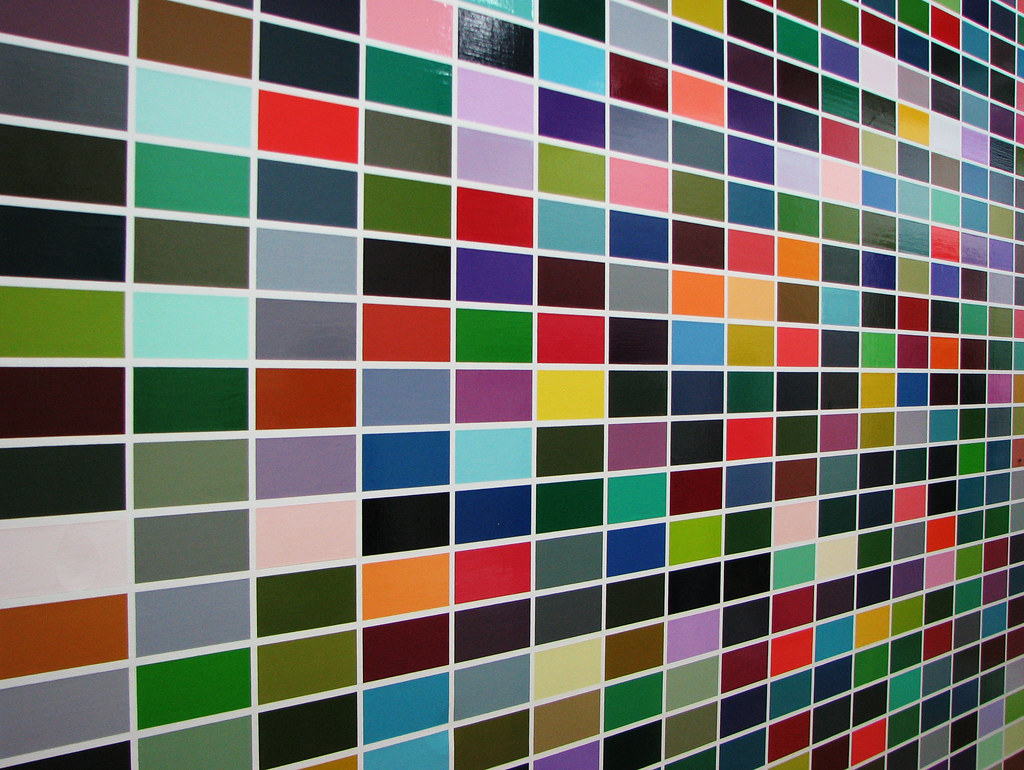 [credit](https://live.staticflickr.com/3173/2971037978_95f41144d3_b.jpg), [licence](https://creativecommons.org/licenses/by/2.0/) ## The Genesis of Color: A Brief History of Color Theory Before we dive into the specifics of complementary colors, it’s worth pausing to appreciate the journey of [color theory](/finder/page/what-is-color-theory) itself. Humans have been fascinated by color since the dawn of time, using natural pigments to adorn caves and bodies. But the systematic study of color relationships, how they interact, and their psychological impact, is a relatively recent development. My definitive guide on [what is color theory](/finder/page/what-is-color-theory) explores this journey in much greater detail. Thinkers like Aristotle and [Leonardo da Vinci](/finder/page/ultimate-guide-to-leonardo-da-vinci) made early observations, pondering the nature of light and color. But it was [Sir Isaac Newton](/finder/page/who-was-david-brewster-inventor-of-the-kaleidoscope)'s groundbreaking work in the 17th century that truly laid the scientific foundation, shifting our understanding from philosophical musings to empirical observation. His meticulous experiments with prisms, meticulously dissecting white light into its constituent spectrum, were nothing short of revolutionary. Newton didn't just show us the rainbow; he famously arranged these colors into a circular diagram, providing the very first scientific basis for the **color wheel** we still rely on today. This wasn't merely a pretty visual; it was a groundbreaking analytical tool that allowed for a systematic understanding of how colors relate to one another, fundamentally introducing the concept of direct opposites – the rudimentary idea of complementary pairs, even if he didn't use that exact terminology. For me, thinking about Newton's methodical approach always makes me appreciate the blend of art and science that underpins so much of what we do as artists. Later, artists and scientists significantly built upon Newton's foundations, each adding crucial layers to our understanding. Johann Wolfgang von Goethe, for example, passionately explored the psychological and [emotional impact](/finder/page/the-emotional-palette:-how-i-choose-colors-for-my-abstract-art) of color in his 'Theory of Colors,' published in 1810, challenging Newton's purely physical approach and advocating for a more experiential, human-centric view of color. [Michel Eugène Chevreul](/finder/page/what-is-pointillism-in-art), a French chemist, delved into the science of **simultaneous contrast**, observing how colors intensely influence each other when placed side-by-side – a phenomenon absolutely critical to understanding complementary pairs, as we'll soon explore. Then came Albert Munsell, who in the early 20th century developed a highly precise and systematic color order system, defining color by hue, value, and chroma. His system provided a three-dimensional model for understanding color that is still used today, crucial for consistent color reproduction. And of course, Johannes Itten, a key figure at the Bauhaus school, developed his own influential color wheel and theories on color contrasts, which are still widely taught in art schools today and form much of the basis for modern color education. Itten's exploration of seven types of color contrast truly opened my eyes to the practical application of color relationships. Their collective work paved the way for modern understanding, influencing everything from [fine art](/finder/page/illustration-vs-fine-art-whats-the-difference) to industrial design. Figures like Josef Albers, with his seminal 1963 'Interaction of Color', further pushed the boundaries of how we perceive and understand color relationships, proving that color is never seen in isolation, but is always in a dynamic, shifting dialogue with its neighbors. It’s a testament to how human curiosity continually seeks to quantify and understand the beauty around us, a journey that still continues today, influencing [digital art](/finder/page/history-of-digital-art), immersive installations, and even scientific data visualization. It makes me wonder what new color breakthroughs are just around the corner, waiting to reshape our visual world. 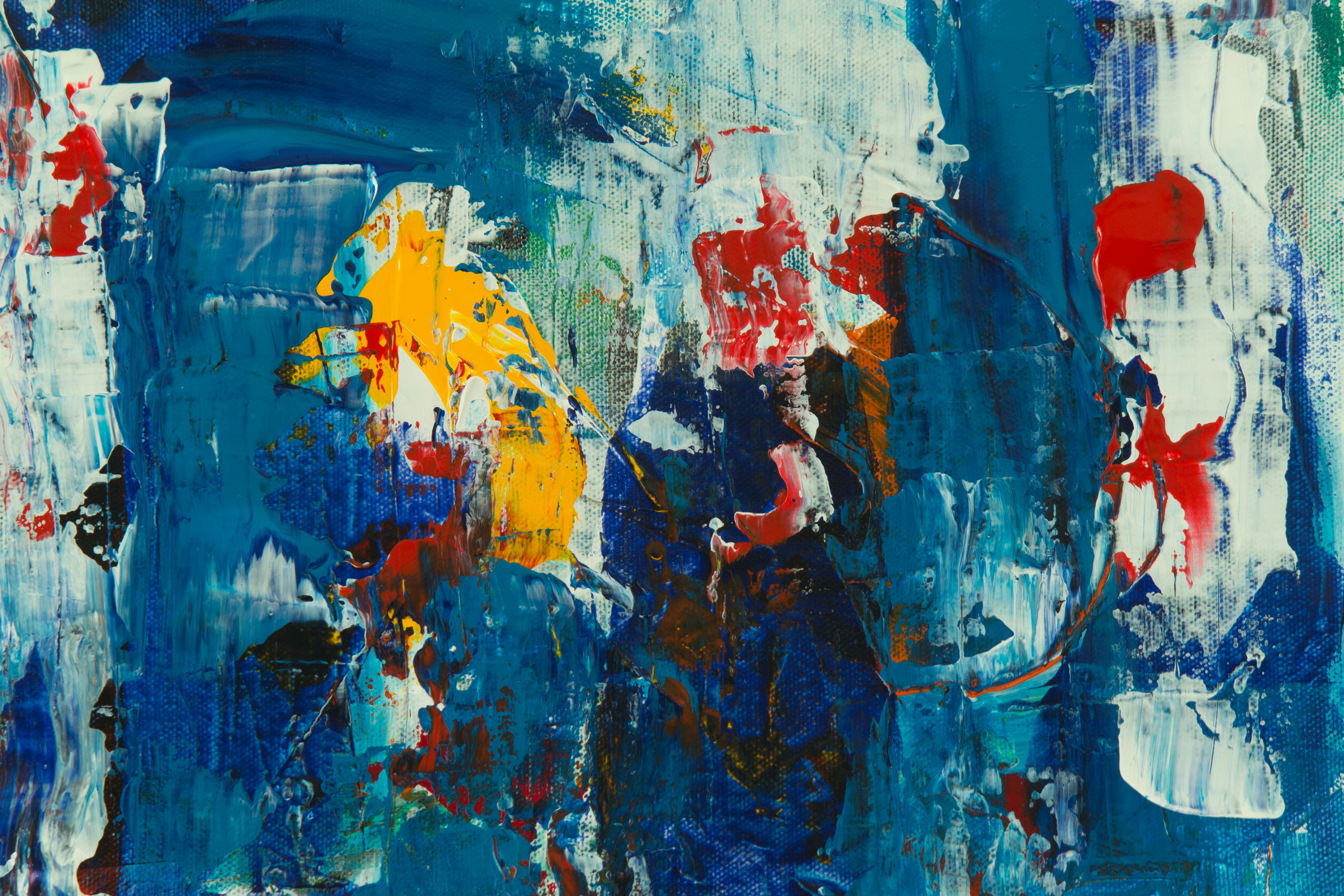 [credit](https://images.pexels.com/photos/9120650/pexels-photo-9120650.jpeg), [licence](https://creativecommons.org/public-domain/) ## The Big Idea: What on Earth Are They? Okay, let's get the technical bit out of the way, because truly grasping it makes all the difference in moving from guessing to intentionality with your palette – I promise, it’s simpler than it sounds! At its heart, **complementary colors** are those fascinating pairs of hues that reside directly opposite each other on a standard **color wheel**. This isn't some random pairing I just made up; this opposition represents the most extreme contrast possible between two colors, creating a unique tension and energy that few other color relationships can achieve. Think of it like a visual tug-of-war, an exhilarating push-and-pull where each color demands attention yet simultaneously amplifies its partner, creating a palpable visual sizzle. This constant, dynamic interplay is precisely what gives them their power. They are, in essence, the 'opposites' in the color world, but it's precisely this opposition that makes them such powerful allies for artists and designers, ready to turn up the volume on your visual story and make it truly unforgettable. 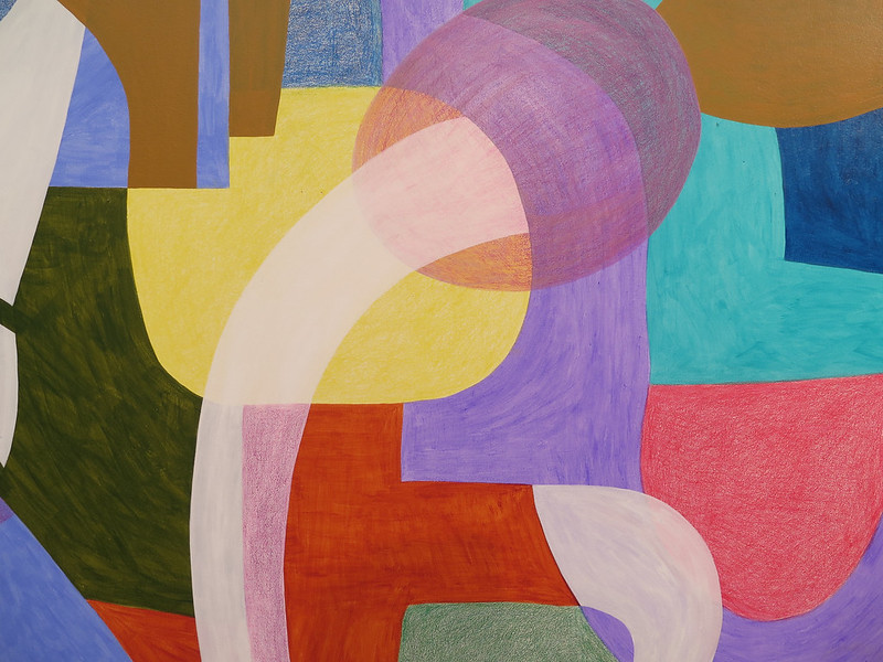 [credit](https://www.flickr.com/photos/42803050@N00/31171785864), [licence](https://creativecommons.org/licenses/by-nd/2.0/) The most recognized and fundamental pairs, the ones you'll encounter consistently in traditional art education and practice (especially with the traditional **RYB ([Red](/finder/page/the-fiery-heart:-how-red-ignites-passion-and-energy-in-my-abstract-compositions), Yellow, Blue) color model**), are: * **Red** and **Green** * **Yellow** and **Purple** * **Blue** and **Orange** These primary and secondary pairings, especially within the historical RYB (Red, Yellow, Blue) color model, form the bedrock of understanding how complementary colors function in traditional art. 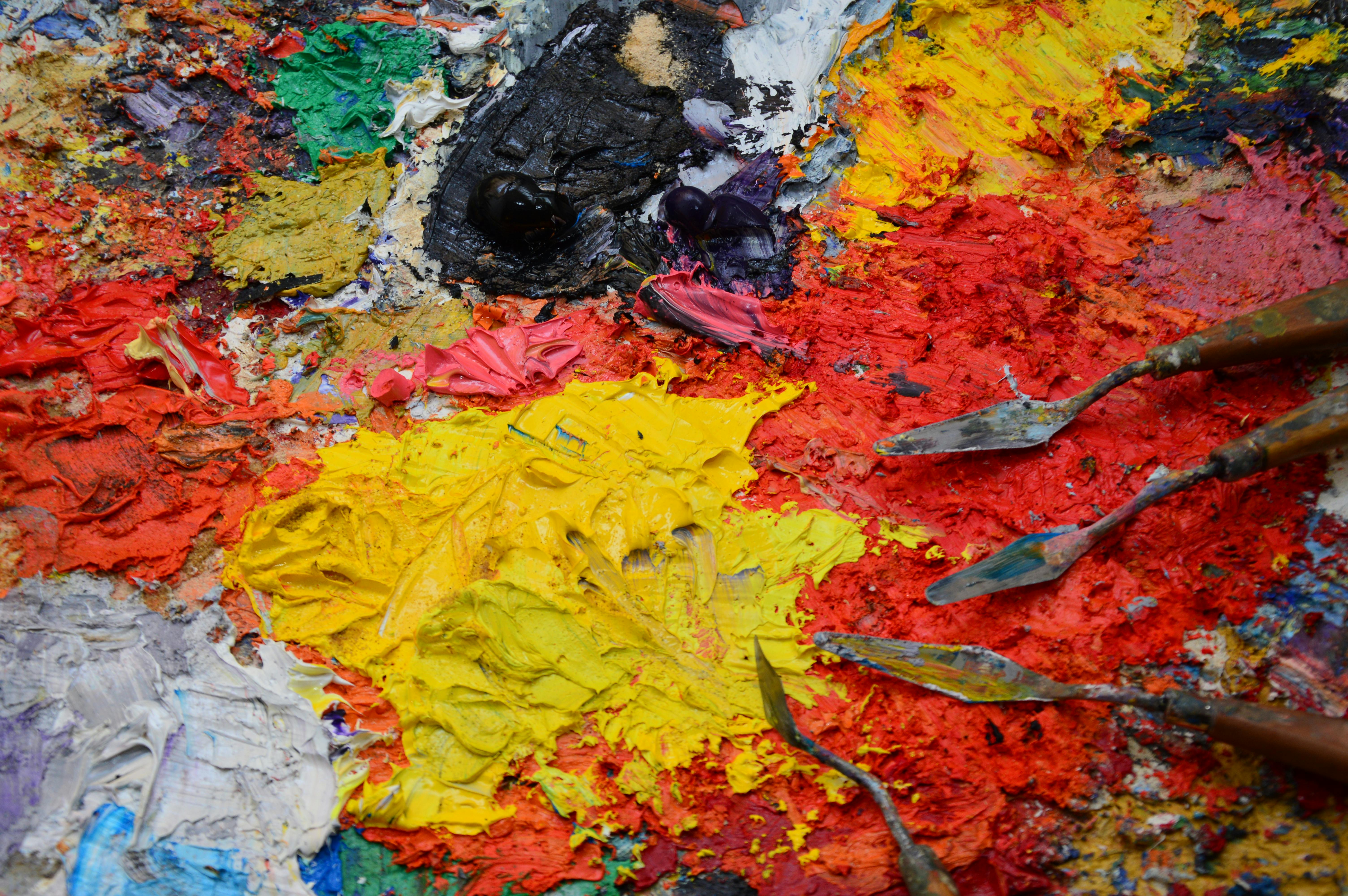 [credit](https://images.pexels.com/photos/15841465/pexels-photo-15841465/free-photo-of-texture-of-palette-in-paint.jpeg), [licence](https://creativecommons.org/public-domain/) ### The Anatomy of the Color Wheel: A Foundation for Understanding To truly leverage complementary colors, we absolutely need to solidify our understanding of the **color wheel** itself. Trust me, it's not just a pretty circle, nor a mere decorative chart; it's a foundational map, an indispensable guide to color relationships that I constantly refer back to in my [definitive guide to color theory in art: from pigments to psychology](/finder/page/the-definitive-guide-to-color-theory-in-art-from-pigments-to-psychology). Think of it as your most reliable GPS for navigating the vast, often overwhelming, landscape of color and understanding its intrinsic logic. It’s where all the fundamental color rules live, including how to find those perfect opposing pairs. If you want a full deep dive, I've got a comprehensive guide on [what is a color wheel: how to use it](/finder/page/what-is-a-color-wheel-how-to-use-it) that explores its history, construction, and manifold applications in detail. Before we even look at the table, let's quickly define the foundational color types that make up this magical circle, as they are the building blocks of all color harmony (and discord!): 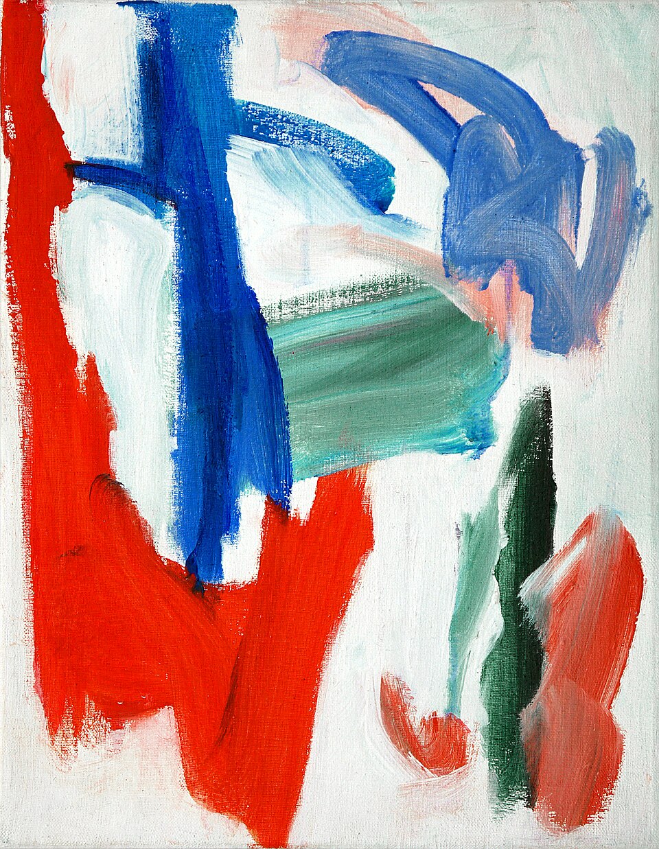 [credit](https://commons.wikimedia.org/wiki/File:%27Abstract_sky%27,_1993_-_small_acrylic_painting_by_Dutch_artist_Fons_Heijnsbroek;_free_download_abstract_art_image,_CCO.jpg), [licence](http://creativecommons.org/publicdomain/zero/1.0/deed.en) ### Defining Primary, Secondary, and Tertiary Colors * **[Primary Colors](/finder/page/what-are-the-primary-colors)**: These are the absolute foundational hues – Red, Yellow, and [Blue](/finder/page/my-personal-connection-to-the-color-blue) in the traditional RYB model for pigments. They are considered "pure" because they cannot be created by mixing any other colors. They're the starting point for everything else, the bedrock of your palette, the first notes in your color symphony. You can explore them further in my guide on [what are the primary colors](/finder/page/what-are-the-primary-colors). * **[Secondary Colors](/finder/page/what-are-secondary-colors)**: These vibrant hues are created by mixing two primary colors in equal proportions. Think of them as the immediate offspring of primaries, giving us more options to play with. Red + Yellow gives you Orange. Yellow + Blue gives you [Green](/finder/page/the-psychology-of-green-in-my-art-growth-harmony-and-natures-influence). Blue + Red gives you Purple. Each secondary color sits directly between the two primaries that form it on the color wheel. Dive deeper into them with [what are secondary colors](/finder/page/what-are-secondary-colors). * **Tertiary Colors**: Now we're getting nuanced! Tertiary colors are formed by mixing an adjacent [primary color](/finder/page/what-are-the-primary-colors) with a secondary color. They bridge the gap between primaries and secondaries, creating a richer, more complex spectrum that opens up so many possibilities. They are typically named with a hyphen, combining the names of the primary and secondary colors (e.g., Red-Orange, Yellow-Green, Blue-Purple). Understanding these hierarchical relationships is crucial because it helps you predict how colors will behave and what kind of contrasts they will create. Now, let's see how these categories relate to their complementary pairs: | Color Type | Description | Formation | [Complementary Pair](/finder/page/how-to-use-complementary-colors-in-painting) (RYB) | Examples | | :--- | :--- | :--- | :--- | :--- | | **Primary Colors** | The absolute foundational colors from which all other colors can theoretically be mixed. They cannot be created by mixing other colors. | N/A | Varies | [Red](/finder/page/what-are-the-primary-colors), [Yellow](/finder/page/what-are-the-primary-colors), [Blue](/finder/page/what-are-the-primary-colors) | | **Secondary Colors** | Created by mixing two primary colors in equal proportions. They bridge the gap between primaries. | Red + Yellow = Orange<br>Yellow + Blue = Green<br>Blue + Red = Purple | Opposite Primary | [Green](/finder/page/what-are-secondary-colors) (complement of Red)<br>[Orange](/finder/page/what-are-secondary-colors) (complement of Blue)<br>[Purple](/finder/page/what-are-secondary-colors) (complement of Yellow) | | **Tertiary Colors** | Formed by mixing an adjacent primary color with a [secondary color](/finder/page/what-are-secondary-colors). These are often named by combining the primary and secondary (e.g., Red-Orange, Yellow-Green). | Red + Orange = Red-Orange<br>Yellow + Orange = Yellow-Orange<br>Yellow + Green = Yellow-Green<br>Blue + Green = Blue-Green<br>Blue + Purple = Blue-Purple<br>Red + Purple = Red-Purple | Opposite Tertiary | **Red-Orange** (complement of **Blue-Green**)<br>**Yellow-Orange** (complement of **Blue-Purple**)<br>**Yellow-Green** (complement of **Red-Purple**) | Notice something incredibly neat here? A secondary color's complement is *always* the primary color that *wasn't* used to create it. For instance, to make green, you combine blue and yellow. The single primary color left out? Red. And there, staring you in the face, is your powerful complementary pair: Red and Green. This elegant, underlying structure is vital to mastering color choices and truly understanding the logic behind these potent pairings. It reveals the inherent interconnectedness of the color spectrum and equips you with a powerful predictive tool. It's a reminder that even in the seemingly complex world of color, there's a beautiful, predictable order that artists can tap into. This foundational understanding is key to moving beyond simply guessing with color, to making intentional, impactful choices. It’s a bit like a well-designed puzzle, everything fits together perfectly. ## Expanding Your Palette: Beyond Primary and Secondary Complements While the classic RYB primary and secondary complements (Red/Green, Yellow/Purple, Blue/Orange) form the bedrock of our understanding, the world of complementary colors extends beautifully into the tertiary realm. This is where palettes gain incredible sophistication and nuance, moving beyond the obvious to truly rich and complex harmonies that can make your work sing with unexpected depth. Remember, tertiary colors are formed by mixing a primary with an adjacent secondary (e.g., Red-Orange, Yellow-Green). The exciting part is that these also have their direct complements across the color wheel, creating equally potent, though often subtler, tension. For instance: * The complement of **Red-Orange** is **Blue-Green**. Imagine the fiery energy of a tangerine sunset against the cool, deep tranquility of a tropical lagoon – a pairing that feels both vibrant and serene. * The complement of **Yellow-Orange** is **Blue-Purple**. Think of golden autumn leaves contrasted with the rich, mysterious tones of twilight; it's a regal combination that evokes drama and introspection. * The complement of **Yellow-Green** is **Red-Purple**. Picture a lush, vibrant spring meadow set against the deep, regal hues of amethyst – a truly luxurious and dynamic pairing. By exploring these tertiary complements, you unlock a much broader and more refined spectrum of visual interactions. It allows for subtler contrasts, richer shadow tones, and more complex color narratives within your artwork, providing endless possibilities for creating unique moods and sophisticated palettes. Don't limit yourself to just the basic pairs; the real magic often happens when you venture into these more nuanced relationships, as I frequently do in my exploration of [beyond the primary: how i use secondary and tertiary colors to create complex abstract worlds](/finder/page/beyond-the-primary:-how-i-use-secondary-and-tertiary-colors-to-create-complex-abstract-worlds). It’s like discovering new flavor combinations for your favorite dish. 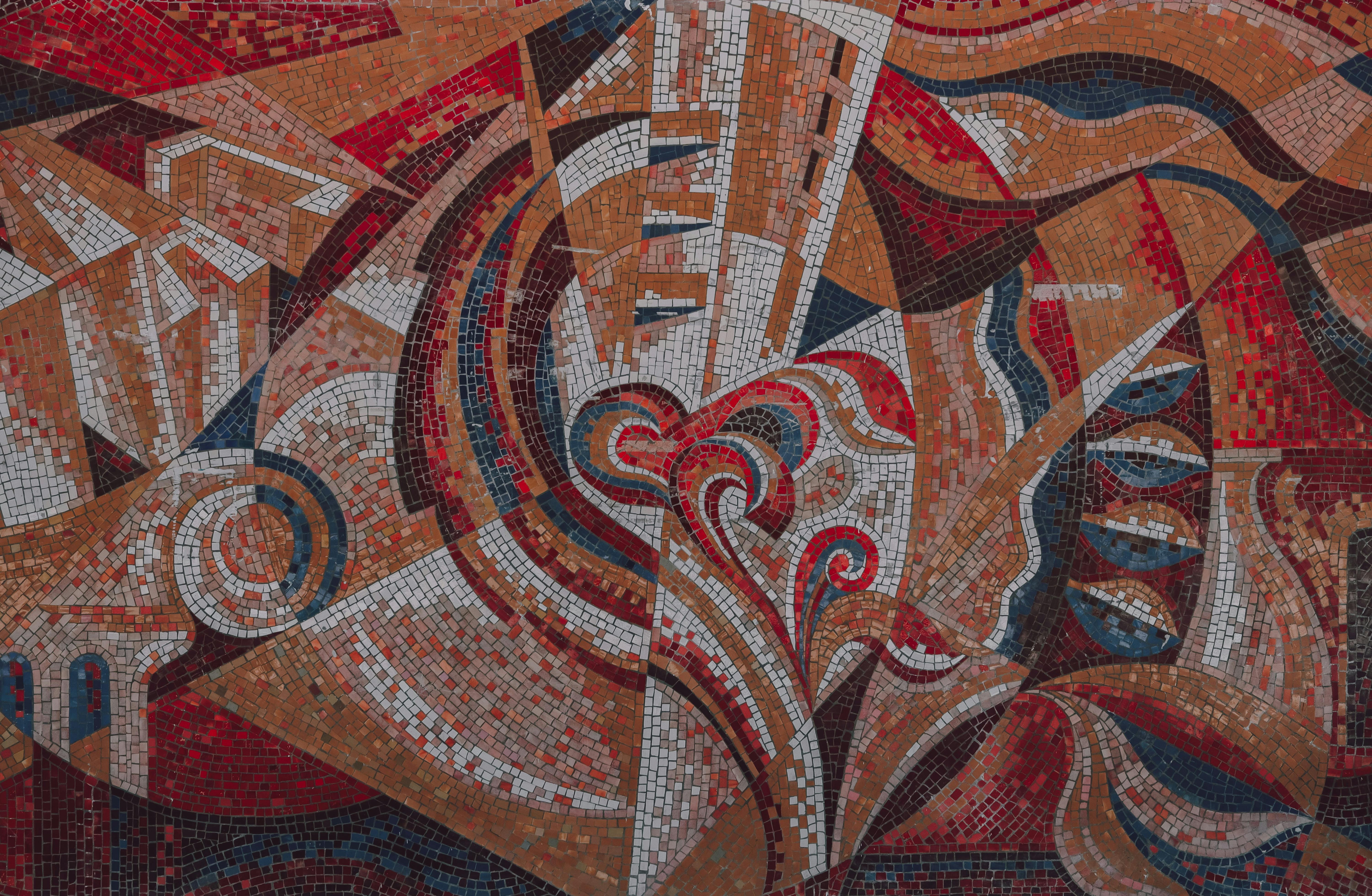 [credit](https://images.pexels.com/photos/12620675/pexels-photo-12620675.jpeg), [licence](https://creativecommons.org/public-domain/) ## Common Misconceptions About Complementary Colors Even with a grasp of the basics, some misunderstandings about complementary colors persist, often leading to frustration or missed opportunities in artistic application. Let's clear up a few common ones I often hear from students and fellow artists. 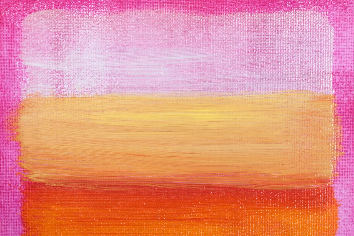 [credit](https://www.rawpixel.com/image/5924320/photo-image-background-public-domain-art), [licence](https://creativecommons.org/publicdomain/zero/1.0/) ### Misconception 1: Complementary Colors Always Clash Violently This is probably the most common fear I hear from students! Many beginners equate "complementary" with "clashing" or "too bright," imagining garish combinations that assault the eyes. While highly saturated complements *can* indeed create intense vibrations (which, believe it or not, can be highly desirable for certain artistic intentions, like [Op Art](/finder/page/what-is-op-art)!), the truth is far more nuanced. As we'll discuss in detail later with **tints, tones, and shades**, you have immense control over the intensity, value, and mood of your colors. Pairing a deep, muted teal with a soft, earthy rust red is still a complementary scheme, but it's harmonious and sophisticated, not jarring. The key is in thoughtful application and varying their saturation and value, not avoiding them altogether out of fear. It’s like learning to play an instrument – you can play a loud, exciting rock anthem, or a soft, melancholic jazz piece, all with the same set of notes. The fear of 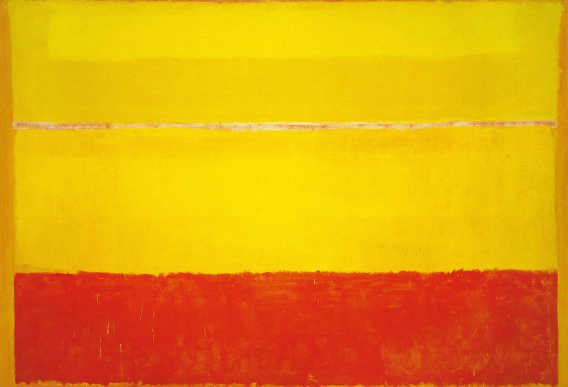 [credit](https://www.flickr.com/photos/sqorda/32547777737), [licence](https://creativecommons.org/publicdomain/mark/1.0/) ### ### Misconception 2: There's Only One Universal Set of Primary and Complementary Colors While the **RYB (Red, Yellow, Blue)** model is foundational for traditional art pigments and what most artists learn first, it's certainly not the *only* color model, nor does it yield the *only* set of complementary pairs. This is a big one, because it opens up the conversation to so many exciting possibilities across different mediums! For instance, in the digital realm, or when working with light sources (the **RGB: Red, Green, Blue** model), the complement of Red is Cyan, Green is Magenta, and Blue is Yellow. And for printing (**CMYK: Cyan, Magenta, Yellow, Key/Black**), the complements shift again. Understanding these distinctions is absolutely crucial for artists working across various mediums, from traditional painting to digital design, ensuring you select the correct complementary pairs for your specific context. It's not about one being "right" and the other "wrong," but about understanding the specific rules of the game you're playing. For a deeper dive into the very foundations, my guide on [what is color theory](/finder/page/what-is-color-theory) explores these models in much greater detail, and I also discuss my personal journey with different palettes in [my approach to color mixing: creating vibrant palettes in abstract painting](/finder/page/my-approach-to-color-mixing-creating-vibrant-palettes-in-abstract-painting). ### Misconception 3: Complementary Colors are Only for "Loud" or Aggressive Art This ties into the first misconception, but it's worth addressing directly. Many artists assume that employing complementary colors *must* result in a high-energy, visually aggressive piece – think the vibrant, almost clashing hues of a Fauvist painting. While complements are indeed unparalleled for creating intensity and dynamism, they are equally adept at fostering subtle, sophisticated, and even tranquil effects. The magic lies in their modulation, the careful tweaking of their properties. By adjusting their value (lightness/darkness) and saturation (intensity or purity), you can create an endless spectrum of moods. A deep, desaturated violet paired with a pale, earthy yellow is still a complementary scheme, but it evokes a sense of serene beauty and understated elegance, rather than a shouting match. The goal isn't always to grab attention violently, but sometimes to create a rich, internal harmony or a soft visual whisper. I find myself constantly experimenting with this, trying to hit just the right note of visual conversation. ### Additive vs. Subtractive Color: A Quick Diversion When we talk about mixing paints, pigments, or inks, we're primarily dealing with **subtractive color**. This means that as you mix colors, more light is absorbed, and the resulting mixture gets darker, eventually leading towards black. The primary colors in subtractive mixing are typically Red, Yellow, and Blue (RYB), which artists are most familiar with, or Cyan, Magenta, and Yellow (CMY) – often with Key (black), forming **CMYK** – in printing. This explains why your printed photos use different "primaries" than your paint set, leading to different complementary relationships for different applications. However, in the world of light (think stage lights, your computer screen, or even the sun's spectrum), we use **additive color**. Here, mixing colors adds light, making the result brighter and eventually leading to white. The primary colors for additive mixing are Red, Green, and Blue (RGB). This is why your phone screen displays millions of colors using only tiny red, green, and blue light-emitting diodes.  [credit](https://www.publicdomainpictures.net/pictures/250000/nahled/messy-colorful-artists-palette.jpg), [licence](https://creativecommons.org/publicdomain/zero/1.0/) Why does this matter for complementary colors? The fundamental principle remains the same – opposites create maximum contrast and, when mixed, neutralization – but the specific complementary pairs can shift slightly depending on whether you're working with light or pigment. For traditional artists working with physical mediums like paint or pastels, the RYB color wheel (and sometimes the CMY or CMYK model for specific applications) is your most direct guide. However, if you're a digital artist, a graphic designer creating for screens, a photographer working with light, or anyone dealing with illuminated projections, understanding the RGB (Red, Green, Blue) additive model and its corresponding complementary pairs (which differ significantly from RYB) becomes equally critical. It's about knowing which 'rules' apply to your chosen medium, preventing frustrating mismatches and ensuring your colors behave as you intend.  [credit](https://live.staticflickr.com/65535/53064827119_1b7c27cd96_b.jpg), [licence](https://creativecommons.org/licenses/by-nc-nd/2.0/) ## Why You Should Care: The Undeniable Magic They Create This is where it gets fun, and where theory genuinely meets thrilling application. Understanding this isn't just for acing an art history exam; it's about unlocking a potent [visual language](/finder/page/the-definitive-guide-to-the-elements-and-principles-of-art-a-visual-language-for-all) that empowers you to make deliberate, powerful, and truly impactful choices in your work. Think of complementary colors as the ultimate visual accelerators, each having a few neat tricks up their sleeves to transform your art, making your art stand out in a crowded world. ### 1. They Make Each Other POP: The Power of Simultaneous Contrast This is, for many artists (myself included!), the most exhilarating and frankly, mind-bending, effect of complementary colors. When you place two complements side-by-side, they don't just sit there; they vibrate, almost physically humming with energy. They make each other appear brighter, more saturated, and significantly more intense than they would in isolation. This fascinating phenomenon is known as **simultaneous contrast**, a term meticulously coined by the 19th-century chemist Michel Eugène Chevreul, who dedicated years to extensively studying how colors dynamically affect each other when viewed together. It's a fascinating optical illusion, a subtle trick of the eye that can feel like pure magic: your brain, receiving these opposing color signals, gets delightfully overstimulated, resulting in a visual sizzle that commands attention and almost makes the colors hum. It’s precisely why a small, vibrant orange dot on a deep blue background feels exponentially more vivid and present, practically leaping off the canvas, compared to the same orange dot placed on a dull, neutral grey background. It’s a trick of perception that, once you see it, you can't unsee, and it becomes an indispensable tool. Think of the intense glow of traffic lights – a bright red 'stop' against a lush green 'go' isn't just about clear signals, but the undeniable visual punch these complements deliver. I remember the first time I truly understood this principle; it felt like I'd been given a secret decoder ring for the visual world! 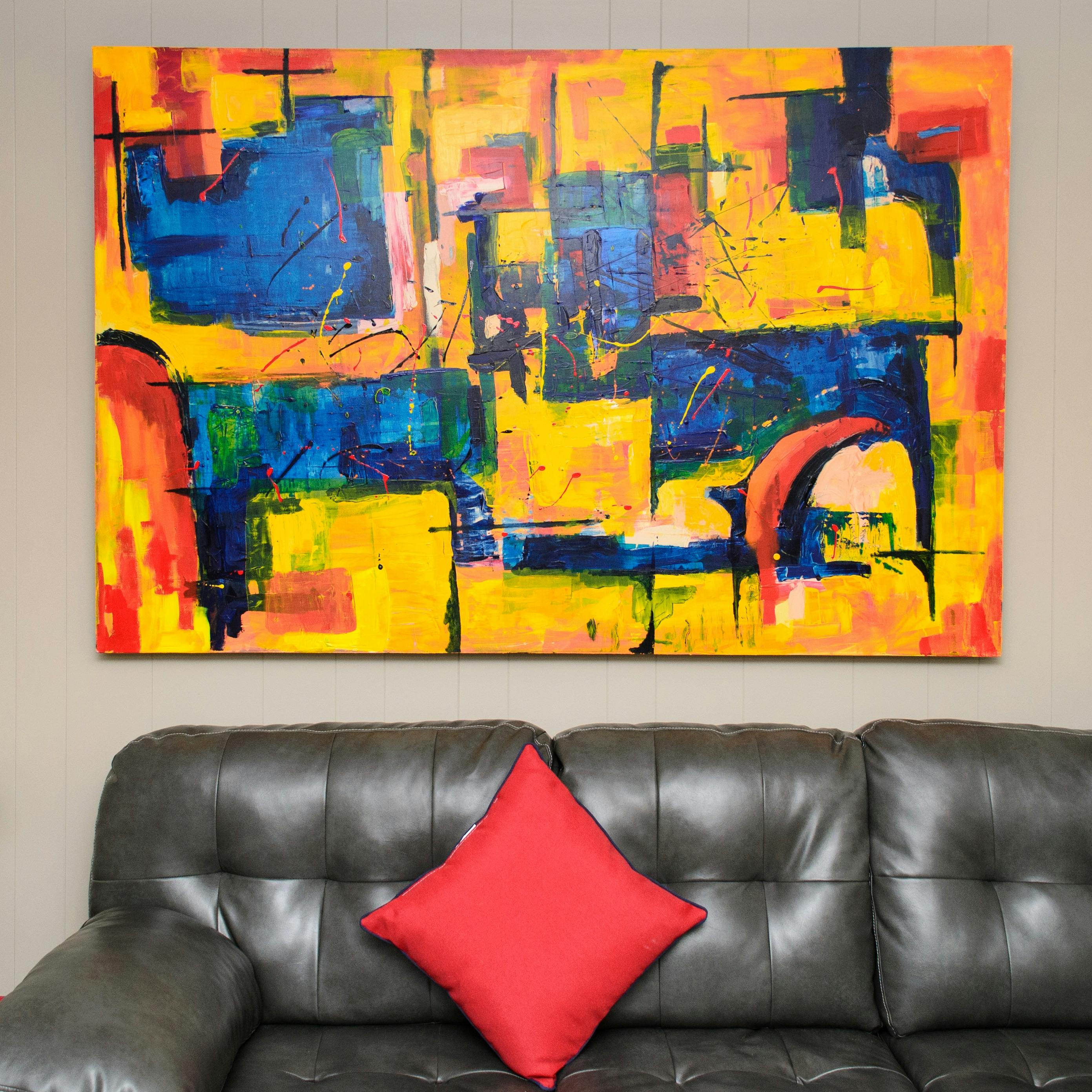 [credit](https://images.pexels.com/photos/1067556/pexels-photo-1067556.jpeg), [licence](https://creativecommons.org/public-domain/) ### 2. They Create Visual Vibration and Movement Beyond simply making each other *pop*, highly saturated complementary colors, especially when placed in equal measure or with a precise line separating them, can create an almost unsettling visual vibration. This optical effect can make colors appear to shimmer, move, or even generate illusory afterimages, almost like they're alive. While sometimes deliberately used to create dynamic, almost frenetic energy (think [Op Art](/finder/page/what-is-op-art) or certain psychedelic designs), it’s often an effect artists learn to manage rather than suppress entirely. However, when controlled, this vibration can imbue a static image with a palpable sense of movement and life, making the composition feel alive and energetic. It's a fascinating testament to how our eyes and brains process opposing color signals, and a subtle trick to master for creating truly dynamic pieces that captivate the viewer.  [credit](https://images.pexels.com/photos/10996828/pexels-photo-10996828.jpeg), [licence](https://creativecommons.org/public-domain/)  [credit](https://live.staticflickr.com/1466/26466528516_383e614347_b.jpg), [licence](https://creativecommons.org/licenses/by-nc/2.0/) Think of it: the vivid red of a poppy field gains incredible vibrancy against its green stems, a classic red and green complementary pairing. Or consider how an orange sunset over a deep blue ocean feels so profoundly dramatic – it’s that complementary tension at play, enhancing both colors. It’s why so many artists, including myself, as I explore in [the emotional palette: how i choose colors for my abstract art](/finder/page/the-emotional-palette:-how-i-choose-colors-for-my-abstract-art), deliberately harness this effect. It's not just about aesthetics; it's about making a statement with color, pushing the visual boundaries of perception. I’ve certainly found myself returning to this phenomenon in my own work, especially when I want a particular element to truly *sing* against its backdrop, creating a moment of undeniable visual impact. This effect isn't just about beauty; it's about creating a conversation between colors that makes both more powerful. This effect isn’t limited to just two colors. Imagine a vibrant yellow lemon (a primary) against a deep purple background (its complement). The yellow will practically glow! The optical dance between these opposing hues creates an electrifying presence, pulling the eye in and holding it captive. It’s a trick that once understood, becomes an indispensable part of your artistic toolbox. 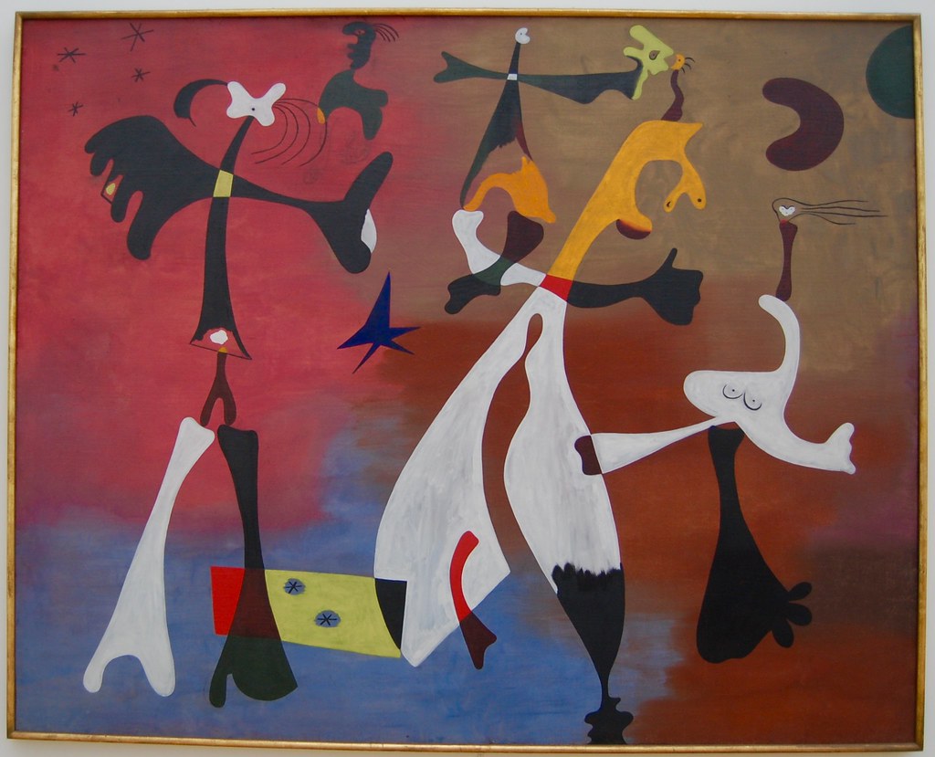 [credit](https://live.staticflickr.com/65535/49810080901_2837d157fd_b.jpg), [licence](https://creativecommons.org/licenses/by-nc/2.0/) Artists have leveraged this visual trick for centuries. [Vincent van Gogh](/finder/page/who-was-vincent-van-gogh), for instance, was practically obsessed with it. That fiery orange in his beard and hair, set against the cool, swirling blues in the background of his self-portraits, isn't an accidental choice. He was using that inherent tension not just to create visual interest, but to powerfully convey energy, emotion, and psychological depth, exploring the very [psychology of color in abstract art beyond basic hues](/finder/page/the-psychology-of-color-in-abstract-art-beyond-basic-hues). His use of yellow and blue in his '[Starry Night](/finder/page/what-is-the-meaning-of-the-starry-night)' series also exemplifies this, where the vibrant yellow of the stars and moon pulsates against the deep, swirling blues of the [night sky](/finder/page/what-is-the-meaning-of-the-starry-night), creating a cosmic energy. His olive tree paintings, with their vibrant yellows against deep blues and purples, are another powerful example of this dynamic at play, transforming a simple landscape into an emotional landscape. It's a masterclass in how complementary pairs can amplify a narrative. One of my absolute favorite examples of [Van Gogh](/finder/page/ultimate-guide-to-van-gogh)’s deliberate use of complementary colors to create atmosphere and intense emotion is his iconic *Café Terrace at Night*. Here, the vibrant yellows and oranges of the café’s awning and the illuminated street stand in striking, yet harmonious, contrast to the deep, inky blues of the night sky and the shadowed buildings. This isn’t just a realistic depiction; it’s an *emotional* one. The warm lights feel inviting and buzzing with life, while the cool blues evoke the stillness and vastness of the night. This powerful blue and orange complementary pairing creates an almost palpable energy and depth, [drawing](/finder/page/definitive-guide-to-drawing-techniques) the viewer into the scene with an intensity that purely descriptive color could never achieve. It's a testament to how color, when wielded with such intention, can communicate volumes beyond mere representation. ### 3. They Create Harmony or Discord While often used for vibrant, high-impact contrast, complementary colors also offer a nuanced ability to create specific moods and communicate complex ideas. A balanced use, where one color profoundly dominates and its complement acts as a carefully placed accent, can bring a sense of dynamic harmony. It feels complete, rich, and visually satisfying, much like a well-composed piece of music where a soloist is beautifully supported by an orchestra. Imagine a vast, serene blue canvas with a single, tiny, intensely orange focal point – the harmony is clear, but the energy is undeniable. However, if used in equal, highly saturated amounts, they can create potent visual discord or tension, an almost jarring effect that can be incredibly powerful if that's your specific artistic intention – think protest art or a scene of intense psychological conflict. It’s a delicate dance, and understanding this balance – and crucially, knowing when to tip it deliberately – is crucial for effective use. A masterful artist knows precisely when to create a peaceful coexistence and when to ignite a visual argument. This nuanced approach is a key aspect of [the definitive guide to understanding color harmonies in abstract art](/finder/page/the-definitive-guide-to-understanding-color-harmonies-in-abstract-art). ### 4. They Create Sophisticated Neutrals and Rich Shadows Here’s a secret that honestly took me way too long to learn, and it was an absolute game-changer for my painting: if you want to create rich, natural-looking shadows or deep, complex neutrals, absolutely do not just reach for black straight from the tube. That often leads to flat, lifeless results, sucking the life out of your colors and making them feel, well, a bit dead. Instead, try the subtle alchemy and magic of mixing complementary colors. It's a technique that adds an incredible depth and luminosity to your darker tones and grays, making them resonate with the rest of your palette and feel truly integrated. 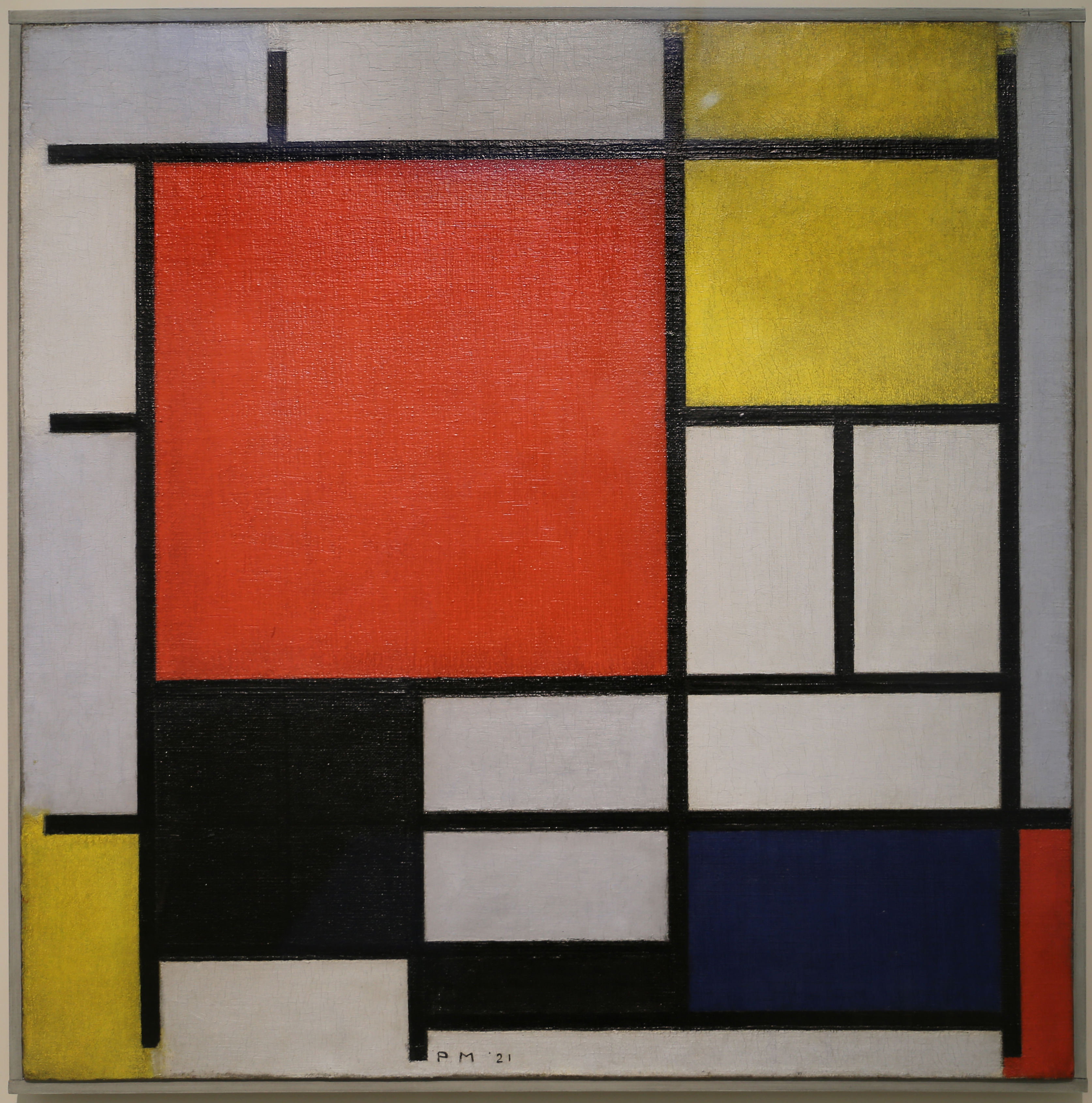 [credit](https://upload.wikimedia.org/wikipedia/commons/2/29/Piet_mondrian%2C_composizione_con_grande_piano_rosso%2C_giallo%2C_nero%2C_grigio_e_blu%2C_1921.jpg), [licence](https://creativecommons.org/licenses/by/3.0) When you mix two complementary colors in varying proportions, they begin to neutralize each other. This isn't a "muddy mess" scenario, as some beginners fear; rather, it's an alchemical process that yields a stunning range of nuanced browns, grays, and deep, earthy tones. For example, mixing red and green in different ratios can produce everything from warm siennas and brick reds to cool umbers and deep forest browns. Blue and orange, when combined, can create a spectrum from earthy ochres and terracotta tones to sophisticated deep grays and near-blacks, perfect for rendering realistic shadows, grounding a vibrant composition, or creating subtle shifts in an abstract piece. I've found this technique indispensable for creating realistic skin tones, for instance, by subtly mixing a touch of green into reds to achieve natural complexions, as explored in my guide on [how to mix realistic skin tones in oil paint](/finder/page/how-to-mix-realistic-skin-tones-in-oil-paint). These resulting neutrals are inherently more dynamic, luminous, and harmoniously connected to the other colors in your palette than a flat, monochromatic black or gray ever could be. This technique is fundamental to [how to avoid making muddy colors in painting](/finder/page/how-to-avoid-making-muddy-colors-in-painting), a concept I wish I'd grasped much earlier in my [artistic journey](/finder/page/my-artistic-journey:-from-early-explorations-to-embracing-abstract-expression). 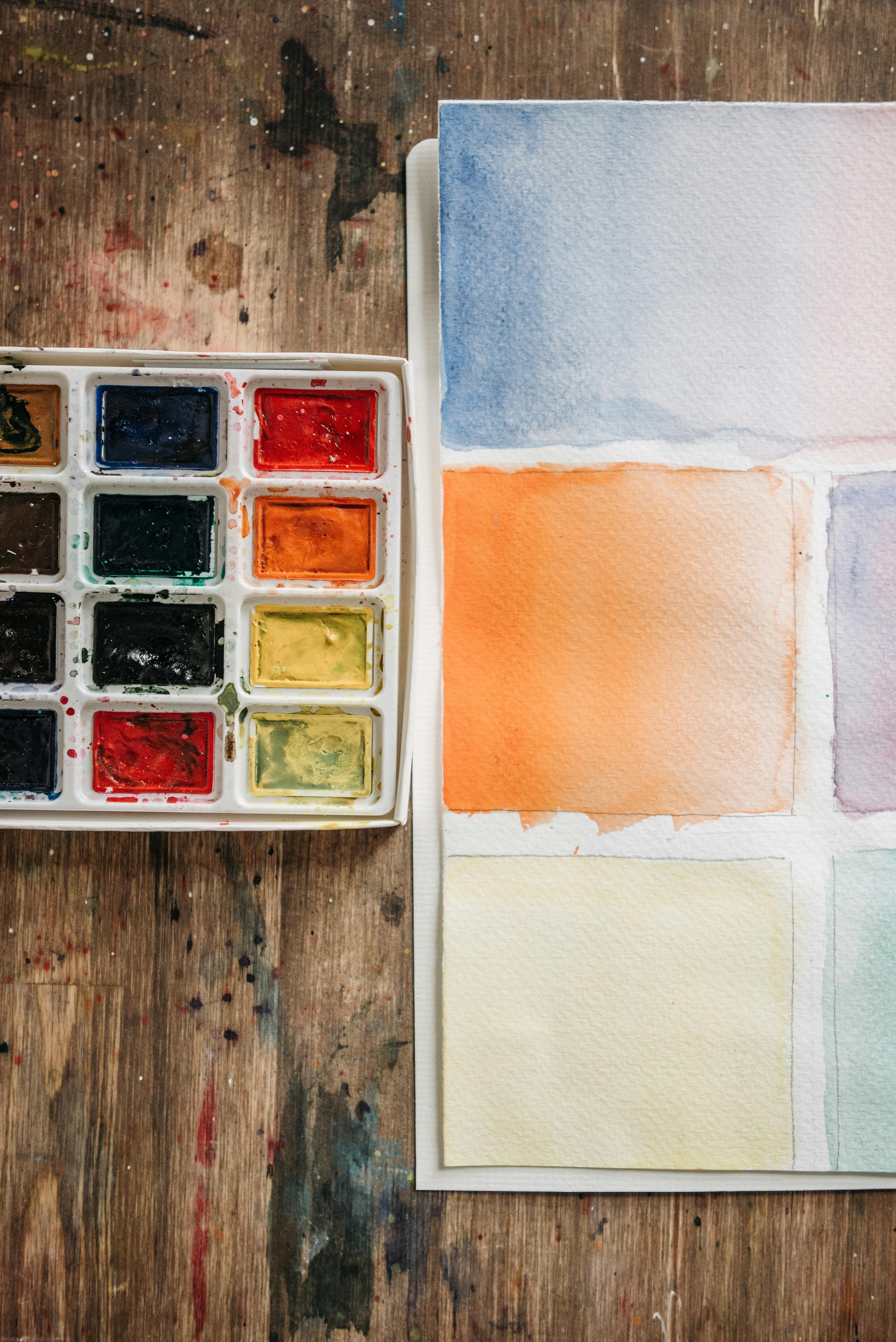 [credit](https://images.pexels.com/photos/6925017/pexels-photo-6925017.jpeg), [licence](https://creativecommons.org/public-domain/) ### 5. They Guide the Viewer's Eye and Define Focal Points Building on that incredible 'pop' effect, a small, strategically placed dash of a complementary color can function like an undeniable spotlight in your artwork. It's a visual magnet, a deliberate interruption that immediately draws the eye, almost like a whispered secret that suddenly demands attention. Imagine a vast, serene blue painting; a tiny fleck of vibrant orange can instantly pull the gaze, creating an immediate focal point that directs where the viewer looks first and lingers longest. It's an incredibly subtle yet immensely powerful way to control the composition, establish hierarchies of importance, and ultimately guide the story you want your artwork to tell. This is a crucial aspect of [understanding balance in art composition](/finder/page/understanding-balance-in-art-composition) and indeed, the entire art of composition in guiding a viewer's eye. It's not just about what colors you use, but how you orchestrate their interactions – how you control the viewer's journey through your visual narrative. A vibrant accent can act as an arrow, pulling attention, while more muted complements can provide a serene resting place for the eye, allowing for moments of calm before the next visual burst. ## Beyond the Canvas: The Psychology and Cultural Impact of Complementary Colors The interaction of complementary colors isn't just a clever visual trick; it taps into our deeper psychological responses, evokes primal emotions, and holds significant cultural weight across the globe. The strong contrast they create can ignite feelings of energy, excitement, or even conflict and tension, making an artwork resonate on multiple levels. Think of the passionate tension in a red and green pairing, often used to symbolize love and jealousy, danger and growth, or even the festive cheer of Christmas. Yellow and purple can feel regal and vibrant, or mysterious and unsettling, depending on their saturation and context. Blue and orange often conjure images of warmth and coolness, sun and sea, offering a dynamic balance between opposing forces in nature. Artists consciously or intuitively use these powerful pairings to imbue their work with specific [emotional resonance](/finder/page/my-palette-my-story-the-emotional-language-of-color-in-my-abstract-art). I explore this extensively in my article on [the emotional language of color in abstract art](/finder/page/the-emotional-language-of-color-in-abstract-art). Understanding this allows you to manipulate not just what viewers see, but precisely how they *feel* when they encounter your art, creating a more profound and memorable experience. ### The Emotional Spectrum of Complementary Pairs | Complementary Pair (RYB) | Common Emotional & Psychological Associations | Artistic Effect | | :--- | :--- | :--- | | **Red & Green** | **Red:** Passion, Love, Anger, Danger, Energy, Excitement (I often think of [the fiery heart: how red ignites passion and energy in my abstract compositions](/finder/page/the-fiery-heart:-how-red-ignites-passion-and-energy-in-my-abstract-compositions)). **Green:** Nature, Growth, Harmony, Serenity, Freshness, Envy (as I explored in my article on [the psychology of green in my art: growth, harmony, and nature's influence](/finder/page/the-psychology-of-green-in-my-art-growth-harmony-and-natures-influence)). Often festive (Christmas) or striking. | High energy, vibrant tension, can feel either festive or confrontational. Ideal for dynamic compositions or creating powerful focal points. | | **Yellow & Purple** | **Yellow:** Joy, Optimism, Energy, Intellect, Happiness, Caution (my thoughts on this are in [the psychology of yellow in my art: joy, optimism, and light](/finder/page/the-psychology-of-yellow-in-my-art-joy-optimism-and-light)). **Purple:** Mystery, Royalty, Spirituality, Luxury, Melancholy, Sophistication, even a touch of the ethereal. | Dynamic, luxurious, can evoke playful energy or introspective depth. Excellent for conveying opulence or a sense of the fantastical. | | **Blue & Orange** | **Blue:** Calm, Serenity, Sadness, Cold, Trust, Stability (I often think of [the psychology of blue in abstract art: calm, depth, and emotion](/finder/page/the-psychology-of-blue-in-abstract-art-calm-depth-and-emotion)). **Orange:** Warmth, Enthusiasm, Excitement, Energy, Creativity, Adventure. Often seen in sunsets, fire, or autumnal landscapes. | Creates a powerful balance of cool and warm, evoking drama, energy, or tranquil scenes. Particularly effective for conveying natural beauty or a sense of adventure. | 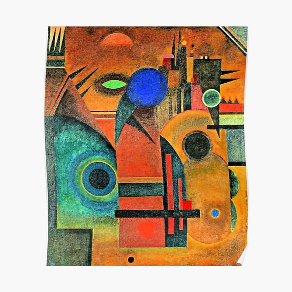 [credit](Printerval.com), [licence](https://creativecommons.org/licenses/by-nc/4.0/) ### Cultural Significance of Complementary Pairs It's fascinating to observe how different cultures perceive and utilize complementary colors. While the optical effects are universal, the symbolic meanings can vary widely, adding layers of interpretation to artwork, as I've explored in [understanding the symbolism of colors in different cultures](/finder/page/understanding-the-symbolism-of-colors-in-different-cultures). * **Festive and Warning:** In Western cultures, red and green are synonymous with Christmas and holidays, evoking cheer and tradition. Yet, the same pairing in traffic lights screams 'stop' and 'go', highlighting its power to convey urgency and command attention. This duality fascinates me, showing how context is everything. * **Royalty and Spirituality:** Yellow and purple, while often playful, can also evoke regal splendor and deep spirituality in many cultures, reflecting their historical use in royal garments and religious ceremonies. The rich intensity of purple juxtaposed with vibrant yellow has been a hallmark of luxury, wisdom, and the mystical. * **Balance of Elements:** Blue and orange often conjure images of elemental forces—the cool expanse of water or sky meeting the warm embrace of fire or earth. This pairing frequently appears in religious iconography to represent divinity and earthly warmth, or in flags to symbolize various aspects of a nation's identity, creating a powerful visual shorthand. * **Modern Branding:** Beyond traditional art, industries from sports to advertising strategically leverage complementary pairings for their uniforms, logos, and campaigns to maximize visual impact and create memorable, dynamic brand identities. Think of a sports team whose colors are a direct complement – their visual presence is undeniably stronger and more unified, almost an unconscious psychological advantage. Understanding these nuances allows for a richer appreciation and more informed application of complementary colors, ensuring your message resonates effectively with your intended audience, whether in fine art or commercial design. It’s about speaking a visual language that transcends borders, but with an awareness of local dialects, making your message land with precision. 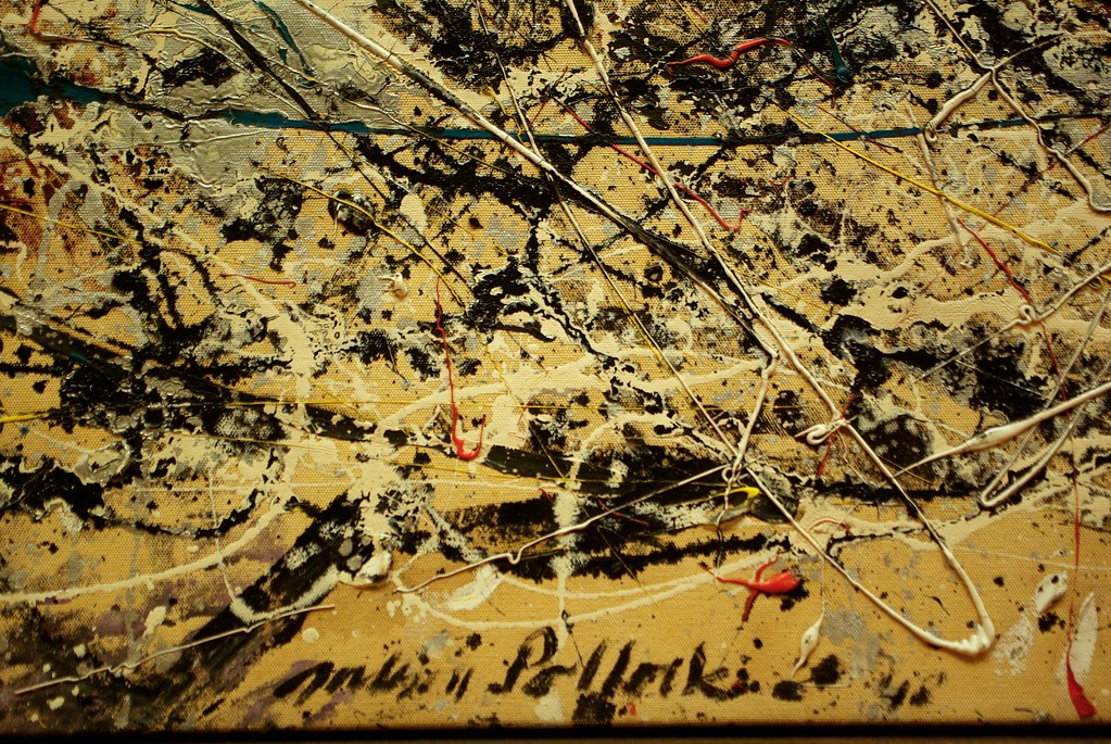 [credit](https://live.staticflickr.com/4006/4506421812_6f2874300c_b.jpg), [licence](https://creativecommons.org/licenses/by-nc/2.0/) ## Seeing is Believing: How the Masters Orchestrated Complements in Famous Art Theory is one thing; seeing it in action, particularly through the masterful hands of art history's giants, is an entirely different, awe-inspiring experience. Let's delve into how these visionaries deliberately employed complementary colors to achieve specific effects, pushing beyond mere representation to infuse their work with profound meaning, psychological depth, and explosive energy. This is where academic concepts truly come alive, providing endless inspiration for any artist or art enthusiast. This is where the academic concepts truly come alive, providing endless inspiration for any artist or art enthusiast. 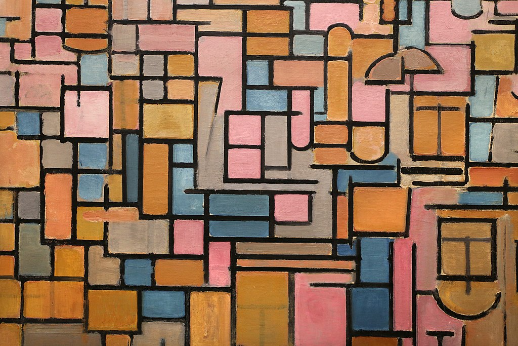 [credit](https://commons.wikimedia.org/wiki/File:Piet_mondrian,_tableau_III,_composizione_in_ovale,_1914_%28stedelijk_museum_amsterdam%29_02.jpg), [licence](https://creativecommons.org/licenses/by/3.0) Let's look at how the masters did it, extracting profound lessons from their deliberate, often revolutionary, choices. Their work isn't just beautiful; it's a living textbook on the power of color. 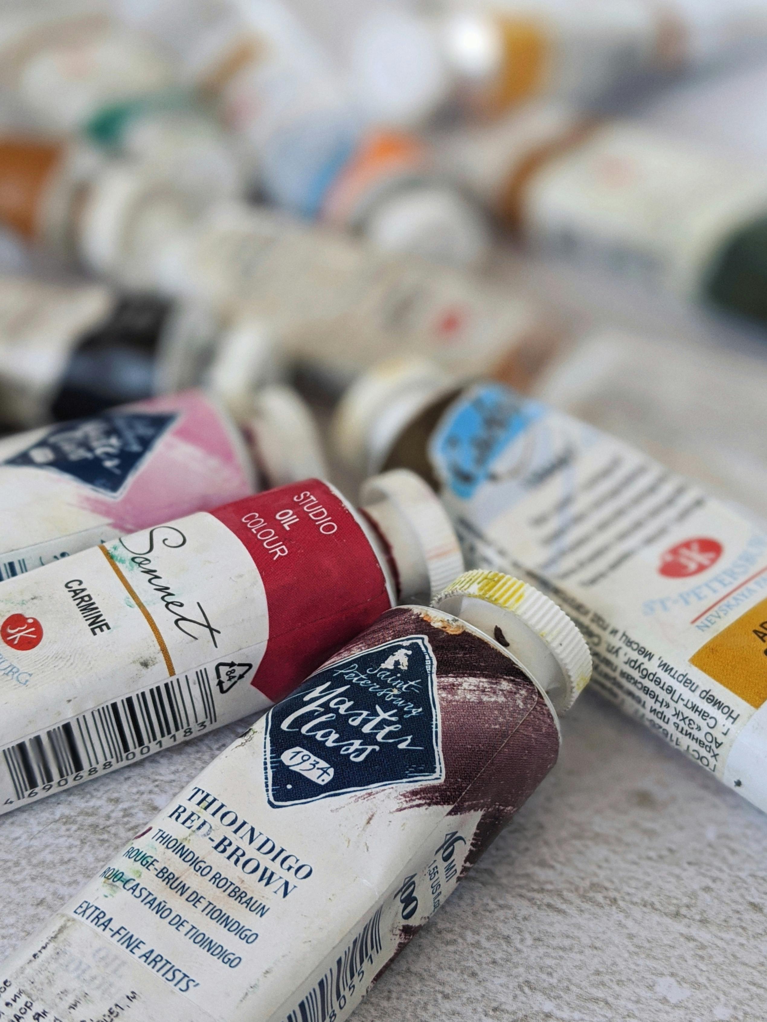 [credit](https://images.pexels.com/photos/4139739/pexels-photo-4139739.jpeg), [licence](https://creativecommons.org/public-domain/) ### Mark Rothko: Subtle Complementary Voids in Color Field Painting While often celebrated for his expansive, luminous color fields, Mark [Rothko](/finder/page/ultimate-guide-to-rothko), a titan of Abstract Expressionism and Color Field painting, offers a profoundly different, yet equally powerful, exploration of complementary principles. Unlike the vibrant clashes of the Fauvists, Rothko's works often involve large, rectangular blocks of color that subtly interact, creating a deep, resonant hum rather than an overt shout. Imagine a deep, meditative blue field hovering above a nuanced, earthy orange – colors that, while not always direct complements in their purest, most saturated form, are chromatically opposed and create an incredible internal tension. These aren't just colors; they're emotional spaces. Rothko masterfully manipulated slight variations in hue, value, and saturation to create vibrations and optical effects that invite quiet contemplation. The subtle contrast between these vast fields makes the colors seem to breathe and expand, drawing the viewer into a profound, almost spiritual experience. It’s a masterclass in how complementary relationships can be used for introspection and deep emotional resonance, rather than mere visual spectacle. He proves that complementary power isn't just about vibrancy, but about profound atmospheric depth and the subtle interplay of opposing forces. It's a reminder that even the quietest conversations between colors can be the most profound. ### Josef Albers: The Science of Color Interaction Another monumental figure in the understanding of color interaction is Josef Albers, whose seminal 1963 book, 'Interaction of Color', became a cornerstone of [modern art](/finder/page/history-of-modern-art) education. While not always focused on *direct* complementary pairs, Albers meticulously explored how colors change when juxtaposed, how our perception of a single hue is dramatically altered by its neighbors. His iconic 'Homage to the Square' series, for instance, often places squares of varying hues within each other, demonstrating how a yellow might appear greener against a violet, or more orange against a blue. He taught us that color is never seen in isolation; it is always in a dynamic, shifting dialogue with its surroundings. Albers' work is a scientific and artistic exploration of how complementary principles, even when subtly applied or implied, create profound optical effects and psychological shifts in perception. He essentially proved, through rigorous experimentation, the inherent relativity of color and the constant 'conversation' that occurs between hues, making him an indispensable figure in understanding the true power of complementary relationships. I often think of his meticulous approach when I'm trying to achieve a specific optical effect in my own abstract compositions. ### Henri Matisse: The Red and Green Power Play in Fauvism 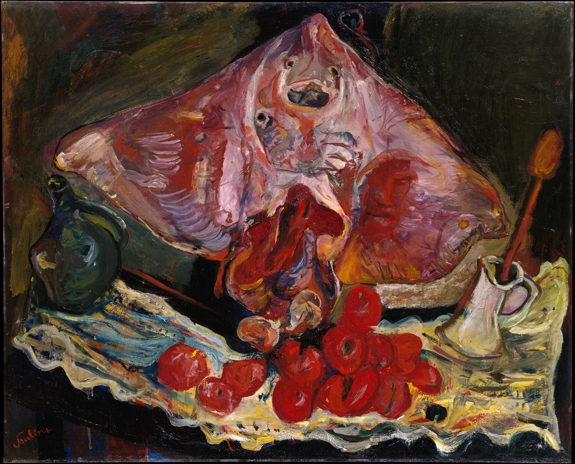 [credit](https://upload.wikimedia.org/wikipedia/commons/b/b5/Still_Life_with_Rayfish_MET_DT4177.jpg), [licence](http://creativecommons.org/publicdomain/zero/1.0/deed.en) [Henri Matisse](/finder/page/ultimate-guide-to-henri-matisse), a leading figure whose work profoundly influenced [how artists use color](/finder/page/how-artists-use-color) and who I admire greatly for his bold choices, masterfully demonstrated the power of complementary colors, often using them not for descriptive realism, but for pure emotional impact and decorative harmony. In his iconic *The Red Room (Harmony in Red)*, the overwhelming, almost oppressive expanse of deep red in the interior could easily have felt flat or suffocating. But Matisse, with his profound understanding of color, deliberately introduced the vibrant, complementary green of the landscape seen through the window. This isn't just a casual touch of green; it's a calculated counterpoint that makes the dominant red feel even richer, more resonant, and profoundly alive. The tension created between the warm, enclosed interior and the cool, expansive exterior is not merely implied; it's dramatically amplified by this precise complementary [color relationship](/finder/page/best-books-on-color-theory), making the entire composition sing with a vibrant, almost pulsating energy. It's a powerful example of how a limited palette, thoughtfully deployed, can achieve maximum expressive force and create a truly memorable visual statement. Matisse wasn’t afraid to use color to express pure joy and vitality. Consider his later 'cut-outs,' where vibrant blues and oranges often dance together, creating a sense of buoyant energy and harmonious movement. His use of these pairings wasn't about illusion, but about creating a direct, emotional experience for the viewer, a celebration of color itself. He understood that these direct oppositions could create a kind of internal glow, making each color more intense and alive in the viewer's eye. His work always reminds me that color isn't just seen; it's *felt*. 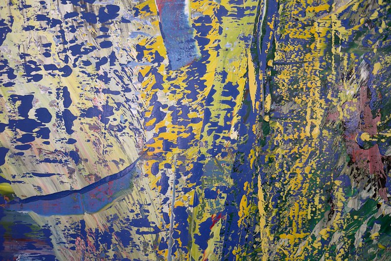 [credit](https://live.staticflickr.com/7275/7548168124_243d637c75_c.jpg), [licence](https://creativecommons.org/licenses/by-nc-nd/2.0/) ### Franz Marc: Pushing the Boundaries with Expressionist Complements  [credit](https://commons.wikimedia.org/wiki/File:Painter_David_Brewster_creating_work_for_the_Art_of_Action_project.jpg), [licence](https://creativecommons.org/licenses/by/1.0) Expressionist painters, like the profound Franz [Marc](/finder/page/franz-marc-color-theory-symbolism), were less concerned with descriptive realism and more with conveying raw emotion and inner experience through color. His work, deeply rooted in the expressive power of [how artists use color](/finder/page/how-artists-use-color), often employs color symbolically and expressively. In *The Bewitched Mill*, for instance, the stark, almost jarring red of the mill wheel isn't meant to be literally red; it's a psychological red, clashing brilliantly and deliberately with the cool, surrounding blues and greens of the landscape. This isn't a serene, peaceful landscape one might passively observe; it's a scene crackling with intense energy, a sense of foreboding or perhaps even a deep, primal life force that he wanted to convey. The bold, near-complementary color scheme here is doing immense heavy lifting, transforming a simple subject into a charged, emotional statement that resonates deeply within the viewer. Marc's use of color embodies a spiritual connection to nature, where hues are imbued with inner meaning and emotional weight, often leading to a [dynamic tension](/finder/page/what-is-dynamic-tension-art) that pulls the viewer into a deeper, more profound engagement with the subject, forcing us to feel rather than just see. His ability to make color speak volumes without direct representation is truly inspiring. ### Joan Miró: Surrealist Play with Primaries and Complements 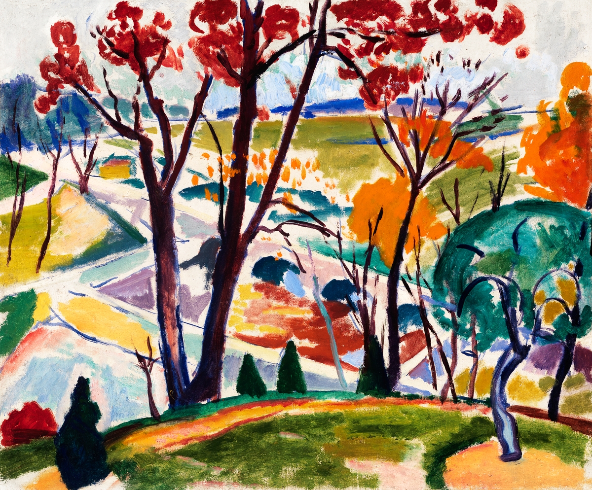 [credit](https://www.rawpixel.com/image/3070907/free-illustration-image-landscape-abstract-painting), [licence](https://creativecommons.org/publicdomain/zero/1.0/) Moving into the whimsical realm of [Surrealism](/finder/page/what-is-surrealism), Joan Miró, while not strictly adhering to formal [color theory](/finder/page/what-is-color-theory) (he was far too much of a free spirit for rigid rules!), often achieved incredibly dynamic compositions through intuitive, yet powerful, complementary pairings. His works frequently feature bold [primary colors](/finder/page/what-are-the-primary-colors) – reds, yellows, and blues – set against their complements or near-complements, creating a playful yet potent visual tension. In pieces like *Figures in a Landscape*, the abstract forms and whimsical figures often practically jump from the canvas due to the contrasting hues. A vibrant blue might find its energy amplified by a splash of orange or a warm yellow, even if not a direct complement, simply because he understood the innate energy of such juxtapositions. His genius lay in using these innate color relationships to evoke a dreamlike, often energetic, atmosphere, showing that even in abstraction and surreal fantasy, the power of complementary colors holds true. Miró's approach to color was less about scientific precision and more about raw [emotional expression](/finder/page/translating-emotion-into-abstract-art-my-process-of-visual-expression) and the creation of a fantastical, often childlike, universe. The dynamic interplay of his chosen hues gives his surrealist landscapes and biomorphic forms a palpable sense of movement and life, inviting the viewer into a world where color is a primary storyteller, speaking directly to the subconscious. It's a testament to the idea that sometimes, instinct is the best guide. 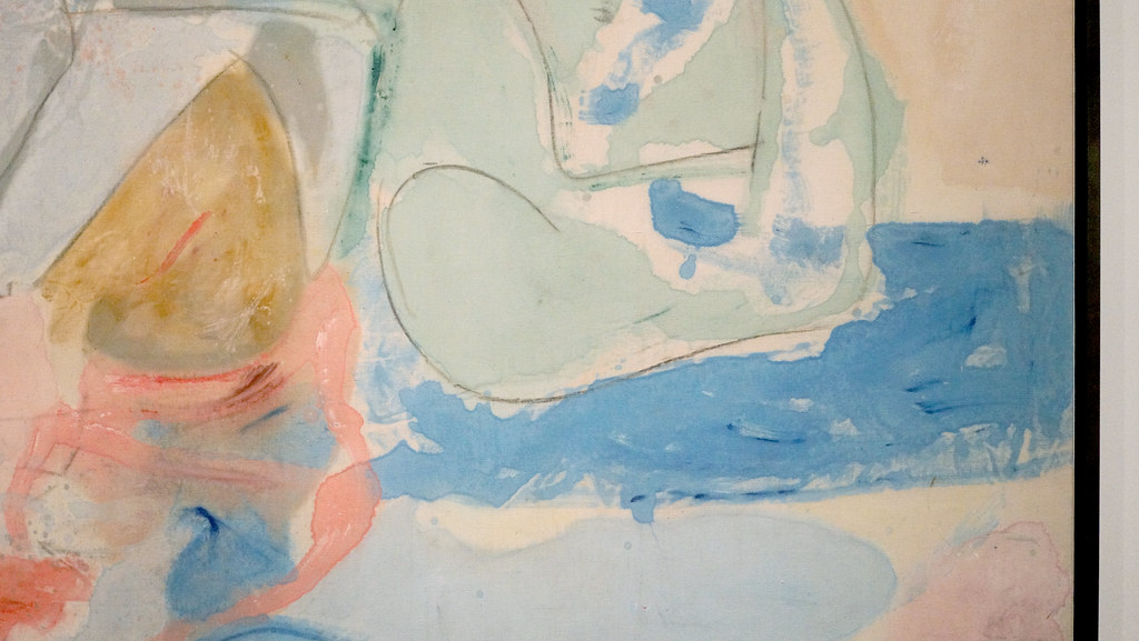 [credit](https://live.staticflickr.com/1809/29039424798_ea4b532566_b.jpg), [licence](https://creativecommons.org/licenses/by-nc-sa/2.0/) ### Georges Seurat: Optical Mixing and Pointillism While not directly about complementary colors in the same expressive, emotional way as Matisse or Marc, [Georges Seurat](/finder/page/who-is-georges-seurat), a pioneer of **Pointillism** and **Neo-Impressionism**, offers a fascinating, almost scientific perspective on color interaction. Seurat's technique involved applying small, distinct dots of pure, unmixed color side by side, allowing the viewer's eye and brain to optically blend them into a single, shimmering hue from a distance. He meticulously studied color theory, including the intricate effects of complementary colors. By strategically placing tiny dots of blue next to orange, or red next to green, he understood that these contrasts would not only create a shimmering vibrancy, allowing light to truly interact with the canvas, but would also optically mix in the viewer's eye. The result? Richer, more luminous, and dynamic colors than if they were physically blended on a palette. This meticulous, almost scientific approach resulted in a unique visual texture and unparalleled luminosity, a kind of internal glow that makes his canvases hum with light. His dedication to this scientific approach to color, as seen in works like *A Sunday Afternoon on the Island of La Grande Jatte*, reveals another powerful application of complementary principles: not just for stark contrast, but for creating a new, dazzling visual experience through careful juxtaposition and the very mechanics of human perception. It’s a testament to how deep an artist can dive into the *how* of color, not just the *what*. It makes you realize how many layers there are to seeing. 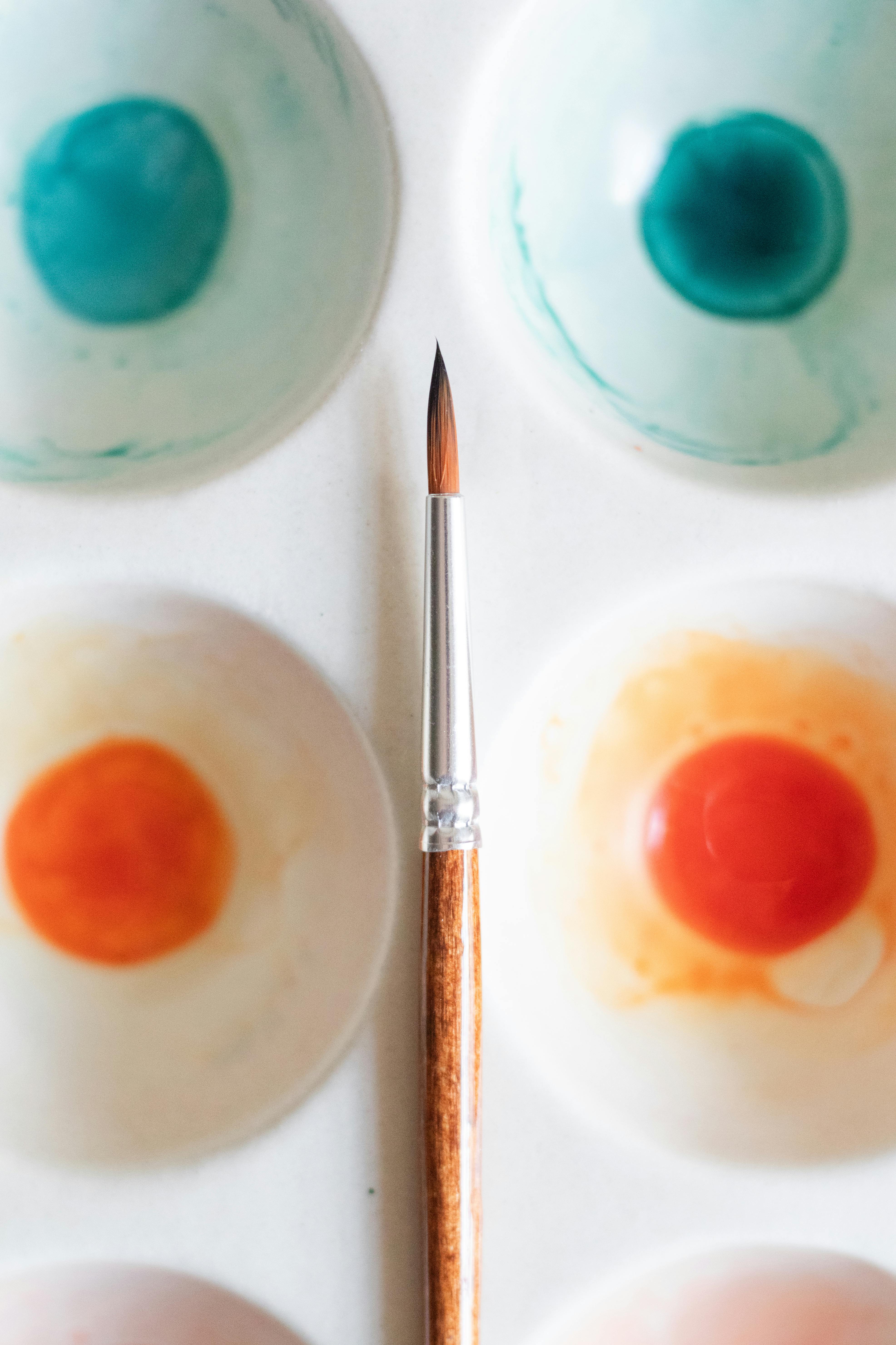 [credit](https://images.pexels.com/photos/17792185/pexels-photo-17792185/free-photo-of-a-palette-with-watercolor-paints-and-a-brush.jpeg), [licence](https://creativecommons.org/public-domain/) 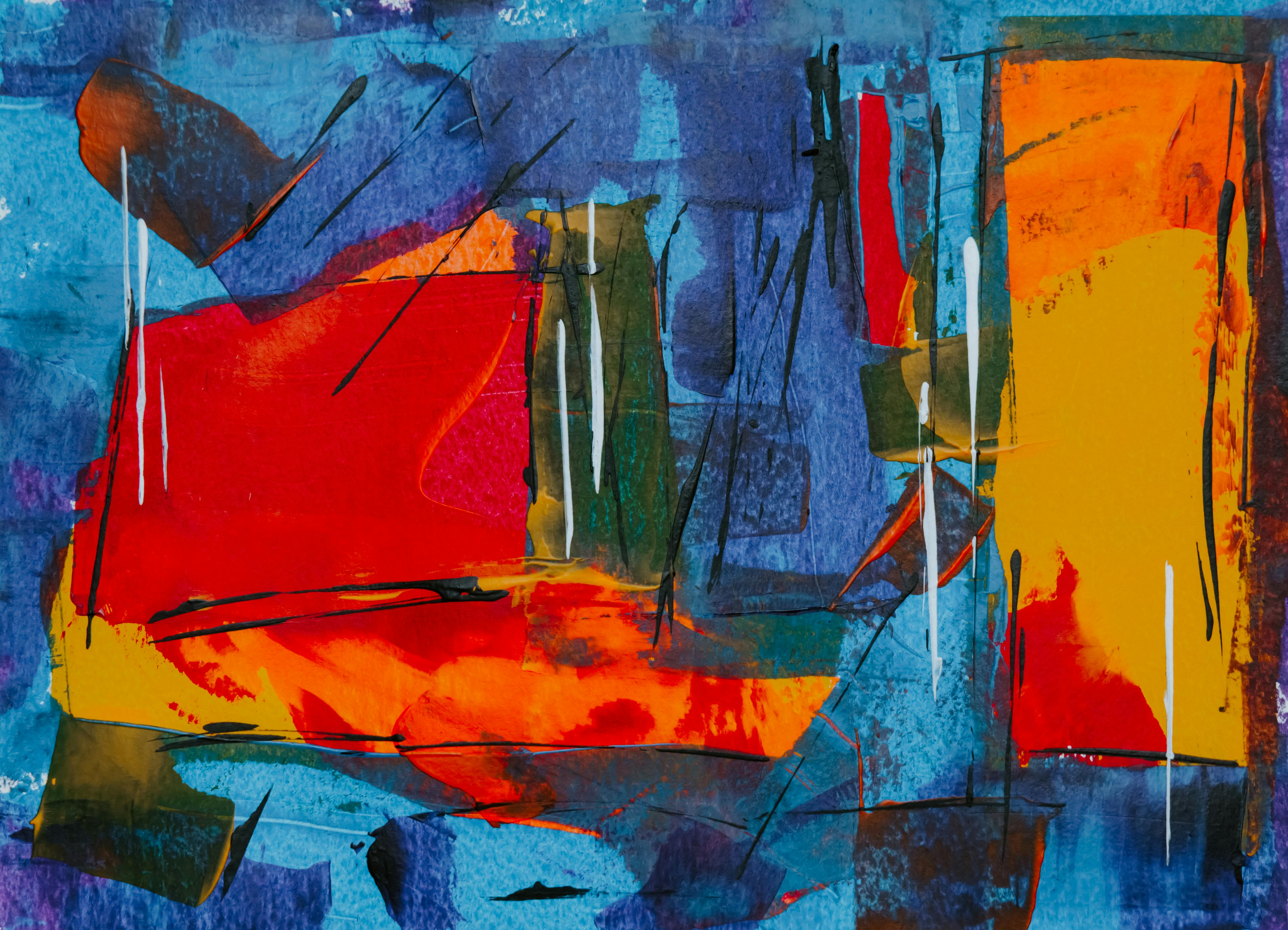 [credit](https://images.pexels.com/photos/1787242/pexels-photo-1787242.jpeg), [licence](https://creativecommons.org/public-domain/)  [credit](https://www.pexels.com/photo/artist-brush-mix-color-oil-painting-8382705/), [licence](https://creativecommons.org/public-domain/cc0/) ### Piet Mondrian: The Pure Geometry of Primary Complements While less about vibrant "pop" and more about structural balance, the works of [Piet Mondrian](/finder/page/ultimate-guide-to-piet-mondrian), a pioneer of the **De Stijl** movement, offer a rigorous exploration of primary colors and their interactions. Though he primarily focused on red, yellow, and blue, often set against a grid of black and white, the inherent complementary relationships (like red and green, yellow and purple, blue and orange) are subtly at play in the overall chromatic balance of his compositions. By reducing his palette to these fundamental elements, Mondrian sought universal harmony and order, a kind of utopian visual language. The dynamic tension created by juxtaposing a primary red against a blue, for example, hints at the underlying complementary principles that provide visual stability and energy even within his highly abstract, geometric framework. His precision reminds us that even the most starkly minimal art benefits from a deep understanding of color theory, demonstrating how even the absence of a direct complement can imply its presence and create a subtle but powerful visual tension that activates the space. This minimalist approach, by carefully considering the weight and interaction of primary hues, still speaks volumes about the power of opposing forces, creating a profound sense of equilibrium. It's a stark beauty that always makes me reconsider the power of simplicity. ### Paul Klee: Orchestrating Color with Poetic Precision Paul Klee, a master of abstraction and a key figure in the Bauhaus movement alongside Itten, approached color with a deeply intellectual yet poetic sensibility. His work often explores complex color relationships, including complementary pairs, not just for their visual impact, but for their ability to convey subtle narratives and emotional states. Klee meticulously studied color theory, developing his own unique systems for organizing and applying hues. You'll find his canvases, sometimes small and intimate, orchestrating delicate balances between complementary colors, where a muted yellow might engage in a quiet dialogue with a soft purple, or a shimmering blue finds its counterpoint in an earthy orange. His use of complements is rarely loud; instead, it's a precise, thoughtful orchestration designed to create an internal luminosity and a harmonious resonance, demonstrating that even in abstract compositions, every color choice is a deliberate and meaningful act. He truly understood how to make colors sing together, even when they were opposites, to create a sense of inner logic and profound beauty. His work always feels like a secret garden of color, full of hidden delights. 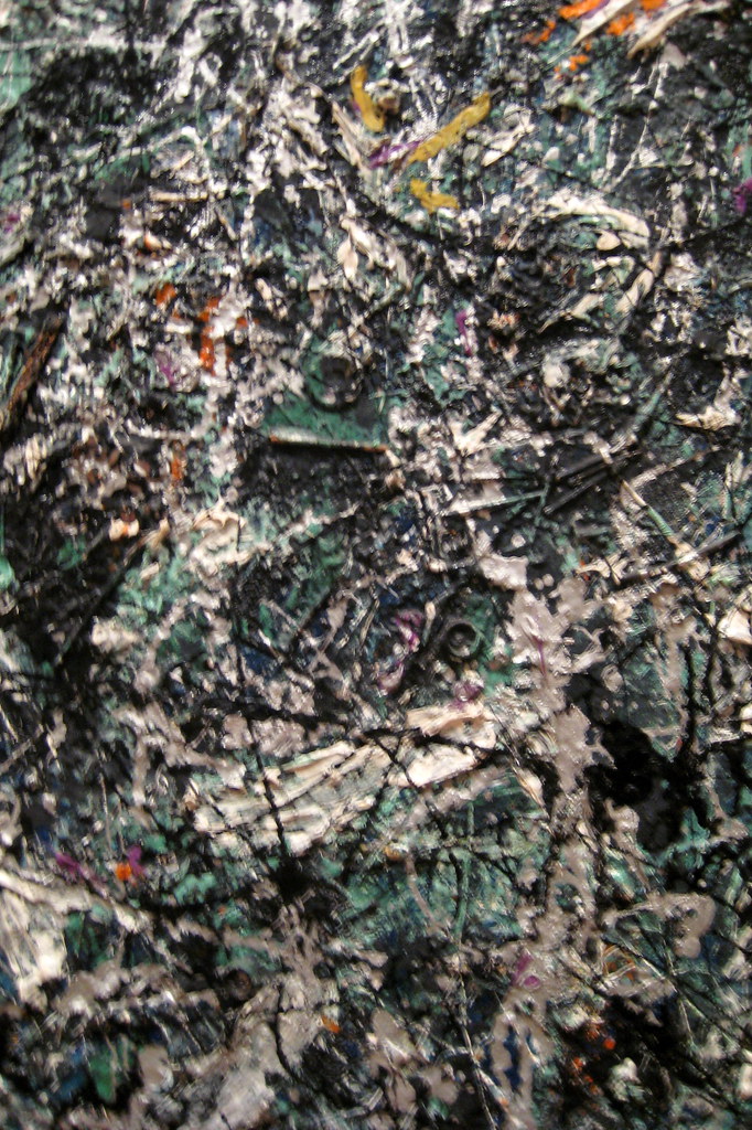 [credit](https://live.staticflickr.com/2062/2386777346_5bf51496cb_b.jpg), [licence](https://creativecommons.org/licenses/by-nc-nd/2.0/) ### Alexandra Exter: Dynamic Complementary Constructs 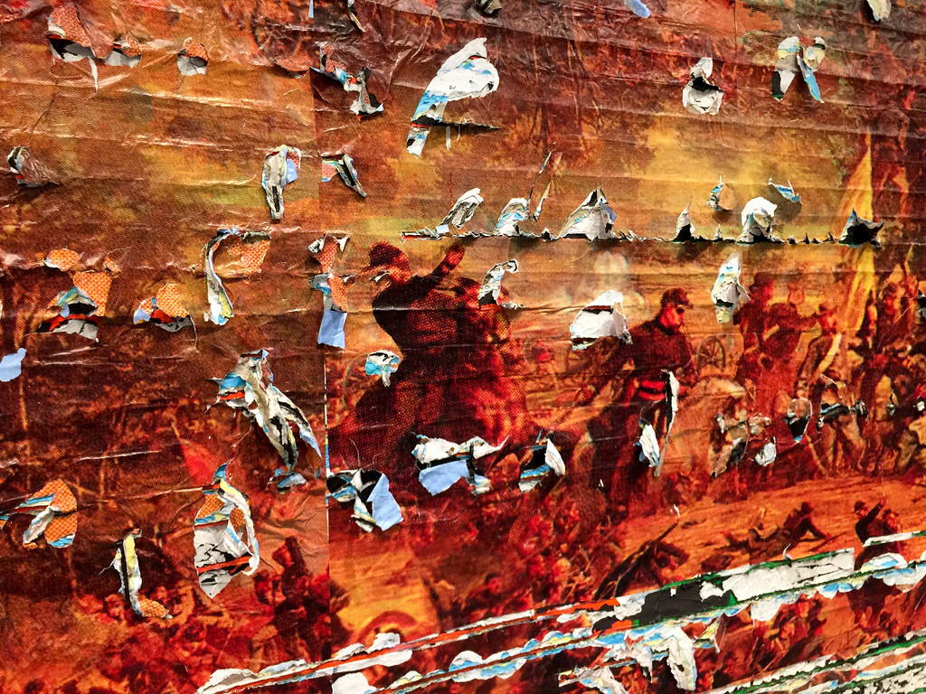 [credit](https://live.staticflickr.com/4579/38453426636_a0217492a2_b.jpg), [licence](https://creativecommons.org/licenses/by/2.0/) Moving beyond the canvas into stage design and other applied arts, figures like Alexandra Exter, a prominent Constructivist artist, utilized complementary colors with radical dynamism. Her theatrical designs and paintings often feature bold, geometric forms in primary and secondary complementary pairings—vibrant reds against deep greens, or electric blues against warm oranges. These weren't subtle suggestions; they were powerful, clashing contrasts designed to create intense visual energy and convey abstract ideas of movement, conflict, and societal change. Exter’s work, deeply rooted in the revolutionary spirit of her time, exemplifies how complementary colors can be used not just for harmony, but for intentional discord, creating a jarring yet utterly compelling visual language that grabs attention and demands interpretation. It’s a powerful reminder that the 'clash' of complements can be a deliberate and potent artistic choice, especially when aiming for a strong, avant-garde statement. Her work makes me think about how art can truly shape an experience, even beyond the [gallery wall](/finder/page/what-is-a-gallery-wall). 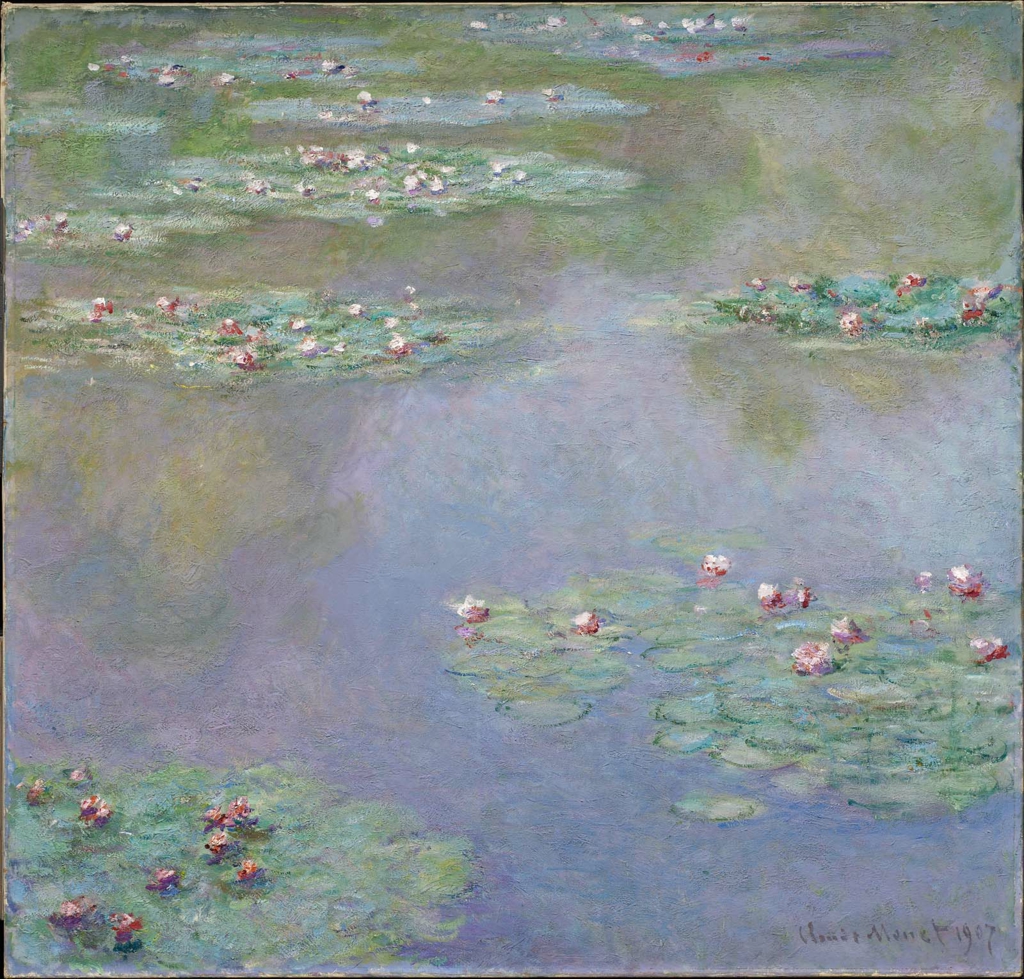 [credit](https://upload.wikimedia.org/wikipedia/commons/5/50/Monet_-_Water_Lilies%2C_1907%2C_19.170.jpg), [licence](https://creativecommons.org/licenses/by-sa/4.0) 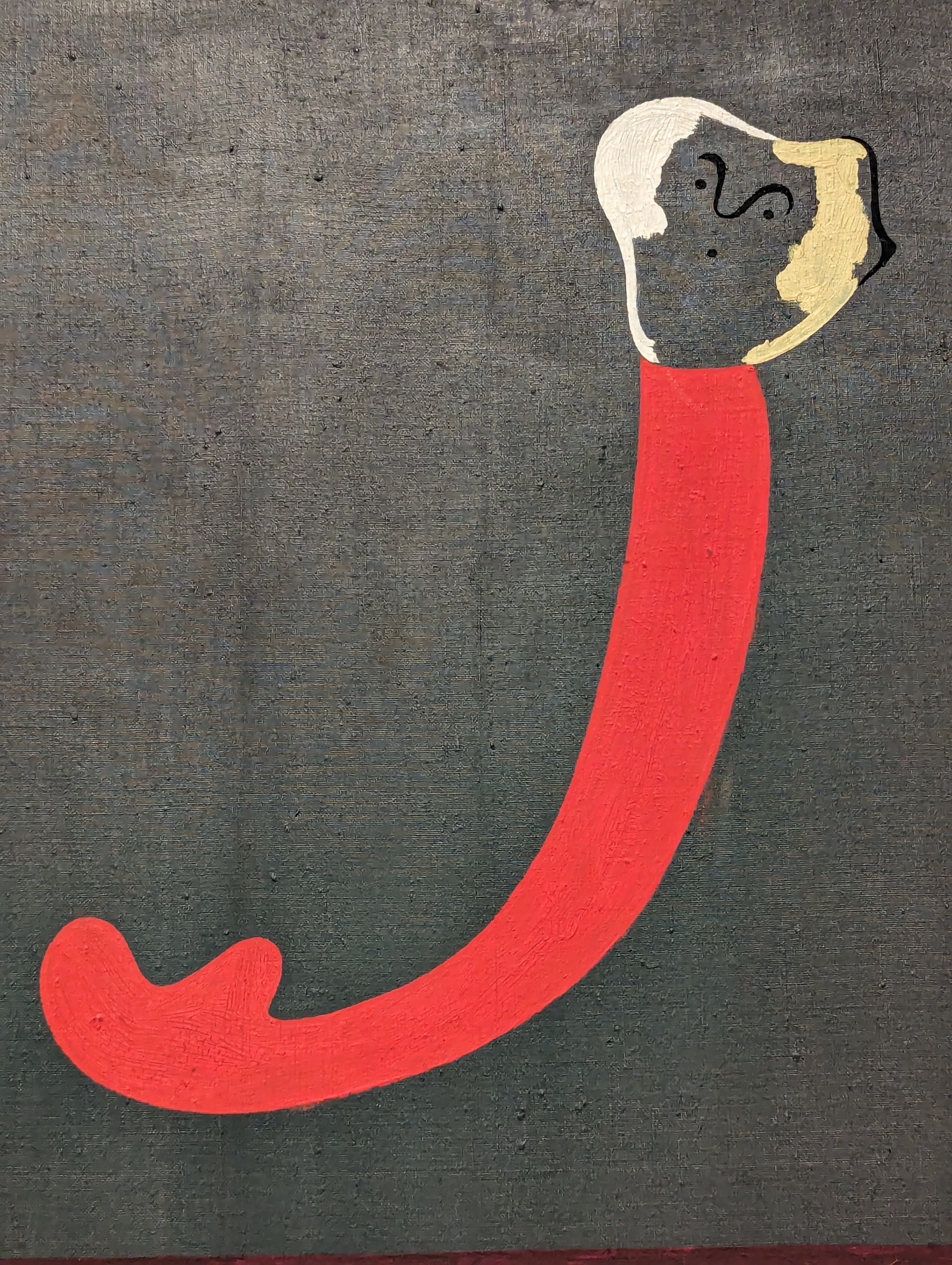 [credit](https://upload.wikimedia.org/wikipedia/commons/5/57/JOAN_MIRO_PAINTING_1938_DETAIL.jpg), [licence](http://creativecommons.org/publicdomain/zero/1.0/deed.en) ## How to Use Them (Without Making Your Eyes Hurt): Practical Application So, you're sold on the idea of these dynamic duos, and you're ready to wield their power, but perhaps you're worried about creating something that screams "Christmas decoration" or "sports team uniform" rather than sophisticated, compelling art? Fair enough, that's a common and completely valid concern! The good news is, harnessing the power of complementary colors without them overpowering your work comes down to a few key principles. The absolute key is **balance** and **intentionality**. It's not about throwing them together randomly, but about orchestrating their interaction, carefully considering not just **hue**, but also **value** (lightness/darkness) and **saturation** (intensity). Mastering these elements, as I discuss in depth in [what is design in art](/finder/page/what-is-design-in-art), is truly what transforms a good color choice into a great one. Let’s dive into how you can wield this power with finesse, making your colors work *for* you. ### Value Contrast: The Unsung Hero One crucial aspect often overlooked when working with complementary colors is **value contrast**. In my opinion, it's the absolute secret ingredient that allows even the most vibrant complements to coexist harmoniously, or to explode with controlled drama. Even a complementary pair can feel perfectly balanced and sophisticated if one color is much lighter or darker than the other, creating a visual hierarchy that guides the eye rather than overwhelming it. A bright, saturated orange against a deep, desaturated blue will have a profoundly different impact than two complements of similar value. Imagine a bright, sunny yellow lemon against a deep, shadowed purple cloth, versus a pastel yellow against a pale lavender – both are complementary, but the former explodes with drama, while the latter sings with gentle harmony. Playing with these aspects allows you to create subtler interactions, prevent your artwork from becoming visually overwhelming, and infuse your pieces with incredible depth and visual sophistication. I find that mastering value is just as important as mastering hue when it comes to impactful compositions, a concept I explore in depth in [what is design in art](/finder/page/what-is-design-in-art) and its foundational elements like [understanding the elements of art: a beginners guide to line, shape, color, and texture](/finder/page/understanding-the-elements-of-art-a-beginners-guide-to-line-shape-color-and-texture). It's about knowing when to whisper and when to shout, visually speaking, and making sure your whispers are just as compelling. ### 1. The 80/20 Rule: Dominance and Accent 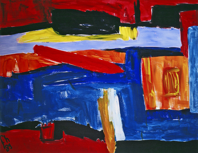 [credit](https://www.flickr.com/photos/abstract-art-fons/30634352376), [licence](https://creativecommons.org/licenses/by/2.0/) The simplest and often most effective way to start incorporating complementary colors is by embracing the **80/20 Rule** (or the principle of dominance and accent). A 50/50 split of two highly saturated, strong complements can indeed be jarring and visually exhausting, almost aggressively competing for attention. I've been there myself, thinking 'more color equals more impact,' only to realize it just made my eyes hurt and viewers quickly looked away! Instead, aim to let one color profoundly dominate your piece – perhaps taking up around 80% or even more of the visual space. Its complement then enters as a small, carefully placed, powerful accent, occupying the remaining 20% or less. This creates a visually harmonious yet [dynamic composition](/finder/page/my-process-for-creating-dynamic-abstract-compositions), much like a well-dressed individual wearing a striking accent piece or a carefully chosen piece of jewelry that elevates the entire ensemble, making it feel complete without being overwhelming. The dominant color establishes the overall mood and atmosphere, creating a broad, enveloping embrace, while the accent color provides the spark, the undeniable focal point, the unexpected twist that elevates the entire piece from merely pleasant to truly captivating. It's about letting one voice lead, and another provide the perfectly timed counterpoint, much like a perfectly arranged musical piece. Think of a vast, serene blue landscape punctuated by a tiny, intensely orange wildflower in the foreground; that flower will explode with visual energy, drawing the eye instantly. Or consider a sophisticated charcoal grey suit with a vibrant yellow pocket square – the small accent electrifies the whole ensemble without overpowering it. This principle is not only about color but about hierarchy and emphasis, crucial to [what is design in art](/finder/page/what-is-design-in-art) and [understanding the elements of design in art: a comprehensive guide](/finder/page/understanding-the-elements-of-design-in-art-a-comprehensive-guide), ensuring that your viewer's eye is always drawn to exactly where you want it to go, creating a compelling visual narrative rather than a chaotic one. It’s a subtle art of manipulation, really. ### 2. Changing the Intensity: Tints, Tones, and Shades This is where the magic of nuance truly comes into play, allowing for endless possibilities beyond those primary-saturated shouts that can feel a bit... well, blunt and unsophisticated if not handled with care. You are absolutely not obligated to use pure, screamingly saturated fire-engine red and kelly green to leverage complementary power, unless that's precisely the statement you want to make! In fact, for a more sophisticated and subtle effect, I often encourage experimenting relentlessly with varying the **intensity**, or chroma, of your complementary pairs. This is a profound game-changer for creating depth, atmosphere, and mood, offering a vast spectrum of emotional expression within these dynamic relationships. It’s like turning down the volume just enough to hear the song properly. Here's how: 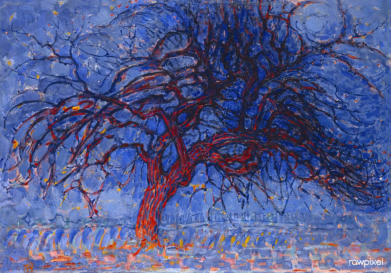 [credit](https://www.flickr.com/photos/vintage_illustration/51913390730), [licence](https://creativecommons.org/licenses/by/2.0/) * **Tints:** Created by adding white to a [pure color](/finder/page/what-is-color-field-painting). This lightens the hue and reduces its saturation, making it feel softer, airier, and more delicate (e.g., pale pink is a tint of red, sky blue is a tint of blue). Tints maintain the hue's inherent temperature but in a gentler manifestation. * **Shades:** Created by adding black to a pure color. This darkens the hue and often deepens its richness, making it feel more serious, dramatic, or mysterious (e.g., maroon is a shade of red, navy blue is a shade of blue). Shades can add gravitas and weight to a composition. * **Tones:** Created by adding gray (which itself can be a mix of black and white, or even two complementary colors mixed together!) to a pure color. This wondrously desaturates the hue, making it more muted, earthy, and sophisticated. Tones often feel more natural and harmonious, ideal for creating subtle transitions, realistic environments, or a sense of quiet introspection (e.g., a dusty rose is a tone of red, an olive green is a tone of green, a warm taupe could be a tone of orange). Tones are truly the unsung heroes of sophisticated palettes. By applying these principles, you can take a vibrant blue and pair it with a rich burnt orange, or a muted, earthy red against a soft, sage green. These are still complementary pairs, maintaining their inherent visual tension, but the effect becomes far more subtle, sophisticated, and harmonious, preventing any unintended "Christmas" vibes and opening up a world of expressive possibilities. This allows for an incredible range of emotional expression within the framework of complementary relationships, from whispered elegance to powerful drama. It's all about making intentional choices, not just defaulting to the loudest options. ### Modifying Complementary Colors: Tints, Tones, and Shades Understanding how to manipulate color intensity is key to nuanced application, transforming direct opposition into subtle dialogues: | Term | Definition | How to Create | Effect on Complementary Pairs | | :--- | :--- | :--- | :--- | | **Tint** | A lighter version of a pure hue. | Add white to a pure color. | Softens the contrast, creates a delicate and airy feel. Ideal for subtle accents or luminous highlights. | | **Shade** | A darker version of a pure hue. | Add black to a pure color. | Deepens the richness, creates drama, mystery, or a grounded feel, adding gravitas without losing vibrancy. | | **Tone** | A desaturated or muted version of a pure hue. | Add gray (or a mix of black and white, or its complementary color!) to a pure color. | Creates sophistication, naturalness, and harmony. Reduces visual noise, making palettes feel more integrated and organic. | Example Tints: * Pale blue and muted peach (tint of orange). Think of a soft spring sky and the gentle bloom of a peach tree. Example Shades: * Navy blue and deep burnt orange (shade of orange). Imagine a dramatic twilight over a desert landscape. Example Tones: * Sage green and dusty rose (tone of red). Picture the serene, faded beauty of an old garden or a vintage textile. ### 3. Explore Complex Color Harmonies: Split-Complementary and Analogous with a Complement Once you're comfortable with basic complementary pairs, you can venture into more complex, yet equally rewarding, color harmonies that leverage the complementary principle. These advanced combinations allow for even richer narratives and nuanced emotional impact in your work, adding layers of sophistication that are truly captivating. 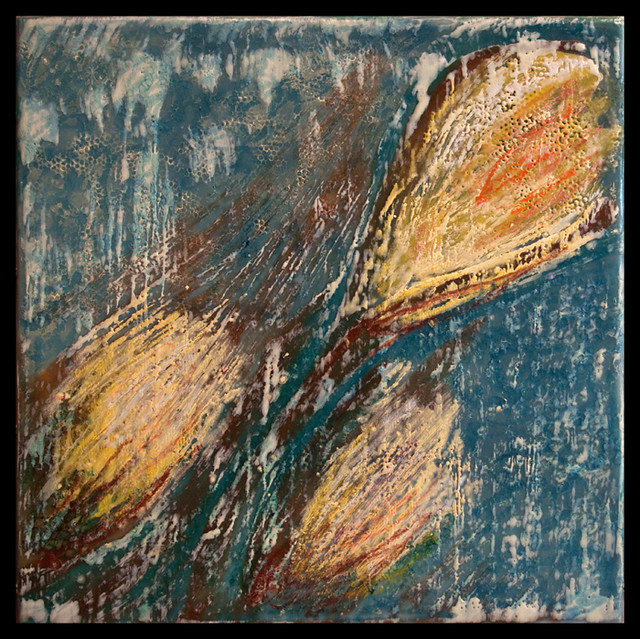 [credit](https://live.staticflickr.com/4068/4517586381_e5a52e9e02_z.jpg), [licence](https://creativecommons.org/licenses/by-nc-nd/2.0/) * **Split-Complementary:** This palette offers a slightly more sophisticated and often more pleasing harmony than a direct complement, offering a broader array of hues without sacrificing visual dynamism. Instead of using the color directly opposite your chosen hue, you use the two colors on either side of its complement. For example, if you start with red, its direct complement is green. A split-complementary palette for red would therefore use blue-green and yellow-green. This triad gives you the dynamic contrast of complements but with less direct tension, providing a broader range of colors while maintaining visual interest and creating a more subtle energy. It's a fantastic way to introduce more complexity and richness without losing the core energy. I often find this scheme strikes a perfect balance between vibrancy and calm. * **Analogous with a Complement:** This is another beautiful way to achieve both harmony and a focal point, striking a delicate balance between serenity and excitement. An **analogous** color scheme uses three or more colors that are next to each other on the color wheel, sharing a common parent hue (e.g., blue, blue-green, and green all share 'blue' or 'green' undertones). They create a sense of harmony, unity, and calm because they flow together naturally, often evoking a sense of peaceful progression, much like the subtle shifts in hues in a tranquil forest or ocean scene. You can dive deeper into these harmonious relationships in my article on [what are analogous colors](/finder/page/what-are-analogous-colors). By adding a single, carefully chosen complementary accent to this harmonious triad (e.g., a vibrant orange as a complement to blue in our example, or a fiery red to a yellow-orange-orange [analogous scheme](/finder/page/what-are-analogous-colors)), you introduce that powerful "pop" effect and create a clear focal point, elevating the entire composition from merely pleasing to truly captivating. It's a method I often turn to in my abstract work to create depth and emphasis, building upon [the definitive guide to understanding color harmonies in abstract art](/finder/page/the-definitive-guide-to-understanding-color-harmonies-in-abstract-art), offering both visual serenity and a potent spark of excitement. 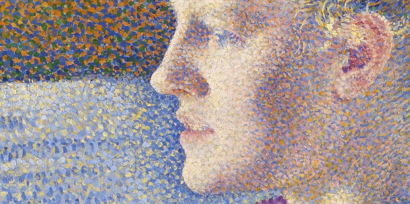 [credit](https://upload.wikimedia.org/wikipedia/commons/6/6f/Maria_S%C3%A8the_at_the_Harmonium_detail.jpg), [licence](https://creativecommons.org/licenses/by-sa/4.0) ### 4. Experiment and Observe Relentlessly Ultimately, understanding complementary colors is not just about memorizing rules; it's about developing an intuitive, almost visceral, feel for their interaction. My biggest advice is always to experiment—to approach it like a curious scientist in your studio. Grab some paints, markers, pastels, or even digital tools and just play. Create small color studies, consciously placing different complements next to each other, mixing them in various proportions, and observing the immediate and lingering effects. Pay close attention to how your eye perceives the colors, how they seem to shift and react in each other's presence. What happens when you mix a tiny bit of red into green? What mood does a desaturated blue-orange pairing evoke versus a highly saturated one? Document your findings, because these personal discoveries are often the most profound! Look at the world around you with new eyes, actively seeking out these dynamic duos. Notice the fiery orange of a setting sun against the deep blue sky, the vibrant red berries nestled amongst lush green foliage, the subtle purple shadows playing on a sun-drenched yellow wall. Nature is the ultimate teacher, constantly demonstrating breathtaking complementary pairings in action, often in the most unexpected and harmonious ways. The more you observe, analyze, and experiment, the more deeply these concepts will sink in, moving from theoretical knowledge to an intrinsic, instinctive part of your artistic language. Pay particular attention to how colors seem to 'feel' in different contexts – do they advance or recede? Do they feel warm or cool? Does the light change their vibrancy? This relentless curiosity is the true secret to mastering color, allowing you to move beyond imitation to truly innovative expression, creating your own unique visual voice. 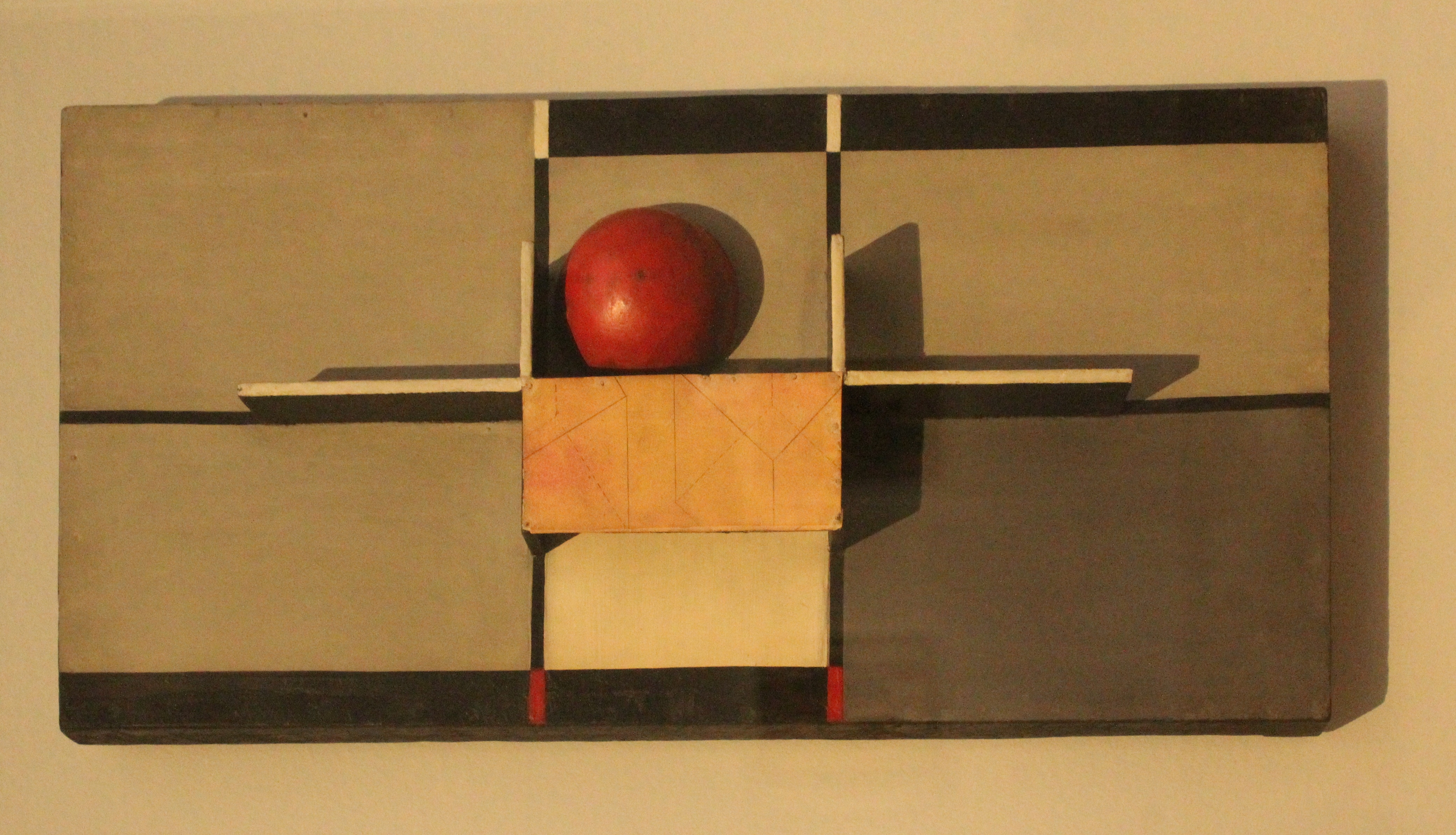 [credit](https://upload.wikimedia.org/wikipedia/commons/0/0b/MERZ_1924%2C_I%2C_Relief_mit_Kreuz_und_Kugel_von_Kurt_Schwitters.jpg), [licence](https://creativecommons.org/licenses/by-sa/4.0) ### Color Studies: Practical Exploration and Journaling One of the most effective ways I've found to internalize these concepts, moving beyond mere intellectual understanding to true intuitive mastery, is through dedicated **color studies**. A [what is a color study in art](/finder/page/what-is-a-color-study-in-art) is essentially a small-scale experiment designed to deeply understand specific color interactions and behaviors. Instead of just reading about blue and orange, paint a small square of blue, then place a smaller orange square next to it, on top of it, or blend them slightly. Observe. How does the blue change the orange's perceived intensity? How does the orange make the blue feel – cooler, warmer, more vibrant? What happens if you mute one of them? These are the kinds of questions that unlock real understanding. 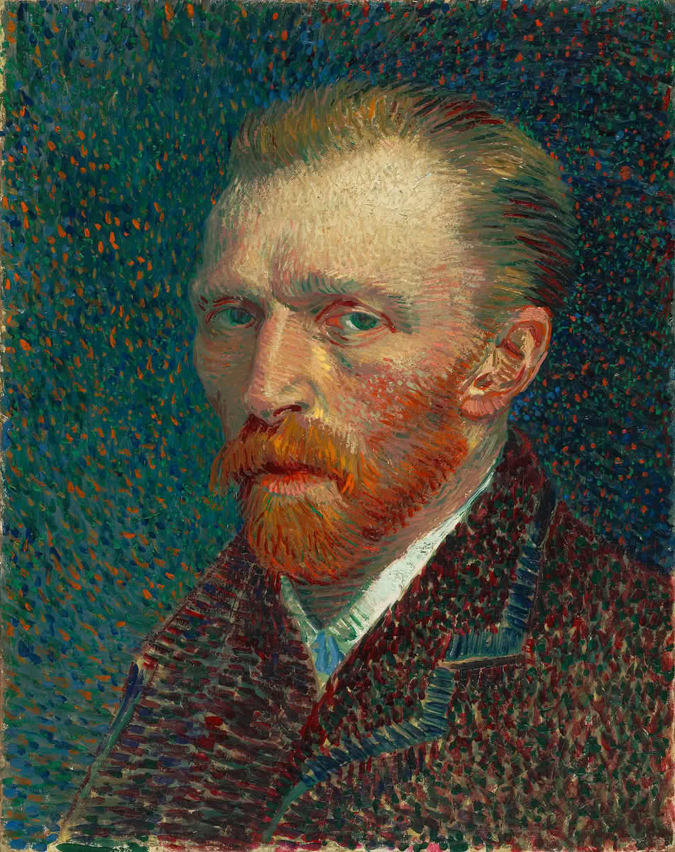 [credit](https://snl.no/pointillisme), [licence](https://creativecommons.org/publicdomain/mark/1.0/deed.no) I often keep a dedicated **color journal** (much like a visual diary) where I document these experiments. I'll note down: * The exact colors used (e.g., "Cadmium Red Light + Phthalo Green"). * The proportions of each color. * The perceived effect (e.g., "Red vibrated intensely," "Green became more earthy," "Resulting brown was warm and luminous"). * Any emotional or psychological responses I felt. This practice isn't just about mixing paint; it's about training your eye and developing a sensory memory for color. It builds an intuitive understanding that theoretical knowledge alone can't achieve. Think of it as a musician practicing scales – seemingly simple, but absolutely foundational to playing a complex symphony later on. The insights you gain from a simple color study can inform entire compositions, helping you make confident and impactful choices with your palette, rather than relying on guesswork. It's the difference between knowing *about* color and truly *feeling* color. 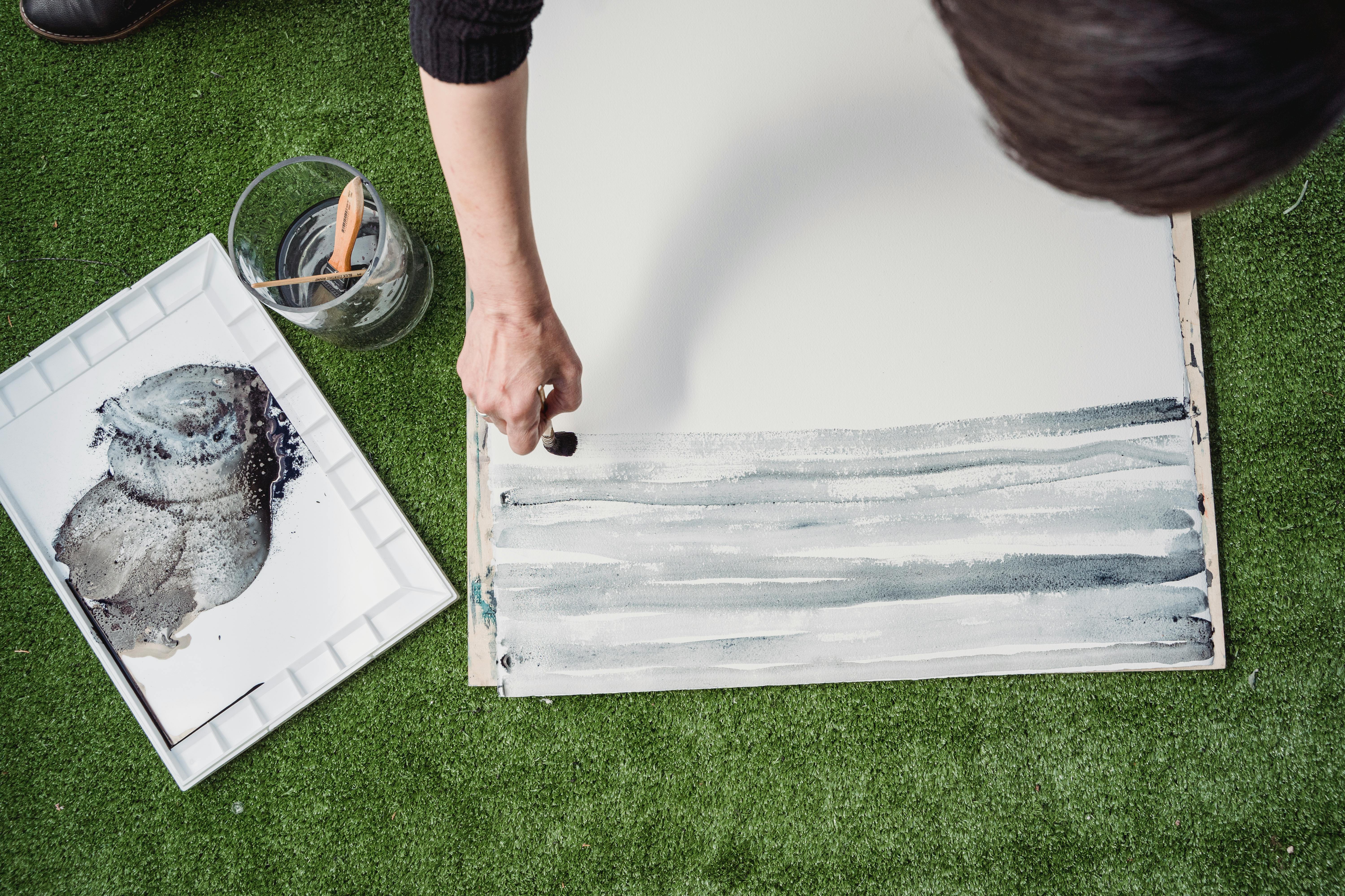 [credit](https://images.pexels.com/photos/7859311/pexels-photo-7859311.jpeg), [licence](https://creativecommons.org/public-domain/) ## Frequently Asked Questions (FAQ) About Complementary Colors It's absolutely natural to have questions, even deep ones, when diving into something as profound and often counter-intuitive as color theory. Trust me, I've asked them all! Here, I've gathered some of the most common inquiries about complementary colors to help solidify your understanding, clear up any lingering mysteries, and perhaps spark a few more 'aha!' moments, because true mastery often comes from asking 'why?' ### What are primary, secondary, and tertiary colors? This is foundational to understanding the color wheel itself, and the building blocks of all color relationships, the very ABCs of color communication! * **Primary Colors:** These are the foundational hues from which all other colors can theoretically be mixed. In traditional RYB (Red, Yellow, Blue) models, these are [Red](/finder/page/what-are-the-primary-colors), [Yellow](/finder/page/what-are-the-primary-colors), and [Blue](/finder/page/what-are-the-primary-colors). They cannot be created by mixing other colors. * **Secondary Colors:** Created by mixing two primary colors in equal proportions. These are [Orange](/finder/page/what-are-secondary-colors) (Red + Yellow), [Green](/finder/page/what-are-secondary-colors) (Yellow + Blue), and [Purple](/finder/page/what-are-secondary-colors) (Blue + Red). Each secondary color is the direct complement of the primary color *not* used to create it (e.g., Green is the complement of Red). * **Tertiary Colors:** Formed by mixing an adjacent primary color with a secondary color. These are often named by combining the primary and secondary (e.g., Red-Orange, Yellow-Green, Blue-Green, Blue-Purple, Red-Purple). Each [tertiary color](/finder/page/beyond-the-primary:-how-i-use-secondary-and-tertiary-colors-to-create-complex-abstract-worlds) also has its own direct complement (e.g., Red-Orange is complemented by Blue-Green). Grasping these fundamental relationships is the first step in truly mastering color, as discussed in detail in my guides on [what are the primary colors](/finder/page/what-are-the-primary-colors) and [what are secondary colors](/finder/page/what-are-secondary-colors), and my broader [the definitive guide to color theory in art: from pigments to psychology](/finder/page/the-definitive-guide-to-color-theory-in-art-from-pigments-to-psychology). It's like learning the notes before you compose a symphony. ### What happens when you mix two complementary colors? This is where the magic of neutralization occurs, and I assure you, it's far from the "muddy mess" many beginners fear! When you mix two complementary colors in roughly equal proportions, they effectively cancel each other out, resulting in a neutral color. This isn't just a dull, flat gray; it's a sophisticated range of nuanced browns, grays, or even deep, rich blacks, depending on the specific hues and their purity. For example, blue and orange mixed together can yield beautiful earthy ochres and deep grays that are infinitely more interesting and versatile than a straight black from the tube. Similarly, red and green can produce a spectrum of warm and cool browns. When mixed in unequal parts, they produce a muted, desaturated version of the dominant color – a crucial technique for creating subtle tones, realistic shadows, or a sense of atmospheric perspective that still harmonizes beautifully with your overall palette, rather than relying on flat black or stark white. It's a core lesson in [how to mix realistic skin tones in oil paint](/finder/page/how-to-mix-realistic-skin-tones-in-oil-paint) and [how to avoid making muddy colors in painting](/finder/page/how-to-avoid-making-muddy-colors-in-painting), opening up a world of subtle color relationships and sophisticated color mixing. This technique is almost always preferable to using black straight from the tube, as the resulting neutrals maintain an inherent vibrancy, complexity, and a harmonious connection to the overall color scheme, feeling more organic and integrated within your artwork. ### What are warm and cool colors, and how do they relate to complements? Understanding warm and cool colors is another fundamental aspect of color theory, intricately linked to complementary pairs. Generally: * **Warm colors** (reds, oranges, yellows) are often associated with energy, passion, sunlight, and heat. They tend to visually advance in a composition, making objects feel closer, demanding attention. * **Cool colors** (blues, greens, purples) are often associated with calmness, serenity, water, and shade. They tend to visually recede, making objects feel further away, creating a sense of spaciousness or depth. The fascinating thing about complementary colors is that they almost always consist of one warm and one cool color (e.g., warm orange and cool blue; warm red and cool green). This inherent warm/cool contrast is precisely what contributes to their dynamic energy, their "pop" effect, and their ability to create a sense of depth and dimension in your artwork. When you place a warm color next to its cool complement, the warmth feels warmer, and the coolness feels cooler, intensifying both. This dynamic interplay is a [powerful tool](/finder/page/art-as-a-tool-for-social-commentary) for manipulating perception and mood, guiding the viewer's eye and influencing emotional response, almost like having a secret weapon in your palette. ### Are black and white complementary colors? No, fundamentally, black and white are not considered complementary colors in the traditional sense of hue relationships. They exist on the spectrum of **value** (lightness and darkness), rather than **hue** (the pure color itself). They are often referred to as achromatic neutrals. While they are indispensable for creating contrast, defining form, and altering the lightness or darkness of colors, they don't engage in the same energetic opposition as complementary hues. They serve as vital supporting actors, enhancing the drama and impact of any color combination, including complementary pairs, without being complements themselves. However, their use is absolutely crucial in manipulating the value and saturation of *any* color, including complementary pairs, making them indirectly essential to successful complementary schemes by offering control over lightness, darkness, and overall intensity. Think of them as the stage upon which the colorful drama of complements plays out, setting the scene for all the vibrancy. 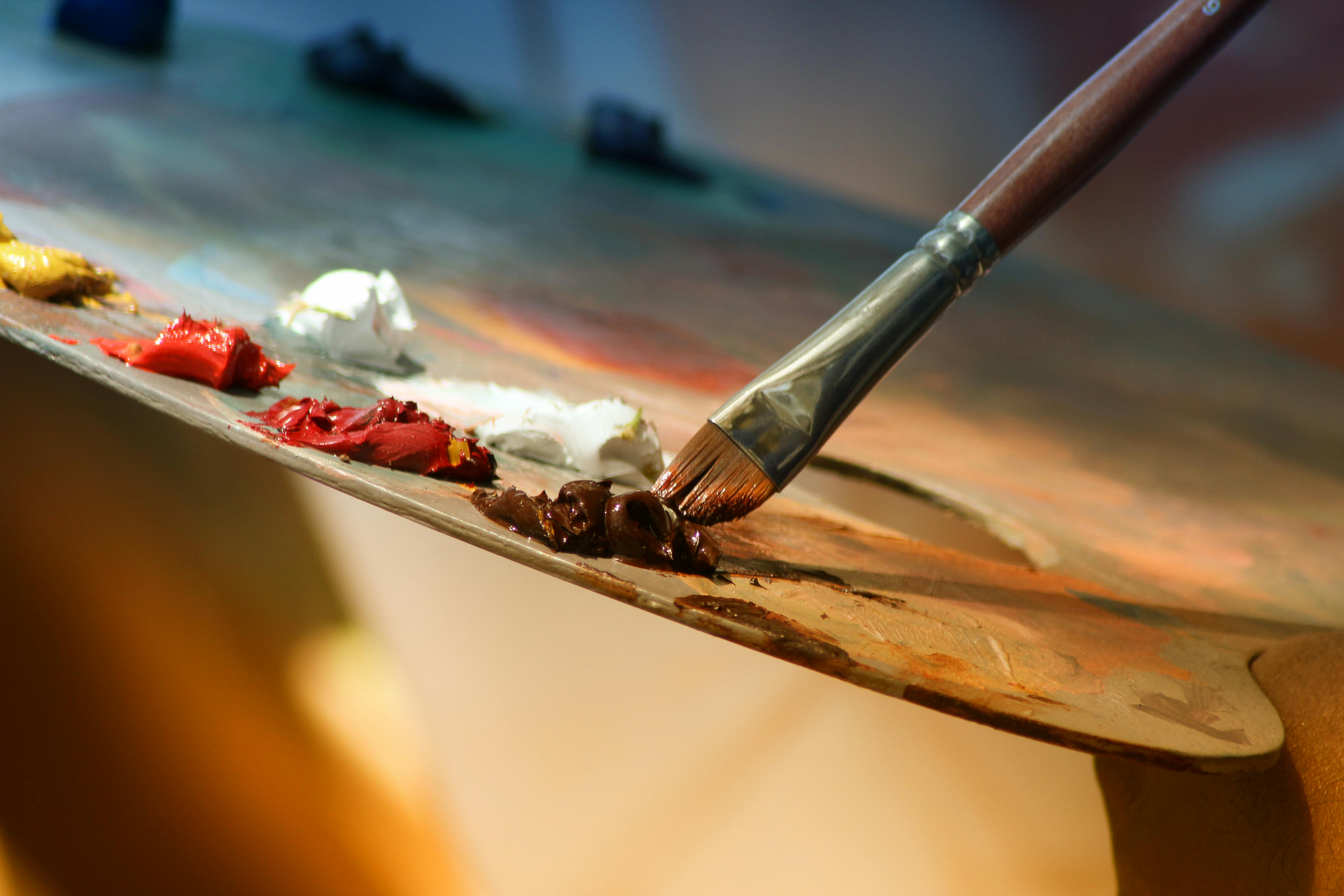 [credit](https://images.pexels.com/photos/102127/pexels-photo-102127.jpeg), [licence](https://creativecommons.org/public-domain/) ### Can complementary colors be used in black and white art? While "complementary colors" technically refer to hues on the color wheel, their underlying principle – **contrast** – is absolutely relevant to black and white (monochromatic) art. In black and white, artists leverage **value contrast** (the difference between light and dark) to create the same kind of visual tension, focal points, and emotional impact that complementary colors provide in full color. A composition with a strong range from deep blacks to bright whites, strategically placed, can be just as dynamic and compelling as a vibrant color piece. So, while you won't find specific complementary *hues*, the *spirit* of complementary contrast is very much alive and crucial in the monochromatic realm. It's about translating the principle of "opposites attract" into the language of light and shadow, and indeed, it's foundational to [understanding the elements of art: a beginners guide to line, shape, color, and texture](/finder/page/understanding-the-elements-of-art-a-beginners-guide-to-line-shape-color-and-texture) or any visual composition. ### What are split-complementary and triadic color schemes? These are more advanced color harmonies that build upon the complementary principle, offering artists and designers even more nuanced palettes! * A **split-complementary** scheme offers a slightly more sophisticated and often more pleasing harmony than a direct complement, providing a broader array of hues without sacrificing visual dynamism. Instead of using the color directly opposite your chosen hue, you use the two colors on either side of its complement. For example, if you start with red, its direct complement is green. A split-complementary palette for red would therefore use blue-green and yellow-green. This triad gives you the dynamic contrast inherent in complements but with less direct, aggressive tension, providing a broader range of colors while maintaining visual interest and creating a more subtle, enveloping energy. It's a fantastic way to introduce more complexity and richness without losing that essential core energy. * A **triadic** color scheme uses three colors that are evenly spaced around the color wheel, forming a perfect triangle (e.g., Red, Yellow, Blue; or Orange, Green, Purple). This creates a vibrant and balanced harmony, as each color is equidistant from the others. While not directly using complementary pairs, the inherent balance of a triadic scheme can be enhanced by understanding the complementary relationships that exist within and between its colors. These harmonies are explored in greater depth, with many more examples and practical tips, in my guide to [the definitive guide to understanding color harmonies in abstract art](/finder/page/the-definitive-guide-to-understanding-color-harmonies-in-abstract-art). The key takeaway is that these schemes offer expanded palettes while still leveraging the fundamental principles of complementary contrast for visual interest, making your color choices feel deliberate and dynamic. ### How do complementary colors impact readability in design? In design, particularly graphic and web design, the judicious use of complementary colors can significantly impact readability and user experience. When used as accents for call-to-action buttons, headings, or important information against a dominant, less saturated background, they create immediate visual hierarchy and draw the eye, making key elements pop. However, if two highly saturated complementary colors are used for text and background in equal measure (e.g., bright red text on a bright green background), the effect can be jarring, cause **chromostereopsis** (where colors appear to vibrate or shimmer, making them hard to focus on), and severely hinder readability. The key is applying the principles of dominance and accent, and playing with value and saturation, to ensure contrast enhances clarity rather than creating visual fatigue. It's a delicate balance between impact and legibility, always prioritizing the user's ease of consumption, especially for diverse audiences and those with visual impairments. This is a crucial consideration for inclusive design. ### ### Do complementary colors always have to be vibrant? Absolutely not! This is a common misconception. While highly saturated complementary colors create that famous "pop," varying their intensity, value, and temperature allows for incredible subtlety and sophistication. As discussed in the "Changing the Intensity: Tints, Tones, and Shades" section, using tints (adding white), shades (adding black), or tones (adding gray) of complementary colors can create soft, harmonious, and elegant palettes. Think of a muted sage green paired with a dusty rose, or a deep navy blue alongside a rich, burnt orange. These are still complementary pairs, but their subdued intensity creates a completely different mood – one of quiet sophistication rather than overt dynamism. The power of complements lies fundamentally in their unique opposing relationship, not necessarily their raw, unadulterated saturation. It's about how they react to each other, not how loudly they shout individually, and this nuanced approach is often where the most profound artistic statements are made. ### ### What is a color discord, and when is it used? A "color discord" occurs when colors clash rather than harmonize, often creating a jarring or unsettling visual effect. While it might sound like something to avoid, deliberate color discord can be a powerful artistic tool. Artists sometimes employ discordant palettes to evoke feelings of tension, anxiety, conflict, or unease, challenging the viewer's comfort and forcing a deeper engagement with the artwork. It can be used to disrupt expectations, create a sense of rebellion, or simply to make a very strong, unconventional statement. It's about using color *against* harmony to achieve a specific emotional or intellectual impact, and in the right hands, it can be incredibly effective and memorable, as seen in some avant-garde [art movements](/finder/page/famous-art-movements-timeline). I sometimes use a touch of discord to create a sense of unease or dynamic energy in my own work. ### ### How does context influence complementary colors? Context is *everything* when it comes to color! The perceived intensity, warmth, or coolness of a complementary color can drastically change depending on the colors surrounding it. For example, a muted green might appear more vibrant when placed next to a soft red, but less so next to a bright yellow. The size of the color area, its texture, the lighting, and even the viewer's own physiological and psychological state can all subtly alter how we experience these powerful pairs. This is the essence of what artists like Josef Albers explored in 'Interaction of Color' – proving that colors are never seen in isolation, but are always in a dynamic dialogue with their environment. Always evaluate your complementary choices within the full context of your composition, considering factors like adjacency, quantity, and quality of light. It's a reminder that there are no absolute rules, only fluid interactions.  [credit](https://www.flickr.com/photos/gandalfsgallery/27744325407), [licence](https://creativecommons.org/licenses/by-nc-sa/2.0/) ### ### How do complementary colors affect visual perception and mood? Complementary colors have a profound impact on both visual perception and emotional mood. Visually, when placed side-by-side, they create **simultaneous contrast**, making each other appear more vibrant, saturated, and optically intense—they seem to 'pop' or vibrate. This dynamic tension engages the eye more actively than analogous or monochromatic schemes, pulling the viewer right into the artwork. Emotionally, this high contrast can evoke a range of feelings: * **Excitement and Energy:** Highly saturated complements can create a sense of dynamism and exhilaration, often used in energetic art or to grab attention in advertising, making a clear, bold statement that demands attention. * **Tension and Conflict:** If used aggressively or in equal measure, they can generate visual discord, which can be deliberately employed to convey unease, drama, or a challenging atmosphere, forcing the viewer to confront the message. It's a powerful tool for storytelling. * **Balance and Harmony:** When one complement dominates and the other acts as a subtle accent, or when their values and saturations are carefully adjusted, they can create a sophisticated harmony that feels complete and visually satisfying, providing a sense of dynamic equilibrium and visual richness. It’s a delicate dance. * **Depth and Dimension:** The inherent warm/cool contrast within most complementary pairs also helps create a sense of depth, with warm colors often appearing to advance and cool colors to recede, adding a spatial dimension to your work, making flat surfaces feel expansive and immersive. Ultimately, they provide artists with a powerful tool to control the viewer's gaze, amplify specific elements, and imbue their work with specific emotional and psychological resonance, as explored in [the emotional language of color in abstract art](/finder/page/the-emotional-language-of-color-in-abstract-art). They are truly an artist's secret weapon for emotional impact. ### ### Are analogous and complementary colors mutually exclusive? No, absolutely not! In fact, some of the most sophisticated and dynamic color palettes combine both principles. You can create an **analogous-with-a-complement** scheme, as discussed in the "Explore Complex Color Harmonies" section. This involves building a harmonious base with [analogous colors](/finder/page/what-are-analogous-colors) (colors next to each other on the color wheel) and then introducing a small, carefully chosen accent of a complementary color. This is a technique I use often to create a beautiful tension within a cohesive palette. 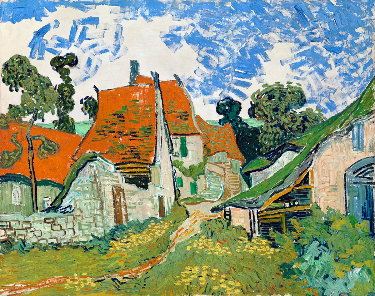 [credit](https://www.rawpixel.com/image/3866294), [licence](https://creativecommons.org/publicdomain/zero/1.0/) This technique offers the best of both worlds: * The **serenity and unity** of the analogous colors provide a smooth, flowing foundation, preventing the composition from feeling chaotic. * The **"pop" and focal point** provided by the complementary accent introduces visual excitement and draws the eye to a specific area. I often use this approach in my abstract work when I want to create a rich, enveloping mood that still has a clear point of interest, a little 'spark' that ignites the whole piece. It’s a wonderful way to achieve complexity without sacrificing harmony, creating a visual narrative that whispers and shouts in all the right places. It's like having your cake and eating it too, but with colors! ### How do I find a color's exact complement? It's actually quite intuitive once you visualize the color wheel! To find a color's exact complement, you simply look **directly across the color wheel** from your chosen hue. This applies consistently across primary, secondary, and tertiary colors. For instance: * The complement of **Red** is **Green**. * The complement of **Yellow** is **Purple**. * The complement of **Blue** is **Orange**. * For tertiary colors, the same principle holds: the complement of **Red-Orange** is **Blue-Green**. The complement of **Yellow-Green** is **Red-Purple**. The complement of **Blue-Violet** (or Blue-Purple) is **Yellow-Orange**. This intuitive pairing on the color wheel makes it a go-to tool for quick and effective color choices. A good color wheel, whether physical or digital, is an artist's best friend for quickly identifying these crucial pairings. It's a tool I find myself referencing constantly, even after years of practice, because it instantly reveals the inherent balance and tension that lies within the color spectrum. For those just starting out, there are many excellent free online color wheel tools that can help you visualize these relationships instantly – you simply select a color, and it will show you its direct complement, as well as analogous, triadic, and split-complementary options. This kind of hands-on, visual exploration is invaluable for truly grasping the logic of color theory and seeing it in action, much like my early days experimenting with the basic [what are the primary colors](/finder/page/what-are-the-primary-colors) and [what are secondary colors](/finder/page/what-are-secondary-colors). It's a cheat sheet for instant color harmony (or dynamic discord!). ### How can complementary colors be used in non-artistic fields? Beyond the traditional canvas and fine art, complementary colors are a fundamental tool in an astonishing array of creative and practical fields, often influencing our perceptions without us even realizing it:  [credit](https://images.pexels.com/photos/8699309/pexels-photo-8699309.jpeg), [licence](https://creativecommons.org/public-domain/) * **Graphic Design:** This is where complements truly shine for immediate, undeniable impact. Used for striking logos, captivating advertisements, and intuitive web design, they ensure elements stand out, capture immediate attention, and create a memorable brand identity that sticks in your mind. Think of a vibrant blue background making an orange call-to-action button feel utterly irresistible, or a brand using red and green to communicate both aggressive energy and eco-friendliness, depending on the chosen saturation and context. Designers also leverage them to create clear visual hierarchies, directing the user's eye to key information and guiding their journey through a layout, creating a compelling journey for the viewer. * **Fashion Design:** From haute couture runways to everyday street wear, designers frequently pair complementary colors to create bold, eye-catching outfits, or to add a dynamic, sophisticated accent to a more subdued palette. A splash of emerald green can make a rich maroon dress truly pop, or a vibrant yellow scarf against a deep purple coat can turn a simple outfit into a statement piece. It’s all about creating visual interest and intentional contrast and making a strong statement that expresses personality and style. * **Branding & Marketing:** Many successful brands leverage complementary color schemes to create memorable and impactful visual identities that communicate energy, innovation, or specific brand values. Think of famous logos that rely on this dynamic tension to stand out in a crowded market, instantly recognizable due to their impactful color choices. It’s a psychological shortcut to brand recognition. * **Interior Design:** Strategically applied, complementary colors can utterly transform a space, infusing it with character and dynamic balance. A room with calming, predominantly blue walls, for example, can instantly come to life with just a few strategically placed orange throw pillows, a piece of [abstract art](/finder/page/what-is-abstract-art) featuring bold orange accents, or even a statement burnt orange armchair. The blue provides a calm, expansive base, and the orange injects energy, warmth, and a clear focal point, creating a dynamic yet wonderfully balanced ambiance that feels both inviting and stimulating. It prevents a room from feeling flat, monotonous, or devoid of personality, turning it into a curated experience. * **Photography:** In visual composition, photographers are masters of using complementary colors to enhance depth, draw intense focus to a subject, or create a particular mood. A golden hour sunset (saturated oranges and yellows) against a deep blue sky is a classic, naturally occurring example of this complementary magic, creating breathtaking drama and a palpable sense of warmth against coolness. It's how they make an image *pop* and tell a story with light and shadow, directing the viewer's gaze with masterful control. * **Film and Theater:** Cinematographers, set designers, and costume designers are absolute masters of this subtle manipulation. They use complementary lighting (e.g., warm orange gels on lights for a cozy interior, contrasted with cool blue moonlight spilling outside a window) and set dressing to heighten emotional impact, create specific atmospheres, or establish clear visual separation between characters or environments. This expertly directs the audience's gaze, influences their mood and perception of the scene, and can even subtly foreshadow events or character conflicts, enriching the narrative and making it more immersive. * **Nature and Landscape:** Perhaps the ultimate teacher, nature itself is the ultimate master of complementary colors. Observe a fiery orange sunset against a deep blue sky, vibrant red berries nestled among lush green foliage, or yellow flowers blooming against purple mountains. These natural pairings are instinctively pleasing and demonstrate the inherent balance and effortless beauty of complements, always harmonizing in their own way, providing endless inspiration for artists and designers alike. * **Data Visualization:** In charts and graphs, using complementary colors can help differentiate data sets clearly and highlight specific trends or contrasts, making complex information more digestible and impactful. They can guide the eye to crucial insights, making data storytelling more effective and persuasive. Their universality stems from their deep impact on human visual perception. ### Can I use complementary colors in home decor? A thousand times yes! It's not just for paintings; it's a fantastic, foundational principle for interior design, fashion, and even garden planning, allowing you to infuse spaces with intentional energy and balance. Imagine a room with soothing, predominantly blue walls – it can instantly come to life with just a few strategically placed orange throw pillows, a piece of abstract art featuring bold orange accents, or even a statement burnt orange armchair. The blue provides a calm, expansive base, and the orange injects energy, warmth, and a clear focal point, creating a dynamic yet wonderfully balanced space that feels both inviting and stimulating. It's about making your home a curated experience, a space that reflects your intentionality with color and expresses your personality. 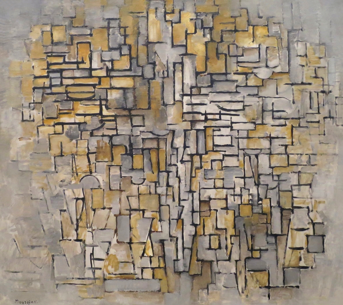 [credit](https://www.rawpixel.com/image/3894575/illustration-image-art-vintage), [licence](https://creativecommons.org/publicdomain/zero/1.0/) Similarly, a vibrant yellow floral arrangement will absolutely sing with visual energy against a deep purple tablecloth, or a subtle red accent in a predominantly green garden will draw the eye, creating moments of captivating visual interest. Understanding this relationship is one of the core [what is design in art](/finder/page/what-is-design-in-art) that translates perfectly and powerfully to the real world, allowing you to curate environments that feel both stimulating and harmoniously inviting. For more specific guidance on incorporating art and color into your living spaces, consider articles like [decorating with abstract art in industrial chic interiors: raw beauty meets bold expression](/finder/page/decorating-with-abstract-art-in-industrial-chic-interiors-raw-beauty-meets-bold-expression) or [decorating with abstract art in eclectic interiors](/finder/page/decorating-with-abstract-art-in-eclectic-interiors) for tailored advice. The trick, as always, is about balance and the 80/20 rule – let one color dominate, and use its complement to provide those delightful, impactful sparks of visual interest that tie the whole space together. It's a way to truly make a space feel *yours*. 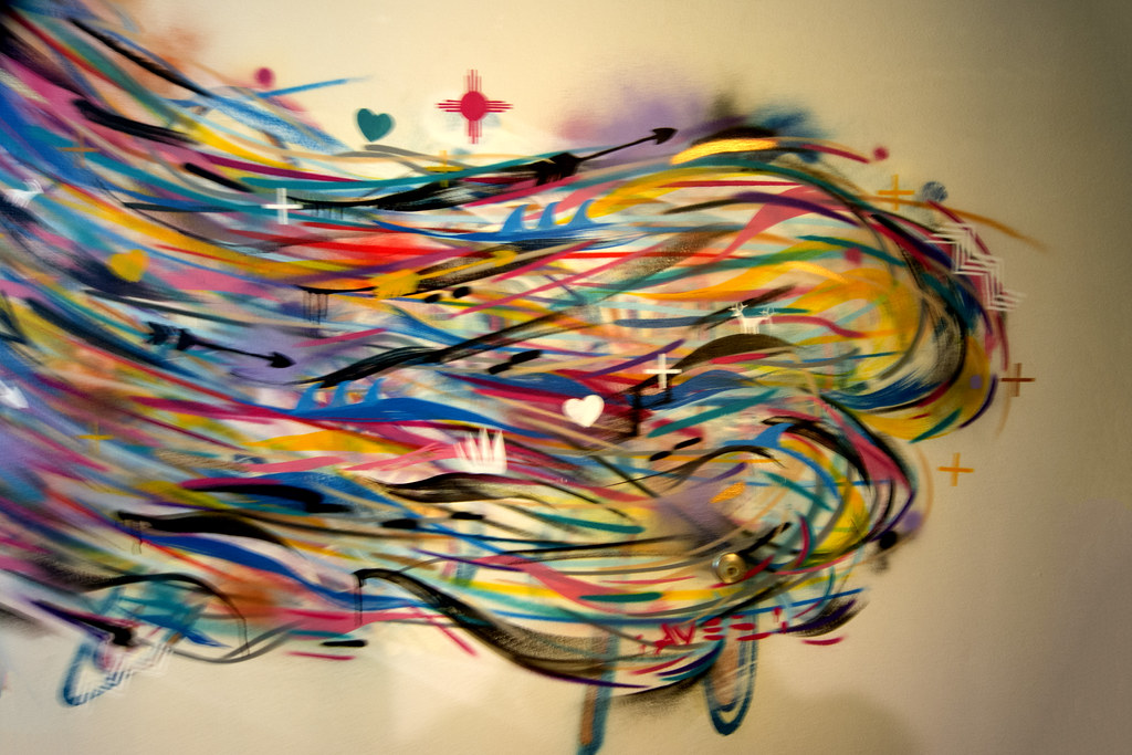 [credit](https://live.staticflickr.com/2940/33246926773_4d63fe20de_b.jpg), [licence](https://creativecommons.org/licenses/by-sa/2.0/) ### What are analogous colors, and how do they differ from complementary colors? **Analogous colors** are those that sit next to each other on the color wheel, sharing a common hue (e.g., blue, blue-green, and green). They create a sense of harmony, unity, and calm because they flow together naturally, often evoking a sense of peaceful progression, much like the changing hues of autumn leaves from yellow to orange to red. Think of a forest scene with its myriad variations of greens and subtle blues; it's inherently soothing. You can dive deeper into these harmonious relationships in my article on [what are analogous colors](/finder/page/what-are-analogous-colors). In stark contrast, **complementary colors** are opposite each other on the color wheel, creating the highest possible visual contrast and dynamism. While analogous schemes offer a serene, flowing progression, complementary schemes provide energy, excitement, and a compelling visual "pop." Both are powerful tools in an artist's toolkit, but they serve very different purposes in setting the mood and guiding the viewer's experience. It's common, and highly effective, for an analogous scheme to be given a jolt of energy and a clear focal point by introducing a small, carefully placed accent of its complementary color, marrying both principles for a truly captivating result. Analogous schemes whisper, creating a gentle flow, while complementary schemes shout, creating an undeniable visual spark – and a master artist knows exactly when and how to do both, often within the same composition, to achieve a rich and varied emotional landscape. It's like finding the perfect balance between quiet contemplation and sudden revelation. ## A Final Thought: The Ongoing Conversation of Color Ultimately, complementary colors are so much more than a rigid rule to be memorized or a dry theory to be intellectually acknowledged. They represent a fundamental, captivating conversation in art and design – a constant push and pull, a dynamic tension that creates sparks, ignites energy, and elicits profound visual and emotional interest. They are the very friction that sets a piece of art alight, demanding attention and conveying emotion in ways few other elements can, truly making a flat surface sing with life and meaning, transforming a mere image into an immersive, resonant experience that lingers long after you've looked away. They are, quite simply, magic. Once you genuinely understand and start actively looking for these powerful pairs, you'll begin to see them everywhere, transforming your perception of the visual world. They're woven into the very fabric of nature, from the fiery red earth against a vibrant green canopy to the golden hues of autumn leaves against a crisp blue sky, the vibrant blue of a peacock's feather next to touches of orange in its eye-spot, or the striking red and green of a traffic light. You'll spot them in thoughtful interior design, compelling graphic layouts, the dramatic lighting of films, the vibrant plumage of birds, the intricate patterns of insects, and, most excitingly, in the art you create or simply appreciate. It's like unlocking a secret code that reveals the hidden logic and breathtaking beauty of visual communication, a language spoken universally but understood deeply only by those who take the time to listen. This profound shift in perception isn't just for artists; it fundamentally enhances how you interact with all visual media, enriching your daily life in countless subtle ways. Suddenly, the world feels more vibrant, more connected. 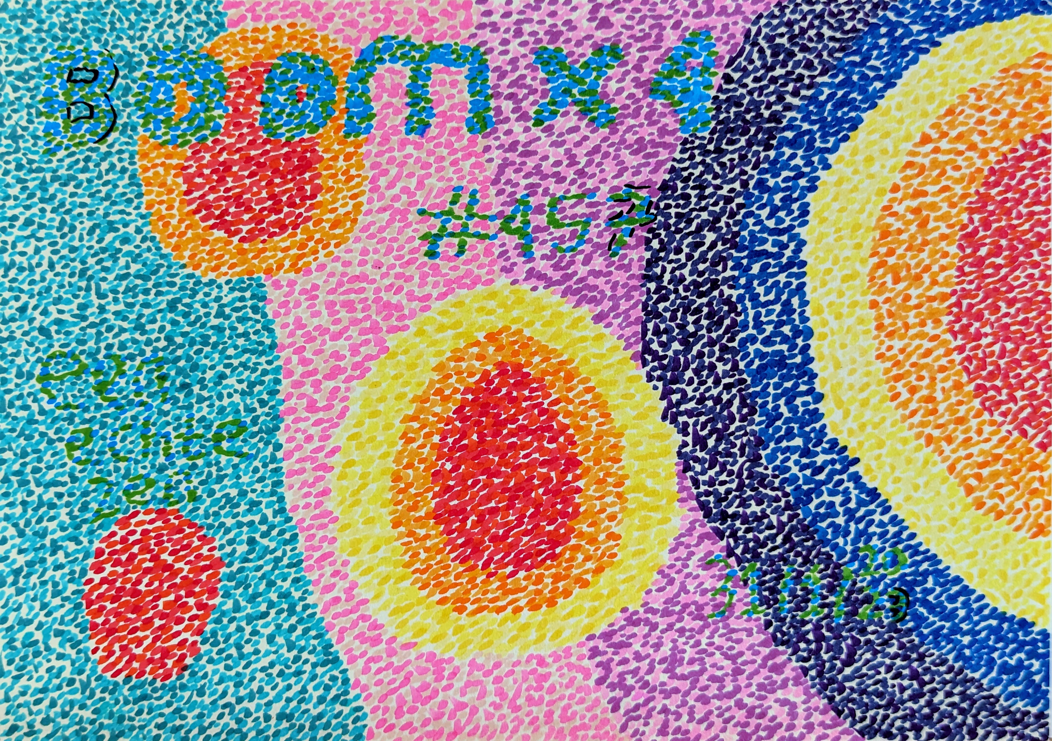 credit, [licence](https://creativecommons.org/licenses/by-nc/4.0/) Embracing complementary colors has been a cornerstone of my own artistic journey, allowing me to create depth, vibrancy, and profound emotional resonance in my abstract paintings. It's a journey of continuous discovery and delightful surprises that I wouldn't trade for anything. I invite you to delve deeper into my process on my [/timeline](/timeline), where you can trace the evolution of my artistic journey, explore my thoughts on [beyond the primary: how i use secondary and tertiary colors to create complex abstract worlds](/finder/page/beyond-the-primary:-how-i-use-secondary-and-tertiary-colors-to-create-complex-abstract-worlds), or simply appreciate [how artists use color](/finder/page/how-artists-use-color) across various styles. You can also explore some of the pieces available to [/buy](/buy) and see if you can discern how I've played with these incredible power couples – those visual conversations that bring my abstract worlds to life and (I hope!) speak directly to your soul. Or, if you're ever near Den Bosch, consider a visit to [/den-bosch-museum](/den-bosch-museum) where I often find endless inspiration. The world is literally saturated with these profound relationships, just waiting for us to notice, understand, and harness their extraordinary power. They are a timeless secret, now yours to wield, to see, and to create with – whether you're painting a masterpiece, designing a website, or simply arranging flowers in your home. So, go forth and explore! What dazzling visual conversations will you ignite when you start truly seeing the world through the vibrant, dynamic lens of complementary colors?