Master Your Walls: Ultimate Art Arrangement & Display Guide
Unlock your home's artistic potential. This ultimate guide covers art arrangement, scale, visual weight, grouping, and psychological impact. Get practical tips for hanging, lighting, framing, and diverse mediums to create stunning, personalized displays.

Mastering Your Walls: A Step-by-Step Art Layout Guide
I know, I know. You’ve just found the perfect piece of art – maybe one of my abstract art prints, or perhaps something completely different that speaks to your soul. You bring it home, full of excitement, only to find yourself staring at a blank wall, art in hand, wondering: Now what? Where does it go? How high? What if I hang it wrong? It’s a common dilemma, and one I’ve wrestled with myself countless times. It’s why I decided to put together this little guide, born from my own trial-and-error moments, to help you navigate the wonderful, sometimes daunting, world of art arrangement. Think of me as your personal guide, helping you rethink your walls, room by room, transforming those blank canvases into a cohesive, inspiring display that truly enhances your space. We'll delve into both the foundational principles that shape stunning displays and the nitty-gritty practicalities of getting art on your walls, empowering you to create something beautiful and uniquely you.
The Foundation: Understanding Your Space and Your Art
Before we even think about hanging anything, I always encourage a little internal dialogue. Call it a "conversation," if you will – a quiet chat between your art and the space it's destined for. I've found that the most captivating arrangements don't just happen; they emerge from truly understanding what you already have and what you want to create.
It All Starts with a Conversation: Your Art and Your Room
Before you even think about grabbing a hammer, let's talk. No, not to me, but to your space and your art. I've found that the best art arrangements begin with a quiet contemplation of what you already have. What's the purpose of the room? Is it a bustling living room, a serene bedroom, a vibrant home office, or maybe a formal dining area where conversations linger? Each room has its own rhythm and function, and your art should flow with it. For instance, a lively abstract piece with bold colors might energize a creative office, inspiring new ideas. Perhaps a vibrant Pop Art print could infuse a sense of playful rebellion into a family room, or a contemplative, almost spiritual piece of abstract expressionism might offer a moment of quiet introspection in a personal study. Even a detailed photorealistic landscape, with its window-like quality, can expand a small space, inviting the outdoors in. Conversely, the soft, blended hues of an Impressionistic-style piece could bring a sense of calm and expansive serenity to a bedroom. A stark, minimalist work might enhance the clean lines of a contemporary dining area, while a Surrealist piece could spark intrigue and deep conversation in a study, creating a sense of intellectual curiosity.
Consider the existing furniture, the natural light, and even the wall color. These elements aren't obstacles; they're collaborators, setting the stage for your art, influencing how we perceive the space itself. A large, dynamic artwork can make a small room feel grander, while a series of smaller pieces can add intimacy to an expansive wall.
Then, turn to your art. What story does it tell? What's its personality? A bold, energetic abstract piece might thrive as a focal point, drawing the eye and sparking conversation. On the other hand, a collection of smaller, more delicate works could create an intimate narrative, inviting closer inspection. Especially with abstract art, the "story" can be less literal and more about emotion – the interplay of color, form, and texture evokes feelings. When I'm in my studio at my artist's museum in 's-Hertogenbosch, amidst the scent of turpentine, the quiet hum of creative energy, and the occasional splash of color on my overalls, I often find myself contemplating the emotional journey a piece takes. From the spark in my mind, through the tactile process of brush on canvas, and then finally, to your wall – each step is a dialogue. Understanding this dialogue between art and environment is crucial, whether you’re just starting to decorate your home or looking to refine how art functions in every room.
What's the first 'conversation' your art and room are ready to have?

The Magic of Scale and Proportion: Don't Underestimate Size (or Visual Weight)
This is where many people, myself included, have stumbled. I remember once trying to hang a tiny painting above a massive sofa, and it just looked… lost. Like a single sardine in the ocean. The inverse is also true: a colossal piece crammed onto a tiny wall can feel overwhelming, almost suffocating. Trust me, I’ve tried to force a larger-than-life canvas into a nook it clearly wasn't meant for, hoping sheer will would make it work. It didn't.
Scale and proportion are the silent architects of a well-arranged space. Think of it as a dance between your art and your furniture. Generally, a piece of art (or a grouped arrangement) should be approximately two-thirds the width of the furniture it hangs above. This creates a visual harmony that feels balanced and intentional. For instance, if your sofa is 90 inches wide, aim for art that's about 60 inches wide.
Beyond just physical size, there's also visual weight. This refers to how much a piece "demands" attention. Darker colors, complex details, heavy frames, or bold forms often carry more visual weight than lighter, simpler pieces. But it's not just about darkness; vivid colors, intricate patterns, or even a strong linear presence can give a piece significant visual weight, making it feel substantial and dominant. Texture, too, plays a silent but powerful role; a deeply textured impasto painting, for instance, naturally commands more attention than a flat graphic print of the same size. Remember, this perception of weight isn't entirely universal; cultural context and individual sensibilities can subtly shift how we 'feel' a piece. Balancing this is key – you don't want a heavy piece visually dragging down one side of a wall.
Don't forget about vertical space either! Beyond the dance with furniture, remember the room itself. A monumental piece that would anchor a grand hall might overwhelm a cozy study. And then there's viewing distance: a complex, intricate piece might reveal its secrets best from a few steps back, while a delicate drawing invites intimate inspection. All of this is part of the visual composition, a principle I'm constantly wrestling with in my own work – finding the perfect balance so that each element, be it color, form, or even empty space, finds its voice without overpowering the others, much like how different shapes and colors balance within one of my abstract pieces. It’s about ensuring each element respects the others, creating a cohesive whole, much like how different shapes and colors balance within one of my abstract pieces.
How will you make your art and furniture dance in harmony?
The Power of Negative Space: Letting Your Art Breathe
Now, while we're talking about spacing, let's consider something often overlooked: negative space. This is the empty area around and between your artworks, and it's just as important as the art itself. Think of it as the quiet pauses in a piece of music, allowing the notes to truly resonate. Too much art crammed together, or a single piece with no breathing room, can feel cluttered and busy. Giving your art enough negative space allows each piece to command attention, preventing visual fatigue and allowing your eye to rest. It enhances the visual impact of each artwork, almost framing it with silence.
Are you giving your masterpieces enough room to sing?
The Subtle Art of Psychological Impact: How Art Influences Mood
Before we move on to physically arranging things, I want to gently nudge your thoughts towards something more intangible: the profound, often unconscious, psychological impact of art. I mean, why else do we collect it, right? It’s not just about filling a void; it’s about filling a space with feeling. A serene landscape in a bedroom can lull you into calm, while a dynamic, abstract piece (like many of my own colorful creations) in a living room can spark conversation and energize a space. Think about the dominant colors, the forms, the subject matter (or lack thereof, in abstract art). Do they evoke peace, excitement, contemplation, or curiosity? Understanding this is like adding another layer to your 'conversation' with the room. After all, the colors themselves have a language, as I explore in The Psychology of Color in Abstract Art: Beyond Basic Hues. This isn't just decoration; it's emotional architecture.
The Art of Arrangement: From Solo Stars to Gallery Walls
This is where the principles meet the practical application, where you move from contemplation to creation. But before you pick up that hammer, here’s a tip from my own clumsy moments: test your arrangement first. Cut out paper templates the size of your artworks and tape them to the wall. Live with them for a day or two. Move them around. This little trick saves holes in the wall and a lot of frustration, trust me. I’ve certainly had my share of art arrangements that looked perfect in my head but disastrous on the wall, only to find the ideal spot after a bit of paper-template shuffling. It’s all part of the journey, a creative puzzle, if you will. And frankly, this testing phase is where I often make some of my best "discoveries" about a piece, seeing it in different lights and contexts before committing.
The Solo Star: Highlighting a Single Piece
Sometimes, one powerful piece is all you need. A large abstract painting, for instance, can command attention and set the tone for an entire room. When choosing a solo star, consider its visual weight and emotional impact. But before you even think about height, think about the wall itself. Is it a high-traffic area, or a quiet nook? A grand entrance might demand a bold, commanding piece, while a more intimate solo star might be perfect for a reading corner. Consider sightlines from other rooms, too; a striking piece might pull you through a doorway. The idea is to choose a wall that allows your solo star to be discovered and appreciated, not just passed by. It should ideally be placed at eye level, with its center approximately 57-60 inches from the floor – the average human eye level. This makes for comfortable viewing, allowing the viewer to engage with the piece without craning their neck. Remember, the goal is not just to fill a space, but to create a moment, a focal point that defines the room. For more on maximizing the impact of individual pieces, especially how light interacts with them, check out The Art of Display: How to Light and Position Abstract Art for Maximum Impact.
The Ensemble: Grouping Art Thoughtfully
Grouping art is where things get really fun, but also where the potential for chaos increases. I've seen some truly wonderful, organic groupings, and some that looked like a tornado hit a thrift store. The secret? Intent. Even if it looks spontaneous, there's usually a plan.
Creating a Cohesive Narrative
When grouping, think about what connects the pieces. Is it a shared color palette, a similar subject matter (even in abstract art, there can be thematic threads!), a consistent frame style, or perhaps a mix of mediums that create a harmonious dialogue through texture, form, or color? You want the grouping to tell a story, even if that story is simply about a shared journey through a specific artistic period or a collection of your own personal memories. For abstract art, a thematic thread might be an exploration of a specific color, a particular emotional state captured across multiple pieces, or a recurring geometric motif that subtly links them.
Here are a few ways to think about your gallery wall or art grouping:
Grouping Type  | Description |
|---|---|
| Thematic | All pieces related to a common subject like nature, urban landscapes, or portraits. For abstracts, this could be a shared mood, a recurring motif, or an exploration of a specific concept, creating a subtle narrative thread. |
| Color Harmony | A collection unified by dominant hues (e.g., blues and greens) or a vibrant mix where specific colors echo across different pieces, creating a visual rhythm. Think of it as a quiet conversation between the colors themselves. |
| Stylistic | All minimalist pieces, all expressionist works, or a thoughtful mix that complements each other through contrast – like rigid lines alongside fluid forms. The key is a shared aesthetic language, even if it's one of thoughtful opposition. |
| Visual Weight | Balance heavier (darker, larger, more complex) pieces with lighter ones to prevent the grouping from feeling lopsided. This ensures the grouping feels balanced, creating an easy flow for the eye. |
| Framing Style | Unify disparate pieces with consistent frame styles (e.g., all black, all natural wood) or use contrasting frames to highlight individual pieces within a cohesive theme. A thoughtfully chosen frame can be the silent conductor of your visual orchestra. |
| Size & Shape Variety | Mix various sizes and shapes (rectangular, square, circular, sculptural) for dynamic interest, ensuring enough negative space to prevent clutter. This creates an energetic, yet balanced, display that keeps the eye moving. |
Check out The Psychology of Color for more on how colors can influence your groupings.
What story will your ensemble tell?





credit, licence
Art Beyond the Furniture Line: Hallways, Staircases, and Open Spaces
Now, most guides talk about art above furniture, but what about those other, often trickier, areas? Hallways, staircases, or even defining zones in an open-plan space – these present unique opportunities and challenges. I often think of these spaces as silent storytellers, guiding you through a home.
- Hallways: These are perfect for creating a narrative sequence. Think of a series of smaller pieces or a linear progression that you can appreciate as you walk past. The key here is not to overwhelm the narrow space; keep pieces relatively flat against the wall. Don't be afraid to vary heights slightly to create visual interest along a longer stretch.
- Staircases: This is where things get really fun with verticality. Follow the ascending line of the stairs with your art, perhaps creating a diagonal gallery wall that mirrors the staircase's rhythm. You can go big here, as the viewing distance changes with each step. Just make sure pieces are securely fastened – the last thing you want is a piece taking a tumble!
- Open-Plan Living: In a large, undivided space, art can become a powerful tool for defining "rooms within rooms." A large, commanding piece can anchor a dining area, while a vibrant gallery wall might delineate a cozy reading nook. The art acts as a visual punctuation mark, signaling a shift in function or mood without the need for physical walls. It's about curating flow and feeling, which is something I often consider when thinking about abstract art for every room: curating flow and feeling in your home.
Practical Considerations: Getting Art on the Wall
So, you've planned, you've contemplated, you've even done the paper cutout test. Now for the moment of truth: the actual hanging. Don't worry, it's not as scary as it sounds, even if my own track record with a hammer involves more than a few crooked nails and patched holes – a personal testament to the fact that even artists need a little practical guidance! Once you've envisioned your perfect arrangement, it's time to get down to the nitty-gritty of bringing it to life on your walls. Remember, the goal here is secure enjoyment, not demolition!
Wall Types and Hardware: Know Your Foundation
Before you drill, know your wall. This isn't just about preventing damage, but ensuring your precious art stays securely in place.
- Drywall: Most common, relatively easy. For lighter pieces (under 10 lbs), a simple picture hook and nail will suffice. For heavier pieces, use toggle bolts, wall anchors, or stud finders for maximum security.
- Plaster: Older homes often have this. It's harder and more brittle. Drill pilot holes carefully and use mollies or specific plaster anchors. Be gentle!
- Brick/Concrete: For these, I'd strongly recommend a hammer drill and masonry bits, along with appropriate wall anchors or lead expansion shields. This is definitely a job that benefits from an extra pair of hands, or perhaps a call to a professional, unless you're feeling particularly adventurous (I usually call a friend for these, just to be safe!).
Beyond wall type, consider the type of art itself. A stretched canvas is typically lighter than a heavily framed print behind glass. Sculptural works might need specialized shelves or robust wall mounts. Always inspect the back of your artwork – ensure any hanging wire or D-rings are securely attached and in good condition before you even think about putting it on the wall. A little pre-hanging check can save a lot of heartache.
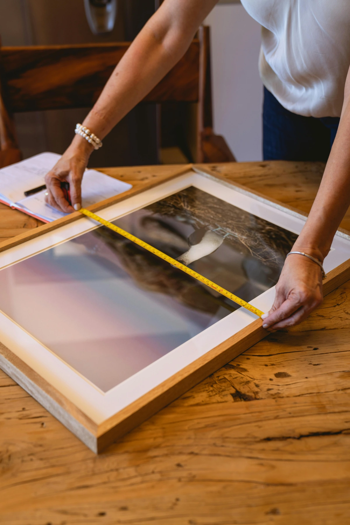
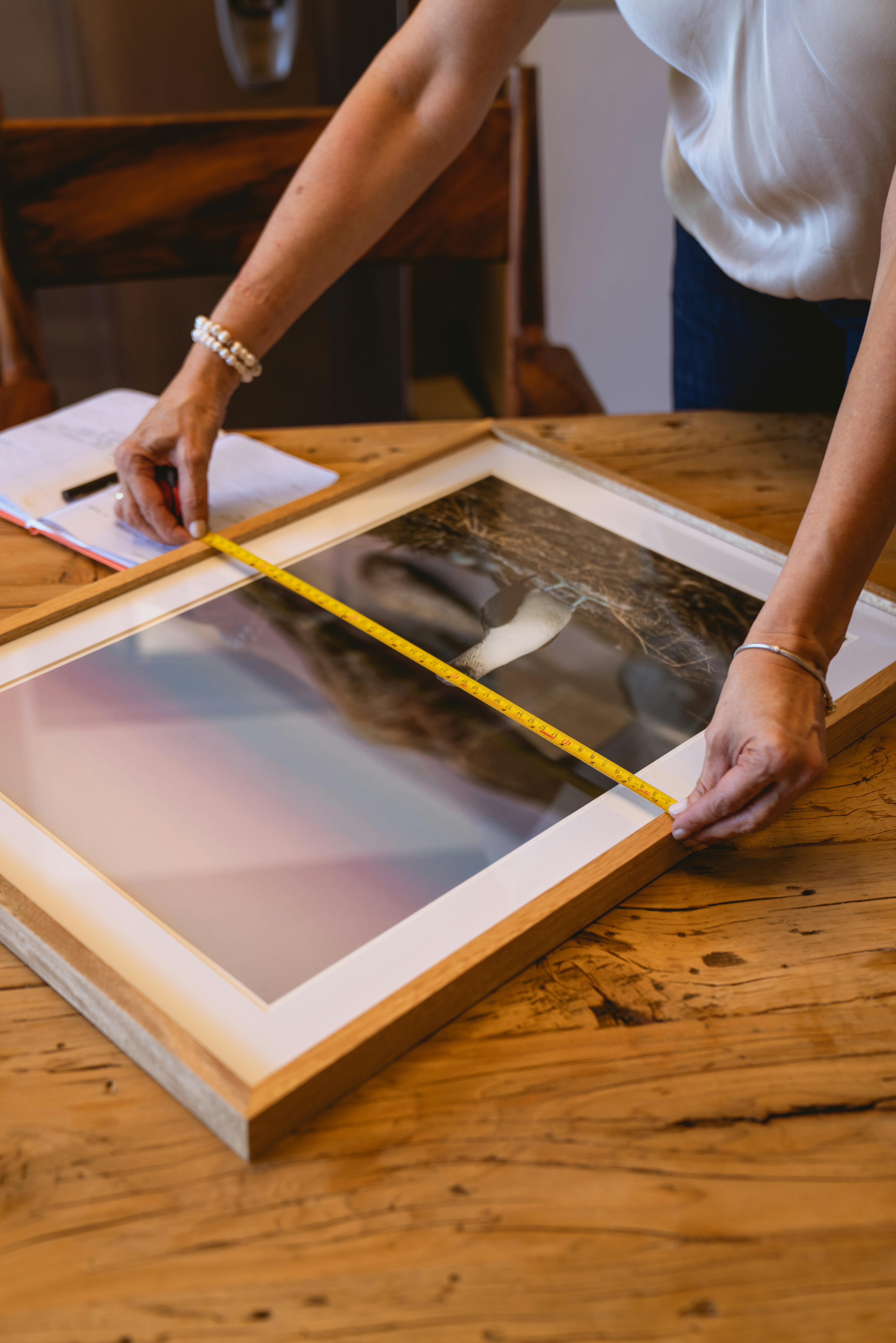
Always use a level – seriously, this is my personal quest for perfect horizontality, and it’s worth the extra minute. And don't underestimate the power of a good measuring tape and a pencil. Mark twice, drill once, as they say. Or in my case, mark four times, drill once, then realize it's still slightly off – it’s all part of the journey, right?
Diverse Mediums, Distinct Needs: Hanging Beyond Canvas
While canvas and framed prints are common, art comes in countless forms, and each brings its own hanging quirks.
- Textiles/Tapestries: These delicate beauties often require specialized hanging systems to avoid damage. Consider curtain rods with clips, magnetic hanging systems, or even Velcro strips if the piece is lightweight and archival methods aren't a concern. The goal is even weight distribution to prevent sagging or distortion.
- Sculptural Works: Depending on size and material, sculptures might need robust wall-mounted shelves, secure pedestals, or custom brackets. Lighter wall sculptures might use French cleats for a flush, secure fit. Always consider the weight and how it will be distributed.
- Mixed-Media/Objects: For pieces incorporating diverse materials or found objects, the hanging hardware needs to accommodate any uneven weight distribution or protrusions. Often, custom mounts or a sturdy floating shelf are the best solutions. The key here is always safety and stability; you don't want your carefully curated piece becoming a hazard.
The Art of Illumination: Lighting Your Masterpiece and Preserving It
Good lighting can transform a good art display into a spectacular one. It's not just about seeing the art; it's about making it glow.
- Ambient Lighting: This is your general room light. Make sure it's not casting harsh shadows that distract from the artwork.
- Accent Lighting: This is where your art truly shines. Track lighting, picture lights mounted directly above the frame, or recessed spotlights can highlight details and colors. Consider the angle and intensity to avoid glare. I personally love how accent lighting can reveal the subtle textures in my abstract work, bringing layers to life that might otherwise go unnoticed.
- Natural Light: While beautiful, direct sunlight can fade artwork over time, especially prints, watercolors, or pieces with delicate pigments. Think of it as a slow, silent thief. Position UV-protective glass, use museum-quality acrylic, or keep delicate pieces out of direct, harsh sun. For long-term preservation, maintaining stable temperature and humidity is also ideal, though I know that's not always practical in a bustling home!
Framing Your Vision: The Unsung Hero
Don't underestimate the power of a good frame. It's not just protection; it's a critical element that can elevate, complement, or even deliberately contrast with the art and your room's decor. A minimalist, sleek black or natural wood frame, for example, allows a vibrant abstract piece to truly pop, letting the colors and forms speak for themselves. In contrast, a richly ornate gold or silver frame can beautifully complement a traditional oil painting, adding a layer of historical gravitas. But sometimes, a deliberate contrast works wonders – a contemporary frame for a classical piece, or vice-versa, can spark unexpected visual interest and dialogue. Think carefully about the frame's material (wood, metal, acrylic), color, texture, and profile. The right frame can transform a piece, bringing an otherwise disparate collection into harmony, tying everything together with a subtle elegance, or boldly proclaiming individuality.
Architectural Challenges and Creative Solutions
Sometimes, our walls throw us curveballs. Radiators, vents, oddly placed windows, or built-in shelving can feel like barriers. Instead, see them as opportunities for creativity.
- Above a Radiator: If heat isn't an issue for the art (check materials!), hang slightly higher to accommodate.
- Around Vents/Switches: Treat these as elements of a larger gallery wall composition, integrating them rather than ignoring them. You might even use a small, interesting piece to draw the eye away or use the switch as an anchor point for a symmetrical arrangement.
- Built-in Shelving: Use shelves for art! Prop smaller pieces, nestle them among books, or use the top as a pedestal for a sculptural work.
What creative solutions will you discover for your space?
Art for the Adventurous (and the Rent-Conscious): Temporary Display Solutions
I get it, sometimes you're not ready to commit to permanent holes, or your lease agreement has strict rules (been there, done that!). But don't let that stop your artistic expression. There are plenty of clever, damage-free ways to display your beloved pieces.
- Adhesive Strips & Hooks: High-quality removable adhesive strips and hooks are a game-changer for lightweight to medium-sized framed pieces. They hold surprisingly well and remove cleanly (usually!).
- Leaning Art: Large canvases can make a powerful statement simply by leaning against a wall, either directly on the floor or atop a console table or bookshelf. This creates a relaxed, contemporary vibe and offers incredible flexibility for rearrangement. I often lean pieces against my studio walls as I'm working, just to see them from different perspectives.
- Picture Rails & Shelves: If your space has existing picture rails, use them! They allow for easy hanging and rearrangement without new holes. Similarly, floating shelves (even if they require a few holes) offer a versatile base for propping smaller framed pieces, sculptures, or ceramics, allowing for quick changes.
- Easel Displays: A stylish easel isn't just for painting; it's a fantastic way to showcase a special piece of art anywhere in your home, adding an artistic touch in itself.
- Washi Tape "Frames": For prints or postcards, use decorative Washi tape to create temporary "frames" directly on the wall. It's fun, easy to change, and leaves no residue. The point is, don't let a lack of commitment or a landlord's rules dampen your curatorial spirit. Where there's a will, there's a wonderfully temporary way!
Your Artistic Journey Continues
So, there you have it – a little peek into my own process for transforming walls from blank canvases into vibrant statements, a journey that’s always evolving. I hope this little guide, born from my own trial-and-error, sparks some confidence and creativity in you. For me, creating art is just one half of the story; seeing it thoughtfully displayed, breathing life into a home, is the other. It's less about following rigid rules and more about understanding principles, then letting your intuition guide you, truly connecting with the pieces you love. Take a look at my art for sale to find that perfect piece to kickstart your journey, or delve deeper into my artistic journey on my timeline for more inspiration. And most importantly, have fun with it! Experiment, move things around, listen to your space, and let your intuition guide you. After all, isn't that what art is all about – expression, joy, and a little bit of playful experimentation?