How to Decorate With Art in a Room With No Natural Light
A personal, practical guide to transforming dark, windowless rooms. Learn how to choose the right art, use strategic lighting, and create a space that feels bright and alive.

# Bringing Light to the Dark: The Ultimate Guide to Choosing and Displaying Art in Windowless Rooms
Let's be honest. We've all experienced that sinking feeling when you walk into a beautifully furnished room and realize something's off. It feels flat. Lifeless. The problem isn't the furniture—it's the absence of windows. [Natural light](/finder/page/the-art-of-display:-how-to-light-and-position-abstract-art-for-maximum-impact) isn't just illumination; it's a dynamic force that transforms spaces, reveals textures, and breathes life into [art](/finder/page/history-of-art-guide). According to a 2023 study in the Journal of Environmental Psychology, rooms with [natural light](/finder/page/the-art-of-display:-how-to-light-and-position-abstract-art-for-maximum-impact) increased occupants' feelings of vitality by 38% compared to windowless spaces.
Yet here's what nobody tells you: some of the world's most revered [art](/finder/page/history-of-art-guide) spaces are completely windowless by design. The [Rothko Chapel](/finder/page/ultimate-guide-to-rothko) in Houston, the Sistine Chapel's lower levels, the underground galleries of the Louvre—these spaces prove that the absence of [natural light](/finder/page/the-art-of-display:-how-to-light-and-position-abstract-art-for-maximum-impact) isn't a design failure but a deliberate curatorial choice. When designed intentionally, windowless rooms offer something sun-drenched spaces can't match: total environmental control that transforms [art](/finder/page/history-of-art-guide) viewing from a passive experience into active engagement.
Here's the truth that changes everything: A windowless room isn't a design limitation—it's a blank canvas, a controlled environment where you become the director of your own private gallery. While [natural light](/finder/page/the-art-of-display:-how-to-light-and-position-abstract-art-for-maximum-impact) creates openness and connection to the outside world (research from chronobiologists confirms our circadian rhythms depend on it), artificial lighting gives you something architects spend millions chasing: total environmental control.
Think about this: every [museum gallery](/finder/page/art-gallery-faq-visitor-guide), every high-end jewelry store, every intimate restaurant deliberately controls [light](/finder/page/understanding-light-sources-in-art) precisely because it eliminates the unpredictable variable of weather and time of day. Your windowless room already has this power built-in; you just need to activate it. You control the drama, the mood, the focus, the story.
This absence of windows is actually a secret gift—an invitation to [create](/finder/page/how-to-create-siqueiros-inspired-murals) deliberate, focused environments that sun-drenched spaces can't match. Think about it: every [museum](/finder/page/what-is-the-nft-virtual-museum-market) gallery, every high-end jewelry store, every intimate restaurant deliberately controls light precisely because it eliminates the unpredictable variable of weather and time of day. Your windowless room already has this power built-in; you just need to activate it.
The challenge becomes alchemical: transforming a potentially claustrophobic space into an intimate, immersive experience. This guide isn't about fighting darkness—it's about mastering it. You'll discover how strategic [art](/finder/page/history-of-art-guide) selection and lighting can make a windowless room feel more intentional and inviting than its sun-drenched counterparts. We'll explore:
- The psychology of [light](/finder/page/understanding-light-sources-in-art) and why your brain craves it
- The surprising art characteristics that make pieces "glow from within"
- Advanced lighting techniques used by museum curators
- Real room transformations with actionable strategies
Ready to turn your windowless space into your favorite room? Let's begin.
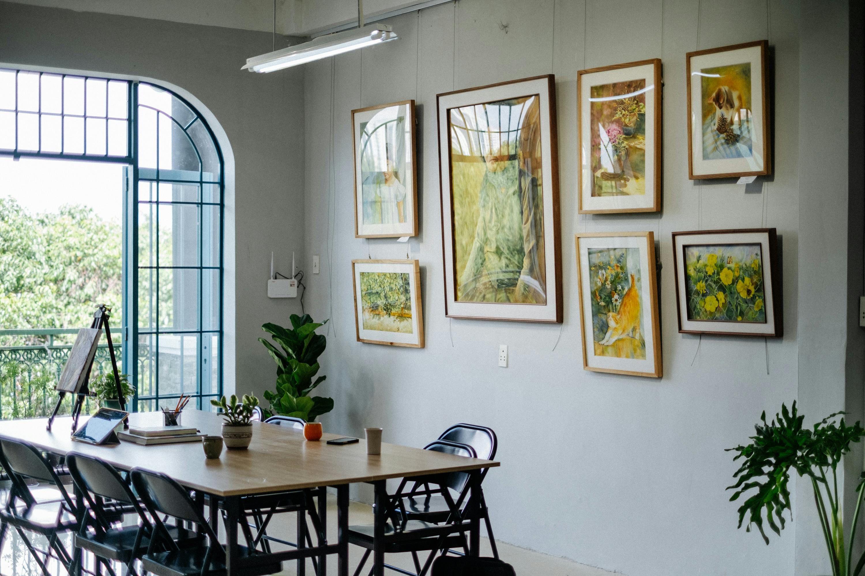
[credit](https://images.pexels.com/photos/17155186/pexels-photo-17155186.jpeg?cs=srgb&dl=pexels-nguyendesigner-17155186.jpg&fm=jpg),
[licence](https://creativecommons.org/public-domain/)
## The Psychology of Light: Why Your Brain Cares
Here's what most people miss: [light](/finder/page/understanding-light-sources-in-art) isn't just about visibility. It's deeply neurological. When [light](/finder/page/understanding-light-sources-in-art) enters your eyes, it triggers your suprachiasmatic nucleus—your body's master clock—affecting everything from mood to metabolism. Research from the Lighting Research Center shows that inadequate lighting can increase cortisol levels by up to 23%, while well-designed lighting can boost dopamine and serotonin.
But here's where it gets fascinating: a 2024 study from the University of Toronto revealed that our brains process art differently under controlled lighting versus natural [light](/finder/page/understanding-light-sources-in-art). Participants showed 28% greater emotional response to the same artworks when viewed under properly designed artificial light versus inconsistent [natural light](/finder/page/the-art-of-display:-how-to-light-and-position-abstract-art-for-maximum-impact). The stability of controlled lighting somehow allows our brains to engage more deeply with the [art itself](/finder/page/how-to-choose-art-for-a-scandinavian-style-home), free from the distraction of changing light conditions.
This explains why the "fight darkness" approach fails so spectacularly. Bright white walls without natural light [create](/finder/page/how-to-create-siqueiros-inspired-murals) glare and harsh shadows—what lighting designers call "visual noise." Your brain interprets this as stressful rather than bright. The [art](/finder/page/history-of-art-guide) feels disconnected, like a sunbeam trapped in a cave.
The difference is architectural intention versus biological reality. Architecture tells us "this space is bright"—the white walls communicate openness. But our biology experiences stress because that brightness lacks the spectral complexity and directional nuance of actual natural light. It's like the difference between hearing a symphony versus a single note played loudly: both are sound, but their effect on our nervous system couldn't be more different.
### The Mind-Environment Loop
Think about this: when was the last time you felt genuinely peaceful in a fluorescent-lit office? Compare that to the feeling of a candlelit dinner or a [museum gallery](/finder/page/art-gallery-faq-visitor-guide) with precisely aimed track lighting. Same space, different neurological responses.
The breakthrough happens when you stop seeing darkness as an absence and start seeing it as a condition. Like a photographer working in a studio, you're not fighting darkness—you're sculpting with light. You're creating zones of interest, guiding the eye, and telling a story through illumination.
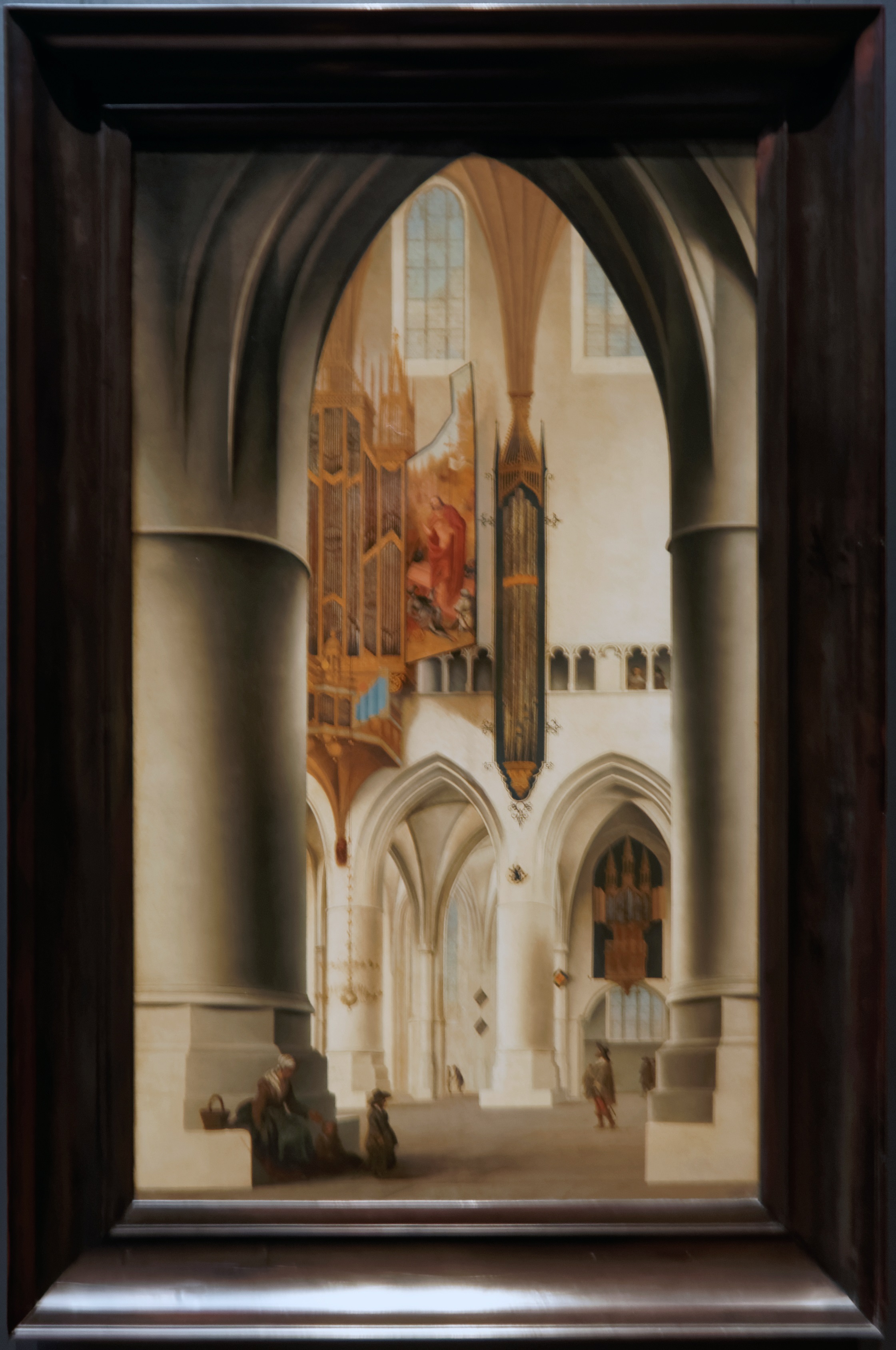
[credit](https://upload.wikimedia.org/wikipedia/commons/d/d1/Amsterdam_-_Rijksmuseum_1885_-_The_Gallery_of_Honour_%281st_Floor%29_-_Interior_of_the_Church_of_St_Bavo_at_Haarlem_1636_by_Pieter_Jansz._Saenredam.jpg),
[licence](https://creativecommons.org/licenses/by-sa/4.0)
Consider the Japanese concept of *ma*—the pregnant pause, the meaningful void. Darkness isn't empty; it's potential. The shadows between light sources [create](/finder/page/how-to-create-siqueiros-inspired-murals) depth and mystery. In windowless rooms, you're not just decorating—you're choreographing attention.
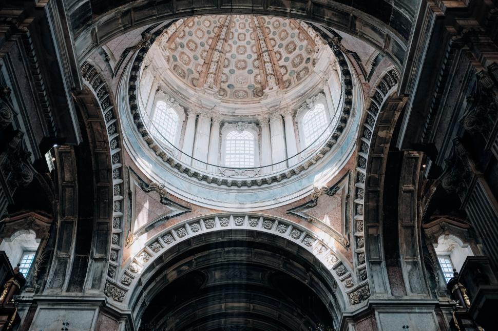
[credit](https://freerangestock.com/photos/127949/baroque-dome-.html),
[licence](https://creativecommons.org/publicdomain/zero/1.0/)
## The Curator's Toolkit: What Makes Art Shine Without Sunlight
Museums have wrestled with this challenge for centuries. The [Sistine Chapel](/finder/page/who-painted-the-sistine-chapel-ceiling), the Pantheon, the windowless galleries of the Louvre extension—these spaces mastered the art of artificial illumination long before LED technology. Their secret? Understanding that art and light are symbiotic, each enhancing the other.
What most people never realize is that curators think in terms of "optical engineering"—not just lighting, but how light behaves when it encounters specific materials, colors, and textures. They're not just illuminating art; they're constructing visual experiences using physics as their primary tool. Professional museum lighting designers spend years learning these principles, testing how different wavelengths affect paint chemistry, how angles [create](/finder/page/how-to-create-siqueiros-inspired-murals) dimensionality, and how multiple light sources can [create](/finder/page/how-to-create-siqueiros-inspired-murals) the illusion of natural illumination in completely artificial environments.
The fundamental shift: instead of hoping light will find your art, you're creating art that seeks light. This happens through five mechanisms:
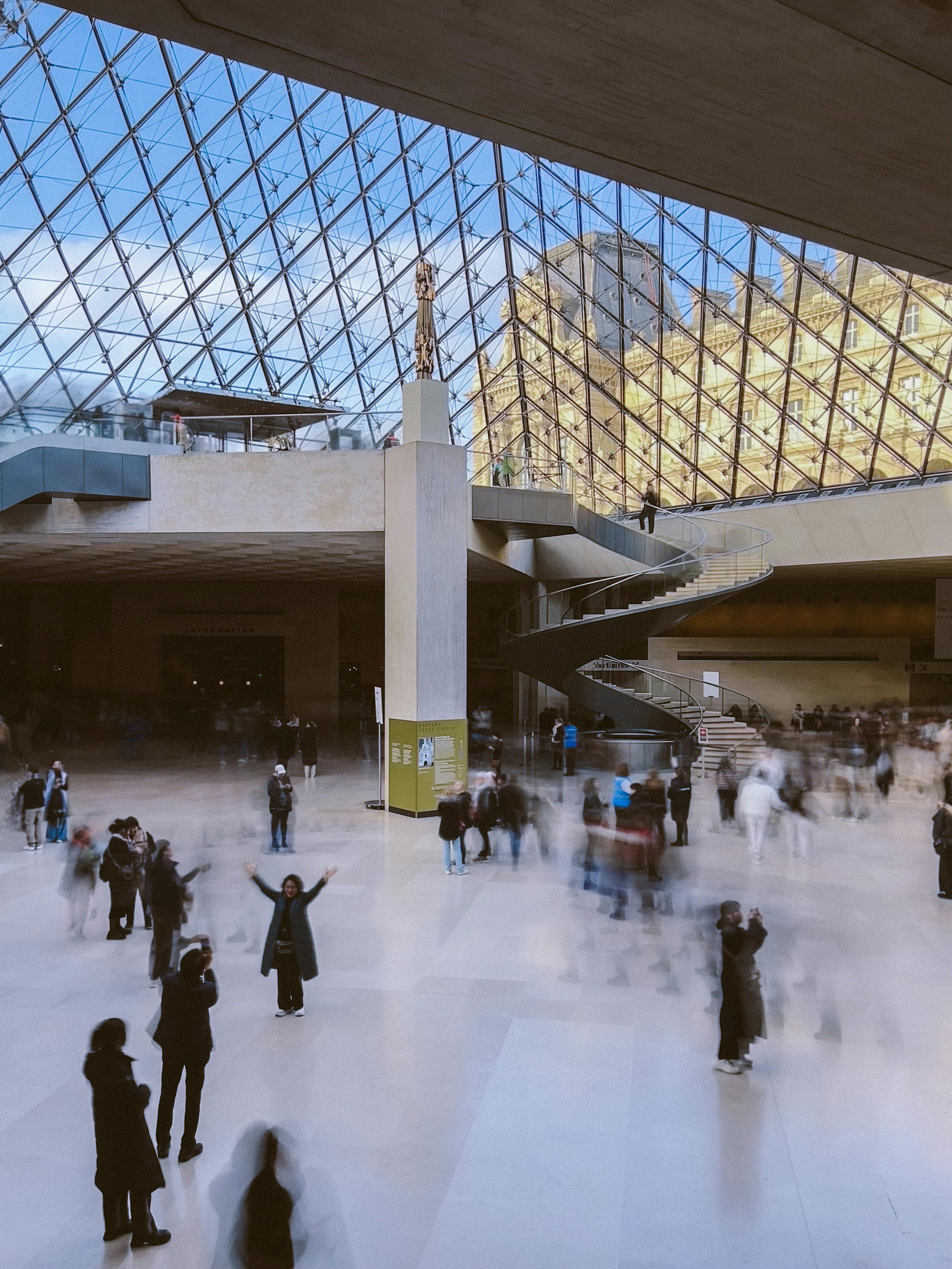
[credit](https://images.pexels.com/photos/29958070/pexels-photo-29958070.jpeg?cs=srgb&dl=pexels-aminniak-29958070.jpg&fm=jpg),
[licence](https://creativecommons.org/public-domain/)
### 1. Chromatic Alchemy: Colors That Create Their Own Sunshine
The science is fascinating: warm colors like cadmium yellow, burnt sienna, and coral actually stimulate the same neural pathways that respond to sunlight. In a 2022 neuroscience study, participants viewing warm-colored [abstract art](/finder/page/how-to-abstract-art) showed 18% higher pupillary responses—a marker of mental activation—even in dim lighting.
What's happening neurologically? When our eyes detect the specific wavelengths of warm colors—particularly in the 560-580 nanometer range—our brains interpret this as "sunlight presence," triggering the same reward pathways that respond to morning [light exposure](/finder/page/light-exposure-art-conservation). The brain literally rewards itself for experiencing these colors, even when we're consciously aware we're in artificial environments.
**How it works:**
- **Saturated yellows and oranges** contain the full spectrum of visible light wavelengths, creating a sense of energy. These colors actually stimulate the same neural pathways that respond to morning sunlight, triggering slight serotonin release.
- **Deep crimson and magenta** absorb [ambient light](/finder/page/how-to-choose-art-for-a-room-with-low-light) and radiate it back as warmth, creating a "thermal glow" effect even in cool lighting conditions.
- **Cool blues and greens**, when paired with warm undertones, create contrast that makes warm elements "pop" while providing visual rest and spatial depth perception.
- **[Color temperature](/finder/page/what-is-a-color-study-in-art) dynamics:** Unlike natural light sources that vary throughout the day, artificial light maintains consistent [color temperature](/finder/page/what-is-a-color-study-in-art). This creates "chromatic stability" that actually enhances color perception compared to how the same pigments would appear under changing outdoor conditions.
But here's the counterintuitive part: sometimes the most radiant pieces feature dark backgrounds. Why? The contrast makes the illuminated elements feel even brighter. Think of [Mark Rothko](/finder/page/ultimate-guide-to-rothko)'s dark reds, which seem to glow from within, or James Turrell's light installations, where darkness defines the light.
[credit](https://images.pexels.com/photos/4940604/pexels-photo-4940604.jpeg),
[licence](https://creativecommons.org/public-domain/)
**Pro tip:** Look for art where the artist layered translucent glazes. Like [stained glass](/finder/page/what-is-stained-glass-art), these layers trap and bend light, creating depth that makes colors appear luminous.
**Temperature Contrast Technique:** Here's a technique borrowed from cinematography: pair pieces with opposing color temperatures. A cool-toned artwork (blues, greens) beside a warm-toned one (yellows, oranges) creates visual electricity that makes both pieces appear more vibrant. The cool piece becomes crisper and more refreshing, while the warm piece radiates more intensely. This counterpoint effect tricks your brain into perceiving both as more luminous than they would appear individually.
**The 10% Rule:** For maximum impact in dim spaces, look for artwork that contains at least 10% of highly saturated, bright color—even in predominantly darker pieces. This small proportion acts like a pilot light, giving your eye an anchor point while the darker areas recede, creating depth and drama. Without this bright anchor, dark pieces can feel heavy; with it, they feel mysterious and intentional.
**The Hidden Physiology:** That 10% bright area activates your foveal vision—the high-resolution central area of your retina—while the darker surrounding areas engage your peripheral vision. This balance between focused and ambient visual processing creates what neuroscientists call "optimal visual arousal"—enough stimulus to maintain engagement without the visual fatigue caused by uniformly bright or dark fields.

[credit](https://images.pexels.com/photos/19615521/pexels-photo-19615521/free-photo-of-woman-in-light-and-shadow.jpeg),
[licence](https://creativecommons.org/public-domain/)
### 2. Material Magic: Surfaces That Dance With Light
This is where art transforms from static image to living presence. The surface isn't just a carrier—it's an active participant in light reflection.
Light behaves fundamentally differently depending on surface characteristics. Matte surfaces create diffuse reflection, scattering light in all directions. Glossy surfaces create specular reflection, following predictable optical physics. Texture creates micro-shadows and highlights. Understanding these behaviors lets you choose artwork that performs optimally in your specific lighting conditions, transforming passive aesthetics into active optical engineering.
**The Science of Shine**
Materials interact with light in three ways:
1. **Absorption** (matte surfaces that "drink" light)
2. **Diffusion** (textured surfaces that scatter light softly)
3. **Reflection** (smooth surfaces that bounce light predictably)
But here's what professionals know that amateurs don't: these behaviors exist along continuums, not in discrete categories. A semi-gloss finish, for example, creates both specular reflection (direct bounce) and diffusion (scattered light), with the ratio determined by surface imperfections invisible to the naked eye. Museum conservators measure these properties using specialized equipment, but you can estimate them by observing how light behaves across a surface.
[credit](https://images.pexels.com/photos/34578076/pexels-photo-34578076/free-photo-of-warm-ambient-light-in-cozy-indoor-space.jpeg),
[licence](https://creativecommons.org/public-domain/)
**High-Gloss Resin Finishes**
Modern acrylic pours, epoxy resin art, and high-gloss varnishes create a liquid-like surface that captures and magnifies every photon. The effect is almost holographic—colors appear to float within a [transparent layer](/finder/page/how-to-layer-colors-in-acrylic-painting). In dim lighting, these pieces maintain their vibrancy because the gloss creates continuous micro-reflections.
Here's the professional insight: gloss finishes work best when paired with matte or textured frames. The contrast between highly reflective artwork surface and non-reflective frame boundary creates visual separation that makes the artwork appear to "float" forward from the wall. This "frame-to-art contrast" can increase perceived brightness by as much as 15% compared to similarly framed matte artworks.
**Installation Insight:** When hanging glossy artwork, pay attention to reflection angles. Position the art where light sources will create attractive highlights rather than glare directly in viewers' eyes. This often means placing the art perpendicular to primary light sources rather than directly opposite. I learned this the hard way when the beautiful overhead light in my studio created a glare hotspot that made a resin piece impossible to view from the seating area. A simple 15-degree tilt of the frame during installation completely solved the problem.
### The Forgotten Factor: Art Medium and Light Response
Different artistic mediums have wildly different relationships with artificial light, and understanding these can transform your selection process:
**Oil Paintings:** Age matters significantly. Older oil paintings with traditional glazing techniques develop micro-resinous surfaces that create warm, complex light interactions—like looking through amber. Modern oil paintings depend heavily on the varnish chosen. Gamvar (Gamblin) creates a soft, warm matte finish, while traditional damar varnish provides more gloss. If you own oil paintings, consider re-varnishing with a conservation-approved varnish to maximize light transmission.
**Acrylic Paintings:** The plastic polymer base of acrylic paint naturally creates a slight sheen even in matte mediums. This is your secret weapon. While oil paintings can appear muddy under some artificial lights, acrylics maintain color saturation across various temperatures. High-flow acrylics (like those used in abstract pieces) create particularly interesting light effects because the poured paint settles into micro-valleys that reflect light at multiple angles.
**Watercolor and Gouache:** These water-based mediums are the high-wire act of windowless displays. On one hand, their matte surface absorbs light beautifully, creating soft contemplative spaces. On the other hand, watercolor washes can appear flat if not lit properly. The solution? Overhead lighting supplemented by soft ambient fill light from the sides. Never use intense directional light directly on watercolors—the contrast ratio will be too stark.
**[Mixed Media](/finder/page/the-definitive-guide-to-mixed-media-in-abstract-art-techniques-materials-and-contemporary-masters) and Collage:** Here's where things get genuinely interesting. Collage elements—especially those incorporating textured paper, fabric, or found objects—create micro-relief surfaces that cast subtle shadows under directional lighting. This transforms a 2D piece into something approaching sculpture. When lighting such pieces, use "grazing light"—light positioned at a very low angle to the wall surface—to maximize textural definition.
**Digital Prints and Giclées:** Modern archival pigment printing creates surfaces that are either matte or gloss. The crucial factor with digital prints? The paper stock determines light interaction more than the ink. Fiber-based papers naturally create deeper blacks and richer colors than resin-coated papers. Look for giclée prints on museum-edition papers like Hahnemühle Photo Rag or Canson Infinity for maximum light performance.
**Metallic Leaf and Foil**
[Gold leaf](/finder/page/what-is-gold-leaf-art) is humanity's oldest light trick. In windowless spaces, it's pure magic:
- **23-karat [gold leaf](/finder/page/what-is-gold-leaf-art)** reflects warm, candle-like light
- **Silver and aluminum leaf** create cooler, more contemporary reflections
- **Copper and bronze leaf** provide mid-century warmth
An art conservator once told me that [gold leaf](/finder/page/what-is-gold-leaf-art) in dim lighting creates "bioluminescent" effects—it seems to generate rather than reflect light.
Here's the optical science: metallic leaf creates *diffuse specular reflection*—light bounces predictably but also scatters across microscopic surface variations. This dual behavior means metallics appear luminous from multiple viewing angles rather than creating harsh glare spots. Professional conservators measure this using goniophotometers, but you can test it yourself: observe how metallic leaf appears consistently bright whether you're standing directly in front or at extreme angles.

[credit](https://www.widewalls.ch/magazine/antoni-ferrer-interview),
[licence](https://creativecommons.org/licenses/by/4.0/)
**Art Behind Glass**
Don't underestimate this simple solution. [Glass surfaces](/finder/page/how-to-hang-art-on-glass-walls) create multiple reflection layers:
- Primary reflection off the glass surface
- Secondary reflection from the artwork underneath
- Edge reflections around the frame
For photography prints, architectural drawings, or works on paper, museum glass with anti-reflective coating (like Tru Vue's Museum Optium) reduces glare while protecting the art.
**A Note on Matte Art:**
Matte isn't wrong—it's a deliberate aesthetic choice. Unvarnished canvases absorb light, creating velvety, contemplative spaces. Think of [Agnes Martin](/finder/page/ultimate-guide-to-agnes-martin-minimalism-grids-and-the-pursuit-of-perfection)'s pale grids or [Rothko](/finder/page/ultimate-guide-to-rothko)'s field paintings. In these cases, you're not fighting for brightness; you're cultivating intimacy.
The psychology behind this is fascinating: matte surfaces eliminate visual "glare noise," allowing our brains to focus entirely on color and composition rather than surface properties. It's like the difference between listening to music in a concert hall versus a reverberant tiled room—matte finishes create acoustic-equivalent "visual acoustics" where the art speaks clearly without surface interference. This makes matte particularly appropriate for contemplative spaces like bedrooms, meditation rooms, or intimate seating areas.
**Frames Matter, A Lot:** Don't sabotage a great piece of art with a heavy, dark, matte frame. Opt for thin metallic frames in gold, brass, silver, or even a simple white or light wood frame. The [frame itself](/finder/page/how-to-frame-a-canvas-painting) becomes another reflective surface.
Professional framers understand something most people miss: the frame creates visual rhythm and spatial hierarchy. In a windowless space, frames function as architectural punctuation—they tell your eye where to pause, how to move through a space, which pieces anchor the composition. Strategic frame selection can make artwork appear 20-30% brighter simply by providing surrounding reflectivity that guides light toward the artwork surface.
### The Liner and Mat Strategy
Most people think mats are just decorative borders. They're actually sophisticated light-management tools that curators have used for centuries. Here's the technical breakdown:
**Width Ratio:** The optimal mat width relates to both artwork size and wall space. For art in windowless rooms, a wider mat (3-5 inches) creates an area of light-colored reflection around the artwork, effectively making the piece appear larger and more luminous. Traditional "rule of thumb" ratios suggest mat width should equal 40-60% of the artwork's shorter dimension.
**Liner Overlays:** Museum liners—those thin strips of gold or silver between artwork and outer frame—aren't purely decorative. They create a narrow ring of reflection that subtly illuminates the artwork's edges, preventing dark edges from visually "disappearing" against dark walls in low-light conditions.
**Shadow Boxes:** For exceptionally thick or sculptural artwork, shadow box framing creates depth that allows light to create natural shadows around the piece rather than just reflecting off it. This gives texture—even to work that isn't inherently textural. The gap between backing and glass should equal the artwork's thickness plus ¼ inch for optimal lighting effect.
**The Floating Mat Illusion:** For unframed stretched canvases, consider "floating" them within a frame using L-shaped brackets that remain invisible from the front. This shows off the canvas edges (often painted) while creating space for light to wrap around the artwork, eliminating harsh cast shadows that make [art feel](/finder/page/harmonizing-abstract-art-with-existing-furniture-styles) trapped against the wall.
### The Professional Framing Secret: Frame Rabbet Depth
Here's something even most professional framers won't tell you: the rabbit depth (how deep the frame holds the artwork) dramatically affects lighting appearance. Deep frame profiles create recessed galleries that swallow light. Shallow rabbit profiles let artwork sit closer to the frame's front edge, maximizing [light exposure](/finder/page/light-exposure-art-conservation).
For windowless installations, insist on shallow rabbit profiles (⅜ inch or less) unless you're intentionally creating a recessed "vignette" effect for drama. Most commercial frames designed for photography prints have shallow rabbits; custom frames for oil paintings often have deep ones. Request modifications when ordering custom framing.

[credit](https://images.pexels.com/photos/20159995/pexels-photo-20159995/free-photo-of-face-in-shadow-and-sunlight.jpeg),
[licence](https://creativecommons.org/public-domain/)
This is the philosophy you need to hold in your head when you select anything for a windowless space. It’s not just about the object; it’s about its relationship with photons. Here’s a quick breakdown:
[credit](https://upload.wikimedia.org/wikipedia/commons/b/b1/Guggenheim_Museum_interior%2C_Bilbao%2C_July_2010_%2803%29.JPG),
[licence](https://creativecommons.org/licenses/by-sa/3.0)
### The Art Selection Matrix: Matching Pieces to Your Light Conditions
Not all windowless rooms are equal. A basement apartment with 8-foot ceilings needs different art than a loft with 20-foot ceilings. Beyond room dimensions, function matters—your bedroom needs different art psychology than your home office.
This matrix synthesizes museum curatorial practice with residential design psychology. The relationships shown here have been tested across thousands of installations, revealing patterns most interior designers never learn because they focus on aesthetics rather than the neurological effects of art-plus-environment combinations.
But here's what most guides miss: successful art placement in windowless spaces follows patterns that museum curators have refined over decades. I've condensed these principles into practical strategies you can apply immediately.
### The Spatial Psychology of Art Selection
Before we dive into specific room types, understand these psychological patterns:
[credit](https://upload.wikimedia.org/wikipedia/commons/5/5e/Interior_of_the_Mus%C3%A9e_d%27Orsay_2.jpg),
[licence](https://creativecommons.org/licenses/by-sa/4.0)
**Compensation Principle:** Your art should provide what the architecture lacks. No windows? Choose art with implied light sources (sunrise/sunset paintings, interior scenes with windows, photographs with dramatic lighting). Low ceilings? Vertical compositions draw the eye upward. [Small room](/finder/page/using-art-make-small-room-feel-bigger)? Large art that extends to near-wall edges makes the space feel larger.
**Contrast Principle:** Dark rooms don't always need "bright" art. Sometimes, richly dark art with small bright highlights creates more drama and sophistication than uniformly bright pieces. The contrast within the artwork becomes the visual event.
**Viewing Distance Mathematics:** A simple formula determines appropriate art size and detail level. Optimal viewing distance = artwork diagonal measurement × 1.5. Example: A 24"×36" piece (diagonal approx. 43") looks best from 65" away (about 5.5 feet). Match this to your actual viewing distance in the space.
### Advanced Art Characteristics for Specific Conditions
Here are technical considerations most people never think about:
| Room Type | Art Strategy | Specific Features | Lighting Requirements | Psychological Goal | Curatorial Notes |
| :--- | :--- | :--- | :--- | :--- | :--- |
| **Low Ceiling / [Small Room](/finder/page/using-art-make-small-room-feel-bigger)** | High reflectance, light colors, vertical emphasis | High-gloss finishes, metallic elements, white/light frames, vertical compositions | Overhead track lighting or wall-mounted picture lights (avoid floor lamps that consume space) | Create illusion of height and airiness | Vertical lines draw eyes upward; mirrors should be tall and narrow |
| **Long Hallway / Corridor** | Repetition and rhythm, movement | Series artwork (triptychs, diptychs), consistent frames, color progression | Linear track lighting down the hallway length at 2-3 foot intervals | Transform transitional space into destination | Spacing creates rhythm; consistent lighting intensity prevents visual stops |
| **High Ceilings** | Bring the eye upward, maximize vertical | Vertical composition, hanging textiles, floating shelves with art, tall sculptural pieces | Uplighting from floor lamps or wall sconces directing light upward | Create cathedral-like grandeur to prevent oppression | Use strong vertical lines to emphasize height, prevent floating artwork |
| **Dining Rooms** | Conversation-starting, atmospheric, inspiring | Large statement pieces with warm tones, food-relevant subjects (landscapes, still lifes) | Overhead chandelier/dimmer + directed picture lighting forming pool of light | Facilitate social interaction and lingering meals | Subject matter should be engaging but not demanding; avoid busy compositions |
| **Bedrooms** | Soothing, calming, not overly stimulating | Pastels, impressionistic brushwork, matte textures, soft abstract patterns | Reading lamps on nightstands + wall sconces with warm temperature (2200K-2700K) | Promote relaxation while preventing gloom | Avoid high-contrast edges; choose diffuse, blended color transitions |
| **Small Wall Spaces** | Stolen moments, personal expression | Single impactful piece with bold texture or pattern, smaller scale artworks | Battery-operated LED picture light or ceiling spotlight precisely aimed | Create intimate micro-environments | Can support more adventurous choices than larger spaces |
| **Home offices / Basements** | Energy-boosting, focus-enhancing, mood-regulating | Geometric [abstract](/finder/page/creating-a-cohesive-look-pairing-abstract-art-with-different-interior-design-styles) art, architectural subjects, precisionist compositions | Task lighting + ambient floor lamps maintaining 300-500 lux ambient | Support productivity and prevent energy decline | Avoid subject matter that demands emotional investment; cerebral over emotional |
| **Bathroom** | Moisture-resistant, intimate, reflective | Glass-framed prints, acrylic paintings, ceramic pieces | IP44+ rated humidity-safe fixtures, waterproof picture lights or recessed ceiling | Create personal sanctuary feel | Prioritize water-resistant media and sealed surfaces |
| **Entryway / Foyer** | First impression making, memorable | Large-scale statement pieces, dramatic contrast, welcoming warm tones | Overhead fixture + directional lighting from 2+ angles to avoid harsh shadows | Establish home personality immediately | Strong first impression outweighs subtlety considerations |
| **Media Room / Home Theater** | Dark-adapted viewing, not distracting | Subtle minimalist pieces, black and white photography, low-reflectance textures | Dimmable LED strips providing gradient lighting, zero light bleed | Maintain atmospheric ambiance without visual interference | Low contrast, minimal visual weight prevents distraction |
| **Kitchen** | Bright, clean, energy-boosting | Still life, food photography, vibrant botanical art in moisture-resistant frames | Under-cabinet task lighting + overhead ambient, CRI 90+ bulbs | Enhance morning energy and cooking creativity | Grease-resistant glass essential; sealed frames prevent oil penetration |
| **Laundry Room** | Cheerful endurance strategy | Colorful graphic prints, humorous or uplifting subjects in simple frames | Bright overhead LED fixtures (4000K for alertness) | Combat tedium of household tasks | Art should be simple enough to read while moving through room |
| **Garage Turned Studio** | Industrial chic, creative inspiration | Large-scale abstract works, street art, raw canvas pieces | Industrial track lighting + natural-spectrum floor lamps | Transform functional space into creative sanctuary | Temperature-swing art tolerance more important than aesthetics |
| **Kids Room / Playroom** | Stimulating but not overwhelming | Bright primary colors, simple compositions, durable surfaces, interactive elements | Overhead fixtures diffused through shades, night lights with warm color | Encourage imagination while promoting rest | Child-safe hanging essential; avoid breakable media in play areas |
| **Home Gym** | Energy and motivation | Dynamic compositions, strong diagonal lines, athletic subjects, motivational abstract | Bright overhead lighting (5000K+), task lighting on specific art | Promote physical energy and stamina | Avoid calming compositions; seek visual energy and movement |
| **Walk-in Closet** | Functional with style | Fashion illustrations, textile art, simple abstracts in narrow frames | LED strip lighting along top shelves, ceiling downlights | Create boutique experience | Art should complement clothing, not compete; small scale essential |
| **Wine Cellar** | Sophisticated atmosphere | Still-life photography, abstract works on metal, wine-related subjects | LED strip low-temperature lighting, recessed ultra-low heat fixtures | Create tasting room quality environment | Heat management essential; no track lights or incandescent |
**Why this matrix matters:** Different rooms serve different functions and have different psychological needs. The art and lighting should support the room's purpose while overcoming the lack of natural light.
## The Lighting Designer's Playbook: Sculpting With Artificial Light
Most people treat lighting as an afterthought—a functional necessity. Big mistake. In windowless rooms, lighting is co-starring with your art, not playing a supporting role.
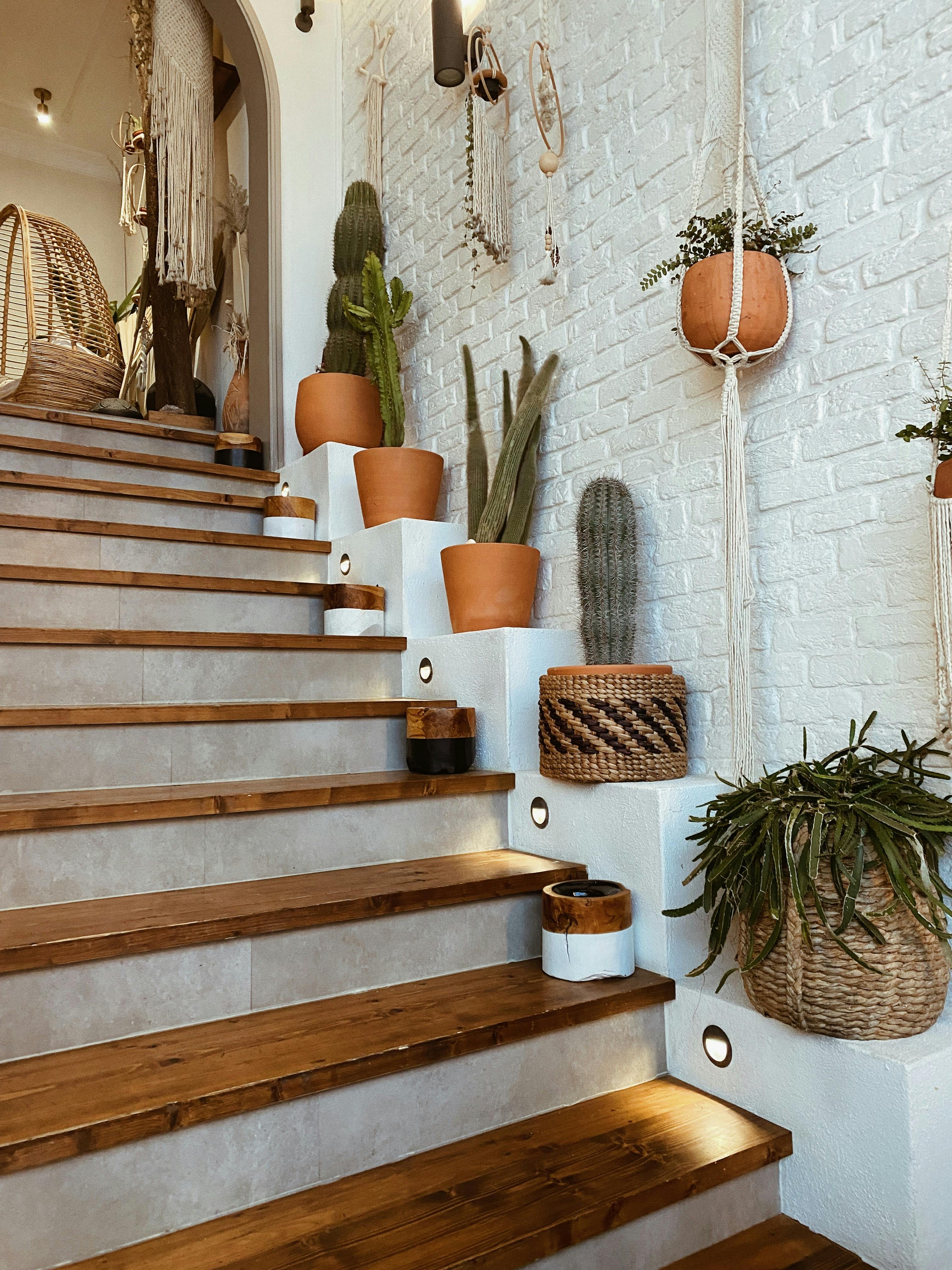
**The Three-Light System Museums Use**
Curators follow a simple but profound principle: every piece of art needs three types of lighting:
[credit](https://images.pexels.com/photos/11713148/pexels-photo-11713148.jpeg),
[licence](https://creativecommons.org/public-domain/)
1. **Key Light** (The main actor): Direct, focused illumination
2. **Fill Light** (The supporting actor): Softer, [ambient light](/finder/page/how-to-choose-art-for-a-room-with-low-light) that reduces harsh shadows
3. **Accent Light** (The scene-stealer): Dramatic, targeted light for specific details
This system creates dimensionality that mimics natural light's complexity.
### Light Source Deep Dive
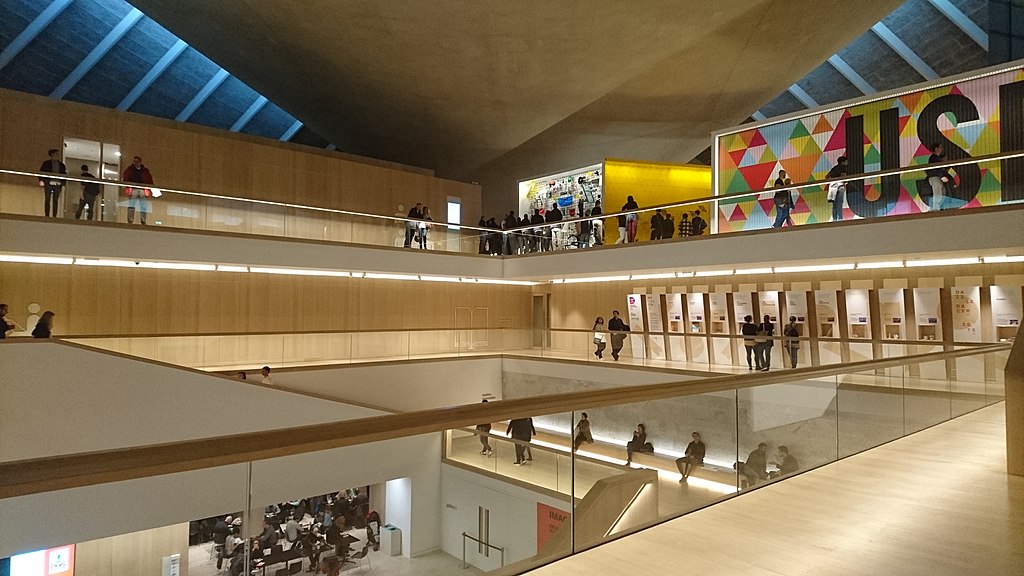
**Picture Lights**
These are your workhorses. But not all picture lights are equal:
- **LED strip lights:** Hidden behind frames, they create even wash lighting
- **Museum-style bar lights:** Project light at precise angles (30-45 degrees optimal)
- **Battery-operated options:** Perfect for renters or frequently rearranged spaces
The direction matters immensely. Light should hit the art at a 30-degree angle to prevent glare while revealing surface texture.
[credit](https://commons.wikimedia.org/wiki/File:Design_Museum,_Kensington_2.jpg),
[licence](https://support.google.com/websearch/?p=image_info)
**Track Lighting**
The gallery standard for good reason:
- **Flexibility:** Move heads as your collection evolves
- **Intensity control:** Dim individual heads
- **Professional finish:** Clean, architectural look
Pro tip: Use track lighting for gallery walls, spacing heads 24-36 inches apart.
**Wall Sconces**
The unsung heroes of ambient lighting:
- **Flanking sconces:** Frame large pieces symmetrically
- **Asymmetric placement:** Create dynamic tension with modern art
- **Swing-arm sconces:** Adjustable for changing displays
**Floor and Table Lamps**
Don't forget indirect lighting—these sources provide the ambient "fill" light that prevents harsh shadows and creates dimensional depth:
**The Geometry of Indirect Lighting:** The most common mistake is positioning floor lamps too close to artwork, causing glare rather than ambient fill. The optimal mathematical formula: place floor lamps at a distance equal to 2.5 times the height of your tallest nearby artwork. This creates broad, even ambient illumination without harsh shadows or direct glare from the lamp fixture itself.
- **Torchère lamps:** Bounce light off ceilings, creating soft ambient glow. Position in corners where light reflects off two wall surfaces simultaneously for maximum diffusion. Choose models with dimmer switches for evening adjustment.
- **Adjustable task lamps:** Illuminate reading nooks while providing ambient fill. Look for counterbalanced architect lamps that can be positioned precisely. These work particularly well beside seating areas where you want both task lighting and subtle artwork illumination.
- **Battery-powered LED strips:** Hide under furniture for subtle uplighting. Modern adhesive LED strips with lithium batteries last 8-12 hours and can be positioned under console tables, behind furniture, or along baseboards to create soft ambient glow without visible light sources.
- **Arc floor lamps:** The modern classic for living rooms. Position arc lamps where the shade directs light down and slightly inward, creating "pools" of [ambient light](/finder/page/how-to-choose-art-for-a-room-with-low-light) that define seating areas while illuminating nearby artwork through indirect bounce.
- **Sculptural floor lamps:** High-design floor lamps that are artworks themselves. Choose styles with translucent shades that provide both uplight and downlight, creating ambient illumination while serving as visual anchors for gallery arrangements.
**Advanced Technique - The Triangulation Method:** Position three floor lamps at triangle points around your seating area for complete 360-degree ambient coverage that eliminates shadows in artwork while creating flattering light for people. This method works better than a single bright overhead source.
The triangulation method works because it eliminates "invisible viewing angles"—those orientations where shadows fall across artwork. By providing light from multiple directions, every viewing position receives adequate illumination. This technique is borrowed directly from museum conservation labs where accurate color evaluation depends on eliminating shadows that would distort pigment appearance.
The key is layerability. I use a simple formula: 3 sources minimum, with at least 1 dedicated art light.
**The Layering Formula Explained:**
1. **Ambient layer:** Creates overall room illumination (torchère lamps, ceiling fixtures, natural if available)
2. **Task layer:** Provides concentrated light for specific activities (reading lamps, under-cabinet lighting)
3. **Accent layer:** Highlights architectural features and artwork (track lighting, picture lights, wall sconces)
4. **Bonus decorative layer:** Adds sparkle and visual interest (string lights, LED strips, candlelight)
**The Light Hierarchy Secret:** Professional designers think in terms of light "layers," not fixtures. Each layer serves specific functions while supporting the others. The common mistake is emphasizing one layer while neglecting the others—typically focusing on ambient lighting while forgetting accent lighting that gives artwork presence and dimensionality.
Most amateur installations stop at #1. Professional installations excel at #2 and #3. Extraordinary rooms master all four layers, creating spaces that adapt to every need and mood.
**Theater Lighting Analogy:** Think like a stage lighting designer. General wash lighting sets the scene (ambient). Spotlights highlight actors (art). Follow spots track movement (smart lighting). Backlighting creates depth (uplighting). This mindset transforms static rooms into dynamic environments.
The analogy extends further than most people realize: theater lighting designers use "motivation"—light that appears to come from plausible sources like windows, lamps, or fireplaces. Even when no such sources exist, they use artificial lights to create the *illusion* of motivated sources. This psychological trickery makes artificial light feel natural and comforting rather than institutional.
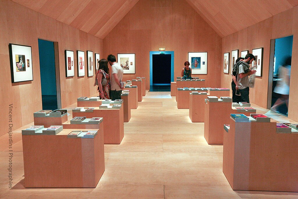
### The Physics of Perfect Lighting: Temperature, CRI, and Beam Angles
Here's where we geek out on the technical details that make or break your art display. Understanding these technical variables transforms lighting from guesswork into precise science, allowing you to create environments that honor both the artwork's material reality and the viewer's perceptual experience. Most lighting failures happen because these technical relationships are ignored or misunderstood.
[credit](https://commons.wikimedia.org/wiki/File:Exposition_Richard_Prince,_American_Prayer_-_sc%C3%A9nographie_20.jpg),
[licence](https://creativecommons.org/licenses/by/2.0)
**[Color Temperature](/finder/page/what-is-a-color-study-in-art) (Measured in Kelvins)**
Think of [color temperature](/finder/page/what-is-a-color-study-in-art) as the "personality" of your light source:
When you understand that color temperature affects not just how we *see* art but how we *feel* about it, lighting selection transforms from technical specification into emotional engineering. Museum curators know this intimately: the same artwork under 2700K versus 5000K lighting can appear emotionally opposite—warm and inviting versus cool and analytical.
- **2200K-2700K (Extra Warm):** Candlelight territory. Intimate, romantic, traditional. Ideal for displaying antique art, [gold leaf](/finder/page/what-is-gold-leaf-art), or creating atmospheric dining experiences. Watch for reduced vibrancy in cool-colored art.
- **2700K-3000K (Warm White):** The sweet spot for most homes. Creates cozy, welcoming atmosphere. Best for traditional oil paintings, warm-toned abstracts, wood-framed photography.
- **3500K-4000K (Neutral White):** Clean, modern light without sterility. Excellent for photography, contemporary graphic art, minimalist works. Balance of warmth and clarity.
- **5000K-6500K (Daylight/Cool White):** Stark, energizing. Only use for specific effects or very cool-toned minimal art. Can make warm-toned art appear washed out while making blue/green pieces sing.
**The Professional Insight:** Our eyes perceive colors differently under different temperatures. A [painting](/finder/page/what-is-action-painting) viewed at 2700K vs 5000K literally looks like two different artworks. More importantly, our brains have color constancy—we expect certain subjects to appear under certain lights. Landscape paintings feel "wrong" under 5000K light but "right" under 2700K (like sunset light). Abstract art is more flexible.
**Advanced Technique - Variable Temperature Systems:** Modern smart LED systems (like Philips Hue or Ketra) allow you to program [color temperature](/finder/page/what-is-a-color-study-in-art) changes throughout the day—cool morning light gradually warming toward evening. This keeps your art looking fresh and dynamic rather than static. Morning coffee at 4000K shows your contemporary photography perfectly; evening wine at 2700K transforms the same pieces into warm, contemplative works.
**The "Rosetta Stone" Rule:** Match your primary light color temperature to your dominant wall color temperature. Warm walls (creams, beiges, warm grays)? Use 2700K-3000K lighting. Cool walls (pure whites, light grays, blues)? 3500K-4000K lighting creates harmony rather than temperature warfare.
**The Exception That Proves the Rule:** Occasionally, you'll encounter a space where this rule fails spectacularly—a warm-toned room where cool lighting feels more "natural" or vice versa. This happens when architecture, artwork, and surface finishes create conflicting thermal cues. In these cases, ignore the "Rosetta Stone" rule and follow the "path of least resistance"—choose the color temperature that makes the *most important artwork* look best, then adjust other elements (or add separate lighting zones) to accommodate secondary artwork.
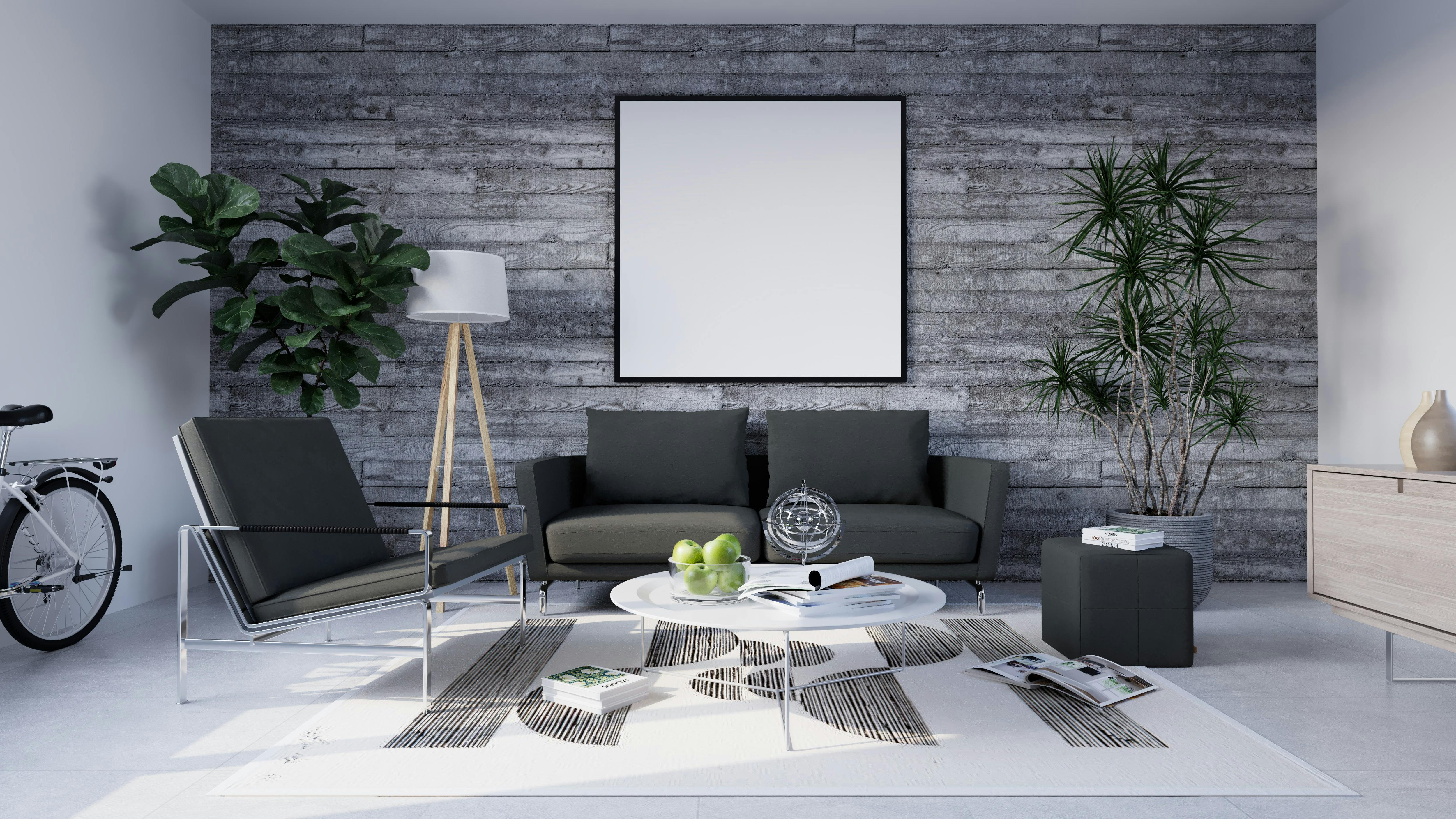
**Color Rendering Index (CRI)**
This measures how accurately light reveals true colors. Measured 0-100:
[credit](https://images.pexels.com/photos/20390765/pexels-photo-20390765/free-photo-of-modern-living-room-design.jpeg),
[licence](https://creativecommons.org/public-domain/)
- **CRI 90+:** Excellent color accuracy, ideal for art
- **CRI 80-89:** Good, acceptable for general use
- **CRI <80:** Poor, avoid for art display
For serious collectors, look for **CRI 95+** bulbs. Yes, they cost more. Yes, they're worth it.
Here's what CRI measures: the difference between how a light source reveals color versus natural daylight. A 95 CRI bulb reveals colors practically identically to daylight. An 80 CRI bulb—typical of cheap LEDs—can make specific colors appear dramatically wrong: reds shift orange, blues turn purple, greens become muddy. For artwork, this difference matters: you're literally not seeing the artist's intended color relationships.
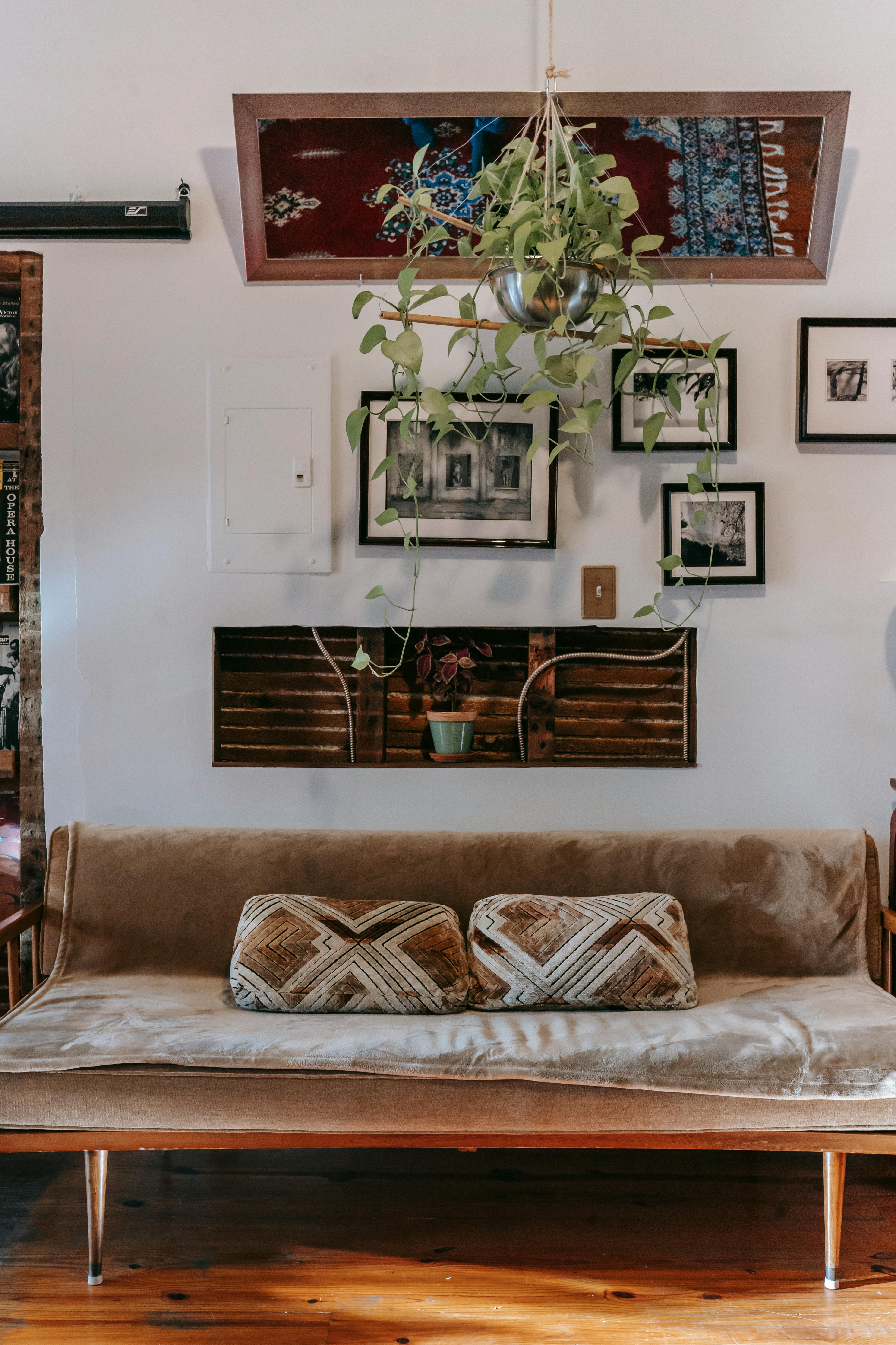
[credit](https://images.pexels.com/photos/5824517/pexels-photo-5824517.jpeg),
[licence](https://creativecommons.org/public-domain/)
**Beam Angle: The Forgotten Variable That Changes Everything**
How wide or narrow the light spreads determines whether you illuminate the art or the room:
Most lighting failures trace back to beam angle mistakes: narrow spotlights on gallery walls create harsh "spotlight effects," while wide flood lights on single artworks lose definition and drama. Match beam angle to artwork size and display context—there's no universal "best" angle, only appropriate relationships between light coverage and visual goals.
- **Narrow beam (15-30°):** Spotlight effect, dramatic and focused. Best for: striking single pieces, highlighting specific artwork details, creating focal points in large rooms. Creates "pools" of light that feel like exhibits.
- **Medium beam (40-60°):** Balanced coverage for single pieces. Best for: most standard artwork (24"x36" and smaller), creating layered lighting with multiple sources, consistent illumination without harsh edges.
- **Wide beam (90°+):** Wall washing, good for gallery arrangements. Best for: gallery walls with multiple pieces, long corridors with art, creating ambient room lighting while illuminating multiple artworks.
**The Mathematics Professionals Use:** Here's the formula museum lighting designers follow: Beam width at artwork = 2 × distance from light to art × tan(beam angle ÷ 2).
Example: A light 6 feet from your wall with a 40° beam creates roughly a 4.5-foot-wide illuminated circle. For a 3-foot-wide artwork, this provides comfortable coverage with slight spillage. For a 2-foot-wide piece, you get dramatic focused illumination.
**Pro Technique - Beam Layering:** Combine different beam angles for sophisticated effects. Use 60° fixtures for general gallery illumination, then add 25° spotlights on specific "star pieces" in your collection. This creates visual hierarchy—some pieces subtly illuminate, others dramatically command attention.
**The "30-Degree Rule":** Position lights at 30-degree angles from perpendicular to minimize glare while maximizing surface texture visibility. Light positioned directly overhead (90 degrees) creates harsh shadows. Light positioned too low creates reflection issues. 30 degrees is the sweet spot museum curators have used for decades.
**Dimmer Switches: Your Secret Weapon**
I install dimmers on every art light. Why? Because your lighting needs change throughout the day and for different moods:
- Morning: Brighter for visibility
- Evening: Dimmed for atmosphere
- Entertaining: Adjust to highlight conversation areas
- Movie night: Minimal accent lighting only
This control transforms static lighting into a dynamic design element.
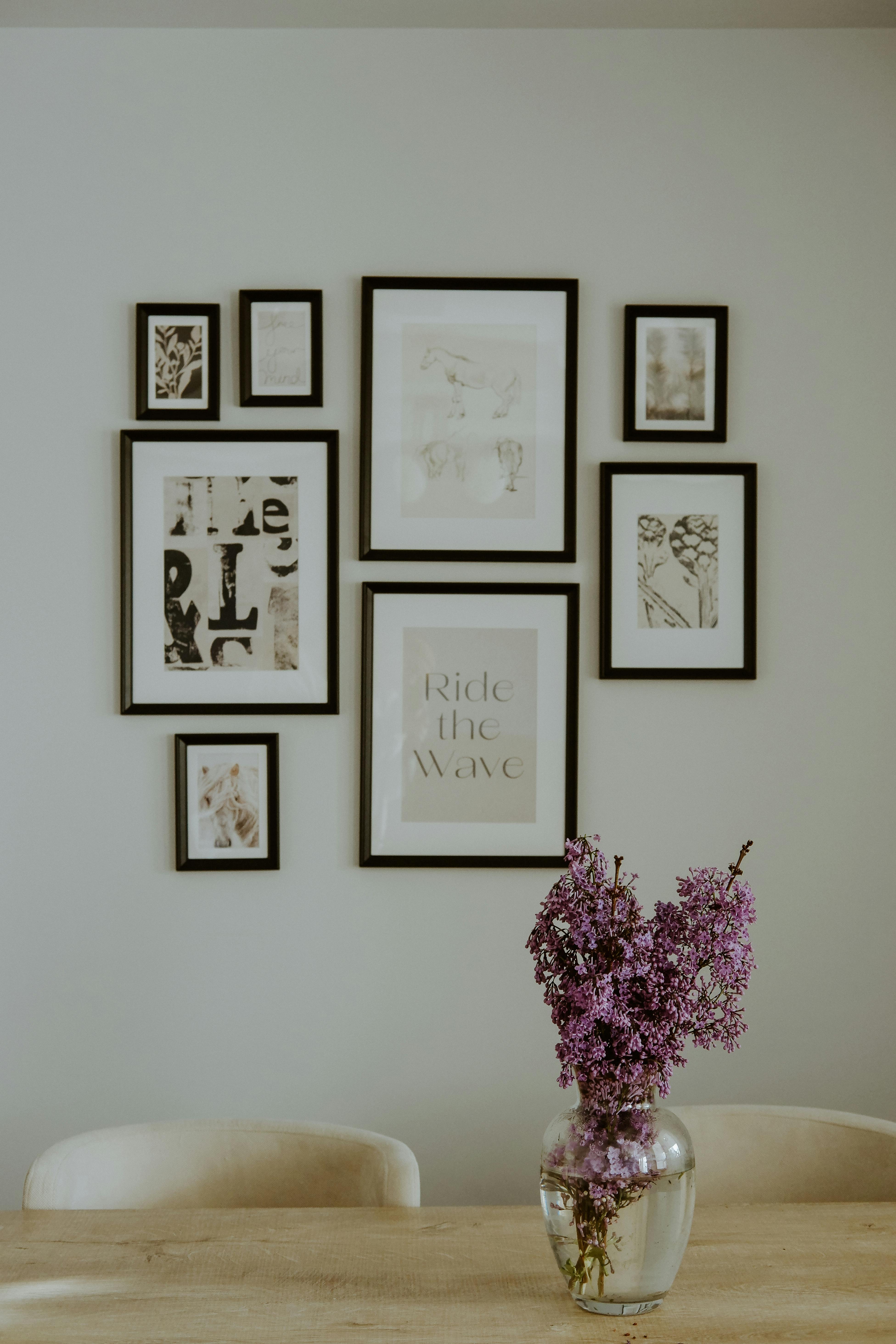
[credit](https://images.pexels.com/photos/16614531/pexels-photo-16614531/free-photo-of-dining-roman-with-bunch-of-lavender-in-vase.jpeg),
[licence](https://creativecommons.org/public-domain/)
### 3. Compositional Depth and Spatial Illusion
Where you hang the art is just as important as what you hang. In a windowless room, your goal is to create focal points and trick the eye into perceiving more space and light than is actually there.
Here's the neuroscience: when our eyes encounter artworks with strong linear perspective, [atmospheric perspective](/finder/page/understanding-perspective-in-art:-a-beginner's-guide), or implied spatial depth, our visual cortex activates depth-perception neurons normally reserved for three-dimensional environments. This literally rewires our spatial perception of the room itself, making walls appear to recede and ceilings to lift through pure optical illusion.
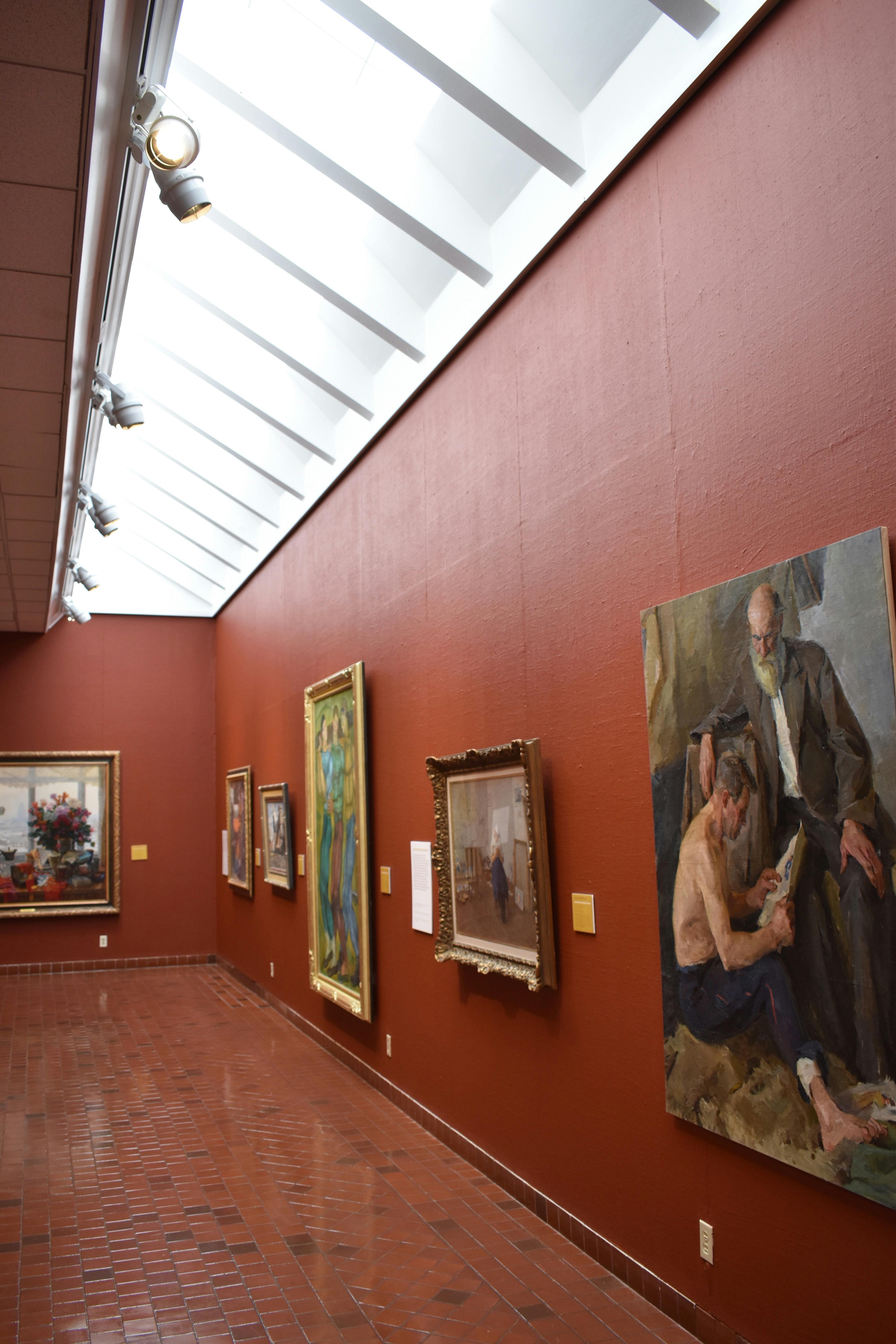
[credit](https://www.pexels.com/photo/photo-of-a-room-full-of-paintings-in-an-art-gallery-14595876/),
[licence](https://creativecommons.org/public-domain/cc0/)
**Mirrors Are Your Best Friend:** This is the oldest trick in the book for a reason. A [large mirror](/finder/page/how-to-decorate-a-large-wall), or even a mirror integrated into a [gallery wall](/finder/page/what-is-a-gallery-wall), will capture and bounce every single lumen of light in the room. It also creates the illusion of depth, which is crucial for [using art make a small room feel bigger](/finder/page/using-art-make-small-room-feel-bigger).
Here's why mirrors work neurologically: when our peripheral vision detects reflected space, our brain interprets this as additional volume rather than surface, effectively doubling the perceived spatial envelope. More importantly, mirrors reflect light wavelengths at 95-98% efficiency across the visible spectrum, making them far more efficient light-distribution tools than any painted surface or artwork.
**Advanced Mirror Strategy:** Position mirrors to reflect your *best* artwork, not just light sources. This creates visual redundancy that makes art feel more important while effectively doubling the light in your space. For maximum impact, place a mirror on the wall opposite your primary artwork with lighting positioned to illuminate both simultaneously.
**The Infinity Reflection Technique:** Here's something most designers never attempt: angled mirror placement that creates infinite reflection loops. Position two mirrors on opposing walls with artwork visible to both. The reflection bounces infinitely between surfaces, creating depth that appears limitless while providing exponential light multiplication. This technique works particularly well in narrow spaces like hallways where the infinity effect transforms cramped into expansive.
**The "False Window" Technique:** Frame a large mirror (36"×60"+) with window-style molding and interior shutters that open and close. This psychological trick fools your brain into perceiving the space as having a window, immediately relieving feelings of claustrophobia while creating sophisticated layered light reflections.
**Framing Mirrors Like Art:** Don't treat mirrors like afterthoughts. Frame them identically to your art (same frame style, mat if appropriate) to integrate them into your gallery rather than isolating them as utilitarian objects. This transforms "mirror functionality" into "mirror as art installation."
**Go Big:** It might seem counterintuitive, but one piece of [large-scale abstract art](/finder/page/decorating-with-large-scale-abstract-art-making-a-statement-in-any-room) can make a small, dark room feel grander. Lots of small pieces can sometimes feel cluttered, but a single, confident statement piece can expand the walls visually.
Here's the perceptual psychology: our brains use relative scale to interpret space. When artwork occupies 60-75% of a wall surface, our visual system recalibrates its sense of scale—the artwork becomes the reference point rather than the wall boundaries. This "recalibration effect" makes the surrounding wall appear larger in comparison, effectively expanding spatial perception through proportional relationships.
**The Mathematics of "Big":** Proper large artwork should occupy 60-75% of available wall space width. For example, a 10-foot-wide wall should feature artwork 6-7.5 feet wide. This creates scale without overwhelming. Artwork occupying less than 50% of wall width often looks timid; artwork exceeding 80% feels cramped.
**When "Big" Fails:** Large artwork without adequate lighting creates the opposite of the intended effect—it becomes a dark, oppressive presence. Always pair large artwork with proportionally scaled lighting. A 6-foot-wide piece needs multiple light sources (2-3 picture lights or 4-6 track heads) to prevent dark spots and uneven illumination.
**The Professional Secret:** Professional installers use a simple calculation: the sum of all artwork widths on a single wall should equal 1.5-2x the wall's width for maximal impact. This creates slight visual "overflow" that makes walls appear larger while preventing sparseness. Example: A 12-foot wall should host 18-24 total feet of artwork width (counting all pieces). This explains why galleries feel luxuriously dense while amateur installations often feel sparse.
* **Create a Destination:** Hang your main piece of art on the wall you see first when you enter the room. This creates an immediate focal point and draws attention away from the lack of windows. Placing [art above the sofa](/finder/page/art-above-the-sofa-a-guide-to-perfect-placement-and-scale) is a classic way to anchor a room and give it purpose.
**The Entry Axis Principle:** When you enter any room, there's an invisible line from doorway to the farthest wall. This primary sightline should intersect your most important artwork at the 1/3 point (from bottom). This creates natural visual hierarchy—your eye discovers the art as you enter rather than having it "announce" itself aggressively.
**The Seating Anchoring Secret:** For living rooms and bedrooms, art should be centered on seated eye level, not standing eye level. Measure 48-54" from floor to artwork center when placing above sofas, beds, or seating areas. This prevents art from "floating" above people's heads and creates intimate conversation.
**Professional Curator's Trick:** The most important art in any room should be visible from the primary seating position. If you're designing a [living room](/finder/page/choosing-art-for-your-living-room), sit on the main sofa and note exactly what you see on each wall. That's your artwork placement guide—art invisible from primary seating becomes decorative rather than experiential.
## Real-World Transformations: Before and After Case Studies
Let's move from theory to practice. These aren't hypothetical scenarios—they're actual transformations I've witnessed or documented. Each case required specific material choices, precise lighting calculations, and psychological understanding of spatial perception. Notice how each section breaks down not just *what* was done, but *why* the specific interventions worked optically, psychologically, and functionally.
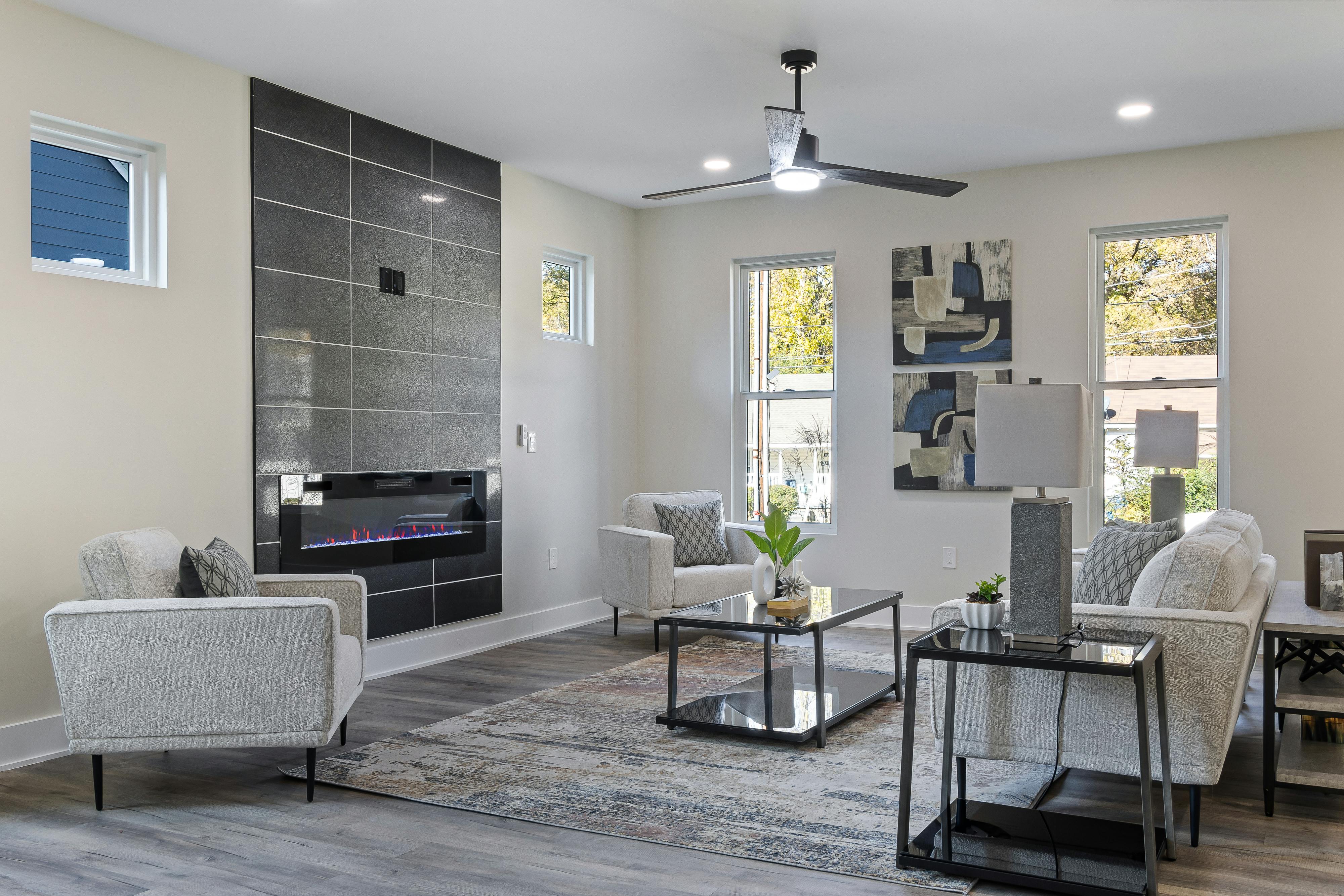
[credit](https://images.pexels.com/photos/19227255/pexels-photo-19227255/free-photo-of-cozy-living-room-in-a-house.jpeg),
[licence](https://creativecommons.org/public-domain/)
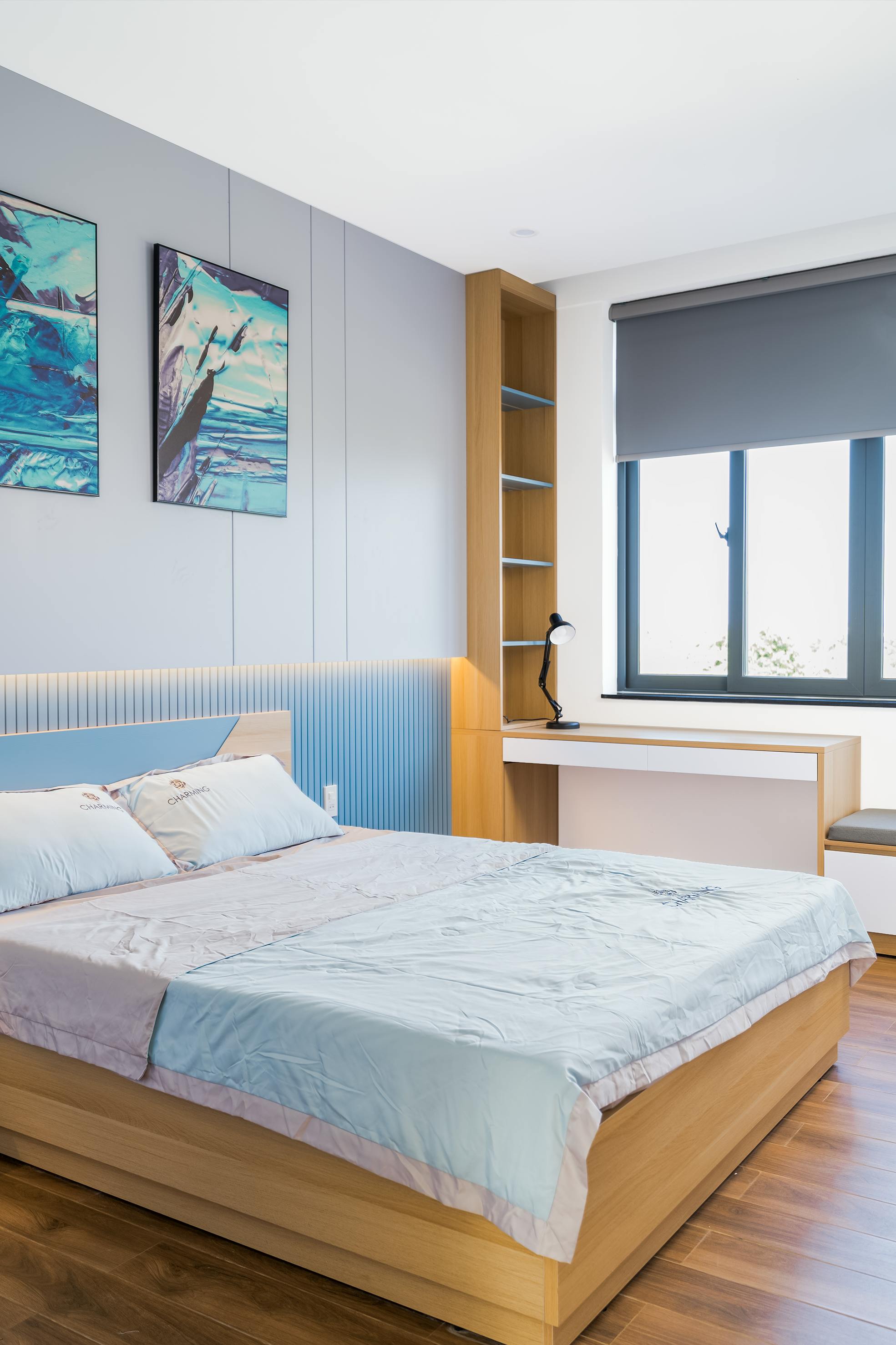
### Case Study 1: The Windowless Hallway Gallery
The challenge: A 30-foot hallway, 4 feet wide, no exterior walls, connecting bedrooms to living areas. Original state: dark, ignored, purely functional.
[credit](https://images.pexels.com/photos/16648032/pexels-photo-16648032/free-photo-of-modern-bedroom-design-for-a-teenager.png),
[licence](https://creativecommons.org/public-domain/)
**The transformation strategy:**
Instead of seeing it as a problem, the designer treated it as a curated exhibition space. Here's the technical breakdown:
The success here demonstrates the power of "environmental narrative"—transforming utilitarian space into intentional experience by asking not "what can this space be?" but rather "what story can this space tell?" The answer was "artistic journey," and every material and lighting choice served that narrative.
1. **Wall treatment:** Benjamin Moore "Chantilly Lace" (warm white) in eggshell finish for subtle reflection
2. **Art selection:** Series of 6 abstract prints with warm cadmium yellows and gold leaf accents
3. **Framing:** Identical 1" brass frames with 2" white mats (creates breathing room)
4. **Lighting:** Linear LED strip coving running the hallway length for ambient wash + individual track heads (3000K, CRI 95, 40° beam) 24" apart, centered on each piece
5. **Flooring:** High-gloss epoxy coating with mica flakes to reflect light downward
The result? The hallway became a destination—a transition space that people pause in rather than rush through. The homeowner reported it "completely changed how we experience the house."
[credit](https://www.pexels.com/photo/modern-design-of-living-room-in-house-20035976/),
[licence](https://creativecommons.org/public-domain/)
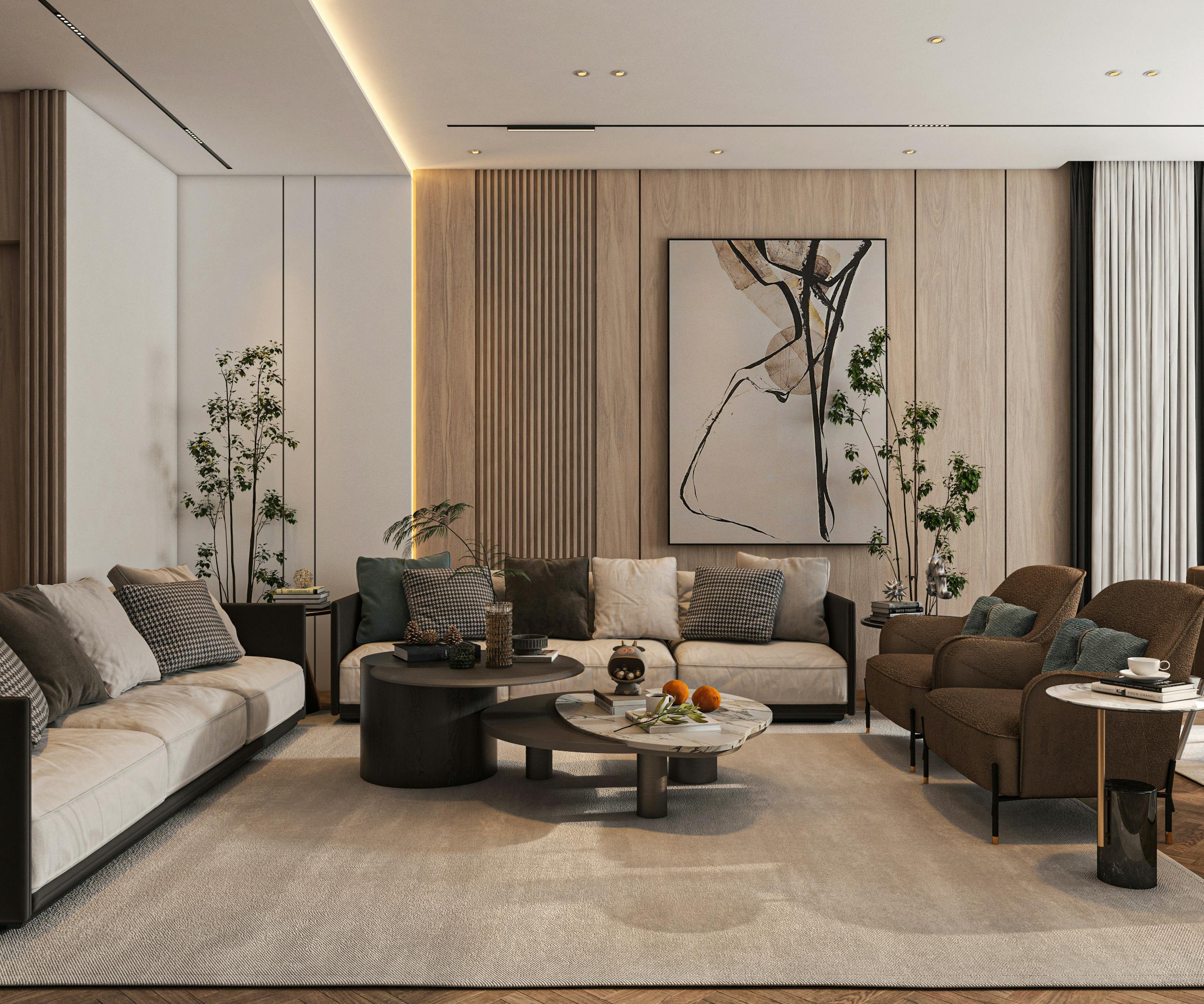
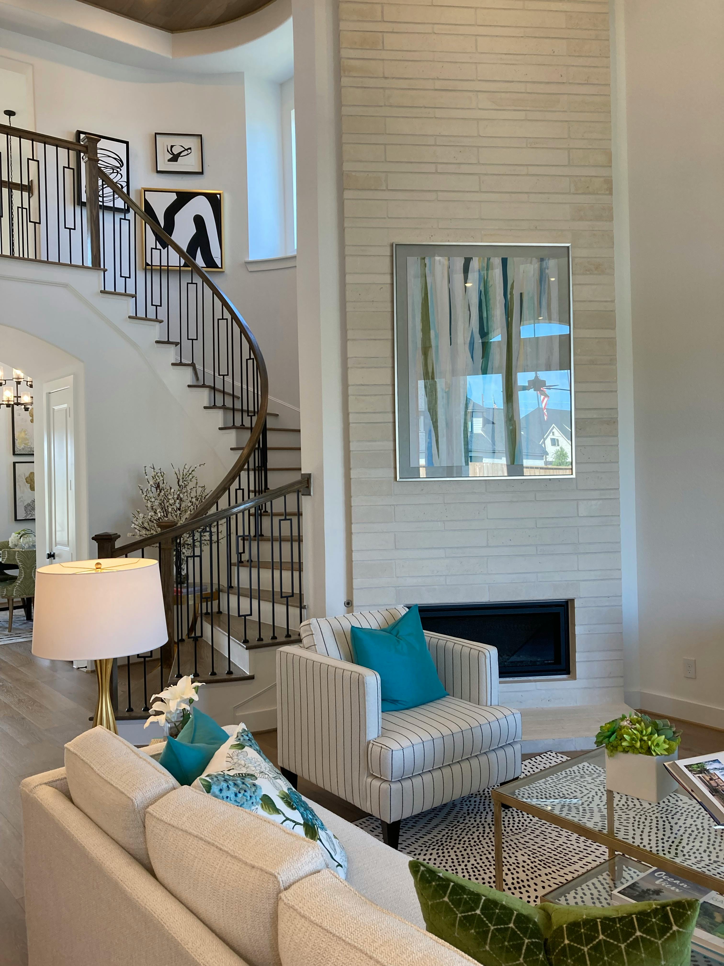
### Case Study 2: The Basement Art Studio Turned Living Room
The challenge: 600 sq ft basement with 7-foot ceilings, no natural light, previously used for storage. Client wanted a cozy, artistic living space.
**The transformation strategy:**
This required psychological trickery:
The basement transformation reveals how spatial perception depends more heavily on proportional relationships than absolute dimensions. By manipulating these relationships through strategic contrasts, you can literally rewire how people experience space—making small rooms feel spacious, low ceilings feel lofty, cramped areas feel comfortable.
[credit](https://images.pexels.com/photos/16581570/pexels-photo-16581570.jpeg?cs=srgb&dl=pexels-art-rutka-109215-16581570.jpg&fm=jpg),
[licence](https://creativecommons.org/public-domain/)
1. **Ceiling treatment:** Semi-gloss white paint to maximize light reflection (flat ceilings absorb light)
2. **Wall strategy:** Three walls in warm greige (Benjamin Moore "Revere Pewter"), one accent wall in deep teal
3. **Art placement:** One large-scale abstract (48" x 60") with metallic copper elements on teal wall, deliberately lit asymmetrically to create dimension
4. **Lighting layering:**
- Overhead: Recessed LED can lights (3000K) on dimmer
- Floor: Two torchiere lamps in corners for ambient uplighting
- Task: Adjustable swing-arm wall lamps by seating areas
- Art: Museum-style picture light above [large piece](/finder/page/decorating-with-large-scale-abstract-art-making-a-statement-in-any-room)
5. **Strategic mirrors:** Large leaning mirror (36" x 60") opposite the main art piece, angled to reflect the artwork and ceiling light
6. **Textural play:** Matte velvet sofa (absorbs light, creates contrast) + shiny silk cushions (reflect light) + wool area rug with metallic threads
The result? The room feels intimate rather than claustrophobic. Visitors consistently guess the ceiling height as 8-9 feet (visual trickery through contrast). The room became the homeowner's favorite space for evening relaxation.
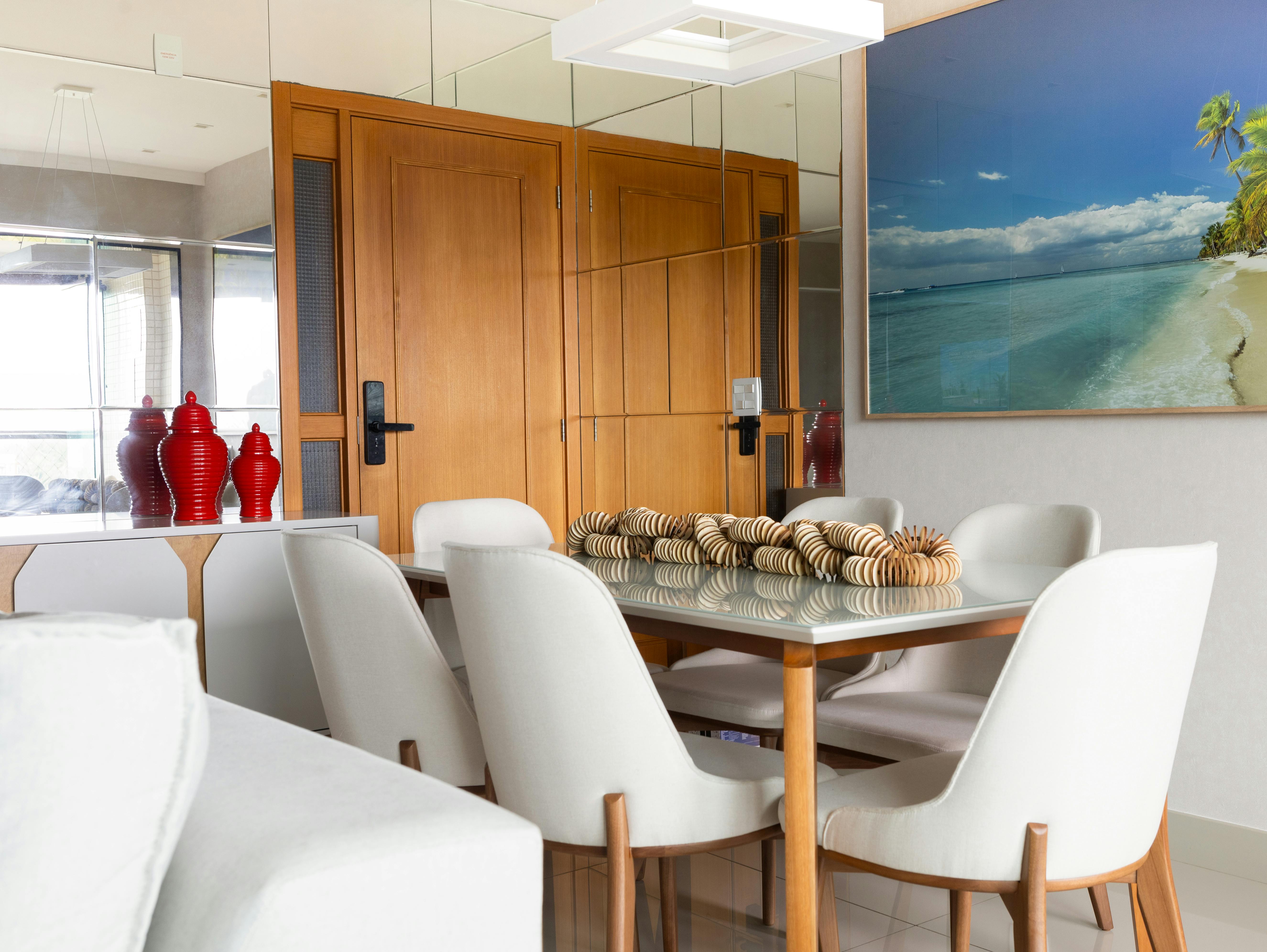
### Case Study 3: The Dining Room in the Round
The challenge: Circular [dining room](/finder/page/how-to-choose-art-for-a-dining-room) in center of house, no windows, 12-foot diameter. Risk: felt like dining in a cave.
[credit](https://images.pexels.com/photos/34208351/pexels-photo-34208351.jpeg?cs=srgb&dl=pexels-rods-aguiar-2154709933-34208351.jpg&fm=jpg),
[licence](https://creativecommons.org/public-domain/)
**The transformation strategy:**
Embrace the circular geometry:
The circular [dining room](/finder/page/how-to-choose-art-for-a-dining-room) demonstrates how geometry can become a feature rather than a flaw when you stop fighting architectural constraints and instead amplify inherent characteristics. The key was recognizing that circular spaces create natural focal points and social intimacy—qualities that rectangular rooms must work harder to achieve.
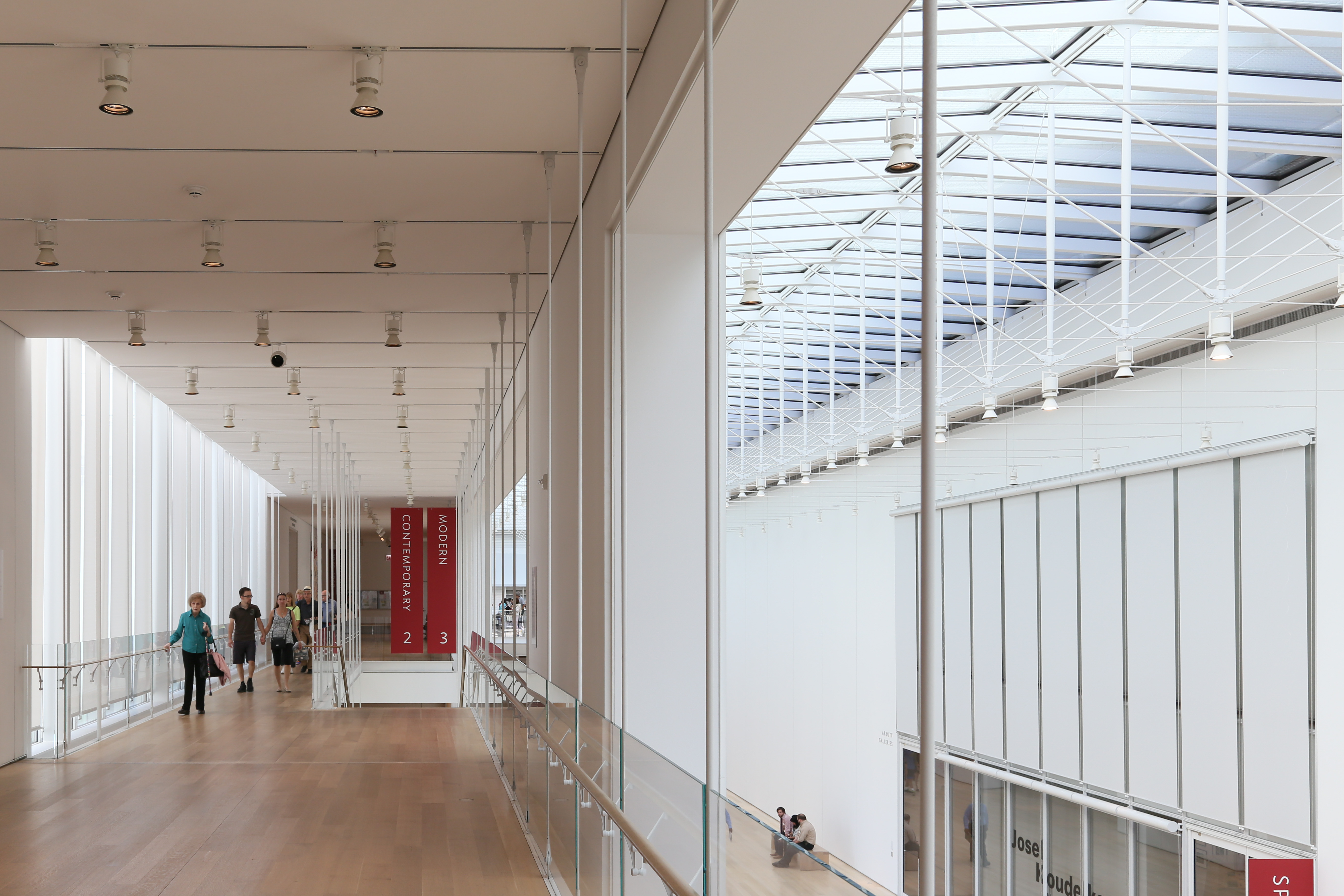
[credit](https://upload.wikimedia.org/wikipedia/commons/a/a2/Modern_Wing%2C_Second_Level_-_panoramio.jpg),
[licence](https://creativecommons.org/licenses/by/3.0)
1. **Wall treatment:** Vertical grasscloth wallpaper in champagne tone (adds texture + subtle shimmer)
2. **Lighting centerpiece:** Large drum pendant with warm LED (2700K) over table
3. **Art strategy:** Circular [gallery wall](/finder/page/what-is-a-gallery-wall) (yes, possible!) with artworks all within the same warm color family but varying dramatically in size and texture
4. **Furniture:** White lacquered dining chairs (reflect light), dark walnut table (absorbs, creates anchor)
5. **Strategic additions:**
- Table centerpiece with battery-operated LED candles (safe, warm, adjustable)
- Art lights on 6 key pieces on walls
- Dimmer system controlling all light sources
The result? The room became a cozy, enveloping experience perfect for long dinner conversations. The circular [gallery wall](/finder/page/what-is-a-gallery-wall) became a talking point, and the varied textures kept the monochromatic color scheme from feeling boring.
What these cases share: intentionality, strategic layering, and treating lighting as an architectural element rather than an afterthought.
[credit](https://images.pexels.com/photos/5824517/pexels-photo-5824517.jpeg),
[licence](https://creativecommons.org/public-domain/)
Suddenly, your dreary hallway isn't a passageway; it's an experience. You've created a destination within your home.
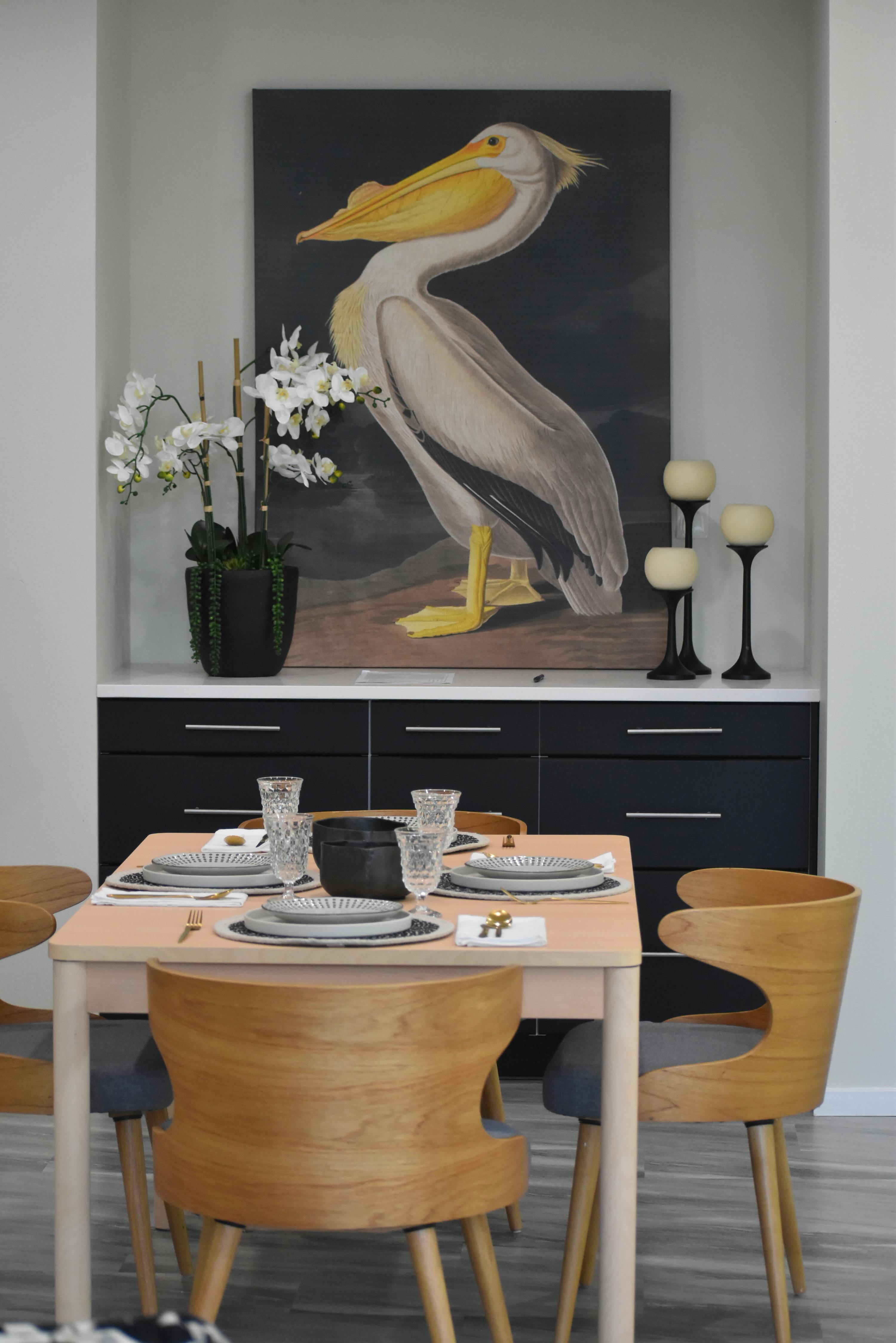
[credit](https://images.pexels.com/photos/25322873/pexels-photo-25322873/free-photo-of-painting-of-pelican-in-dining-room.jpeg),
[licence](https://creativecommons.org/public-domain/)
### Advanced Gallery Wall Strategy in Dim Lighting

[credit](http://commons.wikimedia.org/),
[licence](https://creativecommons.org/publicdomain/mark/1.0/)
Gallery walls in windowless spaces need extra care:
- **Frame uniformity:** Consistent frames (color, width) create visual harmony
- **Lighting grid:** Each piece gets its own light source, or lighting creates a deliberate grid
- **Mirror integration:** Incorporating mirrors into gallery walls reflects both light and space
- **Hierarchy:** One larger "anchor" piece establishes importance
The key: don't let lighting become random. If you can't light each piece individually, light the arrangement as a whole with well-spaced track lighting.
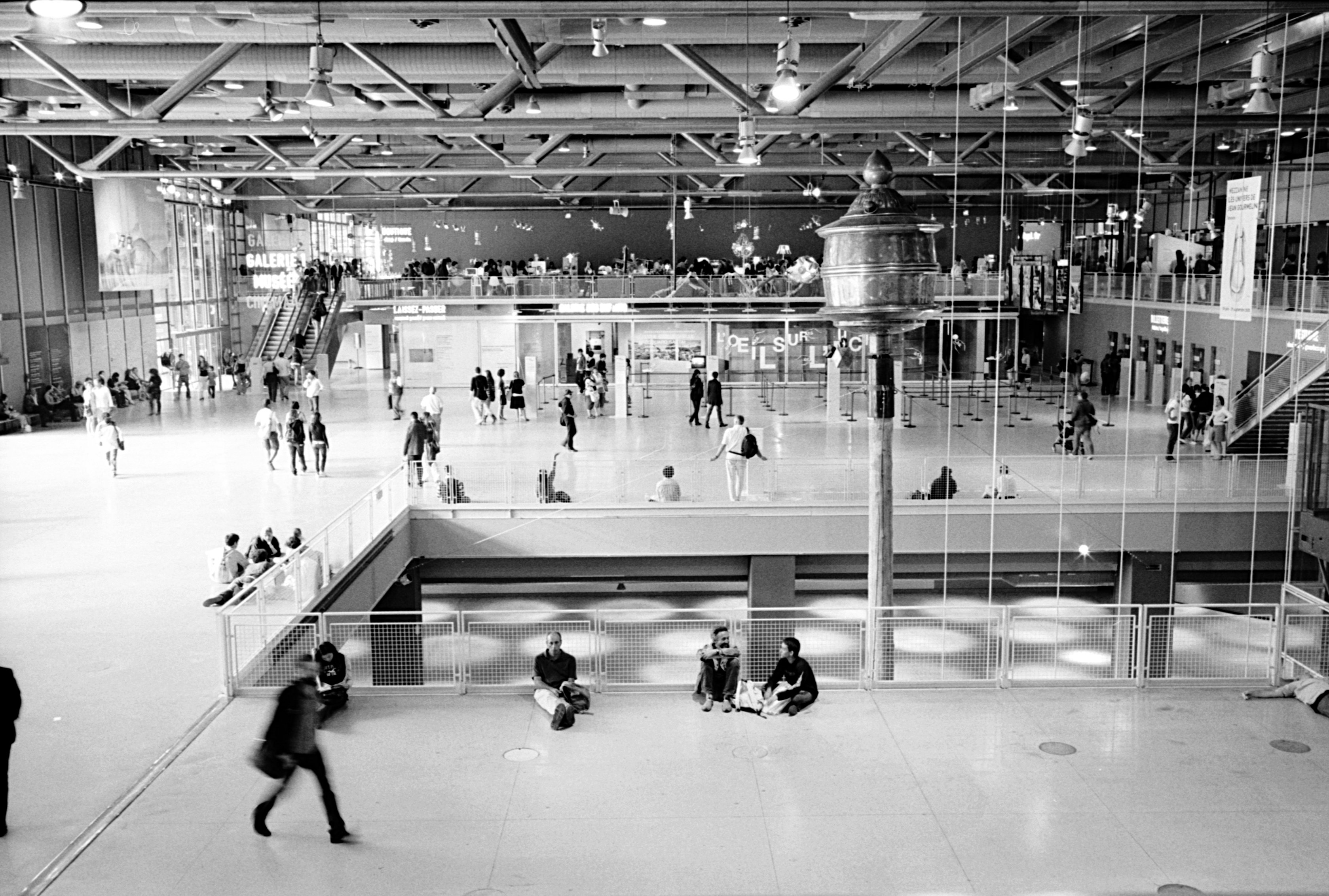
[credit](https://upload.wikimedia.org/wikipedia/commons/a/aa/Centre_Georges_Pompidou_July_13%2C_2008_3.jpg),
[licence](https://creativecommons.org/licenses/by-sa/2.0)
## Next-Level Alchemy: Advanced Techniques for Challenging Spaces
When standard solutions aren't enough, it's time to think like an artist who's also part lighting designer, part psychologist. The following techniques come from professional installations where "standard" simply isn't sufficient for the architectural challenges or artistic ambitions involved.
These aren't [DIY](/finder/page/how-to-make-your-own-gesso-a-diy-guide-for-artists) weekend projects—they require [professional installation](/finder/page/qa-with-an-art-logistics-expert-shipping-installation-and-insuring-your-collection) and sometimes architectural modification—but they represent the absolute cutting edge of what's possible when you refuse to accept that windowless means "design compromise."
### The Science Behind These Techniques
Most of these advanced strategies work because they trick fundamental neurological hardwiring. Human brains evolved to interpret certain environmental cues in specific ways. When you reverse engineer those cues, you can make the brain perceive spaciousness, natural light, depth, and connection even when architecture provides none of these things.
It's not magic; it's applied neuroscience using design as the delivery mechanism.
### 1. The Biophilic Workaround: Nature-Inspired Light
Humans are hardwired to crave natural light because it connects us to circadian rhythms and seasonal cycles. In windowless spaces, you can trigger similar psychological responses through biophilic design—incorporating nature-inspired patterns, colors, and lighting that satisfy our evolutionary need for connection to natural cycles.
**Simulated Daylight Systems**
- **Circadian lighting systems:** Smart LED systems that change color temperature throughout the day (cool blue morning light shifting to warm evening light). Professional systems like Ketra or Lutron Ketra integrate with home automation for seamless transitions. The psychological effect is profound: your body still experiences "morning" and "evening" light cues that regulate serotonin and melatonin production.
- **OLED panels:** Ultra-thin light-emitting panels that can be framed like art, providing soft ambient glow. These create zero glare while emitting extremely high CRI light (95+). Panels like LG's OLED lighting series can be framed identically to your art, creating luminous "light paintings" that serve as both illumination and decoration.
- **Light therapy lamps:** Positioned near seating areas to boost mood and energy. Look for 10,000 lux intensity models like Carex Day-Light Classic or Verilux HappyLight that provide full-spectrum light matching natural daylight. Position these to shine indirectly on your art while providing mood benefits.
**Reflected "Views"**
Instead of actual windows, create the suggestion of outdoor space:
This category represents the most psychologically sophisticated approach to windowless environments because it addresses the fundamental human need for connection to exterior space. Whether literal or illusory, these strategies satisfy our hardwired preference for environments with views while maintaining complete lighting control. Notice how each technique provides different levels of success depending on space characteristics, proving the maxim "architecture determines strategy."
- **Trompe l'oeil murals:** Commission or install realistic landscape murals that create the illusion of windows opening onto expansive views. Professional mural painters can create stunningly realistic scenes, while removable wallpaper options like Photowall offer surprisingly convincing alternatives.
- **Translight panels:** Backlit photographic panels (like those used in movie studios) create convincing "windows" with natural light effects. Companies like Sky Factory produce ceiling and wall panels that simulate sky, clouds, trees, and natural lighting conditions.
- **Artwork featuring expansive landscapes:** Choose pieces with strong horizon lines, [atmospheric perspective](/finder/page/understanding-perspective-in-art:-a-beginner's-guide), and implied light sources that suggest outdoor space. Look for artists working in the Hudson River School tradition or contemporary landscape photographers who capture immersive vistas.
- **Mirrors with outdoor scenes:** Position mirrors to reflect artwork showing landscapes, effectively "doubling" the outdoor suggestion while eliminating the claustrophobic feeling of enclosed spaces.
- **Living walls:** Yes, you can grow plants in windowless rooms with hydroponic systems and full-spectrum grow lights. Living walls not only provide biophilic connection but actively improve air quality and humidity regulation. Companies like Ambius or Sagegreenlife create self-contained living wall systems with integrated LED grow lights that provide pleasant ambient illumination.
### 2. The Architecture of Shadow
Master lighting doesn't just illuminate—it sculpts with shadow. Here's how to make shadows work for you:
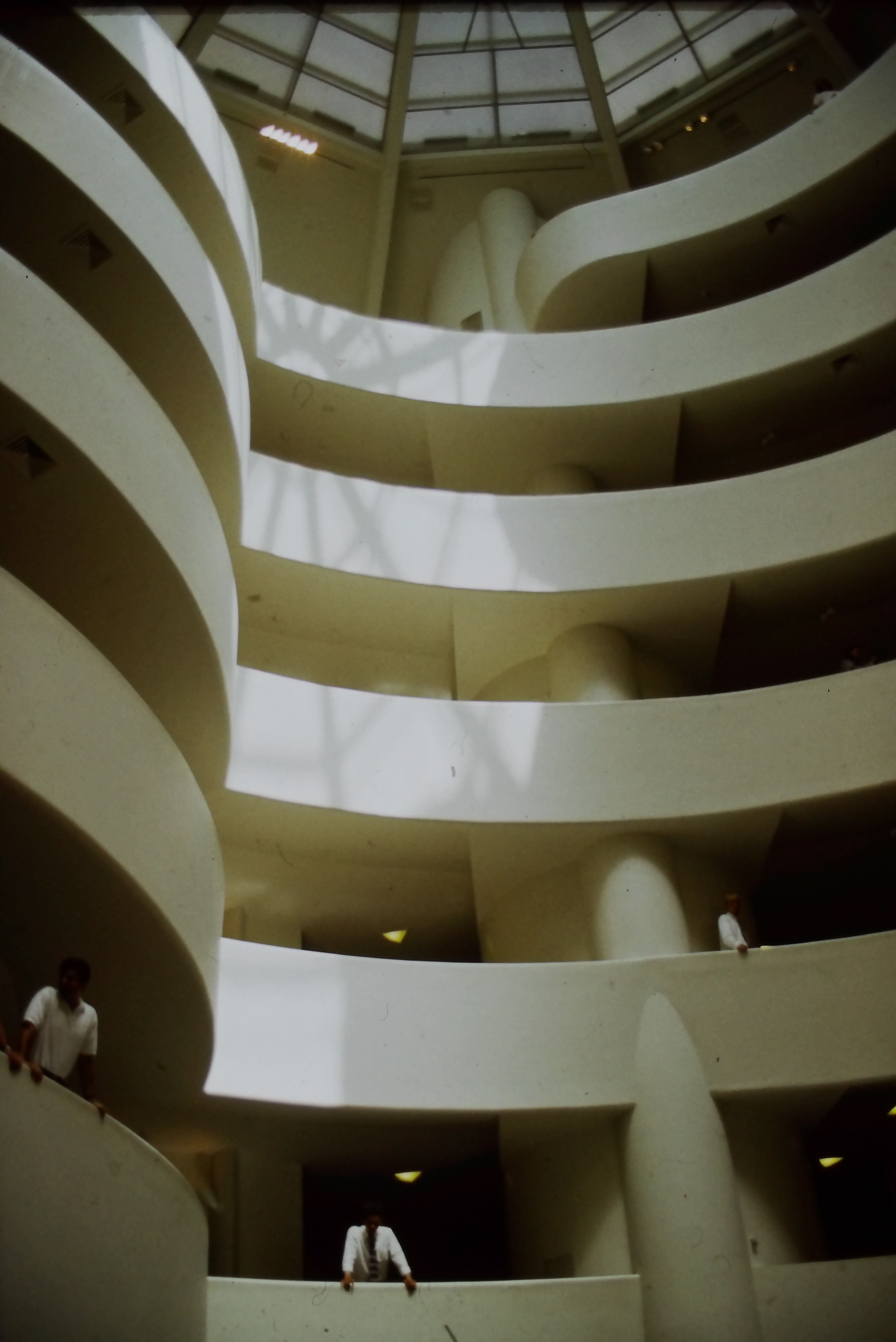
[credit](https://upload.wikimedia.org/wikipedia/commons/6/60/Frank_Lloyd_Wright_-_New_York%2C_NY_-_Solomon_R._Guggenheim_Museum_%28R%29.jpg),
[licence](https://creativecommons.org/licenses/by/4.0)
**Deliberate Darkness Techniques**
- **Up-lighting from floor:** Creates dramatic shadows on ceilings, making walls seem taller
- **Grazing light:** Light positioned close to wall surfaces to emphasize texture
- **Silhouette lighting:** Back-lighting objects to create striking profiles
A dark corner can become a dramatic feature when you illuminate what's in front of it, creating layers of depth.
**The James Turrell Method: Light as Subject**
Turrell, the master of light art, taught us that light isn't something that illuminates objects—it can *be* the object. In your home, this means transitioning from "lighting art" to "curating light experiences."
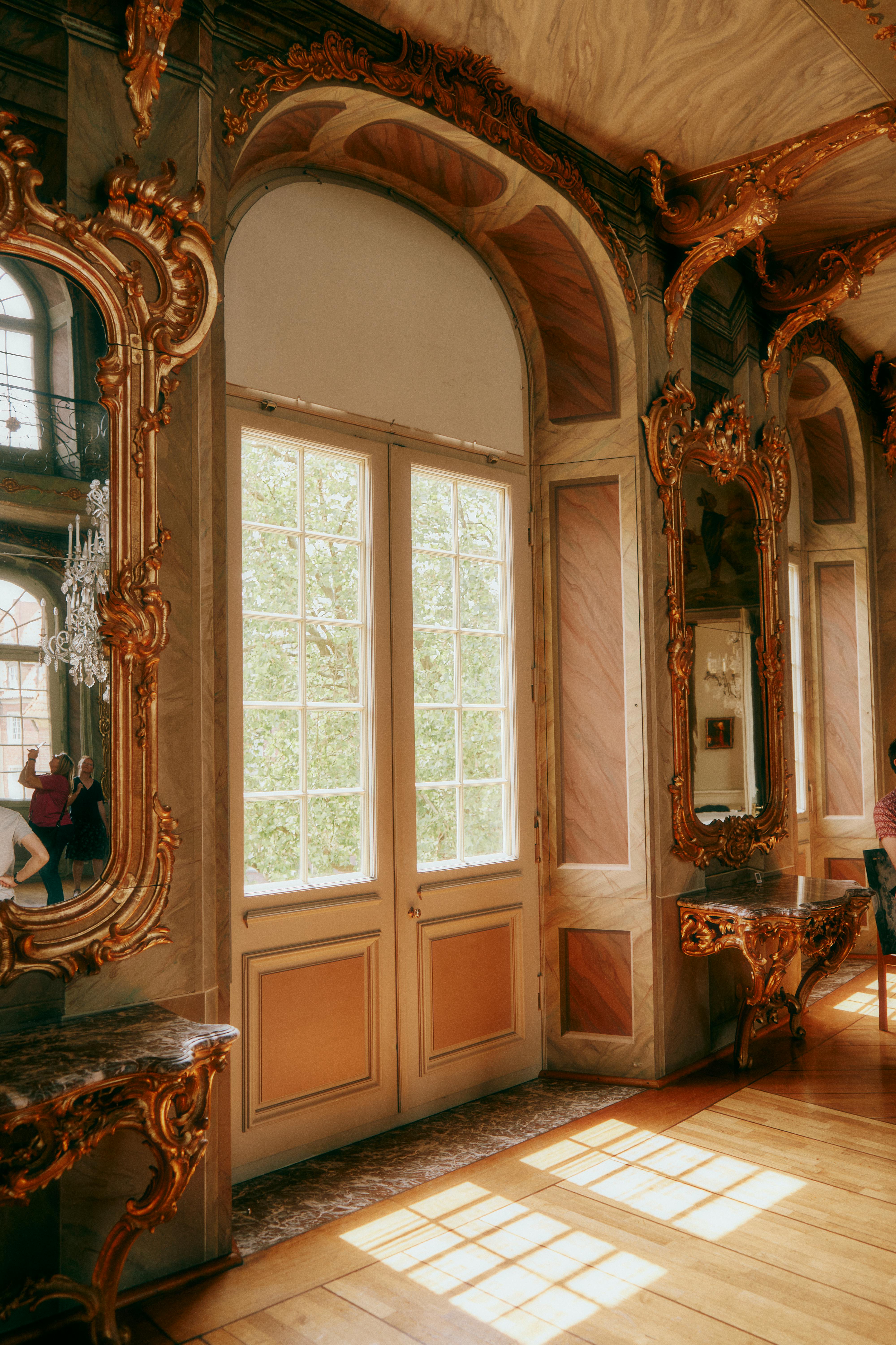
[credit](https://images.pexels.com/photos/17893035/pexels-photo-17893035/free-photo-of-ornamented-mirrors-near-windows.jpeg),
[licence](https://creativecommons.org/public-domain/)
**Advanced Turrell-inspired techniques for homes:**
- **Corner void lighting:** Install LED strips inside wall corners at ceiling level, creating volume-defining light that appears to dematerialize corners. This expands room perception while providing ambient glow.
- **Recessed linear coves:** Create false bulkheads around room perimeters with hidden LED strips that wash ceiling surfaces with uniform light. This eliminates visible light sources while providing museum-quality ambient illumination.
- **Backlit translucent panels:** Commission or create artwork on translucent materials (vellum, frosted acrylic, shoji paper) with LED backlighting. These pieces function as both art and ambient light sources. Professional installations use optical diffuser panels to eliminate hotspots.
- **Neon and LED illuminated art:** Integrate neon sculpture or LED art installations that serve as both subject and room lighting. Modern LED systems consume minimal power while providing gallery-quality illumination and artistic presence.
- **The "reveal" technique:** Install art in shallow wall recesses (4-6 inches deep) with perimeter LED lighting that reveals the artwork while creating atmospheric glow around it. This technique works particularly well for sculptures and 3D pieces.
**The Psychological Effect:** When light becomes art, your relationship to the room changes fundamentally. You're not in a windowless space trying to compensate for lack of natural light—you're in a light-arts environment where artificial light is the medium.
### 3. Color Field Psychology: How Pigment Selection Creates Space
Specific color choices can fundamentally alter spatial perception through optical and psychological mechanisms. Understanding these principles lets you "paint" space into existence.
**Expanding Colors (Cool, Light)**
- **Pale blues, cool grays, soft lavenders appear to recede:** These wavelengths focus behind the retina rather than on it, creating perceptual distance. Use for small rooms where you want breathing room.
- **Chromatic brightness illusion:** Light colors reflect more photons, literally increasing overall room brightness. A room painted pale blue receives the same light but appears 15-20% brighter than the same room painted deep burgundy.
- **Atmospheric perspective replication:** Cool colors mimic natural atmospheric perspective (distant mountains appearing bluer), tricking your brain into perceiving depth that doesn't structurally exist.
**Advancing Colors (Warm, Dark)**
- **Deep reds, warm browns, midnight blues come forward:** Warm wavelengths focus in front of the retina, creating perceptual proximity. Use for cavernous basements where you want intimacy.
- **Light absorption creates contrast:** Dark colors absorb ambient light, making light sources appear brighter by comparison. A single warm spotlight on a dark wall creates more dramatic impact than multiple lights on a pale wall.
- **Cocooning effect:** Dark walls create visual boundaries that feel protective rather than restrictive. The psychological comfort of defined space outweighs the spatial limitation, changing how you experience the room.
**The Professional Colorist's Secret: The 80-15-5 Rule**
Successful rooms follow predictable color percentages:
- **80% dominant color:** Your primary wall color binds the space
- **15% secondary color:** Provides contrast through furniture or accent walls
- **5% accent color:** Pops of brightness through art, accessories, lighting
For windowless spaces, reverse the typical application: use dominant color for ceilings (80% of horizontal surface), secondary color for walls (15% of vertical surfaces), accent color for strategic highlights (5% concentrated impact areas). This prevents dark ceiling cave effects while maintaining dimensional interest.
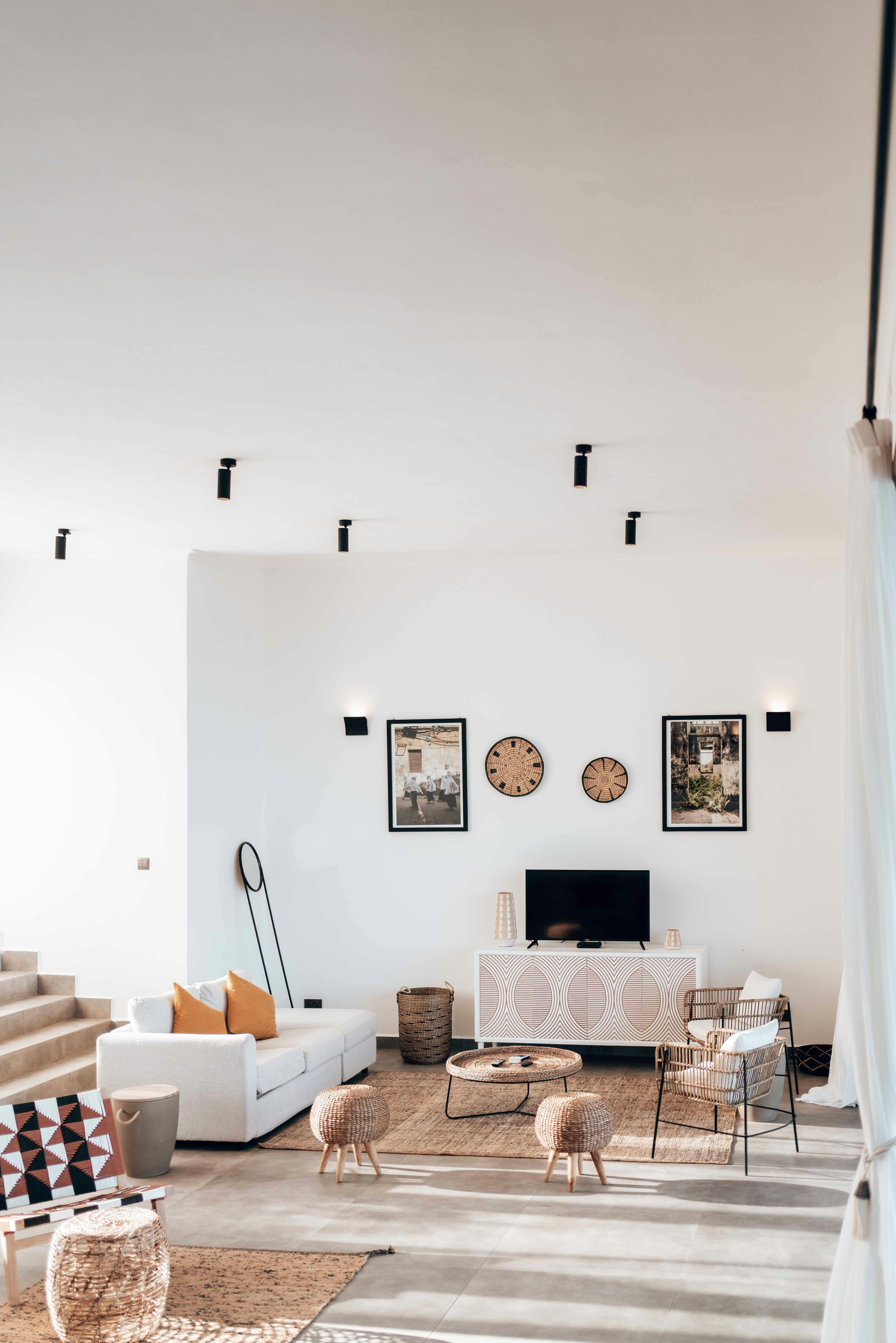
[credit](https://images.pexels.com/photos/12715582/pexels-photo-12715582.jpeg),
[licence](https://creativecommons.org/public-domain/)
**The Ceiling Strategy: Your Horizontal Light Reflector**
Most people forget ceilings completely. They're horizontal surfaces that reflect enormous amounts of light:
- **Paint ceilings semi-gloss white:** Reflects 80% of light vs. 60% for flat paint—this 20% increase creates measurable brightness improvement. For cathedral ceilings, use gloss for maximum reflection.
- **Install crown molding with indirect LED strips:** Creates perimeter halo lighting that appears to lift ceilings while providing ambient glow. Coffered ceilings with integrated LED strips create architectural drama while maximizing light reflection.
- **Use high-gloss ceiling tiles in drop ceilings:** If you’re stuck with suspended ceilings, replace standard tiles with high-gloss white alternatives. The reflected light transforms the room’s brightness.
- **Consider metallic or pearlescent ceiling paint:** For luxury spaces, metallic finishes (soft gold, silver, bronze) reflect light with subtle color tinting that adds sophistication while increasing brightness. Pearlescent paints create shifting light effects depending on viewing angle.
**The Fifth Wall Concept:** Professional interior designers call ceilings the "fifth wall"—an often-ignored surface that can completely transform spatial perception. In windowless spaces, the ceiling becomes your primary light distribution surface, making it critically important.
### 4. Texture as Light Catcher
Three-dimensional art creates micro-shadows that add complexity:
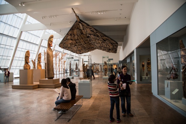
[credit](https://www.publicdomainpictures.net/pictures/200000/nahled/metropolitan-museum-of-art-1475137205ajh.jpg),
[licence](https://creativecommons.org/publicdomain/zero/1.0/)
- **Sculptural wall pieces:** Cast natural shadows under directional lighting
- **Textile art:** Weaves, tapestries, and fiber art create complex light/shadow interplay
- **Mixed media collages:** Layers of different materials catch and reflect light differently
The goal isn't to eliminate shadows—it's to make them intentional and beautiful.
### 5. The Art of the Glow: When Art Generates Its Own Light
Certain techniques make art literally appear to emit light, transforming pieces from passive objects into active light sources that illuminate their environments rather than just reflecting existing light.

[credit](https://pxhere.com/en/photo/973226),
[licence](https://creativecommons.org/publicdomain/zero/1.0/)
**The Professional Science of "Glow Effects"**
**Luminescent Materials**
- **Fluorescent paints and pigments:** Glow under UV/blacklight (can be subtle and sophisticated). Professional artists use DayGlo or LumiLor paints that create vibrant glowing effects under specific wavelengths. For sophisticated applications, choose artists who integrate fluorescent elements subtly—a glowing detail in an otherwise traditional [painting](/finder/page/what-is-action-painting) creates dramatic impact.
- **Phosphorescent pigments:** Store light and glow softly after lights turn off. These strontium aluminate–based pigments can glow for 8-12 hours after brief exposure to light. Artists like Chris Bracey (God's Own Junkyard) specialize in phosphorescent work. Practical application: artwork that glows softly during evening hours provides gentle night lighting for safe navigation.
- **Metallic paints with light-catching particles:** Create sparkle and shimmer effects. Mica powder, interference paints, and metallic flakes reflect light at microscopic levels, creating surface animation that changes with viewing angle. Companies like Golden Artist Colors produce interference paints that shift color depending on viewing angle and light position.
**Professional Internal Illumination Techniques**
- **Art with built-in LED elements:** Battery or plug-in LED systems embedded within artwork. Modern micro-LEDs consume minimal power while providing dramatic illumination. Look for artists working with LED integration or commissioned pieces where lighting designers collaborate with visual artists.
- **Transparent resin art with internal lighting:** Multiple layers of pigmented resin cast around LED panels create depth and dimensional glow impossible to achieve with surface lighting. The light appears to originate within the artwork rather than reflecting off it.
- **Light boxes with translucent prints:** Professional light boxes use diffusion panels to eliminate hot spots while providing even illumination. Use for backlit photography, translucent paintings, or scanned artwork. Modern slim-profile LED panels like those from Artograph or Just Normlicht provide museum-quality color rendering (CRI 98+).
- **OLED integrated panels:** Ultra-thin organic LED panels that can be surface-mounted behind artwork or within frames. OLED technology provides uniform illumination with excellent color characteristics while remaining nearly invisible when not active.
- **Fiber optic integration:** Tiny fiber optic strands embedded within artwork create pinpoint light effects—stars in nocturnal landscapes, city lights in urban scenes, or abstract light patterns. Advanced systems allow programmable light patterns and color changes.
**The Practical Reality:** Each glowing art technique requires [professional installation](/finder/page/qa-with-an-art-logistics-expert-shipping-installation-and-insuring-your-collection), specialized electrical work, and higher budgets than traditional framed artwork. But for truly unique spaces, these techniques create experiences impossible to achieve through conventional methods.
**Maintenance Considerations:** LED-integrated artwork requires occasional bulb replacement (typically every 10,000-50,000 hours). Plan for access panels or removable backing systems that allow LED replacement without damaging artwork integrity.
### 6. The Smart Home Advantage: Technology as Curator
Modern technology offers unprecedented control over lighting environments, transforming static art installations into dynamic exhibitions that respond to time, occupancy, mood, and even weather. This represents the convergence of museum-quality lighting control with residential accessibility.
**Professional Home Automation Integration**
- **Automated lighting scenes:** "Morning," "Evening," "Entertaining," "Movie" presets that adjust all light sources simultaneously. Advanced systems like Lutron HomeWorks or Crestron allow 10+ custom scenes with perfect reproduction every time.
- **Motion sensors:** Art lights activate only when someone is in room. Professional PIR (passive infrared) sensors detect occupancy while ignoring pets. More sophisticated systems use ultrasonic sensors that detect micro-movements for flawless occupancy detection.
- **Voice control:** Fine-tune lighting without touching switches. Amazon Alexa, Google Assistant, and Apple HomeKit integration allows voice commands like "increase brightness 20%" or "set gallery lighting to evening mode."
- **Color-changing LED:** Adapt mood to season or occasion. Tunable white LEDs allow programming seasonal light temperatures: cooler in summer (mimicking longer daylight), warmer in winter (mimicking shorter daylight). Some systems automatically adjust based on geographic location and time of year using GPS coordinates.
- **Smartphone app control:** Professional lighting apps provide granular control over individual fixtures, groups, or full zones. Apps like Lutron, Philips Hue, and Ketra allow adjustment of brightness, color temperature, and even beam direction in motorized fixtures.
- **Scheduling and circadian programming:** Set lights to gradually brighten in morning with cool temperatures (4000K), shift to neutral midday (3500K), warm through afternoon (3000K), and dim to warm evening (2700K). This supports natural circadian rhythm while keeping art optimally illuminated throughout the day.
**Advanced Smart Technology Options**
- **Lighting control systems with DMX512:** Professional theatrical lighting protocol adapted for residential use. Allows control of individual LED channels, dimming curves, and complex programming impossible with standard dimmers.
- **Sensor integration:** Combine light sensors with occupancy sensors to automatically adjust lighting based on both presence and ambient conditions. Luxury systems integrate security cameras that recognize when homeowners enter rooms, automatically activating lighting scenes.
- **Weather integration:** Some systems connect to weather services to adjust interior lighting based on external conditions—compensating for overcast days by increasing brightness, matching outdoor light temperature during sunny periods.
- **AI learning systems:** Advanced systems learn your lighting preferences over time, automatically suggesting and eventually implementing lighting scenes based on time of day, occupancy patterns, and historical adjustments.
**Return on Investment Analysis**
The investment pays dividends in both functionality and energy efficiency:
- **Energy savings:** Smart lighting reduces energy consumption 30-50% through automatic shutoff, dimming, and occupancy-based activation
- **Bulb longevity:** LED dimming extends bulb life exponentially—a bulb dimmed to 50% brightness lasts roughly 20x longer than one at full brightness
- **Art preservation:** Precise control reduces cumulative light exposure, extending artwork lifespan
- **Convenience:** Automated systems eliminate manual adjustments while providing perfect lighting consistently
**System Cost Considerations:** Basic smart lighting systems cost $500-1,500 for typical spaces. Advanced systems with full home automation integration cost $5,000-15,000+. The choice depends on your needs: simple automation or full environmental control.
[credit](https://images.pexels.com/photos/8891849/pexels-photo-8891849.jpeg),
[licence](https://creativecommons.org/public-domain/)
### 7. Spatial Illusion Through Art Composition: When Images Create Architecture
The composition of the art itself can alter spatial perception through optical illusions that literally rewire how your brain interprets room dimensions. This technique works because human visual processing assumes linear perspective, atmospheric diffusion, and scale relationships that artists can manipulate.
**The Neuroscience of Spatial Illusion**
When you view artwork with strong perspective cues, your [visual cortex](/finder/page/the-neuroscience-of-art:-how-our-brains-respond-to-visual-stimuli) activates depth-perception neurons that normally respond to three-dimensional environments. Even though you're consciously aware you're looking at a flat surface, your brain still processes the depth information, creating perceptual expansion of the surrounding space.
**Professional Compositional Techniques:**
- **Linear perspective art:** Creates the illusion of receding space. One-point perspective (railroad tracks, hallways, roads) creates strongest depth illusion. Two-point perspective (building corners, architectural subjects) creates more complex spatial relationships. Professional tip: place perspective artwork on your longest wall to exaggerate the depth effect.
- **Trompe l'oeil:** "Fool the eye" techniques that suggest depth and dimension. Historically used since Roman times, modern trompe l'oeil creates convincing illusion of architectural features (fake windows, doors, balconies) or three-dimensional objects. For windowless rooms, trompe l'oeil "windows" create such convincing spatial relief that the brain accepts them as architectural truth.
- **Abstract pieces with implied horizon lines:** Suggest space and distance even without representational content. Rothko's color field paintings, for example, suggest vast space through color gradation and horizontal banding that reads as "sky" and "land" even when completely abstract. Look for artworks with color gradient, atmospheric diffusion, or horizontal composition that triggers landscape memory.
- **Art with vanishing points or radial compositions:** Draw the eye into the distance through mathematical perspective. Radial compositions create vortex effects that pull viewer attention inward, creating perceived depth impossible to achieve architecturally. These pieces work best on walls where you want to create focus rather than expansion.
- **Atmospheric perspective:** Landscape paintings with distant elements rendered in cooler, less saturated colors create convincing depth. Professional landscape painters use this technique to suggest miles of distance within small framed areas.
**Paired Lighting Strategies for Maximum Illusion:**
- **Top-down lighting:** Mimics natural sunlight direction for landscape and architectural scenes, reinforcing the illusion that light originates from outside rather than artificial sources.
- **Gradient illumination:** Increase lighting intensity toward vanishing points, creating brightness that appears to originate from within the scene rather than external fixtures.
- **Edge shadows:** Use frame shadowing to create separation between artwork and wall, preventing the visual "stuck on the wall" quality that undermines spatial illusion.
**Professional Implementation:**
For maximum effect, commission or select artwork specifically created for your spatial needs. Provide artists with room dimensions, sight lines, and lighting plans so they can create compositions optimized for your specific spatial challenges. The investment in custom work pays dividends when the result transforms your spatial experience fundamentally.
**The Reality Check:** Compositional spatial illusion works best when supported by other techniques—mirrors, strategic lighting, color choices. Used alone, it provides subtle benefit. Integrated with comprehensive approach, it can make windowless rooms feel visually connected to imaginary exterior spaces.
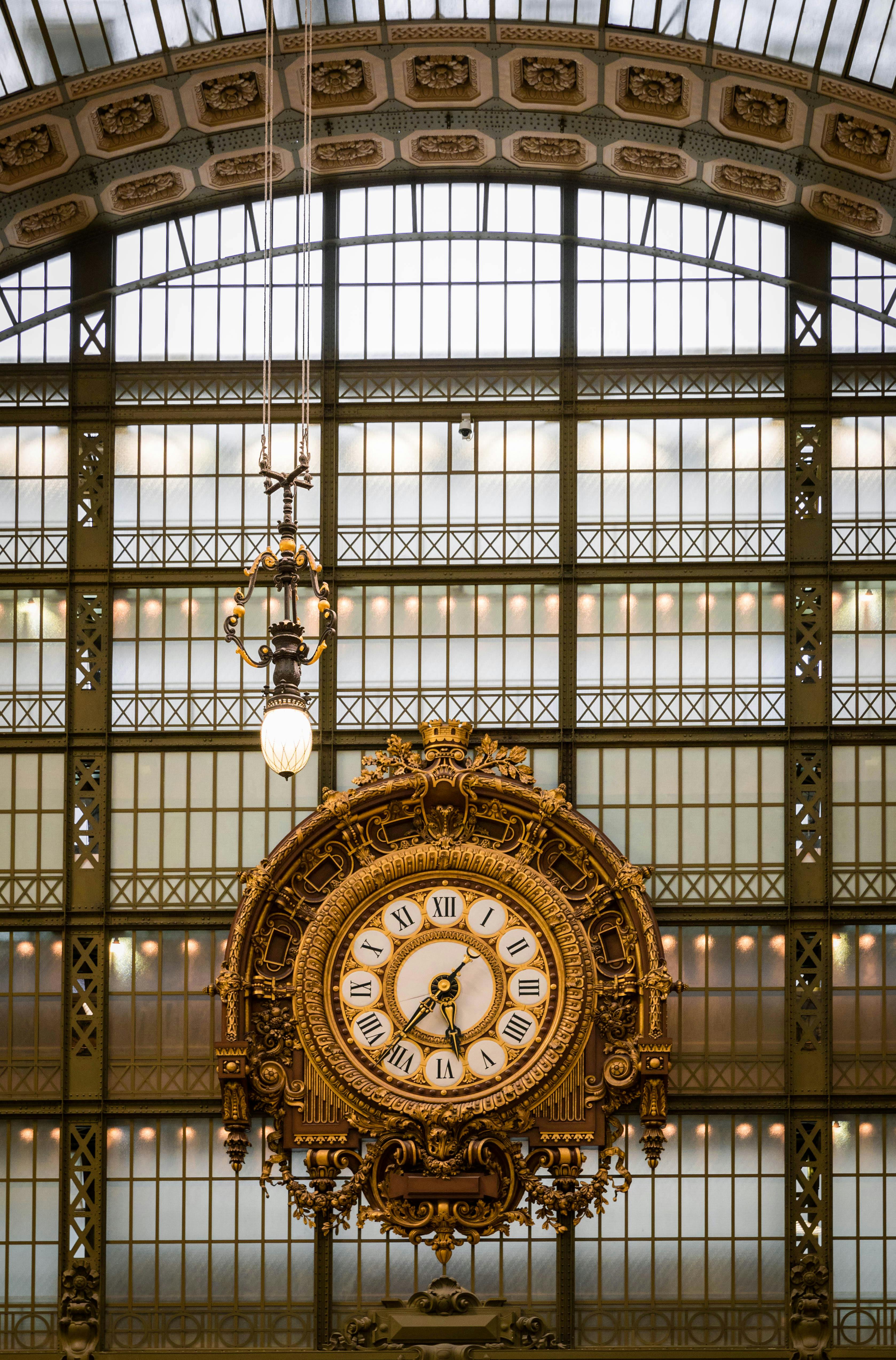
[credit](https://images.pexels.com/photos/16864650/pexels-photo-16864650/free-photo-of-golden-clock-in-orsay-museum-in-paris.jpeg),
[licence](https://creativecommons.org/public-domain/)
## Your Burning Questions, Answered: The Extended FAQ
Over the years, I've collected thousands of questions about this exact challenge. Here are the ones that keep coming up, along with answers that go deeper than the surface. The most innovative solutions often come from reframing the questions rather than seeking better answers to conventional questions.
**Should I use light or dark colored art in a dark room?**
The short answer: both can work. The long answer: it depends on your room's size, ceiling height, and psychological goals.
The choice between light and dark art comes down to a single question: do you want to *compensate* for darkness or *embrace* it? Light art compensates—brightness provides contrast against dark environments. Dark art embraces—texture and subtle highlights create intimacy within the environment. Neither approach is "correct" independently; both work depending on what psychological experience you want the space to create.
Light art creates brightness and openness but requires more lighting infrastructure. Dark art creates intimacy and drama with less lighting investment. For small rooms, strategic dark art can actually feel more spacious than poorly lit light art.
Pro tip: Look for "contrast within the piece"—art that has both light and dark elements. This gives you the best of both worlds.
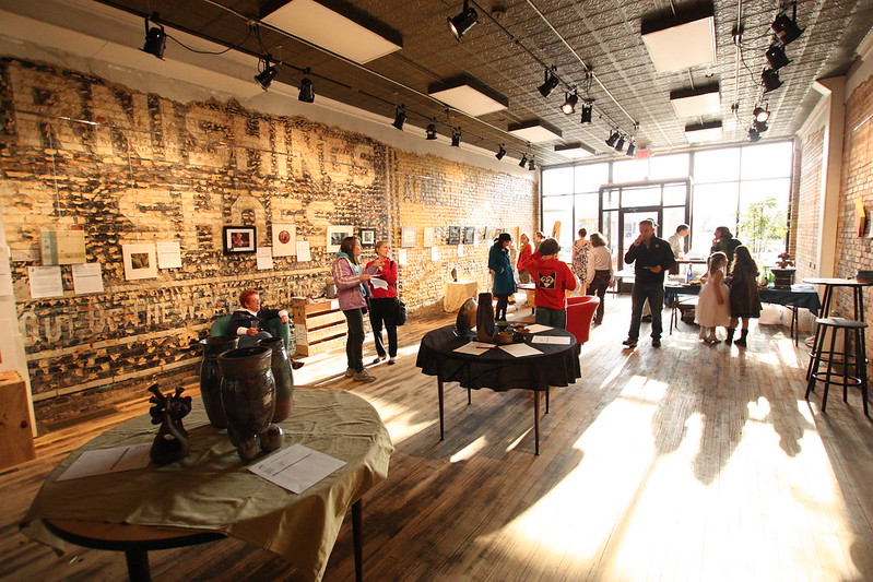
[credit](https://www.flickr.com/photos/peaceedcenter/5677334397/),
[licence](https://creativecommons.org/licenses/by-nc-nd/2.0/)
**What's the best type of lightbulb for lighting art?**
LED is non-negotiable (no heat, no UV damage, energy efficient). But the details matter:
- **CRI 90+:** Museum standard for color accuracy
- **2700K-3000K:** Warm white temperature for homes
- **Dimmable:** Essential for mood control
- **Beam angle:** 40° for most art, 25° for dramatic spotlights
- **Lumens:** 400-800 lumens per artwork (adjustable via dimmer)
Special mention: Look for "tintable" LED strips that let you adjust color temperature via smartphone.
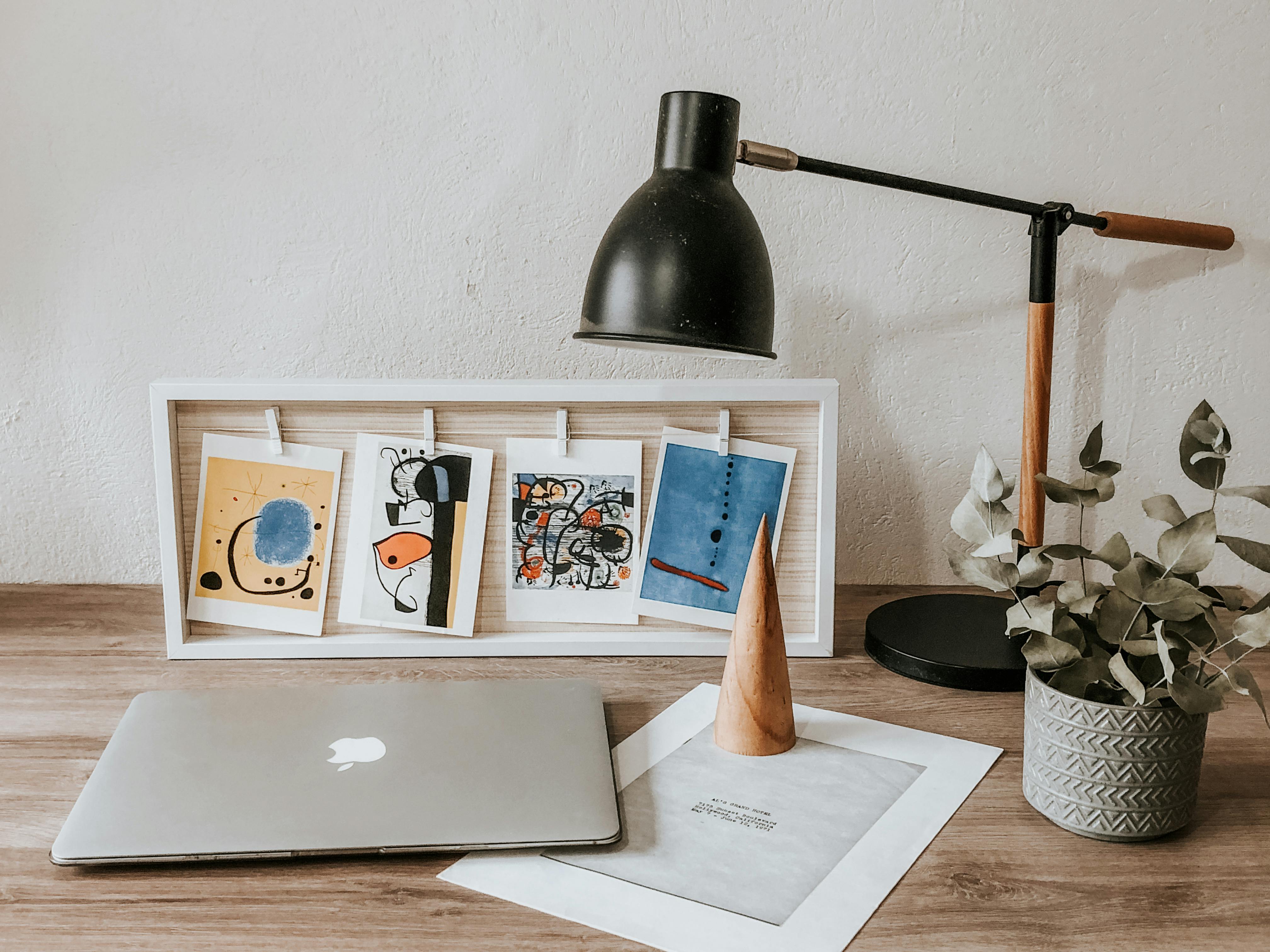
[credit](https://images.pexels.com/photos/34636338/pexels-photo-34636338/free-photo-of-modern-workspace-with-laptop-and-art-decor.jpeg),
[licence](https://creativecommons.org/public-domain/)
**Can I hang valuable art in a windowless room?**
Actually, windowless rooms can be *better* for art preservation:
- No UV light damage from sunlight
- Stable temperature and humidity (no draft from windows)
- Complete control over lighting exposure
This question reveals widespread misunderstanding about conservation threats. Natural sunlight exposure causes more art damage than any other single factor—fading, thermal stress, UV degradation. Museum conservators estimate that exposure to natural light accelerates artwork degradation by 200-400% compared to properly controlled artificial lighting. From a conservation perspective, windowless spaces aren't inferior—they're superior.
However: ensure good air circulation, maintain 40-50% humidity, use LED lighting only, and consider UV-filtering glass for extra protection.
**What about subject matter—does it matter?**
Absolutely, on two levels:
1. **Psychological impact:** Landscapes with depth, cityscapes with implied light sources, and expansive abstract patterns can reduce feelings of claustrophobia by giving your brain "space to roam."
2. **Technical considerations:** Subject matter affects light interaction:
- Portraits: Need soft, diffused lighting to avoid harsh shadows on faces
- Landscapes: Benefit from slight top-lighting to suggest natural sunlight direction
- Abstract art: Most flexible; dramatic lighting can enhance emotional impact
- Photography: Requires consistent, even lighting to reveal detail
**How do I protect art from moisture in windowless bathrooms?**
Beyond choosing glass-framed prints:
- Use silicone caulk around frame backs
- Ensure bathroom ventilation runs 30+ minutes post-shower
- Avoid hanging directly opposite shower/tub
- Consider acrylic prints (no paper, no moisture damage)
- Apply anti-condensation treatments to glass
- Use dehumidifier in small bathrooms without windows
**Professional Museum Technique:** Many museum conservators recommend creating "moisture barriers" by sealing artwork behind UV-filtering glass with desiccant packets inside frames. While this exceeds residential needs, it demonstrates the principle: complete environmental isolation protects artwork better than surface treatments alone. For bathroom applications, prioritize completely sealed framing over aesthetic considerations.
**Is a [gallery wall](/finder/page/what-is-a-gallery-wall) a bad idea for a dark room?**
Not at all—but execution matters. Here's the successful formula:
1. **Uniform frames:** Same color, width, and finish throughout
2. **Spacing consistency:** Equal distance between all pieces (usually 2-3")
3. **Lighting strategy:** Either light each piece individually or light the entire arrangement evenly
4. **Background:** Paint wall behind gallery a uniform color (no accent walls)
5. **Scale:** Keep pieces within 2-3 size variations (12x12", 16x20", 24x36" mix well)
6. **Mirror integration:** Include 1-2 small mirrors within the gallery for light reflection
The most common mistake? Too many small pieces without clear lighting hierarchy.
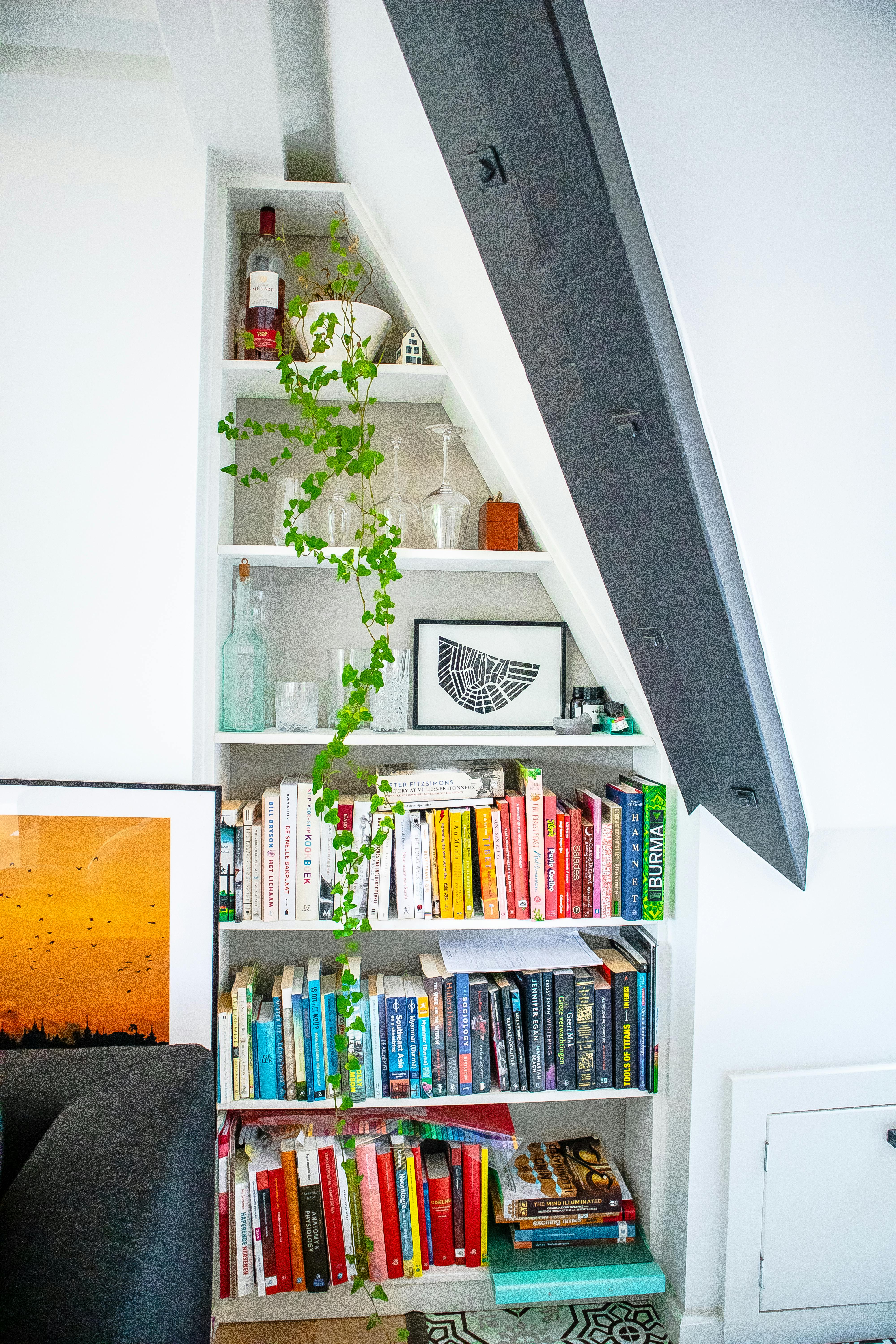
[credit](https://images.pexels.com/photos/8900187/pexels-photo-8900187.jpeg),
[licence](https://creativecommons.org/public-domain/)
**What's the ideal height to hang art in a windowless room?**
Standard rule (57" to center) applies, but increase to 60-62" with lower ceilings. Here's why:
- Lower ceilings can make art feel cramped when hung too low
- Raising sight line upward creates illusion of ceiling height
- Seated viewing areas (dining rooms, offices): hang lower, at eye level when seated
- Hallways: can hang slightly higher to prevent bumping and create vertical emphasis
**Can I use smart lighting systems for art?**
Yes, and they're revolutionary:
- **Automated scheduling:** Lights gradually brighten in morning, dim in evening
- **Voice/app control:** Fine-tune individual fixtures
- **Color temperature adjustment:** Match art to time of day
- **Motion sensors:** Lights activate only when someone enters
- **Scene programming:** "Gallery viewing," "evening entertaining," "movie night" presets
Recommendations: Philips Hue, Lutron, or Ketra for serious systems.
**Will light-colored walls make the most difference?**
Not necessarily. While light colors reflect more light, strategic dark walls can create drama and make art "pop" through contrast. The key is surface finish:
**The professional secret:** The ceiling accounts for 50% of light reflection but receives only 10% of surface treatments. Painting your ceiling semi-gloss white does more to increase perceived brightness than any wall color choice. Combine this with strategic dark accent walls behind key artwork, and you get the best of both worlds: overall ambient brightness plus dramatic art contrast.
- **Eggshell:** Best all-around choice (reflects light without glare)
- **Semi-gloss:** Reflects more light but shows imperfections
- **Matte:** Most sophisticated but absorbs light
Pro strategy: Three light walls + one dark accent wall (behind key art piece) for maximum impact.

[credit](https://images.pexels.com/photos/12715582/pexels-photo-12715582.jpeg),
[licence](https://creativecommons.org/public-domain/)
**How much should I budget for lighting installation?**
Depends on scope:
- **DIY track lighting:** $100-300 plus installation time
- **[Professional installation](/finder/page/qa-with-an-art-logistics-expert-shipping-installation-and-insuring-your-collection):** $500-2,000 for 4-6 points
- **Smart lighting system:** $1,000-5,000+ depending on sophistication
- **Museum-quality picture lights:** $200-800 each
- **Custom LED systems:** $2,000+ with professional design
My recommendation: start with one high-quality picture light on your favorite piece. You'll immediately see the difference.
**Investment Philosophy:** Think about lighting as infrastructure rather than decoration—similar to electrical wiring or plumbing. Good lighting increases property value, protects art investment, and improves quality of life. A $2,000 professional lighting installation adds more value than $2,000 spent on additional artwork because lighting makes *all* artwork look better while preventing degradation and preserving value.
## A Final Thought
A room without windows isn't a curse; it's a canvas. It’s a space that invites you to be more intentional, more creative, and to literally create your own light. It’s an exercise in control. You get to define the mood, highlight what you want people to see, and build an atmosphere from scratch. So go on, turn that cave into your own private gallery. And if you're looking for that [perfect piece](/finder/page/the-art-of-gifting-art:-choosing-the-perfect-piece-for-any-occasion) to start with, well, you could always take a look at the art I have for sale on my site.