The Definitive Guide to Secondary Colors: Mix, Psychology, & Mastery
Uncover the true power of secondary colors: how to mix vibrant orange, green, and purple from primaries, explore their profound psychology, historical impact, and dynamic use across all art forms. Your essential guide.
What Are Secondary Colors? The Indispensable Architects of Your Palette
I remember that moment vividly from kindergarten. It was a foundational memory, a tiny act of alchemy: mixing two primary colors and watching something entirely new, something more, emerge. A vibrant blue and a sunny yellow, each powerful and distinct, then with a swirl of the brush, green effortlessly forms. It felt less like simply mixing and more like a quiet act of creation unfolding right before my eyes, as if these distinct elements were transforming into a new, emergent property entirely. We often champion the 'big three' – the primary colors – as the absolute bedrock of any palette, and they are. They're the non-negotiable starting points, the elemental hues you can't conjure from anything else because their fundamental light properties (or how they behave as physical pigments) can't be broken down further. But if you ask me, the true depth, the real magic, and the expansive world of artistic expression truly begin with the secondary colors. They represent the very first step away from the absolute, the initial act of purposeful creation in color theory. For any artist, grasping these 'in-between' hues isn't just crucial; it's transformative. Despite their "secondary" label, these colors are far from minor players; they profoundly shape an artwork's emotional landscape, infusing a piece with depth, mood, and undeniable emotional resonance. So, let's embark on a journey to truly understand what they are, how they come alive across different color models, and why they are, without question, the indispensable architects of your palette.
Back to Basics: The Simple Recipe for Secondary Colors
At its core, the definition of secondary colors is beautifully straightforward, especially when we're talking about tangible pigments like paint: a secondary color is born when you mix equal parts of any two primary colors.
That's it. For us artists working with traditional pigments (the kind you hold on your brush), the three primary colors are Red, Yellow, and Blue (often remembered as RYB). When you combine them in pairs, you unlock the three traditional secondary colors: Orange, Green, and Purple (or Violet, if you're inclined towards a more formal flourish – though "purple" is perfectly acceptable here, no judgment!). This fundamental equation isn't just a rule; it's the gateway to an almost boundless universe of color. It's the first step I take in my personal approach to color mixing – always, always starting with these fundamentals.
Here's the visual cheat sheet I still carry in my head, a truly foundational understanding that simplifies color mixing every time I pick up a brush:
+ | Primary Color 2 | = | Secondary Color | |
|---|---|---|---|---|
| Red | + | Yellow | = | Orange |
| Yellow | + | Blue | = | Green |
| Blue | + | Red | = | Purple |

This seemingly simple act of mixing is, in my experience, the bedrock of almost every color you'll ever see in a painting. It's a conversation between two primaries, culminating in a new, distinct voice. The potential literally bubbles up on your palette. Without a clear grasp of these core recipes, you'll often find yourself wrestling with unintended muddy browns or dull, lifeless hues. You know that feeling when you're mixing a green and accidentally add too much red, and suddenly everything just goes... drab? That happened to me once, trying to get just the right mossy green for a forest floor, and I ended up with something closer to swamp water. Knowing these foundational combinations is your first, best shield against the dreaded "muddy abyss" and your key to unlocking vibrant, lively colors. For more on avoiding those frustrating moments, check out my guide on how to avoid making muddy colors in painting.
Why "Secondary"? Unpacking the Name
It's a fair question, and the answer is wonderfully straightforward. These colors are called "secondary" precisely because they are second-generation hues. They aren't foundational like the primaries; instead, they are directly derived from the mixing of those fundamental, unmixable primary colors. Think of it as a family tree: primaries are the parents, and secondaries are their immediate offspring. I remember when I first grasped this simple hierarchy; it was one of those small 'aha!' moments that suddenly made the vastness of the color world feel manageable, establishing a clear order in what sometimes felt like beautiful chaos. This simple understanding underpins much of color theory.
This principle extends further: once you understand primary and secondary relationships, you’re ready for the third generation of hues – the tertiary colors – which are formed by mixing a primary with an adjacent secondary. The color world just keeps unfolding!
The Color Wheel: Mapping Relationships, Unlocking Nuance
Now that we've got the basic recipe down, let's talk about the map that makes sense of it all: the color wheel. It's far more than just a decorative chart you hang in your studio; it's a dynamic visual manifesto of color relationships, a cheat sheet, and a strategic guide all rolled into one. I even keep a rough, hand-painted color wheel nearby when I’m mixing, because the physical act of seeing the transitions helps solidify my understanding in a way a chart alone can't.
Mapping Secondary Colors
Once you've grasped the fundamental recipe for secondary colors, the color wheel vividly shows you where these new hues reside. Picture your three primaries forming a perfect equilateral triangle, boldly spaced. Now, imagine the secondary colors nestling precisely in between the two primaries that created them. Yellow and Blue cradle Green, Red and Yellow beautifully embrace Orange, and Blue and Red give birth to Purple. It's like observing a perfectly ordered color family, with the secondaries as the first, vibrant generation, eager to tell their own story.

This elegant, intuitive organization is the absolute cornerstone of all color theory. If you haven't yet, I really do encourage a deeper dive into my extensive guide – it changes everything! The wheel helps us understand not just the names of colors, but their intrinsic relationships, revealing how they conspire to create harmony, contrast, and make whole palettes sing together on a canvas. This understanding is critical for building compelling compositions, whether you aim for serene balance or striking visual disruption.
When we talk about how colors interact, we're really looking at two powerful forces:
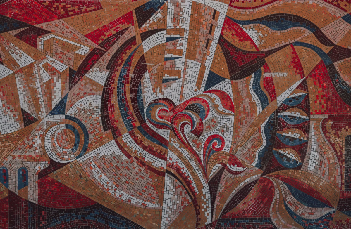
- Color Harmony: Secondary colors often form naturally harmonious relationships with their parent primaries. Think of an analogous harmony like Yellow, Yellow-Green, Green, Blue-Green, and Blue, which flow together seamlessly. They also forge incredibly powerful complementary pairs when placed opposite their primary counterparts on the wheel (e.g., Red and Green, Blue and Orange, Yellow and Purple). But don't stop there; secondary colors can also be part of a triadic harmony (three colors equally spaced on the wheel, like Green, Orange, and Purple, creating vibrant, balanced yet dynamic compositions) or a monochromatic harmony (using various tints, tones, and shades of a single secondary color). Grasping these helps you construct compositions that are either beautifully balanced or intentionally disruptive.
- Color Contrast: The inherent vibrancy of secondary colors, especially when juxtaposed with their complementary primary, generates arresting visual contrast. Imagine the fiery intensity of orange against a deep, cool blue, or the lush tranquility of green against a passionate red – these pairings aren't subtle; they grab attention and inject pure visual excitement into your work. This understanding is key to how artists use color for maximum impact.
Color Mixing Precision for Secondary Colors
While the concept of mixing "equal parts" of two primaries is the perfect starting point, in practice, artists rarely stick to perfectly rigid ratios. And honestly, who ever created anything truly interesting by sticking perfectly to a formula, anyway? The true artistry of secondary colors often lies in understanding proportional mixing. By subtly shifting the balance of your primary colors, you can create an infinite spectrum of nuanced secondary hues. For example:

- Green: A perfect 50/50 mix of yellow and blue gives you a balanced, true green. But nudge it to 70% yellow and 30% blue, and you’ll achieve a zesty, vibrant yellow-green (like a fresh lime), practically bursting with youthful energy. Shift to 30% yellow and 70% blue, and you'll discover a deep, serene blue-green (like a tranquil sea), evoking quiet contemplation. These subtle shifts dramatically alter the mood and temperature of your color.
- Orange: A balanced orange is a 50/50 red and yellow mix. But a red-orange (70% red, 30% yellow) offers a fiery intensity and feels utterly different from a soft, peachy-yellowish orange. Meanwhile, a yellow-orange (30% red, 70% yellow) feels luminous and energetic.
- Purple: A true purple combines equal parts red and blue. However, a red-purple (70% red, 30% blue) can be lush and passionate, while a blue-purple (30% red, 70% blue) leans towards mysterious and cool.
This careful, intentional proportional mixing allows you to personalize your palette and achieve the exact emotional resonance you're aiming for in your work. It's a fundamental skill for moving beyond basic color theory to truly expressive painting.
Once you have your primary and secondary colors firmly established in your mind (and on your palette), you're ready for the next exhilarating chapter: mixing them to forge tertiary colors. These are the 'grandchildren' of the color world, born from combining a primary color with an adjacent secondary color. This is where a whole new realm of complexity, subtlety, and richness begins to unfold, allowing you to bridge the gaps between your primary and secondary hues with even greater precision. Tertiary colors are crucial for creating more naturalistic color schemes, achieving subtle transitions between hues, and giving your palette a sophisticated depth that pure primaries or secondaries alone can't quite capture. It's a journey I explore much more deeply in my guide on beyond the primary: how i use secondary and tertiary colors to create complex abstract worlds.
Here’s a quick overview of how these sophisticated hues come to life:
Primary Color | + | Secondary Color | = | Tertiary Color | Character |
|---|---|---|---|---|---|
| Red | + | Orange | = | Red-Orange | Warm, vibrant |
| Yellow | + | Orange | = | Yellow-Orange | Luminous, energetic |
| Yellow | + | Green | = | Yellow-Green | Fresh, lively |
| Blue | + | Green | = | Blue-Green | Cool, tranquil |
| Blue | + | Purple | = | Blue-Purple | Deep, mysterious |
| Red | + | Purple | = | Red-Purple | Rich, passionate |
This is where the true nuance of color mixing emerges, opening up an even wider spectrum of expressive possibilities for an artist. The color wheel is, ultimately, your most reliable compass for navigating these intricate relationships, guiding you in selecting combinations that resonate, whether you're crafting a calm landscape or a dynamic, explosive abstract piece.
Understanding Different Color Models: Pigments vs. Light (and Beyond)
Before we venture further into the boundless nuances of secondary colors, we absolutely must address a common point of confusion that often trips up even passionate art enthusiasts. This is one of those concepts that, once it clicks, genuinely unlocks a deeper understanding of the definitive guide to color theory in art. The way colors interact and mix depends entirely on what you're actually mixing: is it physical pigments, or is it light? Let's clarify this crucial distinction because, trust me, it's a game-changer.
The Subtractive Color Model: The Language of Pigments
This is the model most relevant to us as painters, the one this article has primarily been discussing. It applies to physical substances like paint, ink, dyes, and even colored filters. Think of it quite literally: each pigment subtracts (absorbs) specific wavelengths of light from the visible spectrum and reflects only the ones we perceive as its color. Imagine layers of stained glass; each layer blocks more light, making the overall image darker. A red pigment, for example, absorbs all wavelengths except red, which it reflects. When you mix red and yellow pigments, the resulting mix absorbs the wavelengths that red and yellow individually absorb, leaving only the wavelengths common to both, which our eyes perceive as orange. The more pigments you layer or mix, the more light is absorbed, and the darker the resulting color becomes, eventually moving towards black (or, more often in practice, a very dark, neutral brown). This is why mixing all your paints on a palette usually ends up in a dull, dark mess – it's the inevitable fate of subtracting all light!
In short: Pigments subtract light; the more you mix, the darker it gets.
- Primaries for Traditional Artists (RYB): Historically and traditionally, artists have worked with Red, Yellow, Blue (RYB) as their primary colors. These mix to create our familiar secondary colors: Orange, Green, and Purple. While not spectrally "pure" in a scientific sense, the RYB system remains foundational for understanding traditional painting.
- Primaries for Printing (CMY/CMYK): This is another subtractive model, but a more scientifically precise one, predominantly used in printing. Printers use Cyan, Magenta, Yellow (CMY) as their primaries. Often, Black (K) is added for richer blacks and deeper shadows, forming the CMYK system.
- CMY Secondary Colors (Subtractive Mixing): When Cyan, Magenta, and Yellow are mixed in pairs in a subtractive system, their secondary colors are Red (Magenta + Yellow), Green (Cyan + Yellow), and Blue (Cyan + Magenta).
- A Crucial Crossover: Did you notice something fascinating there? The secondary colors of the CMY system (Red, Green, Blue) are the primaries of the additive color system we're about to discuss! It’s this beautiful, interconnected dance that makes color theory so endlessly intriguing.
The Additive Color Model: The Language of Light
In stark contrast, the additive color model is all about light. This is what's at play on your computer screen, television, smartphone, or in theatrical lighting. Here, you're adding wavelengths of light together. The more light colors you combine, the brighter the result becomes. Think of three spotlights – red, green, and blue – hitting a stage. Where they overlap, you get new colors, and where all three overlap in equal measure, you get white light. The physics here is that these primaries are emitting light, not absorbing it. When red light and green light are projected together, they stimulate both the red and green cone cells in your eyes, leading your brain to perceive yellow. This is why they behave inversely to pigments.
In short: Light adds light; the more you combine, the brighter it gets (towards white).

- Primaries for Light (RGB): The primary colors of light are Red, Green, Blue (RGB).
- RGB Secondary Colors (Additive Mixing): When Red, Green, and Blue light are mixed in pairs, their secondary colors are Yellow (Red + Green), Cyan (Green + Blue), and Magenta (Red + Blue).
It’s truly a mind-bending crossover, isn't it? The primaries of one system often emerge as the secondaries in another! For our artistic purposes, however, as painters and art appreciators, the subtractive model (primarily RYB, leading to orange, green, and purple secondaries) is our main focus. This is the language our physical pigments speak, and understanding this distinction is a game-changer for mastering your palette.
Other Color Models: HSL and HSV
While RYB, CMY, and RGB are foundational for understanding how colors mix, it's worth a quick mention of other color models, especially if you dabble in digital art or design. Models like HSL (Hue, Saturation, Lightness) and HSV (Hue, Saturation, Value) don't define primaries and secondaries in the same mixing-based way. Instead, they organize colors based on human perception, making them incredibly intuitive for color selection and manipulation. In these models, secondary colors simply fall at specific hue angles on a cylindrical or conical representation of the color spectrum. For instance, green typically sits at 120 degrees and purple around 300 degrees on the hue wheel. Understanding these models means you can precisely control not just the hue of your secondary colors, but also their saturation (how vibrant or dull they are) and their lightness/value (how bright or dark they appear). This offers even more expressive possibilities, allowing digital artists to create harmonious palettes or subtle emotional shifts by adjusting these parameters directly, rather than relying solely on mixing primaries. It's just another way to map and understand these indispensable hues!
To help keep these models clear in your head, here’s a quick comparison:

Feature | Subtractive Model (Pigments) | Additive Model (Light) |
|---|---|---|
| Core Principle | Absorbs/subtracts light | Emits/adds light |
| Analogy | Stained glass filters | Overlapping spotlights |
| Primaries (Traditional Art) | Red, Yellow, Blue (RYB) | Not applicable |
| Primaries (Printing/Scientific) | Cyan, Magenta, Yellow (CMY) | Not applicable |
| Primaries (Digital Screens) | Not applicable | Red, Green, Blue (RGB) |
| Secondary Colors (RYB) | Orange, Green, Purple | Not applicable |
| Secondary Colors (CMY - Subtractive) | Red, Green, Blue | Not applicable |
| Secondary Colors (RGB - Additive) | Not applicable | Yellow, Cyan, Magenta |
| Mixing All Primaries | Towards Black/Brown | Towards White Light |
The Artist's Toolkit: Beyond Basic Mixing with Secondary Colors
While the 'equal parts' recipe is our essential starting point, the true artistic discovery, the real fun, frankly, unfolds when we begin to explore its boundless potential beyond those rigid basics. Who ever created anything truly interesting by sticking perfectly to a formula, anyway? The real magic happens when you thoughtfully, intentionally, break that rule. This is where secondary colors truly begin to act as architects, building complex and emotive structures from simple foundations. It's about taking those initial mixes and coaxing endless variations from them, adding layers of personality and purpose.
Hue Shifts: Personalizing Your Palette with Subtle Leans
What happens when you gently nudge your green towards its yellow parent? You get a zesty, almost electric lime green, practically bursting with life and youthful energy. Nudge it towards blue, and you'll discover a deep, moody forest green, evoking quiet contemplation and ancient wisdom. This is precisely where your unique voice as an artist comes into play, allowing for subtle yet powerful hue shifts that breathe dynamic life into your work. The infinite spectrum of oranges, greens, and purples that exist between their 'pure' forms are where emotion, personality, and genuine artistry truly reside. I remember struggling to get the exact right shade of a secondary color for a particular sky in one of my early abstract pieces; it was only by experimenting with these minute hue shifts – a touch more red to an orange to give it a sunset glow, or a hint more blue to a purple for a truly ethereal feel – that the painting truly came alive. It's a delicate dance.
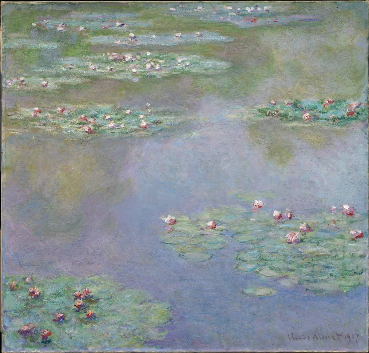
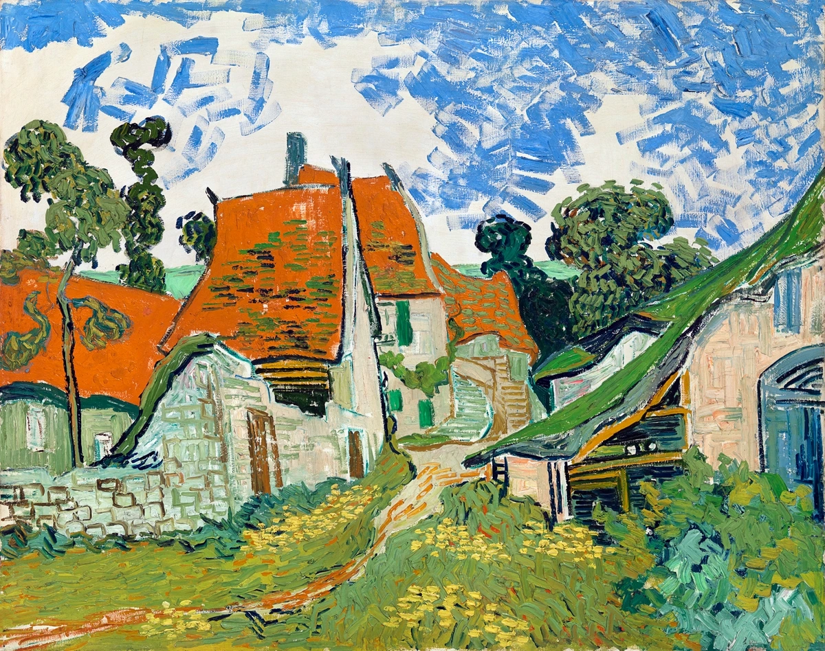
I often think of Claude Monet, who, despite being an Impressionist deeply concerned with light, used incredibly nuanced secondary greens and purples in his water lilies to capture the subtle shifts in reflected light and shadow. Or how Vincent van Gogh's iconic cypress trees and skies burst with greens and purples that are subtly shifted towards blue or red to amplify their emotional intensity. A fiery, reddish-orange feels utterly different from a soft, peachy-yellowish orange, and each tells its own distinct story. This concept seamlessly ties into color temperature: warm secondary colors (like red-orange or yellow-green) tend to advance in a painting, drawing the viewer's eye forward and creating a sense of closeness and intimacy. Conversely, cool secondary colors (like blue-green or blue-purple) tend to recede, generating a sense of depth, expansive atmosphere, and distance. It's precisely how artists use color to craft a specific emotional atmosphere, a particular feeling. My own approach to color mixing for vibrant abstract palettes is built entirely upon this delicate, intuitive dance of push and pull.
Desaturating with Complementary Colors: Crafting Rich Chromatic Grays
But the nuanced exploration doesn't end with hue shifts. Another incredibly powerful technique is to desaturate a secondary color by adding a minuscule touch of its complementary primary. This isn't about haphazardly creating a muddy mess; it's about achieving those complex, organic, real-world tones that don't shout for attention but rather whisper a rich, sophisticated story. These are the elegant browns, the subtle olives, the ethereal lavenders, and the sophisticated grays that bestow depth, realism, and a profound sense of grounding to paintings. They're often called chromatic grays because, unlike a simple mix of black and white, they retain subtle hints of their original color lineage, making them far more lively and complex. Imagine the sophisticated grays in a Chardin still life, or the atmospheric neutrals in a Whistler landscape – these are often chromatic grays, subtly built from complementary mixes. The reason this works is fascinating: when you add a primary's complement to its derived secondary, you're essentially reintroducing the third primary color that wasn't initially part of the secondary mix. For example, adding red (the complement) to green (yellow + blue) means you now have all three primaries (red + yellow + blue) in the mix, which, in subtractive color, neutralizes the vibrancy towards a richer, more complex gray or brown.
Let's break down how this works:
- Green: Add a tiny, almost imperceptible whisper of red (green's complement) to your green. Instead of a jarring green, you'll discover a sophisticated, earthy olive, a muted sage, or the gentle, distant greens found in rolling landscapes and subtle shadows.
- Orange: Introduce a delicate touch of blue (orange's complement) to your orange. What emerges are rich, complex browns, warm terra cottas, or deep, inviting ochres. This is often my go-to method for creating grounding neutral tones that stabilize more vibrant elements in my abstract compositions.
- Purple: Incorporating a small amount of yellow (purple's complement) into your purple will unveil muted grays, soft lavenders, or even subtle ochre-like mauves, perfect for atmospheric effects or creating a sense of melancholic beauty.
For an even deeper dive into this transformative technique, I highly recommend checking out my guide on how to use complementary colors in painting. Go on, grab some paint and play! What unexpected, beautiful shades can you unearth by just slightly tweaking that 'equal parts' recipe?
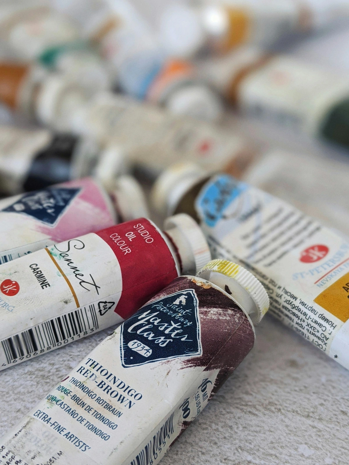
Pigment Properties, Mediums, and Application
The story of secondary colors isn't solely about the initial mix; it's also deeply influenced by the inherent qualities of the pigments themselves and how you apply them. This is where the practical magic truly manifests:
- Pigment Characteristics: Opacity, Transparency, Lightfastness, and Granulation:
- Opacity vs. Transparency: This refers to how much light a pigment lets through. A transparent yellow (like Hansa Yellow) mixed with a transparent blue (like Phthalo Blue) will yield a wonderfully luminous green, allowing light to pass through for delicate washes or glazing to add luminous depth. But if you mix an opaque red (like Cadmium Red) with a transparent yellow, you might get an orange that is vibrant but also slightly muted by the opaque red, offering a different character than two transparent colors. Understanding the opacity of your individual primary pigments profoundly impacts the character of your secondary colors, affecting everything from delicate glazes to creating deep, rich impasto textures.
- Lightfastness: This refers to how resistant a pigment is to fading when exposed to light over time. When choosing your primaries to create secondary colors, selecting pigments with high lightfastness is crucial. A vibrant secondary orange mixed from two highly lightfast primaries will retain its warmth and intensity for decades, while one made from less stable, or "fugitive," pigments might sadly shift or dull, losing its intended emotional impact over time.
- Granulation: Not all pigments are created equal. High-quality artist-grade pigments (like those I rave about in my review of professional watercolors) offer purer, more vibrant mixes and often exhibit beautiful characteristics like granulation – tiny flecks of pigment that settle, creating texture, especially in watercolors. Imagine mixing a granulating Ultramarine Blue with a non-granulating Lemon Yellow; the resulting green might have subtle blue flecks settling into the paper, creating an organic, textured green that adds incredible depth. Cheaper, 'hue' versions of pigments might contain fillers that dull your mixes and lack these interesting qualities.
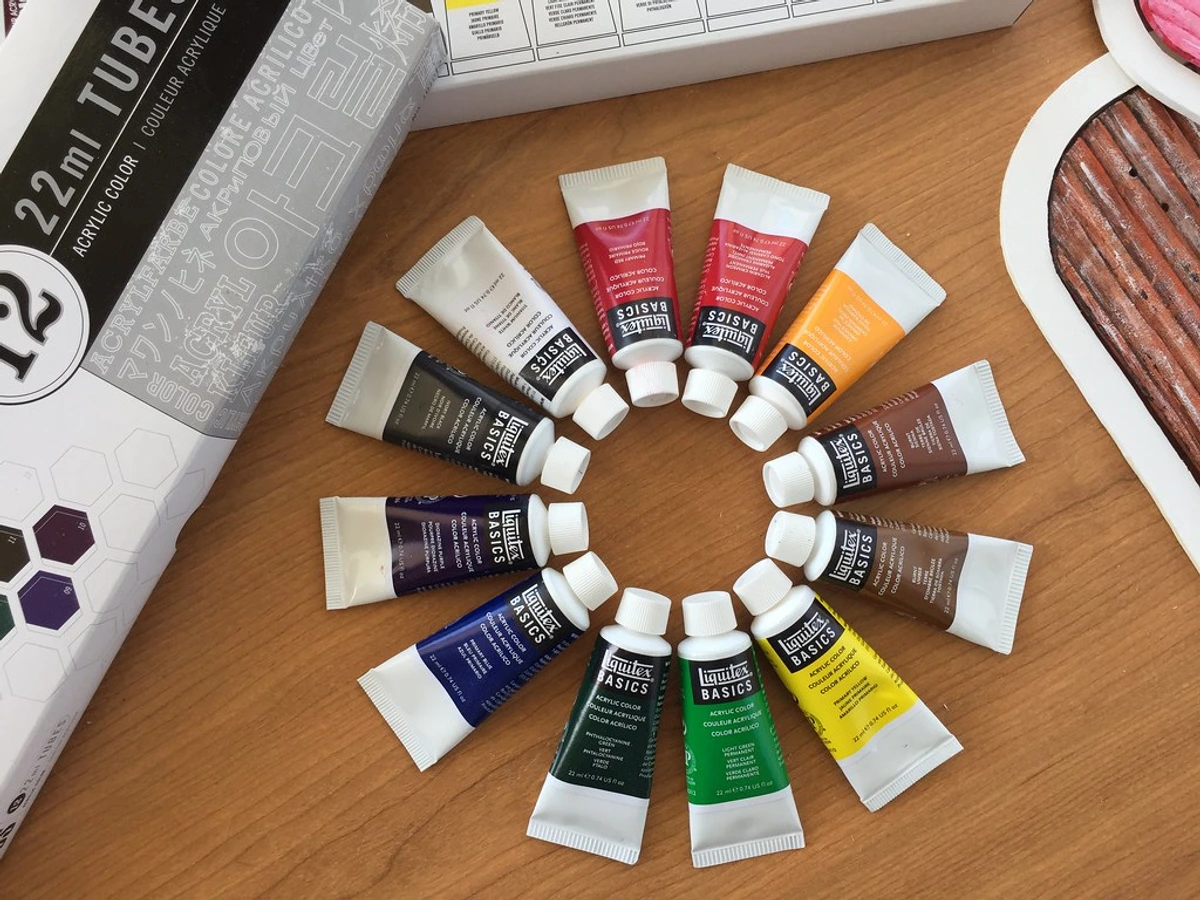
- Binder, Medium, and Surface Texture: The medium itself (oil, acrylic, watercolor, gouache) plays a significant role in how secondary colors behave and appear.
- Oil paints, with their slower drying time, allow for more subtle blending and nuanced shifts within secondary colors directly on the canvas, fostering smooth gradients and allowing for extended manipulation. The rich binder also gives them a unique luminosity.
- Acrylics, drying faster, demand a quicker hand but offer intense, immediate color and excellent layering capabilities, enabling vibrant glazes or impasto. A vibrant purple in acrylics can feel almost electric due to the medium's inherent brightness.
- Watercolors excel at luminous, transparent washes, where secondary colors can be built up in delicate layers, and granulation can add stunning visual interest. A transparent green wash on paper might reveal the subtle white of the paper beneath, adding to its luminosity.
- The binder (the substance that holds the pigment particles together, like linseed oil for oils or acrylic polymer emulsion for acrylics) influences everything from sheen to texture. Knowing your paint types is essential.
- Even the surface texture can influence the perceived color. A rough canvas will catch light differently than a smooth panel, altering how a mixed green or orange is seen, adding another layer of complexity to your secondary palette. A vibrant blue-green on a heavily textured canvas, for example, might appear to have more depth and variation in tone due to the way the light hits the peaks and valleys of the surface.
Echoes in History & Modern Practice: The Enduring Power of Secondaries
Secondary colors are anything but theoretical constructs; they are the bedrock of countless masterpieces and the quiet, potent force behind a painting's emotional punch. As I delve into art history, I consistently see secondary colors forming the backbone of truly expressive, evocative palettes.

A Journey Through Art History: From Ancient Hues to Fauvist Explosions
Before the Renaissance, the use of vibrant secondary colors was often limited by the availability and cost of pigments. Take purple, for instance: the famed Tyrian purple, derived from sea snails, was so rare and expensive that it was reserved almost exclusively for royalty and religious figures. This scarcity underscored its symbolic power, making it a color of profound authority and luxury.
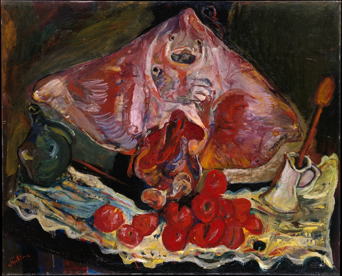
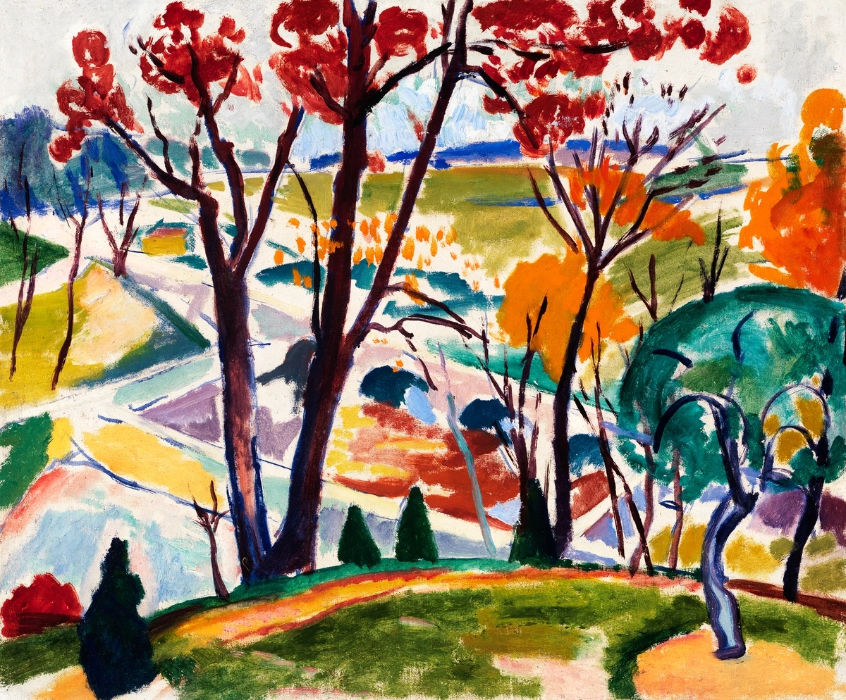
Then came the Renaissance masters like Titian, Rubens, and even Leonardo da Vinci, who began to harness secondary colors with unparalleled sophistication. They often used subtle greens and purples in their underpaintings, which, when glazed over with warm oranges and reds, created luminous, almost glowing flesh tones. This technique, known as sfumato or cangiante, relied on optical mixing through thin, transparent layers, where the underlying secondaries contributed to the richness and depth of the final color. These 'in-between' colors weren't just decorative; they were essential for building depth, vitality, and realism, capturing the very essence of life on canvas.
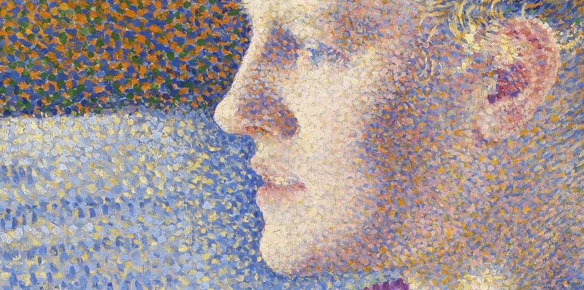
The 19th century brought a revolution in color with the advent of synthetic pigments, democratizing access to vibrant hues that were once impossible or prohibitively expensive to produce. The introduction of pigments like Viridian (a brilliant, stable green) and Cobalt Violet (a pure, luminous purple) allowed artists unprecedented freedom. This freedom with color directly fueled movements like Impressionism and Post-Impressionism. While their starting points were often primaries, the vibrant greens of their fields, the searing oranges of their sunsets, and the deep purples of their shadows were never simple, flat applications. They were almost always built from nuanced secondary mixes, designed to capture the elusive qualities of light, air, and fleeting moments. Consider Claude Monet's legendary water lily series, for example; it's a masterclass in nuanced secondary greens and purples, meticulously rendered to capture the fleeting dance of light and reflection on water. Or Vincent van Gogh, whose iconic skies frequently burst with intense oranges and purples, not merely for representational accuracy but to convey raw, unbridled emotion and dynamic energy. Paul Cézanne, too, meticulously constructed his landscapes with greens and oranges that shifted subtly, creating volume and form without relying on traditional perspective. Even Georges Seurat's Pointillism, an extreme form of optical mixing, relied on placing small dots of primary colors next to each other to allow the viewer's eye to perceive secondary and tertiary colors from a distance.
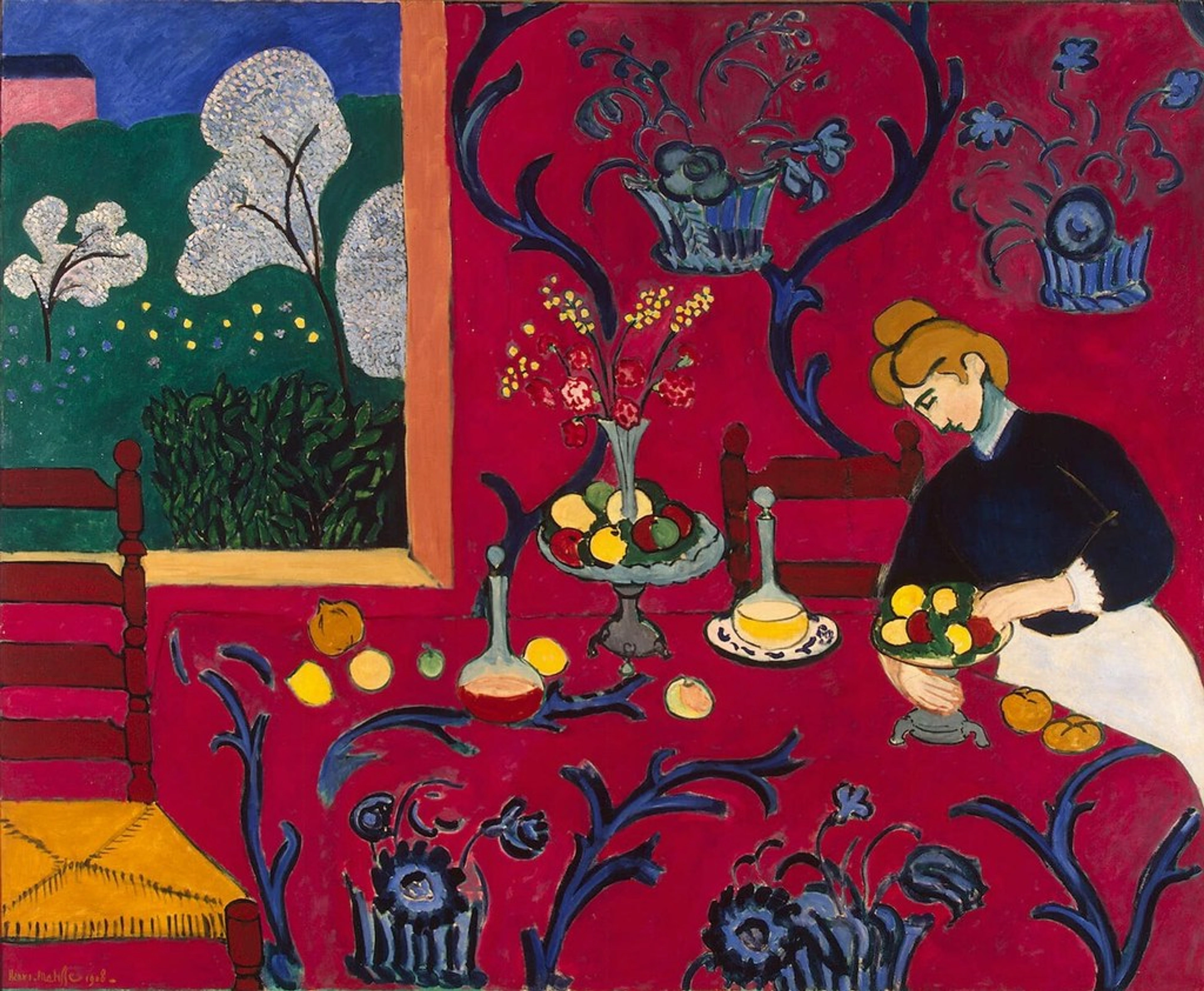
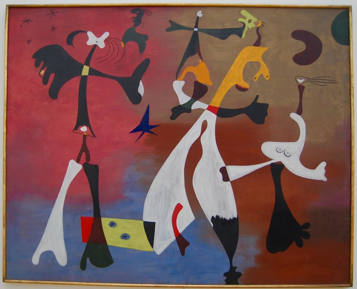
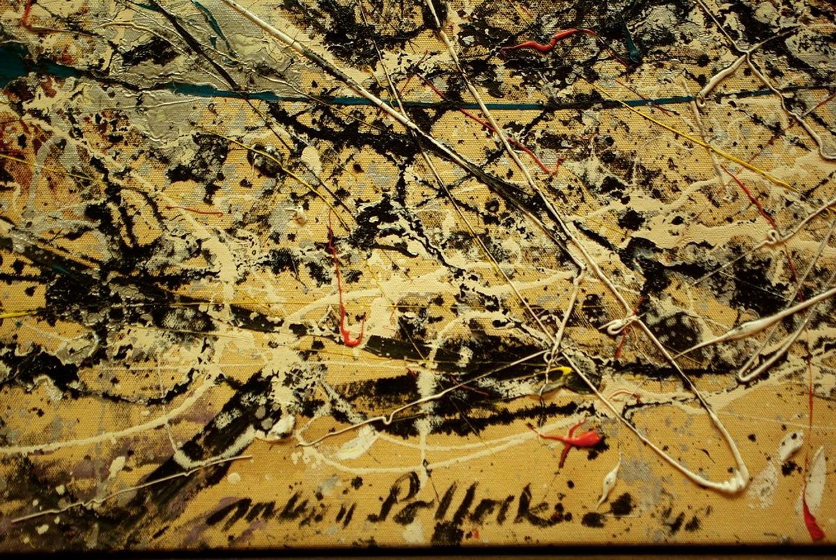
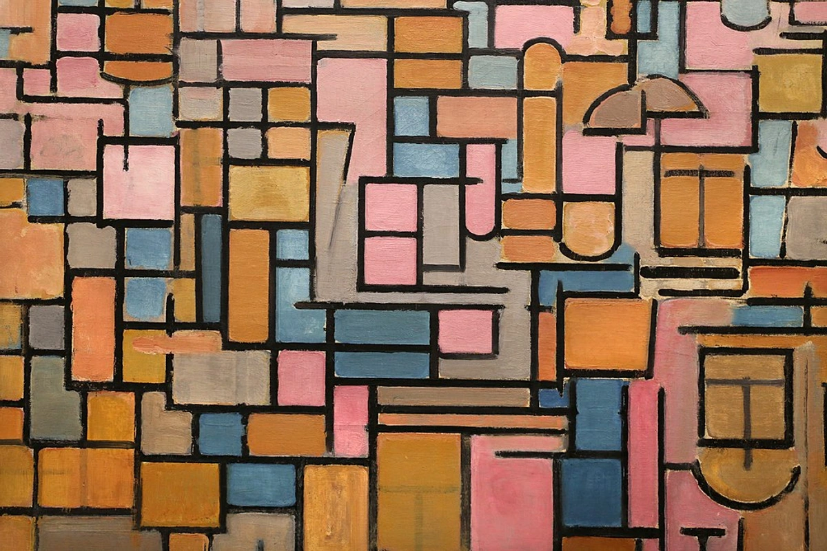
And then, with an explosive leap, came the Fauvists. Artists like Henri Matisse and André Derain boldly defied convention, embracing secondary colors with a non-naturalistic fervor – electric greens, searing oranges, and deep purples – to express pure, visceral emotion and exhilarating joy, liberating color from its descriptive confines. Their canvases, such as Derain's Charing Cross Bridge or Matisse's The Green Stripe, shout with the pure, unadulterated power of these 'mixed' hues. This historical journey vividly demonstrates their versatility and enduring importance.

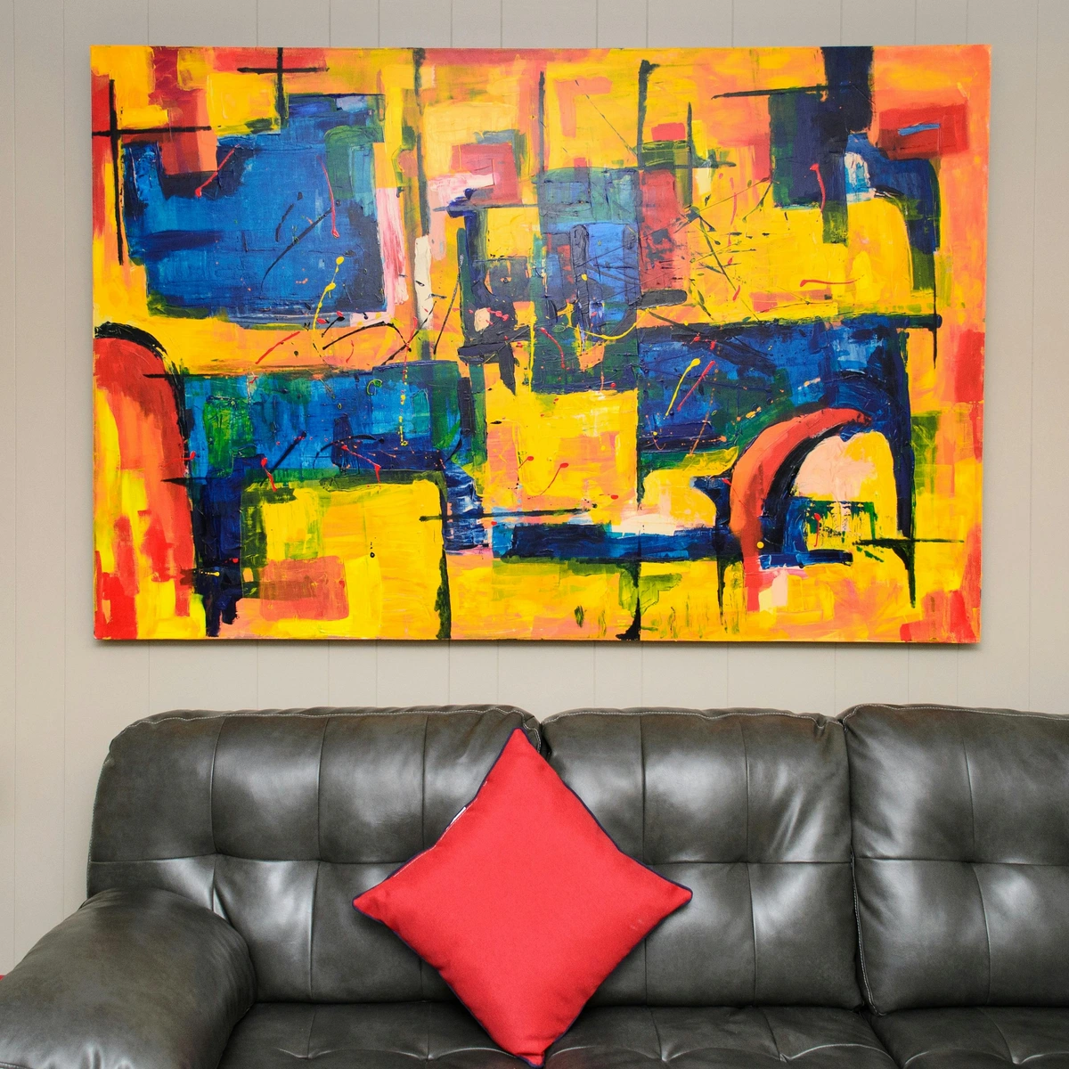
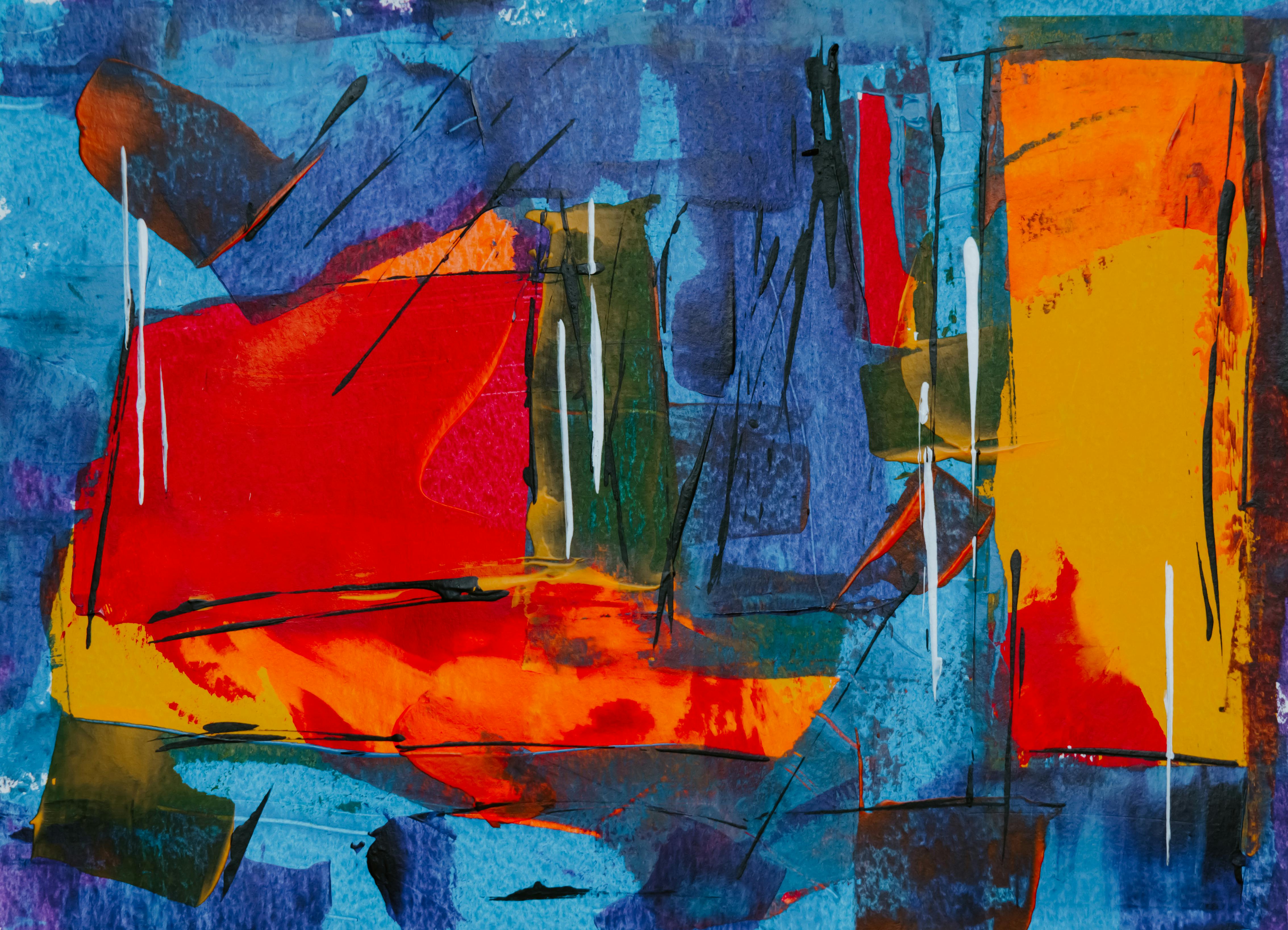
Secondary Colors in Abstract Art: Pure Expression
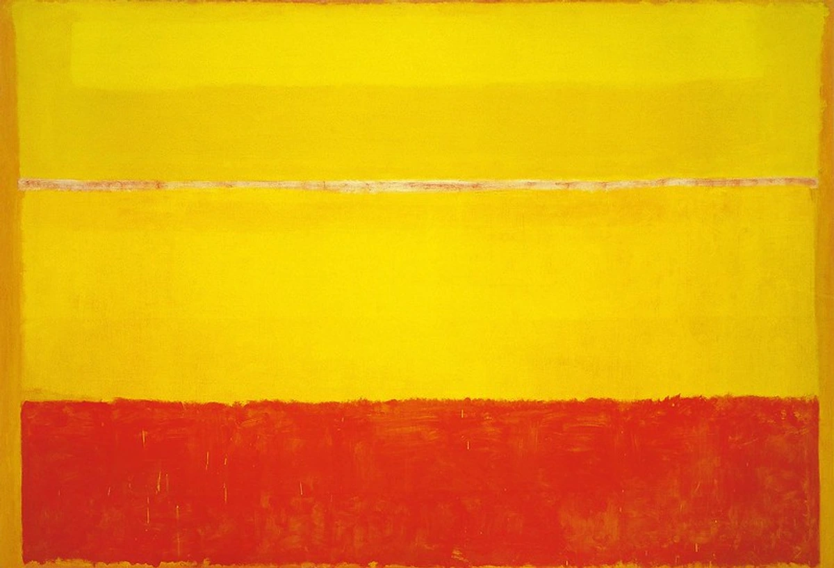
In my own abstract art, secondary colors aren't just tools; they are the very language of emotion and dynamic composition. Without literal representation, these vibrant hues, with all their subtle shifts and desaturated complexities, become the core conveyors of meaning. Think of the dynamic oranges and blues in a Kandinsky composition, or the deep, moody purples in a Rothko. These artists, and many others in the abstract tradition, demonstrate the immense power of secondary colors when divorced from naturalistic depiction.
Let me break down how I use them:
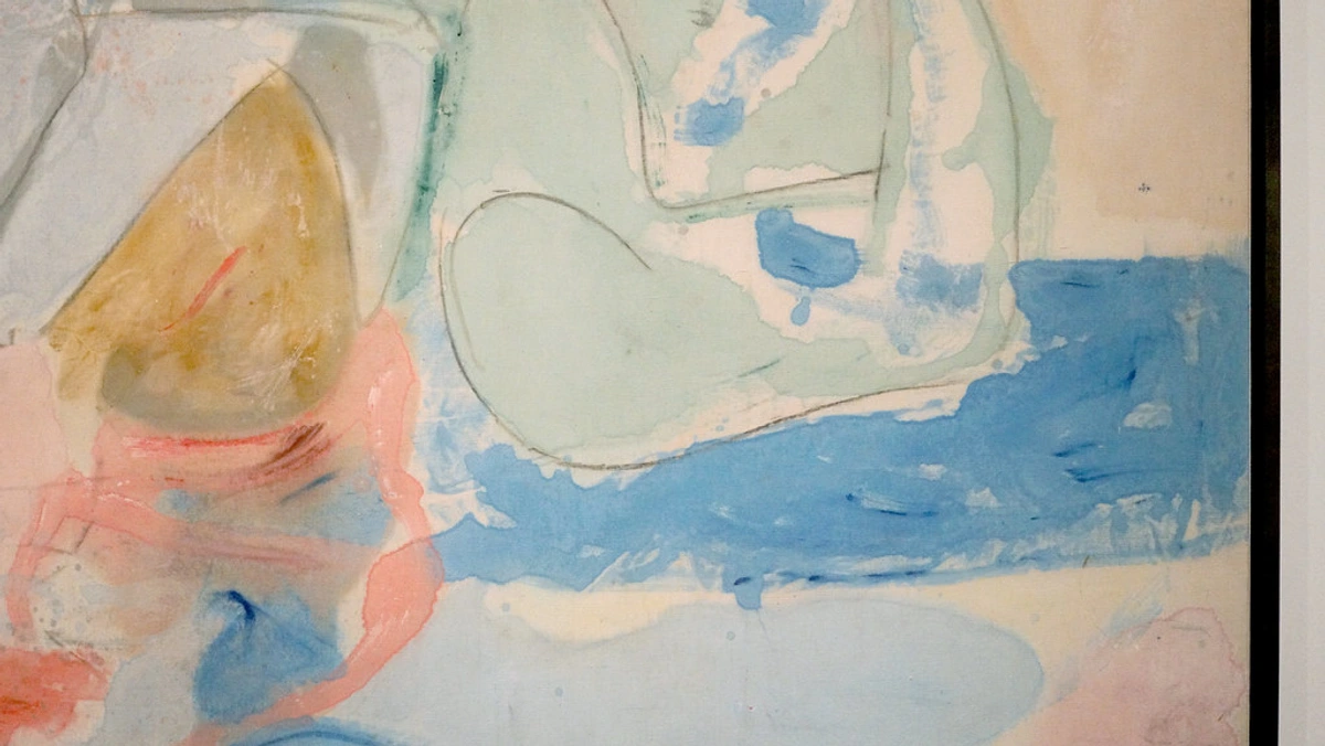
- Emotional Resonance: A rich, deep purple can evoke profound introspection, much like Mark Rothko's contemplative color fields, inviting the viewer into a meditative space. A punchy, warm orange might signify pure joy and energy, reminiscent of some of Helen Frankenthaler's more effervescent works, stimulating immediate excitement. I leverage these psychological associations (which we'll explore more deeply in the next section) to craft an immediate emotional connection with the viewer, without needing a recognizable subject. This is key to the emotional language of color in abstract art.
- Dynamic Composition: The inherent contrast capabilities of secondary colors, especially when juxtaposed, are vital for creating movement and tension. Imagine a splash of luminous yellow-green against a deep, earthy red-orange in one of my pieces; this creates an unexpected focal point, guiding the eye through the composition and injecting a sense of dynamism. This is fundamental to composition in art.
- Layering and Depth: Through careful layering and the use of hue shifts and desaturated tones, secondary colors allow me to build incredible depth. I can push certain blue-greens to recede into the background, while bringing vibrant yellow-oranges forward, creating a sense of three-dimensionality on a two-dimensional surface. This contributes to the unseen layers: my process of building depth and narrative in abstract mixed media. It’s a dance of pushing and pulling, revealing and concealing.
This exploration of how secondary colors speak to us is at the very heart of the emotional language of color in abstract art. They are the silent partners, the diligent architects, shaping entire worlds of feeling and form.
Beyond the Canvas: Secondary Colors in the Wider World
While we've focused heavily on painting, the influence and application of secondary colors extend far beyond the canvas. They are fundamental in:
- Graphic Design & Branding: Designers leverage the psychological impact of secondary colors to evoke specific brand emotions – think the calming green of Whole Foods or the energetic orange of YouTube and Fanta. A sophisticated purple might brand a luxury product like Hallmark, while a fresh yellow-green could signal an eco-conscious brand. This is a powerful application of understanding the elements of design in art.
- Digital Art & Web Design: Understanding how RGB (additive) primaries create CMY (subtractive) secondaries (and vice versa) is crucial for digital artists ensuring their on-screen creations translate effectively to print. A graphic designer needs to know that the vibrant green seen on a monitor (RGB secondary) will be reproduced differently when printed using CMYK inks.
- Fashion & Interior Design: Secondary colors inform palettes for clothing, home decor, and textiles, creating harmonious or contrasting schemes that set a desired mood. The resurgence of "Millennial Pink" (a desaturated red-purple), for example, shaped interiors and fashion for years, evoking a sense of nostalgic comfort and playful modernity. A blue-purple could evoke a serene, elegant space, while a vibrant yellow-orange might create a cheerful, inviting atmosphere.
It's clear that these colors are not just for artists; they're woven into the very fabric of our visual culture, influencing how we perceive and interact with the world around us.


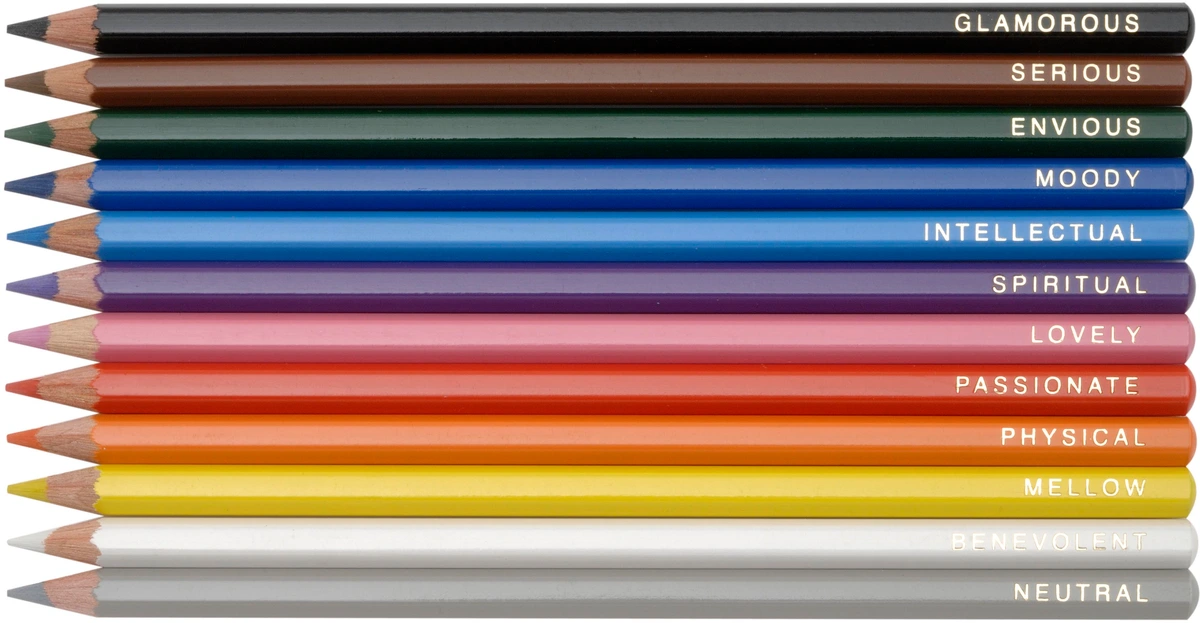
The Psychology of Secondary Colors: Setting the Mood and Telling a Story
Colors aren't just visual data; they are profound emotional triggers, speaking directly to our subconscious. The secondary colors, born from the raw power of primaries, carry their own powerful psychological weight, often blending the energies of their parent hues, and sometimes taking on entirely new meanings altogether. When I'm embarking on a new piece, I'm not merely contemplating what colors look good together; I'm deeply considering the narrative they'll weave, the emotional landscape they're meticulously constructing. This, for me, is the true heart of the psychology of color in abstract art beyond basic hues.
Let's delve into the individual personalities of our three secondary stars. What feelings does that lush, verdant green truly evoke within us? Or that fiery orange? Or a contemplative purple?
Green: Nature's Calm and Envy's Sting
This is perhaps the easiest to connect with intuitively. We inherently associate green with nature, abundant life, flourishing growth, and profound tranquility. It's the invigorating breath of fresh air in a lush forest, the soothing calm of a sun-dappled meadow, or the hopeful unfurling of new leaves in spring. It often symbolizes harmony, renewal, and even prosperity. Think of the lush greens in a Rousseau jungle painting, or the calming hues in a pastoral landscape.
However, green also possesses a darker, more complex side; it can evoke feelings of envy (the "green-eyed monster"), sickness (a sickly-green pallor), or an eerie, unnatural glow (think of certain sci-fi effects). In ancient Egyptian art, vibrant green frequently symbolized fertility and regeneration, as seen in wall paintings depicting geese in papyrus fields. In modern contexts, a light, crisp yellow-green might suggest freshness and vitality and often feels optimistic, whereas a deep, muted blue-green could convey seriousness, melancholy, or even decay. Intriguingly, some cultures associate green with financial prosperity or even danger (e.g., green traffic lights mean go, but a green light for a risky venture can be dangerous), adding nuanced layers to its already rich psychological profile. This dual nature is part of what I explore in the psychology of green in my art: growth, harmony, and nature's influence.
Orange: Energy, Warmth, and Unbridled Enthusiasm
This color is a veritable explosion of energy, warmth, and unbridled enthusiasm, a joyful, vibrant fusion of red's raw intensity and yellow's boundless optimism. Orange is inherently friendly, wonderfully stimulating, and undeniably attention-grabbing without ever veering into aggression. It can feel like the comforting, golden glow of autumn leaves, the fiery spectacle of a sunset, or a pure, invigorating burst of creative energy. It's frequently perceived as adventurous, confident, and deeply inspiring. A bright, saturated yellow-orange might evoke pure joy and playfulness, while a deeper, earthier red-orange could suggest coziness and autumn warmth.
Think of the electric oranges in a Fauvist painting, or the warm, inviting tones of a Rothko color field. Vincent van Gogh famously employed fiery oranges to express the raw, pulsating energy of the sun and his own tumultuous emotional state, much like I discuss with the vibrant energy of yellow in the psychology of yellow in my art: joy, optimism, and light. In certain Asian cultures, orange is profoundly associated with spiritual devotion, enlightenment (e.g., in Buddhism), or even bravery, further highlighting its complex and multifaceted emotional landscape. For instance, the playful, vibrant orange often seen in São Paulo graffiti murals can represent the city's energetic spirit, a feeling of joyful urban creativity.

Purple: Royalty, Mystery, and Deep Wisdom
Historically, purple held the exclusive mantle of royalty, a privilege bestowed by its incredibly rare and prohibitively expensive dye derived from sea snails (Tyrian purple). It still carries that profound sense of luxury, nobility, and undeniable sophistication today. Yet, it also deeply embodies mystery, profound spirituality, and boundless creativity, often feeling deeply introspective and contemplative. Think of the majestic purples in Byzantine mosaics, or the dreamy lavenders in a Symbolist work. A deep, rich blue-purple might evoke solemnity or spiritual depth, while a lighter, more delicate red-purple (like a lavender or mauve) could suggest whimsy, romance, or even a sense of longing.
Depending on whether it leans more towards its red (like the passionate energy I explore in the fiery heart: how red ignites passion and energy in my abstract compositions) or blue parent, purple can be passionately vibrant and expressive, or calmly melancholic and ethereal. It's truly a color of transformation, magic, and deep wisdom. For instance, in Byzantine art, purple was often reserved for sacred depictions of Christ or the Virgin Mary, symbolizing divine authority and imperial power. Different shades of purple can also be linked to mourning, artistic genius, or spiritual awakening in various cultures, firmly establishing it as one of the most versatile and emotionally charged secondary colors.
The entire atmosphere, the very soul of a painting, is built just as much on these secondaries – with all their nuance, their vibrant history, and their psychological depth – as it is on any other element. This deep understanding is, to me, the ultimate guide to the psychology of yellow in my art: joy, optimism, and light, the psychology of green in my art: growth, harmony, and nature's influence, and the fiery heart: how red ignites passion and energy in my abstract compositions – truly, the emotional language of all color in art.

Common Questions & Expert Answers About Secondary Colors: Your Quick Guide
Look, I get it. Color theory can often feel like trying to navigate a beautifully intricate, yet sometimes dizzying, labyrinth. So, it's perfectly normal to have questions! I get asked these all the time, and I promise, with every bit of knowledge you gain, the path gets clearer and more exciting. Let's clear up some common curiosities once and for all.
What are the three secondary colors you make with paint?
Easy peasy! In the subtractive (pigment-based) color model – the one most relevant to painters – the three traditional secondary colors are Orange, Green, and Purple (or Violet). Just remember that each of these is created by mixing equal parts of any two primary colors from the Red, Yellow, Blue (RYB) set. Simple, foundational, and incredibly powerful!
How do you mix secondary colors from primaries?
It's beautifully simple, using the RYB primary colors:
- Red + Yellow = Orange
- Yellow + Blue = Green
- Blue + Red = Purple
Always start with equal parts of two primary colors. From there, you can adjust the ratio slightly to create endless variations of these secondary hues, leaning more towards one primary or the other to achieve different color temperatures or moods. As we discussed, mastering these subtle proportional shifts is where the true nuance of your palette emerges.
What happens if I mix all three secondary colors together?
This is a fantastic question that often leads to unexpected discoveries! If you mix all three traditional secondary colors (Orange + Green + Purple) together in the subtractive pigment model, you'll generally achieve a complex, neutral color. This will typically be a sophisticated, earthy brown or a beautiful chromatic gray. Why? Because by combining Orange (Red+Yellow), Green (Yellow+Blue), and Purple (Blue+Red), you are, in essence, indirectly mixing all three primary colors (Red + Yellow + Blue). In subtractive mixing, when all primaries are combined, they tend to absorb or cancel out most wavelengths of light, resulting in a muted, neutral tone rather than a vibrant new hue. This isn't a mistake, though! Artists frequently do this intentionally to create gorgeous, deep, complex neutral tones that add sophistication, atmosphere, and grounding to their palettes. If you find your colors turning muddy unexpectedly, it's often a sign that you might have too many primaries (or secondaries, which contain primaries) inadvertently mingling on your palette. For practical tips on how to avoid this common pitfall, definitely check out my guide on how to avoid making muddy colors in painting.
Are black and white considered secondary colors?
No, absolutely not. In traditional subtractive color theory (the one we artists predominantly use for pigments like paint), black and white are not classified as primary, secondary, or even tertiary colors. They are considered achromatic colors because they lack hue. Instead, they function to alter the value (lightness or darkness) and chroma (purity or intensity/saturation) of a color. Adding white creates a tint (a lighter, desaturated version), and adding black creates a shade (a darker, desaturated version). They influence a color's intensity and perceived lightness, but they fundamentally do not create new hues in the same way primaries do when mixed. Think of them as modifiers, not creators, of color.
What's the fundamental difference between mixing light (like on a screen) and mixing paint?
This is indeed a crucial distinction, and a source of much confusion, so I'm glad you asked! As we explored in the "Understanding Different Color Models" section, this article predominantly focuses on the subtractive color model (think RYB or CMY). This applies to physical pigments, where mixing colors subtracts wavelengths of light, meaning the more colors you add, the closer you get to absorbing all light, resulting in black (or a very dark brown in practice).
However, devices like your computer or phone screen operate on the additive color model (RGB – Red, Green, Blue). In this system, Red, Green, and Blue are the primary colors of light. Mixing them adds wavelengths of light, and when all three are combined in equal measure, you actually get white light. The core idea is simple, once you get it: paint subtracts light, screens add light. They are almost perfectly inverse in their behavior!
Can I create secondary colors using other color systems besides RYB?
Yes, absolutely! While our primary focus here has been the RYB (Red, Yellow, Blue) system, especially for traditional artist pigments, it's important to remember that other color models operate with their own sets of primaries that then mix to different secondary colors. This interconnectedness is part of the beautiful complexity of color theory!
Let's quickly recap the key players:
Color System | Primaries | Secondary Colors |
|---|---|---|
| Traditional Pigments (RYB) | Red, Yellow, Blue | Orange, Green, Purple |
| Printing (CMY/CMYK) | Cyan, Magenta, Yellow | Red, Green, Blue |
| Light/Digital Screens (RGB) | Red, Green, Blue | Yellow, Cyan, Magenta |

Understanding these different systems helps demystify why a green on your screen might look slightly different when printed, or why some art supplies list CMY instead of RYB primaries. It's all about context and the fundamental physics of color!
What about color blindness and secondary colors?
This is a crucial point for inclusivity in art appreciation! Color blindness (or more accurately, color vision deficiency) primarily affects how an individual perceives differences between certain colors, most commonly red and green (deuteranomaly and protanomaly) or blue and yellow (tritanomaly). For someone with red-green color blindness, distinguishing between red and green secondary colors, or even identifying certain shades of orange, green, and purple, can be challenging or even impossible. A vibrant green might appear muted or brownish, and orange could merge with yellow or red. While it doesn't change the physical properties of how colors mix, it profoundly alters the perceived secondary color. As artists, being aware of this helps us consider contrast and value more deeply, ensuring our compositions remain impactful for all viewers. Utilizing strong value differences (light vs. dark) and clear compositional elements can ensure your artwork's message still resonates, even if color perception is altered.
Why are secondary colors important in art?
Secondary colors are vital because they bridge the gap between primaries, expanding your palette and expressive range exponentially. They allow for:
- Depth and Nuance: Creating sophisticated variations of hue, saturation, and value, moving beyond flat, basic colors.
- Emotional Range: Each secondary color carries unique psychological associations that can evoke specific moods and feelings, often blending the energies of its parent primaries.
- Harmony and Contrast: Essential for building compelling color schemes, whether you want serene balance through analogous hues or dynamic tension through complementary pairings.
- Realism and Abstraction: From rendering naturalistic light in landscapes to conveying raw emotion in abstract works, they are indispensable for a rich visual vocabulary.
They are the very first step into the complex, rich world of color relationships, allowing artists to move beyond basic hues to create truly captivating and meaningful art.
A Final Thought: The Indispensable Architects of Color
Secondary colors are so much more than just a midway point on the color wheel, a simple blend of two ingredients. They are the very beginning of nuance, the inaugural step into true complexity, and the foundation for profound depth in art. They stand as vibrant proof that by thoughtfully combining simple, foundational elements, you can summon forth something entirely new, incredibly rich, and profoundly expressive. They are, in many ways, the energetic engine of the definitive guide to color theory in art, the indispensable bridge that transports you from basic building blocks to an infinite horizon of creative possibilities. They represent the first moment a painting truly starts to speak to the viewer, conveying mood, atmosphere, and a compelling story far beyond mere simple recognition. This, for me, is truly where the magic starts to unfold.
So, the next time you encounter a deep, mysterious purple, a vibrant, joyful orange, or a calming, grounding green, pause for a second. Take a moment to truly appreciate it. It's not just a single color; it's a dynamic narrative, a silent conversation between two primaries coming together, each contributing its unique essence to forge something entirely new, resonant, and deeply powerful. This intuitive understanding of how colors speak to us, how they interact, and how they evolve, is precisely what I strive to capture in my own abstract work, creating pieces that resonate with joy, tranquility, and a profound, captivating depth. As you continue your own color journey, embrace the endless possibilities these secondary hues offer. Experiment with their variations, understand their psychological resonance, and watch as they transform your artistic vision from simple hues into captivating stories. The exploration of color is a lifelong journey, and secondary colors are your essential first steps into its boundless depths. If you feel inspired to see these principles vividly in action and explore how I bring them to life, I warmly invite you to view some of my creations, which are readily available to buy online. Perhaps a piece will speak to you, or spark your own journey of color discovery.
