Mastering Art Composition: Elements, Principles, History & Beyond
Unlock the secrets of art composition. This ultimate guide deep dives into elements, principles (Gestalt, Golden Ratio, balance, negative space), history, and practical tips. Transform your perception and creative practice.

Mastering Art Composition: Your Definitive Guide to Visual Harmony and Impact
I remember walking into a gallery once, a kaleidoscope of colours and forms, yet one piece just stopped me dead in my tracks. It wasn't the subject matter, or even the colour palette, but something deeper, an almost magnetic pull that made my eyes dance across the canvas in a way that felt utterly natural, inevitable. Then, just around the corner, another artwork felt… disjointed. Like a band playing out of tune, it left me cold, my gaze wandering aimlessly before moving on. What is that unseen force, I wondered, that can elevate a mere collection of lines and colours into something truly unforgettable, or leave another feeling utterly flat? As an artist, I’ve wrestled with this question, sometimes triumphing, sometimes utterly failing, and what I've discovered is the silent, often invisible, architect behind every compelling visual: composition. It's the deliberate arrangement of visual elements within a given space, the secret language that speaks directly to our subconscious, dictating how we perceive and feel about an artwork. It's how our brains naturally seek order, patterns, and connections, often without us even realizing it.
For the longest time, I just felt it. An instinctive pull or push. Then, as an artist, I realized that "feeling" has a name, a science, and an art all its own: composition. It's the silent architect behind every impactful piece of art, directing your gaze, stirring emotions, and ultimately, determining whether you linger or pass by. Understanding it isn't just for artists; it's like gaining a secret decoder ring for the visual world, allowing you to not only appreciate art more deeply but also to bring a newfound sense of visual order and intention into your own creative projects, arrange your living space with greater harmony, or even instinctively understand why one advertisement works better than another. My goal here is to demystify composition and empower you to truly see and appreciate art on a whole new level.
Composition 101: The Building Blocks of Visual Art
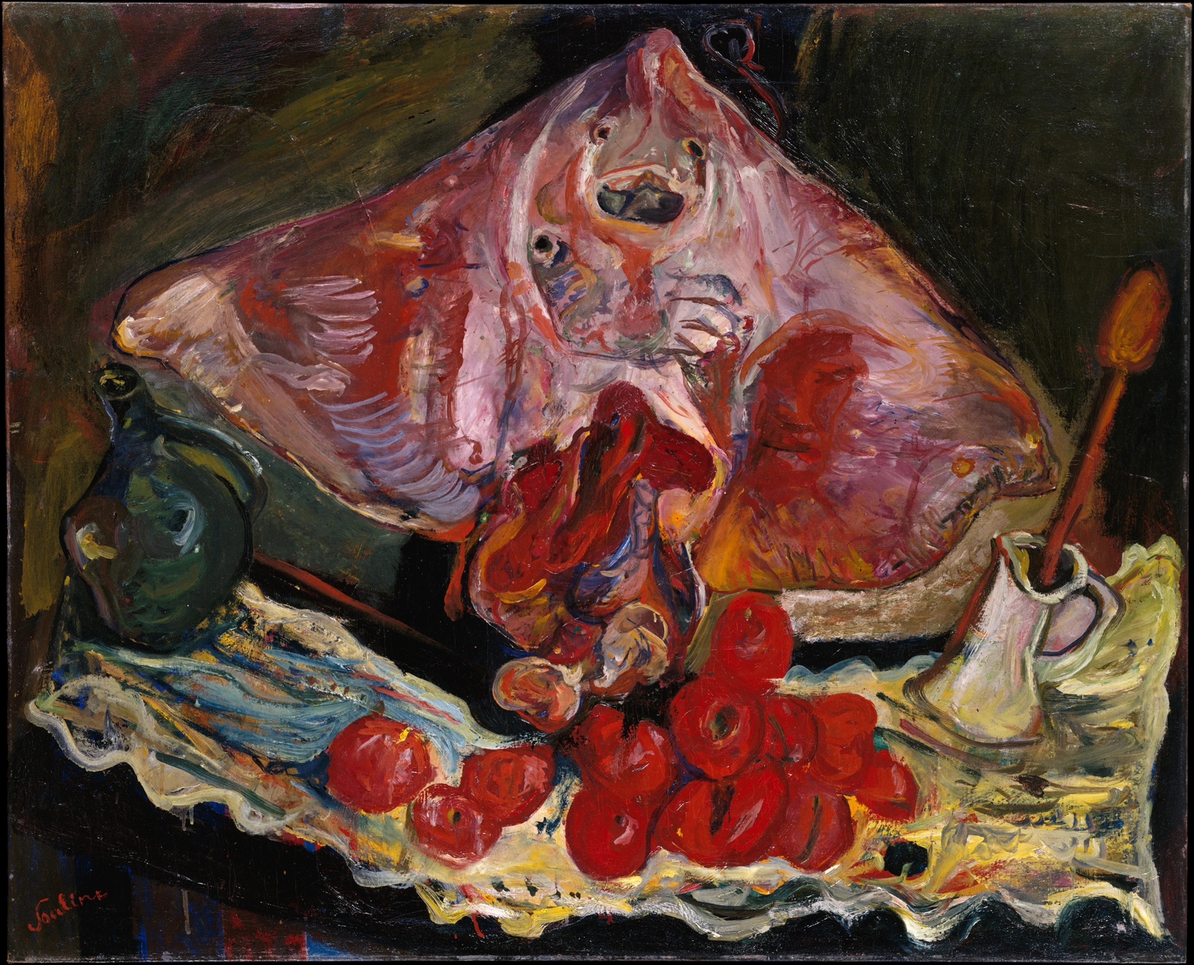
At its core, composition in art is simply the intentional arrangement of all the visual elements a creator has at their disposal. Think of it like a choreographer planning a dance, a chef meticulously arranging ingredients on a plate, or even a composer arranging notes to create a symphony. It's about making intentional choices to guide the viewer's eye, establish a visual hierarchy – essentially, telling the viewer what's most important and what can wait, creating a clear narrative path for their gaze – and convey a specific message, emotion, or narrative. This visual hierarchy is often established through techniques like contrast, size, and placement. This isn't a new idea; artists throughout history have consciously (or intuitively) wrestled with these arrangements, always striving for that elusive visual harmony or even deliberate discord – sometimes a purposeful clash that jolts the viewer, creating tension or reflecting chaos, but always with intention.
To truly grasp composition, we first need to understand its fundamental components, the very building blocks artists use: the elements of art.
The Key Elements of Composition: A Closer Look
These are the fundamental tools artists use to create any visual work. Each element plays a crucial role in how a composition is perceived and how it makes you feel. To learn more about them, check out our comprehensive guide to the elements of art.
Element  | Definition & Impact in Composition | Role in Composition & Example |
|---|---|---|
| Line | A continuous mark on a surface, defining shape, direction, and movement. It guides the eye and evokes emotional responses. Different types (e.g., thick vs. thin, jagged vs. smooth) carry distinct emotional weight. | Guides the eye, creates boundaries, suggests motion or stillness, defines contours. Think of the dynamic diagonals in a Cubist painting or the serene horizontals of a landscape. (See: Understanding Line in Abstract Art) |
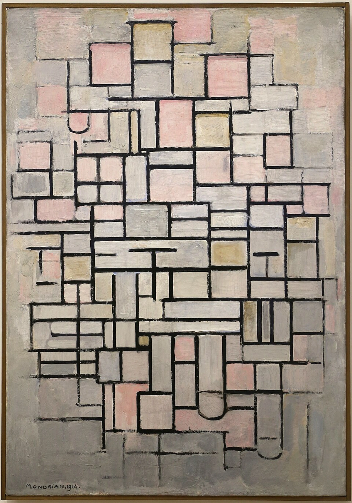
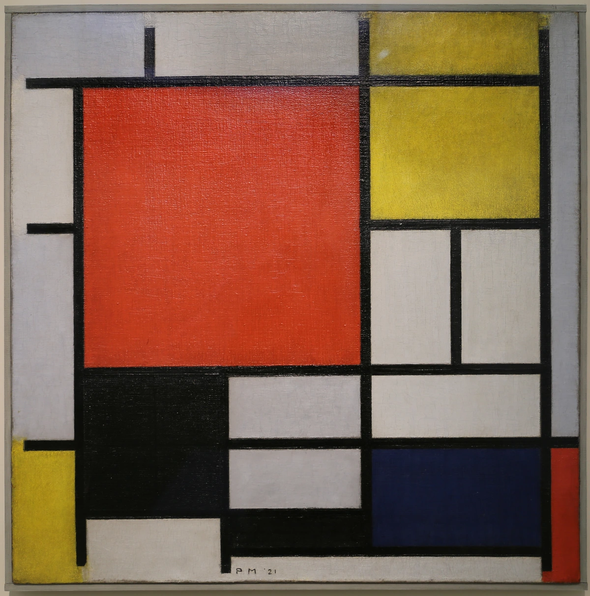
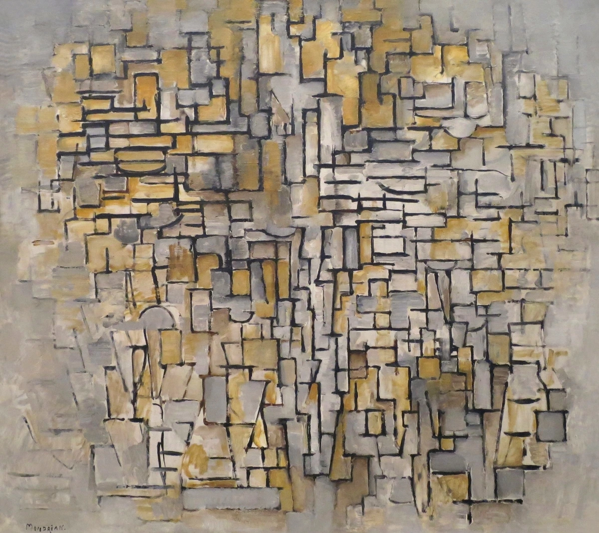
| Shape | A two-dimensional area defined by lines or implied boundaries (geometric like squares, organic like clouds). Shapes establish forms, create patterns, and define both positive and negative space. Geometric shapes often create order, while organic shapes lend naturalism or fluidity. | Establishes forms, creates patterns, dictates positive and negative space. From the geometric precision of a Mondrian to the organic curves of an Arp sculpture, shapes are foundational. |
| Colour | The property of light as seen by the eye, characterized by hue (the pure colour), saturation (intensity), and brightness (lightness/darkness). Colour evokes emotion, creates emphasis, defines depth, and establishes mood. Warm colours (red, orange) tend to advance, while cool colours (blue, green) recede. | Evokes emotion, creates emphasis, defines depth, establishes mood and atmosphere. The vibrant, warm hues of a Fauvist portrait can feel very different from the cool, muted tones of a Baroque interior. |
| Value | The lightness or darkness of a colour or tone. It's crucial for creating value contrast, defining form through subtle shifts (like the gentle shadow on a sphere), and establishing mood (e.g., dramatic chiaroscuro – the strong contrast between light and dark – vs. soft light). | Creates contrast, defines form, establishes mood (dramatic chiaroscuro vs. soft light). Consider the stark black and white contrasts in a Caravaggio painting or a charcoal drawing, creating drama and depth. |
| Form | The three-dimensional quality of an object, or the illusion of three dimensions in a two-dimensional artwork. Form gives objects substance, weight, and presence; it creates depth and realism through techniques like shading, highlighting, and perspective. | Gives objects substance, weight, and presence; creates depth and realism. Sculptures are inherently about form, but painters create the illusion of it through shading and perspective. |
| Texture | The perceived surface quality of an object – rough, smooth, soft, hard – either actual (tactile, like thick impasto) or implied (visual, like rendering fur or fabric). Texture adds sensory detail, creates visual interest, influences light reflection, and can suggest movement. | Adds sensory detail, creates visual interest, influences light reflection, can suggest movement. The thick impasto of a Van Gogh creates a tangible sense of movement, while the smooth surface of a Renaissance portrait offers a different experience. (See: Understanding Texture in Art) |
| Space | The area around, within, or between elements. It can be positive (occupied by objects) or negative (empty areas). Space creates depth, directs focus, allows elements to breathe, and defines relationships between objects. How an artist uses empty space can be as important as the objects themselves, creating shapes in their own right. | Creates depth, directs focus, allows elements to breathe, defines relationships between objects. How an artist uses empty space can be as important as the objects themselves, drawing attention to a solitary figure or creating a sense of vastness. |
| Pattern | The repetition of an element or a motif in a consistent, predictable, or varied sequence. Pattern adds visual rhythm, creates unity, generates interest, and can subtly lead the eye through an artwork, sometimes creating a sense of depth as patterns recede. | Adds visual rhythm, creates unity, generates interest, can lead the eye. Think of the repeating architectural elements in a city scene or the decorative motifs in a Klimt painting. |
The Unseen Rules: Principles that Guide the Eye
Understanding the elements is one thing, but knowing how to arrange them effectively? That's where the principles of composition come in. These are the strategies artists use to organise the elements, creating meaning, emotion, and visual flow. They are the true architects, the unseen forces that dictate whether your eye glides effortlessly or stumbles awkwardly through a piece. It's like having all the finest ingredients laid out, but without a recipe, you're just staring at a pile of food. The principles tell you how to blend, chop, and season to make a masterpiece. And the funny thing is, our brains are often doing half the work for us without us even realising it, constantly seeking out these underlying structures. It’s like our subconscious has its own internal composition app running all the time! For a deeper dive into both, I'd highly recommend checking out The Definitive Guide to Elements and Principles of Art and What is Design in Art – they'll really solidify your understanding of how everything fits together.
Balance: The Art of Visual Weight
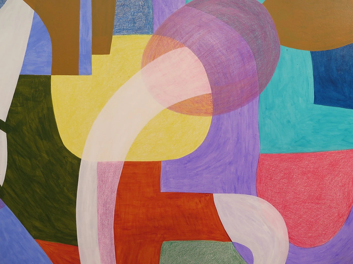
Just like in life, balance in art creates a sense of stability and harmony. It's not about symmetrical mirroring (though it can be), but about distributing the visual weight of elements so that no single part feels too heavy or too light. What's "visual weight"? It's the perceived heaviness or lightness of an element in a composition. Darker colours, larger shapes, complex textures, and high contrast areas generally have more visual weight. It's how I often try to keep my own chaotic thoughts from spilling all over the canvas. I remember one early painting where I crammed all my darkest, most intense colours into one corner, and the whole piece just felt like it was toppling over. There are a few ways to achieve this:
- Symmetrical Balance: Think of a perfect reflection, like a butterfly's wings or a classical temple façade. Both sides are identical or nearly identical, creating a powerful sense of formality, order, and calm. It can be quite striking, but sometimes a little too predictable for my taste, conveying a static rather than dynamic mood. It feels like a whispered, "Everything is exactly as it should be."
- Asymmetrical Balance: This is where things get interesting! Different elements on each side of a central axis are balanced by their visual weight, not their identical nature. A large, dark shape on one side might be balanced by several smaller, lighter shapes on the other. It feels more dynamic, often more natural because it mimics the uneven distribution of elements in the natural world, and definitely more challenging to pull off. It's like balancing a feather with a rock – possible, but you need to know what you're doing and trust your eye. Think of a Japanese rock garden, where rocks of varying sizes and positions create a harmonious yet uneven composition. This whispers, "Order exists, but it's alive and evolving."
- Radial Balance: Elements are arranged around a central point, like spokes on a wheel, ripples in a pond, or a starburst pattern. This creates a powerful sense of movement emanating outwards or inwards, drawing the eye directly to the centre. Flowers, mandalas, or spiral compositions often use this, creating a sense of unity and focus, or even suggesting explosive energy. This shouts, "Look here!" (Read more: Understanding Balance in Art Composition)
Gestalt Principles: How Our Brains Organize What We See
Beyond individual elements and principles, our perception itself plays a huge role in how we understand a composition. This is where Gestalt Principles come in – a set of psychological theories explaining how humans naturally perceive objects as organized patterns and wholes, rather than discrete parts. Artists often intuitively leverage these principles to create cohesive and impactful artworks. It's our brain's way of making sense of the visual world, often filling in the blanks without us even realizing it. I've found that understanding these makes you feel like you're hacking your own visual system!
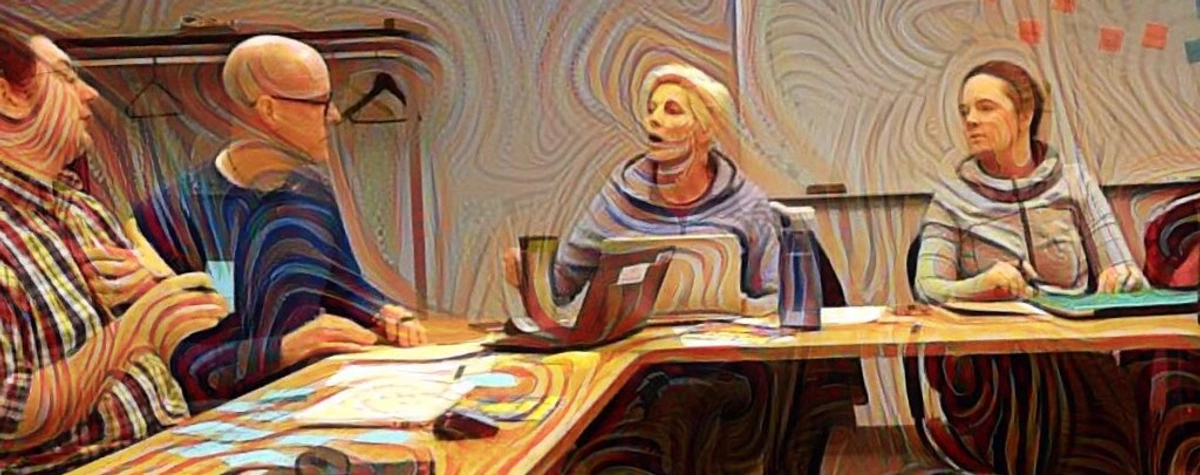
Key Gestalt Principles for composition include:
- Proximity: Objects that are close to one another appear to be grouped together. An artist might cluster elements to suggest a relationship or form a larger shape, even if they aren't physically connected. Think of a flock of birds flying in a loose formation; we perceive them as a single unit, or scattered dots that form a perceived line.
- Similarity: Objects that are similar in shape, colour, size, or texture are perceived as a group. Repeating a particular motif or colour can create unity and visual rhythm. Imagine a painting with several red squares scattered across it – your brain groups them together as belonging to the same visual family.
- Continuation: Our eyes tend to follow lines or curves, extending them beyond their endpoints. This principle is key to creating leading lines and a sense of visual flow, seamlessly guiding the viewer's gaze from one element to the next. Even if a line is broken, our mind 'completes' it, like following a path through tall grass.
- Closure: When we perceive a complex arrangement of elements that don't quite form a complete shape, our brains will often fill in the missing information to create a recognizable whole. Think of implied lines or forms, like how a circle drawn with just a few dashes can still be perceived as a complete circle, or a logo that uses negative space to suggest a missing letter.
- Figure/Ground: This refers to our tendency to separate objects (figure) from their background (ground). Artists manipulate this to create emphasis or even illusions where figure and ground can be reversed, challenging perception. René Magritte's paintings often play with this, making you question what's primary. The classic example is Rubin's Vase, where you can see either two faces or a vase, but not both simultaneously.
The Rule of Thirds & Golden Ratio: Mathematical Harmony
These aren't rigid laws, but rather powerful guidelines that artists throughout history have leveraged for compelling compositions. I like to think of them as suggestions from some very clever ancestors, like a subtle nudge towards what feels right to the human eye!
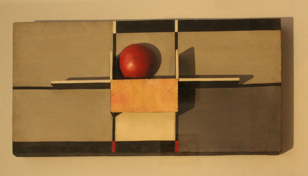
- The Rule of Thirds: Imagine dividing your canvas into nine equal sections with two horizontal and two vertical lines (like a tic-tac-toe board). The idea is to place your focal points or key elements along these lines or, even better, at their intersections. Why? Our eyes naturally gravitate to these points, creating a more engaging and less static composition than simply centring everything. While centring can be powerful for specific messages (like conveying stillness or strict formality), placing elements off-centre using the rule of thirds generally feels more dynamic and natural. It’s incredibly intuitive once you start looking for it, and it applies equally well to both positive and negative space. It's often the first thing I check when a composition feels 'off.'
- The Golden Ratio (Phi ≈ 1.618): Ah, the divine proportion! This mathematical ratio, found abundantly in nature (shells, sunflowers, even human proportions), has been used since ancient times to create aesthetically pleasing and harmonious compositions. Artists often apply it through the Golden Spiral, a logarithmic spiral that grows by the Golden Ratio, leading the eye on an elegant journey through the artwork, often from a larger, less detailed area towards a smaller, more intricate focal point. You might also encounter the Golden Rectangle, a rectangle whose side lengths are in the Golden Ratio, often used as a foundational structure for entire compositions. It's often subtle, an almost unconscious perfection that just feels right, rather than a hard-and-fast rule to be measured precisely. Many Renaissance masters like Leonardo da Vinci and Classical Greek architects are believed to have incorporated it into their works.
Leading Lines & Framing: Paths and Windows
Have you ever noticed how your eye follows a path in a painting or photograph, almost without effort? That's often thanks to leading lines and a technique called framing. These are powerful tools for guiding the viewer's eye and creating a sense of depth and focus.
- Leading Lines: These are real or implied lines (roads, rivers, fences, the gaze of a figure, even a series of objects) that draw the viewer's eye towards a focal point, guiding them through the composition. They add depth, narrative, and dynamism. For me, they’re like setting out breadcrumbs for someone to follow a story I want to tell. A winding path, a row of trees, or even the direction someone is looking can all act as leading lines. In photography, they are fundamental to creating depth and narrative. It's astonishing how a subtle curve can transform a flat image into an immersive scene.
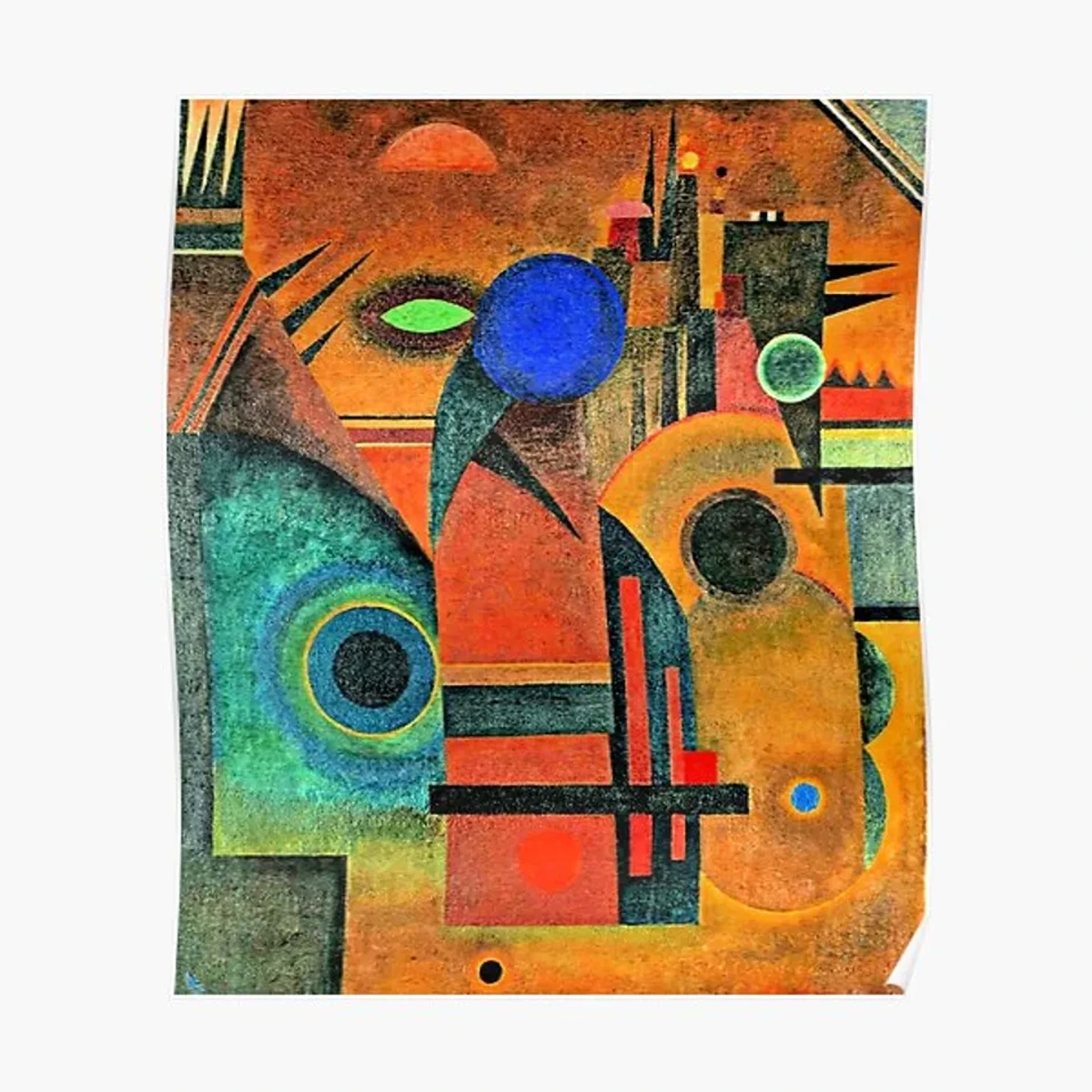
- Framing: This involves using elements within the artwork itself to create a frame around the main subject. Think of a tree branch arching over a landscape, a doorway framing a person, the window of a building, or even an object in the foreground obscuring part of the scene. It directs attention, adds depth, and isolates the subject, making it more impactful. It's a fantastic way to create a sense of looking into a scene, like peeking through a window, and can add a lovely layer of intimacy or mystery.
Focal Point & Emphasis: The Star of the Show
Every great story has a protagonist, and every compelling composition has a focal point – the area that immediately grabs your attention and acts as the visual anchor. Emphasis is the principle an artist uses to ensure this focal point stands out. It's about saying, "Hey, look here!" without having to literally point. My own art often relies on a clear focal point, usually a burst of colour or a striking line, to draw you in. I recall a painting where I used a single, vibrant yellow dot in a sea of blues and grays, and it truly sang.
Artists achieve emphasis through various means:
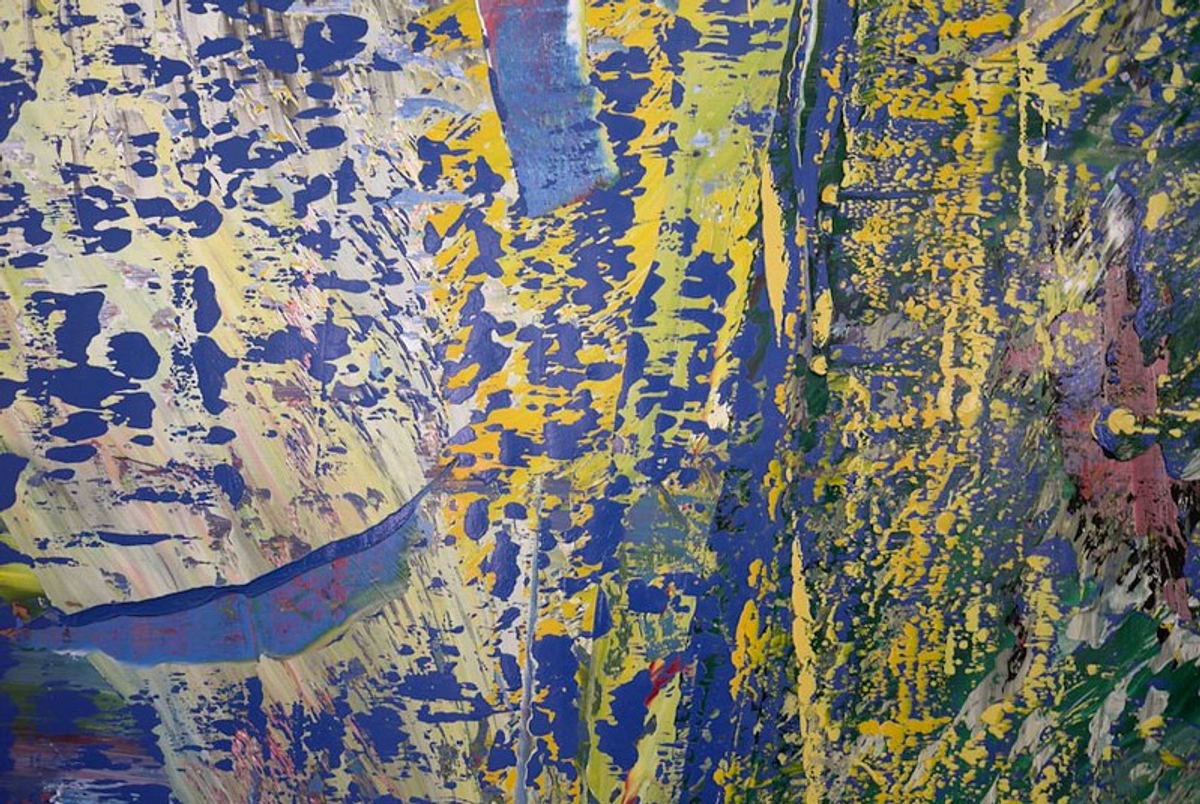
- Contrast: Placing something light against dark, vibrant against dull, rough against smooth, or large against small. This difference naturally draws the eye (e.g., a bright red apple against a dark, muted background).
- Isolation: A single object or figure placed apart from others will naturally draw the eye, especially if it's also distinct in color or value from its surroundings (e.g., a lone figure walking on an empty beach).
- Placement: Often, subjects placed at the intersections of the Rule of Thirds, or along leading lines, become natural focal points.
- Size & Scale: A larger or disproportionate element can command attention simply by its dominance (e.g., a colossal statue dwarfing human figures).
- Color & Detail: A splash of highly saturated colour in an otherwise muted palette, or an area with intricate detail surrounded by simplicity, will undeniably pull the viewer's gaze (e.g., a single intricate flower in a field of softly blurred colours).
Rhythm & Movement: The Dance of Elements
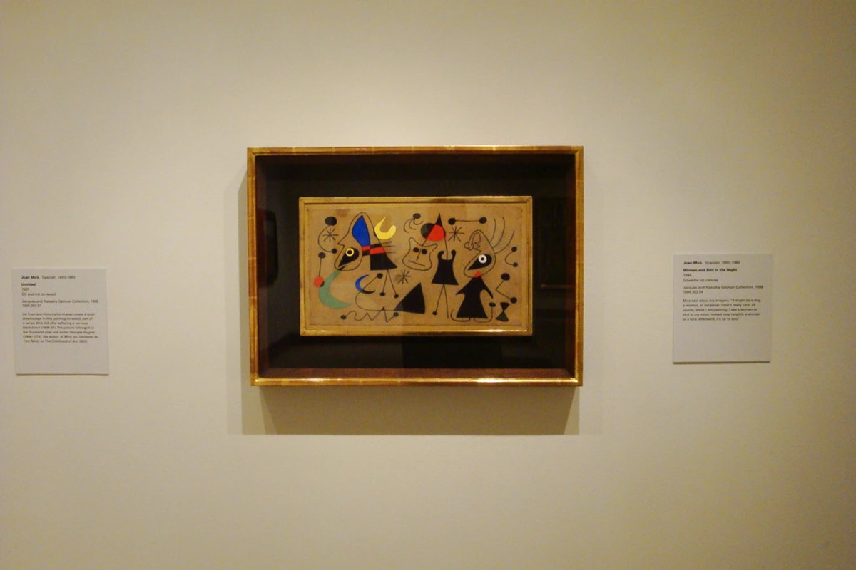
Art isn't always static; sometimes it hums with energy! Rhythm in composition is created by the repetition of elements, shapes, or colours, often with variations, creating a visual tempo. This rhythm then leads to movement, the way the viewer's eye is directed through the artwork, following a path or a flow. Diagonal lines, curves, and the strategic placement of light and shadow are master orchestrators of movement, giving life to a static image. Think of Van Gogh's Starry Night, where swirling lines and energetic brushstrokes create a powerful, almost musical rhythm that guides your eye through the tumultuous sky. Consider also the repeated angular forms in Cubist works or the gentle, undulating curves of Art Nouveau, each creating a distinct sense of motion, much like a fast or slow tempo in music, or the swelling and fading of an orchestra. I find that when a piece truly works, my eyes don't just land on a spot, they travel through it.
Contrast & Visual Impact: Making Things Pop
Contrast is the difference between two or more elements in a composition, and it's absolutely vital for creating visual interest and guiding the eye. Without contrast, an artwork can feel flat, lifeless, and utterly unengaging. It's how you make something scream for attention or subtly recede into the background, creating depth and a dynamic interplay between elements. It’s what gives a piece its visual zing. Different types of contrast include:
- Value Contrast: The difference between light and dark tones. High value contrast creates drama and strong focal points, often seen in chiaroscuro techniques championed by artists like Caravaggio and Rembrandt, making those focal points truly pop. Low contrast often results in a softer, more subtle, or mysterious mood.
- Color Contrast: Juxtaposing complementary colours (e.g., red and green, blue and orange) or warm and cool colours creates vibrancy, emphasis, and can even suggest depth (warm colours tend to advance, cool colours recede). Complementary colours are opposite on the colour wheel and create a strong visual vibration when placed next to each other, like the electric glow in some Fauvist paintings.
- Texture Contrast: Rough against smooth, soft against hard – this adds tactile interest and makes elements stand out by creating a sensory difference (e.g., the rough bark of a tree against a smooth, reflective pond).
- Shape/Form Contrast: Organic shapes next to geometric ones, or large forms against small ones, create visual tension and dynamism (e.g., a jagged mountain peak against soft, rounded clouds).
- Direction Contrast: Horizontal lines meeting vertical ones, or diagonal lines intersecting, creates energy and draws the eye particularly to the point of intersection, establishing a visual anchor.
By carefully manipulating contrast, artists can define forms, create depth, and generate powerful emotional responses. It's often the secret ingredient behind why an image feels striking; without it, I find my own work can quickly lose its punch.
Unity & Variety: The Perfect Partnership
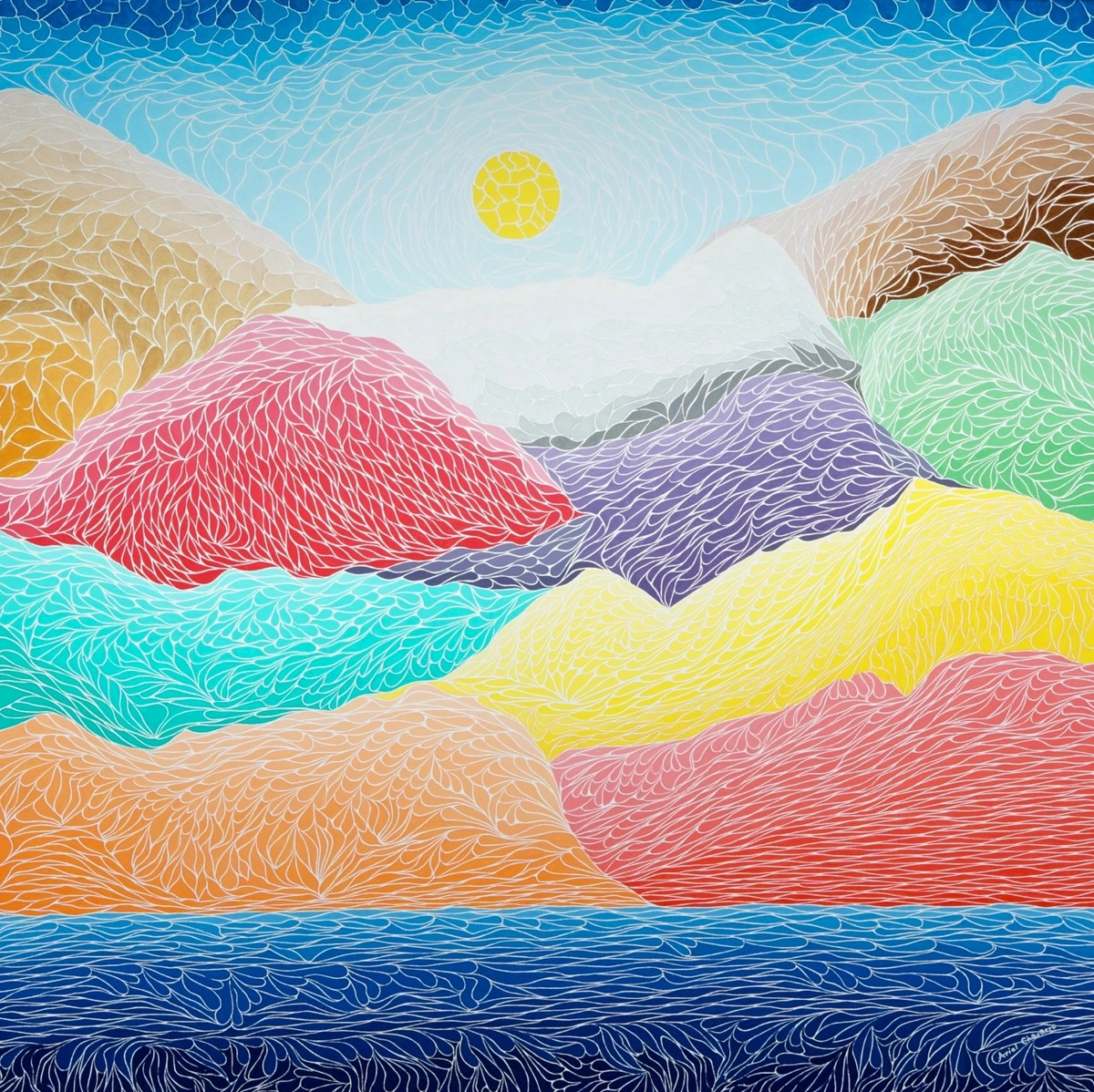
Imagine a painting where everything is exactly the same colour, shape, and size – it would be incredibly dull, right? That's a lack of variety. Now imagine a painting with every element completely different and scattered haphazardly – it would be chaotic and confusing, a lack of unity. The magic of composition lies in the delicate dance between these two principles.
- Unity brings a sense of cohesion and wholeness to an artwork. It's what makes all the individual elements feel like they belong together, creating a harmonious overall impression. This can be achieved through repetition of colour, shape, or texture, or by creating a consistent mood or theme. It's the glue that holds everything together, ensuring the piece doesn't fall apart visually.
- Variety, on the other hand, introduces visual interest and prevents monotony. It's the little unexpected twists – a different colour, a surprising texture, an asymmetrical arrangement, or a unique shape – that keep the viewer engaged and exploring the piece. When balanced by unity, variety makes an artwork rich and compelling, preventing it from becoming a boring repetition, but also ensuring it's not just a jumble of unrelated parts. You might have a painting dominated by cool blues (unity) but with a small, vibrant splash of orange (variety) to provide visual zing. It’s that perfect tension between the familiar and the surprising that makes a composition memorable. (See: Understanding Unity and Variety in Art Composition)
Scale & Proportion: Telling the Story of Size
Scale refers to the size of an object in relation to other objects in the artwork, to the viewer, or to its usual size. This is often called relative scale. Proportion is the relative size of parts of a whole within an object. Together, these principles are powerful tools for narrative and emotional impact. A tiny figure in a vast landscape, for instance, can evoke feelings of awe, insignificance, or profound solitude. Conversely, a monumentalized object can convey power or overwhelm the viewer. I remember seeing a massive sculpture dwarfing the gallery space, and it created an undeniable sense of being utterly humbled. A disproportionately large hand in a portrait might suggest strength, a psychological state, or symbolic meaning (think of the elongated, almost surreal figures of Mannerist painters). By manipulating scale and proportion, artists can exaggerate, monumentalize, or diminish elements, subtly influencing how we interpret the scene and its emotional weight. It's how they control what feels imposing, what feels intimate, or what simply feels off – and sometimes, 'off' is exactly what you're aiming for.
Negative Space: The Power of "Nothing"
Often overlooked, negative space is as crucial to composition as the objects themselves. It's the empty area around and between the main subjects (the positive space). Far from being mere background, negative space actively contributes to the composition by:
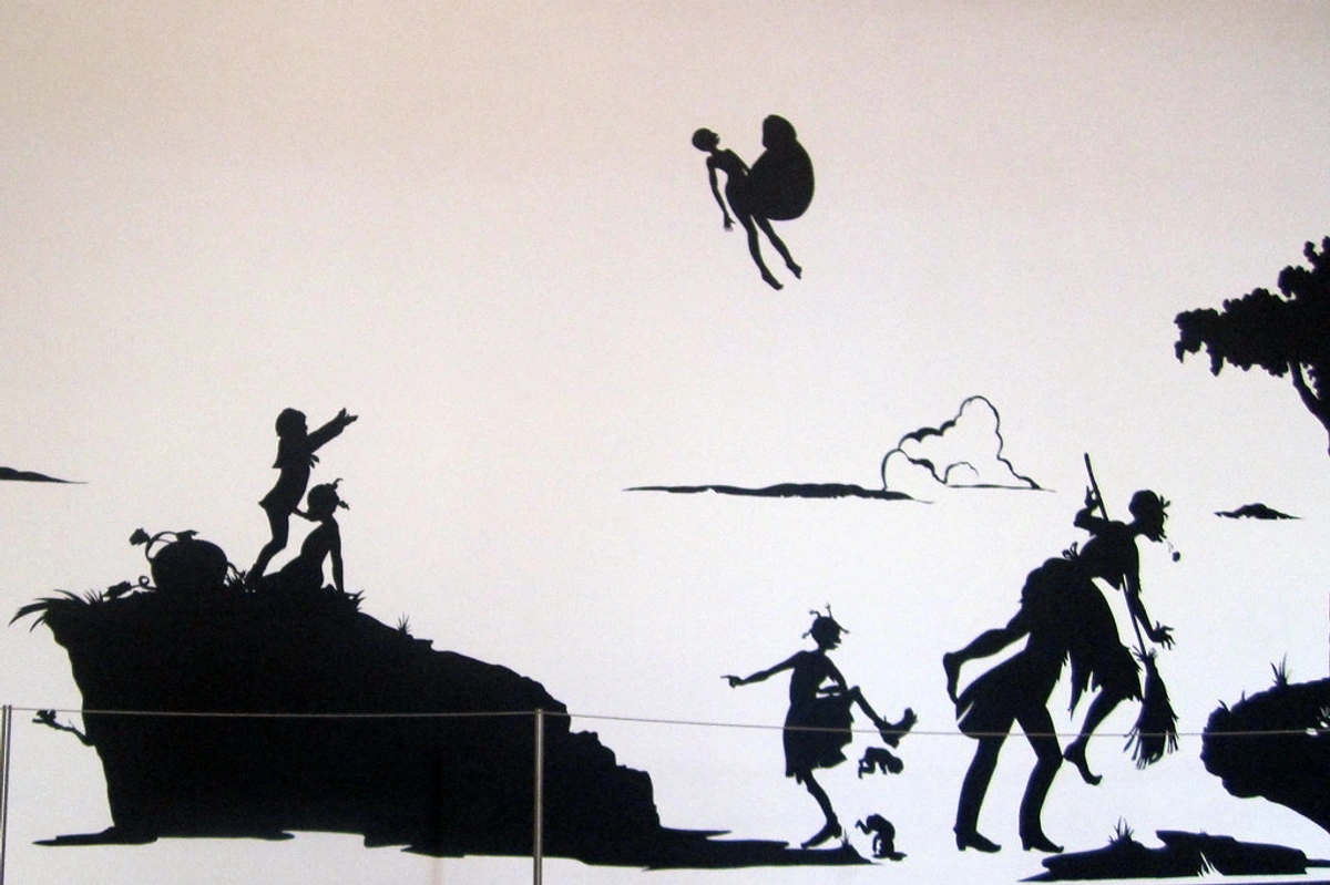
- Defining Positive Forms: It helps clarify the outlines and shapes of the main subjects, making them more legible. The shape of the negative space can itself be interesting and contribute to the overall design, just look at the classic example of Rubin's Vase, where the negative space forms two faces, or the sleek, impactful use of negative space in many modern logos.
- Creating Balance: Large areas of negative space can balance visually heavy positive elements, creating calm and breathing room, preventing the composition from feeling cluttered. I often use it in my own abstract work to give the viewer's eye a place to rest amid the chaos.
- Guiding the Eye: The shape of negative space can create implied lines or paths that direct the viewer's gaze, subtly leading them around the composition.
- Evoking Emotion: Expansive negative space can create a sense of vastness, isolation, or contemplation, while cramped negative space can evoke tension or claustrophobia. Masters of Japanese woodblock prints, such as Hokusai and Hiroshige, are renowned for their expert utilization of negative space to create dynamic and elegant compositions. Think also of Matisse's paper cut-outs, where the cut-out (positive) shape is defined just as powerfully by the surrounding (negative) paper. (See: The Role of Negative Space in Abstract Art)
Harmony vs. Discord: Intentional Tension
While visual harmony is often the goal – a sense of everything fitting together perfectly – artists sometimes intentionally introduce discord to a composition. This is not a failure, but a deliberate choice to create tension, challenge expectations, or reflect chaos. Harmony brings a sense of calm and aesthetic pleasure, achieved through unity, balance, and repetition. Discord, conversely, is created by strong contrasts, clashing colours (think Edvard Munch's The Scream), fragmented forms, unbalanced arrangements, or jarring juxtapositions. Think of Expressionist paintings that use distorted figures and unsettling palettes to convey inner turmoil, or Cubist works that break objects into multiple, disorienting viewpoints. Even some contemporary street art uses a deliberate visual cacophony to make a statement, reflecting urban energy. Both harmony and discord, when used with intention, are powerful compositional tools to evoke specific emotional responses and narratives. My initial anecdote about the disjointed piece? That artist might have been aiming for discord, but perhaps just missed the mark on intentionality – which is the key. The difference lies in whether the dish is intentionally spicy, or simply an accidental mess.
Subject Matter: The Narrative's Influence
While composition is distinct from subject matter, the two are inextricably linked. The very nature of what an artist chooses to depict profoundly influences their compositional choices, and conversely, the composition shapes how the subject is perceived. A serene landscape, like Monet's Water Lilies, might naturally call for horizontal lines and open spaces to evoke tranquility, while a dynamic battle scene, such as Delacroix's Liberty Leading the People, would demand diagonal lines, strong contrasts, and complex layering to convey chaos and movement. The inherent dynamism of a stormy sea might naturally lend itself to diagonal lines and turbulent forms, not a quiet, centred symmetrical arrangement, unless you're aiming for a truly ironic piece! A portrait requires careful attention to balance and focal points to highlight the sitter's personality, whereas an abstract piece might prioritize rhythm and texture, using colour and shape to create a non-representational narrative. The subject, in essence, provides the story, and composition becomes the most effective way to tell it visually, making it emotionally resonant.
Perspective: Creating Depth and Illusion
While not strictly a compositional principle in the same way as balance or rhythm, perspective is an indispensable compositional tool for creating the illusion of depth and space on a two-dimensional surface. It dictates how we perceive distances and spatial relationships, guiding our eye deep into the artwork. Without it, our flat canvases would feel, well, flat.
- Linear Perspective: Uses converging lines (like railroad tracks appearing to meet at a single vanishing point in the distance) to create the illusion of depth and distance on a flat surface. It's a highly structured way to organize space, famously mastered during the Renaissance by artists like Filippo Brunelleschi. It draws the viewer's eye into the painting and establishes a sense of rational space.
- Atmospheric (Aerial) Perspective: Achieved by making objects appear progressively bluer, lighter, and less detailed as they recede into the distance, mimicking how atmosphere affects our vision in real life. Think of how distant mountains appear hazy and pale blue. This softens distant forms and adds a sense of vastness and realism, seen beautifully in the landscapes of J.M.W. Turner.
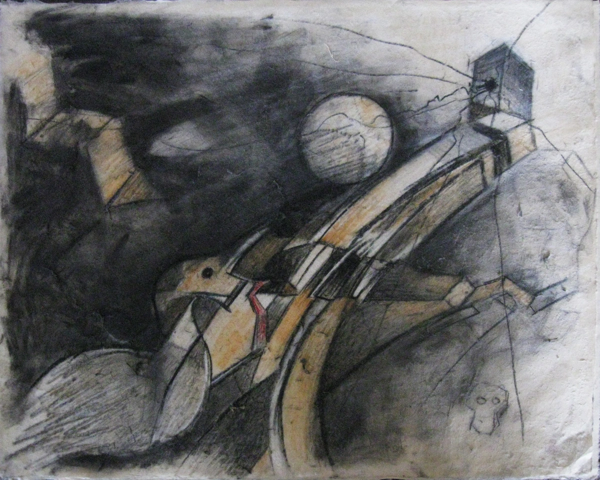
- Foreshortening: A specific application of perspective where an object or part of an object appears shorter than it actually is because it is angled towards or away from the viewer. This creates a powerful illusion of depth and can add dramatic impact and movement to figures, drawing the viewer into the immediate action, as seen in many Baroque artworks like Mantegna's Lamentation of Christ. (See: Understanding Perspective in Art)


A Brief History of Composition: From Ancient Order to Modern Expression
The human desire to organize visual information is as old as art itself. Understanding this lineage helps us appreciate the evolution and enduring relevance of compositional principles:
- Prehistoric Art (c. 40,000 BCE - 3,000 BCE): While often seen as purely representational, early cave paintings show intuitive arrangements of animals and figures, sometimes overlapping, sometimes creating narrative sequences. Composition here was about capturing the essence of life and belief, often using the natural contours of cave walls to enhance forms. It was less about formal rules and more about essential communication.
- Ancient Art (Egyptian, Greek, Roman - c. 3,000 BCE - 400 CE): Early civilizations often employed hierarchical scale (larger figures signifying greater importance) and clear, rigid compositional structures to convey religious or social narratives. Symmetry and balance were paramount, creating a sense of timeless order and stability, often with figures in static, frontal poses. Greek sculpture, for example, aimed for ideal human proportion and harmonious balance.
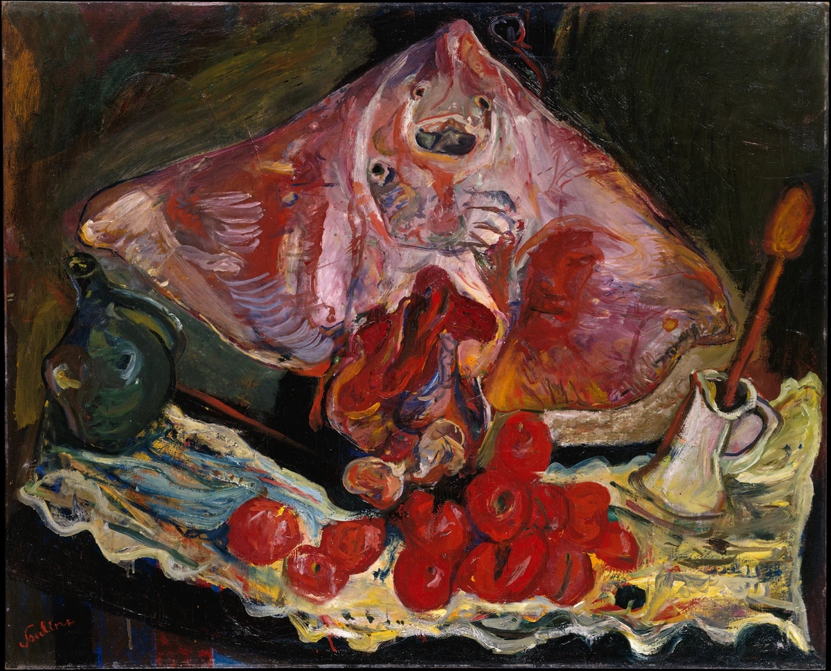

- Medieval Art (c. 500 - 1400 CE): With a focus on spiritual rather than earthly concerns, compositions in illuminated manuscripts, stained glass, and Byzantine icons became flatter and more symbolic. Figures were often arranged frontally, without much illusion of depth, and hierarchical scale was frequently used to emphasize religious importance rather than physical realism. The goal was to convey divine narratives, not earthly space.
- The Renaissance (14th-17th Century): This era revolutionized composition with the development of linear perspective, offering a scientific method for creating believable three-dimensional space on a two-dimensional surface. Artists like Leonardo da Vinci and Raphael used pyramidal compositions and clear focal points to create harmonious, dramatic narratives that reflected a humanistic ideal and a focus on order and reason. The human form, too, was often composed with ideal proportions in mind.
- The Baroque (17th-18th Century): Baroque artists pushed the boundaries of drama and movement. Composers like Caravaggio (with his intense chiaroscuro), Rubens (with swirling forms and dynamic figures), and Bernini (in sculpture) used strong diagonals, complex layering, and intense emotional expressions to create dynamic, engaging, and often theatrical compositions that drew the viewer into the scene. Think of the active compositions of a Rembrandt portrait or a dramatic battle scene.
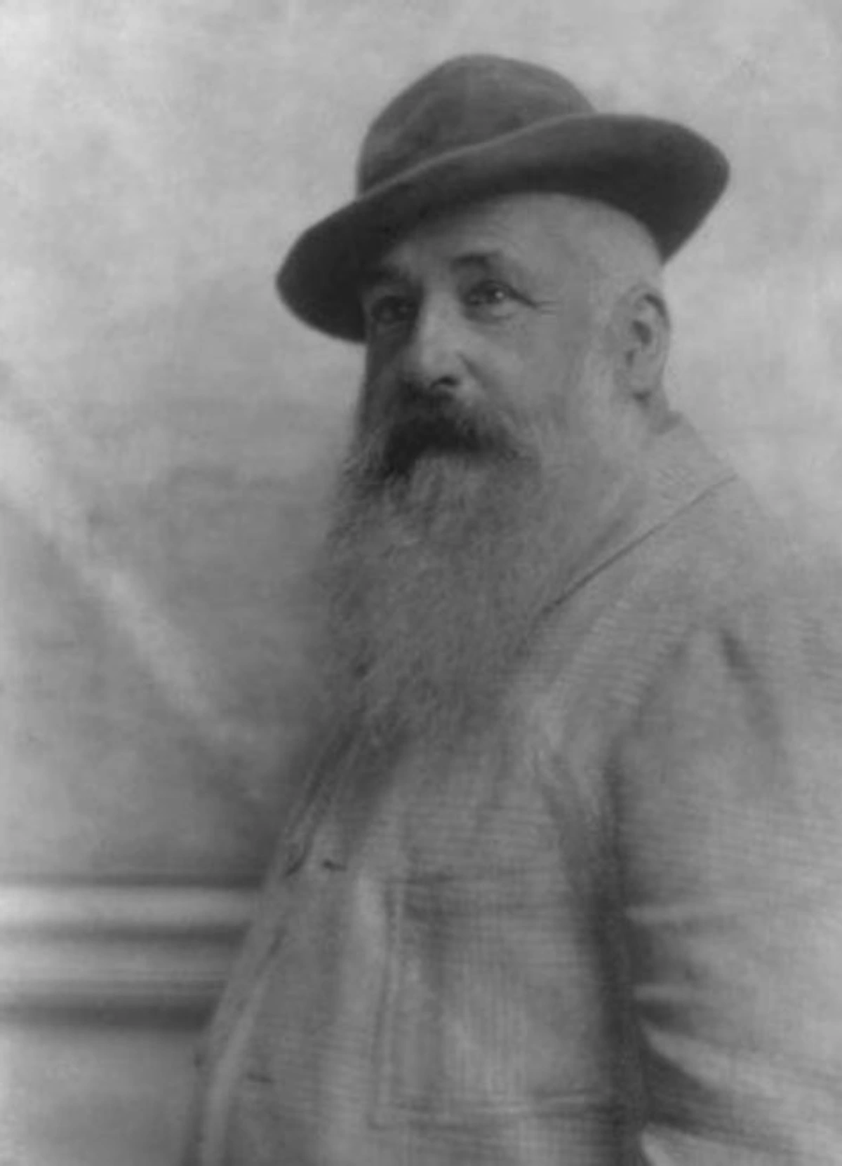
- Impressionism & Post-Impressionism (Late 19th Century): Breaking from traditional academic rules, Impressionists (like Monet) focused on capturing fleeting moments and the effects of light. Their compositions often felt more spontaneous, with cropped views, unusual angles influenced by Japanese prints, and a sense of snapshot-like immediacy. They often de-emphasized a single focal point in favor of an overall visual experience. Post-Impressionists like Vincent van Gogh (with his expressive lines and colours creating emotional rhythm) and Paul Cézanne (who emphasized underlying geometric structures and multiple viewpoints, paving the way for Cubism) pushed compositional experimentation further, bridging to modern art.

- Asian Art Traditions (e.g., Chinese Landscape Painting, Japanese Woodblock Prints, Islamic Geometric Art): It's crucial to acknowledge compositional approaches from beyond the Western canon.
- East Asian Landscape Painting: Often employs multiple perspectives (rather than a single vanishing point) and an emphasis on empty space (negative space) to evoke vastness, spiritual contemplation, and allow the viewer's eye to wander. Calligraphic lines, rhythmic brushwork, and the careful placement of small human figures within grand natural settings are common, as seen in the works of Fan Kuan.
- Japanese Woodblock Prints (Ukiyo-e): Known for their dynamic diagonals, cropped views, bold outlines, and sophisticated use of negative space, often influencing Western Impressionists. Hokusai's The Great Wave off Kanagawa is a prime example of impactful dynamic composition.
- Islamic Geometric Art: Employs intricate, repeating geometric patterns to create compositions of immense complexity and harmony, reflecting the divine order and infinity, often avoiding figural representation. These patterns are not just decorative; they are rigorously composed.
- African Art Traditions: Often utilize compositional elements like repetition, rhythm, and hierarchical scaling in their masks, sculptures, and textiles, not primarily for realism but for symbolic or spiritual power, creating powerful, often abstract, visual statements.
- Modern & Contemporary Art (20th Century to Present): This period has seen an explosion of compositional experimentation:
- Cubism (Early 20th Century): Artists like Picasso and Braque shattered traditional perspective, depicting subjects from multiple viewpoints simultaneously. Compositions became fragmented, emphasizing geometric forms and a flat picture plane, forcing the viewer to reassemble the image mentally. It was a deliberate deconstruction of traditional composition.
- Abstract Expressionism (Mid-20th Century): Driven by artists like Jackson Pollock and Willem de Kooning, compositions became less about planned arrangements and more about spontaneous gesture, emotion, and an "all-over" approach where no single area dominates. The canvas itself became an arena for action and energetic marks.
- Minimalism (Mid-Late 20th Century): Artists like Agnes Martin and Donald Judd sought purity and simplicity. Compositions often featured simple geometric forms, grids, and a strong emphasis on negative space, focusing on the intrinsic qualities of the materials and the viewer's direct experience rather than narrative.
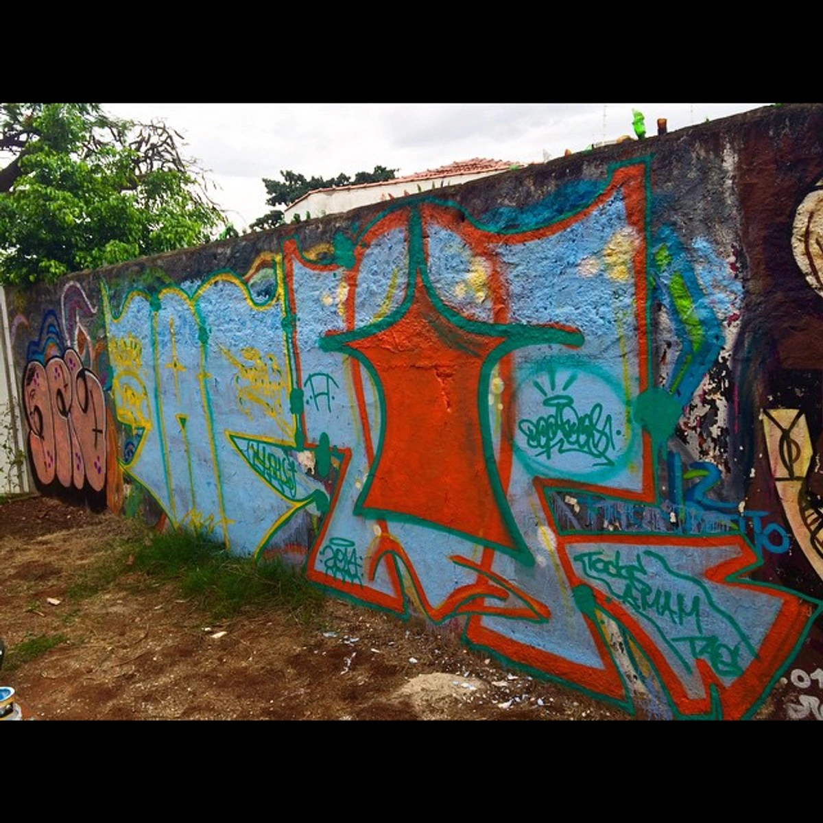
- Postmodernism & Contemporary Art: Composition has continued to evolve, often by referencing, deconstructing, or subverting historical compositional rules. Artists mix styles, embrace digital tools, and use composition to question perception, challenge societal norms, and create immersive installations. The emphasis can be on conceptual ideas as much as traditional visual harmony, often with a playful or rebellious attitude towards what's "supposed" to be composed well. Think of street art and graphic design, where composition is used to grab attention and convey a message in an instant.

Frequently Asked Questions About Composition in Art
I get a lot of questions about this topic, so I thought I’d tackle some of the most common ones here. If you have more, feel free to reach out – I love a good art discussion!
Q: What is the main purpose of composition in art? A: The main purpose of composition is to effectively organize all the visual elements within an artwork to create a cohesive, visually appealing, and meaningful whole. It guides the viewer's eye, establishes hierarchy, conveys emotion, and tells a story, ultimately determining how a piece is perceived and experienced. Think of it as the invisible hand that makes art work.
Q: How can I improve my own compositional skills? A: The best way to improve is by doing and observing. Actively study artworks you admire and try to identify the compositional principles at play. Sketch different layouts before starting a piece – seriously, a tiny thumbnail sketch can save you hours of rework. Practice using the Rule of Thirds, experiment with focal points, and pay attention to negative space. Start simple, even arranging objects on your desk or taking photos, and consciously think about their visual relationships. This practice of seeing is where the real magic happens. I find that even rearranging my spice rack with composition in mind can be a fun exercise!
Q: Is there one "best" compositional rule? A: No, absolutely not! While guidelines like the Rule of Thirds or the Golden Ratio are incredibly useful, they are not rigid laws. The "best" composition depends entirely on the artist's intention, the subject matter, and the emotion they wish to convey. Sometimes breaking a "rule" intentionally can create a far more powerful and memorable artwork. It's about understanding the rules so you can break them effectively – like a jazz musician knows theory but improvises brilliantly. I've often found that my most interesting pieces came from purposefully challenging a compositional norm.
Q: When is it okay to break compositional rules? A: Breaking the rules is not only okay, it's often encouraged once you truly understand them! The key is intentionality. If you're breaking a rule (say, centring your subject when the Rule of Thirds suggests otherwise) to achieve a specific effect – perhaps to convey monumentality, stillness, or confrontational immediacy – then it's a powerful artistic choice. It's about subverting expectation to create a unique impact, rather than breaking them out of ignorance. An unbalancing composition can create unease or dynamism if that's the intended feeling, as seen in many Expressionist works.
Q: What are some common compositional mistakes beginners make? A: Oh, I've made all of these, believe me! A few common ones are: always centring the subject, which can lead to a static image; ignoring negative space, making the composition feel cramped or unbalanced; having too many focal points, which confuses the viewer's eye; and lack of variety, making the piece monotonous. Another common one is simply having elements that almost touch but don't quite, which can be visually irritating. The solution is often simplification and conscious arrangement.
Q: How does composition differ in abstract versus figurative art? A: While the underlying principles (balance, rhythm, contrast, etc.) remain the same, their application differs significantly. In figurative art, composition often serves to clearly define recognizable subjects and narratives, helping the viewer understand what they're seeing. In abstract art, composition might focus more purely on the interplay of shapes, colours, lines, and textures to evoke mood or explore formal qualities, without relying on a recognizable subject. Both demand intentional arrangement, but the visual language shifts from representation to pure visual experience. You can see powerful abstract compositions in works exploring the role of negative space in abstract art or the definitive guide to composition in abstract art.
Q: Can composition evoke emotion? A: Absolutely! Composition is a master of emotional evocation. Diagonal lines can create dynamism and tension; horizontal lines, calm and stability. High contrast can be dramatic; low contrast, mysterious. Expansive negative space can evoke solitude; cramped space, claustrophobia. An artist's compositional choices directly influence how you feel about an artwork, often on a subconscious level. It's truly incredible how much a few well-placed lines can say – sometimes more than words ever could. It's why I spend so much time wrestling with the placement of every mark.
Q: What role does digital art and AI play in contemporary composition? A: Digital art expands the possibilities for composition dramatically. Artists can easily experiment with layouts, colours, and forms, use generative algorithms to create complex patterns, and work with interactive elements. While the tools change, the fundamental principles of guiding the eye, creating balance, and evoking emotion remain relevant, though they might be applied in entirely new, innovative ways. AI, specifically, can assist artists by suggesting compositional variations or even generating entire compositions based on learned patterns. However, I believe the intentionality and expressive choice of the human artist remain paramount in truly impactful composition. It's a new playground, but the sandbox rules are still familiar, just with fancier toys. The real art still comes from the human hand and heart behind the algorithms.
Conclusion: Seeing with a Composer's Eye
Composition, this silent architect, is truly the backbone of visual art. From guiding our eyes across an ancient fresco to making us linger on a contemporary abstract piece, it’s the force that transforms mere elements into an experience. I’ve found that the more I understand these principles – the balance of weights, the rhythm of forms, the subtle dance of positive and negative space – the more deeply I can appreciate every artwork I encounter, and the more intentionally I can approach my own creations. It’s like discovering the grammar of a beautiful, universal language, one that speaks directly to the soul without needing words.
It’s not about rigidly adhering to rules, but about understanding them so intimately that you can wield them with purpose, whether you’re aiming for perfect harmony or deliberate discord. So next time you look at a painting, or even just arrange items on your desk, ask yourself: What is guiding my eye? What feels balanced, or intentionally unbalanced? What story is this arrangement telling? Once you start asking these questions, you’ll find that the world around you, and especially the world of art, reveals an entirely new layer of meaning and beauty. You’ll stop just looking, and start seeing with a composer's eye. And if you're feeling inspired to bring some of that intentional visual harmony into your own space, why not check out some of my work on my art page or explore other artists featured at the Den Bosch Museum? Perhaps, you'll find your own composition waiting to be discovered.