
Negative Space in Abstract Art: An Artist's Introspective Guide to Unseen Power
Explore negative space with an abstract artist. Discover how this 'empty' element actively sculpts balance, guides the eye, and builds depth in art. Includes personal insights, practical tips, and how it transforms composition.
The Unseen Force: How Negative Space Shapes My Abstract Art: A Personal Journey
You know, sometimes the most profound things in life, and certainly in art, aren't the loudest or most obvious. They’re the whispers, the pauses, the unsaid. For me, as an abstract artist, that quiet force is often negative space. It’s the air that art breathes, the silence between the notes, the blank canvas that screams possibility. And despite its misleading name, the 'empty' areas are anything but passive; they are active collaborators, fundamental to the emotional resonance and structure of a piece. It's easy to get caught up in the vibrant colors and bold textures of an abstract piece—and trust me, I love them too!—but without a conscious understanding and masterful use of these 'empty' yet active areas, a painting can quickly descend into visual chaos. It’s a principle echoed across diverse art forms, from the profound voids in Japanese sumi-e painting to the deliberate gaps in ancient calligraphy, and even in the careful placement of elements in architecture or the sculpted air around a figure. While my canvases might look a little different, that ancient wisdom still hums in my studio, underscoring its timeless, universal power.
I remember early in my journey, just throwing paint onto the canvas, convinced that 'more' equaled 'better' or 'more expressive.' It was like trying to tell a joke by yelling all the words at once, hoping sheer volume would make it funnier. The result? A muddy mess, a visual cacophony. And let's be honest, my studio floor is probably still covered in the ghosts of those early 'masterpieces' that never quite made it. It took time, and frankly, a lot of failed experiments, to realize that what I left out was often just as important, if not more so, than what I put in. It's a bit like learning to cook; sometimes the best ingredient is just enough salt, not a whole shaker. This realization was a turning point in my creative process, transforming my approach from merely painting to truly composing.
What Even Is Negative Space, Anyway? My Take.
Okay, let’s strip away the fancy art jargon for a moment. Imagine you're looking at a donut. The donut itself, the bready, sugary part, is the positive space. It’s the main subject, the filled or occupied area that draws your immediate attention. Now, what about the hole in the middle? That's the negative space. It's not "nothing"; it's a defined shape, an active component that gives the donut its identity. Without the hole, it's just a bun, right?
It's crucial to understand that while the donut hole is a literal empty space, in art, negative space isn't always a physical void. It's often a colored or textured area that functions as the surrounding, defining backdrop – an active contributor rather than mere emptiness. It's a principle fundamental not only to abstract art but to all visual creation, whether defining a classical portrait against its background or sculpting the form of a dancer. In art, positive space refers to the subjects or areas of interest—the shapes, lines, colors, and forms that are deliberately placed. Negative space, then, is the area around and between these positive elements. It's often the background, but it's crucial to understand it's not just a passive backdrop. It's an active, contributing element that defines and enhances the positive forms. It’s what allows your eye to rest, to breathe, and to truly appreciate what’s there.
More Than Just 'Empty': Why It Matters in Abstract Art
So, why obsess over emptiness? Especially in abstract art, where there often isn't a "subject" in the traditional sense, negative space transforms from a mere void into a silent, powerful storyteller. It’s what gives forms their strength, colors their vibrancy, and a composition its soul.
Creating Balance and Harmony
Think of it like a carefully arranged bookshelf. If every shelf is crammed with books, it looks cluttered and overwhelming. But if you leave some empty space, perhaps a small plant or a decorative object, suddenly there's a sense of order and calm. Negative space functions similarly in a painting. It provides visual breathing room, preventing your abstract forms from becoming a chaotic jumble. It establishes an equilibrium, allowing different elements to coexist without competing aggressively.
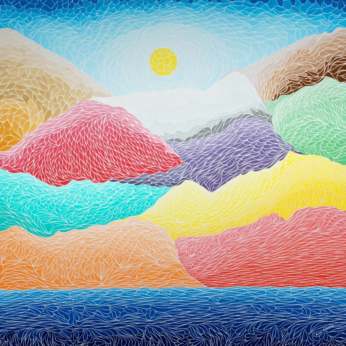
https://commons.wikimedia.org/wiki/File:The_Creation_Of_The_Mountains.jpg, https://creativecommons.org/licenses/by-sa/4.0/deed.en
In a piece like this abstract landscape, the blues and purples of the sky and foreground aren't just background; they're active negative space. They allow the vibrant yellows and reds of the mountains to stand out, creating a cohesive, balanced scene. Imagine if the entire canvas was just swirling colors—it would lose its focal points and sense of structure. This balance is key to what makes abstract art compelling. In Abstract Expressionism, for instance, negative space might provide a raw, energetic backdrop, while in Minimalism, it often becomes the primary subject, demanding contemplation of its pure form and quiet presence.
Guiding the Eye – A Silent Navigator
One of the coolest things about negative space is its ability to subtly guide the viewer's eye through a composition. It's like an invisible arrow, pointing you to what I want you to see, or leading you on a journey through the canvas. When positive forms are strategically placed, the negative space around them creates pathways or focal points, drawing your attention to specific areas. It’s a very intentional dance between absence and presence. In the abstract landscape above, notice how the sweeping blue negative space subtly directs your gaze upwards, then across the vibrant mountain peaks, creating an effortless visual journey.
Emphasizing Form and Feeling
Just as silence can make a single note more poignant, negative space can make a single form or color more impactful. By isolating an element within a field of negative space, you amplify its presence. This is particularly powerful in abstract art, where forms might be ambiguous. The surrounding void helps define their edges, enhance their shape, and even imbue them with a sense of significance, allowing a single gesture or color to resonate with a surprising emotional depth – perhaps calm, a subtle tension that pulls you in, or even a sense of expansive mystery, playful joy, or profound isolation. A vast, open negative space might evoke a sense of boundless freedom or, conversely, a profound sense of isolation, while a tightly constrained one could suggest a simmering tension or intimate focus. And crucially, the color and texture of this surrounding negative space can profoundly influence how we perceive the positive elements – a vibrant red might soften against a cool blue void, or erupt with more intensity against a stark white. Think about how a sharp, angular negative space might feel aggressive or dynamic, while a flowing, organic one could convey serenity or fluidity, shaping the very mood of the piece.
Building Depth and Dimension
Negative space isn't always flat. Through subtle variations in color, texture, or even implied movement, it can create a sense of depth. This allows your eye to travel into the painting, beyond the surface, turning a two-dimensional surface into a window into another world. Imagine a cool, receding blue negative space behind a hot, advancing yellow form; the blue pulls the eye inward, creating an illusion of infinite distance, while the yellow springs forward. This interplay of color and space can even mimic atmospheric perspective, where cooler, lighter negative spaces recede, pulling the eye into an illusion of infinite distance, while warm positive forms spring forward. It’s a trick I learned from studying masters, even those who weren’t strictly abstract. Look at how Mondrian uses the space around his forms, for instance, to create movement and structure.

https://www.flickr.com/photos/vintage_illustration/51913390730, https://creativecommons.org/licenses/by/2.0/
While "Evening; Red Tree" by Mondrian isn't fully abstract in the way we usually think about it, his radical approach to composition and the stark contrast between the tree and the background, with the deliberate use of the blue and orange fields, clearly defines the form and creates a powerful, almost spiritual depth. The "empty" sky isn't empty at all; it's vibrant, contributing immensely to the tree's presence and influencing how later abstract artists would explore space.
Orchestrating Rhythm and Movement
Beyond just depth, negative space orchestrates the very rhythm of a painting. It dictates where the eye pauses, where it speeds up, and where it finds a visual beat. Much like a musical composition relies on rests and intervals between notes to create melody, an abstract painting gains its dynamic energy from the ebb and flow between filled and unfilled areas. This interplay can create a sense of movement, guiding your gaze through swirls of color or along sharp lines, transforming a static image into a vibrant dance. This is where my internal dialogue often turns into a literal dance around the canvas, imagining the flow of the viewer's eye. But how do these powerful principles translate from theory into the messy, vibrant reality of my studio? Let's talk about my personal creative dance.

https://www.flickr.com/photos/42803050@N00/31171785864, https://creativecommons.org/licenses/by-nd/2.0/
My Creative Dance with Negative Space: From Concept to Canvas
So, how do I actually use this silent partner in my studio? It’s rarely a conscious thought like, "Okay, now I need 20% negative space here." It’s much more intuitive, a feeling that something is off-balance, or that a particular shape isn't getting the attention it deserves. Though, for larger commissions, I sometimes do sketch out rough compositional ideas, consciously blocking out areas I intend to keep open.
When I start a piece, I often begin with an explosive burst of color or a strong gestural mark. My initial impulse is usually to add. But then, I step back. Way back. Sometimes I even go make a cup of coffee and come back with fresh eyes. This is where the magic (and often, the self-doubt) happens. I start to see the gaps, the areas that are being overwhelmed. I remember one specific piece, a large diptych, where I had painted a vibrant, sprawling form across both canvases. It felt powerful, but also... suffocating. It wasn't until I had the terrifying (and, frankly, slightly masochistic) thought of painting a bold, stark white stroke right through the middle, effectively 'destroying' a section of the color, that the piece truly came alive. My inner critic, naturally, screamed 'What are you doing?!' but sometimes you just have to mute that voice. That white stroke, originally a positive form, instantly became a commanding negative space, transforming the entire composition from a shout to a conversation. It’s almost like sculpting, but instead of adding clay, I’m mentally subtracting. Have you ever had to make a brave 'subtraction' in your own creative work, taking away to add more?
I might ask myself: "Does this form need more breathing room? Is there a path for the eye to follow, or is it hitting a wall?" Sometimes I'll even paint over existing elements, turning what was once positive space into negative. It feels counter-intuitive at first, like destroying your own work, but it’s often the bravest and most rewarding move. It's a key part of my journey from studio to home, ensuring each piece not only looks good on its own but also complements the space it eventually inhabits. Ultimately, it's a deeply personal dance, and what feels 'right' often comes down to intuition, a quiet conversation between the canvas and my evolving artistic self.

https://freerangestock.com/photos/177284/artists-workspace-filled-with-paint-brushes-and-supplies.html, https://creativecommons.org/public-domain/cc0/
My workbench might be a glorious mess, but the canvas needs clarity. When I'm working, I often think about the relationship between what I have painted and what I haven't. It’s not just about the lines and shapes, but the interplay between them and the 'emptiness' around them. This is especially vital when I'm creating abstract art for small spaces, where every inch of visual real estate counts. A well-utilized negative space can make a small piece feel grander, less imposing.
My Stumbles on the Path to Seeing the Unseen (and How You Can Avoid Them)
If you think mastering negative space is a straight line, let me tell you, my studio floor is littered with canvases that prove otherwise. My path to appreciating negative space wasn't linear. Oh no, it was full of detours and U-turns.
The Fear of the Blank Canvas (or the 'Fill-Every-Inch' Impulse)
One of the biggest mistakes I made (and sometimes still have to catch myself doing) is the "fear of empty space." It’s this subconscious urge to fill every nook and cranny, to make sure there's "enough" going on, as if the canvas might catch a cold if left exposed. I remember one piece I called 'The Visual Avalanche' – every inch crammed, screaming for attention, but really just burying any sense of meaning. My studio floor still shudders at the memory. But often, "enough" is far less than you think. This comes from a good place, a desire for richness and detail, but it can lead to visual fatigue for the viewer. A simple trick I often suggest to budding artists (and remind myself) is to try starting a piece with a limited palette or a very simple, bold form. This naturally forces you to consider the surrounding space from the outset, rather than trying to carve it out later.
Learning to See the Unseen as a Shape
Another challenge is learning to see negative space as a shape in itself, not just a void. It takes practice. I often trace the shapes of the background elements, seeing them as integral parts of the composition, just as important as the bold strokes in the foreground. It’s like looking at clouds and seeing animals; you have to train your eye to recognize patterns in the 'absence.' This is a core aspect of decoding abstract art for viewers too.

https://commons.wikimedia.org/wiki/File:Piet_mondrian,_composizione_n._IV-composizione_n._6,_1914,_01.jpg, https://creativecommons.org/licenses/by/3.0
In a Mondrian, for instance, the white spaces between the colored rectangles are not just background; they are meticulously defined shapes that contribute to the overall tension and balance of the piece. They are as much a part of the 'drawing' as the lines themselves. Another subtle trap is 'over-thinking' negative space. Paradoxically, after years of trying to see it, I sometimes find myself forcing it, trying to engineer perfect voids. But authentic negative space often emerges organically from the positive forms, like two dancers finding their natural distance. It’s a constant push-pull between conscious composition and intuitive flow.
A Little Exercise for Your Eyes: Seeing the Unseen
Want to train your eye to spot this elusive force? Try this simple exercise. Next time you're in a crowded room, or even just looking at a plant on your windowsill, don't focus on the people or the leaves. Instead, consciously shift your gaze to the spaces between them. What shapes do those 'empty' areas form? Can you outline them in your mind? You'll be surprised at how quickly your perception shifts, turning backgrounds into active elements. It's like learning to hear the silence between musical notes, and it's a game-changer for appreciating art, and even the world around you. Now, try it with the Mondrian image above this section – what shapes do you see in the 'empty' areas between his lines and blocks of color? Or look at the Delaunay piece again, focusing on the spaces between the shapes. What new rhythms emerge? What did you notice? Did the everyday objects suddenly feel like they had a new frame, a hidden geometry? Share your insights and let's explore this shift in perspective together!
FAQ: Your Questions, My Answers on Negative Space
As artists, we spend so much time pondering concepts like these. And as a viewer, it’s completely natural to have questions, especially when diving into something as seemingly paradoxical as 'negative space.' So, if you're still mulling things over, here are a few questions that often come up when I discuss this topic:
Question | My Take |
|---|---|
| Is negative space always white or blank? | Absolutely not! While often represented by the canvas color, negative space can be any color, texture, or even a detailed pattern, as long as it functions compositionally to frame or define the positive elements. It's about its role, not its literal appearance. |
| Is negative space the same as empty space? | Absolutely not! This is a crucial distinction. 'Empty space' implies a void, a nothingness. 'Negative space,' however, is an active, intentional, and integral compositional element. It has shape, contributes to balance, guides the eye, and is just as vital as the 'positive' elements. It's the difference between a silent pause in music (negative space) and just noise stopping (empty space). |
| How do I "see" negative space? | Practice! Try focusing your eyes not on the main subjects of a painting or photograph, but on the shapes formed by the gaps between them. Try to outline those 'empty' shapes in your mind. It’s a shift in perspective. |
| Does this apply to all art styles? | Yes, it’s a fundamental principle of design in art across all styles, from classical portraits to pure abstraction. Good composition always considers the interplay between positive and negative space. These principles are equally vital in digital art, graphic design, photography, and even architecture – anywhere visual elements interact. |
| Can negative space be too much? | Definitely. Like any element, too much can make a piece feel sparse, unfinished, or even empty in a desolate way. The key is balance—finding the sweet spot where it enhances rather than detracts. |
| Can negative space ever become the main subject? | Absolutely, and this is where abstract art often plays its most intriguing games! Sometimes an artist deliberately designs a composition so that the 'empty' area is so compelling, so uniquely shaped, or so dramatically contrasted with minimal positive forms, that it steals the show. It can even hold more visual weight and emotional significance than the traditional 'subject.' It’s a beautiful subversion of expectation. |
Quick Tips for Spotting Negative Space in Art
Before we wrap up, here are a few quick tips to help you actively look for and appreciate negative space in any artwork, especially abstract pieces, and perhaps even in the world around you – because once you see it, you start seeing it everywhere!
- Shift Your Focus: Don't just look at the objects or forms; look through them and around them. Try to perceive the shapes created by the gaps.
- Squint Your Eyes: Sometimes blurring your vision helps simplify the composition, making the larger negative shapes more apparent.
- Consider the 'Background': Is it truly passive, or does it actively interact with and define the foreground elements? Does it have its own texture, color, or implied movement?
- Trace the Voids: Mentally or even with your finger (if it's your own art!), trace the outlines of the 'empty' areas. This helps you see them as deliberate shapes.
- Ask: 'What would be lost without it?': Imagine removing the negative space. Would the positive elements become cluttered, less defined, or lose their impact? If so, the negative space is doing its job.
Conclusion: The Unspoken Beauty
The more I paint, the more I realize that the true artistry often lies not just in what I choose to put on the canvas, but in the deliberate choices I make about what I leave untouched. Negative space isn't an afterthought; it's a co-creator, a powerful, silent partner in the artistic process. It’s what gives forms their strength, colors their vibrancy, and a composition its soul.
It’s about understanding that sometimes, less truly is more, and that the beauty of absence can amplify the impact of presence. So next time you're looking at a piece of abstract art, whether it's one of my own works for sale or something in a gallery like the Den Bosch Museum, take a moment to look beyond the obvious. See the shapes that aren't there, the quiet areas that allow the vibrant elements to sing. You might just find a whole new dimension of appreciation. It's an ongoing journey for me, one of constant learning and evolving, as you can see reflected in my artistic timeline. What unspoken stories do you hear in the quiet spaces of the art around you?


