
What is Design in Art? An Artist's Personal & Engaging Guide
Ever wondered what makes art 'work'? It's design! Join me on a personal, introspective journey exploring the elements, principles, and techniques that give art its structure, soul, and unexpected meaning.
What is Design in Art? An Artist's Personal & Engaging Guide
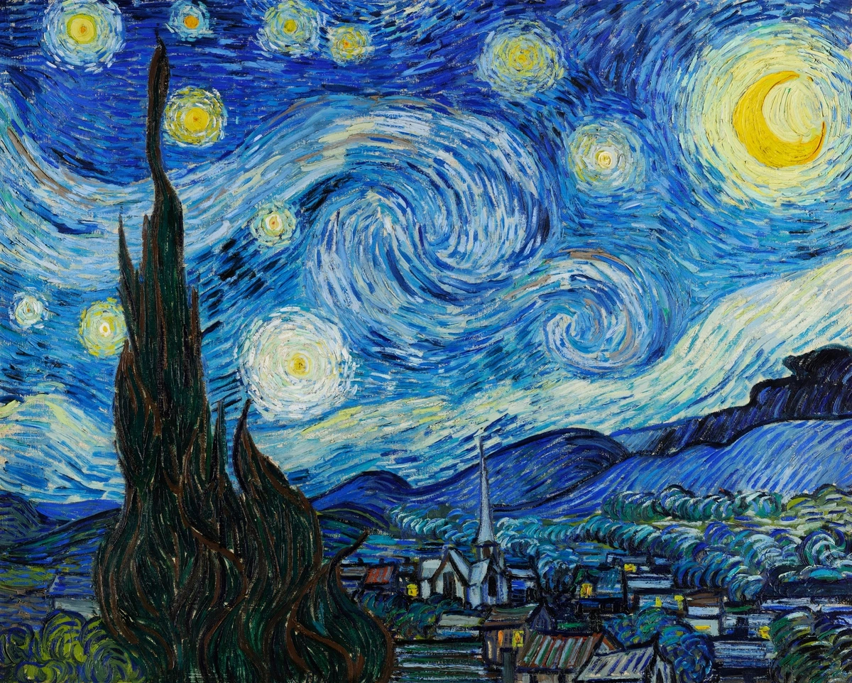
Have you ever stood in front of a painting, maybe something abstract or even a landscape, and felt... something? A pull, a sense of rightness, or maybe just a vague feeling that it works? I know I have. For years, I'd just absorb the feeling, the colors, the subject matter, without really understanding why some pieces resonated so deeply while others left me cold. I remember seeing Van Gogh's "The Starry Night" for the first time, not knowing anything about art theory, but feeling an undeniable energy, a swirling motion that pulled me in. It wasn't just the blue and yellow; it was how they were put together. It was the design.
It took me a while, years of making my own messes in the studio (and occasionally something decent!), to realize that a huge part of that 'why' comes down to something fundamental, something often hidden beneath the surface: design. It's the silent language, the underlying structure that guides your eye and shapes your emotional response. It's the skeleton beneath the skin, the rhythm in the chaos.
Now, when you hear 'design', you might think of sleek furniture, cool websites, or maybe even a perfectly organized closet (a concept I admire from a distance). But design in art? It's not about making things look 'designed' in a sterile, modern sense. It's about the deliberate (or sometimes intuitive) arrangement of visual elements to create a cohesive, impactful whole. Think of it like this: you can have the most beautiful words in the world, but without grammar and sentence structure (design), they're just a jumble. Art is the same. The paint, the clay, the pixels – they're the words. Design is the grammar that makes them sing.
It's something I grapple with every single day in my own work. Sometimes I start with a clear design in mind, a composition I want to explore. Other times, it emerges organically from the process, a happy accident I then refine. It's a constant dance between intuition and intention, a puzzle where you get to make the pieces and decide how they fit. It's challenging, frustrating, and incredibly rewarding when it clicks.

The Building Blocks: Elements of Design
Before we talk about putting things together, we need to know what we're working with. These are the basic ingredients, the atoms of visual art. Artists choose and manipulate these fundamental building blocks to create their visual language and evoke specific responses. I remember learning these in art school and thinking, "Okay, sure, lines and shapes... got it." But it's only through practice, through countless hours in the studio, that you start to see how powerful these simple things are, how they can be pushed and pulled to express an idea or feeling.
They're often called the Elements of Art Explained: Your Ultimate Guide to Seeing Like an Artist, and they are:
- Line: Ah, Line – the simplest start, but oh so powerful. The most basic element. It can be straight, curved, thick, thin, implied, actual. Lines create shape, define form, and can convey emotion or movement. A shaky line feels different from a bold, confident one. I've spent entire days just exploring the quality of a line, the energy it holds. Think of the dynamic, swirling lines in Van Gogh's "The Starry Night".
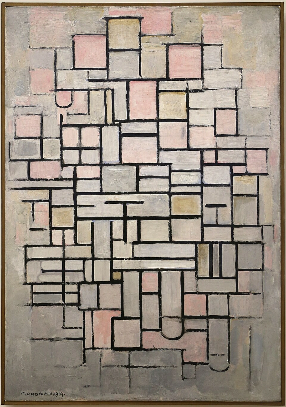
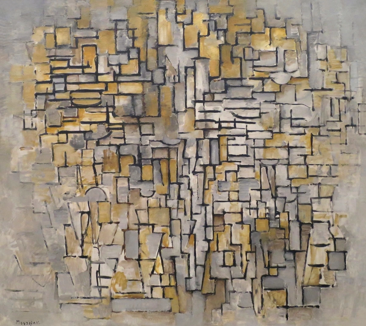
- Shape: A 2D area defined by lines or color. Shapes can be geometric (squares, circles) or organic (free-form, natural). They create patterns and forms. I often think of shapes as characters in my paintings, each with its own personality. Consider the bold, flat geometric shapes in a Piet Mondrian Composition.
- Form: This is 3D shape. It has height, width, and depth. In 2D art, Form is often represented through the use of shading and value to create the illusion of three dimensions on a flat surface – essentially, making a circle look like a sphere. Sculptors work directly with form, but even as a painter, understanding how light wraps around a form is crucial. Think of how light and shadow define the figures in classical sculpture like Michelangelo's David, or how careful rendering makes a painted circle look like a sphere.
- Space: The area around, between, and within elements. It can be positive (the subject itself) or negative (the empty area). Manipulating Space creates depth and perspective, giving the illusion of 3D on a 2D surface. I used to ignore negative space, focusing only on the 'stuff'. Learning to see the space between things was a revelation – it's just as important as the objects themselves. Think of the vast, empty skies in a Romantic landscape painting or the way figures are placed to create depth in a Renaissance fresco.
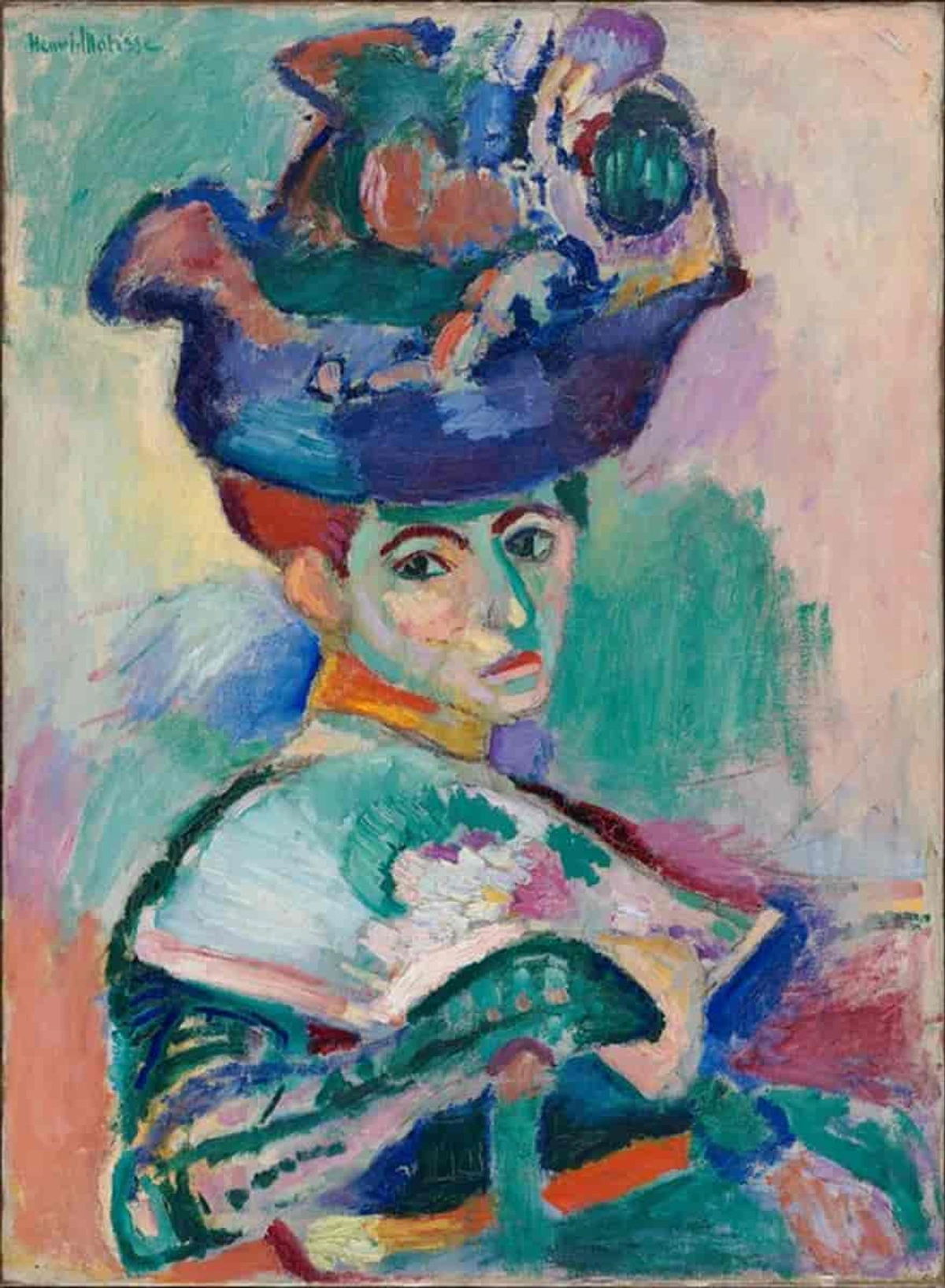
- Color: Oh, Color! My favorite playground. Hue, saturation, value. Color evokes emotion, creates mood, and defines form. We could talk about How Artists Use Color: An Artist's Guide to Theory, Emotion & Light for days. It's not just about picking pretty colors; it's about how they interact, vibrate, and push and pull the viewer's eye. The intense, non-naturalistic colors in a Fauvist painting like Matisse's "Woman with a Hat" are a prime example of color used for emotional impact.
- Texture: How something feels or looks like it would feel. Rough, smooth, bumpy, soft. Texture adds a tactile dimension, even in a flat painting, by creating visual cues that suggest surface quality. I love building up thick layers of paint to create physical texture; it adds another layer of sensory experience. Think of the thick, impasto brushstrokes in a Van Gogh painting that make the surface feel rough and energetic, or the smooth, polished look of a marble sculpture.

- Value: The lightness or darkness of a color. Value creates contrast and defines form, helping us see objects in space. It's the backbone of composition, even more fundamental than color sometimes. Getting the values right is often the key to making a piece 'pop'. The dramatic use of light and shadow (chiaroscuro) in a Caravaggio painting relies heavily on manipulating value to create depth and focus.
These elements are the artist's vocabulary. But just like knowing words isn't enough to write a poem, knowing the elements isn't enough to make compelling art. You need to arrange them effectively. This is where the principles come in.

Putting it Together: Principles of Design
This is where the magic happens – or doesn't, if you're not paying attention! The principles of design are the rules (or guidelines, if you're feeling rebellious) for organizing the elements. They dictate how the viewer's eye moves through the piece and what feeling it evokes. I remember one particularly frustrating week trying to finish a large abstract piece. Nothing felt right. The colors were okay, the shapes were there, but it just felt... static. It wasn't until I stepped back and consciously thought about Balance and Movement that I realized I needed to shift a large shape and introduce a sweeping line to create visual flow. It was a small change, but it unlocked the whole composition.
I often think of composition as a puzzle, but one where you get to make the pieces and decide how they fit. It's challenging, frustrating, and incredibly rewarding when it clicks. You can learn more about Art Composition: A Viewer's Guide to Seeing More Than Just Paint.
Here are some key principles:
- Balance: Creating a sense of visual equilibrium. It can be symmetrical (like a mirror image) or asymmetrical (elements are different but still feel balanced). Imagine trying to stack rocks – balance is key! A classical portrait often uses symmetrical balance, while a dynamic abstract piece might use asymmetrical balance to create tension and energy.
- Contrast: The difference between elements. Light and dark, rough and smooth, large and small. Contrast creates visual interest and emphasis. It's how you make something stand out, how you create drama. Think of the stark contrast between the dark figures and bright backgrounds in a painting by Artemisia Gentileschi.
- Emphasis: Making one part of the artwork stand out. This is your focal point, the star of the show. You can achieve this through contrast, size, color, or placement. In a portrait, the artist usually emphasizes the face. In my own work, emphasis might come from a particularly vibrant color area or a cluster of dynamic lines.
- Movement: Guiding the viewer's eye through the work. Lines, shapes, and colors can create a visual path. The swirling brushstrokes in a Van Gogh or the diagonal lines in a Baroque painting create a sense of Movement. I often use implied lines or color gradients to lead the eye through my abstract compositions.
- Pattern: The repetition of elements. It can be regular and predictable or irregular and dynamic. Patterns can be found in decorative arts, textiles, or even the repeated motifs in a Klimt painting. Sometimes I'll use a subtle pattern to create a sense of rhythm or texture in the background.
- Rhythm: Created by the repetition of elements, like a visual beat. It can be flowing, jerky, or calm. The repetition of shapes and colors in an Orphist painting by Robert Delaunay creates a strong sense of Rhythm. It's the visual equivalent of music.

- Unity/Harmony: Making all the elements and principles work together to create a cohesive whole. Everything feels like it belongs. When a piece feels 'right', it often has strong Unity, even if it's complex. This is often the hardest principle to achieve – it's the feeling that the artwork is complete and resolved.
- Hierarchy: Arranging elements to show their relative importance. What do you want the viewer to see first, second, third? This is crucial for guiding the eye and conveying information effectively. Think of a well-designed poster – the title is usually the most prominent element.
- Scale: The size of an object in relation to the viewer or other objects. Scale can create a sense of grandeur, intimacy, or even disorientation. A monumental sculpture feels very different from a miniature painting.
- Proportion: The size relationship between different parts of a whole. Good Proportion often feels aesthetically pleasing, though artists can intentionally use distorted proportions for expressive effect, like in many Expressionist works.
Understanding these principles is like learning the choreography for the elements. It's what turns a collection of shapes and colors into a dynamic composition. And artists use specific techniques to put these principles into practice.
Compositional Techniques: Putting Principles into Practice
Beyond the basic principles, artists often employ specific techniques to guide the viewer's eye and create compelling arrangements. These are like the specific dance steps you learn once you know the basic rhythm. These techniques serve as practical applications of the principles, offering frameworks for achieving balance, emphasis, and movement.
- Rule of Thirds: Imagine dividing your canvas into a 3x3 grid. Placing key elements along these lines or at their intersections often creates a more dynamic and visually interesting composition than simply centering everything. It feels more natural, somehow. The Rule of Thirds is a common technique artists use to achieve Balance and Emphasis in a dynamic way.
- Golden Ratio/Golden Spiral: This ancient mathematical concept (roughly a 1:1.618 ratio) appears throughout nature and has been used by artists for centuries to create harmonious proportions and compositions. While you don't need to be a mathematician to use it, understanding its visual appeal can inform your placement of elements, contributing to Unity and Balance.
- Leading Lines: Using lines (actual or implied) to direct the viewer's eye towards the focal point or through the artwork. Think of a path in a landscape painting or the gaze of a figure in a portrait. Leading Lines are a powerful tool for creating Movement and Emphasis.
- Framing: Using elements within the artwork to frame the main subject, drawing attention to it. This could be an archway, trees, or even other figures. Framing helps create Emphasis and can add depth, influencing the perception of Space.
- Negative Space: Actively considering the empty space around and between your subjects. Effective use of Negative Space is crucial for clarity and impact. Sometimes, what you don't paint is as important as what you do. Mastering negative space contributes significantly to Balance and Unity.
These techniques aren't rigid rules, but powerful tools in the artist's toolkit. I often use the Rule of Thirds intuitively now, after years of practice. It's less about measuring and more about feeling where the visual weight needs to be. Experimenting with these techniques can dramatically change the feeling of a piece.
The Artist's Process: Design in Action
So, how does an artist actually use design? It's rarely a rigid checklist. For me, it's a fluid process that starts with an idea or emotion. I might do quick thumbnail sketches to explore different compositions, focusing on the placement of major shapes and lines. Or I might just start painting, letting the design emerge organically, then stepping back to analyze what's working and what isn't using the principles as a guide. It's a constant dialogue between the intuitive flow of creation and the analytical eye of design.
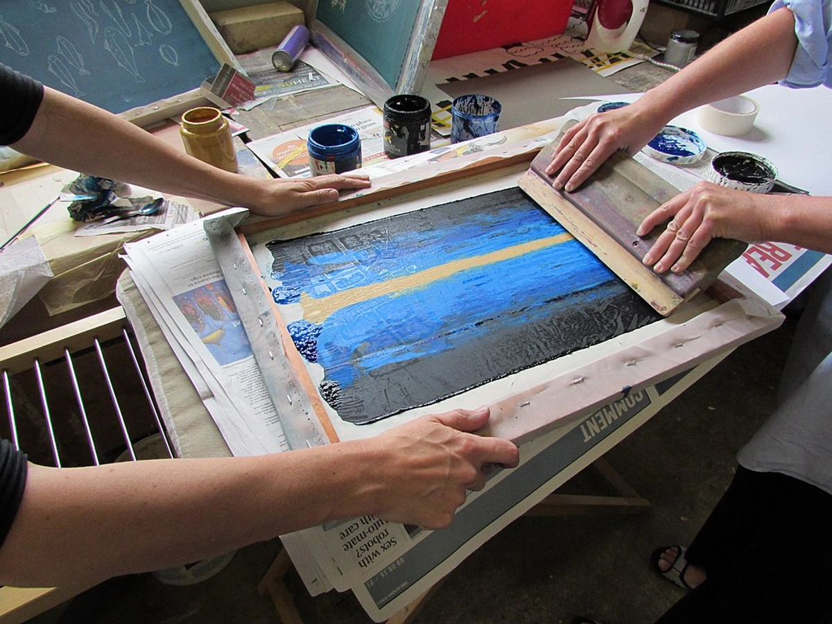
The medium itself also plays a huge role. The thick, tactile quality of oil paint lends itself to building texture and form in a way that watercolor doesn't. Working digitally allows for easy manipulation of color and shape, making it simple to experiment with balance and pattern. Understanding the properties of your materials is part of the design process – it dictates what's possible and how the elements will manifest.

Design Across Different Art Styles
Design isn't confined to one type of art. It's everywhere, just expressed differently. From the strict geometry of Cubism Art Explained: Your Personal Guide to Shattering Reality to the emotional chaos of Expressionism: Ultimate Guide to Art That Feels Deeply, design is the underlying force. Studying how different movements approached design has been fascinating for me; it's like seeing the same language spoken with wildly different accents.
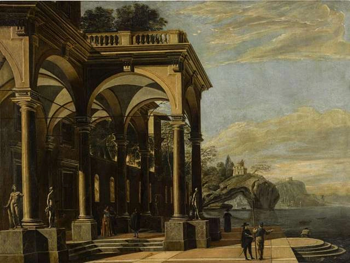
- Classical Art: Often emphasizes Balance, Symmetry, and realistic representation. Think perfect proportions and harmonious arrangements, often using triangular compositions for stability, like in many Renaissance paintings. The design aims for order, beauty, and often, narrative clarity.
- Modern Art: Design becomes more experimental. What is Modern Art? Your Ultimate Guide to Understanding the Revolution explores how artists broke traditional rules. In Cubism, artists like Picasso and Braque deliberately fragmented form and space, using geometric shapes and multiple viewpoints to create a new kind of visual structure. Abstract Expressionism: Ultimate Guide to the Art & Artists might seem chaotic, but there's often a powerful underlying design in the Movement and Energy created by the artist's gestures, the interplay of Colors and Lines, and the overall distribution of visual weight across the canvas. It's design based on intuition and process rather than rigid planning.

- Contemporary Art: Design can be anything! It might be conceptual, focusing on the arrangement of ideas, or physical, using space and materials in new ways. Contemporary Art Meaning: An Engaging Guide to Understanding delves into this. Installations often use the design of the exhibition space itself as a key element, creating immersive experiences. The design might be about the viewer's interaction with the work or the context in which it's presented.
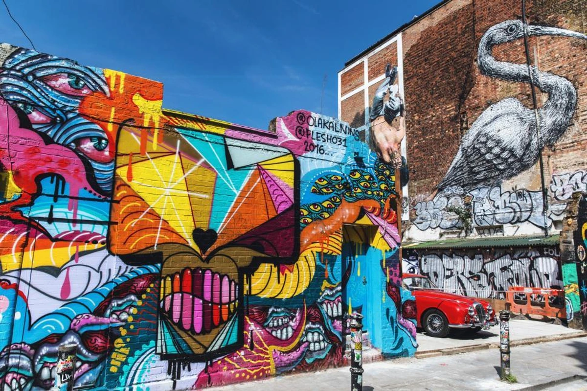
Even in seemingly random street art, there's often a conscious design in the placement, color choices, and flow of the piece. The artist is designing for a specific urban environment, considering how the work interacts with its surroundings.
Design principles are also evident in non-Western art forms. Think of the intricate geometric patterns in Islamic art, which demonstrate a mastery of Rhythm and Pattern, or the deliberate use of Negative Space and dynamic Line in Japanese woodblock prints. These universal concepts appear across cultures, adapted to different aesthetic goals and philosophies.
Why Design Matters (Beyond the Canvas)
Understanding design isn't just for artists or art historians. It changes how you see the world! Once you start noticing Line, Shape, Color, and Balance in art, you start seeing it everywhere – in nature, architecture, even your morning coffee foam. I remember walking through a forest after a particularly frustrating day in the studio trying to get a composition right, and suddenly seeing the Rhythm in the way the branches intertwined, the Balance of light and shadow on the leaves. It was like a switch flipped. Now I can't walk past a poorly designed shop window without mentally rearranging it, which is either a superpower or a mild affliction, depending on the day.
For the viewer, design is the silent guide. It directs your eye, creates a mood, and helps you connect with the artwork on a deeper level, even if you can't articulate why. It's the difference between a cluttered mess and a compelling visual story. Speaking of stories, design is crucial in The Silent Language: Unlocking Visual Storytelling in Art.
For me, as an artist, design is problem-solving. It's how I take an idea or an emotion and translate it into something visual that hopefully communicates something to someone else. It's the structure that allows the feeling to come through. It's also essential when thinking about How to Make Abstract Art: Your Ultimate & Engaging Guide.
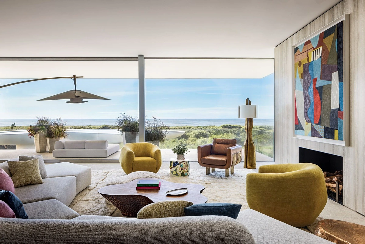
It's also incredibly relevant when you think about bringing art into your own space. Art at Home: A Personal Guide to Choosing & Displaying Art is all about this. How you arrange pieces, how they relate to the furniture and the room's architecture – that's all design! Whether you're How to Decorate Your Living Room: Style Ideas & Layout Tips or just trying to figure out How to Decorate a Wall: Ultimate Guide with Ideas & Tips, design principles are your best friends. They help you create a space that feels balanced, harmonious, and reflects your personality.
Frequently Asked Questions About Design in Art
Okay, let's tackle a few things people often wonder about.
Q: Is design just about making things look pretty?
A: Absolutely not! While good design often results in something aesthetically pleasing, its primary function is structural and communicative. It's about organizing visual information effectively, guiding the viewer, and conveying meaning or emotion. Think of a powerful protest poster – it might not be 'pretty' in a traditional sense, but its design is crucial to its impact.
Q: Can art exist without design?
A: That's a fascinating question! Even seemingly random or chaotic art often has an underlying structure or intention that could be considered design. A Jackson Pollock drip painting, for example, has Rhythm and Movement, even if it lacks traditional composition. Perhaps it's more accurate to say that design is an inherent aspect of visual creation, whether conscious or intuitive. It's hard to make anything visual without some form of arrangement, even if that arrangement is meant to defy convention.
Q: How does design differ from composition?
A: Think of design as the broader concept – the overall plan or structure. Composition is the application of design principles to arrange the elements within a specific artwork. So, composition is a key part of design, focusing on the arrangement of elements within a frame or space to create a unified whole.
Q: Is good design innate or learned?
A: Both! Some people have an intuitive grasp of visual harmony, but the principles and techniques of design are definitely learned skills. Studying art, practicing, and consciously analyzing why certain compositions work are all ways to develop your design 'eye'. Like any skill, the more you practice, the more intuitive it becomes.
Q: How important is design in abstract art compared to representational art?
A: Design is arguably more crucial in abstract art! In representational art, the subject matter provides a familiar framework. In abstract art, there's no recognizable subject to lean on. The success of an abstract piece relies almost entirely on the effective use of the elements and principles of design – the interplay of line, shape, color, value, balance, rhythm, and unity is what creates meaning and impact.

Q: How can I get better at seeing design in art?
A: Practice! Start by looking for the basic elements – Lines, Shapes, Colors. Then try to see how they're arranged. Where does your eye go first? How does the artist create Balance or Contrast? Looking at a variety of Types of Artwork Explained: An Artist's Engaging Guide to Forms, Mediums & More and different Art Genres Explained: A Personal Guide Through the Art Maze helps. Don't be afraid to spend time with a piece and really look. Try describing the design you see out loud or in a journal.
Q: Does 'bad' design ruin art?
A: 'Bad' is subjective, of course. But ineffective design can certainly hinder an artwork's ability to communicate or engage the viewer. If the composition is confusing, the colors clash jarringly without intention, or the elements feel disconnected, it can detract from the artist's message or the viewer's experience. However, sometimes breaking design 'rules' is part of the artistic statement! Think of artists who intentionally use jarring colors or unbalanced compositions to evoke discomfort or challenge expectations.
Q: How does design influence the emotion of an artwork?
A: Design is incredibly powerful in shaping emotion. Sharp, angular Lines can feel jarring or energetic, while soft, curved lines might feel calm or organic. High Contrast can create drama or tension, while low contrast might feel subtle or melancholic. Color choices are obvious, but the way colors are arranged and balanced (or unbalanced) also impacts mood. A chaotic composition can feel unsettling, while a harmonious one feels peaceful. It's the artist's way of orchestrating your feelings.
Q: How can someone without formal training learn about design in art?
A: You absolutely can! Start by simply looking at a lot of art – in museums, galleries, online. Pay attention to what you like and what you don't, and try to figure out why. Read articles like this one! Look for books or online resources that break down the elements and principles. Practice drawing or painting yourself, even simple exercises focusing on line or shape. The more you look and experiment, the more intuitive your understanding of design will become.
My Final Thoughts: Design is Everywhere
For me, understanding design has been like getting a new pair of glasses. I see more clearly now, not just in art, but in the world around me. It's a reminder that even in the most expressive or abstract creations, there's often a thoughtful framework holding it all together.
It's the silent partner to creativity, the logic to the emotion. And appreciating it, whether you're making art or just looking at it, adds a whole new layer of richness to the experience.
So next time you see a piece of art that grabs you, take a moment to look beyond the surface. See if you can spot the design at play. It's a rewarding game, and one that will deepen your connection to the incredible world of visual art.
If you're curious about my own journey with design and how it influences my work, you can read about it on my [/timeline]. And if you're interested in seeing how these principles come together in my own colorful, abstract pieces, feel free to explore the art available [/buy]. Or perhaps visit my museum in [/den-bosch-museum] to see the design principles in action in a physical space.
Happy looking (and designing)!


