Art Composition: A Viewer's Guide to Seeing More Than Just Paint
Unlock art's secrets through composition! This guide for viewers explores balance, lines, depth, and more, blending expert insights with personal reflections to deepen your appreciation.
See More Than Just Paint: Your Guide to Understanding Composition in Art
Have you ever stood in front of a painting and felt… something? Maybe drawn in, maybe confused, maybe just aware that it looks right, even if you can't pinpoint why? Chances are, you're responding to its composition. It's the invisible skeleton that holds the artwork together, guiding your eye and shaping your experience.
Now, 'composition' sounds a bit like homework, doesn't it? Like something only artists hunched over sketchbooks need to worry about. I get it. Sometimes art talk can feel a bit… exclusive. Like needing a secret handshake to understand why a splatter of paint is considered genius (or why people think modern art is bad).
But here’s the thing: understanding the basics of composition isn't about becoming an artist (unless you want to be!). It’s about becoming a better viewer. It’s like learning a few basic chords on a guitar – you suddenly hear the music differently. You start noticing the structure, the choices, the magic. For me, learning about composition was like getting a new pair of glasses; suddenly, the world of art snapped into sharper focus, revealing layers I hadn't even known were there. It transformed passive looking into active seeing.
Think about arranging furniture in a room (which, believe me, is its own art form). You don't just randomly throw things in. You think about flow, balance, where you want people to look. Art composition is similar, but instead of sofas and lamps, artists use elements of art like line, shape, color, texture, and space. Composition is essentially the grammar that organizes these elements into a coherent visual statement, much like arranging words and sentences to convey a specific meaning or feeling.
This guide is your backstage pass. We'll ditch the overly technical jargon and focus on what you, the viewer, can see and feel. Let's learn how to look actively, not just passively, and unlock a deeper appreciation for the art you encounter.
What Exactly Is Composition in Art?
At its core, composition is the arrangement or organization of visual elements within an artwork. It's how the artist puts together the pieces – the lines, shapes, colours, tones, textures – to create a unified and intentional whole.
Imagine an artist's canvas or a photographer's frame as a stage. Composition is the stage direction. It tells the elements where to stand, how to interact, and what role to play in the overall performance. It's a language artists learn over time, through countless hours of practice, studies, and simply observing the world around them. Much like mastering grammar, it moves from conscious effort to an intuitive sense.
It’s not just about making things look pretty (though that can be part of it). Good composition serves several purposes:
- Guides the Viewer's Eye: It creates a path for your eye to follow, leading you through the artwork in a specific way.
- Creates a Focal Point: It draws attention to the most important part(s) of the piece.
- Establishes Mood and Atmosphere: Arrangement choices can make a piece feel calm, chaotic, joyful, or somber. Think of the unsettling diagonals in a piece conveying tension, versus the restful horizontals of a serene landscape.
- Builds Narrative or Meaning: How elements relate to each other can tell a story or convey an idea.
- Achieves Balance and Harmony (or intentionally disrupts it): It creates a sense of visual stability or tension.
Essentially, composition is the artist's way of controlling how you perceive their work. It's the invisible language they use to communicate with you.
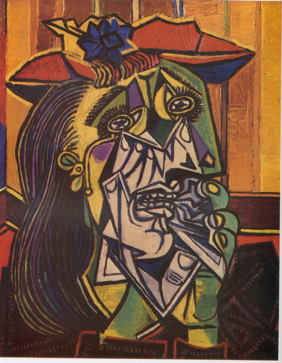
Picasso's 'Weeping Woman' uses jagged lines and fragmented shapes (composition!) to convey anguish. (Learn more about Picasso)
Why Should You, the Viewer, Care About Composition?
Okay, so artists care about composition. But why should you? You're just here to look, right?
Well, yes. But understanding composition enhances that looking experience exponentially. It transforms you from a passive bystander into an active participant in the conversation the artwork is having.
Here’s why it matters:
- Deeper Appreciation: Knowing why something works visually allows you to appreciate the artist's skill and choices on a new level. It’s the difference between saying 'I like this' and 'I like how the artist used leading lines to draw my eye to the sunset'.
- Understanding the Message: Composition is key to unlocking the artwork's meaning or intended feeling. Is the composition balanced and serene, suggesting peace? Or is it jarring and asymmetrical, conveying unease? (How to Read a Painting delves deeper into this).
- Seeing Beyond the Subject: You start to see how the subject is presented, not just what is presented. A simple portrait becomes a study in balance, light, and shadow.
- Comparing and Contrasting: Understanding composition gives you a framework for comparing different art styles or works by different artists (like comparing Impressionism and Expressionism).
- It Makes Looking More Fun! Honestly, it turns gallery visits (even virtual ones!) into a kind of visual treasure hunt. You start actively looking for these principles in action.
Think of it like learning about film techniques. Suddenly, you notice the camera angles, the editing cuts, the use of music – and you appreciate the movie more. Same goes for art composition.
Your Compositional Toolkit: Key Principles to Look For
Ready to peek behind the curtain? These are some common compositional principles – the tools artists use to build that visual structure. Don't worry about memorizing terms; focus on recognizing the effect they create and how they make you feel or where they lead your eye. What visual building blocks can you spot?
1. Rule of Thirds
Imagine dividing the artwork into nine equal sections with two horizontal and two vertical lines. The Rule of Thirds suggests placing key elements along these lines or at their intersections. Why? It tends to create a more dynamic and visually interesting composition than simply centering the subject. It feels more natural, less static.
- What to Look For: Are important elements placed off-center, near those imaginary intersection points? Does the horizon sit on the top or bottom third line, rather than smack in the middle?
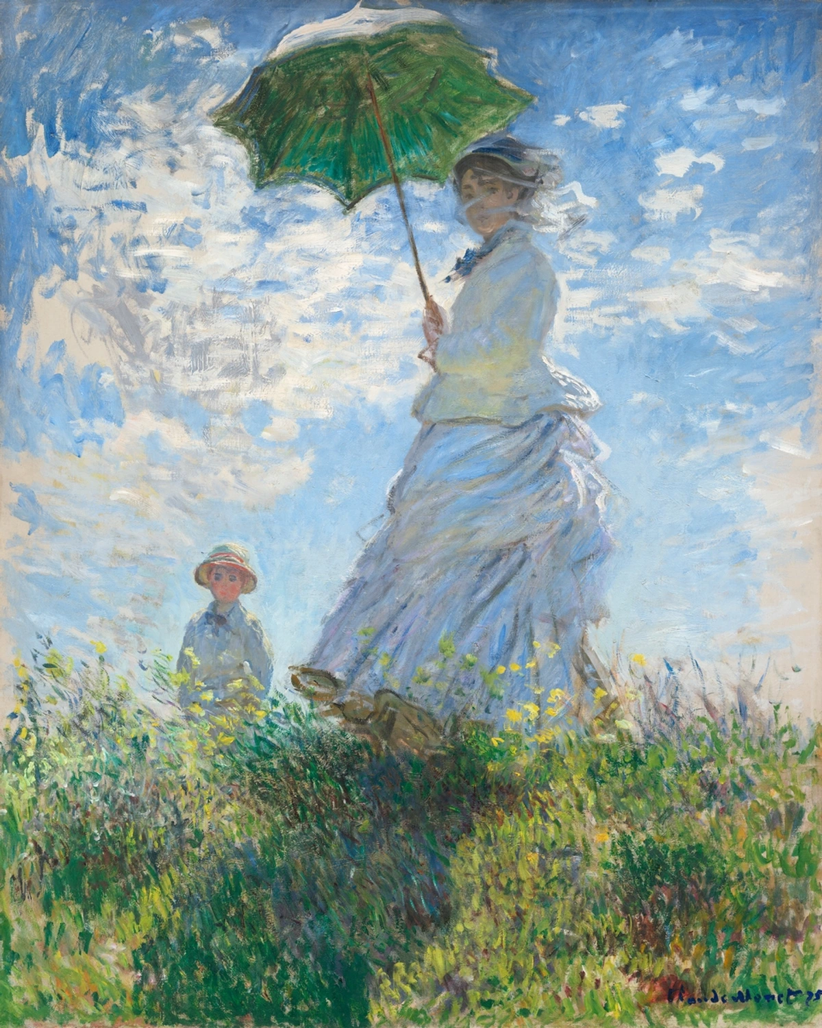
Monet often placed figures or horizons along the 'thirds' for a natural feel. (Explore Impressionism)
2. Leading Lines
These are lines within the artwork – real or implied – that draw your eye towards a specific point, often the focal point. Think roads, paths, fences, rivers, or even the direction of a gaze. They create a sense of depth and guide your journey through the piece. I often find myself unconsciously following these lines in a painting, like a visual breadcrumb trail.
- What to Look For: Is there a line pulling your eye into the picture? Where does it lead you? Does it create a sense of depth or movement?
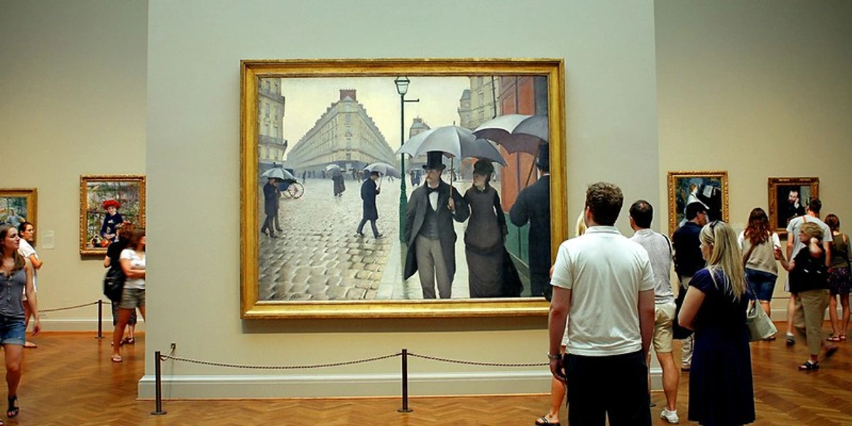
Caillebotte masterfully uses the lines of the buildings and cobblestones to lead the viewer's eye through this rainy Parisian scene.
3. Balance
Balance refers to the distribution of visual weight in an artwork. Elements have 'weight' based on their size, color, complexity, and placement. A large, dark shape on one side might be balanced by several smaller, brighter shapes on the other. It's something I sometimes wrestle with in my own work, deciding if I want that feeling of solid stability or something more dynamic and perhaps a little precarious.
- Symmetrical Balance: Elements are mirrored on either side of a central axis. Often feels formal, stable, and calm. Think of classical architecture or portraits.
- Asymmetrical Balance: Elements are not mirrored, but still feel balanced due to careful arrangement of different 'weights'. Often feels more dynamic and modern. It's like balancing a large rock with a pile of smaller stones.
- Radial Balance: Elements radiate outwards from a central point. Think of a starfish or a bicycle wheel, or perhaps a mandala.
- What to Look For: Does the artwork feel stable or lopsided? Is it the same on both sides, or do different elements balance each other out? How does the balance (or lack thereof) affect the mood? Does it feel grounded or dynamic?
4. Contrast
Contrast is created by placing dissimilar elements next to each other. This could be contrast in:
- Tone: Light vs. Dark (Chiaroscuro is a dramatic example, like the intense shadows and highlights in a Caravaggio painting that create powerful drama and focus).
- Color: Warm vs. Cool, Complementary Colors.
- Shape: Geometric vs. Organic.
- Texture: Smooth vs. Rough.
Contrast creates visual interest, helps elements stand out, and can generate tension or drama. In Picasso's 'Weeping Woman' mentioned earlier, the stark tonal contrast and the jagged, fragmented shapes against softer curves create a powerful visual representation of emotional turmoil. I often rely heavily on color contrast in my abstract pieces to make certain areas pop or recede.
- What to Look For: Where are the strongest differences in the artwork? How does contrast create emphasis or mood?
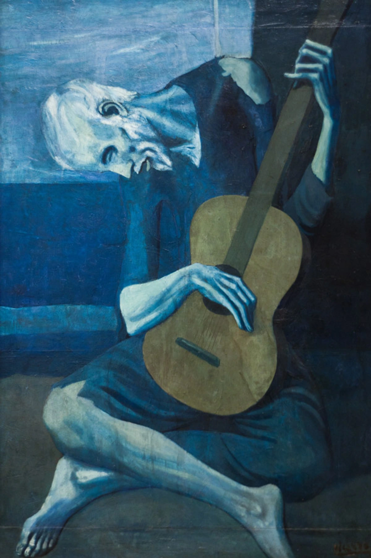
Picasso's 'Blue Period' uses tonal contrast subtly, but the contrast between the sharp angles of the figure and the curve of the guitar is striking.
5. Framing
This is when elements within the artwork (like a doorway, window, or overhanging trees) create a 'frame' around the main subject. This draws attention to the subject, can add depth, and sometimes creates a sense of looking into a scene. It's like looking through a keyhole, focusing your view.
- What to Look For: Is the main subject viewed through something else in the scene? Does this add context or focus?
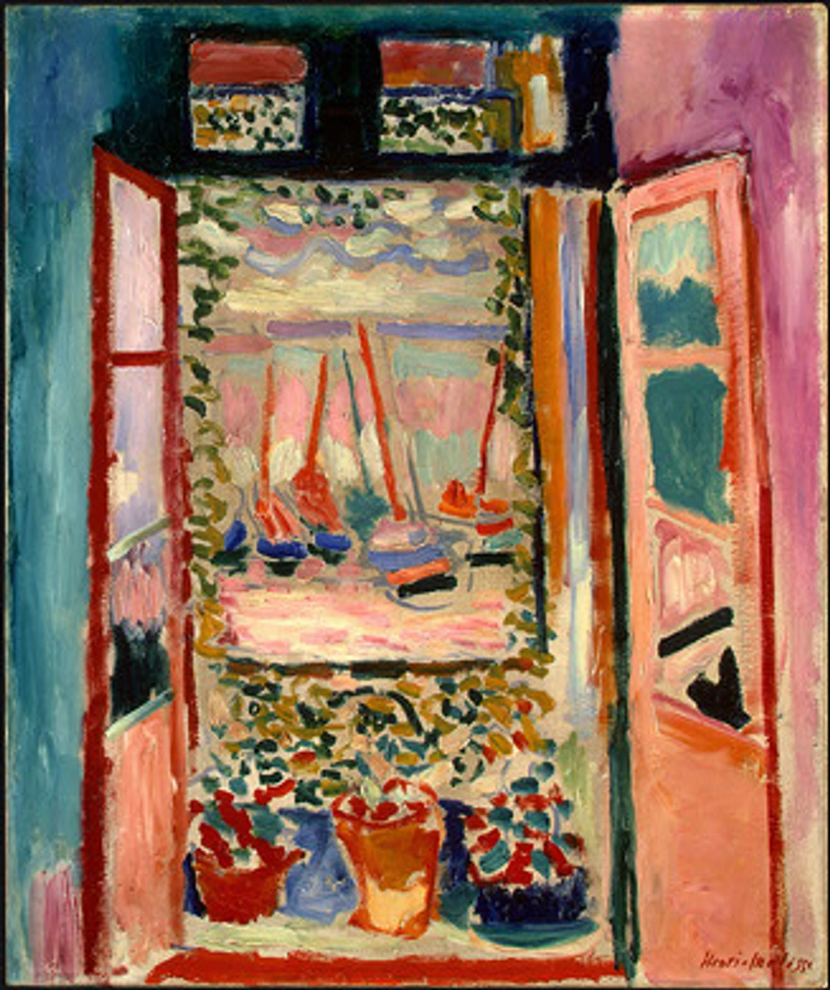
A classic example of framing – the window frames the view beyond. (See similar compositional ideas in Matisse)
6. Focal Point / Emphasis
This is the area of the artwork that grabs your attention first. Artists use various techniques (contrast, placement, color, leading lines, isolation) to create emphasis and tell you what's most important. There might be one strong focal point or several areas of interest. Sometimes, in my own work, I struggle with having too many focal points – everything screams for attention, and I have to dial some elements back.
- What to Look For: Where does your eye naturally land first? What element seems most dominant? How did the artist make it stand out?
7. Rhythm and Movement
Rhythm is created by repeating elements (lines, shapes, colors) in a way that creates a pattern or beat. This repetition can create a sense of movement, guiding the viewer's eye through the piece, sometimes in a flowing, dynamic way. Think of the visual beat created by repeated columns or the swirling movement in a sky. It's like a visual melody playing out across the canvas.
- What to Look For: Are there repeating shapes or colors? Does your eye seem to dance across the artwork? Does it feel static or full of energy?
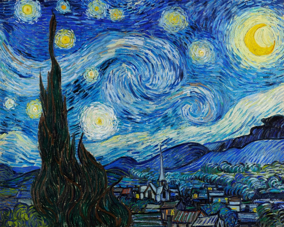
Van Gogh's swirling brushstrokes create incredible rhythm and movement. (Dive into Van Gogh's world)
8. Scale and Proportion
Scale refers to the size of objects in relation to each other or to the viewer. Think about a tiny figure standing next to a massive mountain – the scale emphasizes the mountain's grandeur. Proportion refers to the relative size of parts within a whole (like the size of a head compared to the body). Artists manipulate these to create realism, emphasis, distortion, or a sense of grandeur or intimacy. Think of the elongated figures in Mannerism, where proportion is intentionally distorted for effect.
- What to Look For: Do the sizes of objects feel realistic? Are certain elements intentionally larger or smaller to make a point or create a specific feeling? How do the parts relate to the whole?
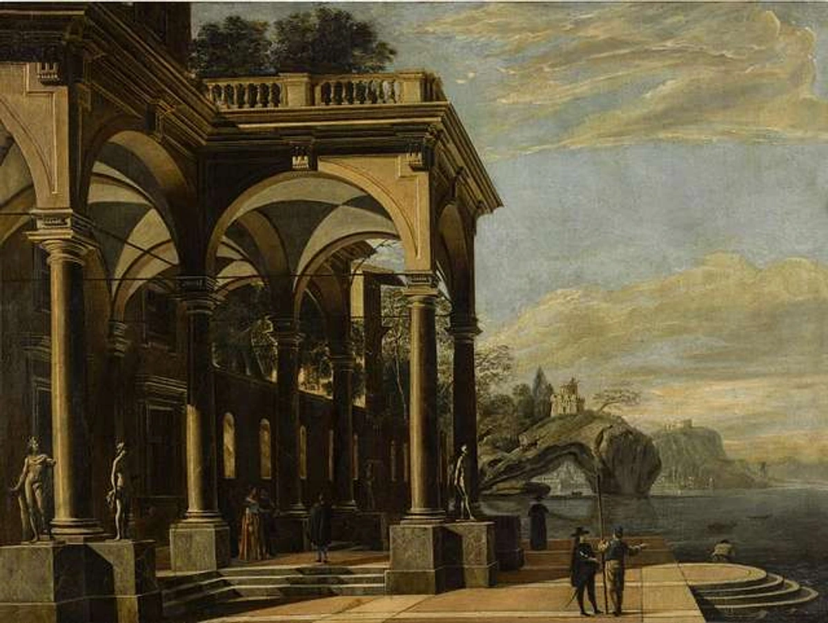
In architectural capriccios or historical paintings, scale and proportion are often used to convey grandeur or the relative importance of figures.
9. Negative Space
This is the area around and between the subjects or elements in an artwork. It's the 'empty' space, but it's far from unimportant. Negative space helps define the positive shapes (the subjects), creates balance, and can significantly impact the overall feeling of the composition – ample negative space can feel calm or isolated, while cramped negative space can feel tense or crowded. I often find myself consciously playing with negative space in my abstract pieces, using it to give the more colorful elements room to breathe or to create tension.
- What to Look For: Pay attention to the shapes formed by the background or the gaps between objects. How does this 'empty' space contribute to the overall image? Does it feel open or confined?

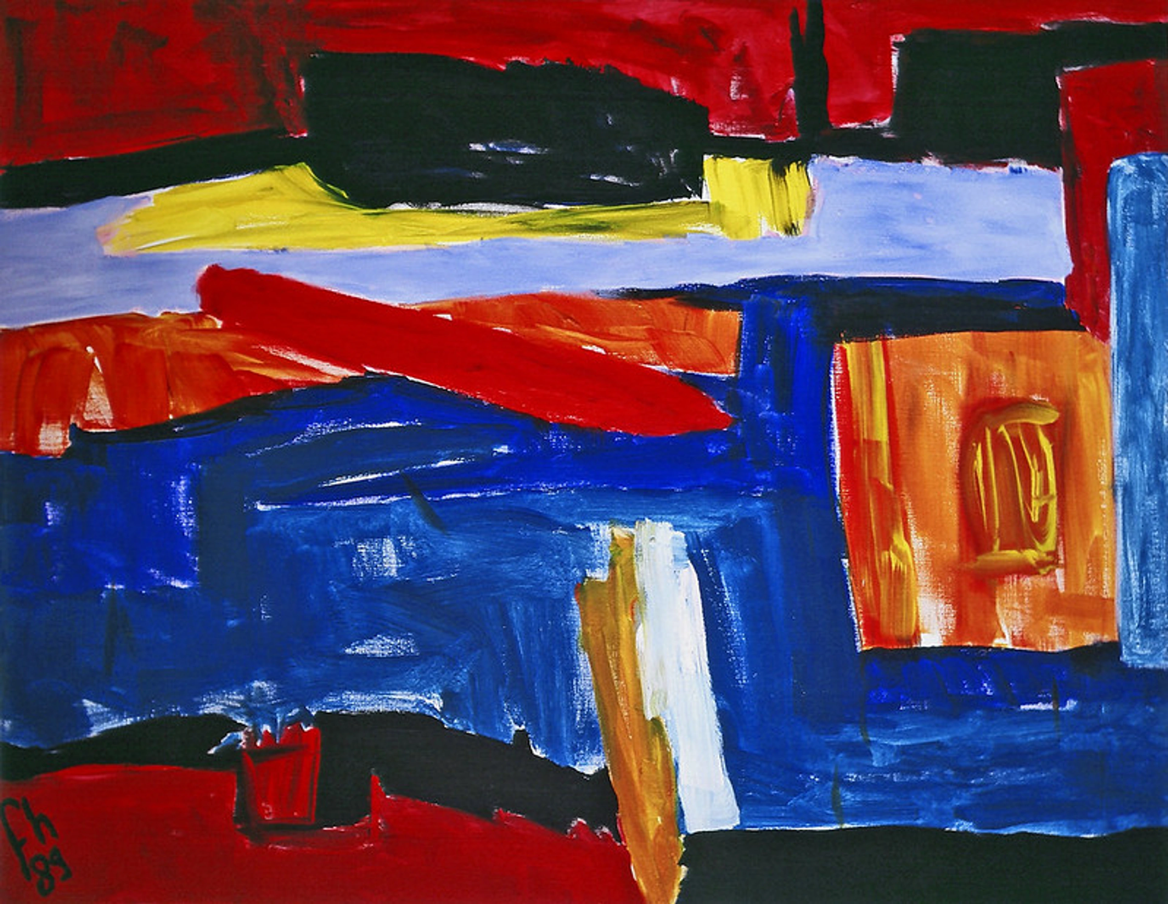
In abstract art, like this piece by Delaunay, the interplay between positive shapes and negative space is crucial to the composition.
10. Depth
Creating the illusion of three-dimensional space on a two-dimensional surface is a key compositional goal for many artists. This sense of depth can be achieved through various techniques:
- Overlapping: Placing one object in front of another suggests that the overlapped object is further away.
- Size Variation: Objects that are meant to be further away are depicted as smaller.
- Linear Perspective: Using converging lines to create the illusion of distance, like railway tracks appearing to meet on the horizon.
- Atmospheric Perspective: Objects further away appear less detailed, lighter in color, and bluer due to the effect of the atmosphere. Think of hazy mountains in the distance.
- Placement: Objects placed lower on the picture plane often appear closer than those placed higher.
Understanding how artists create depth helps you appreciate the construction of the visual world they present. It's not just magic; it's technique.
- What to Look For: How does the artist make some things feel close and others far away? Can you spot overlapping shapes, changes in size, or lines that seem to recede into the distance?
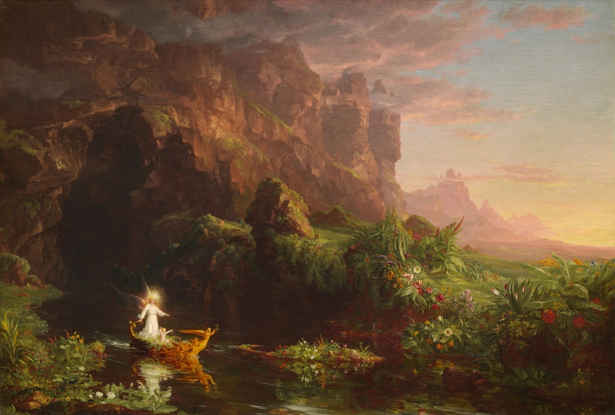
Thomas Cole uses atmospheric perspective and size variation to create a strong sense of depth in this allegorical landscape.
11. Unity, Harmony, and Variety
These principles describe the overall feeling of the artwork:
- Unity: The feeling that all the elements in the artwork belong together and form a coherent whole. Everything feels connected.
- Harmony: Achieved when similar elements are used (e.g., similar colors, shapes, textures), creating a pleasing, calm, or cohesive effect.
- Variety: The use of different elements to create visual interest and avoid monotony. Too much harmony can be boring; too much variety can be chaotic.
Good composition often balances unity/harmony with variety. It's like a good conversation – there's a central theme (unity), points that flow together smoothly (harmony), but also new ideas and perspectives to keep it interesting (variety). It's the difference between a bland meal and one with perfectly balanced flavors and textures.
- What to Look For: Does the artwork feel cohesive? Is it visually interesting, or a bit boring? Is it chaotic, or pleasantly complex?
A Quick Note on the Golden Ratio
You might hear about the Golden Ratio (roughly 1.618) or the Fibonacci sequence in relation to composition. These mathematical concepts describe proportions found in nature and have been used by artists and architects throughout history, believed to create aesthetically pleasing compositions. While fascinating and sometimes intentionally applied, don't feel you need to measure artworks! It's more of a historical/theoretical idea that some artists explore, rather than a universal rule you must spot. It's just another tool in the vast compositional toolbox.
How to 'Read' Composition Like a Pro (Well, Almost)
Okay, you know some tools. Now, how do you use this knowledge when looking at art in a gallery (like the famous ones) or even online (where you can find art for sale)? It's less about ticking boxes and more about developing an intuitive sense. Think of these steps as flexible suggestions, not a rigid checklist you have to follow every time.
- The Squint Test: Seriously, try it. Squint your eyes slightly. This blurs the details and helps you see the main shapes, lines, and areas of light and dark more clearly. Where does your eye go? What shapes dominate? This is often the composition speaking loudest.
- First Glance Gut Feeling: What's your immediate impression? Calm? Busy? Dramatic? Happy? Often, the composition is driving that initial feeling. Trust your gut, then try to figure out why you feel that way.
- Follow the Path: Where does your eye enter the artwork? Where does it travel next? Are there leading lines guiding you? Is there a clear focal point? Let your eyes wander naturally, then consciously trace the visual flow.
- Check the Balance: Does it feel stable or tilted? Symmetrical or asymmetrical? How does the balance (or lack thereof) make you feel? Does it feel grounded or dynamic?
- Look for Repeats and Contrasts: Notice recurring shapes, colors, or lines (rhythm). Where are the biggest contrasts (light/dark, color, texture)? How do these repetitions and differences create interest or emphasis?
- Consider the Edges: How do the elements interact with the frame or edges of the artwork? Does the composition feel contained or like it extends beyond the borders? Does anything feel awkwardly cut off?
- Pay Attention to the Empty Bits: Look at the negative space. How does it shape the main subjects? Does it create a sense of openness, isolation, or tension?
- Ask 'Why?': Why might the artist have placed that element there? Why that color contrast? Why lead the eye in that direction? Thinking about the choices helps you engage more deeply. It's like trying to understand the author's intent in a book.
Try applying these steps to a well-known painting you haven't analyzed before, maybe something like Van Gogh's 'Starry Night Over the Rhône' or a classical portrait. See what you notice!
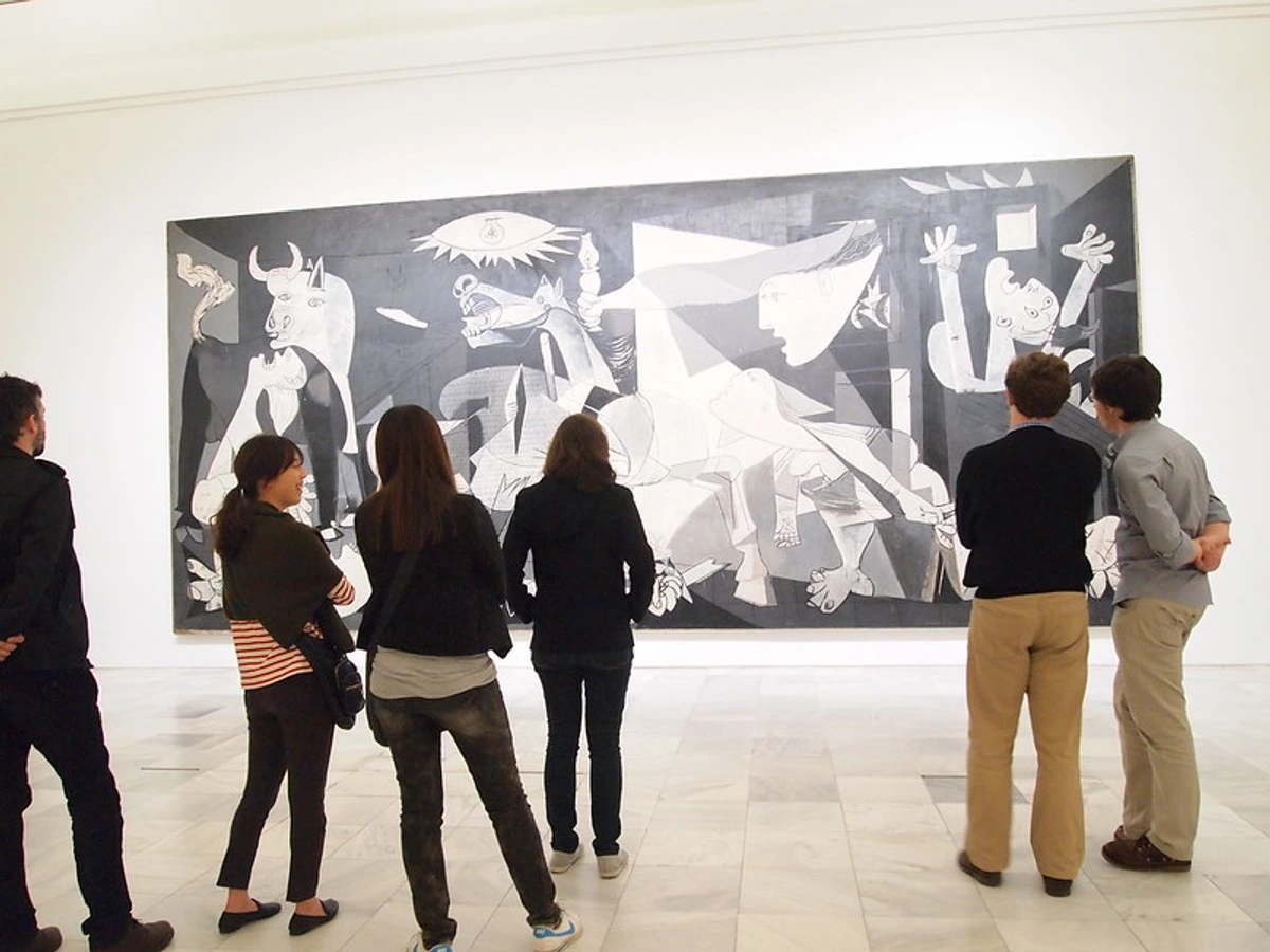
Actively looking at a complex work like Guernica involves tracing the lines, noting contrasts, feeling the chaotic balance, and observing the powerful use of negative space to amplify the horror.
Breaking the Rules: When Chaos is the Point
Just like grammar rules in language, compositional 'rules' are often broken by artists, especially in modern and contemporary art. Sometimes, the point is to create unease, challenge expectations, or focus purely on elements like color and texture, rather than traditional structure. It's a deliberate choice, not a mistake.
Abstract Expressionists, for example, often prioritized gesture and emotion over conventional balance or focal points. Think of Jackson Pollock's drips or Mark Rothko's immersive color fields. The composition might feel overwhelming or decentralized, and that's intentional – it reflects the artist's focus on process, feeling, or the raw impact of the elements themselves. Other artists, like the Surrealists (think Salvador Dalí or Yves Tanguy), deliberately used jarring or illogical compositions to evoke dream states and the subconscious.

In Abstract Expressionism, energy and color often take precedence over traditional compositional rules, creating a different kind of visual order (or disorder). (Explore the history of abstract art)
Understanding the 'rules' helps you appreciate when and why artists choose to break them. It adds another layer to your interpretation. It's like knowing musical scales helps you appreciate jazz improvisation.
Conclusion: Seeing with New Eyes
Learning about composition isn't about judging art as 'good' or 'bad' based on whether it follows the rules. It's about equipping yourself with the tools to see more. It’s about understanding the artist's craft and the subtle (and not-so-subtle) ways they guide your experience. It's about appreciating the visual language they speak.
I remember the first time I really saw the leading lines in a landscape painting, or felt the tension created by asymmetrical balance in a portrait. It was like a switch flipped. Suddenly, art wasn't just something to look at, but something to look into. It became a conversation, a puzzle, a journey. This shift in perspective has been invaluable, not just in appreciating the masters in museums (like the ones I love visiting), but also in understanding the choices I make in my own colorful, abstract work and the pieces I create for sale.
Next time you're looking at a piece of art, whether it's a famous masterpiece or a contemporary print, take a moment. Squint. Trace the lines with your eyes. Feel the balance. Notice the contrasts and the empty spaces. You might be surprised at how much more you see, how much deeper your connection becomes. It doesn’t require years of study, just a willingness to look actively and ask questions. It's a skill that enriches your appreciation not just of art, but of the visual world all around you. Happy viewing!
Frequently Asked Questions (FAQ)
Q1: Do all artists consciously think about these composition rules? A1: Not always explicitly, especially experienced artists. Much like a skilled writer uses grammar intuitively, many artists develop an innate sense of composition through practice and observation. However, the principles are often deliberately employed, particularly when learning or planning complex pieces. Some artists (like those exploring abstract concepts) might intentionally subvert these rules.
Q2: Is good composition subjective? A2: To some extent, yes. What one person finds balanced or engaging, another might not. Cultural backgrounds and personal preferences play a role. However, certain principles (like balance creating stability, or leading lines directing focus) have a generally predictable psychological effect on most viewers. There's a difference between effective composition (it achieves the artist's intended effect) and simply liking the composition.
Q3: Does composition apply to photography and graphic design too? A3: Absolutely! The principles are universal across visual media. Photographers frame shots, use the rule of thirds, and capture leading lines. Designers balance elements on a page or screen, create focal points, and use contrast. Understanding composition helps appreciate all visual communication.
Q4: Can abstract art have composition? A4: Yes, definitely. While it might not have recognizable subjects arranged realistically, abstract art relies heavily on the composition of its core elements: line, shape, color, texture, space. The balance of colors, the rhythm of shapes, the contrast between textures, and the use of negative space – these are all compositional choices that create the overall impact.
Q5: How does composition differ based on subject matter (e.g., portrait vs. landscape)? A5: While the core principles remain the same, their application shifts. In a portrait, the focus is often on the figure, using balance and framing to emphasize their presence and expression. In a landscape, leading lines and depth become crucial for guiding the eye through the scene and conveying scale. Still lifes might emphasize balance, texture, and the arrangement of objects within a confined space. Artists adapt the principles to best serve the specific subject and their intended message.
Q6: Does composition matter in digital art, video, or other modern media? A6: Absolutely! Composition is fundamental to all visual media, regardless of the tools used. Digital artists still arrange elements on a screen, photographers compose shots, filmmakers use composition within each frame and across sequences, and graphic designers rely heavily on compositional principles for layout and visual hierarchy. The medium changes, but the need to organize visual information effectively remains.
Q7: Where can I learn more about analyzing art? A7: Great question! You can explore guides on how to read a painting, understanding art elements, different art styles, or even the history of art to get more context.


