How to Read a Painting: An Artist's Deeper Guide to Art Interpretation
Unlock art's silent language with this artist's guide to reading paintings. Explore formal elements, techniques, context, and the powerful impact of symbolism. Overcome art anxiety, deepen your personal connection, and interpret abstract pieces, understanding the artist's unique choices and creative process for a richer, more profound experience.
How to Read a Painting: A Guide to Deeper Understanding (From an Artist's Perspective)
Beyond the canvas, a silent language awaits. Okay, let's be honest. We've all been there. Standing in front of a painting, maybe in a hushed museum or a buzzing gallery, and thinking... well, not much. Or maybe thinking, "That's nice," or "Hmm, weird," or even the classic, slightly panicked, "Am I supposed to be feeling something profound right now?"
I remember once, visiting the Rijksmuseum, staring at what I thought was a brilliant minimalist piece – just a vast, dark canvas. Only later did I realize I was looking at the back of a large easel, facing the wrong way. My brain just really wanted to 'get' something profound out of it! Truth be told, it's rarely that simple, but let's explore why you might feel something profound after all! And honestly, that feeling of 'Am I getting this wrong?' or 'Why don't I feel what I'm supposed to feel?' isn't just a viewer's anxiety; it's a silent fear every artist wrestles with too, wondering if their carefully crafted visual whispers are being heard at all. Sometimes, even the creator stands back and thinks, 'Did I actually achieve what I set out to do, or did something entirely unexpected emerge?'
I also remember a particular afternoon, wrestling with a tube of paint that just wouldn't cooperate. I spent hours trying to get a specific shade of grey to feel 'alive' – it looked simple, but it fought me every step of the way, resisting any hint of vibrancy until a final, almost accidental, brushstroke changed everything. That elusive pursuit of a perfect color, that constant struggle with the materials, is a silent battle in the studio, a reminder that the seemingly simple often conceals immense effort and intention. It’s a constant battle, but a fun one.
For years, I just looked at art. I saw the picture, maybe read the label, and moved on. It felt a bit like trying to read a book in a language I didn't quite speak. I remember once, staring blankly at a famous modern piece, utterly convinced it was just a blank canvas with a single, perfectly straight line – only to realize later, upon closer inspection (and a helpful label), it was actually a meticulously rendered, hyper-realistic depiction of a brick wall. My brain had completely missed the 'brick' part. But then, something shifted. I started learning the 'grammar' of painting, and suddenly, looking transformed into reading. It became a conversation, a puzzle, a connection. And trust me, it's way more fun.
I wrote this guide because I believe everyone deserves to experience art beyond just 'nice' or 'weird' – to truly read it. It’s a language, sometimes a quiet whisper, sometimes a shout, and I want to help you tune in. (And yes, sometimes it's a messy, paint-splattered shout, but that's part of the fun!) For me, art is this profound human communication, reaching across cultures and generations with its timeless dialogue. Learning to read it isn't just about enjoyment; it genuinely enriches your life, sharpens your perception, and opens up new perspectives on human creativity, allowing for a much deeper, more personal connection with the artist and their era.
This guide isn't about telling you what art means – because often, that's a deeply personal thing. It's about giving you the tools to understand how a painting works, the choices the artist made, and how those choices might speak to you. Think of it as learning to listen to the painting's quiet conversation, and recognizing that your interpretation is part of an ongoing dialogue between the artist's intent, the artwork's visual language, and your own evolving perspective. Ready? Let's dive in. And hey, don't feel pressured to become an expert overnight; I'm still learning every day, and sometimes my own paintings surprise me! Reading a painting can be a quick appreciative glance or a deep dive; this guide offers tools for wherever you are on that spectrum. You can dip into the sections that interest you most, or follow along step-by-step.
1. The First Glance & Your Gut Reaction
Before you do anything else, just... look. Resist the urge to read the label immediately! Give yourself a moment with the pure visual experience first. What's your immediate, unfiltered gut reaction? Don't censor it. Do you feel calm? Anxious? Excited? Confused? Does the painting draw you closer, or do you want to back away? This initial, often emotional, response is incredibly valid. Think of the unsettling feeling from a Goya, or the calm of a Rothko. It's your first point of connection, or perhaps disconnection, and it's a crucial piece of the puzzle. Sometimes, I walk into a studio and just know if a piece is working based on that first hit. It's not intellectual; it's just... a feeling. Maybe it makes you feel uneasy, like that one time I saw a painting that just felt... off, and I couldn't figure out why until I looked at the composition later – turns out, the artist deliberately unbalanced it to make me feel exactly that unease. Sneaky! Does anything immediately strike you as symbolic, even if you don't know what it means yet? I even remember creating a series of paintings that felt incredibly serene to me, only for a friend to point out they gave her intense anxiety due to the sharp, hidden lines. I learned then that my gut reaction as the creator wasn't always the universal one, and that was a valuable lesson in perspective!
What's literally depicted? Is it a portrait, landscape, still life, historical event, religious scene, or something else entirely? Who or what are the main figures or objects? If it's abstract, what shapes, colors, or forms dominate? Just identify the players or the dominant visual elements. And hey, while you're up close, sometimes you can even spot the artist's signature or other identifying marks – a little detail that connects you directly to the creator's hand. This physical trace can offer a powerful sense of connection to the artist's presence, affirm authenticity, and even provide crucial clues for dating or contextualizing the work within their broader oeuvre. It's like finding a secret message from the past, a direct link to the person who stood right where you are now, making that mark. Or sometimes, for me, it's like finding a little note from my past self, asking 'Did I really do that?'. Also, pay attention to the sheer scale of the work – a massive mural feels different immediately than a tiny miniature. We'll explore scale and proportion further when we talk about Composition.
2. Your Personal Connection: It's Not Just About History Books
Speaking of gut reactions, let's talk about you. Yes, you, standing there. Your personal response isn't just allowed; it's essential. Art isn't just historical artifact; it's meant to be experienced. Sometimes a painting just hits you. Maybe the colors remind you of a place you love, or a figure's expression echoes a feeling you know well. Perhaps it simply makes you feel... something. Happy, sad, restless, peaceful.
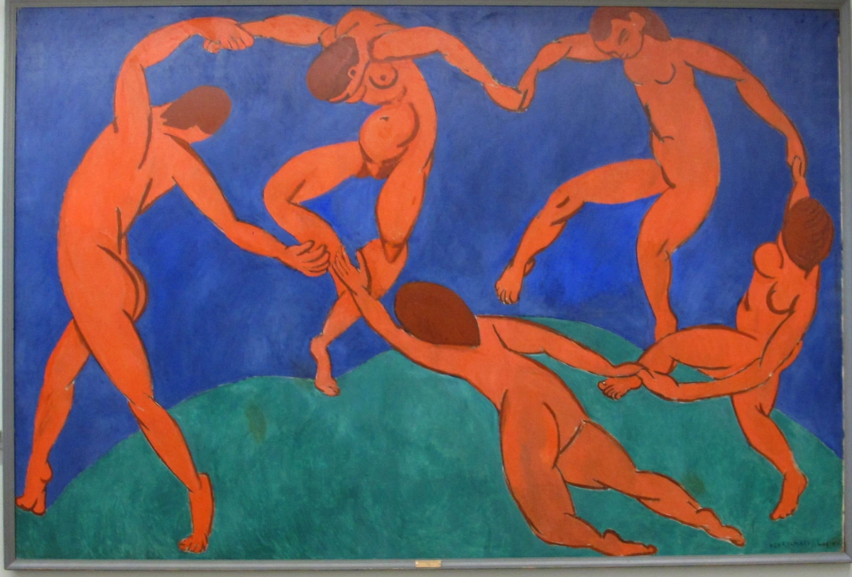
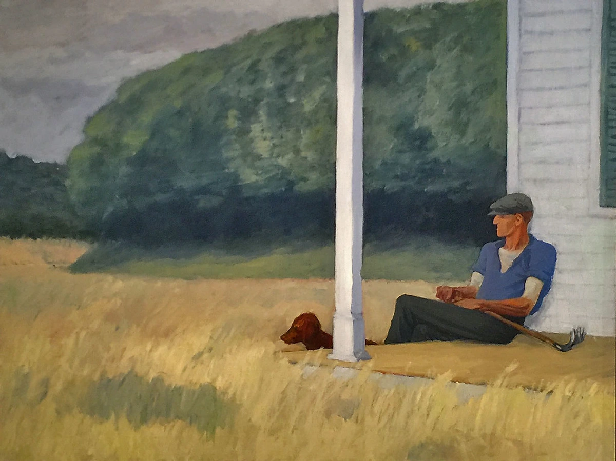
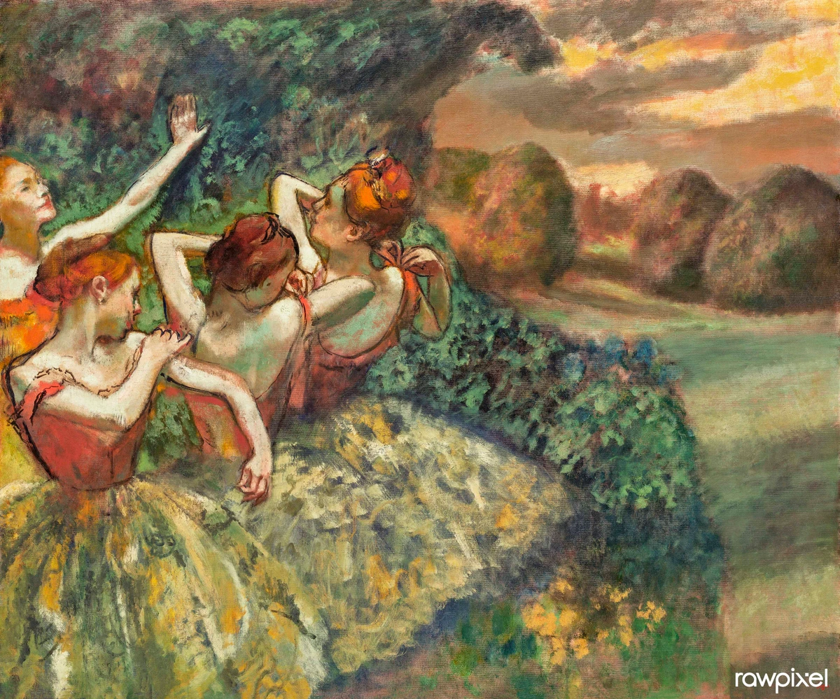
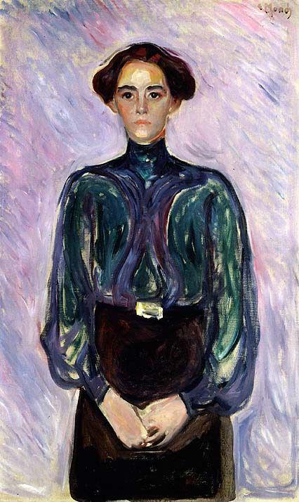
Seeing others engage with a piece like this Caillebotte always reminds me how deeply personal art truly is.
Don't dismiss these feelings! They are a valid starting point for understanding. Ask yourself why you feel that way. Can you trace that feeling back to something specific you see? "I feel peaceful because the colors are cool and the composition feels balanced." "This feels chaotic because of the sharp lines and clashing colors." Linking your subjective response to the objective visual elements is where the magic starts to happen. Perhaps the vibrant blues in a Van Gogh remind you of a childhood sky, and you then notice his energetic brushwork, which adds to that feeling of active memory. It makes the whole process less like a test and more like... well, like getting to know someone new. Maybe the way the light hits a figure reminds you of a specific memory, and then you notice the artist used strong chiaroscuro (the use of strong contrasts between light and dark) to create that effect, enhancing the dramatic emotional impact of the scene. I once painted a series inspired by a melancholic dream, expecting only somber reactions, but a viewer told me one piece made her feel hopeful, reminding her of resilience after loss. It was surprising and deeply humbling to see my work resonate in a way I hadn't explicitly intended, revealing the unexpected power of shared human experience. And sometimes, living with art, perhaps a piece you've decided to truly make your own, deepens this connection over time in ways you'd never expect, revealing new layers with every passing day.
3. Formal Analysis: The Painting's Language (Yes, Even Abstract Ones)
Ready to peek behind the curtain? This is where we explore the universal vocabulary and grammar artists use across all styles and eras – the fundamental visual elements and organizational principles that form the very language of art. Think of the elements as the ingredients in a chef's pantry, or the notes in a musician's scale – each one a fundamental building block.
And the principles? They're the recipe, the score, dictating how those building blocks are arranged to create a unique visual symphony. Even the artist's initial choice of subject matter – whether it's a heroic battle or a quiet still life – inherently steers these formal choices, influencing everything from the composition to the color palette, and ultimately, your experience of the piece. And here's a secret: these tools apply whether you're looking at a Renaissance portrait or a splashy abstract piece. The difference is, in abstract art, these elements often are the subject. Think of it as learning the fun "rules of the game" or the "secret code" artists use to communicate visually. You can explore these fundamental concepts further in guides on the elements of art.
Principles of Design: The Painting's Grammar
If the elements of art are the 'vocabulary' – the raw visual components like line, color, and shape – the principles of design are the 'grammar' or 'syntax'. They are the guidelines artists use to organize and arrange those elements into a cohesive, impactful, or expressive composition. Understanding them helps you see how the artist leads your eye, creates a mood, or communicates a kind of idea. These aren't just abstract ideas; they're the silent architects of impact.
I remember spending weeks on a painting, feeling utterly lost, until I realized I'd completely neglected the principle of 'unity' – it was a visual cacophony! Once I brought in some repeating elements and a cohesive color scheme, it was like the painting finally exhaled, and suddenly, everything clicked into place. It's often the principles you overlook that are screaming the loudest for attention. These principles include:
- Unity/Harmony: The feeling that all parts of the artwork belong together, creating a sense of completeness and often evoking a sense of calm or coherence. As an artist, I aim for this when I want the viewer to feel a sense of calm and coherence, like the serene, balanced scenes in classical Renaissance art. While Unity and Harmony are often used interchangeably to describe this sense of completeness and belonging, for the purpose of this guide, think of them as two sides of the same coin: 'unity' being the overall sense that all parts work together, and 'harmony' the pleasing visual relationships that create that cohesion.
- Variety: The use of different elements to create visual interest and avoid monotony. Why use variety? To keep the eye engaged and prevent boredom, adding energy or complexity, like in a busy, complex Pieter Bruegel the Elder painting, full of diverse figures and actions.
- Emphasis/Focal Point: Drawing attention to a specific area or element, making it stand out. This is often achieved through high contrast, as seen in the dramatic spotlights of a Rembrandt portrait. For me, it's about leading your eye exactly where I want it to go, like a visual whisper, or to create a dramatic sense of importance.
- Balance: The distribution of visual weight within the composition (can be symmetrical or asymmetrical). Think of the serene compositions of Renaissance Madonnas. As an artist, I consider if I want a feeling of stability and peace (symmetrical balance) or a subtle tension and dynamism (asymmetrical balance) that keeps the eye moving.
- Contrast: The difference between elements (e.g., light and dark, rough and smooth, large and small) to create visual interest or highlight areas. A bold Abstract Expressionist work might use strong color contrasts to create energy or emotional intensity. I use contrast to make elements pop, to create drama, or even to challenge the viewer's eye and spark a strong emotional response.
- Rhythm: The repetition of elements to create a sense of movement or pattern. Consider the repetitive patterns in Islamic art or the sequential flow in a Baroque altarpiece. Why use rhythm? To create a feeling of flow, movement, or even a sense of musicality in the visual, guiding the viewer's eye in a structured way that can evoke feelings of comfort or excitement.
- Movement: The way the artist guides the viewer's eye through the artwork. A swirling Van Gogh sky or a dynamic Futurist painting will exemplify this. For me, creating movement is like setting the pace of a visual dance across the canvas, evoking a sense of action, vitality, or emotional flux.
- Pattern: The repetition of specific motifs or elements in a predictable way. Think of the intricate details in a Klimt painting or the repeating forms in some textile art. Why use pattern? To create a sense of order, decoration, or to emphasize a repeating idea, which can evoke feelings of harmony, predictability, or even a hypnotic quality.
Together, elements and principles form the complete visual language artists employ to tell their stories, evoke emotions, or simply create something beautiful.
Composition: The Painting's Blueprint
Composition is the deliberate arrangement of visual elements to guide the viewer's eye and create a specific feeling or structure. It's the underlying skeleton that holds the visual information together. As someone who wrestles with composition in my own work, I can tell you it's often the hardest part! It's like trying to get a cat to pose for a portrait – looks easy, never is. And honestly, sometimes I just stare at it and hope the composition fairy shows up.
But how does an artist really guide your eye? It's about creating balance or tension, directing your gaze, and establishing a sense of space. Why choose one arrangement over another? An artist might use a stable pyramidal composition for a religious scene to evoke reverence and permanence, while a dynamic diagonal thrust might be chosen for a battle scene to convey chaos and action, thus building a visual narrative within the image. It's all about directing your experience and telling a story without words. Think of the controlled chaos in a Futurist painting or the serene balance of a Renaissance Madonna.
- Arrangement & Focal Point: Where does your eye go first? Artists often create a focal point using contrast (light/dark, color), converging lines, or placement. How does the artist lead your eye through the painting? Look for leading lines – actual or implied lines that direct your gaze.Does the arrangement feel balanced? Symmetrical (like a mirror image) feels stable and formal, often evoking peace. Asymmetrical balance feels more dynamic, using unequal elements that still balance each other out visually, creating subtle tension. A deliberately unbalanced composition can create tension or unease, perhaps to evoke a feeling of discomfort, anxiety, or dynamism. Sometimes, when I'm stuck on a painting, I'll flip it upside down just to see the composition purely as shapes and weights – it's amazing how that can reveal a problem or a solution!Note that sometimes an artist deliberately avoids a single focal point to create a different effect, like a sense of diffusion or an overall pattern, which is also a conscious choice about the viewer's experience. Why avoid a focal point? To create an overarching mood, a sense of unity, or to encourage the eye to wander freely for a more diffuse or meditative experience, leading to a contemplative emotional impact. For me, avoiding a single focal point can be a way to invite the viewer to linger, to explore without being rushed towards one specific 'answer.'
- Compositional Structures: Artists often use classic structures, sometimes without even thinking about it consciously. Look for a pyramidal composition (figures forming a triangle, common for stability, like in Leonardo's 'The Last Supper'), a radial composition (elements bursting from a center point, like a mandala or a burst of light), strong diagonal lines (creating dynamism, action, or instability, as seen in Gericault's 'The Raft of the Medusa'), or flowing S-curves (leading the eye gently). Recognizing these structures helps you understand the artist's underlying intent for the painting's energy or stillness, and the emotional tone they want to set.Beyond these, you might also find subtle echoes of classical guidelines like the Golden Ratio (a mathematical proportion often found in nature and art, creating aesthetically pleasing compositions) or the Rule of Thirds (dividing the canvas into nine equal parts with two horizontal and two vertical lines, placing key elements at their intersections for visual interest). While not every artist consciously applies them, these underlying principles often contribute to what just 'feels' right in a composition.
- Rhythm and Movement: How do repeated shapes, colors, or lines create a sense of rhythm? Does the painting feel static, or does it have a sense of flow or movement? Artists create movement not just by showing action, but through the direction of lines (curved, jagged, straight), energetic brushwork, or the way forms are arranged to guide your eye's pace. Why create movement? To evoke energy, narrative progression, or vitality, giving the piece a feeling of life. Why static? To convey stillness, permanence, or introspection, leading to a sense of peace or solemnity. Think of the swirling energy in a Van Gogh sky or the vibrant, almost musical pulse in a Delaunay abstract (even though he called it Orphism!). Try physically tracing the lines or implied movement with your finger (or eye) on an imaginary painting to feel the rhythm. It's like the visual equivalent of a musical beat or a graceful dance across the canvas.
Kandinsky's abstract works, like "Brown Silence," demonstrate how lines can be purely expressive, creating dynamic rhythm and energy through their arrangement and interaction – a powerful lesson in visual language that always inspires me.
- Implied Lines: These are fascinating! Sometimes lines aren't drawn but are strongly suggested. Look at where figures are looking – their gaze creates a powerful implied line, directing your attention. Pointing fingers, the line of a road, or even the psychological connection between figures can create lines that structure the composition and tell a story without a single drawn stroke. Why use implied lines? To subtly guide the viewer's eye, create connections between elements, or convey narrative without explicit drawing, adding a layer of subtle psychological or emotional connection. In abstract art, implied lines can be formed by the edges of shapes or the direction of brushstrokes. Even the arrangement of objects on a table can create implied lines leading your eye. As an artist, I often use implied lines to create a sense of unfolding narrative, like a hidden thread pulling the viewer through the visual story.
- Scale and Proportion: How large are objects or figures in relation to each other, and to the overall canvas? Are these proportions realistic? Sometimes artists use hierarchical scale, making more important figures larger regardless of perspective (common in older art) to show significance, and evoke a sense of awe or importance. Why use hierarchical scale? To emphasize importance or status, especially in historical or religious contexts. Consider how the scale affects the feeling – vast landscapes dwarfing tiny figures can evoke awe or loneliness, creating a powerful emotional contrast. In abstract art, the scale of shapes and their relationship to the canvas size can dramatically alter the impact, making you feel overwhelmed, intimate, or expansive, directly affecting your emotional response. And speaking of size, the overall size of the painting itself matters! A tiny miniature draws you in close, demanding intimacy, while a massive mural can feel monumental and overwhelming, changing your physical relationship to the art. Getting the scale wrong in my own work can completely kill the intended feeling, which is why it's such a crucial artistic decision. Been there, done that, painted the tiny, un-monumental mural.
- Visual Weight: Some elements feel 'heavier' than others – maybe due to size, color intensity, complexity, or placement. How does the artist distribute this visual weight? A balanced composition distributes weight evenly (though not always symmetrically). An unbalanced one might place heavy elements near an edge, creating tension and perhaps a feeling of unease. A large, dark shape carries more visual weight than a small, light one. Why manipulate visual weight? To create stability, dynamism, or focus, guiding the viewer's perception of balance and tension, and thus, influencing their emotional experience. It's like arranging furniture in a room; you want things to feel stable, but maybe with a little visual tension to keep it interesting. Or think of it like balancing rocks on a seesaw – size, density (color intensity), and placement all matter. For me, it's about carefully directing your eye's journey, making sure certain parts of the painting hold your gaze a little longer.
- Shape and Form: While related to line and space, shape (2D, like a square or circle) and form (3D, suggesting volume and mass) are distinct elements. Are the shapes in the painting geometric (precise, man-made feel, often evoking order or rigidity) or organic (curvy, natural feel, suggesting fluidity or softness)? How does the artist use light and shadow to turn flat shapes into seemingly solid forms? Why use geometric shapes? To convey order, structure, or a sense of the man-made, which can evoke feelings of precision or starkness. Why organic shapes? To evoke nature, fluidity, or an expressive, less rigid feeling, often leading to a sense of calm or natural harmony. In abstract art, the interplay of shapes and forms can be the primary visual event, creating rhythm, tension, or harmony purely through their interaction, directly affecting the viewer's emotional response. Consider the stark geometric purity of a Piet Mondrian, or the swirling, organic forms in a Wassily Kandinsky work. Sometimes, in my own studio, I'll attempt a perfect geometric circle, meticulously measuring and adjusting, only to step back and find it's subtly warped into something vaguely reminiscent of a slightly deflated football. It's a humbling reminder that even the most precise intentions can have unexpected, and sometimes hilariously lopsided, deviations in the physical act of painting!
Kandinsky's abstract works, like "Brown Silence," demonstrate how lines can be purely expressive, creating dynamic rhythm and energy through their arrangement and interaction – a powerful lesson in visual language that always inspires me.
Color: The Emotional Palette
Color is arguably the most immediate emotional trigger in art. Why would an artist choose this color palette over another? What colors dominate? Are they warm (reds, yellows – often associated with energy, passion, warmth, closeness, or even aggression) or cool (blues, greens – often suggesting calm, sadness, distance, or coolness)? Are they bright and saturated (intense, pure, often evoking vibrancy and excitement), or muted and desaturated (subtle, greyed, suggesting tranquility, age, or melancholy)?
Why choose warm colors? To create vibrancy, closeness, excitement, or a sense of urgency. Why cool colors? To evoke tranquility, sadness, distance, or a feeling of calm. Why high saturation? To make elements pop and feel intense, leading to a powerful visual impact. Why desaturated? To create a softer mood, subtlety, or an aged feel, fostering a more introspective or melancholic atmosphere. Are the colors realistic, or are they expressive, chosen purely for emotional impact? Color choices are powerful mood-setters (color theory is a whole rabbit hole!). As an artist, I spend ages mixing colors, trying to get just the right shade that feels right, not just looks right. Sometimes a tiny shift in hue or saturation completely changes the emotional temperature of a piece. I once spent days trying to get a perfect, ethereal blue for a sky, only to realize I'd mixed something that felt more like a gloomy puddle. It was a spectacular lesson in how subtle shifts can dramatically alter the mood! There was also a time I painted a vivid, unrealistic magenta sky in a landscape; it felt almost rebellious, but it screamed 'passion' and 'unbridled energy' in a way a realistic blue never could.
Also consider Value – the lightness or darkness of a color. High contrast in value (light next to dark) creates drama and helps define forms, while low contrast feels softer or more atmospheric. Getting values wrong can actually kill the sense of form and depth in a painting, making it feel flat or unconvincing, and thus dilute its emotional impact. I've definitely made some portraits where the subject ended up looking like a ghostly apparition because I couldn't get the shadows right – not the effect I was going for!
Beyond emotional impact, consider how specific colors might carry symbolic meaning in historical or cultural contexts (e.g., blue for divinity or stability in Western art, but perhaps mourning in other cultures; red for passion or blood, green for nature or envy. Think of purple, often associated with royalty and luxury in some cultures, but sometimes mourning in others, or white, symbolizing purity and new beginnings in the West, yet death and grief in parts of Asia.) – a deliberate choice that adds layers of narrative or cultural resonance. Consider the emotional intensity of a Mark Rothko color field painting, or the jarring vibrancy of a Fauvist landscape.
- Color Relationships & Harmonies: How do the colors interact? Does the artist use complementary colors (opposites like red/green, blue/orange) next to each other? This creates maximum vibrancy and contrast, making things pop and often evoking excitement or tension! Or analogous colors (neighbors like blue/green/yellow-green) for a more harmonious, unified, gentle feel, leading to a sense of calm or cohesion? Perhaps a triadic harmony (three evenly spaced colors, as seen in some vibrant Pop Art pieces) for dynamic balance and visual excitement? Understanding these relationships reveals deliberate choices that affect the painting's mood and visual punch, and its ultimate emotional impact. As an artist, choosing a limited palette or pushing colors to be non-realistic is a conscious decision to prioritize feeling over depiction. Think of the difference between a vibrant Fauvist landscape using bold complementaries and a somber Rembrandt portrait dominated by analogous earth tones. In abstract art, color is the main event, creating energy, depth, and emotion through these very relationships. Why use complementary colors? To make the painting vibrate! It's like two strong personalities clashing but creating an undeniable, electric energy. Why analogous? To create a sense of calm or unity. It's all intentional. I remember struggling with a painting that felt flat until I realized I needed to introduce a touch of a complementary color to make the main subject sing. It's like finding the right spice for a dish!
Matisse, with works like 'The Red Room,' often employed striking color relationships to maximize visual intensity and emotional expression, showing how color alone can drive the feeling – a bold approach I deeply admire.
Line: The Painting's Energy
Lines aren't just outlines; they are paths of energy, creating shapes, defining forms, and directing the eye. How do lines, seemingly simple, convey so much energy? They convey energy and emotion. Are the lines sharp and defined (creating clarity, structure, perhaps tension, or a feeling of precision), or soft and blurry (suggesting atmosphere, softness, movement, or a dreamlike state)? Why choose sharp, defined lines? To convey precision, tension, clear boundaries, or a sense of starkness. Why soft, blurry ones? To suggest atmosphere, dreaminess, a sense of movement, or to evoke feelings of tranquility or nostalgia. Are they straight, curved, jagged, thick, thin? Jagged lines might feel aggressive or chaotic, eliciting feelings of unease, while flowing lines feel calmer or more graceful, like the elegant curves in Art Nouveau works by Alphonse Mucha, evoking beauty or fluidity. Contrast the precise, angular lines of Cubism with the free, expressive drips of a Jackson Pollock. There's a visceral difference in how a quick, gestural line feels as it flows from my hand compared to a slow, precise one. The former is a burst of immediate energy, almost a physical echo of emotion, while the latter is a controlled, deliberate thought, each tiny tremor a conscious decision. This physical act of drawing/painting directly imbues the line with its expressive quality, directly influencing your emotional impact as a viewer. Sometimes, I'll even doodle with my non-dominant hand just to force myself into a different kind of 'line thinking' – the results are usually hilarious, but always instructive! In abstract art, lines can be purely expressive gestures, creating rhythm, direction, and energy without depicting anything recognizable.
Kandinsky's abstract works, like "Brown Silence," demonstrate how lines can be purely expressive, creating dynamic rhythm and energy through their arrangement and interaction – a powerful lesson in visual language that always inspires me.
Light and Shadow (Chiaroscuro): Sculpting with Light
Light and shadow are the sculptors of form, creating depth, mood, and focus. Where does the light come from? Is it a single dramatic source, or soft and diffused? Is the contrast between light and dark strong (chiaroscuro – creating drama, volume, and focus, like a spotlight, often evoking tension or intense emotion) or subtle (creating a softer, more even illumination, perhaps evoking tranquility or mystery)? Why use strong chiaroscuro? To heighten drama, emphasize form, or draw immediate attention to a focal point, thereby controlling the viewer's gaze and emotional response. An extreme form of chiaroscuro is Tenebrism, where large areas are plunged into darkness, with only a few areas strongly illuminated, heightening the drama even further by creating extreme emotional impact, mystery, or a sense of raw power. Think of a Caravaggio where figures emerge dramatically from darkness, or a Monet landscape where light dissolves forms. Even in abstract art, the contrast between light and dark colors or areas can create a sense of form, depth, and drama.
For me, manipulating light and shadow is like setting the emotional temperature of a piece. A single harsh light can create immense tension, while a diffused glow can evoke deep introspection or melancholy. When I'm painting a portrait, getting the light and shadow right is crucial for making the face feel real, for giving it weight and presence. It's truly how forms come alive on a flat surface. And yes, I've definitely messed up a few faces along the way, turning a serene gaze into something vaguely unsettling purely by misplacing a shadow – not the effect I was going for! Beyond form and mood, light and shadow can also powerfully suggest the passage of time – think of the long, dramatic shadows of late afternoon, or the soft, diffused light of dawn, instantly transporting you to a specific moment and imbuing it with a particular emotional resonance. I've spent countless hours trying to capture that golden hour glow in my own landscapes, not just to model form, but to evoke the specific melancholy or peace of that fleeting time of day.
Picasso's 'The Old Guitarist' masterfully uses light and shadow to sculpt form and evoke profound emotion, even with a limited palette, demonstrating the power of chiaroscuro.
Texture: The Surface Story
Texture refers to the perceived or actual surface quality of a painting. Does the painting look like it has texture (this is visual or implied texture – making fur look soft or metal look hard), or does it have actual physical texture from the paint application (this is actual or physical texture, like impasto – thick dabs or strokes of paint that stand out from the surface)? Why use implied texture? To add realism or a specific tactile suggestion without altering the paint surface, appealing to your sense of touch. Why use actual texture? To convey energy, emphasize the materiality of the paint, or create a unique visual and tactile experience, adding a raw, physical emotional impact to the piece. Think of Van Gogh's swirling impasto, which conveys intense energy and emotion. Or perhaps the gritty, urban textures implied in a Christopher Wool painting.

Christopher Wool often explores implied texture and the materiality of paint in his work, prompting viewers to consider the surface story of his art.
In abstract art, texture created by thick paint, collage elements, or other materials can be a primary source of visual and even tactile interest. Impasto makes the paint itself a physical presence, conveys energy, or catches the light in a specific way, directly adding to the painting's emotional impact. There's a unique, almost primal satisfaction in pushing thick paint around, feeling its resistance and seeing it build up on the canvas. It's a tactile pleasure that becomes woven into the very fabric of the art. Though, to be fair, it also often means my studio floor ends up looking like a Jackson Pollock threw a paint party. I've also intentionally used sharp, jagged textures in my abstract pieces to convey a sense of unease or conflict, letting the physicality of the paint communicate an emotional tension.
Visible impasto, like these bold blue brushstrokes, emphasizes the artist's hand and adds tangible texture to the surface – a tactile quality I aim for to truly engage the viewer.
Space: Creating Depth (or Not)
Space is how the artist creates the illusion of depth or flatness on a two-dimensional surface. How is depth created, or is the space deliberately flattened? Artists use techniques like overlapping objects, linear perspective (converging lines meeting at a vanishing point, like the deep cityscapes of the Italian Renaissance), atmospheric perspective (distant objects appearing hazier and bluer), and varying scale. How does the artwork occupy its space – does it feel deep and recessive, like looking through a window, or flat and decorative, like a pattern on a wall? Why flatten space? To emphasize decorative qualities, pattern, or to challenge traditional illusionism, drawing attention to the painting as a flat object rather than a window into another world, which can create a direct, confrontational emotional impact. In abstract art, space can be ambiguous, created by overlapping shapes, color relationships, or the illusion of layers, inviting you to navigate a non-literal depth. For me, creating an ambiguous space in my abstract work is like building a visual labyrinth – a dreamlike depth that pulls you in but never quite offers a clear path, perhaps evoking a sense of disorientation or a meditative calm. Also consider the Negative Space – the space around and between objects, contrasted with the positive space occupied by the main subject. Artists compose with this space as much as with the positive forms, using it to define shapes and create balance, contributing to the overall emotional impact of the composition. Understanding how an artist manipulates space is key to unlocking their visual intent. I once painted a series of figures where I intentionally flattened the background, using only bold, flat colors to create a sense of immediacy and confrontational presence. My goal was to strip away any narrative depth and force the viewer to engage directly with the figures themselves, making them feel less like subjects in a scene and more like direct embodiments of emotion.
- Foreshortening: This is a clever trick! It's how artists depict objects or figures extending towards or away from the viewer to create an illusion of depth and projection. A dramatically foreshortened arm reaching out of the canvas, for example, pulls you into the scene and adds immediacy, heightening the emotional impact. It's a tricky technique that, when mastered, adds significant realism and drama. Getting foreshortening right is notoriously difficult, even for experienced artists! I still occasionally draw an arm that looks like a sausage when I'm trying to foreshorten it perfectly – definitely not the dramatic projection I'm usually aiming for! While less common in pure abstract art, the feeling of foreshortening can sometimes be evoked by the arrangement and scale of abstract forms, suggesting a push and pull that affects your sense of space and movement.
Gerhard Richter's abstract works, with their layered and scraped effects, often manipulate space and texture in ways that invite contemplation about depth and surface – a fascinating approach to visual perception.
Brushwork: The Artist's Hand
Brushwork is the visible evidence of the artist's hand, revealing their unique touch and energy. Is the brushwork visible and energetic (like in Abstract Expressionism), or smooth and meticulously blended (like in Neoclassicism)? Why use visible brushwork? To reveal the artist's hand, their process, their energy, and to add emotional weight or texture, creating a sense of immediacy or raw power. Why use smooth brushwork? To create a sense of polish, stillness, or illusionistic reality, fostering a sense of timelessness or refined beauty. Visible brushwork emphasizes spontaneity, raw emotion, or the act of creation itself, directly connecting you to the artist's physical effort and emotional state. Smooth brushwork creates an illusion of reality, a sense of timelessness, or a highly refined aesthetic. Looking closely at the brushstrokes is like seeing the artist's dance across the canvas. When I'm painting quickly, the brushstrokes are wild and free; when I'm working on detail, they disappear. Both are deliberate choices about the energy I want the painting to have. Brushwork can also convey the speed or hesitation of the artist's hand, adding another layer to its expressive potential. Why convey speed or hesitation? To add a sense of urgency, vulnerability, or a deeper connection to the artist's emotional state during creation, giving the artwork a more human, relatable quality. Ultimately, brushwork is a direct line to the artist's physical and emotional presence in the work. For me, brushwork often feels like a direct emotional release, a way to pour my inner world onto the canvas. It's like leaving a unique, tangible signature of my mood in that very moment.
4. Technique and Medium: Knowing How It Was Made
Transitioning from the visual language to the physical creation, understanding the 'how' – the materials and methods – is like knowing if a chef baked, fried, or steamed your meal. It changes everything about the final result! It's not just technical jargon; it's about how the artist physically interacted with the materials to create the visual effects you see. Why did they choose that paint or that surface? It wasn't random. Choosing the medium feels like choosing the instrument for a song – it fundamentally changes the performance and the sound (or look). And trust me, some instruments are way more temperamental than others! I once started a large landscape with watercolor, only to realize halfway through that I desperately needed the opacity and layering capabilities of acrylics. It was a chaotic switch, full of unexpected challenges, but it also forced me to experiment and ultimately led to a surprising, layered texture I wouldn't have discovered otherwise. It’s a constant battle, but a fun one.
Kandinsky's abstract works, with their layered and scraped effects, often manipulate space and texture in ways that invite contemplation about depth and surface – a fascinating approach to visual perception.
What physical properties make a medium unique? What materials were used? Each has unique properties that affect the look, feel, and even the potential meaning of the work. Choosing a medium is a big decision! Do I want the luminosity and blendability of oil, even if it takes forever to dry? Or the speed and versatility of acrylic? Or maybe the transparency of watercolor for a lighter feel? These aren't just practical choices; they influence the entire process and the final outcome. This is where 'medium specificity' comes in – the idea that each material has inherent qualities that uniquely shape the artwork and its meaning. Think of it this way: oil paint isn't just a pigment; its slow drying time inherently encourages blending and layering, contributing to a sense of depth and timelessness that's harder to achieve with fast-drying acrylics. The medium isn't just a vehicle for an idea; it's integral to the idea itself, dictating how emotional impact is achieved. I remember a particular painting where I tried to use a fast-drying acrylic to achieve the soft, hazy transitions I usually get with oils, and it just fought me every step of the way, drying before I could blend it properly. It was a humbling reminder that sometimes the medium dictates the message, or at least the process!
Consider too how the historical prevalence or perceived "seriousness" of a medium might influence its reception or the artist's choice; traditionally, oil paint held a higher status than, say, watercolor, affecting its place in the art market and critical regard. The widespread adoption and dominance of oil paint, particularly during the Renaissance and beyond, was due to its incredible versatility, rich color, and ability to create convincing illusionism, solidifying its place as the premier medium for centuries. This hierarchy, though less rigid now, still subtly impacts how we view certain works. Furthermore, the historical availability and cost of pigments significantly influenced artistic choices and the evolution of art. For centuries, certain colors like genuine ultramarine blue were prohibitively expensive, reserved for depicting important figures like the Virgin Mary, impacting not only what was painted but how it was painted. The advent of synthetic pigments in the 19th and 20th centuries dramatically expanded artists' palettes and enabled new movements like Impressionism.
- Common Paints:
- Oil paint: The grand master's choice, for its luminous depth and endless blendability. Rich colors, slow drying (allows for blending and subtle transitions like sfumato – that hazy, soft-focus effect), great for detail and luminosity, contributing to a sense of timelessness or mystery. It feels traditional, often associated with depth and richness. Oil is chosen for its smooth gradients, deep color, and the ability to rework areas for days. But oh, the endless waiting for it to dry! It's a test of patience, like waiting for a slow-motion paint to dry... literally.
- Acrylic: The versatile workhorse, for its speed and bold possibilities. Fast drying, versatile, bright colors, relatively modern. Can mimic oils or watercolors, or create flat, bold areas. Why choose acrylic? It feels contemporary, sometimes more graphic or immediate, allowing for quick decisions and layered textures that can convey energetic or spontaneous emotions. Acrylic is chosen for speed, layering, bold flat colors, or creating textures that dry quickly.
- Watercolor: The elusive beauty, for its spontaneous washes and delicate glow. Transparent, luminous, often used on paper. Creates washes and delicate effects. Why choose watercolor? It feels light, spontaneous, sometimes ephemeral, perfect for evoking soft, fleeting, or dreamlike emotions. Watercolor is chosen for its unique transparency, portability, and the beautiful, unpredictable way it flows. It's notoriously unforgiving, like trying to paint with a cloud – once it's on, it's pretty much there to stay, so don't sneeze!
- Tempera: The ancient precisionist, for its matte finish and fine detail. Opaque, dries quickly, allows for fine detail, common in early Renaissance. Creates a matte, precise finish. Egg Tempera is a specific type, known for its durability and use in icons. Why choose tempera? It's chosen for incredible detail and a distinct matte surface quality, which can lend itself to a quiet, precise, or even sacred emotional tone.
- Pastel: The pure colorist's friend, for its vibrant pigments and soft glow. Powdery sticks, vibrant color, blends easily but fragile. Creates soft, luminous effects. Why choose pastel? It's chosen for pure, intense color and a soft, velvety texture, often evoking a sense of gentle beauty, warmth, or raw, unblended emotion.
- Other Mediums: Don't forget fresco (pigment on wet plaster, becoming part of the wall – think Michelangelo's Sistine Chapel; Why choose fresco? It's chosen to make the art inseparable from the architecture, for permanence and monumental scale, imbuing it with a sense of historical weight.), encaustic (pigment with hot wax, durable, luminous, creates a unique texture, like ancient Fayum portraits; Why choose encaustic? It's chosen for its incredible durability, tactile quality, and luminous, almost gem-like colors, which can evoke a sense of ancient mystery or ethereal beauty.), gouache (opaque watercolor, vibrant, matte; Why choose gouache? It's chosen for its vibrant, matte finish and its ability to create both bold, flat areas and fine detail, allowing for both graphic impact and subtle expression.), or mixed media (combining various materials – feels experimental, layered, sometimes chaotic; Why choose mixed media? It's chosen to break boundaries, to incorporate found objects, and to tell a more complex, layered story, often reflecting modern complexity or fragmentation.). The medium is truly the message, or at least a powerful part of it.
Support: What's It Painted On?
The support is the surface the paint is applied to. It influences texture, longevity, and sometimes the technique. Common supports include stretched canvas (flexible, textured weave, feels classic for oils/acrylics), wood panel (smooth, rigid, common in older paintings, allows for fine detail), paper (especially for watercolor, gouache, pastel, feels lighter, more immediate), metal (like copper, used for its smooth surface allowing for very fine detail), or a wall (fresco, murals, feels monumental). Why choose a specific support? The preparation of the support (like gesso priming) also affects the final appearance. A rough canvas will grab paint differently than a smooth panel, influencing the brushwork and texture, and thus affecting the overall emotional impact and surface quality. The choice of support is a foundational decision that impacts every subsequent mark the artist makes. Choosing a poor support can lead to endless frustration, like paint just sliding off a too-smooth surface, or a canvas sagging like a worn-out hammock, making your vibrant masterpiece look instantly deflated!
Technique: How Was It Applied?
How was the medium applied? This is where the artist's hand is most visible. It's the physical act of creation, and it leaves clues. The artist's choice of tools—whether specific brush types, palette knives, sponges, rags, or even fingers—directly impacts the resulting marks, texture, and expressive quality of the work. And let's not forget the size of the tool! A tiny detail brush allows for meticulous precision, while a broad house painter's brush lends itself to sweeping, energetic gestures, each impacting the visual rhythm and emphasis, and thus, the emotional impact of the piece. Why choose a specific application method? To create a particular visual and emotional effect.
- Application Methods: Was the paint applied thickly (impasto – creating physical texture and emphasizing the paint itself, often conveying energy or raw emotion), in thin transparent layers (glazes – allowing underlying layers to show through, creating depth and luminosity, fostering a sense of mystery or ethereal beauty), with precise details, or using loose and gestural strokes (emphasizing spontaneity, energy, or the artist's hand)? Was it applied with brushes, palette knives, sponges, or even dripped or poured? Washes (thin, translucent layers, especially in watercolor or diluted acrylic) are another key method. Each method leaves a different trace and conveys a different energy, and I can tell you, the physical act of applying paint can be almost meditative or incredibly exhilarating. There's a tangible difference in the energy that flows from a broad, sweeping gesture versus the quiet focus of a tiny detail, and that's precisely what I want the viewer to feel in the finished work. Each method leaves a different trace and conveys a different energy.
- Specific Techniques: Look for signs of underpainting (an initial layer establishing forms/values, often for foundational structure), scumbling (applying broken color so the underlayer shows through, creating texture and vibrancy), grisaille (painting in monochrome, often grey, to establish values before adding color glazes, creating a sculptural effect), or sfumato (soft, hazy transitions, famously used by Leonardo da Vinci to create atmospheric effects and soft forms, evoking mystery or dreaminess). Was the painting done alla prima (Italian for "at first attempt," meaning wet-on-wet, often resulting in a spontaneous, fresh look, conveying immediacy and vitality)? These techniques aren't just technical details; they are choices that profoundly affect the visual and emotional impact. Sometimes, when I'm struggling with a passage, I'll switch from a brush to a palette knife, and that change in technique can unlock a whole new approach. It's like finally using the right wrench for the job, after trying a hammer and a spatula first.
- Varnish: Don't forget the final layer! A varnish is often applied after the paint is dry. It protects the painting but also affects the final look. A glossy varnish can deepen colors and increase contrast, making the surface reflective and vibrant. A matte varnish reduces glare and can give the painting a softer, flatter appearance, fostering a more contemplative or subdued mood. The choice of varnish is another deliberate decision about how the artist wants the finished piece to be seen. It's the final touch, the last whisper of intent, or sometimes, the moment I realize I've accidentally turned my masterpiece into a mirror, thanks to an overly glossy finish. It's a risk! I remember once finishing an abstract piece and agonizing over the varnish – a high gloss would make the colors pop dramatically, but a matte finish would give it a quieter, more meditative quality. I went with matte, hoping to invite a more introspective viewing experience, even if it meant sacrificing some initial visual 'punch'. It's always a calculation of feeling versus visual impact.
5. Uncovering Symbolism and Iconography
Sometimes, objects or figures aren't just what they seem; they carry symbolic meaning. This is iconography – the study of symbols and themes. It's like learning a visual code used by artists and understood by viewers of a particular time and culture. Understanding symbolism adds layers of narrative, emotional resonance, and deeper meaning to your interpretation.
Historical Symbolism
- Common Symbols: Certain objects acquired common meanings (though they can change!). A skull (memento mori) reminds us of death, often evoking a sense of solemnity or mortality. A dove means peace. A lily means purity. A dog means fidelity. Rotten fruit or a snuffed candle means the transience of life, bringing a melancholic or reflective tone. You get the idea.
- Iconographic Attributes: Specific figures (religious, mythological) often have consistent attributes that identify them. Saint Peter holds keys, Saint Catherine has a spiked wheel. Saint Sebastian is often identified by arrows. Recognizing these helps identify figures and understand the narrative, which in turn deepens the emotional impact of the scene.
- Context is Key: A symbol's meaning isn't fixed. A lamb might be innocence or Christ. Researching the specific historical period and cultural background is crucial. What did that object mean then? If you're keen to explore this further, there are great resources on how to understand symbolism. Also, remember that not everything is a symbol; sometimes a pipe is just a pipe! While searching for hidden messages can be fascinating, be wary of over-interpreting symbolism where elements might be purely aesthetic or functional, not loaded with secret meanings. I once painted a simple red apple, intending it as a symbol of life and vitality, only to have a viewer deeply ponder its biblical implications of temptation. It was a good reminder that once the art leaves your hand, its symbolism can take on a life of its own!
Personal and Abstract Symbolism
- Personal and Contemporary Symbolism: While historical iconography relies on widely understood codes, many contemporary artists develop their own unique or personal symbols. These might be drawn from their private experiences, dreams, cultural heritage, or specific philosophical ideas. Understanding these often requires delving into the artist's statements, interviews, or broader body of work, as the meaning won't be immediately apparent or universally recognized. They create a new visual language for their specific message, inviting a more personal and introspective emotional response from the viewer.
- Abstract Art Symbolism & Universal Archetypes: Beyond explicit narratives, abstract art often taps into universal archetypes, deep-seated patterns of thought, emotion, or experience that resonate across cultures. A bold red circle might symbolize primal energy or the sun, while a swirling vortex of blue and green could evoke the depths of the unconscious mind or the boundless ocean. A sharp, angular form might represent conflict or tension, whereas soft, flowing curves might evoke harmony or peace. Composers like Wassily Kandinsky explored how pure forms and colors could directly express inner spiritual or psychological states. This isn't about finding a secret code as much as recognizing how fundamental visual elements can trigger profound, shared human responses, like tuning into a collective subconscious. Think of it like a piece of evocative music: it doesn't represent a specific story, but through its harmony, rhythm, and tension, it can stir universal feelings of joy, longing, or awe.

Kandinsky's non-representational works, like "Brown Silence," powerfully demonstrate how color, line, and shape alone can evoke universal concepts or psychological states – a deep dive into the very essence of visual communication, tapping into shared human responses.
6. Context: The World Around the Canvas
Stepping back from the canvas itself, understanding the context is vital for a richer interpretation, whether the work is representational or abstract. It’s like knowing the backstory before watching the movie – it adds layers. Think of it as the painting's environment – the world it was born into and the journey it has taken. This is where the detective work really begins. For contemporary or abstract art, the "context" might be less about historical events and more about philosophical ideas, personal experiences, or the artist's dialogue with other contemporary art.
Museums and their resources are invaluable for contextual research when reading paintings – they hold so many stories beyond just the art. Just like understanding how a piece like this Caillebotte came to be adds layers of depth.
- Artist: Who created the work? What is known about their life, style, intentions, and artistic development (perhaps visible on their personal artist's timeline)? Was this typical for them, or a departure? Knowing the artist's story can unlock a lot. Sometimes, knowing an artist's struggles or inspirations makes their work resonate in a completely different way.
- Artist's Influences: What other artists, art movements, philosophical ideas, or personal experiences (e.g., travel, relationships, political events) significantly shaped the artist's style or subject matter? Understanding these influences provides crucial insight into their artistic choices and helps place their work within broader artistic dialogues.
- Artist's Words: Whenever possible, look for artist's statements, interviews, letters, or journals. What did the artist say about their work? This isn't just a bonus; for contemporary or abstract art, it's often a crucial roadmap directly from the creator, like a personal decoder ring for their visual language. While not the only key (artists can be tricky, sometimes we even surprise ourselves and give conflicting or evolving statements about our work, making it a puzzle even for us!), their perspective is invaluable. It's like hearing directly from the creator, even if you still need to filter it through your own analysis. As an artist myself, sometimes the 'why' is clear, sometimes it's a mystery even to me! Reading an artist's sketchbook or preparatory studies (primary sources) can offer incredible insight into their process and thinking, like seeing the raw ingredients before the meal. Look for interviews or studio visit videos online if available.
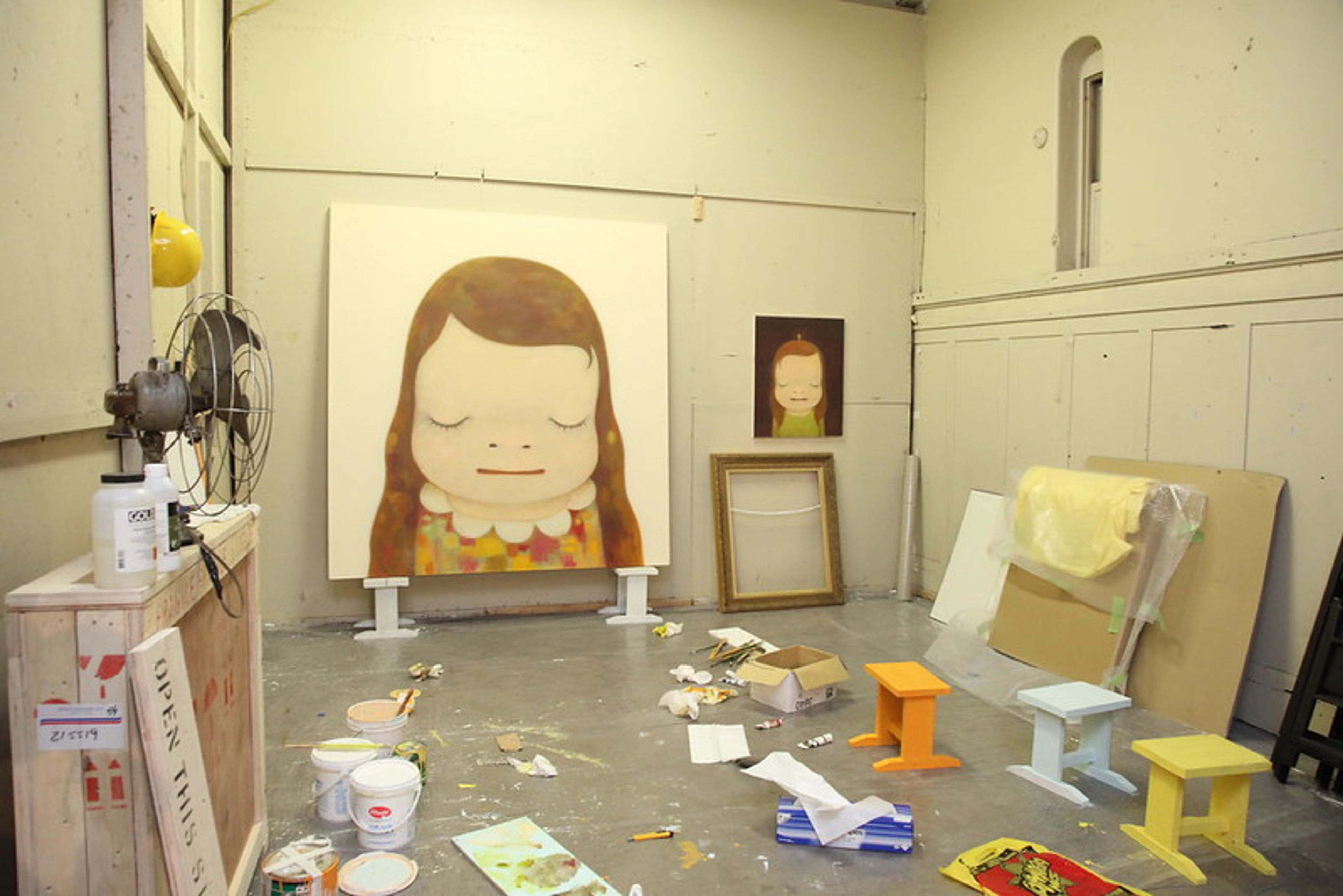
- Creative Process: Beyond their biography, understanding an artist's creative process can be incredibly illuminating. Do they work spontaneously or meticulously? Do they use sketchbooks for planning, or embrace happy accidents? Is their studio a chaotic mess or a minimalist sanctuary? Do they revisit themes repeatedly, or constantly experiment? How do they approach failure or breakthroughs? Insights into their routine, mental approach, and physical interaction with materials and tools (like specific brush types or palette knives) offer a direct line to their artistic decisions and the very genesis of the work, revealing the underlying emotional investment. Think of Pollock's action painting or the meticulous workshop practices of Renaissance masters.
- Historical Period: When was it made? What social, political, cultural, or artistic events might have influenced it? (e.g., Renaissance humanism, Impressionist focus on modern life, Modernist experimentation). This is also where the idea of "art movements" comes in – shared philosophies, styles, or goals that bind artists together for a period, influencing how they saw the world and chose to express it. Key art styles often reflect their times. Our guide to the history of art can offer broader context.It's fascinating how major technological advancements, like the invention of photography, irrevocably shifted art. Photography freed painting from purely representational duties, pushing artists towards abstraction and new ways of seeing. Similarly, new pigments in tubes allowed Impressionists to paint outdoors, changing their subjects and techniques.Moreover, before the modern era, art academies played a significant role. These institutions influenced artistic training, style, and acceptable subject matter, often dictating what was considered 'good' art and setting rigid hierarchies. Understanding their influence helps explain why certain artistic conventions persisted for centuries, and how later movements rebelled against them, like Impressionism's break from Salon traditions.
- Purpose/Patronage: Was it commissioned? For whom (church, royalty, private collector)? Was it for public display or private contemplation? This affects the subject, scale, and style. Was it made for a specific location or event? Also consider the rise of the art market and galleries as a context, shifting art creation from commission-based to market-driven, and how this influenced what artists made. The tastes and acquisitions of influential private collectors, beyond official patrons, have also significantly shaped art history, influencing trends, supporting experimental work, and building collections that eventually become public museums or foundations. Perhaps you'll even want to buy some art yourself from /buy!Beyond commissions, art has also historically served as propaganda or a powerful tool for social and political messaging. Whether promoting religious dogma, glorifying a ruler, or critiquing societal injustices, many artworks were created with the explicit purpose of influencing public opinion or reinforcing specific ideologies. Recognizing this underlying intention adds another layer to your interpretation, revealing how art isn't just about beauty, but also power. A powerful example is the work of Jacques-Louis David, often used to promote revolutionary ideals.
- Intended Audience: Beyond the patron, who was the artist's intended audience? Was it for the masses, a niche group, or fellow artists? The anticipated viewer might subtly (or overtly) influence stylistic choices, complexity of symbolism, or even the chosen subject matter.
- Genre Hierarchies: Historically, certain types of paintings were ranked. History Painting was often at the top, followed by Portraiture, Genre Painting (everyday life), Landscape, and Still Life. Understanding where a painting fits (or challenges) this hierarchy gives insight into its ambition and reception at the time.
- Cultural Context: What cultural norms, beliefs, or stories are relevant? Religious paintings rely heavily on shared cultural understanding. Symbols can mean different things in different cultures or times. Also consider Social Commentary – how paintings can reflect or critique the society they were made in, even subtly, linking back to the idea that art isn't made in a vacuum. I once saw a modern artwork using a traditional Western symbol for 'peace' (a dove), only to learn later that in the culture of the artist, that specific bird was seen as a harbinger of bad luck. Talk about a complete cultural misfire in interpretation!
- Provenance and Exhibition History: What's the painting's ownership history (provenance)? Knowing who owned it, where it's been displayed (exhibition history), and how it moved through the world can add layers of meaning or historical significance.Was it owned by a famous collector? Hidden during a war? Shown in a groundbreaking exhibition? This journey is part of the artwork's story. Provenance can sometimes reveal fascinating stories, like a painting being lost and rediscovered. Navigating the secondary art market often involves tracing provenance. Sometimes I imagine the 'secret life' my paintings lead after they leave my studio, traveling to new homes, hanging in different lights, perhaps even quietly witnessing new human dramas. It's a whimsical thought, but it underlines how art continues to evolve and live long after creation. I also recall the profound emotional impact when I learned the provenance of a beloved painting I own – knowing it had been passed down through generations of a family, witnessing their lives, gave it a weight and personal resonance far beyond its visual appeal.
- Artist's Intent vs. Evolving Reception: It's fascinating to consider how the meaning or reception of a painting can evolve over time. An artist might create a work with a clear intention, but as time passes, new cultural perspectives, historical events, or academic scholarship can shift how that work is understood. Consider Édouard Manet's Olympia, once a scandalous and shocking painting that challenged conventions, now a revered masterpiece of modern art, its meaning continually re-evaluated by successive generations. A painting seen as scandalous in its time might be a revered masterpiece today, or a piece intended for a specific purpose might gain new interpretations as its context changes. This dynamic interplay between the creator's initial vision and the audience's evolving understanding is a true dialogue with history, and it's a crucial part of art's enduring power.
- Critical Reception: How was it received when first shown? Praised, condemned, ignored? Reading contemporary reviews reveals how it was understood (or misunderstood) by its initial audience and how its reputation evolved. The ongoing work of art critics and art historians continuously shapes and re-shapes the understanding and value of artworks over time, building upon initial receptions and placing works within broader academic narratives. Art critics today still shape how we see things. I remember vividly receiving a scathing review for a piece I poured my heart into, while another, which felt almost accidental, garnered unexpected praise. It was a humbling reminder that once a piece leaves the studio, its reception is truly in the hands of the audience, and it's not always what you anticipate as the creator.
- Influence: Did this painting or artist influence later art? Recognizing its influence helps place it within the broader sweep of art history and understand its lasting impact. Great artists often leave a significant legacy.
- Physical Condition & Conservation: Has it been damaged or restored? Extensive conservation can alter the appearance from the artist's original intent. Knowing about significant interventions helps in evaluating what you are truly seeing. Information might be available from museum labels or conservation resources. It's a bit like knowing if an old building has been heavily renovated – it changes how you see the original structure. Cleaning can reveal brighter colors previously hidden under old varnish or grime.
- The Title: Don't underestimate the title! For any type of art, the title can be a key – sometimes a helpful hint, sometimes a deliberate misdirection, sometimes just a label. Does it describe the subject? Hint at a feeling? Pose a question? Knowing the title can subtly (or dramatically) shift your interpretation, directly affecting the emotional impact or narrative. Artists sometimes choose titles that are deliberately vague or misleading, just to see what happens! When I'm titling my own abstract works, I often wrestle with whether to be purely descriptive or to offer a poetic hint that nudges the viewer towards a feeling, without dictating a specific narrative. Sometimes, I'll even pick a title that's a bit ambiguous, just to spark that sense of personal discovery and allow for multiple interpretations.
- Physical Presentation & Viewing Context: Where are you seeing it? A grand museum gallery, a small independent space, online, or in someone's home? The frame, the hanging height, the lighting – these aren't trivial! A dramatic spotlight changes how you see texture and light/shadow compared to even gallery lighting or natural daylight. A heavy, ornate frame sets a different tone than a simple modern one. How art is presented physically affects your experience, and thus, its emotional impact. As an artist, I often think about how a piece will be framed or lit, as it's the final stage of shaping the viewer's experience, and sometimes it's a battle to get it just right! Even the viewing context itself – the quiet reverence of a museum vs. the buzz of a gallery opening vs. seeing it on a screen – subtly shifts your perception. I've seen my own work look completely different depending on the lighting and the wall color; it's a reminder that presentation is part of the experience.
7. Facing the Blank Wall (or Canvas): Overcoming Art Anxiety
Okay, let's pause for a moment. Does all this sound a bit... intimidating? Like there's a secret handshake you missed? Or maybe you're looking at something totally abstract and thinking, "Seriously, my kid could do that" (A common thought, though often an unfair one!). I once spent a whole afternoon trying to get a particular shade of grey to feel 'alive' – it looked simple, but it fought me every step of the way, resisting any hint of vibrancy until a final, almost accidental, brushstroke changed everything. The truth is, that 'simplicity' is often the hardest thing to achieve. You're not alone. Feeling intimidated, worrying there's a single "right" answer you're missing, or feeling like you just don't "get" abstract art are super common anxieties. Even as an artist, I sometimes stand in front of a piece and feel completely lost, wondering if I've missed some crucial clue. It happens! Embrace the discomfort or confusion as part of the process, rather than seeing it as a failure to understand; it's often a sign of genuine engagement and the beginning of deeper insight.
I remember once walking past a very minimalist installation, thinking, "That's just a pile of bricks, how is this art?" I literally walked away. Years later, I learned the incredible social and historical context of that exact piece, and revisiting it (even online) made me realize how quickly I'd dismissed something profound simply because it didn't fit my preconceived notions of 'pretty' or 'complex'. It was a valuable lesson in keeping an open mind!
The truth is, there's no single "right" way to feel or interpret. Art is complex, and it's meant to be explored, not solved like a math problem. Think of this guide not as a rulebook, but as a set of suggestions, tools to help you look a little closer, think a little deeper. It's okay to not like something. It's okay to be confused. The goal isn't to become an art history professor overnight, but to find ways to connect with art on a more meaningful level, whatever that means for you. Your perspective is valuable precisely because it's yours. Don't fall into common pitfalls like dismissing a piece because it's not 'pretty' or searching desperately for a hidden message that isn't there. Trust your eyes and your feelings, and use these tools to understand why you feel that way. For example, you might look at a piece of abstract art that seems simple, but when you apply these tools, you see the artist made complex choices about color relationships or texture that create a specific feeling or energy. A couple of simple strategies to try when feeling overwhelmed:
- Start by focusing on just one element at a time – maybe just look at the colors, or trace the lines with your eye. This simplifies the process and makes it less intimidating.
- Imagine you're explaining the painting to a friend who knows nothing about art; how would you describe what you see and how it makes you feel? This often makes the process less daunting.
- Try sketching what you see, even if badly, to force yourself to observe details and relationships you might otherwise miss. You'd be surprised what you notice when your hand is trying to replicate what your eye sees.
- Consider its 'personality'. If this painting were a person, what kind of person would it be? What emotions does it embody? This can sometimes help shift your perspective from analytical to empathetic.
8. Interpretation: Bringing It All Together (And Trusting Yourself)
Based on everything you've observed – your initial reaction, the formal elements, the technique, the context, any symbolism – what do you think the painting is saying? This is where you synthesize everything. Remember, interpretation is an ongoing process; your understanding of a painting can change over time as you learn more or your own life experiences shift. The goal is to build a well-supported subjective interpretation – a dynamic conversation between the artist's original impulse, the artwork's visual language, and your evolving perspective – rather than implying a single, unchanging objective meaning.
- Start by combining your observations of the subject (or dominant forms if abstract) and the formal elements such as composition, color, line, space, and texture, paying close attention to the emotional impact each element contributes.
- Then, layer in the insights from the artist's technique, including the medium, support, application methods, and even the varnish.
- Finally, weave in the broader context, encompassing the artist's background, historical period, purpose, provenance, reception, influence, title, physical presentation and viewing context, any social commentary, and insights from the art market. Don't forget to consider any potential symbolism.
- What story is being told? What ideas, emotions, or experiences is the artist exploring? How does the how (formal elements, technique) and the why (context, intent) inform the what (subject, message)?
- Remember, interpretation is inherently subjective, but the strongest interpretations are those well-supported by visual evidence and contextual understanding. There might not be one single "right" answer, but some interpretations are better supported than others. Aim to build a persuasive case for your reading, linking your feelings and ideas back to what you actually see.
- Interpreting Abstract Art: When faced with abstract art, the synthesis shifts slightly. Since there's no recognizable subject, you focus intensely on how the formal elements (color, line, shape, form, texture, composition, movement, value, saturation, negative space) interact to create a visual experience. How do the artist's choices in technique and medium contribute to this? What does the context (artist's statements, historical period, title) suggest about the intent behind these non-representational elements? The interpretation becomes about the experience the painting creates and the ideas it evokes through its pure visual language, rather than a narrative or depiction. Think about abstract art like music – it doesn't depict things, but it evokes feelings and ideas through rhythm, harmony, tension, and energy. Or, imagine it as a piece of abstract poetry, where the arrangement of words and sounds creates meaning through suggestion and feeling rather than literal description.
9. Putting It All Together: A Mini-Analysis Example (Through My Eyes)
Let's try a quick practice run, thinking about a colorful abstract painting. Imagine something like this, bursting with color and energy:
Take a moment. What do you see in Kandinsky's "Brown Silence" shown above? Apply the checklist questions. What are your first impressions, feelings, and what formal elements stand out to you? Once you've spent a few minutes forming your own thoughts, continue below to see how I'd approach reading it, step-by-step.
- First Glance & Gut Reaction: Wow, vibrant! Feels energetic, maybe a bit wild, but also joyful. Makes me think of nature, but not literally. It pulls me in with the swirling lines.
- Personal Connection: It reminds me of the feeling of being outdoors on a bright, slightly windy day, where everything feels alive. The blues and greens feel grounding, while the yellows and reds add excitement.
- Subject Matter: Abstract. Dominant forms are swirling lines, organic shapes, bold color areas.
- Formal Analysis (Artist's Thoughts):
- Composition: I wasn't aiming for perfect balance, more a sense of dynamic flow. The strong diagonal lines and curves create movement, leading the eye around. There's a central cluster of energy, but the lines push outwards too. I used overlapping shapes to create a sense of layered space, not deep perspective, but like things are pushing forward or receding slightly. My goal was for the yellow circle to act as a kind of focal point, maybe like a sun, drawing your eye. The overall size feels expansive, contributing to the sense of a vast sky or landscape. Honestly, getting that central cluster of energy to feel 'right' took countless adjustments; sometimes it felt too dense, other times too scattered, like trying to arrange a spontaneous conversation on canvas!
- Color: I chose these colors for their emotional punch. The blues and greens are cool and calming, contrasting with the warm, energetic reds, oranges, and yellows. I used complementary colors (like blue and orange) next to each other to make them vibrate and feel more alive. When I choose colors, I think about the feeling I want to evoke – joy, energy, a connection to the vibrant parts of nature. It's less about depicting reality and more about creating a visual symphony of feeling. I also played with value and saturation to create depth and intensity.
- Line: Lines are crucial here! They aren't defining objects; they are the energy. The thick, swirling lines create rhythm and movement. The thinner lines add detail and texture. They feel organic, like wind or water or growing things.
- Light/Shadow: Not traditional, but the contrast between the bright yellow and the darker blues/reds creates highlights and depth. It's more about creating visual punch than modeling form. I wanted the light to feel internal, radiating from within the piece, rather than cast from an external source.
- Texture: I probably used some impasto here, letting the paint build up to add physical texture and emphasize the energy of the brushstrokes. I want you to see and feel the paint itself. It adds another layer of sensory experience, almost like I'm inviting you to touch the surface and feel its history.
- Space: It's ambiguous. Overlapping shapes and color layering create a sense of depth, but it's not a realistic space. It's more of an emotional or energetic space. I also thought about the negative space between the forms, making sure it felt active and contributed to the overall flow. For me, it's like creating a world you can wander through, even if it defies literal mapping.
- Scale/Proportion: The shapes vary in size, creating visual interest and rhythm. The overall scale feels expansive, like a big sky or landscape. I aimed for a sense of monumental natural forces at play, even in a relatively small canvas.
- Brushwork: Definitely visible and energetic! I want you to see the movement of my hand, the speed and direction of the strokes. It's part of the painting's story, a trace of the energy that went into making it. For me, the brushwork is a direct record of my emotional state during creation.
- Shape and Form: The shapes are mostly organic, flowing into one another. While it's a 2D painting, the layering and color shifts create a sense of form, suggesting undulating hills or swirling masses of energy. I deliberately let the forms emerge and dissolve, hinting at something recognizable but never fully defining it.
- Technique/Medium: Looks like acrylic on canvas. Acrylic because I like the vibrant color and how it dries relatively quickly, allowing for layering. I probably used brushes and maybe some palette knives for the thicker textures (impasto). I might have done a quick underpainting to block in the main color areas. The varnish looks like it might be semi-gloss, allowing some color depth without too much reflection. This balance between vibrancy and subtlety was crucial to the feeling I wanted to achieve.
- Context: If this were my piece, the context would be my interest in the emotional power of color and form, my connection to nature, and my process of letting the painting evolve organically. The title, "Brown Silence," offers a clear hint towards a natural, dynamic theme, perhaps even a contradiction or paradox. Knowing the artist's background or statement would add another layer – perhaps they were inspired by a specific landscape or a scientific concept, or even by artists like Kandinsky, who also explored color and form for spiritual expression.
- Interpretation: This painting is an expression of dynamic natural energy and the feeling of vibrant life. It's a visual symphony of color and line, inviting the viewer to feel the rhythm and movement rather than look for recognizable objects. The artist used bold colors and energetic brushwork to convey a sense of joy and wildness, perhaps reflecting on the raw power and beauty of creation. The abstract forms and intense colors create an immersive experience that bypasses literal representation to evoke a direct emotional response. It's about the experience it creates.
See? By systematically looking, thinking about the elements, considering context, and allowing for personal response, even a complex abstract work becomes approachable. It's about asking questions and seeing where the painting leads you.
10. Summary: Your Art Reading Checklist
Ready to get practical? To make your journey into reading art even smoother, here's a quick checklist to keep handy as you practice reading paintings. Remember, this is a guide to spark your curiosity, not a test you need to ace every time! You don't have to hit every single point on every painting; just pick a few to focus on.
Element | Questions to Ask |
|---|---|
| First Impression | What's your immediate gut feeling? What mood does it set? |
| Personal Reaction | How does it make you feel? Why? Does it remind you of anything? |
| Subject | What/Who is depicted? What's happening? If abstract, what forms/colors dominate? |
| Principles of Design | How are elements organized for unity/harmony, variety, emphasis/focal point, balance, contrast, rhythm, movement, or pattern? |
| Composition | How are things arranged? Where does your eye go? Balanced or dynamic? What structure (pyramidal, etc.)? Why this choice? |
| Rhythm & Movement | How do repetition/lines create flow? Static or dynamic? |
| Implied Lines | Are lines suggested by gaze, gesture, or arrangement? Where do they lead? |
| Scale & Proportion | How large are elements relative to each other/overall size? Realistic or hierarchical? How does physical size affect experience? |
| Visual Weight | How is visual weight distributed (balanced/tense)? What elements feel 'heavy' and why? |
| Shape & Form | Are shapes geometric or organic? How is 3D form suggested (or flattened)? Why these choices? |
| Color | What colors? Warm/cool, bright/muted? Mood? Realistic/expressive? Emotional impact? Why these choices? |
| Value | How light or dark are colors? How does this create contrast or model form? |
| Saturation | How intense or pure are the colors? Vibrant or subtle? Why these choices? |
| Color Harmonies | Complementary, analogous, triadic harmony used? Effect? Why these choices? |
| Line | Sharp, soft, curvy, straight? Define or convey energy? Emotional quality? Why these choices? |
| Light/Shadow | Light source? High contrast (chiaroscuro, tenebrism) or low? Mood/volume created? Why these choices? Can it suggest time or atmosphere? |
| Texture | Implied texture (looks rough/smooth)? Actual texture (impasto)? Sensory/emotional effect? Why use this texture? |
| Space | Deep or flat feel? How is depth suggested (linear perspective, overlapping objects, atmospheric perspective)? Ambiguous? Why flatten space? |
| Negative Space | How is the space around and between objects used? Does it contribute to the composition? |
| Foreshortening | Are objects projected realistically towards/away? Effect on depth/immediacy? |
| Brushwork | Visible/energetic or smooth/blended? Artist's hand revealed? What energy does it convey? Does it suggest speed or hesitation? Why these choices? |
| Medium | What materials (Oil paint, Acrylic, Fresco, Watercolor, Encaustic, Tempera, Egg Tempera, Pastel, Gouache, Mixed media)? Properties? How does it affect the look/feel? Why this medium? Medium specificity? |
| Support | What surface (Canvas, Wood panel, Paper, Metal, Wall)? How does it affect appearance? (e.g., gesso) |
| Technique | How applied (Impasto, Glazes, Washes, Scumbling, Grisaille, Sfumato, Alla prima, Gestural strokes, Underpainting, etc.)? Tools used? What visual/emotional effect does the technique create? Why these techniques? |
| Varnish | Is there a varnish? Is it glossy or matte? How does it affects the appearance? |
| Context | Who made it? When? Why? Historical/cultural background? Artist's intent/artist's statements? Creative process? Artist's Influences? Title? |
| Primary Sources | Are there sketchbooks, preparatory studies, artist's manifestos, or writings that offer insight? |
| Genre Hierarchy | How does it fit traditional subject rankings? (If applicable) |
| Purpose/Patronage | Was it commissioned? For whom? Public/private? Art market context? Intended audience? Was it used as propaganda or social commentary? |
| Cultural Context | What beliefs/stories are relevant? Social commentary? |
| Provenance/Exhibition history | Ownership history? Where has it been shown? Significance? How has its meaning/reception evolved over time? |
| Critical Reception | How was it received initially? How did its reputation evolve? |
| Influence | Did this painting or artist influence later art? |
| Condition | Any significant damage or conservation affecting appearance? |
| Physical Presentation | Frame? Hanging height? Lighting? How does this affect the experience? |
| Viewing Context | Museum, gallery, online, home? How does the setting influence perception? |
| Symbolism/Iconography | Symbolic meaning? Common symbols? Specific attributes identifying figures? Personal symbols? Universal archetypes? Is everything a symbol? (Over-interpreting symbolism pitfall?) |
| Interpretation | Synthesize observations: What's the story/idea/emotion? Grounded in evidence from formal elements, technique, context, and symbolism? (For abstract: What is it doing? How does it make me feel?) |
11. Diving Deeper: Where to Find More Clues
While looking is paramount, sometimes you need more information to fully unlock a painting's context or symbolism. Think of these as your detective tools. They help fill in the gaps that looking alone can't provide. Remember, research supports observation; it doesn't replace it. Start with looking, then use resources to answer specific questions that arise. Think of it as building a case – you need both the visual evidence and the background information.
- Museum Websites & Labels: Often the best starting point. Museum websites usually have online collection databases with information about artworks, artists, periods, and sometimes even essays or audio guides. Wall labels in the gallery provide essential details. Explore resources from famous museums worldwide.
- Exhibition Catalogues: Catalogues for specific exhibitions often contain detailed essays by curators and scholars, offering in-depth analysis and context.
- Artist Biographies & Monographs: Books dedicated to a single artist's life and work provide rich biographical context and detailed analyses.
- Art History Books & Academic Journals: General surveys provide broad context, while specialized books and journals offer focused research.
- Catalogues Raisonnés: Comprehensive, scholarly compilations of all known works by a single artist. The ultimate authority, but specialized.
- Primary Sources: Don't forget things like the artist's sketchbooks, preparatory drawings, studies, letters, or diaries. These offer direct insight into their process, thoughts, and intentions in a way finished works or later analysis can't. It's like reading their mind as they worked. Artist interviews, whether written or video, are also invaluable. Hearing an artist speak about their work, their struggles, their breakthroughs, or even their seemingly tangential inspirations can be like receiving a personal decoder ring for their visual language. I vividly recall researching a contemporary artist whose abstract works I found perplexing; then I stumbled upon an old interview where she spoke about her fascination with subatomic particles and quantum physics, and suddenly, her swirling, layered compositions clicked into place. It was like a hidden key unlocking a whole new universe of meaning. Also, look for artist's manifestos – declarations of their artistic intentions, philosophies, or the principles of their movement. These can be incredibly direct and powerful keys to understanding the core ideas driving their work, almost like a mission statement for their art. When you're starting out, museum websites are your best friends. Browse their online collections first, then if a piece really catches your eye, branch out to more specialized books or journals for a deeper dive.
- Art Documentaries and Online Courses: Increasingly accessible ways to dive deeper, offering visual context and expert commentary on artists, movements, and techniques.
12. Frequently Asked Questions (Artist Edition)
Let's tackle some common questions you might have, from my perspective as someone who makes art and thinks about it constantly. Because honestly, we artists are sometimes just as confused as anyone else, even when it comes to our own work!
Q1: Is there only one correct way to interpret a painting?
A: Absolutely not! And honestly, thank goodness for that. If there were only one answer, art would be a lot less interesting. While understanding the artist's likely intent and historical context gives you a solid foundation, your personal experiences and perspective are going to shape how you see it. The most compelling interpretations are those you can back up with what you see in the painting and what you know about its context. Think of it as building a really good case for your reading, not finding the single key that unlocks the one true meaning. It's a conversation, not a quiz.
Q2: Do I need to know art history to read a painting?
A: Knowing art history is super helpful, like having a map for a new city. It gives you context – understanding periods, movements, influences, why certain things were done at certain times. It helps decode symbolism. But you don't need a degree to start! Focusing on the formal elements – the colors, lines, shapes, how things are arranged – is something anyone can do, right now. That's the painting's basic language. Art history just adds layers of nuance and backstory. Start with looking, and let your curiosity guide you to the history. You can always look things up as you go!
Q3: What if I don't "like" the painting?
A: That's totally fine! "Reading" a painting is about understanding it, not necessarily falling in love with it. You can analyze why it doesn't resonate with you. Is it the colors? The subject? The style? Sometimes understanding why you don't like something, based on its formal elements or message, is just as insightful as understanding why you do. It's all part of defining your own art taste. My studio is full of pieces I don't like, but I keep them around because I'm still learning from them.
Q4: Where should I start looking when I analyze a painting?
A: Start with that first gut feeling! Then, just let your eyes wander. Where do they naturally go? Artists often guide your eye with contrast, bright colors, or interesting details. Follow the lines, notice the big shapes, see how the colors make you feel. There's no single right path across the canvas. Just explore, like walking through a new place, and see what catches your attention. Then, you can start asking why it caught your attention. Don't overthink it initially; just look.
Q5: How do I interpret abstract art if it doesn't "mean" anything specific?
A: Ah, the abstract art question! This is where you shift from asking "What is it?" to "What is it doing?" and "How does it make me feel?" Forget finding hidden objects. Focus entirely on the formal elements – the colors, lines, shapes, textures, how they interact. How do those elements create energy, tension, calm, or excitement? It's a common thought to think your kid could do that – and honestly, sometimes I look at a seemingly simple abstract piece of my own and think, 'Did I really spend three days wrestling with that particular shade of grey to achieve that specific sense of quiet tension, or did it just happen?' But then I remember the layers of intention, the subtle push and pull of colors, the quiet decisions that underpin even the most spontaneous-looking gesture. The simplicity is often the hardest thing to achieve. Look at the artist's process – the visible brushstrokes, the layers, the medium. Research the context – what was the artist trying to explore? Abstract art communicates directly through its visual language, aiming for an emotional or sensory experience. Its "meaning" is often found in that direct impact on you and the artist's intention behind the visual choices. Think about abstract art like music – it doesn't depict things, but it evokes feelings and ideas through rhythm, harmony, tension, and energy. Or, imagine it as a piece of abstract poetry, where the arrangement of words and sounds creates meaning through suggestion and feeling rather than literal description.
Q6: Can an interpretation be "wrong"?
A: While subjectivity is key, an interpretation can be weak if it's completely unsupported by what you see or know about the context. If you say a painting with dark, muted colors and jagged lines feels joyful, without explaining how those elements create joy, that's a tough case to make! A strong interpretation is like a good story – it needs evidence. It should be grounded in observation and informed by context, even if it's a personal reading. It's about making a case for your perspective.
Q7: How important is knowing about things like Provenance or Conservation History?
A: For a casual look, maybe not crucial. But for a deeper understanding, especially of older works, they add fascinating layers. Provenance is the painting's biography after it left the studio – who owned it, where it traveled. It tells you about its life in the world. Conservation history tells you if the painting has changed over time due to damage or restoration. Knowing this helps you understand if what you're seeing is exactly what the artist intended. It's like knowing if an old building has been heavily renovated – it changes how you see the original structure. Or, as I've seen in my own work, a simple cleaning can reveal brighter colors previously hidden under old varnish or grime, completely changing the artwork's vibrancy. This info usually requires digging into those research resources we talked about. It adds depth, but you don't need it for a basic reading.
Q8: What are some common pitfalls or misconceptions when trying to read art?
A: Oh, there are a few! One is definitely searching for the single, hidden meaning – art is rarely that simple. Another is dismissing abstract art because it doesn't look like something recognizable; you miss the whole point of its visual language. Feeling unqualified to have an opinion is a big one; your personal response is valid! Also, getting bogged down in historical facts without actually looking at the painting, or conversely, ignoring context entirely. It's a balance!
Q9: How long should I spend looking at a painting?
A: There's absolutely no rule! It depends entirely on the painting and how it connects with you. Sometimes a quick glance is enough to get a strong feeling. Other times, you might stand in front of a piece for ten minutes, half an hour, or even longer, noticing new details and letting it sink in. Don't feel pressured to spend a certain amount of time. Just stay as long as you feel engaged or curious.
Q10: Is it okay to just enjoy a painting without analyzing it?
A: A thousand times, yes! Analysis is a tool to deepen understanding, but it's not a requirement for appreciating art. If a painting simply brings you joy, makes you feel something, or you just like looking at it, that is perfectly valid and wonderful. Don't feel like you have to dissect every piece. Sometimes, simple, pure enjoyment is the most profound connection of all.
Q11: Do these principles apply to digital art or new media?
A: Absolutely! While the mediums and supports change, the fundamental principles of formal analysis often remain relevant. For digital art, you'd still consider composition, color, line, light, and how they create a visual experience. Texture might be implied through pixels rather than physical impasto, and the "brushwork" could be algorithms or digital strokes. Context and intent are just as crucial, perhaps even more so, as artists experiment with new forms of expression. The core idea is always to ask: What visual choices did the artist make, and why? How do those choices create meaning or evoke a feeling?
Q12: How do I develop my own 'eye' for art?
A: It's less about a secret technique and more about consistent, curious engagement. First, look actively: don't just passively view art. Apply the questions from our checklist. Second, engage with diverse art: visit museums worldwide, browse online galleries, look at everything from Renaissance to contemporary. The more you see, the more patterns, styles, and choices you'll begin to recognize. Third, reflect and journal: write down your initial reactions and observations. Over time, you'll see your preferences and understanding evolve. Fourth, learn from artists: follow artists you admire, watch studio tours, read their statements. Understanding their process can illuminate your own viewing. Finally, trust your gut: your personal response is a valid starting point. The 'eye' isn't just about knowledge; it's about developing your sensitivity to visual language, and that comes from repeated, thoughtful exposure. It's like training a muscle – the more you use it, the stronger it gets.
13. Practice Makes... More Interesting Looking!
The more you practice reading paintings, the more intuitive and rewarding it becomes. It's like learning any new skill – the first few times feel clunky, but then it starts to flow. Visit galleries and museums (maybe even my little museum in 's-Hertogenbosch if you're ever in the Netherlands!), look at art online, and consciously take the time to analyze what you see using these steps. Don't just glance; actively apply this checklist. Engage. Ask questions. Look closely. And importantly, revisit paintings! You'll often notice new things, and your understanding and appreciation can deepen with repeated viewing. And here’s a thought: try making something yourself! Even a simple exercise like sketching a still life, trying a quick watercolor wash, or deliberately composing a photo with leading lines can give you an immediate, visceral understanding of the artistic decisions involved. It's like learning to drive a car versus just reading about it – suddenly, you feel the mechanics and the nuances in your own hands. You might even challenge yourself: pick a painting you initially don't like and try to analyze why using this checklist, or compare two very different paintings (e.g., a realistic portrait and an abstract landscape) to see how the same formal elements are used differently. You'll start to discover layers of meaning you never noticed before and appreciate the incredible richness and complexity of visual art on a much deeper level. You might even start defining your own art taste more clearly!
Conclusion: The Ongoing Conversation
Learning to read a painting is an ongoing journey, not a destination. It's about opening yourself up to a conversation with the artist, across time and space. It's about using your eyes, your mind, and your feelings to connect with something created by another human being, and allowing that connection to change and grow over time. It can be challenging, confusing, and sometimes, absolutely breathtakingly rewarding. So next time you stand in front of a painting, take a moment. Take a breath. And start reading. The painting is waiting to tell you its story, and perhaps, reveal a little bit of yours. It's a door waiting to be opened. What story will you discover next?
Find out more about my artist's journey on my timeline.