The Ultimate Guide to Mark Rothko: Master of Immersive Color
Ever stood in front of a painting that just... washes over you? That bypasses your brain and hits you somewhere deeper? If you have, chances are it might have been a Mark Rothko. It's a feeling that's hard to put into words, isn't it? Like the color itself is breathing, or maybe it's you that's breathing differently in its presence. Mark Rothko (1903-1970) stands as a giant within the landscape of 20th-century art. An American painter originally from Latvia, he was a leading figure of Abstract Expressionism, yet carved a unique path distinct from the gestural "action painting" of contemporaries like Jackson Pollock. But Rothko? He was after something else entirely. He wanted to hit you right in the gut, aiming to express... well, the big stuff. Profound human emotions – tragedy, ecstasy, doom – through the luminous, enveloping power of pure color. His signature Color Field paintings remain some of the most recognized and emotionally resonant works of Modern Art.
This guide offers a comprehensive exploration of Mark Rothko's world: his compelling life story, the evolution of his artistic style from early representation to his iconic abstractions, the techniques behind his mesmerizing canvases, his major commissions like the Rothko Chapel, and his enduring legacy. Think of it as stepping into a conversation about an artist who wanted his work to be an experience, not just something you look at. And maybe, just maybe, finding a little bit of yourself in the process.
Mark Rothko: The Life Behind the Canvases
Understanding Rothko's art is enriched by understanding the man and his journey. It wasn't a straightforward path, and honestly, whose is? His life story feels intertwined with the intensity of his work. It makes me wonder how much of ourselves we truly pour onto the canvas, whether we intend to or not.
- Early Life (1903-1920s): Born Marcus Rothkowitz in Dvinsk, Russian Empire (now Daugavpils, Latvia), into a Jewish family, he emigrated to Portland, Oregon, with his family in 1913 to escape Cossack persecution. Imagine leaving everything behind at age 10, crossing an ocean, and landing in a completely new world. That kind of seismic shift must leave a mark, shaping a young mind in ways you can only guess at. The family settled in Portland, where Marcus quickly adapted, excelling academically and showing early artistic talent. He eventually dropped out of Yale University – a bold move, right? – and moved to New York City in 1923 to pursue art.
- Formative Years (1920s-1930s): He studied briefly at the Art Students League under Max Weber, an artist known for his early American Cubism and Expressionism. Weber's emphasis on form and structure, even in abstraction, likely laid some groundwork. But it was his association with artists like Milton Avery, known for his flattened forms and bold use of color, that seems to have profoundly influenced Rothko's developing palette and his move away from strict representation. You can see hints of this shift in some of his early, more expressive urban scenes or portraits before he fully embraced abstraction. He also taught art during this period, including at the Center Academy in Brooklyn and later at Brooklyn College. He reportedly emphasized the emotional and expressive potential of art to his students, a clear foreshadowing of his later focus. I wonder how articulating his ideas to students might have solidified his own thinking? It's like trying to explain your messy creative process out loud – sometimes it just clicks into place.
- The New York School & Abstract Expressionism (1940s): Rothko, alongside artists like Adolph Gottlieb, Barnett Newman, Clyfford Still, and Jackson Pollock, formed the core of the burgeoning Abstract Expressionist movement. The 1940s in New York were a crucible – post-war anxiety, the echoes of European Surrealism (with its fascination for myth and the subconscious), and a deep search for universal truths in a fractured world. This was the intellectual and emotional climate that fueled the New York School. Rothko moved decisively towards abstraction during this time, seeking universal themes beyond depicting the visible world. He wasn't interested in painting things anymore; he wanted to paint ideas and feelings. His engagement with Surrealism, particularly its interest in automatic techniques and mythology, was a crucial step. He explored biomorphic forms and mythic titles, trying to tap into a universal subconscious, much like European Surrealists such as Joan Miró or Yves Tanguy were doing. It was a way to bypass the conscious mind and reach something deeper, a search for content that transcended the everyday. Beyond Surrealism, Rothko was a voracious reader and thinker, deeply influenced by philosophy and classical literature. He spoke of the ideas of Nietzsche, particularly The Birth of Tragedy, and the profound emotional dramas of Greek tragedy as key inspirations. But his intellectual curiosity didn't stop there; he engaged with a wide range of philosophical thought, including ideas that touched upon existentialism and the human condition, and found resonance in the works of poets who grappled with similar themes of spirituality and the sublime. He saw his paintings as modern equivalents of these ancient forms and profound ideas, capable of evoking the same sense of awe, fate, and catharsis. It wasn't just about aesthetics; it was about grappling with the fundamental human condition on the canvas.
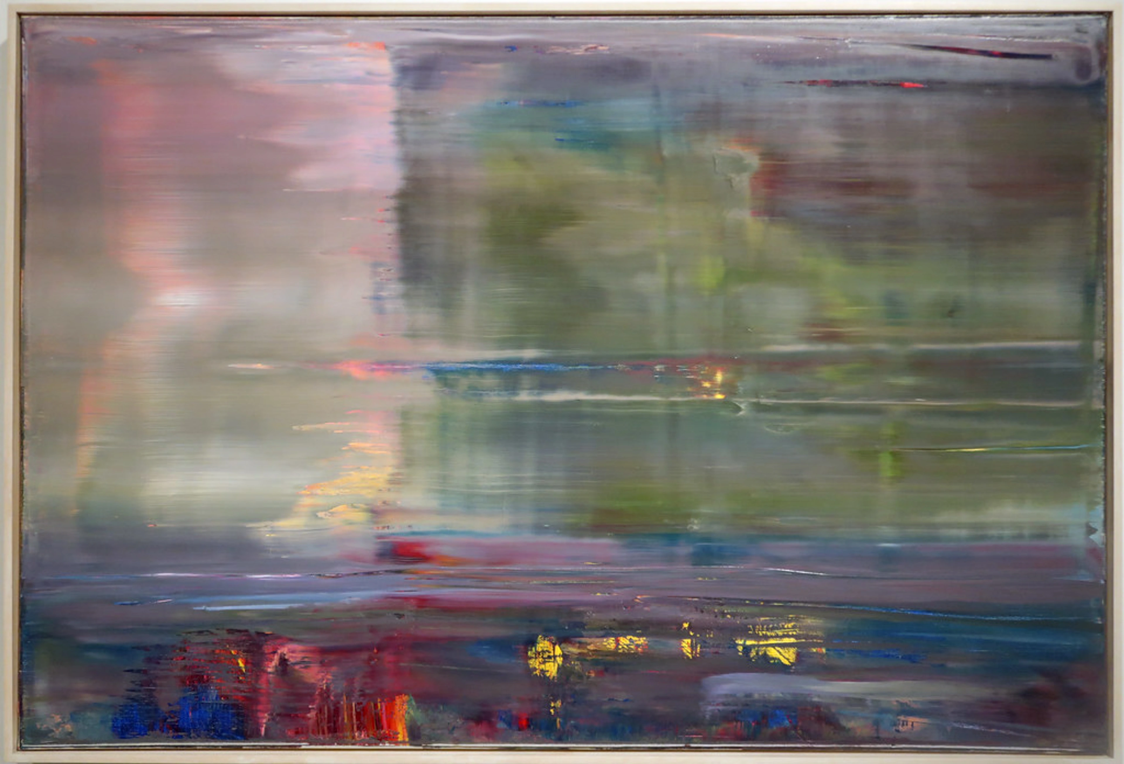
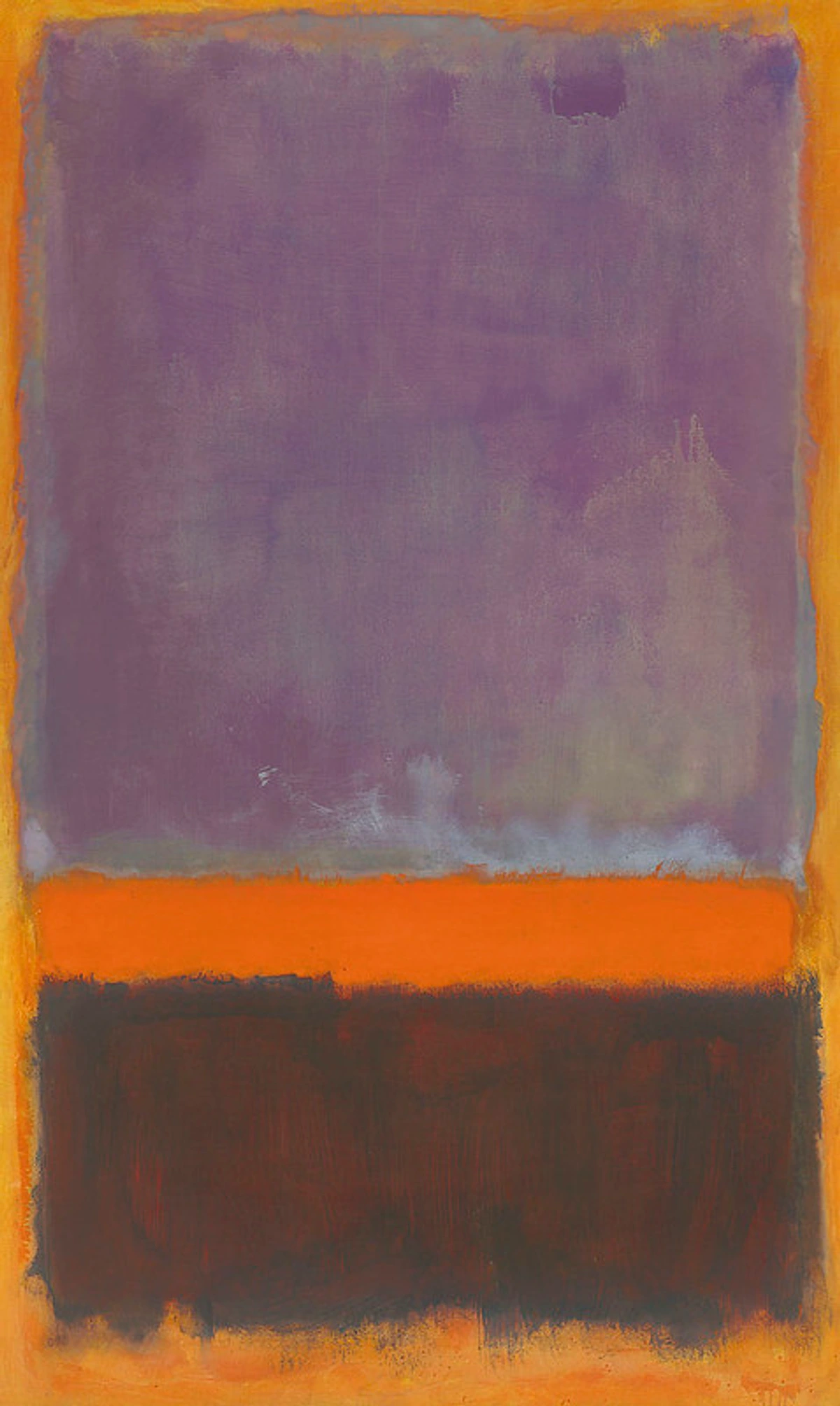
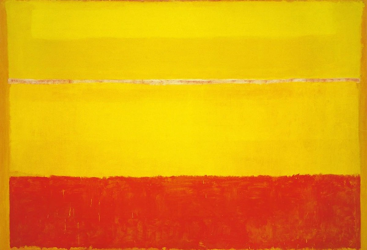
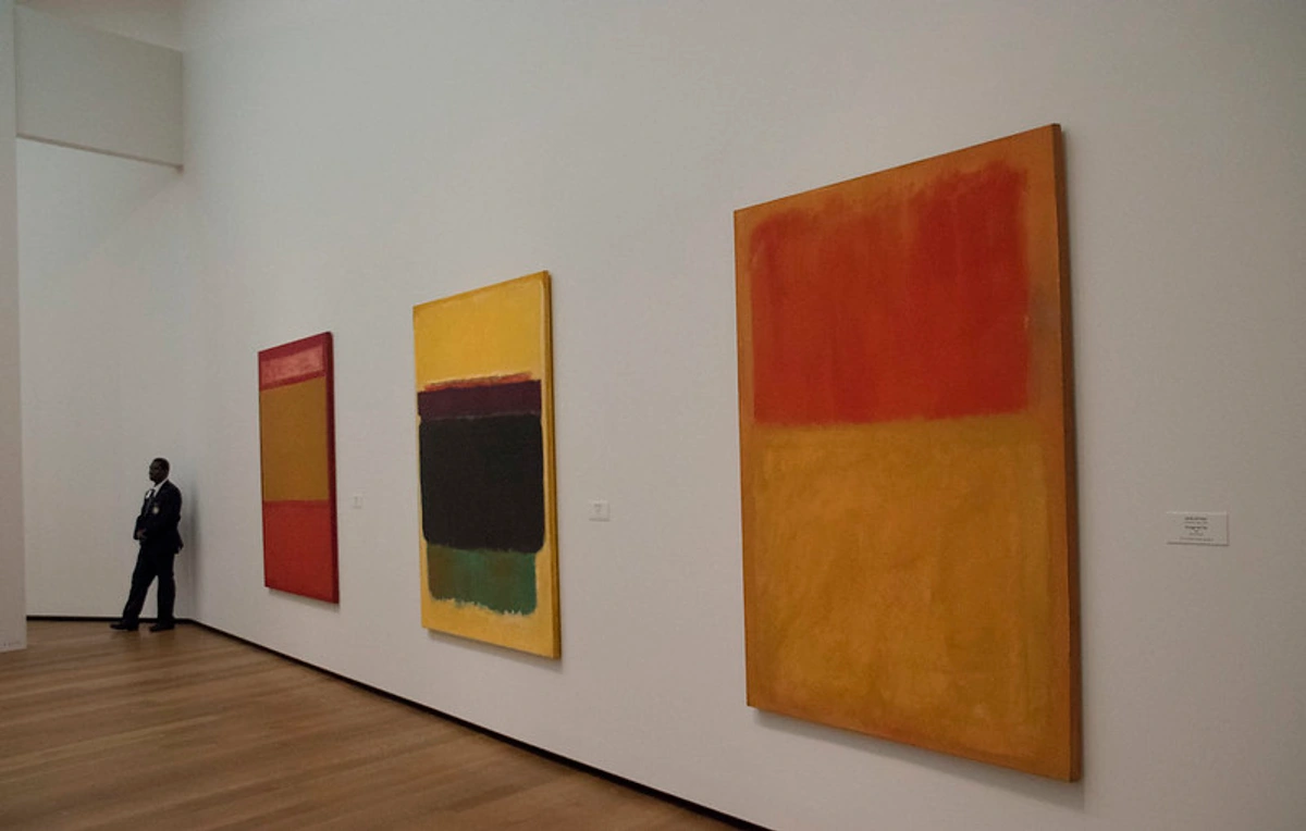
- Development of Signature Style (Late 1940s - 1950s): Rothko abandoned mythological and biomorphic forms for what he termed "Multiforms" – canvases with loosely defined, floating patches of color. Think of them like soft-edged clouds of color, hovering on the canvas, with no clear figure or ground. A painting like No. 18 (1948) is a great example – it's a vibrant arrangement of irregular, soft-edged color areas that seem to float and interact, a clear step away from earlier figurative or surrealist hints but not yet the stacked rectangles. Unlike the later, more structured Color Fields, Multiforms often featured a greater variety of shapes and a more spontaneous, less hierarchical arrangement of color areas. They were generally smaller than the monumental works that followed, a crucial transition, a stepping stone away from any hint of representation towards pure abstraction, where color and form existed solely for their own sake and their emotional potential. Early critics sometimes found these works baffling or empty, struggling to reconcile their apparent simplicity with the profound emotional weight Rothko intended, a reaction that would follow him throughout his career. By around 1949-1950, these coalesced into his classic format: large vertical canvases dominated by two or three soft-edged, stacked rectangles of luminous color. This breakthrough brought him increasing critical acclaim and gallery representation (notably with Betty Parsons and later Sidney Janis). It took time for the art world, and the public, to catch up to what he was doing. It's a familiar story for artists pushing boundaries, isn't it? You have to wait for the world to catch up to your vision.
- Final Years & Tragic End (Late 1960s-1970): Battling health problems (an aortic aneurysm), depression, and marital separation, Rothko's palette often darkened. He completed the intense, somber paintings for the Rothko Chapel. Works from this period, like the powerful Black on Grays series (1969-70), show a stark, almost monochromatic shift, moving away from the vibrant hues of the 1950s towards deep, resonant blacks, grays, and browns. It's impossible, and perhaps unfair, to draw simple lines between Rothko's inner turmoil – his documented struggles with depresssion and anxiety, particularly in later years – and the darkening palette of his final works. Art isn't just autobiography. Yet, knowing the weight he carried adds another layer to experiencing those deep, somber canvases. They feel less like aesthetic choices and more like existential statements, wrestling with the profound emotions he spoke of. His pursuit of the transcendent through art was relentless, demanding, and ultimately, perhaps intertwined with the personal darkness that led to his tragic end. His complex, dedicated artistic journey, filled with such intensity, reflects this complex interplay between creation and the human condition.
Rothko's Artistic Evolution: From Representation to Immersion
Rothko's path to his signature style was a gradual but deliberate evolution. It wasn't a sudden leap, but a thoughtful shedding of layers, moving closer and closer to the core of what he wanted to express. Understanding this journey helps us appreciate the final destination – those immersive color fields. It's a bit like watching a plant grow, slowly unfurling towards the light, shedding old leaves as it goes.
Here's a quick look at the key phases of his artistic development:
Phase | Approx. Dates | Key Characteristics | Notes |
|---|---|---|---|
| Early Representational | c. 1920s-1930s | Figurative, urban scenes, portraits, expressive realism | Influenced by Avery, Expressionism |
| Surrealist / Mythological | c. 1940-1946 | Biomorphic forms, mythic titles, automatic techniques | Search for universal content |
| Multiforms | c. 1946-1949 | Abstract patches of color, soft edges emerging, no clear figure/ground | Crucial transition to pure abstraction |
| Classic / Color Field | c. 1949-1969 | Large vertical canvases, 2-3 stacked luminous rectangles, soft edges | The iconic Rothko style |
| Late Dark Palette | c. 1964-1970 | Darker hues (browns, maroons, blacks), sometimes near-monochrome, contemplative | Associated with final commissions (Seagram, Chapel) |
Let's look at a couple of examples to really see this shift. An early work like Subway Scene (c. 1938) shows figures and architectural elements, albeit rendered with an expressive, almost melancholic quality. It's clearly representational, capturing a specific place and mood. Fast forward to the Surrealist phase, and you might see something like Slow Swirl at the Edge of the Sea (1944), where biomorphic shapes float and interact in a dreamlike space, hinting at figures but dissolving into abstraction. Then come the Multiforms, like No. 18 (1948) or Untitled (Multiform) (1948), where recognizable forms are gone, replaced by irregular, soft-edged patches of vibrant color that seem to pulse and shift on the canvas. They lacked the defined structure of the later works, feeling more organic and spontaneous, and were generally smaller in scale than the monumental Color Field paintings that followed. Finally, the classic Color Fields of the 1950s, like Orange, Red, Yellow (1961), present those familiar stacked rectangles, monumental and glowing, stripped down to pure color and form, demanding an emotional response. It's a journey from depicting the world to evoking a feeling about the world, or perhaps, about existence itself.
Rothko's Painting Technique: Layers of Luminosity
How did he get those colors to glow like that? Rothko's signature luminous effect was achieved through painstaking technique, a process that was as much about the final look as it was about the meaning he embedded in the work. Understanding how he painted is key to understanding what he wanted the paintings to do to you. It wasn't magic, though sometimes it feels like it; it was deliberate craft.
- Preparation: He meticulously prepared his canvases, often applying a thin layer of rabbit-skin glue followed by a tinted gesso ground, which influenced the final color interactions. It wasn't just a blank surface; it was part of the painting from the start, like building a specific foundation for a house.
- Layering: He applied numerous thin washes of oil paint, heavily diluted with turpentine or other binders, sometimes including egg or synthetic mediums. Each layer affected the perception of the layers above and below, creating complex, vibrating color. Honestly, looking at those layers, you start to wonder how he had the patience. It's not thick, quick strokes; it's a slow build-up of translucent veils, like mist settling over a landscape.
- Pigments: He used a range of pigments, sometimes experimenting, which occasionally led to instability (like the lithol red in the Harvard Murals). This experimental drive, a willingness to push materials for a specific chromatic effect, is a constant tension in art care. Museums and conservators still face challenges preserving the original intensity of some of his works due to these material choices. It's a reminder that even the most profound art is still just... stuff. Fragile stuff.
- Application: Using large brushes and rags, he stained the canvas quickly and broadly, allowing the paint to soak in. He carefully worked the edges of his rectangles to achieve their characteristic soft, hazy quality. That soft edge wasn't an accident; it was a deliberate act to make the forms breathe and float, preventing them from feeling static or heavy.
- Surface: He deliberately avoided varnish on his classic works, preferring the matte, light-absorbing surface that enhanced the feeling of color emanating from within the canvas itself. This matte surface was crucial because it absorbed light rather than reflecting it, drawing the viewer in rather than pushing them away with glare. It contributed to that feeling of the color emanating from some inner source. This delicate, unvarnished surface is easily damaged by touch or even dust, reinforcing the need for careful museum display.
But the technique wasn't just about achieving a visual effect; it was intrinsically linked to the meaning Rothko sought. Those thin, stained layers weren't just about luminosity; they denied the paint its physical objectness. It wasn't thick impasto shouting "I am paint!"; it was color soaking into the very fabric of the canvas, becoming atmospheric, less material. Even the occasional pigment instability speaks to his experimental drive, perhaps a willingness to risk material permanence for a specific, immediate chromatic power. He wanted the color to feel like pure energy, not just pigment stuck to cloth. His meticulous, layered approach was his way of building a visual space for profound emotion, making the technique inseparable from the spiritual aim.
Rothko and the Art World: A Complex Relationship
Rothko's dedication to his artistic vision often put him at odds with the commercial realities and critical reception of the art world. He wasn't always an easy figure to deal with, especially as his fame grew.

- Relationship with Critics: While he achieved critical acclaim, Rothko was deeply sensitive to how his work was interpreted. He famously disliked purely formal analysis, insisting his paintings were about profound human emotion, not just arrangements of color and shape. He could be quite confrontational with critics he felt misunderstood his intentions, sometimes walking out of interviews or exhibitions. It's understandable, I think; when you pour your soul into something, you want it to be met on its own terms. Trying to explain abstract art can feel like trying to describe a dream – you know what you mean, but getting someone else to feel it is another matter.
- The Commercial Market: Rothko was wary of the art market, fearing his work would become mere commodities or status symbols, stripped of their spiritual weight. His withdrawal from the Seagram commission (discussed below) is the most famous example of this. He sought to control where and how his paintings were shown, often stipulating that they should be exhibited together in dimly lit rooms to preserve their intended effect. This desire for control clashed with the demands of galleries and collectors, creating tension. His relationships with dealers like Betty Parsons and Sidney Janis were crucial for his career but also navigated this difficult balance between artistic integrity and commercial necessity. It's a classic struggle for artists, isn't it? How do you make a living without compromising your vision? Seeing his works command astronomical sums on the secondary art market today, while a testament to his legacy, also feels like a strange twist of fate for an artist who rejected the idea of his work as mere decoration or investment. The challenges of authenticating his work and the history of forgeries, like the infamous Knoedler Gallery scandal where fake Rothkos were sold for millions, also play a role in the market's complexity and highlight the risks when art becomes a high-stakes commodity.
- Exhibition Challenges: Beyond the Harvard murals' degradation, museums continue to face challenges exhibiting Rothkos according to his wishes. His preference for low light levels, while enhancing the viewing experience, can be problematic for long-term preservation of the pigments. Curators must balance his strict instructions with the need to protect the artworks for future generations. It's a delicate dance between honoring the artist's intent and the practicalities of conservation and public access. Sometimes, you see his works behind glass, which he disliked, but it's a necessary evil for preservation. It makes you appreciate the effort that goes into presenting these works as he intended, whenever possible.
Landmark Works and Commissions
Three major commissions define Rothko's later career and push his artistic vision towards creating total environments. These weren't just paintings for a wall; they were intended to shape the entire space and the viewer's experience within it. This was a significant evolution in his thinking, moving from individual canvases to immersive installations.
- The Seagram Murals (1958-59): Initially commissioned for the upscale Four Seasons Restaurant in the Seagram Building in New York, Rothko created a series of dark, brooding paintings in reds, maroons, and blacks. He famously said he wanted the room to feel like "a place where the diners are stifled." He envisioned the murals creating an oppressive, intense atmosphere, perhaps a modern take on Michelangelo's Laurentian Library vestibule, which he admired for its overwhelming quality. Turns out, fancy restaurant diners weren't quite ready for existential dread with their steak. Feeling the environment was inappropriate for his serious art – he couldn't bear the thought of his work being mere background decoration for wealthy diners – he ultimately withdrew from the commission and refunded the advance. It was a bold, principled stand that cost him a fortune but cemented his commitment to the integrity of his art's intended experience. A significant group of these powerful works is now housed at Tate Modern, London, where they can be experienced in a more contemplative setting.
- The Harvard Murals (Holyoke Center, 1961-62): Created for a penthouse dining room at Harvard University, these five large panels suffered severe color degradation due to Rothko's experimental use of unstable red pigment (lithol red) and excessive light exposure in their original location. This highlights the importance of material knowledge and proper art care. It's a tough lesson, seeing such powerful work damaged by time and environment. Harvard later pioneered innovative conservation using projected light to restore the murals' original appearance non-invasively – a fascinating blend of technology and art preservation, a kind of digital ghost of the original intensity.
- The Rothko Chapel (Houston, Texas, commissioned 1964, opened 1971): Considered by many to be his masterpiece environment. Unlike the Seagram and Harvard commissions, which were for secular spaces he hoped to transform, the Chapel was conceived from the ground up as a dedicated spiritual environment. Rothko worked closely with architects on the design of this octagonal, non-denominational chapel. Inside hang fourteen monumental canvases, mostly in near-black and dark purple hues, creating an intense, somber, and deeply contemplative space dedicated to spirituality and human rights. Stepping into the Rothko Chapel is unlike visiting a typical museum gallery. The light is controlled, the space is quiet, and the dark, enveloping canvases demand your full presence. It feels less like looking at paintings and more like being within them, a truly unique encounter. It's a space designed for quiet reflection, a visual sanctuary.
Deconstructing the Rothko Experience: Key Elements of His Style
Okay, so you're standing in front of a Rothko. Maybe it's one of the bright ones, maybe one of the dark ones. What makes these seemingly simple paintings so powerful and unique? It's a combination of factors, all working together to create that immersive feeling. It's not just paint on canvas; it's a carefully constructed encounter. It's like he built a little room for your emotions to wander into.
- The Primacy of Color: For Rothko, color wasn't just pigment on canvas; it was the medium for conveying the spectrum of fundamental human emotions – "tragedy, ecstasy, doom." How do you paint 'doom' with just color? He achieved extraordinary luminosity and depth through meticulous layering of thin washes, allowing colors to interact optically and glow from within. This focus on color is central to what makes abstract art compelling. He wasn't just decorating; he was building emotional spaces with color. Think about how different colors make you feel – he just took that idea and blew it up to monumental scale.
- The Floating Rectangles: These iconic forms are not hard-edged geometric shapes but soft, hazy zones that seem to hover and pulsate. Look closely at the edges – they aren't sharp lines, but blurred transitions where colors bleed into each other. This blurred edge is key; it denies the forms solid definition, creating an atmospheric, non-defined space that feels less like a shape and more like a presence. It's like looking at something just slightly out of focus, forcing your eye to soften and blend.
- Monumental Scale: Rothko deliberately worked on a large scale. Why? He wanted his paintings to envelop the viewer, creating an intimate, one-on-one encounter that bypassed intellectual analysis and went straight for emotional impact. He famously instructed viewers to stand close (around 18 inches) to achieve this immersion. It's not meant to be viewed across a room like a landscape; it's meant to fill your vision. It's a bit like standing too close to a movie screen, but in a good way.
- Elimination of Obstacles: He stripped away titles (preferring numbers or color descriptions), narrative, and recognizable forms to ensure nothing distracted from the direct emotional dialogue between the painting and the viewer. He didn't want you thinking about what it was, but how it made you feel. No stories, no figures, just pure feeling. It's surprisingly difficult to just feel without trying to understand, isn't it?
- Surface and Light: The matte, absorbent surfaces, achieved through thin paint application and the absence of varnish, interact crucially with ambient light. The paintings seem to emanate their own light and can shift dramatically depending on viewing conditions. Avoiding varnish wasn't just about preventing glare; it kept the colors from becoming too saturated or glossy, preserving that ethereal, soaking-in quality. It's why museum lighting is so critical for his work – the wrong light can kill the magic.
- The Search for the Sublime: Rothko aimed high. He spoke of wanting his paintings to evoke a sense of the transcendent, the spiritual, the fundamental dramas of the human condition – an experience akin, for some, to standing before ancient ruins or religious icons. It wasn't just about feeling sad or happy. He was reaching for something bigger, something universal, what philosophers might call the sublime. Think about standing before a vast ocean or a towering mountain – that feeling of awe mixed with a little bit of scary insignificance? That's closer to the mark. He wanted his Color Fields to bypass our chattering minds, our need to label everything, and hit us right in the soul. It’s why people sometimes cry in front of his paintings – not necessarily out of sadness, but maybe from a sudden, unexpected connection to something profound they can't quite name. It’s a bit like stumbling into a sacred space, even if it's just a museum room. He was chasing a kind of modern spirituality, stripped of specific dogma but full of resonant feeling. You can explore more about the drive behind such art in the history of abstract art.
Rothko's Legacy: Emotion in Abstract Expressionism
Mark Rothko left an indelible mark on art history, pushing abstraction into a realm of profound emotional and spiritual inquiry. His influence is undeniable, even if it's sometimes subtle.

- Pioneer of Color Field Painting: He, along with Barnett Newman and Clyfford Still, spearheaded this major Abstract Expressionist tendency, shifting focus from gesture to the power of large, flat areas of color. It's important to note that Color Field Painting is considered a branch or type of Abstract Expressionism, focusing specifically on the expressive potential of color itself, rather than the gestural application seen in artists like Jackson Pollock. They proved that color alone could carry immense weight and meaning. It's like they distilled painting down to its most potent element.
- Emphasis on Viewer Experience: His concern for how his work was displayed and encountered underscored the idea that the viewer's direct, subjective, emotional response was paramount. He didn't just make paintings; he created environments for contemplation. His specific, sometimes rigid, instructions for hanging and lighting his work – often demanding low light levels and specific wall colors – were all part of this commitment to controlling the viewer's encounter. He wanted nothing to interfere with the direct dialogue between the person and the painting. It's a level of control that's almost unheard of, but it speaks volumes about his belief in the power of his art.
- Influence: His work impacted subsequent movements like Minimalism (in its scale and presence). When I look at the immersive scale and focus on the viewer's phenomenological experience – that is, the direct, conscious experience of encountering the artwork through the senses – in the work of Minimalists like Donald Judd or Dan Flavin, I can totally see that Rothko DNA, even if they stripped away the overt emotionalism. Later artists exploring colour theory and perception, like James Turrell with his light installations, also owe a debt to Rothko's pioneering efforts in creating environments that act directly on the senses and emotions. His insistence on the seriousness of abstract art helped pave the way for generations of artists pushing boundaries, and continues to inspire artists exploring the emotional and spiritual capacity of color and abstraction. He stands firmly among the great American top artists ever.
- Market Significance: Rothko's paintings are among the most coveted and expensive works on the secondary art market, demonstrating their enduring cultural and financial value and impacting discussions around art prices. It's a strange paradox – works meant to evoke deep spiritual feeling commanding astronomical sums. It also means that authenticating his work is a serious business, and the history of Rothko forgeries, like the infamous Knoedler Gallery scandal where fake Rothkos were sold for millions, also play a role in the market's complexity and highlight the risks when art becomes a high-stakes commodity.
Experiencing Rothko: How and Where to Look
To truly understand Rothko, you must experience his work in person. Seeing them online or in books just doesn't cut it. They are meant to be felt. This is where the legacy truly lives on. It's like trying to understand a symphony by reading the sheet music; you need to hear it, feel the vibrations.
So Rothko wants you to stand close. Like, really close. Eighteen inches. That's personal space territory! Why? Because he wasn't creating decoration; he was crafting an encounter. Standing that close forces the painting to dominate your field of vision. The edges blur away, the colours wash over you. It’s supposed to be intimate, just you and the canvas. But let’s be honest, sometimes it feels… awkward. You’re standing nose-to-canvas in a quiet museum, other people are shuffling around, maybe you feel self-conscious. Or maybe you feel… nothing? That’s okay too. Rothko knew his work demanded patience and a certain openness. He famously said, "A painting is not a picture of an experience; it is an experience." The dialogue isn't always immediate. Sometimes you have to let the silence and the colour just be for a while. It’s not about getting it instantly, like figuring out a puzzle. It’s more like sitting quietly with another person – sometimes deep connection happens, sometimes it’s just quiet presence. And maybe that quiet presence is the point. It's a far cry from just glancing at art for sale online; it demands your time and focus.
- Key Museum Collections:
- National Gallery of Art, Washington D.C.: Holds a large collection, including a dedicated contemplative Rothko room.
- Tate Modern, London: Home to the powerful Seagram Murals room.
- MoMA (Museum of Modern Art), New York: Features important examples from various stages of his career.
- The Rothko Chapel, Houston: A unique, purpose-built environment offering total immersion (check visiting hours). It's a pilgrimage for many art lovers.
- Other Major Collections: San Francisco Museum of Modern Art (SFMOMA), Art Institute of Chicago, Whitney Museum of American Art (New York). Find these in lists of the best museums for modern art.
- Tips for Viewing:
- Stand Close: Follow Rothko's advice – about 18 inches (45 cm) away. Let the color fields fill your vision. It feels weird at first, but trust the process. Yes, it feels a bit like invading its personal space, doesn't it?
- Be Patient: Allow your eyes to adjust. Spend several minutes quietly observing. The paintings reveal themselves slowly. Don't rush it; it's not a checklist.
- Minimize Distractions: Seek a quiet moment if possible. Focus on the painting, not your phone or conversation. Silence your inner critic, too.
- Observe the Edges: Pay close attention to the soft, blurred edges where the colors meet. This is crucial to the feeling of the forms floating and interacting. They aren't sharp lines for a reason.
- Feel, Don't Analyze (Initially): What emotions arise? What is the overall mood? Let the intellectual analysis come later, if at all. Just let the color wash over you.
- Observe the Light: Notice how the colors shift and glow depending on the gallery's lighting. It's part of the experience.
Conclusion: The Enduring Resonance of Rothko
Mark Rothko pushed abstraction into a realm of profound emotional and spiritual inquiry. Using deceptively simple forms – soft-edged rectangles of luminous color on large canvases – he created immersive environments designed to evoke fundamental human experiences. His paintings bypass narrative to communicate directly through the visceral power of color, offering viewers a space for contemplation, introspection, and connection to something beyond the everyday. Rothko's unique vision, fueled by a deep engagement with philosophy and a relentless pursuit of the sublime, secured his place as a master of Abstract Expressionism and ensures his work continues to resonate deeply with audiences today. He reminds us that art can be a profound encounter, a space for feeling the big, messy, beautiful, and sometimes terrifying emotions that make us human. So next time you see a Rothko, remember you're not just looking at art history; you're stepping into a conversation he started decades ago, waiting for you. And maybe, just maybe, you'll find a piece of that conversation waiting inside yourself.
Frequently Asked Questions (FAQ)
- Who was Mark Rothko? Mark Rothko (1903-1970) was a highly influential American Abstract Expressionist painter known for his large "Color Field" paintings featuring soft-edged, floating rectangles of color intended to evoke deep emotions. He was a key figure in the New York School, always pushing towards a more profound, non-representational expression. It's a movement I find fascinating because it really challenges you to feel rather than just see.
- What art movement is Rothko associated with? He is primarily associated with Abstract Expressionism, specifically the Color Field Painting branch, alongside artists like Barnett Newman and Clyfford Still. It's a movement I find fascinating because it really challenges you to feel rather than just see.
- What are Rothko's paintings of? Rothko rejected the idea that his paintings were simply arrangements of color and shape. He insisted they were about basic human emotions: tragedy, ecstasy, doom, spirituality. He aimed to create a direct emotional experience for the viewer, rather than depicting recognizable objects. It's less about what you see and more about how it makes you feel – a concept I grapple with in my own work sometimes.
- Why are Rothko's paintings so large? He painted on a large scale to create an intimate and immersive experience for the viewer. He wanted the viewer to feel enveloped by the painting, promoting a direct, personal encounter. Standing close to one, you really get it; it fills your whole field of vision.
- Why did Rothko's paintings get darker later in his life? This is debated among art historians. Some attribute it to his declining health and struggles with depression. Others see it as a continued formal exploration of color and light, or a deliberate choice to create more somber, meditative environments suitable for commissions like the Rothko Chapel. Personally, I think it's probably a complex mix of both – life and art are rarely separate, are they?
- What is the Rothko Chapel? The Rothko Chapel is a non-denominational spiritual space in Houston, Texas, designed in collaboration with Mark Rothko. It houses fourteen monumental, dark-hued paintings created by Rothko specifically for the chapel, intended to provide an environment for contemplation and spiritual reflection. It's meant to be an experience, a place to just be with the art.
- How should I look at a Rothko painting? Stand relatively close (about 18 inches/45 cm), spend several minutes allowing your eyes to adjust, minimize distractions, and focus on the emotional response the colors and forms evoke rather than trying to interpret a specific meaning. It requires patience, which isn't always easy in a busy museum, but it's worth it.
- Was Mark Rothko religious? Rothko was raised in a Jewish family and identified culturally as Jewish, but he wasn't conventionally religious in terms of adhering to specific doctrines or practices. However, his art, especially the Rothko Chapel, is deeply concerned with spirituality, transcendence, and creating spaces for contemplation akin to religious experience, but in a universal, non-denominational way. He sought the feeling of the sacred, not the dogma. It resonates with my own search for meaning through art.
- Did Rothko really hate it when people analyzed his paintings? He definitely preferred viewers to have a direct emotional response rather than getting bogged down in intellectual analysis or trying to "decode" symbols. He felt over-analysis could be an obstacle to the intended experience. It wasn't that he hated thinking about art, but he prioritized the immediate, visceral encounter. He wanted you to feel it first. It's a common debate – how much context do you need? Sometimes just letting abstract art be compelling on its own terms is the way to go.
- Is Rothko's art just expensive decoration? Absolutely not, at least not in intent or impact for many. While his paintings can be visually beautiful, Rothko vehemently rejected the idea of them being merely decorative. He aimed for profound emotional and spiritual weight. Their high value on the secondary art market reflects their historical importance and deep resonance, but reducing them to decoration misses their entire purpose. Understanding the factors influencing art prices helps see beyond just the aesthetic appeal. It's a bit ironic, isn't it, that art meant to transcend the material world becomes so tied up in market value?
- Why are Rothko's paintings so valuable? Their high value stems from Rothko's historical importance as a leading Abstract Expressionist, the profound impact and unique quality of his work, the relative rarity of his classic period paintings on the market, and high demand from major collectors and institutions. Factors influencing art prices strongly apply here. The challenges of authenticating his work and the history of forgeries also play a role in the market's complexity.
- What did Rothko mean by his titles, or lack thereof? In his later, classic period, Rothko deliberately moved away from descriptive or evocative titles, often simply numbering his works or referring to them by the colors used (e.g., Orange, Red, Yellow). He did this to prevent viewers from bringing preconceived notions or narratives to the paintings. He wanted the encounter to be direct and emotional, not intellectual or narrative-driven. The numbers or color names were simply identifiers, not keys to meaning. He wanted the painting itself to be the experience, unmediated by words. It makes sense, doesn't it? Sometimes words just get in the way of feeling.
- Are all of Rothko's paintings dark and sad? While his later works, particularly those for the Rothko Chapel, are known for their deep, somber palettes of maroons, browns, and blacks, Rothko's earlier Color Field paintings from the 1950s are often vibrant and luminous, featuring brilliant yellows, oranges, reds, and blues. He explored a wide range of emotional registers through color, from ecstatic joy to profound tragedy. So no, they aren't always dark; he used color to express the full spectrum of human feeling. It's a reminder that even within a signature style, there's immense variation and depth. It's like saying all music in a certain genre sounds the same – you'd miss so much nuance!