The Secret Language of Color: An Artist's Guide to How Pigment Speaks
Dive into the secret language of color in art. An artist shares personal insights on theory, emotion, symbolism, and how masters from Rothko to Van Gogh wielded pigment to make us see and feel.
The Secret Language of Splashes: How Artists Really Use Color
Let's be honest, talking about color can sometimes feel a bit... basic. Red is angry, blue is sad, yellow is happy. We learned it in kindergarten, right? But when you stand in front of a painting – maybe a Rothko that just swallows you whole, or a Van Gogh swirling with energy – you know there's more to it. Color isn't just decoration; it's a language, a tool, sometimes even the entire point. It's a secret language artists speak, and learning to listen is a journey.
I remember wrestling with color choices early on. It felt like trying to solve a puzzle with infinite pieces, and half of them were invisible. Do these blues work together? Is this red too much? It’s easy to get lost, or worse, fall back on 'safe' choices. I once spent an entire afternoon trying to mix the 'perfect' shade of grey, only to realize I was overthinking it completely. The magic happens when artists push past that, using color deliberately to make us feel, think, and see the world differently. It's less about rigid rules and more about intention, intuition, and sometimes, just happy accidents on the palette. Like that time I spilled a vibrant cadmium yellow right next to a deep ultramarine blue – the contrast was electric, and it ended up inspiring a whole series. It was like two colors shouting at each other, and suddenly, I understood a new dialect of this visual language.
So, let's peel back the layers and explore how artists – from the old masters to the contemporary stars – actually harness the power of pigment. Think of this as learning to listen to the whispers and shouts in the visual world, deciphering the grammar and poetry of color.
The Building Blocks: Understanding Color Fundamentals
Before we dive into the deep emotional waters, let's get our feet wet with some fundamentals. Think of this as learning the grammar before writing poetry. Understanding these basic concepts helps us decode what an artist is doing.
The Basics: Color Theory Refresher
You've probably heard these terms, but a quick recap never hurts. These are some of the core elements of art, the basic vocabulary of color's language:
- Hue: This is the pure color itself – red, blue, green, etc. It's the first thing we usually identify, the 'noun' of color.
- Saturation (or Intensity): This refers to the purity or vividness of a color. A highly saturated red is bright and intense, like a loud declaration. A desaturated red might look duller, closer to grey, like a hushed whisper. Artists manipulate saturation to control the energy and emotional punch of a color. Think of the difference between the intense, almost vibrating colors of the Fauvists like Matisse and the muted tones of a Renaissance portrait.
- Value (or Luminance): This is the lightness or darkness of a color. Adding white creates tints (lighter values), adding black creates shades (darker values), and adding grey creates tones. Value is crucial for creating form, volume, and the illusion of light and shadow. Masters like Rembrandt used dramatic shifts in value (chiaroscuro) to sculpt figures out of darkness, making light itself feel like a tangible element.
Understanding how artists manipulate these three aspects is key to seeing how they achieve certain effects. It's like understanding how volume and inflection change the meaning of a spoken word. But where do these colors come from?
The Color Wheel: A Visual Map
Imagine a circle where colors blend seamlessly. That's the color wheel, a fundamental tool for understanding color relationships – the basic syntax of color language. It starts with:
- Primary Colors: Red, Yellow, Blue. These are the base colors that cannot be created by mixing others – the root words.
- Secondary Colors: Green, Orange, Violet (Purple). Created by mixing two primary colors – simple compound words.
- Tertiary Colors: Colors created by mixing a primary and a secondary color (e.g., red-orange, blue-green). These fill in the gaps on the wheel – more complex vocabulary.
The color wheel isn't just a pretty diagram; it's a map artists use to navigate harmonies and contrasts, helping them choose colors that work together – or deliberately clash. It shows the potential conversations between colors.
Warm vs. Cool Colors: Setting the Temperature
Colors generally fall into two camps, creating different atmospheric effects:
- Warm Colors: Reds, oranges, yellows. They tend to feel energetic, passionate, cozy, or sometimes aggressive. They often appear to advance towards the viewer, like a warm presence.
- Cool Colors: Blues, greens, purples. They often evoke calmness, serenity, sadness, or distance. They tend to recede, like a cool breeze or a distant horizon.
Artists play with this constantly. A predominantly warm painting might feel intense and immediate, while a cool one can create a sense of peace or melancholy. Mixing them creates dynamic tension, like a heated debate or a cool, calculated statement.
Beyond just warm and cool, colors can be warmer or cooler within their own hue. A red with a hint of blue is a cool red (like crimson), while a red with a hint of yellow is a warm red (like cadmium red). Artists use these subtle temperature shifts to create depth, push or pull areas of the composition, and add nuance to their color statements.
Color Schemes: Building Palettes with Purpose
Beyond just warm and cool, artists use various color schemes based on the color wheel to create specific effects – these are like choosing a particular style or genre of writing:
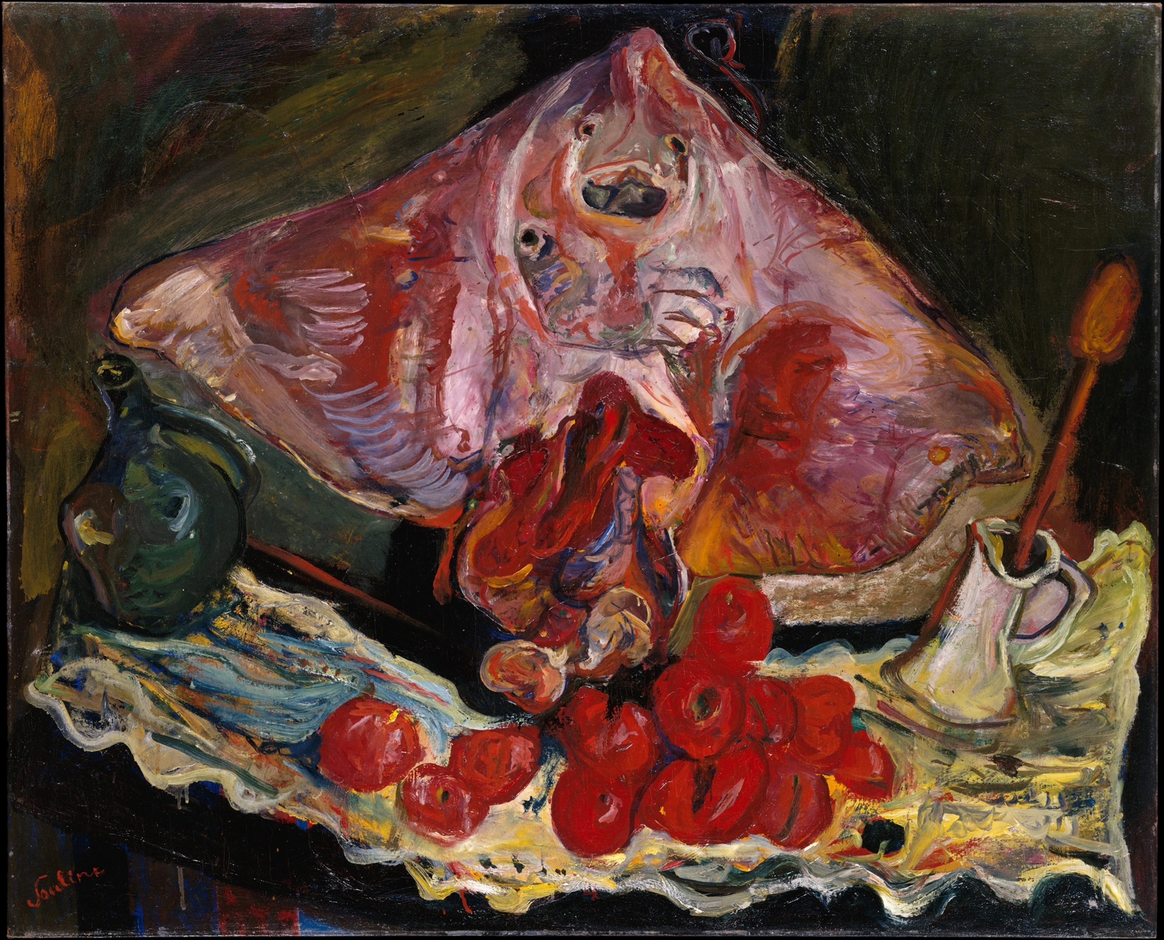
- Complementary Colors: Directly opposite each other (red/green, blue/orange). They create the strongest contrast, making each other pop. Van Gogh was a master of this, using blues and oranges/yellows to create intense visual energy, making his canvases practically vibrate with feeling.
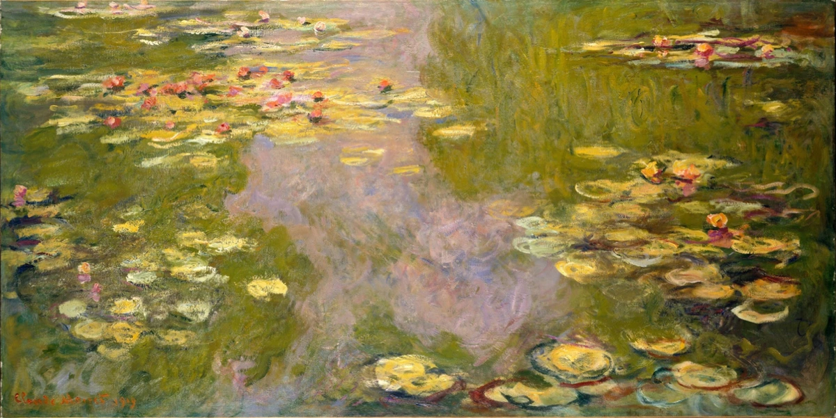
- Analogous Colors: Sit next to each other (blue, blue-green, green). Create harmony, unity, and calm. Think of the gentle transitions in a Monet landscape, like a smooth, flowing sentence.
- Monochromatic: Uses different values and saturations of a single color. Creates a sense of unity and subtlety, like a focused, quiet meditation.
- Triadic: Uses three colors evenly spaced on the wheel (red, yellow, blue). Offers vibrancy and balance, a lively conversation between three distinct voices.
- Tetradic (or Rectangular): Uses four colors arranged into two complementary pairs. Can be complex and dynamic, like a bustling marketplace of visual information.
Choosing a scheme is like choosing a musical key – it sets the overall mood and potential for the composition, guiding the color conversation.
Neutrals and Greys: The Quiet Powerhouses
Black, white, grey, and earth tones (like browns and beiges) are often called neutrals, but they are far from passive. They play a crucial role, providing structure and context, like the pauses and punctuation in language:
- Defining Value: White lightens, black darkens, and grey creates tones, as we saw earlier. They are the backbone of light and shadow.
- Muting or Enhancing: Neutrals can tone down overly vibrant colors or make surrounding colors appear more intense through contrast. A splash of bright color against a grey background feels much louder than the same color surrounded by other bright hues.
- Creating Mood: A palette dominated by greys and blacks can feel somber or sophisticated, while whites can feel airy and clean. Think of the stark, atmospheric power of James McNeill Whistler's Nocturnes, where subtle shifts in grey and black evoke the mood of twilight or night.
- Functioning as Color: In media like charcoal or ink, or in minimalist paintings, black, white, and grey are the colors, carrying all the expressive weight. They can be just as eloquent as the most vibrant pigments.
Neutrals provide the anchor and the breathing room in many compositions, allowing other colors to sing or creating a powerful statement all their own.
Techniques & Application: How the Magic Happens
Knowing why artists use color is one thing; understanding how they apply it reveals another layer of mastery. It's in the physical act of painting, mixing, and layering that the theoretical becomes tangible, where the words are actually spoken or written onto the canvas.

Mixing & Layering: Creating Depth and Nuance
Few artists use paint straight from the tube. The real artistry lies in mixing colors to achieve precise shades and tones. I can spend ages just mixing, trying to find that exact dusty rose or that murky, deep green. It's a meditative process, sometimes frustrating, but essential. It's like finding the perfect word or phrase to convey a specific feeling.
Layering thin washes of color (glazing) can create luminosity and depth, allowing light to pass through upper layers and reflect off lower ones. Think of the rich, deep colors of Renaissance masters – often achieved through meticulous layering. It's like building a color from the inside out, adding layers of meaning.
The Materiality of Pigment: Color's Physical Form
The physical properties of the paint itself matter. Oil paints offer rich, blendable color and can be layered thickly or thinly. Acrylics dry faster, allowing for quick layering and bold, flat areas of color. Watercolors create translucent washes and delicate transitions. Even digital color has its own 'materiality' – the way light is emitted from a screen is different from light reflecting off pigment. Artists choose their medium not just for convenience, but for how its physical nature affects the color, influencing the texture and depth of the color's voice.
Juxtaposition & Optical Mixing: Colors Talking to Each Other
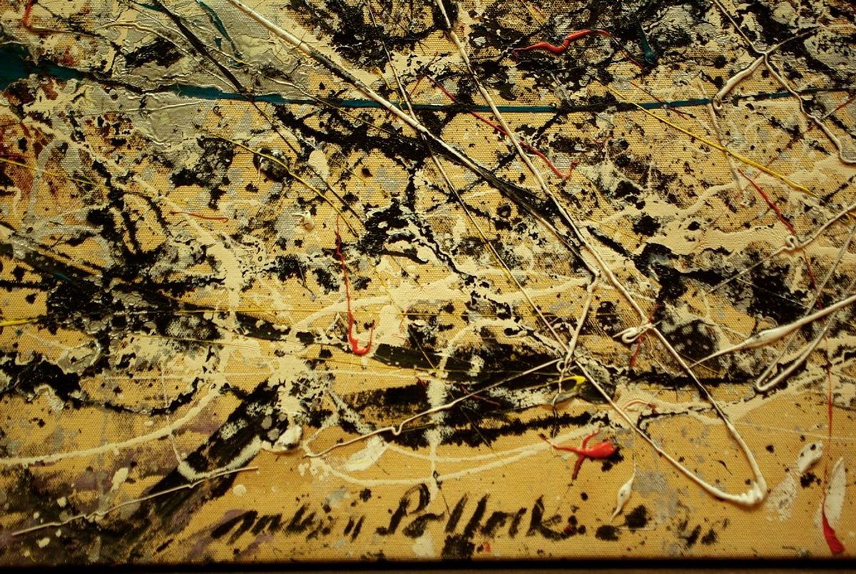
The Impressionists and Post-Impressionists were particularly interested in how colors interact when placed next to each other. Instead of smoothly blending, they often used distinct dabs or strokes of different colors. From a distance, our eyes blend these colors optically, creating a vibrant, shimmering effect that captures the fleeting quality of light. This 'broken color' technique creates a visual vibration, like multiple voices speaking at once, blending into a chorus.
The Pointillists, like Georges Seurat, took this to an extreme, using tiny dots of pure color that would mix in the viewer's eye. This scientific approach aimed for maximum luminosity and a precise, calculated visual effect, like constructing a sentence dot by dot.

Color and Texture: The Feel of Color
The way paint is applied creates texture, and this texture interacts with color to add another layer of meaning and sensory experience. Thick, impasto strokes (like those often seen in Van Gogh's work) create shadows and highlights that make the color feel more physical, more immediate, almost sculptural. Thin washes, on the other hand, can make color feel ethereal and luminous. Texture gives color a physical presence, a tactile dimension to its language.
The Influence of Light: Color's Constant Companion
Color is inseparable from light. The same object looks different under bright sunlight, soft twilight, or harsh artificial light. Artists have always grappled with capturing this, as light fundamentally alters how we perceive color's message.
- Natural Light: Impressionists chased the changing effects of sunlight on landscapes, trying to capture its fleeting language. Caravaggio used dramatic chiaroscuro (strong contrasts between light and dark) to sculpt forms and create intense drama, often using light to highlight specific colors or areas, making them pop like a sudden exclamation.
- Artificial Light: Think of the eerie glow in an Edward Hopper painting or the vibrant, sometimes jarring, colors under neon signs in contemporary art. Artificial light creates its own distinct color vocabulary.
- Digital Light: In digital art, color is created by light pixels, offering a different kind of luminosity and control than physical pigments. It's a new medium with its own rules of color expression.
Artists don't just paint objects; they paint the light on those objects, and that light fundamentally alters how we perceive the color, changing the entire tone of the visual conversation.
Limited Palettes: The Power of Restraint
Sometimes, using fewer colors can be more powerful than using many. A limited palette forces an artist to focus on value, composition, and the subtle relationships between the chosen hues. It can create a strong sense of mood, unity, or focus. Think of black and white photography, or paintings that rely heavily on varying shades of just two or three colors. It's like telling a story with a carefully chosen, sparse vocabulary – every word (or color) counts, and their relationships become incredibly important.
Color and Composition: Guiding the Eye
Color isn't just about what you see; it's about how you see it. Artists use color as a powerful compositional tool to guide the viewer's eye through the artwork. Bright, saturated colors tend to attract attention and can be used to create focal points. Contrasting colors placed next to each other create visual tension and can lead the eye along a line or shape. Warm colors often advance, while cool colors recede, creating a sense of depth and space. By strategically placing colors, artists can establish rhythm, balance elements, and control the visual flow, directing the viewer's journey through the painting's narrative.
Color as Emotion: Painting Feelings
Okay, grammar lesson and technique overview done. Now for the poetry. This is where color truly transcends the technical and speaks directly to our hearts (or guts, depending on the artist). It's the most subjective, powerful aspect of color use, the raw feeling behind the words.
The Psychology of Color (Briefly)
While cultural associations vary (more on that later), certain colors often trigger common psychological responses. It's not an exact science, and context is everything, but artists leverage these tendencies:
- Red: Passion, love, anger, energy, danger.
- Blue: Calm, sadness, stability, coldness, depth.
- Yellow: Happiness, optimism, warmth, caution.
- Green: Nature, growth, envy, tranquility.
- Purple: Royalty, mystery, spirituality, creativity.
- Orange: Enthusiasm, warmth, excitement.
- Black: Power, elegance, death, mystery.
- White: Purity, peace, emptiness, cleanliness.
Artists rarely use these in isolation. It's the combination, value, and saturation that truly crafts the emotional narrative. A bright, saturated yellow feels very different from a pale, desaturated one. Think of the difference between a cheerful sunflower yellow and a sickly, pale yellow – same hue, vastly different feeling. It's the nuance that speaks volumes.
Rothko's Embrace: Color Fields as Emotional Landscapes
Mark Rothko famously wanted viewers to have deeply emotional, even spiritual, experiences before his large canvases. He stripped away representation, relying purely on large, hovering blocks of color. By carefully choosing hues, controlling their edges (sometimes sharp, sometimes blurred), and layering thin washes of paint, he created immersive fields that could evoke awe, despair, tranquility, or unease. It wasn't about red or blue; it was about the feeling those specific reds and blues created together in that specific scale and context. Standing close to a Rothko, as he intended, allows the color to envelop you – it's a physical and emotional encounter. His work is a testament to color's power beyond simple description, a core idea in Abstract Expressionism. He spoke directly to the soul using only color.
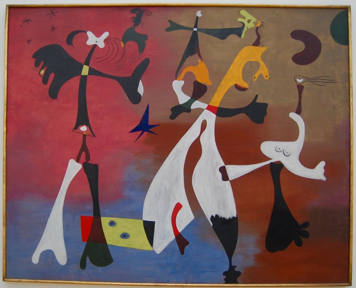
Expressionism and Fauvism: Unleashing Raw Color
Movements like Expressionism and Fauvism threw the rulebook out the window regarding 'realistic' color. Artists like Edvard Munch, Henri Matisse, and André Derain used color arbitrarily and intensely to express inner turmoil, joy, or the sheer sensory experience of a moment. Trees could be red, faces green, skies orange – not because they looked that way, but because that color conveyed the feeling the artist wanted. It was subjective, bold, and often jarring, prioritizing emotional impact over visual accuracy. It's like they turned the volume up on their emotions and painted the sound, using color as a direct scream or a joyful song.

Color as Symbol & Storyteller
Color doesn't just evoke feelings; it can also carry specific meanings and contribute to the narrative of an artwork. This meaning can be widely understood or deeply personal. It's another layer of the visual language, adding layers of symbolism and narrative.
Cultural Meanings: When White Isn't Just White
Symbolism in art is often tied to cultural context. This is where things get fascinatingly complex. In many Western cultures, white signifies purity or weddings, while in some Eastern cultures, it's associated with mourning. Red might mean luck and prosperity in China, but danger or passion elsewhere. Green can symbolize nature and growth in the West, but in some Islamic contexts, it's a sacred color associated with paradise. Artists are often aware of these associations and might use them to reinforce a theme or subvert expectations, playing with our learned responses. For instance, the deep blue used for the Virgin Mary's cloak in many Renaissance paintings wasn't just aesthetic; it symbolized her purity, royalty, and heavenly association, often achieved with expensive ultramarine pigment, adding to its significance.
Personal Symbolism: An Artist's Unique Code
Sometimes, an artist develops their own color code. A specific shade of blue might consistently represent a memory, a person, or a particular idea throughout their body of work. For me, a certain combination of deep teal and burnt orange often shows up when I'm exploring themes of transition or introspection – it wasn't a conscious choice initially, but it became a recurring visual motif, a personal dialect within my color language. Understanding an artist's life and other works can sometimes unlock these personal meanings.
Picasso's Blue Period: Color Defining an Era
One of the most famous examples of color dictating mood and theme is Picasso's Blue Period (roughly 1901-1904). Following the suicide of a close friend and experiencing poverty himself, Picasso painted almost exclusively in shades of blue and blue-green. This somber palette perfectly captured the themes of poverty, old age, despair, and alienation that dominated his work during this time. The color wasn't just descriptive; it was the emotion, a visual manifestation of his state of mind, a period written entirely in shades of blue.

Contemporary Color: Pushing Boundaries Today
While the historical examples are foundational, contemporary artists continue to innovate and challenge our understanding of color. They use traditional pigments alongside new technologies, often incorporating color into installations, digital art, and performance, not just painting. They are expanding the very definition of color's language.
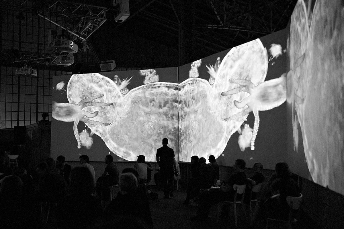
Artists like Olafur Eliasson use light and color filters to transform spaces and alter our perception of reality. James Turrell creates immersive light installations where color becomes a tangible, almost architectural element. Yayoi Kusama's infinity rooms use vibrant dots and mirrored spaces to create overwhelming, immersive color experiences. These artists demonstrate that color isn't confined to the canvas; it's a force that can shape our entire environment and sensory experience. Adding a piece of contemporary art for home can bring this dynamic energy into your own space.
Color and Accessibility: Considering All Eyes
As art becomes more inclusive, some contemporary artists also consider how color is perceived by people with color vision deficiencies. While not always the primary focus, awareness of how certain color combinations might appear differently can inform choices, particularly in public art, digital media, or educational materials. It's a subtle but important aspect of ensuring the color conversation is accessible to as many viewers as possible.
Finding Your Own Way with Color
Understanding how the greats used color is inspiring, but what about applying it yourself, or even just appreciating it more deeply in the art you see? It's a journey, not a destination. It's about finding your own voice within this vast language.
Observing the World: Inspiration is Everywhere
Pay attention to color in your daily life. The weird green of moss on an old wall, the way streetlights turn pavement purple, the unexpected clash of colors in a flower bed. Sometimes the most interesting palettes aren't invented, they're found. I find just walking around my city, perhaps near my studio and museum, offers endless, often unexpected, color combinations. Like the way a bright red brick wall looks against a stormy grey sky – it's a ready-made lesson in contrast, a sentence written by the world itself.
Experimentation: Don't Be Afraid to Get Messy
Whether you're an artist or just curious, play with color. Mix paints, try weird combinations, see what happens. Don't worry about making 'good' art; focus on learning what different colors do. Some of the best discoveries come from mistakes or just messing around without pressure. It's a bit like my own artistic journey – lots of trial, error, and surprising turns. I've wasted more paint than I care to admit on experiments that went nowhere, but the few that worked were worth it. Remember that accidental yellow and blue splash? That taught me more about contrast than any textbook. Just start speaking the language, even if you stumble over the words.
Developing a Personal Palette
Over time, many artists naturally gravitate towards certain color combinations that resonate with them. This becomes part of their unique style, their personal accent or voice. Don't feel pressured to find 'your' colors immediately, but notice which hues you're drawn to. What colors feel authentic to the way you see or feel? In my own work available online, you'll likely notice recurring themes and color relationships that have emerged over years of painting. It's less about choosing and more about discovering what feels like 'home' on the canvas, the colors that feel most like you.
FAQ: Untangling Color Queries
Q: What is color theory in simple terms?
A: Color theory is essentially a set of guidelines about how colors mix, interact, and the visual effects they create. It covers concepts like the color wheel, primary/secondary colors, warm/cool colors, complementary colors, value, and saturation. It helps artists (and viewers) understand how color works, giving you a vocabulary to describe what you see. Think of it as the grammar and basic rules of the color language.
Q: How does color affect mood in art?
A: Colors often have psychological associations (like red for passion, blue for calm). Artists use these, along with saturation and value, to create specific emotional atmospheres. Warm colors can feel energetic, cool colors calming or somber. The context and combination of colors are crucial – a single color rarely tells the whole story. It's the combination and application that create the emotional tone, like the inflection in a voice.
Q: Why did Van Gogh use such bright colors?
A: Van Gogh used bright, often non-naturalistic colors, especially later in his career, to express intense emotions and the vibrant energy he felt in nature. He used complementary colors (like yellow/purple, blue/orange) side-by-side to heighten their intensity and convey his subjective experience, a hallmark of Post-Impressionism. He wasn't painting what he saw, but what he felt, using color to amplify his emotional message.
Q: Is there a 'right' way to use color in art?
A: Absolutely not! While color theory provides useful principles, art history shows artists constantly breaking 'rules'. The 'right' way depends entirely on the artist's intention – whether it's realism, emotional expression, symbolism, or pure abstraction. Effectiveness is judged by whether the color choices serve the artwork's purpose. If it works for the piece, it's 'right'. The language of color is constantly evolving, with new dialects and expressions emerging all the time.
Q: How do contemporary artists use color?
A: Contemporary artists use color in incredibly diverse ways. Some draw heavily on historical techniques, others experiment with new pigments and digital color, some use color symbolically to address social or political issues, and others focus purely on color's formal and perceptual qualities, even using light itself as a medium. There's no single trend, reflecting the broad nature of contemporary art. They are pushing the boundaries of color's language.
Q: How do artists choose a limited palette?
A: Artists might choose a limited palette for various reasons: to create a specific mood (like the somber blues of Picasso's Blue Period), to force themselves to focus on other elements like value or composition, to create harmony and unity, or simply due to practical limitations (like working with a small set of available pigments). It's a deliberate choice to work within constraints to achieve a particular effect or deepen their understanding of color relationships.
Q: What's the difference between pigment and color?
A: Pigment is the physical substance (like finely ground minerals or synthetic compounds) that absorbs certain wavelengths of light and reflects others, giving paint its color. Color, on the other hand, is our perception of those reflected wavelengths. Pigment is the material; color is the visual experience created by light interacting with that material and our eyes. Pigment is the ink; color is the meaning we read.
Q: How does screen color differ from paint color?
A: Screen color (digital color) is created by mixing light (Red, Green, Blue - RGB). It's an additive process – the more light, the brighter the color. Paint color (pigment color) is created by mixing physical substances that absorb light (Cyan, Magenta, Yellow, Black - CMYK). It's a subtractive process – the more pigment, the darker the color as more light is absorbed. This is why colors can look different on screen than they do in print or on a canvas; they are fundamentally different ways of creating color.
Q: How do you choose colors for your abstract work?
A: For me, it's a mix of intuition and experimentation. I often start with a feeling or a vague idea, and then I just start mixing and applying paint. The colors on the canvas start talking to each other, and the painting develops a life of its own. Sometimes a color combination surprises me, and I follow that thread. It's less about planning and more about responding to what's happening on the surface, letting the colors lead the conversation.
Q: What's your favorite color palette to work with?
A: That changes constantly! For a long time, I was really drawn to deep blues, greens, and earthy tones. More recently, I've been exploring warmer palettes with vibrant oranges, pinks, and yellows, often contrasted with sharp blacks or deep indigos. It really depends on the mood I'm in and what the painting seems to demand. It's like having favorite words or phrases that change depending on what story I'm trying to tell.
Q: Where can I learn more about color theory and practice?
A: There are tons of resources! Books, online courses, art classes, and even just dedicated practice with paints or digital tools. The best way to learn is by doing – mix colors, try different schemes, and observe how they interact. Don't be afraid to make a mess! And visit galleries and museums (like these famous ones or local ones) to see how artists throughout history have used color. Look at my own work and see how I try to make colors speak.
The Enduring Power of Pigment
Color is so much more than meets the eye. It's a fundamental tool artists use to shape our perception, evoke deep feelings, tell stories, and challenge how we see. From the subtle harmonies of an analogous palette to the clashing vibrancy of complementary hues, color choices are deliberate acts of communication. They are the artist's way of speaking directly to your senses and your soul, a secret language waiting to be understood.
Next time you look at a piece of art – whether in a famous gallery or on a website like this one – take a moment to really see the colors. Ask yourself not just what colors are there, but how they're being used and why the artist might have chosen them. How do they make you feel? What do they make you think? You might find yourself understanding the artwork, and maybe even your own reactions, on a whole new level. It's a language worth learning, even if it takes a lifetime to become fluent. And who knows, maybe you'll discover a color combination that speaks directly to you, just like I did with that accidental yellow and blue splash. Try mixing some colors yourself, or just spend five minutes really looking at the colors in a painting or even just the view outside your window. You might be surprised by the conversation that starts.