Elements of Art Explained: Your Ultimate Guide to Seeing Like an Artist
Unlock the secrets of art! This ultimate guide, from an artist's perspective, explains the 7 elements of art (line, shape, color, value & more) with personal insights & humor. Start seeing art differently.
The Elements of Art: Your Ultimate Guide to Seeing Like an Artist
Ever stood in front of a painting, maybe something wildly colorful and abstract, and thought, "Okay, I like it... but what am I actually looking at?" Or maybe you've tried your hand at drawing and felt like something was missing, but couldn't pinpoint what? You're definitely not alone. For a long time, art felt like a secret language to me too, full of hushed tones and knowing nods I wasn't privy to.
Then, somewhere along my own journey as an artist – maybe it was during a particularly frustrating painting session where nothing felt 'right', or perhaps while staring intently at a masterpiece trying to reverse-engineer its magic – I stumbled (or was gently nudged) towards the Elements of Art. It was like someone handed me the Rosetta Stone. Suddenly, the secret language started making sense. I began to see the underlying structure, the fundamental components that artists, from the Old Masters to the wildest contemporary creators, use to build everything you see.
Think of them as the basic building blocks, the alphabet, or the essential ingredients in an artist's pantry. Understanding them is genuinely like getting a pair of X-ray glasses for looking at art – suddenly, you start seeing the bones beneath the surface, the method behind the magic. It can profoundly change how you appreciate, discuss, and even create art yourself.
Now, it's easy to get these mixed up with the Principles of Design (sometimes called Principles of Art), which are more about how these building blocks are arranged – the recipe, if you will, the rules of grammar that turn words into meaningful sentences. We'll touch on that difference briefly, but today, our main focus is squarely on the fundamental elements in art. Knowing what is elements of art can truly unlock a new level of visual literacy.
What Are the Elements of Art? The Essential Ingredients
So, what are these magical components, these fundamental forces artists wield? Traditionally, there are seven key elements of art that form the foundation of visual creation:
- Line
- Shape
- Form
- Space
- Texture
- Value
- Color
Let's break down each one. Don't worry, this isn't going to be a dry lecture. Think of it more like exploring an artist's toolbox together, figuring out what each tool does and why it's indispensable.
Line: The Starting Point (Where Everything Begins)
A line is essentially a dot that decided to go for a walk. It's the path of a moving point through space. It sounds almost ridiculously simple, maybe even a bit boring on paper, but lines are incredibly powerful. They are often the very first mark an artist makes.
- Types: Lines are incredibly versatile. They can be straight, curved, wavy, jagged, thick, thin, horizontal, vertical, diagonal. They can be explicit (clearly drawn, like an outline) or implied (created where shapes meet, or where your eye naturally connects points, like a dotted line or a row of objects). Contour lines define the edges and boundaries of objects, while hatching and cross-hatching use parallel or intersecting lines to create shading (value) and suggest form or volume.
- Function: Lines define shapes, create outlines, suggest movement, direction, and energy. A jagged line feels chaotic or energetic, while a smooth, curving line feels calm or graceful. I often think of line as the nervous system of a piece, directing the viewer's eye and conveying underlying energy. Think of the wild, expressive energy in Van Gogh's lines, or the precise, controlled lines of a Renaissance drawing.
Shape: Flat and Defined (The 2D World)
When a line loops around and connects back to itself, or when an area is defined by color or value contrast, it creates a shape. Shapes are flat, two-dimensional (2D) areas defined by edges. They have height and width, but no depth.
- Types: Shapes fall into two main categories:
- Geometric Shapes: These are the regular, named shapes we learn in geometry class – circles, squares, triangles, rectangles, etc. They often feel man-made, precise, or structured. Think of the building blocks in a Cubist painting.
- Organic Shapes: These are irregular, free-form shapes, often found in nature – think clouds, leaves, puddles, or the blobby forms in abstract art. They tend to feel more relaxed, natural, or unpredictable.
- Function: Shapes form the basis of objects, create patterns, and help organize the composition of an artwork. They define areas within the picture plane. It's also worth remembering positive shapes (the area occupied by the main subjects) and negative shapes (the empty area surrounding them). These are fundamentally defined by shape and are crucial for a balanced composition – sometimes the space between things is just as important as the things themselves!
Form: Bringing Shapes to Life (Adding Depth)
Now, let's add depth. Form refers to objects that are three-dimensional (3D), having height, width, and depth. It's essentially the 3D equivalent of shape. Think of how a square (shape) becomes a cube (form), or a circle (shape) becomes a sphere (form).
- In 2D Art: Obviously, a painting or drawing is a flat surface. But artists are clever! They create the representation or illusion of form using techniques like shading (playing with value – light and dark, also known as modeling) and perspective. They make flat things look solid and round or blocky. Trying to make a flat canvas look 3D? It's basically visual trickery, and value is your main accomplice.
- Types: Like shapes, forms can be geometric (cubes, pyramids, spheres) or organic (trees, human figures, rocks). Sculpture is the most obvious example of art that is inherently about form – you can walk around it and see its actual three-dimensionality.
- Function: Form gives objects weight, substance, and makes them look realistic, tangible, or volumetric. It's what makes a drawn circle look like a ball instead of just a flat ring.
Space: The Area Within and Around (Creating Depth and Relationship)
Space is the area around, between, above, below, or within objects. It's the breathability of an artwork, the distance between elements, and the illusion of depth on a flat surface.
- Types:
- Positive Space: The area occupied by the main subjects or objects (the 'stuff').
- Negative Space: The empty area surrounding the objects (the 'not-stuff'). As mentioned before, negative space is incredibly important for composition and can even form shapes of its own. Look at the space between the legs of a chair – that's negative space defining the form of the chair.
- Creating Depth: Artists use various techniques to create the illusion of depth or perspective on a 2D surface. This includes linear perspective (using lines converging at vanishing points, making things look smaller further away) and atmospheric perspective (making distant objects paler, bluer, and less detailed due to the effect of the atmosphere). Overlapping objects is another simple yet effective way to create a sense of depth and spatial relationship – the object in front appears closer than the one behind it.
- Function: Space creates depth, defines relationships between objects, balances the composition, and can create feelings of openness, confinement, tension, or calm depending on how it's used. Think about a minimalist painting with lots of empty space versus a crowded, detailed historical scene.
Texture: How It Feels (Or Looks Like It Feels)
Texture refers to the surface quality of an object – how it feels if you could touch it, or how it looks like it would feel. It appeals directly to our sense of touch, even when we can only see it.
- Types:
- Actual Texture (Tactile): This is the real physical feel of a surface. You can actually touch and feel the bumps, roughness, smoothness, etc. Think of rough stone in a sculpture, thick, built-up paint (impasto) on a canvas, the smooth finish of polished wood, or the varied materials in a collage. You find this in sculpture, mixed media, and certain painting techniques. Rudolf Stingel's carpet works are a fantastic example of playing with actual texture.
- Implied Texture (Visual): This is the illusion of texture created on a flat surface through the use of lines, shading, and color. A painting might make wood look grainy, fabric look silky, or skin look smooth, even though the canvas itself is relatively flat. The artist draws or paints the texture so your eye believes it's there. This is different from pattern, which is the repetition of a design or motif. Pattern can use texture or line, but it's about repetition, whereas texture is about surface quality.
- Function: Texture adds realism, creates visual interest, can evoke emotional responses (a rough texture might feel unsettling, a smooth one calming), and appeals to our sense of touch, making the artwork more engaging and multi-sensory.

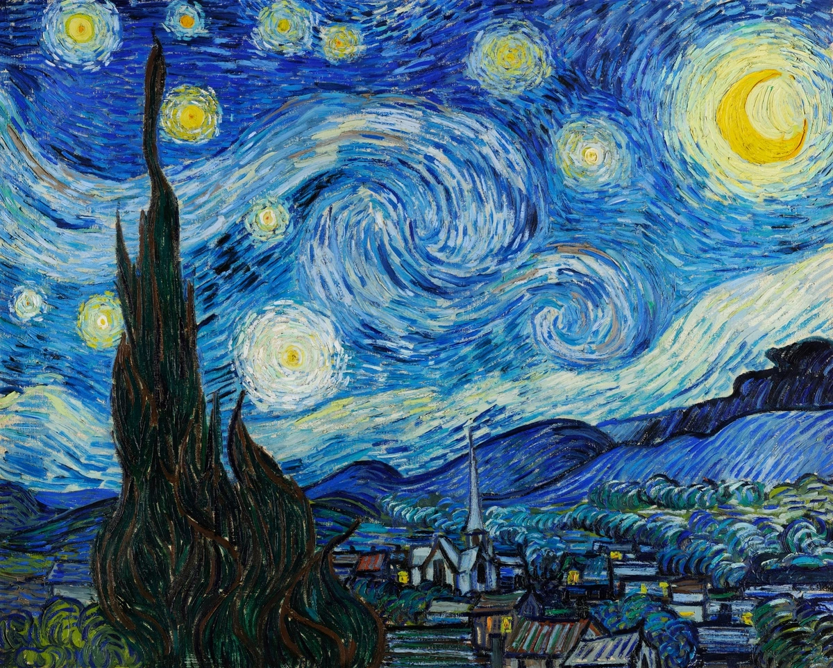
(Notice the implied texture in Van Gogh's swirling brushstrokes – you can almost feel the thick paint!)
Value: Light and Dark (The Secret Sauce)
Value (sometimes called Tone) is the lightness or darkness of a color or a shade of gray. It ranges from the brightest white to the deepest black, with all the grays in between. Value... sounds a bit dry, right? But trust me, it's the secret sauce that makes things pop (or recede).
- Function: Value is absolutely crucial for creating the illusion of form through shading and modeling. The way light hits an object creates a range of values, from highlights to shadows, which tells our brain it's a 3D form, not a flat shape. The strong contrast between light and dark is known as chiaroscuro (think dramatic Renaissance paintings where figures emerge from deep shadow). Value also creates contrast in general, making objects stand out or blend in. It helps establish mood (dark values can feel somber, mysterious, or dramatic; light values feel airy, peaceful, or optimistic). It also creates a sense of depth, as things often appear lighter and less distinct further away.
- Value Scale: Artists often think in terms of a value scale, a gradient showing the range from white to black. It's like the grayscale setting on your phone, but way more artistic!
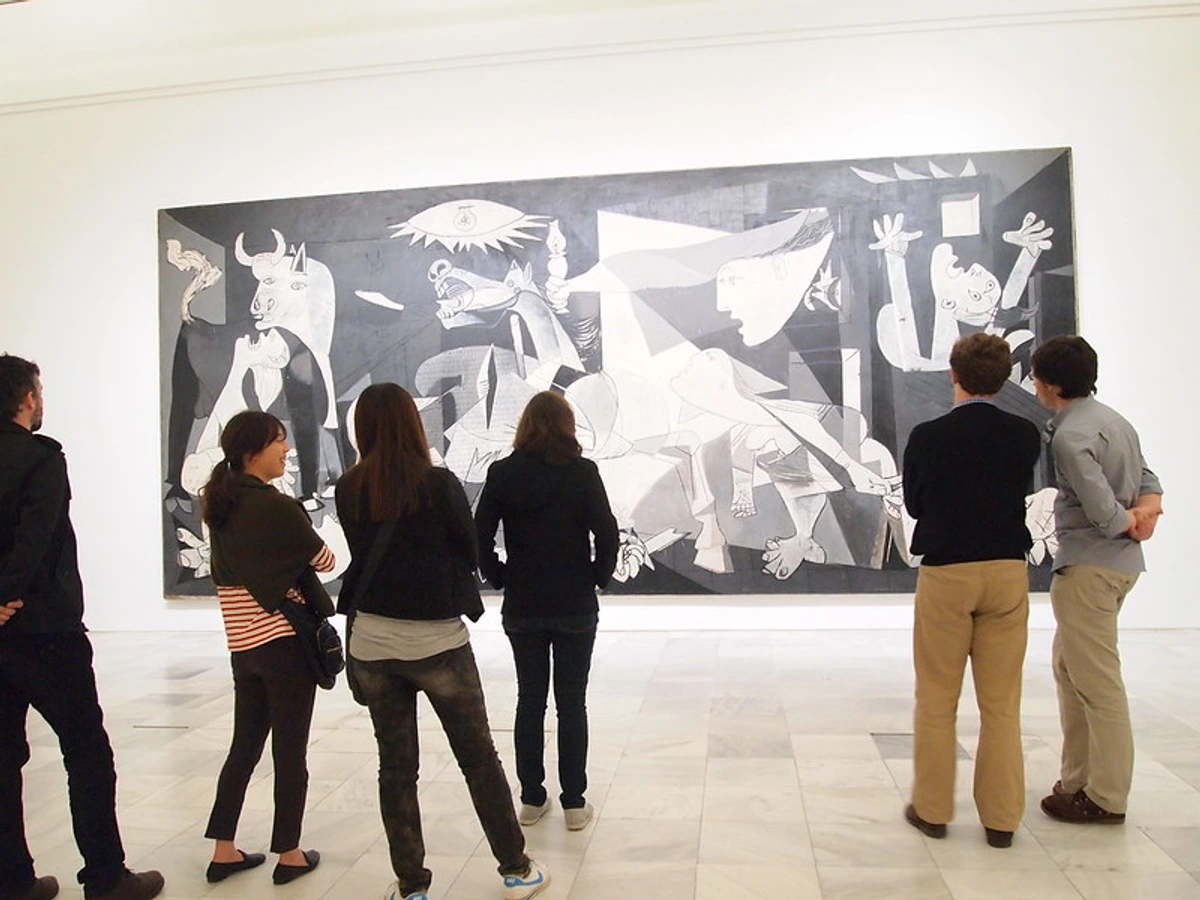
(Picasso's Guernica relies heavily on value contrast to create its powerful, dramatic effect.)
Color: The Most Expressive Element? (Where the Magic Happens)
Ah, color. Perhaps the most emotionally charged and immediately impactful element. It's what our eyes see when light reflects off an object. For me, color is where the real magic happens, where a piece truly comes alive and speaks directly to your feelings. Understanding color involves a bit of theory, but the basics are intuitive.
- Properties: Every color has three main properties:
- Hue: This is the pure color name (red, blue, green, yellow). It's where the color sits on the spectrum.
- Saturation (Intensity): This is the brightness or dullness of a color. High saturation is vivid and pure; low saturation is muted, grayish, or closer to brown.
- Value: As discussed, this is the lightness or darkness of the color (e.g., a light, pastel blue vs. a deep, navy blue).
- Relationships & Schemes: Colors interact in fascinating ways. We talk about warm colors (reds, oranges, yellows – tend to feel energetic, passionate, cozy, and often appear to advance) and cool colors (blues, greens, purples – tend to feel calm, serene, sometimes sad, and often appear to recede). Complementary colors are opposites on the color wheel (like red/green, blue/orange, yellow/purple). Placed next to each other, they create strong contrast and vibrancy. Analogous colors are neighbors on the color wheel (like blue, blue-green, green). They create harmony and a sense of unity. Artists also use various color schemes like monochromatic (using different values and saturations of a single hue), triadic (using three colors evenly spaced on the color wheel), and more, to create specific moods and visual effects.
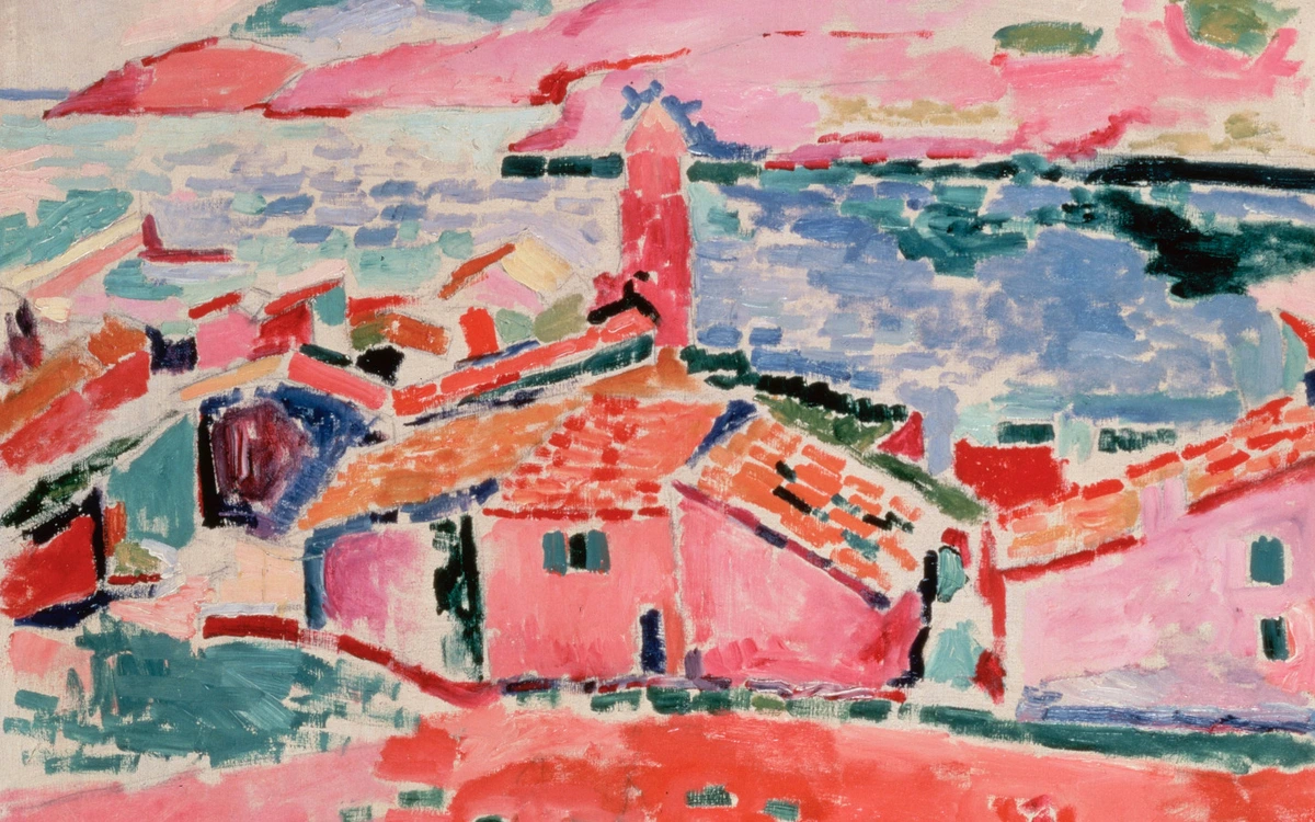
- Function: Color evokes emotion, creates mood, attracts attention (emphasis), creates depth (warm colors advance, cool colors recede), and can have symbolic meaning (learn more about symbolism here). Many artists, including myself, use color as a primary means of expression – you can see this in the colorful abstract art available on this site. The Fauvists famously used wild, non-naturalistic colors to express feeling rather than simply describe reality.
Elements vs. Principles: The Building Blocks vs. The Blueprint
This is a common point of confusion, especially since searches often combine "elements of principles of art." But the distinction is pretty simple once you get it.
Think of it like building a house:
- Elements of Art: These are the materials – the bricks, the wood, the glass, the paint (Line, Shape, Form, Space, Texture, Value, Color). These are the things you use to make art.
- Principles of Design/Art: These are the architectural plans and construction techniques – how you arrange the materials, how you ensure the structure is balanced, where you put the windows for emphasis (Balance, Contrast, Emphasis, Movement, Pattern, Rhythm, Unity/Harmony). This is how you use the elements effectively.
Or, like language: Elements are the letters and words; Principles are the grammar and sentence structure that create meaning and flow. You need both to communicate effectively, whether you're writing a novel or creating a painting. We focus on the elements here as the absolute fundamentals, but knowing the principles exist helps understand the bigger picture of composition and design.
Seeing the Elements in Action: A Few Examples
Let's look at how these elements come together in actual artworks. Once you start looking for them, you'll see them everywhere!
Example 1: Vincent van Gogh, Starry Night Over the Rhône
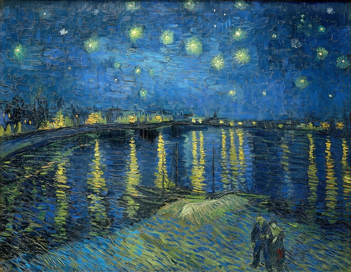
- Line: Van Gogh uses energetic, swirling lines in the sky and water reflections to create a powerful sense of movement and emotion. Straighter, more controlled lines define the town and figures.
- Color: Strong contrast between the cool blues and greens of the night sky and water and the warm yellows and oranges of the gaslights and stars creates vibrancy, depth, and a specific mood.
- Value: Deep darks in the sky and water contrast sharply with the bright lights, creating drama and helping to define the forms and space.
- Texture: Implied texture is strong here through the thick, visible brushstrokes (impasto), which also adds to the feeling of energy and movement.
- Space: The placement of the figures in the foreground, the river leading back, and the distant town and sky create a sense of depth and vastness.
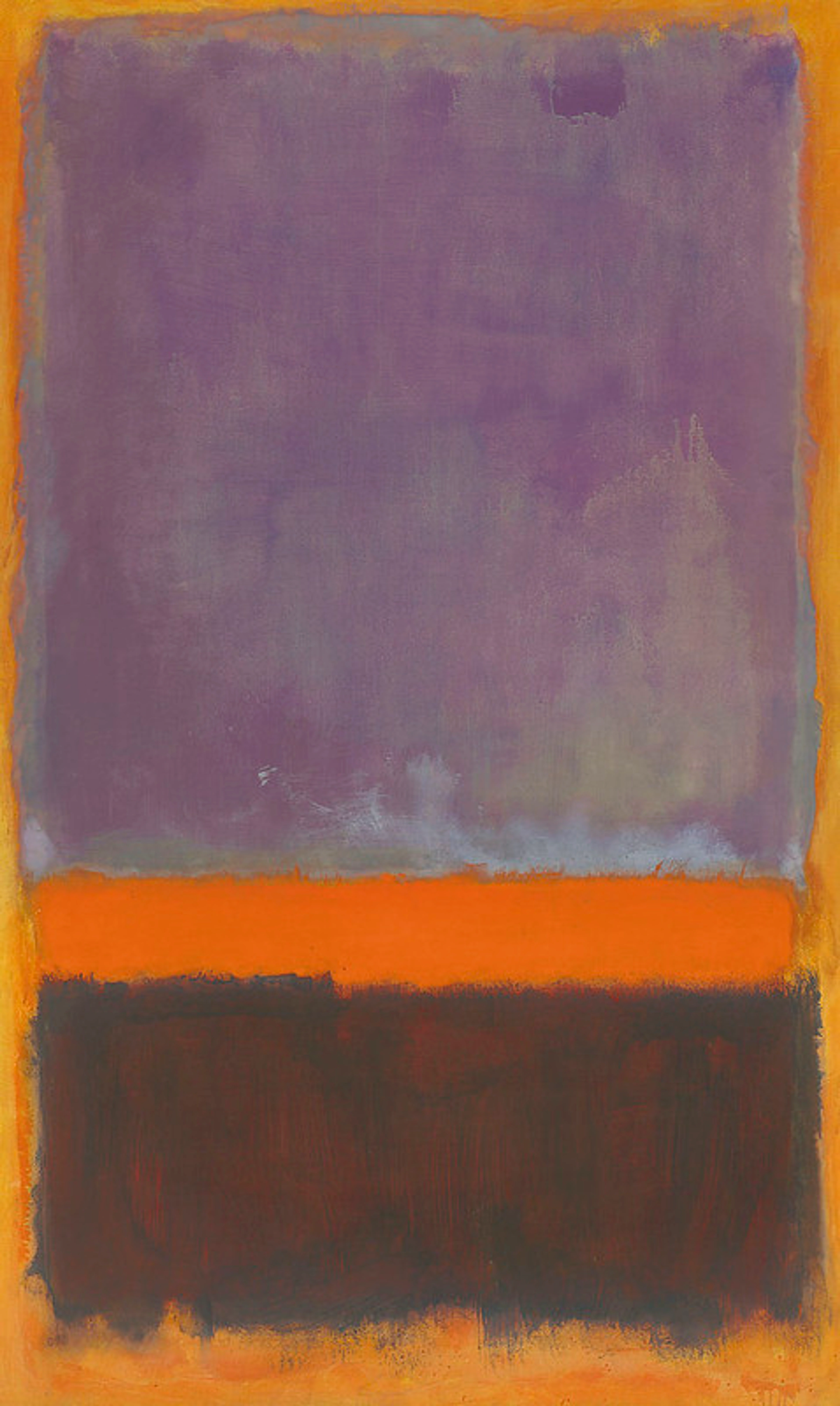
Example 2: Mark Rothko, Untitled (Violet, Black, Orange, Yellow on White and Red)
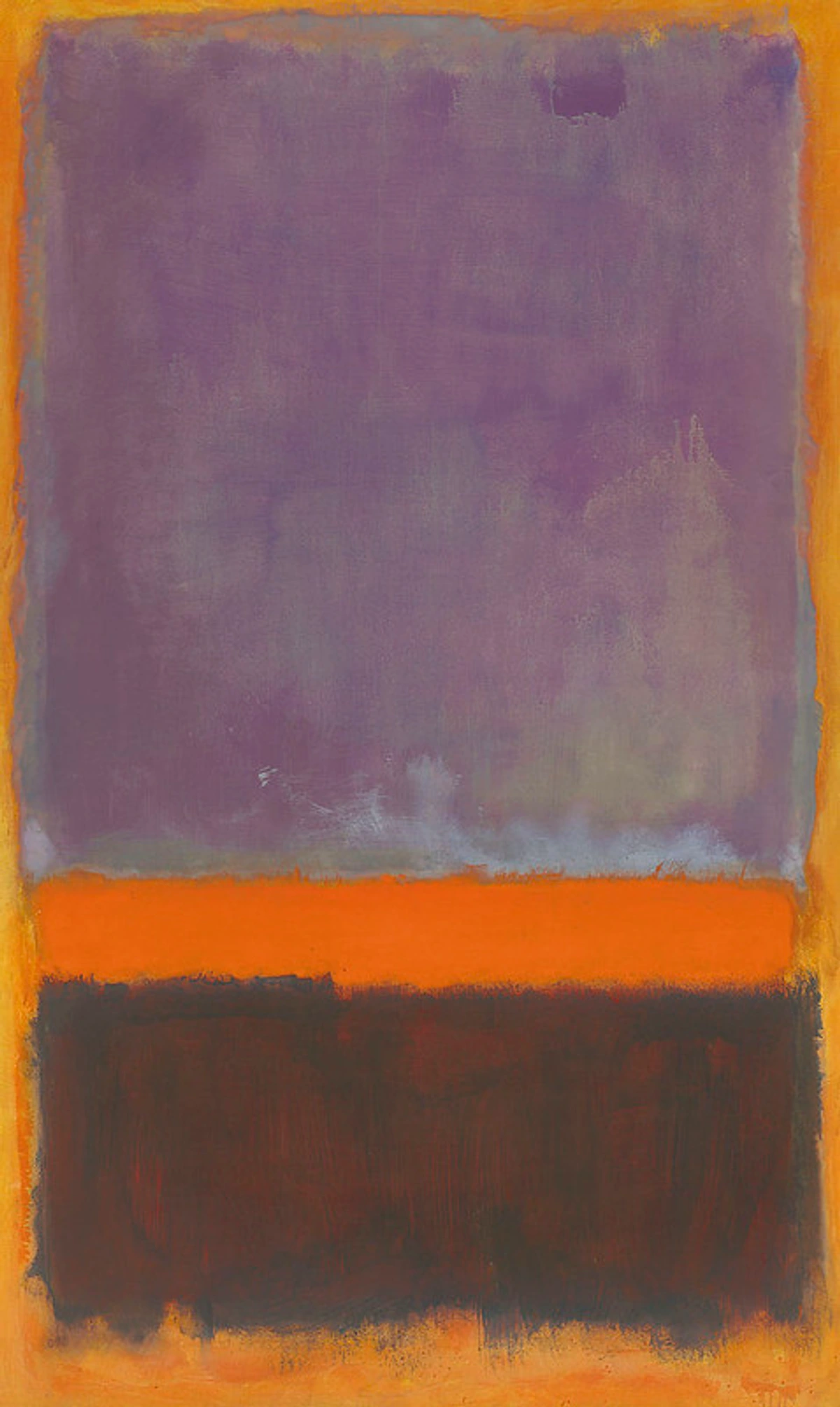
- Color: This is arguably the dominant element in Rothko's work. He explores the emotional and spiritual impact of large fields of color and their subtle interactions. The soft, hazy edges make the colors seem to float and breathe.
- Shape: Simple, soft-edged rectangular shapes are the primary forms, but their interaction with the color and space is key.
- Space: The large scale of the canvases and the floating, layered shapes create an immersive spatial experience that can feel vast or intimate depending on the viewer's proximity.
- Value: While known for color, Rothko also uses subtle shifts in value within and between his color blocks to create depth and luminosity.
- Texture: While the paint application might have subtle actual texture, the primary effect is visual, created by the layering and soft edges of color and value.
Many contemporary artists, especially in abstract art, push these elements in new ways, often focusing intensely on just one or two to create a powerful statement. Sometimes the process itself, and how it uses these elements over time, becomes part of the artwork's story. In my own abstract work, for instance, I often find myself primarily wrestling with color and texture, exploring how vibrant hues interact and how the physical application of paint creates visual interest and depth. It's a constant dialogue between the material and the intended feeling.
Why Bother Learning the Elements of Art? (Seriously, Why?)
Okay, maybe you're still thinking, "This is interesting theory, but does it really matter for just enjoying art?" I'd argue, absolutely, yes! And not just for artists.
- Deeper Appreciation: Understanding the elements helps you move beyond just a gut reaction ("I like it" or "I don't get it") to understanding how an artwork achieves its effect. You start seeing the artist's choices. It's like appreciating music more when you understand melody, rhythm, and harmony – you hear the layers.
- Better Communication: It gives you a vocabulary to talk about art more precisely and confidently. Instead of saying, "That painting is really busy," you might say, "The artist uses lots of sharp, jagged lines and high-contrast values to create a sense of energy and chaos." See? Instant art critic!
- Improved Art Analysis: You can break down complex works into their components to understand the artist's intentions and the visual language they're speaking.
- Foundation for Creation: If you make art (or want to), mastering the elements is fundamental. They are your primary tools, your basic vocabulary. You can't write a poem without words, and you can't make visual art without the elements.
- Informed Choices: Even when buying art or decorating your home, knowing the elements helps you identify what resonates with you on a deeper level – do you love bold colors? Subtle textures? Dynamic lines? Understanding why you're drawn to something helps you make more intentional choices for your space.
- Breaking the Rules: And here's a fun one – once you understand the rules (the elements and principles), you know how to break them effectively and intentionally! Artists often manipulate or even omit elements to create specific effects, challenge expectations, or make a powerful statement. Knowing the fundamentals gives you the power to subvert them with purpose, adding another layer of sophistication to your own work or your appreciation of others'.
Honestly, sometimes even experienced artists revisit these basics. It's like practicing scales on an instrument – it keeps your understanding sharp and reminds you of the fundamental power of these simple tools. I know that reflecting on how I use color or line in my own abstract pieces helps me refine my approach and push my own boundaries. You can see some examples of this ongoing exploration in the works available here.
FAQ: Your Questions Answered (Let's Wrap This Up!)
Okay, I've thrown a lot at you! Let's tackle some common questions that pop up when diving into the elements of art.
Q1: What are the 7 elements of art? A: The commonly accepted seven fundamental elements are Line, Shape, Form, Space, Texture, Value, and Color.
Q2: Are the elements and principles of art the same thing? A: No, they're different but related! Think of Elements as the basic building blocks or ingredients (what you use), and Principles as the rules or guidelines for arranging those blocks (how you use them) – things like Balance, Contrast, Emphasis, etc.
Q3: Why is line often considered the most basic element? A: Because a line is the simplest mark you can make, and almost every other visual element starts with or can be defined by lines (e.g., lines enclose shapes, lines create implied texture, lines can suggest form). It's the absolute starting point.
Q4: How do the elements of art apply to abstract art? A: Abstract art relies heavily on the elements! Often, abstract artists choose to emphasize some elements over others, exploring the pure potential of color, the energy of line, the interaction of shapes, or the creation of space without representing recognizable objects. Understanding the elements is key to appreciating abstract art's compelling nature.
Q5: Can I use this knowledge to decorate my home? A: Absolutely! Thinking about line, shape, color, texture, and space can help you make more intentional choices when arranging furniture, choosing paint colors, or displaying art. It helps you consciously create the mood and visual harmony you want for your space. Check our decorating guides for more specific tips.
Q6: Are the elements always used in isolation? A: Almost never! In most artworks, the elements work together, often influencing and relying on each other. Value helps define form, line creates shape, color has value, and so on. Artists manipulate the interplay of these elements to create complex and engaging compositions.
Conclusion: Go Forth and See!
The elements of art aren't just academic terms to memorize; they're the fundamental forces that make visual art communicate, resonate, and excite us. They are the universal language spoken by every painting, sculpture, photograph, and design you encounter.
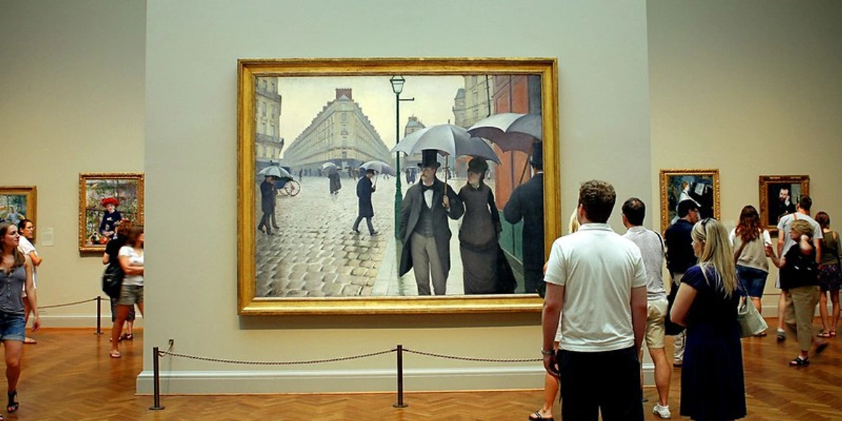
Once you start actively looking for line, shape, form, space, texture, value, and color, you'll find them everywhere – not just in museums (like the one near Den Bosch!) or galleries, but in design, nature, architecture, and everyday objects. The world around you will start to look different, richer, and more visually interesting.
It might feel a bit like learning a new language at first, perhaps a little awkward as you consciously identify things. But stick with it. The next time you look at a piece of art, or even just glance out the window, try to identify which elements stand out most. Ask yourself how the artist (or nature!) used them. You might be surprised at how much more you see, how much more you understand, and how much more you appreciate the incredible visual world we live in.
So go ahead, put on your new "art element glasses" and start exploring. The visual world just got a whole lot more interesting. Happy seeing!


