My Palette, My Story: How Color Speaks Emotion in Abstract Art
Dive into an abstract artist's intuitive world where color is a raw, personal language. Discover how palettes speak emotion, from vibrant hues to subtle textures, inviting your own unique interpretations. A journey into the soulful, often surprising, dialogue of paint.
My Palette, My Story: How Color Speaks Emotion in My Abstract Art
Sometimes, I wonder if colors are just light bouncing off things, or if they're tiny, silent storytellers. For me, as an abstract artist, it's definitely the latter. My palette isn't just a collection of pigments; it's a diary, a symphony, and sometimes, a chaotic argument, all laid bare on the canvas. When I say "chaotic argument," I'm talking about those moments where seemingly clashing hues duke it out, energetic strokes collide, and unexpected juxtapositions create a visual tension that's strangely compelling. It's the emotional language I speak when words just don't cut it, which, let's be honest, is often. And perhaps that's why abstract art, stripped of literal representation, is uniquely suited for this – it's a direct conduit, bypassing the conscious mind's need for recognition and allowing a raw, unfiltered expression that literal forms might inadvertently constrain or simplify. It's a direct line from my intuition to the canvas, and hopefully, from the canvas to your gut feeling. If you're curious about the deeper reasons I choose this path, you might explore why I paint abstract: my personal philosophy and artistic vision.
I remember once, trying to explain a complex feeling to a friend – something between exasperation and a surprising burst of hope. I stumbled over words, got tangled in metaphors, and eventually just threw my hands up. But later that day, in my studio, a single stroke of cadmium yellow against a stormy blue said it all. It was imperfect, a little messy, but utterly me. That's the power of color in my abstract art: it doesn't just represent emotion; it is the emotion.
Beyond the Rainbow: My Personal Relationship with Color
When I first started painting, I treated colors like obedient soldiers, marching them into their pre-assigned places based on some forgotten color theory chart. Red means anger, blue means calm, yellow means joy. Simple, right? Oh, how naive I was. I mean, who decided red always means anger? Sometimes, for me, it’s just a really enthusiastic hello. While traditional color theory, influenced by figures like Goethe or Itten, often assigns universal meanings and neatly categorizes them, my own journey quickly veered off that well-trodden path.
Over the years, my relationship with color has evolved from a textbook understanding to a deeply personal, often unpredictable affair. It's less about universal symbols and more about my own internal landscape. A specific shade of violet might whisper of twilight contemplation one day, and scream of creative frustration the next. I remember a moment, trying to coax a tranquil blue onto the canvas for a 'peaceful' piece, only for it to insist on feeling like a sarcastic wink, utterly out of sync with my intention. That's when I truly understood: my colors have their own will, their own language, independent of what any book might dictate. It's like having a conversation with an old friend – sometimes they comfort you, sometimes they challenge you, but they always reveal something new about yourself.
This deeply personal, often stubborn, relationship with my palette is precisely what allows color to become the primary voice in my abstract compositions. It's about finding the emotional palette: how I choose colors for my abstract art that truly resonates with my inner world.
The Unspoken Dialogue: How Color Communicates in Abstract Art
One of the most liberating aspects of abstract art, for me, is that it strips away the need for literal representation. There's no tree that must be green, no sky that has to be blue. This freedom allows color to step forward and become the primary narrator. It doesn't just convey a general mood; it weaves specific emotions, sensations, and even fragmented narratives that bypass the logical mind.
I often begin a piece with a vague emotion or a fleeting memory, not a clear image. Then, I let the colors guide me. Sometimes, a vibrant orange will call out, demanding attention, pulling me in a direction I hadn't planned. Other times, a quiet, somber gray will insist on setting the mood. It's an embrace of the unknown, a dance with intuition. If you're curious about this intuitive process, I've written more about embracing intuition in abstract painting.
Beyond mere hue, the way paint is applied dramatically amplifies this emotional conversation. The thick impasto suggesting raw energy or urgent declaration, the brush dragging heavily across the canvas. A thin, layered wash evoking gentle melancholy or a quiet, expansive contemplation, the pigment whispering across the surface. Or a vigorous scrape revealing hidden layers or a struggle for breakthrough, the canvas absorbing the raw declaration. For a deeper dive into techniques, you might also explore what is impasto painting or the role of texture in abstract art: a sensory exploration.

And let's not forget the crucial impact of value (lightness/darkness) and tone in abstract art, which can dramatically shift the emotional weight, adding drama or serenity independently of the color itself. The slow drying time of oils allows for a more contemplative layering of blues, while the immediacy of acrylics lends itself to the urgent bursts of red. Even the sheer scale of a piece can shift its emotional weight – a vast canvas often invites a different kind of contemplation than an intimate study.
What truly fascinates me is the silent negotiation between colors. A vibrant orange placed next to a quiet, deep blue isn't just two colors; it's a dynamic tension, a conversation between exuberance and introspection, creating a feeling far more complex than either color alone. And then there’s a splash of aggressive magenta screaming next to a comforting, earthy umber – that's not just a contrast; it's a silent commentary on finding strength amidst grounding realities, a whispered defiance in the ordinary. It’s in these juxtapositions that new emotional territories are often charted on my canvas.

My goal isn't to make you feel exactly what I felt when I painted it. That would be, frankly, a bit dictatorial, like a know-it-all art critic telling you how to feel. Instead, it's to create a space where your emotions can resonate with the colors I've chosen. It's a shared experience, an unspoken dialogue where my palette meets your story. If you're interested in understanding the broader impact of color, explore the emotional language of color in abstract art or my approach to palette and emotion.
My Creative Canvas: Weaving Emotions into Form
Let's delve into some specific colors and the stories they often tell on my canvas:
The Blues of Reflection and Depth
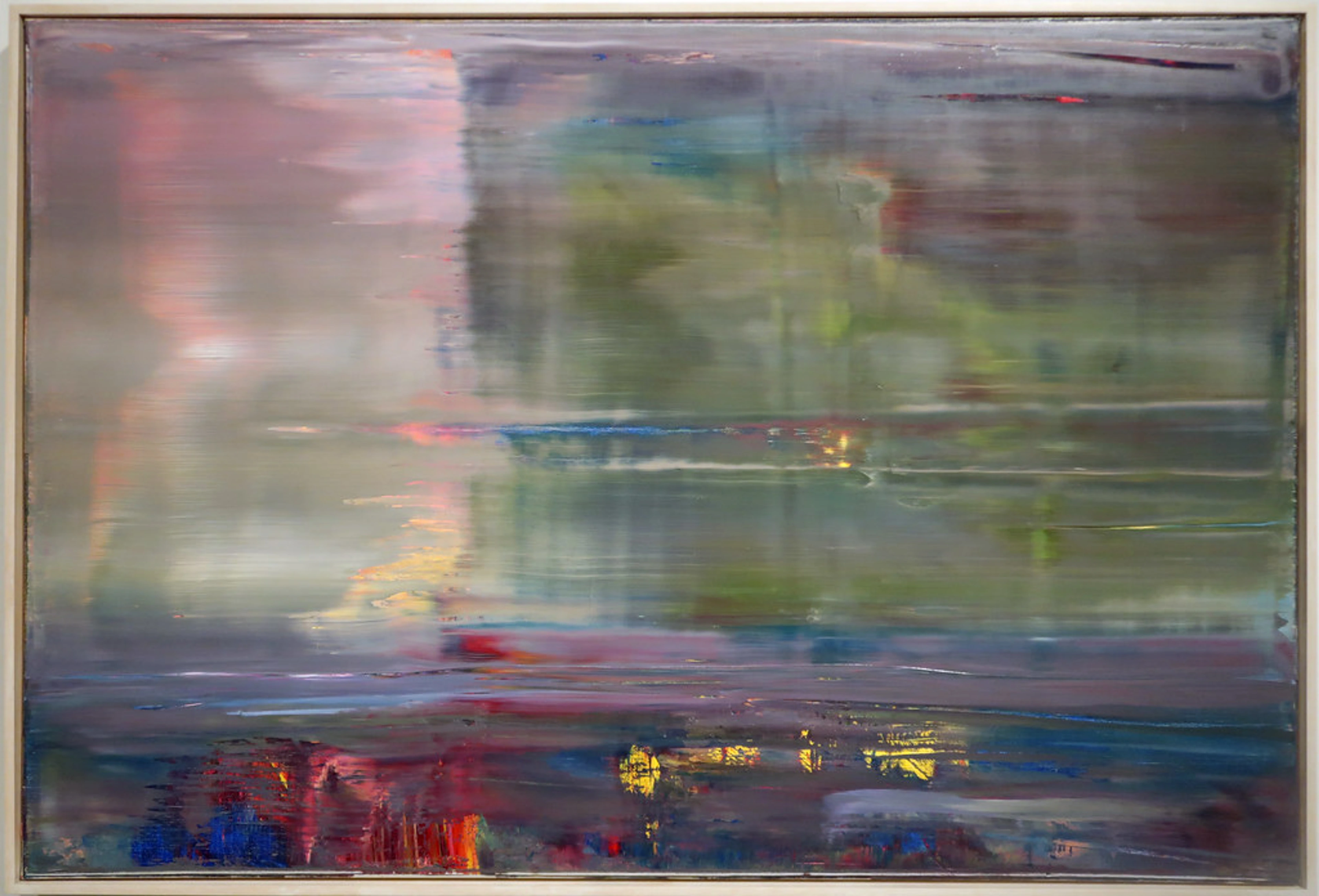
For me, blue is the color of the vast ocean, the endless sky, and sometimes, my deepest contemplations. I find myself reaching for blues when I want to explore themes of introspection, calm, or even a touch of melancholy. I often layer blues with thin, translucent washes to create that sense of depth and vastness, sometimes contrasting them with a single, sharp stroke of opaque cobalt for emphasis. This interplay of transparent and opaque blues can evoke the vastness of the sky meeting the solidity of earth, or the ebb and flow of introspective thought. It's a color that can feel both expansive and incredibly intimate. I remember one quiet evening where the world held its breath, and that stillness settled onto my canvas through layers of deep indigo. It's fascinating how universal yet personal blue can be; I've even explored the psychology of blue in abstract art in another piece.
Reds: Passion, Energy, and a Dash of Chaos
Red is the fire, the heartbeat, the sudden burst of energy when an idea strikes. It's rarely a calm color for me; it's dynamic, urgent, and sometimes a little bit aggressive – in a good way, of course! It's the color that always wants to be heard, even if it has to shout a little. When I want to convey urgency or raw power, I apply reds with bold, often impasto strokes, letting the texture speak as loudly as the color itself. When I feel a surge of creative force, or want to inject undeniable presence into a piece, red is my go-to. I recall a specific moment, a raw jolt of a breakthrough idea, messy but undeniable, which translated into a fierce swipe of crimson. It demands attention and often pushes other colors into exciting new dialogues, creating sparks of tension and release, much like a heated, yet ultimately productive, conversation.

Yellows and Oranges: Glimmers of Joy and Optimism
When I think of yellow and orange, I think of sunbeams on canvas. They represent optimism, a lighthearted moment, or the pure joy of creation. These sunlit hues are often applied with a free, expansive gesture, sometimes scraped lightly over darker tones to suggest a breakthrough of light. They often act as spotlights, drawing the eye and infusing areas with immediate warmth, or working alongside cooler tones to create a dynamic interplay of light and shadow, an optimistic whisper against a pensive backdrop. I often use them to create focal points or to uplift a more subdued palette. There's an undeniable warmth and approachability to these hues that just makes me smile while painting. It's like finding a ray of sunshine on a cloudy day. I remember trying to capture the lingering warmth of a specific memory, soft and golden, which naturally led me to these radiant tones.
Greens: Growth, Renewal, and Subtle Shifts
Green for me is rarely just 'nature'. It's more about the quiet hum of growth, the slow unfurling of understanding, or sometimes, the unsettling feeling of being caught between two states. I use various shades, from almost-black forest greens to vibrant lime, often to suggest layers of experience, unexpected resilience, or a sense of peace found after turmoil. It's a trickster color, sometimes hiding within other hues, only to reveal itself upon closer inspection – much like certain feelings. Often, greens are the quiet mediators, bridging the gap between fiery reds and serene blues, or offering a subtle, grounding counterpoint to vibrant bursts. There was a time I wanted to paint the stubborn push of new life through cracked pavement, and a deep, surprising green was the only color that truly captured that quiet defiance.
Earth Tones and Neutrals: The Grounding Force
While I love vibrant explosions of color, I also deeply appreciate the quiet power of earth tones, grays, blacks, and whites. They're the anchors, the breathing room, the silent observers that allow the louder colors to truly sing. Sometimes, a subtle blend of ochre and cream, or a deep charcoal juxtaposed with a crisp white, can convey more profound emotion than any bright hue, suggesting quiet resilience or a deep, underlying peace. I often find them when painting the profound stillness of old stones, holding untold stories, their muted presence allowing for deeper contemplation. They're the unsung heroes of my palette, providing balance and grounding, though they often complain they don't get enough direct spotlight.
The Imperfect Palette: Embracing the Unexpected
Isn't it odd how we chase perfection, even in the messy world of emotions? If my painting journey has taught me anything, it's that perfection is an illusion, especially when it comes to expressing emotion. Sometimes, I'll mix a color with a specific feeling in mind, and it will stubbornly refuse to cooperate. It'll turn out muddier, brighter, or simply wrong. In those moments, I have a choice: fight it, or lean into the unexpected. Sometimes, the tube of cadmium yellow just stares back at me, defiantly refusing to be 'joyful,' choosing instead to be 'a bit annoyed.'
I remember one frustrating afternoon, trying to mix a serene, meditative blue, and somehow, it kept turning into this muddy, almost sickly teal. I was ready to scrape the whole thing off, but then, in a moment of exasperated surrender, I let it be. That 'mistake' ended up becoming the perfect, uneasy backdrop for a sudden, sharp streak of orange – a perfect representation of how moments of discomfort can sometimes precede breakthroughs. More often than not, embracing the 'mistake' leads to something far more interesting, more authentic. That unexpected shade of green might just become the perfect representation of lingering uncertainty or new growth. This unpredictability isn't just about paint; it's a profound reminder that emotions themselves are rarely neat and tidy; they're complex, sometimes contradictory, and always evolving. Embracing these 'mistakes' in my art has mirrored a larger truth: true beauty and authentic expression often lie beyond the pursuit of flawless outcomes, in the very imperfections that make us human. It's a testament to my creative process: from concept to canvas in abstract art and truly the art of intuitive painting: embracing spontaneity in abstract creation.
For You, The Viewer: Finding Your Story in My Colors
Ultimately, my art is a conversation. While I pour my story, my feelings, and my energy into each piece, the true magic happens when you, the viewer, step in. My colors are an invitation for your own emotions to emerge, to connect with the canvas in a deeply personal way.
Perhaps a bold blue evokes a sense of peace for you, while for me, it was painted from a moment of profound sadness. Neither is right or wrong. Art, especially abstract art, is a mirror. It doesn't tell you what to see; it reflects what's within you. Next time you encounter an abstract piece, try to let go of the need to 'understand' it literally; just observe, and let your own emotional resonance guide you. Try simply breathing with the piece for a moment, letting the colors wash over you. What does your body feel? If you're interested in how this reflection works, I encourage you to read about how abstract art can be a mirror to your inner world or a guide to decoding abstract art: a guide to finding meaning in non-representational works. For a broader understanding of finding meaning, consider demystifying abstract art: a personal guide to finding meaning.

FAQs: Decoding the Emotional Palette
As you delve into the emotional language of color, you might find yourself with a few questions, and I've tried to offer some insights from my own journey here:
Question | My Insight |
|---|---|
| Do specific colors always mean the same thing? | Not at all! While there are cultural and psychological associations with colors, in my abstract art, their meaning is fluid. A vibrant yellow might be joy in one painting, and anxious energy in another. It’s all about context, surrounding colors, and the viewer’s personal interpretation. |
| How do artists choose colors for abstract art? | For me, it's a blend of intuition, emotional response, and sometimes, pure experiment. I rarely pre-plan a strict palette. Instead, I let the emotions I'm exploring guide my hand. Often, one color will demand another, creating an organic flow. It’s a bit like choosing words for a poem – you feel your way through it. For more on this, check out how artists use color. |
| Can abstract art evoke strong emotions? | Absolutely. Because abstract art bypasses literal representation, it can connect directly with your subconscious and emotions. It doesn't tell you what to feel, but it creates a powerful emotional atmosphere. It’s often more about the 'how' a color is used – its intensity, texture, and relationship to other colors – than its specific hue. |
| How can I cultivate my own emotional connection to abstract art? | Beyond simply looking, try to engage with abstract art on a sensory level. Notice the textures, the depth, how colors interact. Don't try to intellectualize it immediately; instead, pay attention to the gut feeling, the subtle shifts in mood, or the memories it might unexpectedly trigger. It's a conversation that starts without words, relying purely on visual and emotional resonance. |
| How do you know when an abstract painting is 'finished'? | That's often the hardest question! For me, a painting is 'finished' when it feels complete – not necessarily perfect, but when adding or subtracting anything feels wrong. It's an intuitive moment, a quiet 'click' when the visual conversation feels resolved, and the emotional resonance is clear. |
| Where can I explore more of your work and the emotional language of your art? | If you're curious to see these ideas in action, you can dive deeper into my collection of abstract art for sale or learn more about my journey and influences on my artist timeline. And if you're local, I'd be delighted for you to experience the art firsthand at my museum in 's-Hertogenbosch! |
My Journey Continues: A Never-Ending Exploration
Every new canvas is an opportunity to delve deeper into this fascinating, often perplexing, language of color. It's a continuous process of self-discovery, of learning to trust my instincts, and of allowing my most authentic self to emerge through strokes of paint. My palette is, truly, my story – messy, vibrant, sometimes quiet, always evolving. It's an ongoing conversation, a mutual evolution with the paints themselves, always revealing new depths. And I wouldn't have it any other way.


