Abstract Art & Color Psychology: Decoding Emotional Language
Uncover the profound emotional language of color in abstract art. Explore how hue, saturation, and context evoke deep feelings, with insights from masters like Kandinsky and Rothko.
Decoding Color's Whisper: The Emotional Language of Abstract Art
Sometimes, I find myself standing before a canvas, a torrent of feeling washing over me – a sudden lightness, perhaps, or a quiet, persistent ache in my chest – and I can't quite pinpoint why. It's not a landscape, no familiar face, just… colors and shapes. Have you ever felt that inexplicable resonance with something purely abstract, a piece that seems to speak directly to your very core, bypassing the logical mind? For me, it's almost always the emotional language of color at play, a silent, profound conversation unfolding on the canvas. Is it a clever trick, a masterful sleight of hand by the artist? Or am I, perhaps, just overthinking a splash of cerulean blue, attempting to find meaning where there's none? It’s truly fascinating how, when freed from the imperative to represent the 'real' world, colors abandon their descriptive roles and leap into a life of their own, communicating directly with that primal part of us that feels, often before our logical minds can catch up. Sometimes, this connection is so profound it's almost synesthetic, where colors evoke not just feelings but sounds or even tastes. This article explores that profound connection, guiding you to understand and experience the psychological impact of color in abstract compositions, inviting you to discover how this unspoken dialogue can be surprisingly revelatory.
The Primal Pull: Why Colors Resonate So Deeply
I used to dismiss my emotional reactions to art as just... my emotions. Simple as that. A convenient little box to put things in. But the deeper I delved into creating and appreciating abstract art, the more I realized there’s a profound, almost primal connection between specific hues and our inner world. It's no mere coincidence that a fiery red can make your pulse quicken, or that a deep indigo might lull you into a state of calm. These are often archetypal associations, woven into our collective human experience, rooted deeply in our evolutionary past and cultural conditioning. Indeed, the field of color psychology actively studies these very connections, observing how different colors influence human emotion and behavior, lending academic weight to what often feels purely intuitive.
Think about it: the vivid red of danger or passion, inherited from ancient alerts to blood and fire. Or the lush, reassuring green of fertile lands, signaling safety and abundance. Our brains are wired to respond to these ancient cues.
Beyond our shared primal history, cultural conditioning also plays a massive role. While a crisp white often signifies purity or innocence in Western cultures, in many Eastern traditions, it’s the color of mourning. Consider red: in China, it's a symbol of luck, prosperity, and celebration, while in many Western contexts, it signifies passion, danger, or anger. Similarly, blue can represent protection in some Middle Eastern cultures, while in the West, it's often associated with calm or sadness. This highlights that a color's emotional weight isn't universally fixed, but rather a rich tapestry woven from our shared humanity and diverse experiences. This dance between the universal and the deeply personal is what makes the emotional language of color so endlessly captivating.
Just last week, I found myself adrift in another one of those interminable, energy-sapping meetings. My thoughts were a gray, monochrome haze. Then, my eyes snagged on a vibrant, almost aggressively yellow post-it note someone had slapped onto the wall. For a split second, a jolt – like a tiny sun had exploded in my peripheral vision. A flicker of optimism, a ridiculous, unwarranted spark of joy, broke through the dullness. I almost laughed out loud, realizing how easily my internal landscape could be swayed by something so trivial. It’s like a secret handshake, isn't it? The artist lays down a vibrant yellow, and a part of you instantly connects it to sunshine or joy, even if your day has been a complete washout. It's not magic, but it certainly feels like it sometimes, these tiny, unexpected shifts in our internal landscape triggered by nothing more than a hue. If you're curious about the broader strokes of how artists use color, you might find this article on how artists use color insightful, or even delve into the psychology of color in Impressionist painting.
https://commons.wikimedia.org/wiki/File:The_Creation_Of_The_Mountains.jpg, https://creativecommons.org/licenses/by-sa/4.0/deed.en
The Silent Conversation: What Colors "Say"
So, what do colors actually "say"? It's less about a rigid dictionary definition and more about a fluid mood, a subtle vibration, a direct channel to a feeling within. Think of it as a spectrum of emotions, much like a good song uses different notes and chords to convey a complex range of feelings. As an artist, I often find myself wrestling with a particular shade, trying to coax out just the right emotional nuance. It’s a delicate dance, often frustrating, occasionally exhilarating, and sometimes, I just want to sit down and ask the paint what it wants to be. It’s also about constantly observing how colors betray or enhance the forms they are part of; a slight shift in shape can demand an entirely new color, or vice versa.
A Spectrum of Emotions: Individual Hues
This table offers a starting point, a basic lexicon, but it’s crucial to remember that these are just general tendencies. The true magic, and often the greatest challenge in abstract art, lies in the myriad ways colors can be manipulated and combined, as their emotional impact shifts dramatically based on context and interaction. It's not just about the basic hue; it's about the entire orchestra of color properties playing together:
Color | Primary Emotional Associations |
|---|---|
| Reds | Passion, Energy, Anger, Love, Danger, Groundedness |
| Blues | Calm, Serenity, Sadness, Contemplation, Vastness, Melancholy |
| Yellows | Joy, Optimism, Warmth, Energy, Freshness, Anxiety, Caution, Sickness |
| Greens | Nature, Growth, Harmony, Envy, Freshness, Vitality, Renewal |
| Oranges | Enthusiasm, Creativity, Warmth, Excitement, Playfulness, Vibrancy |
| Purples | Royalty, Mystery, Spirituality, Introspection, Luxury, Depth, Ambiguity |
| Black | Absence, Depth, Seriousness, Sophistication, Formality, Power, Elegance, Grief, Mystery |
| White | Presence, Light, Simplicity, Purity, Innocence, Emptiness, Cleanliness, Sterility, New Beginnings |
| Grays | Neutrality, Balance, Seriousness, Melancholy, Sophistication, Dullness |
| Browns | Earthiness, Stability, Comfort, Warmth, Reliability, Nature, Dullness |
- Value (Luminosity): Imagine the brightness dial on your feelings. Value refers to how light or dark a color is. High-value colors (light colors) often evoke lightness, airiness, happiness, or openness. Low-value colors (dark colors) can suggest seriousness, mystery, drama, or somberness. Think of the difference between a bright sky blue (high value, open) and a deep, midnight blue (low value, mysterious).
- Saturation (Chroma): This is the intensity or purity of a color. Crucially, saturation describes the purity or intensity of a color; a color can be light or dark, and simultaneously highly saturated (vibrant) or desaturated (muted). This quality is distinct from tints (color + white), tones (color + gray), and shades (color + black), which inherently alter both a color's lightness/darkness and its purity by dilution. A brilliant, pure red screams passion, while a dusty, muted red might whisper old memories.
- Tints, Tones, and Shades: These refer to variations created by adding white, gray, or black to a pure hue.
- Adding white creates tints (lighter, often softer emotions – think a pale pink vs. a fiery red, conveying gentleness or innocence).
- Adding gray creates tones (muted, subtle, complex emotions – a dusty rose vs. a vibrant magenta, suggesting sophistication or ambiguity).
- Adding black creates shades (darker, more intense or somber emotions – a deep, brooding blue vs. a bright sky blue, indicating depth or solemnity). These shifts dramatically alter the emotional weight of a color. That 'sickly' yellow? Probably a desaturated, pale tone. That 'melancholic' blue? Likely a dark shade. Understanding these variations is fundamental to exploring the psychological impact of color.
- Color Temperature: Warm colors (reds, oranges, yellows) tend to feel energetic, inviting, or aggressive, drawing the eye forward and creating a sense of immediacy. Cool colors (blues, greens, purples) often evoke calm, distance, or introspection, receding into the background. An abstract piece might play with these temperatures to create a visual push and pull, a dynamic tension or a serene harmony.
- Color Combinations and Interaction: The emotional impact isn't just singular; it's a profound conversation.
- Complementary colors (opposites on the color wheel, like red and green) create intense vibrancy and tension.
- Analogous colors (next to each other on the wheel, like blue and green) foster harmony and calm.
- A carefully chosen triad can feel balanced and dynamic, while a monochromatic scheme can evoke a singular, profound mood. Beyond these pairings, colors actively influence each other. This is known as simultaneous contrast, a phenomenon meticulously explored by artists like Josef Albers. Place a medium gray square against a vibrant red, and that gray might suddenly appear greener. Place the same gray against a calm blue, and it might seem to take on a warmer, even yellowish tinge. Our perception shifts based on context, adding layers of emotional complexity as the colors visually "speak" to each other, altering our experience of them entirely. It’s like two people having a conversation, and depending on who's talking, the same word takes on a different meaning.
https://live.staticflickr.com/3173/2971037978_95f41144d3_b.jpg, https://creativecommons.org/licenses/by/2.0/
Form and Shape: The Unspoken Dance with Color
Beyond the inherent qualities of color itself, the form or shape it inhabits profoundly influences its emotional impact. Imagine a vibrant red. If that red is contained within sharp, angular lines or jagged, aggressive forms, it might evoke feelings of tension, danger, or raw energy. But if the same red flows within soft, organic curves or nebulous, bleeding edges, it could convey warmth, passion, or gentle intimacy. The psychological weight of a color shifts dramatically depending on its visual container. Abstract artists master this dance: a large, sprawling, undefined blue field can feel boundless and meditative, while a small, perfectly square blue can feel constrained, orderly, or even cold. It's like the difference between a spontaneous sigh and a carefully delivered, pointed statement – the emotion is there, but the delivery changes everything.
- Texture and Application: How paint is applied—thick impasto, thin washes, energetic drips, smooth glazes—can profoundly influence the emotional language of color. A vibrant red applied thickly with aggressive brushstrokes might scream passion or anger, carrying a raw, visceral energy. While the same red, applied as a transparent wash, might whisper vulnerability or a gentle warmth. The tactile quality adds another layer to the unspoken message, conveying the artist's intent and emotion through physical presence. This is part of the broader elements of art that contribute to a piece's overall impact.
The Abstract Playground: Where Color Takes Center Stage
This is where it truly gets interesting for someone like me, who lives and breathes abstract art. In representational art, color typically serves the subject – the emerald green of a leaf, the cerulean blue of a sky. But in abstract art, color is the subject. It doesn't depict; it evokes. It doesn't illustrate; it stimulates. Without figures or landscapes to guide you, your eye and your emotions are left to grapple directly with the raw, unadulterated expressive power of hue, saturation, contrast, and application. It’s a liberation for the color itself, a true moment of freedom for the paint. It’s also worth noting the distinction between abstract art, which simplifies or distorts reality, and non-objective art, which has no ties to the real world at all. In non-objective works, the role of color becomes even more singularly paramount, as it's the only visual information conveying meaning and emotion.
It's a beautiful, often maddening, challenge deciding which colors will convey the precise feeling I'm trying to capture. Sometimes it's a spontaneous burst, a sudden flash of insight. Other times, it's a meticulous, agonizing selection process, where I feel like a chemist trying to unlock an elusive emotional compound. When I'm working on a new series for the museum, I often think about how to create a specific emotional tone just through color. I remember one particular piece, an almost entirely blue canvas, where I wrestled for days with a single, small orange dot. It felt jarring, 'wrong' – too aggressive, too much of an interruption. I almost gave up, ready to paint over it entirely, convinced I'd failed. Then, almost by accident, I blended a tiny hint of gray into the orange, softening it ever so slightly, and suddenly, it just clicked. It went from an interruption to a quiet, hopeful counterpoint, a gentle whisper against the blue vastness. It's like writing poetry without words, just pure feeling, and sometimes, you just want to throw your brushes across the room in exasperation (and occasionally do, if I'm honest), and other times, you feel like you've unlocked a secret of the universe, or at least how to get two stubborn colors to play nice. If you've ever wondered how to approach abstract art as a creator, this guide on how to abstract art might spark some ideas, or explore what makes abstract art compelling.

https://www.flickr.com/photos/abstract-art-fons/30634352376, https://creativecommons.org/licenses/by/2.0/
Case Studies in Color Emotion: Masters of the Unspoken
To truly grasp the profound impact of color in abstract art, let's peek at some masters who fearlessly wielded this unspoken language, using it as their primary emotional conduit and, in some cases, redefining what art could be. Each of these artists approached the psychological impact of color in their unique way, inviting us into their inner worlds, demonstrating the vast spectrum of personal and philosophical approaches to this chromatic dialogue.
Wassily Kandinsky: The Spiritual Architect
Wassily Kandinsky, often hailed as one of the pioneers of abstract art, believed deeply in the spiritual and psychological power of color. He famously experienced synesthesia, a fascinating neurological phenomenon where the stimulation of one sensory pathway leads to automatic, involuntary experiences in another. For Kandinsky, this meant he literally heard colors and saw sounds – red might be a trumpet blast, yellow a middle C on a piano, blue the deep resonance of an organ or cello. His theoretical writings, like Concerning the Spiritual in Art, meticulously detailed how specific colors and forms evoked particular emotions or spiritual states. His synesthesia always fascinated me; it's like he had a secret key to the universe of feeling, an intimate dialogue between senses most of us only dream of. He would compose his abstract works like intricate musical scores, with vibrant yellows and reds creating a sense of dynamic, clashing energy (e.g., in his Composition VII), while deep blues and greens brought contemplation and peace (as seen in many of his early 'Impressions'). For him, color wasn't just visual; it was a profound, multi-sensory experience designed to resonate with the viewer's inner being, a direct line to the soul.

Printerval.com, https://creativecommons.org/licenses/by-nc/4.0/
Mark Rothko: The Sublime Horizon
From Kandinsky's dynamic compositions, we shift to the serene yet profoundly moving world of Mark Rothko. A titan of Abstract Expressionism and Color Field painting, Rothko offers a starkly different, yet equally profound, exploration of color's emotional power. His signature works feature immense, luminous rectangles of color that seem to float, often bleeding softly into one another, on vast canvases. When I first stood before a Rothko, it was almost disorienting; the colors just are, they envelop you, and suddenly, you're not looking at a painting anymore, you're inside a feeling. Rothko wasn't interested in depicting objects or narratives; his singular aim was to evoke profound, often tragic, human emotions – ecstasy, despair, spirituality, transcendence – through the sheer presence and interaction of color. He famously insisted that viewers stand close to his paintings, allowing the vast fields of color to envelop them, fostering a meditative or even spiritual encounter. The subtle variations in hue, saturation, and the soft, blurred edges created a sense of immense depth and a pulsating vitality. His deep, brooding reds (like those in his Seagram Murals) could be both visceral and solemn, his blues simultaneously vast and melancholic, inviting a direct, unmediated emotional experience that bypasses the intellect entirely. To truly understand his monumental impact, exploring a guide to Rothko is a must.
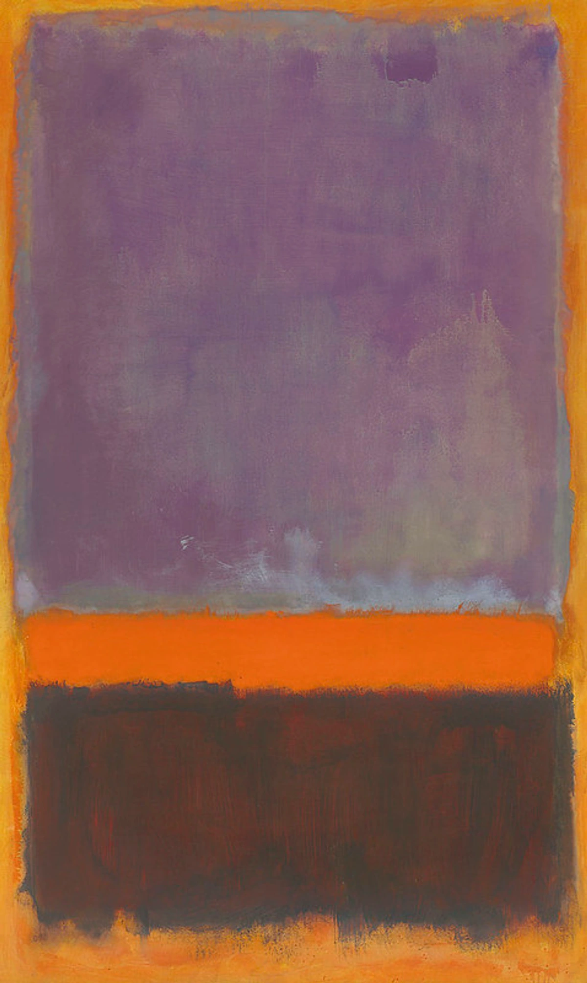
Image Source, https://creativecommons.org/licenses/by-nc-sa/2.0/
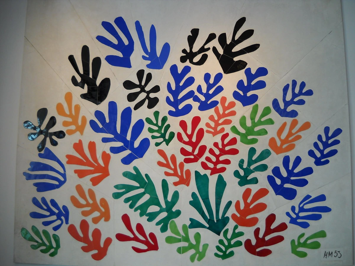
Henri Matisse: The Harmony of Liberation
While not exclusively an abstract artist in the same vein as Kandinsky or Rothko, Henri Matisse, especially in his later life, used color with an almost radical independence from form, particularly in his famous paper cut-outs. Confined to his bed, Matisse embarked on a revolutionary period, creating vibrant, large-scale compositions by cutting shapes from paper pre-painted with gouache. For him, color was a primary means of expression, a source of profound joy and liberation, and he often employed it in bold, flat expanses that defied naturalistic representation. I find his cut-outs absolutely captivating; they feel so utterly joyful and free, despite the physical limitations he faced. Think of the intense, almost unbelievable blue of his Blue Nudes series, or the joyful, almost childlike arrangements and interplay of red, blue, and green in La Gerbe (The Sheaf). His use of pure, saturated color, divorced from traditional drawing, was revolutionary. It conveyed a profound sense of harmony, spontaneity, and an unbridled zest for life, even amidst his physical limitations. Matisse demonstrated how color, in its purest, most direct form, could communicate profound emotion and visual delight, becoming the very essence of the artwork, a true symphony of the soul. You can dive deeper into his world with our ultimate guide to Henri Matisse.
https://live.staticflickr.com/6090/6059309027_476779f1de_b.jpg, https://creativecommons.org/licenses/by-sa/2.0/
Robert Delaunay: The Rhythmic Pulse of Color
Shifting gears to another pioneer, Robert Delaunay, a key figure in Orphism (a branch of Cubism focusing on pure abstraction and vibrant color), explored the dynamic interplay of color as a source of rhythm and movement. Unlike Kandinsky's spiritual quest or Rothko's meditative fields, Delaunay was fascinated by how colors, when placed next to each other, could create a sense of simultaneous movement and light, purely through their chromatic relationships. His series of "Simultaneous Contrasts" paintings, often featuring concentric circles or fragmented forms, explode with vibrant hues of red, orange, yellow, and blue. I always felt his work had a kind of cheerful, bustling energy, like a visual jazz composition. He believed that color, independent of form, could evoke emotion and a sense of vitality, creating a visual "symphony" or "rhythm" that directly stimulated the eye and the mind. For Delaunay, color wasn't just descriptive; it was active, energetic, and capable of generating its own light and emotional pulse.

https://www.flickr.com/photos/42803050@N00/31171785864, https://creativecommons.org/licenses/by-nd/2.0/
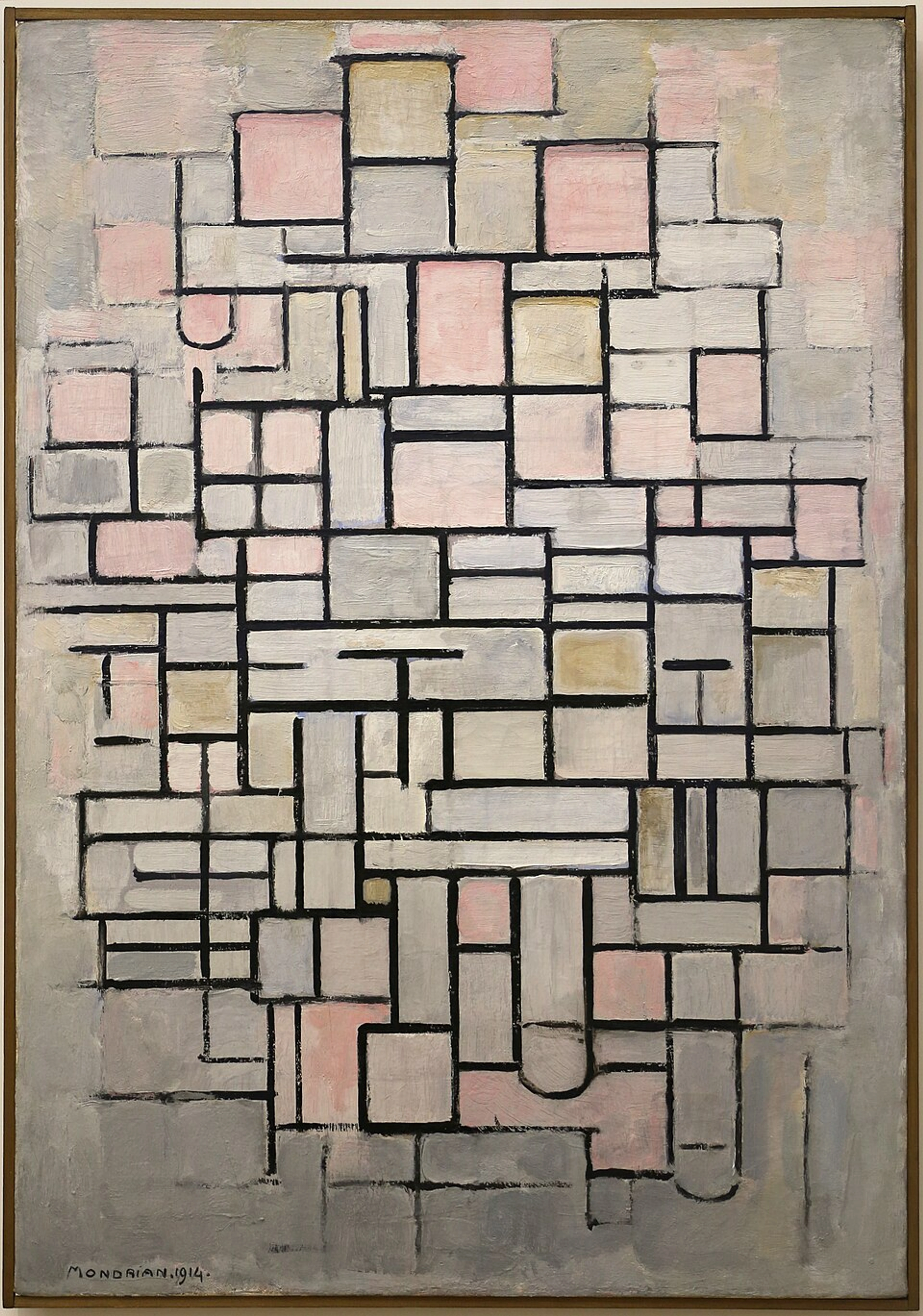
Piet Mondrian: The Harmony of Universal Forms
Moving from expressive and rhythmic abstraction, we arrive at the stark, logical, yet profoundly harmonious world of Piet Mondrian. A leading figure in the De Stijl movement, Mondrian sought to express universal truths and spiritual harmony through the most fundamental elements. He famously deliberately limited his palette to primary colors (red, yellow, blue) and non-colors (black, white, gray), arranged in grids of horizontal and vertical lines, believing these pure forms and colors were universal and transcendent. His aim was to create a "pure plastic art" that transcended individual emotion to achieve universal balance. While his work might initially seem rigid or cold, the careful balance and precise relationships of his colored rectangles evoke a profound sense of order, stability, and quiet contemplation. For me, looking at a Mondrian is like watching a perfectly choreographed dance of equilibrium; it calms the mind and suggests a deeper, underlying structure to existence. He believed these pure colors and forms could evoke a feeling of universal equilibrium and spiritual order, a stark contrast to the emotional turbulence often found in other abstract movements.

https://commons.wikimedia.org/wiki/File:Piet_mondrian,_composizione_n._IV-composizione_n._6,_1914,_01.jpg, https://creativecommons.org/licenses/by/3.0
Your Own Emotional Palette: Applying the Language of Color
Ready to unlock your own emotional palette? So, how can you tune into this unspoken symphony yourself, whether you're creating or simply appreciating art? It’s simpler, and perhaps more deeply rewarding, than you might think. I remember one time, early in my journey, I stood before a vast, minimalist painting – just a deep blue field with a whisper of yellow at the edge. My logical brain tried to find a boat, a horizon, anything concrete. But then, I just let myself feel, truly surrendered to the visual experience. And a surprising calm washed over me, a sense of immense space, almost like floating. It was a revelation – that the art wasn't about something, but was something, directly impacting my inner state. Start by being utterly present. When you look at an abstract painting, resist the urge to 'figure out' what it depicts. Instead, ask yourself, genuinely: What do I feel? Does the dominant blue evoke a profound peace, or a vast, haunting emptiness? Does that unexpected splash of red ignite excitement, or a subtle, almost subconscious alarm? Trust your gut. Don't worry if you don't 'get it' right away; it's like learning a new language, and sometimes you just babble in color.
- Observe Your Responses: Pay close attention to your immediate, unedited reactions to colors not just in paintings, but in your everyday life – the vibrant burst of an advertisement, the serene expanse of a twilight sky, the chaotic harmony of a wild garden, the colors of your clothes or your living room. What unexpected emotions do they spark within you? Keep a mental note, or even a small journal, of these moments. You might discover some fascinating personal patterns. Consider how factors like the type of light (natural daylight, warm indoor lighting, cool artificial light) subtly alter how colors are perceived and, consequently, how they make you feel.
- Experiment with Your Own Expressions: Grab some paints, crayons, pastels, or even digital tools. Without a subject in mind, just play with colors. How do different hues interact on the page? Can you consciously try to create a feeling of 'calm' with just three colors? What about 'chaos,' or 'longing,' or 'elation'? It's an incredibly freeing exercise, a direct dialogue between your inner world and the outer world of color.
Consider Starting with a Mood
Before you even pick up a brush, or even before you look at a piece of art, try setting an intention. If you're creating, decide what emotion you want to evoke. Do you want to create calm? Excitement? Melancholy? Let that feeling guide your initial color choices, rather than just picking colors you like. If you're appreciating, approach the art with an open question: 'What feeling is this color trying to convey to me right now?' This subtle shift in focus can open up a whole new channel of emotional understanding.
- Acknowledge Nuance and Context: Remember that color is just one potent element within a complex artwork. The size and placement of shapes (composition), the direction and quality of lines, and the overall balance of the piece all profoundly contribute to the emotional impact. A tiny, vibrant red dot against a vast, brooding black canvas will feel dramatically different from a large expanse of the same red. And while powerful archetypal tendencies exist, your personal history, current mood, and cultural background also play a significant, shaping role. What moves one person might leave another cold, and that's perfectly okay. This is why understanding symbolism and creating mood with art are such personal journeys.
- Visit Art Spaces: Take a trip to an art gallery or museum with a focus on abstract or modern art. Don't go with the goal of understanding every piece intellectually. Instead, focus purely on the colors. Stand before a painting and just breathe. What is the dominant color? How do the colors interact? What sensations or emotions arise? It’s a powerful exercise in mindful observation and emotional connection.
The Symphony Continues: Connecting Through Color
The emotional language of color in abstract art isn't a cryptic code to be definitively cracked, but rather a living, breathing conversation waiting for you to join. It bypasses our logical, categorizing minds and speaks directly to our inner landscape, inviting us to feel, to reflect, and to experience the world in a profoundly different way. For many, this engagement can even be a therapeutic or meditative experience, a way to process emotions or find moments of calm and clarity. It’s a powerful reminder that beauty, truth, and deep meaning aren't always found in clear, literal representations, but often in the vibrant, silent, and deeply personal dialogue between color and soul. The psychological impact of these chromatic compositions can be surprisingly profound.
So, next time you encounter an abstract piece, lean into the mystery. Let the colors wash over you, and listen closely to what they whisper to your unique emotional palette. Perhaps you'll find a piece that resonates deeply, a vibrant conversation waiting just for you. If you're curious to explore this language further, whether through creating your own art, visiting a gallery, or perhaps even finding a piece that speaks to you here on my site, or at my museum in Den Bosch, the journey into color's whisper continues. You can also delve deeper into the journey of how I, as an artist, discovered my own connection to this profound world on my timeline.


