
Color Field Painting: An Artist's Deep Dive Beyond Rothko
Dive deep into Color Field painting beyond Rothko. Explore key artists like Frankenthaler, Newman, Still, Louis, and Noland, their techniques, historical context, and the movement's enduring power through an artist's personal lens.
Color Field Painting: Beyond Rothko (An Artist's Personal Take)
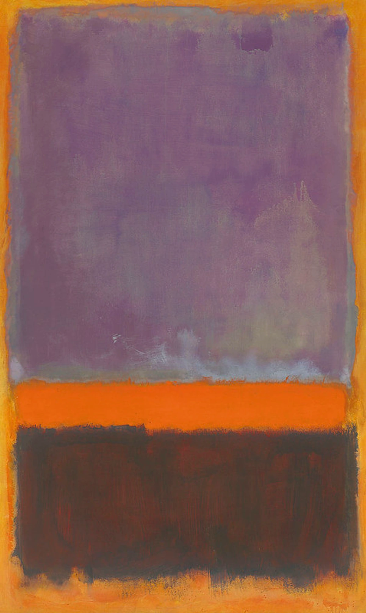
Okay, let's talk about color. Not just 'what's your favorite?' color, but the kind of color that hits you like a wave, that fills your entire field of vision and maybe, just maybe, makes you feel something deep down. I remember the first time I stood in front of a massive Rothko – it wasn't just looking at a painting, it felt like stepping into a space made of pure emotion. It was overwhelming, quiet, and utterly captivating, a moment that really shifted how I thought about what art could do. When most people think of that kind of color in art, they immediately picture Mark Rothko. And fair enough! His work is iconic, a gateway drug into the power of pure pigment. It's like standing in front of a vast, vibrating space that just... exists. See some of his work.
Color Field painting didn't just appear out of nowhere, though. It emerged in the late 1940s and 1950s in New York, right alongside its more gestural cousin, Abstract Expressionism. This was a pivotal time; the art world's center of gravity was shifting from Paris to New York after World War II, and artists were grappling with new ways to express the post-war human condition. Think of Color Field as a branch of that broader movement – part of the New York School – that decided to focus really hard on one thing: color. While Action Painters like Jackson Pollock were all about the gesture and the process, Color Field painters were more interested in the effect of large areas of flat color on the viewer. This shift from the artist's hand to the viewer's experience was a significant point of discussion and sometimes contention at the time. Critics like Clement Greenberg championed Color Field, seeing it as the next logical step in the evolution of modern art, emphasizing its flatness and opticality, which helped define and promote the movement, though not without debate. They took elements already present in Abstract Expressionism – the emotional power of color, the large scale – and isolated them, making them the central subject. It also owes a debt to earlier European modernists like Henri Matisse, who explored the emotional power of pure color, and even Monet's late works, which dissolved form into shimmering fields of light and color.
As an artist myself, diving into Color Field is like exploring the very building blocks of my own practice – the emotional weight, the spatial possibilities, the sheer presence of color. It makes me think about how I use color in my own abstract art and how it speaks its own silent language learn more about that. It's a constant reminder that sometimes, the simplest elements can hold the most profound power.
So, let's step beyond the famous rectangles for a moment and explore the vibrant, sometimes challenging, always compelling world of Color Field painting.
What Exactly Is Color Field Painting? (And Why Should You Care?)
Okay, let's cut to the chase. What is this stuff, really? The goal wasn't to depict something from the real world, or even to show the artist's hand in a dramatic splash. It was about creating an immersive experience, where the color itself is the subject, the form, and the content. The canvas became a field, a space for pure visual sensation. It's less about what is painted and more about how the color makes you feel, how it interacts with the space around it, and how it affects your perception. It challenges you to look differently, to quiet the part of your brain that wants to identify objects and instead just experience. It's like listening to instrumental music – you don't need lyrics to feel the emotion, right? Color Field aims for that same direct, non-representational impact. It's pure visual sensation. It's about the optical experience, the way color interacts and vibrates on the surface, sometimes creating a sense of infinite space or overwhelming presence. Encountering Color Field art early in my journey really shifted my perspective on looking – it taught me to trust my gut reaction to color and form, rather than searching for meaning or narrative.
Key Concepts in Color Field Painting: The Ideas Behind the Color
Want to understand what makes a big canvas of color tick? Understanding Color Field goes beyond just looking at the artists; it's about grasping the ideas that drove them. These concepts are the silent language spoken by the canvases, and they resonate deeply with my own artistic process. Here are a few that are crucial to appreciating the work:
Flatness
This was a big deal. Moving away from illusionistic space, Color Field painters emphasized the two-dimensionality of the canvas. The color exists on the surface, not receding into a depicted depth. It's about the reality of the painting as an object. Think of it like looking at a perfectly smooth, colored wall versus a painting with perspective – the wall is just there, flat and present. In my own work, achieving a sense of flatness while still creating visual depth is a constant push and pull, a direct conversation with this idea. It's surprisingly tricky to make something feel both flat and expansive at the same time, like trying to fold space.
All-over Composition
Many Color Field paintings lack a central focal point. The composition is spread across the entire canvas, encouraging the eye to wander and experience the whole field of color equally. It's a democratic approach to the surface. For someone like me, who is often tempted to put something right in the middle, resisting that urge and making every corner of the canvas equally important is a real exercise in discipline. It forces you to think about the edges, the corners, the whole darn thing all at once.
Scale
The often large size of these paintings is crucial. Standing close to a massive Rothko or Newman allows the color to fill your peripheral vision, creating that immersive, almost overwhelming experience. Scale isn't just about being big; it's about changing the relationship between the viewer and the artwork, making the color environment wrap around you. It's something I think about constantly when planning larger pieces – how does the sheer size change the viewer's physical and emotional response? Does it hug you or push you away? It's a powerful tool, and frankly, requires a bigger studio than I currently have!
The Sublime
As mentioned with Newman, this concept is key. It's the feeling of encountering something so vast, powerful, or awe-inspiring that it transcends normal comprehension. Color Field painters sought to evoke this through pure color and scale, bypassing narrative or representation. It's that feeling you get standing before a massive natural landscape, translated into pure visual terms. Trying to capture or even hint at that feeling of awe through abstract color alone is one of the most challenging and rewarding aspects of my own artistic exploration. It's like trying to paint the feeling of staring into the Grand Canyon.
Opticality
The focus is on the visual experience itself – how colors interact, vibrate, and affect the eye. It's less about the artist's gesture (though technique is vital) and more about the viewer's perception of the color field. Colors placed next to each other can create optical illusions, making the surface seem to shimmer, advance, or recede. It's about the pure visual effect, the dance of light and pigment on the retina. Think about how a bright color next to a dull one makes the bright one seem even brighter, or how certain color combinations can make your eyes feel like they're vibrating. It's like visual music, but instead of notes, you have hues and saturation playing off each other. It's about the effect of color on your vision, rather than the physical texture or brushwork (though those play a role too). It's the difference between feeling the texture of a wall and being mesmerized by a light projection on it.
The Viewer's Role
Unlike traditional art where you might analyze narrative or symbolism, Color Field painting often demands a more subjective, experiential engagement. Your personal reaction to the color, the scale, and the atmosphere created by the painting is central to the experience. It's less about what the artist depicted and more about what the painting makes you feel. It puts the ball squarely in your court, asking you to bring your own emotions and experiences to the viewing process. No cheat sheet, just you and the color.
Beyond the Veil: Other Masters of the Field
So, who else pushed the boundaries of pure color? While Rothko is the name everyone knows (and rightly so, his work is profound – think of the deep, resonant layers in a piece like No. 14, 1960), there are other artists whose contributions are equally vital and offer different perspectives on the power of color. Exploring them reveals the true breadth of this movement.
Helen Frankenthaler: The Stain and the Flow
If Rothko built his fields with soft, layered rectangles, Helen Frankenthaler poured hers directly onto unprimed canvas. This technique, called stain painting, involved thinning acrylic or oil paint to a watercolor-like consistency and letting it soak into the raw canvas. The color wasn't sitting on the surface; it became part of the surface, merging pigment and support. It eliminated the visible brushstroke, creating a sense of spontaneity and organic flow. Seeing a Frankenthaler, like her groundbreaking Mountains and Sea (1952), is like witnessing color breathe. It feels less structured, more fluid, like a moment captured in time. It definitely influenced how artists thought about materials and the canvas itself. I remember seeing a large Frankenthaler once, and the way the colors bled into the canvas felt almost like looking at a giant, vibrant watercolor – so different from the solid blocks I was used to.
Barnett Newman: The Zip and the Sublime
Barnett Newman took a different path. His canvases are often vast, single fields of color punctuated by thin vertical lines he called "zips." These zips aren't just lines; they're interruptions, divisions, and points of connection within the color field. Newman was deeply philosophical, concerned with the idea of the sublime – that feeling of awe, terror, and transcendence you get from confronting something immense and overwhelming, like nature or existence itself. His large scale and simple, yet powerful, compositions, such as Vir Heroicus Sublimis (1950-51) or Who's Afraid of Red, Yellow and Blue IV (1969-70), aimed to evoke this feeling directly in the viewer. Standing before a Newman, you're meant to feel the scale of the color, the tension created by the zip, and perhaps a sense of your own presence within that vastness. It's a very different experience from Rothko's meditative glow or Frankenthaler's lyrical flow. I find Newman's work almost confrontational in its scale and simplicity – it demands your full attention, like a quiet shout across a vast space.
Clyfford Still: Jagged Edges and Primal Energy
Clyfford Still's work feels more rugged, more elemental. He used thick, often jagged forms of color that seem to tear or push against each other. His surfaces can be dense and textured, unlike the smooth fields of Rothko or the stained surfaces of Frankenthaler. Still was fiercely independent and saw his work as deeply personal and tied to the American landscape and a sense of the primeval. His paintings, like 1957-D No. 1 (1957) or PH-950 (1950), evoke a feeling of raw energy, of geological forces or ancient forms emerging from the canvas. They demand a different kind of engagement, less about pure opticality and more about the physical presence and texture of the paint and the forms. Looking at a Still feels like looking at the raw, untamed edge of something vast. (He definitely wasn't messing around with delicate washes).
Morris Louis: Veils, Unfurleds, and the Power of Pouring
Morris Louis, heavily influenced by Frankenthaler's staining technique, developed his own distinct methods of pouring thinned acrylic paint onto unprimed canvas. His famous series include the Veils, where translucent washes of color overlap to create shimmering, atmospheric effects (e.g., Alpha-Phi, 1961), and the Unfurleds, where rivulets of vibrant color flow down the edges of the canvas, leaving the center raw and empty (e.g., Saraband, 1959, or Where, 1960). Louis's work is all about the controlled flow of liquid color, the way it pools and spreads, creating luminous effects that feel both deliberate and organic. It's a pure celebration of color's inherent properties and the process of letting it move across the surface. There's a quiet elegance to Louis's pours, like watching liquid light. Louis, along with Noland, was a key figure in the Washington Color School, a regional movement that further explored the possibilities of stain painting and color interaction.
Kenneth Noland: Targets, Chevrons, and Shaped Canvases
Kenneth Noland brought a sense of geometric precision to Color Field painting. He is known for his series of Targets (concentric circles, like Beginning, 1958), Chevrons (V-shapes, like Trans Shift, 1964), and Stripes (e.g., Via, 1964). Unlike the more atmospheric or gestural approaches, Noland's work is characterized by clear, defined shapes and vibrant, often high-key colors. He also experimented with shaped canvases, moving away from the traditional rectangle to integrate the form of the painting with the composition itself. Noland's work is a direct exploration of color relationships and how they interact within a defined structure. It's clean, bold, and focuses purely on the visual impact of color and shape. Noland's work feels like a joyful, precise experiment in pure color harmony (a neat freak's dream of color, perhaps?). Like Louis, Noland was a central figure in the Washington Color School. You can find great galleries in DC to see some of this work.
Sam Francis: Luminous Fields and Cellular Forms
Another artist who engaged with large fields of color, though often with a different energy, was Sam Francis. While sometimes associated with Abstract Expressionism, his work often leaned towards the expansive, luminous qualities of Color Field. Francis is known for his large canvases featuring vibrant, often dripped or poured, areas of color interspersed with white space, creating a sense of light and airiness. His later works, with their cellular or web-like structures, still explore the interaction of color and space, but with a more fluid, calligraphic quality than the hard-edge forms of Noland or the solid blocks of Rothko. Seeing a Francis, like Blue and Yellow (1954-55), feels like looking at a vibrant, breathing organism of color and light. It shows how the core ideas of Color Field could be interpreted in diverse ways.
Other Voices: Jules Olitski, Sam Gilliam, and Beyond
Artists like Jules Olitski, known for his sprayed fields of color (check out High a Yellow, 1967), and Sam Gilliam, who moved Color Field off the wall with his draped and suspended canvases (like Cascade, 1968), further pushed the boundaries of the movement. Olitski's work often has a misty, ethereal quality, while Gilliam's introduces a sculptural dimension, allowing the color to interact with space in new ways. These artists show that even within the focus on color, there was immense room for innovation and personal expression, proving the movement wasn't static but continued to evolve and influence later art. You might even see echoes in artists like Kenneth Kemble or Alma Thomas, who explored similar ideas of color and form in different contexts.
Materials, Techniques, and Lessons for Artists
From an artist's perspective, Color Field painting is a masterclass in materials and process. Frankenthaler's stain painting, Louis's pouring, Olitski's spraying – these weren't just stylistic choices; they were fundamental explorations of how paint behaves and interacts with the support. They often used acrylics, which became widely available in the 1950s and allowed for thinner washes and faster drying times than oils, crucial for techniques like staining and pouring. Unlike oils, which sit more on the surface and require solvents for thinning to this degree, acrylics can be thinned with water and soak directly into the raw canvas fibers, creating that unique stained effect where the color becomes one with the support. Using fluid acrylics or thinning mediums to get that perfect flow and absorption, like Louis did, takes serious experimentation. And controlling those large pours? Much harder than it looks, trust me. It takes a deep understanding of the medium and a willingness to embrace unpredictability. Plus, the sheer physicality of working on canvases that are sometimes twenty feet wide is no joke. You're not just painting with your hand; you're using your whole body, moving across the floor, wrestling with huge pieces of fabric. It's a workout!

What can contemporary artists learn? A lot. Color Field teaches us the power of:
- Focus: Dedicating yourself to exploring a single element, like color, can yield incredible depth.
- Materials: Understanding and experimenting with how your chosen medium behaves is key to unlocking new possibilities. I've spent countless hours just playing with how different pigments interact or how thin washes soak into different papers or canvases. It's a direct line back to the Color Field guys.
- Scale and Environment: How does the size of your work and the space it's shown in affect the viewer's experience? Color Field painters were acutely aware of this. A small color study feels very different from a massive canvas that dominates a room. It's like the difference between listening to music on earbuds versus feeling it in a concert hall.
- Emotional Impact: Color alone, without imagery, can carry immense emotional weight. How can you harness that? This is something I constantly grapple with in my own work – how to make a color combination feel a certain way without depicting anything specific. It's a fascinating challenge.
It makes me think about my own process, how I choose my pigments, how the texture of the canvas matters, and how the final piece will feel in a space, whether it's a gallery like these great ones or someone's home maybe even yours?. You can even see some of my journey reflected in my timeline.
Addressing the "Is it just..." Question
Ah, the classic question. I often hear people look at Color Field paintings and ask, "Is it just big blocks of color?" or "My kid could do that!" And I totally get it. On the surface, the simplicity can be deceiving. I even had a relative once look at one of my abstract pieces and say, "Well, that's... colorful." It's easy to dismiss what seems simple.
But just like a minimalist piece of music isn't just a few notes, Color Field painting isn't just color. It's the culmination of decades of artistic evolution, a deliberate stripping away of representation and gesture to get to the core of visual experience. It's about the specific colors chosen, their relationships, the scale, the texture, the subtle variations within the field, and the artist's intention to create a particular feeling or experience. Why is it harder than it looks? Because achieving that specific, resonant effect with color alone requires incredible control, intuition, and a deep understanding of color theory and how pigments interact. It's not just slapping paint on a canvas; it's about carefully orchestrating a visual experience. It requires the viewer to slow down, to look without trying to identify, and to simply feel the presence of the work. It's a challenge, yes, but a rewarding one. And honestly, if your kid can make a painting that evokes the sublime or creates a truly immersive optical experience, then yes, maybe they're a genius! But it's harder than it looks, trust me.
It's also worth noting how Color Field differs from Minimalism, which came later. While both often use simple forms, large scale, and emphasize the objecthood of the work, Minimalism often sought to remove the artist's hand and emotional content, focusing on industrial materials and pure form. Color Field, despite its simplicity, is deeply concerned with emotion, the sublime, and the subjective experience of color. It's less 'what you see is what you see' and more 'what you feel is what you get'.
The Enduring Power and Legacy of Color Field
Color Field painting, born from the intensity of Abstract Expressionism and the broader New York School, carved out its own powerful space in art history. It pushed the boundaries of what painting could be, focusing on the fundamental elements of color and form to create immersive, emotional experiences. From Rothko's meditative spaces to Newman's sublime zips, Still's raw energy, Louis's flowing veils, Noland's precise structures, and Francis's luminous fields, these artists demonstrated the incredible range and depth possible when color takes center stage.
The movement's influence extends beyond its core group. It paved the way for later developments like Post-Painterly Abstraction and aspects of Minimalism, and its emphasis on the emotional and optical power of color continues to resonate with contemporary artists working today. You can see echoes of its concerns in everything from large-scale abstract murals to digital art exploring color gradients. It even has a connection to the Washington Color School through artists like Louis and Noland.
For me, as an artist, it's a constant reminder of the profound impact color has, independent of subject matter. It's a lesson in trusting the power of the visual itself, and in the endless possibilities that emerge when you dare to simplify and focus. It encourages me to keep exploring, keep experimenting, and keep pushing the boundaries of my own work see my journey. It even influences how I think about displaying art in my own space or recommending it for others find art for your home.
So next time you encounter a large canvas filled with color, take a moment. Step closer, step back. Let the color wash over you. Don't try to figure it out, just feel it. You might just find yourself feeling something unexpected, something deep within the field. Perhaps you'll even be inspired to explore how color impacts your own space or creative endeavors.


