The Color Wheel: Your Secret Weapon (Or Just a Really Cool Circle) – An Artist's Personal Guide
Okay, let's talk color. As an artist, color is, well, everything. It's the first thing that grabs you, the last thing you remember. It sets the mood, tells a story, and sometimes, it just makes you feel something you can't quite explain. I remember one particularly frustrating afternoon trying to mix the perfect shade of violet for a sunset, only to end up with something that looked suspiciously like bruised mud. That's when I knew I needed a map.
That's where the humble color wheel comes in. For years, I saw it as this slightly intimidating, overly technical tool. Something you learned in art class and then promptly forgot, like the quadratic formula (unless you're into that, no judgment!). But the truth is, understanding the color wheel, even just the basics, can unlock a whole new level of confidence and intention in your work, whether you're painting, designing, or even just picking out clothes.
So, let's peel back the layers of this colorful circle together. Think of this less as a dry lecture and more like a chat over coffee about why certain colors just work and how you can make them work for you. I mean, who doesn't want to avoid accidental mud puddles on canvas?
What Exactly Is This Wheel Thing? (And Where Did It Come From?)
At its core, the color wheel is a visual representation of color relationships. It organizes colors in a circle based on how they relate to each other through mixing. The most common version, and the one most useful for artists working with pigments, is based on the RYB (Red, Yellow, Blue) model. This is likely what you learned with crayons and paint sets as a kid, and it's specifically designed to show how physical colors mix subtractively – meaning when you mix them, they absorb light, and the resulting color is what's left over.
It's worth noting that other color models exist, like RGB (Red, Green, Blue) used for mixing light (think screens and digital art – this is additive mixing, where colors combine to create white) and CMYK (Cyan, Magenta, Yellow, Key/Black) used in printing (also subtractive, but based on different primaries optimized for ink). While these are crucial in their respective fields, the traditional RYB color wheel we're discussing here focuses on the subtractive mixing of pigments, which is fundamental to painting and traditional art. Understanding why RYB is the artist's standard helps clarify its practical application, even though modern pigment sets often use Cyan, Magenta, and Yellow as their 'true' primaries for a wider gamut (the range of colors a system can produce). The RYB wheel remains a fantastic conceptual tool for understanding basic relationships.
Did you know the concept of organizing colors in a circle dates back to Isaac Newton in the late 17th century? He arranged the colors of the spectrum into a circle, laying the groundwork for later artists and scientists. Thinkers like Johann Wolfgang von Goethe later explored the psychological and emotional effects of color, adding layers of meaning beyond just the physics of light or pigment. The journey didn't stop there; chemists like Michel Eugène Chevreul in the 19th century delved into how colors appear different when placed next to each other (simultaneous contrast), crucial for understanding how colors interact in a painting. Later, artists and educators like Johannes Itten developed color systems and exercises based on the wheel, emphasizing subjective color and its emotional impact. And then there's Josef Albers, whose seminal work "Interaction of Color" showed just how much the perception of a color is influenced by the colors surrounding it – a mind-bending concept that makes you question if you ever truly see a color in isolation. It's a tool with a surprisingly long and evolving history, constantly being refined and reinterpreted!
Primary, Secondary, Tertiary – The Building Blocks
It all starts with the primary colors: Red, Yellow, and Blue. These are the rock stars, the OGs. You can't create them by mixing other colors in the RYB system.
Then come the secondary colors. You get these by mixing two primary colors:
- Red + Yellow = Orange
- Yellow + Blue = Green
- Blue + Red = Violet (or Purple)
Finally, the tertiary colors are born from mixing a primary color with an adjacent secondary color. Think of names like Red-Orange, Yellow-Orange, Yellow-Green, Blue-Green, Blue-Violet, and Red-Violet. They fill in the gaps on the wheel, creating a smooth transition.

Warm vs. Cool Colors: The Temperature Gauge
The color wheel also naturally divides into warm and cool colors. Generally, reds, oranges, and yellows are considered warm colors. They tend to feel energetic, inviting, and can appear to advance in a composition. Blues, greens, and violets are typically cool colors. They often evoke feelings of calm, serenity, or distance and can appear to recede.
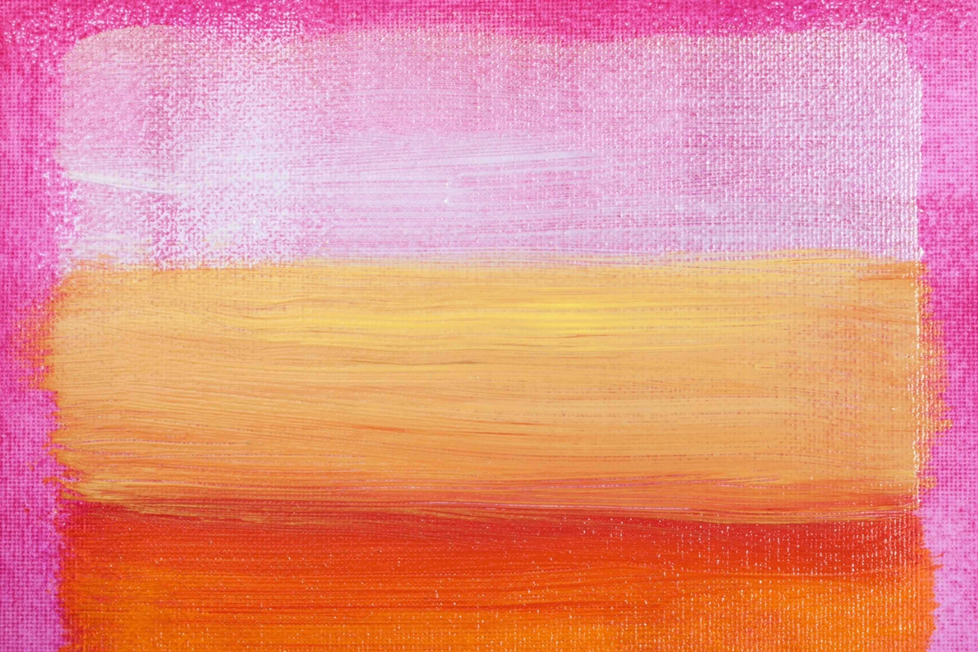
Understanding color temperature helps you set the overall mood of a piece and create visual interest through contrast. A painting dominated by warm colors feels very different from one using primarily cool tones. Think about the fiery sunsets I often try to capture versus the cool, misty mornings. It's fascinating how just shifting the temperature can completely change the emotional impact of a scene. I remember trying to paint a forest scene, and it felt flat until I pushed the greens towards cooler, bluer tones in the background and warmer, yellower tones in the foreground – suddenly, it had depth and atmosphere. Take a moment to look around you right now – can you spot warm and cool colors? How do they make you feel?
Beyond the Pure Hue: Value, Saturation, Tints, Shades, and Tones
Understanding the pure colors (hues) on the wheel is just the beginning. To get the full spectrum of possibilities, you need to know how to modify these hues. This is where Value and Saturation come in. Think of it like this: the hue is the color's identity (Red, Blue, Green), but value and saturation are its brightness and intensity dial.
- Value: This refers to how light or dark a color is. It's about the amount of white or black mixed in. Imagine a grayscale from pure white to pure black – value is where your color sits on that scale. Adding white increases value (makes it lighter); adding black decreases value (makes it darker). Think of a bright sky blue (high value) versus a deep midnight blue (low value).
- Saturation: This is the intensity, purity, or vividness of a color. A highly saturated color is bright and clean (like the pure hues on the wheel), while a less saturated color is duller, more muted, or greyed down. Imagine a fire engine red (high saturation) versus a dusty brick red (low saturation). It's the difference between a loud shout and a quiet whisper.
These two properties give us:
- Tints: Created by adding white to a hue. This increases its value (makes it lighter) and decreases its saturation, resulting in softer, paler colors like pastels (e.g., adding white to red makes pink). Tints feel airy and light.
- Shades: Created by adding black to a hue. This decreases its value (makes it darker) and often slightly decreases saturation, resulting in deeper, richer colors (e.g., adding black to blue makes navy). Shades feel grounded and moody.
- Tones: Created by adding grey to a hue, or more commonly for artists, by mixing a color with its complement (the color directly opposite it on the wheel). This primarily decreases saturation, making the color less vibrant or muted, while the value can vary depending on the grey or complement used. Mixing with a complement is incredibly powerful because complements neutralize each other. Adding a tiny bit of green to red, for instance, won't necessarily make it brown, but it will make the red less intense, creating a more subtle tone – like adding a little bit of the 'opposite' to calm things down. This is crucial for creating realistic shadows, soft, atmospheric effects, or just dialing down the intensity of a color without making it simply lighter or darker. For example, adding a touch of red's complement (green) to a vibrant red can create a more natural, earthy red perfect for painting skin tones or muted landscapes. Tones feel sophisticated and nuanced.
These modifications are crucial for creating depth, mood, and realism (or intentional lack thereof!) in your work. They allow you to move beyond the bright, flat colors of the pure wheel into a world of subtle nuance. Mastering value and saturation is arguably even more important than mastering hue for creating compelling compositions. It felt like unlocking a secret dimension in my own painting process, suddenly seeing the world not just in colors, but in how light and shadow played on those colors.
Why Should You Care? (The Artist's Perspective)
Honestly, for a long time, I just mixed colors by feel. A bit of this, a bit of that, hoping for the best. Sometimes it worked, sometimes... well, let's just say some canvases ended up looking like mud puddles after a particularly vibrant rainstorm. Learning the color wheel wasn't about stifling my creativity; it was about giving me a map and a language. It's like learning grammar before writing poetry – you can break the rules more effectively when you know what they are.
Understanding how colors interact gives you control. It allows you to predict outcomes, troubleshoot muddy mixes, and intentionally create specific moods or effects. It helps you understand why that violet turned muddy (maybe your blue had a yellow bias, or your red had an orange bias – more on that in a moment!) and how to fix it. It turns frustration into informed experimentation.
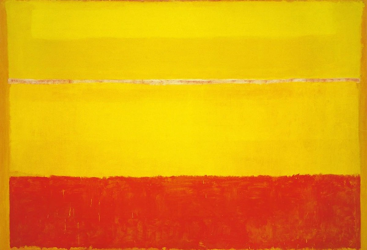
Color isn't just about aesthetics; it's deeply tied to emotion and psychology. Different colors evoke different feelings, and how they're combined can amplify or contradict those feelings. Think about the vibrant, emotional palettes of the Fauvists or the intense, spiritual colors of Rothko. They weren't just slapping paint on a canvas; they were speaking a language. If you're curious about how artists wield this power, check out my thoughts on The Secret Language of Color or the Psychology of Color in Impressionist Painting.
How to Actually Use the Color Wheel (Practical Application)
This is where the rubber meets the road, or rather, the brush meets the canvas. The color wheel helps you understand color harmony – combinations of colors that are pleasing to the eye. Ready to see how these relationships translate into stunning palettes? Here are some classic combinations derived from the wheel:
Understanding Color Relationships & Schemes
Scheme Name | Definition (Based on Wheel) | Typical Visual Effect/Mood | Example Artwork (Consider looking these up!) |
|---|---|---|---|
| Complementary | Two colors directly opposite each other (e.g., Red & Green) | High contrast, vibrant, creates visual tension/excitement. | Vincent van Gogh, The Night Café |
| Analogous | Three colors next to each other (e.g., Yellow, Yellow-Orange, Orange) | Harmonious, comfortable, serene, creates a sense of unity. | Claude Monet, Water Lilies series |
| Triadic | Three colors evenly spaced (e.g., Red, Yellow, Blue) | Vibrant, balanced, offers strong contrast while remaining harmonious. | Piet Mondrian, Composition with Red, Blue and Yellow |
| Split-Complementary | One color plus the two colors adjacent to its complement (e.g., Blue + Yellow-Orange & Red-Orange) | High contrast, but less intense than complementary; offers more variety. | Often seen in landscapes for vibrant but not jarring contrast. |
| Tetradic (Rectangular) | Four colors arranged into two complementary pairs. | Rich, varied, requires careful balancing to avoid chaos. Often best to let one color dominate or vary values/saturations significantly. | Many complex, multi-colored compositions. |
| Square | Four colors evenly spaced around the wheel. | Similar to Tetradic, vibrant, requires careful balancing. Consider varying values and saturations to manage complexity. | Can be found in bold, graphic design or abstract art. |
| Monochromatic | Variations (tints, shades, tones) of a single hue. | Subtle, cohesive, creates depth within one color family. | Pablo Picasso, The Old Guitarist (Blue Period) |
| Achromatic | Uses only black, white, and shades of grey. | Stark, minimalist, focuses on form, light, and texture. | Ansel Adams' photography |
These schemes are starting points, not rigid rules. They give you a framework to build upon. You can see these principles at play in everything from classical painting to Modern Art and even How to Make Abstract Art.
Mastering Pigment Bias
Here's a crucial nuance the basic wheel doesn't always show: pigments aren't pure. A tube labeled "Red" might lean slightly orange or slightly violet. This is called pigment bias. It exists because of the specific chemical composition of the pigments used to create the paint. Understanding this is key to clean color mixing.
- Warm Reds (like Cadmium Red) lean towards orange.
- Cool Reds (like Alizarin Crimson) lean towards violet.
- Warm Yellows (like Cadmium Yellow) lean towards orange.
- Cool Yellows (like Lemon Yellow) lean towards green.
- Warm Blues (like Ultramarine Blue) lean towards violet.
- Cool Blues (like Cerulean Blue) lean towards green.
Why does this matter? If you mix a warm red (orange bias) with a warm yellow (orange bias), you get a vibrant orange. But if you mix a cool red (violet bias) with a cool yellow (green bias), you're essentially introducing tiny amounts of violet and green (the complements of yellow and red, respectively) into the mix. Complements neutralize each other, so instead of a clean orange, you get a duller, muddier color. This was the secret behind my bruised mud violet! My blue likely had a green bias, and my red had an orange bias, introducing yellow (complement of violet) into the mix. It's like trying to mix a pure color but accidentally adding a tiny bit of its opposite – it just dulls the whole thing down.
Knowing your pigments' biases allows you to choose the right primaries for the secondary color you want to achieve. Want a clean, vibrant green? Mix a cool yellow (green bias) with a cool blue (green bias). Want a muted, earthy green? Mix a warm yellow (orange bias) with a warm blue (violet bias) – the orange and violet biases will introduce red (green's complement), toning down the green. I remember finally understanding why my attempts at vibrant purples were always slightly off until I switched from a warm red to a cool red – suddenly, the mixes were clean and singing!
Mixing Techniques & Troubleshooting
The wheel, combined with an understanding of pigment bias, is your ultimate guide here. Need a specific shade of green? Look at where green sits between yellow and blue. Consider the bias of your specific yellows and blues. Want to tone down a color without making it muddy? Add a tiny bit of its complement, keeping pigment bias in mind. For example, if your red is too intense, adding a tiny amount of its complement, green (using a green pigment with a red bias, like Viridian, can be helpful here), will neutralize it and make the red less saturated. Similarly, if a blue feels too bright, adding a touch of orange (its complement) will mute it down, creating a more atmospheric or natural blue, perfect for distant mountains or soft shadows. This is how you create those beautiful, subtle tones you see in realistic paintings or atmospheric landscapes.
This is where practice comes in, of course. Theory is essential, but nothing replaces getting your hands dirty and seeing how your specific paints interact. Different mediums (oils, acrylics, watercolors) also behave slightly differently, adding another layer of nuance. But the color wheel provides the theoretical foundation to understand why things happen and troubleshoot when they don't go as planned.
The Power of a Limited Palette
One practical tip I learned is creating a limited palette based on the color wheel and pigment bias. Instead of having every color imaginable, choose a warm and cool version of each primary (e.g., Cadmium Red, Alizarin Crimson, Cadmium Yellow, Lemon Yellow, Ultramarine Blue, Cerulean Blue) plus white and maybe a black or earth tone. This forces you to mix most colors, deepening your understanding of how they interact and giving your work a more cohesive feel. For a landscape, I might lean towards cooler blues and greens and warmer yellows and reds; for a portrait, I'd focus on specific warm/cool reds and yellows for skin tones. It's a fantastic exercise!
Choosing Palettes & Considering Lighting
Whether you're planning a painting or decorating a room, the color wheel helps you choose a palette with intention. Want a calm, serene space? Analogous colors are your friend. Want a bold, energetic piece? Complementary or triadic schemes might be the way to go. This applies to everything from fine art to choosing Art for New Homeowners or even Choosing Art Based on Room Color.
For a recent abstract series, I decided to work with a monochromatic palette based on deep blues and violets. My goal was to evoke a sense of calm and introspection. Using the color wheel, I explored different shades and tints of blue and violet, adding black and white to create depth and variation within that single color family. The result was a cohesive, moody series that felt exactly as intended, all thanks to starting with that monochromatic concept.
It's also important to remember that lighting conditions dramatically affect how colors appear. Warm indoor lighting (incandescent/LED) will make blues appear duller and reds/yellows warmer, while cool daylight or fluorescent light will make blues pop and warm colors appear less saturated. As an artist, you might adjust your palette or mixing to compensate for the intended viewing environment, or simply be aware that your beautiful, perfectly mixed color might look slightly different under different lights. This is especially true for digital art, where the color model is different, but the principles of harmony and the impact of screen calibration still matter.
Color Psychology in Practice: What Colors Say
Beyond the technical aspects, color speaks a language all its own. Understanding basic color psychology can dramatically impact how your art is perceived or how a space feels. While subjective, certain colors have common associations:
- Red: Passion, energy, danger, excitement, love. It's attention-grabbing and can feel intense.
- Orange: Enthusiasm, creativity, warmth, friendliness. Often seen as energetic and inviting.
- Yellow: Happiness, optimism, caution, intellect. Can be cheerful but also overwhelming in large doses.
- Green: Nature, growth, harmony, freshness, tranquility. Feels balanced and calming.
- Blue: Calm, trust, stability, sadness, coolness. Can be serene or melancholic.
- Violet/Purple: Royalty, mystery, creativity, spirituality. Can feel luxurious or introspective.
- Black: Power, elegance, mystery, grief. Can be sophisticated or oppressive.
- White: Purity, innocence, cleanliness, simplicity. Feels open and clean.
Artists use these associations intentionally. A portrait artist might use warm, slightly desaturated tones for skin to feel natural and inviting, while an abstract artist might use jarring complementary colors to create a sense of unease or excitement. Think about how the cool blues and greens in a landscape can evoke a sense of peace, or how a splash of vibrant red can draw the eye and create a focal point. It's a powerful tool for storytelling and emotional connection. It's also worth remembering that color symbolism can vary significantly across cultures – white, for instance, is associated with purity in some cultures but mourning in others. This adds another fascinating layer to the language of color.
Local Color vs. Perceived Color: Seeing the World Like an Artist
Here's a concept that ties the technical to the observational: Local Color is the inherent color of an object in neutral white light (e.g., a red apple is 'locally' red). Perceived Color is how that color actually appears to our eyes, influenced by lighting conditions, atmospheric effects, and the colors surrounding it. A red apple under cool blue light will appear different than under warm yellow light. A white wall next to a green field might pick up subtle green reflections. Or think about how a white object in a sunlit forest might appear greenish or yellowish due to reflected light from the leaves and ground. Understanding this helps artists paint what they see, not just what they know the color to be. It's why shadows aren't just darker versions of the local color, but often contain cooler tones or reflections from the environment. It adds another layer of complexity and beauty to the act of observation and painting.
Practical Color Wheel Exercises to Try
Ready to move from theory to practice? Here are a few simple exercises to deepen your understanding:
- Build Your Own Wheel: Using your primary paints (Red, Yellow, Blue), mix your secondary and tertiary colors to create your own physical color wheel. Pay attention to the ratios needed and how your specific pigments behave. Note down which specific pigments (e.g., Cadmium Yellow Light, Ultramarine Blue) you used for each mix – this helps you learn their biases!
- Monochromatic Study: Choose one hue and create a small painting or study using only tints, shades, and tones of that single color. Focus on value and saturation to create depth.
- Complementary Pair Study: Choose a complementary pair (e.g., Red and Green). Create a small piece using only these two colors and their mixtures (which will create tones). See how they interact and how mixing them neutralizes intensity.
- Limited Palette Challenge: Select a warm and cool version of each primary (six tubes total, plus white/black). Try painting a subject using only these colors, forcing yourself to mix everything else. This is a fantastic way to learn your pigments.
- Observe Color in the World: Actively look for color schemes in nature, architecture, or everyday objects. Can you identify analogous colors in a garden? Complementary colors in a logo? How does the light change the perceived color of objects throughout the day?
These exercises aren't just busywork; they build your intuition and practical skills, making the color wheel less of a chart and more of a living tool.
Beyond the Basics: Finding Your Color Voice
Using the color wheel isn't about being rigid. It's a tool, not a dictator. I often start with a scheme in mind, but then my intuition takes over. Sometimes the most exciting discoveries happen when you deliberately nudge outside the lines, understanding why it works (or doesn't) because you know the underlying principles. It's the difference between blindly following a recipe and knowing enough about ingredients to invent your own dish.
For abstract art, the color wheel is particularly freeing. Since you're not tied to representing reality, you can play with relationships purely for their visual and emotional impact. It's like composing music – the notes (colors) have relationships, and understanding them lets you create symphonies or jarring punk rock, whatever you feel! My journey into How to Make Abstract Art definitely deepened my appreciation for pure color interaction.
Understanding the color wheel also helps you develop your own unique color voice or signature palette. By experimenting with different schemes, biases, and value/saturation variations, you start to gravitate towards certain combinations that resonate with you and your artistic vision. It's a process of informed exploration.

It's also a reminder that color is just one element of art, albeit a powerful one. It works in tandem with Elements of Art Explained like line, shape, texture, and space, and plays a huge role in Art Composition: A Viewer's Guide. The color wheel gives you a handle on one crucial piece of that puzzle.
FAQs
Still have questions swirling around like a messy paint mix? Let's try to clear them up.
- Is the color wheel only for painters? Absolutely not! Designers, photographers, interior decorators, fashion designers, even chefs think about color relationships. It's a universal principle.
- Do I have to use the color wheel? Nope. Some artists work purely intuitively, and that's valid. But if you find yourself struggling with color choices or wanting more control and predictability, it's an invaluable resource.
- Where can I get a color wheel? Most art supply stores sell them, or you can find interactive versions online or as apps. They're usually inexpensive and worth having around.
- What's the difference between RYB, RGB, CMYK, and modern CMY? RYB (Red, Yellow, Blue) is the traditional model for mixing pigments (like paint) and the basis for the classic color wheel. RGB (Red, Green, Blue) is for mixing light (like on screens). CMYK (Cyan, Magenta, Yellow, Key/Black) is used in printing and represents modern pigment primaries. While CMY are technically 'truer' primaries for mixing a wider gamut, the RYB wheel is still widely taught and useful for understanding fundamental color relationships and mixing concepts in traditional art.
- How does pigment bias affect mixing? Pigment bias refers to the subtle leanings of primary colors towards other colors (e.g., a red leaning orange or violet). Mixing primaries with clashing biases (like a cool red and a cool yellow) introduces small amounts of complements, which can neutralize and muddy the resulting secondary color. Understanding bias helps you choose primaries that will give you the cleanest or most intentionally muted mixes.
- Does the color wheel apply to digital art? Yes! While digital art uses the RGB or CMYK color models, the principles of color harmony, temperature, value, and saturation derived from the color wheel are still fundamental to creating visually pleasing and effective digital artwork.
- How does color blindness affect using the color wheel? Color blindness (or color vision deficiency) affects how individuals perceive certain colors or color differences. While the principles of the color wheel (relationships, value, saturation) still apply, artists with color blindness may rely more heavily on value and saturation contrasts, or use tools/apps that simulate different types of color vision deficiency to ensure their work is accessible and impactful for all viewers. It's a reminder that color perception is a complex, personal experience.
Hopefully, that clears up a few things! Don't hesitate to experiment and see how these concepts play out in your own work.
Wrapping Up
The color wheel might seem simple, but it's a powerful tool for understanding the complex world of color. It's given me confidence in my own studio, helping me move past guesswork to intentional choices. It's not about following rigid rules, but about having a foundation to build upon, experiment with, and ultimately, express yourself more fully. Just last week, I used the principle of analogous colors, combined with an understanding of value shifts, to create a surprisingly vibrant yet harmonious background for a new piece, something I might not have attempted without that basic understanding.
So, grab a wheel, grab some paint (or just look around you!), and start exploring. You might be surprised at the colorful discoveries you make. And remember, the journey of understanding color is ongoing – there's always more to learn and experiment with. What's one color combination you're excited to try or understand better now?
If you're feeling inspired to bring more color into your life, perhaps explore some Art for Sale or learn more about my own Artist's Journey.
Explore More
Color Theory & Elements
Art History & Movements
- [Famous Abstract Art](/finder/page/famous abstract art)


