Choosing Art Based on Room Color: An Artist's Guide to Harmony & Contrast
Unlock the secret to choosing art for your home based on room color. An artist shares personal insights, practical tips on harmony vs. contrast, lighting, texture, framing, and finding pieces that truly resonate with your space and soul.
Choosing Art Based on Room Color: A Personal Journey Through Hue and Harmony
Okay, let's talk color. Not just the color on your walls, but the color that makes you feel something. As an artist, I spend an inordinate amount of time thinking about how colors interact, how they sing (or sometimes scream) at each other, and how they can completely transform a space or a mood. It's not just about slapping paint on a canvas; it's about creating an experience.
I remember once trying to hang a vibrant, fiery abstract piece in a room I'd just painted a calming, cool sage green. In my head, it was going to be this exciting, dynamic contrast. But when I held it up... it just fought the wall. It felt jarring, like two people shouting different conversations in the same small room. It taught me that while contrast can be thrilling, it needs intention and balance. Sometimes, the most beautiful pairings are happy accidents, born from just trying things out, and sometimes, they require a bit more thought than just 'opposite sides of the color wheel'. (Learning how to define your personal art style and taste is a great first step, by the way.)
So, when it comes to choosing art for your home, especially in relation to your room's color, it's less about following rigid rules and more about understanding how colors play together and, most importantly, how they make you feel in your space. Think of your room color not as a dictator, but as a friendly guide, maybe a slightly eccentric one, pointing you towards possibilities you hadn't considered.
The Emotional Palette: Why Room Color Matters
Before we even look at art, let's acknowledge the power of the walls around us. A room painted a deep, moody blue feels vastly different from one bathed in cheerful yellow or serene green. Color psychology is a real thing, influencing our moods, energy levels, and even how we interact within a space. As an artist, I constantly think about this – how does the red in a painting make you feel? Does the blue evoke calm or sadness? We spend ages figuring out how artists use color to evoke specific emotions, and those same principles apply to the colors you choose for your home.
Your room color sets the stage. It's the backdrop against which everything else, including your art, will be seen. Choosing art that either harmonizes with or intentionally contrasts with this backdrop is key to creating a cohesive and impactful space. It's like picking the right outfit for a specific event – you want your art to fit the vibe, or perhaps, delightfully, challenge it.
Starting with Your Walls: A Colorful Compass
Let's break it down by wall color, because, let's be honest, that's often the biggest block of color you're dealing with.
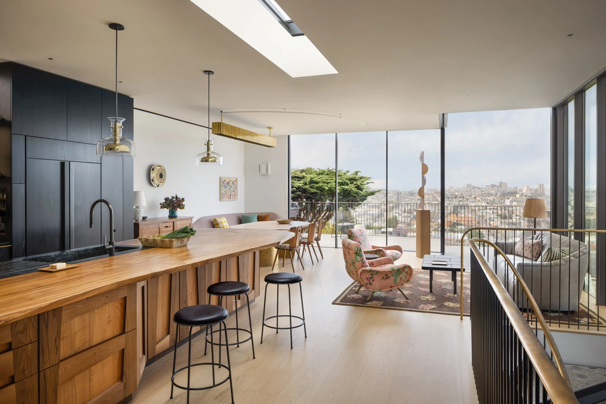
Neutral Walls (White, Gray, Beige, Cream)
Ah, the classic canvas. Neutral walls are the chameleons of the design world. They're forgiving, versatile, and let your art truly be the star. Sometimes, staring at a blank white wall feels like a challenge, like it's daring you to make a statement. And you absolutely can!
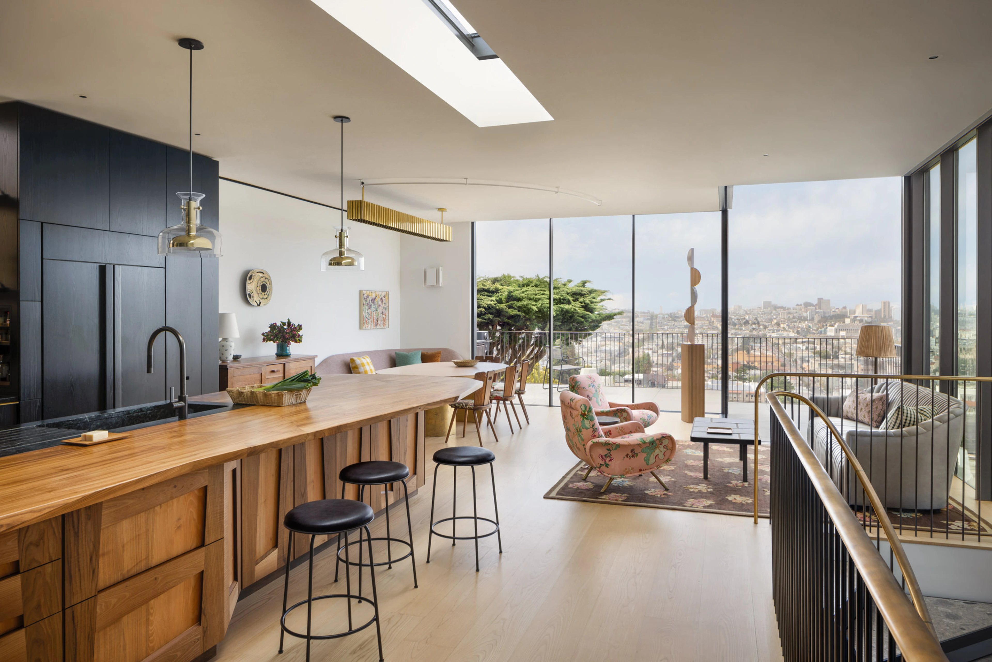
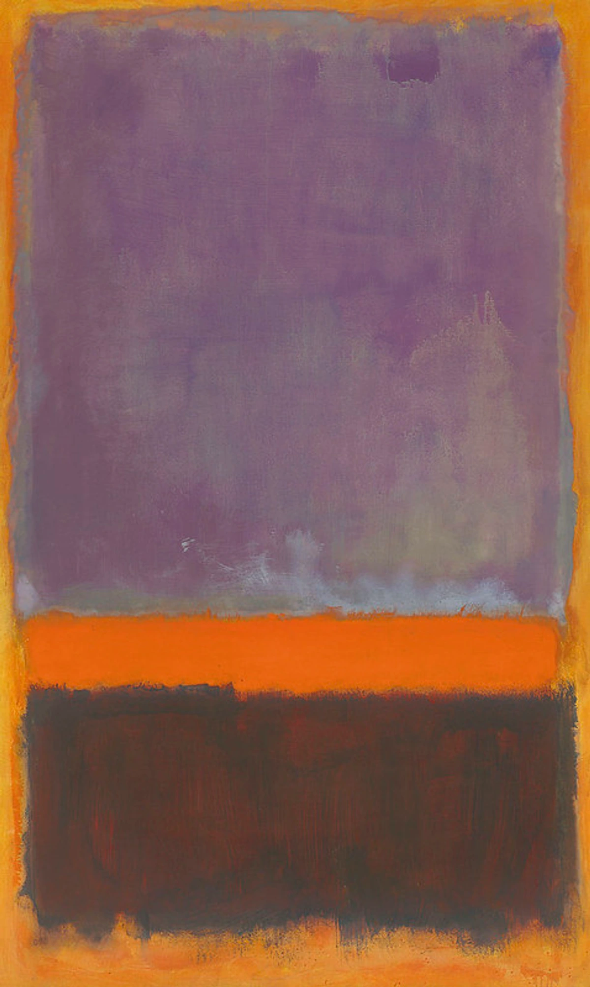
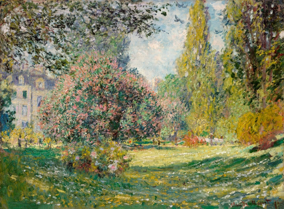
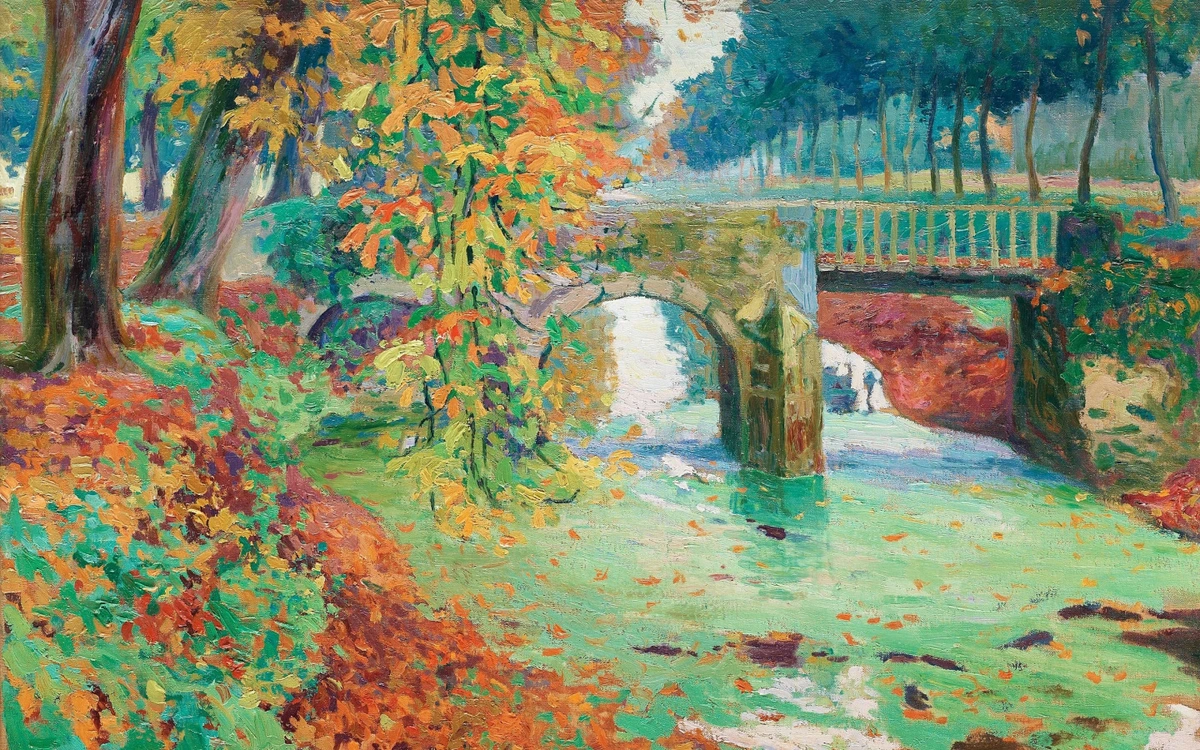
- Opportunity: This is where you can go bold! Vibrant colors, large-scale pieces, or a gallery wall with diverse styles can all work beautifully. The neutral background prevents visual clutter. Think of a bright abstract piece – it just sings against a soft gray or crisp white. A Mark Rothko color field painting, like one with deep purples and oranges, could create a meditative focal point against a soft gray wall.
Or consider a striking black and white photograph or a highly detailed line drawing. Against a neutral wall, the focus shifts entirely to the subject matter, composition, and texture of the artwork itself, creating a different kind of impact than color alone.
credit, licence
- Consideration: While anything can work, think about the feeling you want. A minimalist abstract piece might enhance the calm, while a riot of color could inject energy.
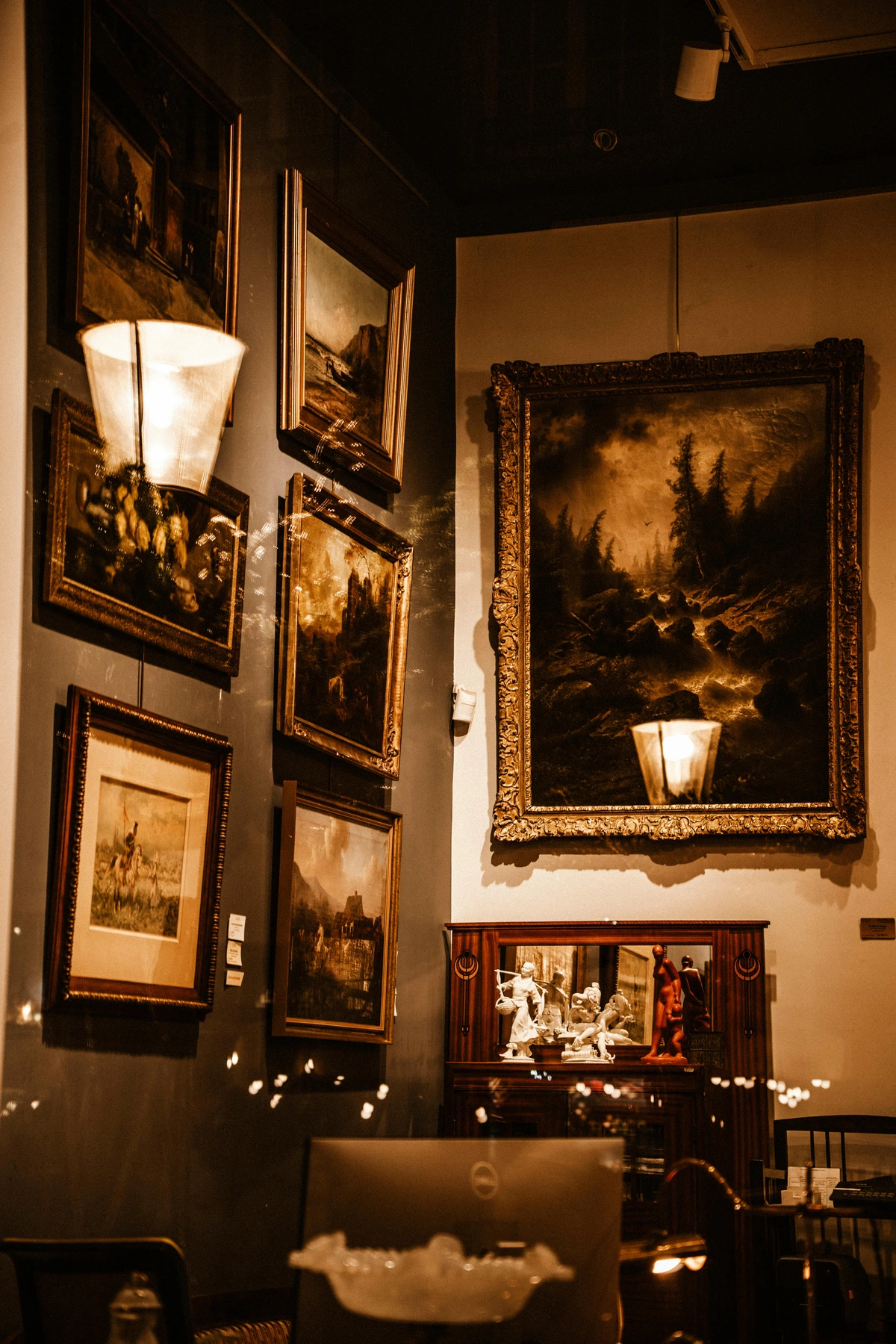
Bold or Dark Walls (Navy, Charcoal, Emerald Green, Deep Red)
Now things get interesting. Bold or dark walls create drama and intimacy. They can make colors in art pop in a way white walls can't. I remember painting a small study a deep, inky blue, and suddenly, even simple sketches felt profound.
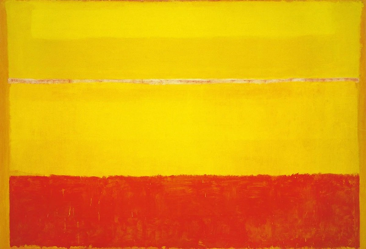
- Opportunity: Metallic accents (gold, brass, silver) in frames or the art itself look stunning. Art with a lot of white space or bright, contrasting colors will really stand out. Think jewel tones against a deep background. A vibrant abstract with yellows and reds, like some of Rothko's later works, would absolutely sing against a charcoal or navy wall.
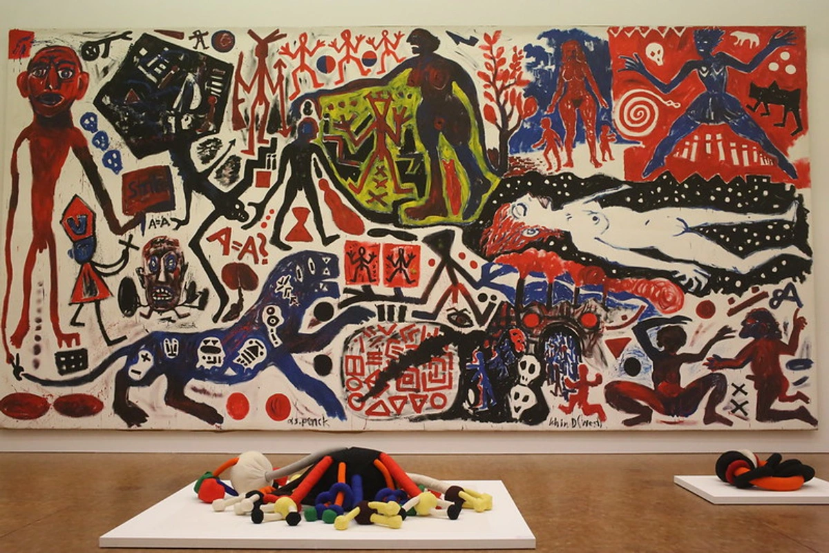
Consider a piece with metallic leaf or a contemporary portrait with dramatic lighting – the dark wall acts like a velvet curtain, making the artwork feel richer and more intense. A piece like A.R. Penck's work, with its bold symbols and contrasting colors, could feel incredibly powerful against a dark wall.
- Consideration: Avoid art that's too dark or muted, as it might get lost. The art needs enough visual weight or contrast to hold its own. It's like trying to whisper in a loud room – your art needs to speak up!
Colored Walls (Pastels, Bright Hues, Patterns)
Colored walls bring their own personality. They're already part of the conversation, so your art needs to join in thoughtfully. This is where it gets tricky, but also potentially the most rewarding. I once saw a bright orange abstract piece hung on a vibrant teal wall – it was a bold choice that shouldn't have worked, but the specific shades and the energy of the room made it sing. It was a delightful visual argument that ended in harmony.
- Harmonize: Choose art with colors that are similar or analogous to the wall color (e.g., blues and greens on a blue wall). This creates a calm, cohesive look. Think soft landscapes or abstract pieces with a similar color family. It's like a gentle, flowing melody. This approach often works well in bedrooms or spaces where relaxation is key.
- Complement: Use colors opposite the wall color on the color wheel (e.g., orange or yellow on a blue wall). This creates energy and vibrancy. It's a bolder choice, but can be incredibly effective. A bright, Fauvist-style piece with intense oranges and yellows could be electric on a blue wall. This is where the colors have a lively debate, but in a good way.

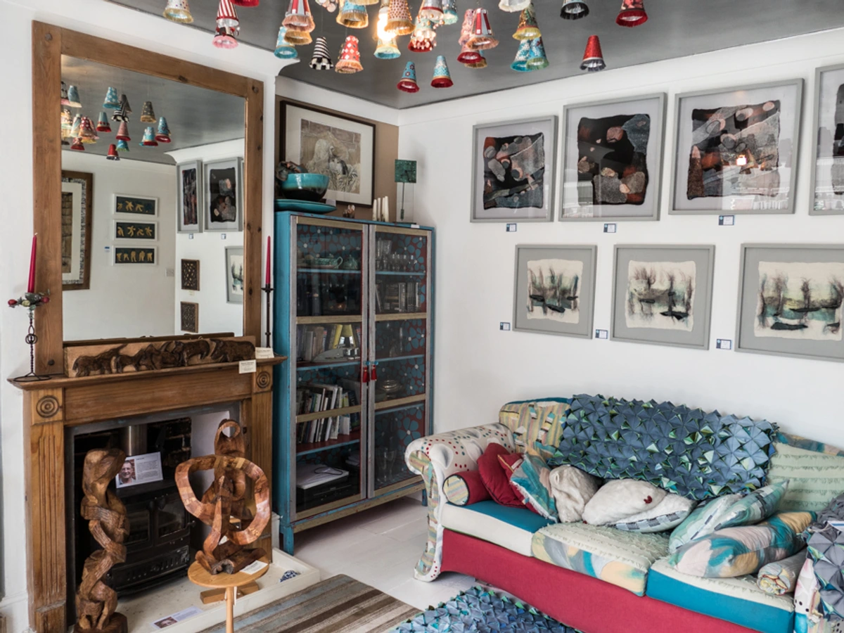
- Neutral Art: Black and white photography or drawings can provide a grounding contrast against a colorful wall without competing with the hue. They offer a moment of visual quiet.
- Patterned Walls: If your walls have a busy pattern, consider art that is simpler in composition or uses colors pulled directly from the pattern. Alternatively, a bold, graphic piece can sometimes work as a deliberate contrast, but this requires careful balance. Think about the scale of the patterns – a small, intricate wall pattern might pair well with a large, simple graphic print, whereas a large, bold wall pattern might need a very minimalist piece or something that picks up just one or two colors from the pattern. Hanging a painting with a detailed scene on a busy floral wallpaper, for instance, can be visually overwhelming unless the painting is large enough and framed to create a clear separation.
Harmony vs. Contrast: The Great Debate (Or Not)
This is where personal taste really kicks in. Do you want your art to blend in beautifully, creating a serene, harmonious environment? Or do you want it to pop, creating a dynamic, high-contrast statement? There's no right answer, only your answer. In my own work, I often find myself playing with both – sometimes a piece is about the subtle vibration of similar hues, and other times it's about the electric tension of opposites. It depends entirely on the feeling I want to evoke.
- Harmony: Choosing art with a similar color palette to your room creates a sense of calm and sophistication. It feels intentional and put-together. Think soft landscapes in a green room or warm abstracts in a terracotta space. It's like a gentle hum. This approach often works well in bedrooms or spaces where relaxation is key.
- Contrast: Choosing art with colors that are opposite or significantly different from your room color creates excitement and draws the eye. It makes the art a focal point. A bright abstract on a dark wall, or a cool-toned piece in a warm-toned room. This is where colors can really sing or even scream in a good way, creating visual tension that keeps the eye engaged. This can be fantastic for living rooms, dining areas, or entryways where you want to make an impact.

Neither is inherently better; it's about the mood you want to create. It's your space, your rules. What feeling do you want this room to evoke?
Beyond the Wall: The Art's Own Story and Room Context
Remember, the wall color is just one piece of the puzzle. The art itself has its own story to tell, its own palette, its own style. ([Abstract art](/finder/page/famous abstract art) has a different energy than a classical portrait, for example.) And the room itself has a purpose.
The Art's Palette and Undertones
Look at the dominant colors in the artwork. How do they interact with your wall color? Do they fight, or do they complement? Think about the overall temperature of the art's palette – is it warm (reds, oranges, yellows) or cool (blues, greens, purples)? A warm painting can feel cozy on a warm wall (harmony) or vibrant on a cool wall (contrast). A cool painting can feel calming on a cool wall or striking on a warm wall.
Also, consider the undertones. Is your gray wall a cool, blue-gray or a warm, brown-gray? Does the white in the painting have a yellow or a blue tint? Matching or intentionally contrasting these subtle undertones can make a big difference in how the art feels in the space. Think of a seemingly neutral beige wall – does it lean pink or yellow? An artwork with similar undertones will blend seamlessly, while one with contrasting undertones might feel slightly off, or perhaps, intentionally jarring in an interesting way. It's like finding the right key for a song, or maybe more like trying to match the perfect foundation shade to your skin – those subtle shifts in warmth or coolness make all the difference!

The Room's Purpose and Existing Elements
Beyond the walls, the room itself speaks volumes. Is it a vibrant living room meant for entertaining, a serene bedroom for rest, a focused home office, or a playful child's room? The function of the space should influence the mood you want to create, which in turn guides your art choices. For me, the art in my studio is often different from the art in my living space – one is about energy and inspiration, the other about calm and reflection.
Consider the existing elements in the room: furniture, rugs, curtains, pillows, decor objects. These aren't just background noise; they contribute significantly to the room's overall color scheme, texture, and style. Your art needs to converse with these elements too. A bold abstract might clash with a traditional floral sofa, or it might be the perfect modern counterpoint. A delicate watercolor might get lost in a room filled with heavy textures, or it could provide a much-needed moment of lightness.
Think of it as building a complete outfit – the wall color is the main garment, but the art is the statement accessory, and the furniture/decor are the shoes and jewelry. Everything needs to work together, even if through deliberate contrast.
Practical Considerations: Size, Framing, and Light
Color interaction isn't the only practical aspect. How the art is presented and seen matters just as much.
Size and Scale
The size of the artwork relative to the wall and the room is crucial. A tiny piece on a vast wall will look lost, no matter how perfect the color match. Conversely, a massive piece in a small room can feel overwhelming. As an artist, I think about scale constantly – how does the work fill the space? How does it relate to the viewer's body? For your home, consider the wall space available and the overall size of the room. A large statement piece can anchor a wall, while smaller pieces work well in a gallery wall arrangement or in more intimate corners. If you have a large wall but smaller pieces you love, grouping them effectively can create the necessary visual weight.

Framing and Presentation
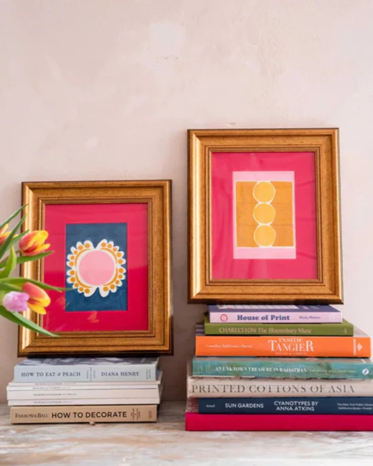
The frame is the bridge between the art and the wall. It can enhance the artwork, complement the wall color, or even add another layer of contrast or harmony. A warm wooden frame might soften a bold wall, while a sleek metallic frame could add a modern edge to a neutral space. Consider the material and finish of the frame too – natural wood adds warmth and texture, painted wood can match or contrast colors, and metal (like brushed aluminum or polished brass) brings a different kind of visual weight and shine. A simple canvas wrap offers a minimalist look where the art extends to the edge. The matting (the border around the art within the frame) also plays a role, providing visual breathing room and influencing how the art's colors interact with the frame and wall. Don't underestimate the power of a well-chosen frame! (The ultimate guide to framing your artwork is a rabbit hole worth going down.)
Lighting
Lighting changes everything. Natural light shifts throughout the day, altering how colors appear. Artificial light sources also dramatically impact the perception of both wall color and artwork. Consider the type of artificial light – warm LED bulbs will make reds and yellows pop and cool colors recede, while cool fluorescent or daylight bulbs will enhance blues and greens. Spotlights can create drama and highlight texture, while ambient light provides a softer, more even illumination. Consider how the room is lit at different times and how this affects the art. Sometimes, a piece that looks perfect in daylight might feel dull under evening lamps, or vice versa. This is why seeing art in person, if possible, is always a good idea, or at least considering the lighting conditions of your specific space.
Wall Texture
It's also worth a quick thought about the texture of your walls. A perfectly smooth, matte wall will absorb light and make colors appear flatter, which can be great for letting vibrant art stand out. A wall with a slight texture (like orange peel or knockdown) or a finish with a sheen (eggshell, satin, gloss) will reflect more light, adding subtle variations to the wall color itself and potentially interacting differently with the texture or finish of the artwork. It's a small detail, but one that can subtly influence the overall feel.
Addressing Common Challenges
What about rooms that don't fit neatly into one category? Or spaces with multiple colors or open plans?
- Rooms with Multiple Wall Colors: In spaces where walls are painted different colors or transition between hues (like an open-plan living/dining area), consider the dominant color in the specific zone where the art will hang. Alternatively, choose art that incorporates colors from both wall colors to create a bridge between the spaces. Neutral art (black and white, sepia tones) is also a safe and effective choice here, providing visual continuity.
- Open-Plan Spaces: In large, open areas, art can help define different zones. Use the art's color palette to reinforce the intended mood or function of a specific area, even if the wall color is consistent throughout. A vibrant piece might mark a lively seating area, while a calming piece could define a reading nook.
- Patterned Art on Patterned Walls: This is tricky! Generally, one element should be dominant. If the wall pattern is bold, choose art with a simple composition and limited color palette, perhaps pulling one or two colors from the wall pattern. If the art is busy, a solid or subtly textured wall color is usually best. Sometimes, a deliberate clash can work in a highly eclectic space, but it requires a confident hand and a willingness to experiment. Remember the scale point – varying the scale of the patterns is often key to making this work without looking messy.
Finding Art That Resonates
Ultimately, choosing art is a deeply personal journey. While color harmony and contrast are valuable tools, they are just that – tools. The most important factor is whether the art speaks to you. Does it evoke an emotion? Does it tell a story you connect with? Does it simply make you happy to look at? Does this piece make your heart sing? (Finding art in unexpected places can lead to wonderful discoveries.)
Don't be afraid to experiment. Try holding pieces up against your walls (carefully!). Use online tools that let you visualize art in a room. Visit galleries (What is an art gallery?) and art fairs (Visiting art fairs) to see how different pieces make you feel in person. Consider supporting artists directly (Buying art from local artists). My own journey as an artist has taught me that the connection to the work is paramount, whether it's a piece I created or one I've brought into my own home. You can even explore my own art for sale if you're looking for something vibrant and contemporary.
Choosing art for your home is an ongoing conversation between your space, your art, and your soul. Let color be your guide, but let your heart make the final decision. And remember, there are no real mistakes, only opportunities to learn and rearrange. Happy decorating, and may your walls be ever vibrant (or serenely calm, whatever feels right to you)!


