The Emotional Brushstroke: Unpacking the Psychology of Color in Impressionist Painting
Explore how Impressionist painters revolutionized art by using color to evoke emotion and capture fleeting moments. Discover their groundbreaking techniques like broken color, complementary hues, and colored shadows, and understand their lasting impact on modern art.
The Emotional Brushstroke: Unpacking the Psychology of Color in Impressionist Painting
Okay, let's talk about color. Not just 'oh, that's a nice blue' color, but the kind of color that hits you right in the gut, makes you feel something before your brain even catches up. As an artist, I spend a lot of time thinking about color – mixing it, applying it, watching how it interacts. But there's something particularly magical, almost sneaky, about how the Impressionists used it. They weren't just painting what they saw; they were painting what they felt and how the light felt in that fleeting moment. And honestly? It messes with your head in the best possible way. It's like they found a direct line from the canvas to your soul, purely through color. I remember standing in front of a Monet landscape once, and the way the light seemed to vibrate off the canvas... it wasn't just seeing green and blue, it was feeling the warmth of the sun and the coolness of the shade simultaneously. It was a moment that fundamentally shifted how I thought about paint and how artists use color to evoke feeling. It made me realize that color isn't just a visual element; it's a sensory and emotional language all its own. They achieved this revolution through some truly groundbreaking techniques, like using unmixed colors side-by-side and filling shadows with vibrant hues instead of dull browns or blacks. Let's unpack how they did it.
Beyond the Palette: The Impressionist Color Revolution
Before the Impressionists came along in the late 19th century, painting often felt... well, a bit more restrained. Think of the polished, carefully rendered scenes you'd see in the official Salon exhibitions – colors were mixed on the palette to achieve realistic, often muted, tones, and shadows were typically depicted using browns and blacks. It was all very proper and representational, aiming for a kind of photographic likeness, like the detailed architectural scenes or historical paintings of the era. Honestly, looking back, it feels a bit like painting with one hand tied behind your back compared to the freedom the Impressionists embraced. But these new kids on the block, like Monet, Renoir, Pissarro, and Degas, looked at the world and saw something different. They saw light dancing, shadows filled with color, and the vibrant, ever-changing nature of the world around them.
Their goal wasn't photographic accuracy. In fact, the rise of photography at the time arguably freed painting from this very constraint, allowing artists to explore other aspects like light, color, and subjective experience more deeply. This liberation allowed painting to evolve beyond mere documentation. And color was their absolute superpower in this quest. They dragged their easels outside, into the bustling streets and sun-drenched fields – painting en plein air was a revolutionary act in itself! Imagine trying to capture the light of a sunset before it vanishes, battling the wind and the changing angle of the sun. Focusing on the immediate visual impression, especially the color and light, became a practical necessity as much as an artistic choice. This shift was also hugely helped by advancements in chemical pigments during the 19th century, which gave artists access to a wider range of brighter, more stable colors than ever before. Suddenly, vibrant Cadmium Yellows, brilliant Cobalt Blues, rich Viridians, and even new Chrome Yellows and synthetic Ultramarines were readily available in tubes, making it easier to paint outdoors and capture those intense, fleeting colors. Imagine having all these new, intense colors at your disposal – it must have felt like unlocking a new dimension! The sheer speed required to capture the changing light en plein air also pushed them away from careful mixing on the palette towards applying colors more directly, side-by-side.
Beyond Western traditions, the Impressionists were also profoundly influenced by the influx of Japanese woodblock prints (Ukiyo-e) into Europe. These prints often featured flat areas of bold, non-naturalistic color – think vibrant, unshaded reds, blues, and greens used symbolically or decoratively rather than strictly representing reality – and unconventional compositions, which resonated with the Impressionists' desire to break away from traditional representation and explore color for its own sake. This influence on modern art was significant. Artists like Mary Cassatt, who was deeply influenced by Japanese prints, brought a unique perspective to domestic scenes, using color to convey mood and atmosphere in intimate settings. Edgar Degas, while often associated with indoor scenes and artificial light, also experimented with color, particularly in his pastels, capturing the movement and fleeting moments of dancers and bathers with vibrant, layered hues. Other notable Impressionists like Berthe Morisot and Alfred Sisley also contributed significantly to this color revolution, each with their unique touch, further expanding the movement's vibrant palette and focus on capturing light and atmosphere.
The Science (and Magic) Behind Their Hues
So, how did they achieve this vibrant, almost luminous effect? It wasn't just about using bright paints; it was about how they used them. They were, perhaps intuitively or through keen observation, tapping into the psychology and physics of color perception. It's like they were saying, "Let the eye do the work!" While they might not have been strictly adhering to scientific formulas, the ideas circulating at the time, particularly from chemists like Michel Eugène Chevreul, certainly informed their practice. Chevreul's influential works on simultaneous contrast (how colors affect each other when placed side-by-side) and optical mixing provided a theoretical basis for what the Impressionists were discovering through experimentation. It's fascinating to think about this intersection of art and science – were they strictly applying his theories, or did his theories simply articulate what they were already seeing and doing intuitively? Probably a bit of both, right? It makes me wonder how much of my own intuitive color mixing is secretly rooted in physics I don't consciously understand. Probably more than I'd like to admit. It's a bit humbling, honestly, to think that some of the 'magic' I feel when colors interact is actually just... science.
Ready to dive into the specific techniques that made their colors sing?
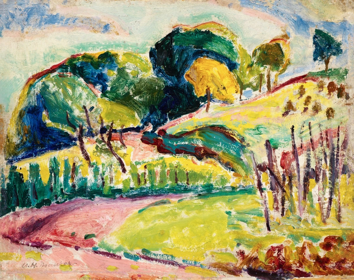
- Broken Color and Optical Mixing: Instead of mixing colors thoroughly on the palette, they'd often apply dabs or strokes of pure color side-by-side. Your eye, standing back, would then mix these colors optically – not on the canvas, but in your brain. Think of a patch of grass – instead of a flat green, they might use strokes of yellow, blue, and green. This creates a vibrating, lively surface that feels much more like actual light hitting foliage.It gives the painting a sense of immediacy and freshness that pre-mixed colors often lack. This technique doesn't just represent light; it feels like light, creating a visual buzz that can make a scene feel more alive and energetic. You can see this technique beautifully in Monet's famous Haystacks series, where the texture of the paint and the juxtaposition of colors create the shimmering effect of light changing throughout the day. Camille Pissarro was another master of this, his landscapes often built from countless small, distinct brushstrokes that merge into harmonious, light-filled scenes when viewed from a distance.It's a bit like how pixels on a screen blend to form an image, or the tiny dots in a newspaper photo create shades of gray. Or maybe like how different instruments in an orchestra play individual notes that blend into a rich chord from a distance. I've experimented with this in my own work, and the way those little dabs of pure color interact from a distance is genuinely fascinating – it feels alive, almost breathing. Trying to control the chaos of those individual strokes while still achieving a cohesive image is a unique challenge. Sometimes it works perfectly, and sometimes... well, let's just say some attempts end up looking less like vibrant light and more like a toddler's finger painting. It's a fine line!
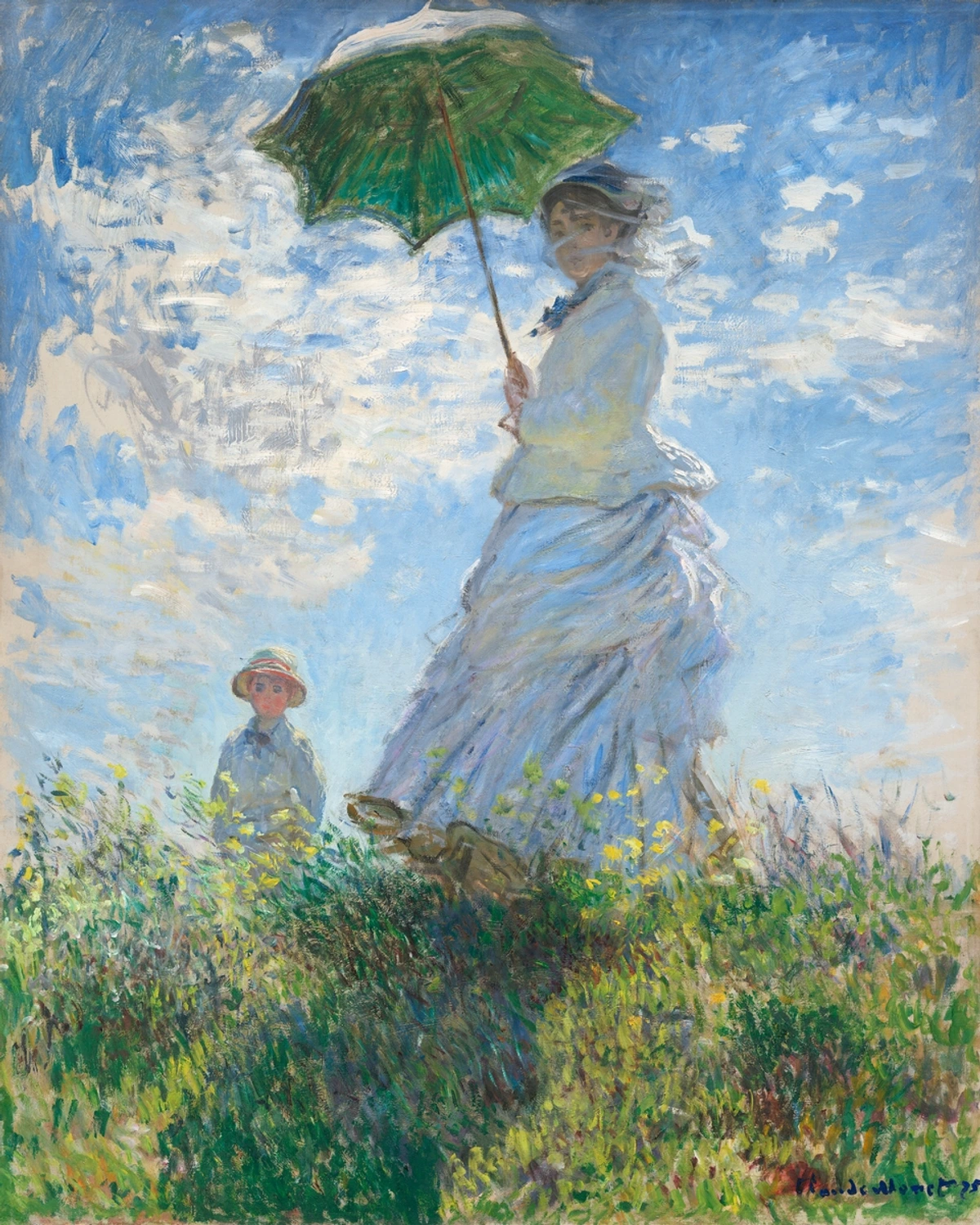
- Embracing Complementary Colors: They understood (or discovered) that placing complementary colors next to each other (like blue and orange, red and green, yellow and violet) makes both colors appear more intense. Those vibrant oranges in a sunset against cool blues? Pure Impressionist magic to make the light feel blindingly bright. This simultaneous contrast creates visual excitement and makes the colors 'pop', contributing to the overall feeling of vibrancy and energy in their scenes.Psychologically, placing warm colors (like reds, oranges, yellows) next to cool colors (blues, greens, violets) creates a dynamic tension that can feel stimulating or even slightly jarring, depending on the intensity. It's this tension that makes the light feel so electric in their work. Renoir often used this to make the figures in his outdoor scenes glow against their backgrounds, like in "Bal du moulin de la Galette" where the dappled light and colorful crowds are brought to life by these contrasts. Look closely at the blues and oranges in the clothing or the interplay of green foliage and reddish skin tones – they vibrate against each other, enhancing the sense of lively movement and sun-drenched atmosphere.It's a trick I still use today when I want a certain area to really sing – a little bit of the opposite color nearby can make all the difference. It's counter-intuitive sometimes, but incredibly effective at creating visual heat or coolness, making a warm color feel warmer next to a cool one, and vice versa. It's like adding a pinch of spice to a dish – just enough to make the main flavor pop.
- Shadows Aren't Black (or Brown): This was a big one! Instead of using black or brown for shadows, they'd use blues, violets, and greens, reflecting the colors of the sky and surrounding objects. This made their shadows feel airy and full of life, not just dark voids. It's a more accurate representation of how light behaves in the real world – shadows are rarely truly black; they're filled with reflected light and the colors of their environment. Similarly, they avoided using black for highlights or light areas, instead using pure white or colors mixed with white to depict luminosity.This use of colored shadows contributes to the overall feeling of light and atmosphere, making the scenes feel more natural and less heavy. Psychologically, these cooler, colored shadows can evoke a sense of calm, depth, or even melancholy, depending on the context, adding another layer to the emotional landscape of the painting. I remember struggling with shadows early on, always reaching for black, until I really looked and saw the blues and purples hiding there. It was a revelation. It felt like I'd been painting in black and white and suddenly discovered the rest of the spectrum. Look closely at the shadows in Monet's Rouen Cathedral series; they shift dramatically in color depending on the time of day and the light conditions, showing how shadows are dynamic, not static. This simple shift adds so much depth and realism, paradoxically, by using non-traditional shadow colors. It completely changed how artists thought about depicting form and light.

Beyond Chevreul, other scientific and philosophical ideas about color were circulating. While perhaps less directly applied than Chevreul's principles, figures like Goethe, with his Theory of Colours, explored the psychological and sensory effects of color, suggesting that color perception was not purely a physical phenomenon but also a subjective experience. For instance, Goethe discussed how certain colors evoke specific feelings – yellow feeling warm and cheerful, blue feeling cool and calming. An Impressionist painting might use a dominance of warm yellows and oranges in a sunlit scene not just to depict the light accurately, but to evoke the feeling of warmth and joy associated with that light, tapping into that subjective response. This broader intellectual climate, emphasizing observation and subjective experience, certainly aligned with the Impressionist ethos. It highlights that how we feel about a color is just as important as its physical properties. This subjective element is key to understanding the Impressionist focus on the impression – the personal, fleeting experience of seeing, which is inherently tied to our individual perception and emotional state. How you feel when you look at a vibrant Impressionist painting might be subtly different from how I feel, and that's part of the magic.
Beyond the application of color, the Impressionists also paid attention to the physical quality of the paint itself. The use of impasto, or thick application of paint, created a textured surface that caught the light in unique ways, further enhancing the sense of vibration and immediacy. This texture wasn't just a byproduct; it was an integral part of how the color interacted with the viewer's eye and the ambient light, adding another layer to the visual and sensory experience.
Public Reaction and Lasting Impact
Given these radical departures from tradition, it's perhaps not surprising that the public and critics were initially shocked, even outraged. Can you imagine being used to paintings that looked like polished photographs, often displayed in the prestigious, conservative Salon, and then suddenly seeing canvases filled with visible brushstrokes, unmixed colors, and purple shadows? The techniques that felt like magic to the artists felt messy and crude to many viewers accustomed to smooth, blended surfaces. This backlash famously occurred at the First Impressionist Exhibition of 1874. The term "Impressionism" itself was originally a derogatory label, coined by critic Louis Leroy in Le Charivari, mocking Monet's painting Impression, soleil levant (Impression, Sunrise). He famously declared, "Impression! Of course. Wallpaper in its embryonic state is more finished than that seascape!" It's almost funny how a term meant to insult became the name of one of the most beloved art movements! It just goes to show, you never know how your work will be received, do you? Sometimes the things people criticize are the very things that make it revolutionary.
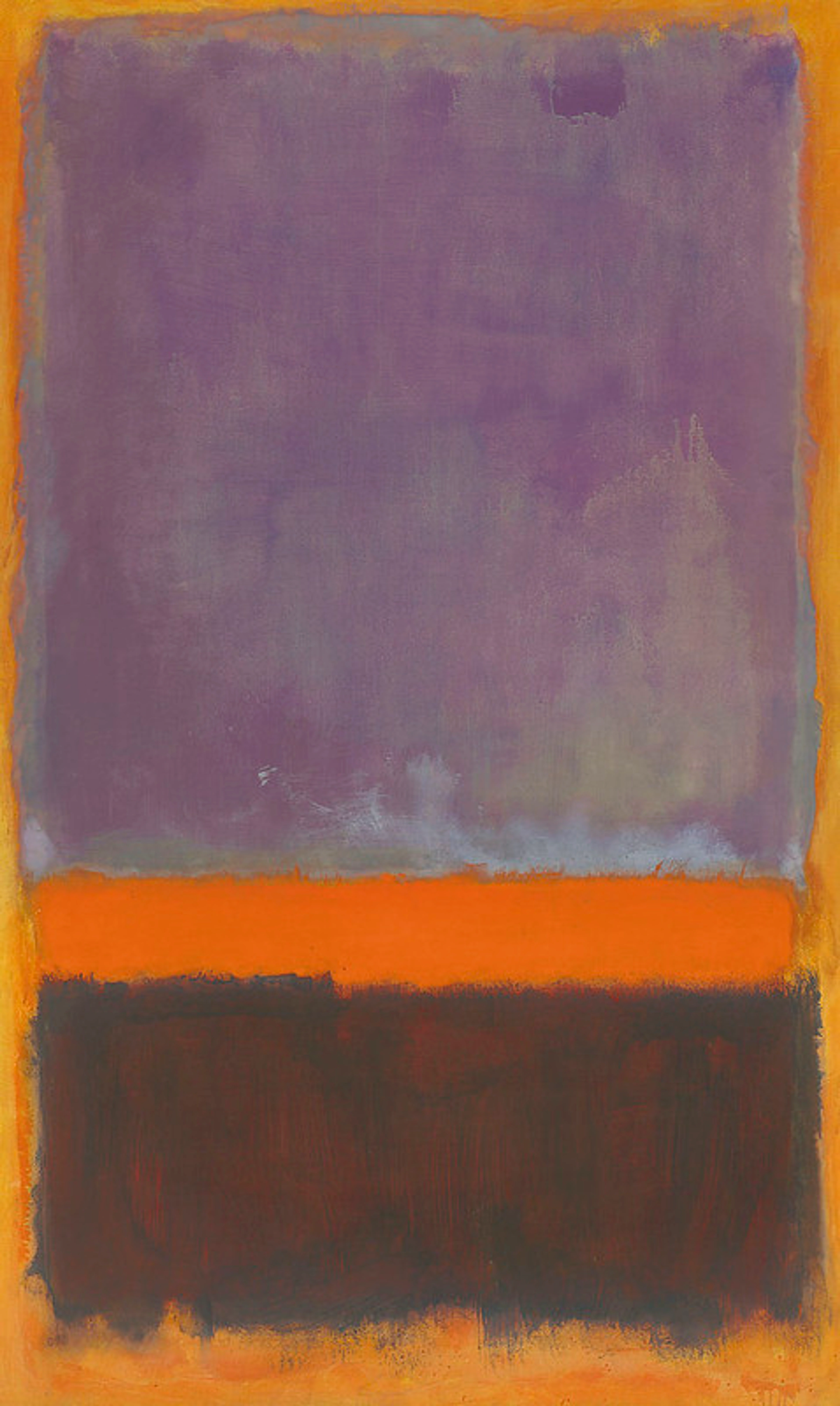
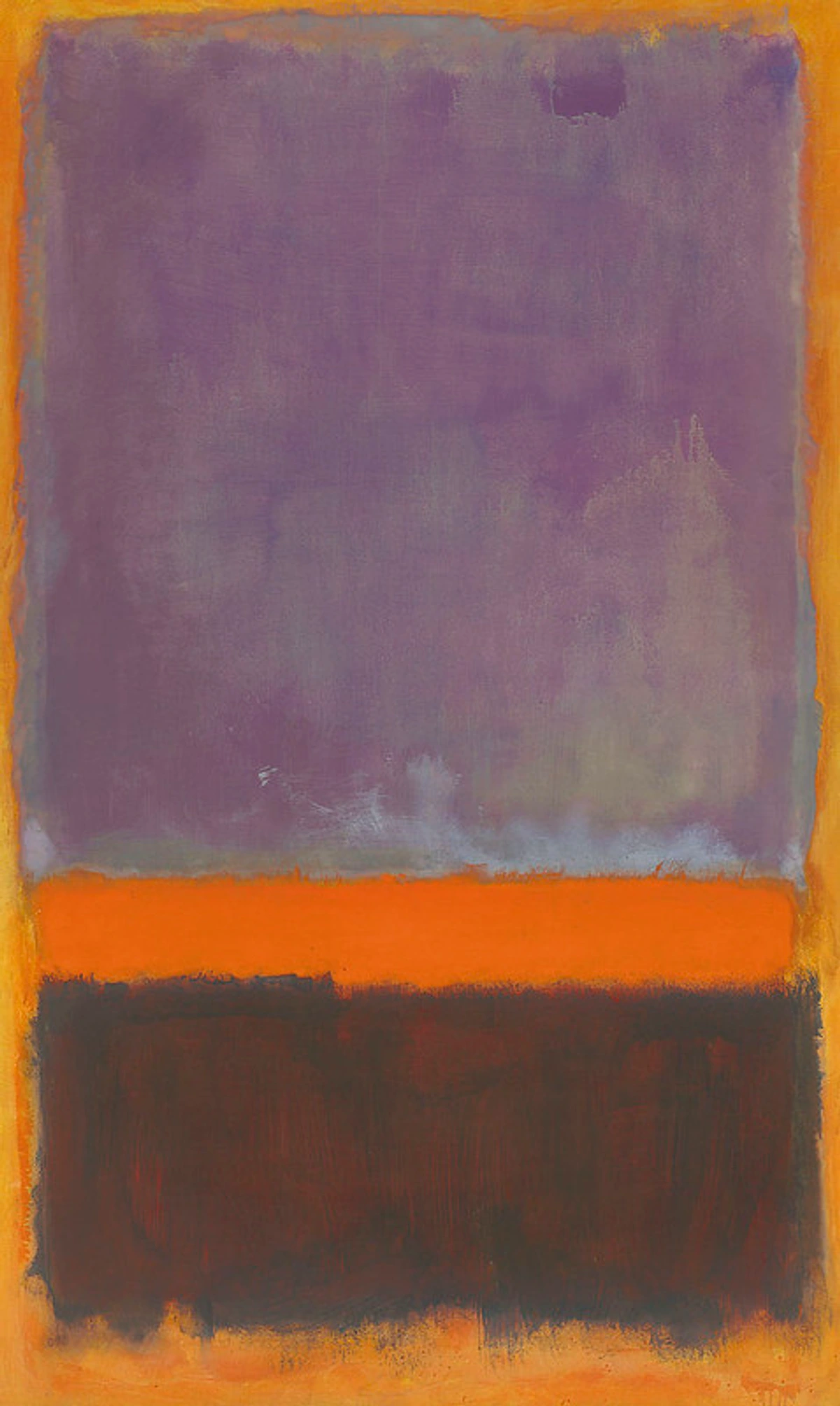
But despite the initial resistance, the movement gained traction. Why? Perhaps because people started to see the world through the Impressionists' eyes – noticing the fleeting effects of light and color in their own surroundings. The relatable emotional and sensory experience captured in the paintings resonated with viewers, making the initial shock give way to appreciation. This revolutionary approach to color didn't just stay within Impressionism. It profoundly influenced subsequent movements. Post-Impressionists like Van Gogh and Gauguin pushed color even further, using it more subjectively to express emotion rather than just capture light (explore Expressionism, which took this even further). The vibrant, non-representational use of color in Fauvism (discover Fauvism) is a direct descendant of the Impressionist palette. Even movements like Pointillism (learn more about Pointillism), while more systematic, built directly on the Impressionist exploration of optical mixing. Beyond specific movements, the Impressionists' liberation of color paved the way for abstract art and the use of color as a primary subject in itself, seen in artists like Mark Rothko (ultimate guide to Rothko). Contemporary artists today continue to explore the emotional and perceptual power of color, building on the foundation laid by Monet and his peers. As a contemporary artist myself, the Impressionists' fearless approach to color and light is a constant source of inspiration. It reminds me that color isn't just something you see; it's something you experience. It's a legacy that lives on in every vibrant canvas you see today, whether it's a bold abstract piece or a subtle study of light.
Capturing the Feeling of Modern Life
It's also worth noting the Impressionists' choice of subject matter. They turned their gaze to the everyday – bustling city streets, tranquil landscapes, portraits, and scenes of leisure. Their use of color wasn't just a technical innovation; it was specifically tailored to capture the fleeting feeling of these modern moments. The vibrant dabs of paint in a city scene conveyed the energy and movement of urban life. The shimmering light on water in a landscape captured the transient beauty of nature. Color became the primary tool for translating the sensory experience of being present in these specific places and times onto the canvas. They weren't just painting a scene; they were painting the experience of that scene.
The Emotional Connection: Why Impressionist Color Still Moves Us
So, beyond the techniques, the history, and the subject matter, why does Impressionist color still resonate so deeply? Why do we stand in front of a Monet and feel something stir inside us? I think it's because they tapped into something fundamental about human perception and emotion. By focusing on the impression – the subjective experience of light and color – they created paintings that feel incredibly alive and relatable. The shimmering light on water, the warmth of a sun-drenched field, the cool relief of a shadow – these aren't just visual facts; they are sensory and emotional experiences. The Impressionists understood, perhaps intuitively, that color is a powerful trigger for memory and feeling. A certain combination of blues and greens can instantly transport you to a cool, shaded forest, while warm oranges and yellows evoke the feeling of a hot summer day or a cozy sunset. They didn't just paint the scene; they painted the feeling of being there.
Consider Monet's Water Lilies series. It's not just a depiction of a pond; it's an exploration of light, reflection, and the feeling of being immersed in a tranquil, yet vibrant, natural space. The blues and greens aren't just colors; they evoke the coolness of the water, the depth of the pond, the lushness of the foliage. The dabs of pink and yellow aren't just paint; they are the fleeting glints of light on the surface, the warmth of the sun filtering through. When you stand before one, you don't just see the scene; you feel the stillness, the humidity, the gentle movement of the water. Or think of Renoir's portraits and scenes of people enjoying themselves; his warm, luminous colors don't just show sunlight, they convey the feeling of warmth, joy, and human connection in those moments. It's a direct line from the artist's feeling to yours, mediated purely by the language of color and light. It's a powerful reminder of how color can be a direct conduit to emotion, bypassing the analytical brain and speaking straight to the heart. It's the kind of connection I strive for in my own work, whether it's a vibrant abstract piece or a more representational study of light. It's a reminder that art, at its core, is about feeling, and the Impressionists were masters of using color to tap into that universal language.
Conclusion: Seeing the World Through a Colorful Lens
The Impressionists didn't just change painting; they changed how we see the world. Their bold, intuitive, and surprisingly scientific approach to color unlocked new ways of capturing the fleeting beauty and emotional truth of everyday moments. From broken color to vibrant shadows, they showed us that color is a powerful tool for expressing feeling and experience. Looking at their work, or even just stepping outside and really seeing the colors in the world around you, is a reminder of the incredible emotional power packed into every hue and shade. It's a lesson that continues to inspire artists today, myself included, to explore the endless possibilities of color on the canvas and in life. If you're curious about how contemporary artists are using color, perhaps take a look at some art for sale or visit a modern art gallery. The journey of color in art is far from over; it's an ongoing conversation between the artist, the canvas, and the viewer's heart, proving that color is, and always will be, the emotional brushstroke that connects us all. It's a legacy that makes me excited to pick up my own brushes every day and see what feelings the colors will unlock.


