The Psychology of Color in Abstract Art: Unlocking Emotions & Personal Palettes
Dive deep into the emotional and psychological impact of color in abstract art. Join my personal journey exploring how hues evoke feelings, from historical roots to developing an intuitive, unique color language.
The Psychology of Color in Abstract Art: Beyond Basic Hues and into Emotion
Honestly, when I first started my journey into abstract art, I was a bit... well, let's just say I was more focused on getting the paint onto the canvas than what those paints were actually doing. Color theory felt like a textbook chore, a set of rules I had to grudgingly acknowledge. I’d pick a red because it was red, a blue because it was blue, and often, the result felt a bit flat – like a beautiful but silent orchestra, notes played without feeling.
Then, slowly, almost sneakily, color began to whisper to me. It started with a subtle shift, a moment when a vibrant yellow didn't just 'fill a space,' but made me feel an unexpected surge of optimism, or a deep indigo brought a strange, comforting calm. It was like realizing my favorite song wasn't just notes, but a story, a feeling, a memory woven into sound. That’s when the real fun began: delving into the psychology of color, not as a rigid theory, but as an intimate, emotional language within my abstract world. It's a journey that still surprises me, proving that even as an artist, I'm constantly learning how to truly see and feel what I'm painting, and how that translates to you, the viewer. This article delves into that emotional and psychological impact, exploring how specific hues evoke feelings and narratives in my non-representational works, going far beyond basic color theory. It's a conversation that echoes through centuries of art history, a dialogue I've been participating in, even without realizing it. We'll journey through the historical roots of color psychology, explore the unique language of individual hues, understand how colors interact, and consider the unseen influences that shape our perception of abstract art.
Beyond Instinct: A Glimpse at Color Theory's Roots and My Early Revelations
While my journey with color is deeply personal, it's built upon centuries of exploration into how colors affect us. Before I ever really felt color, there were thinkers like Wassily Kandinsky, who spoke of color as a means to move the soul, linking specific hues to spiritual and emotional states. He saw color not just as a visual element, but as a direct channel to inner feelings, a key part of what makes abstract art so powerful. Similarly, Johann Wolfgang von Goethe explored the psychological impact of colors, noting how they could elicit specific emotions and even influence our perception of warmth or coolness.
But the dialogue extends further. Visionaries like Michel Eugène Chevreul, a French chemist, explored simultaneous contrast, showing how colors adjacent to each other subtly alter our perception of both – a profound revelation for any artist. Then there's Faber Birren, a 20th-century color consultant, who meticulously documented the practical applications of color psychology in everything from marketing to therapy, bridging the gap between theory and everyday human experience. And then there’s the quiet brilliance of Josef Albers, who through his Homage to the Square series, meticulously demonstrated how colors change entirely based on their interaction – a profound lesson in how no color truly exists in isolation. These pioneers understood that color isn't just about optics; it's about our inner world. Honestly, looking back, that initial 'textbook chore' feeling about color theory was a phase I'm so glad I outgrew! It was like being given a map, and then discovering the entire uncharted territory it promised.
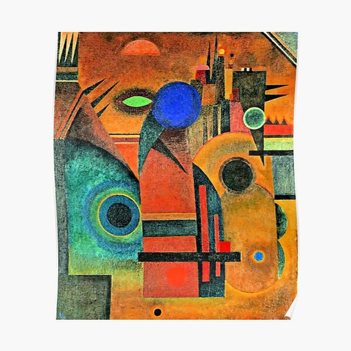
This historical and theoretical grounding, even if I approach it intuitively, reminds me that the emotional language of color is universal, even as it manifests uniquely in each artist and viewer. Understanding these established principles helps me deliberately choose a palette that resonates, or sometimes, playfully subvert expectations to create a new emotional landscape. It's an ongoing dialogue between the academic and the deeply felt. And it's a journey that continually refines my own practice, and hopefully, offers insight for those who seek to understand the definitive guide to color theory in abstract art: principles, psychology, and application.
More Than Just Pretty Pigments: My Initial Hesitations and Discoveries
I used to think color was primarily aesthetic – a visual treat, nothing more. My early works often reflected this, beautiful perhaps, but lacking that deep resonance, that emotional thump in the chest. I’d try to incorporate different shades, experimenting with how artists use color in a technical sense. But the 'why' remained elusive. I was stuck, aimlessly mixing, hoping for a breakthrough that never seemed to arrive. It was during a particularly frustrating period, trying to convey a sense of 'hope amidst chaos,' that I stumbled upon the transformative power of a single, unexpected hue.
It was a brilliant, almost defiant, cadmium orange against a stormy grey. Suddenly, the chaos wasn't just chaos; it was a backdrop for resilience, a flicker of defiance against the encroaching darkness. The painting, and my understanding, clicked. It wasn't about simply choosing primary colors; it was about the nuanced world of secondary and tertiary shades, how they mingle, fight, or embrace. It's a vast universe, and I've poured countless hours into exploring beyond the primary: how i use secondary and tertiary colors to create complex abstract worlds ever since. And in this intricate dance, I also started to grasp the subtle magic of color harmony – how analogous shades create a soothing flow, or how carefully chosen complementary colors can spark an electrifying tension that feels just right, even if my gut led me there before my brain did.
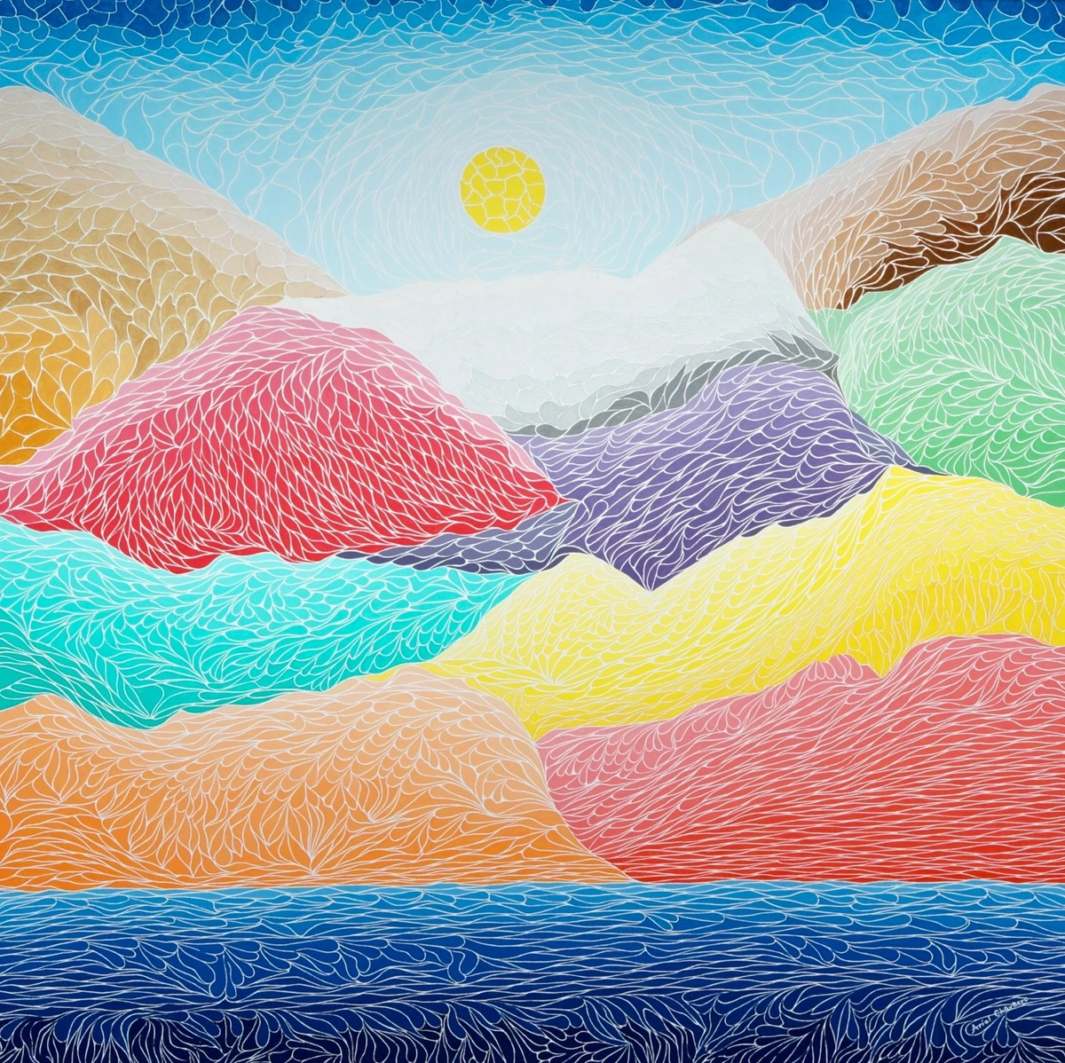
Decoding the Emotional Palette: A Personal Spectrum
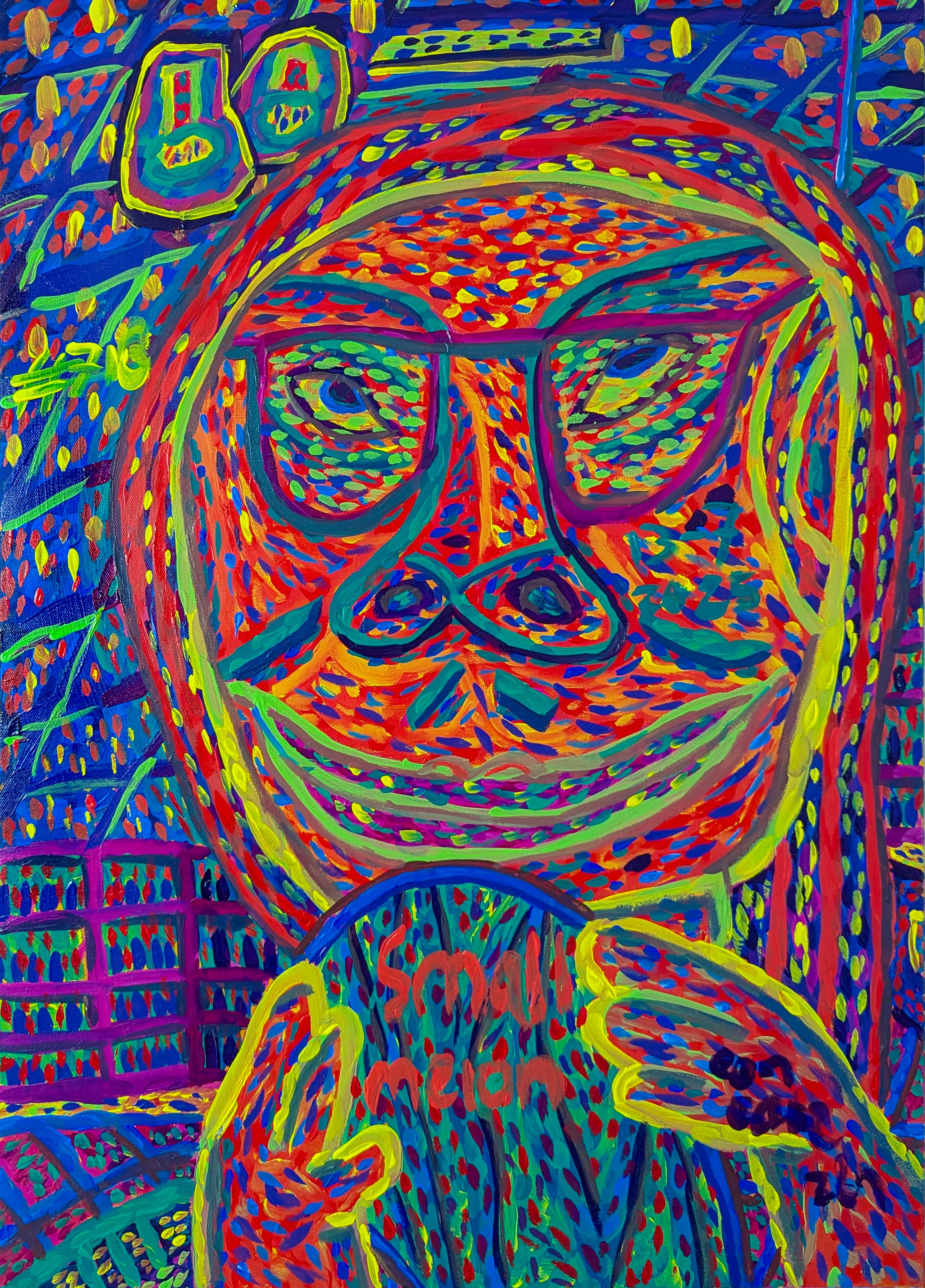
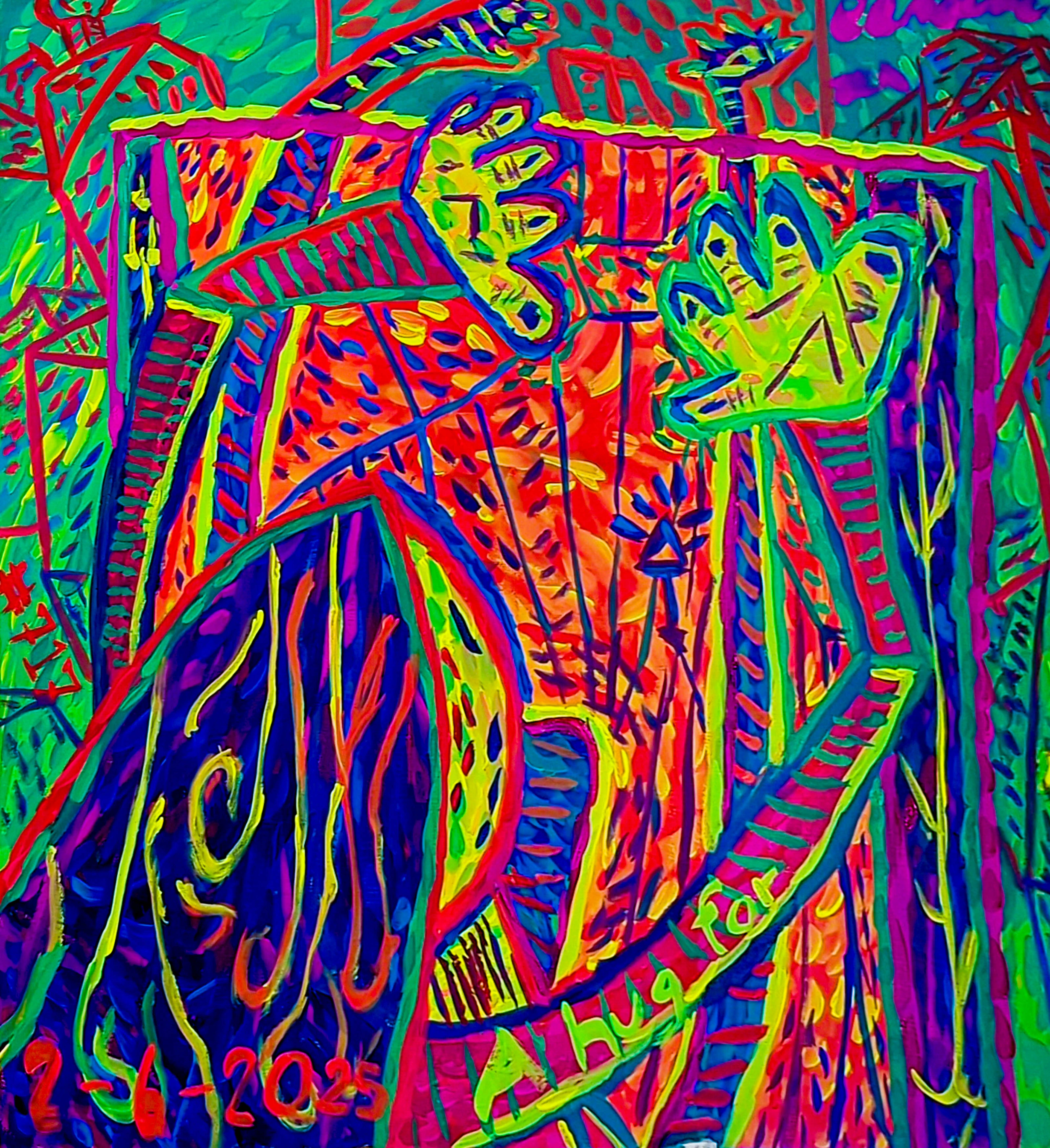
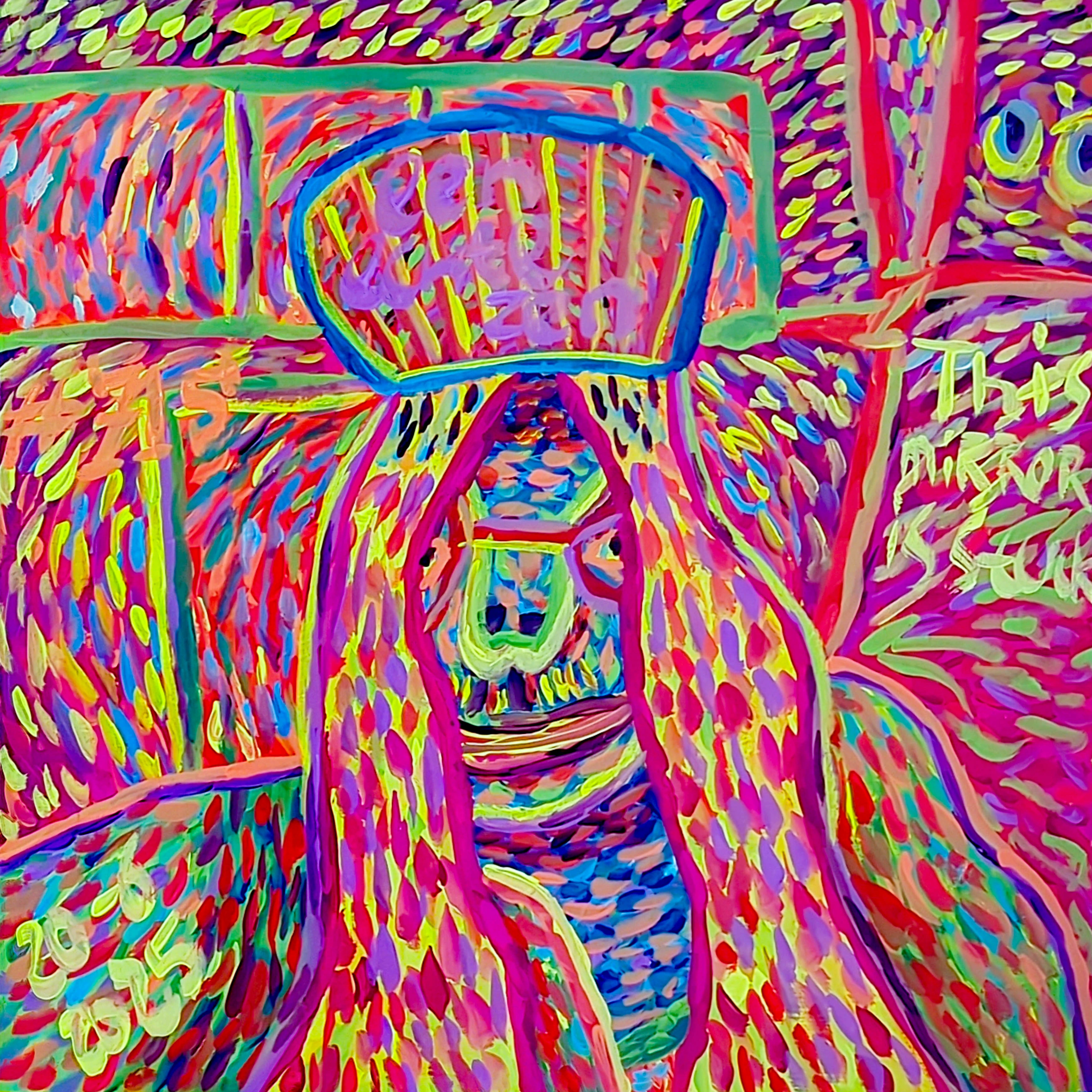
So, how do I translate these feelings into paint? Let me walk you through my personal color dictionary, how I see and feel these hues, and how they contribute to the emotional impact of my non-representational paintings:
- Reds & Oranges: The Heartbeat and the Blaze. These aren't just 'warm' colors; they're the pulse of my work. Red can be fiery passion, raw anger, or profound love. Orange is often exuberance, creativity, or the comforting glow of a sunset. When I want to inject urgency or a vibrant, almost audacious joy, these are my go-to. Think of Henri Matisse's 'The Red Room' (Harmony in Red) – it's not just red, it is red. It envelops you, creating a mood that transcends simple depiction.
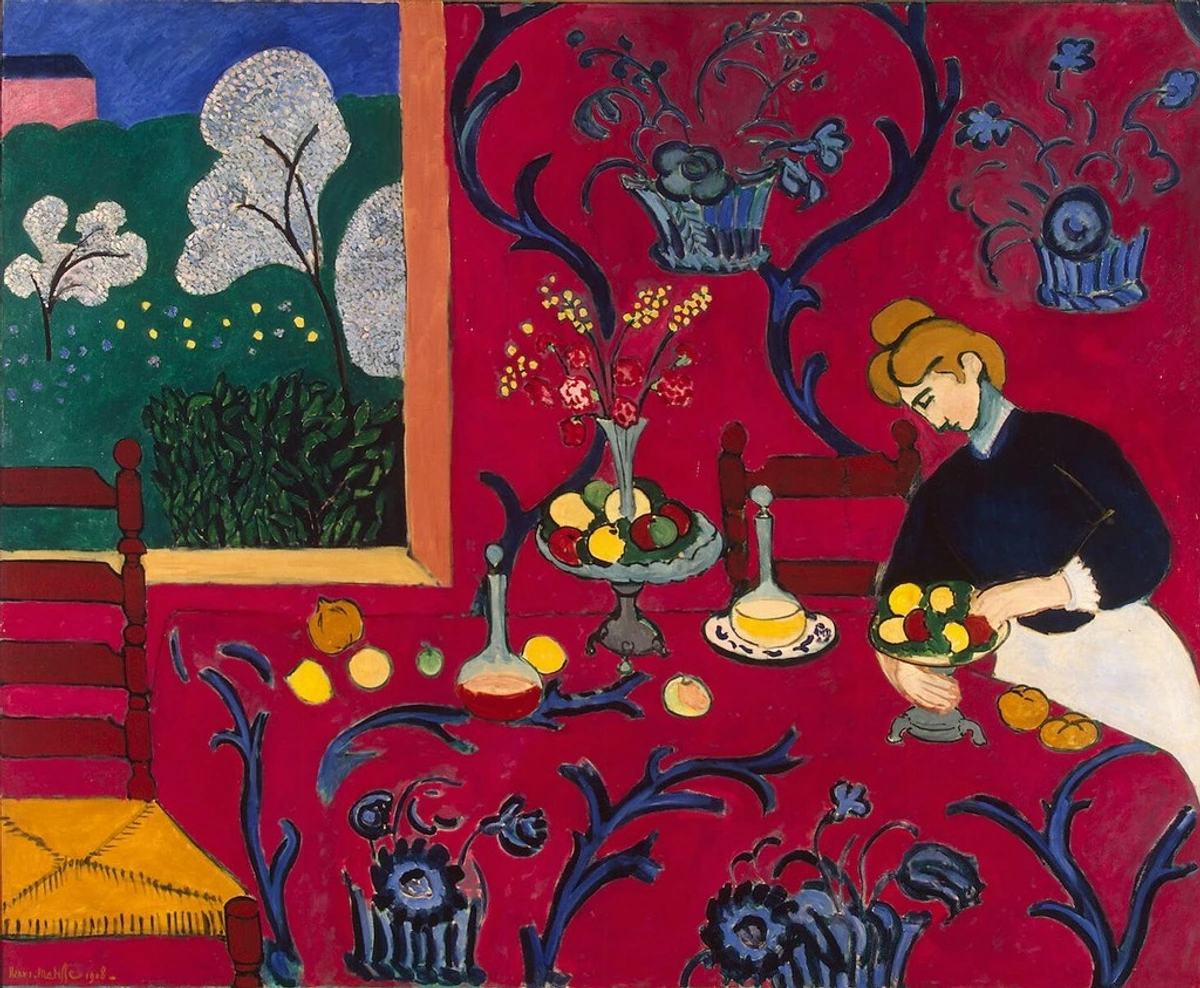 They are the engine of my most visceral expressions.
 - Blues & Greens: The Whisper and the Embrace. If red is the scream, blue is the sigh. It's tranquility, depth, introspection, and sometimes, a quiet melancholy, like the deep, silent ocean before a storm. Greens bring life, growth, and a connection to nature, even in the most abstract forms – the lush quiet of a forest floor. I use these to create spaces for contemplation, for breath. They invite you to lean in, to ponder. They are the calm anchor, the deep breath.
- Yellows: The Spark and the Smile. Yellow is pure energy, optimism, and clarity. It's the first ray of dawn, a sudden burst of an idea. But, like sunshine, too much can be blinding, so I often use it as an accent, a beacon of hope or a flash of insight. It's a reminder that even in complexity, there's often joy. I've even dedicated an entire exploration to the psychology of yellow in my art: joy, optimism, and light. It’s the radiant burst of pure possibility.
- Purples: The Mystery and the Majesty. There’s an inherent mystique to purple. It's spiritual, luxurious, and often a bridge between the fiery reds and the serene blues. In my abstract pieces, purple often introduces a layer of the enigmatic, a quiet power that demands reverence and wonder. It’s where intuition often leads me when I want to explore deeper, unseen narratives. It’s the color of profound contemplation and quiet power.
- Neutrals (Black, White, Grey): The Structure and the Silence. These are not simply fillers. Black isn't just absence; it's depth, definition, and sometimes, profound silence. Think of a black hole, pulling everything in, creating a sense of infinite space. White is expansion, purity, and light – a blank canvas of possibility. Greys are the complex nuances, the transitions, the moments of calm or uncertainty. Together, they create rhythm and the unseen structure: how composition guides my abstract art, allowing the more vibrant colors to truly sing. A single bold stripe of black can anchor an otherwise floating composition, giving it weight and purpose, dramatically altering how the adjacent colors are perceived. They are the essential foundation, the quiet strength.
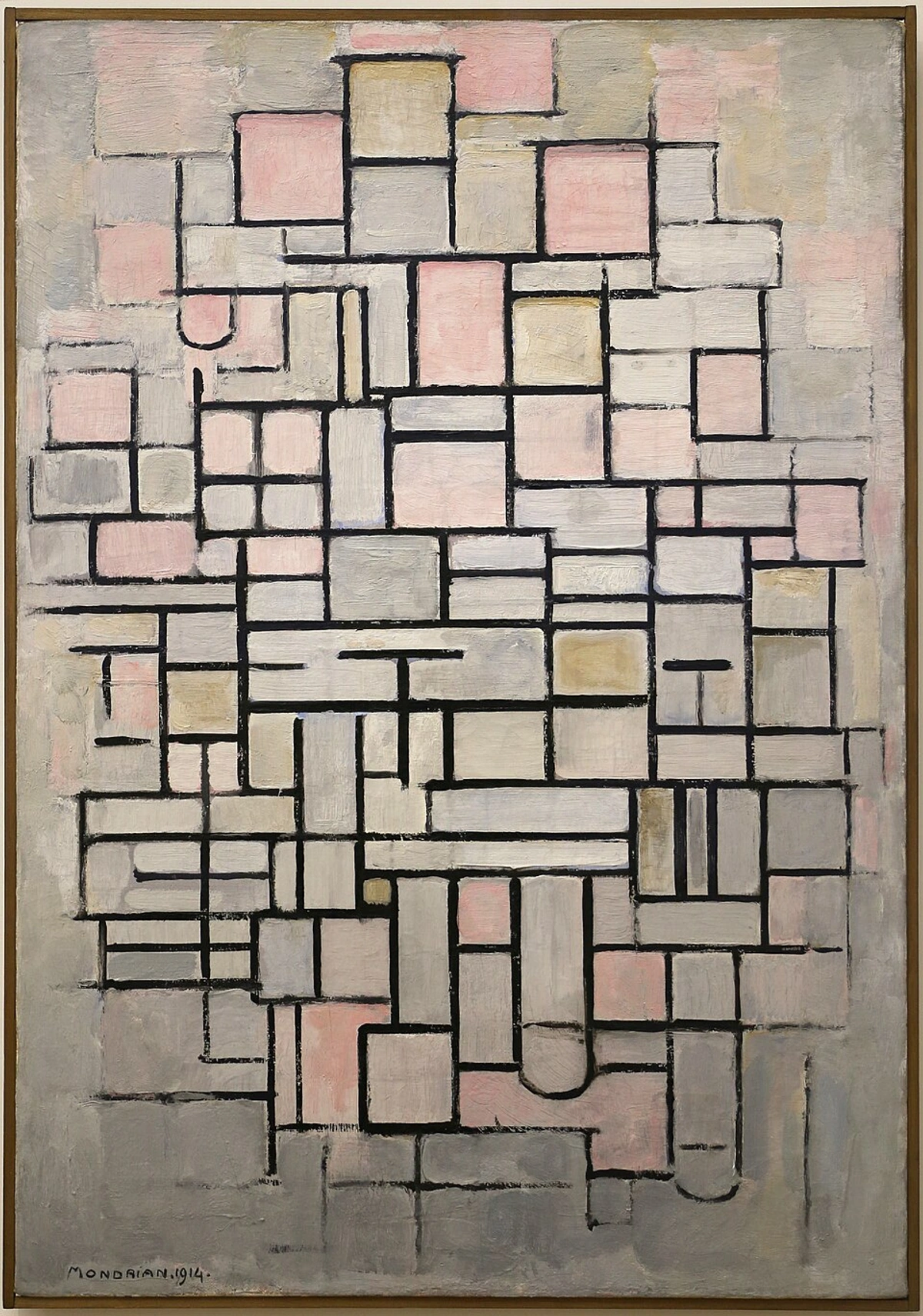
- Beyond the Usual Suspects: Browns, Pinks, and Metallics. While my core palette leans into the vibrant emotions, other hues have their unique psychological roles, even if I use them more sparingly. Browns can ground a piece, evoking earthiness, stability, and comfort – a quiet anchor in a storm of color, like that old, comforting armchair that's seen a thousand stories. Pinks often bring a touch of tenderness, playfulness, or even a nuanced sensuality, like a shy blush on a cold morning or the joyful pop of bubblegum. I remember once adding a vibrant neon pink to an otherwise somber blue-grey piece, and it instantly transformed it from melancholy to a playful, almost cheeky, optimism. And metallics, though less frequently in my own work, introduce elements of luxury, futurism, or a striking, almost otherworldly gleam, like sunlight catching on something precious and unexpected. They remind me that the color spectrum is vast, and every hue holds a whisper of meaning, waiting to be discovered or, sometimes, subtly left out for impact.
The Symphony of Shades: How Colors Interact in My World
It’s rarely about a single color. It’s about the conversation they have. Imagine a crowded room: some people are loud, some quiet, some clash, others harmonize. Colors are the same. A red next to a green vibrates differently than a red next to a yellow. This interplay is where the magic, and sometimes the frustration, happens. I'm always looking for that perfect balance, that dynamic tension that gives my abstract compositions their emotional punch. This careful consideration of how hues communicate is at the core of the emotional language of color in abstract art.
- Contrast & Harmony: Sometimes I want the visual equivalent of a shout – stark contrast that demands attention, like a vibrant orange against a deep blue, creating an almost electric tension. Think of a brilliant sun setting over a dark ocean, that defiant glow. Other times, I crave the gentle hum of harmony, colors that blend seamlessly, like various shades of blue and green creating a soothing, meditative flow, much like a calm forest scene. It's an intuitive dance between the two, a constant search for the right emotional resonance.
- Temperature, Saturation & Value: Beyond the hue itself, how warm or cool a color feels (its temperature), its intensity (its saturation), and its lightness or darkness (its value) completely change its emotional weight. Think of these as my secret controls for fine-tuning the emotional impact and creating the subtle shifts in feeling that make a non-representational painting come alive. A dull, desaturated blue might evoke a quiet melancholy, like a rainy afternoon, while a brilliant, highly saturated one could feel energetic and expansive, like a clear summer sky. Similarly, a warm, high-value (light) yellow bursts with optimism, whereas a cool, low-value (dark) purple carries a sense of profound mystery. Sometimes, I even deliberately choose dissonant, clashing combinations – a jarring pink next to an aggressive green – to evoke discomfort, chaos, or a powerful, unsettling energy. This deliberate disharmony can create specific visual rhythms or even a subtle optical illusion of movement, pushing and pulling the eye in unexpected ways. It's a meticulous process, but when it clicks, the canvas truly sings.
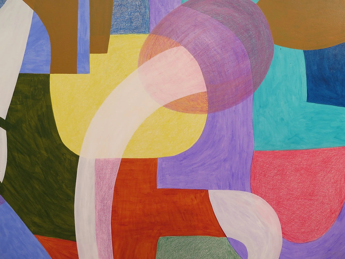 And a final thought on this symphony: the absence or limited use of a particular color can be just as powerful. A vast expanse of muted greys, broken only by a single, vibrant splash of red, speaks volumes more than if the entire canvas were a cacophony of hues. It’s about intentionality, about giving space for the chosen colors to truly resonate and command attention.
The Unseen Influences: Light, Environment, Perception, and Texture
But what happens when the canvas leaves the studio and enters the world? The emotional impact of color in abstract art isn't just about the pigments on the canvas; it's a dynamic interplay with the world around it. It's easy to forget that a painting isn't static; its impact changes with its environment. The kind of light, for instance—natural daylight versus artificial gallery lighting—can dramatically alter how colors are perceived. A vibrant red might appear muted under warm incandescent light, while a subtle blue could pop under cool LED. This interaction between color and light is another layer of the psychology of art, constantly shifting the emotional tone of a piece. As an artist, I constantly consider this, often working in varied lighting conditions, and even test pieces in different rooms to understand how they 'behave.' It's why I'm so passionate about showcasing my work in various settings, including my own museum in 's-Hertogenbosch, where you can experience these nuances firsthand.
Moreover, how you perceive color is also wonderfully unique. Our brains constantly perform an incredible feat called color constancy, where they try to keep our perception of an object's color stable despite changes in illumination. However, in abstract art, where there's no 'real world' object to anchor to, this can lead to fascinating, sometimes unpredictable, shifts in emotional experience as colors interact with changing light. Color blindness, for example, affects a significant portion of the population, meaning my carefully constructed palette might be experienced differently by various viewers. This doesn't diminish the art; it merely highlights the deeply personal and subjective nature of color's emotional language. It's a reminder that while I speak through hues, the interpretation is always a beautiful collaboration between the canvas and your unique eyes, sometimes even inspiring artists to consider more universally impactful color relationships.
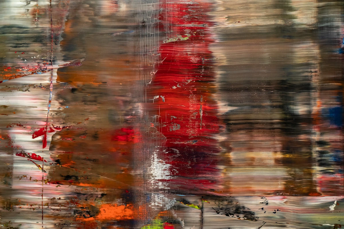
And let's not forget the silent language of texture. The way paint is applied – thick impasto, smooth glazes, or scraped surfaces – profoundly influences how light interacts with the color, and therefore, its emotional resonance. A heavily textured red might feel raw and aggressive, while a smooth, deep blue could evoke serene introspection. It adds another tactile layer to the visual and emotional experience, a quiet physicality that colors the perception even before the brain processes the hue itself. Have you ever noticed how the surface of a painting can change how you feel about its colors?
Finally, the silent hand of culture often shapes our understanding of color, sometimes in ways we don't even consciously realize. While some emotional responses to color might be universal, others are steeped in tradition and symbolism. For example, white can signify purity in one culture and mourning in another. While my art aims for a universal emotional language, acknowledging these cultural nuances reminds me of the rich tapestry of human experience that colors can evoke, even if my personal journey is the primary lens.
My Intuitive Approach: Feeling the Colors, Not Just Thinking Them
While I've studied color theory, my true relationship with color is deeply intuitive. It’s less about a strict mental checklist and more about an internal dialogue. I often start a painting with an emotion or a vague concept, letting the colors guide my hand. It's an essential part of my creative flow: embracing intuition in abstract painting. Sometimes I find myself reaching for a particular tube of paint before I even consciously know why, only to realize later that it perfectly captures the underlying mood I was aiming for. And when an unexpected combination emerges, a "happy accident" perhaps, I usually lean into it, allowing it to redirect the piece in a new, unforeseen emotional direction. This constant openness to discovery helps me to define and refine my unique personal color palette over time, not as a rigid system, but as an evolving vocabulary.
It's a beautiful, messy process of discovery. I've learned to trust my gut, to listen to what the canvas, and the colors themselves, are telling me. This intuitive from concept to canvas: my intuitive approach to starting an abstract painting allows for those 'happy accidents' – unexpected color combinations that spark new ideas or unlock deeper emotional resonance. The medium itself plays a role here too; the fluidity of acrylics versus the rich texture of oils can dramatically influence how colors blend and appear, subtly altering their emotional impact. It’s also fascinating to see how color interacts with other elements, like the symbolism of geometric shapes in abstract art: a deeper look, adding layers of meaning and an even richer emotional tapestry to my non-representational works.

Beyond the Canvas: How Color Connects Us
Ultimately, my goal is not just to paint, but to connect. When you stand before one of my abstract pieces, the colors are speaking directly to you, bypassing the logical mind and heading straight for the emotions. Your own experiences, memories, and cultural background will subtly influence how you interpret those hues, creating a unique, personal dialogue with the artwork. It's this beautiful, silent conversation that makes non-representational art so profoundly personal and universal at the same time.
Understanding the psychology of color isn't just for artists; it's for everyone who engages with art. It's about opening yourself up to the unspoken language, allowing the colors to wash over you, and seeing what feelings or thoughts they evoke. If you’re looking to dive deeper into finding meaning, check out my guide on decoding abstract art: a guide to finding meaning in non-representational works. Perhaps it will help you find that same connection I felt when I first visited the museum in 's-Hertogenbosch, seeing how different palettes truly come alive in person. What colors resonate most with you? What stories do they tell you?
And if a particular piece speaks to your soul, if the colors resonate with an emotion you want to bring into your home, you can always explore my current collection.
FAQ: Your Colorful Questions Answered (Sort Of)
Q: What's the most powerful color in abstract art?
A: Ah, a trick question! There isn't one most powerful color. Its power comes from context, interaction, and personal perception. A whisper of pale blue can be more impactful than a shout of red, depending on the surrounding colors and the viewer's state of mind. It’s all wonderfully subjective – and that's precisely what makes the power of color in abstract art: my approach to palette and emotion so fascinating.
Q: Do abstract artists intentionally choose colors for specific meanings?
A: Absolutely, and often simultaneously intuitively! While I might know red evokes passion, I also feel it. It's a blend of learned knowledge and gut instinct. Sometimes the meaning emerges during the process, rather than being pre-determined. It’s a dance between intention and discovery, an ongoing journey that evolves as much as my artist timeline.
Q: How can I better understand the colors in abstract art?
A: Engage with it! Look at art, read about color theory (if you're into that sort of thing), but most importantly, pay attention to how colors make you feel. Close your eyes, open them to a painting, and just notice your immediate emotional reaction before your brain starts analyzing. The more you practice this, the richer your experience will become. Perhaps try to create your own color diary, noting how different hues you encounter throughout your day make you feel.
Q: How do you balance intuition with established color theory?
A: For me, intuition is the engine, and theory is the map. I start with a gut feeling, an emotional impulse. Theory then helps me understand why certain combinations resonate, or how to achieve a desired effect more deliberately. It’s like learning the rules of music so you can then improvise with greater freedom and understanding. The theory grounds the intuition, giving it structure, but the intuition is what keeps the art alive and personal.
Q: How do you choose colors for a specific mood or emotion?
A: It's rarely a rigid formula, more like listening to an inner compass. If I want to evoke a sense of vibrant, hopeful new beginnings, I might lean into brilliant yellows, perhaps with accents of sky blue, carefully considering their saturation and value to prevent overwhelming the viewer. But it's not just the hue – it's how I apply it, its saturation, and the colors I put next to it. Sometimes a quiet, unexpected shade of purple can evoke a deeper, more profound joy than a bright yellow. I start with an intention, then let the paint, and my gut, lead the conversation on the canvas. It's less about choosing and more about feeling my way through the palette until the emotion sings true.
My Colorful Confession: An Ongoing Dialogue
So, there you have it. My winding, sometimes clumsy, but utterly passionate journey with the psychology of color in abstract art. What started as a technical exercise evolved into a profound exploration of emotion, a way to communicate what words often fail to capture. It's an ongoing conversation between myself, my canvas, and hopefully, you – a dialogue that deepens every time I pick up a brush, a conversation that never truly ends, always surprising me with new insights.
I encourage you, whether you’re an artist, a collector, or just someone who enjoys a splash of visual delight, to look beyond the basic hues. Ask yourself: What is this color doing? How is it making me feel? You might be surprised by the rich, unspoken narratives that emerge. It’s a bit like learning to read between the lines, but with a much more vibrant vocabulary. And trust me, once you start, you'll never look at a canvas the same way again.


