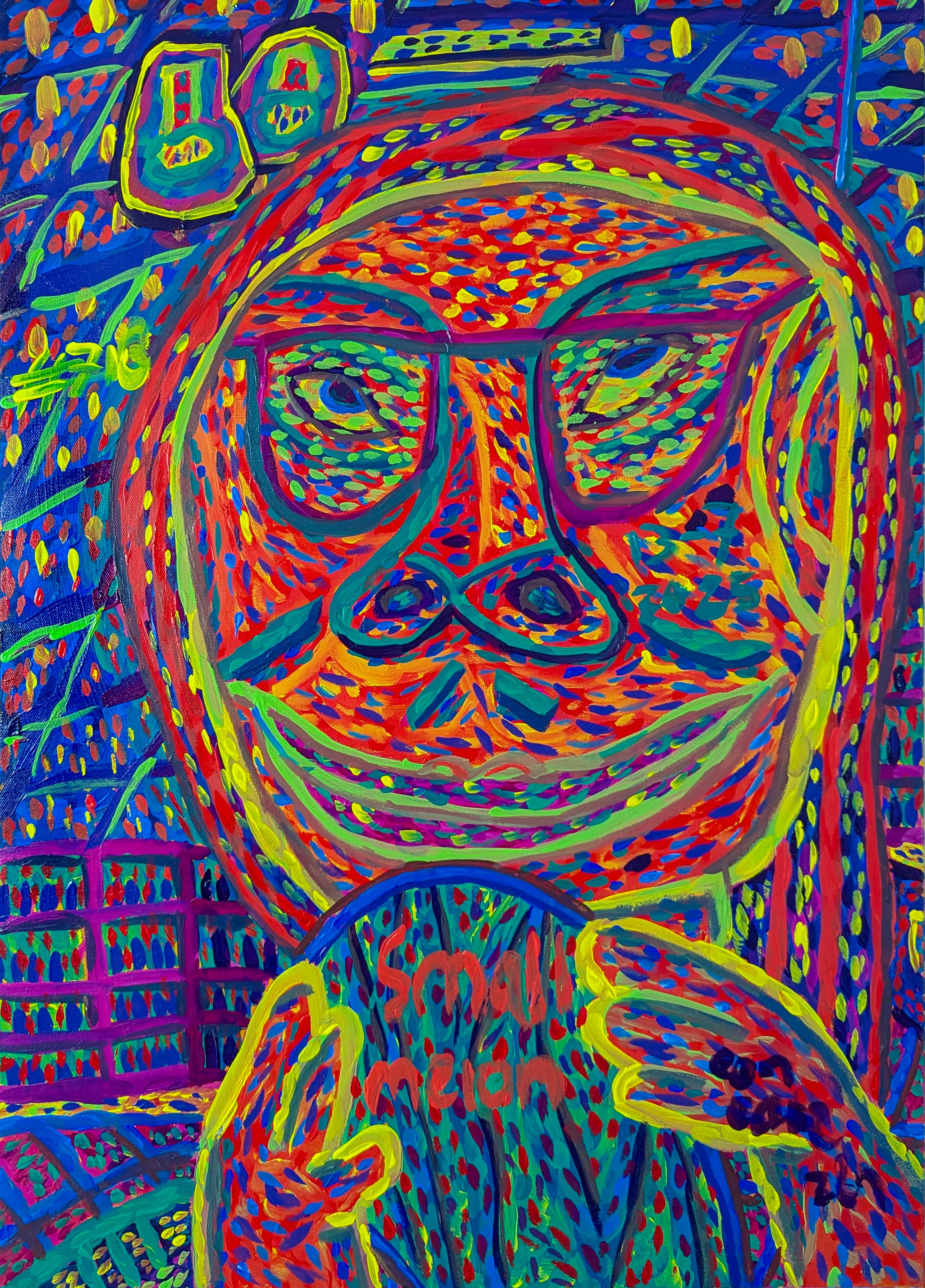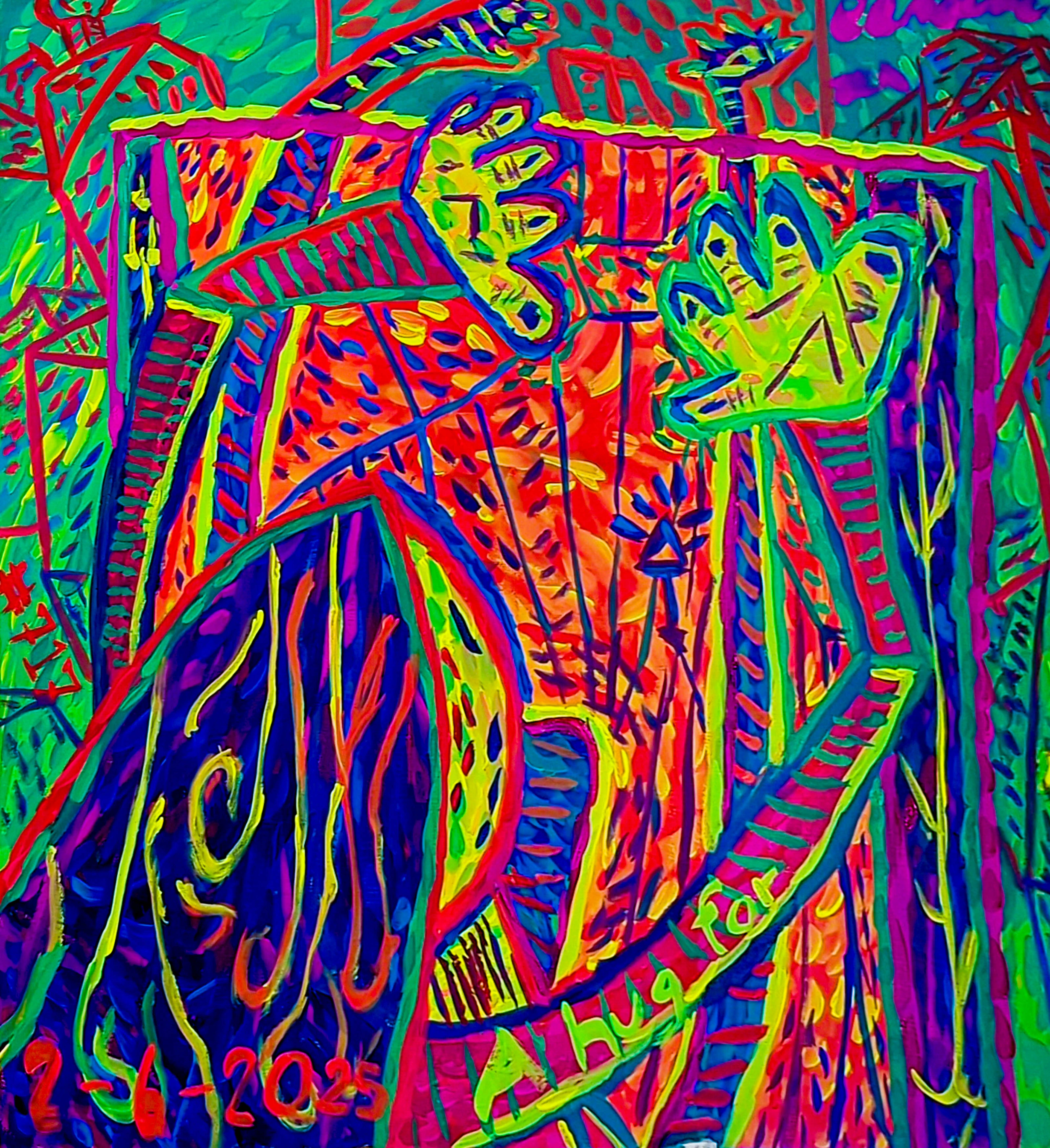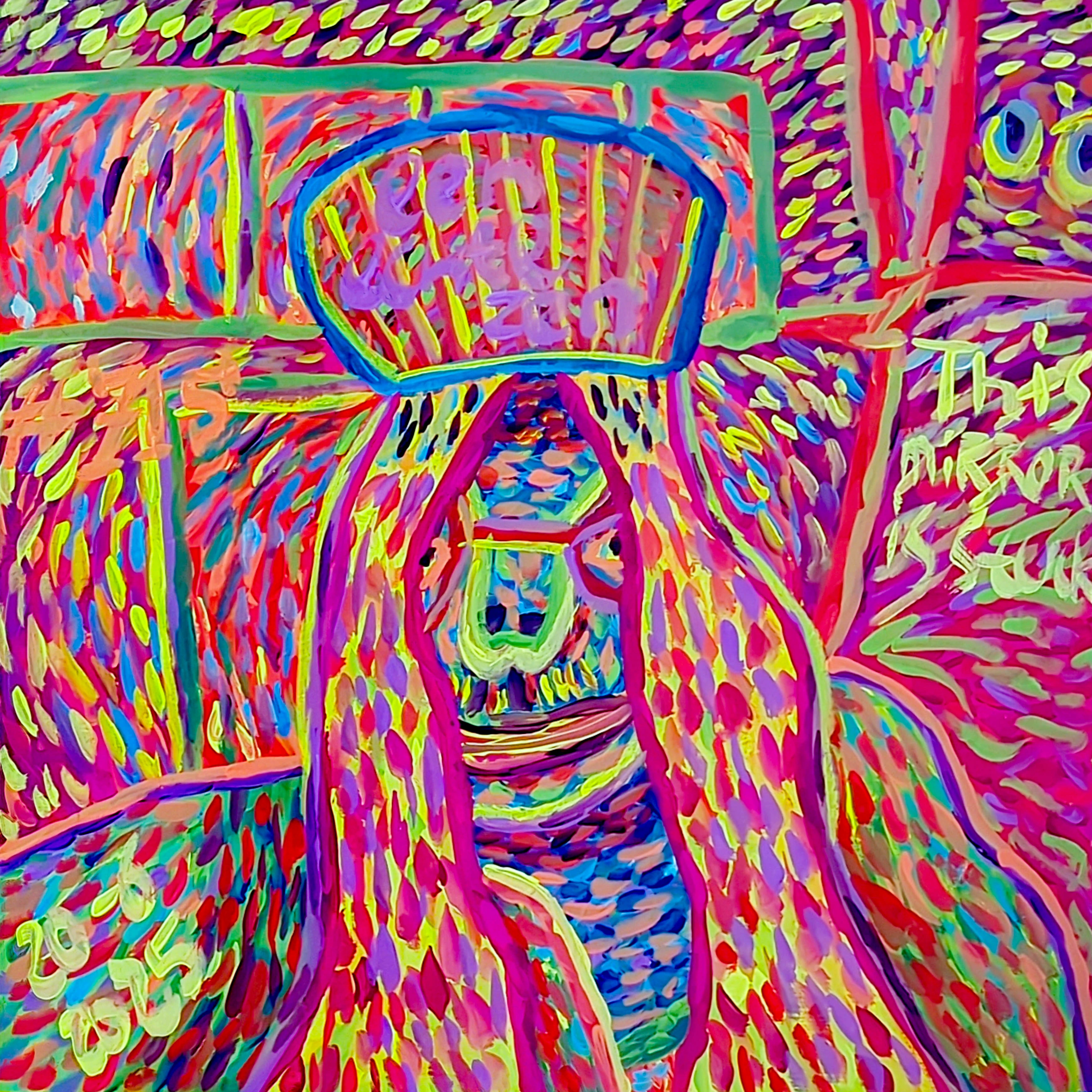
Abstract Art Color Theory: My Intuitive Approach to Hue & Emotion
Explore color theory in abstract art through my personal lens. Discover foundational principles, the psychology of color, and my intuitive techniques for creating expressive, meaningful paintings.
Color Theory in Abstract Art: My Intuitive Dance with Hue, Psychology & Creative Flow
Color. It’s more than just a visual sensation; it’s the very pulse of abstract art, a whisper of the subconscious, a raw burst of emotion. For me, color isn't just paint on a canvas; it's a conversation, a feeling, sometimes even a silent shout. It's the very soul of abstract art, a constant source of fascination and occasional bewilderment. You'd think after years of working with it, I'd have it all figured out, but color is a mischievous beast, always revealing new facets.
There was one time I was aiming for a serene blue composition, and a rogue splash of vibrant orange from a previous project landed right in the middle. Initially, I was annoyed, but that unexpected orange, initially a 'mistake,' eventually became the heart of the piece. I found myself pushing it, pulling it, layering translucent blues over it to hint at its presence, allowing it to sing through. It was a chaotic symphony I hadn't planned, teaching me that sometimes the most profound statements emerge from embracing the unexpected beauty of imperfection. So, join me as we journey into the vibrant realm of color theory in abstract art—a guide born from both dedicated study and the delightful, often messy, chaos of my studio. We'll explore its foundational principles, psychological depths, and my very personal, ever-evolving application.
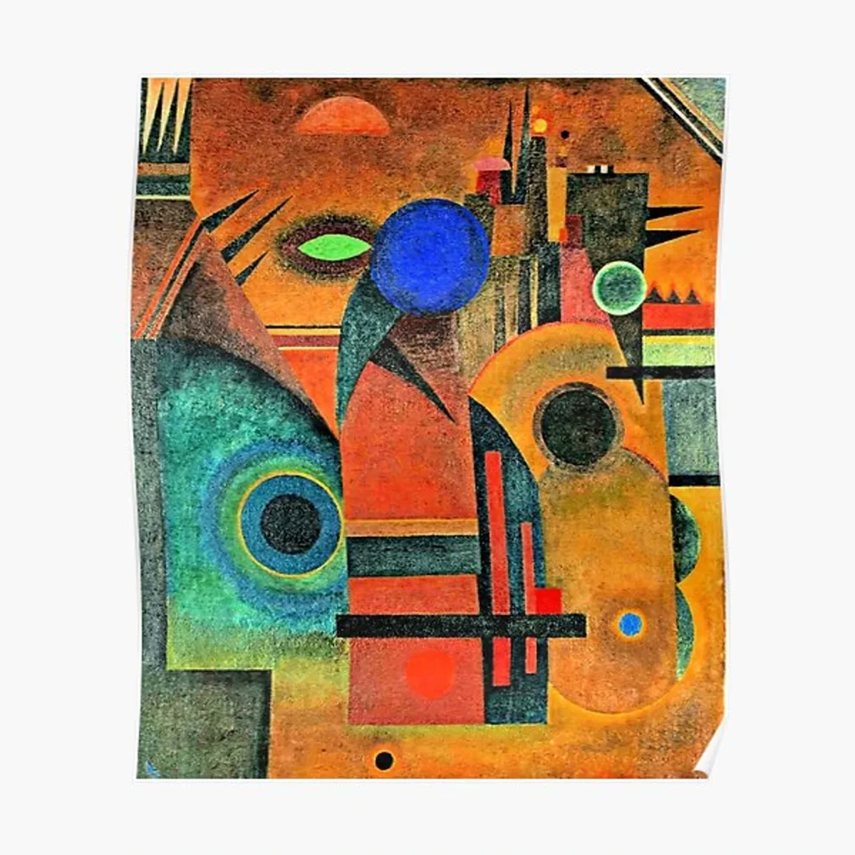
The Building Blocks: Knowing the Rules Before We Break Them
Before we can truly let loose, before we can playfully defy conventions, it’s immensely helpful to understand the language color speaks. For me, these basics aren't about rigid adherence; they're about building a rich vocabulary to express what's simmering within, to articulate the ineffable. If you're curious about the broader world of abstraction, I've got a whole other ramble on the definitive guide to understanding abstract art styles that might pique your interest.
The Color Wheel: My Old Friend, Reimagined
The color wheel is our starting point, our compass in this colorful world. It's a neat little diagram that organizes colors based on their relationship to one another, a foundational tool I still reference regularly. For a deeper dive, check out what is a color wheel: how to use it.
- Primary Colors (Red, Yellow, Blue): The OGs. You can't mix these from other colors. They're the elemental building blocks of everything else.
- Secondary Colors (Orange, Green, Violet): Born from mixing two primary colors in equal measure.
- Tertiary Colors: The slightly more grown-up offspring, created by mixing a primary and a secondary color (e.g., Red-Orange, Blue-Green). They add nuance and complexity to any palette.
Value (Lightness/Darkness) & Saturation (Intensity): The Understated Powerhouses
Beyond hue (the pure color itself), value and saturation are, for me, the quiet architects of drama. Value refers to how light or dark a color is, from the whisper of pure white to the profound silence of pure black. It sculpts contrast, builds structure, and can create an illusion of light from within the canvas. Think of a charcoal drawing; it's all about value, yet it can evoke immense emotional weight. Saturation, on the other hand, is the intensity or purity of a color. A highly saturated color is vibrant, almost shouting, while a desaturated color is muted, introspective, perhaps even melancholy.
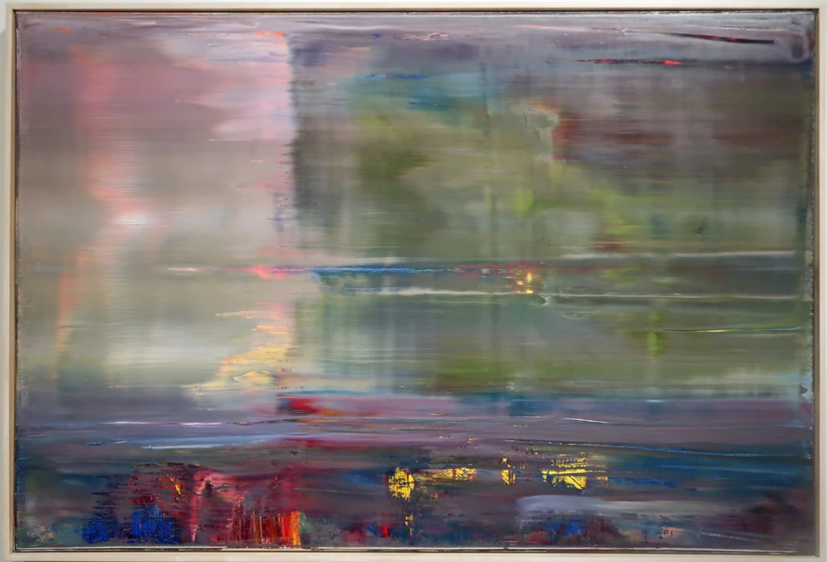
Manipulating value and saturation allows me to create subtle shifts in mood, direct the viewer's eye with gentle nudges or bold declarations, or build an atmospheric depth that pure hue alone cannot achieve. It's a powerful trio: hue, value, and saturation, constantly in dialogue. Artists like Gerhard Richter masterfully manipulate these elements, creating rich, complex works from seemingly simple grids or scraped layers. Or consider Christopher Wool, whose stark, often monochromatic paintings demonstrate the immense power of value and contrast alone, stripping color down to its skeletal structure, yet retaining profound expressiveness.
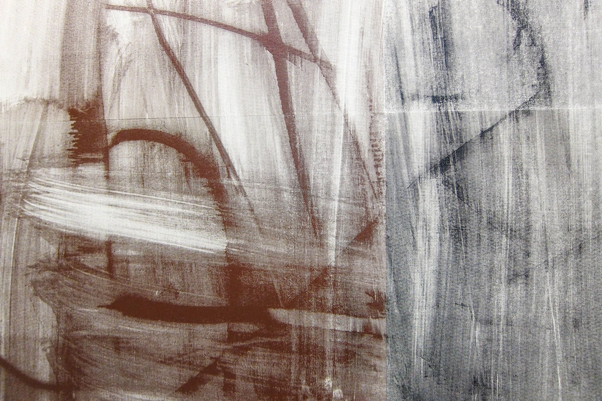
The medium itself profoundly affects these qualities. Acrylics dry quickly, allowing for crisp value shifts, while oils offer a longer working time for subtle blending and luminous glazes that build saturation over time. Even the texture of the canvas or the brushstroke can alter how we perceive a color's value and saturation, making the choice of material an integral part of the creative dialogue. Some might delve into more scientific systems like the Munsell or Ostwald color systems, which provide highly precise ways to categorize and organize color based on these properties. While fascinating, my own practice leans more into the intuitive side, using these foundations as a launching pad rather than a rigid blueprint.
For a deeper dive into the overall subject, check out the definitive guide to color theory in art.
Warm vs. Cool: A Gut Feeling & Color Temperature's Subtle Dance
This is where color gets personal, where it starts to feel. Warm colors (reds, oranges, yellows) tend to advance, to step forward, feeling energetic, passionate. They're like that friend who always gets the party started, drawing attention. Cool colors (blues, greens, purples) recede, feel calming, introspective. They're the quiet observer, holding deep thoughts, inviting contemplation. I often use this push and pull to create depth and visual tension in my compositions, sometimes unconsciously, just letting the colors guide my hand.
Beyond just warm or cool, there's also color temperature – the subtle, almost imperceptible shift in a color's perceived warmth or coolness. Even within blue, for instance, a blue with a hint of green feels like a chill arctic breath compared to a blue with a whisper of red, which feels like a cozy twilight. This nuance allows for incredible depth and vibration, making a single hue feel multi-layered, alive with internal chatter.
Why Color Is the Soul of Abstract Art (Even When There's No "Subject")
Now that we’ve touched upon the fundamentals, let's circle back to why these building blocks are so utterly vital, especially in abstract art. Imagine walking into a room. Before you even register the furniture, the light, or the faces, you feel the atmosphere, don't you? That's color working its magic, speaking a language beyond words. In abstract art, where there's no obvious landscape or portrait to anchor your eye, color doesn't just take center stage; it becomes the narrative, the very pulse of the piece. It's the melody in a song without words, the spice in a dish without a main ingredient, shaping our initial gut reaction and pulling us into the artwork's world with an undeniable, sometimes inexplicable, force.
More than just mood, color in abstraction can create a sense of movement, guiding the eye through a vibrant dance across the canvas. It establishes rhythm, a visual beat that can be fast and frenetic or slow and meditative. Through carefully chosen hues and their interactions, an abstract piece can convey a narrative arc without ever depicting a literal story – a journey of tension and release, calm and storm, dawn and dusk, all through the silent, eloquent language of color.
Historically, color often served a purely representational purpose – painting green leaves, blue skies. But with movements like Impressionism and Fauvism, artists began to appreciate and use color for its own sake, for its emotional impact and visual power, paving the way for abstraction. Even earlier, artists like Vincent van Gogh or Paul Gauguin, though not strictly abstract, employed color with such expressive intensity that it transcended mere depiction, directly conveying emotion and symbolism. When I started really digging into abstract art, I quickly realized that dismissing color as "just decorative" was like saying the engine is "just for show" in a race car. It's fundamental. It's what moves you, challenges you, makes you pause, makes you feel.
Crafting Harmony (and Dissonance): My Go-To Color Schemes
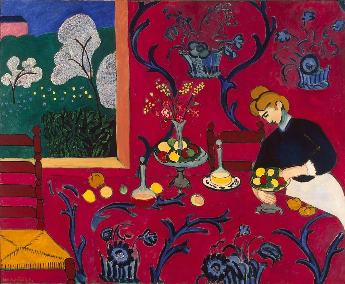
When I'm staring at a blank canvas, sometimes the hardest part is just starting. Which colors? How many? That's where color harmonies come in. They're like a gentle suggestion, a springboard rather than a rigid instruction, offering a starting point for intentionality. But sometimes, just sometimes, the most exciting discovery is the deliberate breaking of harmony, the introduction of a jarring note that creates a powerful, intentional dissonance. I've explored these in much more detail in the definitive guide to understanding color harmonies in abstract art, but here are my favorites – the ones that consistently resonate with my artistic soul:
- Complementary Colors: Opposites on the color wheel (e.g., Red and Green, Blue and Orange). They create maximum contrast, a vibrant tension that can be electrifying, almost a visual shout. I love how they challenge each other, creating a dynamic punch that grabs attention and holds it. Dive deeper into their power with beyond the spectrum: my approach to complementary and analogous colors in abstract art.
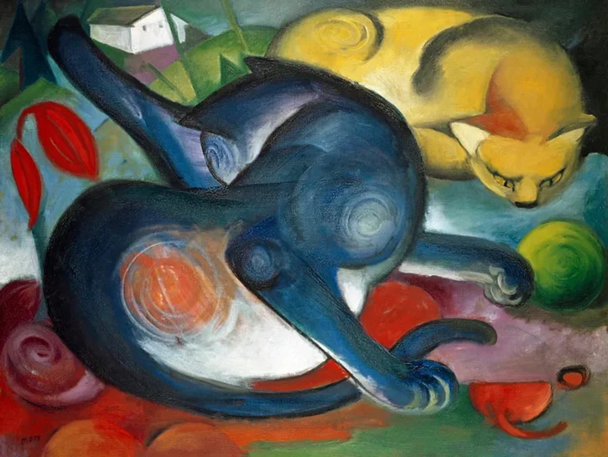
- Analogous Colors: Neighbors on the color wheel (e.g., Blue, Blue-Green, Green). They create a sense of unity and calm, flowing smoothly from one to the next. They're the harmonious choir of the color world, whispering secrets of subtle transitions and serene depth.
- Monochromatic Colors: Different shades, tints, and tones of a single color. This scheme is all about subtlety, depth, and texture. It's a whispered secret, not a shouted declaration, forcing the viewer to appreciate nuance. For a masterclass in subtle shifts, explore the ultimate guide to Gerhard Richter.
- Triadic Colors: Three colors equally spaced on the color wheel (e.g., Red, Yellow, Blue). These offer strong visual contrast while retaining balance and richness. They're the energetic trio, full of life and playful interaction.
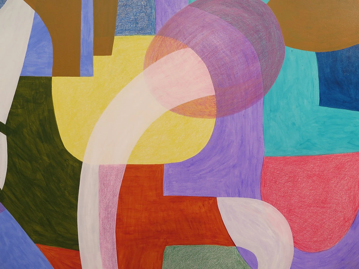
While these are my primary tools, there are also more complex schemes like split-complementary or tetradic harmonies, offering even more intricate possibilities for those who wish to delve deeper into structured color relationships. Each scheme is a different kind of conversation, and choosing the right one sets the tone for the entire piece. Artists like Sonia Delaunay, with her pioneering work in Orphism, beautifully demonstrated the power of simultaneous contrast and color relationships to create dynamic, abstract compositions.
The Emotional Palette: Psychology of Color, a Deep Dive into Feeling
This is where color truly becomes abstract, isn't it? It's not just about what you see, but what you feel. Colors have this incredible ability to tap into our subconscious, evoking memories, moods, and even physical sensations. It's as if colors speak a secret language, and as an artist, I aim to translate or even provoke that dialogue. But it's also important to remember that these associations can vary widely across cultures and even individual experiences. What feels calming to one person might stir anxiety in another, making the interpretation a rich tapestry.
I've spent a lot of time pondering the emotional language of color in abstract art, and it's a rabbit hole I happily fall down again and again. Each color, it seems, has its own personality, its own story to tell.
- Red: Passion, energy, intensity, love, anger. It's that fiery heart, igniting canvases with raw emotion. Read more about the fiery heart: how red ignites passion and energy in my abstract compositions.
- Blue: Calm, depth, contemplation, sadness, spirituality. It's the vast ocean or a peaceful sky, inviting introspection. Explore the psychology of blue in abstract art.
- Yellow: Joy, optimism, light, intellect. It's sunshine on a canvas, chasing away the shadows. Discover the psychology of yellow in my art.
- Green: Growth, harmony, nature, balance. It's the grounding force, connecting us to the earth. Learn about the psychology of green in my art.
- Black & White: Often overlooked, but for me, absolutely crucial. Black isn't just an absence; it's a grounding force, adding drama, profound depth, and sharp definition, anchoring vibrant chaos with a silent strength. White isn't just empty space; it brings light, expansive breathing room, and a sense of purity, offering moments of serene clarity. In abstract work, they aren't merely voids or backdrops; they are powerful statements in themselves, capable of carrying immense emotional weight, creating a stark dialogue that can be as eloquent as any vibrant hue.
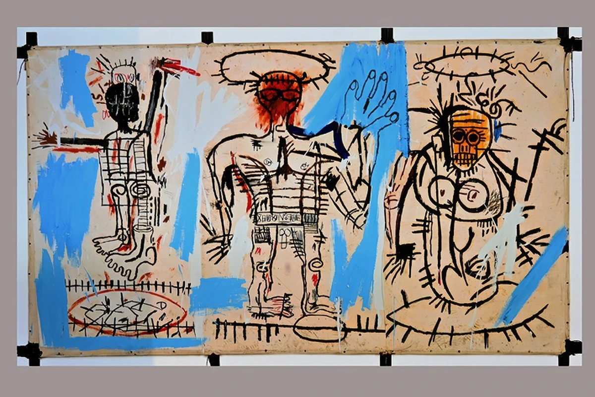
Think about artists like Mark Rothko, whose immense color field paintings are pure emotional experiences, drawing viewers into meditative states through vast, pulsating hues. He didn't just use color; he immersed you in it. Or Jean-Michel Basquiat, who used raw, vibrant color and bold lines to convey powerful social commentary and raw emotion, almost as a visceral language. These artists exemplify how color can transcend mere aesthetics to become a profound communicator of human experience. You can delve deeper into his impactful work in ultimate guide to Jean-Michel Basquiat.
Application & Intuition: My Personal Dialogue with Color
This is where the rubber truly meets the road, or perhaps, where the soul meets the canvas. While understanding theory is crucial, abstract art, for me, is equally—if not more—about intuition. Sometimes, I meticulously plan a palette with almost scientific precision; other times, a single, unexpected splash of color dictates the entire direction of a piece, like a mischievous muse whispering secrets. It's a constant, exhilarating dance between knowing the rules intimately and knowing precisely when and how to gracefully step outside them. There have been countless moments where I've started with a perfectly balanced analogous scheme, only to find myself adding a jarring, complementary accent that felt utterly right in that moment, defying all my initial plans. That's the magic, the unpredictable joy of the creative process, the very essence of my creative flow: embracing intuition in abstract painting.
My approach to palette and emotion is something I constantly refine, as you can read in the power of color in abstract art: my approach to palette and emotion. It's a journey of self-discovery through hue, and you can explore more about the emotional palette: how I choose colors for my abstract art.
Building Your Palette: Starting with Intent, Embracing Serendipity
Before any paint hits the canvas, the choice of palette sets the stage, almost like choosing the key for a musical composition. Sometimes, I start with a very specific emotional goal: do I want to evoke serenity, a quiet reflection? Then a cool, analogous scheme might be my starting point, built around soft blues and greens. Other times, I'm simply drawn to a particular set of hues, perhaps a vibrant red-orange that feels like a pulsing heart, and then I build around it, letting it lead the conversation. Working with a limited palette can be incredibly liberating, forcing focus and creating inherent harmony through constraint. Alternatively, a vast, diverse palette allows for boundless exploration and surprising juxtapositions. It's a constant negotiation between constraint and freedom, often guided by my internal compass.
Layering: The Alchemy of Depth and Narrative
One of my favorite techniques is layering. It's not just about putting one color on top of another; it's about transparency, luminosity, depth, and how colors interact beneath the surface. A vibrant red, peeking through a cool blue, tells a different story than a flat red on its own. This alchemy of layers is truly my secret to creating depth and narrative in abstract paintings. It's where the magic truly unfolds, creating an optical richness that draws you in, inviting closer inspection.
Beyond Layering: Techniques that Bring Color to Life & The Unseen Role of Texture
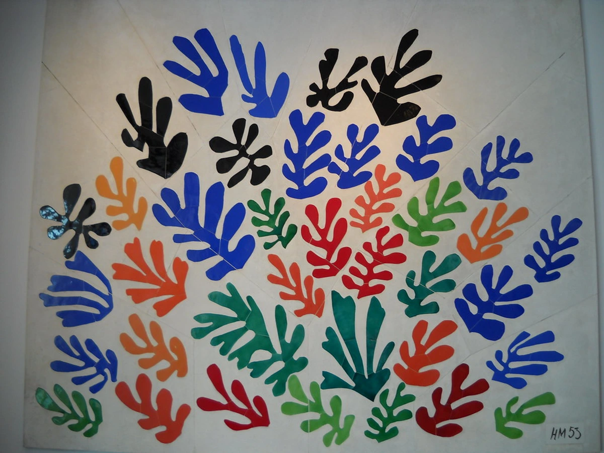
Beyond layering, abstract artists employ a myriad of techniques that heavily rely on color to forge their visual narratives. Color blocking, for instance, uses distinct, often large, blocks of pure color to create strong visual impact and structure, establishing a bold, geometric rhythm, as often seen in some of Henri Matisse's vibrant cut-outs. Another powerful approach is gestural application, which involves applying paint with broad, energetic strokes, where the movement, texture, and raw force of the color become part of the expression itself, reminiscent of the visceral power of Abstract Expressionism, as explored in the art of mark-making: expressive lines and gestures in abstract painting. And then there are glazes, thin, translucent layers of color that subtly alter the hue and depth of the underlying paint, adding a luminous, almost breathing quality to the surface, which I delve into in the art of glazing: adding luminous depth to my abstract acrylics.
![]()
Moreover, texture plays a surprising, often unsung, role in how color is perceived and felt. A thickly applied impasto of crimson, with its peaks and valleys, will absorb and reflect light differently than a smooth, glazed crimson. This creates distinct optical effects and profoundly alters emotional resonance. The physical surface itself becomes an integral part of the color experience, adding another dimension to the visual narrative, a subject I explore further in the role of texture in abstract art: a sensory exploration.
Experiencing Color: My Museum in Den Bosch & Art for Sale
Understanding color theory doesn't just change how you look at art; it fundamentally changes how you perceive the world around you. Suddenly, a fiery sunset isn't just "pretty"; it's an analogous scheme of vibrant oranges and soft purples, a masterclass in atmospheric perspective. A bustling market becomes a joyous, chaotic riot of complementary contrasts, a symphony of visual energy. It makes life, in my humble opinion, a lot more interesting, a canvas constantly unfolding before your eyes.
And speaking of seeing things differently, if you're ever near 's-Hertogenbosch in the Netherlands, I'd be absolutely thrilled if you stopped by my museum in Den Bosch. It's a place where you can experience the power of color firsthand, where the concepts we've discussed today jump off the walls, vibrant and alive. And if a particular piece captures your heart, well, you know you can always find art for sale on my site. No pressure, of course! Just an invitation to let color speak to you.
FAQ: Your Colorful Questions Answered
Is color theory a strict set of rules, or more of a guideline?
Definitely more of a guideline! Think of it as knowing the notes on a piano before you compose a symphony. You need to understand the fundamentals to intentionally create harmony or dissonance. In abstract art, especially, knowing the "rules" gives you the power to break them effectively, creating truly unique and impactful work that challenges perception and evokes deep feeling.
How do abstract artists choose their colors?
It varies wildly! Some, like me, start with an intuitive feeling, a mood, or a profound emotional response they want to evoke, letting the colors flow from an inner spring. Others meticulously plan their palettes based on specific color harmonies or symbolic meanings they wish to convey. And sometimes, the color choice emerges from a deeper conceptual idea, where hues are selected not just for their aesthetic appeal, but to represent complex thoughts or philosophical concepts. Often, it's a beautiful, messy mix of all three—a planned starting point that evolves organically, joyfully, during the creative process.
Can I learn color theory without painting?
Absolutely! While hands-on practice deepens understanding, you can learn a tremendous amount by observing. Look at art (abstract or otherwise), nature, fashion, and even interior design. Pay attention to how colors interact, how they make you feel, and try to identify the color schemes at play. Your brain is a powerful learning tool, constantly processing and learning, even when you're just observing the vibrant world around you!
Does light affect color perception in abstract art?
Oh, absolutely! Light is a game-changer, a silent collaborator. Natural daylight, warm incandescent light, cool LED light—each alters how colors appear, shifting their value, saturation, and even perceived hue. This is especially true for textured abstract pieces, where shadows and highlights play a crucial role. What looks vibrant in one light might appear muted, or take on a completely different emotional tone, in another. It's a constant consideration for both the artist creating the work and the viewer experiencing it, and part of the magic of seeing art in person.
How important is personal preference in color choice?
Massively important! While universal psychological associations exist, color is deeply personal. What evokes calm for one person might feel melancholic to another, based on their unique experiences, memories, and cultural background. As an artist, I infuse my work with my own preferences, my own soul, hoping to resonate with yours. As a viewer, trust your gut reaction to a piece's colors; it's your personal dialogue with the art, your unique interpretation that truly brings it to life.
How do I overcome artist's block when it comes to color?
Ah, the dreaded color block! I've been there, staring at a blank canvas that feels utterly uninspired. My advice: don't force it. Instead, try playing. Set a timer for 15 minutes and just mix colors without a goal, exploring textures and transparency. Or pick three random tubes of paint from your collection—colors you'd never usually put together—and see what happens. Sometimes, limiting your choices sparks unexpected creativity. Look at things around you – a vibrant piece of fruit, a worn-out book, the subtle hues in a shadow – and try to replicate its colors, pushing yourself to see beyond the obvious. Better yet, create a monochromatic study of an object you usually find visually uninteresting; you might uncover hidden nuances of color you never expected. Developing your personal color vocabulary is a journey, not a sprint. Trust the process, allow for happy accidents, and remember that sometimes the best solutions come when you're not even looking for them.
Embracing the Spectrum: My Continuing Color Journey
And so, my colorful companions, our journey through the vibrant, endlessly fascinating world of color theory in abstract art continues. It’s a field that’s constantly evolving, shifting, revealing new secrets, much like my own artistic journey. If you're curious about the twists and turns of that path, you can always check out my timeline. For me, every brushstroke, every accidental splatter, every carefully chosen hue is an exploration, a personal revelation. It's a constant dance between control and surrender, theory and pure, unadulterated feeling. And that, my friends, is why I keep coming back for more. It's a lifelong conversation, one brushstroke, one color, one profound feeling at a time. What colors are speaking to you today?


