Green in Abstract Art: Growth, Harmony, & Nature's Profound Influence
Uncover the profound psychology of green in abstract art. Join an artist's journey exploring how this versatile color embodies growth, harmony, and nature's timeless impact on creation, mood, and space.
The Profound Psychology of Green in My Abstract Art: Growth, Harmony, & Nature's Soul
Sometimes, a color just feels right, almost like an undeniable gravitational pull. For me, that color often turns out to be green. It’s not a conscious decision, at least not initially. It’s more of an itch, a whisper from the canvas, a feeling that something organic, something alive, needs to happen. I recall one particular morning, bleary-eyed, I tried to start a new series focused solely on vibrant reds and blues, determined to break away from my usual palette. Yet, within minutes, my hand instinctively drifted towards the tubes of green – a rich sap green, then a luminous chartreuse. It was like my subconscious had a secret green-loving committee I wasn't aware of, perhaps with a very strict dress code and an agenda to keep me perpetually grounded in verdant hues. It subtly nudged me back to what simply felt right. So, welcome to my green-tinged world. In this article, I want to unravel the profound psychological impact of green on my abstract work, exploring its deep connection to nature, growth, and the elusive harmony I seek on and off the canvas. We'll delve into how this color shapes my creative process, influences your space, and holds a rich, sometimes surprising, history in art.
This subconscious pull towards green isn't just a studio quirk; it's deeply rooted in my lifelong fascination with the natural world – the quiet strength of ancient trees, the chaotic beauty of an untamed garden, the relentless march of spring after a long winter. It's a cliché, I know, but nature truly is the ultimate artist, and green is its most eloquent language. So, it’s no surprise that this color has woven itself deeply into the fabric of my abstract art. For me, abstract art isn't about literal representation; it's about distilling the essence of an emotion, a memory, or a concept onto canvas, creating a visual language that speaks directly to the soul. And green, in this context, is more than just an aesthetic choice; for me, green is a profound psychological anchor, a personal conversation with growth, harmony, and nature's undeniable influence. This feeling often translates into a deep-seated association with growth and renewal in my work. Ever wonder what color truly speaks to your own subconscious, guiding your path?
Green: The Color of Growth and Renewal
Think about it: what comes to mind when you picture growth? Lush forests, sprouting seeds, new leaves unfurling. Green is the visual embodiment of life's relentless push forward. It whispers of fertile soil, abundant harvests, and life's endless capacity to renew itself. In my studio, when I find myself reaching for green, it often signifies a moment of artistic evolution. It’s a color I turn to when I’m trying to break new ground, experiment with a fresh technique, or push the boundaries of my artistic style. It feels like planting a seed on the canvas and watching it bloom, or perhaps like a slightly chaotic, but ultimately thriving, science experiment where the variables are paints and the hypothesis is "what if I just throw some green at it?" Sometimes, this green-tinged growth even manifests in a messy studio floor, a beautiful chaos that's part of the evolving ecosystem of my work.
Beyond its obvious association with burgeoning life, green holds a fascinating duality. It’s also the color of tranquility, balance, and yes, even envy – perhaps because it’s so often tied to nature’s abundance and the lushness of wealth, making it the color of desiring what others possess. In my abstract pieces, I find myself navigating these nuances, sometimes consciously, sometimes by accident. A vibrant, almost electric green might express raw, burgeoning energy, while a muted, smoky olive green can evoke a deep sense of peace or even a melancholic reflection. Sometimes, I lean into the calming aspect, using soft greens to create a meditative space. Other times, I introduce a sharp, almost aggressive green to symbolize a growth that’s challenging or unyielding, a testament to the fact that even beautiful things can be a bit prickly. This ever-shifting negotiation on the canvas is what keeps things interesting.
It’s a funny thing, really. Sometimes, I feel like my artistic journey is less about grand plans and more about just… growing. Like a plant, you need light, water, and sometimes a bit of pruning to really flourish. Green reminds me that every brushstroke, every layer, every mistake, is part of that organic process. It’s about being okay with the awkward, leggy phases, knowing that they’re leading to something stronger, more beautiful. It’s a comfort, a permission slip to just be and evolve.
Seeking Harmony: A Balancing Act on Canvas
Life, as we all know, is rarely a perfectly balanced equation. There’s chaos, there’s calm, there are moments of exhilarating highs and frustrating lows. My art, in many ways, is a reflection of this beautiful, messy reality. And green, with its inherent connection to balance and stability, plays a crucial role in creating harmony within my compositions. While I’ve explored the emotional language of other colors, green is unique.
It’s not just about what green is, but what it does to other colors. It’s fascinating, isn't it, how green acts as a kind of visual thermostat? It can cool down a fiery red, making it less aggressive and more contemplative, or bring depth to a vibrant yellow, grounding its exuberance. For instance, placing a vibrant emerald green next to a fiery cadmium red doesn't just create contrast; it can temper the red's intensity, inviting a more grounded, earthy feel, as if a lush forest is quietly observing a passionate flame. Green truly is the peacekeeper of the palette. It’s the quiet strength that brings disparate elements together into a cohesive whole, often by subtly shifting the perceived temperature of the entire composition. When I place a warm, yellow-green next to a cool blue, it's not just a contrast of hues, but a dialogue about warmth and coolness, energy and calm. Consider its complementary colors like fiery reds, vibrant oranges, or deep purples; when placed next to green, they don't just clash – they ignite a dynamic conversation, each color enhancing the other's intensity while green simultaneously offers an anchor. It's like green says, "Hey, let's talk this out, but calmly." Sometimes, I'll layer a translucent green over a more aggressive color to soften its edges, to create a sense of calm amidst the storm. It’s a visual sigh of relief, a quiet nod that yes, everything can coexist.
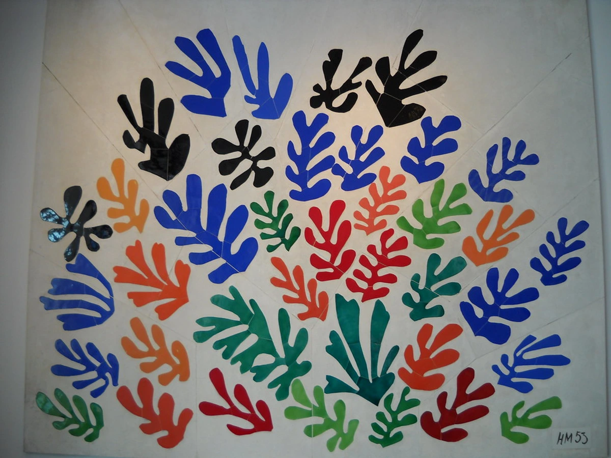
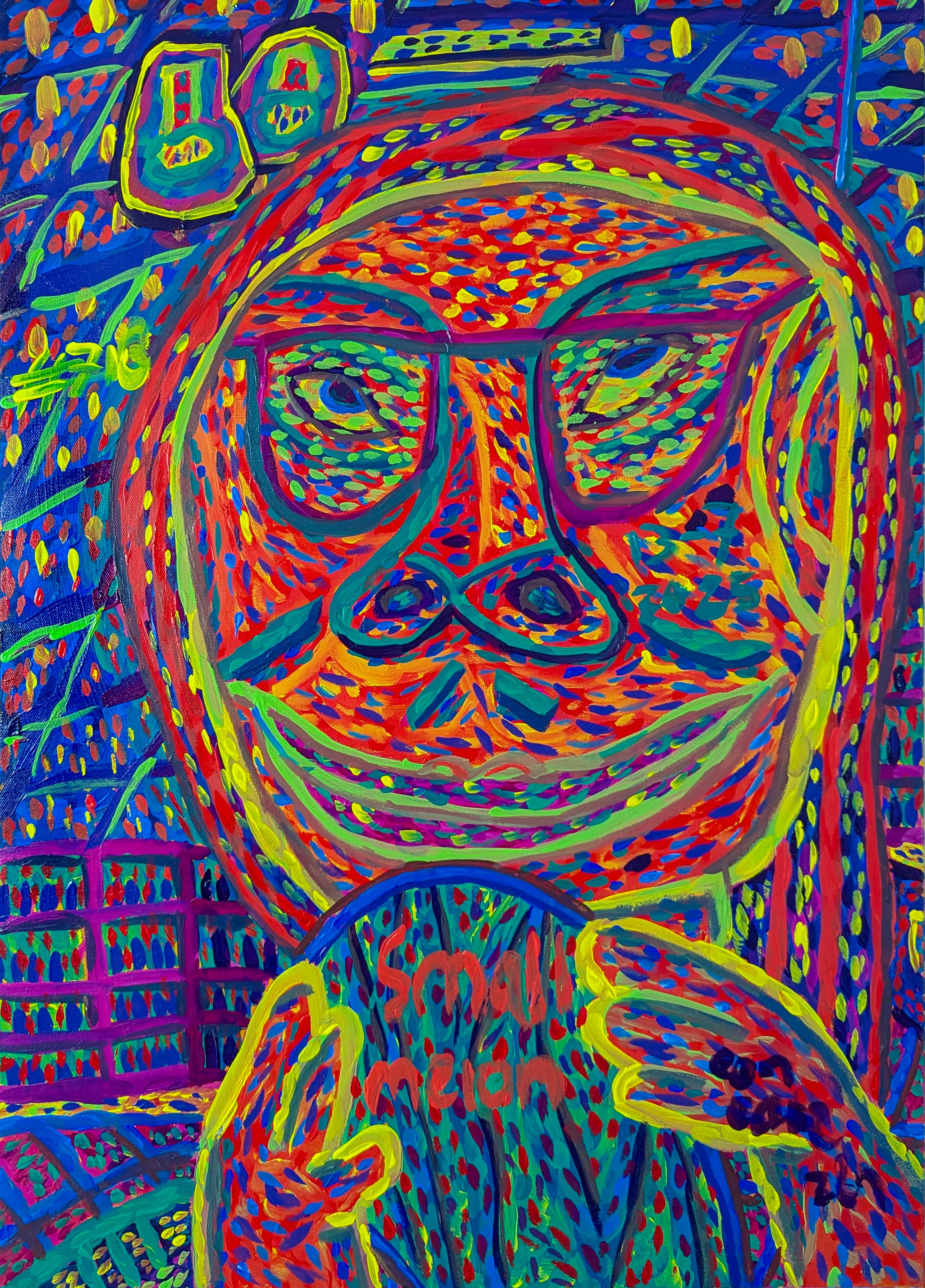
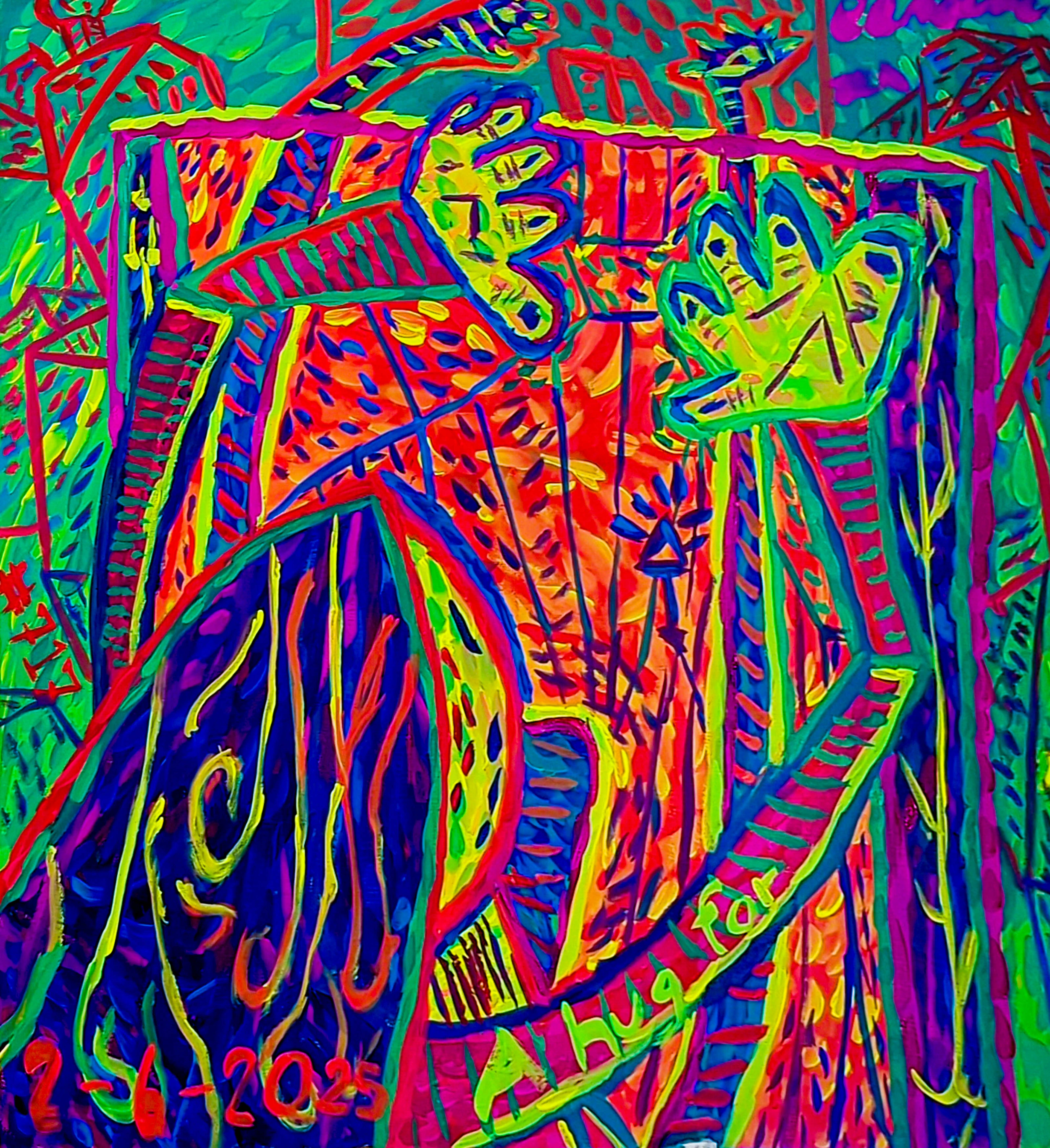
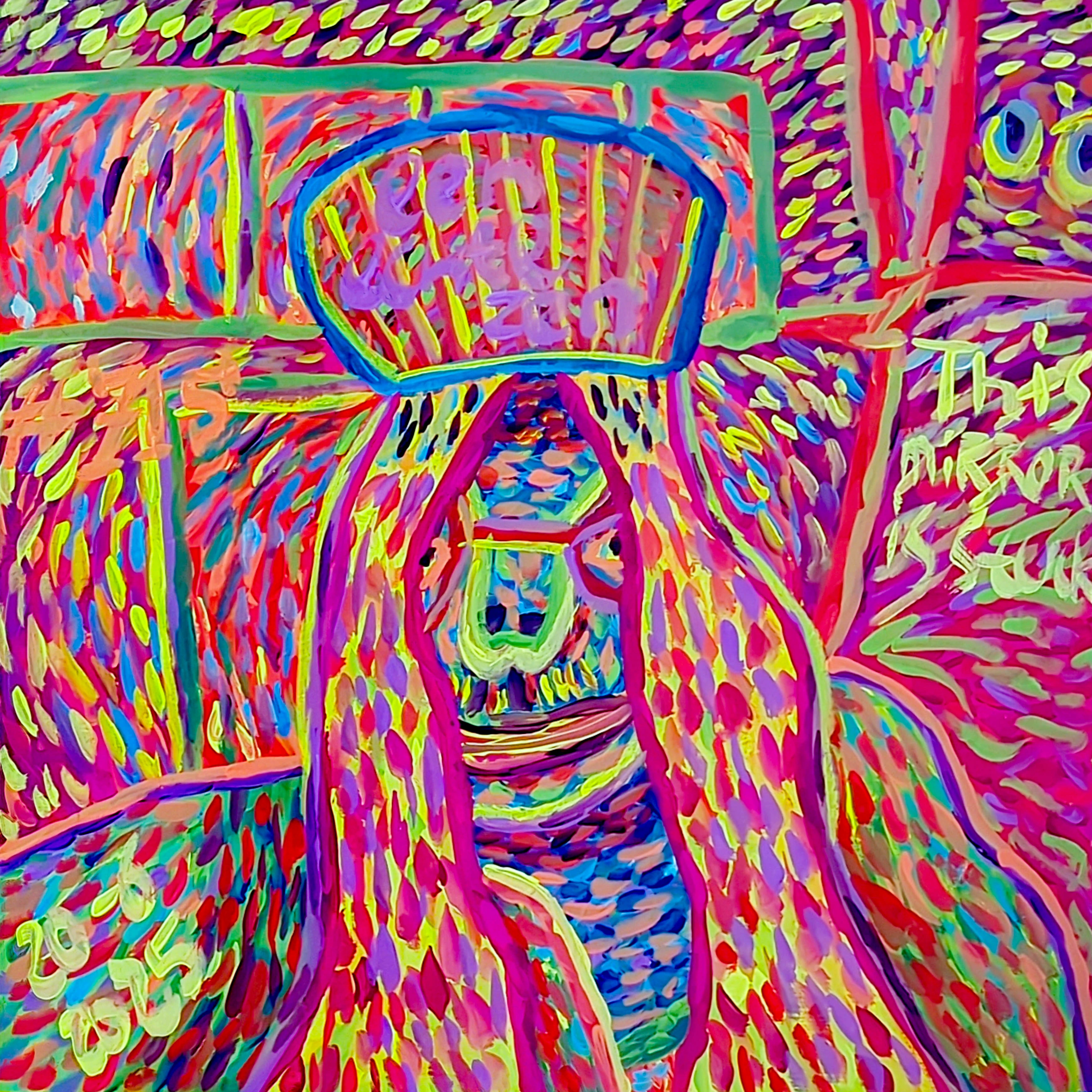
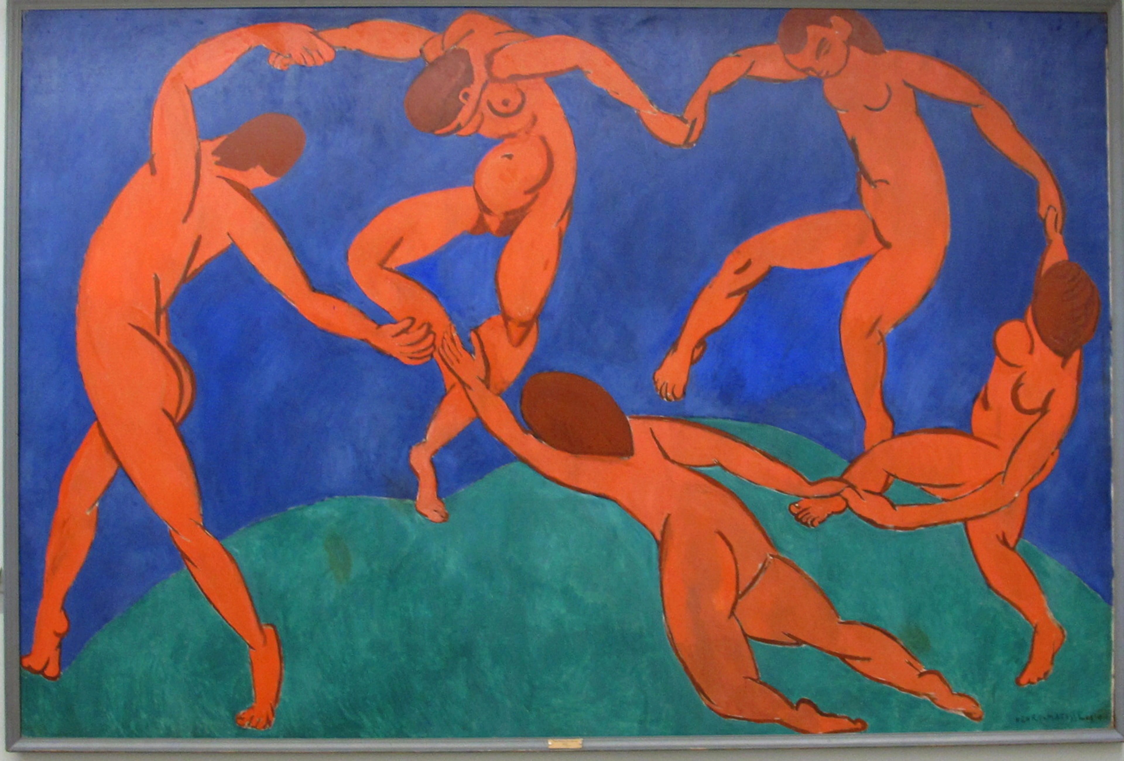
Just like Henri Matisse masterfully balances vibrant forms in his collages, as seen above, I strive for a similar equilibrium. For instance, in my own abstract works, you might see bold, energetic strokes of orange or pink. If I feel those colors are becoming too overwhelming, too much, a touch of green often enters the scene. It’s not about overpowering them, but about creating a conversation, a dialogue where every voice is heard, but none shouts over the others. It's the harmony I often crave in my own life, mirrored on the canvas.
Nature's Undeniable Influence: From Forest to Canvas
My connection to nature isn't just a theme; it's a foundational element of my creative existence. It's where the abstract forms find their grounding. I remember spending countless hours as a child, lost in the woods behind my grandparents' house. I can still recall the exact scent of damp earth after a spring rain, the spongy feel of bright green moss under my fingers, and the infinite shades of green – from the almost black-green of pine needles to the luminous chartreuse of fresh moss, shifting with every ray of light. That deep, visceral experience still informs my work today, influencing the subtle layering and organic forms you might see in my pieces, like the way a rich, deep green can anchor a vibrant splash of yellow, much like sunlight piercing a dense canopy.
When I’m feeling creatively blocked or simply overwhelmed, a walk in nature is often my first remedy. It’s where my artist's muse truly comes alive. The way light filters through leaves, the subtle shifts in hue across a meadow, the texture of bark – all these elements seep into my subconscious and re-emerge on the canvas in abstract forms. I recall one piece, a large diptych, where I wanted to capture the feeling of ancient, moss-covered stones in a deep forest. Instead of literal depiction, I used thick, almost sculptural applications of various dark greens, layering them wet-on-wet with subtle hints of ochre and brown. Then, with a palette knife, I dragged across the still-wet surface, creating deep furrows and ridges that mimicked the weathered, cracked texture of ancient bark, or the soft, undulating folds of velvety moss underfoot. The resistance of the thick paint, the cool slide of the metal — it was like sculpting the very essence of the forest floor onto the canvas, a direct translation of the rough, tactile sensation of bark and the velvety softness of moss under my fingertips. This created a deeply textured, organic surface that pulsed with the quiet energy of the forest floor, without ever showing a single leaf. Green, in this context, isn't just a color; it’s a memory, a feeling, a deep breath. It’s the quiet conversation between my inner world and the outer landscape. It's about trying to capture that deep, human need to connect with nature and make it something you can actually see and feel.
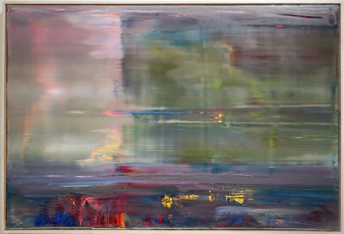
And it’s not always about direct representation. My art is, after all, abstract. But the feeling of being immersed in a forest, the sense of peace and interconnectedness – that’s what I aim to capture. You might not see a literal tree in my green paintings, but you might feel the same calm you get from standing in a sun-dappled glade. It’s a very personal form of art about nature.
How Green Transforms My Process and Your Space
Incorporating green isn't just about the final outcome; it genuinely influences my creative process. When I start with green, or introduce it early on, it often sets a different tone for the painting. There's a certain groundedness, a sense of quiet potential that allows me to explore more freely, without feeling rushed. It's like the earth beneath my feet, providing a stable foundation for wilder expressions to emerge. When I incorporate green into my work, my intention is often to infuse the piece with this very sense of grounding and renewal. And what's truly magical is how that intention translates, allowing green in abstract art to offer a similar transformative experience in your space. For example:
- Grounding Explorations: If I begin a piece with a deep, earthy olive green, it often nudges me towards exploring more textural elements, building up layers to mimic the rough surface of bark or the soft undulations of moss. This particular shade seems to quiet the chaos and encourage a more contemplative, layered approach.
- Energetic Dialogues: Conversely, if I introduce a vibrant spring green early on, it tends to invite more playful, energetic brushstrokes and pushes me to experiment with complementary colors like bold fuchsias or oranges, creating a dynamic visual conversation.
For you, the viewer, green in abstract art can offer a similar transformative experience in your space:
- Creating Calm Sanctuaries: Think of a cool, pale mint green in a bedroom – instantly calming, almost refreshing, like a cool breeze. It fosters an atmosphere of tranquility and rest.
- Inviting Warmth: Contrast that with a rich, almost gold-tinged olive green in a living room, which can feel incredibly inviting and warm, like sunlight filtering through autumnal leaves. It creates a cozy, welcoming ambiance.
- Enhancing Focus: In a home office, a muted forest green can help create an environment conducive to concentration and clarity, grounding the space without being distracting.
Different shades of green genuinely influence the perceived temperature and energy of a space, making them incredibly versatile tools in my abstract 'toolkit' for home environments. This kind of abstract art for every room can truly transform a mood, turning a bustling living room into a serene retreat, or a stark hallway into a welcoming passage. The healing power of color is real, and green is often at its heart.
A Brief History of Green in Art
Before diving into my personal reflections on green, it's worth a quick historical detour. Green pigments have been around for millennia, from ancient Egyptian malachite to Renaissance verdigris. Historically, green was often challenging for artists to master, sometimes unstable or prone to fading. Yet, its presence was crucial for landscapes and portraiture, symbolizing nature, fertility, and even status. Culturally, green has worn many hats – from prosperity and luck to envy and even danger, reminding us that its meaning is as varied as its hues.
![]()
The Impressionists, for instance, revolutionized its use, moving beyond flat applications to capture the fleeting, shimmering light of meadows and water, layering greens to create unprecedented depth and vibrancy. Think of Monet’s water lilies, where greens aren’t just backdrops but living, breathing elements. Later, artists like Van Gogh imbued green with intense emotional expression, using it to depict everything from melancholic interiors to vibrant, energetic fields. The Fauvists, including Henri Matisse, pushed green even further, using it non-naturalistically and boldly to convey pure emotion and vibrant energy, freeing it from literal depiction and paving the way for abstract explorations. This rich history reminds me that while my approach to green is personal and abstract, I'm participating in a long, evolving conversation with this timeless hue.

Frequently Asked Questions About Green in Art
As I delve deeper into my relationship with green, I often find myself answering similar questions from fellow artists and art lovers. Here are some thoughts on common questions I hear about green in abstract art:
Why is green often associated with healing and well-being?
It largely stems from our primal connection to nature. Green environments are inherently restorative and calming to the human nervous system. In art, this translates to a sense of peace, balance, and renewal, making it a popular choice for spaces intended for relaxation and introspection. Historically, artists from the Renaissance often used green pigments, sometimes in glazes, to add depth and life to their landscapes and portraits, intuitively understanding its calming and grounding effects, even if not explicitly for "healing" in the modern sense. My own journey with green echoes this ancient wisdom, albeit through an abstract lens.
How do different shades of green impact a painting's mood?
Oh, the nuances! Bright, lime greens often evoke freshness, youth, and energy. Deep, forest greens convey stability, maturity, and depth. Sage or olive greens can feel sophisticated, tranquil, and earthy. For instance, if I want to evoke the feeling of a new beginning, a burst of optimism, I might reach for a bright, almost electric spring green, perhaps a touch of Phthalo Green, layered translucently over a vibrant yellow. But if the aim is deep introspection, a quiet grounding, I'd instinctively turn to a muted, dusty sage green, perhaps mixed with a hint of Payne's grey, to create a profound, almost ancient stillness on the canvas. Knowing these subtle differences allows me to fine-tune the emotional impact of a piece, steering it towards vibrant growth or serene introspection.
How do you choose which specific shade of green for a new piece?
It's rarely a purely intellectual decision. Often, it's an intuitive pull, a memory of a particular landscape, or even the underlying colors already on the canvas guiding me. If I'm aiming for a sense of quiet contemplation, I might reach for a muted, almost dusty green. If I want to inject vibrant, restless energy, a bright chartreuse might emerge. Sometimes, the shade is dictated by the season I'm feeling – the crisp greens of spring, the lush depths of summer, or the faded, warm greens of autumn. The choice of medium also plays a significant role; a transparent watercolor green will behave differently and offer a distinct luminosity compared to a thick, opaque Sap Green or Emerald Green oil paint. It's a dialogue with my subconscious, always.
Can green in art ever represent something negative, like decay or stagnation, and how do you approach that?
Yes, green can certainly evoke less pleasant associations like decay, sickness, or stagnation – think of sickly yellowing leaves or swampy hues. However, in my abstract work, I consciously choose to lean into green's more vibrant and restorative qualities. If a duller, muted green appears, it's usually to evoke a sense of grounding, timeless age, or quiet, reflective solemnity, rather than outright decay. It’s an intentional decision to reframe these less 'positive' aspects through the lens of enduring stillness or natural cycles, ensuring that even the most subdued greens in my pieces contribute to a sense of balance and organic flow, rather than anything truly negative.
Can green be used in contemporary abstract art without looking dated or overly naturalistic?
Absolutely! The beauty of abstract art is that it frees colors from their literal associations. When I use green, it's often not to depict a leaf, but to evoke the feeling of a forest, the energy of growth, or the harmony of interconnectedness. For example, in my 'Urban Jungle' series, I combine sharp, neon greens with metallic grays and industrial textures, using green not to depict foliage, but to evoke the resilient energy of nature pushing through concrete, creating something undeniably contemporary and abstract. Paired with unexpected colors or bold textures, green becomes a thoroughly modern and dynamic element. It's all about intentionality and context within the composition.
Embracing My Green-Tinged World
So, as you can see, green for me is far more than just a pigment on a palette. It’s a philosophy, a constant reminder of life’s cycles, and a comforting presence in my artistic journey. It grounds me, allows me to grow, and helps me find that elusive harmony both on and off the canvas. It's a conversation starter, a quiet confidante, and a source of endless inspiration.
Sometimes, when I step back, my studio floor, with its scattered splatters of viridian, sap green, and forest green, truly resembles a miniature, abstract forest floor – a vibrant, chaotic ecosystem of creative energy. It’s here, amidst the beautiful mess, that I find that quiet, green-tinged world I inhabit. So, the next time you see a green piece of my art for sale – perhaps a vibrant print or an original painting, where you can explore the nuances of this profound color – I hope you feel a little bit of that connection. A whisper of growth, a moment of harmony, and an echo of nature's timeless influence. I invite you to step into this world, to find your own green moments within it, and perhaps even to listen to the quiet whispers of growth and harmony that green might be speaking in your own subconscious, guiding your path.
If you're ever in 's-Hertogenbosch, you can also experience some of my art firsthand at the Den Bosch Museum, where the colors truly come alive. And if you're curious about the broader journey that led me to embrace such colors, my timeline offers a deeper look into my artistic evolution.


