Abstract Art & Color: My Personal Journey to a Healing Home
Discover how abstract art's vibrant colors and textures can transform your home into a personal sanctuary. An artist shares their introspective journey to well-being through intuitive art curation.
The Healing Power of Color: How Abstract Art Transforms My Space
You know, for someone who spends a significant chunk of their life wrestling with paint and canvas, it’s a bit ironic how much thought I put into the colors outside my studio. My home isn't just a place to crash; it's my sanctuary, my refuge from the delightful chaos of creation. And trust me, there's a lot of chaos. Just last week, a rogue blob of cadmium red decided to redecorate my pristine white wall, adding an unexpected, fiery accent. So yes, my sanctuary is desperately needed. Slowly but surely, I’ve come to realize that the most potent architects of this sanctuary aren't the fancy furniture or the perfect lighting, but the silent, vibrant hues humming from the abstract art on my walls. It’s a journey I didn't consciously embark on, but one that has genuinely transformed my everyday well-being. Could a splash of paint truly change your day, or even your entire outlook? For me, the answer has been a resounding yes, in ways I never anticipated.

The Unseen Language of Hues: My Personal Color Confessions
I used to think color psychology was a bit… fluffy. Like, "Oh, red makes you angry," and "Blue is calming." Sure, intuitively, that makes sense, but how deeply does it really sink in? Well, deep enough, apparently, to subtly reshape my entire outlook. While I used to dismiss formal color psychology, artists for centuries, from Goethe to Kandinsky, have explored how hues resonate with our inner world. Goethe, for instance, approached color as a phenomenon of light and darkness, exploring its emotional and psychological effects, while Kandinsky, a pioneer of abstract art, saw color as a direct path to spiritual expression, believing each hue and form possessed its own 'inner sound.' It's fascinating how these historical giants wrestled with the same questions I ponder daily in my studio, translating inner states into visual language. Sometimes I wonder if they, too, occasionally mixed up their cadmium red with their alizarin crimson in the creative fervor, only to discover a new, unexpected harmony. This deep historical lineage underscores how color has always been more than just pigment. Even later movements, like the vibrant brushwork of the Impressionists capturing fleeting light, or the bold, often jarring palettes of the Fauvists used for expressive impact, further proved that color held immense power beyond mere representation. Abstract art takes that exploration to its purest form, often acting as a form of visual therapy. Unlike traditional chromotherapy, which uses direct light exposure, abstract art achieves similar emotional shifts through the viewer's personal interpretation and emotional response to its distinct colors, forms, and crucially, texture.
I’ve found that living with abstract art, devoid of explicit subjects, allows the pure emotional punch of color and texture to hit differently. It's not about what the painting depicts, but how its very essence feels. The raised impasto, the smooth washes, the gritty sand mixed in – each texture adds another layer to the emotional dialogue. Just last week, I caught myself tracing the thick, swirling lines of a new piece, and the rough, almost visceral texture grounded me instantly, pulling me out of a spiral of creative self-doubt. It was a tangible anchor. If you're curious about the general impact, there's a great piece on the emotional language of color in abstract art that delves deeper.
Take blue, for instance. My bedroom is a haven of blues and soft greens. Not because I set out to make it a cliché serene space, but because after a particularly chaotic day in the studio – maybe a painting isn't quite working, or I've had a minor paint explosion (it happens!) – walking into that room is like a sigh of relief. The cool tones, often deep and layered in my own pieces, just… quiet things down. It’s like the color itself breathes out a calm I desperately need. There's also a fantastic article on the psychology of blue in abstract art: calm, depth, and emotion that resonates deeply with my experience.
And speaking of vibrancy, then there's yellow. Oh, yellow! I have a smaller, intensely vibrant yellow abstract piece near my kitchen, a splash of pure, unadulterated sunshine. On gloomy mornings, when my coffee hasn't quite kicked in and the thought of facing the day feels like dragging myself through treacle, that yellow hits me. It's not an aggressive "wake up!" but a gentle, persistent reminder that joy exists, that light can break through. It's almost embarrassing how much a blob of yellow paint can lift my spirits, but honestly, it works.
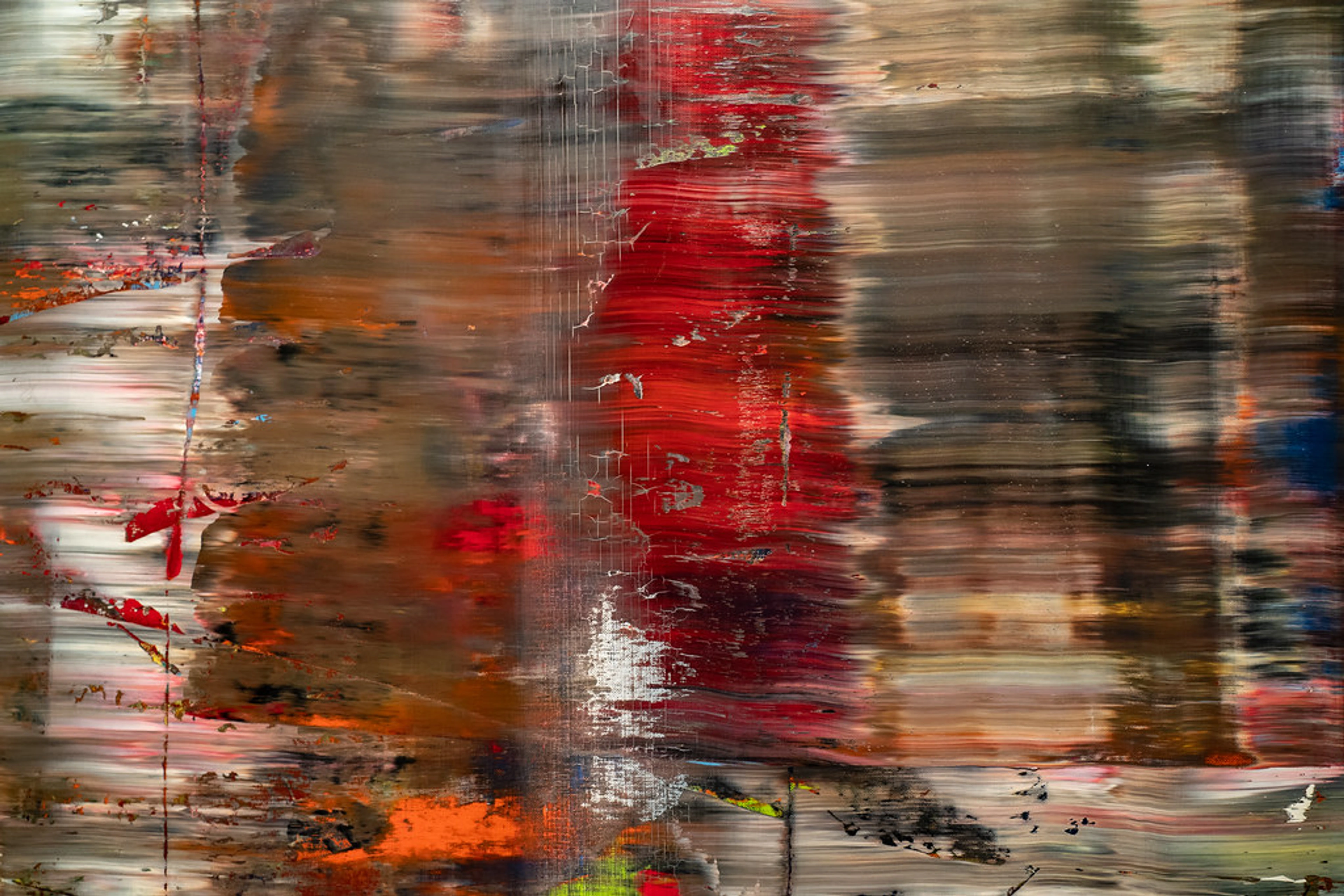
And red? My partner once questioned why I put a vibrant, fiery red abstract in our living room – "Isn't it too much?" they asked, probably picturing a bullfight, or perhaps my latest attempt at a chili recipe gone wrong. But it's not. It's an anchor of passion and energy. For me, it ignites conversation, makes the room feel alive, not overwhelming. It's not a shout; it's a confident, warm embrace. It sparks a certain joie de vivre that makes movie nights feel a little cozier and conversations flow a little freer.
And then there's green. Often overlooked in the splashier conversations about color, green, for me, embodies growth and renewal. I have a subtle green abstract print in my small reading nook, a space where I go to decompress and let ideas germinate. It's not a bold, statement piece, but one that uses layered greens and earthy tones to evoke the feeling of a calm forest. When I’m wrestling with a creative block or feeling mentally fatigued, sitting with that green piece is like a quiet recharge, reminding me of nature's endless cycles of growth and resilience. It's a whisper of hope, a visual deep breath.
Why Abstract Art? The Freedom of Formless Expression
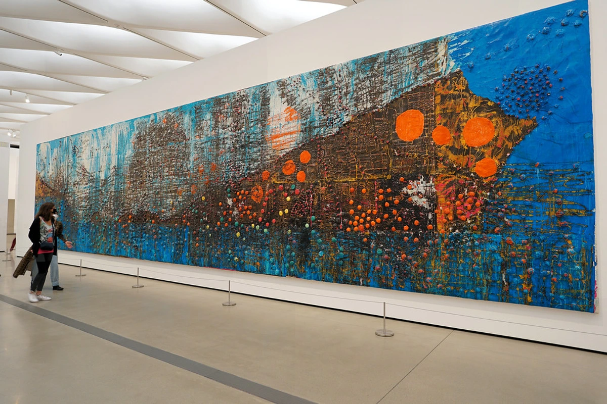
This brings me to the "why abstract?" part. Abstract art emerged in the early 20th century, a revolutionary break from centuries of representation, pushing artists to explore emotion and ideas through pure form and color. When you look at a landscape, your brain immediately tries to identify trees, mountains, rivers. With a portrait, you're looking for emotion in the face. But with abstract art, your brain, bless its diligent heart, has to work differently. It can’t pin it down. It bypasses the analytical mind's need to categorize, allowing you to feel the color, the texture, the composition, purely. There’s no narrative imposing itself, no story you must follow. It’s just… feeling, a direct line to your emotional resonance. This lack of a fixed narrative profoundly encourages personal projection and introspection, making abstract art a powerful tool for self-discovery and emotional processing. Non-representational forms, gestural marks, the interplay of light and shadow, and the palpable texture of the paint itself—all these elements uniquely contribute to a raw, unmediated emotional experience. It's fascinating how our brains are wired; certain wavelengths of light (colors) can trigger specific physiological responses, impacting everything from heart rate to mood, even before we consciously 'think' about them. Science is now confirming what artists have long intuitively known: color isn't just seen, it's felt.
This pure experience is what makes it so incredibly effective in shaping a space's emotional landscape. There are no right or wrong interpretations, just your personal reaction. It’s like looking into a mirror, not of your reflection, but of your inner world. If you’ve ever found yourself wondering about this, I've written about demystifying abstract art: a personal guide to finding meaning and decoding abstraction: a beginner's guide to understanding non-representational art, which might help.

Curating My Own Healing Palette: A Room-by-Room Reflection
This understanding then led me to treat my home as a living canvas, intentionally curating each space with abstract art to tune its emotional frequency. My entire home has become a deliberate (or perhaps, intuitively accidental) curation of color therapy. It’s a bit like my personal museum, except I get to live in it. Let me walk you through how I've applied this intuitive approach, room by room:
- Bedroom: As I mentioned, it’s all about the blues and greens. I’ve placed pieces that use these colors in broad, sweeping strokes, often with a whisper of texture, creating soft, blended gradients that melt into each other. These are typically hung above the bed or on the main wall, acting as a visual lullaby, gently nudging my overactive brain into a state of rest. I specifically chose artworks that don't demand attention but rather invite calm contemplation—perhaps a subtle color field piece. It’s a great feeling to retreat into a space that visually embraces tranquility after a long day. You can find more tips on how to decorate your bedroom with art.
- Living Room: This is where things get a bit more adventurous. It’s a blend of vibrant reds, oranges, and yellows juxtaposed with cooler tones to maintain balance. The goal here is energy and warmth for social gatherings, but also enough visual interest to keep my own mind stimulated without feeling restless. My red piece here often uses bold, impasto strokes that give it a palpable energy—a gestural abstract that commands attention without overwhelming. I often position it as a focal point above the sofa or on a prominent wall. It’s not a chaotic explosion; it’s a symphony of color. This is where I truly understand how to decorate your living room with art, allowing pieces to breathe while still interacting.
- Dining Room/Hallway: While not a primary 'healing' space in the same quiet way as the bedroom, these transitional areas offer unique opportunities. In my dining room, I chose an abstract piece with dynamic, intersecting lines and a mix of warm and cool colors. It's usually placed on the longest wall, meant to spark conversation and keep the energy flowing during meals, without being overly prescriptive. In the hallway, a smaller, contemplative piece with muted purples and grays, often placed on an eye-level wall near a doorway, provides a moment of visual pause between rooms, a gentle reminder to transition mentally as well as physically. It's all about subtly influencing the energy flow of the home.
- Studio/Office: This is where the magic happens, and sometimes, where the frustration lives. For my studio, I lean into colors that inspire creativity and focus, but also provide a gentle grounding. So, you’ll find vibrant, almost electric blues and greens that spark ideas, alongside earthy browns and grays that keep me rooted – perhaps on a wall directly opposite my easel, a constant visual prompt. The art here often features dynamic lines and energetic compositions—think a dynamic geometric abstract. It’s a practical, emotional space, and the art here is less about 'healing' in a calming sense and more about 'fueling' the creative fire. As an artist, I find that the same principles of color and form that affect me as a viewer also guide my hand. I consciously use specific hues and textures to evoke the feelings I want to capture on canvas, a deliberate act of translating internal states into visual language. It’s where I explore my creative flow: embracing intuition in abstract painting and learn how to decorate your office. Sometimes, my own canvases-in-progress are the best 'art' for this space, reflecting the glorious, beautiful mess of artistic pursuit.
It’s an ongoing experiment, really. My home has become a canvas of its own, and the abstract art I choose for each space is less about matching the sofa and more about tuning the emotional frequency of the room. It's a fantastic way to approach decorating your home if you ask me!
Choosing Your Own Healing Palette: Trust Your Gut
So, how do you choose your own color therapy? It's simpler than you think, and it starts with a feeling. My advice, as someone who stares at colors all day, is this:
- Forget the rules, for a second. Walk around your space. What do you want to feel when you’re there? Do you want a burst of energy in your dining area? A quiet calm in your reading nook? It might feel a bit awkward at first, listening to your gut instead of a color chart, but trust me, your intuition knows more than you think. Try this: close your eyes for a moment, envision the perfect mood for that room, then open them and let your gaze fall on pieces of art. Which ones instinctively resonate with that envisioned feeling? That's your gut speaking.
- Consider your existing palette. Look at your furniture, walls, and larger decor items. Do you want the art to harmonize with these, creating a cohesive, soothing environment? Or do you want a bold abstract piece to create an intentional, eye-catching contrast that sparks energy? Both approaches are valid, depending on the mood you seek.
- Let the art speak to you. Once you have that feeling in mind, go look at art. Not necessarily with an analytical eye, but with your gut. Which pieces make your heart beat a little faster? Which ones make you exhale a little slower? That's the color (and texture!) talking to you. It's about finding that emotional connection: why collecting abstract art is a personal journey.
- Mind the light. Consider the light in your room – natural daylight can transform colors throughout the day, making a painting appear vibrant in the morning and subdued by evening. Artificial lighting also plays a huge role; warm light (like incandescent or soft white LEDs) can make reds and yellows pop, while cool light (like daylight LEDs) enhances blues and greens. Experiment with how different light sources affect the artwork's mood.
- Consider size and scale. A common pitfall! Don't just pick a piece you love; think about its physical presence. A small piece can get lost on a large wall, and an oversized one can overwhelm a tiny space. Measure your wall, visualize the piece there, and ensure it feels balanced with your furniture.
- Don't be afraid to experiment! Start small. Maybe a vibrant print, or a smaller painting, and see how it feels. After all, if you love what you see, you can always buy art from my collection, knowing it comes from a space where color is deeply valued.
And if you're exploring creating mood with art or choosing art based on room color, this intuitive approach is still your best guide.
Beyond the Canvas: A Personal Shift
So, what happens when art truly becomes a part of your daily rhythm? What shifts, subtly, almost imperceptibly, when the art on your walls isn't just decoration, but a deliberate companion to your emotional landscape? Living with art that actively contributes to my emotional well-being has been a quiet revolution. It’s not a dramatic "aha!" moment every day, but a subtle, cumulative effect. I find myself more patient, more centered, and surprisingly, more productive. For instance, after a particularly frustrating studio session, I take a deeper breath when I walk into my blue bedroom, and that small moment of calm helps reset my entire evening. Or, on a day when creative blocks feel insurmountable, stepping into the vibrant living room can spark a small, unexpected burst of inspiration. It’s a constant, gentle reminder that even in chaos, there’s beauty, balance, and a sense of calm to be found.

This isn't just about pretty pictures on a wall; it's about curating an environment that supports your inner self. And for me, abstract art, with its boundless colorful possibilities, has become an indispensable tool in that ongoing self-care project. It's truly a mirror to your inner world.
Frequently Asked Questions
What are some common questions I hear about this? Glad you asked.
Question | My (Personal) Answer |
|---|---|
| What exactly is abstract art? | For me, it's art that doesn't try to represent reality in a recognizable way. It uses color, shape, line, and texture to evoke emotion, ideas, or just pure aesthetic pleasure. It asks you to feel, not just see. |
| How do I choose the "right" colors for my space? | My honest advice? There's no "right." It's deeply personal. Think about the mood you want to create in a room. Do you want calm? Energy? Focus? Let that guide you. Then, find art whose colors evoke that feeling in you, even if it's just a gut reaction. |
| Can abstract art really "heal" me? | "Healing" might be a strong word for some, but I find it incredibly therapeutic. It shifts your perspective, affects your mood, and creates a space that supports your mental and emotional well-being. It’s a form of visual therapy. |
| What if a color I choose feels 'wrong' later? | Don't worry! Your emotional landscape evolves. If a piece no longer resonates, it's okay to move it or even swap it out. Art in your home should always support your current well-being, not trap you in a past choice. |
| What if I don't "understand" abstract art? | The beauty of abstract art is that you don't need to understand it in a conventional sense. It's not a puzzle to solve. Instead, approach it with curiosity and an open heart. Allow yourself to simply feel the colors, textures, and forms. Your personal reaction is the only "understanding" that matters. |
| How do I hang abstract art to maximize its impact? | Placement is key! Consider the size and scale relative to your wall and furniture. For a powerful statement, hang larger pieces at eye level in prominent spots. For smaller pieces, group them or place them in intimate nooks. Always consider the light, as it dramatically changes how colors appear throughout the day. |
| Where should I start if I’m new to collecting abstract art? Do I need to spend a fortune? | Start with what genuinely resonates. Don't worry about trends or what you "should" like. Visit galleries, browse online. You don't need a fortune; prints or smaller pieces are a great start. Sometimes the smallest piece can make the biggest impact. You can always explore my artist journey for inspiration! |
Final Thoughts: My Colorful Confession
So, there it is. My confession: I’m hooked on the healing power of color through abstract art. It's less about decorating a house and more about painting a feeling into every corner of my life. If you’ve been on the fence about embracing bold, abstract pieces, I hope this deeply personal journey has given you a nudge. Dive in, trust your instincts, and let the colors work their magic. Who knows, your home might just become the next masterpiece in your personal well-being journey. Maybe you'll even visit my museum in Den Bosch to see how I play with color on a larger scale!


