The Psychology of Yellow in Art: A Personal Journey into Joy, Light & Creativity
Dive into an artist's deeply personal journey with the color yellow. Explore its complex psychology, vibrant historical presence in art movements like Fauvism and Pop Art, and how this dynamic hue embodies joy, light, and creativity in abstract art and everyday life.
The Psychology of Yellow in My Art: A Personal Journey Through Joy, Optimism, and Light
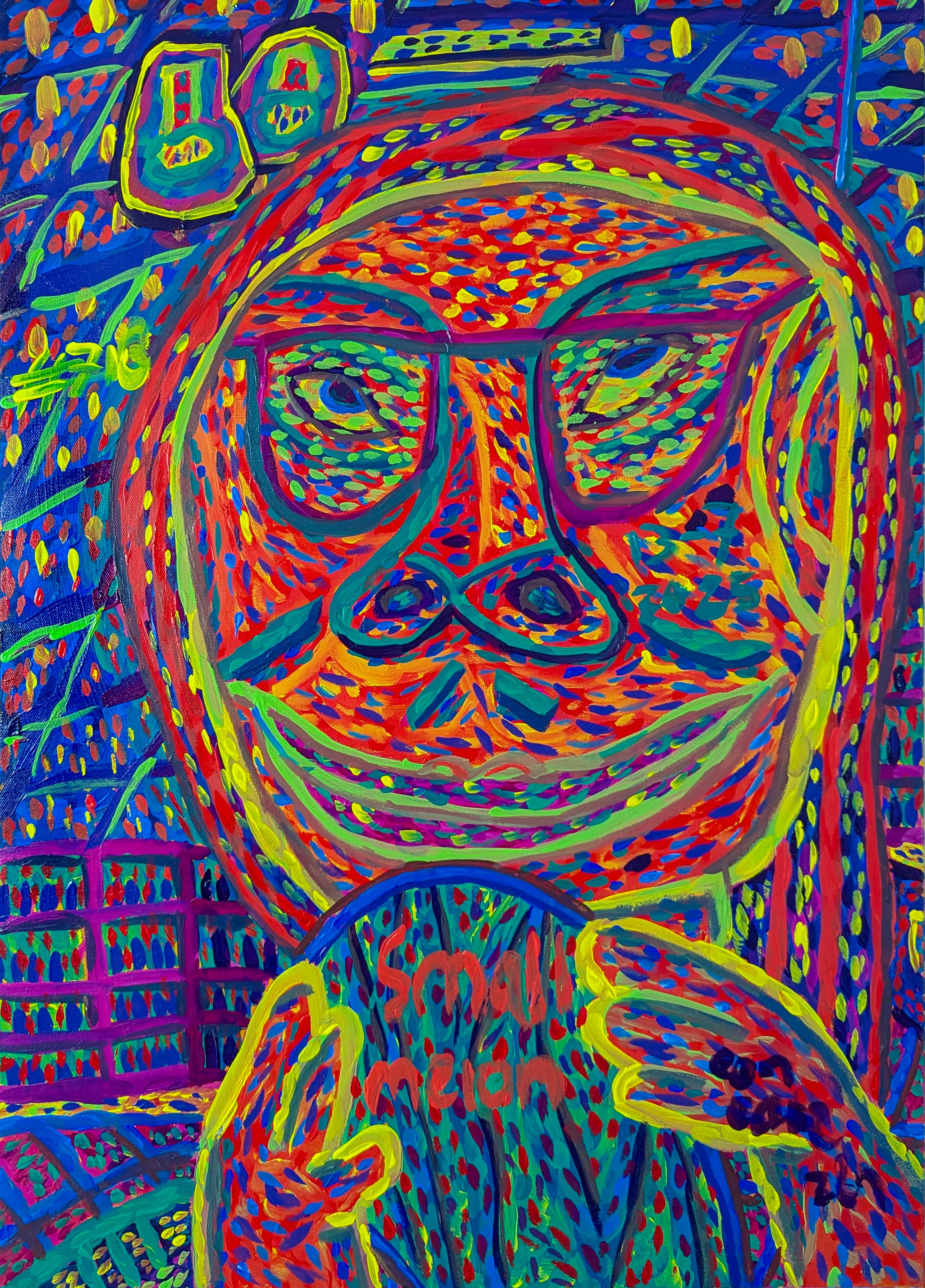
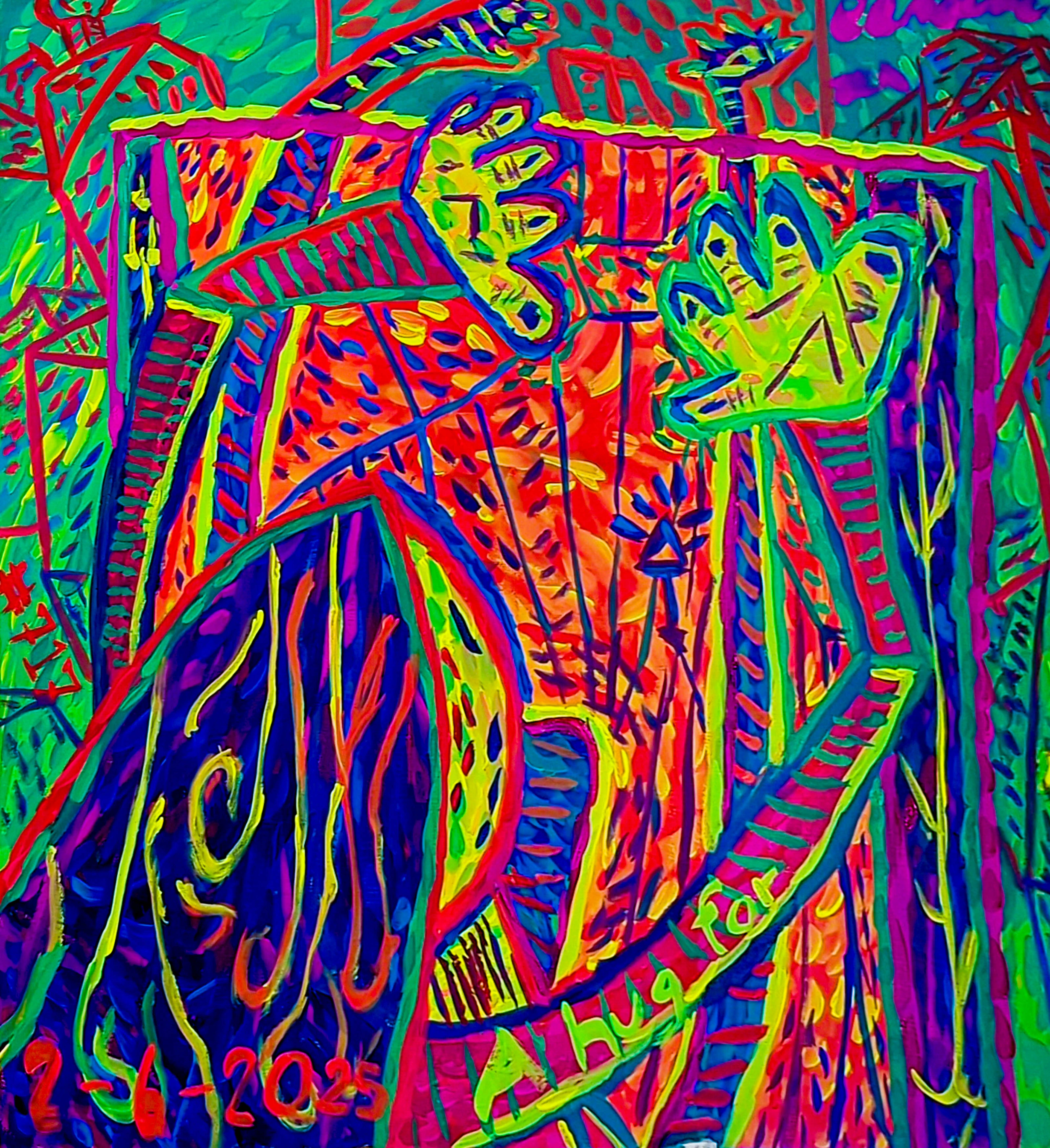
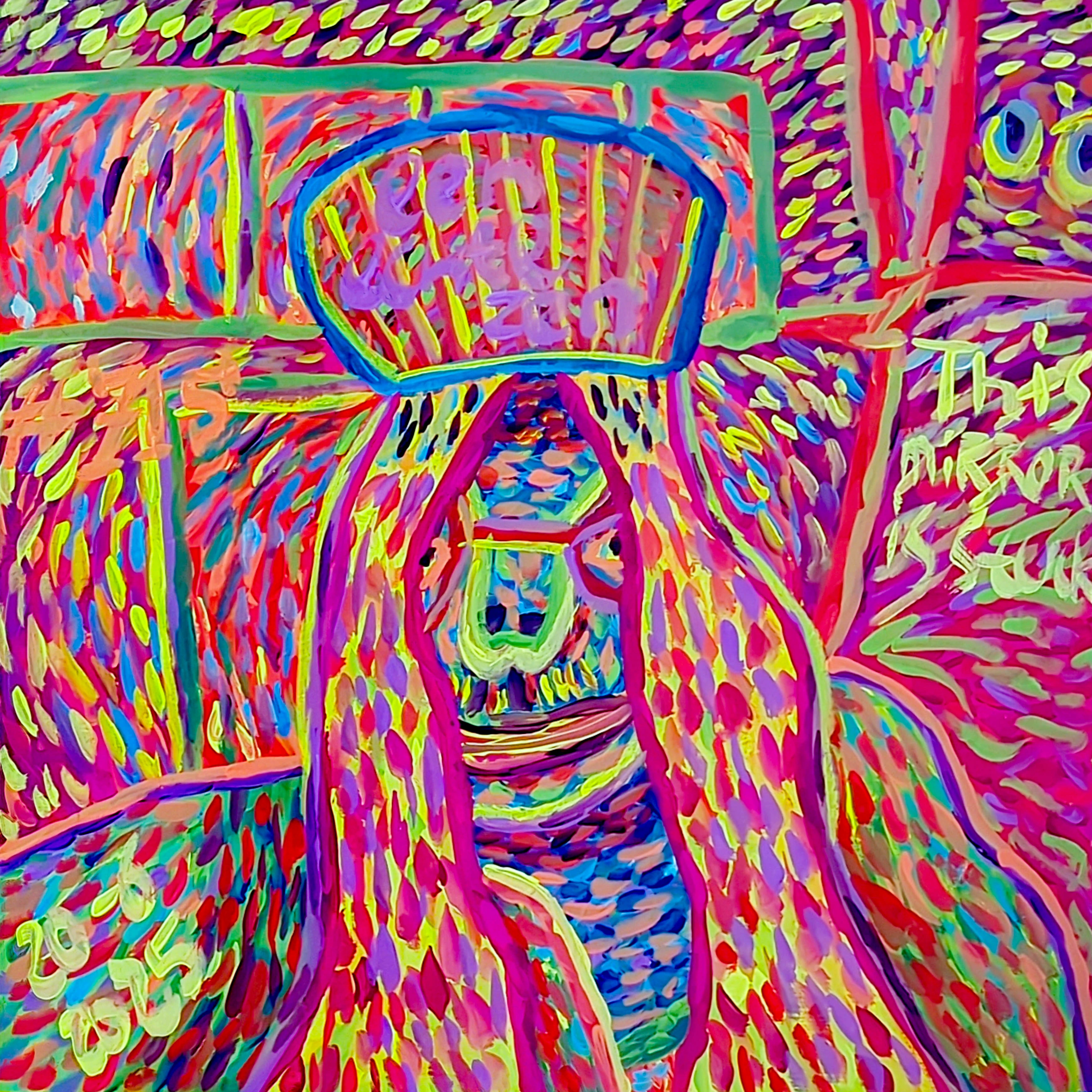
You know, it’s funny how some colors just… choose you. For me, it's yellow. While I truly believe in the emotional language of color in abstract art across the spectrum, yellow always seems to find its way into my palette, almost without me consciously directing it. It’s more than just a pigment; it’s a silent, sometimes pushy, conversation, a burst of energy, and a constant reminder of everything bright and hopeful. This particular conversation, I've noticed, sometimes feels a little one-sided, like yellow is always enthusiastically bubbling over, pulling me along into its relentless optimism – frankly, sometimes it’s a bit much, but in the best way. If you've ever wondered why I often gravitate towards it in my abstract pieces, and what deeper psychological currents it might tap into for all of us, well, pull up a chair. This is less an academic treatise and more of a peek into my artistic soul, a place where yellow reigns supreme, often by charming its way in. So, why this persistent, sunny obsession?
Why Yellow, Anyway? My Accidental Sunshine
I remember once trying to paint a really moody, introspective piece – lots of blues and greys, you know, the kind that whispers secrets. I was aiming for quiet contemplation, perhaps a hint of melancholy. But then, almost reflexively, my brush would reach for a cadmium yellow or a bright lemon. And just like that, a tiny sunbeam would cut through the gloom, turning my carefully constructed somber narrative into something… unexpectedly cheerful. It was infuriating at first, like my subconscious was actively sabotaging my dark artistic intentions, insisting on a little burst of joy. I can almost hear it, a tiny, insistent voice in my head, chirping, "Just a little bit more! You know you want to!" This initial frustration, however, led me down a fascinating rabbit hole into the deeper psychological currents that yellow taps into.
Beyond cultural associations, there's a fascinating physiological aspect. Yellow, with its long wavelengths, is the most visible color in the spectrum, and our brains process it quickly. It literally stimulates our eyes and can trigger feelings of alertness and energy, almost like a jolt of caffeine for the optic nerve. It’s a warm color, and much like actual warmth, it draws us in and invigorates us. This might explain why, even when I'm aiming for something somber, my hand just reaches for that bright yellow – it’s a subconscious craving for that energetic spark, a primal pull towards light itself. It’s like my hands know what my heart needs, even when my mind is trying to be all serious.
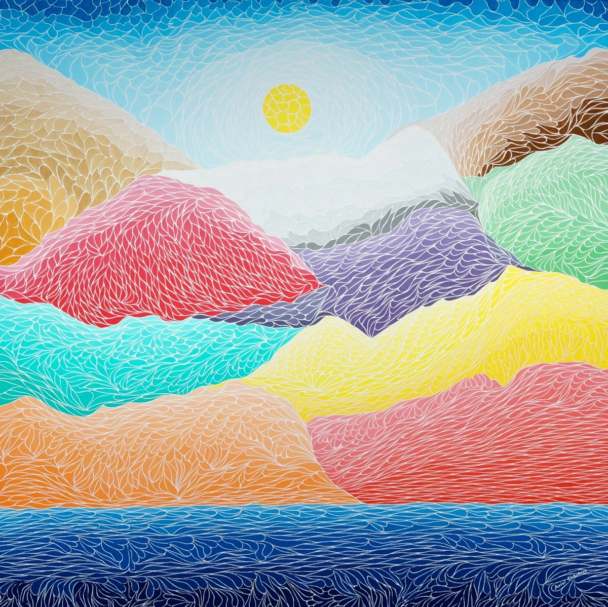
Psychologically, yellow is quite a powerhouse. While it’s often touted as the poster child for happiness, energy, and intellect – think sunbeams, smiley faces, and those 'aha!' lightbulb moments – yellow is a complex, almost mischievous beast. It’s the color of new beginnings and optimistic outlooks, yes, but its lesser-known siblings can whisper caution, a fleeting sickness, or even the sting of envy. You see it in the pallor of illness, the yellow 'caution' tape, or in the old phrase 'yellow-bellied' for cowardice. Though, I must confess, my artistic journey keeps me firmly in the realm of its vibrant, hopeful, even cheeky side. For me, it’s a direct conduit to those positive feelings. When I'm embracing spontaneity in abstract creation, yellow is often the first burst of intuition, an unbidden thought demanding attention. It's truly a color that asks to be noticed, sometimes quite loudly, which is perhaps why I often find it so compelling.
My Personal Yellow Spectrum: From Gentle Glow to Roaring Sunshine
My relationship with yellow isn’t monolithic. It's not just "yellow" as one flat color; it's a whole, nuanced spectrum, each shade whispering its own story. The choice isn't just about hue, but about the specific pigment itself – a cadmium yellow might have a robust, earthy warmth, while a Hansa yellow could offer a cleaner, almost electric luminosity, each with its own subtle psychological nudge.
- Soft Pastels: These are my quiet whispers of hope, like the first rays of dawn, hesitant but full of promise. They often appear in layers, peeking through like a shy smile, creating a gentle luminosity beneath bolder strokes. I might use them when a piece feels too heavy, adding a subtle lift without dominating. They remind me of quiet mornings and the soft light that filters through curtains.
- Vibrant Lemons: These are the playful, energetic yellows. They're the splash of cold water on a hot day, the sudden giggle. I use them when I want to inject an immediate jolt of positive energy, a direct shot of cheerfulness. Think of the sharp, exhilarating zest of a fresh lemon – that's the feeling. They bring to mind particularly sunny childhood afternoons, full of laughter.
- Deep Mustards & Golds: These bring a sense of grounded warmth, wisdom, and sometimes a touch of ancient knowledge. They’re less about overt joy and more about a deep, comforting sense of well-being, like a well-worn leather-bound book or the glow of embers in a fireplace. They feel timeless, almost meditative.
The way I apply them matters too; a thick impasto of mustard can feel profoundly weighty, suggesting resilience, while a thin glaze of gold just hints at hidden luxury, a secret shimmer within the layers. And then there’s the surface itself – a matte yellow can feel comforting and soft, absorbing light, while a gloss yellow can bounce it back, creating an almost electric vibrancy, a kind of audacious cheerfulness. It's a fine line, really, between inviting warmth and an insistent shout, and knowing which one to choose is part of the dance.
When I’m in my studio, navigating the dance of intuition and intent, selecting which yellow to introduce feels less like a choice and more like tuning into a specific emotional frequency. It’s a negotiation, really, between what the painting seems to ask for and what my hand instinctively reaches for. Sometimes, the initial intuitive burst of a lemon yellow gives way to a more considered layering of soft pastels as the piece evolves, a journey from a loud declaration to a quiet truth. And sometimes, it’s about pulling back before that cheerful zest becomes an overly enthusiastic alarm clock.
Yellow: The Unsung Hero of Light and Space
Beyond just emotion, yellow is fundamentally about light. It’s the color that illuminates, that pushes back shadows, that declares 'Here I am!' In abstract art, where there's no literal sun or lamp, yellow becomes that source of luminescence. It can open up a piece, make it feel expansive, or draw your eye to a specific area like a spotlight, a visual magnet pulling your gaze. Sometimes, I'll add a touch of yellow into a deep blue or purple area, not because I want it to be overtly yellow, but because I want that section to breathe, to have a subtle internal glow. It's like turning on a tiny, hidden light in a dark room, creating an unexpected pocket of warmth. This interplay is fascinating. Bright yellows can visually advance a plane, making it feel closer or more prominent, like a sunbeam hitting a foreground object, while muted yellows can recede, adding a nuanced sense of depth. This is part of how artists use color to manipulate perception, to create a sense of push and pull, of space and intimacy, all without a single literal depiction.
![]()
Yellow's Enduring Legacy in Art: A Journey Through Time and Art
While my personal journey with yellow is rooted in contemporary abstract art, this vibrant hue has a rich, sometimes tumultuous, history that spans centuries and cultures. From ancient Egyptian murals where yellow ochre symbolized gold and eternal life, and Chinese imperial robes used vibrant yellow to signify royalty, to the illuminated manuscripts of the Middle Ages, yellow has consistently been linked to divinity, wealth, and radiance. Early pigments like Orpiment, a brilliant but highly toxic yellow, were prized and feared.
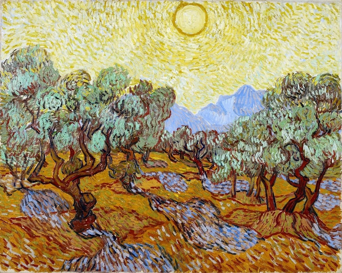
The Impressionists, like Monet and Van Gogh, famously embraced yellow to capture the ephemeral qualities of natural light – think Van Gogh’s vibrant sunflowers bursting with life or his starry nights shimmering with golden light, a testament to his emotional intensity. The development of synthetic yellow pigments in the 19th and 20th centuries, like Hansa yellow, made these vibrant hues more stable and accessible, forever changing the painter's palette and allowing for even bolder expressions of light and emotion.
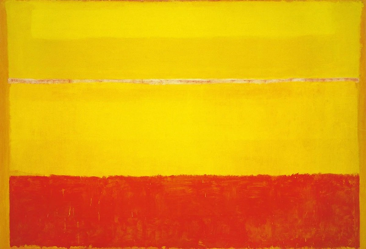
Later, artists like Wassily Kandinsky, a pioneer of abstract art, used yellow to evoke strong, energetic feelings, often describing it as a "trumpet blast" or an "exuberant rush," seeing it as a powerful, aggressive color when juxtaposed. In movements like Fauvism, artists like Henri Matisse used bold, non-naturalistic yellows to express raw emotion and break from traditional representation, while Pop Art, with figures like Andy Warhol, often utilized bright yellows for their mass appeal and commercial vibrancy. More recently, giants of abstract expressionism like Mark Rothko used expansive fields of yellow to create meditative, transcendent experiences, exploring pure light and emotion in vast, immersive blocks of color.
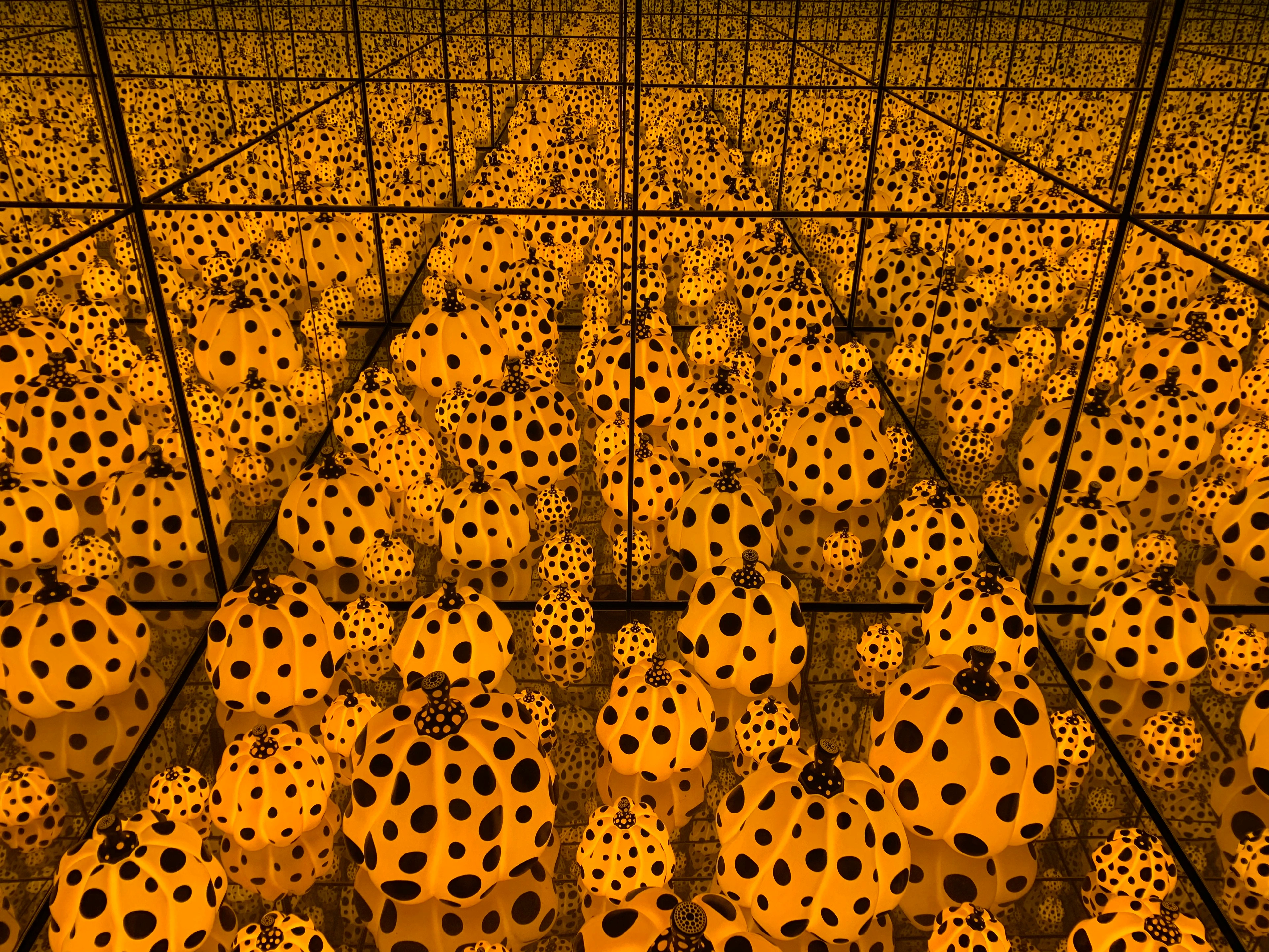
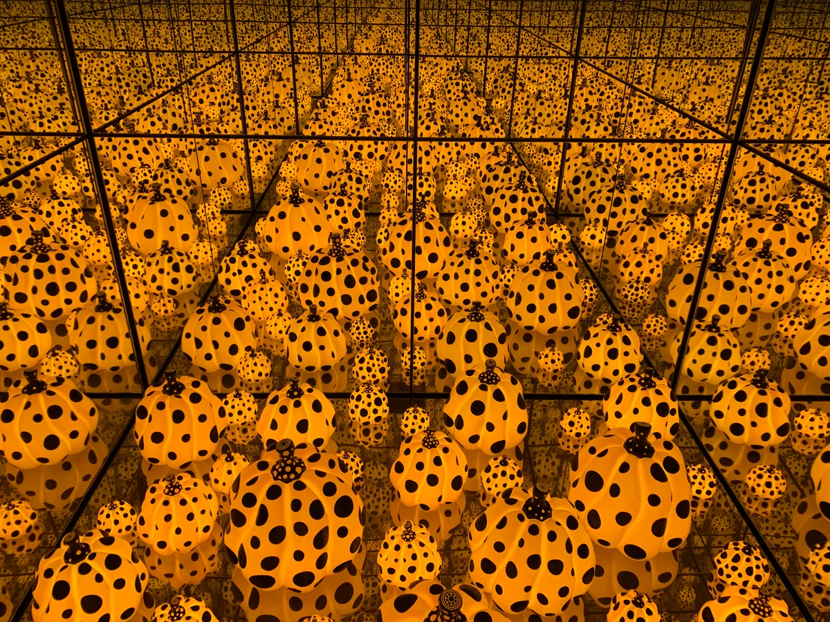
And then there's Yayoi Kusama, whose repetitive yellow motifs, like her iconic polka-dotted pumpkins, explore themes of infinity, obsession, and the sublime, transforming a cheerful color into a profoundly introspective experience. This enduring, diverse presence of yellow across so many artistic movements and cultures speaks volumes about its universal, albeit complex, power to stir the human spirit. It’s comforting, in a way, to know my own little yellow obsessions are part of such a grand, historical conversation.
Yellow Beyond the Canvas: Everyday Glow and Artistic Inspiration
Ever notice how certain colors just feel a certain way, even outside a gallery? My studio often feels like a bubble, a world of pigment and canvas. But yellow reminds me that its magic extends far beyond. Think of the first rays of morning sun hitting your window, instantly uplifting your mood. Or the golden glow of autumn leaves, a bittersweet reminder of nature's cycle. A field of sunflowers, their faces perpetually turned towards the light. These everyday encounters with yellow are, in their own way, abstract art in motion. They tap into the same core feelings of warmth, energy, and renewal that I try to capture on my canvases. For me, seeing a particularly vivid yellow sunset isn't just beautiful; it's a reaffirmation of yellow's fundamental role in our emotional landscape, constantly inspiring new strokes and compositions. And it's not just nature; think about how brands use yellow in their logos or packaging to signal cheerfulness, warmth, or attention – it’s a silent, visual whisper of positive energy. Yellow also plays a crucial role in settings like theater, where a well-placed yellow spotlight can instantly denote optimism, highlight a character's joyous moment, or create a warm, inviting atmosphere on stage.
Integrating Yellow Into Your World (Beyond My Canvas)
So, you’ve seen how yellow lives in my art and in the world around us. But what about your world? Moving from the canvas to your living space, the principles of yellow's impact remain strikingly consistent. The beauty of understanding color psychology is that you can apply it to your own space and mood, becoming your own curator of light. If you’re curating joy and integrating colorful abstract art into your home decor, consider a piece with strong yellow elements. It can be a surprisingly versatile addition, especially if you want to:
- Brighten a Room: Even a small splash of yellow can lift the entire atmosphere, especially potent in north-facing rooms or cozy nooks that need a dose of simulated sunshine.
- Create a Welcoming Vibe: Yellow is inherently inviting and cheerful, making it perfect for entryways or living areas where you want guests to feel instantly at ease.
- Spark Creativity & Focus: Its association with intellect and energy can make it a great choice for a study, a home office, or any creative space where you want to foster mental agility and inspiration.
- Add a Pop of Optimism: Sometimes, all a room needs is a little jolt of cheer. A yellow throw pillow, a small painting, or even a vase of sunflowers can provide that instant mood lift.
Of course, like any powerful tool, yellow needs to be handled with care. Too much can be overwhelming or even induce anxiety – it's the visual equivalent of a constant, insistent trumpet blast, or perhaps a perpetual state of 'on' that prevents relaxation. Just remember, while a touch of yellow is sunshine, a whole room drenched in it might have you feeling like you've moved into a giant lemon drop, perpetually squinting. It's a fine line between cheerful zest and an overly enthusiastic alarm clock, isn't it? It's all about balance and finding your personal yellow, whether that's a bold centerpiece or a subtle accent. Sometimes, the most powerful yellow is the one that peeks out from behind a cooler shade, a quiet surprise, a little secret only you share with the light.
Frequently Asked Questions About Yellow in Art
Let's address some common thoughts and curiosities about this sunny, sometimes tricky, hue. You'd be surprised how often these questions pop up, even in casual conversations about my work.
Question | My Artistic Take |
|---|---|
| Is yellow always "happy"? | Not always. While primarily associated with joy, specific shades (like dull or muddy yellows) can evoke caution or sickness. It's the vibrancy and context that define its emotional impact. Personally, I mostly stick to the vibrant, joyful end of the spectrum – my art is, after all, an exploration of positive human experience. |
| How do you balance yellow so it's not overwhelming? | Layers, layers, layers! I often use yellow as an underpainting, allowing it to glow from beneath other colors, like a hidden light source. Or, I use it in smaller, concentrated bursts, like a visual exclamation mark. Contrast with cooler colors, such as purples and especially those explored in the psychology of blue in abstract art, helps to ground its vibrancy and prevent it from dominating the entire composition. I also find that using its analogous colors – greens and oranges – can help temper its intensity while maintaining a harmonious warmth, leading the eye gently through the composition rather than hitting it with a loud bang. |
| Why is yellow important in abstract art? | In abstract art, where realism is often absent, colors speak for themselves, carrying the full weight of emotion and meaning. Yellow is crucial for conveying energy, light, and specific emotional states without literal representation. It's a direct connection to primal feelings of warmth, optimism, and illumination. It truly is the color of pure, unadulterated feeling, a direct line to the subconscious. |
| Do you ever use yellow for negative emotions? | Rarely, personally. My artistic vision leans towards exploring positive human experiences and resilience. If I did, it would be a very specific, muted, or muddy yellow, carefully chosen to convey unease rather than joy, a stark contrast to my usual palette. But honestly, I'd probably just reach for a blue or a grey instead; they feel more natural for those kinds of expressions. |
| Does the medium affect how yellow behaves in your art? | Absolutely! Yellow's inherent luminosity means it interacts uniquely with different mediums. Oil yellows, for instance, often have a rich, buttery luminosity and depth that acrylics, while versatile, can struggle to replicate directly without careful layering. I've learned that wrestling with yellow in oils is a different beast than coaxing it into a watercolor wash – each has its own delightful challenges. Watercolors, on the other hand, offer a delicate transparency, allowing yellow to create ethereal washes of light, almost like pure sunshine caught in a raindrop. Pastels can create a soft, powdery glow. The finish also plays a role: a matte yellow might feel soft and inviting, while a high-gloss yellow can amplify its vibrancy, almost making it jump off the canvas. Each medium interprets yellow's inherent light differently, impacting its emotional resonance and how it interacts with other pigments on the canvas. Mastering yellow in each requires understanding its unique properties and embracing happy accidents. |
| How does your personal experience with yellow differ from its general psychological associations? | That’s a great question! While yellow is broadly linked to happiness and energy, my connection is almost... active. It's less about a general feeling and more about a dynamic, sometimes insistent presence in my work. For me, it embodies a persistent, almost defiant optimism, a refusal to be weighed down, even when I'm trying to explore deeper, darker themes. It's a conscious choice to lean into that light, an ongoing conversation with a color that feels like a piece of my own spirit. |
Embracing the Light
So, there you have it. My not-so-secret love affair with yellow. It’s not just a color I use; it’s a feeling I chase, a light I try to capture and share. Every time I swirl it onto a canvas, it's a little prayer for optimism, a quiet rebellion against the grey, and an invitation for you to feel a flicker of that same joy. Ultimately, the joy I find in yellow is a deeply personal one, yet I believe the way color speaks to us is universal. What yellow means to me might be different for you, but its power to evoke a feeling, a memory, a spark of light, remains. Perhaps it’s a reflection of my journey as an artist, always seeking that little bit of sunshine, always striving to infuse a bit more warmth into the world, one brushstroke at a time. It's a constant quest for that radiant, undeniable glow.
If you’re curious to see how yellow dances in my work, feel free to explore my art for sale or visit my museum in 's-Hertogenbosch. Maybe you’ll find your own little piece of sunshine there, a visual reminder that even in the darkest corners, light always finds a way.


