Mastering Color Harmony in Abstract Art: An Artist's Intuitive Journey
Dive into an abstract artist's personal process for achieving profound color harmony. Explore value, saturation, and deliberate discord, finding your unique voice in the dance of hues.
The Intuitive Dance of Hues: Mastering Color Harmony in Abstract Art
Honestly, when I first started truly exploring abstract art, the idea of "color harmony" felt a bit like a dusty old textbook concept, something meant for art school exams, not for the messy, intuitive process I cherished. I remember staring at a canvas, a riot of muddy browns battling anxious greens, a visual argument with no clear resolution, feeling utterly lost, convinced "harmony" was a secret code only other artists possessed. I thought, "Can't I just throw colors together and call it a day? It's abstract, right?" (Spoiler alert: you can, but it often lacks that certain oomph, sometimes ending up like a toddler's food fight on canvas—a muddy brown smear battling an anxious yellow for no clear purpose). This feeling of discord, though initially accidental, later became a deliberate tool in my artistic arsenal, a way to make the 'oomph' even more resonant when harmony finally arrived. My journey has been less about rigid rules and more about finding a profound, almost symphonic understanding of how colors interact, where hues are notes, values are dynamics, and saturation is the very resonance, especially in the boundless world of non-representational work. It was a slow, sometimes frustrating dance, but one that ultimately unveiled a deeper, more personal language.
This isn't just theory; it's a peek into my own studio, my thought process, and the occasional happy accident that teaches me more than any book ever could. I remember one moment, years ago, when I was struggling with a piece, layering seemingly clashing reds and oranges. Frustrated, I impulsively brushed a thin, translucent wash of an unexpected, cool cerulean blue over a section. Instead of a mess, it created an unforeseen depth, a shimmering tension that suddenly made the whole canvas sing. It was a quiet 'aha!' moment, not 'correct' by the rules, but it felt profoundly right. So, if you've ever looked at an abstract painting and felt a harmonious pull, wondering how the artist achieved it, you're in the right place to explore how colors can sing – or sometimes scream – together.
What Even Is Color Harmony? (And Why I Used to Think It Was Just a Theory Class Thing)
Before we even get to what harmony is, let's acknowledge that sometimes, the most profound artistic statements come from its intentional absence, from a vibrant, almost jarring discord. But paradoxically, understanding harmony is the key to mastering both. At its core, color harmony is about creating a pleasing and balanced arrangement of colors. Historically, artists and thinkers from ancient Greece to the Renaissance explored these relationships, trying to codify the 'rules' for beauty, drawing parallels to music and mathematics. Think of Leonardo da Vinci's meticulous observations on light and shadow, or Johannes Itten's systematic approaches in the Bauhaus era, often visualized through his famous color star or sphere. But for me, in the context of painting, think of it simply: a symphony where each color, like a distinct instrument, contributes its unique timbre and presence, creating a richer, more engaging soundscape. For a long time, traditional art education made it feel intimidating, presenting it as unbreakable laws. But in abstract art, I've found the rules are less about unbreakable laws carved in stone, and more like deeply insightful suggestions, almost friendly nudges, for how colors might converse on the canvas.
I used to get caught up in the technicalities of the color wheel, I was practically wearing a lab coat, meticulously measuring my cadmium red against my phthalo blue, convinced I'd unlock the universe's secret formula for 'perfect' art. Over time, I realized it's less about a perfect formula and more about the feeling it evokes. It's about how colors communicate with each other, how they create visual flow, tension, or serenity. If you're curious about the deeper scientific and psychological aspects of color, you might find my guide on the definitive guide to color theory in art from pigments to psychology a useful companion.
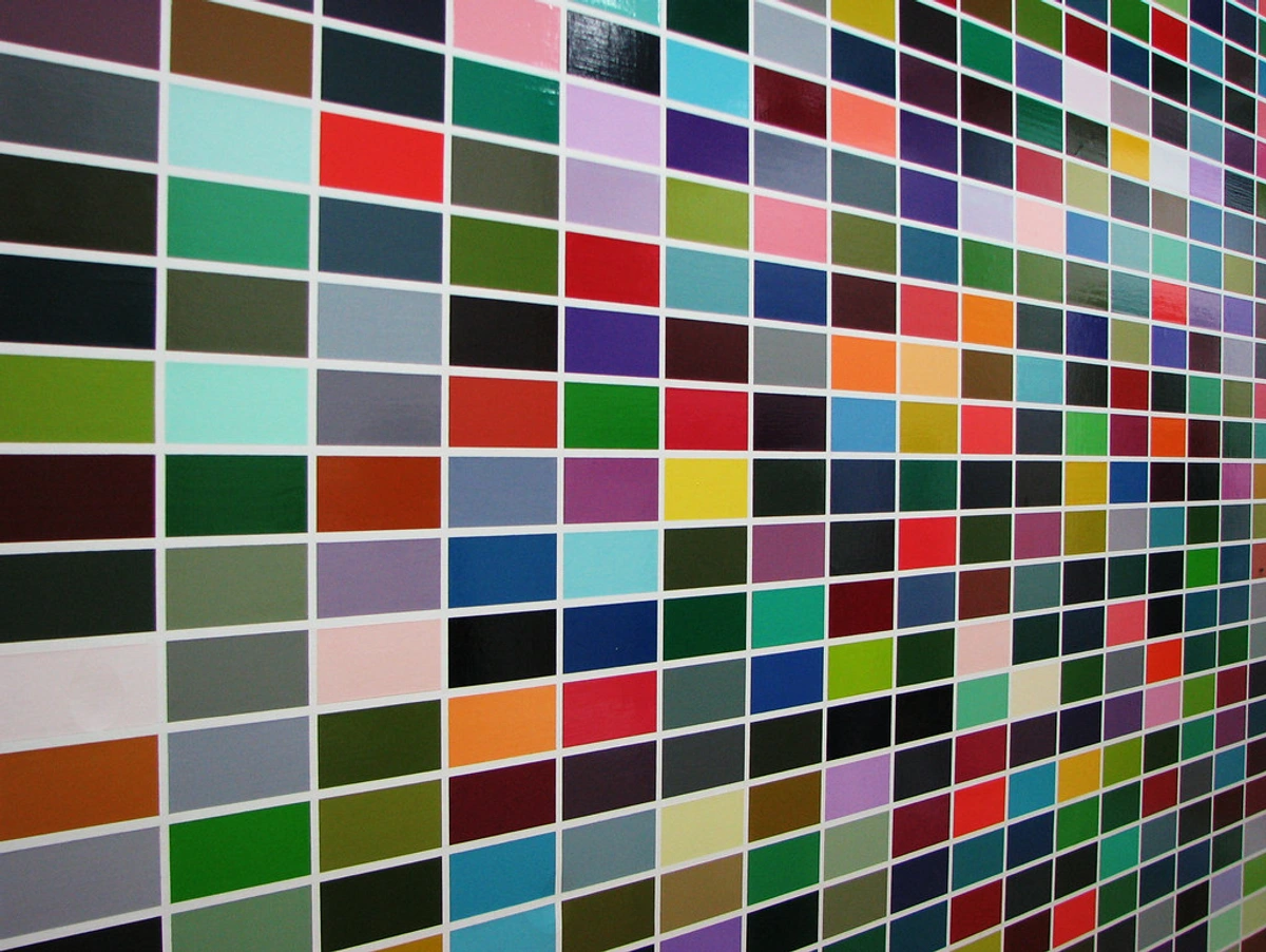
And if you're like me, sometimes a simple grid of colors can be surprisingly profound, showing the sheer variety and subtle shifts within a palette.
Beyond Hue: The Power of Value and Saturation
Before diving into specific color harmonies, it’s crucial to understand two fundamental dimensions that profoundly influence how colors interact: value and saturation. Neglecting these is like trying to compose music with only notes, ignoring volume and rhythm.
- Value (Lightness/Darkness): This refers to how light or dark a color is, independent of its hue. A pure yellow has a naturally high value, while a deep blue has a low value. Varying the value of colors can create a sense of depth, contrast, and structure, even within a single hue. Think of a black and white photograph – all the harmony comes from the interplay of values. Or, consider value as the volume knob for each color; turning it up makes it sing louder, turning it down makes it whisper. In abstract art, using a wide range of values can add drama and focus, guiding the eye through the composition and preventing colors from flattening out.
- Saturation (Intensity/Purity/Chroma): This describes the vividness or dullness of a color. A highly saturated color is pure and vibrant, while a desaturated color is muted, leaning towards gray. Playing with saturation allows for incredible nuance. For instance, a highly saturated red can feel like an aggressive shout, while a desaturated red might evoke a quiet melancholy. A small burst of highly saturated color can draw immediate attention amidst a field of muted tones, or a subtle shift in saturation can create a gentle vibration. I often use desaturated colors to create a sense of calm or distance, and then introduce highly saturated elements for emotional punch or a dynamic focal point. Understanding how to manipulate value and saturation is key to unlocking the true potential of any color harmony; indeed, these two dimensions are often the unsung heroes, unifying disparate hues and preventing a vibrant palette from devolving into visual noise.
![]()
My Go-To Harmonies in Abstract Work (And What They Feel Like)
While I preach intuition, a basic understanding of common color harmonies gives me a powerful vocabulary to start a piece. It's like knowing the notes before you improvise a jazz solo, a framework I can then joyfully deconstruct. Before diving into specific types, it's worth a quick mention of color temperature – the perception of a color as warm (reds, oranges, yellows) or cool (blues, greens, purples). Juxtaposing these temperatures isn't just about contrast; it's about creating a visual push-and-pull, a subtle dance that can add incredible depth and emotional resonance, making surfaces recede or advance, even in a flat abstract plane. Here are a few harmonies that regularly show up in my abstract explorations:
Monochromatic Harmony: The Understated Whisper
This is when you use variations (tints, tones, and shades) of a single hue. A tint is created by adding white, a tone by adding gray, and a shade by adding black. It's like looking at the ocean on a cloudy day – endless blues, each slightly different, creating immense depth and unity without needing stark contrasts. I recall one piece where I used deep teals and aquamarines, layered translucently, to capture the quiet melancholy of a rainy afternoon, the subtle shifts creating a palpable sense of atmospheric depth. I often turn to this when I want to create a sense of calm, introspection, or focused energy. It's deceptively simple but incredibly powerful for evoking a specific mood. It's a quiet power, a deep breath. For more on single-color impact, check out the psychology of blue in abstract art calm depth and emotion. What hidden depths or quiet emotions could a single hue evoke for your next piece?
Analogous Harmony: The Harmonious Neighborhood Gathering
Imagine three or five colors that sit next to each other on the color wheel – blue, blue-green, green, for example. These colors naturally get along; they're neighbors, often found together in nature. This harmony creates a sense of serenity, flow, and visual cohesion. The closer they are, the smoother the transition; a wider spread still feels cohesive but introduces a subtle vibration. Think of a gradient where teal melts into emerald, then into a vibrant lime, all singing the same gentle song. This gentle progression can also create a sense of movement, guiding the eye smoothly across the canvas, like a slow, deliberate breath. It's wonderful for when I want a gentle progression of color that guides the eye softly across the canvas. It's a comforting whisper, a smooth journey. If you want to dive deeper into this, check out beyond the spectrum: my approach to complementary and analogous colors in abstract art. How might a gentle gradient of neighboring colors tell a story of quiet transformation?
Complementary Harmony: The Dynamic Duo (or Fierce Rivals, Depending on My Mood)
These are colors directly opposite each other on the color wheel – think red and green, blue and orange, yellow and purple. They provide the ultimate contrast and, when used well, create incredible energy, vibrancy, and a palpable sense of tension. For a slightly less intense, yet still dynamic, contrast, I sometimes lean into a split-complementary harmony, pairing a color with the two colors adjacent to its complement. It’s like a controlled explosion rather than a full-blown war. This is where the magic happens for me when I want a piece to really pop. It’s a dance between opposition and balance, a visual electric current that electrifies the canvas. I often find myself drawn to the electric tension of a vibrant orange, using it as a sharp, almost defiant accent against a dominant, expansive blue field. Crucially, the intensity or saturation of these colors (as discussed earlier) drastically alters the perceived harmony or dissonance. A highly saturated red next to a muted green will feel different than two equally vibrant counterparts. It's the spark, the clash, the undeniable presence. I talk a lot about how I use this to evoke emotion in my article on the power of color in abstract art: my approach to palette and emotion. Where in your work could a bold, complementary pairing ignite a spark?
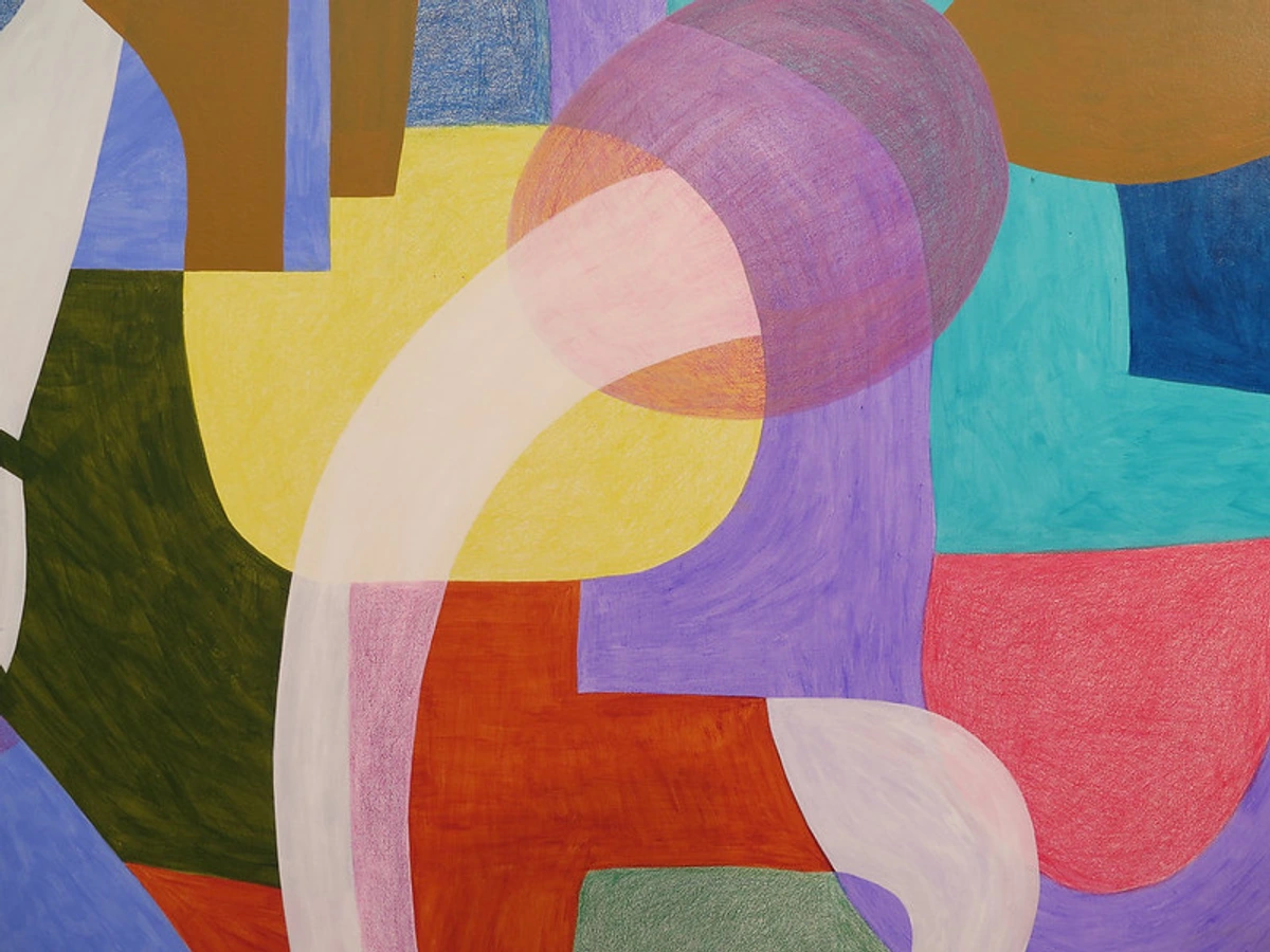
Triadic Harmony: The Energetic Triangle
This involves three colors that are equally spaced around the color wheel, like red, yellow, and blue. Triadic harmonies are inherently vibrant and often quite playful. The challenge here is maintaining balance, as all three colors carry a strong presence, sometimes shouting over each other if not handled with care. It's like trying to get three strong personalities to cooperate in a room – everyone wants to be heard! Often, I'll allow one color to assert its dominance, with the other two acting as lively, supporting accents. Or, I might intentionally mute one of the triad, softening its voice to create a more nuanced interplay, preventing a visual shouting match. When balanced, perhaps a burst of primary red is confidentially supported by a warm yellow and grounded by a deep, expansive blue, it becomes a dynamic abstract piece. It's a carnival of color, a joyous explosion. I use this when I'm feeling particularly bold and want to infuse a piece with dynamic energy and varied emotional notes. What vibrant, multi-faceted story could three equidistant hues tell?
Advanced Harmonies: Square and Tetradic
These involve four colors. A square harmony uses four colors equally spaced around the wheel, literally forming a square. A tetradic (or rectangular) harmony uses two pairs of complementary colors. These are the big leagues, offering incredible richness and complexity but also demanding careful consideration to avoid visual chaos – a chaos I sometimes, perhaps foolishly, embrace, or more often, approach with sheer terror. Imagine a painting that orchestrates two dynamic complementary pairs, like red/green and blue/orange, into a dense, multi-layered visual feast. It's a grand opera, a symphony of layers. I've learned to approach them by building upon a strong complementary base, then carefully introducing a second pair, slowly orchestrating their interactions to ensure a balanced richness rather than a bewildering cacophony. I'll admit, these are less frequent in my work, often because I'm a bit lazy and prefer the punch of a complementary or the flow of an analogous, but when I get them right, they are truly captivating. Mastering these requires a deep understanding of value and saturation to ensure no single color overwhelms the others, creating a balanced, albeit complex, visual narrative, and sometimes, a deliberate, captivating discord. How might you orchestrate a grand symphony of four colors without descending into visual noise?
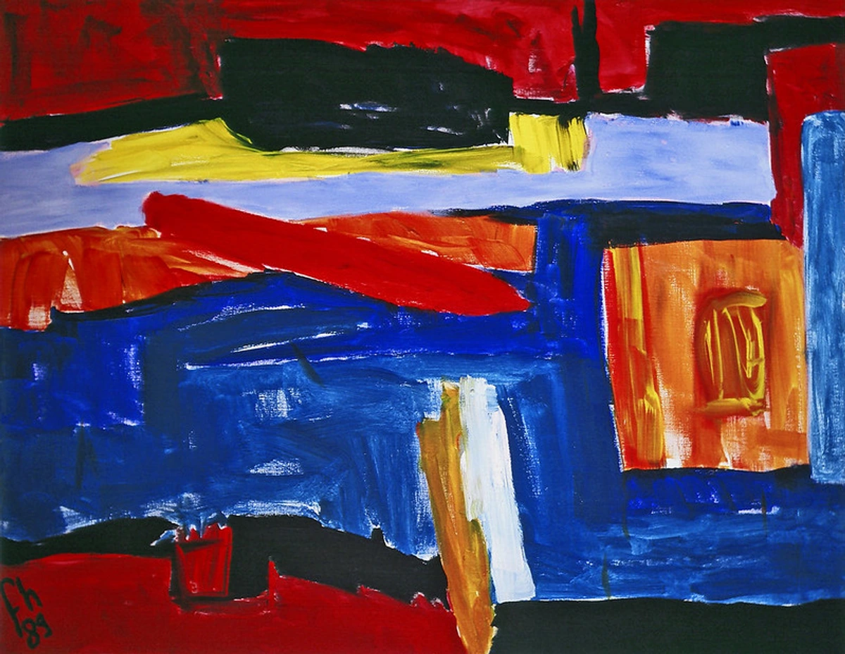
Quick Guide to Color Harmonies
Harmony Type | Key Characteristic | Description | Typical Feeling / Effect | When to Use (in Abstract Art) |
|---|---|---|---|---|
| Monochromatic | Single Hue Variations | Variations of a single hue (tints, tones, shades). | Calm, unity, depth, introspection. | For mood studies, subtle narratives, or focused energy. |
| Analogous | Adjacent Hues | 3-5 colors adjacent on the color wheel. | Serene, flowing, cohesive, natural. | To create visual flow, gentle movement, or natural transitions. |
| Complementary | Opposite Hues | Colors directly opposite on the color wheel. | Dynamic, energetic, vibrant, tension, dramatic contrast. | For high impact, dramatic focal points, or intense emotion. |
| Triadic | Equidistant Hues | Three colors equally spaced on the color wheel. | Vibrant, playful, bold, energetic, joyful. | To infuse dynamic energy, varied emotional notes, or playful compositions. |
| Square/Tetradic | Four Hues (Equally spaced/Pairs) | Four colors (equally spaced or two complementary pairs). | Rich, complex, nuanced, grand, sophisticated, balanced chaos. | For grand, complex narratives, multi-layered depth, or managed visual richness. |
Beyond the Rules: The Abstract Twist (Where My Intuition Kicks In)
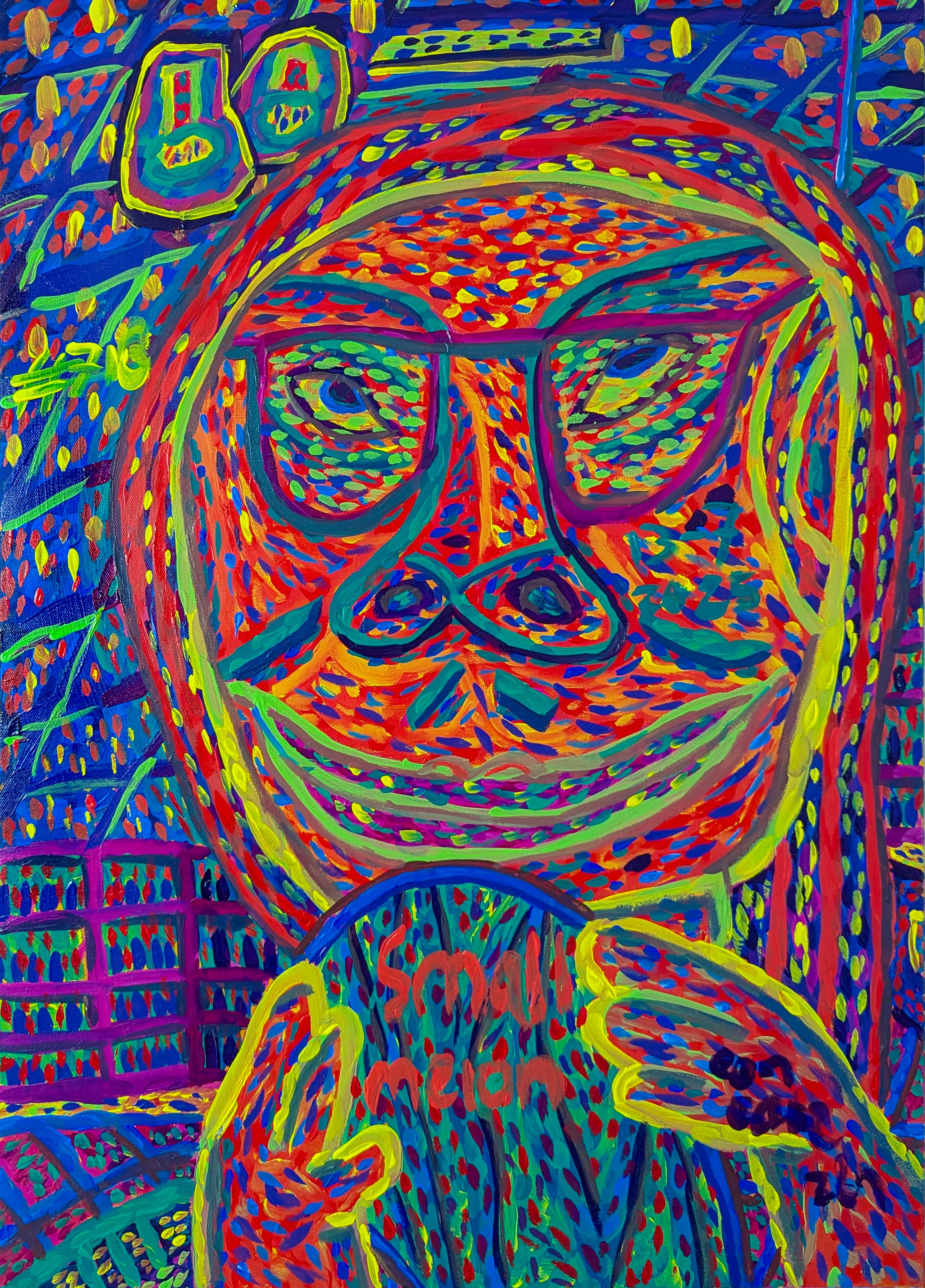
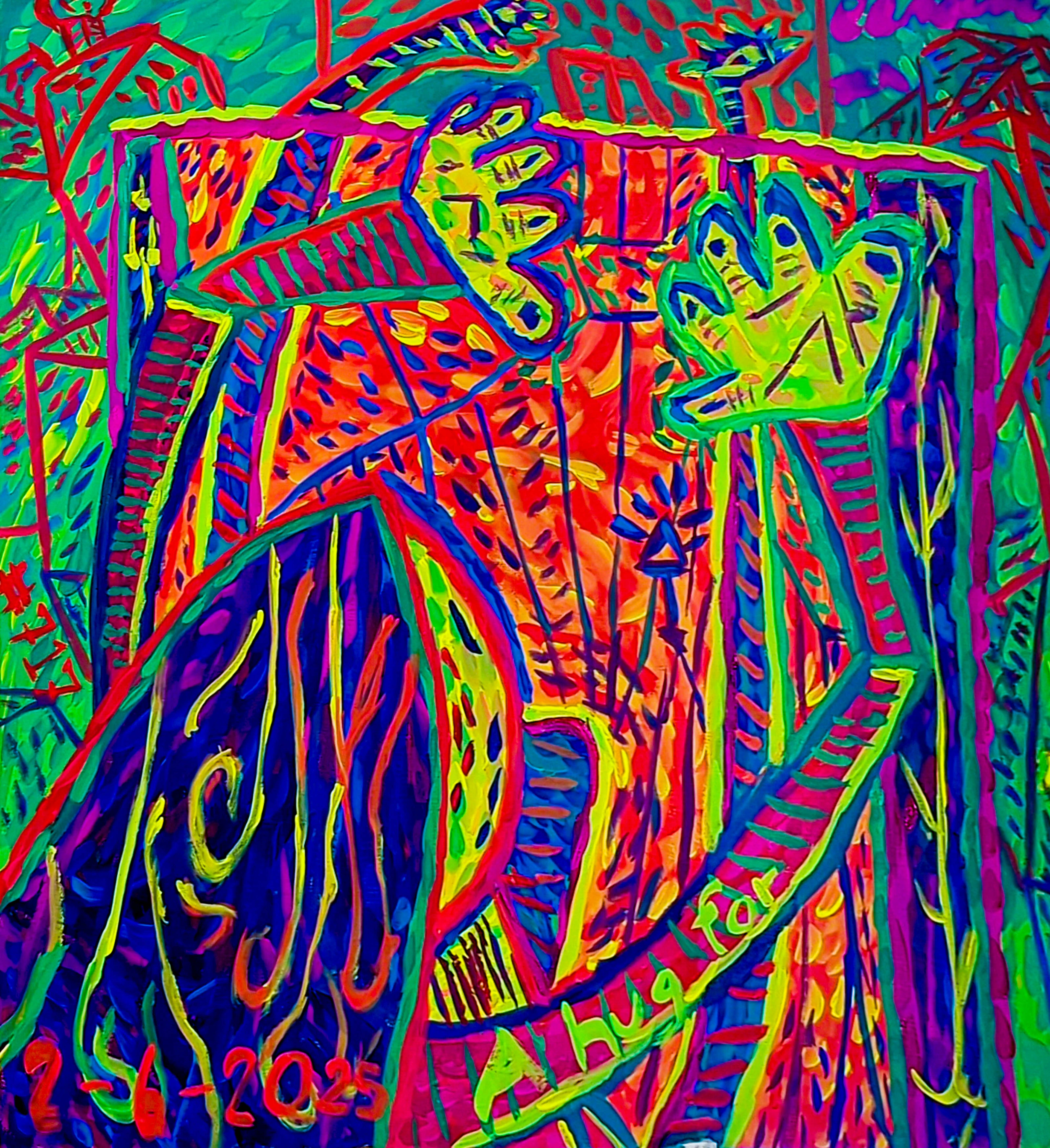
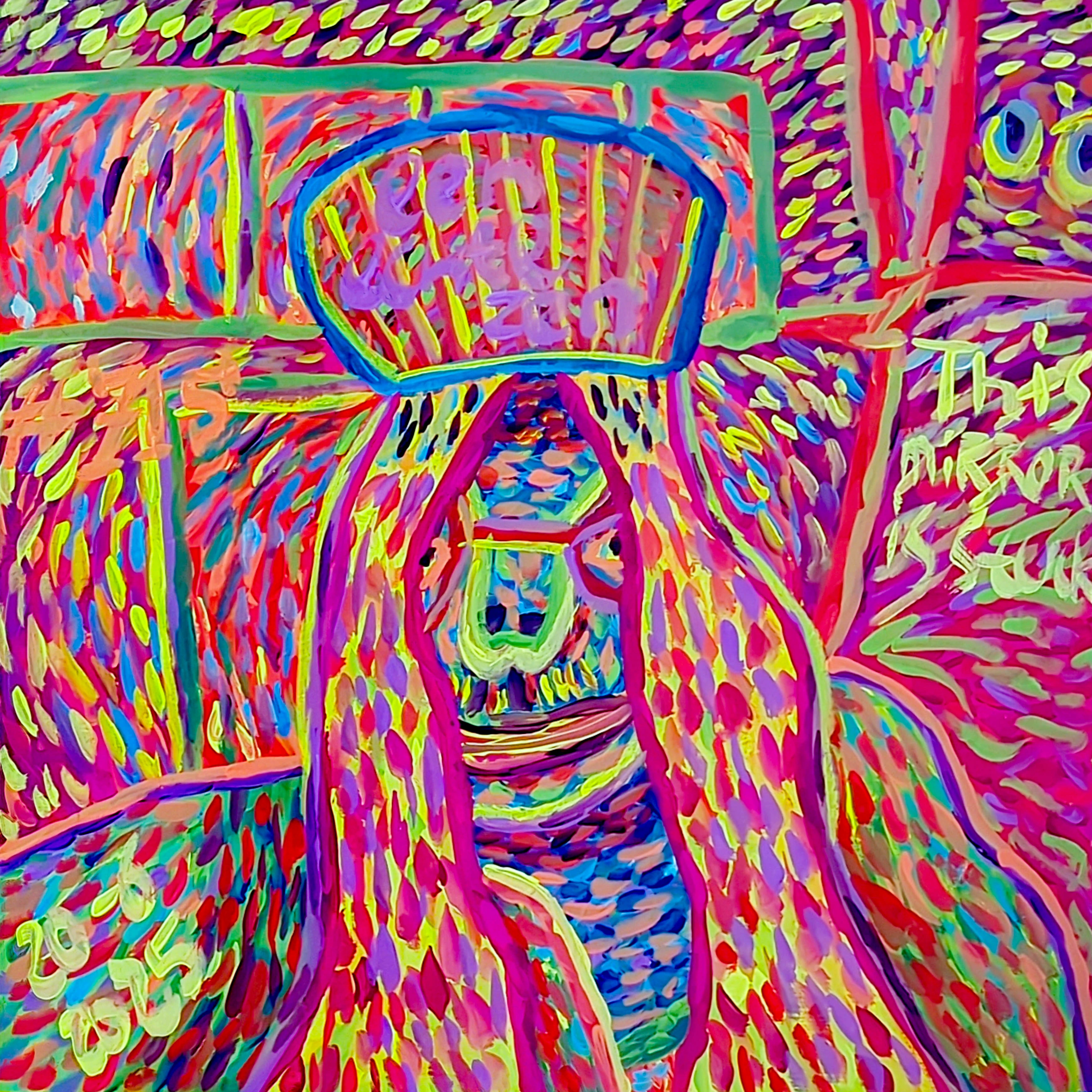
Here’s the thing about abstract art: the goal isn't always to create something traditionally "pretty" or perfectly balanced. Sometimes, I want to evoke discomfort, chaos, or a sense of urgency. In these moments, understanding color harmony allows me to deliberately break the rules. It's like a musician hitting a dissonant chord for emotional effect – a scream in the symphony, if you will. This is what I call a "harmonious discord" – where the perceived clash serves the deeper artistic intention, creating a new, compelling form of order. I remember a triptych where the central panel featured a raw, almost violent clash of chartreuse and magenta, applied with furious, jagged strokes. It was meant to be jarring, a visual scream reflecting the internal dissonance of a societal issue I was grappling with at the time. Yet, within that very discord, carefully manipulated through shifts in value and bursts of saturation, a new, brutal kind of harmony emerged, a truth that couldn't be expressed through traditional 'beauty.'
My approach to color in abstract art is deeply rooted in feeling. What emotion am I trying to convey? Is it joy, turmoil, peace, or a restless energy? The colors chosen become the language. But it's not just the colors themselves; the tactile and textural elements also profoundly influence how we perceive color harmony. A rough, heavily impastoed surface can 'absorb' a color's light, making it appear denser or more muted, while a smooth, glossy glaze can amplify its intensity and create luminous shifts, almost making colors sing in different octaves. Matte textures recede; glossy ones advance. Texture can also break up a color, introducing micro-variations that add complexity. Similarly, the white space or negative space around and within color blocks plays a crucial role, acting as a visual anchor or a conduit, providing breathing room for intense colors, emphasizing their impact, or creating pathways for the eye to follow through the composition. I explore this a lot in the emotional language of color in abstract art and how my palette tells my palette my story: the emotional language of color in my abstract art. For a deeper dive into how tactile qualities shape your visual experience, read the role of texture in abstract art: a sensory exploration and the power of negative space: sculpting the unseen in my abstract compositions.
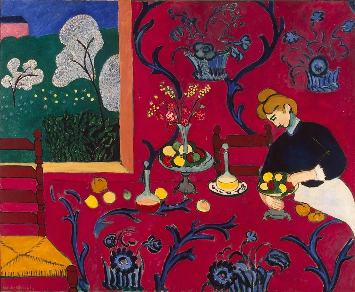
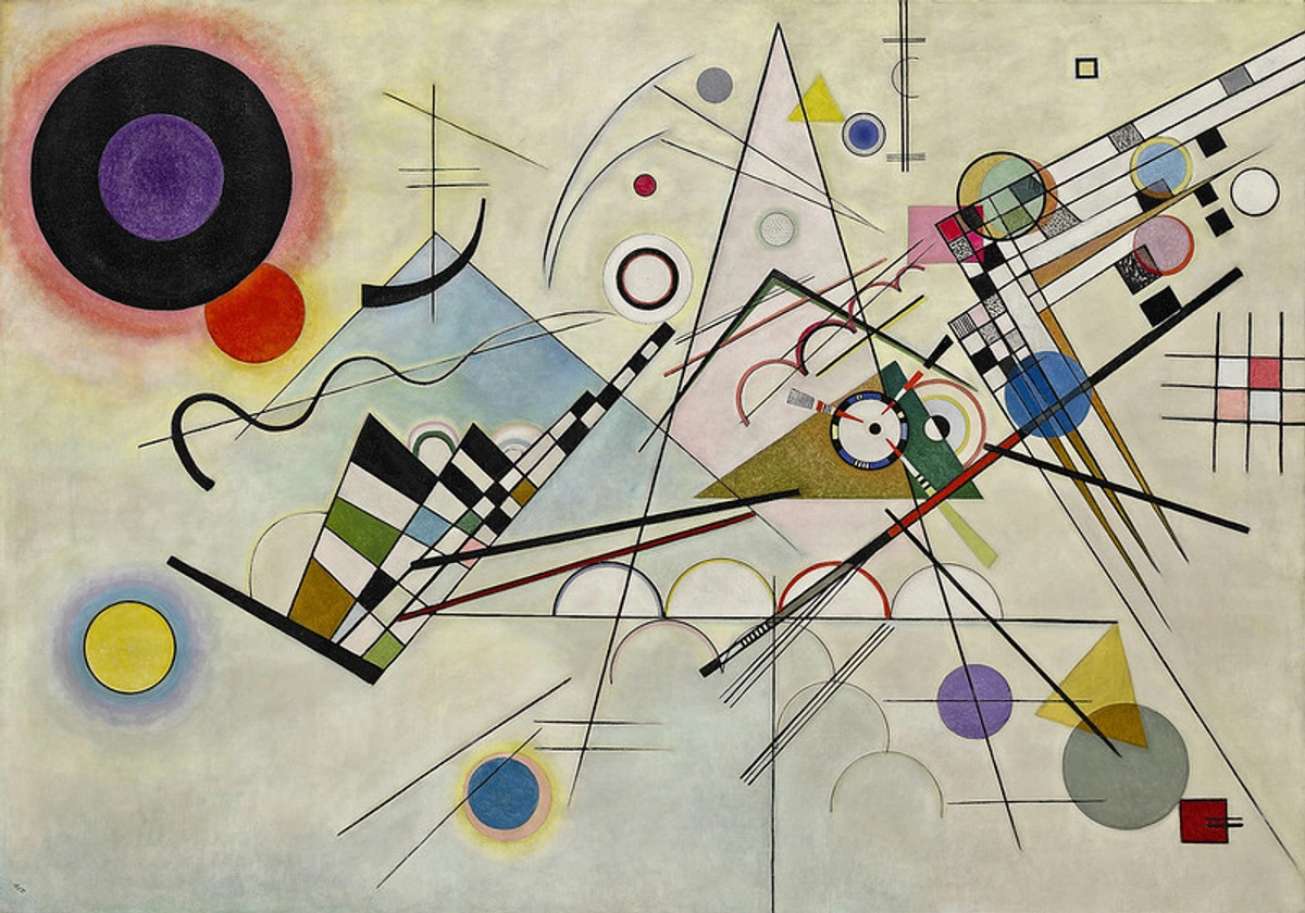
When you're trying to decode abstract art: a guide to finding meaning in non-representational works, remember that the artist might be using color harmonies (or lack thereof) to tell a story that transcends literal representation. It's a dialogue without words, a conversation between hues and textures. Even a master like Henri Matisse, while not strictly an abstract artist, brilliantly demonstrated how a dominant color can create an all-encompassing harmony, dictating the entire emotional landscape of a piece. Think of how "The Red Room" envelops you in its singular, vibrant embrace, demonstrating the power of a unified, if bold, palette. Similarly, artists like Wassily Kandinsky embraced the spiritual resonance of color and form, orchestrating complex harmonies (and dissonances) to evoke deep emotional responses, while Mark Rothko's luminous color fields invite profound, almost meditative experiences through simplified, yet powerful, chromatic relationships.
Creating Your Own Harmony: A Peek Into My Process (No Pressure, Just Suggestions)
If you're an artist, or even just someone appreciating art, here are a few things I do that might help you connect with color harmony on a deeper, more personal level:
- Start Small: Don't commit to a huge canvas immediately. Create small color studies, mix swatches, or even use digital tools to play with different palettes. This takes the pressure off. Try creating a series of small, square studies, perhaps 4x4 inches, focusing solely on exploring the tints, tones, and shades of two analogous colors. This isolates the challenge and makes it less daunting.
- Observe Relentlessly: Nature is the ultimate master of color harmony. Look at a sunset, a forest, or even the subtle variations in a single leaf. Notice how the muted greens, ochres, and deep browns of a forest floor create a sense of grounding and quiet contemplation, or how the fleeting, fiery oranges, pinks, and purples of a sunset evoke a transient, energetic beauty. How do those colors coexist? What mood do they create? Also, study other artists – not just abstract, but across all genres, to see how they use color. Pay attention to how color is used in photography, film, interior design, and even urban landscapes to evoke specific feelings. My musings on how artists use color might give you more ideas.
- Experiment Fearlessly: This is the big one. Don't be afraid to make "ugly" art. Seriously. Some of my biggest breakthroughs came from paintings I initially hated. Push boundaries, try combinations that feel wrong, and see what happens. Don't be afraid to create what might, at first glance, look like a paint factory explosion. Seriously. Some of my most profound breakthroughs came from paintings I initially wanted to hide away. Pushing those 'wrong' combinations is where the unexpected magic often lies. The canvas is a playground, not a battlefield.
- Reflect and Feel: Once you've laid down some colors, step back. How does it feel? Does it make you happy, uneasy, calm, energized? Your gut feeling, that immediate, visceral reaction, is often your most honest critic and collaborator here. This visceral reaction is often more informative than any theoretical rule.
- Consider the "Home" for Your Art: When I create a piece, I often think about where it might live. Do I want it to bring calm to a quiet corner, or be a vibrant focal point in a lively room? Imagine a serene, monochromatic abstract piece in soft blues or grays bringing a sense of calm to a bustling home office, or a dynamic, complementary piece in bold reds and greens igniting a minimalist living space with vibrant energy. This external context subtly, yet powerfully, informs my choices. Perhaps you're looking for something that speaks to you; my art for sale might just have what you're looking for.
- Embrace the Medium: Remember that the medium you use – whether it's oil, acrylic, watercolor, or digital – will profoundly influence how colors mix, layer, and present themselves, and thus affect the perceived harmony. Oils, for instance, invite luminous glazes and subtle, endless blending, allowing colors to merge in soft, harmonious whispers. Acrylics, with their fast drying time, lend themselves to sharp, vibrant juxtapositions and bold, energetic contrasts. Watercolors, with their inherent transparency and fluidity, encourage delicate, analogous flows and unexpected fusions. Understanding these properties isn't just technical; it's about letting the medium guide your color conversation. You might enjoy my article on the alchemy of layers: my secret to creating depth and narrative in abstract paintings.
- Play with Light: The light in which your artwork is viewed, or even the light depicted within the abstract work, dramatically affects color perception and harmony. A warm, yellow light can make blues appear cooler and reds more vibrant, while a cool, blue light can enhance purples and greens, often making warm tones recede. Try viewing your color studies under various light sources – soft natural daylight, the warm glow of incandescent bulbs, or the cooler, sharper cast of LED lights. You'll be amazed at how colors transform, how harmonies shift, and how a seemingly perfect balance can be subtly altered. Always consider how both ambient and depicted light interact with your chosen palette.
- Color Proportion and Weight: Beyond the individual qualities of hue, value, and saturation, the sheer amount of each color—its proportion—and its perceived visual 'weight' within a composition are crucial for harmony. A small burst of highly saturated yellow can balance a large field of muted blue, creating a dynamic tension. Dark, highly saturated colors tend to feel 'heavier' and draw the eye, while lighter, desaturated colors recede. Learning to balance these weights is like choreographing a visual dance, ensuring no single element overwhelms the stage, or like a conductor ensuring each section of an orchestra has its moment without drowning out the others.
- The Dance of Adjacent Hues (Color Interaction): Colors rarely exist in isolation; they are constantly chattering to their neighbors. A vibrant red placed next to a muted green will make the green appear even duller, and the red more intense. A neutral gray can suddenly take on a bluish cast when surrounded by warm yellows. Understanding this subtle dance of simultaneous contrast, how colors influence each other's perception, is a game-changer for achieving truly nuanced harmony.
FAQs About Color Harmony in Abstract Art
Q: Do I have to follow color harmony rules in abstract art?
Absolutely not! Think of them as foundational knowledge. Understanding the rules allows you to break them intentionally and effectively to achieve a specific emotional or visual impact. It empowers you to intentionally, and effectively, shatter them when your artistic vision demands it. Sometimes a deliberate dissonance is the most truthful or impactful choice for the narrative you're trying to convey, a scream in the symphony that perfectly serves the emotional truth. This is a core tenet of the art of intuitive painting: embracing spontaneity in abstract creation.
Q: How do I know if my colors are harmonious?
It's deeply subjective, but generally, harmonious colors create a sense of unity, balance, or a pleasing visual flow for the intended effect. Trust your gut feeling. If the colors feel jarring without purpose, they might not be harmonious. However, if they create a specific, intended tension or discomfort – perhaps to evoke anxiety or chaos – then that tension itself is a form of harmony, aligned with the artwork's purpose. It boils down to what makes abstract art compelling to you and the story you're telling. If your colors achieve your intended effect – be it serenity, vibrant energy, or even unsettling discord – then they are harmonious within the context of your artistic intention. It's about coherence of purpose, not just prettiness.
Q: Can "clashing" colors be harmonious?
Yes, absolutely! This is where abstract art truly shines. Intentional juxtaposition of seemingly clashing colors can create incredible dynamism, excitement, or a powerful emotional statement. Indeed, they can! This is where the abstract artist's mastery truly shines. By carefully manipulating factors like saturation, value, proportion (how much of each clashing color is used), or even texture to soften the edge, an artist can transform a loud clash into a compelling, dynamic conversation. Think of a tiny, intensely vibrant scarlet dot against a vast, deep forest green – the clash is undeniable, but the controlled tension it creates is the harmony. It's about how the artist frames that contrast, often by adjusting saturation, value, proportion, or even the texture. A loud clash can be a harmonious statement if it serves the artistic vision and emotional truth. Think of it as a shout in a silent room – it stands out, but it can be part of the overall, compelling narrative.
Q: What's the difference between color harmony and color theory?
Color theory is the overarching science and art of using color, encompassing how colors mix, the visual effects of specific color combinations, and how colors affect human psychology. It's the broad field of study. Color harmony is a subset of color theory, specifically focusing on combinations of colors that are pleasing to the eye or evoke a desired aesthetic/emotional response. So, color theory is the big umbrella of knowledge, and harmony is one of its beautiful, sometimes chaotic, rooms that we explore. Or, to put it another way: Color theory is the entire cookbook, filled with ingredients, techniques, and culinary science. Color harmony, then, is a specific, carefully crafted recipe within that cookbook, designed to create a pleasing or purposeful flavor (visual experience) from those ingredients.
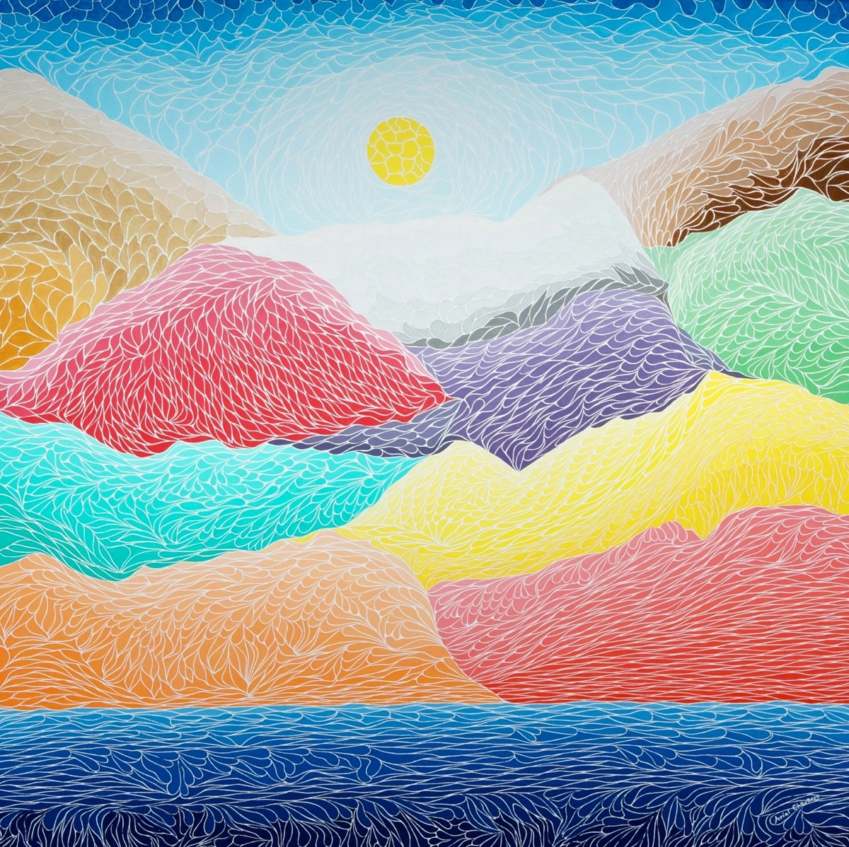
Final Thoughts: My Ever-Evolving Dance with Color
My journey with color harmony in abstract art is a continuous conversation, a never-ending exploration. It's less about finding a definitive answer and more about constantly asking new questions. Each painting is a new experiment, a chance to push the boundaries of what colors can say together, and indeed, what they feel together. It's a constant dialogue, a dance where the canvas and I learn from each other with every stroke, every decision, every wild, intuitive leap. It's a personal dialogue between me, the pigments, and the canvas, constantly revealing new insights into the emotional language of art.
I encourage you to look at art – mine, others, or even your own creations – with fresh eyes, feeling the colors rather than just seeing them. Notice how they interact, how they move you, how they make your own internal symphony hum. I invite you to step into this dance yourself. Look at art—mine, others', or even the spontaneous compositions of everyday life—with fresh eyes. Feel the colors rather than just seeing them. Notice how they interact, how they move you, how they resonate deep within. It's in that visceral, sensory engagement that true understanding and your own unique harmonies will blossom. Don't be afraid to develop your own personal color vocabulary, a palette that speaks uniquely to your soul. If you're interested in more of my artistic journey, you can always visit my timeline or see some of my work up close at my den bosch museum location.
Keep exploring, keep feeling, and keep creating your own unique harmonies.


