The Unseen Power: My Abstract Art's Deep Dive into Negative Space
Uncover the profound philosophy behind negative space in my abstract art. Learn how I transform voids into active, emotionally resonant elements, sculpting depth, intrigue, and meaning into every canvas.
Sculpting the Unseen: My Abstract Art's Dance with Negative Space
There's a quiet hum in my studio, often drowned out by the clatter of brushes, the rustle of canvases, and the internal monologue that usually resembles a small, agitated orchestra. I find myself instinctively drawn to the 'nothing'—the space between two stacked canvases, the way a stray shadow carves a temporary form on the wall. This isn't just a studio quirk; it's a deep-seated appreciation, perhaps born from observing the intricate dance of bare tree branches against a winter sky as a child, or finding faces in the clouds that formed the contours of something else. It's a strange kind of logic, I know, especially when my creative process often feels less like a thoughtful brushstroke and more like an attempt to wrestle a particularly energetic octopus—messy, but with an odd, surprising grace. Yet, it’s this very fascination that constantly pulls me towards the quiet, undeniable power of negative space in my abstract compositions. For me, it's not just a backdrop; it's a co-creator, an active participant. In this article, I want to demystify this powerful concept and share my deeply personal philosophy and practical approach to how I harness this unseen force to sculpt depth, emotion, and intrigue into my art, transforming mere voids into vibrant meaning.
Perhaps it was the ingrained 'fill the page' mentality from early art classes, or the subconscious societal pressure to always show 'something,' but for years, I saw negative space as just that: negative. The leftover bits, the white canvas peeking through, the areas I hadn't quite filled yet. It was the background, the supporting cast, never the star. Oh, how wrong I was! It's not just a passive void; it’s an active, powerful sculptor, a silent choreographer that guides the eye and breathes life into the positive forms. It’s the invisible hand that defines the visible. My personal journey into understanding this concept often feels like trying to grasp smoke, but the more I try, the more I realize its profound presence, not its absence.
What Exactly Is Negative Space (Beyond the Obvious)?
This personal exploration of the 'unseen' naturally led me to grapple with the very essence of what we call negative space in art. If you've ever found yourself lost in a good conversation, you know it's not just the words that carry meaning. It's the pauses, the breaths, the unspoken moments where understanding truly deepens. That, in essence, is negative space. It's the moment of suspended silence before a revelation, the intentional hush that amplifies what's about to be said. In art, negative space is traditionally defined as the area around and between the subjects or positive shapes in a composition. But for me, the textbook definition only scratches the surface of its true potential. Like most things worth exploring, the real magic lies far beyond the classroom.
For me, negative space is the breath of the painting, the rhythm that holds the chaos in check, or sometimes, intensifies it. It’s not merely a backdrop; it's a participant, an equal player. It dictates flow, creates tension, and can evoke emotion just as powerfully as a vibrant brushstroke. Think about a photographer framing a subject: the empty space around the figure isn't just wasted pixels; it's a carefully chosen void that either isolates the subject, emphasizes its solitude, or connects it to a broader landscape. It defines the subject by its absence, creating what we call visual weight—the perceived lightness or heaviness of an element in a composition. It's the architect of form, silently guiding our perception.
This mastery of omission, however, proves surprisingly elusive. It’s easy to over-omit, to create so much ‘nothing’ that a piece feels unfinished rather than profound. I once tried to create a stark minimalist piece, aiming for impactful negative space, but I over-omitted—the canvas was so empty it felt less like a profound statement and more like I’d forgotten to finish it. The problem wasn't just the blankness, but the lack of intention behind it; there was no visual anchor, no subtle pull or counterpoint to give the emptiness purpose. It felt like a stage set for a play that never started. It took a while to learn that even 'nothing' needs careful attention, a specific visual weight that serves the composition rather than simply existing. The fear of leaving too much blank, or the urge to fill every corner, is a common hurdle for artists, and one I’ve had to consciously overcome.
This concept isn't new. Cultures across the globe, particularly in East Asian art forms like traditional ink painting, have long embraced the power of Ma (間)—the conscious use of emptiness and intervals. Ma isn't just empty space; it's the interval that gives form to the whole, a pregnant pause that enhances perception. Beyond Ma, we see similar principles at play in the stark, yet deeply expressive, compositions of ukiyo-e woodblock prints, where open skies or calm water are as integral as the figures. Even in Western art, the dramatic shadows and contrasts of chiaroscuro during the Renaissance masterfully utilized dark, 'empty' areas to define form and evoke emotion, proving that the 'void' has always been a powerful tool, regardless of cultural context. I first encountered Ma when studying traditional Japanese gardens and immediately felt a connection, seeing it mirrored in the way a solitary rock can anchor a vast, empty gravel field, its presence amplified by the surrounding absence. It's not just about what you depict, but what you don't, and how that absence shapes the perception of presence. It's not merely a component, but an active principle that underpins what design in art truly means.
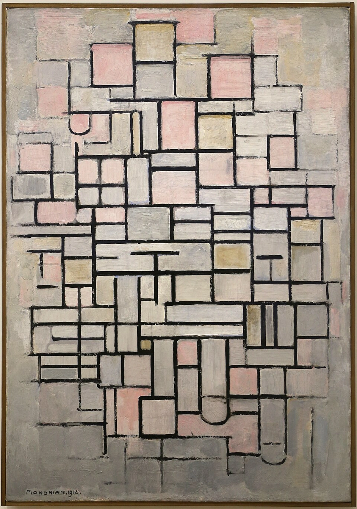
When I look at a work like Mondrian's "Composition No. IV," the seemingly simple areas of light pink, gray, and off-white are not just background. They are carefully proportioned negative spaces that interact with the black lines and primary color blocks, creating a dynamic balance and a sense of visual harmony. It's a masterclass in how absence can contribute profoundly to the overall visual weight and equilibrium of a composition.
Why I'm Obsessed: The Magnetic Pull of the Unseen
Mondrian’s work, in its precise balance, truly embodies the elegance of controlled negative space. But for me, the pull of the unseen runs deeper, a kind of magnetic force that shapes my entire artistic journey. My journey into abstract art has always been about finding freedom within structure, or perhaps, structure within chaos. It’s like trying to keep my studio tidy; I crave order, but the creative process often defies it, scattering paint and ideas everywhere. Yet, it's in this very chaos that the magnetic pull of negative space became my secret weapon, not just conceptually, but through specific 'aha!' moments that solidified its profound power. I distinctly remember one frustrating afternoon, wrestling with a new series. I had a vision of vibrant energy, but everything felt heavy, clunky. In a fit of artistic exasperation (which usually involves me staring blankly at the wall while drinking lukewarm coffee), I accidentally knocked over a half-finished study. The way it landed, with a corner of a positive shape perfectly aligned against a stark, empty section of canvas, suddenly made everything click. The accidental negative space was more powerful than anything I’d intentionally painted. It was messy, but beautiful, and made me realize I wasn't just painting shapes, I was sculpting voids. This is why I find its power so undeniable:
- It Defines and Frames: The Invisible Outline: Negative space literally sculpts the positive forms. It's like the air around a dancer; it accentuates every curve and movement, making the form sharper, more deliberate. Or think of a single, perfectly ripe cherry placed on a stark white tablecloth; the expanse of white isn't just background, it’s actively isolating, celebrating, and amplifying the cherry’s vibrant redness and delicate form. Without that surrounding emptiness, the forms would lose their distinctiveness, blurring into one another, much like how the silence between notes makes a melody recognizable. It’s the unseen boundary that gives definition, helping me in developing my unique artistic style.
- It Creates Balance and Harmony: The Art of Visual Equilibrium: Ever look at a piece and feel something is just off? Often, it's an imbalance in negative and positive space. A heavy, dense area needs a lighter, more open counterpart to breathe. It’s about creating a visual equilibrium, a serene whisper next to a bold shout.
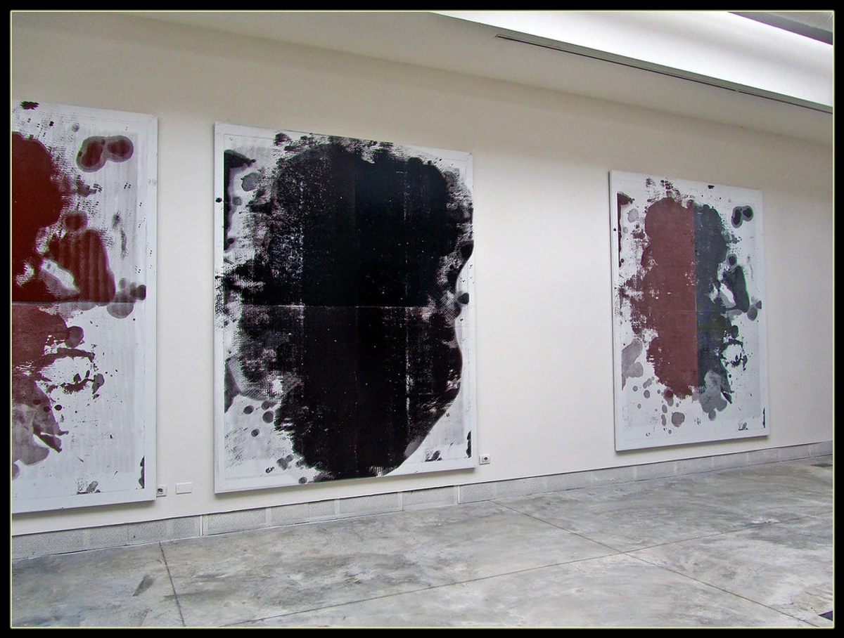
- It Guides the Eye: The Silent Choreographer: This is where the choreographer comes in. By consciously shaping the negative space, I can direct your gaze through the painting, leading you on a visual journey, hinting at paths and inviting you to linger. It creates a narrative even in the absence of traditional subjects. Consider a vast expanse of cool blue negative space: depending on its scale and the surrounding forms, it can evoke profound peace, a sense of limitless possibility, or even a deep loneliness, inviting the viewer's eye to float and explore. Conversely, compressed, angular negative spaces can create tension, unease, or a dynamic sense of movement, pushing the eye forward. This psychological impact is something I constantly explore; the feeling of spaciousness can induce calm, while tightly wound 'empty' areas can mirror an inner restlessness, turning the canvas into an emotional landscape. Have you ever felt that subtle push or pull while gazing at an artwork, even before you consciously understand why? It's this dynamic interplay that I find so incredibly fascinating. It makes the empty parts feel full, the quiet parts loud, and the unseen utterly essential. If you’re curious about how this translates into my broader philosophy, you might enjoy finding my voice: the evolution of my abstract artistic style. The ability of negative space to establish a strong sense of visual weight and counterpoint is evident in works like those by Christopher Wool, where bold, often stark forms are given immense power by the expansive, contrasting white or muted backgrounds, drawing the eye directly to the painted elements while emphasizing their raw presence. His large, stenciled letters or gestural marks become monumental not just by their size or texture, but because the vast 'empty' canvas around them grants them a powerful, almost confrontational stage, amplifying their message and their physical impact. You can delve deeper into his work with our ultimate guide to Christopher Wool.
My Toolkit: Sculpting with Absence
So, how does one 'sculpt' with something that isn't there? It sounds paradoxical, like trying to catch smoke, or perhaps herd cats—a task I occasionally attempt in my studio, with similar results. But it's about intentionality. When I approach a new canvas, whether it's an intuitive painting or a more planned piece, I don't just think about where I'm going to put the paint; I think about what I'm not going to paint, and why. It’s a deliberate dance with the unseen, a constant dialogue between positive and negative, a push and pull. This intentionality is the bridge from why I'm obsessed to how I make it work.
Compositional Play: The Dance of Forms and Voids
This is where the magic really begins. I often start by laying down large, sweeping forms, then step back. What do the spaces between these forms look like? Do they create interesting shapes themselves? Sometimes, I'll even invert my thinking: focusing on painting the negative space first, letting the positive shapes emerge from the tension. It's a bit like seeing the silhouette of a tree and realizing the sky around it is just as compelling, or using masking tape to block out areas before applying paint, knowing that the removed tape will reveal pristine negative shapes.
Let's say I'm starting a new piece with a feeling of dynamic tension. I might begin with a few bold, gestural lines or blocks of color, perhaps creating two strong diagonal forms meeting in the center. Then, I step back. Instead of immediately filling in the gaps, I squint, letting my eyes blur, and ask: What shapes have I created in the air between these forms? Do they feel static or active? If they feel static, I might adjust one of the diagonals, pushing it further or pulling it back, until the negative space between them feels like a vibrant, energetic arrow, guiding the eye—almost like an invisible lightning bolt, crackling with implied movement, directing you to a specific point of collision or expansion. Or, perhaps, I'm aiming for quiet reflection. I might place a single, vibrant form off-center. The vast, unpainted area around it then becomes a contemplative field, amplifying the small form's presence, making it a focal point of intense contemplation, a solitary island in a sea of calm. It's about designing the 'nothing' with the same care as the 'something', allowing the voids to push and pull, recede and advance, creating a nuanced sense of depth and movement. It's how I build complex abstract compositions that feel both dynamic and balanced.
Color and Value: Giving the 'Empty' its Own Voice
Who said negative space has to be bland? Not me! While it often serves as a calm counterpoint, its color and value are crucial. A subtle shift in the background's hue can dramatically alter the perception of the positive forms. Imagine a vibrant yellow shape: if it's surrounded by a cool, muted blue negative space, it pops, almost vibrating with energy, evoking a sense of sudden emergence or joyous conflict—a bold declaration against a serene backdrop. But if surrounded by a warm, earthy ochre, the yellow might recede, blending into a harmonious warmth, perhaps suggesting quiet contentment or an ancient, earthy connection, like sunlight filtering through autumnal leaves. For me, choosing the color of the 'empty' space feels like orchestrating a symphony, carefully selecting each instrument, each note, so that even the quietest hum has purpose, adding depth and emotion. It's a delicate balance that brings a personal touch to every canvas. If you've ever wondered how I get my colors to sing, you might like my palette, my story: the emotional language of color in my abstract art.
Texture and Layers: Beyond the Smooth Surface
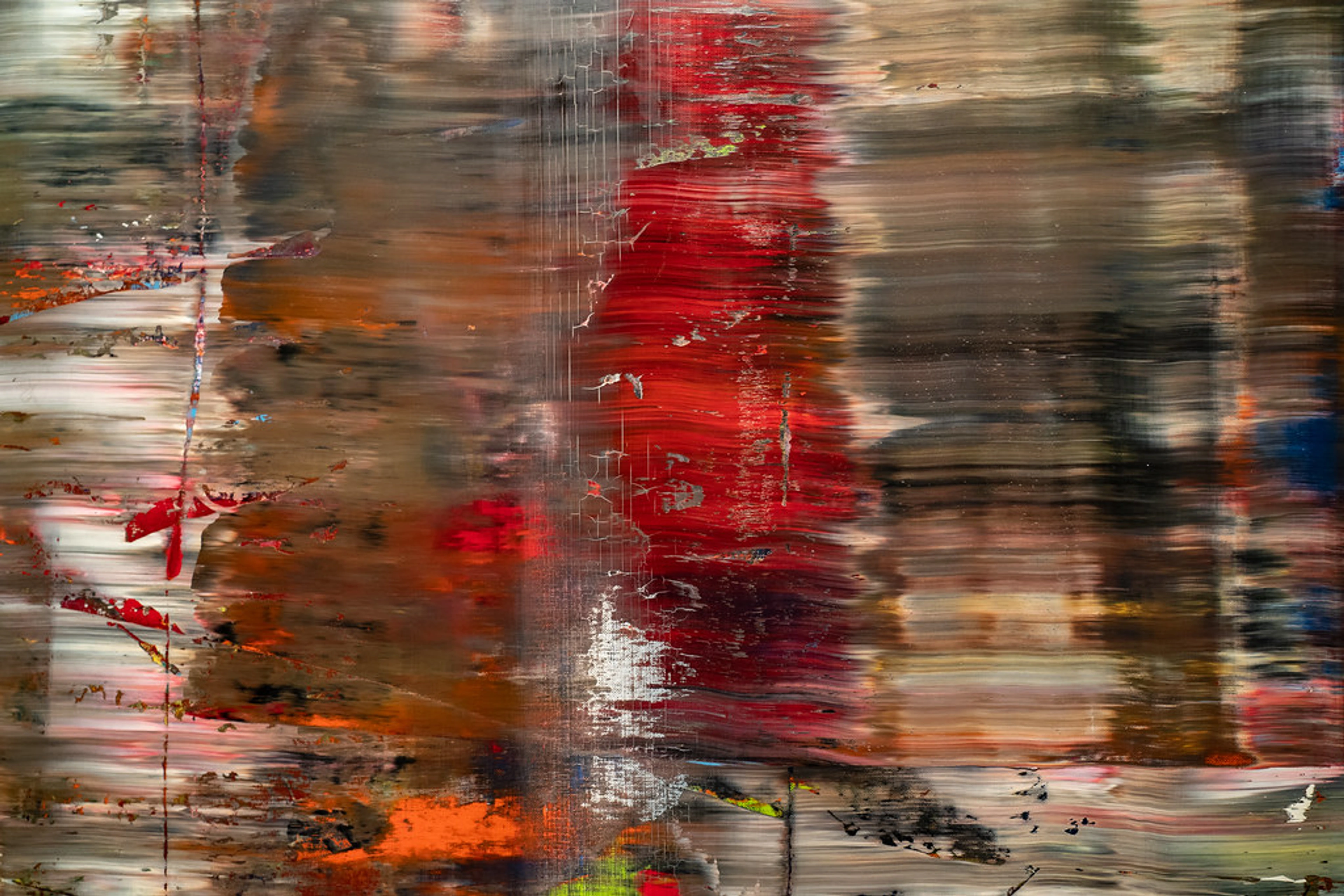
Even when an area appears to be 'empty' or flat, it rarely truly is. Negative space can hold just as much textural interest and layered depth as the positive forms. I often use subtle textural variations, delicate glazes, or faint underpainting within the negative spaces. These details invite the viewer closer, rewarding their exploration and transforming a seemingly blank area into a rich, nuanced field. A gentle wash of transparent color, a barely-there mark, or even the subtle weave of the canvas itself can become part of the 'negative' narrative. To achieve this 'whisper of depth,' I often employ techniques like thin, translucent glazes that allow underlying layers to subtly show through, creating a luminous effect. Sometimes, I’ll use a dry brush to create faint, almost imperceptible striations in a seemingly uniform area, or even scratch back into partially dry paint to reveal the canvas texture or a contrasting underlayer. These aren't overt marks, but rather subtle invitations for the viewer to lean in, to discover the richness within the perceived emptiness. The deliberate choice of raw canvas peeking through, or a heavily impastoed area adjacent to a smooth, almost polished void, can dramatically alter the emotional weight and dynamism of the negative space itself. Exploring texture is fundamental to making these quiet areas sing. This is particularly evident in the work of artists like Gerhard Richter, where even seemingly uniform areas of paint often reveal incredible depth and movement through his signature scraping and layering techniques. Richter's negative spaces are rarely truly flat; his process of dragging and blurring paint across the canvas creates subtle striations, ghosted forms, and unexpected light shifts within the 'empty' areas. These textural nuances become active participants, breathing with their own quiet life and enhancing the intensity of the more defined elements, ensuring the background is as active and intriguing as the foreground. Dive deeper into his fascinating techniques with our ultimate guide to Gerhard Richter.

Negative Space Across Mediums and Styles
The application of negative space also varies subtly across different abstract styles. In geometric abstraction, like Mondrian's work, negative spaces are often precisely defined, rigid, and contribute to a sense of intellectual order and balance. They are as much a 'shape' as the positive forms, meticulously planned. In contrast, in gestural abstraction or action painting, the negative space might be wilder, more spontaneous, defined by the sweeping arcs of a brushstroke or the splatters of paint. Here, the 'void' becomes a witness to the action, a space of dynamic energy or explosive release, often amplifying the raw emotion of the positive marks. This versatility means negative space is not a static concept, but a dynamic tool adaptable to any artistic intention.
While traditionally applied to painting, the concept of negative space translates across mediums with fascinating results. In digital art, for instance, a graphic designer creating a sleek logo will meticulously consider the counter-forms within and around letters, ensuring the 'empty' space enhances legibility and visual impact, making the logo instantly recognizable. Similarly, a web designer might use ample white space around elements to guide the user's eye and create a sense of calm and clarity. In sculpture, the voids within and around a form are as crucial as the material itself; consider Henry Moore's reclining figures, where the holes and open areas are not merely gaps, but active elements that define the interior volume and interact with the surrounding environment, giving the solid form its grace and weight. It's a universal principle, an undeniable truth that presence is often defined by absence. The trick is always a delicate balance: a 'blank' area isn't truly inert; it’s an opportunity for a subtle hum, a whisper of depth, rather than a flat, inert silence. When there’s too much undifferentiated negative space, a profound silence can unfortunately become a mere absence, making a composition feel empty or unresolved. The key, always, is intentionality and balance.
Embracing the Void: A Final Thought
In a world constantly demanding more, more, more – more information, more attention, more 'stuff' – there's something profoundly liberating about celebrating the 'less'. Negative space, for me, is more than a compositional tool; it's a philosophy, a reminder that the quiet moments, the unspoken truths, the gaps between things, are just as vital, if not more so, than the obvious. It’s where the true conversation happens, where meaning is made, and where the eye, and indeed the soul, finds room to breathe and wander. It’s what transforms mere marks on a canvas into an abstract journey.
So next time you look at a painting—or even just gaze out your window—try to see not just the tree, but the sky around it; not just the mug, but the table surrounding it. Notice how the absence defines the presence. I invite you to consider: what 'unseen' forces are shaping the 'seen' in your own life? Where are the quiet moments that hold the most meaning? Perhaps, like me, you'll find that embracing the void leads to an unexpected fullness. It's a skill that will not only deepen your appreciation of art but might just offer a fresh perspective on the beautiful chaos of life itself. It's like realizing that the most profound insights often come not from constant noise, but from the quiet space where thoughts can truly form. And if my art can help you see those quiet spaces, that's a true win for me, and hopefully, for you too. I invite you to discover more of my abstract works here, or delve deeper into my artistic journey at my museum in 's-Hertogenbosch.


