Color Theory in Art: Your Personal Guide to Pigments, Psychology & Expression
Unravel color theory: from light science and pigment mixing to emotional impact, master artists, and practical application. This personal, comprehensive guide transforms how you see and use color.
Color Theory in Art: Your Definitive Guide to Pigments, Psychology & Personal Expression
You know that feeling when you walk into a room, and it just… feels right? Or when a painting stops you dead in your tracks, not just because of the subject, but because of the sheer vibrancy or subtle harmony of its colors? That, my friend, is the magic of color theory at play. And let me tell you, as an artist whose studio is perpetually dusted with pigment and whose mind often wanders into the vibrant chaos of abstract color, it’s a rabbit hole I’ve tumbled down more times than I can count. I often find myself staring at a particularly vibrant red apple, not just seeing red, but contemplating the entire spectrum of light it absorbs and rejects, the silent conversation happening between light and pigment. It was pure intuition then, a childish wonder. Later, in art school (which, by the way, felt more like a monastic retreat for introverts than a party), I realized there was an actual science behind this intuition. And suddenly, my chaotic crayon experiments had a name: color theory. It felt a bit like being handed a secret decoder ring to the universe.
For me, color isn't just about what looks good together; it's a language, a whisper, a shout. It's the silent communicator in my abstract art, often speaking before any line or shape. And while my journey into art began with a rather chaotic "just throw paint at it and see what happens" philosophy (which, let's be honest, still happens on Tuesdays), understanding color theory truly transformed my practice. It's like learning the grammar of emotion. This guide will take you from the scientific foundations of how we perceive color, through the profound emotional and psychological impact every hue has on us, to practical applications that will transform how you see and create. In this guide, we'll explore the science behind how we see color, the emotional impact of different hues, how artists have masterfully used color, and how you can apply these principles to your own creative life.
So, buckle up! We're not just going to skim the surface. We're diving deep, from the nitty-gritty of how we even see color, through the artist's trusty color wheel, all the way to the profound psychological impact every hue has on us. Consider this your personal, slightly-unhinged, but undeniably comprehensive guide.
The Science Behind the Rainbow: How We See Color
Before we even talk about mixing pigments, let's get a little nerdy for a moment. How do our eyes and brains actually perceive color? It all boils down to light.
Light, as you might remember from a dusty science class, is made up of different wavelengths. When white light (like sunlight) hits an object, some of those wavelengths are absorbed, and others are reflected. The ones that are reflected are the ones our eyes perceive as color. A red apple, for instance, absorbs most wavelengths but reflects red ones. Simple, right? Until you try to explain it to someone over coffee, and then it suddenly sounds like quantum physics.
Our brains are pretty clever, too. They perform a neat trick called color constancy, allowing us to perceive the color of an object as relatively stable despite dramatic changes in lighting conditions. That red apple still looks red whether it's under bright sunlight or dim indoor light, thanks to our brain's automatic adjustments. Even trickier, artists often grapple with metamerism – where two colors appear identical under one light source but totally different under another. Imagine matching a paint chip in the store only for it to look completely off once you get it home! It's a subtle reminder that color isn't just an inherent property of an object; it's a dynamic interplay between light, the object itself, and our own perception.
Beyond objects, the light source itself has a color temperature, measured in Kelvin. Think about the stark, cool blue of a fluorescent light versus the warm, inviting glow of an incandescent bulb, or the pure, balanced spectrum of natural daylight. These varying light temperatures can subtly (or not-so-subtly) shift how we perceive the colors of our paints and artworks, demanding a careful eye and adaptability from the artist. It’s why a painting can look absolutely breathtaking in your studio but feel a little… off… once it’s hung in a client’s home.
Artists, however, mostly deal with subtractive color, which is all about pigments. When you mix paints, you're subtracting wavelengths of light. The more colors you mix, the darker it gets, eventually leading to black (if you've ever ended up with mud-brown, you know what I mean!). This is different from additive color (think light on a screen), where mixing colors creates white. Imagine the difference between shining colored spotlights (additive, combining to white) and mixing paint on a palette (subtractive, combining to black). This is why your printer uses CMYK (Cyan, Magenta, Yellow, Key/Black) – a subtractive model – while your computer screen uses RGB (Red, Green, Blue) – an additive model. Different tools, different rules for making magic.
And speaking of perception, it's worth noting that not everyone experiences color in the same way. Around 8% of men and 0.5% of women have some form of color blindness (or color vision deficiency), a condition where the eye's cones struggle to differentiate between certain wavelengths. This isn't about seeing in black and white, but rather a spectrum where some hues might appear muted, or certain distinctions (like red and green) become blurred. It's a powerful reminder that our perception of color is deeply personal and biologically determined. Many artists with color blindness have developed unique and powerful approaches to color, focusing on other visual elements to create impact.
Primary, Secondary, and Tertiary Colors: The Building Blocks
At the heart of the subtractive color system are our trusty primary colors: red, yellow, and blue. You can't create them by mixing other colors, which is why they're so fundamental.
- Primary Colors: Red, Yellow, Blue (the un-mixables!)
- Secondary Colors: Created by mixing two primary colors.
- Red + Yellow = Orange
- Yellow + Blue = Green
- Blue + Red = Violet (or Purple)
- Want to know how I use these? Check out my deep dive into how I use secondary and tertiary colors to create complex abstract worlds.
- Tertiary Colors: The delightful offspring of a primary and a secondary color. Think red-orange, yellow-green, blue-violet. These are where things start to get really interesting and nuanced!
And let's not forget earth tones! These natural, muted hues (think ochres, siennas, umbers) are essentially desaturated secondary and tertiary colors, often derived from mineral pigments. They're the grounding force in many palettes, providing warmth and stability without demanding attention. And alongside them are the neutrals: black, white, and a myriad of grays and browns. While they might seem to lack 'color,' they are indispensable for controlling value, creating contrast, and allowing other colors to truly shine.
One of the most frustrating, yet illuminating, parts of painting is realizing that mixing colors isn't always straightforward. Achieving a pure, vibrant green, for instance, can be surprisingly difficult with certain blues and yellows – it often comes out dull or muddy. This is because pigments are impure; they absorb and reflect a range of wavelengths, not just one specific hue, and often carry inherent undertones (e.g., a blue might lean slightly green or red). To overcome this, I often rely on a carefully curated palette of pigments, sometimes using specific pre-mixed paints or layering techniques to achieve the desired vibrancy. Or try getting a truly rich purple without it looking like a bruise! These challenges remind you that the 'rules' are just starting points; the real magic happens through relentless experimentation and a growing intuition for your pigments. It's a never-ending quest for that perfect, elusive shade.
What's your most memorable experience with light and color, perhaps one that surprised you?
The Artist's Playground: Navigating the Color Wheel
Ah, the color wheel! It might look intimidating, but it's genuinely the most practical tool in an artist's arsenal. It's a visual representation of how colors relate to each other, helping us choose palettes that sing (or scream, depending on the mood!). Understanding these relationships is your first step; mastering them is a lifelong dance, but it all starts with the basics like warm and cool, and then building more complex color harmonies. Knowing the science of light helps you understand why these relationships create certain visual effects, giving you deeper control over your palette.
Warm and Cool Colors: Setting the Mood (Even Accidentally)
This is one of my favorite distinctions because it immediately impacts the feeling of a piece.
- Warm Colors: Reds, oranges, yellows. They tend to jump forward, evoke energy, passion, warmth (surprise!), and even aggression. Think of a fiery sunset or a cozy fireplace.
- Cool Colors: Blues, greens, violets. They recede, evoke calm, serenity, sadness, or detachment. Think of a deep ocean or a tranquil forest.
Knowing this distinction is a superpower. Want to make something feel close and intimate? Lean into warms. Want to create a sense of vastness or distance? Cools are your friend. Sometimes I'll throw in a cool color into a warm painting just to make the warm colors feel even warmer. It's like adding a pinch of salt to caramel—it just makes everything pop. Beyond just warm and cool, understanding color temperature within a single hue is key. A yellow-green might feel 'warmer' than a blue-green, even though both are green, because the yellow undertone pushes it towards the warm side of the spectrum. Or a red with a hint of orange feels hotter than a red leaning towards violet. For example, I might use a warmer yellow-green in the foreground of a landscape to bring the foliage closer, while a cooler, bluer green recedes into the distant hills, creating a sense of depth and atmosphere. These subtle shifts allow for incredible depth and nuance, making colors vibrate against each other in truly exciting ways.
Color Harmonies and Schemes: The Art of Getting Along
This is where the real fun begins. Color schemes are like choosing the right outfit for an occasion. You can go bold, subtle, elegant, or rebellious. Here are the classics:
Scheme Name | Description | My Take |
|---|---|---|
| Monochromatic | Uses different shades, tints, and tones of a single color. | It's surprisingly powerful. It's like whispering secrets in a dark room—subtle, yet intense. Great for building mood and depth without overwhelming the viewer. |
| Analogous | Uses colors next to each other on the color wheel (e.g., blue, blue-green, green). | My go-to for creating harmony and flow. It feels natural, like a gradient in a sunset. These schemes are usually pleasing to the eye and less jarring. |
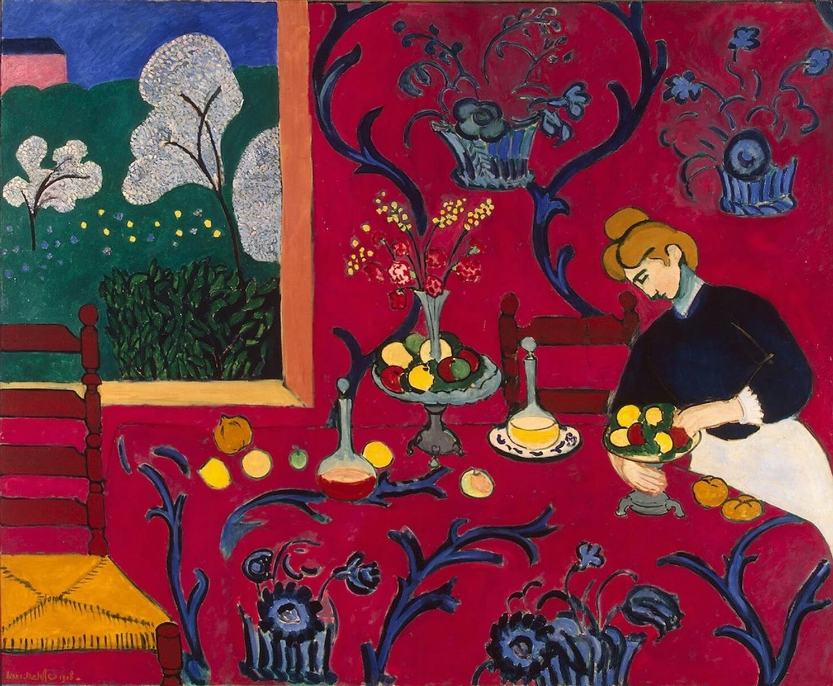
| Complementary | Uses colors directly opposite each other on the color wheel (e.g., red and green, blue and orange). | The ultimate power couple! They create high contrast and vibrancy, often causing a visual 'vibration' when placed side-by-side due to their opposing wavelengths. Use them for focal points, or if you're feeling brave, all over. It’s a delicate balance, though—too much can feel aggressive, but just right, and it’s pure fireworks. Henri Matisse, for example, often mastered this in his Fauvist period, allowing the tension between hues to create intense emotional resonance. Take a look at his "The Red Room". |
| Triadic | Uses three colors equally spaced on the color wheel (e.g., red, yellow, blue). | A bold choice! It's vibrant and balanced, but needs careful handling to ensure one color doesn't dominate too much. It's like having three strong personalities in a room—they can create a lively conversation if managed well. |
| Tetradic (Rectangular/Square) | Uses four colors, either in two complementary pairs (rectangular) or equally spaced (forming a square). | This is where things get really complex and potentially chaotic. A rectangular tetradic scheme uses two complementary pairs (e.g., blue and orange, red-violet and yellow-green). A square tetradic uses four colors equally spaced on the wheel (e.g., blue, green, yellow, red-orange). The square version is often more visually demanding due to its intense contrast, while the rectangular offers a slightly softer complexity. It offers the richest color possibilities but is also the hardest to balance. It’s like trying to juggle four colorful balls while riding a unicycle, and sometimes I feel like all four are headed straight for my face. I mostly admire these from afar, or break them down into smaller, more manageable analogous or complementary sections within a larger piece. |
Advanced Harmonies: Beyond the Basics
While the classic schemes are a fantastic foundation, the color wheel offers even more sophisticated relationships:
- Split-Complementary: Instead of using a direct complementary color, you use the two colors adjacent to it. For example, with blue, instead of its direct complement orange, you'd use the two colors adjacent to orange: yellow-orange and red-orange. This offers high contrast but with a softer, less aggressive feel than a pure complementary pair because the 'clash' is distributed across two related hues, providing more visual interest and flexibility. The visual effect is often lively and dynamic, without being overwhelming.
- Double-Complementary (Tetradic variations): As mentioned in the table, this uses two complementary pairs. It's truly complex and can be overwhelming, but when mastered, it produces rich, multi-dimensional palettes. The visual effect can be incredibly vibrant and full of depth, a true symphony of color, where each hue finds its unique voice while contributing to a complex whole. I often think of it as orchestrating a full symphony rather than a duet – every instrument needs its place.
And for those seeking ultimate minimalism, achromatic schemes use only black, white, and various shades of grey. These schemes strip away hue to emphasize form, texture, and value, often creating a sense of drama, sophistication, or quiet contemplation. They’re like turning down the volume on color to better hear the melody of light and shadow.
These advanced schemes allow for incredible complexity and emotional range, but they also demand a deeper understanding of balance and proportion. Don't be afraid to experiment, even if it feels like you're just throwing paint at the canvas (remember my Tuesdays?). The beauty of color theory is that it gives you the language to understand why some of those random throws actually work.
What kind of color harmony makes you feel most at peace, or most excited?
Beyond the Pigment: The Psychology and Emotion of Color
This, for me, is where color truly comes alive. It's not just about wavelengths or paint mixtures; it's about what happens in your gut, your heart, your soul. Colors bypass our rational mind and go straight for the feelings. It's why I often say that the emotional language of color in abstract art is arguably more potent than any literal representation. And don't forget simultaneous contrast, where colors look different when placed next to other colors. A grey square will appear warmer when placed on a cool blue background, and cooler on a warm red background. It's a powerful trick of the eye that artists constantly leverage to make colors sing or whisper.
Beyond just the hue, the saturation and value of a color dramatically impact its emotional weight. A highly saturated red might scream passion or danger, conveying an intense, raw emotion, while a desaturated, muted red could evoke tenderness, faded memory, or quiet melancholy. Similarly, a high-value (light) blue can feel airy and hopeful, like a clear sky, whereas a low-value (dark) blue might convey solemnity, deep introspection, or even despair. It’s like the difference between a loud shout and a soft murmur – same message, entirely different feeling.
Think about it:
- Red: Passion, anger, love, danger, energy. It screams, "Look at me!" If I want to wake someone up or demand attention, I reach for red. It’s a primal force, the beating heart of a canvas. For me, the psychology of red is about raw, unfiltered emotion.
- Blue: Calm, sadness, stability, trust, melancholy. It's the color of a clear sky or a deep, introspective mood. It's why blue can be so healing in abstract art. It's the quiet contemplation, the vast unknown. My journey with de psychologie van blauw has shown me its profound depth.
- Yellow: Joy, optimism, warmth, caution, intellect. It’s sunshine on a canvas, but too much, and it can feel overwhelming or even sickly. It’s that initial burst of inspiration. The psychology of yellow in my work often captures fleeting moments of happiness.
- Green: Nature, growth, harmony, envy, freshness. The ultimate balancer, the promise of renewal. The psychology of green in my art often speaks to cycles and new beginnings.
- Purple: Royalty, mystery, spirituality, creativity. Historically a difficult pigment to create, hence its association with luxury and the mystical.
- Orange: Enthusiasm, creativity, excitement, warmth. A friendly, energetic color that demands attention without being as aggressive as red.
The fascinating thing is how these associations can shift based on culture and personal experience. My bright red might be pure joy, while for someone else, it's a warning sign. For instance, while white symbolizes purity in Western weddings, it often represents mourning in some Asian cultures. Conversely, red, a color of passion in the West, is a symbol of good luck and prosperity in China. Or consider green: in Western contexts, it’s often tied to nature and environmentalism, but in some Middle Eastern cultures (like those of Islam), it holds sacred significance and represents paradise. Even within Western cultures, purple can signify royalty and luxury, but historically, it's also been a color of mourning in some contexts (e.g., Victorian England), and in some subcultures, a symbol of LGBTQ+ pride. It’s a wonderfully nuanced tapestry of meaning. This deeply personal and cultural connection is what makes psychology of color in Impressionist painting so rich, and indeed, any art. I remember once, I used a very specific shade of muted violet in a piece, intending it to feel serene and spiritual. A collector, however, told me it evoked a deep sense of nostalgia for a childhood home – a powerful reminder that once the paint leaves the brush, its story becomes intertwined with the viewer's own heart and personal history.
In abstract art, where there's no literal subject to guide the viewer, color shoulders an even greater responsibility. It becomes the primary conduit for emotion, creating immersive experiences that speak directly to the subconscious. A vibrant clash of complementary colors can create tension and excitement, while an analogous scheme can wrap the viewer in a soothing embrace. It's pure, unadulterated feeling, communicated through light and pigment.
Has a specific color in an artwork ever evoked a surprisingly personal or strong emotion for you, different from the artist's apparent intent?
Masters of the Palette: Learning from the Greats (And My Own Faux Pas)
After exploring the science and emotion, it's inspiring to see how the giants of art history wielded color. Learning from their triumphs—and occasionally, my own missteps—has been a crucial part of my journey in painting. These masters, each with their unique approach, demonstrate the boundless ways color theory can be bent, broken, and ultimately, celebrated.
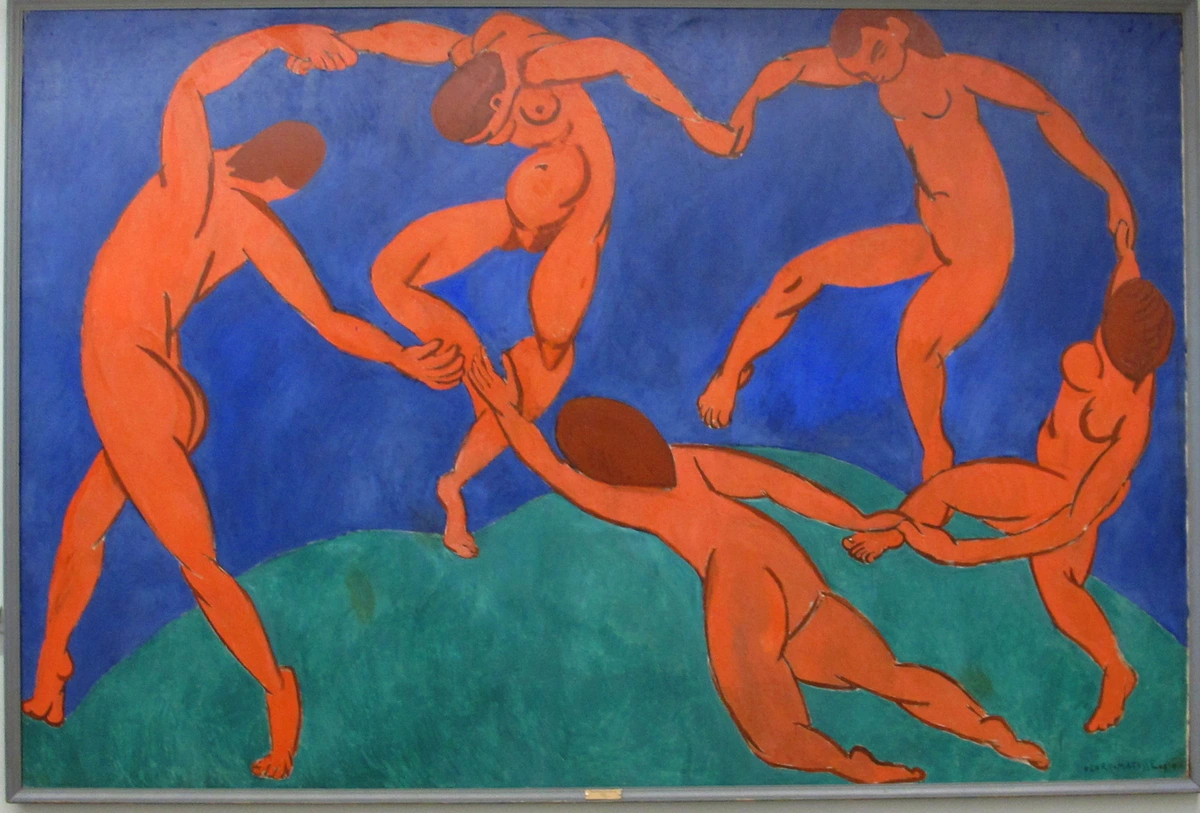
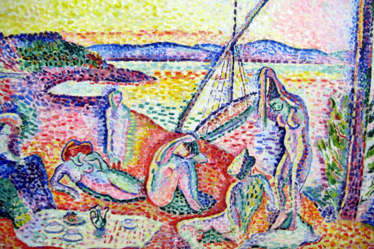
Take Henri Matisse, for example. He wasn't afraid of color; he embraced it, twisted it, and made it sing louder than anyone thought possible. His Fauvist period pieces, like "La Danse" or "Luxe, calme et volupté," are explosions of pure, unadulterated color, used to express emotion rather than just describe reality. He understood that color could be a force unto itself, and this fearless approach always makes me want to push my own boundaries, to not be afraid of making a joyful mess.
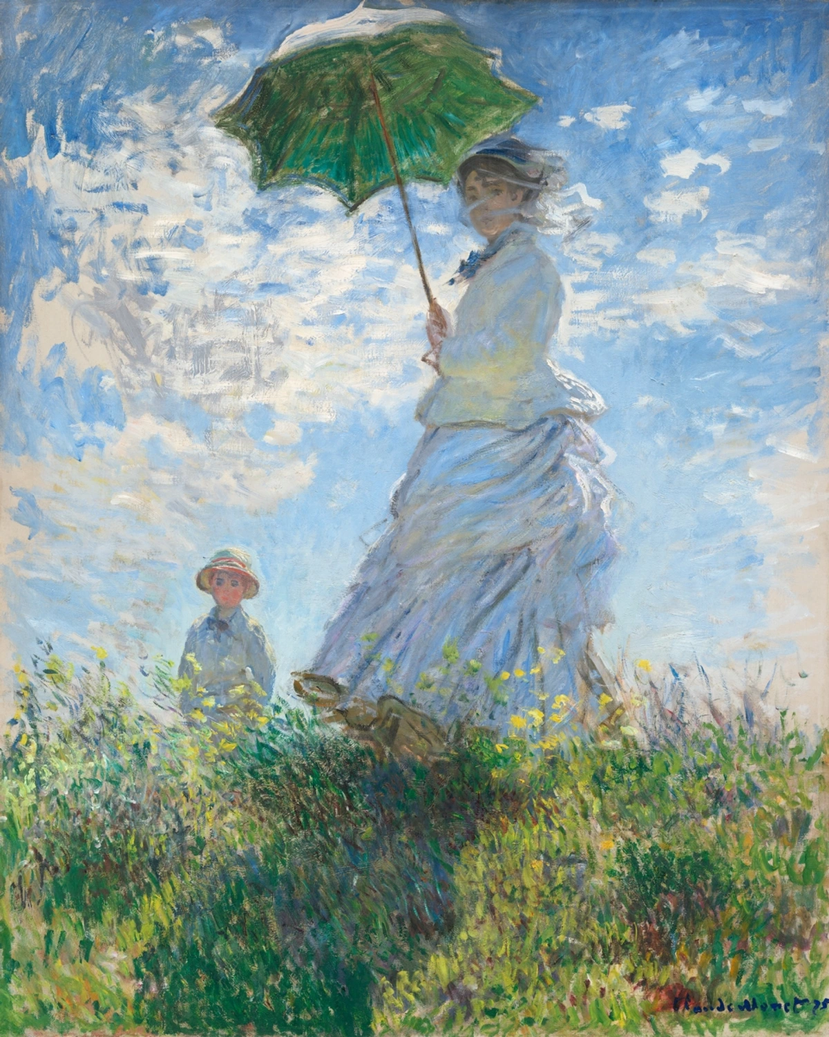
Then there's Claude Monet, the Impressionist master. He didn't just paint haystacks; he painted the light on haystacks, and the color of that light. His genius lay in capturing fleeting moments, using broken brushstrokes and pure, unmixed colors to create vibrant, shimmering surfaces. Look at "Woman with a Parasol" – it's less about the woman and more about the way light dances off the fabric and through the air. His dedication to capturing the ephemeral quality of light always reminds me to truly see the colors in the world, not just label them, to look closer, always closer.
And what about the quiet mastery of Johannes Vermeer? While his palettes might seem less overtly dramatic than Matisse's, his use of color to define light, space, and form is unparalleled. He often worked with limited palettes, focusing on a few key pigments to achieve incredible luminosity and depth, rather than a broad spectrum of hues. His subtle harmonies, often combining cool blues with warm yellows, create an incredible sense of stillness and presence, as seen in the contemplative atmosphere of "Girl with a Pearl Earring." He famously used a limited, but carefully chosen, palette that often included expensive pigments like ultramarine blue, lead-tin yellow, and vermilion, maximizing their luminosity through careful layering and glazing techniques, allowing light to seemingly emanate from within the canvas.
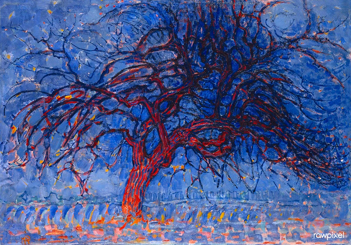
In the realm of abstraction, Piet Mondrian and Wassily Kandinsky are phenomenal examples. Mondrian, with his early works like "Evening; Red Tree," shows a fascinating journey from expressive, almost Fauvist color towards pure primary color abstraction. This early piece, with its vibrant but representational tree, marks a crucial step in his evolution towards non-objective art. Influenced by Theosophy – a spiritual philosophy seeking universal truths – Mondrian meticulously stripped away the superfluous, believing that universal harmony could be expressed through elemental forms and colors. This 'simplification' was his way of finding a deeper order, a transition brilliantly seen as he moved from more representational works towards his iconic grids of primary colors.
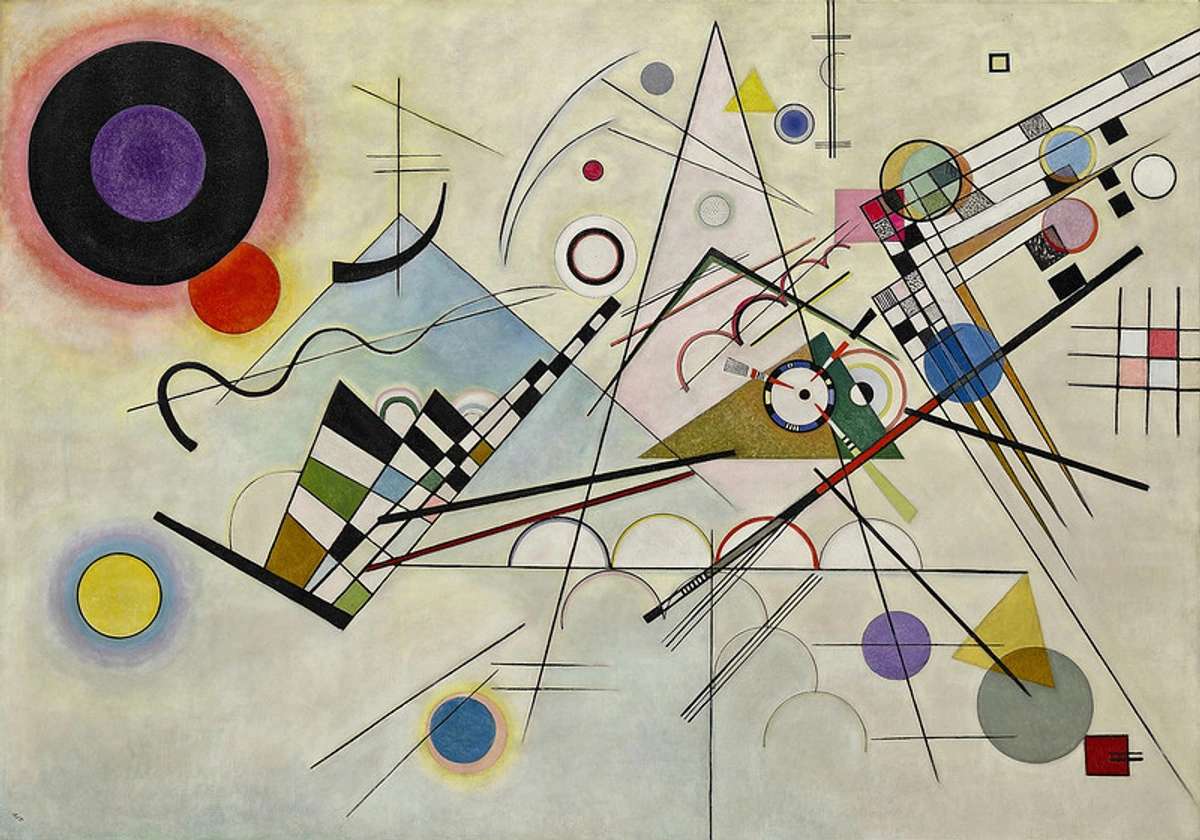
Kandinsky, on the other hand, was deeply invested in the spiritual and emotional power of color, believing that specific colors and shapes could evoke specific feelings – a true pioneer in color field painting beyond Rothko. His theoretical writings, like "Concerning the Spiritual in Art," explored these connections, arguing that art could directly communicate with the soul. Kandinsky, deeply influenced by synesthesia (the fascinating experience of 'seeing' sounds or 'tasting' colors), believed that specific colors had spiritual vibrations and emotional impacts – yellow, for example, he associated with earthly warmth, while blue resonated with spiritual depth and coolness. His theory was that the right combination of colors and forms could evoke a 'spiritual chord' in the viewer. His "Composition VIII" is a symphony of geometric forms and vibrant hues, each chosen for its intrinsic emotional resonance.
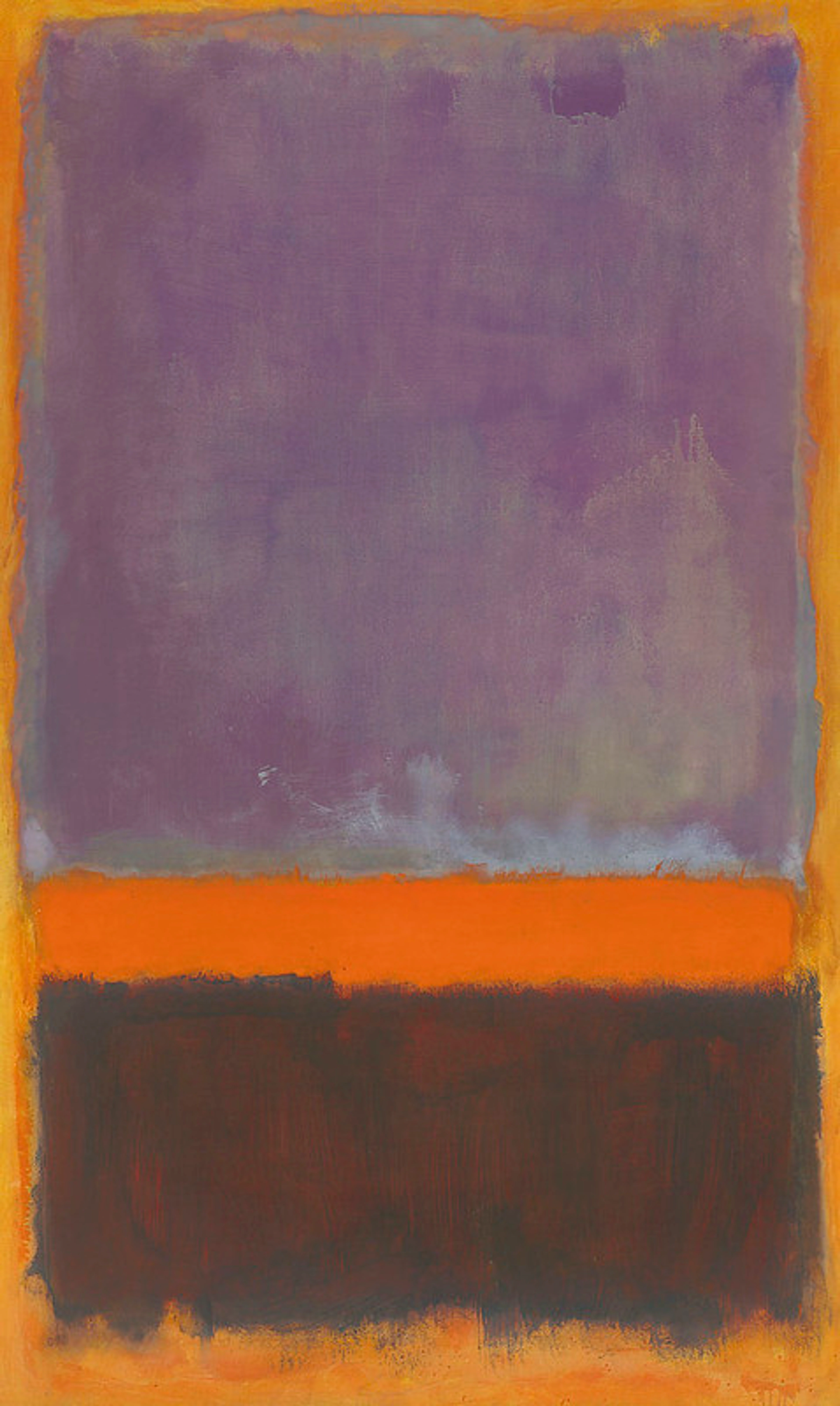
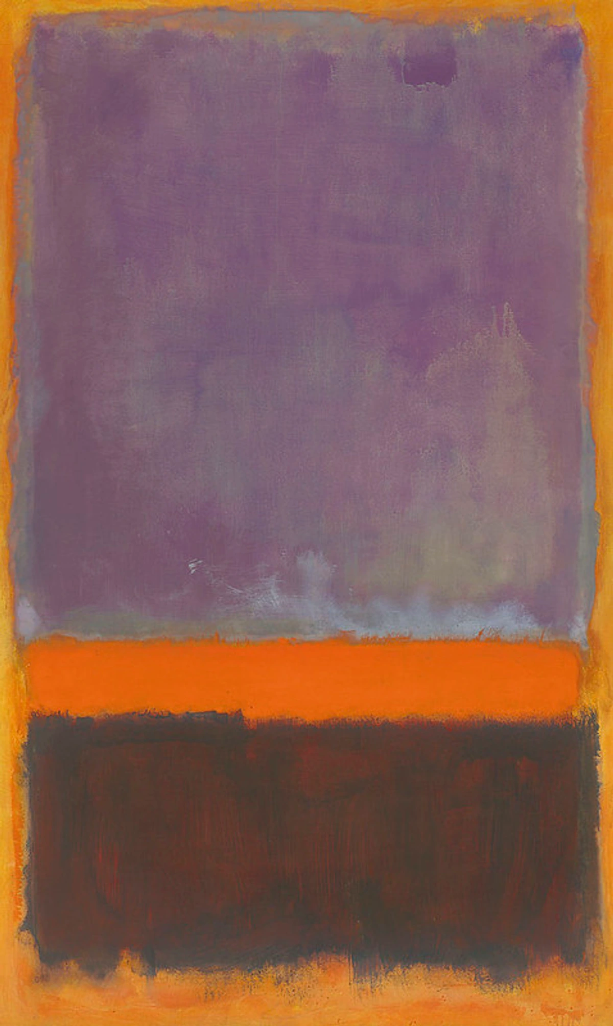
Speaking of color fields, Mark Rothko used monumental blocks of color to create immersive, emotional experiences, where the hues themselves become the subject, inviting profound contemplation and feeling. His ability to convey such depth with apparent simplicity is a constant source of wonder.
These artists, and countless others, show us that color theory isn't a rigid set of rules, but a launchpad. It’s a foundational understanding that allows for boundless experimentation. Sometimes I get it gloriously wrong, like the time I tried to mix a 'perfect' cerulean blue with some leftover pigments and ended up with a murky, depressing grey that had absolutely no business being near my canvas. And sometimes, just sometimes, I stumble upon a combination that makes my heart sing. That's the beauty of the journey, right? Knowing the 'grammar' of color empowers you to truly express yourself, or as I often say, to break the rules with purpose.
Whose artistic approach to color resonates most deeply with you, and why?
Applying Color Theory to Your Own World (No Art Degree Required)
Now that we've explored the science, the emotion, and learned from the masters, let's bring it all back to you. Color theory isn't just for art history books; it's a living, breathing tool you can apply every day, in every creative endeavor. Seeing how these masters wielded color has profoundly influenced my own approach, and I want to share how you can start applying these principles yourself. Whether you're an aspiring artist, a seasoned painter, or just someone who wants to curate their living space, color theory is your secret weapon. For those of us exploring how artists use color in our daily lives, these steps can be transformative.
- Observe, Observe, Observe: Start noticing the colors around you. What palettes are used in your favorite movies? In nature? In advertisements? What emotions do they evoke? Truly seeing is the first step to understanding.
- Experiment Fearlessly: Don't be afraid to mix colors. Get some cheap paint and just play. See what happens when you add a touch of blue to orange, or a hint of yellow to purple. This hands-on approach is how you truly learn. For instance, try a simple color mixing exercise: select a specific, perhaps challenging, shade of grey or brown you see in everyday life, and try to recreate it using only your primary colors. Or, aim to mix a vibrant purple using two different reds and two different blues to understand how pigment undertones affect the outcome. You could also try a monochromatic study of a simple object, focusing solely on variations in value and saturation to create depth. It's often through these 'failures' that the most profound insights emerge! I remember trying to mix a specific 'forest green' for a piece once, and after about twenty muddy attempts, I finally got it. The sense of triumph was utterly disproportionate to the task, but that's the joy of true experimentation!
- Create Mood Boards: If you're decorating, collect images with color palettes that appeal to you. See what harmonies emerge. This helps you visualize the emotional impact of a room before you even buy a single can of paint.
- Embrace Your Intuition: While theory is a guide, your gut feeling is crucial. What colors resonate with you? What makes you feel good? Trust that inner artist. This is key to developing your unique artistic style.
- Start Small: Don't try to master everything at once. Pick one color scheme (e.g., analogous) and try to create a small sketch or arrange a few objects with that in mind. Tiny victories build confidence.
- Consider the Context: A color scheme that works for a vibrant abstract piece might not work for a serene bedroom. Think about the purpose and desired feeling. This is often why abstract art is so compelling – it leverages color for pure feeling, unconstrained by literal representation. Also, keep an eye on color forecasting – trends in interior design and fashion that predict popular palettes, which can be a fun way to experiment with contemporary color theory applications.
Remember, my art is all about emotion and expression, and color is at the heart of that. If you're curious about how I bring these concepts to life, feel free to explore my art for sale where you can see many of these principles in action. The power of color in abstract art, particularly in how it conjures emotional landscapes, is a journey I'm constantly exploring in my own work.
What's one small way you could apply color theory to your world this week, even if it's just noticing a beautiful palette?
Frequently Asked Questions About Color Theory (The Stuff I Get Asked All The Time)
Q: Is color theory a rigid set of rules I must follow?
A: Absolutely not! Think of it as a robust toolkit or a helpful map. It gives you a framework, an understanding of why certain color combinations work (or don't). But once you know the rules, you're free to break them, bend them, and invent your own. That's where the real creativity lies!
Q: What's the difference between hue, saturation, and value?
A: Great question!
- Hue: This is the pure color itself (e.g., red, blue, green). It's what we usually mean when we say "color."
- Saturation (or Chroma): This refers to the intensity or purity of the hue. A highly saturated red is vivid and bright; a desaturated red is duller, closer to grey.
- Value (or Lightness/Darkness): This is how light or dark a color is. Adding white increases a color's value (making a tint); adding black decreases it (making a shade). The dramatic contrasts of light and shadow, known as chiaroscuro, heavily rely on manipulating value to create depth, volume, and emotional impact, as seen in the evocative works of masters like Caravaggio or Rembrandt. They understood that shadows could be as expressive as light, guiding the viewer's eye and intensifying the narrative.
Q: How can I improve my eye for color?
A: Practice, practice, practice!
- Mix paints (or digital colors): Seriously, just mix. Don't be precious.
- Study masterworks: Analyze the color choices of artists you admire. Actively identify the dominant color schemes in artworks or photographs – is it analogous? Complementary? Monochromatic? How does that choice influence the mood? Ask yourself: Why that red? What's the dominant color scheme? Delve into how artists use light and shadow dramatically. Then, try to recreate that palette digitally or with paint.
- Take photos: Capture interesting color combinations you see in everyday life.
- Create color studies: Dedicate small canvases or digital files to exploring just color. Try creating color palettes from photographs you take, trying to capture the mood or essence of the scene.
Q: Can a color have different meanings?
A: Absolutely! Color meanings are highly influenced by culture, personal experience, and context. For example, white is often associated with purity and weddings in Western cultures, but with mourning in some Eastern cultures. Red can mean love in one context and danger in another. It's wonderfully complex! Beyond cultural differences, personal associations play a huge role. The exact shade of blue that reminds you of a serene childhood vacation will evoke a different, more powerful emotion for you than it might for someone else. Our memories are constantly painting our perceptions.
Q: What about color blindness? How does that affect art?
A: As mentioned earlier, color blindness (or color vision deficiency) means someone's eyes struggle to differentiate certain wavelengths. For artists, this can mean relying more heavily on value and contrast rather than specific hues. It's a reminder to consider accessibility in art, as well as the subjective nature of color experience. Many artists with color blindness have developed unique and powerful approaches to color, focusing on other visual elements to create impact. It just goes to show there's no single 'right' way to see or use color.
My Colorful Journey Continues: A Final Thought
Learning about color theory has been a journey of endless discovery for me. It's not just about mixing paints; it's about understanding the silent symphony that plays out on a canvas, or in a room, or even in the quiet moments of nature. It's about tapping into that universal language that resonates deep within us all. Ultimately, color theory isn't about rigid rules; it's about giving you the vocabulary to understand, express, and appreciate the silent, vibrant conversations happening all around us. It empowers you to not just see the world, but to truly feel it, to connect on a deeper, more resonant level, and ultimately, to find your unique voice within this incredible spectrum.
I hope this guide has sparked a little bit of that color magic for you too. Maybe you'll even be inspired to create something of your own, or perhaps visit my museum in 's-Hertogenbosch to see my latest explorations. And if you're curious about the path that led me here, you can always check out my artist's timeline. I'm always chasing that elusive perfect blend, that unexpected harmony, that raw emotional punch that only color can deliver. What colors are calling to you today, and what stories do they tell you? I'd love to hear your own color insights and experiences!
The world is a kaleidoscope, and we're all just trying to catch the most beautiful patterns. What colors are calling to you today?


