Mastering Nuance: The Soul of Color in Abstract Art
Dive into the emotional depth of abstract art by exploring secondary & tertiary colors. Learn layering, desaturation, and the psychological impact of nuanced hues with personal artist insights.
The Soul of Color: Mastering Nuance & Depth in Abstract Worlds
I have this vivid memory of being a kid with one of those cheap watercolor sets. You know the one: eight hard cakes of color, a flimsy plastic brush, and that undeniable smell of chalk and possibility. I'd always start with the bright, happy primaries: the sunshine yellow, the fire-engine red, the sky blue. They were loud, simple, and honest. But the real magic, the part that truly fascinated me, happened in the murky puddles on the plastic lid where the colors bled into each other. A weird, swampy green. An unexpected, dusty purple. A brownish orange that felt more real than the pure colors in their pans. This early exploration of muddy puddles was, unknowingly, my first lesson in what would become the bedrock of my artistic philosophy – a deep appreciation for the nuance and complexity hidden within mixed hues. This childhood fascination with the mixed colors on my palette has, I believe, shaped my entire artistic philosophy as an adult. We're taught that primary colors are the heroes, the main characters of the color story. They're loud, they're simple, they're honest. But for me, the soul of a painting, its deepest secrets and most complex emotions, lives in the supporting cast: the secondary colors and tertiary colors. It's almost as if the primary colors are the enthusiastic, sometimes naive, young protagonists, while the secondaries and tertiaries are the world-weary characters with the best backstories, the ones who have truly lived and have something profound to confide. Learning to speak their language changed everything for me, shifting my entire artistic philosophy and unlocking a new dimension of depth and subtle emotional resonance in my abstract work.
What Are We Even Talking About? A Quick (and Painless) Refresher
Before I get lost in poetic waxing – a dangerous habit, believe me – let's get on the same page. It’s not as academic as it sounds, I promise, just a quick family reunion of colors. While primaries are the unmixed building blocks, their pure intensity can sometimes be limiting when trying to capture the subtle, fleeting beauty of reality or the layered complexity of human emotion. This is where their 'children' and 'grandchildren' come in. Think of it like a family tree:
- The Grandparents (Primary Colors): Red, Yellow, Blue. They are the origin of everything. They can't be created by mixing other colors; they're unmixed, the building blocks, the Big Bang of color, from which all other hues derive. Stoic, foundational, the matriarchs and patriarchs of the palette.
- The Parents (Secondary Colors): Orange, Green, Violet. These are the direct children, born when two primary colors mix. (Red + Yellow = Orange, Yellow + Blue = Green, Blue + Red = Violet).
- The Moody Grandchildren (Tertiary Colors): Yellow-Orange, Red-Orange, Red-Violet, Blue-Violet, Blue-Green, Yellow-Green. This is what you get when a primary color mixes with a secondary color that sits directly next to it on the color wheel. This is my neighborhood, and it's full of fascinating characters, each with their own subtle shifts and stories.
- The Unsung Relatives (Complementary Colors): Colors directly opposite each other on the color wheel (e.g., Red and Green, Blue and Orange, Yellow and Violet). While they create the most contrast when placed side-by-side, a tiny whisper of a complementary color into a hue is the ultimate secret to achieving sophisticated desaturation – that nuanced 'lived-in' feeling without entirely neutralizing the color. This happens because complementary colors, being opposite on the color wheel, tend to cancel each other out when mixed, effectively reducing the chroma (or purity/intensity) of the hue and nudging it towards a more neutral, complex tone.
Understanding this is the absolute foundation. If you want a deeper dive into the theory, I’ve written a bit about how artists use color in a broader sense.
The Nuance of Temperature and Value: Warm, Cool, Light, and Dark In-Betweens
Beyond just their hue, colors carry temperature (warm or cool) and value (lightness or darkness). Even a primary red can lean warm (like a fire-engine red with a hint of orange) or cool (like a crimson with a touch of blue). When you start mixing, these subtle temperature differences create entirely new families of secondary and tertiary colors. For instance, a warm yellow-green with a hint of ochre feels like late summer, lush and golden, while a cool blue-green with a touch of grey evokes the quiet, misty depths of a forest after rain. This interplay of warm and cool within the secondary and tertiary spectrum adds an incredible layer of richness and emotional resonance, allowing you to build worlds that breathe with life and specific atmosphere. Equally vital is value. A high-value (light) blue-violet feels ethereal, floating like distant mountains, while a low-value (dark) blue-violet can be profoundly moody and grounded, like deep velvet. Manipulating value, especially within the nuanced tertiary shades, is how you create true depth and make colors truly sing, pushing elements forward (typically with lighter, warmer values) or allowing them to recede (often with darker, cooler values). This play of light and shadow, created by value shifts in complex hues, draws the viewer into the composition, making it feel expansive and alive. Beyond pure aesthetics, the subtle psychological impact of these nuanced shifts is profound. Warm tones can suggest energy, comfort, or aggression, while cool tones often evoke calm, solitude, or melancholy. By weaving these into tertiary mixes, artists can subtly guide the viewer's emotional journey through a piece.

https://www.flickr.com/photos/42803050@N00/31171785864, https://creativecommons.org/licenses/by-nd/2.0/
My Love Affair with the 'In-Betweens': The Language of Depth and Emotion
A pure, cadmium red shouts. There’s a time and a place for shouting, of course. But a deep, rusty maroon—mixed from that red with a touch of black and a whisper of its complementary green—it confides. It tells you a secret. It has lived a life, perhaps weathered a few storms, known some quiet joys. It's the color of old, beloved leather, or the rich earth after a rain. This magic often happens when you invite a whisper of a complementary color into the mix—just enough to push a hue towards that sophisticated desaturation, that 'lived-in' feeling, without completely neutralizing it. It’s a delicate balance, a conversation between opposites, yielding something entirely new.
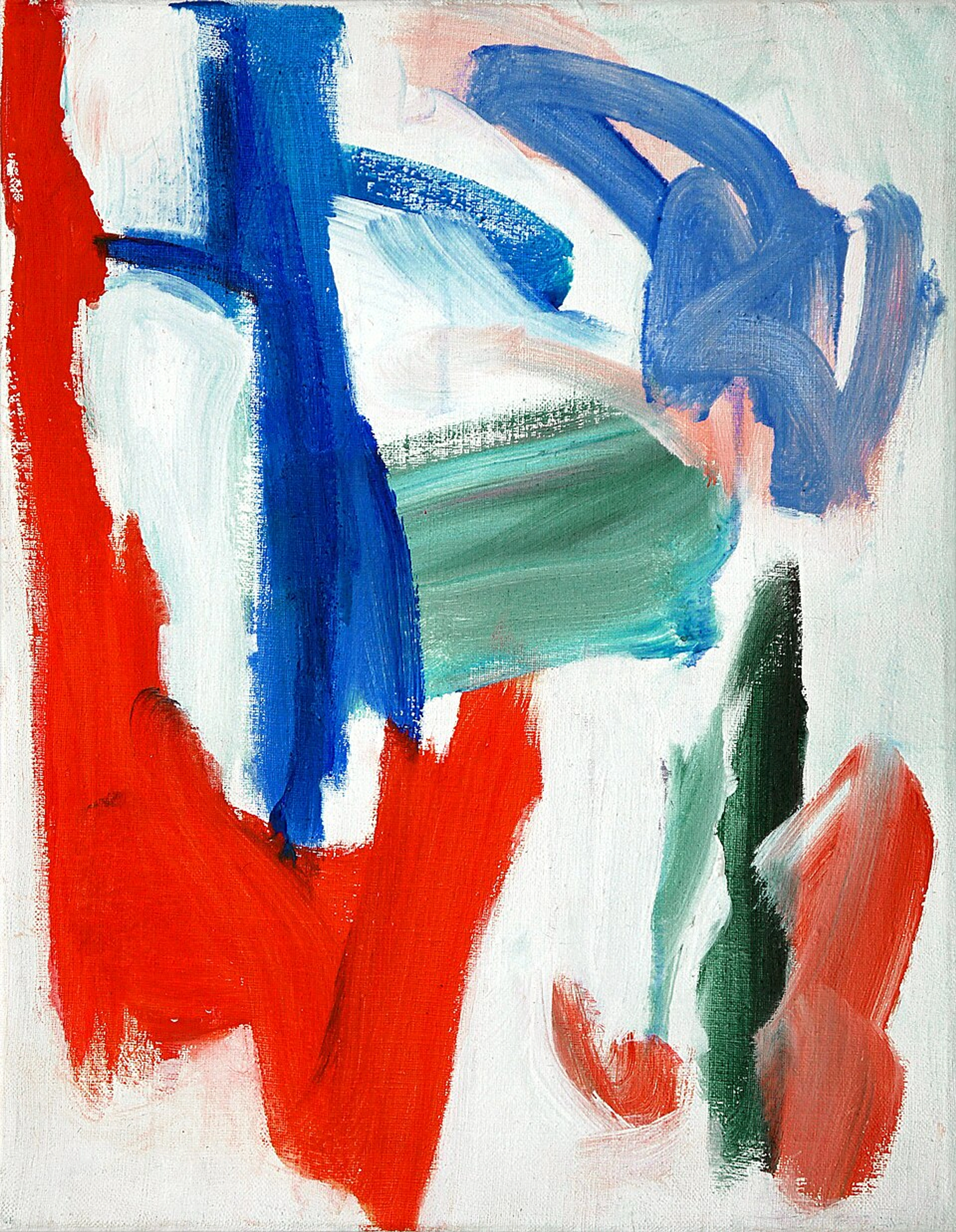
Secondary and tertiary colors are the language of nuance, the whispers of complexity and depth. Think about the difference between a bright, grassy green and a deep, muted olive green. One is a summer picnic; the other is a quiet walk in an ancient forest. Both are 'green,' but they tell completely different stories and create distinct senses of space—one flat and immediate, the other receding and mysterious. The nuanced greens of an ancient forest, the deep blues of a stormy sea, or the soft purples of a fading twilight aren't just colors; they're emotional landscapes that invite introspection and a sense of enduring history. Unlike the immediate impact of a primary, these in-between colors invite you to linger, to feel the layers of emotion they hold. They are also crucial for creating a sense of depth and perspective within an abstract composition; by varying their temperature and value, you can make elements appear closer or further away, creating an immersive, multidimensional space rather than a flat surface. This exploration of nuance is a huge part of the evolution of my artistic style and really, the entire trajectory of my artistic timeline.

https://live.staticflickr.com/65535/53064827119_1b7c27cd96_b.jpg, https://creativecommons.org/licenses/by-nc-nd/2.0/
These colors create atmosphere. They can be moody, dreamlike, earthy, or incredibly sophisticated. They are the colors of dusk, of stormy seas, of old leather and forgotten letters. They provide the emotional gravity that allows the brighter, purer colors to truly shine. Moreover, they are essential for creating sophisticated color harmonies that guide the viewer's eye gently through the composition, rather than jarring it with sharp contrasts.
Practical Magic: Techniques I Use to Weave in Nuance
So, how do I actually bring these deep, whispering colors to life on the canvas? It's a mix of intention and letting go. It's a dance.

https://www.rawpixel.com/image/5924320/photo-image-background-public-domain-art, https://creativecommons.org/publicdomain/zero/1.0/
Layering and Glazing
I rarely put down a single, flat color. My surfaces are built from many thin, often translucent, layers. A thin glaze of transparent yellow oxide over a dry patch of ultramarine blue doesn't just make a flat green; it creates a green that seems to glow from within, a green that has a history unfolding before your eyes, creating a luminous, shimmering effect through a phenomenon known as optical mixing. This is where your eye, rather than the paint on the palette, blends the translucent layers from a distance, creating a new, vibrant color sensation. Each layer is a whisper, and together they form a conversation, a gradual reveal. This is the core of my process, which I explore more in my guide on building depth in abstract acrylics.
Mud is Not the Enemy (It's a Superpower)
New painters are often terrified of making 'mud'. I get it. You mix too much and suddenly everything is a noncommittal brown. I certainly spent years trying to avoid it, often ending up with flat, uninteresting colors as a result. And believe me, I've had my share of truly disastrous mud baths on the palette – the kind that make you want to throw the brush across the studio and rethink your entire career path. There was this one time I was trying to mix the perfect dusty rose, and somehow, I ended up with a shade that precisely matched the sludge at the bottom of a rusty bucket. A truly humbling moment! But through those failures, I learned the alchemy. What people call 'mud' is actually controlled desaturation – a nuanced reduction in chroma (the intensity or purity of a color). This opens up a world of sophisticated neutrals and muted tones that are essential for creating depth and atmosphere. A key trick here, and one I wish someone had told my younger, mud-phobic self, is to start with a limited palette for your mixing. Too many pure pigments on the go can indeed lead to chaos. And consider developing a 'master palette' for your neutrals, a consistent mix you can always return to for grounding your compositions. For example, a reliable base for my neutral 'greys' is often a mix of Ultramarine Blue, Burnt Sienna, and a tiny touch of Cadmium Yellow. This combination works beautifully because Ultramarine Blue and Burnt Sienna (which leans orange) are near-complements, creating a rich neutral when mixed. The Cadmium Yellow then offers a slight, subtle warmth, preventing the grey from becoming too cold or stark. Imagine taking a vibrant blue and just a tiny, tiny speck of its complementary orange, and mixing them. You don't get 'mud' in the bad sense; you get a profound, greyed-out blue, a stormy sea blue, perhaps, or the color of ancient stone. It’s that controlled 'mud' that makes a single sliver of bright turquoise sing like an opera star. It’s the quiet that makes the loud meaningful.
The Unpredictable Joy of Wet-on-Wet
Sometimes, the best colors are happy accidents. They happen when a bit of orange still on the brush contaminates the blue I was reaching for, creating a streak of unexpected slate-grey. It's a surrender, a letting go. Working wet-on-wet allows colors to mingle and create their own tertiary shades right on the canvas, often leading to surprising, organic gradients and blends you could never pre-plan. It's a process of letting go and trusting the paint, allowing the material itself to contribute to the evolving narrative of the piece. It's a huge part of my belief in embracing spontaneity in abstract creation.

Printerval.com, https://creativecommons.org/licenses/by-nc/4.0/
So, what subtle hues are you feeling drawn to explore in your next creative venture?
Case Study: Deconstructing a Palette
Let’s imagine one of my paintings. From a distance, you might see a lot of grey and blue. But if you look closer, you'll see I don't own a tube of grey paint. That 'grey' is actually a complex mix of ultramarine blue, a dab of burnt sienna, and a tiny fleck of alizarin crimson. It’s a living grey, one that shifts from cool to warm, revealing hints of its fiery or earthy origins as your eye moves across it, almost breathing with subtle temperature changes. And that muted teal? It's not straight from the tube either. It's a careful blend of phthalo blue, a touch of yellow for green, and a whisper of its complementary red to desaturate it and give it that aged, contemplative quality. Every color choice is a feeling, a memory. It’s a story told not just in hue, but in temperature, value, and saturation. It’s really my palette, my story. What 'living greys' or muted teals might tell your story?

https://live.staticflickr.com/65535/51907566658_1100dbeb2a_b.jpg, https://creativecommons.org/licenses/by-nc-sa/2.0/
Beyond the Studio: How You Can See and Use Complex Color
Once you start seeing this way, you can't stop. You'll notice the complex violet-grey in a storm cloud, the rich ochre in a city puddle, the subtle sage green on a weathered door, the surprising spectrum of blues and purples in a pigeon's feather, the iridescent sheen on a raven's wing, or the myriad shifts of ochre and rust on an ancient, weathered stone wall. It changes how you see the world. And if you’re looking to truly connect with art that mirrors the complexities of life, that invites introspection rather than just demanding attention, this is the palette to seek. A painting that leans into these nuanced, complex shades can bring a quiet, sophisticated, and calming energy to a room that a loud blast of primary colors just can't. It invites contemplation, a deeper relationship with the artwork.
Of course, working with these complex hues isn't without its challenges. There's a fine line between sophisticated nuance and simply dulling your palette. The trick is always intentionality—knowing when to pull back and when to push a color into that rich, desaturated realm, ensuring it still sings its own quiet song without becoming muted to the point of silence. If you're interested in integrating colorful abstract art into your home decor, thinking about these palettes is a great place to start.
Many artists through history, from the Impressionists who masterfully used nuanced hues to capture the ephemeral, shifting effects of light and atmosphere, often depicting subtle changes in landscapes or urban scenes; to the Fauvists who, paradoxically, played with surprising and intense color combinations to evoke raw emotion and break from naturalistic representation, yet often through the interplay of bold and slightly muted tones; and certainly many Abstract Expressionists like Mark Rothko or Clyfford Still, masterfully leveraged these complex, in-between hues to evoke profound emotional states and atmospheric depth. They understood that the most compelling stories often aren't shouted, but rather, whispered through layers of subtle color and deep feeling.
https://www.rawpixel.com/image/3894575/illustration-image-art-vintage, https://creativecommons.org/publicdomain/zero/1.0/
If you're curious to see how I use these principles, you can always browse the pieces currently available in my online gallery. Perhaps one speaks to your own quiet complexities.
FAQ - Your Questions About the Colors in Between
Do I need to buy a million tubes of paint to use tertiary colors? Absolutely not! The opposite is true. Start with a limited palette—a warm and cool version of each primary color, plus white and a dark neutral like Payne's Grey or Burnt Umber. The beauty of tertiary colors is in the mixing. You discover them.
How do I avoid making everything brown and muddy? Fear of 'mud' is common, but it's often a sign you're on the cusp of understanding sophisticated color. To avoid accidental muddying while learning, try these tips:
- Limited Palette First: Resist the urge to use too many pure pigments at once. Begin with just a few primaries and experiment with their secondary and tertiary mixes.
- Small Amounts: Mix small quantities of paint. It's easier to adjust or discard a small mix than a large one.
- Clean Tools: Clean your brush or palette knife thoroughly between color additions. Contamination is a primary culprit for unwanted mud.
- Separate Mixing Area: Instead of mixing directly on your canvas, use a separate palette. This gives you more control over the outcome before applying it to your artwork.
- Embrace Controlled Desaturation: Understand that 'mud' in the negative sense often comes from uncontrolled mixing of too many pigments that neutralize each other. Intentional desaturation, however, is your superpower for creating complex, muted tones. Learn to add just a tiny speck of a complementary color or a neutral to reduce a color's chroma (purity) without making it dull. Remember, those complex neutrals are your best friends, especially when you understand how to control their richness and subtle shifts.
Are secondary and tertiary colors less impactful than primary colors? They are not less impactful; they are differently impactful. A primary color is an immediate, bold statement—a shout. It grabs attention. A secondary or tertiary color, however, is a compelling whisper that makes you lean in closer to hear what it has to say. It creates a subtle, sustained emotional resonance, inviting contemplation and revealing its depth over time. Think of primary colors as pop music, and secondary/tertiary colors as jazz—both impactful, but in very different, profound ways. They add a layer of sophistication and narrative complexity that pure primaries often cannot achieve alone.
How can secondary and tertiary colors help me create specific moods in my art? Secondary and tertiary colors are your emotional toolkit! To evoke a serene, calming mood, lean into cool, desaturated blues and greens – think muted teals or soft grey-greens. For a sense of warmth, energy, or groundedness, explore earthy oranges, rusty maroons, and deep yellow-greens. By controlling their temperature (warm/cool) and value (light/dark), and adjusting their chroma (saturation), you can fine-tune the emotional impact. For instance, a high-value, cool blue-violet can feel dreamy and expansive, while a low-value, warm red-orange can feel intimate and intense. It's all about intentional mixing to create that specific emotional landscape.
A Final Thought
The primary colors are the alphabet. They are essential, foundational. But the secondary and tertiary colors are the words, the sentences, the poetry. They are where communication becomes art, where emotions deepen, and where silent narratives unfold on the canvas.
So next time you pick up a brush, or just look at the world around you, I encourage you to look past the obvious, bright heroes. Fall in love with the beautiful complexity of the in-betweens. That’s where the best stories are hiding, where the deepest feelings reside. That’s where I’ll be. If you ever find yourself near my hometown of 's-Hertogenbosch in the Netherlands, I hope you'll consider visiting my museum, where you can see these colors in person.

https://commons.wikimedia.org/wiki/File:%27Abstract_sky%27,1993-_small_acrylic_painting_by_Dutch_artist_Fons_Heijnsbroek;_free_download_abstract_art_image,_CCO.jpg, http://creativecommons.org/publicdomain/zero/1.0/deed.en


