Layering Acrylics for Depth: Abstract Art Secrets & Personal Insights
Unlock breathtaking depth in abstract acrylics! Discover the artist's secrets to masterful layering, from luminous glazes to bold impasto. This guide reveals essential techniques, tools, and personal insights for vibrant, textured, and emotionally resonant abstract art. Navigate challenges, embrace spontaneity, and find profound meaning in your creative journey.
The Profound Language of Layers: Creating Unforgettable Depth in Abstract Acrylics
Ever stared at your abstract painting, feeling that familiar pang that something crucial is missing? Perhaps it feels… flat. Like a really well-intentioned pancake that didn't quite rise. For ages, I wrestled with this elusive "oomph" – that invitation for the eye to wander deeper, to discover secrets hidden beneath the surface. My colors were bold, my strokes energetic, but the canvas still felt two-dimensional, despite my best efforts. It was a frustrating dance with an invisible barrier.
Then, I stumbled upon the magic of layers. And I don't mean just painting over something you don't like (though that happens too, often with surprisingly delightful results, or at least a good laugh at yourself). I mean intentionally building up a history on the canvas, a conversation between what's visible and what's peeking through from beneath. It’s like life, isn't it? We’re all a product of our past layers, some shining brightly, some subtly hidden, all contributing to who we are today.
More Than Just Paint: Why Layers Speak Volumes
When you build layers in abstract acrylics, you’re not just applying paint; you’re weaving a narrative. Each stratum adds to the story, conjuring a sense of time and movement that a single, flat application just can't replicate. While we're focusing on abstract acrylics, the principle of layering has been a cornerstone of art for centuries, from the luminous glazes of Old Masters like Titian or Rembrandt to the expressive impasto of the Impressionists, finding new life and purpose in abstract forms. It transforms a two-dimensional surface into a window to another dimension, inviting viewers to explore beyond the immediate. It’s how you give your art a heartbeat, a soul that resonates. If you've ever felt lost trying to understand abstract works, know that decoding abstract art is often about understanding these visual cues. Layers create an optical depth, allowing colors to mix not on the palette, but optically within the viewer's eye as light passes through the layers, resulting in a luminous quality that feels alive.
The Whispers of Transparency and the Shout of Opacity
This is where the real fun begins, playing with how light interacts with your paint. Imagine trying to tell a complex story using only one voice. A bit dull, right? Layers allow for a symphony of voices, each contributing to the visual and emotional landscape:
- Translucent Washes/Glazes: These are like quiet whispers, allowing the colors and textures beneath to show through, creating subtle shifts and incredible luminosity. A glaze, specifically, is a thin, transparent layer applied over a dry underpainting to modify its color or tone, creating a vibrant, jewel-like effect through optical mixing. They are perfect for establishing atmospheric backgrounds, unifying disparate elements, or creating a deep, jewel-like glow. I often start with these, allowing chaos to reign a little, knowing it will be tamed later. It's truly a dance with how artists use color.

https://www.flickr.com/photos/42803050@N00/31171785864, https://creativecommons.org/licenses/by-nd/2.0/
- Semi-Opaque Layers: These are your conversational tones, partially obscuring what's below but hinting at its presence. They build form and depth without completely erasing the past, adding a sense of veiled mystery or soft transitions.
- Opaque & Impasto Layers: These are the bold shouts, the declarative statements. Thick, textural applications of paint that sit on top, demanding attention. They add incredible physical depth and can really make elements pop, establishing strong focal points or adding bold, graphic elements.
Sometimes, I'll put down a bold, opaque stroke, then immediately regret it (we all do it!), only to find that a translucent glaze over it transforms that 'mistake' into a delicious, unexpected shadow or a complex new tone. These happy accidents are often the best kind, aren't they? They teach you to lean into the unexpected, trusting the process will lead you somewhere interesting.
My Layering Playbook: Techniques for the Curious Artist
Ready to get your hands (and brushes) dirty? Wondering where to even begin? This isn't a rigid formula – art is never that, thankfully – but more like a collection of thoughts and techniques I've found helpful. Think of it as a starting point for your own adventures in creating deep, compelling abstract art. Remember, every stroke is an experiment, and every 'mistake' is a potential breakthrough. My studio is a constant testament to this philosophy!
Essential Tools & Mediums for Acrylic Layering
Ever wonder how artists achieve those incredible textures and luminous depths? Beyond just your paints, there's a whole world of acrylic mediums that can utterly transform your layering capabilities. It’s like having a secret arsenal for manipulating light, texture, and time. My studio shelves are practically groaning under the weight of them!
1. Modifying Paint Consistency & Finish:
- Gloss & Matte Mediums: These change the finish of your paint (from shiny to dull) and can increase transparency without thinning the paint's body too much.Pro Tip: Use gloss medium for deep, jewel-like glazes that make colors sing; matte for a more subdued, integrated look.
- Flow Improvers/Thinners: A few drops can make your acrylics behave more like watercolors, perfect for thin, staining washes that sink into previous layers.Crucial Distinction: Flow improvers maintain the paint's binder integrity, allowing for thin washes without compromising the paint film. Excessive water, however, can dilute the acrylic polymer binder too much, leading to brittle, poorly adhered layers that may crack or peel over time. So, less is often more when it comes to water!
- Retarders: These slow down the drying time of acrylics, giving you more 'open time' to blend, manipulate, or create softer transitions between layers – a godsend for avoiding harsh lines or muddying.Artist's Insight: A few drops can give you precious extra minutes to blend soft gradients or work wet-into-wet, especially useful for skies or subtle color shifts.
2. Adding Body & Texture:
- Gel Mediums (Soft, Regular, Heavy): These add body and transparency, allowing you to build thick, sculptural layers that retain brushstrokes or create smooth, transparent glazes. They're fantastic for impasto work or for adhering collage elements.Pro Tip: Heavy gel medium allows you to create dramatic peaks and valleys that literally add dimension. I once tried to build a mountain range directly on a flat canvas – total disaster! Then I discovered heavy gel medium, and suddenly, my peaks actually had a physical presence.
- Texture Pastes/Gels: From fine pumice to glass beads, these mediums create incredible physical texture, adding another dimension to your layered surfaces. They catch light dramatically and can be painted over or mixed with paint.Idea Sparker: Experiment by mixing in household items like sand, coffee grounds, fabric scraps, or even sawdust for unique, organic textures.
3. The Canvas's Voice: Choosing Your Substrate:
Before any paint touches the surface, the choice of your painting support – be it stretched canvas, wood panel, or thick paper – quietly dictates how your layers will behave. A smooth wood panel offers a resistance that makes fine details and scraping techniques sing, while the subtle weave of a canvas can add an inherent texture that plays beautifully with transparent washes. For very thick impasto, a rigid support like a wood panel can prevent cracking and warping over time. It’s a silent partner in your creative dance.
And it’s not just about what you mix with the paint. Think about what you use to apply it! Beyond brushes and palette knives, I often grab:
- Rollers: For smooth, even washes or to impress texture, creating subtle, consistent backgrounds.
- Spray bottles: For creating drips and softening edges, adding an element of unpredictable flow.
- Rags: For wiping back layers to reveal what's underneath, unearthing hidden histories.
- Stencils and Brayers: For adding repetitive patterns or applying thin, even coats, building structured complexity.

https://freerangestock.com/photos/177284/artists-workspace-filled-with-paint-brushes-and-supplies.html, https://creativecommons.org/public-domain/cc0/
Safety Note: Always ensure good ventilation in your studio when working with acrylic mediums, especially sprays or those with strong odors. Clean your brushes and tools regularly to maintain their longevity and prevent paint build-up.
With our expanded arsenal of tools and a keen eye for our surface, let's step into the thrilling uncertainty of the first mark on the canvas.
Starting the Conversation: The Foundation Layer
My first layer is rarely precious. It's often a chaotic burst of color and texture, laid down with an almost primal energy. Sometimes it's a monochrome wash, sometimes a riot of complementary hues. The goal isn't perfection, but to break the intimidating white of the canvas and create a 'ghost' of what's to come. This also means starting with a clean, dry surface, sometimes even primed with gesso, to ensure proper adhesion. When I say "allow chaos to reign a little," I mean letting go of immediate control. Try experimenting with large, sweeping brushstrokes or a roller to cover the canvas quickly, focusing on complementary colors to create initial visual tension or a monochromatic wash to establish mood. This initial intuition often guides the entire piece, truly embracing spontaneity in abstract creation.
https://live.staticflickr.com/65535/52756888197_ece375ce5f_b.jpg, https://creativecommons.org/licenses/by-nc-nd/2.0/
Building the Narrative: Mid-Layers and Their Purpose
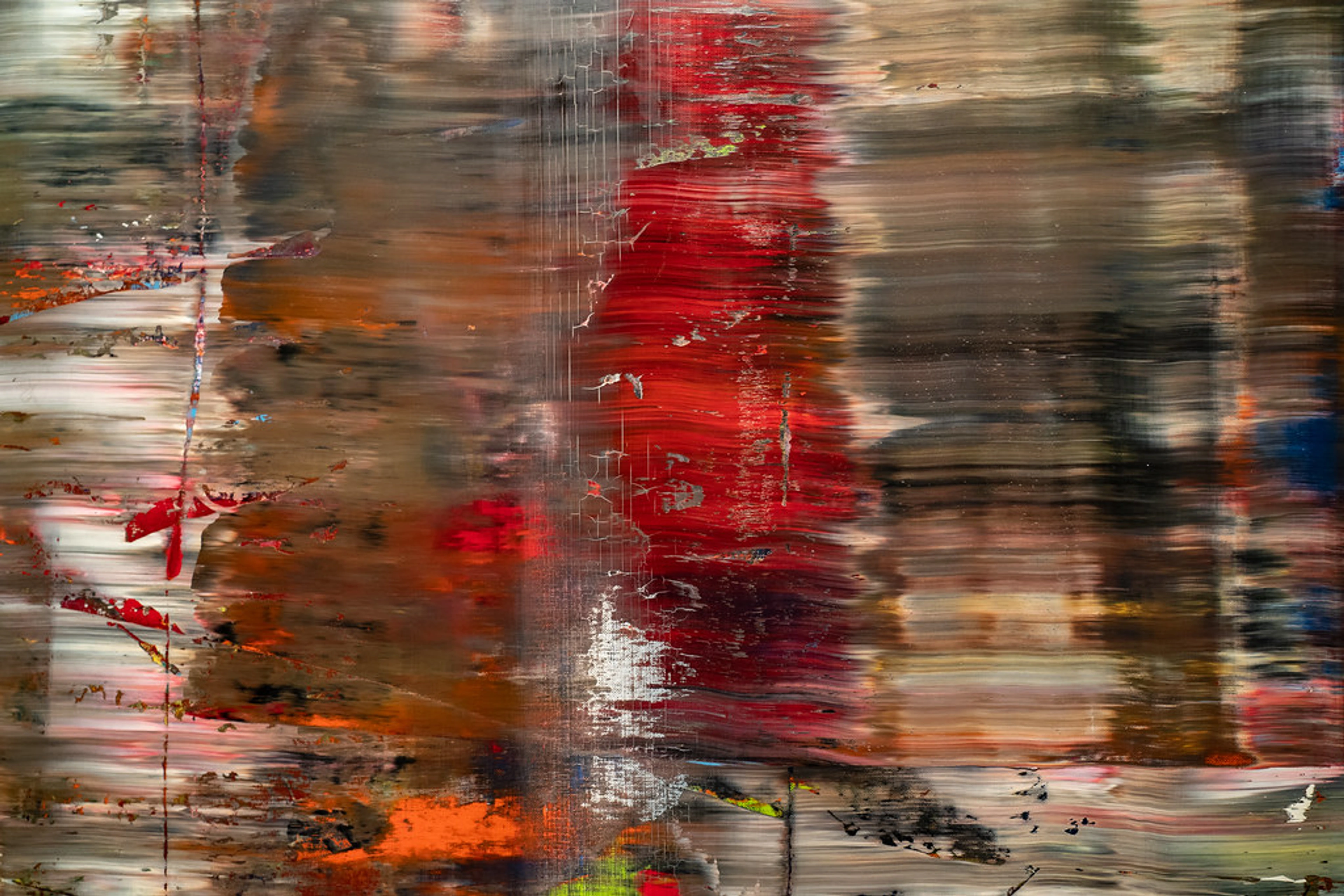
This is where the real work of depth begins, a delicate dance of addition and concealment. I'll use a mix of transparencies, building up areas, making others recede or appear less prominent. I'm constantly thinking about how colors interact, how a warm tone next to a cool one can create a visual vibration, or how a darker, thin wash can make a lighter form appear further away. Sometimes I'll use a dry brush to apply a thin, broken layer of paint, a technique known as scumbling, allowing the underpainting to peek through, creating a soft, misty effect. Managing drying times here is crucial; I’ve learned the hard way that impatience leads to muddy colors and frustration. I once ruined an entire gradient because I rushed it – lesson learned! Practical Tip: Work on multiple pieces simultaneously, or use a fan from a safe distance (not too close!) to gently accelerate drying, ensuring each layer is truly dry before proceeding. Maintaining consistent studio humidity can also help. Letting layers dry thoroughly, especially opaque ones, is key to vibrant, clean results.
Artist's Insight: Color Theory in Action Layering isn't just about paint, it's about light. Understanding basic color theory is paramount for optical mixing. Placing a translucent warm color over a cool one can create a vibrant 'flicker' as the eye blends them. Using analogous colors (next to each other on the color wheel) in thin layers can create harmonious, subtle shifts, while contrasting complementary colors (opposite on the wheel) can create intense vibrations and push/pull effects, adding incredible perceived depth. Don't be afraid to experiment with value – a light, opaque layer over a dark, transparent one will always recede, pushing the lighter elements forward. It's like choreographing a visual ballet.
It’s also the stage where the role of texture in abstract art truly comes into play. I might use palette knives, sponges, or even household items to create varied surfaces. These textures catch the light differently, adding another dimension to the layering, like the satisfying drag of a palette knife across a semi-dry surface, leaving behind a subtle ridge that catches the light and adds a whisper of history.
https://live.staticflickr.com/2875/8866942510_439379d853_b.jpg, https://creativecommons.org/licenses/by/2.0/
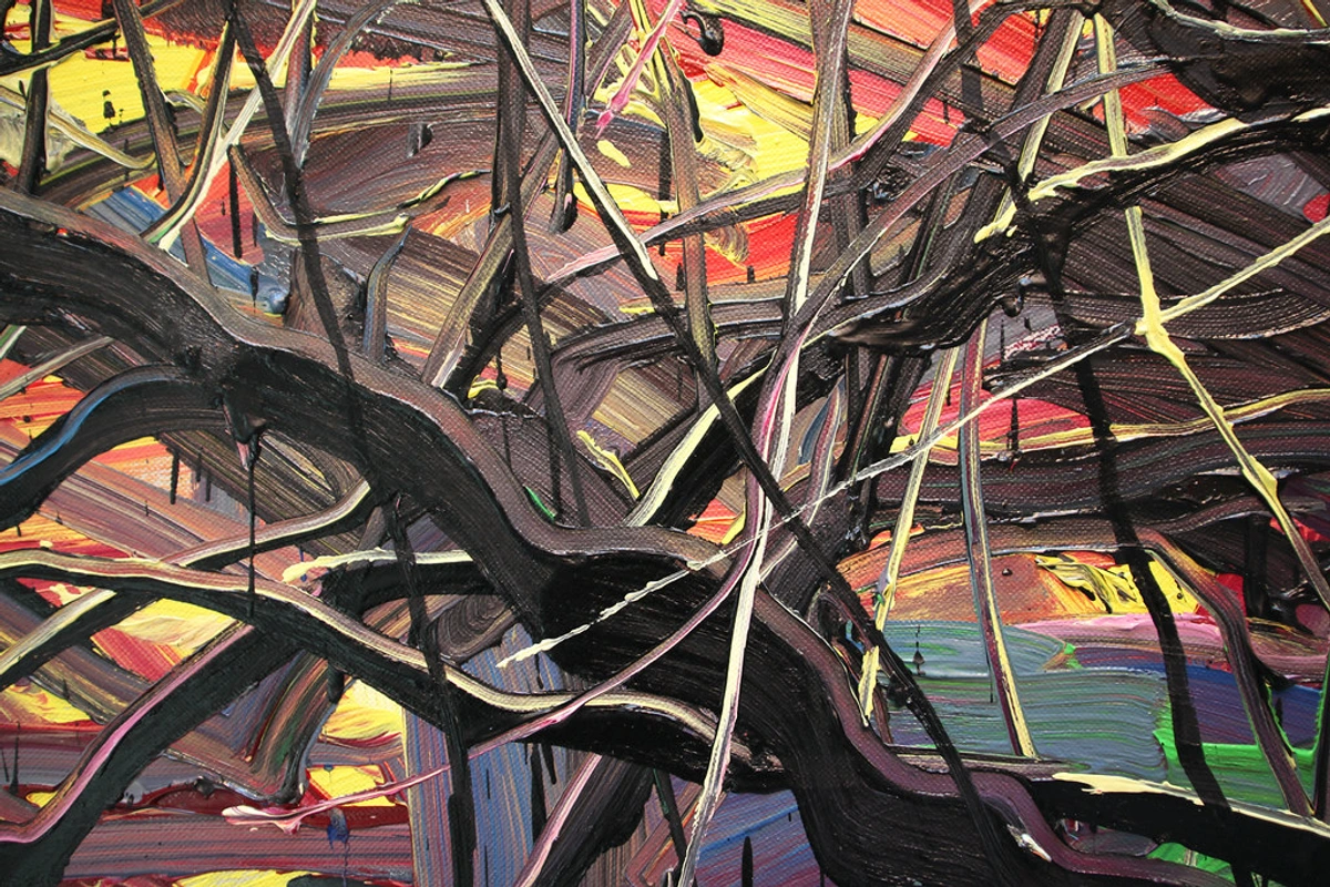
The Grand Reveal: Finishing Touches and Subtraction
Sometimes, adding isn't enough. The final stages often involve subtraction, a powerful act of revealing. I might scrape back a layer to reveal the vibrant color or intriguing texture beneath, creating sharp lines and unexpected juxtapositions – a technique also known as sgraffito. Or I'll sand a dried layer to expose hidden textures and create a soft, ethereal quality. Another powerful technique is lifting, where you use water, a damp rag, or a sponge to remove wet or semi-dry paint, creating soft edges or revealing underlying layers. This technique, often seen in abstract expressionism, allows for a dynamic tension, a pushing and pulling of forms, creating visual intrigue by hinting at what lies beneath. It's about letting the past layers breathe and interact with the present.
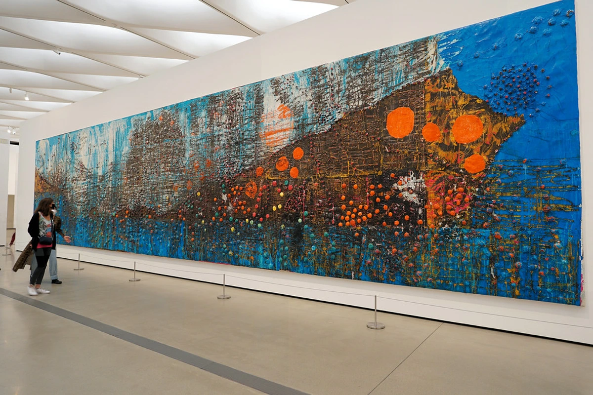
Think of it as the ultimate editing process, where less can truly be more, even after building up so much. It's about letting the painting breathe and speak for itself, often through the very marks you've made and then partially undone. If you look closely at many Abstract Expressionist works, you'll see this interplay of build-up and reduction, like the intense, layered surfaces of a Gerhard Richter or the energetic marks of a Jean-Michel Basquiat.

https://live.staticflickr.com/65535/53064827119_1b7c27cd96_b.jpg, https://creativecommons.org/licenses/by-nc-nd/2.0/
Finishing Your Masterpiece: The Final Embrace
Once your layered masterpiece is complete, don't forget to protect all that hard work! Varnishing is a critical final step for acrylics, offering UV protection, a consistent finish, and a barrier against dirt and grime. It's like giving your painting a final, loving embrace after all that emotional outpouring, ensuring its longevity for years to come. Beyond mere protection, varnish comes in different finishes—gloss, satin, and matte—each subtly altering how light plays across your layers. A gloss varnish will deepen colors and enhance luminosity, making your glazes sing even louder, while a matte finish can unify a piece and give it a softer, more integrated feel. Satin sits somewhere beautifully in between, offering a balanced glow. It's the final whisper, the last decision that shapes how your story is seen.
And as you admire your finished piece, remember how light plays its part. The direction and intensity of your studio light or the light in which the painting will eventually hang, can dramatically alter how layers are perceived. Textural elements will cast different shadows, and glazes will reveal their luminosity more or less depending on the illumination. It's a conversation not just between paint and surface, but also with the ambient light around it.
Navigating the Labyrinth: Common Pitfalls & Solutions
Even with all the tools and techniques at our disposal, the layering journey isn't always smooth. I've certainly had my share of "what was I thinking?" moments. Here are some common traps artists fall into, and how I've learned to navigate them:
- The Overworked Canvas: Sometimes, in the pursuit of depth, we keep adding, blending, and refining until the painting loses its freshness and spontaneity. It becomes muddy, lifeless, or simply too busy. My solution? Step away! Seriously, walk away for a few hours, a day, or even longer. Your canvas isn't going anywhere (unless your cat decides to use it as a scratching post, which, let's be honest, has happened). When you return, you'll see it with fresh eyes. Sometimes, less is truly more, and a confident, simpler layer can be more impactful than a hundred hesitant ones.
- Losing Spontaneity: The structured nature of layering can sometimes stifle the initial intuitive flow. My first layers are often the most energetic, and it's easy to lose that raw power as I add more precise details. To combat this, I try to re-introduce elements of chaos or quick, expressive marks in later stages. A vigorous scrape, a deliberate drip, or a bold, impulsive stroke can re-inject life. Remember, the art of intuitive painting is about embracing spontaneity at every stage.
- Muddying Colors & Losing Vibrancy: This is perhaps the most common frustration. It often happens when applying wet paint over a still-damp or uncured layer, especially with transparent glazes. The colors beneath get disturbed, mixing unintentionally and creating dull, muddy tones, causing a loss of vibrancy. The simple (but sometimes hard to follow!) rule is: let each layer dry thoroughly. Patience is your secret weapon. Also, maintaining a clean palette and using fresh water helps prevent cross-contamination.
The Emotional Resonance of Depth
For me, the layers aren’t just about visual depth; they're about emotional depth. Each layer captures a moment, a decision, a feeling. When you look at a richly layered piece, you’re not just seeing the surface; you’re sensing the journey. You're feeling the history. This physical act of building and subtracting layers mirrors the emotional journey of life itself. It's similar to how abstract art can be a mirror to your inner world, reflecting your own experiences and interpretations.
I remember one painting where I just couldn't get the foreground right. I layered, scraped, layered again, feeling utterly frustrated. For days, it sat, a testament to my creative block. Then, almost impulsively, I picked up a brayer and rolled a thin, almost transparent layer of deep blue over the entire troubled area. To my surprise, it didn't hide the 'mistakes'; instead, it unified them, turning the chaotic under-layers into a mysterious, receding background. That moment taught me that sometimes, the solution isn't adding more, but finding a way for everything to coexist, a beautiful lesson that resonates far beyond the canvas. Perhaps this is also why the emotional language of color in abstract art speaks so deeply to me.
Perhaps it's a subconscious reflection of my own personal philosophy and artistic vision, where every experience, good or bad, builds upon the last, creating the complex individual I am today. And honestly, isn't that just a wonderful thought? So grab your paints, put on some music, and start that conversation with your canvas. You never know what beautiful, layered stories it will tell, or what profound truths about yourself you might uncover along the way. Embrace the unknown; it's where the real magic happens. If you're curious to see how these principles manifest in my own work, you can explore my timeline for a journey through my artistic evolution. Or, if you're ever in 's-Hertogenbosch, you might find some of these layered stories on display at my den-bosch-museum. And for those looking to bring some of that layered depth into your own space, take a peek at the art for sale – you might find a piece that speaks to your own layered existence.
Frequently Asked Questions about Layering in Abstract Acrylics
Still pondering the mysteries of the universe, or just how many layers are too many? Fair enough! It can feel like a lot to take in. Here are some common ones I hear (and used to ask myself!):
Question | Answer |
|---|---|
| How many layers are too many? | There's no magic number. It's about achieving the desired visual and emotional depth. If your painting starts looking muddy or overworked, or if thick layers begin to crack, you might have gone too far. Sometimes less is more, other times, more is... well, more! Focusing on the intent behind each layer, rather than quantity, is key. |
| Do I need special acrylics? | Not really! Most artist-grade acrylics work great. What you will want are various mediums (gloss, matte, gel, pouring mediums, texture pastes, flow improvers, retarders) to alter transparency, texture, and drying time, allowing for more diverse layering effects. |
| How do I prevent muddy colors? | The key is to let layers dry thoroughly, especially opaque ones. Also, avoid mixing too many colors directly on the canvas, particularly when using transparent layers. Think about color theory and how colors mix when applied thinly. Don't be afraid to scrape off what's not working! And consider using a limited palette with transparent layers to maintain vibrancy. |
| Can I use different mediums? | Absolutely! Acrylics are incredibly versatile, allowing for exploring texture in abstract art with ease. You can layer paint with collage elements, pastels, charcoal, or even household items for texture. Just ensure anything you add is archival – meaning it's stable and won't degrade, yellow, or cause damage to your artwork over time. Experimentation is your best friend here! |
| How do I prevent cracking in thick layers? | When applying very thick layers or impasto, mix your acrylic paint with a heavy gel medium or modeling paste to ensure flexibility as it dries. Avoid applying subsequent layers too quickly over a still-drying, very thick layer. Controlled drying in a consistent environment also helps. |
| My paint is peeling off! What's wrong? | Paint peeling usually indicates poor adhesion. Ensure your surface is clean, dry, and properly primed. Applying very thin, watery washes without enough binder can also cause this. If you're painting over glossy surfaces, a light sanding can provide 'tooth' for better adhesion. |
| How do I know when a layer is dry enough? | Generally, acrylic layers are dry to the touch within minutes to a few hours, depending on thickness and humidity. However, for opaque layers or when applying subsequent transparent glazes, it's best to wait until the layer is fully cured (usually 24 hours) to prevent muddying or lifting. A good rule of thumb: if it still feels cool, it's probably not fully dry. |


