
How to Layer Colors in Acrylic Painting: An Artist's Ultimate Guide
Unlock the secrets to vibrant, dynamic acrylic paintings by mastering color layering. Learn techniques like glazing, impasto, masking, and underpainting, understand mediums, avoid pitfalls, and find your unique voice.
How to Layer Colors in Acrylic Painting: An Artist's Ultimate Guide
Oh, acrylics. My sometimes-friend, sometimes-frenemy. They dry fast, which is both a blessing and, let's be honest, a curse when you're trying to blend. I remember one early painting where I was trying to blend a sunset directly on the canvas, and before I could even get the brushstroke right, the paint was already tacky, creating these frustrating, hard edges. Ugh. But that speed? It's pure magic when it comes to layering colors. Layering isn't just putting one color on top of another; it's building depth, creating luminosity, and finding those unexpected color relationships that make a painting sing. It's like building a story, layer by layer, revealing more as you go. I remember one early painting where I layered a thin, almost watery blue over a warm yellow base, and the resulting green had this incredible, vibrating quality I couldn't have mixed directly. It felt like discovering a hidden gem, a secret conversation between the colors.
I remember when I first started, my acrylics felt flat. Lifeless, even. I'd mix a color, slap it on, and... well, that was it. The painting felt thin, like a single sheet of paper instead of a rich tapestry. Learning to layer changed everything for me. It unlocked a whole new dimension in my work, allowing me to create the kind of vibrant, complex pieces I saw in my head (and sometimes, if I'm lucky, on the canvas!).
So, let's dive into the wonderful, sometimes messy, world of layering acrylic colors. It's less about a single 'right' way and more about a personal journey of discovery, finding your way to build up color and texture. Grab your paints, and let's explore.

Why Layering Matters (Beyond Just Adding More Paint)
Think about nature. A forest isn't just one shade of green. It's a million greens, browns, and blues, layered over time. Light filters through leaves, shadows pool, textures overlap. That's what layering does for your painting. It adds:
- Depth and Dimension: Layers create a sense of space and form. A single flat color is just that – flat. Layers build volume and make things feel real (or wonderfully unreal, if that's your goal). I remember working on a portrait once, and it wasn't until I started layering subtle shifts in shadow and light on the cheekbone that the face really started to feel three-dimensional, like it could step off the canvas.
- Color Vibrancy and Luminosity: This is where the magic happens, especially with glazes. Thin, transparent layers of color stacked on top of each other can create incredibly rich, glowing effects that you just can't get by mixing colors on your palette. The luminosity comes from light passing through the transparent layers and reflecting off the underlying colors or the white of the canvas, creating an optical mix that feels alive. It's like stained glass, letting light pass through and interact.
- Texture and Visual Interest: Layering isn't always smooth. Impasto, dry brushing, scumbling – these techniques build up physical texture, adding another sensory dimension to your work. Texture isn't just something to look at; it adds visual richness, conveys energy, suggests surface qualities (like rough bark or smooth skin), and makes the viewer want to reach out and touch (though please, tell them not to!).
- Complexity and Nuance: Life isn't simple, and neither should your colors be. Layers allow for subtle shifts, hidden undertones, and complex color interactions that keep the viewer engaged. It's like a conversation with the painting; the more layers, the more there is to discover.
- Control and Refinement: Unlike trying to get the perfect color mix in one go on the palette, layering allows you to build up color and value gradually. You can adjust as you go, refining shapes, deepening shadows, or adding highlights with precision over multiple steps. This gradual process also offers incredible forgiveness; painted something you hate? Layer over it! Acrylics are forgiving in that way. It's like giving your painting a second chance, or a third, or a tenth... don't judge my process.
- Atmospheric Perspective: Layering thinner, cooler, or less saturated colors in the background layers can create the illusion of distance and atmosphere, just like how the air makes distant mountains appear bluer and less distinct.
Layering is the secret sauce to moving beyond flat color and building paintings that breathe and have a life of their own. But to really harness that power, you need to understand the paint itself.
A Brief History of Layering in Painting
Layering isn't unique to acrylics; artists have been building up color and texture for centuries across different mediums. In oil painting, artists perfected techniques like glazing during the Renaissance, applying multiple thin, transparent layers of oil paint over an opaque underpainting to achieve incredible depth, luminosity, and subtle color transitions. Think of the glowing skin tones in a Titian portrait or the rich shadows in a Rembrandt. Tempera painting, often used before oils, also involved building up color through layers, though the fast-drying nature required a different approach, often using cross-hatching or fine strokes.
Impressionists, while often celebrated for their alla prima (wet-on-wet) techniques, also used layering to build up the vibrant, broken color that captured the fleeting effects of light. Post-Impressionists like Van Gogh used thick, layered brushstrokes (impasto) to convey emotion and texture, while Pointillists like Seurat built images from layers of tiny dots of pure color, relying on optical mixing in the viewer's eye.
Acrylics, arriving in the mid-20th century, offered a new paradigm. Their fast drying time made traditional oil-style blending challenging but opened up possibilities for rapid layering, opaque block-ins followed by quick glazes, and building texture quickly. Abstract Expressionists, for instance, embraced the fluidity and layering potential of acrylics to create dynamic, multi-layered surfaces. Understanding this history helps appreciate how acrylics fit into a long tradition of artists building complexity through layers, while also offering their own unique advantages.
The Basics: Understanding Acrylics for Layering
Before you start slapping paint around, it helps to know what you're working with. Acrylics are essentially pigment suspended in a polymer emulsion. When the water evaporates, the polymer binds the pigment, creating a durable, plastic-like film. This is why they dry fast and are permanent when dry. Understanding these properties is key to successful layering. It's like getting to know your tools and materials intimately before you ask them to perform.
Artist Grade vs. Student Grade Acrylics
Not all acrylics are created equal, and this significantly impacts layering. Artist-grade acrylics have a higher pigment concentration and use higher quality binders. This means colors are more vibrant, have better lightfastness, and crucially for layering, their transparency and opacity are more predictable and consistent. Student-grade acrylics contain more filler and less pigment, resulting in weaker colors and often less reliable transparency/opacity. While fine for practice, using student-grade paints for complex layering, especially glazing, can be frustrating as they may appear muddy or lack the desired luminosity. Investing in artist-grade paints, particularly for key transparent colors used in glazing, can make a world of difference.
Drying Time: The Acrylic Race Against the Clock
This is the big one. Acrylics dry quickly, which means you can apply new layers relatively fast – a huge benefit for building up paintings efficiently. But it also means you have to work quickly if you want to blend or manipulate wet paint. Drying time isn't just about the paint type; it can vary slightly depending on the specific pigment used, the thickness of the application, the surface absorbency, and environmental factors like humidity and temperature. More humid or cooler conditions slow drying, while dry, warm, or breezy conditions speed it up. Working on a less absorbent surface can also keep the paint wetter longer. Retarders or open acrylics can slow this down, but generally, embrace the speed for layering.
- Tip: Keep a spray bottle filled with water nearby to lightly mist your palette and the painting surface (if appropriate for your technique) to extend the working time of your wet paint. Or use a stay-wet palette! This is a game-changer for managing acrylics.
Transparency vs. Opacity: Knowing Your Paint's Personality
Paints have different levels of transparency. Opaque colors (like Cadmium Red or Titanium White) cover what's underneath. Transparent colors (like Quinacridone Magenta or Phthalo Blue) allow the underlying layers to show through. Knowing the difference is crucial for effective layering, especially glazing, where you need the underlying color to influence the top layer and create luminosity. Semi-opaque colors fall somewhere in between.
- Tip: If your paint tube doesn't clearly state the transparency, you can do a simple test. Draw a thick black line on a piece of paper. Once dry, paint a swatch of the color you want to test over half of the line. If the line is completely covered, the paint is opaque. If you can still see the line clearly through the paint, it's transparent. If it's partially obscured, it's semi-opaque.
Surface Preparation: The Unsung Hero
Working on a properly prepared surface (like a gessoed canvas or panel) is key. Gesso provides a stable, slightly absorbent surface that allows acrylics to adhere well and prevents the paint from sinking unevenly into the support. More importantly for layering, it seals the surface, preventing the bright white of the canvas from showing through thin layers and ensuring that subsequent colors sit on top predictably, allowing their true hue and value to come through. Different surfaces (canvas, wood, paper) will also affect how the paint behaves and dries. The tooth of the surface – its slight roughness or texture – also impacts how paint layers adhere and how techniques like dry brushing work. A surface with more tooth will grab the paint more readily. You can even get different types of gesso, like clear gesso (which leaves the surface color visible but seals it) or black gesso (which provides a dark, dramatic base for layering light colors).
Lightfastness: Building for the Future
When you're building beautiful layers, you want them to last! Lightfastness refers to how resistant a pigment is to fading when exposed to light over time. High-quality acrylics will have lightfastness ratings on the tube (often ASTM ratings like I, II, or III). For work you want to keep or sell, aim for pigments rated I or II. Building layers with fugitive (non-lightfast) colors means your masterpiece could fade or change dramatically over the years. Trust me, you don't want your vibrant glazes to disappear like a bad memory. I once saw an old painting where the beautiful pinks and purples had completely faded, leaving only the duller, more lightfast pigments behind. It was a stark reminder of why this matters.
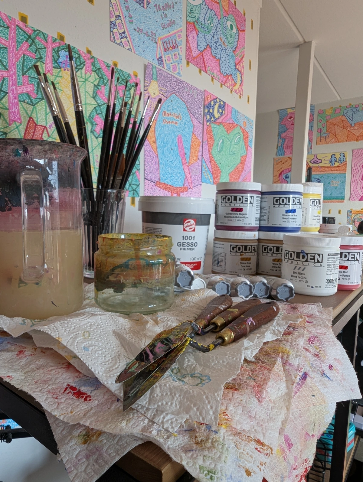
Mediums: Your Layering Toolkit
Acrylic mediums are your best friends for layering. They are essentially acrylic polymer emulsion with additives that change the paint's properties. They can change the paint's consistency, drying time, finish (matte, gloss), and transparency. Here are a few key ones. Remember, when mixing mediums, start with a small amount of medium and gradually add paint, or vice versa, depending on whether you want to alter the medium or tint the paint.
Medium | Primary Effect on Paint | Main Use Case for Layering |
|---|---|---|
| Gloss Medium | Increases transparency, creates glossy finish | Luminous glazes, increasing depth |
| Matte Medium | Increases transparency, creates matte finish | Glazes where shine is undesirable |
| Gel Mediums | Thicken paint, add body/texture | Impasto, creating dimensional layers |
| Heavy Gel Medium | Very thickens paint, holds sharp peaks | Sculptural impasto, strong texture |
| Pumice Gel Medium | Adds gritty, sandy texture | Building textured underlayers/surfaces |
| Glazing Liquid | Increases transparency, extends drying time | Smooth, even transparent layers |
| Flow Improver | Reduces surface tension, increases flow | Thin washes, staining effects, smooth blending |
| Retarder | Slows drying time | Wet-on-wet blending, longer working time |
Different Acrylic Types: Consistency is Key
Not all acrylics are created equal! Heavy body acrylics have a thick, buttery consistency, great for impasto and visible brushstrokes. Fluid acrylics are thinner, like heavy cream, perfect for smooth layers, washes, and detailed work. Acrylic inks are highly pigmented and very liquid, ideal for staining, thin washes, and vibrant, thin layers. Acrylic Gouache dries to a matte, opaque finish, offering a different option for flat, layered color areas or opaque details over transparent layers. Understanding these variations helps you choose the right tool for the layering job and how each type lends itself to different techniques – heavy body for building thick texture, fluid for smooth glazes, inks for staining effects.
Understanding these basics helps you predict how your layers will behave. It's like knowing the personality of your paint before you ask it to do something tricky.

Essential Layering Techniques to Play With
Knowing your paints is step one; applying them is where the real fun begins. Here are some fundamental layering techniques you can experiment with, each offering a different visual effect:
Technique | Typical Effect & Purpose | Common Tools/Approach |
|---|---|---|
| Underpainting | Establishes tone, value, or color base; kills canvas white | Thin washes, single color block-in, grisaille |
| Glazing | Creates luminosity, depth, and optical color mixes | Transparent paint + medium; soft brush |
| Wet-on-Wet | Achieves soft transitions and layered gradients | Wet paint applied onto wet/damp paint; blending medium, spray bottle |
| Dry Brushing | Adds texture, broken color, and highlights | Stiff brush with minimal paint; dragged lightly |
| Impasto | Builds physical texture, boldness, and dimension | Thick paint, palette knife, stiff brush, gel mediums |
| Scumbling | Creates soft texture, atmospheric effects, veiled color | Soft brush with thin, broken layer of opaque/semi-opaque; dry brush motion |
| Washes | Stains surface, blocks in initial color, creates soft base | Very thin, watery paint; soft brush |
| Masking | Creates crisp edges and defined shapes | Painter's tape, liquid masking fluid, stencils |
| Sgraffito | Reveals underlying layers, adds line and texture | Scratching tool (knife, brush end, clay tool, skewer) into wet paint |
| Building Form/Volume | Creates illusion of 3D shape | Layering shadows (darker, opaque) and highlights (lighter, transparent/dry brush) gradually |
| Optical Color Mixing | Achieves vibrant, luminous color interactions in the eye | Thin, transparent layers (glazing, washes) |
| Sanding | Creates smooth surface, reveals underlayers | Fine-grit sandpaper, sanding block |
Underpainting (Establishing the Foundation)
Before you even get to your main colors, an underpainting can be a game-changer. This is an initial layer (or layers) applied to the canvas to establish the overall tone, value structure, or even a complementary color base. It helps kill the white of the canvas, which is important because the bright white can show through thin layers and affect the perceived color of subsequent applications. An underpainting unifies the painting's mood early on and provides a base for subsequent layers. You might use thin washes, a single color block-in, or even a grisaille (monochromatic) layer to map out light and shadow. It's like sketching with paint, setting the stage for the drama to come. I often use a warm, earthy red or a cool blue underpainting depending on the mood I'm aiming for; it subtly influences every layer that follows. A warm underpainting can make subsequent cool colors pop, while a cool underpainting can make warm colors feel more vibrant.
Glazing (Luminosity & Depth)
This is probably my favorite. Glazing involves applying thin, transparent layers of color over a dry underlayer. You mix a small amount of paint with a lot of transparent medium (like gloss medium or glazing liquid). Because the layer is transparent, the color underneath shows through, and the new color acts like a filter, subtly changing the hue and adding depth. Building up multiple glazes creates incredible richness and luminosity, making colors seem to glow from within. I remember glazing a deep blue over a warm yellow underpainting once, and the resulting green was unlike any green I could mix on my palette – it had this incredible, vibrating quality. It felt like discovering a hidden gem. Think of the luminous effects achieved by artists like Helen Frankenthaler, though she often used staining techniques, the principle of thin, layered color creating depth is similar.
- Tip: Make sure the previous layer is completely dry before applying a glaze. This is crucial! If the underlayer is still damp or not fully cured, the wet glaze brush can lift or disturb it, leading to muddy colors or patchy application. Use a soft synthetic brush for glazing to avoid disturbing the dry layer below.
Wet-on-Wet (Soft Transitions)
While true wet-on-wet blending across large areas is tricky with fast-drying acrylics, you can use this idea for soft transitions between layers or within a single layer. Apply a layer, and while it's still wet (or slightly damp), apply the next color and gently blend the edges where they meet. This is less about distinct layers and more about soft, layered gradients. It requires speed and a bit of nerve – I've definitely ended up with some unintentional mud puddles trying to push this too far! Using a spray bottle with water or a blending medium helps extend the open time. This technique is often best used in limited areas where soft edges are desired, rather than across the entire painting.
Dry Brushing (Texture & Broken Color)
This is fantastic for texture. Load a brush with a small amount of paint, wipe most of it off, and then lightly drag the brush across a textured surface (like canvas). The paint only catches on the raised parts of the texture, creating a broken, scratchy effect. Layering dry brush colors adds complexity and grit. It's like adding whispers of color that sit on top, letting the layers beneath peek through. I used this technique extensively in a recent abstract piece to create the look of weathered stone; layering subtle shifts in grey and brown with a stiff bristle brush built up the illusion beautifully. Old, stiff bristle brushes work particularly well for this technique.
Impasto (Physical Texture & Boldness)
Go thick! Impasto is applying paint thickly, often with a palette knife or stiff brush, so that brushstrokes or knife marks are visible and create physical texture. You can layer impasto over a dry underpainting, or even layer thick paint on thick paint (just make sure the lower layer is stable). This adds serious dimension and presence to your work. If you're curious about going thick, I wrote a whole piece on What is Impasto Painting? An Artist's Guide to Texture & Emotion. Think of the bold, sculptural surfaces in some of Anselm Kiefer's work, though he often uses mixed media, the principle of building up thick layers for impact is similar. Be mindful that very thick layers can take a significantly longer time to fully cure than thin layers and can be prone to cracking if not applied correctly or if the painting is subjected to temperature fluctuations.

Scumbling (Soft Texture & Atmospheric Effects)
Similar to dry brushing but often uses a softer brush and a more random or circular motion. You apply a thin, broken layer of opaque or semi-opaque color over a dry underlayer. The underlayer shows through in places, creating a soft, textured, and layered effect. It's great for creating atmospheric effects or softening edges. Think of it as a gentle veil of color. I use scumbling to create misty effects in landscapes or to soften the transition between colors without blending them smoothly. Like dry brushing, scumbling is often done with a relatively dry brush loaded with a small amount of paint, but the motion is less about dragging and more about a light, broken application.
Washes (Staining & Initial Color Blocking)
Applying very thin, watery layers of paint. This is often done in early layers to block in color or create an initial stained effect. Subsequent layers can be built up on top of these washes. Acrylic washes can behave a bit like watercolor, sinking into the canvas, but they dry permanently. They are excellent for quickly covering a large area or establishing a base tone that will show through later layers. You can even apply washes directly to raw canvas before gessoing for a stained effect that becomes part of the surface itself. Be aware that washes can create interesting drips and runs, which can be controlled or embraced as part of the layered texture.
Masking (Creating Sharp Edges and Shapes)
Sometimes you want crisp, clean lines or shapes between your layers. That's where masking comes in. Using painter's tape, liquid masking fluid, or stencils allows you to protect areas of a dry layer while you apply paint over the top. Once the new layer is dry (or sometimes while still slightly damp, depending on the mask), you remove the mask to reveal the sharp edge or shape of the layer beneath. This is fantastic for geometric abstraction or creating defined areas of color. I've used masking to create sharp architectural lines against a softer, layered sky. A key tip is to remove tape before the paint is completely bone dry to prevent it from lifting the layer underneath. For extra crisp lines, seal the edge of the tape with a thin layer of the underlying color or a clear medium before applying the new color; this seals the edge and prevents bleeding.
Sgraffito (Scratching Through Layers)
This technique involves scratching through a wet layer of paint to reveal the dry layer underneath. You can use the end of a brush, a palette knife, or a dedicated sgraffito tool. It's a way to add line, texture, and reveal hidden colors, adding an element of surprise and history to your surface. I love using sgraffito to add fine details like grass blades or hair, letting the underpainting peek through for added depth. Experiment with different tools like clay tools, skewers, or even fingernails for varied effects. The timing is crucial here – the top layer needs to be wet enough to scratch through easily, but not so wet that the scratched lines immediately fill back in.
Building Form and Volume (Layering Light and Shadow)
Layering is essential for creating the illusion of three-dimensional form on a two-dimensional surface. You build form by gradually adding layers of shadow and light. Starting with a mid-tone or underpainting, you layer darker, often more opaque, colors in the shadow areas and lighter, sometimes more transparent or dry-brushed, colors in the highlights. Each layer refines the shape and adds to the sense of volume, much like sculpting with paint. This technique primarily uses opaque or semi-opaque layers to build up value and shape, contrasting with the use of transparent glazes for luminosity. This is fundamental to representational painting, building up the form of an apple or a face layer by layer. The key is to build this up gradually over multiple layers, allowing each layer to inform the next.
Optical Color Mixing (Vibrancy in the Eye)
This is a fascinating effect achieved through layering, particularly with glazes or thin, broken layers like scumbling or dry brushing. Instead of physically mixing colors on your palette, you place thin layers of different colors on top of each other. The viewer's eye then mixes these colors optically. For example, layering a transparent blue glaze over a dry yellow layer makes the eye perceive green. This technique can create incredibly vibrant and luminous colors that have a different quality than physically mixed paints. Layering a warm red glaze over a cool blue underpainting can create rich, vibrating purples. Or try layering a transparent yellow over a transparent blue to create a green that seems to shimmer. It's a way to make your colors sing with an internal light.
Sanding Between Layers
While it might seem counter-intuitive, sanding between layers can be a powerful technique. Using fine-grit sandpaper (like 400-grit or higher) on a completely dry acrylic layer can smooth out brushstrokes, reduce texture, or even partially reveal the color of the layer beneath. This is particularly useful if you want a very smooth surface for subsequent glazes or if you want to create a distressed or aged effect by selectively sanding back to reveal undercolors. Just be sure to wear a dust mask and clean the surface thoroughly before applying the next layer.
These techniques aren't mutually exclusive! The real fun comes from combining them. A wash base, followed by some impasto texture, then finished with a few glazes? Yes, please. Try starting with a wash, then building form with opaque layers, and finally adding texture with dry brushing or scumbling. Knowing these tools is one thing, but deciding how and when to use them requires a different kind of thinking. So, grab some paint and try one of these techniques right now! See what happens.
Using the Right Tools
The brush or tool you choose can significantly impact your layered effects. Soft synthetic brushes are excellent for smooth washes and glazes, allowing the paint to flow evenly without disturbing layers below. This is because their smooth fibers glide over the dry acrylic film. Stiffer bristle brushes are your go-to for techniques like dry brushing and impasto, where you want to push or drag the paint to create texture; their rougher texture grabs and moves the thicker paint effectively. Palette knives are essential for thick impasto applications, creating bold, sculptural marks. Don't be afraid to experiment with different tools to see how they interact with your layers. I once tried applying a glaze with a palette knife just to see what happened – it wasn't pretty, but I learned something! Also, consider your palette type; a stay-wet palette can be a lifesaver for keeping your acrylics workable longer, especially when you're trying to manage multiple colors for layering. Beyond brushes and knives, consider tools like silicone shapers (great for pushing thick paint or creating textures), sponges (for soft, layered effects or removing paint), or even rags (for wiping away layers or creating distressed textures).
Planning Your Layers (or Just Seeing What Happens)
Some artists meticulously plan every layer. They know exactly what color goes where and why. I... am not always that artist. Sometimes I have a general idea, but often, the painting tells me what it needs as I go. Layering allows for both approaches.
- Planned Layering: Great for realism, portraits, or when you have a specific color effect in mind (like building up skin tones or creating deep shadows). You might start with an underpainting to establish the value structure or a limited color palette, then build up local colors, add shadows and highlights, and finish with glazes. This requires patience and foresight. Creating color studies or value studies on a smaller scale beforehand is a great way to plan your layers and test your approach before committing to a larger piece. Using reference photos can be invaluable here, helping you map out where different layers of light and shadow will fall.
- Intuitive Layering: This is often how I work, especially with How to Make Abstract Art: Your Ultimate & Engaging Guide. I'll put down a color, see how it feels, and then react. Maybe that blue needs a warm red glaze over it to make it sing. Maybe that texture needs a dry brush of white to pop. It's a conversation with the canvas, a process of discovery. It can be messy, unpredictable, and sometimes leads to happy accidents – like the time I accidentally dripped some ink onto a textured layer and realized it created the perfect effect I didn't know I needed. It's about trusting your instincts and the process.
Neither approach is better, just different. Find what works for you and the piece you're creating. Sometimes, the most beautiful layers are the ones you didn't expect.

Color Palettes for Layering
Choosing your colors wisely can enhance the layering process. Working with a limited palette can actually force you to explore color relationships more deeply through layering. For example, using only primary colors (red, yellow, blue) and white allows you to mix a wide range of hues and values, but layering transparent primaries can create incredibly vibrant secondary and tertiary colors through optical mixing that you might not achieve with simple palette mixing. Try layering a transparent yellow glaze over a dry, opaque blue underpainting to see the green emerge with a unique depth.
Another approach is to use complementary colors in different layers. An underpainting in a color's complement can make the subsequent layers of that color appear more vibrant. For instance, a thin red underpainting can make green layers pop. Experiment with layering warm and cool colors – layering a cool transparent color over a warm opaque one, or vice versa, can create interesting temperature shifts and visual vibration.
Keeping a small notebook or swatching different layered combinations is incredibly helpful. Note which colors you layered, in what order, and with what medium. This builds your personal color library and helps you predict results in future paintings. I have pages filled with little squares showing how different glazes look over various opaque bases – it's saved me from many potential muddy disasters!
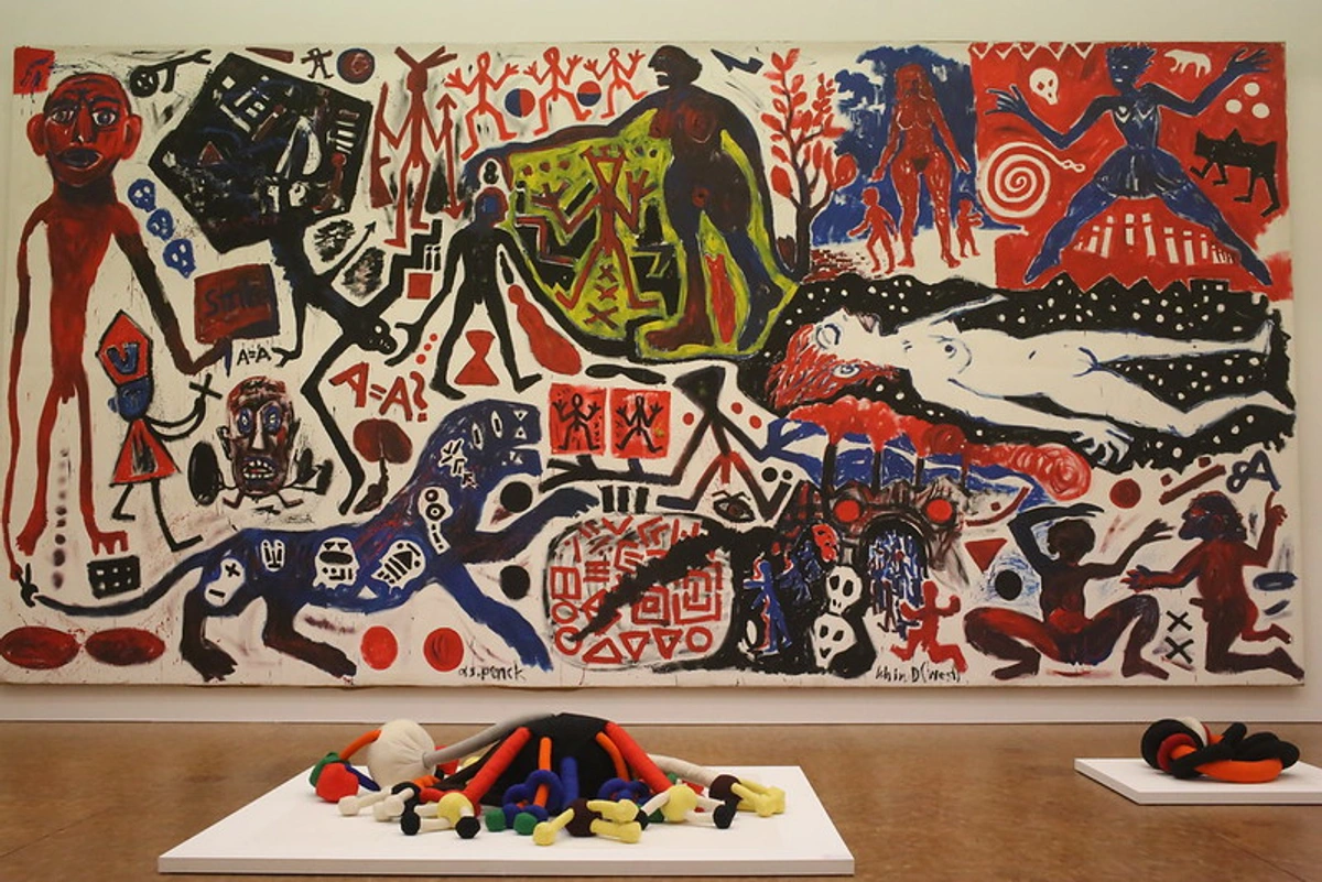
Contemporary Artists Using Layering
Beyond the historical examples, many contemporary artists utilize layering in innovative ways. While I mentioned Anselm Kiefer's thick, layered surfaces, consider artists like Gerhard Richter, whose abstract squeegee paintings involve building up and scraping back multiple layers of paint to create complex, textured surfaces that reveal glimpses of underlying colors. Or Julie Mehretu, who builds incredibly complex, layered compositions using architectural drawings, maps, and abstract marks, often with transparent layers of ink and acrylic. Even street artists use layering, building up murals with multiple passes of spray paint and stencils, creating depth and texture on urban surfaces. Looking at how contemporary artists push the boundaries of layering can provide fresh inspiration for your own work.
Common Pitfalls (and How I Learned to Avoid Them)
I've made every mistake in the book when it comes to layering acrylics. Here are a few I've stumbled over, so maybe you don't have to:
- Lifting the Underlayer: Trying to paint over a layer that isn't fully dry, or scrubbing too hard with a wet brush. This happens because the dried acrylic film can be re-solubilized or physically disturbed before it's fully cured or when scrubbed too hard. Patience, young padawan. Let it dry. This is particularly a risk with thin, scrubbed applications or when the underlying layer hasn't fully cured (which takes longer than just being surface dry). I learned this the hard way, turning a promising sky into a muddy disaster more times than I care to admit.
- Muddy Colors: Applying opaque colors over wet or damp colors, or trying to blend too many colors at once. This often happens when you don't understand the transparency of your paints or rush the drying process. Work in distinct layers, letting each dry, especially when using opaques. Using a limited palette or being mindful of complementary colors when layering can also help avoid accidental mud. My early attempts at blending often resulted in unintentional mud puddles!
- Overworking: Adding too many layers without letting them serve a purpose. Sometimes, less is more. Step back, look at the painting, and ask what the next layer needs to achieve, not just what color you feel like adding. This is a trap I still fall into when I forget to step back and assess. Try stepping back frequently, looking at the painting from across the room, or even taking a break for a few hours or a day to gain fresh perspective.
- Ignoring Transparency: Using opaque paint when you wanted a glaze effect, or vice versa. Check your paint tubes! They usually indicate transparency. This seems obvious, but in the heat of painting, it's easy to grab the wrong tube.
- Fat Over Lean (Acrylic Version): While not as critical as in oils, applying thicker, more flexible layers (often with more medium) over thinner, more rigid layers can contribute to the long-term stability of the paint film, especially with heavy impasto. Acrylics dry by evaporation, forming a polymer film. Layers with more medium or thicker applications tend to be more flexible. Applying a thin, rigid layer over a thick, flexible one could potentially lead to cracking over time, particularly if the painting is subjected to temperature or humidity changes. A simple rule of thumb is to build from thinner, more rigid layers to thicker, more flexible ones. This also relates to the curing time; thicker layers take longer to fully cure and become rigid.
- Brush Cleaning Neglect: Letting paint dry in your brushes, especially when working with multiple layers and colors. This is a cardinal sin! Dried acrylic is tough to remove and ruins brushes. Clean your brushes thoroughly during your painting session when switching colors or techniques, and give them a deep clean with brush soap afterwards. I've lost too many good brushes to my own laziness. It's like a little graveyard of stiff bristles in my studio.
Learning from mistakes is part of the journey. My studio floor has seen its share of 'oops' moments. It's all part of Developing Your Unique Artistic Style: A Personal Journey of Discovery and Evolution.
Troubleshooting Common Layering Issues
Even with practice, you might run into challenges. Here are a few common ones and how to approach them:
- Paint Drying Too Fast: This is the classic acrylic problem! Work in smaller sections, use a spray bottle to keep areas damp, or incorporate a retarder or glazing liquid into your paint mix. Using Open Acrylics, which are formulated to stay wet longer, is another option. A stay-wet palette is arguably the most effective solution for keeping paint workable for extended periods.
- Layers Look Flat or Muddy: This often means you're not letting layers dry completely, using too much opaque paint when transparency is needed, or overworking wet layers. Slow down, let layers dry completely (especially when using opaques!), and understand the transparency of your colors. Embrace the distinctness of layers rather than trying to blend everything into one smooth transition.
- Brushstrokes Are Too Visible (When You Want Smoothness): Use softer brushes, thin your paint with water or a medium (like flow improver or glazing liquid), and apply paint smoothly rather than scrubbing. Multiple thin layers (glazing) build color without heavy brush marks.
- Paint Isn't Sticking or Lifts Easily: Ensure your surface is clean and properly primed with gesso. Acrylic needs a surface it can adhere to. Also, avoid scrubbing aggressively over dry layers, especially if they are thin or not fully cured. Lifting can also happen if the underlying layer is still damp.
Every 'mistake' is a learning opportunity. I've certainly had my share of paintings that taught me exactly what not to do! Remember to ensure good ventilation when using certain mediums or varnishes.
Practice Exercises to Get Started
The best way to understand layering is to just do it. Here are a couple of simple exercises to get you started. Consider keeping a small notebook or journal to record your observations – what happened when you layered certain colors? How did the technique feel? What unexpected results did you get? Keeping color notes and swatches is invaluable!
- Gradient Glazing: Take a small canvas or piece of paper. Paint a simple shape or block of a light, opaque color (like white or a pale yellow) and let it dry completely. Then, mix a transparent color (like Phthalo Blue or Quinacridone Magenta) with gloss medium or glazing liquid. Apply thin layers of the glaze, building up the color gradually from one side of the shape to the other to create a gradient. See how the underlying color influences the glaze.
- Texture Layering: On a textured surface (like canvas or textured paper), apply a base layer of an opaque color and let it dry. Then, try dry brushing a contrasting color over the top. Next, try scumbling another color. Feel how the different techniques interact with the texture and the layers beneath.
- Building Form with Opaque Layers: Paint a simple shape like a circle or square with a mid-tone opaque color. Once dry, use slightly darker opaque colors to layer in shadows, gradually building up the sense of form. Then, use lighter opaque colors (or even a bit of dry brushing with a lighter color) to add highlights. Focus on how layering different values creates the illusion of three-dimensionality. Using a simple reference photo of a sphere or cube can help guide your value placement.
- Combined Techniques Study: On a small surface, try combining several techniques. Start with a thin wash for an underpainting. Once dry, build up some form or texture using impasto or opaque layers. Once that is fully dry, apply a glaze over a section to see how it changes the underlying colors and texture. Finish by adding some detail or highlights with dry brushing or scumbling. This exercise helps you see how different techniques can work together.
Don't worry about making masterpieces with these exercises. The goal is just to feel the paint, understand the techniques, and see the effects you can create. And remember to clean your brushes properly afterwards! It's a small step that saves a lot of frustration (and money on new brushes).
Surfaces for Acrylic Layering
The surface you choose can significantly impact your layering experience and the final look of your painting. Different surfaces have varying absorbency and texture, which affect how the paint sits and dries. Consider the cost when choosing surfaces for practice versus finished work.
- Canvas: The most common surface. Gessoed canvas provides a good tooth for layers to adhere to. Stretched canvas offers flexibility, while canvas panels are more rigid. The weave of the canvas can also add subtle texture that interacts with techniques like dry brushing. Working on pre-primed canvas is convenient, but you can also gesso raw canvas yourself for a specific effect.
- Wood Panels: Offer a rigid, stable surface. They usually require gessoing. Wood panels can be very smooth or have a visible wood grain, offering different textural possibilities.
- Paper: Heavyweight acrylic paper or watercolor paper (primed with gesso) can be used. Paper is more absorbent than canvas or wood, which can affect drying time and how washes behave. It's great for studies and smaller works.
- Other Surfaces: Acrylics are versatile and can be layered on many surfaces once properly prepared, including metal, plastic, and even glass (with specific primers). Experimenting with unusual surfaces can lead to unique layered effects.
Always ensure your surface is clean and properly primed for the best adhesion and predictable layering results. Working on raw, unprimed surfaces will cause the paint to sink in and appear dull.
The Final Layer: Varnishing
Once your painting is completely finished and fully cured (this can take days or even weeks for thick impasto layers – surface dry is not the same as fully cured!), you might consider varnishing it. Varnishing adds a protective layer against dust, UV light, and environmental damage. It can also unify the sheen of your painting, especially if you've used a mix of matte and gloss mediums or techniques. A final varnish can really make the colors pop and give your layered masterpiece a professional finish. Just make sure the painting is fully dry before varnishing – trapping moisture can cause problems down the line. Also, ensure good ventilation when varnishing, as some varnishes can have strong fumes. You can choose between different types of varnishes, such as spray or brush-on, removable or permanent, and finishes like matte, satin, or gloss, each impacting the final look of your layered surface differently.
Practice Makes... Interesting Art
Layering is a skill that develops with practice. Don't expect perfection on your first try. Grab some cheap canvas or paper and just experiment. Try glazing over different colors. See what happens when you dry brush over a textured surface. Play with thick and thin layers. The more you play, the more you'll understand how the paint behaves and what effects you can create. I remember one early experiment where I just layered random colors and textures on a small board, and it ended up being surprisingly compelling – a happy accident born purely from play. Keep your old practice pieces; they serve as a great visual record of your progress and experimentation.
Think of it as building your paint vocabulary. Each technique, each layer, is a new word or phrase you can use to express yourself on the canvas. And hey, if you end up with something you love, maybe it's ready to be seen! You could explore where to buy art or even consider adding it to my collection or showing it at my museum in 's-Hertogenbosch!
Conclusion: Embrace the Layers
Layering colors in acrylic painting is a fundamental technique that opens up a world of possibilities. It's about patience, experimentation, and building complexity and beauty one stroke at a time. It allows you to correct, refine, and discover new directions as you paint. It's a process that mirrors life itself, isn't it? Building on what came before, sometimes covering up the messy bits, sometimes letting the light shine through from underneath.
So, grab your brushes, your paints, and maybe a medium or two. Don't be afraid to experiment, make mistakes, and learn as you go. Your unique artistic voice is built, layer by layer, on the canvas and in the studio. And who knows, maybe one day you'll be sharing your own layered masterpieces with the world, perhaps even in a gallery or online where to buy art.
Happy layering! (And try not to get too much paint on your clothes. Or do. I won't judge.)


