
Mastering Complementary Colors in Art: The Ultimate Guide to Vibrant Paintings
Unlock vibrant art with this ultimate guide to complementary colors. Explore RYB pairs, advanced techniques, and artist insights to make your paintings pop and create stunning depth.

Mastering Complementary Colors in Art: The Ultimate Guide to Vibrant Paintings
Have you ever looked at a painting that feels flat, lacking a certain spark, as if the colors are whispering instead of singing? That's precisely how my work felt for a long time, despite my intuitive dabbling with color. I remember countless hours spent mixing, hoping for that elusive zing, only to end up with something merely 'nice.' This quest for spark led me to a fundamental color relationship: complementary colors. Trust me, understanding and really feeling these color relationships has been one of the biggest game-changers in my own journey as an artist. It's like finding a secret cheat code for making your art pop, hum, and sing with an undeniable energy, revealing a world where every hue has a perfect partner, ready to ignite its full potential – a true harmony of opposites. This cheat code isn't about shortcuts; it's about unlocking profound visual power and making your colors vibrate with life.
By the end of this guide, you'll be able to intuitively select and apply complementary colors to inject life, vibrancy, and captivating depth into your own artwork, moving your pieces from 'good' to 'captivating.' It’s the difference between a muted whisper and a symphonic crescendo on your canvas.
What Exactly ARE Complementary Colors? The Science and the Soul
At its core, a complementary color is simply a color located directly opposite another on the traditional color wheel – that's the Red-Yellow-Blue (RYB) model we often learn in art class. Think of it as color's perfect sparring partner, its ideal counterpoint. When placed side by side, these pairs create the strongest possible contrast, making each other appear more vivid, more intense, more... alive. It's a beautiful, almost paradoxical relationship: opposites attracting to create something truly spectacular. This inherent push-pull creates an undeniable visual vibration that draws the eye and holds attention, a phenomenon known as simultaneous contrast.
I know what you're thinking: isn't there an RGB or CMYK color wheel? And yes, absolutely, those models have different complementary pairs, primarily used for digital screens (RGB, additive color for light) or printing (CMYK, subtractive color for inks). But for us painters, working with physical pigments, the RYB color wheel remains the foundational bedrock for understanding how colors interact on canvas. Why? Because RYB directly reflects how pigments mix and how light is absorbed by paint, rather than emitted by light sources or processed by printers. It's the painter's truth. Its principles have been explored for centuries, with figures like Isaac Newton laying the groundwork for understanding the spectrum. Imagine Newton, peering at light through prisms, meticulously documenting his observations, unknowingly laying the groundwork for my own vibrant canvases centuries later! Later, Michel Eugène Chevreul, a French chemist, conducted extensive research on color interaction in the 19th century, with his seminal work on simultaneous contrast demonstrating precisely how colors influence each other when juxtaposed, profoundly shaping our understanding. Johannes Itten, a Bauhaus master, further systematized color theory, making profound contributions to how artists practically apply these concepts, teaching us that these color relationships aren't just aesthetic choices, but deeply rooted in human perception. We've talked about the broader spectrum of color in my definitive guide to color theory in art, but complementary colors are where the rubber truly meets the road for visual impact, a true "how to make colors pop" technique.
Beyond RYB: A Look at Other Color Models and Their Complements
While RYB is our core for painting, it's worth a quick detour to acknowledge other crucial color models and their respective complementary pairs. The principle of complementary contrast – that opposite colors enhance each other – is universal across all color models, even if the primary definitions shift. Understanding these helps you navigate the broader world of color, especially if you ever dabble in digital art or design.
Complementary Pairs in Other Color Models
Color Model  | Complementary Pairs | Primary Use Case | |
|---|---|---|---|
| RYB | Red, Yellow, Blue | Red/Green, Blue/Orange, Yellow/Purple | Traditional pigment mixing (painting) |
| RGB | Red, Green, Blue | Red/Cyan, Green/Magenta, Blue/Yellow | Light-based (digital screens, photography) |
| CMYK | Cyan, Magenta, Yellow, Key (Black) | Cyan/Red, Magenta/Green, Yellow/Blue | Printing (inks) |
Mastering the Core RYB Complementary Pairs: Your Palette's Powerhouses
Our foundational complementary pairs, derived from the primary and secondary colors on the RYB color wheel, are the superstars of contrast. These are the ones we artists truly live by. And honestly, once you start seeing them, you'll spot them everywhere – from nature's grand designs to masterpieces in museums. It's a universal language of visual excitement, deeply ingrained in our perception, and I personally find it endlessly fascinating to spot them in the wild.
Key RYB Complementary Pairs at a Glance
Primary/Secondary Color | Direct Complementary Color | Secondary Complements (Examples) | Visual Effect & Emotion (My Interpretation) |
|---|---|---|---|
| Red | Green | Blue-Green, Yellow-Green | Dynamic urgency, raw vitality, intense passion vs. calming growth, natural balance, tranquility, vibrant life. Can be festive or aggressive. |
| Blue | Orange | Red-Orange, Yellow-Orange | Expansive, deep coolness, atmospheric depth vs. inviting warmth, energetic glow, earth and sky, dramatic contrast. Often used for vast landscapes and dynamic atmospheres. |
| Yellow | Purple | Blue-Purple, Red-Purple | Playful joy, radiant optimism, pure light vs. profound mystery, luxurious sophistication, spiritual depth. Can feel whimsical, regal, creating a sophisticated and intriguing contrast. |
| Red-Orange | Blue-Green | - | Earthy warmth vs. serene coolness, often found in natural transitions. |
| Yellow-Orange | Blue-Purple | - | Golden glow vs. deep twilight, regal and exotic. |
| Yellow-Green | Red-Purple | - | Natural vitality vs. rich passion, a vibrant, almost ethereal contrast. |
The Biology of Contrast: How Our Eyes See Complementaries
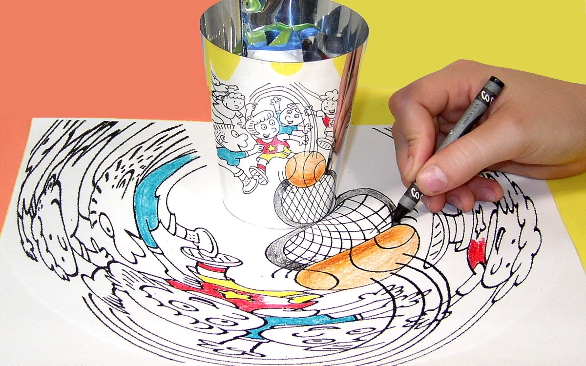
So, why do these pairs create such a powerful visual punch? It boils down to something called simultaneous contrast. When you place two complementary colors next to each other, each color makes the other appear more vibrant and intense than it would in isolation. Your eye, in its tireless quest for balance, actually tries to create the complementary color for whatever it's seeing. When that complementary color is already present, the effect is amplified, often to thrilling results! This inherent biological trick is your secret weapon as an artist; by understanding it, you can deliberately create these powerful visual sensations. It's a fundamental principle of the psychology of color in abstract art.
Ever stared at a bright color for a while, then looked away at a white wall, only to see an afterimage of its complementary? That's your visual system working overtime, trying to re-balance what it just perceived, and it’s a brilliant demonstration of how deeply ingrained these color relationships are in our perception. Our eyes' cone cells, responsible for color vision, operate in opposing pairs (red-green, blue-yellow). When one type of cone cell is stimulated, its opposite is momentarily fatigued, leading to that afterimage. This isn't just theory; it's biology, and it’s a tool we artists get to wield. I remember once trying to paint a truly vibrant red, and it wasn't until I placed a tiny strip of muted green next to it that the red seemed to practically leap off the canvas. That’s the magic of using opposite colors in painting, a subtle dance of perception, a true "chromatic adaptation" in action.

Experiencing the Core RYB Complementary Pairs: My Insights and Applications
While the principle is simple, the applications are infinite. Each pair carries its own unique personality, its own emotional resonance. You can explore the emotional language of color in abstract art more deeply, but here's how I think about the big three and how I use them to evoke different feelings and dynamics in my own work:

Red and Green: The Dynamic Duo of Life
This pair is pure energy, a fascinating dance between passion and peace. Think of the fiery urgency of a rich red balanced by the serene calm of a deep green. It's life itself – blood and foliage, urgency and tranquility. This combination can be incredibly dramatic, bold, and attention-grabbing. It can feel festive, natural, or even a little aggressive, depending on the shades and proportions you choose.
I personally find this pair electrifying when I want to convey a sense of urgency, raw vitality, or a stark contrast between organic growth and explosive emotion. My thoughts on the fiery heart delves into red's power, and green is its perfect foil, offering respite and grounding. Think of a deep red rose against its rich green leaves – nature’s perfect example. I often use a vibrant red against a deeper, forest green to represent themes of growth and decay, or even a subtle holiday cheer without being overtly seasonal. For me, Red and Green often feel like the heartbeat of a piece – sometimes racing, sometimes resting.
Blue and Orange: Earth, Sky, and the Horizon
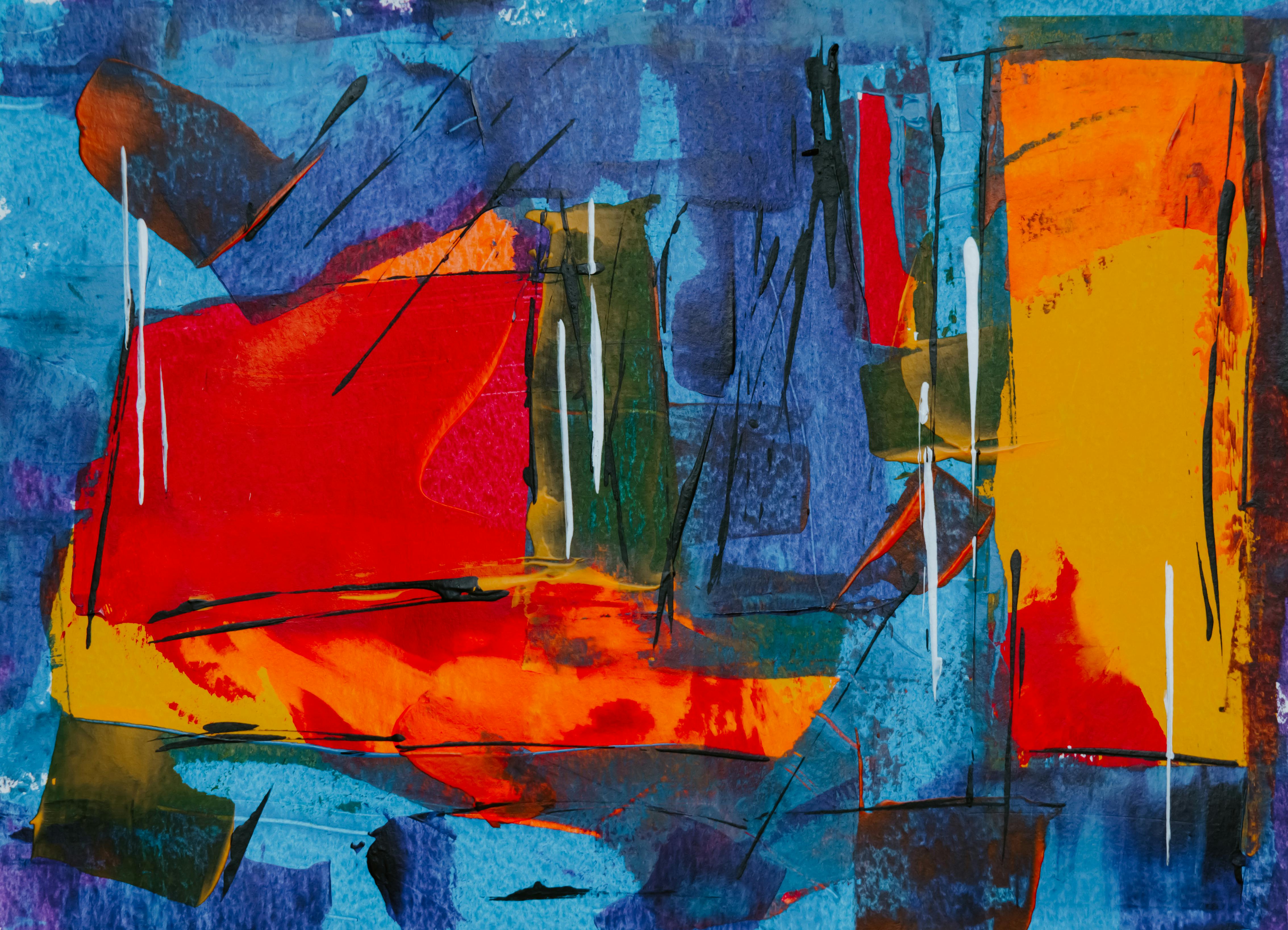
This is perhaps my most frequently used pair, especially for evoking natural landscapes or a sense of vastness and atmospheric depth in abstract pieces. The cool depth of blue finds its perfect counterpart in the warm, inviting glow of orange. Think stunning sunsets over a deep blue sea, or a fiery desert against an azure sky, or even the subtle gleam of a streetlamp against a twilight sky. This pairing offers a beautiful push and pull: warmth inviting you in, coolness providing depth. It creates a palpable sense of dimension, often making the warmer orange advance and the cooler blue recede, creating incredible visual depth and atmospheric perspective. I've often thought about the psychology of blue in abstract art and its calming depth, and orange often provides that exciting spark against it, creating a visual vibration that draws you in.
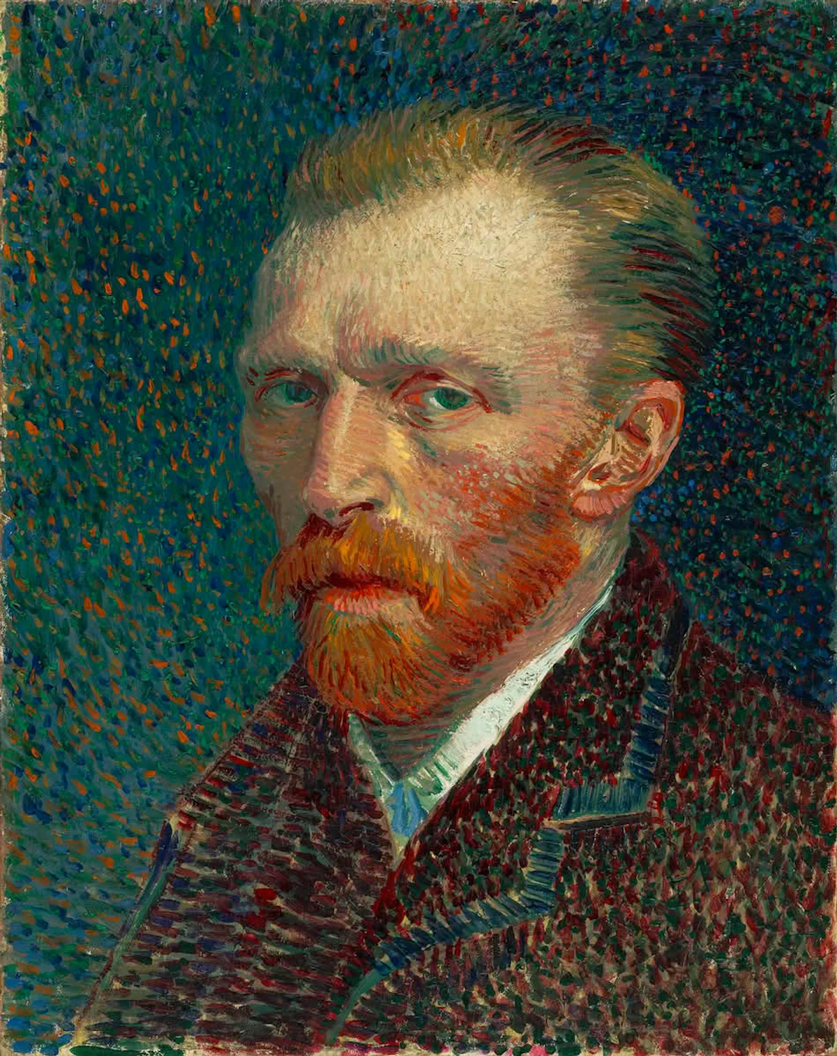
In one piece, I used a dominant ultramarine blue for a distant, misty mountain, then introduced strokes of earthy orange in the foreground to pull the viewer's eye forward, creating an immediate sense of vast space. For me, Blue and Orange speak of journeys and profound quiet. Vincent van Gogh, a master of vibrant color, frequently used blue and orange. His self-portraits often feature his reddish-orange beard against a swirling blue background, demonstrating how these complementary colors intensify each other, making the subject leap forward. This isn't just theory; it's a "color contrast technique" that masters have employed for centuries.

Yellow and Purple: Royal Radiance and Mystical Play
This pair feels regal, mystical, and often wonderfully playful. Yellow, with its inherent joy and optimism (something I explore in the psychology of yellow in my art), finds a profound depth and mystery in purple. It’s less common to see used boldly in the wild, which makes it all the more impactful when you do. Think vibrant crocuses against rich earth, or the dazzling costumes of a jester against a deep velvet curtain, or the rich, jewel-like quality of precious stones. This combination can feel luxurious, spiritual, wonderfully whimsical, or even provocative, adding a touch of unexpected sophistication.
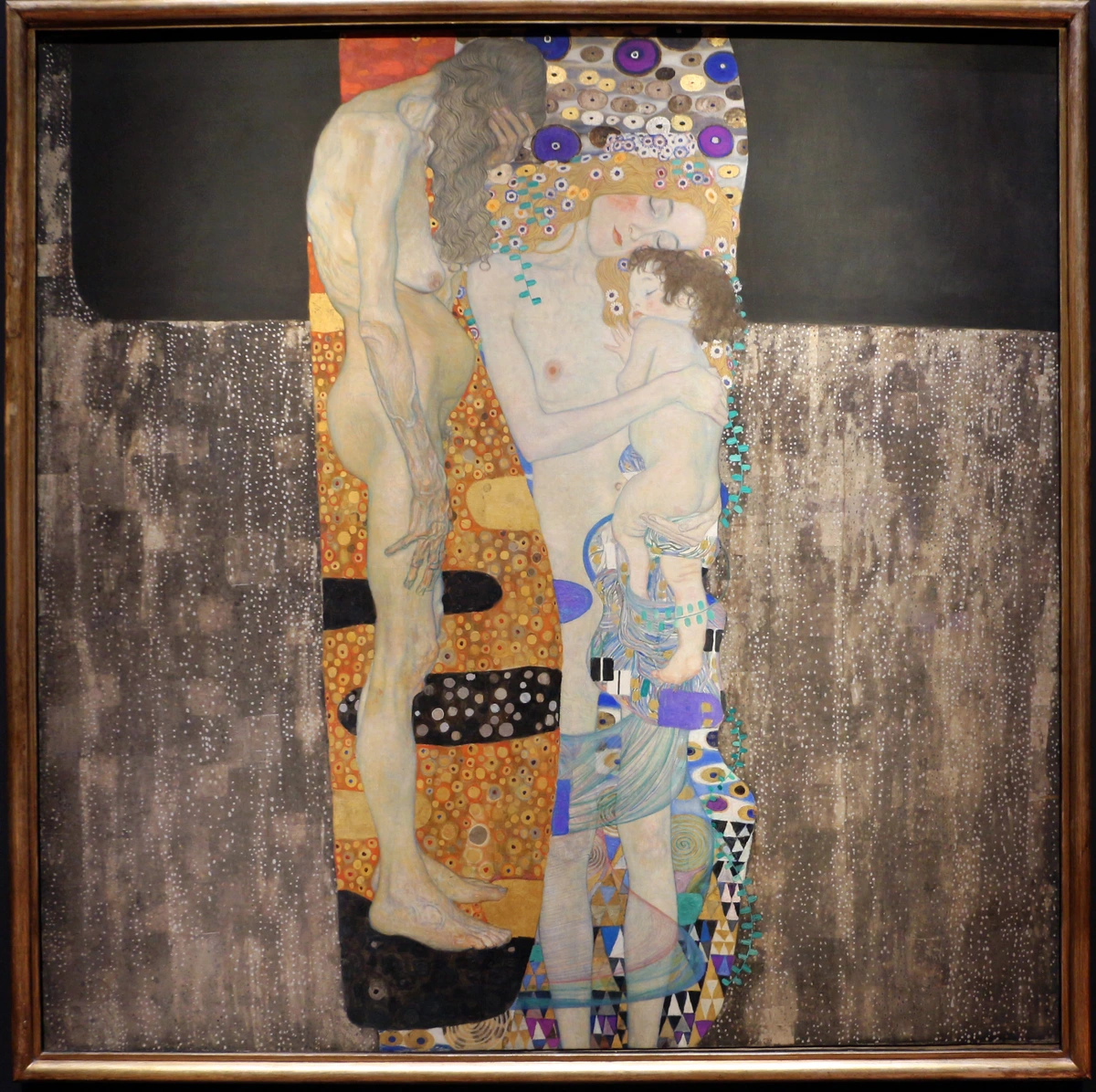
I often turn to this pair when I want to create a sense of magic, introspection, or pure, unadulterated visual delight in my work. It’s like a secret handshake among colors, adding an air of intrigue. For example, a soft, ethereal yellow wash layered over a deep violet can evoke a sense of quiet contemplation, while sharp, bright yellow lines against a bold purple background can create an almost electric, celebratory mood. For me, Yellow and Purple often feel like a joyful secret, a whispered wonder.

Beyond the Basics: Elevating Your Palette with Advanced Complementary Color Techniques
Now, simply slapping red next to green isn't always the goal. Sometimes it works beautifully! But the real magic happens when you understand how to modulate and nuance these relationships. This is where you move from merely understanding to truly mastering the dance of opposites, creating harmonies that are both rich and complex, using opposite colors in painting not just for contrast, but for sophisticated visual storytelling. This is about learning to speak fluent color.
1. Modulating Hue: Tints, Tones, Shades, and Desaturation
Don't just think pure pigment. Consider the tints (colors with white added for lightness), tones (colors with grey added for subtlety), and shades (colors with black added for depth) of each complementary color. A soft, pale pink (a tint of red) against a muted olive green (a tone of green) can create a far more subtle and sophisticated contrast than their pure, aggressive counterparts. Sometimes, a whisper is more powerful than a shout. I remember one piece where a dominant ultramarine blue felt a little too stark. A tiny, almost accidental wash of a pale, desaturated orange on a background layer completely transformed the mood without being obvious, warming the whole piece from within. It was a happy accident turned technique, showing the power of nuanced "color contrast techniques." This delicate interplay of light and dark is crucial for understanding color relationships, a concept beautifully explained in what is the difference between tone, tint, and shade.
Beyond just adding white, grey, or black, think about the overall value (lightness or darkness) of your chosen complementary pair. A dark blue next to a light orange will create a very different dynamic and perceived depth than a light blue next to a dark orange. The contrast in value, combined with the complementary hue, adds another layer of visual interest and allows for more complex compositions.
You can also mix a tiny touch of a complementary color into another color to subtly desaturate it or 'dampen its vibrancy' – making it more complex and less jarring. This is a crucial technique for achieving rich, sophisticated palettes and for creating harmonious neutrals. For instance, adding a tiny speck of purple to a yellow will make the yellow less aggressively bright, transforming it into a more complex, earthy tone. This is also how you create those rich, complex grays and browns that are far more interesting than just black and white or simple earth pigments. To create a truly vibrant, nuanced gray, I often mix small amounts of blue and orange, then adjust with a touch of red or green until it sings. And what about black? Black isn't considered a complementary color itself, as it's the absence of light (or the absorption of all colors by pigment). However, it can play a vital role. I often use it to deepen a shade or to create an incredibly stark, graphic contrast, pushing the vibrancy of the surrounding hues even further, almost like framing a jewel.
2. Expanding Your Palette: Split Complementary and Triadic Schemes
Once you're comfortable with direct complementaries, venture into the more complex, yet equally rewarding, color schemes. These schemes offer a balanced vibrancy, often feeling more sophisticated than a direct complementary pair:
- Split Complementary: Instead of using a direct complement, you use the two colors on either side of the complement. For example, for red, instead of green, you'd use blue-green and yellow-green. Think of it like this: instead of a direct high-five, you're getting a friendly handshake from two people standing next to your intended partner – still impactful, but more nuanced and often more harmonious than a straight 180-degree opposition. It offers a broader range of hues while maintaining strong visual interest. I've seen artists use this beautifully in landscapes, where the main color is a warm yellow, and instead of pure purple, they opt for blue-violet and red-violet in the shadows, creating a rich, subtle complexity.
- Triadic Scheme: This uses three colors equally spaced around the color wheel, like the primary triad (red, yellow, blue) or secondary triad (orange, green, purple). While not strictly complementary, they inherently include complementary relationships within their broader arrangement, offering a vibrant balance and a dynamic palette. We delve deeper into how I use these in beyond the primary: how i use secondary and tertiary colors and beyond the spectrum: my approach to complementary and analogous colors. Many Fauvist painters, like Henri Matisse, used strong triadic schemes to create vibrant, expressive works that hum with energy.
3. Playing with Perception: Color Temperature and Accents
Complementary colors are also your best friends when it comes to playing with color temperature. Warm colors (reds, oranges, yellows) tend to advance and feel closer, while cool colors (blues, greens, purples) tend to recede and create a sense of distance. When you place a warm complementary next to a cool one, you're not just creating contrast in hue; you're creating a dynamic push-and-pull of perceived depth and atmospheric effect. I often use this technique to make areas of my abstract work feel like they're breathing, creating an illusion of space on a flat canvas, guiding the viewer's eye through a vibrant landscape of pure color. This is a powerful way of "creating depth with color." Imagine a blazing orange sunset depicted over a deep, cool blue ocean – the orange leaps forward, the blue recedes, and suddenly your flat canvas has infinite depth.
Sometimes, all you need is a tiny spark. I often use a small brushstroke or a subtle underlying layer of a complementary color to make a dominant color sing. Imagine a predominantly blue abstract piece with just a tiny, fiery orange dot or a thin line. That small accent can draw the eye, create a focal point, and electrify the entire composition. It's all about strategic placement and understanding the visual weight of each hue. Even a mere whisper of a complementary can transform a piece, giving it that indefinable zing. It’s a trick I learned from seeing how a single yellow leaf can stand out against a forest of green, or a tiny red berry pops on a blue winter branch. A sliver of pure cadmium red against a field of viridian green, for instance, can draw the eye from across a room, creating an astonishing focal point with minimal effort.
4. Introducing Analogous Colors (and how they differ from Complements)
To truly grasp the power of complementary colors, it helps to understand their aesthetic opposite: analogous colors. Analogous colors are groups of three colors that are next to each other on the color wheel, sharing a common hue. Think of blue, blue-green, and green, or red, red-orange, and orange. While complementaries create dramatic contrast and energy, analogous colors foster harmony, unity, and a sense of calm. They are often found together in nature and create smooth, flowing transitions. I often use analogous schemes to establish a mood or a dominant color family in a painting, and then introduce a small, strategic complementary accent to provide that pop of visual interest. It's about knowing when to whisper and when to shout with your palette.
Complementary Colors Across Different Art Mediums
While this article primarily focuses on traditional painting with pigments (RYB), the principles of complementary colors resonate across various art mediums, adapting to their unique properties and allowing simultaneous contrast to manifest in fascinating ways:
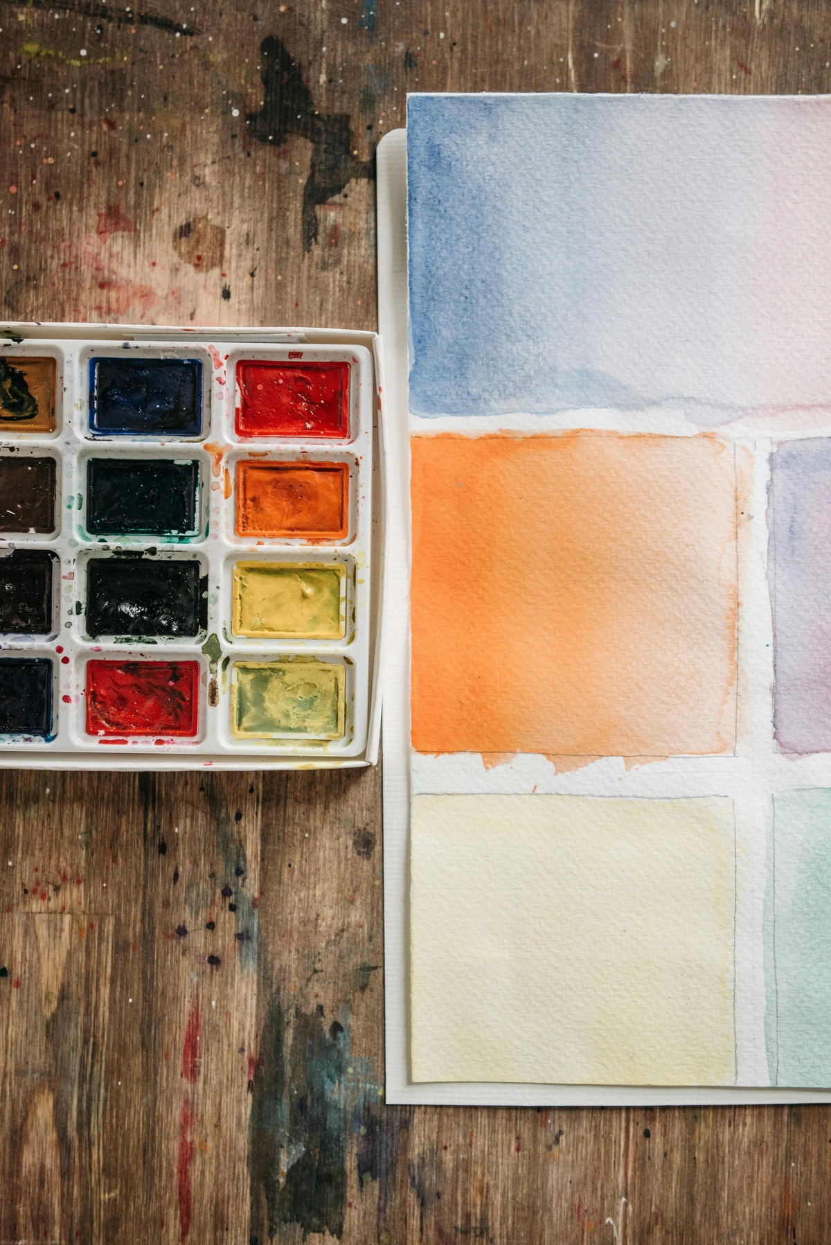
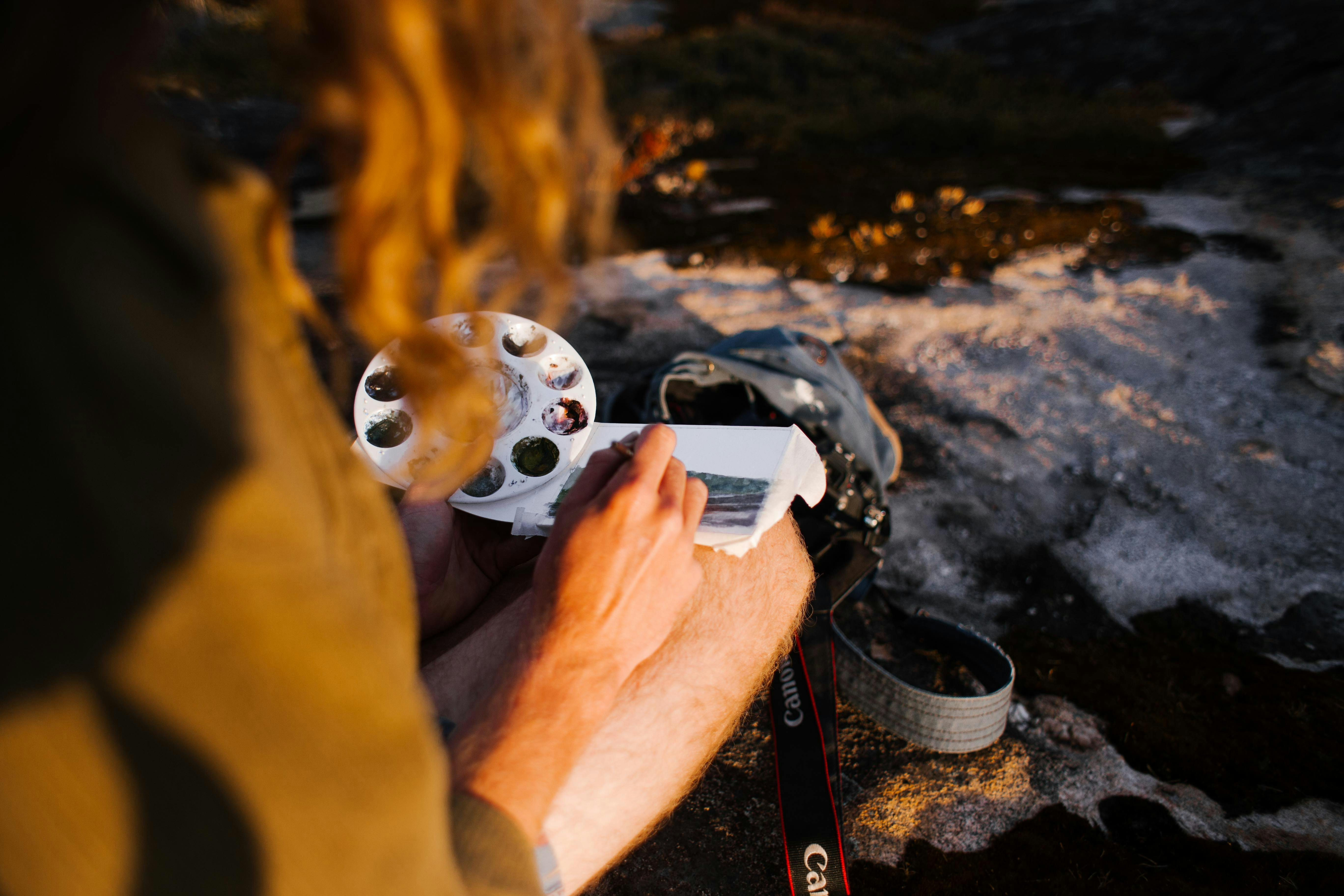
- Watercolor: The transparency of watercolor allows for subtle layering of complementary glazes. A thin wash of orange over a blue can create nuanced browns or purples, or simply make the underlying blue appear more vibrant without losing its luminosity. The delicate interaction creates beautiful, shimmering effects, where the eye optically blends the colors to amplify simultaneous contrast.
- Pastels: With dry mediums like pastels, complementary colors can be layered without mixing, creating optical blending. Placing dots of orange next to blue, for instance, allows the eye to mix them from a distance, resulting in a rich, vibrant gray or a shimmering effect that retains the intensity of both colors. The individual particles of pigment interact with light to enhance the visual vibration.
- Digital Art: While digital tools often use RGB (light-based) color wheels, the effect of complementary contrast remains paramount. Digital artists can leverage this to create impactful web designs, illustrations, and digital paintings, controlling saturation and luminosity with precision to achieve the desired visual pop. The complementary pairs may differ (e.g., red and cyan), but the dynamic of opposition for vibrancy is universal, though the way light behaves on a screen can create even more intense simultaneous contrast.
- Sculpture & Mixed Media: Even in three-dimensional art, complementary colors play a role. A sculptor might use a patina (a finish applied to metal) in a blue-green hue to enhance the warm, earthy tones of a bronze sculpture. In mixed media, the juxtaposition of materials of complementary colors – say, a vibrant red fabric against a deep green painted element – can create the same visual tension and excitement, making each component stand out more forcefully.
How I Actually Use Them in My Abstract Paintings (A Practical Walkthrough)
This is where theory meets practice, where the abstract becomes concrete. My approach isn't rigid; it's a fluid process of experimentation, but it always starts with an intention. My approach to color mixing is a good foundation, but here's how I specifically apply complementary thinking to bring my canvases to life, creating stunning vibrancy and dynamic tension:
- Setting the Stage: I usually start with a dominant color or a broad color field. Let's say I'm working with a deep, moody blue. I know, intuitively, that orange is waiting in the wings to awaken it. It’s a silent conversation waiting to happen.
- Strategic Introduction: I don't just dump orange on top. I might subtly layer a diluted orange glaze underneath as an underpainting, allowing glimpses to peek through, or I'll introduce it in smaller, more deliberate, sharp strokes near the blue. It’s about creating a conversation, a visual dialogue, not a shouting match. I might use an opaque stroke for a bold statement or a transparent wash for a softer glow, sometimes even using dry brush techniques to let the underlying color show through, creating a shimmering visual texture.
- Balancing Act: The key is rarely a 50/50 split. Often, one complementary color will dominate, with the other acting as an accent, a counterpoint. If I'm using a lot of blue, a small but intense orange shape will grab attention – think an 80/20 ratio, where the accent color is potent because of its limited appearance. If I want a softer effect, I'll use desaturated versions or spread the complementary more widely but with less intensity. It's a delicate dance of proportion, always asking: "What colors go together for art in this specific moment?"
- Creating Depth and Movement: By placing a warm orange next to a cool blue, I can create an illusion of space. The warmer color tends to advance, while the cooler color recedes, adding incredible depth to what might otherwise be a flat surface. This dynamic push and pull makes the painting feel alive, almost three-dimensional, guiding the viewer's eye through a vibrant landscape of pure color. For example, a warm yellow shape in the foreground can dramatically separate itself from a cool purple background, creating a sense of immediate proximity and vast distance simultaneously.
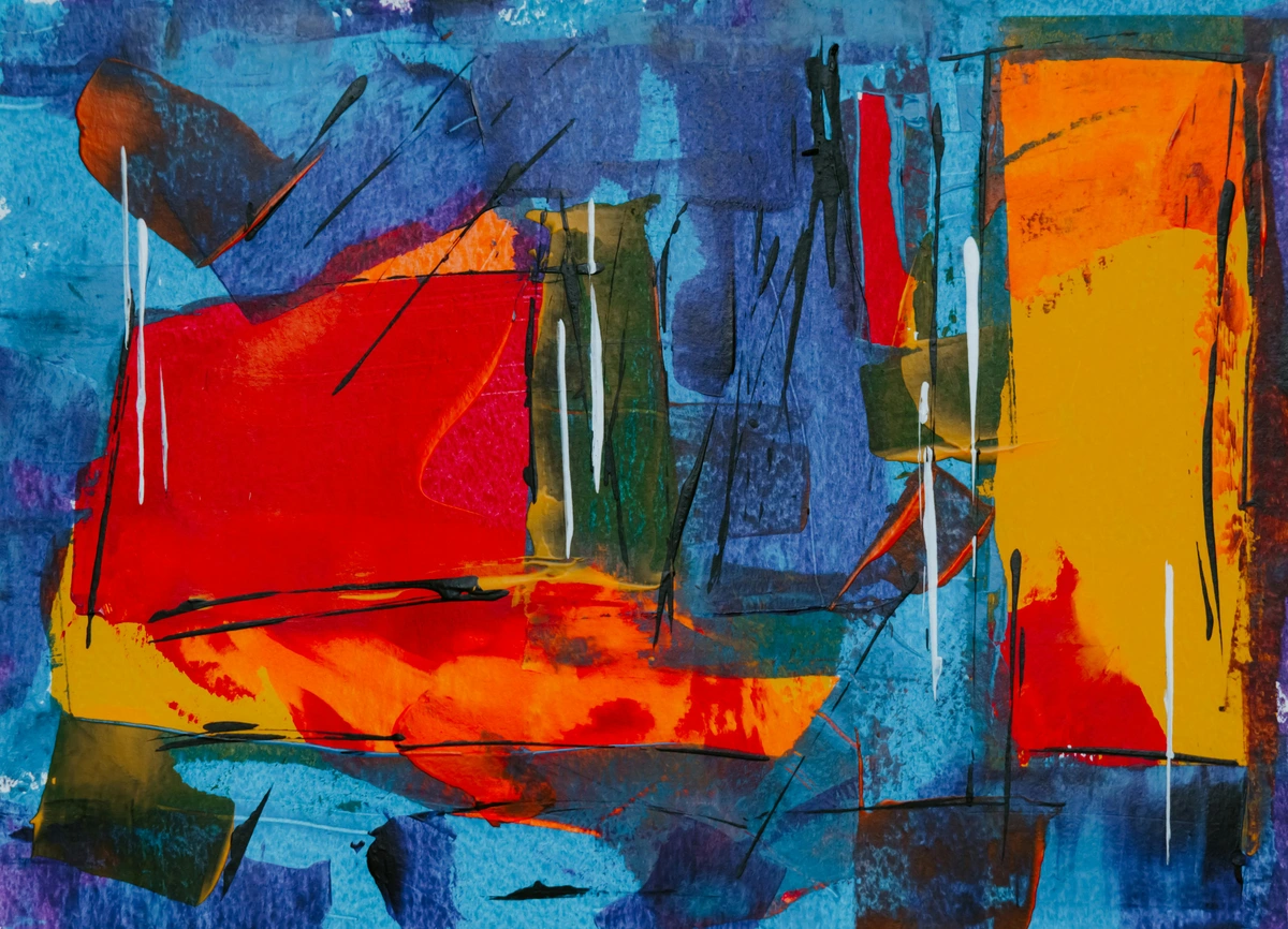
I often find myself using complementary colors to define sections or create tension between different elements in my abstract works. It's less about strict representation and more about emotional and visual impact. My goal is to make the colors vibrate against each other, creating a hum that resonates with the viewer, a visual melody of opposites.
Practical Exercise: Two Complements, One Still Life
Want to try this out right now? Pick a simple still life setup – maybe a piece of fruit and a mug. Now, choose only one complementary pair (e.g., Red and Green, or Blue and Orange). Paint the entire still life using only tints, tones, and shades of these two colors. Don't worry about perfect realism; focus on how you can use their interplay to create form, light, shadow, and depth. You'll be amazed at the vibrancy and complexity you can achieve with a limited, yet powerful, palette.
Troubleshooting Complementary Color Use: Avoiding Common Pitfalls
Even the most vibrant palettes can sometimes go awry. Look, we all make mistakes. I certainly have. Using complementary colors can sometimes go wrong, especially if you're too heavy-handed or not thoughtful enough. Through years of experimentation, I've learned to navigate these challenges. Here are a couple of traps I’ve fallen into and learned to avoid, along with my personal solutions, helping you master "how to avoid muddy colors" and other common issues:
- Over-Saturation/Garishness: Sometimes, putting two pure, highly saturated complementary colors right next to each other can be too much. It can feel aggressive, almost vibrating unpleasantly, rather than harmoniously. I've certainly had pieces that screamed at the viewer rather than sang! My solution? Dial back the saturation on one or both, or introduce a neutral color between them, or vary their proportions dramatically. Often, less is more, especially when dealing with high contrast. A small, vibrant accent will often have more impact than a large, screaming field. Consider using a broken color technique, where complementary colors are juxtaposed in small dots or strokes that blend optically from a distance, maintaining vibrancy without the harshness.
- Muddying Colors: This happens when you mix too much of a complementary into another color without intending to create a neutral. A tiny bit can neutralize beautifully, creating complex, rich grays or browns, but too much creates a dull, lifeless mess. I once tried to subtly tone down a brilliant blue by adding orange and ended up with a murky, tragic swamp-like green-brown that ruined the vibrancy I was aiming for. It was a truly tragic swamp-green moment I'd rather forget! It's a delicate balance. Always start with a very small amount when neutralizing or toning down a color, and build up slowly, testing on a scrap piece. If I want to desaturate a vibrant purple, I'll add a tiny, almost imperceptible drop of yellow, rather than a big blob. Achieving those coveted rich earth tones (like a beautiful sienna or deep umber) from complementaries requires careful observation of the exact pigment hues you're working with, as even slight variations can lead to unexpected results. For deliberate chromatic grays, aim for a near 1:1 ratio of complementary hues, then adjust to achieve warmer browns or cooler umbers.
- Losing Harmony: While contrast is the goal, chaos isn't. Ensure there's still a unifying element or a dominant color that ties the piece together. Complementaries should enhance, not disrupt, the overall harmony. Think of them as seasoning, not the main course. Just as a pinch of chili can elevate a dish, a strategic touch of a complementary can elevate your painting without overpowering it. Sometimes, using a unifying glaze over the entire piece, or ensuring a dominant color field covers most of the canvas, helps to integrate even the most striking complementary contrasts.

Common Misconceptions About Complementary Colors
I've heard and believed a few myths about complementary colors over the years, and I want to clear them up for you. Dispelling these can really open up your creative possibilities:








- Misconception 1: Complementaries must always be used in equal measure. Absolutely not! As I mentioned, an overwhelming 50/50 split can often lead to garishness. The most effective use often involves one color dominating, with the complementary acting as a smaller, potent accent. Think of the vast blue sky with a tiny, fiery orange sunset – the orange has immense power precisely because of its limited proportion and intense contrast against the expansive blue.
- Misconception 2: You can only use pure, saturated complementaries. Another myth! Tints, tones, and shades of complementary colors offer incredible subtlety and sophistication. A muted red-violet and a soft yellow-green can create a gentle, harmonious contrast far removed from the aggressive punch of pure red and green. This is where truly sophisticated and unique palettes emerge, often resulting in more visually comfortable and engaging art for the viewer.
- Misconception 3: Complementary colors are only for creating jarring contrast. While they excel at contrast, their purpose extends far beyond. They can be used to mix rich neutrals, create atmospheric depth (warm advances, cool recedes), or even subtly enhance the vibrancy of a single dominant color without being overtly noticeable themselves. Their magic lies in their versatility and their ability to subtly influence perception.
- Misconception 4: They only apply to the RYB color wheel. While the RYB model is paramount for traditional painting pigments, it's important to understand that other color models (like RGB for light on screens and CMYK for printing) also have complementary relationships, though the specific pairs differ. The principle of complementary contrast – that opposite colors enhance each other – is universal across all color models, even if the primary definitions shift. For painters, however, RYB remains the most relevant for pigment interaction.
Key Takeaways for Mastering Complementary Colors
To summarize your journey into the vibrant world of complementary colors:
- Opposites Attract for Impact: Complementary colors (Red/Green, Blue/Orange, Yellow/Purple on the RYB wheel, plus their secondary/tertiary counterparts) are directly opposite each other, creating the strongest possible visual contrast and making each other appear more intense.
- It's Biological: Simultaneous contrast and afterimages demonstrate that our eyes are wired to seek these relationships, allowing artists to leverage natural perception.
- Beyond Pure Hues: Mastering tints, tones, shades, and understanding value, or using split-complementary and triadic schemes, opens up a world of nuanced, sophisticated palettes. You can even create rich chromatic grays and browns by mixing them!
- Strategic Application: Use them to create depth, guide the eye, add small accents for big impact, and convey specific emotions or atmospheres. Remember the iterative nature – experimentation is key!
- Rules are Guidelines: While theory is crucial, don't be afraid to break 'rules' and experiment. Artistic license is your superpower in creating truly unique work.
- Avoid the Traps: Watch out for over-saturation, muddying colors (mix sparingly and with intent!), and losing overall harmony. Proportion and subtlety are your friends.
- Challenge the Myths: Forget equal measure, pure saturation only, or solely jarring contrast. Complementaries are incredibly versatile tools for any artist, applicable across various mediums.
Frequently Asked Questions About Complementary Colors in Art
What are the three main complementary color pairs?
The three main complementary color pairs based on the traditional RYB (Red-Yellow-Blue) color wheel, which is foundational for artists working with pigments, are: Red and Green, Blue and Orange, and Yellow and Purple.
Are there 'secondary' or 'tertiary' complementary pairs?
Yes, absolutely! The concept extends beyond the primary colors. For example, the complementary color for a secondary color like Orange is Blue. For tertiary colors, like Red-Orange, its complement would be Blue-Green. The principle remains the same: directly opposite on the RYB color wheel.
How do complementary colors make each other look more vibrant?
When placed side-by-side, complementary colors create a phenomenon called simultaneous contrast. Your eye perceives each color more intensely and vibrantly because it instinctively tries to create the complementary color of what it's seeing. When that complementary is already present, the effect is amplified, making both colors appear more vivid.
Can I use complementary colors to create a subtle effect, not just strong contrast?
Absolutely! While known for strong contrast, complementary colors can be used subtly. By using tints (adding white), tones (adding grey), or shades (adding black) of complementary colors, you can achieve nuanced and sophisticated contrasts. A small, desaturated complementary accent can also enhance a dominant color without being overtly bold. You can even mix them carefully to create a wide range of harmonious chromatic grays and browns.
How do I avoid muddy colors when mixing complementary pigments?
Muddying often happens when you add too much of a complementary color when attempting to desaturate or neutralize another. The key is to add very small, almost imperceptible amounts, gradually building up the desired effect. Test your mixes on a separate surface first, and aim for complex grays or browns rather than dull, lifeless mixtures. Remember to observe the exact hues of your pigments, as slight variations can impact the final neutral. For deliberate chromatic grays, aim for a near 1:1 ratio of complementary hues, then adjust to achieve warmer browns or cooler umbers.
What's the difference between RYB, RGB, and CMYK complementary colors?
- RYB (Red-Yellow-Blue): The traditional artist's color wheel, based on how pigments mix. Its complementaries are Red/Green, Blue/Orange, Yellow/Purple. It's about light absorption.
- RGB (Red-Green-Blue): An additive color model used for light (e.g., screens). Its complementaries differ (e.g., Red/Cyan, Green/Magenta, Blue/Yellow). It's about light emission.
- CMYK (Cyan-Magenta-Yellow-Key/Black): A subtractive color model used for printing inks. Its complementaries also differ (e.g., Cyan/Red, Magenta/Green, Yellow/Blue). It's about ink layering and light reflection. For painters, RYB is the most relevant for pigment interaction on canvas.
How can complementary colors help create depth in a painting?
Complementary colors inherently have a strong contrast in color temperature (warm vs. cool). Warm colors (reds, oranges, yellows) tend to advance visually, while cool colors (blues, greens, purples) tend to recede. By strategically placing a warm complementary next to a cool one, you can create an illusion of space and depth, making parts of your painting feel closer or further away, a phenomenon known as atmospheric perspective.
How do I choose the right complementary pair for a specific mood?
Consider the emotional associations of each primary color. For urgency or vitality, Red/Green is dynamic. For expansive landscapes or dramatic atmosphere, Blue/Orange excels. For luxury, mystery, or playfulness, Yellow/Purple offers sophistication. Experiment with tints, tones, and shades to fine-tune the emotional resonance of your chosen pair. Remember, it's a personal journey, and your intuition will guide you.
What are some common art movements or artists known for their effective use of complementary colors?
Many art movements have leveraged complementary colors for impact! Impressionists like Claude Monet often used broken color techniques with complementaries (e.g., violet shadows on yellow fields) to capture fleeting light. Post-Impressionists like Vincent van Gogh masterfully intensified hues through direct juxtaposition (think his famous blue-orange contrasts). The Fauvists, such as Henri Matisse, pushed complementary colors to their most vibrant extremes for emotional expression, often using triadic schemes. Even modern abstract artists continue to explore these dynamics to create powerful visual effects.
Are there any colors that don't have a direct complementary on the RYB wheel?
While primary and secondary colors have clear complementaries, neutral colors like pure grays or browns are often created by mixing complementary colors rather than having a direct opposite hue themselves. Black and white are also not considered hues and thus don't have direct complementaries, but rather serve to modify the value and saturation of other colors, pushing other hues to greater vibrancy or depth.
Embrace the Dance of Opposites: Your Canvas Awaits!
So, there you have it – my deep dive into the captivating world of complementary colors. What began as a simple theoretical concept transformed my art, allowing me to move beyond flat, quiet canvases to pieces that truly sing and resonate with undeniable energy. These aren't just rules to follow; they are insights into the very fabric of visual perception, powerful tools you can wield to create art that captivates, stirs emotion, and draws the viewer into a dynamic dialogue of hues.
I encourage you to experiment, to play, and perhaps most importantly, to feel these color relationships on your own canvas. Don't be afraid to try a tiny, fiery orange accent in a field of deep blue, or to temper a vibrant yellow with a whisper of purple. The journey of mastering color is endless, but understanding complementaries is like finding a trusted companion who will always ensure your palette is full of life and your paintings burst with undeniable vitality. Go forth and make your colors sing! And if you’re curious to see how I apply these principles in my own work, feel free to explore my gallery.