My Deep Blue Soul: An Artist's Intimate Journey with Abstract Blue
Blue. It’s the color that feels like a deep, cleansing breath, isn't it? For me, it's more than a color; it's a confidante, a constant companion, and perhaps, a reflection of my own sometimes-moody, always-dreaming soul. You know how some people have 'their' song or 'their' season? Blue is unequivocally my color. It’s a quiet knowing, a deep hum in the background of my existence – a gentle, almost subconscious pull towards specific shades and compositions that feel intrinsically right. This hum guides my brushstrokes, determines the emotional landscape of a canvas, and manifests as a subtle yearning for the infinite. This isn't just an article; it's a journey into the very essence of my artistic identity, exploring why blue isn't merely a pigment on my palette, but a reflection of my inner landscape and a language through which I speak. In the following sections, we'll delve into my earliest inspirations, the complex role of blue in my abstract compositions, its profound impact on the viewer, and how this incredible hue continues to shape my creative universe.
The Whisper of the Waves: My First Memories of Blue
I often joke that my earliest memories are probably tinted azure. Growing up, the sea was never far, and its vastness, its ever-changing shades of cerulean, navy, and turquoise, seeped into my very being. I remember one specific hazy summer afternoon, standing on the Dutch coast, the invigorating scent of salt on the wind, the rhythmic hush and roar of the North Sea, the soft, cool sand beneath my feet, gritty with tiny shells, watching the vast expanse merge seamlessly with a sky the color of forgotten dreams, a sort of gentle, hopeful expanse. It felt like forgotten dreams, a hue holding the quiet promise of childhood and limitless imagination before life's complexities set in. That particular shade of deep ocean blue, almost black in its intensity, still makes my heart ache in the most beautiful way. It wasn’t just the color; it was the feeling of infinite possibility – the kind you get when you're standing at the edge of the world's immense horizon, gazing into the vast unknown. It’s the beautiful, bittersweet ache that reminds you of life’s profound mysteries. This is the feeling I chase in my art, the vastness of the sea translated into the vastness of human emotion. I've always found solace in that. It's probably why my studio, my creative sanctuary, always has a hint of blue, even if it's just in a forgotten coffee mug or the reflection on a canvas. And so, the ocean's deep embrace became the first, indelible brushstroke on my soul's canvas, a memory I return to again and again. What colors hold such deep, foundational memories for you?
Blue's Palette: From Serenity to Storm in My Abstract Art
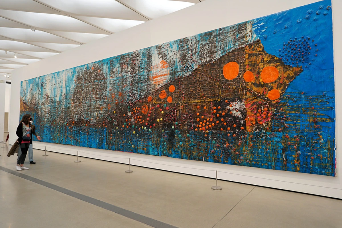
When it comes to my art, blue isn't just a choice; it's often the starting point, the anchor. It can be the quiet whisper of a clear sky or the furious roar of a winter storm. For me, blue embodies profound thought and introspection, capturing those moments when you're completely lost in your own world, finding meaning in what isn't a picture of anything. It speaks a quiet, personal truth that doesn't need a literal image to convey its message. For example, in a piece like "Quietude," soft, layered washes of cerulean and sky blue create an almost breathing space, inviting stillness with their smooth, blending forms and ethereal luminosity, often covering a large, serene canvas. Conversely, "Tempest" explodes with jagged strokes of indigo and navy, intercut with hints of raw umber, evoking the raw power of nature's fury and the internal turmoil we sometimes face, characterized by turbulent lines and dense, almost sculptural textured surfaces.
You'll notice blue often appears in my abstract pieces, layered and morphing from soft, ethereal washes to bold, impasto strokes. These layers are like thoughts building upon thoughts, each shade a new perspective. I’ve explored its depth in pieces where indigo and sapphire dominate, creating almost meditative spaces – compositions designed to invite stillness and internal dialogue. This isn't just a happy accident; it's a deliberate attempt to capture the vast emotional landscape that blue represents for me. Sometimes, it’s about the tranquility of a summer sky; other times, it's the profound quiet of a winter night.

Blue's Companions: A Palette of Dialogue
While blue often takes center stage in my work, it rarely exists in isolation. It thrives in dialogue with other hues, revealing new facets of its character. A vibrant cerulean, for instance, finds new energy when placed beside a fiery orange, creating a dynamic tension that can evoke the vibrant glow of a sunset over a calm sea. When a vibrant cerulean meets a cadmium orange, the resulting tension feels like the last fiery rays of a sunset bleeding into the cool, darkening ocean – a moment of beautiful, fleeting drama. Or, a calm navy can ground the playful exuberance of lime green and fuchsia, offering a stable counterpoint to their energy. It’s in these unexpected pairings that the real magic happens, where colors start to sing together, highlighting contrasts and creating complex harmonies that just feel right. I don't just choose colors; I orchestrate a conversation, and blue is often the thoughtful, grounding voice that allows the others to truly express themselves. It's a delicate balance, much like the unexpected harmonies you find in life itself, that ultimately shapes my artistic vision. This interplay isn't just for my benefit; it profoundly influences the viewer's emotional response, inviting them into a complex emotional landscape rather than a singular mood.
Exploring Blue's Versatility: A Spectrum of Emotion and Technique
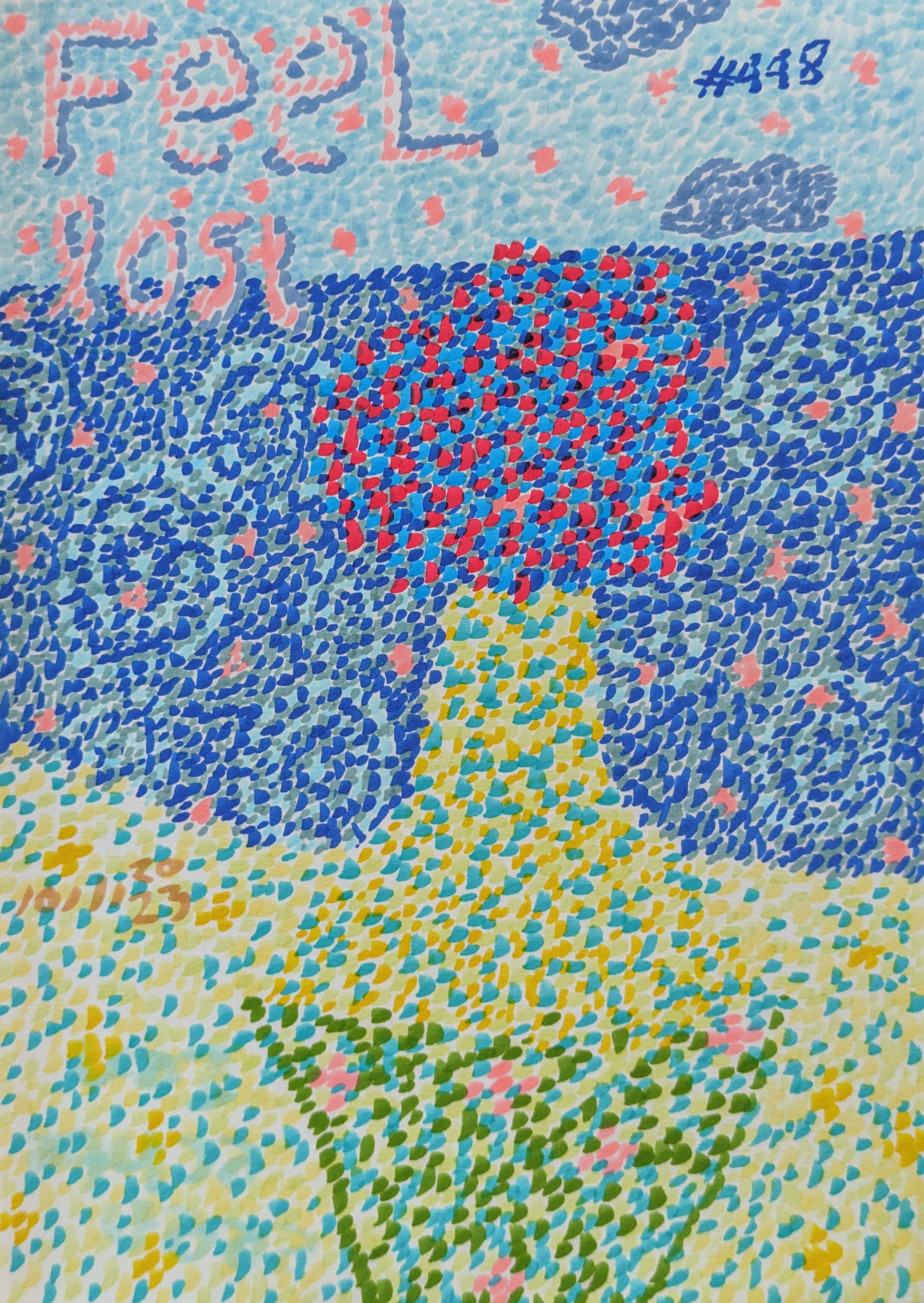
Beyond its interactions with other colors, to truly appreciate blue’s profound influence, we must look beyond its singular presence and explore its incredible versatility. Blue is far from monolithic. From the gentle wash of sky blue to the commanding presence of midnight blue, its spectrum offers endless possibilities. Consider how a warm blue, like a teal, can evoke tropical seas and vibrancy, while a cool ultramarine plunges into profound depths and quiet contemplation. Historically, blues like Ultramarine, once more precious than gold, captivated artists for centuries with its luminous depth, frequently used in religious art to depict divine figures. The serene Prussian Blue, known for its intense, deep hue, played a significant role in early modern art. Even though I'm using modern paints, I can't help but feel the weight of history behind these blues; it pushes me to dig deeper, to find that same profound resonance they held centuries ago. In my journey with color field painting, blue has been a central player, allowing me to explore vast emotional landscapes with minimal fuss, just pure color. Each shade of blue whispers a different secret, waiting to be unveiled on the canvas, its inherent coolness manipulable to create warmth or tension depending on its companions and saturation.
Let’s briefly look at some shades and their typical effects:
Shade of Blue | Typical Emotion/Association | Characteristics |
|---|---|---|
| Sky Blue | Calm, open, light | Ethereal, expansive, airy |
| Cerulean | Bright, clear, focused | Vibrant, fresh, positive |
| Indigo | Deep thought, mystery, intuition | Rich, spiritual, contemplative |
| Navy Blue | Stability, authority, tradition | Grounding, sophisticated, reliable |
| Ultramarine | Profound depth, spiritual, intense | Luminous, historically significant, resonant |
| Prussian Blue | Serene, strong, intense | Deep, powerful, often used for dramatic effect |
| Teal | Tropical, vibrant, refreshing | Lively, exotic, evokes nature |
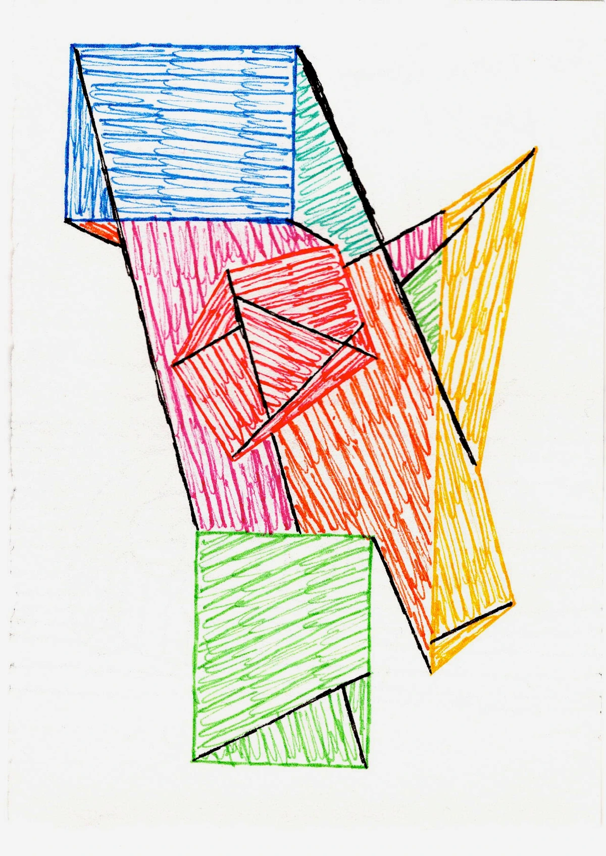
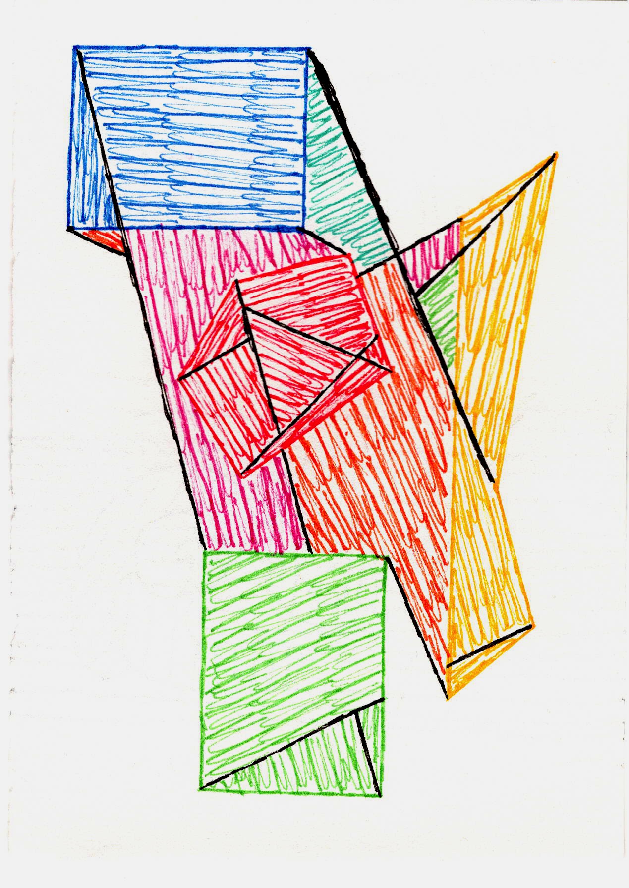
Consider the interplay of various blues in my more geometric works:
Here, blue isn't just a background; it's an active participant, defining edges, creating depth, and holding its own against more vibrant hues. It's the quiet strength that allows the other colors to sing. And speaking of singing, understanding the emotional language of color in abstract art is key to appreciating this dynamic.
One of my favorite techniques is building depth through layering translucent colors. Blue, especially, lends itself beautifully to this. Imagine a deep indigo emerging from beneath a wash of cerulean – achieved through delicate glazes, subtle scumbling, and varied brushwork, often using fluid acrylics and soft brushes for seamless blending. This process creates depth by allowing light to interact with multiple levels of pigment, creating a shimmering, almost atmospheric quality, much like looking into layers of colored glass or observing how light filters through the ever-changing ocean. It's like peeking into a secret, underwater world. This process isn't just about aesthetics; it's about revealing something hidden, much like our own inner worlds. I often find myself building up these unseen layers, creating a tactile and visual richness that invites the viewer to look closer.
Why Abstract Art is Blue's Perfect Canvas
For me, blue’s intangible nature finds its most profound expression in abstract art. Unlike representational painting, which aims to depict a recognizable reality, abstract art allows blue to exist purely as emotion, as a state of being, unburdened by literal interpretation. It’s why I’ve found that working with blue allows me to embrace a certain intuitive painting process. It's less about a plan and more about letting the color guide me, building layers and letting narratives emerge organically. If you've ever found yourself staring at an endless sky, you know what I mean – there's a story unfolding, even if you can't quite articulate it. There was one time, a particularly frustrating afternoon in the studio – one of those days where nothing felt right, and I was about to throw my brushes across the room. I just started applying different shades of blue, almost without thinking, and suddenly, a quiet breakthrough – a compositional balance I hadn't seen, an emotional release through the blending. The canvas started speaking to me, guiding my hand to blend and layer until a profound sense of peace emerged. It was as if blue itself showed me the way out of the artistic wilderness, proving that sometimes, the most direct path to emotion is through abstraction.
The Psychology and Symbolism: My Personal Take
Blue is widely known for its calming effect, its association with wisdom, stability, and even sadness. It's often linked to feelings of trust and productivity, frequently used in corporate branding for these very reasons. For me, it's all of that and more. It’s the color of dreams, of the subconscious, of the quiet moments spent pondering the universe. When I delve into the psychology of blue in abstract art, exploring its calming depth and emotional resonance, I'm not just reading facts; I'm revisiting my own experiences. It's why I often pair it with hints of gold or warm reds, not to diminish its calm, but to spark a dialogue between the serene and the passionate. The warmth acts as an unexpected counterpoint, like a fleeting sunrise over a calm sea, creating a tension that brings both colors to life and reflects the ebb and flow of emotions in life. Speaking of tension, isn't it funny how a color so often associated with peace can also be so profoundly unsettling? I guess even the calmest waters hide their depths.
Beyond my personal connection, blue has a fascinating history in art. Think of Yves Klein, who famously developed International Klein Blue (IKB) in the 1950s, a vibrant, ultramarine hue he believed embodied pure spirit and the void. His monochrome blue paintings weren't just about color; they were about a spiritual experience, much like the transcendence I seek through my own abstract explorations of blue. For a deeper understanding of this interplay, consider exploring color theory in abstract art.
Culturally, blue holds a fascinating tapestry of meanings, from ancient Egyptian reverence for the heavens to its association with royalty in Europe and even mourning in some Asian cultures. While my connection is intensely personal, I find it endlessly intriguing how a single hue can carry such diverse weight across the globe. This awareness subtly informs my choices, adding layers of potential interpretation for the viewer. And, to be honest, it sometimes just makes me giggle to think about a color being so universally complicated. Perhaps that's why it extends beyond the canvas into every corner of my life.
Beyond the Canvas: Blue in My World
My connection to blue isn't confined to the studio. It's in the way I instinctively gravitate towards blue textiles, the way I seek out expansive skies, or even the playlist I put on when I need to clear my head. My studio playlist often features melancholic, atmospheric tracks from artists like Olafur Arnalds or Hania Rani, mirroring the mood of a deep blue canvas. It’s a full sensory experience, a constant, comforting presence.
I once read that blue is the color most associated with intelligence, and while I certainly don't claim any genius (my coffee mug tracking abilities would argue otherwise!), I do think blue fosters a certain contemplative state. It's the color that encourages you to slow down, to breathe, and to simply be, allowing complex ideas to unfurl gently. Perhaps that's why it's so fundamental to my creative rituals – it helps me get into that flow state where intuition and intellect subtly intertwine. Blue, for me, is the silent conductor of my inner symphony, guiding every beat and every breath. It’s almost like having a quiet, incredibly insightful friend who always knows how to steer me back to creativity.
Frequently Asked Questions about Blue in My Art
Welcome to a quick dive into some common queries about blue's role in my artistic practice.
Q: Why is blue so prevalent in your abstract art?
A: Oh, blue! It's so much more than just a color to me; it's like a mirror to my inner world, a source of calm, introspection, and endless inspiration. It embodies both vastness and intimacy, emotions I constantly explore in my abstract art.
Q: How do you achieve such a profound sense of depth with blue?
A: I achieve profound depth by meticulously layering translucent acrylics, often employing techniques like glazing, scumbling, and subtle washes. I typically use fluid acrylics, building up thin veils of color with soft brushes or even sponges. This allows light to interact with multiple levels of pigment, creating a shimmering, almost atmospheric quality, much like looking into the ever-changing ocean or a clear night sky.
Q: What emotions does the color blue typically evoke for you?
A: Blue, for me, can evoke a wide range of emotions: serenity, contemplation, a touch of melancholy, vastness, and a sense of timelessness. It's the quiet observer, the thoughtful ponderer, and a profound emotional anchor.
Q: How do you choose specific shades of blue, and how do you balance them with other colors?
A: Choosing specific shades is highly intuitive, driven by the emotion or narrative I want to convey. For serenity, I might lean into softer ceruleans and sky blues; for intensity, deeper indigos or navies. Balancing blue with other colors involves orchestrating a dialogue: warm colors like gold or red create dynamic tension, while greens or purples can enhance blue's tranquil or mysterious qualities. It's about finding the perfect counterpoint to make each hue resonate more powerfully.
Q: What is your preferred medium for working with blue, and why?
A: Ah, my trusty acrylics! While I experiment with various media, I primarily gravitate towards acrylics for my blue abstract works. Their fast drying time allows for rapid layering, which is essential for building the translucent depths I crave – something more challenging with slow-drying oils. The versatility of acrylics also enables me to move between delicate washes and thick impasto with ease, giving me maximum flexibility to capture blue's vast emotional range without long waiting periods.
Q: Do you ever find yourself tiring of working with blue?
A: Honestly? No, never! Just like the sky or the ocean, blue is endlessly varied. There are always new shades, new interactions, new stories to tell. It's a conversation that never gets old, always revealing new depths, much like life itself. I might occasionally venture into other hues, but blue always calls me back, like a familiar, comforting friend.
Conclusion: My Everlasting Blue Note
So, there you have it – my somewhat meandering, yet deeply personal love letter to the color blue. We've explored its origins in my earliest memories, witnessed its transformative power in abstract compositions, delved into its psychological and symbolic weight, and even peeked into its presence in my everyday life. Blue, for me, is more than just a pigment on my palette; it’s a fundamental part of my artistic identity and, dare I say, my soul. It grounds me, challenges me, and consistently inspires me to look deeper, both within my art and within myself, revealing the endless, evolving stories that blue holds. It’s truly a journey, much like the infinite shades of blue itself. Just as a deep breath steadies the mind, blue steadies my artistic hand and fuels my creative spirit.
Now, as you look around your own world, perhaps consider: What journey is blue taking you on today? How does it make you feel?
If you’re ever in 's-Hertogenbosch, consider visiting my museum. You’ll see plenty of blue there, I promise – perhaps even a piece that directly speaks to the vastness of the ocean, or the quiet contemplation of a winter sky, inviting you to find a little piece of your own blue connection. My latest abstract paintings for sale also often feature this beloved hue, continuing this exploration. An artist's journey is always evolving, much like the endless shades of blue.