My Journey into Color Field: Emotion, Art & Expansive Hues
Explore my personal journey into Color Field painting. Discover its history, innovative techniques, and how expansive hues evoke profound emotions, bridging personal experiences with art's rich legacy.
My Journey into Color Field Painting: Where Expansive Hues & Deep Emotions Collide
Introduction: When Color Became My Confidant
You know, sometimes life throws you a curveball, and you find your true calling in the most unexpected places. For me, that curveball looked suspiciously like a giant canvas and an even larger bucket of paint. My journey into Color Field painting wasn't a grand, deliberate march; it was more like a slow, curious drift into a vast, welcoming ocean of pure color. And honestly, it’s become one of the most profoundly personal ways I express myself. In this article, I want to share what draws me to this style, my process, and why I believe these expansive hues can speak so profoundly to us, delving into the very heart of how color becomes a direct conduit for emotion, bridging my personal experiences with a rich artistic legacy.
There's something incredibly liberating about shedding the constraints of subject matter and letting color itself be the protagonist. It's like having a conversation where words aren't needed, only feelings. And if you've ever felt overwhelmed by words, you'll know what a relief that can be. This isn't just art; it's a quiet rebellion, an embrace of the profound power of feeling over form, a path that unexpectedly led me to understand myself and the world in a more vibrant way than words ever could. So, let’s peel back the layers of hue and history, shall we?
The Allure of the Expansive: What is Color Field Painting Anyway?
Before we dive too deep into my own emotional palette, let's set the scene. If you're wondering, "What is Color Field painting?" – well, it's essentially a style of abstract art that emerged in the 1940s and 50s, primarily from Abstract Expressionism, but with a distinct shift. While Abstract Expressionism often emphasized the artist's gestural mark and raw emotional outpouring, Color Field painting emerged as a distinct, yet related, path. It shifted towards large, flat areas of color, often soaking into unprimed canvas, to create an immersive, atmospheric effect. This was a deliberate move away from the raw, often angst-ridden gestural marks of Abstract Expressionism towards a more serene, almost meditative engagement with pure color, aiming for a universal, optical experience rather than personal drama. If you're keen to know more about the broader movement, I've got an ultimate guide to Abstract Expressionism for you!
This pursuit of an undifferentiated, unified surface, where no single part dominates, is often referred to as 'all-over' painting. While artists like Jackson Pollock also used an all-over approach, their emphasis was on dynamic gesture and chaotic energy. Color Field artists, in contrast, focused on achieving this 'all-over' effect through the sheer expanse and unified intensity of color itself, creating a harmonious, often meditative field that minimized discernible brushstrokes or focal points. Think less about what the painting depicts, and more about what it feels like to stand in front of it. It's not about narratives; it's about pure, unadulterated experience.
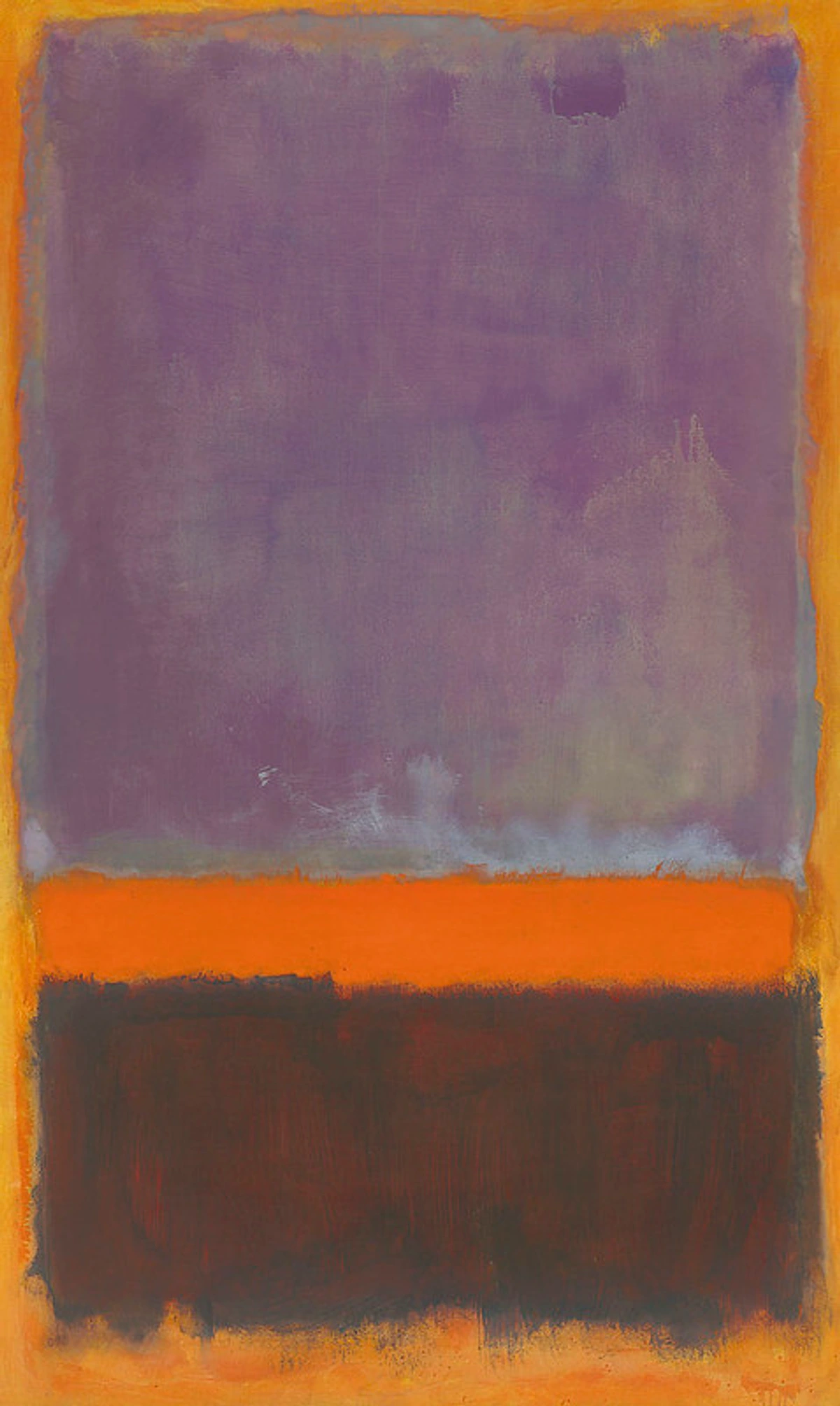
Artists like Mark Rothko (if you're keen to know more about the master, I've got an ultimate guide to Rothko for you!) were pioneers, aiming for a sublime, almost spiritual connection through color alone. His monumental canvases, often reaching impressive scales, were designed to envelop the viewer, creating an intimate, meditative space. But the movement didn't stop there. Barnett Newman explored vast, single fields broken by thin vertical "zips," also embracing immense scale to create an all-encompassing visual encounter. Clyfford Still created rugged, jagged forms that tore across the canvas, yet still focused on immersive color. Beyond these titans, Helen Frankenthaler and Morris Louis pioneered staining techniques, allowing thinned paint to soak directly into unprimed canvas, making the color an integral part of the fabric itself. This innovative approach was further explored by artists of the Washington Color School, like Kenneth Noland, who pushed staining and hard-edge abstraction to new, vibrant extremes, creating works that celebrated the inherent qualities of color and surface. Even artists like Ellsworth Kelly, with his bold, simplified forms, can be seen as embracing the Color Field ethos by stripping down imagery to its most essential color components.
These methods—staining, pouring, large rollers—weren't just stylistic choices; they were philosophical ones. By allowing thinned paint to soak directly into unprimed canvas, the color became inseparable from the fabric itself, eliminating the illusion of depth and emphasizing the flatness of the picture plane. It created an immediate, immersive atmospheric effect, bypassing overt narrative or traditional composition.
Initially, Color Field painting sparked considerable debate. Critics and the public grappled with its apparent simplicity, questioning how mere blocks of color could constitute 'art' when traditional subject matter was absent. Yet, its proponents argued for its profound ability to evoke universal emotions and spiritual experiences, challenging traditional notions of composition and subject matter. They saw it as a purification of art, a direct confrontation with the essence of painting itself. While initially met with skepticism, its re-evaluation over time has solidified its place as a pivotal movement, challenging art's very definition and proving color's profound communicative power. This shift in critical perception, recognizing the subtle power and intellectual rigor beneath the apparent simplicity, is a testament to the movement's enduring influence. This profound focus on pure color and immersive experience, where the canvas itself breathes with pigment, is precisely what ignited my own journey into this compelling world. And it’s a journey that quickly taught me that 'simple' rarely means 'easy.'
More Than Just a Pretty Hue: My Emotional Landscape
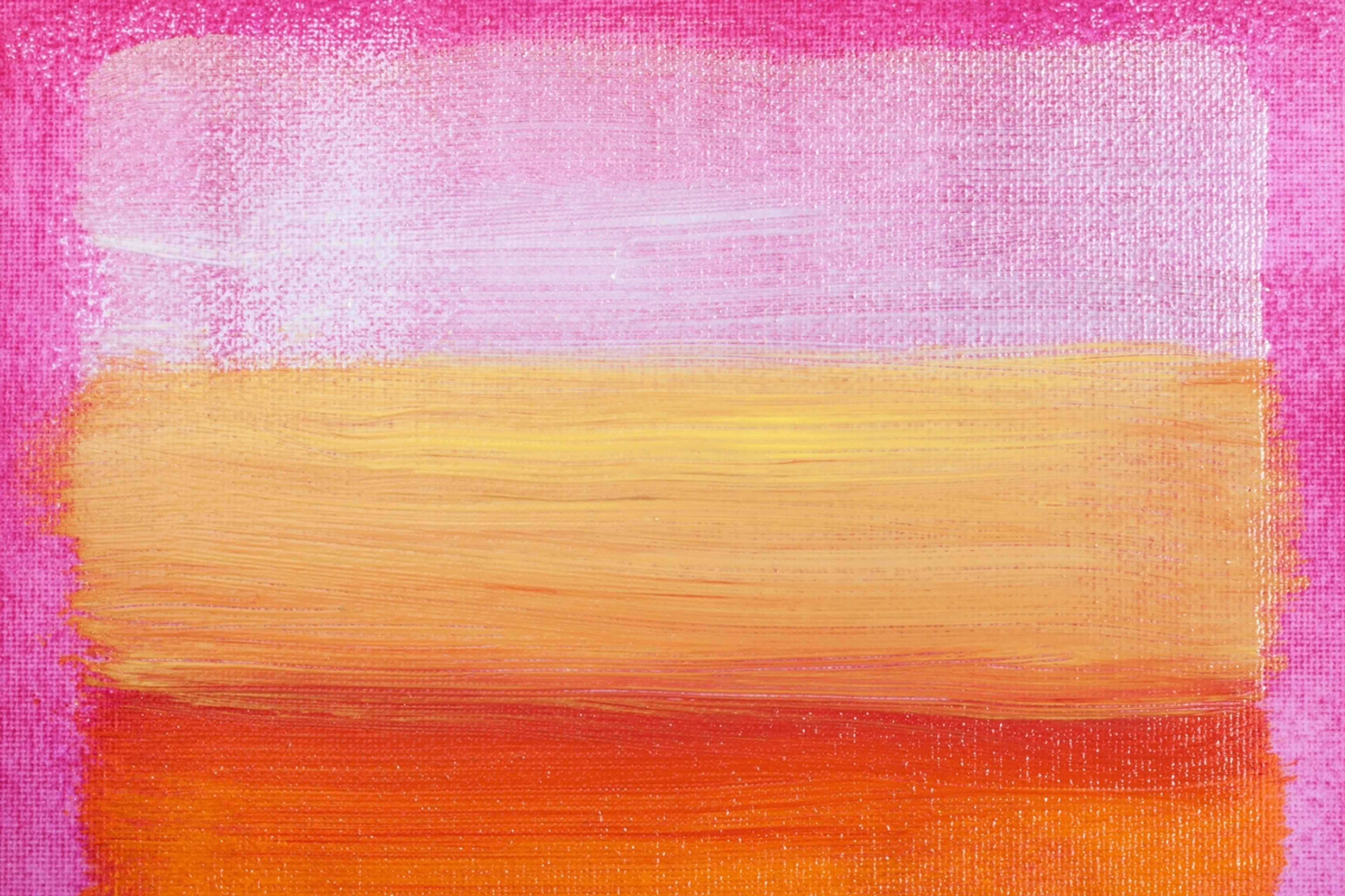
This is where the magic truly happens for me, and perhaps, where I reveal a little too much of my inner world. Color isn't just a visual element; it's a language. A silent, potent language that speaks directly to the soul, bypassing words and often, my own internal filter. I've spent years exploring the emotional language of color in abstract art, and Color Field is where that language finds its purest form, a place where I can truly let my feelings flow onto the canvas.
When I paint, I’m not just mixing pigments; I’m mixing memories, moods, and aspirations. Sometimes, it’s about capturing the quiet melancholy of a rainy Sunday, using deep blues or muted grays. Other times, it’s the pure, unadulterated joy of a summer day, bursting forth in vibrant yellows and oranges.
Sculpting with Light: Layers and Innovative Application
My approach often involves a dance between meticulous planning and spontaneous discovery, where 'innovative application methods' aren't just buzzwords, but a quest for new emotional textures. For instance, I might prepare the canvas with a subtly textured gesso, then apply translucent washes of thinned acrylics, allowing them to pool and dry in organic patterns that catch the light. This isn't about creating an illusion of depth in the traditional sense, but rather a shimmering play of light across the flat color field, revealing subtle variations within the hue – like sunlight shifting across a vast, unbroken desert. It's about light through color, revealing hidden nuances. I remember a piece where I used a custom-made, extra-wide roller to apply a series of horizontal gradients, letting the colors subtly bleed into one another. The effect was a breathtaking, continuous horizon line that felt both infinite and deeply personal, like witnessing a sunrise across a vast, solitary landscape – a bittersweet echo of hope. Sometimes, I even use gravity itself as a co-conspirator, tilting canvases to guide the flow of thinned paint, letting serendipity play its part.
While monolithic fields are powerful, I often introduce subtle variations, layered hues, or carefully placed contrasting elements to build a more complex emotional narrative. It's like life, isn't it? Rarely just one feeling at a time. The interplay of colors can create a vibration, a visual hum that resonates deep within, a kind of silent symphony. I often think about the power of color in abstract art: my approach to palette and emotion when choosing these combinations.
Sometimes, I'll layer translucent washes of color, one over another, allowing them to merge and create new, ethereal tones. This process, often involving techniques like pouring, staining, subtle blending, or even using large rollers for smooth gradients, is deeply meditative, almost spiritual, as if I'm building a new world, one shimmering layer at a time. This layering also gives paintings a wonderful depth; if you want to know more about it, I've explained the language of layers: building depth in abstract acrylics in another article. It's a subtle way to create movement and light, to suggest an unfolding narrative without ever drawing a line or form. And sometimes, when I'm particularly brave, I might introduce a deliberate clash of colors – a jarring note, perhaps – to reflect the beautiful dissonance that life often throws our way.

The Whispers of a Single Shade
It’s astonishing how much emotion a single, carefully chosen shade can convey, a solitary note holding an entire symphony. Take blue, for instance. It's not just blue; it's the calming expanse of a clear sky, the mysterious depth of the ocean, or the subtle ache of longing. I’ve written extensively about the psychology of blue in abstract art: calm, depth, and emotion, and it’s a color that consistently pulls at my heartstrings, often feeling like a quiet conversation with my own soul. Similarly, exploring the psychology of yellow in my art: joy, optimism, and light and the psychology of green in my art: growth, harmony, and nature's influence has shown me the incredible range of feelings these seemingly simple colors can hold. But it's not just the primary and secondary hues; even the absence or intensity of color speaks volumes. A deep black might evoke introspection or a comforting void, while pure white can symbolize beginnings or profound stillness. Each chosen hue becomes a focal point for a specific emotional resonance, a singular wavelength of feeling.
When I lay down a large field of a single color, I want it to envelop you. I want it to feel like a warm hug, a quiet contemplation, or a sudden burst of energy, depending on its hue and intensity. It’s a deliberate act of creating an atmosphere, a feeling space, a kind of silent invitation. This profound exploration of how color expresses feeling naturally leads me to my creative process, where these emotional landscapes are brought to life on canvas, often through sheer physical exertion.
My Creative Process: Letting the Colors Lead
My approach to Color Field painting is deeply rooted in intuition. It's less about a rigid plan and more about a responsive dance with the canvas. I've found that embracing intuition in abstract painting leads to the most authentic results.
The Blank Canvas and a Deep Breath
It usually starts with a feeling, an impulse. A vague sense of a color, a mood I want to explore. There’s no sketch, no preliminary drawing. Just the canvas, an arsenal of paints, and a willingness to see where the color takes me. It’s a bit like staring at a blank page and hoping the words just appear. And sometimes, they do! It’s about letting the painting emerge, rather than forcing it into a preconceived form.
Beyond the mental preparation, there's the very physical reality of it all – a kind of grueling, beautiful ballet. Stretching a truly monumental canvas, say, ten by twelve feet, is a full-body workout. I often find myself wrestling with the sheer scale, muscling canvas into submission before it even sees a drop of paint. Mixing paint isn't a delicate squeeze from a tube; it's often emptying entire buckets of artist-grade acrylics, sometimes fortified with flow improvers or transparent mediums, diluting them to the perfect consistency for soaking, then hauling and maneuvering these unwieldy, wet giants around my studio. Gravity, as I often joke, is both my best collaborator and my most infuriating nemesis; it demands respect and careful calibration. Every pour, every stain is a calculated risk, a trust fall with physics. And don't even get me started on drying times! The thin, expansive layers of paint can take days, even weeks, to fully cure, demanding immense patience and careful management to avoid dust or accidental smudges. Transporting and exhibiting these monumental works also presents a unique set of logistical puzzles, often involving specialized crates and a surprising amount of upper-body strength. It demands a kind of full-body engagement, a dance with the material itself, a far cry from the serene finished product.
I often begin with a large, sweeping wash, establishing the foundational emotional tone. This first layer is crucial; it sets the stage for everything that follows, almost like the overture to a symphony. It's a moment of commitment, a silent agreement between me and the canvas, a deep breath before the plunge. I remember one time, struggling with a particularly stubborn canvas, feeling like I was just pushing paint around, utterly devoid of inspiration. I thought, 'This isn't working, I'm stuck.' Then, out of sheer frustration, I decided to let go, pouring thinned pigment and letting it spread organically, almost without thought. That chaotic, beautiful mess taught me the power of relinquishing control and letting the materials guide me towards innovative application methods, often utilizing large brushes, rollers, or even my bare hands to spread and manipulate the expansive fields. It was a profound secret being whispered, a breakthrough that truly shifted the painting's soul, liberating me from rigid intention and teaching me that sometimes, the best path forward is to just listen to the art.
From Impulse to Form: The Evolution of a Painting
The beauty of Color Field, for me, lies in its iterative nature. I don’t just slap down a color and call it a day. Oh no, that would be far too easy, and where’s the fun in that? Instead, I build, I adjust, I respond. A painting might start as a simple blue rectangle, but then a subtle crimson edge might emerge, like a shy blush, or a whisper of yellow might peek through from an underlayer, suggesting a hidden optimism. It’s a process of listening to the painting, letting it tell me what it needs.
While Rothko's colossal works aimed to overwhelm and envelop, my canvases, often ranging from medium to truly vast, seek a similar immersion but with a slightly different invitation. They aim not to preach, but to whisper. A piece might fill a wall, demanding your full attention, yet its nuances invite you closer, for a more intimate conversation between you and the subtle shifts within a seemingly endless field of color. Sometimes, I find myself standing back, arms crossed, scrutinizing a painting, and thinking, "You know, this would be so much easier if it just told me what to do." But that's the joy and the challenge: the silent dialogue. It’s an evolution, a slow unveiling of what was always there, waiting to be revealed. This constant search for my artistic voice and the evolution of my abstract artistic style is a never-ending, fascinating journey. This intuitive, responsive process is what allows me to imbue these formless fields with such personal meaning.

Finding Meaning in the Formless: Why I Paint This Way
Perhaps the most common question I get about abstract art, especially Color Field, is "What does it mean?" And my answer is always the same: "What does it mean to you?" For me, painting in this style is deeply personal. It's a way to process emotions, to find calm in chaos, to express the inexpressible. It's about creating spaces – literal and metaphorical – where the viewer can simply be with color, without the distraction of objects or figures. This allows for a deeply personal, almost meditative, interaction. The painting isn't just something to look at; it's something to experience and inhabit.
For me, this connects to philosophical ideas like phenomenology, where the emphasis isn't just on looking at a painting, but on the direct experience of it. A Color Field painting, then, isn't something to be deciphered; it is its experience. You don't interpret it, you inhabit it. It exists purely in the unmediated interaction between you and the expansive color, a direct sensory encounter. If you're curious about why I paint abstract: my personal philosophy and artistic vision, you'll find that for me, it's about connecting on a deeper, more primal level.
While pioneers like Rothko often aimed for the tragic or the spiritual through grand, imposing fields, my own exploration of Color Field painting has led me down a path of deeply personal discovery, aiming to push Color Field painting beyond Rothko's profound legacy. I aim to create a space for individual, perhaps more nuanced, emotional dialogues—a soft murmur instead of a booming sermon. I often inject a distinct contemporary energy and a touch of personal narrative through innovative application methods to explore new emotional depths, perhaps using a brighter, more playful palette to evoke unexpected joy, or a subtle interplay of translucent layers that hint at hidden narratives, almost like secrets whispered across the canvas. It's about inviting a more intimate, relatable experience, often through a brighter palette or a more dynamic interplay of subtle textures and layers, allowing the viewer to bring their own stories to the unwritten fields.

It’s a bold assertion, isn't it? To say that a simple field of color can move mountains within you. But I truly believe it can, because it transforms viewing into an encounter, inviting you to simply be with color, without the distraction of objects or figures. This unmediated experience, for me, is what truly makes abstract art compelling.
FAQ: Your Questions, My (Sometimes Quirky) Answers
You've got questions, I've got answers! (Though sometimes, my answers just lead to more questions, which is the beauty of art, right?)
Question | My (Personal) Answer |
|---|---|
| Is Color Field art easy to make? | Oh, if only! It looks deceptively simple, like staring at a perfectly still lake. But getting that lake to be perfectly still, and for its stillness to evoke profound emotion? That's the tricky part. It requires immense control, patience, and a deep understanding of color theory. And often, a lot of scrapped canvases. |
| How do you choose your colors? | It's a mix of intuition, mood, and what the painting tells me it wants. Sometimes, I have a specific emotion in mind (like the "blue of tired joy"). Other times, I just grab a tube and see what happens. It's a dialogue, often a very sassy one. My approach to my palette, my story: the emotional language of color in my abstract art is quite detailed. |
| Do you ever get bored painting large areas? | Never! It's like asking if a musician gets bored playing long notes. Each "long note" of color has its own vibrato, its own subtle shifts. It’s a constant meditation, a deep dive into the essence of hue. If anything, I get bored with smaller details. |
| Why is scale so important in Color Field art? | Size matters! A large canvas isn't just 'bigger'; it's designed to envelop you, to remove peripheral distractions, and to create an immersive, almost environmental experience. It's about stepping into the color, rather than just looking at it. It transforms the viewing into an encounter. |
| What happens when you get 'stuck' on a painting? | Oh, it happens more often than I'd like to admit! My studio becomes a graveyard of half-finished dreams. Sometimes, the only way out is to walk away for days, even weeks. Other times, it's about doing something completely counter-intuitive – adding a color I never thought would work, or literally turning the canvas upside down. It's a reminder that art, like life, often requires a leap of faith into the unknown, or perhaps just a very long coffee break. It often means going back to embracing intuition in abstract painting. |
| Where can I see your Color Field art? | Well, right here on my website, of course! You can explore my art for sale. If you're ever in the Netherlands, you might even catch a piece or two at my museum in 's-Hertogenbosch, or you can follow my entire artistic timeline right here. |
Conclusion: A Love Affair with Color, Continued
My journey with Color Field painting has been, and continues to be, a profound exploration of emotion, space, and the sheer, unadulterated power of color. It's less about painting things and more about painting feelings. It's a quiet rebellion against the literal, an embrace of the vast, inner landscapes that reside within all of us.
It’s a bit like falling in love, isn't it? You start with an initial spark, a curiosity, and then you find yourself completely enveloped, discovering new depths and nuances you never knew existed. And much like a good relationship, it’s not always easy, but it’s always worth it. My Color Field journey continues to surprise and challenge me, a never-ending dialogue with the infinite possibilities of hue. So, I invite you: step into the expanse, let the colors wash over you, and perhaps even explore my art for sale on this website, or visit my museum in 's-Hertogenbosch if you're ever in the Netherlands. Allow your own emotional landscapes to unfold, and join me on this never-ending, vibrant journey.
Thank you for joining me on this colorful introspection. I hope it inspires you to look a little longer, feel a little deeper, and perhaps even find your own expansive hue of joy, waiting just beneath the surface of a seemingly simple shade.


