The Alchemy of Light: My Secret to Layering Translucent Colors in Abstract Painting
You know, there’s this little secret I hold, a kind of quiet whisper in my studio that often translates into the loudest, most captivating colours on my canvas. It’s not some arcane alchemy or an expensive pigment. It’s far simpler, yet profoundly effective: layering translucent colours. If you’ve ever wondered how some abstract paintings seem to glow from within, or how their colours achieve such remarkable depth and richness, chances are, it’s not just a single bold stroke, but a symphony of thin, luminous layers. Join me as I pull back the curtain on this captivating technique, delving into the 'why,' 'what,' and 'how' of achieving truly vibrant, luminous art that feels like it breathes.
For me, painting is a journey, and like any good journey, it's filled with unexpected turns and hidden depths. A flat, opaque colour, while powerful in its own right, sometimes feels like a closed door, holding its secrets too tightly. But translucent layers? They’re like windows, inviting you to peek into the soul of the piece, revealing hints of what lies beneath, and creating a dialogue between light and pigment that truly electrifies the surface. It’s this interplay, this continuous unfolding of light through colour, where the magic, for me, truly happens, creating an internal glow.
Why Translucency? The Magic of Light and Depth
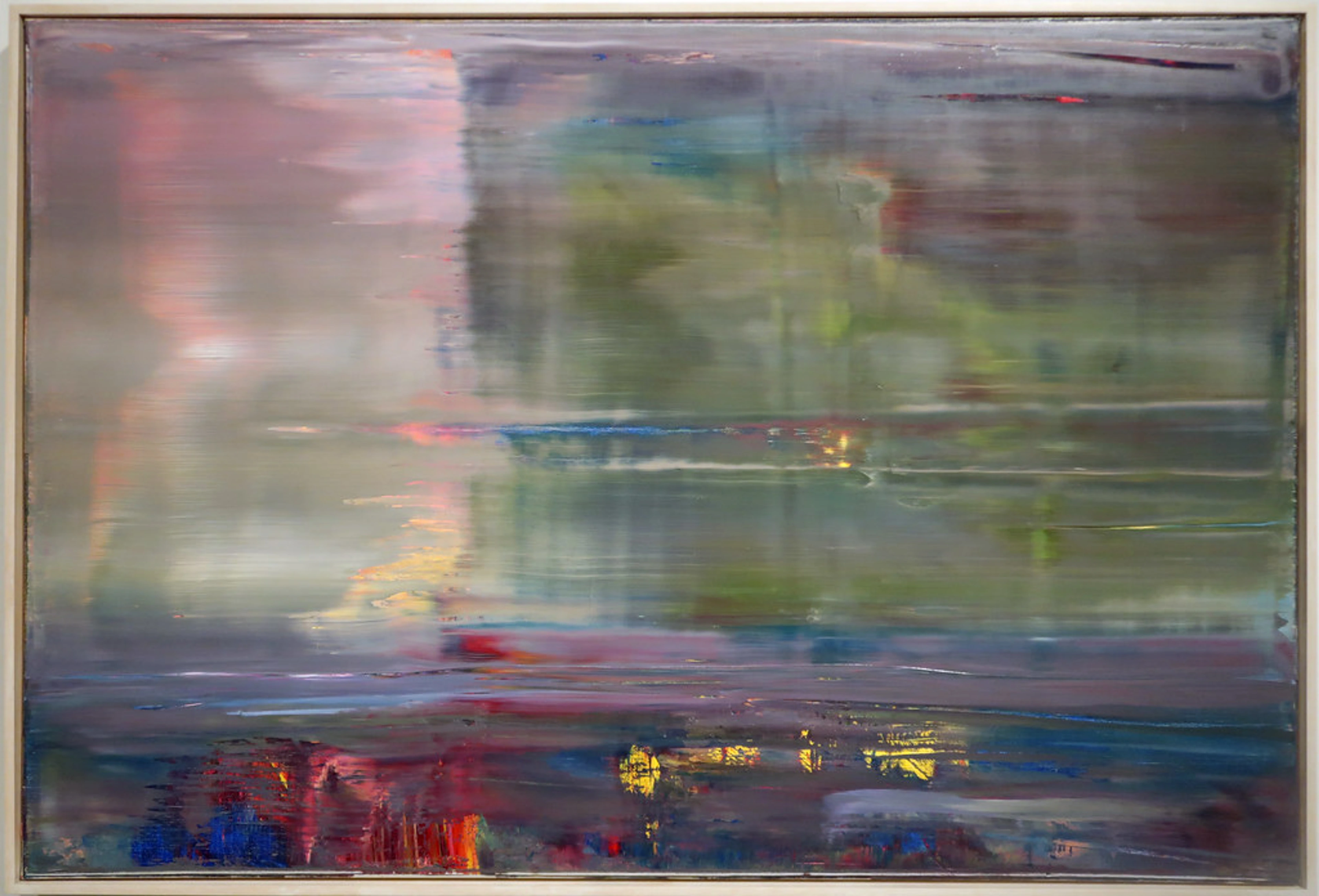
I'll be honest, sometimes I get bored easily. A single, flat colour, no matter how beautiful, can quickly lose its appeal for me. I crave movement, a story unfolding. That’s why I fell head over heels for the concept of translucency. Imagine dappled sunlight filtering through autumn leaves, or the way the ocean shifts from a clear turquoise near the shore to an inky, mysterious blue in its depths – it’s all about layers interacting with light. This isn't a new concept, mind you; master painters from the Renaissance, like Jan van Eyck and Leonardo da Vinci, perfected glazing techniques to infuse their works with an almost ethereal glow. The Impressionists, with their broken brushstrokes, and Post-Impressionists like Paul Cézanne, who meticulously built forms with nuanced, overlapping washes of color, pushed this idea further. I'm just doing it my way, with my trusty acrylics.
In abstract art, this translates into incredible visual effects. Each thin, almost watery layer of paint catches and reflects light differently, allowing the underlying colours to shine through, not in a muddy mess, but in a brilliant interplay. Consider layering a transparent warm yellow (like a Quinacridone Yellow) over a cool transparent blue (like a Phthalo Blue); the resulting green is not a flat mix, but a vibrant, almost shimmering hue that seems to contain both its parents, creating a kind of optical vibration. This is the pulsating energy I speak of – a colour that isn't just there but actively engages with the eye, drawing you deeper into the canvas. It adds a pulsating energy, a visual vibration that a single, thick layer just can't achieve. It’s also a fantastic way to build incredible The Language of Layers: Building Depth in Abstract Acrylics, making the canvas feel expansive rather than confined. If you're eager to learn more about the practical application, you can explore more on How to Layer Colors in Acrylic Painting.

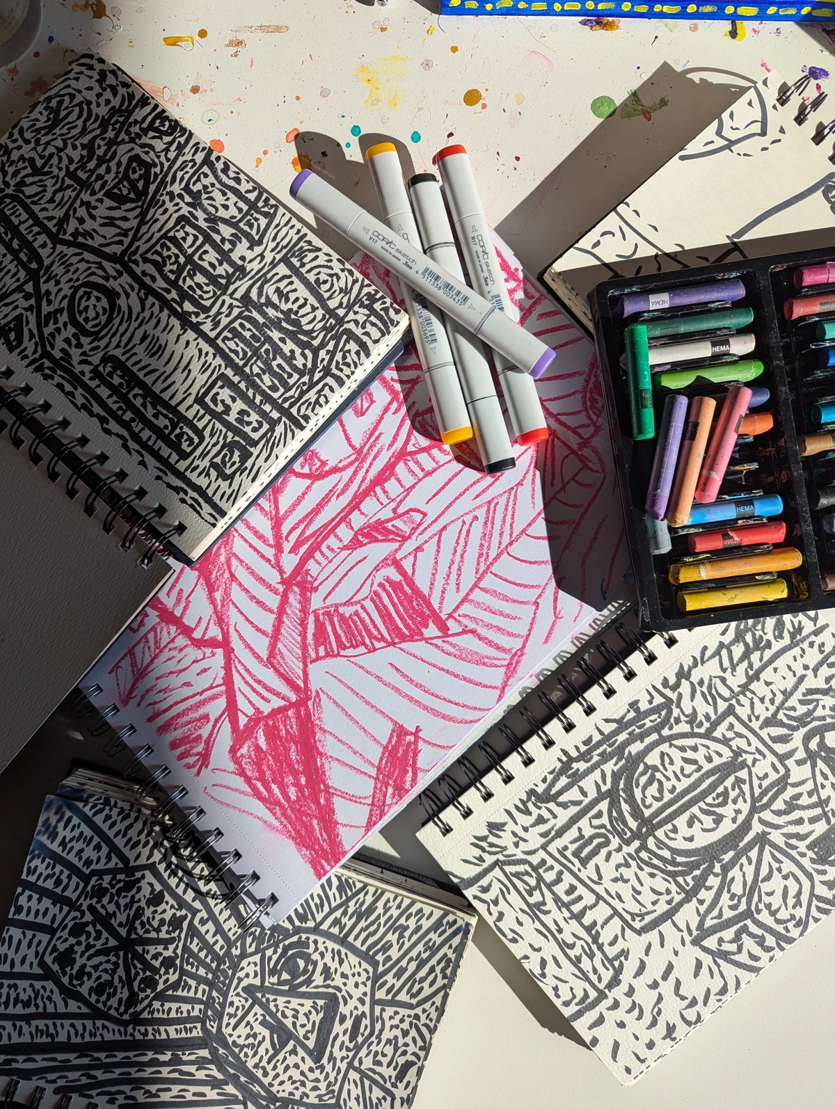
Tools of the Trade: What You'll Need (and My Personal Preferences)
Ever wonder what’s tucked away in an artist's secret stash, the tools that whisper possibilities onto the canvas? So, now that we've glimpsed the magic, let's talk about the mundane, yet essential, practicalities – what you'll need to bring this luminous vision to life. You don't need a fancy art store pilgrimage for this, though a new tube of paint always sparks joy, doesn't it? The key isn't necessarily specific brands, but rather understanding your materials and how they work.
- Paints: I lean heavily on fluid acrylics. They're inherently more liquid, and can be thinned further without losing their intensity, perfect for translucent washes. This is because fluid acrylics typically have a higher pigment concentration suspended in a thinner binder, meaning they can be diluted significantly while maintaining vibrant color saturation, unlike heavy body acrylics which have a thicker binder. Heavy body acrylics can work too, but you'll need more medium, which then alters the binder ratio more substantially, sometimes leading to a chalky finish if not balanced correctly.
- Mediums: This is your best friend! A high-quality glazing liquid or a general fluid medium will extend your paint, make it more transparent, and give you longer working times. Glazing liquids are often formulated to dry to a very clear, flexible film, specifically enhancing transparency and flow, whereas general fluid mediums are more versatile for thinning and extending without a specific 'glazing' focus. It’s the secret sauce for those luminous layers. When you add a medium, you're essentially increasing the binder content relative to the pigment, which increases transparency without 'breaking' the paint film. This is crucial; too much water, for example, can break down the binder, making the paint brittle or less permanent. Be mindful of cheaper mediums that might yellow over time or alter the paint's texture in undesirable ways; a good medium is an investment in your art's longevity and luminosity.
- Brushes: Soft, synthetic brushes are my go-to. Unlike natural hair brushes, synthetics don't absorb as much moisture, making them ideal for even application of thinned paint and ensuring your translucent washes remain clear and streak-free. They hold a good amount of thinned paint and allow for smooth, even application. And of course, don't forget water! A small amount can thin fluid acrylics even further for delicate washes, but be careful not to overdo it, or you'll break down the binder.
- Surface: A gesso-primed canvas or wood panel works wonderfully. A smoother surface helps tremendously with even application, allowing the translucent layers to flow seamlessly. While a rougher texture can add interest, for pure luminosity, I find smoother grounds allow the colours to truly sing. A light ground can also help the translucent colours pop, reflecting light back through the layers. And on that note, the quality of your gesso or primer is often overlooked; a good quality, non-absorbent gesso will prevent your precious translucent layers from sinking in and losing their luminosity, allowing them to truly glow on the surface.
My studio, by the way, looks like a battleground of half-squeezed tubes and dried paint splotches. One time, I mistakenly picked up a tube of "Titanium White" thinking it was a semi-transparent mixing white, only to lay down a completely opaque cloud over my carefully built layers. Rookie mistake, even for me. So don’t worry if your workspace isn’t pristine – it’s all part of the creative chaos! And remember, these tools are just companions on your journey; the true magic unfolds through your hands and your willingness to experiment – no pristine studio required!
My Layering Process: A Dance of Intuition and Intent
This isn't a rigid, step-by-step instruction manual; it's more like a conversation I have with the canvas. It's truly a The Dance of Intuition and Intent: My Process in Creating Abstract Layers.
The Underpainting: Laying the Foundation
Sometimes I start with a very loose, vibrant wash of colour across the entire canvas. Other times, it’s a more deliberate block of colour in certain areas. The key here is not perfection, but rather laying down an initial energy, a ghost of what's to come. This first layer can be quite thin and quick, allowing me to explore initial My Approach to Color Mixing: Creating Vibrant Palettes in Abstract Painting. For instance, I might begin with a sunny cadmium yellow for warmth, knowing I'll later cool it down with translucent blues, or perhaps a rich, deep crimson, which will glow under layers of cool greens. It's like whispering to the canvas, asking it what it wants to become.
The hardest part? Waiting for it to dry. My impatience is legendary, but rushing translucent layers is a one-way ticket to muddy disaster. So, I often have several pieces going at once, allowing one to dry while I work on another. A little trick I learned: a hairdryer on a cool setting can be a lifesaver!
Building the Narrative: Thin Layers, Big Impact
This is where the real fun begins. I mix small amounts of fluid acrylics with plenty of glazing medium, creating highly transparent, almost stained-glass-like washes. I apply these in broad, sweeping motions or focused areas, allowing each layer to partially obscure and partially reveal the one beneath it.
Think about what happens when you layer a translucent blue over a translucent yellow – suddenly, you have a rich, complex green that seems to vibrate! Or a warm red over a cool blue creating an unexpected violet. Each application is a small decision, a tiny adjustment to the overall harmony. For example, a thin veil of transparent Cadmium Orange over a deep Ultramarine Blue won't simply mix to brown; instead, you get a surprising, luminous violet, a shimmering interaction that a direct mix can't replicate. A translucent Quinacridone Magenta over an Olive Green can shift it from earthy to ethereal, creating a tension that breathes life into the piece. Sometimes, I stare at a layer, feeling like it's just 'not right,' and then I remember a challenging moment in life – a time when something felt messy or unclear. Just like those experiences, these layers often hold the key to a richer narrative. It’s an ongoing conversation, a delicate negotiation between what was and what could be. It's truly The Art of Glazing: Adding Luminous Depth to My Abstract Acrylics, bringing luminosity to the forefront.
I often think of it like adding chapters to a story. Each layer adds information, emotion, and complexity without erasing what came before. It’s a bit like life, isn’t it? Every experience, every lesson, adds a new layer to who we are, making us richer and more complex.

credit, licence
The Grand Finale: Refining and Revealing
As the painting progresses, the colours deepen and become more vibrant. I might introduce a more opaque mark here and there for contrast, but generally, I maintain the translucent approach. This final stage is about refinement: looking for areas that need a little more warmth, a cooler tone, or a touch more light. For instance, a very thin, almost invisible layer of white or a pale warm yellow can create a sense of atmospheric perspective, pushing certain elements back into the distance, suggesting a misty horizon or receding light, much like how distant mountains appear lighter and bluer. Conversely, a final translucent glaze of a vibrant hue, like a rich crimson or a deep cobalt blue, applied subtly over a lighter area can suggest a powerful light source emanating from within the canvas itself, as if the light is truly trapped and glowing from within.
It's also about knowing when to stop. This is often the hardest part for any artist, isn't it? The temptation to add just one more layer can be overwhelming. But sometimes, the greatest vibrancy comes from restraint, allowing the accumulated depth to speak for itself. It’s about letting the painting breathe and trusting the layers to do their work, revealing their secrets gracefully.
credit, licence
Beyond Technique: The Emotional Resonance of Layered Color
For me, the visual effect of layered translucent colours goes far beyond mere technique. It speaks to something deeper, something about the human experience. Life isn't a single, flat emotion; it's a tapestry woven from countless experiences, joys, sorrows, and moments of quiet reflection. Each adds a layer, creating a complex, vibrant, and unique whole.
When you stand before a painting created with these layered techniques, you're not just seeing colours on a surface. You're feeling a sense of history, a journey, a hidden conversation between pigments. It’s why colour is so powerful in abstract art, often moving us in ways words cannot. It taps into The Psychology of Color in Abstract Art Beyond Basic Hues on a profound level, truly exploring The Emotional Language of Color in Abstract Art.
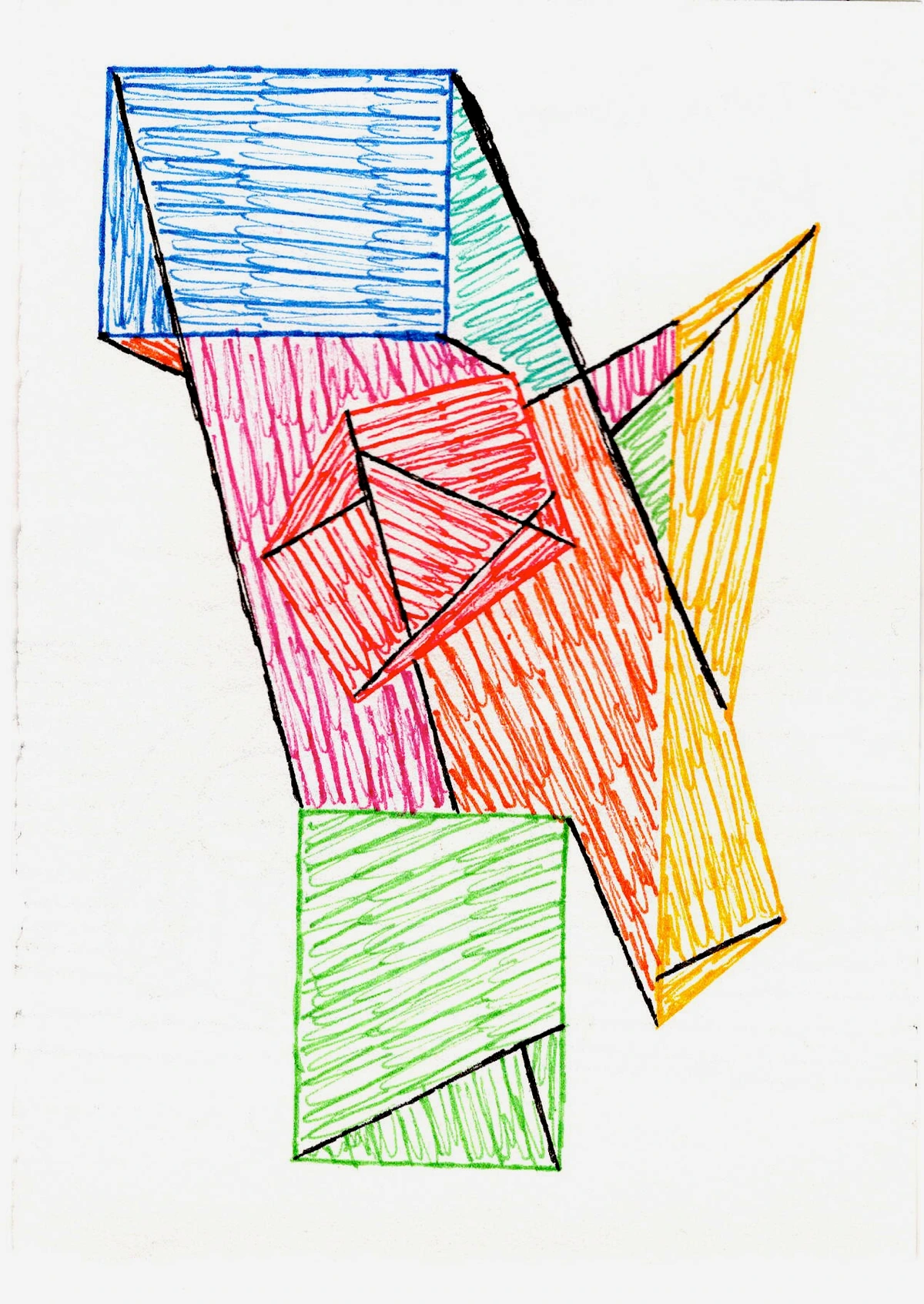
Related Techniques: Scumbling, Dry Brushing, and Beyond
While the emotional depth and seamless luminosity of glazing are paramount, sometimes the narrative on my canvas calls for a different kind of whisper, a complementary technique to deepen the conversation. Its cousin, scumbling, offers a different kind of magic. Scumbling involves applying a thin, broken, often semi-opaque layer of paint over a dry underlayer, allowing fragments of the underlying color to peek through. Where glazing creates a seamless, stained-glass effect, scumbling adds a textural, almost hazy vibration. This "hazy vibration" occurs because the broken application of paint leaves tiny gaps, allowing the underlying colour to show through unevenly, creating an optical mix that shimmers rather than blends smoothly, adding a nuanced visual texture. It’s less about crystal clear depth and more about a subtle, shimmering diffusion. I often use it to soften edges or introduce a gentle, atmospheric fuzziness to a particularly bold area, creating another layer of visual interest, like the soft focus of a memory. It's a wonderful way to continue Exploring Texture: My Favorite Techniques for Adding Depth to Abstract Paintings in your work.
Another technique to consider is dry brushing. This involves applying paint with a brush that has very little moisture or paint on it, dragging it lightly across the surface. The result is a broken, textured mark that also allows the underlying layers to show through, similar to scumbling but often more linear or gestural. It's fantastic for creating subtle textural shifts or for adding a whisper of translucent colour without full coverage, ideal for suggesting subtle changes in light or form.


Common Questions I Get (and My Honest Answers)
How many layers are too many?
Honestly? There's no magic number. I've had paintings with three layers and others with thirty. The true measure isn't how many, but how each layer contributes to the overall visual story and emotional resonance. If the colours are still vibrant, and you're still seeing new interactions and depth, keep going. If it starts to look muddy or loses its luminosity, you’ve likely gone too far or weren’t letting layers dry properly. It's a feeling you develop over time, a subtle intuition that guides you.
What if my colours get muddy?
Ah, the muddy monster! This usually happens for a few reasons:
- Not enough medium: You need that translucency! Don't be shy with the glazing liquid.
- Not letting layers dry: Impatience, my old friend. Wet-on-wet translucent layers tend to mix rather than layer, leading to mud.
- Too many opaque pigments: If your base colours are too heavy or opaque, they'll block the light instead of letting it filter through. Stick to naturally transparent or semi-transparent pigments. Even within the same brand, some pigments are inherently more transparent than others; cadmium reds and yellows, for example, are often more opaque than quinacridones or phthalo blues. Understanding your pigment's natural transparency is key. Oh, and one more thing on the muddy monster: while I always advocate for good quality paints, the quality of your medium is equally vital. A cheap medium can sometimes react poorly with pigments or yellow over time, dimming that internal glow you’re working so hard to achieve.
Can I do this with other paint types like oils or watercolors?
Absolutely! The principle of layering translucent colours is fundamental to many painting traditions. Oils are fantastic for glazing due to their long open time, allowing for incredibly smooth transitions and subtle blending between layers. The slower drying time means you have more room to manipulate and fine-tune, though it also means a longer wait between layers. Watercolors, by their very nature, are all about translucent washes, where the white of the paper shines through. The key difference is often the binder and the drying time; acrylics offer a fantastic middle ground, combining the layering potential with a relatively quick turnaround, though be mindful that over-diluting acrylics with water (without sufficient medium) can weaken the binder and make the paint film brittle over time. And what about gouache or tempera? While beautiful, they are inherently more opaque due to higher pigment load and binder properties, and can be challenging for true translucency as they tend to reactivate with subsequent wet layers, making clean, distinct layers harder to achieve. Each medium presents its own unique challenges and advantages in achieving luminous layers.
How do I achieve specific textures or edges?
This is where control meets chaos, isn't it? For soft edges, you'll want to apply your translucent wash quickly and smoothly, often feathering the edges with a clean, damp brush before it dries. Think of it like a gradient mist. For hard edges, I typically mask off areas with tape (allowing a clean, dry edge for the paint to abut) or use a very steady hand and a fine-tipped brush, almost like drawing with a slightly thicker, but still translucent, mix. Sometimes, I even use the edge of a palette knife to create a crisper line that still reveals the layers beneath, a beautiful contradiction.
Troubleshooting Common Issues
Even with the best intentions, things can go a little sideways. Don't worry, it's part of the journey!
- Uneven drying/streaks: This often happens when you're working too slowly with acrylics, or if your brush isn't loaded evenly. Try working faster in broad strokes, or use a larger, softer brush to ensure smooth, even coverage.
- Brush strokes showing too much: If you're aiming for a seamless glaze, visible brush strokes can be frustrating. Ensure your paint is sufficiently thinned with medium and your brush is soft and fully loaded, allowing the paint to flow rather than being dragged. Sometimes, a very light, almost dry-brush application can soften previous strokes.
- Lifting previous layers: This is a classic acrylic problem, especially if you're applying a wet layer too vigorously over a not-quite-dry one. Patience is your best friend here! Always ensure the previous layer is bone dry. If you absolutely must work quickly, a hairdryer on a cool setting can help, but gentle application is still key.
Your Turn to Experiment: Embrace the Journey
The beauty of abstract art, and particularly this layering technique, is that there are no strict rules. It's all about discovery, experimentation, and finding your own voice. Don't be afraid to try odd colour combinations, to apply layers in ways that feel "wrong" – sometimes, those are the most liberating discoveries.
So, grab your paints, your glazing medium, and dive in. Here’s a little challenge: try layering a primary colour (red, blue, or yellow) over a complementary one (green, orange, or purple) using thin translucent washes – perhaps a Phthalo Blue over a Cadmium Orange. See what unexpected vibrancy emerges! Or, attempt a simple gradient, layering two analogous colours (like blue and green) to create a subtle, flowing transition. You could even try layering a slightly opaque color with a very transparent one to see how the transparent layer creates a subtle veil, softening or harmonizing the more dominant color. Let yourself get lost in the process, watch the colours transform, and allow the hidden depths to emerge. Every layer is a testament to growth, both on your canvas and within yourself. And who knows, maybe you'll stumble upon your own secret to vibrant hues, a quiet whisper that turns into a symphony of light that resonates with others! What unexpected color stories will you uncover?
If you're curious to see how these techniques translate into my finished works, you can always browse my art for sale or explore my artistic journey to see how my process has evolved. Every piece has a story of layers within it. Don't forget, if you're ever in 's-Hertogenbosch, you can experience my work firsthand at my artist's museum!


