Intuitive Color Mixing: Controlled Chaos for Vibrant Abstract Art
Explore an artist's personal philosophy of color mixing in abstract art. Delve into 'controlled chaos,' emotional resonance, layered techniques, and embracing happy accidents to create truly unique, vibrant, and expressive palettes.
Mastering Color Mixing: My Intuitive Approach to Vibrant Abstract Art
You know, sometimes I look at a finished abstract piece, particularly one bursting with color, and I think, "How on earth did that happen?" It's a bit like asking a chef about their secret sauce. There's a recipe, sure, but there's also a generous dash of intuition, a pinch of happy accidents, and a whole lot of 'tasting' as you go. For me, color mixing in abstract painting isn't just a technical skill; it's a deeply personal dance, a conversation between my inner world and the canvas. And honestly, sometimes the canvas wins the argument, which is fine by me. It usually knows best, after all.
Today, I want to pull back the curtain a little on this often-mysterious process. This isn't just a technical lesson; it's an invitation into the very personal and often whimsical world of how I, an abstract artist, coax life into my colors. We'll explore the emotional language of hues, delve into my philosophy of controlled chaos, look at the tools that facilitate discovery, and embrace the unexpected twists and turns that define my journey in crafting truly vibrant palettes. Ready to dive into the vibrant world of color mixing with me?
The Emotional Resonance of Color: More Than Just Pigment
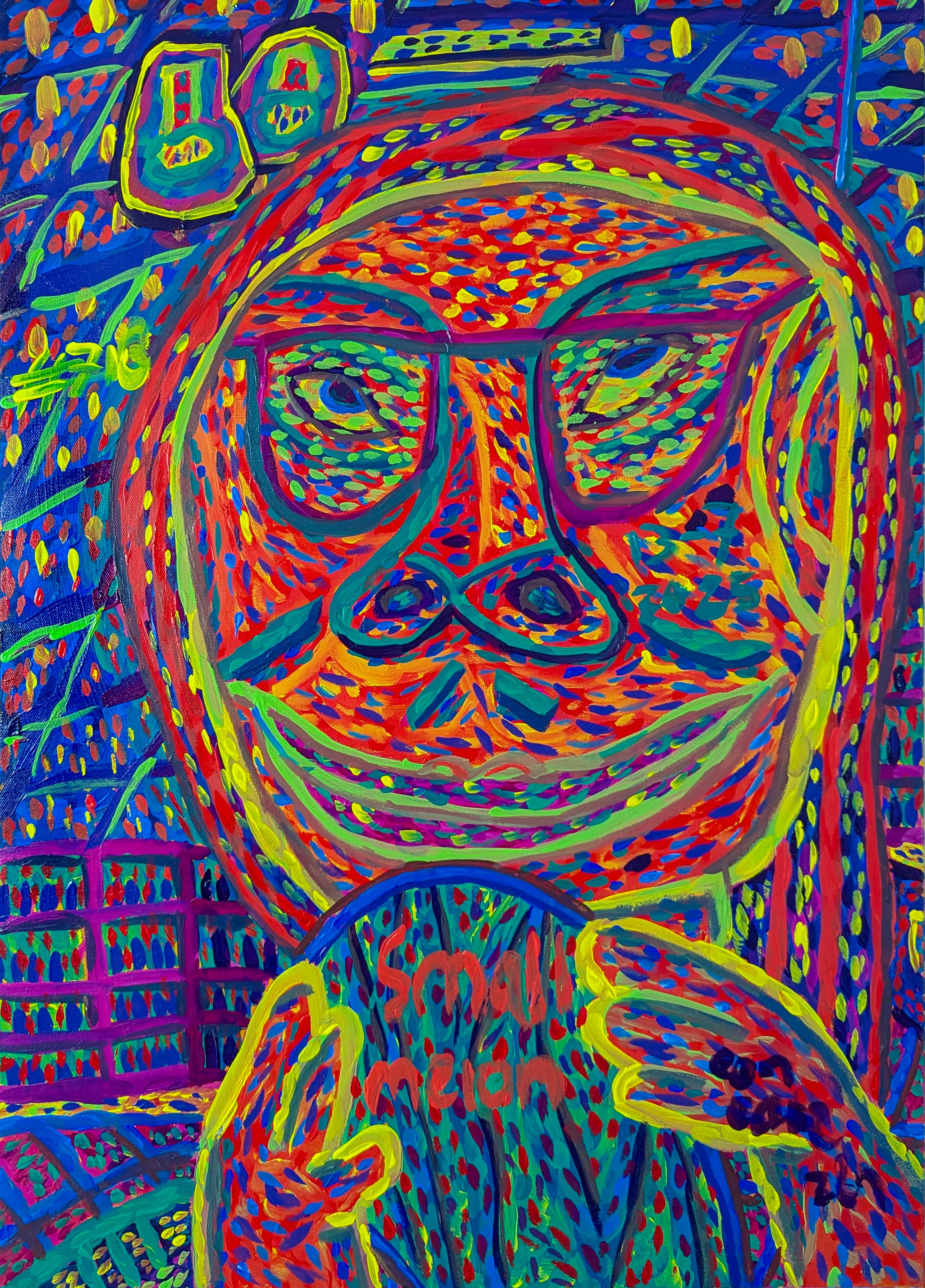
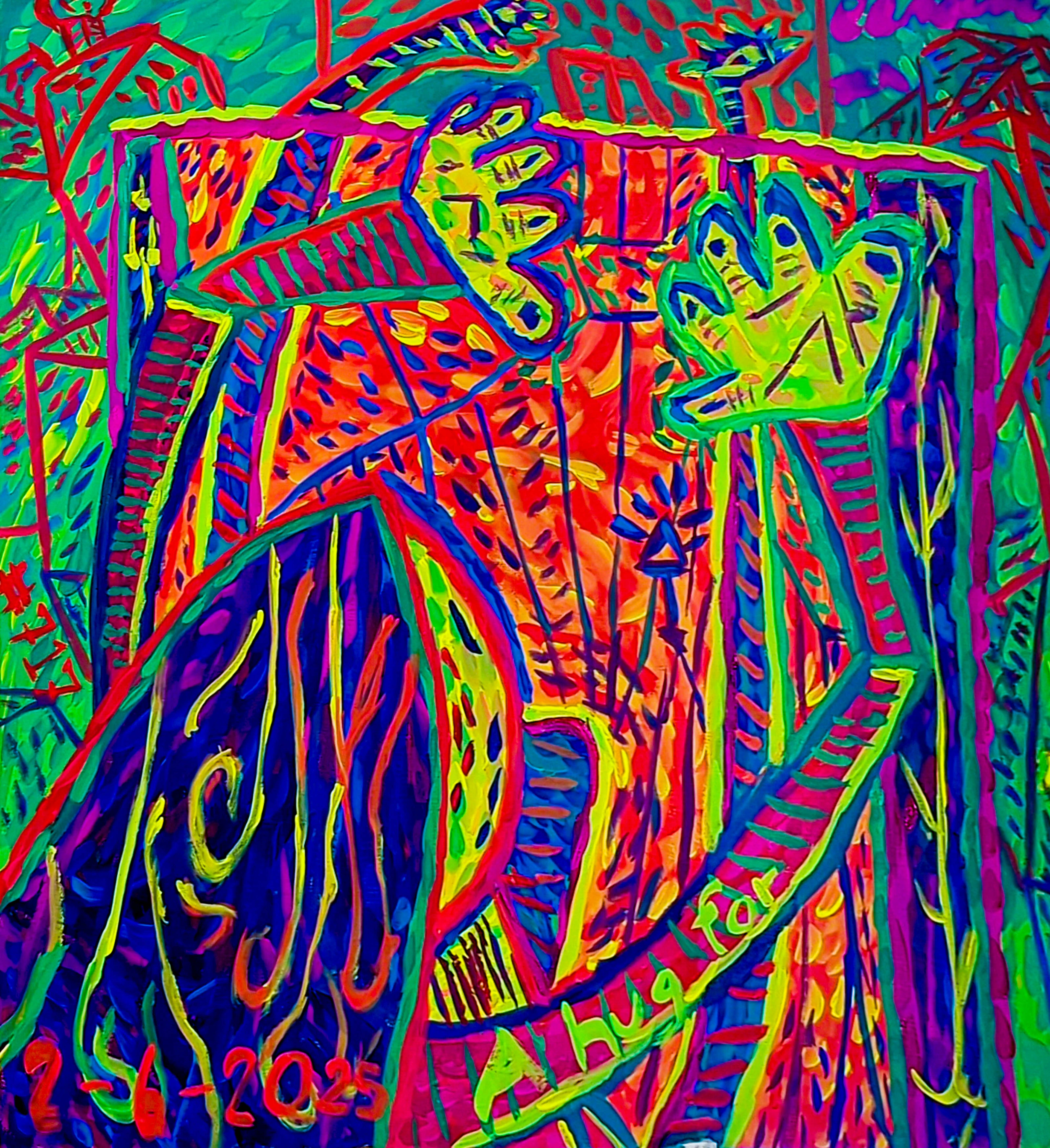
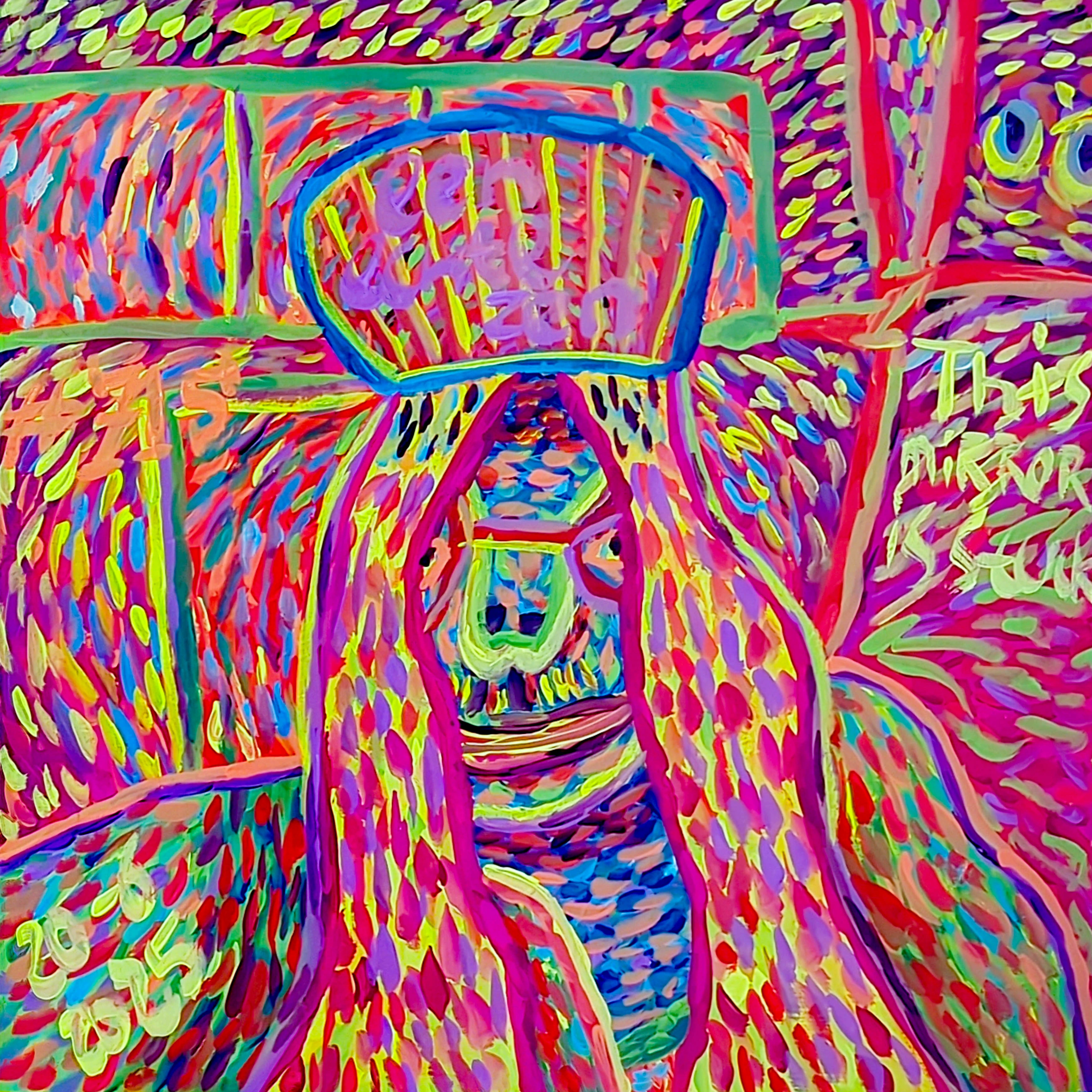
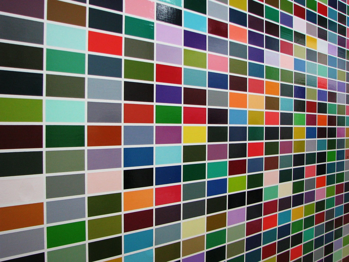
Before I even squeeze a tube of paint, there's an internal conversation happening. What am I trying to feel? What do I want you, the viewer, to feel? Colors, for me, aren't just pretty shades; they are emotional conductors, whispering secrets and shouting joys. A vibrant yellow can be pure, unadulterated joy, a deep blue, profound introspection, almost like the quiet before a confession. And it's not just the hue itself; the saturation – its intensity or purity – and its value – how light or dark it is – also profoundly shape its emotional weight. A highly saturated, dark crimson evokes a different kind of passion than a muted, pale pink. It's a language, really, one I'm constantly trying to master and expand. For instance, pairing a fiery orange with a cool, serene teal can create a palpable tension, almost a dynamic friction, while soft lavenders and pale greens might evoke a dreamlike tranquility or a quiet hope. Consider, for instance, the quiet, almost ethereal conversation between a muted, desaturated rose and a deep, shadowy indigo, whispering of twilight secrets. Or the boisterous clash of an electric lime green against a fiery magenta, pure, unbridled energy. It's an endless dictionary, really, one I find myself constantly flipping through, adding new words with every brushstroke. Think of how fluid acrylics, with their smooth flow, might express a gentle, unfolding emotion, while thick, heavy-body oils can convey raw, intense feeling through impasto. I often consider the cultural associations too; while red screams passion in many Western cultures, its symbolism shifts elsewhere, but my personal interpretation, the feeling it evokes in me, always takes precedence. If you've ever wondered about this, you might find my thoughts on the emotional language of color in abstract art resonate deeply with your own experiences, or explore my emotional palette and how I choose colors.
This internal dialogue often guides my mixing. I recall one particular instance where I was aiming for a very specific, almost melancholic blue – the kind of blue you see just before a storm breaks, full of anticipation and a hint of sadness. I kept adding ultramarine, a touch of black, a whisper of red... chasing that elusive hue. But suddenly, almost against my will, it veered into this surprisingly hopeful violet-grey. My initial reaction was, naturally, a groan of frustration – who enjoys things not going to plan? But then, I looked at it differently. It wasn't the storm blue I wanted, but it was something else, something unexpected, perhaps even more profound, speaking of a calm after the storm, or a quiet hope. It reminded me, as it often does, that the canvas often has its own agenda, its own voice in our colorful conversation. What colors resonate most deeply with your own emotions?
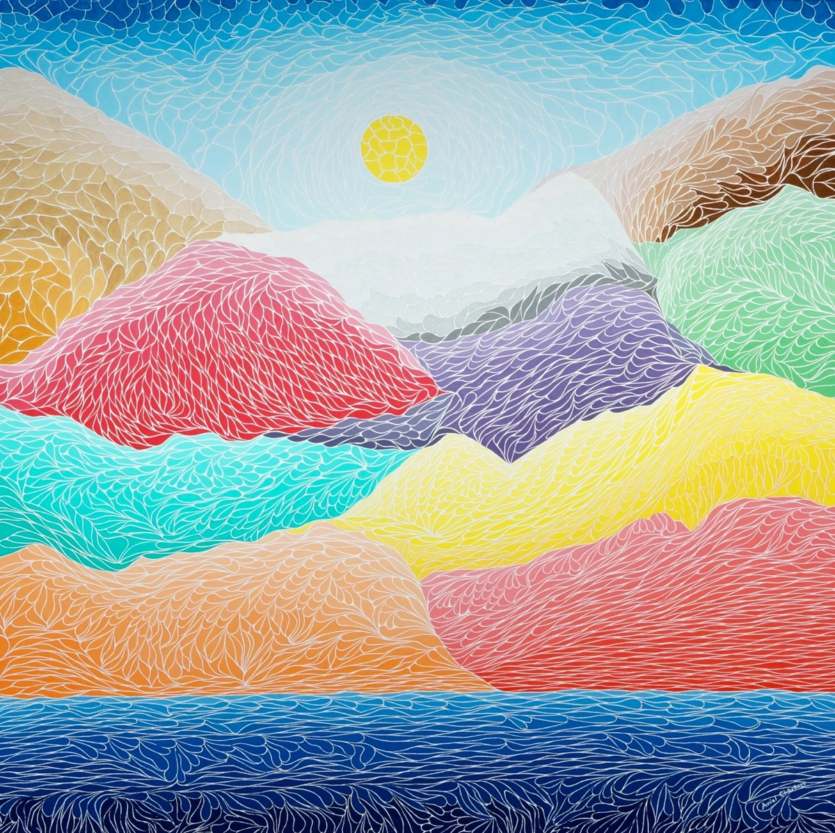
My Palette Philosophy: Controlled Chaos and Intentional Intuition
My approach to color isn't about rigid adherence to a color wheel. While I respect it immensely – it's a wonderful theoretical guide, and I highly recommend exploring the definitive guide to color theory in abstract art for a solid foundation – my process is far more organic, a vibrant negotiation between knowledge and instinct. I often think of it as "controlled chaos" or "intentional intuition." It's a bit like cooking without a precise recipe, where you know the ingredients and have a general idea, but you're constantly "tasting" and adjusting as you go, letting the flavors guide you. But what does 'controlled chaos' truly mean? It's the deliberate decision to loosen my grip on predictability while retaining a subtle awareness of underlying principles. It's knowing that if I want a cool green, I'll start with blue and yellow, but allowing the exact shade to emerge through playful experimentation, guided by an internal compass that whispers, 'Just a touch more yellow for warmth,' or 'A hint of white to soften that intensity.' The 'control' isn't about rigid adherence, but about responsive, intuitive adjustments to achieve an emotional or visual goal, even if it wasn't the initial goal. This intuitive method, the very heart of my creative process, is something I explore deeply in my intuitive approach to starting an abstract painting.
At its core, my philosophy embraces a few key principles, balancing the wild freedom of intuition with a subtle, guiding hand:
Principle | Description |
|---|---|
| Limiting Choices | Starting with a restricted palette to force deeper engagement and understanding of color potential, encouraging creative problem-solving. |
| Embracing Play | Allowing for spontaneous experimentation and valuing unexpected outcomes over rigid planning, fostering genuine discovery. |
| Layered Discovery | Building complexity and depth through successive, often translucent, applications of color, allowing previous layers to influence the overall harmony or discord. |
| Emotional Focus | Prioritizing the feeling or mood a color combination evokes above strict adherence to theoretical rules, letting the heart lead the brush. |
| Intentional Discord | Deliberately introducing unsettling color combinations to create tension, visual interest, or a sense of unease, rather than always seeking harmony. This is where the 'chaos' gets 'controlled.' |
Starting with a Foundation: The Power of Restraint
Ironically, for someone who loves vibrant palettes, I often start with a surprisingly limited range. Think three or four main colors, perhaps a white and a black. Why? Because too many choices too early can be paralyzing. It's like trying to pick an outfit for a big event from an entire department store – overwhelming! By limiting my initial choices, I force myself to really work those colors, to push their boundaries, and to understand their full potential when mixed. This initial restraint actually pushes me to be far more creative later, uncovering nuances I might otherwise overlook, especially when I start venturing beyond the primary, using secondary and tertiary colors and building upon the layers.
Building a Palette: Layers, Harmony, and Pigment Properties
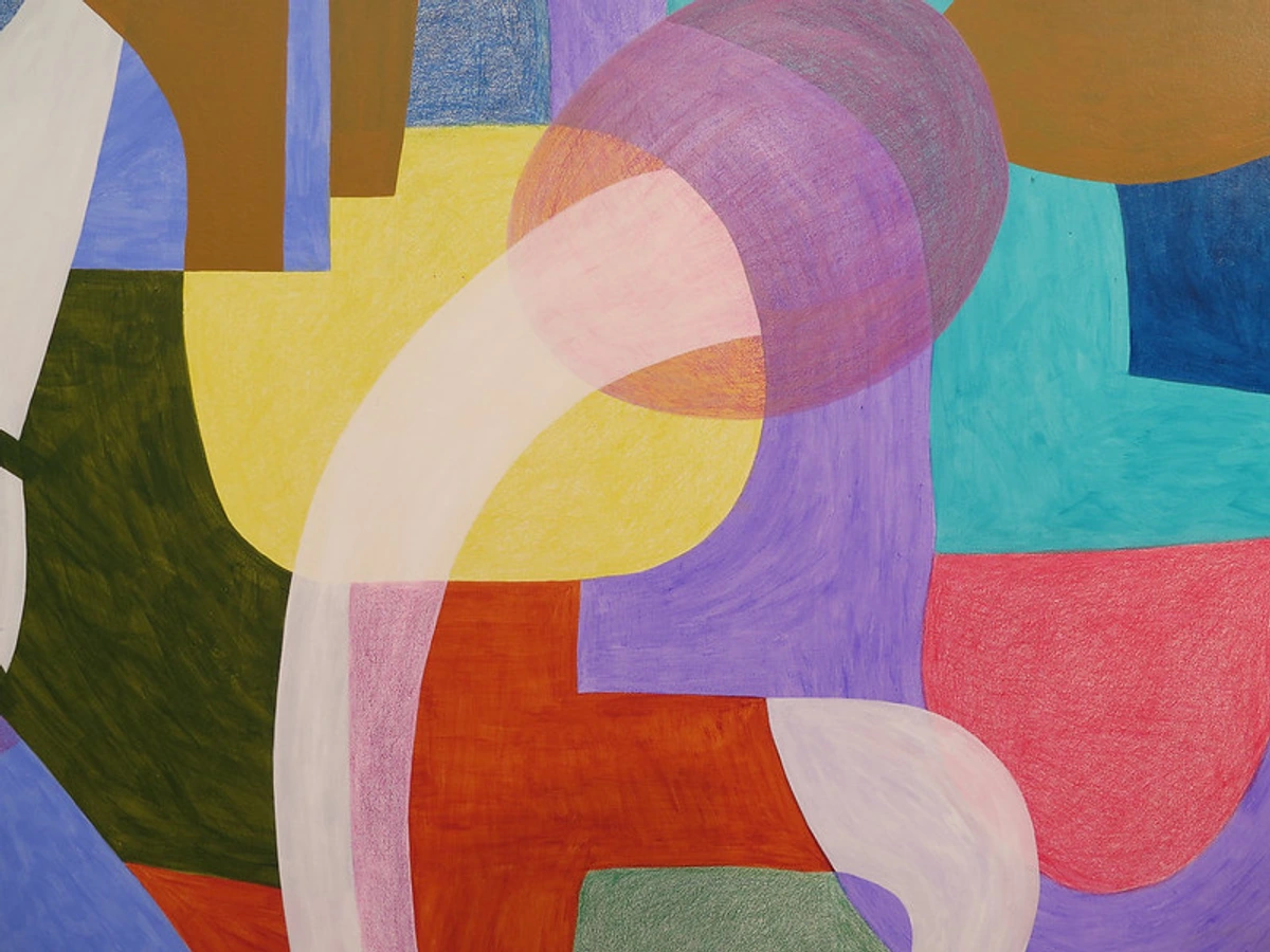
Color mixing doesn't stop on the palette; it continues on the canvas, often through layers. This layering technique is absolutely fundamental to my work and something I often write about, for instance, in building depth in abstract acrylics and how to layer colors in acrylic painting. I might lay down a transparent base of warm yellows, then slowly introduce cool blues and greens on top, using thin glazes or scumbling techniques. This allows the underlying warmth to peek through, creating an unexpected luminosity and a complex interplay of color temperatures. It’s all about creating depth and visual interplay, considering not just what colors are next to each other, but what lies beneath. Sometimes I imagine the colors whispering to each other, forming harmonies and dissonances, just like notes in a symphony. This creates a rich dialogue between pigment properties – some transparent, some opaque, some staining – which I constantly consider. For instance, the transparent, staining quality of a phthalocyanine blue is perfect for creating luminous glazes that allow underlying layers to glow, while the powerful opacity of titanium white makes it ideal for bold statements or covering mistakes. Similarly, a quinacridone crimson offers incredible transparency and vibrancy for glazes, while cadmium yellow can provide dense, warm opacity. Understanding these characteristics is vital to achieving the desired effect, whether it's a subtle blend or a striking contrast, or even an intentional discord that grabs attention. How do you approach building layers in your own creative process?
The Dance of Discovery: Experimentation and Happy Accidents
This is where the real fun begins – the moment of raw, unadulterated play. Once I have my foundational colors, and a general sense of how I might layer them, I start mixing, often without a clear outcome in mind. Sometimes I'll just swatch a little bit of yellow into blue, just to see what kind of green emerges, or add a dash of red to that green to explore the earthy tones. This hands-on, almost childlike curiosity, is how my intuition truly develops – through countless hours of observing, feeling, and remembering how different pigments interact. It's an ongoing conversation, a visual diary of cause and effect. It's also where the "controlled chaos" really comes to life; I allow the pigments to surprise me, but I'm always subtly guiding the conversation, gently nudging it toward an emotional direction. When I'm "tasting" and adjusting, I'm looking for that zing – that moment a color feels right, balanced, or excitingly off-kilter. It's an almost visceral response, a visual hum, a feeling of completeness or provocative tension.
What usually happens, to my immense delight, is a series of "happy accidents." A drip here, an unexpected blend there, a color that shouldn't work but suddenly sings. I’ve learned to embrace these imperfections, as I often talk about in embracing happy accidents in my abstract art. I remember once trying to achieve a muted, industrial grey for a particular section. I mixed black, white, and a touch of raw umber, but it kept leaning too warm. Frustrated, I impulsively added a tiny, almost microscopic, drop of vibrant crimson. Instead of muddying, it sparked a deep, rich charcoal grey with an unexpected internal glow – a "mistake" that became the focal point of the piece. Another time, I was attempting a serene, misty grey for a background layer. I mixed white, black, and a touch of blue, but it just wasn't right – too flat, too... polite. In a moment of sheer, almost reckless abandon, I splattered a vibrant, almost neon, pink onto it. My studio assistant (who, bless her heart, has seen it all) probably braced herself for a meltdown. But instead of a muddy mess, the pink bloomed into a shimmering, almost iridescent pearl grey, buzzing with an unexpected inner light. It became the perfect, vibrant counterpoint to the more somber elements I later introduced – a true testament to the canvas's often superior judgment over my own initial plans. Who knew pink could be so transformative, and so insistent on making its presence known? This constant embrace of the unforeseen is a huge part of the role of experimentation in my abstract art. Without it, everything would be too predictable, too… sterile, and frankly, a bit boring. How do you allow for surprise in your creative process?
Tools of My Trade: Beyond the Tube
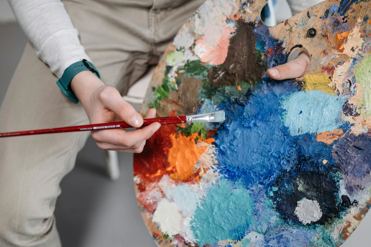
All this glorious chaos and deliberate intuition wouldn't be possible without the right (or sometimes, simply available) tools. My mixing palette is usually a large, flat surface – sometimes a dedicated wooden palette, sometimes just a piece of glass or even a discarded ceramic tile. I prefer a flat surface over a traditional curved one because it allows for larger mixing areas and a truer perception of color without reflections distorting the hue. Each material has its own quirks: glass is easy to clean and offers excellent color purity, but can be fragile; wood offers a warm tone that can influence perception but develops a lovely patina; ceramic tiles are durable but heavy. I also pay keen attention to my studio lighting; natural daylight is always preferred for accurate color mixing, but if working under artificial light, I ensure it's full-spectrum to avoid color shifts. I use palette knives, brushes of all shapes and sizes, and, yes, sometimes my fingers (don't tell my art school instructors, okay?). Each tool gives a different texture, a different blend. A knife creates sharp, clean transitions and distinct impasto, while a brush allows for a softer, more integrated swirl or a delicate glaze. And speaking of tubes, the quality and brand of pigments matter immensely. Artist-grade paints, while pricier, often offer higher pigment concentration, better lightfastness, and more vibrant, consistent mixing results than student-grade. They allow for a richer, more nuanced conversation between colors. Each brand often has its own unique consistency and intensity, too, which becomes part of my intuitive understanding of how they'll behave on the palette and canvas. These tools are extensions of my intentional intuition, helping me sculpt and coax the colors into being. But these tools are merely extensions of intent, their true potential unlocked only when they meet the varied landscapes of different mediums and surfaces, which, perhaps unsurprisingly, demand their own unique dance.
My studio, where all this messy magic happens, is less a pristine laboratory and more a vibrant battleground of pigment. A happy, colorful battleground, I assure you. If you ever visit my museum in 's-Hertogenbosch, you'll likely see traces of this organized chaos in my early works, perhaps even a particular piece from my student days where I struggled (and eventually triumphed) with a stubborn opaque red refusing to blend the way I wanted.
Adapting My Palette: Mediums and Surfaces
While my core philosophy of intuition and experimentation remains steadfast, the practicalities of color mixing certainly shift with different mediums and surfaces. Acrylics, for instance, dry quickly, demanding a faster pace and often leading to more layered glazes and opaque applications. This rapid drying time means mixing decisions often need to be swift, almost instinctual. Oils, on the other hand, allow for much longer blending times directly on the canvas, encouraging subtler transitions, richer impasto, and a more deliberate, unhurried approach to marrying hues. Even other mediums present their own unique challenges and joys: Watercolors, for instance, demand a delicate touch and a deep understanding of transparency and flow because their luminosity comes from the white of the paper shining through, requiring careful layering without overworking. Gouache, on the other hand, offers opaque, matte finishes that require precise pre-mixing on the palette as its quick drying time and opacity make blending directly on the canvas challenging without losing its characteristic flat appearance. And then there are paint consistencies: fluid acrylics, with their runny nature, lend themselves to washes and glazes, creating soft, blended effects, while heavy-body acrylics offer thick, sculptural applications perfect for impasto and strong, defined color blocks. The surface itself also plays a crucial role: a smooth panel will showcase color purity and delicate blends, while a textured canvas will inherently influence how colors appear, how they accept the paint, and how light interacts with the pigment. Each medium and surface offers its own unique set of challenges and delightful surprises, keeping the process fresh and engaging. How do different mediums influence your color mixing approach?
A Dialogue with the Canvas: Adjusting and Evolving
The truly fascinating, and sometimes infuriating, part of this whole affair is how a color mixture can look one way on the palette, then transform entirely once it's on the canvas, surrounded by other colors, breathing a different air. It’s a constant, evolving dialogue. I step back, I squint, I turn my head, sometimes even walk away for a cup of coffee. I might even use a mirror to see the composition in reverse, which helps to reveal imbalances I might have otherwise missed. Then I return and ask myself, "Is this working? Does it need more warmth? A touch more intensity? Or perhaps, surprisingly, less?" This is where I might consider specific artistic goals: do I need to create atmospheric perspective with cooler, lighter tones, or build luminous depth with transparent glazes? For example, in abstract landscapes or conceptual pieces, I might use cooler, desaturated blues and grays for elements I want to recede, creating a sense of atmospheric perspective, while warmer, more vibrant hues for foreground elements pull them forward, even without explicit representation. Do I want a vibrant neutral that still holds a hint of underlying color, or a bold contrast that shouts? Sometimes the answer is a sigh and then the bold decision to scrape it all off and start a section anew. It’s a humbling, often messy process, a continuous learning curve that beautifully mirrors my broader artistic journey. Each painting, each color decision, becomes a chapter in that story. How do you know when a color is 'finished' on your canvas?
Embracing the Unexpected: Lessons Learned
Ultimately, my approach to color mixing is a constant dance with discovery. It's about letting go of the need for absolute control, allowing the materials to sometimes lead the way, and finding beauty in the unforeseen. Understanding that a "mistake" is often just a new, exciting direction, waiting to be explored. This openness, this willingness to engage in a dialogue with my palette and my canvas, is precisely what allows me to create the kind of vibrant, dynamic palettes you see in my abstract art for sale.
Color isn't just a medium; it's a conversation, an exploration, a playground for the soul. And every time I mix a new hue, I feel a little spark of that same childlike wonder, that undeniable excitement of creating something brand new from a few simple ingredients. It’s a privilege, really, and one I invite you to explore. Perhaps you'll find your own unexpected beauty when you delve into the heart of my work. What new colors will you discover today?

Frequently Asked Questions (FAQ)
Do you ever follow color theory strictly?
While I deeply respect and understand color theory – the principles of complementary, analogous, and triadic schemes – I don't follow it strictly like an unbreakable rulebook. For me, it's more of a knowledgeable suggestion, a set of venerable guidelines that I'm perfectly happy to bend, stretch, or even outright break if it better serves the emotional impact or visual interest of the painting. My intuition, honed by years of practice and countless "happy accidents," often overrides strict theory in the heat of the moment, seeking a deeper, more personal truth.
How do you choose your initial colors?
Often, it genuinely starts with an emotion or a vivid memory. I might think, "I want this piece to hum with kinetic energy," and immediately find myself gravitating towards vibrant oranges, assertive yellows, and passionate reds. Or, conversely, "I need something profoundly calming," which instinctively leads me to the depths of blues and the quietude of soft greens. Sometimes, it’s even simpler – a striking color combination I observed in nature, like the fleeting glow of an autumn sunset on a grey building, or a vibrant patch of moss on a dark rock after rain. It’s rarely a purely intellectual decision; it’s more akin to a gut feeling, a stirring in the soul, much like my creative flow and embracing intuition.
What do you do when a color mix doesn't turn out as planned?
Oh, darling, that happens all the time! My first reaction might be a theatrical groan, or a quiet internal sigh of resignation. But then, almost immediately, I reframe it as an invaluable opportunity. Sometimes a "wrong" color can be completely covered by an opaque layer. Other times, it unexpectedly becomes an interesting undertone, adding a subtle complexity and depth to the subsequent layers. And sometimes, most wonderfully, I just embrace it. Maybe the "wrong" color was actually the right one all along, simply waiting to be discovered, waiting to teach me something new about the paint, the canvas, and myself. It's all part of the thrilling process of exploring texture in my abstract paintings, as well as wrestling with color.
How do you avoid or fix 'muddy' colors?
Ah, the bane of every artist's existence! 'Muddy' colors usually happen when you mix too many pigments together, especially when they're complements (like red and green) in equal measure, or when opaque colors are indiscriminately layered. My main strategy is prevention: limiting my palette as discussed earlier, and understanding pigment properties. I try to keep my mixes to 2-3 colors, maybe 4 if one is a white or black. If a color does go muddy on the palette, I rarely try to "save" it; it's often more efficient to discard it and start a fresh mix, perhaps with a clearer intent. On the canvas, if a section turns muddy, sometimes a transparent glaze of a pure, vibrant color can 'lift' it, or I might simply decide it’s an opportunity for a bold, opaque layer to cover it and restart that area. Sometimes, a 'muddy' mix can even be intentionally used for earthy, grounded tones, so it's not always a failure, just a detour!
How do you achieve specific effects like luminosity or vibrant neutrals?
Luminosity often comes from strategic layering, especially using transparent glazes over lighter, reflective underpainting. Think of building up light, like stained glass. For vibrant neutrals, it's about mixing complementary colors (like red and green) in specific, uneven ratios, so one color slightly dominates. This creates a muted, earthy tone that still retains a 'ghost' of the original colors' vibrancy, preventing it from looking flat or muddy. It's a delicate dance of balance, often achieved through subtle shifts and small additions until that perfect 'living' neutral emerges.
How do you handle color fatigue or creative burnout?
Color fatigue is a real thing! When my eyes feel overwhelmed or my decisions start to blur, I step away. Sometimes it's a short break for a cup of tea, other times it's a full day or two away from the studio. I might look at black and white photos or spend time in nature, observing natural forms and light without the pressure of interpreting color. Reading, walking, or even just cleaning my palette can reset my visual and mental space. Often, the solution isn't to push harder, but to simply step back and allow my subconscious to do the heavy lifting, trusting that the inspiration will return refreshed.


