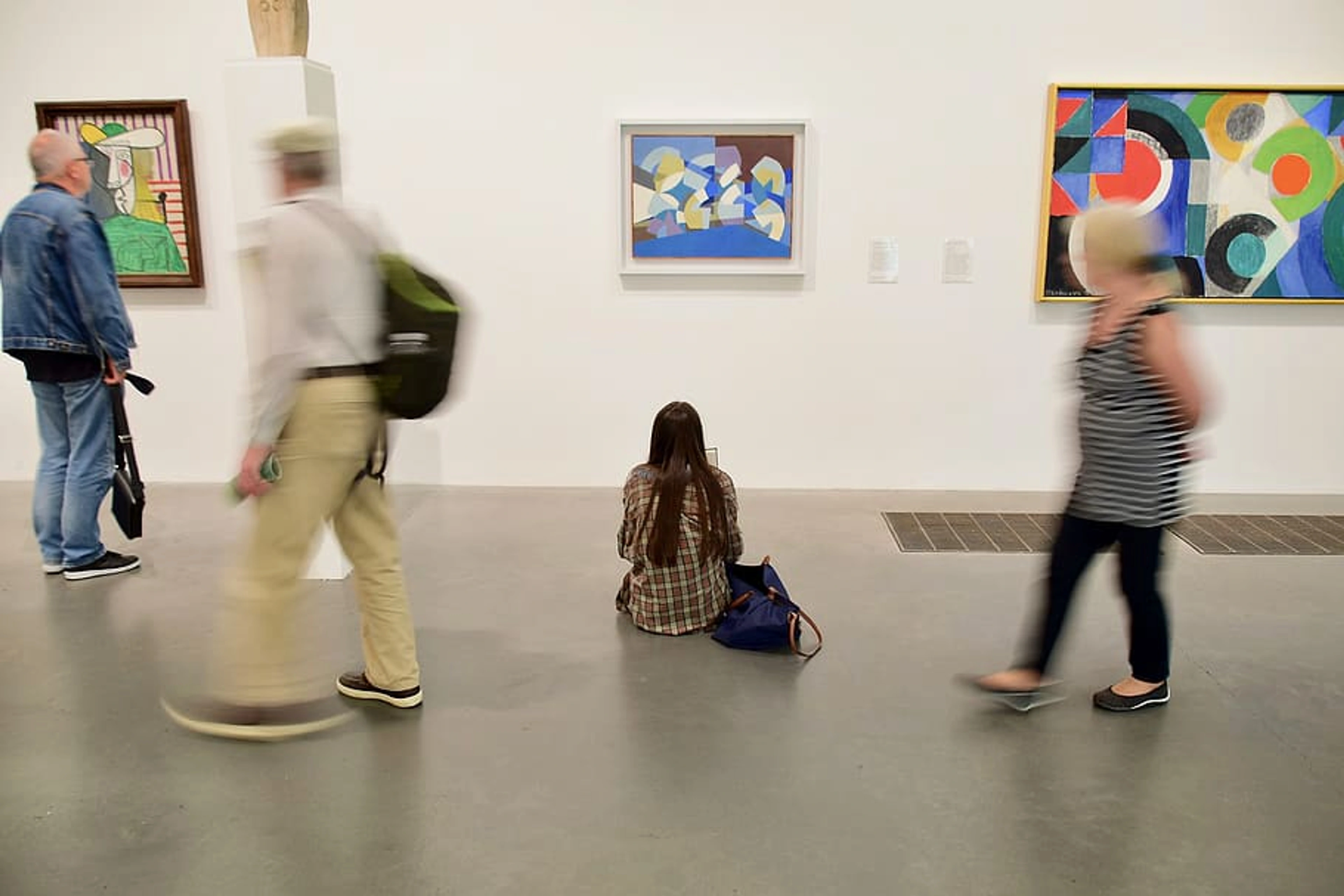
Color Field Painting: The Ultimate Guide to Immersive Color, Iconic Artists & Lasting Legacy
Get wonderfully lost in Color Field painting. Explore its profound emotional power, iconic artists like Rothko & Frankenthaler, groundbreaking techniques, and how to truly experience pure, expansive color. Your definitive guide.

Color Field Painting: Getting Wonderfully Lost in the Grand, Pure Embrace of Color
Have you ever been in a room where the very air shifted, the space hummed, just from the sheer presence of a painting? I certainly have. It’s that profound, almost gravitational pull – the sense of being utterly absorbed by pure, expansive color – that defines an intimate encounter with Color Field painting. This isn't art about looking at a picture; it’s art about having an experience, about letting yourself get wonderfully, unapologetically lost. It's a silent conversation between you and the canvas, without the distracting noise of the everyday world. What I've discovered is that these works often hit you when you least expect it, like a quiet revelation.
Now, I know what you’re probably thinking, that classic, slightly exasperated thought when faced with abstract art that seems deceptively simple: "My kid could do that!" And believe me, I get it. I’ve felt that initial flicker of confusion, standing before what appears to be a vast, unblemished block of color. I'll even admit, there were times early in my art journey when I'd stare at a Rothko and think, 'Is this it? Where's the horse?' (A very literal thought, I know.) But stick with me, because what appears minimal on the surface holds an incredible, often spiritual, depth. This perceived simplicity isn't a lack of skill; it's the result of profound thought and deliberate reduction, a search for universal meaning in a chaotic world.
My journey through art has taught me that Color Field works aren't just pretty; they're designed to make you feel something immense, something universal. This guide will take you on an immersive journey through this remarkable movement, unveiling its rich history, the revolutionary ideas behind it, the key artists who shaped it, and most importantly, how to truly connect with these evocative works. It’s an invitation to shift your perspective and discover the sublime, transformative power of color itself. Consider this your ultimate resource for understanding, appreciating, and getting wonderfully lost in Color Field painting.
credit, licence
Addressing Common Misconceptions: The "My Kid Could Do That!" Conundrum
I've heard it a thousand times, and honestly, even I occasionally catch myself thinking it about some abstract pieces when I’m not fully engaged. It's a natural, almost instinctual, reaction to art that deliberately sheds recognizable forms and traditional markers of skill. That little voice in my head sometimes whispers, "Really? That's all there is to it?" But here's the crucial insight into Color Field painting, and indeed much of abstract art: the art isn't just in the doing – the physical act of applying paint – it's profoundly in the concept, the intention, the meticulous choice of color, and the intended emotional and spiritual impact. This is where the "my kid could do that" argument completely misses the mark. It's like saying a child could write a symphony because they can bang on piano keys, ignoring the profound difference in deliberate, thoughtful, and deeply informed orchestration. Or, a child can mix ingredients, but a master chef creates a Michelin-star meal through intentionality, technique, and a deep understanding of flavor interaction. It's about mastery through reduction, a stripping away of the superfluous to arrive at the fundamental.
Yes, a child might put paint on a canvas. They might even smear large areas of color. But the Color Field artist is not randomly experimenting. They are engaged in a rigorous, deeply considered practice:
- Engaging with profound philosophical questions: They are grappling with existence, emotion, the nature of art itself, and the human condition in a post-war world. Their art is a response to deep anxieties and a search for transcendent meaning, often aiming to create a space for sublime encounter, echoing existentialist concerns about individual experience and universal truth.
- Meticulously selecting and applying colors: This isn't random. Each hue is chosen for its specific psychological resonance. Mark Rothko, for instance, spent years refining his color palettes to evoke precise states of contemplation, joy, or melancholy. It’s a mastery of the psychology of color in abstract art and its raw power, often involving complex optical mixing and layering that defies simple reproduction. Barnett Newman, with his razor-thin "zips," demonstrated an almost surgical precision in placing these lines to activate and measure vast color fields, a far cry from a child's spontaneity.
- Manipulating scale and technique with precision: The monumental size is not arbitrary; it's a calculated decision for immersion. The soak-stain technique requires immense control to achieve luminous, unblemished surfaces, far beyond a child's spontaneous gesture. Helen Frankenthaler's innovations were groundbreaking, requiring deliberate experimentation and a deep understanding of materials and how they interact with pigment. The choice of raw canvas itself is a highly intentional material decision, aimed at dissolving the barrier between paint and support, making the canvas an active participant.
- Seeking a universal, not personal, experience: While a child's art is intensely personal and expressive of their world, Color Field artists deliberately removed their ego and narrative to create a space for your universal experience, a dialogue between the viewer and pure form. They believed the artist's visible "hand" could distract from this direct encounter, a kind of artistic self-effacement for the sake of greater connection. This aligns with later ideas about the "death of the author," effectively empowering the viewer, making their experience and interpretation paramount. It's less about what the artist did and more about what the artwork does to you.
It's less about the superficial skill of realistic depiction and more about the mastery of evocation – the ability to make you feel something profound, even overwhelming, through seemingly simple means. It's about knowing why a particular shade of red next to a muted orange will evoke a certain feeling, and then executing it with absolute conviction. The perceived simplicity is the result of profound thought and deliberate reduction, not a lack of skill; it's the distillation of complex ideas into their purest visual form, a testament to deep artistic intention rather than casual accident. It’s certainly not just decorative wallpaper, but a profound philosophical statement rendered in paint.
Tracing the Threads: Precursors and Early Seeds of Color Field
While Color Field painting burst onto the scene with a radical new visual language, it didn't emerge in a vacuum. I've found that understanding its subtle lineage makes its revolutionary nature even clearer. While distinct, these earlier movements laid crucial groundwork, hinting at color's inherent psychological power and preparing the canvas, so to speak, for the expansive fields to come. Think of them not as direct predecessors, but as whispers of pure color's potential.
- Symbolism's Emotional Palette: In the late 19th century, Symbolist painters like Paul Gauguin moved beyond naturalistic color. His bold, non-naturalistic hues in Tahitian scenes weren't meant to depict reality, but to evoke moods, feelings, and spiritual states. This was a crucial step towards understanding color as a direct emotional conduit, not just a descriptive tool. Gauguin famously said, "Color which, like music, is a matter of vibration, reaches what is most general and therefore most indefinable in nature: its inner power."
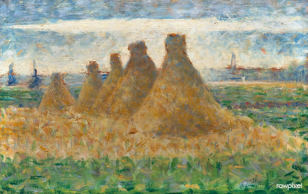
- Post-Impressionism's Expressive Color: Artists like Vincent van Gogh and Paul Cézanne, though not focused on pure abstraction, pushed the expressive and structural capabilities of color. Van Gogh's intense, swirling colors in works like Olive Trees with Yellow Sky and Sun demonstrate how color can convey raw emotion and energy, while Cézanne's use of color to build form and flatten perspective in his landscapes hinted at color's ability to define space and structure beyond traditional illusionism. They started to free color, giving it weight and feeling in its own right.

- Fauvism's Explosive Color: Early 20th-century Fauves, led by Henri Matisse and André Derain, took color further, unleashing it from its descriptive role entirely. Their canvases vibrated with intense, pure, often arbitrary colors, creating a sense of energy and emotional directness. While still depicting recognizable subjects, their simplified forms and expressive color fields, like those in Derain's vibrant London scenes, demonstrated color's capacity to create overwhelming visual impact and psychological resonance on its own terms.
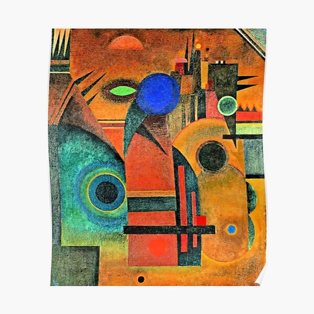
- Kandinsky's Spiritual Abstraction: Even earlier, Wassily Kandinsky, often credited with some of the first purely abstract paintings, believed deeply in the spiritual power of color and form. His early abstract works, like Composition VII, aimed to express inner necessity and spiritual truth through the interplay of non-objective colors and shapes, connecting art directly to the soul. He articulated a grammar of pure color, influencing the conceptual underpinnings of later abstraction.
These movements, in their varied approaches, slowly untethered color from representation, allowing it to gain autonomy and speak its own language. Color Field painting would then strip away even more, focusing intensely on this newfound expressive freedom, a radical step towards pure opticality and immersive feeling.
What IS Color Field Painting? Beyond the Canvas, Into the Experience
This immersive sensation, this feeling of being drawn into the sheer power of hue, is the hallmark of Color Field painting. At its heart, it’s a style of abstract art that emerged in New York in the late 1940s and 1950s. While abstract art, in general, moves away from depicting recognizable objects, Color Field takes this a step further: it’s characterized by large, unmodulated (meaning uniform in tone and hue within a given area, with no distracting brushstrokes or variations) fields of color, meticulously applied to a canvas to create a singular, immersive visual experience. Imagine looking at a perfectly smooth, unbroken expanse of the ocean or a vast, cloudless sky – that's what 'unmodulated' means in art: pure, consistent color without distracting changes or visible texture, a stark contrast to gestural, expressive painting. The artists weren't interested in depicting objects or narratives; instead, they aimed to evoke profound emotional or spiritual responses through the sheer power and presence of color itself – a pervasive atmosphere rather than a stated emotion.
For them, pure color was a direct line to universal human experience, a search for transcendent meaning amidst the anxieties of the post-World War II and Cold War eras. This was a period rife with the existential dread of nuclear threat, the disillusionment with traditional values, and the burgeoning, sometimes alienating, consumer culture. Artists yearned for something authentic, something enduring, in a rapidly changing, often chaotic, world. This deliberate choice for flatness – minimizing perceived depth or texture, a principle famously championed by critic Clement Greenberg – forced a direct confrontation with color in its purest form, rejecting the illusionistic space of traditional painting.
They wanted to tap into the psychology of color in abstract art directly, creating an experience where the painting felt less like an object and more like an environment, a world you could step into. It's about pure perception, unburdened by the artist's hand or any intellectual intermediary, making your personal, subjective encounter paramount – a kind of "death of the author" in painting, empowering the viewer.
Core Concepts: The Visual Lexicon of Color Field
Key to understanding this movement are a few core concepts that form its visual and philosophical foundation. What I've found so fascinating is how these seemingly simple principles combine to create such profound impact, guiding not just the artist's hand, but your entire viewing experience:
1. Flatness: Embracing the Canvas as a Surface
This is a fundamental principle, particularly championed by critic Clement Greenberg, emphasizing the two-dimensional nature of the canvas. Color Field artists achieved this by applying paint uniformly and minimizing any illusion of depth or sculptural texture, forcing the viewer to engage directly with the surface and the pure presence of color. This wasn't a limitation; it was a liberation from traditional illusionism, a stripping away of artifice to get to the essence. I remember my initial confusion – why no perspective? Why no focal point? But then it clicked: they wanted to remove all the noise of traditional art, allowing the color to simply be, without any visual tricks. It was a radical assertion of the canvas as a flat object, not a window to another world.
2. All-Over Composition: The Boundless Canvas
Unlike traditional paintings with a central focal point or a clear narrative, Color Field works often treat the entire canvas as a unified field, with no single dominant element. Your eye is encouraged to wander, to drift, to simply exist within the painting’s environment. It's like looking up at a vast, cloudless sky or across an open desert – there's no specific 'thing' to focus on, just the boundless expanse, allowing your gaze to roam and embrace the whole. This intentional lack of hierarchy challenges traditional ideas of understanding balance in art composition, creating a sense of serene equilibrium by distributing visual weight evenly across the entire canvas. This contributes to the immersive, meditative quality, inviting you to lose yourself in the field, making the canvas feel like a world rather than a window.
3. Opticality: The Eye's Direct Dialogue with Color
This refers to the direct visual impact of color and form, focusing solely on what the eye directly perceives. It prioritizes pure perception over subjective interpretation through the artist's touch or any intellectual intermediary. The art is meant to be experienced directly by your eye, unburdened by narrative or the artist’s expressive hand. It’s a purely visual, almost retinal or sensory, encounter where the colors, often through optical mixing (which I'll explain more about later), create new perceived hues right before your eyes. It’s about the raw data your eye receives, unfiltered and immediate. I’ve often felt this when two colors, placed side-by-side, start to shimmer or even generate a third, phantom color in my peripheral vision. It's truly a conversation happening in your mind, sparked by the canvas. Think of the principles explored by Josef Albers in his Interaction of Color, which, while not Color Field, deeply informed the understanding of how colors influence each other in our perception.
4. The Sublime: Encountering the Infinite
This is a feeling of awe, overwhelming grandeur, or even a delightful terror in the face of something immense and ineffable. Color Field artists sought to evoke this, drawing you out of yourself and into a vast, powerful experience. Think of it less as 'pretty' and more as a confrontation with the infinite, like standing alone beneath an impossibly huge, stormy sky. For me, standing in front of one of Mark Rothko's Seagram Murals in a dim room feels less like looking at a painting and more like entering a sacred space, a direct encounter with something immense that dwarfs my individual worries yet simultaneously elevates my spirit. Philosophically, this often harks back to Edmund Burke's concept of the sublime as a "delightful horror" arising from overwhelming power, a sensation that simultaneously attracts and repels, overwhelming the senses. But it also resonates with Kant's notion of the dynamic sublime, where nature's might leads to a feeling of moral elevation – ideas these artists powerfully translated to the canvas, often echoing existentialist concerns about individual experience and universal truth. It's a conversation that transcends words, a direct line to feeling, and in my own journey with art, these works often feel like visual meditations, offering a quiet, profound space for introspection and connection to something larger than oneself. They compel a feeling of being 'dwarfed' yet simultaneously 'elevated' – a powerful, almost spiritual paradox.
5. Soak-Stain Technique: Color One with Canvas
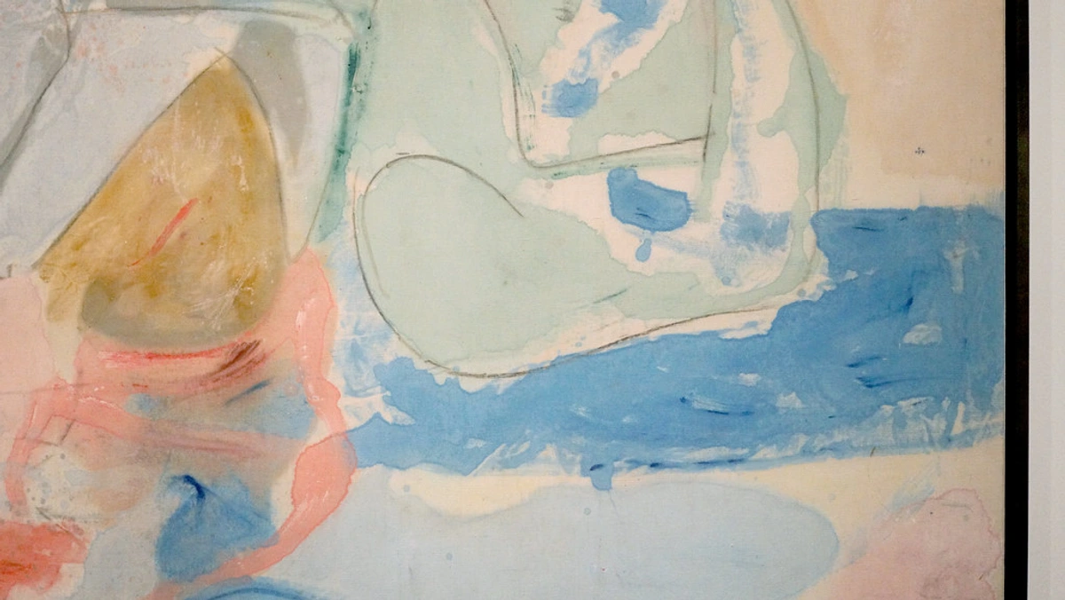
A truly revolutionary method (pioneered by Helen Frankenthaler) where thinned paint is poured or brushed onto raw, unprimed canvas, allowing the fabric to absorb the color. This creates a luminous, ethereal effect, making the color seem to emerge from the canvas rather than sitting on it. It becomes truly one with the canvas, fostering a unique, organic connection between pigment and surface. This wasn't just a technique; it was a philosophical statement about the intrinsic nature of color and surface, dissolving the traditional barrier between paint and support and creating an almost breathable texture. I remember seeing Frankenthaler's Mountains and Sea for the first time; it felt less like a painting and more like a living, breathing landscape where the colors seeped into my very being. It was an "aha!" moment that shifted my understanding of what paint could do.
The Canvas as a Sanctuary: Color Field's Quiet Rebellion
Color Field painting truly blossomed in New York during the late 1940s and 1950s, evolving directly from the fertile, albeit angst-ridden, ground of the ultimate guide to abstract art movements. This revolutionary movement emerged in the vibrant, post-World War II art scene, as artists grappled with the traumas of war, the anxieties of the Atomic Age, and the burgeoning consumer culture. It was a search for universal meaning and raw emotion in a world reeling from chaos, a desperate attempt to find something pure and authentic amidst the noise and the looming existential dread of the Cold War. These artists, in their quiet way, sought a new language for art, consciously breaking free from the European traditions that had long dictated the art world.
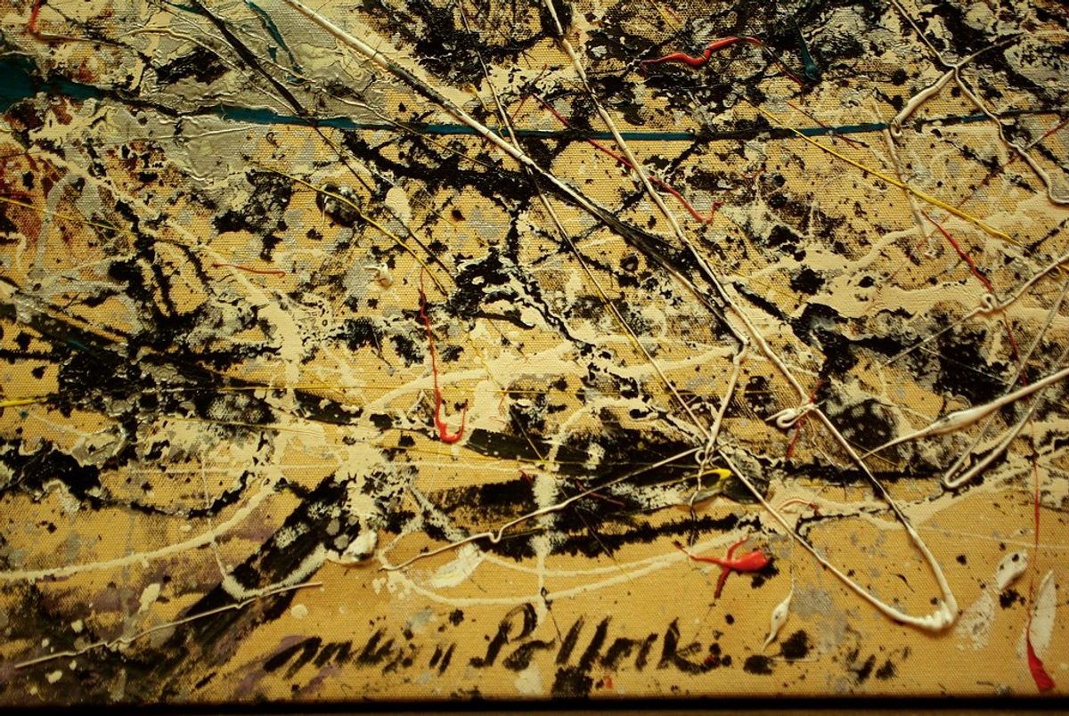
But while figures like Jackson Pollock (who, let's be real, redefined "action" in painting with his dramatic, energetic dance around the canvas) and Willem de Kooning, with his turbulent, gestural figures, left visible, often turbulent, traces of their creative struggle, Color Field painters took a radically different path. They actively sought to strip away the angst, the gestural brushstrokes, the very hand of the artist, and any sense of personal narrative. Why? Because they believed the artist's individual mark could be a distraction, pulling the viewer away from a more universal, unmediated encounter with the art itself. This approach, almost a premonition of Roland Barthes' concept of the "death of the author," effectively empowers the viewer, making their experience and interpretation paramount. It's less about what the artist did and more about what the artwork does to you.
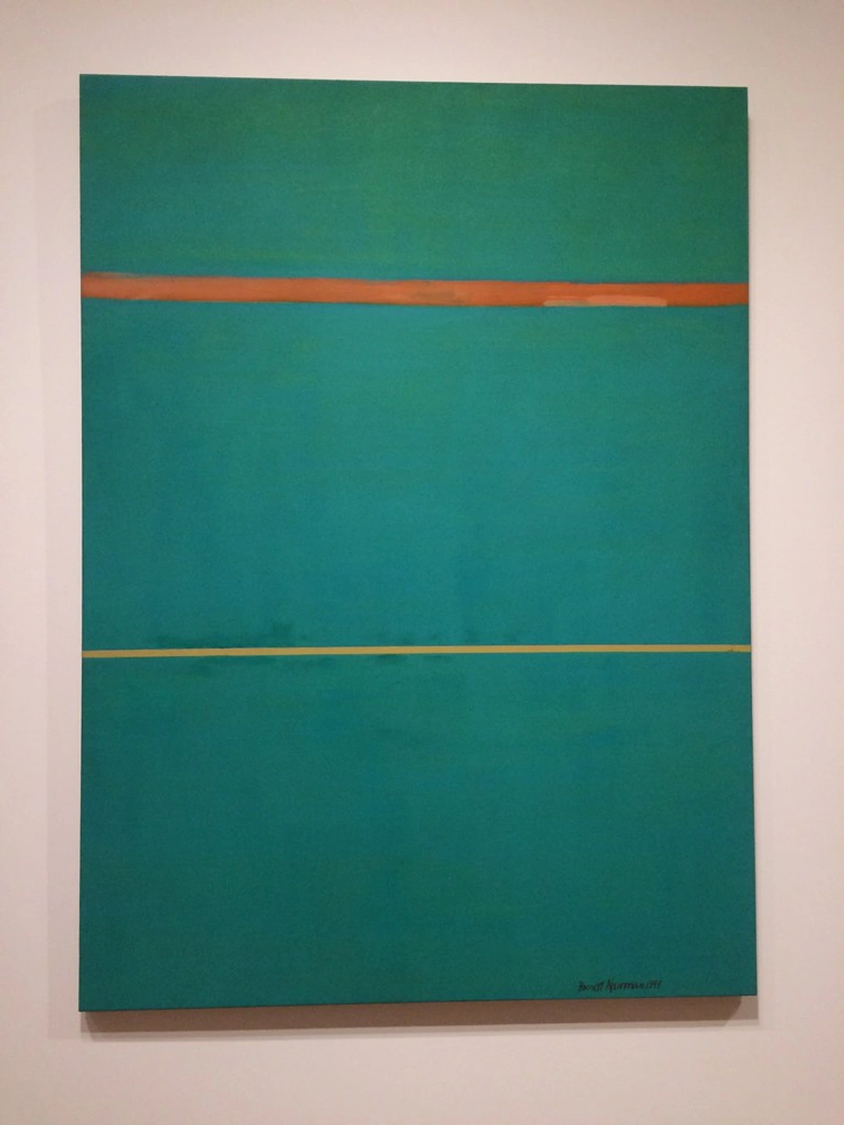
Early on, this stark departure from traditional representation and even from the energetic brushstrokes of their Abstract Expressionist peers wasn't without its vehement detractors. Beyond the casual "my kid could do that" dismissals, some critics found Color Field to be intellectualized and cold, lacking the human touch they associated with meaningful art. Others questioned its artistic rigor, seeing vast fields of color as a conceptual dodge rather than a profound artistic statement. Influential critics like Clement Greenberg and Harold Rosenberg played a pivotal role.
Clement Greenberg, a fervent champion, argued that Color Field painting represented the logical next step in painting's evolution – a move towards greater purity and opticality, emphasizing the canvas's inherent flatness and the unmediated impact of color. For Greenberg, the highest aim of painting was to purify itself, shedding anything external (like narrative or illusion) to focus on its essential, visual properties, a strict formalism. Harold Rosenberg, while more aligned with Action Painting's gestural drama and existentialist concerns, also recognized the power of these new forms, though he famously coined the term "The American Action Painters" to describe Pollock and his peers. Their debates helped provide a critical framework for an art form that challenged conventional notions of what painting should be, and frankly, what art could be.
Action Painting vs. Color Field: A Philosophical Divergence
Think of them as two distinct, yet related, responses within the broader umbrella of Abstract Expressionism, each with its own philosophical bent. One was about intense personal drama, the other about universal serenity. My take? Both are powerful, but they pull you in profoundly different directions. This fundamental difference in approach and intent is crucial for understanding the diverse landscape of post-war American abstraction.
Feature  | Action Painting (e.g., Jackson Pollock) | Color Field Painting (e.g., Mark Rothko) | Why it matters |
|---|---|---|---|
| Focus | Process of creation, artist's gesture | Result: Immersive emotional impact of color | The how vs. the what – a shift from performance to pure presence. |
| Brushwork | Visible, energetic, turbulent drips & splatters | Invisible, minimized, smooth application | Deliberately removes the artist's ego, putting your experience first. |
| Emphasis | Existential angst, personal psyche & performance | Universal, transcendent experience, meditative | A move from individual turmoil to collective contemplation. |
| Goal | Record of artist's struggle & pouring out | Evoke raw, unhindered emotion, sublime encounter | Expressing internal drama vs. inviting universal feeling. |
| Artist's Hand | Highly visible, central to meaning | Deliberately invisible, removed ego | The artist as protagonist vs. the artwork as the experience itself. |
| Viewer Experience | Confronting the artist's intense energy, often chaotic | Quiet, contemplative engagement with pure color, often serene | A dynamic, often chaotic confrontation vs. a serene, immersive journey. |
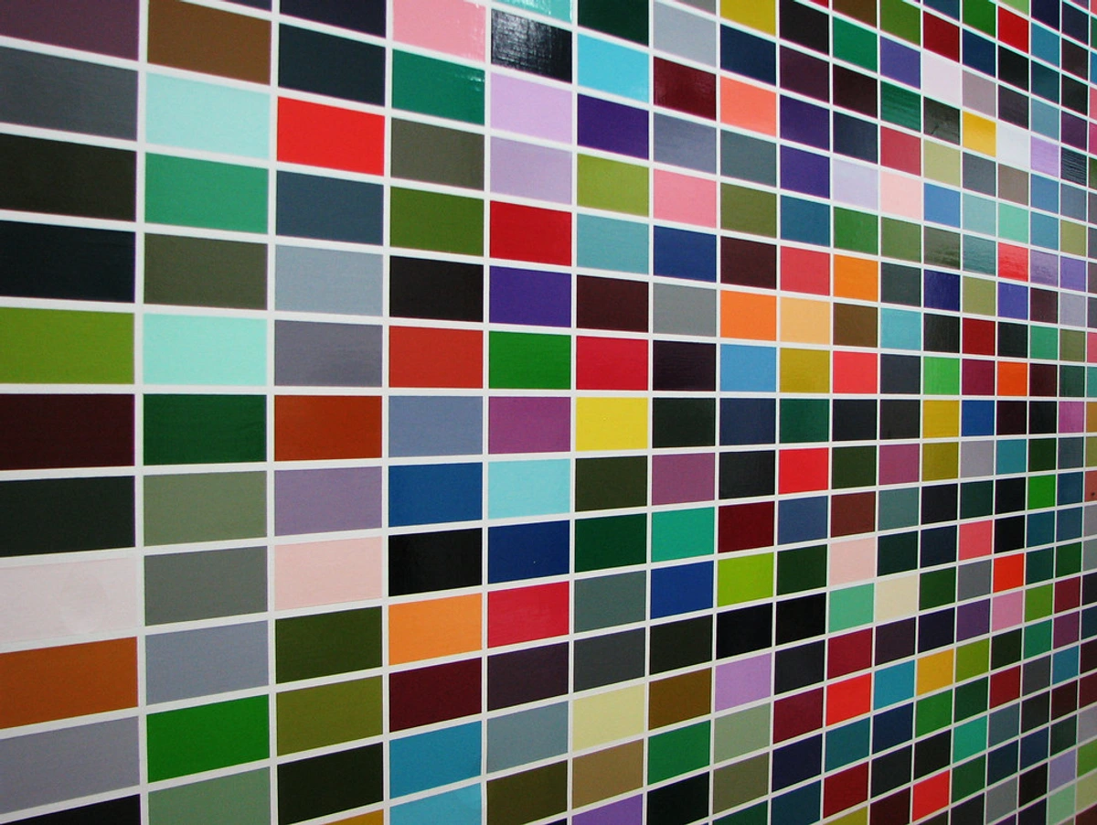
credit, licence
Their driving force was to let color itself be the protagonist – the entire narrative, the subject, the emotional landscape. They weren't interested in depicting objects, or even the artist's personal turmoil, but in evoking raw, unhindered emotion and a sense of the boundless. They deeply believed large, flat areas of pure color could elicit a powerful, almost religious, response – a feeling often described as sublime. For them, the sublime wasn't merely beautiful; it was awe-inspiring, overwhelming, sometimes even a little terrifying in its vastness, pulling you out of your everyday self and confronting you with something immense and ineffable. Philosophically, this echoes ideas of the sublime found in thinkers like Edmund Burke, who described it as a feeling of delightful horror stemming from the overwhelming power of nature, and Kant, who saw it as an encounter with magnitude that overwhelms the imagination but elevates the human mind. It's a conversation that transcends words, a direct line to feeling, and in my own journey with art, these works often feel like visual meditations, offering a quiet, profound space for introspection and connection to something larger than oneself. This search for authenticity in pure form, stripping away the superfluous, deeply resonates with broader existentialist concerns of the era, where artists and thinkers grappled with individual freedom, responsibility, and the search for meaning in a seemingly indifferent universe. Beyond Western philosophy, some scholars also connect the meditative, boundless quality of Color Field to concepts found in Eastern philosophies, particularly Zen Buddhism's emphasis on emptiness (sunyata), direct experience, and the pursuit of enlightenment through quiet contemplation, which aims to transcend dualities and find universal truth.
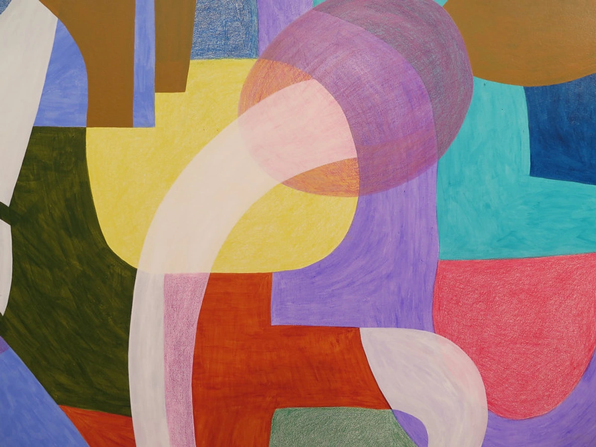
Understanding Color: The Palette of Emotion and Perception
To truly appreciate the genius of Color Field painting, we need a brief dive into the language of color itself. It's not just about picking a nice shade; it's a sophisticated manipulation of visual perception and emotion. Color Field artists, in their quest for profound impact, were masters of the psychology of color in abstract art and applied fundamental principles of color theory with deliberate intent.
Term | Definition | Role in Color Field Painting | Example/Impact |
|---|---|---|---|
| Hue | The pure spectral color (e.g., red, blue, green). | The primary building block, chosen for its direct psychological and symbolic associations. | Rothko's use of deep reds for tragedy, Newman's vibrant blues for infinity. |
| Value | The relative lightness or darkness of a color. | Manipulated to create subtle internal contrasts, depth, and luminosity, even in flat fields. | A lighter hue can appear to advance, a darker one recede, creating spatial illusion without lines. |
| Saturation | The intensity or purity of a color (vividness). | Highly saturated colors can create a visceral, energetic impact; muted colors, a contemplative, somber mood. | Frankenthaler's thinned washes often achieve a delicate, less saturated, ethereal quality. |
| Complementary Colors | Colors opposite each other on the color wheel (e.g., red/green, blue/orange). | Juxtaposed to create intense optical vibration, shimmer, or perceived shifts in hue. | A subtle green next to a red can make both appear more intense or create a new 'phantom' color. |
| Analogous Colors | Colors next to each other on the color wheel (e.g., blue/green). | Used to create harmonious, flowing compositions and a sense of calm continuity. | Agnes Martin's delicate, close-hued grids often evoke peace and quiet introspection. |
| Warm/Cool Colors | Warm (red, orange, yellow) tend to advance; Cool (blue, green, purple) tend to recede. | Meticulously used to manipulate perceived space and emotional temperature within the flat canvas. | A warm color layered over a cool one can create a shimmering, pulsating effect, drawing the viewer in. |
| Simultaneous Contrast | The effect where the perceived color of a hue is altered by the surrounding colors. | Exploited to make colors appear to vibrate, glow, or shift, making the canvas a living, optical experience. | A grey square will appear warmer or cooler depending on the color it's placed against, a principle outlined by Michel Eugène Chevreul. |
By understanding these principles, we can better grasp the immense thought and deliberate decision-making behind seemingly simple fields of color. It's not just paint; it's a carefully orchestrated visual phenomenon designed to resonate deeply with our primal responses to hue.
Unlocking the Visual Dialogue: Recognizing and Experiencing Color Field Art
So, when you encounter one of these captivating works, what visual and experiential cues tell you it's a Color Field painting? While art often defies neat categorization (and I appreciate that!), I've found a few defining traits that not light only give it away but, more importantly, tell you how to truly experience it. This is where the magic, often initially misunderstood, truly lies, and it's a magic built on deliberate choices and deep understanding of perception. Here are the hallmarks, the visual lexicon to help you begin that dialogue:
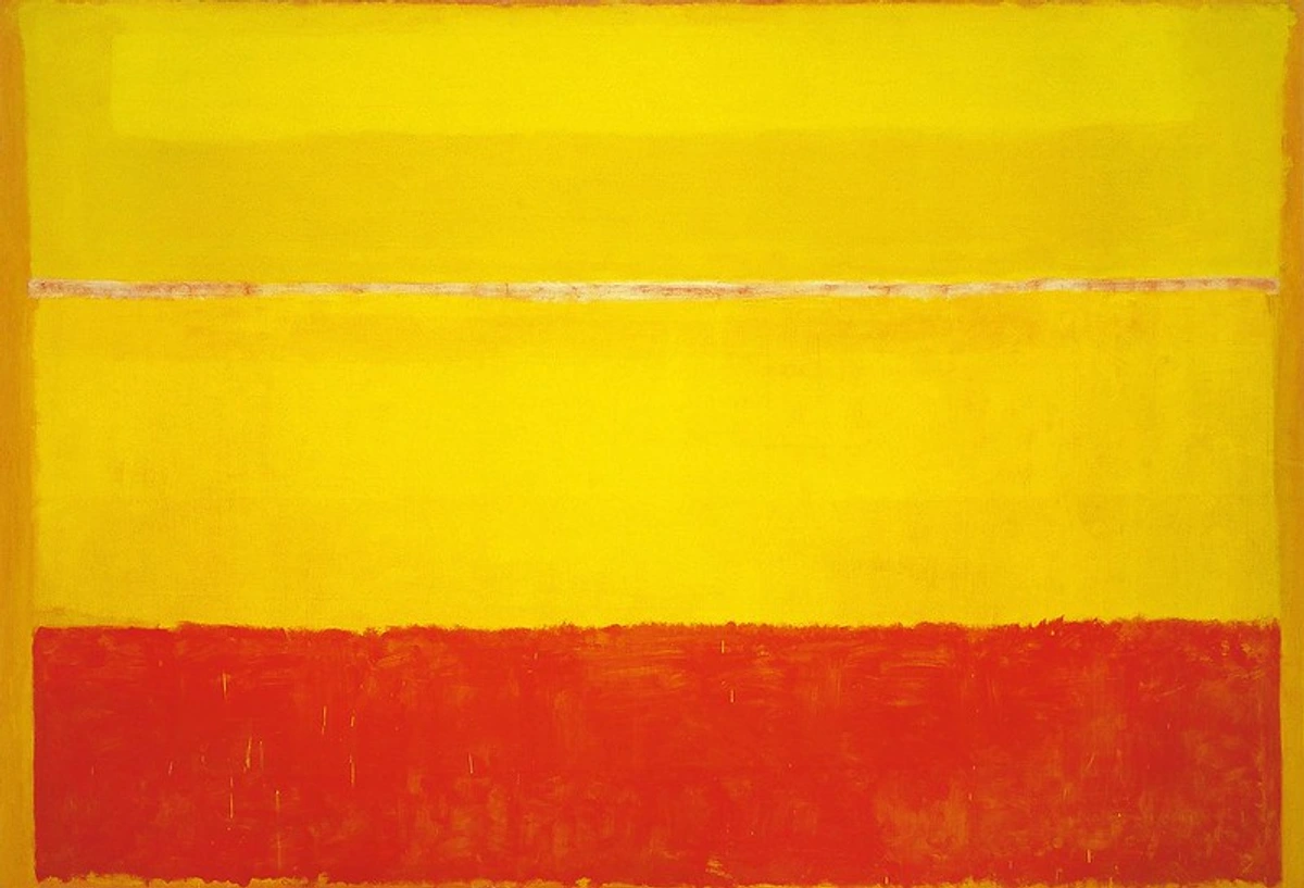
1. Expansive Color Fields: Color as Pure Universe
This is arguably the most visually striking element. These canvases are utterly dominated by expansive, uninterrupted fields of a single color or a few closely related hues. The color isn't there to describe an apple or a tree; the color is the entire subject, the very universe of the painting – a universe that feels like it breathes and shifts. The application is deliberately flat, meticulously applied to minimize any distracting painterly texture or illusion of depth, pushing the boundaries of what is design in art. This impeccable flatness forces you to confront the color head-on, in its purest, most direct form.
The Luminous Layering of Rothko
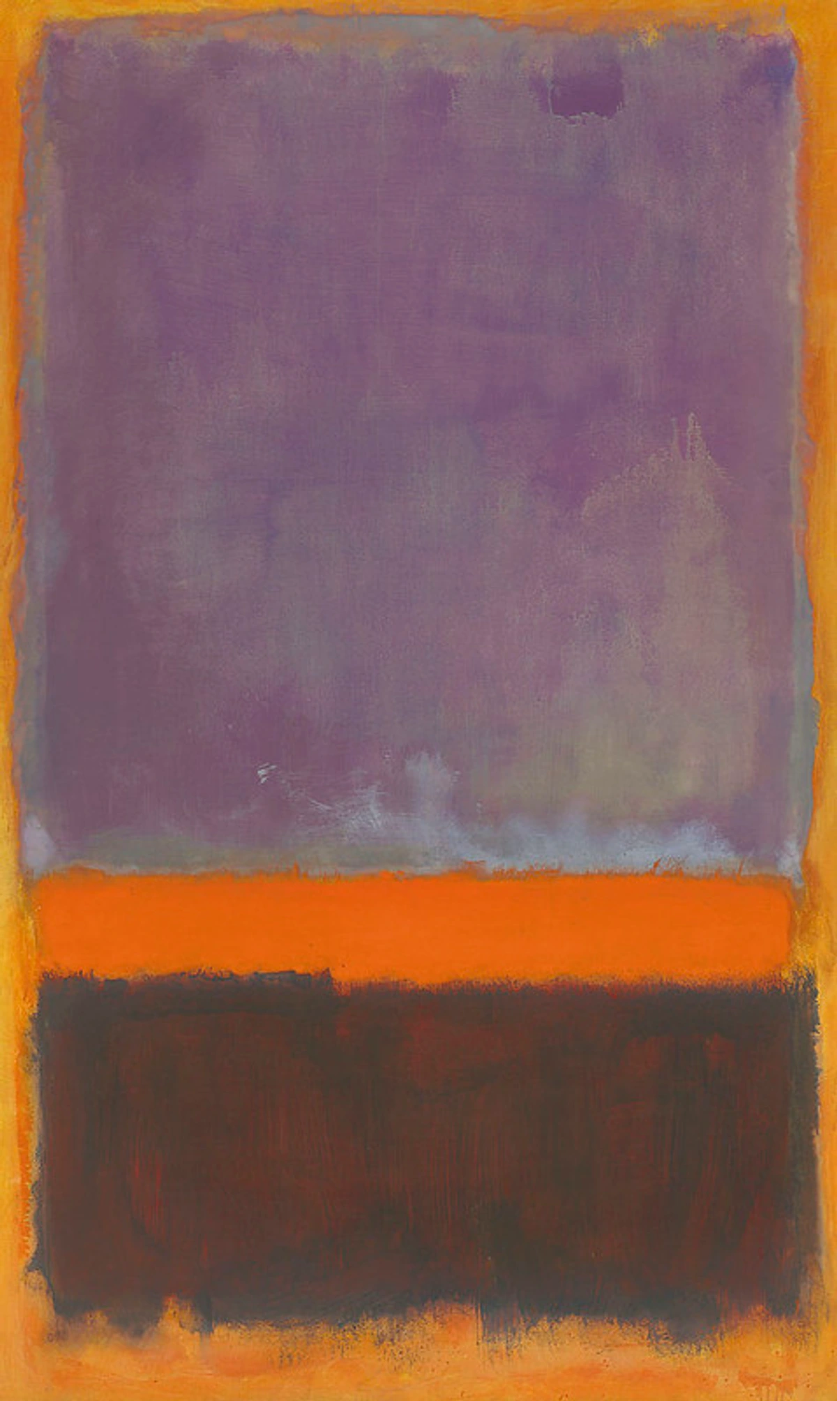
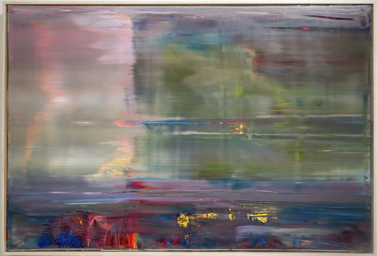
Think of Mark Rothko's hovering rectangles, like in his iconic No. 14, 1960: they appear deceptively simple, yet are composed of countless thin, translucent washes of color, with deliberately softened, blurred edges, creating a luminous internal glow that seems to emanate from within the canvas itself. It’s this subtle interplay of light and pigment that gives his work, and Color Field as a whole, its profound depth – I remember standing before one, feeling as though the light was literally emanating from the painting itself, pulling me in. The deliberate choice of specific hues and their interactions is a masterclass in the psychology of color in abstract art, with artists carefully manipulating saturation, warmth, and coolness to evoke precise emotional and spiritual responses. A Rothko isn't just a rectangle; it's a breathing, pulsating entity, a space for silent contemplation that can shift from serene joy to profound melancholy based on the subtlety of its hues. The soft, vibrating edges are not accidental; they create a delicate atmospheric boundary, blurring the lines between colors and contributing to the overall sense of immersion and gentle luminosity, a stark contrast to the crisp, sharp edges of later Hard-Edge painting.
The Power of Optical Mixing: When Your Eye Creates the Color
Color Field artists often experimented with optical mixing, where juxtaposed colors (like complementary or analogous hues) create a new perceived color in the viewer's eye, further enhancing the immersive optical experience, making the canvas a pulsating, living entity. For instance, imagine a field of deep red with a thin, almost invisible wash of translucent blue brushed over it. Instead of physically mixing into a muddy purple on the canvas, your eye might perceive a shimmering, vibrant violet where they overlap, making the color dynamic and responsive to your gaze. Or think of tiny dots of yellow and blue placed side-by-side; from a distance, your eye might perceive a vivid green. It’s less about what's on the canvas, and more about what happens in your eye – a purely retinal phenomenon that makes you an active participant in the artwork's creation, generating a perceived color that isn't physically present on the surface.
2. The Revolutionary Soak-Stain Technique: Color One with Canvas
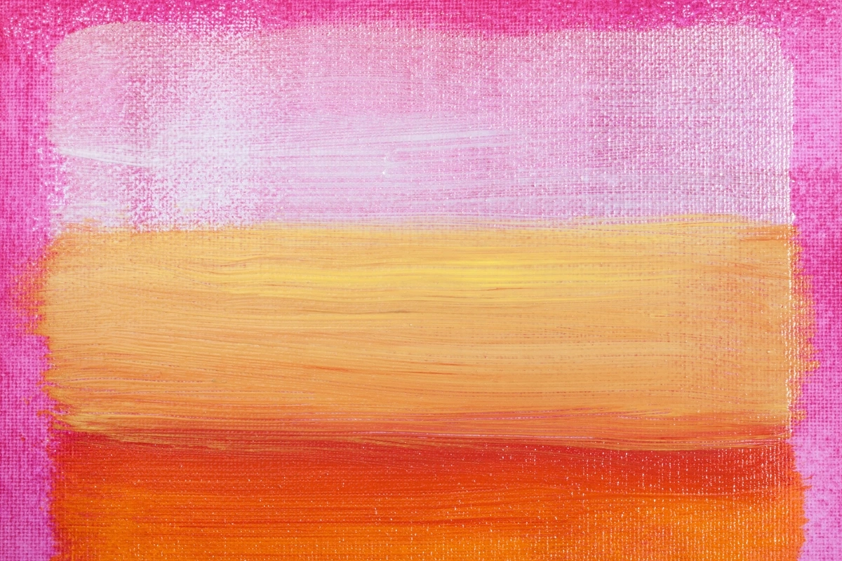
The incredible Helen Frankenthaler (b. 1928 – d. 2011) was a true pioneer here, and her innovation fundamentally changed abstract painting. Instead of applying thick paint onto the canvas, she thinned her oil paint (or later acrylics) with turpentine until it was almost like watercolor. Then, she poured, dripped, or brushed it directly onto raw, unprimed canvas. The choice of raw, unprimed canvas was crucial: it allowed the pigment to integrate directly with the fibers, literally absorbing the color. This dissolved the traditional barrier between paint and support, making the color seem to emerge from within the weave rather than sitting on the surface – becoming truly one with the canvas. I remember learning that working with raw canvas also meant the artist had less control over how the paint spread and bled, demanding both spontaneity and a keen understanding of the material's properties – a beautiful paradox of deliberate accident. This material exploration, including the deliberate choice of specific pigments and binders, was key to achieving the unique optical and tactile qualities.
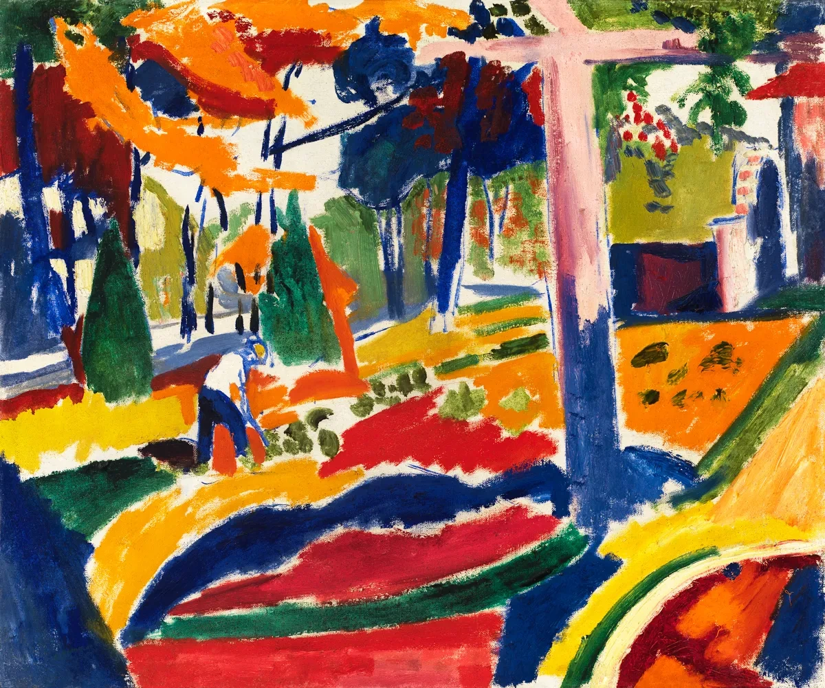
The result is a luminous, fluid, and ethereal effect, often described as a "breathing" surface, making the work less about a painted image and more about a visual phenomenon, a direct engagement with the intrinsic texture in art. Her seminal work, Mountains and Sea (1952), is the perfect illustration of this technique, a watershed moment that opened up new possibilities for subsequent generations of abstract artists, including figures like Morris Louis. It was an "aha!" moment for so many artists, and I think you can still see its echoes today in artists who push the boundaries of materials, often trying to make the paint and surface inseparable, a true unity of form and substance. It completely redefined the relationship between paint, canvas, and viewer.
3. Monumental Scale for Utter Immersion: Stepping into the Art
Unlike a traditional still life meant for quiet observation, if you've ever stood before a Rothko or a Newman, you know these paintings are often immense – sometimes towering, sometimes stretching across an entire wall. This isn't just for dramatic effect; it's a deliberate, psychological strategy, a direct invitation to step into the artwork. The artists wanted the painting to completely fill your field of vision, to literally envelop you. When you stand close to a massive Color Field work (and I mean really close, like 18 inches away, as Rothko himself often suggested for his works), your peripheral vision is consumed by the art. There is no 'outside' world, no distractions, only the expansive color. It’s just you and the vast, pulsating field, a truly immersive and sometimes overwhelming experience designed to be intensely personal and transformative. Think about how a huge, open sky makes you feel – a similar, expansive psychological effect is at play here, forcing a confrontation with the infinite. The sheer scale is not arbitrary; it is meticulously calculated to create an environmental, rather than merely observational, encounter, a powerful dialogue between you and the canvas that is often physical as much as it is visual.
4. No Central Focus (The All-Over Composition): The Boundless Canvas
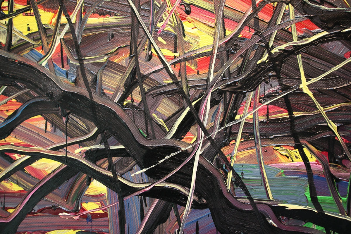
Unlike most traditional paintings that guide your eye to a specific focal point or narrative scene, Color Field works often embrace an all-over composition. This means there's no hierarchy, no single dominant element that demands your immediate attention. Your eye is encouraged to wander, to drift, to simply exist within the painting's environment, allowing the entire surface to resonate equally. This lack of a narrative or a clear subject helps to create a contemplative space, challenging conventional notions of understanding balance in art composition by distributing visual weight across the entire canvas. It’s a bit like looking up at a vast, cloudless sky – there's no single "thing" to focus on, just the boundless blueness, or the profound emptiness of an open desert. This compositional choice directly contributes to the feeling of boundless immersion, inviting a truly unmediated dialogue with pure color and form. It expands beyond typical the ultimate guide to abstract art movements principles.
The Visionaries of the Field: Masters of Emotion and Scale
While Mark Rothko (b. 1903 – d. 1970) is often the most recognizable name, a constellation of visionary artists known for using bold colors truly defined this emotionally charged approach to art. They pushed the boundaries of what painting could be, laying crucial groundwork for much of modern abstraction. Each brought their own distinct flavor to the pursuit of pure, immersive color, often with the critical support of influential critics like Clement Greenberg, who championed their radical departure from traditional art forms. To truly appreciate Color Field painting is to understand the unique contributions of these pioneering minds, who collectively transformed our understanding of art and its potential for universal communication, acting as much as philosophers of form as they were painters.
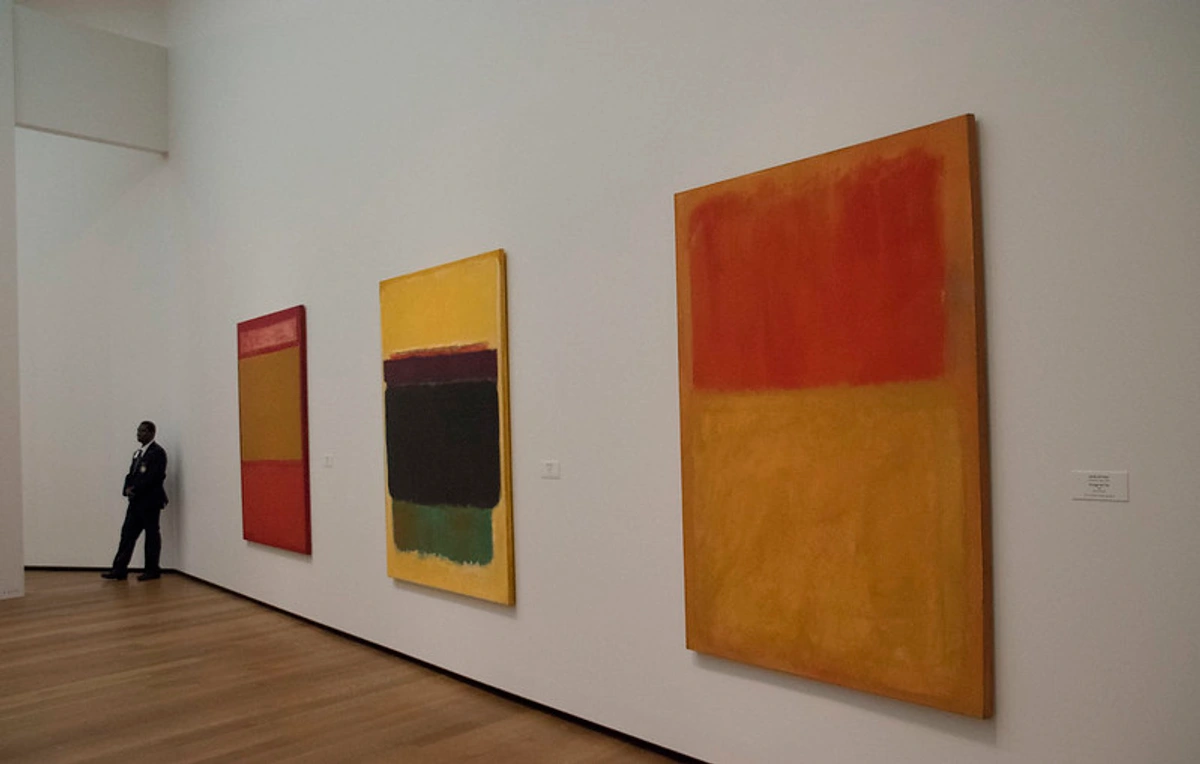
Artist | Known For | Their Unique Contribution to Color Field | Example Work | Key Philosophies/Goals | Why They're Important |
|---|---|---|---|---|---|
| Clyfford Still (b. 1904 – d. 1980) | Jagged, interlocking shapes, often with fiery or earthy tones, appearing like torn, raw surfaces, emphasizing the elemental. | Pioneered a fully non-representational style focused on large fields of color, emphasizing the primal and raw. His works possess an immense, almost frightening presence, demanding a visceral, confrontational response that speaks to the sublime. He fiercely protected his vision, often controlling exhibition of his work like 1949-A-No. 1, rejecting commercialism and seeking a pure, uncompromised artistic statement, believing art should remain aloof from the marketplace. | 1949-A-No. 1, PH-962 | Primal, raw expression; confrontation with the sublime; elemental force; rejection of commercialism and the art market's corrupting influence. | His early move to pure abstraction and colossal scale set a precedent for the entire movement, advocating for artistic integrity over commercial gain. His works are not windows, but walls that confront you, demanding an unmediated experience. |
| Mark Rothko (b. 1903 – d. 1970) | Large, hazy, hovering rectangles of luminous color, often layered with subtle variations and soft, vibrating edges. | Perfected the idea of painting as a gateway to profound emotional and spiritual states, creating works intended to be sites of meditation and contemplation. His art is the quintessential Color Field experience, often evoking a secular spirituality through color, famously designed to be viewed up close, almost breathing with the viewer, to encompass the viewer's entire being. He sought to express the full spectrum of human emotion, from joy and ecstasy to tragedy and despair, through color alone. | Seagram Murals, No. 14, 1960 | Secular spirituality; meditative contemplation; emotional depth through color (from melancholy to joy); intimate confrontation with universal feeling. | His unparalleled ability to evoke deep emotion and spirituality through pure color transformed abstract art into an almost religious experience, profoundly impacting subsequent generations and defining the immersive quality of Color Field. His soft edges create a breathing atmospheric boundary. |
| Barnett Newman (b. 1905 – d. 1970) | Vast, unified color fields punctuated by thin, vertical lines extending from one edge to the other, which he called "zips." | Used his "zips" not as divisions, but as integral elements that "measure" the sublime expanse of the color field, creating a sense of scale, human presence, and even a "divine spark" within the overwhelming void. His work invites us to consider our own scale against the infinite, a powerful existential affirmation, asserting the "self" within the boundless. His monumental Vir Heroicus Sublimis is a prime example of this confrontation, daring the viewer to stand before its immense red field, marked only by the thin vertical line, a single pulse against the vastness. | Vir Heroicus Sublimis, Who's Afraid of Red, Yellow and Blue III | The sublime experience; human scale against the infinite; existential affirmation; purity of form and the potential for a new iconography. | His "zips" brought a radical new spatial dynamic to color fields, integrating human presence and a sense of 'here and now' into the abstract sublime, challenging traditional composition and redefining the relationship between line and color. He saw the zip as a revelation, an assertion of self within the vast. |
| Helen Frankenthaler (b. 1928 – d. 2011) | Her pioneering "soak-stain" technique, resulting in expansive, luminous fields of flowing color that are one with the canvas. | Her innovation fundamentally reshaped abstract painting, influencing generations and paving the way for Post-Painterly Abstraction by merging color directly with the canvas's very fabric, creating an organic, breathable surface that seems alive. Her art felt simultaneously spontaneous and deeply considered, bridging gestural energy with pure color fields. Mountains and Sea is the seminal work demonstrating this revolutionary approach, making the canvas an active participant in the creation of form and color, dissolving the traditional paint-surface barrier. | Mountains and Sea, The Bay | Organic unity of color and canvas; fluid, spontaneous yet controlled expression; opening new material possibilities; bridging gestural and pure abstraction. | Her soak-stain technique was a watershed moment, literally changing the way paint interacted with canvas and opening up entirely new possibilities for abstraction, directly influencing artists like Morris Louis and Kenneth Noland with its airy, watercolor-like luminosity. |
| Ad Reinhardt (b. 1913 – d. 1967) | Near-monochromatic "black" paintings that, upon close inspection, reveal subtle shifts in hue and geometric forms, demanding rigorous optical engagement. | Pushed the concept of art-as-object and purity of painting to its absolute limit, seeking an "ultimate" or "last" painting that was free from any external reference, emotion, or brushstroke, making the viewer confront the essence of pure vision itself. His work epitomized a rigorous "art-as-art" philosophy. His Abstract Painting, No. 5 appears as a solid black square from afar, but close inspection reveals subtle crosses or squares in different, dark tones, often deep reds or blues, only visible through sustained, patient looking, challenging the very act of perception. | Abstract Painting, No. 5, Abstract Painting | Purity, reduction, ultimate abstraction, art-as-art, non-objective art, the absolute in painting, opticality over emotion, art free from all external baggage. | His relentless pursuit of pure, unadulterated abstraction provided a crucial, albeit austere, philosophical counterpoint to the more emotionally charged Color Field works, emphasizing opticality, objecthood, and the self-referential nature of painting, pushing it towards its logical conclusion and forcing a rigorous engagement with pure form. |
| Agnes Martin (b. 1912 – d. 2004) | Grid paintings, often with subtle pencil lines and delicate, pale washes of color, creating a meditative, minimalist aesthetic. | While often associated with Minimalism, her focus on subtle, expansive fields of color, meticulously applied to evoke quiet emotion and transcendental states, deeply connects her to Color Field. Her delicate grids create a profound sense of inner space and light, inviting contemplation and a gentle, almost silent, immersion, echoing principles of Zen Buddhist meditation. Her works, like Friendship, embody a serene, spiritual clarity through subtle repetition and muted hues, seeking to evoke a sense of happiness and innocence. | Friendship, Untitled #3 | Quiet contemplation, subtle emotion, transcendence, inner experience, purity of form, the pursuit of happiness and innocence through art. | Her unique approach bridged Color Field's emotional depth with Minimalism's formal rigor, creating a singular vision that emphasized the quiet, contemplative power of pure, undiluted feeling through ethereal color and form, resonating with a profound sense of peace and a deeply spiritual search. |
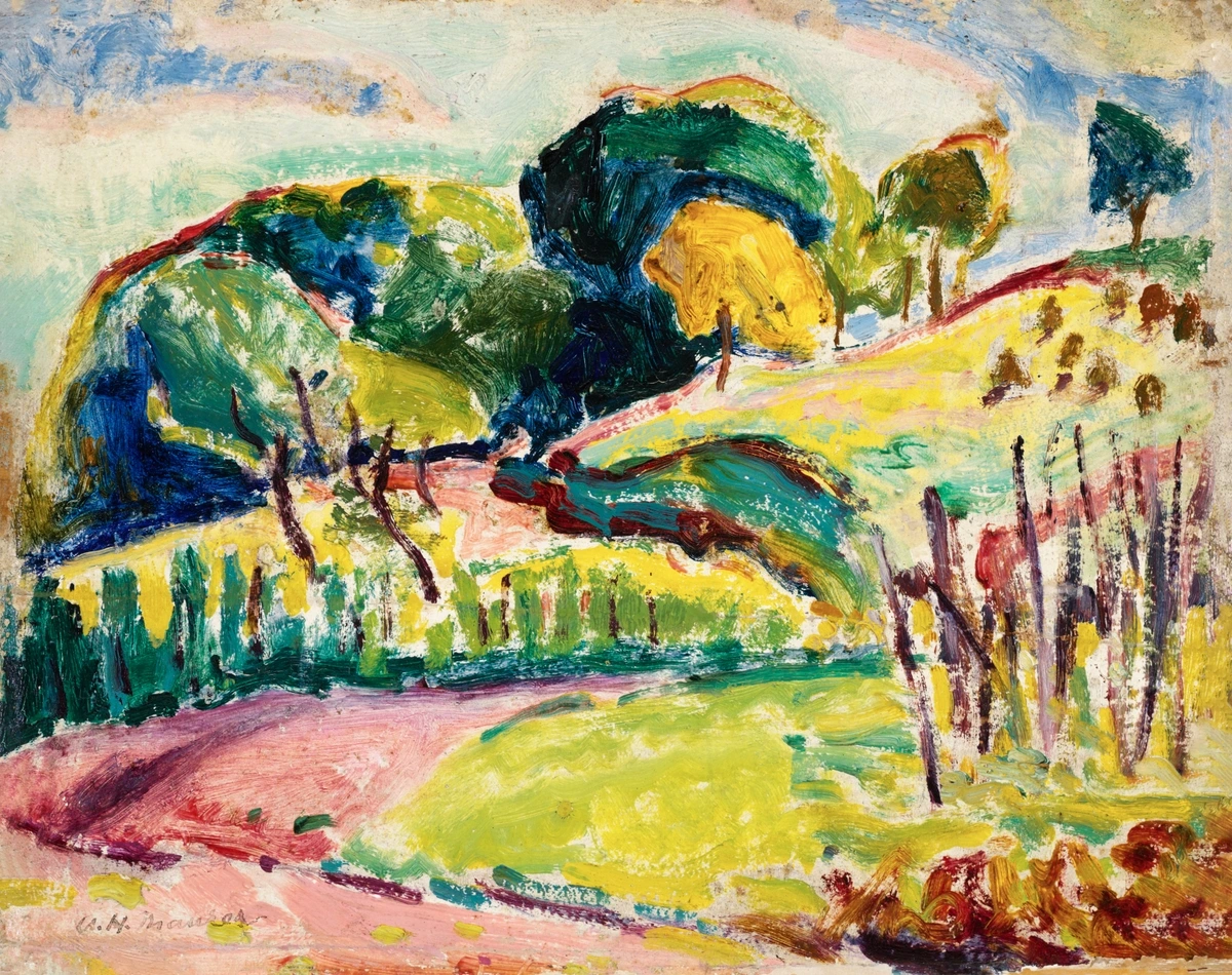
These artists, among others, saw the canvas not as a window to another world, but as the world itself, created anew with color. Their works are held in major museums worldwide, from the Museum of Modern Art (MoMA) in New York to the Tate Modern in London, cementing their status as cultural touchstones.

Beyond the Brushstroke: Color Field's Evolution & Enduring Legacy
Helen Frankenthaler's staining technique was so impactful that it essentially launched a new direction in art known as Post-Painterly Abstraction. This broader movement, of which Color Field painting is a primary example and a foundational subset, emphasized a deliberate departure from the painterly, gestural qualities of the ultimate guide to abstract art movements – meaning the visible brushstrokes and emotive application of paint. Whereas Abstract Expressionism often highlighted the struggle and the artist's hand, Post-Painterly Abstraction sought a cooler, more analytical approach, prioritizing clarity, openness, and the purity of color and form.
This often manifested in Hard-Edge painting, characterized by sharply defined, geometric fields of color, a stark contrast to the soft, blurred edges of a Rothko. Think of artists like Kenneth Noland, known for his target and chevron paintings with crisp edges; Morris Louis, who famously used the staining technique to create his ethereal veil and unfurled series; or Ellsworth Kelly and Frank Stella, whose works feature clean, unemotional surfaces and precise geometric forms that still deliver a powerful visual punch. They prioritized opticality – the direct visual impact of color and form, aiming for a purely retinal experience that bypassed narrative or subjective expression through brushwork. It's about what the eye sees directly, unburdened by the artist's psychological traces. So, while Color Field is a major type of Post-Painterly Abstraction, the latter term encompasses a wider array of artists and techniques that prioritize opticality and unmodulated color fields, often with a more restrained, impersonal touch. And let's not forget Op Art (Optical Art) which, while distinct, also shares Color Field's deep commitment to pure optical effects, but often with the intention of creating illusions of movement or vibration rather than emotional immersion.
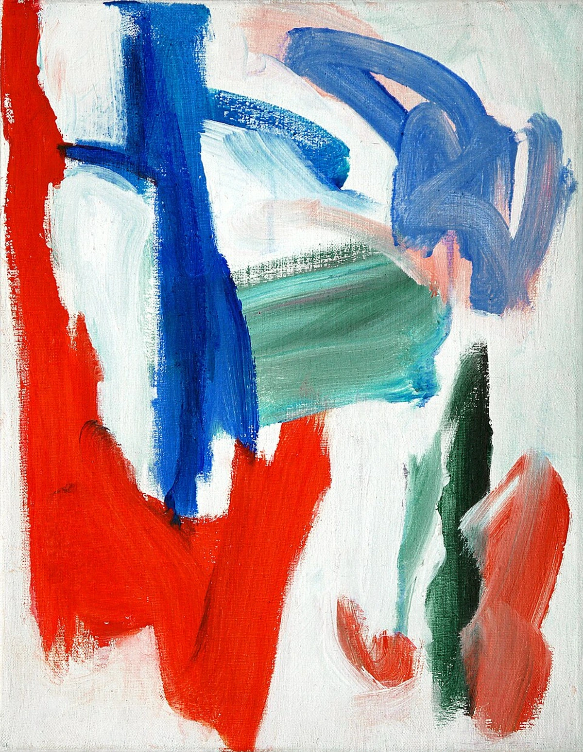
The emphasis on flatness and the reduction of elements in Color Field painting also directly informed later movements like Minimalism. For instance, Donald Judd's 'specific objects,' with their industrial materials and stripped-down forms – which he considered neither painting nor sculpture but existing as self-sufficient entities – extend Color Field's inquiry into the essential qualities of art. Judd's theory that a work should simply be rather than represent or express clearly builds on Color Field's removal of narrative and subjective expression, focusing even further on the object's inherent presence and relationship to space. Artists like Robert Ryman, with his relentless focus on the properties of white paint on various surfaces, clearly built upon Color Field's investigation into the essence of painting itself, pushing the boundaries of what paint is to its absolute limit. It's a clear lineage, a quiet revolution that altered the course of modern art, demonstrating how the pursuit of purity and essential form can lead to entirely new artistic languages. The common thread is a stripping away of the superfluous to arrive at the fundamental.
Color Field Painting vs. Post-Painterly Abstraction: Subtle but Significant Differences
While Color Field is often considered a form of Post-Painterly Abstraction, it's helpful to understand the nuances that define its unique place within this broader movement. It's not a simple either/or, but a spectrum of shared principles with distinct priorities.
Feature | Color Field Painting | Post-Painterly Abstraction (broader term) | Why the distinction matters |
|---|---|---|---|
| Scope | A specific style within the movement, emphasizing deep emotional/spiritual immersion. | A broader umbrella movement, characterized by a reaction against gestural abstraction. | Color Field is a foundational type within the larger trend, deeply rooted in emotional impact and the sublime. |
| Edges | Often soft, hazy, blurred, vibrating, creating a sense of luminosity and atmosphere. | Can be soft OR sharply defined (Hard-Edge), exploring diverse formal effects. | Hard-Edge painting, a prominent sub-style of PPA, offers a geometric contrast and different emotional impact, focusing on precision and clarity. |
| Intent | Primarily emotional, spiritual immersion, striving for the sublime, a universal feeling. | Cooler, more analytical, optical clarity, focusing on formal properties and perception, often more objective. | Color Field aims for transcendence and feeling; PPA prioritizes formal purity and purely visual perception, often with less overt emotional charge or personal narrative. |
| Texture | Minimal, paint absorbed into canvas (soak-stain technique) for an organic unity and 'breathing' surface. | Minimal, but can explore various surface treatments, often with cleaner, flatter applications, sometimes industrial-like. | Both prioritize flatness, but PPA techniques vary more broadly, including harder-edged applications and a wider range of material explorations, sometimes completely removing the 'artist's hand'. |
| Key Artists | Rothko, Newman, Still, Frankenthaler (foundational figures who defined its emotional core). | Noland, Louis, Kelly, Stella, Agnes Martin (and Color Field artists) – a wider array with diverse approaches, some moving towards a more detached aesthetic. | PPA encompasses a wider range of artists beyond the core Color Field group, showing diverse approaches to opticality and formal concerns, some leaning towards greater objectivity. |
Its DNA is still woven into so much contemporary abstract art today, anytime an artist uses color not just as a tool, but as the very subject of their work. From large-scale digital projections that envelop viewers in shifting hues to immersive light installations (think of the work of James Turrell or Olafur Eliasson) and generative art focused on pure color, the spirit of Color Field's pursuit of pure, overwhelming sensory experience lives on. It's a powerful reminder of the direct, unfiltered line the psychology of color has to our deepest emotions, and how the careful manipulation of color can transcend narrative to create visceral, unforgettable experiences. Even in the digital realm, where pixels replace pigment, the core principle remains: color as pure, immersive experience.
The Unseen Challenges: Conservation and the Digital Divide
However, it's important to acknowledge that while contemporary digital art and even NFTs have explored new ways to present immersive color experiences, the physical presence, monumental scale, and unique material reality of traditional Color Field painting remain unparalleled. Digital reproductions often struggle to capture the subtle luminosity, the delicate interaction of layered washes, the nuanced texture of the raw canvas, and the sheer physical presence that defines these works. The immersive, almost spiritual encounter is often diminished when divorced from its original context and scale, underscoring the necessity of seeing these masterpieces in person whenever possible. It's a different kind of magic, one that truly demands your physical presence, and one that resonates deeply with the unique energy of an original artwork.
Also, while some NFTs might promise unique digital ownership, the environmental impact of certain blockchain technologies (especially those relying on proof-of-work) raises significant concerns. For an art form that often sought purity and transcendence, the energy consumption and speculative nature of some digital art forms feel like a stark philosophical contrast to the deliberate, enduring values these artists sought. It also invites reflection on the ethical implications of virtual versus tangible artistic experiences, and whether true artistic value can be reduced to a purely digital, commodified asset without losing its soul.
Speaking of the physical presence of art, a quick but important note on conservation: The materials and scale of Color Field paintings, particularly those utilizing raw, unprimed canvases and thinned paints, present unique challenges for conservationists. The delicate nature of the paint absorbed into the canvas, rather than resting on top, means these works are exceptionally susceptible to environmental damage from light exposure, humidity fluctuations, and even airborne pollutants. The raw canvas fibers, now saturated with pigment, become more brittle and fragile over time. This requires precise, often painstaking, control over light levels (e.g., typically under 50 lux for sensitive pigments), humidity (typically 45-55% RH), and temperature (around 68-72°F or 20-22°C) in museum settings, and incredibly careful handling during transport or installation. For example, the precise pH of storage materials and the absence of even microscopic dust particles are crucial. Conservators often employ advanced scientific analysis to understand the specific properties of each pigment and canvas, tailoring interventions to preserve the subtle surface qualities. This adds another layer of appreciation for the continued existence and display of these magnificent works, a quiet testament to their vulnerability and the dedication required to preserve them for future generations, allowing us to continue experiencing their transformative power.
Beyond the Gallery: Impact on Design, Architecture, and Contemporary Practice
The influence of Color Field painting extends far beyond the canvas and into our everyday visual landscape. Its principles of expansive color, minimalist form, and immersive experience have subtly shaped various fields:
- Architecture and Interior Design: The desire for vast, unbroken planes of color, for minimalist spaces that allow light and hue to define the mood, directly echoes Color Field's aesthetic. Modernist and contemporary architecture often features large, unadorned walls that, like Color Field canvases, become fields of color interacting with natural light, creating a sense of calm or drama. Interior designers use large rugs, single-color feature walls, and monochromatic schemes to achieve similar immersive, atmospheric effects, transforming rooms into contemplative environments.
- Graphic Design and Branding: The power of pure color to evoke immediate emotional responses, stripped of narrative, is fundamental to effective branding and graphic design. Think of iconic logos or minimalist posters that rely on bold, unmodulated color blocks to convey a message or feeling instantly. This direct, impactful use of color owes a debt to Color Field's lessons in opticality and emotional resonance.
- Contemporary Art Installations: Many contemporary artists create immersive environments using light, projection, and colored fabrics that directly build upon Color Field's goal of enveloping the viewer in pure color. These installations transform passive viewing into an active, multisensory experience, demonstrating the enduring power of these foundational ideas in new mediums.
Displaying and Collecting Color Field Art: A Practical Guide
For those of you inspired to bring the profound impact of Color Field into your own space, or simply to understand how these works are best presented, there are a few practical considerations. Displaying Color Field art isn't just about hanging it on a wall; it's about curating an experience, whether in a grand museum or a quiet corner of your home.
Optimizing the Viewing Experience at Home
- Space is Key: Given their monumental scale, these works thrive in environments where they have room to breathe. Avoid clutter; a clean, uncluttered wall allows the color fields to truly expand and engulf the viewer, creating that immersive sensation. Think of the canvas not as a picture, but as an entire wall, a landscape in itself. Ideally, the painting should have significant negative space around it.
- Lighting Matters Immensely: Natural, diffused light is often ideal, as it allows the subtle nuances of layered color to reveal themselves without harsh shadows or glare. If using artificial light, opt for warm, adjustable LED lighting with a high Color Rendering Index (CRI) that can be directed to highlight the painting's surface without causing hot spots or fading. Track lighting or picture lights with dimming capabilities can offer excellent control. Direct sunlight should always be avoided due to the delicate pigments and raw canvas, which are highly susceptible to UV damage and accelerated aging.
- Proximity is Power: Remember Rothko's advice? He wanted viewers to stand close. If possible, arrange your space to allow for both distant and close viewing. The distant view gives you the overall emotional impact, while the close-up reveals the incredible subtlety of texture and layering, the optical mixing, and the delicate integration of paint with canvas. This dual perspective is essential for a full appreciation.
- Minimalist Surroundings: These works often resonate best with minimalist interiors. Their power lies in their simplicity, and busy surroundings can detract from their contemplative nature. Let the painting be the star, the focal point around which the room's energy orbits. A neutral palette for walls and furniture will allow the artwork's color to truly sing.
Considerations for the Aspiring Collector
Collecting Color Field art, whether original works or high-quality prints, is a journey of passion and responsibility. Here's what I've learned:
- Research and Authenticity: For original works by major artists, provenance (the documented history of ownership) is paramount. Work exclusively with reputable galleries, art dealers, or auction houses that specialize in modern and contemporary art. Be aware that the unique techniques, like Frankenthaler's soak-stain, have specific material characteristics that experts can identify to ensure authenticity. Always request condition reports and verify exhibition history.
- Conservation is an Investment (and an Ethical Responsibility): As discussed, these paintings are delicate. Factor in the long-term costs of proper conservation, including professional handling, specialized framing (often museum glass for UV protection), and maintaining strict climate control (temperature and humidity) in your home or storage facility. Regular inspections by a qualified conservator are also essential. It's an investment not just in the art, but in its future and enduring value, and a critical ethical consideration for preserving cultural heritage. The ethical responsibility of stewardship cannot be overstated for such fragile and historically significant pieces.
- Personal Connection Above All: With any art, but especially Color Field, the most valuable piece is the one that speaks to you. Don't just chase big names or market trends; seek out works that evoke a personal, profound response. That's the true treasure and the essence of appreciating this art form.
- Exploring the Market: Beyond major auction houses and blue-chip galleries, there's a vibrant market for emerging contemporary abstract artists who are deeply influenced by Color Field principles. Explore smaller galleries, online platforms, and artist websites (like original piece for sale) to find pieces that offer similar immersive experiences at different price points. You might discover the next great visionary, or simply a piece that resonates deeply with your personal aesthetic, offering a rewarding collecting experience that goes beyond mere investment.

Key Takeaways: Your Journey into Color Field Painting
For those of you who've journeyed through this guide, or even just skimmed to grasp the essentials, here's a concise summary of the core insights I hope you'll carry with you:
The Core Experience
- Experience, Not Depiction: Color Field painting invites you into a direct emotional and sensory encounter, prioritizing feeling over seeing a narrative or object. It's a journey into pure sensation, a unique dialogue between you and the canvas that offers space for profound introspection and a direct engagement with the artwork's inherent presence.
- Color as the Core: Pure, expansive color, often in vast, flat fields, is the absolute subject and protagonist of the artwork, carefully manipulated for psychological impact and to evoke a deep, primal emotional connection. It's not a background; it's the entire universe of the painting.
Innovative Techniques & Scale
- Groundbreaking Techniques: Innovations like Helen Frankenthaler's "soak-stain" technique radically integrated color into the canvas, creating luminous, breathable, and deeply unified surfaces, making the canvas an active participant in the artwork's creation and its optical effects.
- Immersion through Scale: Monumental canvases are strategically designed to envelop your entire field of vision, fostering an intensely personal and often overwhelming experience, making you a physical participant in the art, shutting out the external world and drawing you into the artwork itself.
Legacy & Philosophical Depth
- Contemplative Engagement: Lacking a central focal point, these works encourage deep, prolonged introspection and a silent, unmediated dialogue between viewer and pure color, often leading to profound insights and a sense of calm amidst chaos. Your personal response is paramount, effectively empowering the "death of the author" in art.
- Profound Legacy: Color Field painting provided a crucial bridge to movements like Minimalism and Hard-Edge painting, continuing to inspire contemporary abstract artists and underscoring art's essence and the raw power of the psychology of color. Its influence spans art, design, and even architecture.
- Philosophical Depth: Rooted in post-war existential questions and a search for authenticity, Color Field seeks universal, transcendent experiences through pure form, offering a profound counterpoint to the gestural angst of Action Painting. The deliberate removal of the artist's hand empowers your personal encounter with the art, making you the active interpreter, and often echoing Eastern philosophical concepts of contemplation and emptiness.
FAQ: Your Color Field Questions Answered
To further clarify common queries and solidify your understanding, here are answers to frequently asked questions about Color Field painting.
Core Concepts & Distinctions
What defines Color Field painting?
The primary characteristic is the use of large, expansive, unmodulated (meaning uniform in tone and hue within a given area) fields of pure color to create a profound emotional, spiritual, or contemplative experience. The focus is on the immersive quality and sheer presence of color itself, often on monumental canvases, rather than on depicting objects, narratives, or visible brushstrokes. It's about feeling the color, rather than analyzing a scene; a direct, unmediated encounter with the canvas's inherent flatness, as championed by critics like Clement Greenberg.

Is Color Field painting just one solid color?
Not usually! While some works might appear uniformly monochromatic from a distance, if you get up close (which I highly recommend!), you'll almost always discover subtle variations, delicate layers, and nuanced shifts in hue. Mark Rothko's iconic rectangles, for instance, are composed of many thin, translucent washes of color, meticulously built up. This layering is precisely what gives them their characteristic luminosity and profound depth, inviting you to literally peer into the surface, as if gazing into a colored fog or a light source that emanates from within. The seeming simplicity is a masterwork of intentionality and nuanced control over the medium, making each viewing a discovery. Don't be fooled by initial appearances; the true magic is in the subtlety and the optical effects generated in your eye.
Color Field vs. Action Painting: What's the main difference?
Think of them as two distinct, yet related, responses within the broader umbrella of Abstract Expressionism. Action Painting (epitomized by Jackson Pollock) emphasizes the process of creation – the artist's gestural energy, the visible traces of drips, splatters, and vigorous brushstrokes, serving as a physical record of the artist's intense emotional performance. Color Field painting, by contrast, is about the result – the calm, immersive, and emotional impact of pure color itself, with the artist's hand deliberately made as invisible as possible to foster a contemplative, universal experience for the viewer. One is about the drama of making; the other, the quiet, profound power of being.
What are the main differences between Color Field painting and Abstract Expressionism in general?
Color Field painting is actually a subset of Abstract Expressionism, but it represents a significant departure from what many consider the stereotypical "Abstract Expressionist" look. While both movements share a commitment to abstraction and emotional expression, Abstract Expressionism is the broader term, encompassing both the highly gestural and personal "Action Painting" (like Pollock's drips) and the more serene, contemplative "Color Field" style. The key difference lies in how emotion is conveyed: Action Painting uses visible, energetic brushstrokes to convey the artist's internal struggle, while Color Field painting uses vast, unmodulated fields of color to evoke universal emotions and meditative states in the viewer, deliberately minimizing the artist's visible hand.
Is Color Field art always emotionally uplifting?
Not at all. While often associated with spiritual uplift or meditative calm, Color Field artists, particularly figures like Mark Rothko, intentionally explored a full spectrum of human emotions. Many of Rothko's later works, for example, are characterized by somber, dark hues, evoking feelings of melancholy, tragedy, or even existential dread. The power of Color Field lies in its ability to facilitate a profound, often intense, emotional experience, which can encompass a wide range of feelings, not just positive ones. It's less about prescribing an emotion and more about evoking a deep, unfiltered response, allowing the viewer's own feelings to emerge.
Are Color Field paintings purely decorative?
Absolutely not. While their aesthetic beauty is undeniable, Color Field paintings are far from mere decoration. They are deeply conceptual and philosophical works, born from a serious artistic and intellectual pursuit to explore fundamental questions about existence, perception, and the nature of art itself. Their deliberate reduction of form and emphasis on pure color serves to strip away the superficial, inviting viewers into a profound, unmediated encounter that is meant to be transformative, not just visually pleasing. The simplicity is a means to an end: a direct dialogue with universal emotion and a challenge to conventional notions of what art can be. To dismiss them as decorative is to miss their profound intellectual and spiritual ambition, as well as the rigorous process of reduction and intentionality.
What if I don't feel anything immediately when viewing Color Field art?
That's perfectly normal, and honestly, something I've experienced myself! Color Field art isn't always an instant gratification experience. It demands patience and an open mind. Don't force a feeling. Instead, try the techniques described in "How to Actually Look at a Color Field Painting": get close, relax your eyes, and simply linger for a few minutes. Let the colors wash over you without judgment. Sometimes, the profound quiet is the feeling. The magic often unfolds subtly, slowly revealing itself as your perception adjusts and your subconscious begins to engage. It's a journey, not a sprint, and the absence of an immediate, overt feeling is often the first step towards a deeper, more personal connection.
How does Color Field painting relate to Op Art?
While distinct, Color Field painting shares a common thread with Op Art (Optical Art) in its emphasis on opticality and the viewer's direct visual perception. Both movements prioritize the purely retinal experience of color and form. However, Color Field aims for an emotional or spiritual immersion through vast, unmodulated color fields, often with soft, vibrating edges, to evoke a subjective, internal response and a sense of the sublime. Op Art, by contrast, deliberately uses precise geometric patterns and sharp contrasts to create illusions of movement, vibration, or hidden images, focusing on the objective, physiological effects of color and line on the eye, often aiming to create optical trickery or disorientation rather than profound emotional depth. While related in their optical focus, their underlying intentions and visual outcomes diverge significantly.
Why are Color Field paintings so expensive?
Several factors contribute to their high value in the art market. Firstly, their immense historical significance: they represent a pivotal moment in art history when the very definition and purpose of painting shifted, moving away from representation towards pure, immersive experience. They were championed by influential critics and acquired by major institutions, validating their place in the canon. Secondly, the rarity of these masterpieces by foundational artists like Rothko, Newman, Still, Frankenthaler, and Reinhardt, whose output was limited and highly influential, contributes significantly. Thirdly, the monumental scale and often complex, labor-intensive production processes (especially with the deliberate layering and staining techniques that require great skill to control pigment and canvas interaction) contribute to their value. Finally, their enduring influence on subsequent art movements and their continued ability to deeply move viewers solidify their place in the art market. They are, quite simply, cultural touchstones and transformative works, eagerly sought by collectors and institutions alike, representing a unique peak in 20th-century art.
What are the ethical considerations around collecting and displaying such delicate artworks?
Collecting and displaying Color Field artworks comes with significant ethical responsibilities, primarily due to their unique material properties. Because many utilize raw canvas and thinned, absorbed pigments, they are highly fragile and susceptible to environmental damage. Collectors have an ethical duty of stewardship to ensure these works are preserved for future generations. This includes investing in museum-standard conservation (climate control, light regulation, specialized framing), professional handling, and supporting ongoing research into their long-term preservation. Improper care can lead to irreversible damage, effectively diminishing a piece of cultural heritage. It's not just about ownership, but about the profound responsibility to protect these vulnerable masterpieces.
Techniques & Materials
What materials did Color Field artists primarily use?
Color Field artists experimented with various materials, but a key innovation involved working with thinned oil or acrylic paints applied to raw, unprimed canvases. This allowed the pigment to be absorbed by the fabric rather than sitting on its surface, as seen in Helen Frankenthaler's pioneering "soak-stain" technique. This choice of materials was deliberate, designed to create a luminous, integrated color field that felt unified with the canvas itself and minimized the visible hand of the artist, enhancing the opticality of the experience. They wanted color and canvas to be inseparable, creating an almost organic unity. Their material exploration often included careful selection of pigments for their particular transparency, lightfastness, and interaction with various binders.
What is the "soak-stain" technique in Color Field painting?
The "soak-stain" technique, pioneered by Helen Frankenthaler, involves thinning oil or acrylic paint with turpentine and applying it directly onto raw, unprimed canvas. Instead of sitting on the surface, the paint is absorbed by the fabric, creating a unique, luminous, and ethereal effect where color appears to emerge from within the canvas itself. This technique creates fluid, expansive fields of color and minimizes the appearance of the artist's brushstrokes, contributing to the overall sense of immersion and unity between color and support, making the canvas itself an active participant in the artwork. The raw canvas is crucial because its absorbency allows the pigment to truly integrate, dissolving the traditional paint-canvas barrier and giving the work its characteristic breathable, watercolor-like quality. It was a groundbreaking material innovation that profoundly influenced subsequent abstract art.
Scale & Viewer Experience
Why is the scale of Color Field paintings so important?
The monumental scale of Color Field paintings is absolutely crucial to their intended experience. Artists like Mark Rothko and Barnett Newman deliberately created immense canvases to literally envelop the viewer, filling their entire field of vision. When standing close to these large works, your peripheral vision is consumed by the expansive color, shutting out distractions and creating a singular, immersive environment. This forces a direct, intensely personal confrontation with the artwork, transforming a passive viewing into an active, almost overwhelming, sensory and emotional experience, similar to the awe inspired by vast natural landscapes. The size itself becomes part of the message, creating a world for you to enter, rather than a picture to merely observe.
What role does the viewer play in Color Field art?
In Color Field painting, the viewer's role is paramount and active. Artists deliberately removed their own visible hand and narrative to empower your direct, unmediated experience. You are not just observing; you are meant to be enveloped, to feel the emotional and spiritual resonance of the pure color within your own being. The artwork becomes a catalyst for your own introspection, a space for personal encounter rather than a dictated message. It's a profound dialogue between you and the canvas, where your interpretation and feeling are central, making you an active co-creator of meaning. This aligns with the concept of the "death of the author," transferring interpretive authority from artist to audience.
Artists & Legacy
Who are the most famous Color Field artists?
Some of the most influential and recognized Color Field artists include Mark Rothko, Clyfford Still, Barnett Newman, Helen Frankenthaler, Ad Reinhardt, and Agnes Martin. Other significant figures like Morris Louis and Kenneth Noland further developed aspects of Color Field within the broader movement of Post-Painterly Abstraction. Each brought unique contributions to the movement, from Rothko's luminous rectangles and Newman's "zips" to Frankenthaler's pioneering soak-stain technique and Martin's meditative grids, collectively shaping a pivotal era in abstract art and continuing to inspire generations.
How does Color Field painting relate to Minimalism?
Color Field painting served as a crucial precursor and influence for Minimalism. Both movements share a reductionist impulse, stripping away narrative, illusionistic depth, and expressive brushwork to focus on the essential properties of art. Color Field's emphasis on flatness, the objecthood of the canvas, and the direct optical impact of pure color paved the way for Minimalist artists like Donald Judd, who further removed subjective expression, concentrating on industrial materials, geometric forms, and the object's inherent presence in space. The lineage is clear: a shared quest for purity and fundamental form, albeit expressed in different material and philosophical contexts, with Minimalism taking the reductionist impulse even further into three-dimensional space and industrial materials. Agnes Martin, though rooted in Color Field's emotional depth, also stands as a bridge figure to Minimalism with her precise, meditative grids.
How to Actually Look at a Color Field Painting (and Find Yourself Lost)
Okay, so you're standing in front of a giant canvas of pure, pulsating color. It can feel...awkward, right? Like you're supposed to do something profound, or understand some hidden code. It might feel strange at first, like learning a new language, but patience is key. The secret, as I've found over many years of getting delightfully confused (and then enlightened!) by these works, is to simply let go of those expectations. This isn't a puzzle; it's an environment. It’s an invitation. Here’s how I approach it, and what I encourage you to try to unlock that unexpected conversation within:
1. Get Close. Seriously, closer than you might think.
Many artists, especially Mark Rothko, intended for you to stand quite near the canvas – maybe 18 inches away. This is where the monumental scale works its magic, enveloping your vision and making the painting your entire world. It’s a deliberate act of immersion, shutting out the gallery noise and drawing you into a singular, intense experience. I remember feeling a genuine sense of disorientation the first time I did this with a Rothko, as if the color was literally breathing around me, and the edges of the canvas simply ceased to exist. You become part of the painting, a feeling that still gives me chills. This isn't just looking; it's entering, it’s a physical confrontation with color itself, enabling that pure opticality the artists sought.
2. Let Your Eyes Relax, and Your Mind Wander.
Don't strain to find a hidden meaning or a symbolic narrative. Let your vision go a little soft, unfocused. Notice the subtle shifts in color – how one hue vibrates against another, how light seems to emanate from within the pigment, the delicate edges where one hue bleeds into another, the gentle texture of the canvas where the color was absorbed (thanks to that soak-stain technique). The magic often lies in these quiet, peripheral details, in the subtle breath of the surface. It's like listening to ambient music; you let it wash over you rather than dissecting each note, allowing your subconscious to take over and find its own rhythm within the artwork. And if you find yourself initially feeling nothing, or even a bit bored, that's okay too; that stillness is part of the experience. The absence of a prescribed feeling creates a space for your feeling to emerge.

3. Be Patient. Give it Time to Speak.
Don't glance and walk away. Give it time – a minute, five minutes, ten. Let the color wash over you, soak into your senses, become part of your own internal landscape. What does it feel like? Don't judge the feeling, just observe it. Does it evoke calm, agitation, expansiveness, melancholy, joy, a sense of profound quiet, or even a delightful uncertainty? The goal is to allow the painting to resonate with your inner state, to initiate a dialogue without words. This slow engagement directly relates to the all-over composition, which encourages your eye to wander rather than focusing on a single point. I've often found myself surprised by the emotions a seemingly simple block of color can stir, even if I wasn't expecting them; it’s a quiet, powerful form of communication, a true meeting of minds (and senses). Patience is your key to unlocking its secrets.
4. Forget "Understanding." Embrace "Feeling."
This isn't about intellectual comprehension in the traditional sense. It's about sensory and emotional engagement. The goal isn't to leave saying, "I understand what the artist meant" (though that might come later, with research and reflection). The primary goal is to leave feeling something – a profound quiet, a surge of energy, a sense of peace, or even a deep introspection. It's about the conversation that starts within your own head and heart, a unique and intensely personal experience of the psychology of color in abstract art. And remember, it's okay if your interpretation isn't definitive or changes over time; the ambiguity is part of its power, like an open-ended question inviting endless personal answers.
5. Consider the Context of Creation.
While the art is meant to be a direct, unmediated experience, a brief thought about the societal and artistic climate in which the painting was made can enrich your appreciation. These works emerged from the anxieties of a post-war world, a search for universal meaning in chaos, often echoing existentialist concerns, and sometimes even Zen philosophical principles of transcending dualities. Knowing this doesn't dictate your feeling, but it can add a layer of historical and philosophical resonance to your personal encounter, like understanding the backstory to a powerful song.
Summary of How to Look: Your Personal Guide to Color Field Immersion
Action | Purpose | Expected Outcome |
|---|---|---|
| Immerse | Get uncomfortably close to let the painting fill your vision. | You become enveloped, distractions fade, a singular experience. |
| Relax | Let your eyes and mind soften; don't strain for explicit meaning. | Notice subtle shifts, optical illusions, and the painting's quiet breath. |
| Linger | Give the artwork ample time to work its magic and speak to your senses. | Allow emotions to surface, engage in a dialogue without words, find your rhythm. |
| Feel | Prioritize emotional and sensory response over intellectual analysis. | Experience profound quiet, energy, peace, or introspection. |
| Contextualize | Briefly consider the historical and philosophical backdrop for added depth. | Add a layer of historical resonance to your personal, primal encounter. |

A Final Thought: Embrace the Unseen and Feel the Color
The next time you find yourself in a museum – perhaps even here at the Den Bosch Museum or any gallery showcasing modern abstract art – and you spot a painting that initially looks like 'just a big square of blue' or 'a few blurry rectangles,' I implore you: take that dare. Stop. Get close. Let it surround you. Don't try to intellectualize, don't try to analyze in the traditional sense. Just feel. Let the color wash over you, and allow yourself to get wonderfully lost in its quiet, expansive presence. You might just be astonished by the unexpected conversation that begins within your own mind, perhaps even inspiring you to explore your own relationship with color, whether through appreciating more art or considering an original piece for sale.
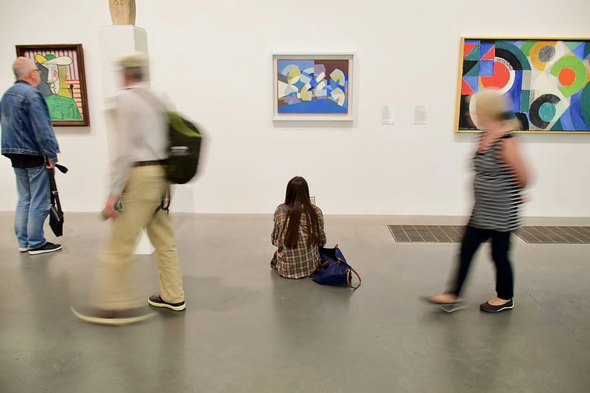


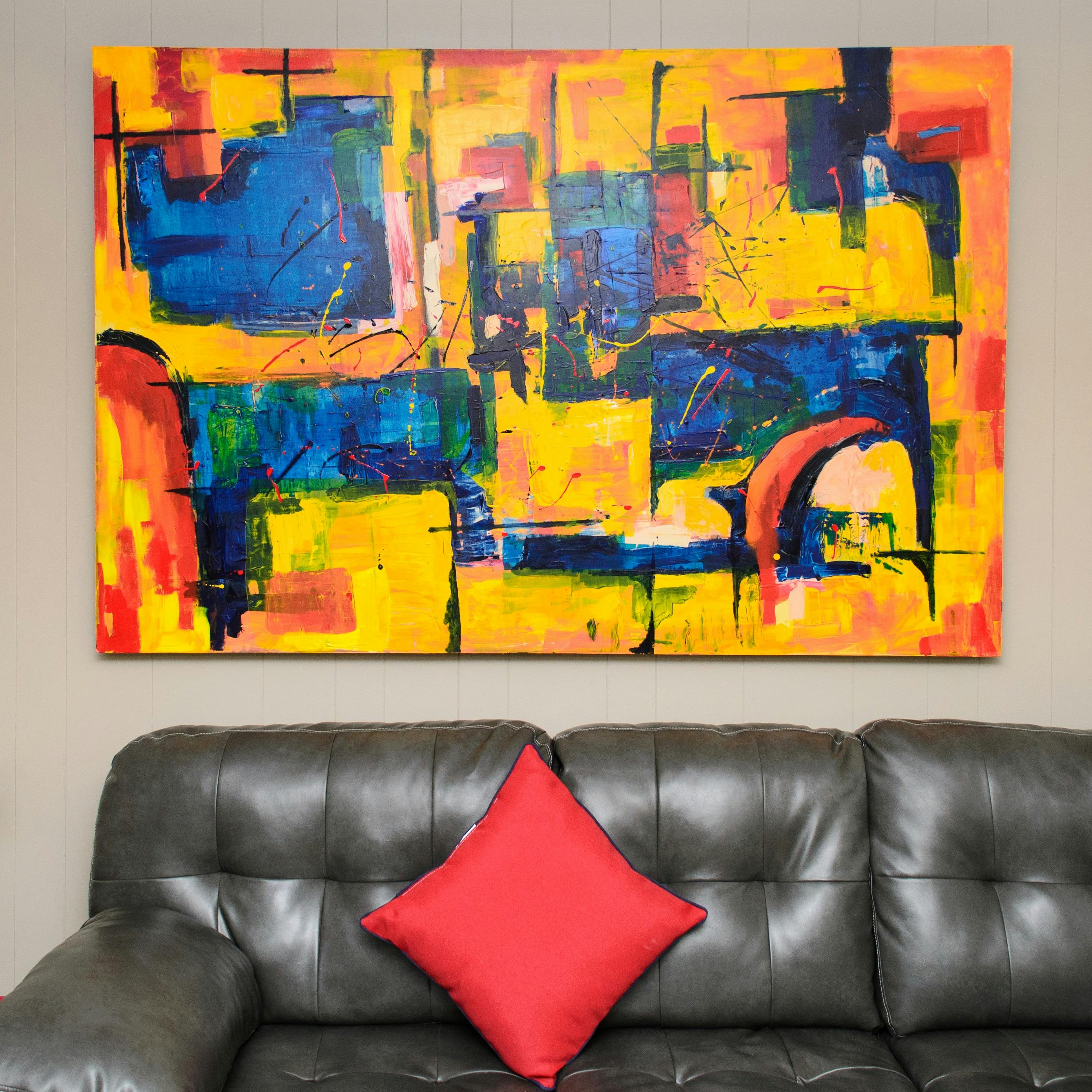




credit, licence
It’s a journey, my friend, truly worth taking, and one that reminds me daily of the profound simplicity and power of art to connect us to something beyond ourselves. Isn't that, after all, what we're truly searching for?
Other topics you might be interested in:
Further Reading and Exploration
If your curiosity about Color Field painting, its philosophy, and its enduring influence has been piqued, I highly encourage you to delve deeper. Visiting museums and galleries that house these monumental works in person is an absolute must – the scale and subtle luminosity cannot be fully appreciated through reproductions. Seek out collections at the Museum of Modern Art (MoMA) in New York, the Tate Modern in London, or the National Gallery of Art in Washington D.C., all of which boast significant holdings by Rothko, Newman, Still, and Frankenthaler. Engaging with these works firsthand offers a truly transformative experience that digital images simply cannot replicate. You might even find yourself inspired to explore the vibrant world of contemporary abstract art, perhaps discovering an original piece for sale that resonates with your newfound appreciation for the power of pure color. There's a whole world of visual meditation waiting for you. For more in-depth academic exploration, I recommend books like Clement Greenberg's essays on modern art, or studies specifically on Mark Rothko and Helen Frankenthaler that delve into their philosophical motivations and technical innovations. Don't forget to check your local library or university resources for a treasure trove of knowledge!
Glossary of Terms
- Abstract Expressionism: A post-World War II art movement in American painting, developed in New York in the 1940s. It was the first specifically American movement to achieve worldwide influence and is often understood as encompassing two main approaches: Action Painting and Color Field Painting.
- Absurdism: In philosophy, the belief that human beings exist in a meaningless, irrational universe and that any search for order or meaning will ultimately bring them into conflict with the universe. This concept often underpinned the existential anxieties that Color Field artists sought to transcend through pure form.
- Action Painting: A style within Abstract Expressionism characterized by energetic, gestural application of paint, emphasizing the physical act of painting and the artist's expressive mark.
- All-Over Composition: A compositional approach where all areas of the canvas are given equal attention, with no single focal point dominating the viewer's gaze, encouraging an immersive, boundless experience.
- Analogous Colors: Colors next to each other on the color wheel (e.g., blue/green). Used to create harmonious, flowing compositions and a sense of calm continuity.
- Authenticity: In existentialist philosophy and art, the degree to which one's actions and experiences are consistent with one's true self, independent of external expectations. Color Field artists sought to create an authentic, unmediated encounter with pure color, stripping away inauthentic narratives.
- Color Field Painting: A style of abstract art characterized by large, unmodulated expanses of color, used to evoke emotional or spiritual responses through immersive opticality.
- Color Theory: The principles and guidelines surrounding the use of color, including concepts like hue, value, saturation, and how colors interact visually and psychologically.
- Complementary Colors: Colors opposite each other on the color wheel (e.g., red/green, blue/orange). Juxtaposed to create intense optical vibration, shimmer, or perceived shifts in hue.
- Conservation: The profession devoted to the preservation of cultural heritage, including works of art. For Color Field paintings, this involves meticulous control of environmental factors due to the delicate nature of materials like raw canvas and thinned paints, representing a significant ethical responsibility.
- Death of the Author: A literary theory proposed by Roland Barthes, asserting that an author's intentions and biographical context are irrelevant to the interpretation of their work. In Color Field art, this concept resonates with the deliberate removal of the artist's visible hand, empowering the viewer's subjective experience.
- Dematerialization of Art: A concept describing a shift in art from emphasizing the physical object or the artist's 'hand' towards focusing on concepts, processes, or the viewer's experience, often seen in Minimalism and Conceptual Art, influenced by Color Field's reductionist tendencies.
- Ephemeral: Lasting for a very short time; fleeting. Often used to describe the delicate, light-like quality of colors in Color Field painting.
- Evocation: The act of bringing a feeling, memory, or image into the mind. In Color Field painting, the primary goal is to evoke profound emotional or spiritual states through pure color and form.
- Existentialism: A philosophical movement emphasizing individual existence, freedom, and responsibility. It posits that human beings define their own meaning in life, and that this search for meaning often takes place against a backdrop of an indifferent or 'absurd' universe, deeply influencing the post-war artists of the Color Field movement.
- Flatness: A fundamental principle in Color Field painting, famously championed by Clement Greenberg, emphasizing the two-dimensional nature of the canvas by minimizing perceived depth or texture, fostering a direct confrontation with color and surface and rejecting illusionistic space.
- Formalism: An approach to art criticism and art theory that emphasizes the analysis of a work's visual or material elements and structure, rather than its context, subject matter, or narrative. Clement Greenberg was a key proponent in relation to Color Field painting.
- Gestural Abstraction: A term for a style of abstract painting in which the artist's expressive movements (gestures) of the hand or arm are evident in the brushstrokes or application of paint, often associated with Action Painting.
- Hard-Edge Painting: A style within Post-Painterly Abstraction characterized by sharply defined, geometric forms and flat, unmodulated areas of color, emphasizing clarity and precision, in contrast to the more organic edges of earlier Color Field works.
- Hue: The pure spectrum color (e.g., red, blue, green) that distinguishes it from others, independent of its value or saturation. A core element artists manipulate to evoke specific responses.
- Luminosity: Emitting or reflecting light; shining. Often used to describe the glowing, ethereal quality of colors, especially in Rothko's work, which seems to glow from within.
- Minimalism: An art movement that emerged in the 1960s, reacting against Abstract Expressionism by reducing art to its most essential forms, emphasizing geometric shapes, industrial materials, and a complete absence of overt expression or narrative, often directly influenced by Color Field's reductionist tendencies.
- Optical Mixing: The phenomenon where colors, when placed in close proximity, appear to blend and create a new perceived color in the viewer's eye, rather than physically mixing on the palette.
- Opticality: In art, the quality of prioritizing direct visual perception and the purely retinal experience of color and form, often minimalizing narrative or expressive brushwork and focusing solely on what the eye sees.
- Op Art (Optical Art): An art movement that emerged in the 1960s, using precise geometric patterns and sharp contrasts to create illusions of movement, vibration, or hidden images, focusing on physiological optical effects, often sharing opticality with Color Field but differing in intent.
- Post-Painterly Abstraction: A broader movement encompassing Color Field and other styles, characterized by a reaction against the gestural, 'painterly' qualities of Abstract Expressionism. It favors clarity, openness, and pure color applied without visible brushstrokes, with Color Field often seen as its foundational innovation.
- Provenance: The documented history of ownership of a work of art, used to establish its authenticity and value.
- Retinal Experience: A term referring to an artistic experience that relies primarily on the direct, physiological response of the eye to color and form, bypassing intellectual or narrative interpretation.
- Saturation (or Chroma): The intensity or purity of a color; a highly saturated color is vivid and bright, while a less saturated color is duller or more muted. Color Field artists meticulously controlled saturation to achieve desired emotional effects.
- Simultaneous Contrast: The effect where the perceived color of a hue is altered by the surrounding colors, as articulated by Michel Eugène Chevreul, leading to optical vibrations and shifts in perception.
- Soak-Stain Technique: An innovative painting method, notably pioneered by Helen Frankenthaler, where thinned paint is applied to raw canvas, allowing it to be absorbed by the fabric rather than sitting on the surface, creating luminous, integrated color fields and minimizing the artist's hand.
- Stewardship: The ethical responsibility to care for something, particularly cultural heritage, ensuring its preservation for future generations.
- The Sublime: A concept referring to an experience of awe, grandeur, or even terror that overwhelms the viewer, often evoked by immense scale, power, or beauty in nature or art, inspiring a sense of transcendence and moral elevation, a key aim of Color Field artists. Philosophers like Edmund Burke and Immanuel Kant explored this concept.
- Translucent: Allowing light to pass through but diffusing it so that objects on the other side are not clearly visible. Often describes the layered quality of colors in Color Field painting.
- Unmodulated: Referring to a single, uniform color that is applied evenly across a surface without variations in tone, hue, or intensity, creating a flat, unbroken field, a core characteristic of Color Field painting.
- Value (or Lightness): The relative lightness or darkness of a color. Color Field artists manipulated value to create depth and contrast within their flat color fields, even without traditional chiaroscuro.