
Josef Albers & 'Interaction of Color': The Ultimate Guide to Seeing Color
Dive into Josef Albers' 'Interaction of Color'. Explore how context transforms hues, why color is a beautiful trickster, and his revolutionary impact on art, design, and your daily visual world.

Josef Albers & 'Interaction of Color': The Ultimate Guide to Seeing Color Forever
I remember the exact moment I realized I knew absolutely nothing about color. It wasn't in a lecture hall or poring over a dusty art history book. It was far more visceral, far more frustrating. I was simply staring at two swatches of brown, trying to decide which one to use in a new piece. On my desk, in isolation, they looked distinct enough. But on the canvas, nestled against other hues – a deep teal, a soft ochre – one brown looked muddy, lifeless, while the other suddenly vibrated, buzzing with an unexpected warmth. It was infuriating. I genuinely thought my eyes were playing tricks on me.
Turns out, I wasn't losing my mind; I was just having my first, unwitting Josef Albers moment. I was encountering color as the ultimate beautiful liar, a master of disguise. Most of us, when we first encounter color theory for artists, picture a simple color wheel, complementary pairs, and the basic rules we learned in grade school. But Josef Albers, in his quiet, methodical brilliance, looked at that rigid rulebook and, quite politely, threw it out the window. This wasn't just about rejecting old ideas; it was a profound paradigm shift, inviting us to abandon static definitions and embrace the living, breathing phenomenon of color itself.
He wasn't interested in static definitions or prescriptive formulas. His lifelong obsession was with the slippery, mischievous, and downright magical nature of color itself – how it shifts, deceives, and transforms based purely on its context. He taught us that true understanding comes from opening our eyes through guided exploration, not rote learning. My goal here is to unravel Albers' revolutionary ideas, explore his seminal work 'Interaction of Color,' and reveal its enduring relevance to how we truly see the world, whether in a gallery or in our everyday lives.

So, let's dive into the world of the man who didn't just teach the world about color, but taught us how to truly see it for what it is: a living, breathing phenomenon of perception.
Josef Albers: Artist, Educator, Revolutionary
Josef Albers (1888-1976) was a German-born artist, designer, and perhaps most profoundly, a legendary teacher. Born in Bottrop, Germany, Albers initially trained as an elementary school teacher. This early path, I've always thought, subtly foreshadowed his lifelong commitment to pedagogy – the art and science of teaching. He understood from the outset that true learning wasn't about memorizing facts, but about fostering genuine understanding and curiosity.
He later studied art in Berlin and Munich before joining the radical Bauhaus in 1920. If you trace his career on my [/timeline], you'll find him at the very nexus of some of the 20th century's most significant art movements.
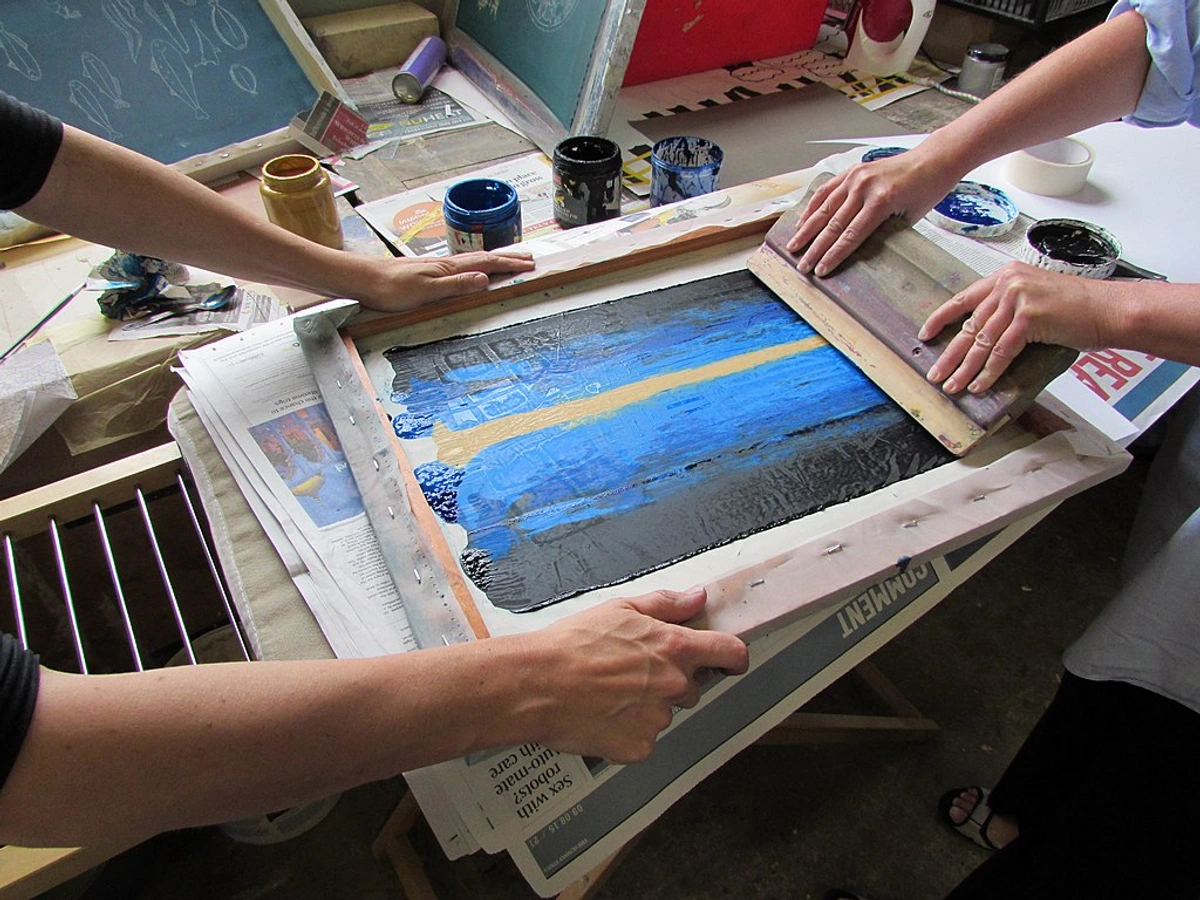
The Bauhaus, that mythical German school, wasn't just an art academy; it was a societal experiment, a crucible where art, craft, and technology were radically merged to reshape society through design. Albers quickly rose to become a master there. What set his teaching apart, even then, was his insistence on direct experience.
His classes weren't about memorizing historical facts or artistic dogma. Instead, they were immersive laboratories where students learned by doing, experimenting, and seeing for themselves. This empirical, hands-on approach, where students directly manipulated materials to discover principles, was revolutionary, a stark contrast to the traditional art academies of the time that favored rote copying and rigid rules.

When the Nazis, with their suffocating ideology, shut the Bauhaus down in 1933, Albers and his equally brilliant wife, the renowned textile artist Anni Albers (whose groundbreaking work deserves an article all its own!), immigrated to the United States. Anni Albers' pioneering work in weaving and textile design, much like Josef's, explored the inherent qualities of materials through rigorous experimentation, making them a formidable duo in pushing the boundaries of modern art and design. Their arrival was a seismic event for American art education, almost like a transplant of radical European pedagogy.
Albers then helped establish and shape the experimental Black Mountain College in North Carolina – an institution that became a crucible for avant-garde art and interdisciplinary learning, attracting a constellation of artistic and intellectual talent including John Cage, Merce Cunningham, and Buckminster Fuller. It was a place where artistic boundaries dissolved, and learning was a collaborative, experiential process. He eventually headed the design department at Yale University. At Yale, from 1950 to 1958, he refined his pedagogical methods, making his color course a cornerstone of the curriculum and influencing countless students who would go on to shape modern design and art. His influence, therefore, stretched across continents and generations of artists and designers, shaping the very curricula that would train future creative minds.
While Albers is a monumental figure, he didn't emerge from a vacuum. His explorations built upon the work of earlier color theorists like Johann Wolfgang von Goethe and Michel Eugène Chevreul, who also delved into the subjective nature of color perception. However, Albers diverged sharply from their more scientific, systematic approaches.
Goethe, for instance, in his 'Theory of Colours,' focused on the psychological and symbolic effects of colors, their appearance in nature, and their emotional associations. Chevreul, on the other hand, systematically explored optical effects, particularly in the context of textiles and dyeing, famously impacting the Gobelin Tapestry workshops and later, Impressionist painters. Both were systematic in their observations, seeking to categorize and define. Albers, however, chose to focus purely on the phenomenological experience of color – not its physical properties or universal rules, nor its symbolism, but solely on how it appears to us in the moment, as a direct, felt visual experience. It was a subtle but profound shift: moving from what color is to how we see color, ultimately redefining color studies and grounding them in human perception.
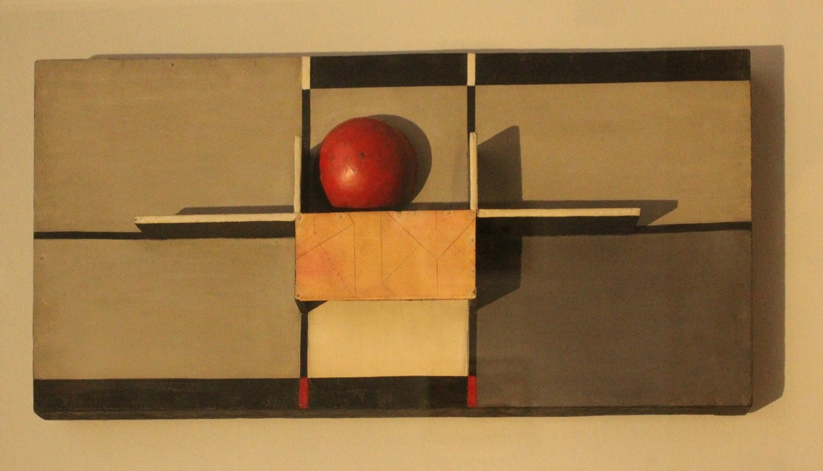
'Interaction of Color': A Practical Revelation
Published in 1963, Josef Albers' 'Interaction of Color' isn't a book you simply read from cover to cover like a novel. Think of it more as a workbook for your eyes, a practical manual, or even a philosophical treatise disguised as a collection of stunning visual experiments. It’s a book you do, an invitation to become an active observer and to challenge your deepest preconceptions about color.
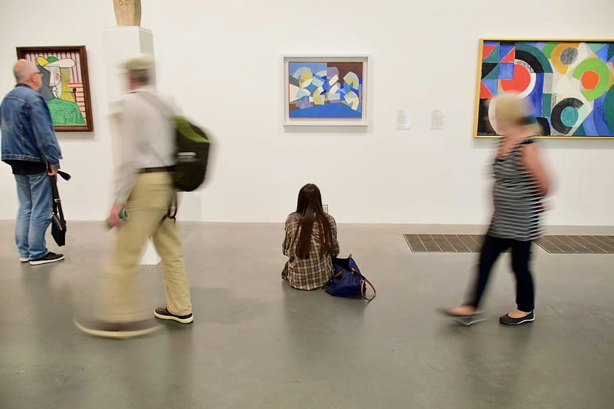
Comprising a series of exercises and detailed plates, its sole purpose is to demonstrate one central, paradigm-shifting idea: no color is ever seen as it really is. Color, Albers proved, is inherently unstable, a trickster. Its identity and perceived qualities are determined almost entirely by its neighbors, its surrounding context. This monumental book is his proof, a series of mind-bending experiments that he developed for his students, often using nothing more complex than colored paper and glue. It focuses primarily on subtractive color mixing, which is what happens when pigments absorb certain wavelengths of light and reflect others – the world of paint, inks, and physical objects, as opposed to additive color (light).
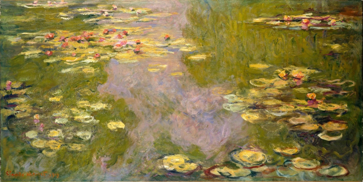
The Phenomenon of Color Interaction: Why Colors Deceive
Albers wasn't content to merely tell us that color is relative; he demanded that we experience it. He wanted to show, with irrefutable visual evidence, that color is the most relative medium in art. These core concepts are fundamental to understanding not just color, but the very elements of art themselves.
To fully grasp Albers' insights, it helps to first understand the three main properties of color: hue (the pure color, like red or blue – its name), value (how light or dark a color is – think sky blue vs. navy), and saturation (its intensity or purity – vibrant cherry red vs. muted rose). These aren't just definitions; they're the levers and pulleys Albers taught us to manipulate to understand color's shifting identity, as each property can be altered by its neighbors.
Simultaneous Contrast: Why Colors Fight (Beautifully)
This is the 'why' behind the magic trick, the underlying mechanism of color's deceptive nature. Simultaneous contrast is the tendency of a color to induce its visual opposite (complementary color) in hue, value, and intensity in an adjacent color. In simpler terms, colors are always subtly, and sometimes aggressively, fighting with their neighbors, influencing each other's appearance. It's like your brain is constantly trying to 'balance' the color information it's receiving.
Imagine a medium gray square placed on a vivid red background. What happens? That seemingly neutral gray will start to take on a faint, almost imperceptible greenish tint. Why? Because green is the complementary color of red, and your brain, in its tireless effort to find balance, is trying to 'complete' the red. It's an optical illusion, a perceptual compensation. Or consider a bright yellow square on a dull blue; suddenly, the yellow appears even more luminous, almost as if it's glowing. Or perhaps a dark purple placed next to a light, desaturated yellow – the purple will seem to take on a slightly warmer, more yellowish cast, while the yellow may appear even paler and cooler. Conversely, a vibrant orange against a deep teal can make the orange leap forward with incredible intensity, while the teal itself might appear richer and deeper. It's a delightful battle our eyes witness daily.

Understanding this push and pull, this constant interplay, is key to figuring out how artists use color to create mood, depth, vibration, and even spatial illusions in their work. It's why two seemingly identical yellows can pop or recede depending on the blue next to them. It's why two seemingly identical reds can scream or whisper depending on the green next to them.
One Color, Many Faces (Relativity): The Famous Albers Experiments
This is where the direct experience comes in, Josef Albers' famous color experiments that prove color relativity. These optical illusions vividly demonstrate that a single, objective color can appear as many different colors depending on its context.
Here's how it generally works: You take a small square of a single, uniform color – let's say a specific medium green. You then place an identical square on a background of a very dark green. Next, you place another identical square of that same medium green on a background of a very bright yellow.
Suddenly, before your very eyes, you perceive two different greens. The medium green on the dark green background will appear noticeably lighter and perhaps even more vibrant, almost leaping forward, possibly taking on a slightly cooler cast. Conversely, the identical medium green on the bright yellow background will look darker, duller, maybe even a bit brownish, appearing to recede, and might even appear warmer. It's the exact same piece of paper, the same pigment, but your eyes are being tricked, beautifully and profoundly. It's a simple, yet incredibly powerful, demonstration that context is everything when it comes to color.
To illustrate the tangible results of Albers' approach, here's a breakdown of some key exercises you might encounter in 'Interaction of Color':
Experiment Name  | Goal | What You'll See | Visual Example (Description) | Learning Outcome | Typical Materials |
|---|---|---|---|---|---|
| One Color Appears as Two | To demonstrate color relativity through contextual changes. | The same physical color swatch appears lighter on a dark background and darker on a light one, despite being identical. | A grey square on a black background looks lighter than the identical grey square on a white background. | A single color's perceived hue, value, and intensity are dramatically altered by its surrounding colors. | Colored paper, cardboard, glue |
| Two Colors Appear as One | To show how different colors can be made to look identical. | Two very different colors (e.g., a light olive and a dark tan) can appear to be the same hue and value when placed on carefully chosen, contrasting backgrounds. | A pale yellow-green square on a vibrant blue and a dull beige square on a muted orange, both appearing as the same 'middle' green. | Through manipulating backgrounds, disparate colors can achieve perceptual unity, highlighting the power of context over intrinsic color. | Colored paper, scissors, glue |
| The Illusion of Transparency | To create the effect of overlapping, transparent colors. | By placing a specific, often middle-value color between two others, you can make it look like a transparent film, revealing the background colors beneath. | A single purple square placed between a blue and a red square, making it appear as if the blue and red are overlapping to create the purple. | The perception of depth and layering can be engineered purely through color placement and interaction, without actual transparency. | Colored paper, scissors, glue |
| Fading & Advancing Colors | To show how colors create spatial illusions. | Warm, saturated colors often appear to advance, while cool, desaturated colors tend to recede, altering perceived depth on a flat surface. | A bright orange square feels closer to the viewer than an identical size desaturated blue square on the same neutral background. | Colors possess inherent spatial qualities that can be manipulated to create illusions of depth and movement. | Colored paper, neutral backgrounds |
The Universal Language of Color: Why Albers Matters Beyond the Studio
Okay, I know what you might be thinking: this is all utterly fascinating for professional artists, designers, or anyone who spends their days pushing paint around. But why should you, someone not necessarily in an art studio right now, care about the subtleties of color interaction? Haven't you ever wondered why that wall color looks so different in your home than it did in the paint store? My answer is simple: because these principles are everywhere, quietly shaping your world, whether you realize it or not.
Albers didn't just teach artists; he taught us all to be more critical and curious observers of our own visual environment. He reminds us that what we see isn't always the objective truth. It's a starting point for exploration, which is, I believe, the very essence of the psychology of color in abstract art.

Consider these everyday "Albers moments," organized by theme:

1. Home & Interior Design:
- Paint Colors: Ever picked out a gorgeous gray paint swatch in the store, only to find it looks distinctly purple, or even a sickly green, once it's on your living room wall? Chances are, it's reacting to the warm, yellow-toned hardwood floors, the cool blue sofa, or the dominant natural light. Albers would simply nod and say, "Of course." Your chosen gray is being influenced by simultaneous contrast with every other color in the room. This is why interior designers spend so much time evaluating samples in situ.
2. Fashion & Personal Style:
- Clothing Combinations: That elegant tie or vibrant scarf doesn't exist in a vacuum. Its perceived color changes completely depending on the shirt it's paired with, or even the skin tone it's near. A deep navy can make a bright red pop or recede depending on the fabric's texture and surrounding hues. Understanding this allows you to intentionally create harmony or dynamic contrast in your outfits.
3. Digital Design & Branding:
- User Interface (UI): For web design and branding, a call-to-action button needs to stand out. Its color might look perfectly vibrant in isolation, but place it on a busy background, and it might instantly appear dull or merge with its surroundings, losing its impact. Brands spend millions understanding these subtle color interactions to ensure their visual identity always communicates effectively and prompts desired actions.
- Virtual Reality (VR) & Gaming: In immersive digital environments, subtle color interactions can significantly impact a user's perception of depth, mood, and even physical presence. Designers meticulously craft color palettes to avoid eye strain, create realistic atmospheric effects, or guide player attention without explicit cues.
4. Photography & Visual Media:
- Ambient Light & Filters: In photography, lighting and surrounding colors in a scene dramatically alter the perceived color of your subject. Understanding simultaneous contrast can help you intentionally use ambient colors or filters to enhance or alter the mood and appearance of your photographs, ensuring the final image captures the emotional truth you intend, rather than just objective reality. It’s why a golden hour glow can make a landscape feel ethereal, and a cool blue filter can evoke melancholy, even with the same subject matter.
Albers essentially gave us a language, a framework, to understand these pervasive visual quirks. He encourages us to pause, to look closer, and to recognize the subjective, dynamic nature of perception. It’s a liberation from the idea of fixed color, opening up a world of endless visual possibilities.
Key Takeaways from Josef Albers' Color Philosophy
Before we delve into his iconic series, let’s condense the core wisdom Albers shared, which I find myself returning to again and again:
- Color's Deceptive Nature: Always influenced by context, never trust an isolated color. It’s a master of illusion, constantly shifting its appearance based on its neighbors.
- Context is King: A color's perceived identity – its hue, value, and saturation – is almost entirely defined by its surroundings, not its isolated self.
- Experience Over Rules: True understanding of color comes from direct, hands-on experimentation and observation, not from memorizing rigid formulas or historical facts. Doing is seeing.
- Perception is Primary (Phenomenology): Albers was interested in how we see color – the subjective, felt visual experience – rather than its scientific composition or fixed properties. This focus on perception was his revolutionary contribution.
- Visual Vibration & Spatial Illusion: Colors in close proximity can create dynamic effects, causing a sense of movement, depth, expansion, or recession, demonstrating their lively, interactive relationship.
Homage to the Square: Albers' Lifelong Color Laboratory
Later in his incredibly productive life, Albers embarked on his most famous and enduring series of paintings: Homage to the Square. For over 25 years, from 1950 until his death in 1976, he painted thousands of variations of the exact same composition: three or four squares nested within each other. I know what you're probably thinking – "Sounds a bit, well, boring, right?" But for Albers, this wasn't about the squares themselves. This seemingly repetitive act was, in fact, the ultimate controlled experiment, a consistent container, a controlled laboratory, to hold and highlight his true subject: the pure, unadulterated interaction of color.
These paintings, meticulously executed in oil paint on rigid supports like Masonite or aluminum composite panels (like Alucobond), are never about form; form here serves color with unwavering dedication. His choice of stable, non-absorbent surfaces and carefully selected, high-quality oil pigments allowed him ultimate control over color application and interaction, ensuring the optical effects were purely a result of the color relationships themselves, not material inconsistencies. Each "Homage" is a stunning, silent drama where colors push, pull, vibrate, expand, and recede next to each other, creating astonishing illusions of depth and movement on a flat surface. What appears to be a simple, static image transforms into a dynamic field of shifting perceptions. They are the ultimate masterclass in composition in art, showing how the most basic forms can unlock the profound mysteries of color. The meticulous yet experimental nature of this series perfectly encapsulates Albers' philosophy: endless discovery within self-imposed limits.
Frequently Asked Questions (FAQ) About Josef Albers and 'Interaction of Color'
To further clarify some of the key concepts and common queries, here are answers to frequently asked questions about Josef Albers and his groundbreaking work:

What is Josef Albers best known for? He is best known for his iconic 'Homage to the Square' series of paintings and his highly influential 1963 book, 'Interaction of Color,' which fundamentally revolutionized art education and our understanding of color perception. He's also a foundational figure of the Bauhaus and Black Mountain College.
What is the main point of 'Interaction of Color'? The main point is that color is inherently unstable and relative. A color's appearance is almost entirely dependent on the colors surrounding it. The book uses hands-on, empirical exercises to prove this principle through direct visual experience, showing that how we see color is more important than fixed rules.
Is 'Interaction of Color' only for artists? Absolutely not. While it's a cornerstone for artists, designers, and art educators, its lessons in observation, critical thinking, and understanding visual perception are invaluable for anyone interested in the visual world. This includes interior decorators, photographers, graphic designers, or simply anyone curious about how we see. It can even deepen your appreciation for the psychology of color in abstract art.
What is color relativity? Color relativity is the central idea that a single, objective color can appear as many different colors depending on its context or surrounding hues. It's the core theme of Albers' work and is powerfully demonstrated through his optical experiments in 'Interaction of Color'. He proved that color doesn't have a fixed, isolated identity.
Did Josef Albers invent color theory? No, color theory has existed for centuries, with contributions from figures like Goethe and Chevreul. However, Albers didn't invent color theory; he revolutionized the teaching and understanding of it. He shifted the focus from rigid, scientific models (like the color wheel) to empirical, hands-on discovery and the study of subjective visual perception. He was an innovator in pedagogy as much as he was an artist, emphasizing direct experience over prescribed rules.
How did Albers' teaching impact artists? Albers' teaching methods fundamentally changed art education. He moved away from traditional art academy models, fostering an environment of experimental, hands-on learning. His emphasis on direct observation and critical thinking about color's relativity empowered generations of artists and designers to break free from rigid color rules and explore color's dynamic potential, inspiring a more intuitive and personal approach to art-making.
How does Albers' work apply to people with color blindness? Albers' theories, focused on the interaction of colors rather than their absolute values, remain largely relevant. While individuals with color blindness may perceive hues differently (e.g., distinguishing certain reds from greens), the principles of simultaneous contrast and relativity still apply to their perception. The surrounding colors will still influence how a specific hue appears to them, even if that hue differs from what someone with full color vision sees. His work underscores that color perception is inherently subjective for everyone, regardless of visual ability.
Was Albers' approach universally accepted, or did it face criticism? Albers' radical pedagogical approach was highly influential, especially in American art education, but like any truly innovative idea, it wasn't without its detractors. Some traditionalists found his methods overly systematic or too focused on formal elements, potentially overlooking other aspects of artistic expression. However, his profound impact on the study of color and visual perception is undeniable, and his empirical approach became a cornerstone for many modern art and design curricula.
What simple exercises can an amateur artist or hobbyist try to apply Albers' ideas? Absolutely! You don't need a formal art education. Try these: 1. Collect Swatches: Gather paint chips, fabric scraps, or colored paper. Place the same small swatch on different backgrounds to observe how its hue, value, and saturation change. 2. Limited Palette Collages: Pick just two or three colors. Cut them into simple shapes and arrange them on various neutral or colored backgrounds. See how their relationships shift. 3. Color Interaction Journal: Dedicate a sketchbook to these experiments. Document what you expect, what actually happens, and your observations. The goal isn't to create masterpieces, but to train your eye.
How did Anni Albers' work complement Josef's focus on color? Anni Albers, a pioneering textile artist and designer, shared Josef's dedication to material exploration and empirical learning. While Josef focused on color interaction through paint and paper, Anni explored similar principles through weaving. Her innovative use of threads and patterns demonstrated how color, texture, and structure interact to create perceived depth and visual effects, embodying a shared Bauhaus ethos of understanding materials through direct engagement.
How do the physical properties of paint or paper influence color perception according to Albers' principles? Albers understood that the physical properties of materials, such as the sheen of paint or the texture of paper, subtly influence how we perceive color. A matte finish absorbs more light, often making a color appear deeper or richer, while a glossy finish reflects light, which can make a color seem brighter or even washed out depending on the viewing angle. Similarly, the texture of paper can add a tactile dimension that subtly affects how hues interact, demonstrating that even seemingly minor material qualities contribute to the overall visual experience.
Are there any modern digital tools or apps that emulate 'Interaction of Color'? Yes, several digital adaptations of 'Interaction of Color' exist, including official apps developed by the Josef and Anni Albers Foundation. These apps allow users to interactively manipulate color swatches on screens, replicating many of the original book's exercises. While they can't fully replicate the tactile experience of working with physical materials, they offer an accessible and dynamic way for a new generation to engage with Albers' principles of color relativity and simultaneous contrast.
What is the difference between additive and subtractive color, and which did Albers focus on? Additive color refers to colors created by mixing light (like on a screen or stage lights), where mixing all primary colors (red, green, blue) produces white light. Subtractive color, on the other hand, refers to colors created by mixing pigments (like paint or ink), where mixing primary colors (red, yellow, blue, or cyan, magenta, yellow) absorbs light and produces darker colors, ideally black when all are mixed. Albers' work, particularly in 'Interaction of Color' and his paintings, almost exclusively focused on subtractive color, studying how pigments interact on surfaces, which is directly relevant to painting, printing, and textile design.
Are there ethical considerations regarding the reproduction of Albers' work or the use of his specific color combinations? While Albers' principles are foundational and widely taught, simply copying his color combinations or compositions misses the point of his pedagogy. He emphasized discovery and understanding through direct experience, not replication. The ethical consideration lies in honoring his intent: to inspire a deeper, more critical way of seeing and experimenting with color, rather than reducing his complex insights to mere formulas for imitation. True homage comes from internalizing his methods and applying them to one's own creative journey.
A New Way of Seeing: My Final Thoughts
Working through Albers' ideas isn't about memorizing a new set of rules or formulas. It's far more profound than that. It gives you, quite literally, a new set of eyes. It forces you to slow down, to truly observe, and to question what you thought you knew. You begin to see the subtle greenish tint in a gray cloud against a pink sunset, or the way a red car seems to buzz and vibrate against the black asphalt on a sunny day. The world around you becomes a constantly shifting, dynamic painting.










He taught me that color isn't an inherent, fixed property of an object; it's an experience, a phenomenon that happens between the object and your brain, mediated by everything else around it. And that, to me, is a beautiful, complicated, and endlessly fascinating place to be – a journey of continuous visual discovery. If Albers' insights have ignited your curiosity about how colors interact, exploring the vibrant, often abstract, compositions available for [/buy] on this site offers a tangible way to experience these principles firsthand, seeing how these ideas manifest in contemporary art and inspiring your own visual journey. Perhaps you'll even find your own 'Homage to the Square' among them.