Who Was Josef Albers? The Man Who Made Colors Talk to Each Other
A personal dive into Josef Albers and his groundbreaking book 'Interaction of Color'. Discover why color is never seen as it really is and how it changed my art.

Who Was Josef Albers? The Master Who Taught the World to See Color
I’ve always been fascinated by how we perceive the world. You know, how a simple shift in context can entirely change what you think you’re seeing? I remember a moment like that, staring at two pieces of what I thought was the same dull green paper. But one sat on a bright yellow background, the other on a deep blue. Suddenly, the one on yellow looked sickly, almost brown, while the one on blue sang with a vibrant, almost electric life. It was the exact same green. My mind was utterly blown. That, my friends, was my unofficial, uncredited introduction to the mesmerizing world of Josef Albers, a man whose life work fundamentally altered our understanding of visual perception, and whose investigations laid the groundwork for modern color theory. His profound insights didn't just transform how artists approached their craft; they fundamentally reshaped our everyday visual literacy, teaching us all to be more discerning observers of the world around us. For anyone serious about understanding the true nature of color – not as a fixed property, but as a dynamic, relational phenomenon – Josef Albers is the absolute starting point, a master whose influence continues to resonate in art, design, and even in how we understand human perception itself. This article isn't just a biography; it's an invitation to rediscover the visual world through the eyes of a true pioneer, and to understand why his work remains so utterly vital today.

Albers was, in essence, a visual philosopher, obsessed with a profound, yet deceptively simple idea: color is a liar. Or, perhaps more accurately, color is the most relative and contextual medium in all of art. He dedicated his life not to telling us what color is, but to showing us that we never truly see a color in isolation. We perceive it in a constant, dynamic interplay with everything around it. This is a concept deeply explored in the psychology of color in abstract art, and Albers was a pioneer in demonstrating these effects. He taught us that colors are always in a conversation – sometimes whispering, sometimes arguing, and often, making each other appear as something they are inherently not. It’s a dance of perception, and Albers was its most eloquent choreographer. What's truly revolutionary about this isn't just an artistic observation; it's a profound statement on visual epistemology. He challenged the very notion of objective color, asserting that our perception is always subjective, always mediated by context. This notion of color relativity also touches upon broader ideas within understanding the elements of design in art: a comprehensive guide, particularly how different visual elements interact to create a cohesive whole.
From the Bauhaus to Black Mountain
Before diving into the legendary institutions that shaped him, it's worth pausing on Albers's earliest foundations. Born in Bottrop, Germany, in 1888, the son of a house painter and craftsman, his childhood was imbued with a practical, hands-on engagement with materials. This wasn't merely a quaint family background; it was the very forge of his later artistic philosophy. This early immersion in the tactile world, understanding form and function through tangible craft, cultivated a deep respect for the inherent properties of materials – a principle that would become a cornerstone of his teaching. He also spent years as a primary school teacher, from 1908 to 1913, an experience that, for me, seems to be the very bedrock of his artistic philosophy. It's almost as if the methodical, empathetic nature of teaching found its perfect artistic parallel in his later work. That deep-seated passion for pedagogy (the method and practice of teaching) would define his entire career, shaping his approach to both creating and instructing art. This dual foundation in practical craft and systematic instruction provided a unique lens through which he would later revolutionize art education. He wasn't just an artist by training; he was a craftsman and an educator by instinct, and these early experiences profoundly shaped his later groundbreaking investigations into art and perception.
From the Bauhaus to Black Mountain
So, who was this color magician, this pioneer of perception? Josef Albers was born in Bottrop, Germany, in 1888, the son of a house painter and craftsman. His early life was steeped in practical application and a deep respect for materials, even before he formally entered the art world. This hands-on engagement with craft, the very process of making, instilled in him a foundational understanding of form and function long before he stepped into any art academy. He trained and worked as a schoolteacher from 1908 to 1913, an experience that, for me, seems to be the very bedrock of his artistic philosophy. It's almost as if the methodical, empathetic nature of teaching found its perfect artistic parallel in his later work. That deep-seated passion for pedagogy (the method and practice of teaching) would define his entire career, shaping his approach to both creating and instructing art. This dual foundation in practical craft and systematic instruction provided a unique lens through which he would later revolutionize art education. In 1920, at the relatively late age of 32, he enrolled as a student at the legendary Bauhaus school in Weimar, Germany. This wasn't just any art school; it was a radical experiment in integrating art, craft, and technology, striving for a new unity of artistic expression, a concept central to what is design in art. Albers quickly distinguished himself, first in the glass workshop, where he explored the interplay of light and color with an almost alchemical precision, creating stained-glass compositions that were both abstract and deeply engaging. Within a few short years, his talent and innovative thinking were so profound that he was recognized and appointed as a master (a professor) himself. He taught the foundational Vorkurs (Preliminary Course), a mandatory introduction for all students, shaping the minds of countless future artists and designers in the fundamental principles of materials, color, and design. He pushed students to truly engage with materials – from paper and wood to glass and metal – exploring their inherent properties before imposing preconceived notions upon them. For me, this hands-on approach is where real learning happens, a direct challenge to the rote memorization that characterized much of traditional art education. The Bauhaus, as many of us know, was more than a school; it was a revolution that fundamentally shaped the definitive guide to the history of abstract art: key movements, artists, and evolution and what is design in art as we understand them today, and Albers was at its beating heart.
When the Nazis, in their infinite lack of wisdom and profound artistic ignorance, aggressively moved to shut the Bauhaus down in 1933, labeling its art as 'degenerate,' Albers and his wife, the equally incredible and pioneering textile artist and designer Anni Albers, made the courageous and urgent decision to leave Germany and move to the United States. This was a dark time, a stark reminder of how political ideologies, fueled by ignorance, can attempt to stifle creativity and intellectual freedom, forcing artists to become refugees of their own minds. Anni, a formidable artist in her own right, had been instrumental in the Bauhaus weaving workshop, revolutionizing textile design and creating innovative, abstract works that blended traditional craft with modern aesthetics. Her contributions to modernism, particularly in introducing complex geometric patterns and experimenting with unconventional materials in weaving, are often lauded as much as Josef's in their respective fields. Anni's innovative approach transformed weaving from a mere craft into a legitimate art form, influencing subsequent generations of textile artists and designers globally. Her seminal book, On Weaving, published in 1965, remains a foundational text in the field, a testament to her profound theoretical and practical contributions to textile art. I think it’s crucial to remember that their story is one of two artists, not just one, a partnership of immense creative power, each pushing the boundaries of their respective fields while championing a shared philosophy of art and education. Their emigration marked the end of one pivotal chapter and the beginning of another, carrying the Bauhaus spirit, and their individual genius, across the Atlantic.
He landed, almost by serendipity, at a tiny, experimental college in North Carolina called Black Mountain College. Imagine, if you will, a truly utopian educational environment: a place where artists, writers, musicians, and thinkers of all stripes converged, largely free from traditional academic constraints and deeply rooted in democratic principles. Students, faculty, and administration often shared responsibilities, fostering a unique sense of community and collaborative spirit. This place was a hotbed of creative energy, a crucible for the American avant-garde, and Albers, with his rigorous yet profoundly liberating approach to teaching, was at the very heart of it. He essentially transplanted the spirit of the Bauhaus—its emphasis on experiential learning, material exploration, and the integration of art and life—to a new generation of American artists. His students there included future luminaries like Robert Rauschenberg, Cy Twombly, Ray Johnson, and Kenneth Noland. He wasn't just imparting knowledge; he was fostering a fundamental way of seeing and thinking that encouraged independent discovery and critical inquiry, challenging them to find their own artistic voice through rigorous material exploration. His pedagogical methods here profoundly influenced what would become postwar American art, shifting the focus from traditional representation to abstract experimentation and conceptual rigor, paving the way for movements like Minimalism and Conceptual Art.
After his transformative tenure at Black Mountain, he went on to chair the prestigious design department at Yale University from 1950 to 1958. There, he continued to solidify his monumental influence on visual arts education, establishing a curriculum that prioritized foundational principles over stylistic trends. He famously insisted that students learn to draw by understanding the underlying structure of objects, rather than just copying their appearance, fostering a deep analytical approach to visual problems. This rigorous, analytical approach forever changed how institutions approached teaching understanding the elements of design in art: a comprehensive guide and left an indelible mark on generations of designers. His curriculum at Yale emphasized the exploration of fundamental design elements like line, shape, and color, encouraging students to approach creative problems with a systematic and experimental mindset. His impact at Yale extended beyond the classroom, shaping the very discourse around graphic design, industrial design, and architecture in the mid-20th century, cementing his legacy as a transformative educator.
Albers's Key Teaching Positions
Institution  | Location | Years | Key Role & Impact |
|---|---|---|---|
| Bauhaus | Germany | 1920-1933 | Student, then Master; Taught Vorkurs (Preliminary Course), emphasizing material exploration and foundational design. |
| Black Mountain College | North Carolina, USA | 1933-1949 | Head of painting, fostering experimental, interdisciplinary art education with a focus on experiential learning. |
| Yale University | Connecticut, USA | 1950-1958 | Chairman of Design Department, established a curriculum focused on foundational principles and visual analysis. |
Albers truly wasn't just an artist; he was a teacher, a pedagogical pioneer through and through. His journey from a German schoolteacher, via the avant-garde Bauhaus and experimental Black Mountain College, to chairing a department at an Ivy League institution like Yale, is a fascinating and crucial part of 20th-century art history, which you can explore further on my own personal timeline. It's a testament to his unwavering commitment to education, and how profoundly one individual can reshape the very foundations of visual arts pedagogy.

The Core Idea: Interaction of Color
In 1963, Albers unleashed his definitive masterpiece upon the world: a book (and an accompanying set of eighty silkscreen prints) called Interaction of Color. Now, let me tell you, this was no ordinary textbook. It wasn't about rigid color wheels, complex recipes for mixing pigments, or dry historical narratives. Instead, it was a radical, hands-on, experiential guide to seeing—a call to awaken a dormant visual literacy in everyone who engaged with it, a true masterclass in what is a color study in art. Albers’ singular aim was to pry open people's eyes to the ceaseless, fascinating, and often profoundly deceptive dance of color in our everyday lives. He believed that color could never be understood through dogma or fixed rules, but only through direct, active experience. The book itself was a work of art, meticulously designed to be interacted with, not just read passively, and it boldly challenged the very notion of objective color, advocating for a deeply subjective and contextual understanding that continues to resonate with artists and designers today. It's a cornerstone in understanding how we visually process the world, a truly indispensable resource for anyone seeking to master the elusive nature of hue, saturation, and value. Upon its release, it quickly became a seminal text, revolutionizing art education and influencing practitioners across disciplines, from fine artists to commercial designers, solidifying Albers’ reputation as a titan of visual theory.
His main, revolutionary point was that colors are profoundly governed by context. A color's apparent hue, value, and intensity can be changed dramatically by its neighbor, by its size, its texture, and the light conditions around it. He developed a series of ingenious exercises, not to prescribe rules, but to allow students to discover these phenomena for themselves. Here are a few of the mind-bending concepts he consistently proved, right before your very eyes:
- One Color Looks Like Two: This is often the first trick that truly shatters preconceptions, making you question everything you thought you knew about color. Imagine taking the exact same shade of grey and placing it first on a vibrant yellow background, then on a deep violet. What happens? The grey on yellow might take on a bluish cast, appearing cooler, while the grey on violet seems to shift towards a yellowish-green, appearing warmer. The central color hasn't changed, but your perception of it has, dramatically. It’s mind-bending to witness, a clear demonstration that context truly is king in how we interpret color's inherent properties.
- Two Colors Look Like One: The visual magic works in reverse, too. You can take two quite distinct colors—perhaps a muted orange and a slightly desaturated red—and, with the clever placement of surrounding hues (maybe a dark, unifying background), make them appear almost identical, blurring their individuality into a perceived unity. This phenomenon is particularly striking because it challenges our fundamental belief in a color's fixed identity. It’s a testament to the power of context, and it makes you realize how easily our eyes can be tricked into seeing sameness where there is difference.
- Simultaneous Contrast: This is a powerful, automatic optical effect where two adjacent colors influence each other's appearance. Place a neutral gray square on a saturated red background, and the gray will subtly take on a greenish tint, because your eye's red receptors get fatigued and start compensating by perceiving the complementary color. Conversely, place that same gray on a blue background, and it might appear with a subtle orange cast. It's a fascinating look into the psychology of color in abstract art and how our visual system constantly adjusts, actively seeking understanding the elements of design in art: a comprehensive guide and balance within the visual field. This effect is a cornerstone of understanding the definitive guide to understanding color harmonies in abstract art.
- Vanishing Boundaries (or Optical Mixture): Albers demonstrated that by choosing colors with precise value and hue relationships, the line or boundary between them can seem to disappear. Instead of a hard edge, you perceive a vibrating, shimmering fusion, an optical mixing of the two colors right on the surface, almost like a third, new color emerges without any physical mixing. Imagine a pure blue placed next to a pure yellow: the boundary might shimmer with a perceived green. It's a precursor to how many artists how artists use color today, especially in fields like Pointillism or digital imaging, letting the eye do some of the mixing, creating a dynamic visual experience.
- The Bezold Effect: This fascinating phenomenon, named after German professor Wilhelm von Bezold, shows how a color appears to change when it is surrounded by a new color. Essentially, altering one color in a pattern can dramatically affect the perceived hues of all other colors. Imagine a patterned fabric: if you change the background color of the pattern from, say, white to black, the colors within the pattern can seem to shift dramatically, even though they haven't actually changed. The perceived contrast, brightness, and even hue of the unchanged elements are altered by their new chromatic environment. It’s all about the perceived relationship, proving that the whole is truly different from the sum of its parts! This effect is a potent reminder that color is never static, always engaged in a dynamic visual conversation.
- Transparency Illusion: Albers created exercises where two opaque colors were arranged in such a way that a third, transparent color appeared to emerge where they overlapped, even though no transparent color was actually present. For example, by carefully placing a middle yellow between a blue and a red, the yellow can be made to look like a transparent overlap, suggesting a green where it meets the blue and an orange where it meets the red, even though the yellow itself is fully opaque. It's a pure trick of the eye, a testament to how our brain interprets visual cues and actively constructs our visual reality, filling in the gaps with what it expects to see.
- Color Assimilation (or Von Bezold Spreading Effect): While simultaneous contrast makes colors appear more different, color assimilation can make them seem more similar. This happens when small areas of one color are interspersed within a larger field of another, causing the surrounding color to visually 'pull' the smaller color towards its own hue, making them appear to blend. It’s a subtle but powerful effect, often seen in textiles or finely patterned works, such as a field of small blue dots on a large yellow background, where the blue might appear slightly greenish due to the yellow's influence. This demonstrates how adjacent colors can merge into a perceived unity, an optical blending that tricks the eye.
It's a practical, hands-on approach. He wasn't saying 'learn these rules.' He was saying 'do this, and see what happens.' This is where I think his genius truly shines – he taught people how to see for themselves, rather than just telling them what to see. He made perception itself the subject, turning every student into an active participant in the ongoing discovery of visual truth.

Key Concepts from Interaction of Color
Concept | Description | Practical Example |
|---|---|---|
| One Color Looks Like Two | The same color swatch appears as two different hues/values when placed on contrasting backgrounds. | A grey square on yellow looks different than the same grey square on blue. |
| Two Colors Look Like One | Two distinct colors can appear identical when surrounded by specific neighboring hues. | A light green and a desaturated yellow might merge optically when placed on a vibrant, unifying background. |
| Simultaneous Contrast | Adjacent colors optically influence each other, causing a neutral color to take on a complementary tint of its neighbor. | A neutral grey square on a red background will appear to have a greenish tint. |
| Vanishing Boundaries | Colors with precise value/hue relationships can cause the boundary between them to disappear, creating optical mixture. | Carefully chosen blue and yellow can create a shimmering edge that looks like a transparent green. |
| The Bezold Effect | A color's appearance changes dramatically when the color of its surrounding area is altered. | Changing the background of a pattern can make the foreground colors seem to shift. |
| Transparency Illusion | Opaque colors arranged to create the perception of a third, transparent color where they overlap. | Two solid colors crossing over can trick the eye into seeing a transparent blend in the middle. |
| Color Assimilation | Small areas of one color interspersed within a larger field of another cause the smaller color to shift towards the larger hue. | Tiny red dots on a large blue background might take on a purplish tint, appearing more similar to the blue. |

A Simple Experiment You Can Try
Don't just take my word for it. Want to truly grasp what Albers was talking about? Try this simple experiment for yourself:
| Step | Action | | ### What was Josef Albers' teaching method? Albers famously rejected traditional art school methods that emphasized copying masters or strict rules. His method was primarily experiential and inductive: he would present students with carefully designed exercises that allowed them to discover color phenomena for themselves. He emphasized observation, critical thinking, and the idea that there are no 'facts' about color, only contexts. He believed that true learning was about active engagement and questioning, not passive reception of information. This inductive approach meant that students weren't told what to see, but rather how to see and interpret the visual world around them.
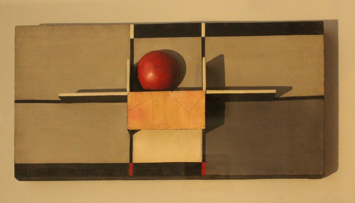
What is the significance of the Homage to the Square series?
The Homage to the Square series represents Albers' lifelong dedication to exploring the infinite variations and interactions of color within a strictly defined, unchanging format. By removing all other variables (subject matter, texture, gesture), he forced the viewer to confront color relationships directly. The series is significant for its rigorous methodology, its contribution to geometric abstraction and Minimalism, and its profound impact on understanding pure optical phenomena.
Where can I see Albers's work?
Josef Albers's work is held in major museum collections around the world, including the Museum of Modern Art (MoMA) in New York, the Tate Modern in London, the Guggenheim Museum, and numerous university art museums. His prints and paintings are frequently featured in exhibitions focused on modern art, color theory, and art education.
Did Albers use digital tools or computers?
No, Albers worked long before the widespread availability of digital tools or computers for art and design. His meticulous studies and explorations were entirely manual, relying on carefully chosen papers, pigments, and silkscreen printing. This makes his precise predictions of color interaction all the more remarkable, highlighting his profound intuitive and observational skills rather than technological assistance.
How do Albers's principles apply to digital art and design today?
Although Albers worked in a pre-digital era, his principles of color interaction are perhaps even more critical in digital art and design. Screens, with their additive color mixing (RGB), and the vast array of digital tools allow for endless color combinations and precise control. Understanding Albers's insights into simultaneous contrast, transparency illusion, and the relativity of color is fundamental for digital artists and UI/UX designers to create effective, harmonious, and visually engaging digital experiences. His work provides a timeless framework for manipulating color on any platform, digital or analog.
How did Albers finance his art and teaching throughout his life?
Josef Albers supported himself primarily through his teaching positions at esteemed institutions like the Bauhaus, Black Mountain College, and Yale University. While his art gained recognition, especially later in his career, his consistent employment as an educator provided stability and a platform for his groundbreaking pedagogical work. He was a working artist-teacher, dedicated to both creation and instruction, a testament to his belief that teaching and art were not separate but intrinsically linked.
| --- | | 1 | Find a piece of colored paper. Let's say, a medium red. | | 2 | Cut two small squares from this red paper. They are identical. | | 3 | Get two larger pieces of paper for backgrounds: one a bright, fiery orange, and the other a deep, dark purple. | | 4 | Place one red square in the middle of the orange background, and the other in the middle of the purple. | | 5 | Stare at them. Notice anything? The red on the orange will look duller, maybe a little darker. The red on the purple will seem to pop, looking much brighter and more intense. |
That's it. You just experienced the interaction of color. You made one color look like two. Now, let's try another one that's equally mind-bending.
Another Experiment: Creating the Transparency Illusion
This one is a little trickier, but it perfectly illustrates Albers's point about perceived transparency:
Step | Action |
|---|---|
| 1 | Find two distinct, opaque colored papers. Let's pick a medium blue and a bright yellow. |
| 2 | Cut two identical squares of each color. |
| 3 | On a neutral background (like white or gray), arrange the two blue squares so they partially overlap, forming a 'V' or an 'X'. |
| 4 | Now, take one of the yellow squares and place it directly over the overlapping section of the blue squares. |
| 5 | Take the other yellow square and place it next to this arrangement, not overlapping anything. |
| 6 | Stare at the setup. With careful placement and selection of hues, the yellow square that overlaps the blue squares can sometimes appear 'transparent', as if you're seeing through it to a third color (often a greenish hue) created by the optical mixture of blue and yellow. The standalone yellow square, meanwhile, looks entirely opaque. |
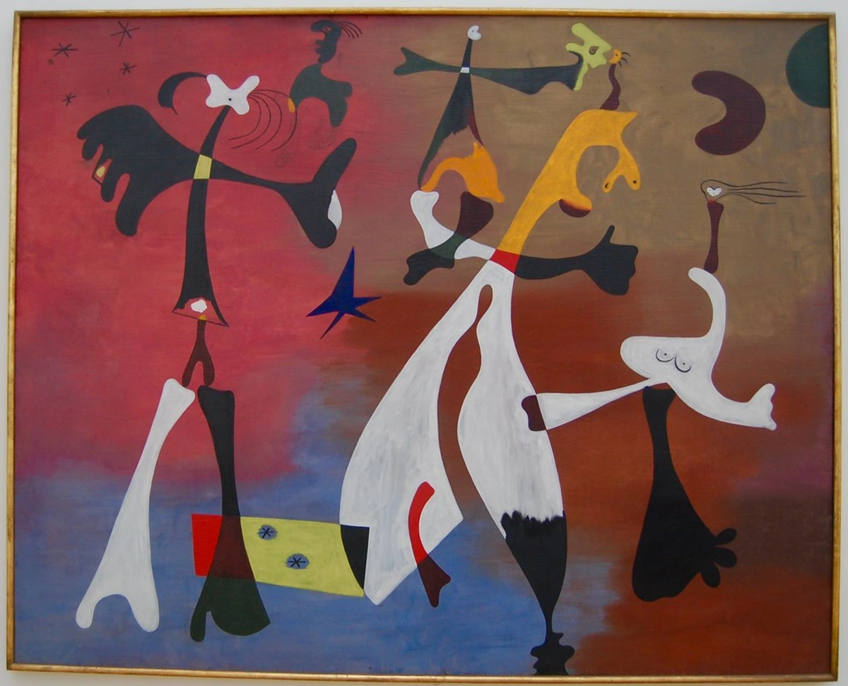
This illusion proves that even transparency can be a trick of context, a testament to the powerful, interpretive work our eyes and brains do constantly. It's truly incredible how Albers distilled such complex phenomena into simple, actionable exercises.

The experiments above are just a tiny glimpse into the profound revelations Albers systematically uncovered. And while these demonstrations are powerful, he wasn't just a theorist; he was a prolific artist whose practical work brought these concepts to vibrant, enduring life. He truly believed that the act of making was inseparable from the act of understanding, and his art became the ultimate laboratory for his theories. This brings us to his most iconic series.
Homage to the Square: The Ultimate Color Laboratory
Now, if you've ever dipped your toes into the world of modern art, especially geometric abstraction, you’ve probably encountered his most iconic and immediately recognizable body of work: the Homage to the Square series. Beginning in 1950, and continuing relentlessly until his death in 1976, Albers painted thousands of variations of the same deceptively simple composition: three or four squares meticulously nested inside each other, always from the same set of central points. This wasn't, as some initially assumed, a lack of imagination; it was a profound testament to his singular focus and systematic inquiry into pure color and its effects on our perception. Each painting, typically executed in oil on Masonite, was a fresh scientific experiment, a new exploration of the infinite visual conversations colors could have within a strictly defined, unchanging format. It’s a foundational series in what is abstract art and a landmark in 20th-century art, a visual manifesto for the relativity of color. His relentless pursuit of variations within this single motif highlights his belief that there are no absolute truths in color perception, only endless, dynamic relationships, constantly challenging the viewer's assumptions and inviting them into a deeper engagement with seeing itself.
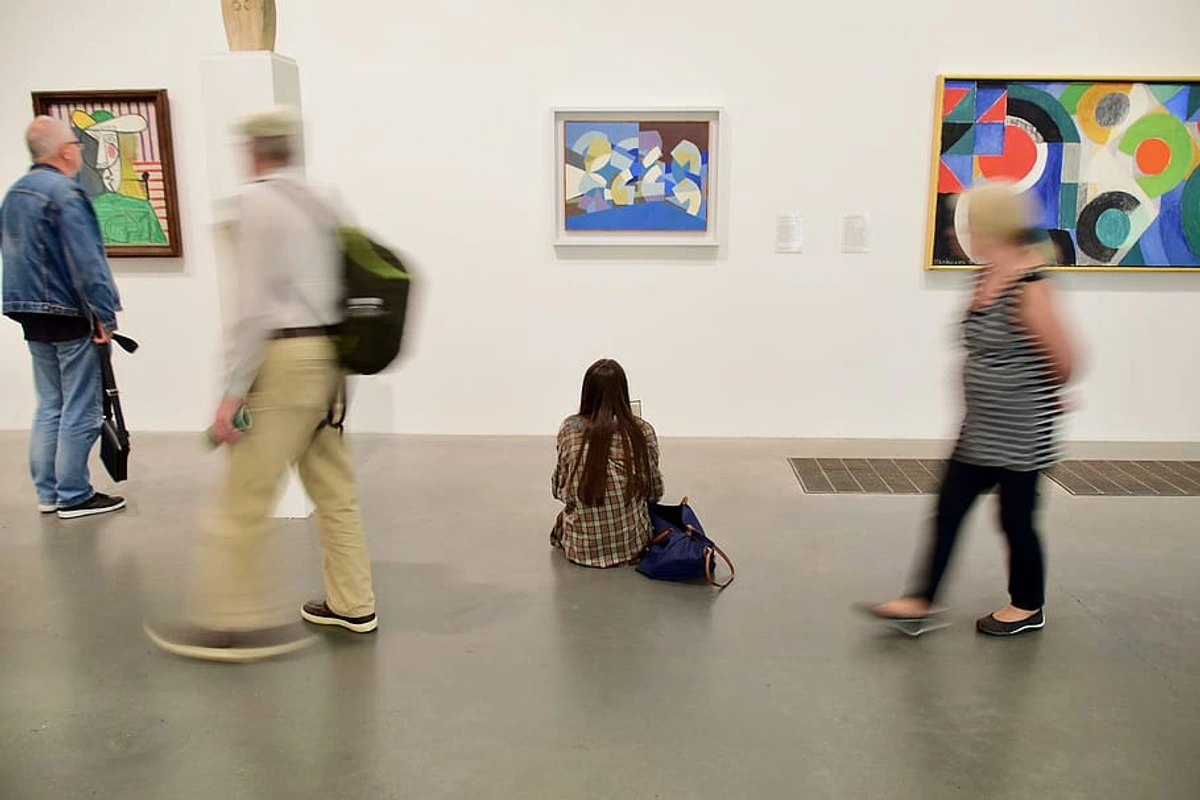
At first glance, you might think, "Okay, squares. I get it. Squares are simple." And yes, the square, as a fundamental geometric shape, feels like a core idea in what is design in art, offering a sense of stability and formal purity. But here's the profound truth: Albers, in a way, couldn't have cared less about the squares themselves as mere geometric forms. He famously called them "platters for color," suggesting they were simply a vehicle, a neutral stage, a stage for the infinite drama of color perception. The rigid, unwavering format was a deliberate and brilliant strategy to strip away every conceivable distraction. By eliminating variables like subject matter, emotional gesture, or complex textures, he forced both himself and the viewer to confront color relationships directly and without interference. No narrative, no expressive brushstrokes, no complex shapes or figures—just pure, unadulterated color interacting on a flat plane. Each painting was a fresh, meticulous experiment, a new, nuanced conversation between hues, a demonstration of optical phenomena. Some compositions evoke a profound sense of calm and stable harmony; others buzz and vibrate with an almost palpable energy, making your eyes dance. He wasn't painting squares; he was, with almost scientific precision, painting relationships and the subjective nature of perception, urging us to question what our eyes tell us. It was a rigorous, systematic approach to understanding the ephemeral nature of color, a true visual philosophy, and a profound exercise in visual meditation, demonstrating that even within the strictest constraints, an endless universe of visual experience can unfold.
This unwavering devotion to a single, reductive form to explore a deeper, multifaceted concept is, for me, one of the most compelling aspects of his work. It’s a hallmark of Minimalism, an art movement that emerged later and which Albers profoundly influenced with his emphasis on fundamental geometric forms and pure abstraction. His rigorous, almost monastic approach to limited forms and colors directly inspired artists seeking to strip away non-essential elements, focusing on elemental forms and pure optical effects. His systematic approach and intense focus on optical phenomena also laid significant groundwork for Color Field painting, with its exploration of expansive fields of color that often evoke a similar meditative quality, and for artists like Mark Rothko and Barnett Newman. And of course, Op Art, which explicitly explored optical illusions and the immersive power of color to create perceptual shifts, owes an enormous debt to Albers. Artists like Bridget Riley and Victor Vasarely certainly owe a debt to Albers's pioneering investigations, taking his explorations of visual kinetics to new, dizzying heights, and influencing subsequent generations of geometric abstractionists.
Key Aspects of the Homage to the Square Series
Aspect | Description | Significance |
|---|---|---|
| Consistent Format | Three or four squares nested centrally within each other. | Stripped away distraction (narrative, gesture, texture), focusing solely on color interaction. |
| Rigorous Experimentation | Each painting was a new color combination, exploring infinite variations. | Demonstrated Albers's scientific approach to art, proving no two colors are seen the same way twice. |
| "Platters for Color" | The squares were a neutral vehicle for color, not the subject itself. | Emphasized that the relationships between colors were the true artistic statement, not the forms. |
| Optical Phenomena | Paintings created visual vibrations, perceived transparencies, and shifting hues. | Directly engaged the viewer's perception, making them an active participant in the artwork. |
| Influence on Art Movements | Precursor to Minimalism, Color Field Painting, and Op Art. | Established a foundational methodology for artists exploring pure abstraction and optical effects in the latter half of the 20th century. |

Why Albers Still Matters: His Enduring Legacy and Influence
Albers's groundbreaking work is far more than just a neat party trick for artists or a fascinating historical footnote. For me, it fundamentally changes how you see the world, forever altering your visual vocabulary. After seriously engaging with his ideas, you can't help but start noticing the subtle nuances of color everywhere: the way a blue shirt looks dramatically different under fluorescent light versus natural sunlight, or why that perfect paint color you chose for your living room wall looks completely wrong once your furniture and lighting are in the room. His theories aren't abstract academic exercises; they are profoundly practical tools for navigating a visually complex, color-saturated world.
His influence, truly, ripples across countless disciplines and artistic practices. In graphic design, his principles are paramount in dictating effective visual hierarchies, ensuring legibility, and crafting compelling brand recognition – think of how logos and advertisements rely on precise color relationships, how a specific shade can evoke trust or excitement depending on its surrounding palette. In architecture and interior design, his insights inform how spaces evoke mood, how natural and artificial light interact with surfaces, and how different materials visually harmonize or contrast. Architects consider how light plays across a facade, or how a color choice for an accent wall will shift throughout the day. Even in burgeoning fields like user interface (UI) and user experience (UX) design, understanding color relativity is absolutely crucial for creating intuitive, accessible, and harmonious digital experiences that don't cause eye strain or confusion. Ensuring readability of text against different backgrounds, or using subtle color shifts to indicate interactivity, all draw from Albers's foundational ideas. He essentially gave us a new, observational language for color, one based not on rigid, prescriptive rules, but on active engagement, constant experimentation, and direct, subjective experience. It's about empowering the eye, rather than just instructing the mind. His work teaches us to design not just with color, but through color, leveraging its inherent mutability. His ideas aren't just for artists, they're for anyone who wants to truly see the visual world in its full complexity. Beyond these, his influence can be seen in fields as diverse as textile design (echoing Anni Albers's own work), industrial design, and even in scientific visualization, wherever the precise manipulation and understanding of color perception are critical.
His teachings have, quite frankly, influenced countless artists, designers, and architects across generations. From graphic novelists to textile artists, from minimalist sculptors to digital illustrators, his insights are foundational. He gave us a new language for color, one based not on rigid rules but on acute observation and personal experience. For me personally, understanding his principles has been absolutely huge. It's the very foundation of how I choose palettes, create mood, and explore visual tension in my own work. You can see these ideas in action in the pieces I have for sale.
Beyond the Canvas: Albers as a Glass Artist and Printmaker
While Albers is most renowned for his painting and color theory, it’s a mistake to limit his artistic practice to the canvas. His dedication to exploring the interaction of color extended across various mediums, truly embodying the Bauhaus ethos of integrating art and craft. Before becoming a master at the Bauhaus, he actually trained extensively in stained glass, creating striking, geometric compositions that manipulated light and color with exquisite precision. These early glass works, often overlooked, foreshadow his later explorations in their focus on abstract form and chromatic interaction. His stained-glass panels from this period, such as his work for the Grassi Museum in Leipzig (1927), and the Siemens-Stadt housing estate in Berlin (1929), are exemplary of his early mastery in harnessing light as a medium for color interaction, demonstrating a sophisticated understanding of how light transforms color perception. I find it fascinating how his early work with light passing through colored glass set the stage for his later investigations into the optical mixing of pigments on a flat canvas. It truly shows a consistent, lifelong inquiry into the nature of visual experience.

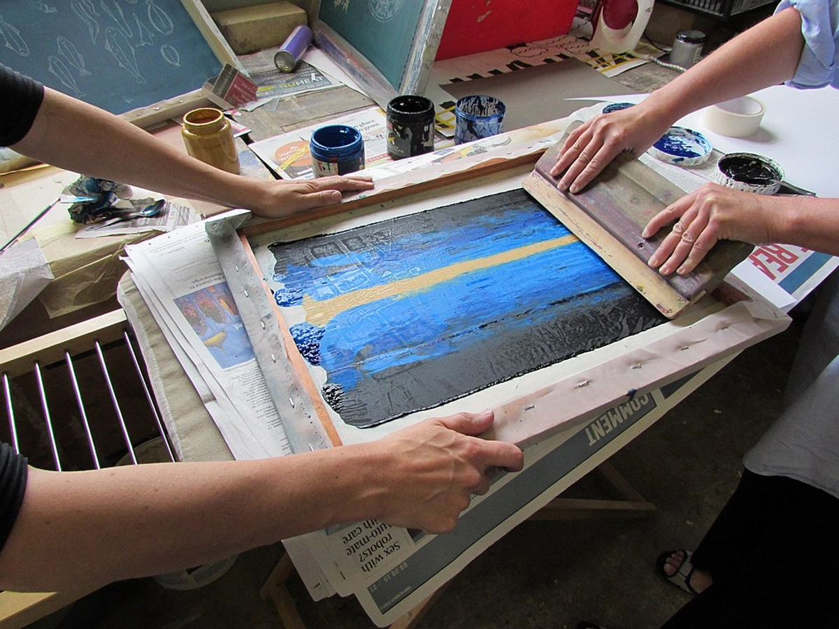
He was also a prolific printmaker, primarily utilizing silkscreen (serigraphy) – a technique that allowed for the flat, unmodulated application of color, perfectly suited to his systematic approach. Silkscreen allowed him to achieve precise, consistent color fields, minimizing the appearance of brushstrokes or texture that might distract from the pure interaction of hues. This precision was paramount for his explorations, where the slightest variation could alter the optical effect, making it the ideal medium for his exacting color studies. The silkscreens that accompanied the original publication of Interaction of Color were not merely reproductions; they were original works of art, meticulously crafted to demonstrate the very principles the book espoused, offering a direct, visual experience of his theories, often with up to 20 different screens used for a single print. This mastery across diverse media underscores his unwavering commitment to the fundamental properties of color, regardless of the material – a true testament to his investigative spirit and his belief in the universality of color phenomena.
Albers's Pedagogical Legacy: Learning Through Doing
Beyond his celebrated artworks and theoretical texts, Albers's most profound and enduring legacy might just be his revolutionary approach to teaching. He fiercely rejected traditional academic methods that emphasized copying masters, strict rules, or mere technical skill. Instead, he championed an experiential and inductive pedagogy, a fancy way of saying he wanted students to learn by doing and by discovering for themselves. He would present meticulously designed exercises that guided students to observe color phenomena directly, fostering critical thinking and a deep, intuitive understanding.
His classrooms were laboratories of perception. He encouraged a spirit of inquiry, experimentation, and respectful dialogue, famously stating, "To see takes time, for seeing means to see in relationships." His emphasis was always on the process over the product, on the journey of discovery over a prescribed destination. This 'learning through doing' philosophy influenced generations of artists and educators, proving that true understanding comes from active engagement, not passive absorption. It’s a lesson that resonates deeply with me, as I believe the greatest insights often come from the messy, hands-on process of creation, not from rigid adherence to rules. His insistence on active engagement fundamentally shifted the paradigm of art education, making him a perpetual touchstone for any teacher striving to truly empower their students to see and think independently.
Albers's Core Pedagogical Principles
Principle | Description | Impact on Students |
|---|---|---|
| Experiential Learning | Students learned by direct observation and hands-on exercises, discovering principles themselves. | Fostered independent thought, critical observation, and a deep, intuitive understanding of visual phenomena, empowering them to trust their own eyes and intellect rather than external dogma. |
| Process Over Product | Emphasis was placed on the journey of discovery and experimentation, not just the final artwork. | Reduced fear of failure, encouraged continuous exploration, and valued the learning process above all else, thereby nurturing genuine curiosity and a lifelong habit of inquiry. |
| Material Exploration | Students engaged with the inherent properties of materials before imposing preconceived forms. | Developed a profound respect for materials and an understanding of how they inform design and artistic expression. |
| Inductive Reasoning | Guided students to draw conclusions from their own observations, rather than being given rules. | Empowered students to become active participants in their learning, making them visual philosophers in their own right, capable of forming their own insightful conclusions about the world. |
| Questioning & Dialogue | Classrooms were places of inquiry, experimentation, and respectful discussion. | Cultivated critical thinking and encouraged students to challenge assumptions about art and perception, fostering an environment of intellectual rigor and open-mindedness. |
| Relativity of Color | Taught that color is always contextual and dynamic, never absolute. | Revolutionized how color was understood and applied, moving beyond rigid systems to a more fluid, observational approach, impacting everything from painting to product design. |
The Enduring Influence of the Bauhaus Vorkurs
Albers's role in the Bauhaus Vorkurs (Preliminary Course) is particularly significant. This mandatory introductory course, which he taught from 1923, was revolutionary. It moved away from traditional academic drawing from models or copying old masters, instead focusing on fundamental principles of material, composition, and color through hands-on exercises. Students explored the properties of wood, paper, metal, and textiles, learning to understand their inherent characteristics before imposing form upon them. This intensive foundation shaped the pedagogical approach of countless art and design schools worldwide, and its echoes can still be felt in foundational art programs today, where active, inquiry-based learning is increasingly valued. It taught students how to think visually, rather than what to think, equipping them with a versatile problem-solving toolkit applicable to any creative challenge.

credit, licence
Frequently Asked Questions (FAQ)
What was Albers's philosophical approach to art?
Albers believed art was primarily about perception and the active engagement of the viewer. He saw himself as a facilitator, creating conditions through his art and teaching that allowed others to discover visual truths for themselves. For him, art was a means to an end: a tool for cultivating a deeper, more nuanced way of seeing and understanding the world, rather than simply an object to be admired or an expression of personal emotion.
What were Albers's earliest artistic mediums or interests?
Before his intense focus on painting and printmaking, Albers was deeply engaged with materials, particularly glass. He began his artistic journey working with stained glass at the Bauhaus, where he created abstract compositions that explored light and color interaction. This early experience profoundly influenced his later, systematic approach to color, demonstrating his belief in the fundamental properties of materials regardless of the medium. It's fascinating how the luminosity of glass and the way light refracts through it became a foundational lesson for his later work with opaque pigments.
How did Albers's work impact commercial design?
Albers's principles of color interaction, legibility, and visual hierarchy are fundamental to modern commercial design. His emphasis on how colors influence each other directly informs logo design, branding, advertising, and user interface (UI) design. Designers apply his insights to create visual communications that are not only aesthetically pleasing but also clear, effective, and psychologically impactful, ensuring that colors convey intended messages without visual interference or confusion.
What is Josef Albers best known for?
He is most famous for his iconic Homage to the Square series of paintings, which he tirelessly explored for over 25 years, and his definitive book, Interaction of Color. This book remains a foundational text for art and design students, educators, and artists worldwide, revolutionizing how color is taught and understood. Beyond these, his profound influence as an educator at the Bauhaus, Black Mountain College, and Yale also forms a crucial part of his legacy.
Were there any controversies or criticisms of Albers's work?
While widely revered, Albers's rigorous, systematic approach to art was sometimes perceived as overly academic or lacking in emotional expression by critics accustomed to more gestural or narrative forms of modern art. Some found his Homage to the Square series repetitive or cold. However, Albers consistently argued that his work aimed not at personal expression, but at revealing objective visual truths, and that the emotional impact came precisely from the viewer's direct, perceptual engagement with the dynamic interactions of color, not from the artist's subjective hand. This ongoing debate highlights the tension between art as objective inquiry and art as subjective expression.
How did Albers's work evolve over his career?
Albers's career shows a consistent trajectory towards reduction and systematic inquiry. He started with crafts and stained glass at the Bauhaus, then moved into painting and printmaking with his iconic Homage to the Square series, which became his life's work. While the forms became simpler, his investigations into color relationships grew exponentially more complex and profound, revealing an endless universe within a limited form. He never stopped experimenting within his chosen frameworks, constantly discovering new optical phenomena until his death, a true testament to his insatiable curiosity.
How did Albers view the relationship between art and science?
Albers saw a profound and essential connection between art and science, treating his artistic practice almost as a form of scientific inquiry. He meticulously set up controlled experiments within his paintings and exercises, varying one element (like a color's background) to observe its precise effect on perception. For him, the artist was a researcher, systematically investigating the laws of visual phenomena. He believed that this rigorous, empirical approach was crucial for artists to move beyond arbitrary taste and into a deeper, more universal understanding of how we see.
What is the main point of Interaction of Color?
The core message, delivered with revolutionary clarity, is that color is fundamentally contextual and relative. We simply never perceive color in isolation. A color's appearance is profoundly affected by the colors surrounding it, its size, texture, and light conditions. Albers taught that the only true way to understand color is not through static rules, but through active, experimental observation of how it behaves in diverse situations. It's a call to engage with color, not just intellectually, but perceptually.
What are some lesser-known aspects of Albers's art?
Beyond his celebrated paintings and color theory, Albers was a highly skilled and prolific artist in less common mediums. His early work at the Bauhaus in stained glass is particularly noteworthy, where he created striking, abstract compositions that manipulated light and transparency. He was also an accomplished photographer, printmaker (especially silkscreen), and furniture designer. These diverse practices underscore his Bauhaus training and his lifelong commitment to exploring the fundamental principles of art and design across various materials and disciplines.
What other influential figures taught or studied at Black Mountain College alongside Albers?
Black Mountain College was a vibrant hub for many avant-garde artists and thinkers. Alongside Albers and his wife Anni, notable figures included the composer John Cage, dancer Merce Cunningham, poet Charles Olson, and artists like Robert Rauschenberg and Cy Twombly. This interdisciplinary environment, fostered by Albers's pedagogical approach, created a unique crucible for artistic innovation in mid-20th century America, truly shaping the trajectory of the American avant-garde.
How does Albers's work inform contemporary abstraction?
Albers's work continues to be a foundational reference for contemporary abstract artists. His rigorous systematic approach to color, form, and perception provides a robust framework for artists exploring non-representational art. His legacy encourages contemporary artists to delve into the fundamental elements of art, to consider the viewer's active role in constructing meaning, and to push the boundaries of optical experience, influencing movements ranging from Minimalism to Op Art and even digital art forms. His insistence on pure, unmodulated color and precise formal relationships remains a potent source of inspiration for artists seeking clarity and intellectual rigor in their abstract practices.
Was Josef Albers part of the Abstract Expressionist movement?
No, he wasn't. While Josef Albers was active during the same period as the Abstract Expressionists (think Pollock or Rothko), his artistic and philosophical approach diverged significantly. Abstract Expressionists often prioritized raw emotion, spontaneous gesture, and the subconscious mind. Albers, in contrast, pursued a disciplined, systematic, and almost scientific investigation of visual perception and the inherent properties of color. His work is more closely aligned with movements like geometric abstraction, Minimalism, and Color Field painting, where optical effects and formal rigor were paramount. He was interested in the objective behavior of color, not subjective expression.
What public artworks or installations did Albers create?
While Albers is primarily known for his easel paintings and prints, he also created several significant public art commissions that applied his principles on a larger scale. Notable examples include his monumental mural Manhattan at the Time-Life Building in New York City (1961), a striking geometric composition in aluminum and bronze. He also designed stained-glass windows for various churches and public buildings throughout his career, translating his explorations of light and color into architectural contexts. These works demonstrate his ability to adapt his rigorous aesthetic to diverse materials and public spaces, showcasing the enduring power of his visual language beyond the gallery walls.
What was Albers's philosophy on art education?
Albers's philosophy centered on experiential learning and the idea that perception is paramount. He believed students should discover artistic principles through direct engagement with materials and carefully designed exercises, rather than memorizing rules or copying masters. He famously stated, "Good teaching is more a giving of right questions than a giving of right answers." This inductive approach fostered independent thought, critical observation, and a deep understanding of visual phenomena.
How did the Bauhaus influence Josef Albers?
The Bauhaus's radical focus on craftsmanship, the revolutionary unity of art and technology, and its emphasis on experimental, hands-on learning formed the absolute bedrock of Albers's philosophy. He not only absorbed these principles as a student and master but also passionately carried its spirit of 'learning by doing' with him to America. He deeply embedded this experiential pedagogy into his own influential teaching methods at Black Mountain College and Yale, fostering a holistic understanding of art and design that transcended traditional boundaries. It’s hard to imagine the Albers we know without the foundational experience of the Bauhaus.
What materials did Josef Albers use in his Homage to the Square series?
Albers meticulously executed his Homage to the Square series primarily using oil paint on Masonite panels. He chose Masonite for its smooth, untextured surface, which allowed for the flat, unmodulated application of color, minimizing any distracting brushstrokes or surface variations. This focus on smooth application ensured that the viewer's attention remained solely on the interaction of the colors themselves, reinforcing his systematic approach to optical phenomena.
How did Albers choose the colors for his paintings?
Albers's color choices were never arbitrary; they were meticulously calculated. He selected colors specifically to demonstrate particular optical effects and relationships. He often used colors from commercially available tubes without mixing them to avoid introducing variables, ensuring purity of hue. His goal was not to create aesthetically pleasing combinations in the traditional sense, but to create visual paradoxes and phenomena that would force the viewer to question their perception. Each painting in his series was, in essence, a controlled experiment, a carefully constructed visual problem for the eye to solve.
Did Albers work with any other famous artists or intellectuals?
Absolutely. Throughout his career, Albers engaged with an incredible array of influential figures, forming a dense web of creative exchange. At the Bauhaus, he interacted with luminaries like Walter Gropius, Wassily Kandinsky, and Paul Klee. At Black Mountain College, his students included future art giants such as Robert Rauschenberg, Cy Twombly, and Kenneth Noland. He also collaborated with and was influenced by other interdisciplinary figures like the composer John Cage and the dancer Merce Cunningham, creating a rich intellectual and creative environment wherever he went. It’s clear that his influence wasn't just in his solo work, but in the fertile ground he helped cultivate for others.
What mediums did Albers use for his color studies?
Albers primarily used oil paint on Masonite for his iconic Homage to the Square series, appreciating its smooth, untextured surface for a pure, unmodulated application of color. For Interaction of Color, he used silkscreen printing to produce the precise, unvarying color fields essential for demonstrating his optical effects. He also began his career working extensively with stained glass at the Bauhaus, manipulating light and color with exquisite precision.
What are some common misconceptions about Josef Albers's work?
One common misconception is that his Homage to the Square series is simplistic or repetitive due to its consistent format. However, as Albers himself demonstrated, within this strict framework, an infinite number of color relationships and optical illusions could be explored, proving that true depth often lies beneath apparent simplicity. Another misconception is that his work is purely intellectual or devoid of emotion. While systematic, Albers's goal was always to provoke a perceptual and therefore deeply subjective and felt experience in the viewer, proving that rigor doesn't preclude profound engagement. His work is about the experience of seeing, which is inherently emotional.
Ultimately, Josef Albers didn't just teach us about color. He taught us how to look closer, to be more curious about our own perception, and to understand that so much of what we see is, in its essence, about relationships. He was, in a way, teaching us how to be better observers—not just of art, but of the entire visual world. His work asks us to pause, to question, and to truly engage with what's before our eyes, rather than merely glancing, and in doing so, to unlock a richer understanding of reality itself. The next time you see a painting, or even just a vibrant sunset against a deep blue horizon, take a second. Truly look at how the colors are talking to each other, how they influence, shift, and sing. I promise you, you might just be profoundly surprised by what you hear them say. And that, I think, is a truly transformative and beautiful legacy, one that continues to illuminate the way we see and experience the world around us. It's an ongoing invitation to open our eyes, truly, and see the extraordinary in the seemingly ordinary – a timeless lesson in visual literacy that remains as vital today as it was in Albers's time, guiding us to a more perceptive and appreciative engagement with the visual symphony of our world.