What is Op Art? Unpacking the Dazzling World of Optical Illusion
Dive deep into Op Art with a personal guide. Discover its illusions, key artists like Vasarely & Riley, and how it challenges your perception of movement and form.

What is Op Art? The Ultimate Guide to Optical Illusion and Perceptual Play in Art
Welcome, my friends, to a world where art isn't just something you observe, but something you experience – a captivating dance between your eyes, your brain, and the very fabric of visual reality. Have you ever found yourself staring at a painting, only for it to seem to shimmer, pulsate, or even move right before your very eyes? If your vision has ever played such delightful tricks on you, then you've undoubtedly stumbled into the fascinating and disorienting realm of Op Art – short for Optical Art, and often referred to as optical illusion art or perceptual art. I still remember my first truly mind-bending encounter with an Op Art piece; it wasn't just a painting on a wall, it felt like an interactive puzzle for my brain, both delighting and, I'll admit, slightly short-circuiting my perception. This isn't a cheap magic trick, mind you, but a profound artistic movement that doesn't just ask you to look; it demands that you engage with the visual, often transforming static images into dynamic spectacles. Op Art challenges the very wiring of your vision, inviting your brain to grapple with what your eyes perceive, and ultimately, to question the inherent nature of visual reality itself. At its core, Op Art is a rigorous form of abstract art that leverages pure visual elements like lines, shapes, and colors to create dynamic, illusory effects directly within your perception. To truly grasp the brilliance of Op Art, to truly unravel its dazzling aesthetic, we need to delve deep into its intricate historical tapestry, the profound scientific principles it so cleverly exploits, and the visionary artists who meticulously pioneered its dazzling aesthetic. It’s a genre that truly comes alive in the active, often dizzying, interaction between the artwork and your individual optical system, a testament to the boundless possibilities of visual language. Join me as we explore the captivating history, the mind-bending techniques, and the lasting impact of this truly unique art form.
The Magic Behind the Movement: Unpacking the Visual Deception and Perceptual Play
The true genius of Op Art lies in its ability to make a static image appear vibrantly alive, purely through the sophisticated processing of the viewer's optical system. It’s a silent, yet incredibly dynamic, conversation between the canvas and your brain, where the artwork meticulously sets the rules of visual engagement, and your perception, quite literally, dances to its tune. This isn't just an art form; it's an exploration of consciousness itself, a delightful deep dive into how our minds interpret the world.
At its heart, Op Art is a form of abstract art that uses precise geometric shapes, lines, and contrasting colors – the very elements of art – to create compelling illusions of movement, vibration, and hidden images. It's less about overt emotional expression (like, say, Expressionism) and more about the cool, calculated manipulation of the eye and mind, delving into the very mechanics of visual perception. It invites you to a purely visual and intellectual engagement, often without narrative or external reference. Think of it as a meticulously crafted visual puzzle that changes depending on how you look at it, or even if you look at it for too long. My own experience with abstract forms often seeks to evoke similar shifts in perception, albeit through different means. The core idea is to engage the viewer not just emotionally, but cerebrally, often tapping into the psychology of color and the symbolism of geometric shapes in abstract art to create a profound sensory experience. This isn't random; it's a deliberate exploitation of how our visual system processes information, often playing on phenomena like simultaneous contrast, retinal fatigue, and the inherent human tendency to seek patterns to achieve its dazzling effects. It really makes you think about the power of design in art and how artists use color to achieve specific effects.
Core Principles of Visual Perception in Op Art
Op Art isn't just a collection of mesmerizing visual tricks; it's an art form deeply rooted in a rigorous understanding of how our brains interpret what our eyes perceive. Artists in this movement systematically applied principles from fields like Gestalt psychology and neuroaesthetics to meticulously engineer their illusions. If you're not familiar, Gestalt psychology is a school of thought that emphasizes that our minds naturally organize sensory information into meaningful 'wholes' rather than just perceiving individual parts. It’s the idea that 'the whole is greater than the sum of its parts,' and Op Artists masterfully exploited this. Here are some of the fundamental Gestalt concepts and other perceptual principles they cleverly leveraged:
- Figure-Ground Relationship: This foundational Gestalt principle describes our innate ability to perceive objects (figures) as distinct and separate from their surroundings (ground). Op Artists are absolute masters at creating ambiguous figure-ground relationships, where the brain struggles to decide what's in front and what's behind, or which part is the positive space and which is the negative. This deliberate uncertainty leads to those mesmerizing visual oscillations and shifting perceptions that are so characteristic of the movement.
- Perceptual Constancy: Our brains are generally wired for efficiency, striving for perceptual constancy. This means we tend to perceive objects as stable and unchanging in properties like size, shape, and color, even when the sensory information they project onto our retina constantly changes (think of how a door is still perceived as a rectangle even when viewed from an angle). Op Art, with its delightful mischievousness, deliberately undermines this constancy, making static shapes appear to bulge, recede, rotate, or distort in truly uncanny ways, forcing our brains to confront these contradictions.
- Binocular Rivalry: This fascinating phenomenon occurs when each eye is presented with distinctly different images, and the brain struggles to fuse them into a single, coherent perception. Instead, it often alternates between perceiving one image and then the other. While not always the primary mechanism in Op Art, the underlying concept of visual system 'competition' – where the brain receives conflicting signals and tries to resolve them – is absolutely central to the dynamic, often flickering, effects achieved by many Op Artists. It's like your brain can't quite make up its mind, and that indecision creates the illusion!
- Retinal Fatigue and Afterimages: Our eyes, though marvelous, are not inexhaustible. Prolonged staring at high-contrast patterns, especially those with intense colors, can actually fatigue specific photoreceptor cells in your retina. When you then shift your gaze to a neutral surface, the temporarily desensitized areas cause the unfatigued areas to overcompensate, resulting in the perception of vivid, complementary colored 'afterimages.' It’s a truly delightful trick of your own biology, and Op Artists like Bridget Riley masterfully exploit this to extend the artwork's visual life beyond the canvas itself.
- Simultaneous Contrast: This principle, famously explored by artists like Josef Albers, demonstrates how a color's perceived hue, saturation, and lightness can dramatically change based on the colors immediately surrounding it. Op Artists are absolute masters at leveraging simultaneous contrast to make colors appear to vibrate intensely, shimmer, or even advance and recede within the composition, all without any actual physical movement of the pigments. It’s like a subtle, silent conversation between colors, influencing each other’s perceived identity.
- Proximity (Gestalt Principle): We instinctively group elements that are close together, perceiving them as a unified whole. Op Artists can use this by arranging disparate elements that, when viewed from a distance, coalesce into a new, larger form or pattern, challenging the initial perception of individual components.
- Continuity (Gestalt Principle): Our eyes tend to follow lines or curves, even when they are interrupted, perceiving smooth, continuous patterns rather than disjointed ones. Op Artists leverage this by creating compositions where lines or forms appear to flow seamlessly, guiding the viewer's gaze and contributing to the illusion of movement or extension.
- Common Fate (Gestalt Principle): Elements that move in the same direction or appear to be part of the same action are perceived as a single group. While Op Art is static, artists can evoke this by arranging patterns or lines in a way that suggests a unified direction or impending motion, making the brain anticipate movement that isn't physically present.
The Science of Perception: More Deep Dives into How Op Art Works its Magic
Beyond these core principles, Op Art taps into even more subtle aspects of our visual processing. It's truly fascinating how a static image can hijack our brain's sophisticated machinery.
- Similarity (Gestalt Principle): Our brains tend to group together elements that share visual characteristics like shape, color, size, or orientation. Op Artists exploit this by creating patterns where similar elements form implied lines or shapes, even when those connections aren't explicitly drawn, creating complex, often shifting, overall patterns.
- Autokinetic Effect: Sometimes, prolonged staring at a small, stationary point of light in an otherwise dark room can make it appear to move. While Op Art pieces aren't always viewed in such extreme conditions, the intense focus on specific, high-contrast elements can sometimes induce a similar perceived motion, making lines or shapes seem to drift.
- Closure (Gestalt Principle): This principle states that our perception tends to 'close' or complete incomplete figures, filling in the missing information to perceive a whole form. Op Artists use this by presenting fragmented or partial shapes that the viewer's brain then completes, creating a sense of coherent form or pattern where none explicitly exists, often leading to surprising emergent imagery.
- Illusory Contours: Our brains have a remarkable ability to perceive contours and shapes that aren't actually drawn, filling in gaps based on surrounding information. Op Artists can cleverly arrange elements to suggest these 'phantom' lines or forms, creating a sense of hidden imagery or additional depth.
- Depth Ambiguity: By carefully manipulating perspective cues without offering a clear, consistent vanishing point, Op Art often creates compositions where the viewer's brain struggles to assign a definitive foreground or background. This constant shifting of perceived depth is a hallmark of the movement, leading to those wonderful sensations of bulging or receding forms.
Neuroaesthetics and the Brain's Role in Op Art
It's truly fascinating to consider how Op Art directly engages with neuroaesthetics, a field that studies the neural bases for the contemplation and creation of art. Op Artists were, in many ways, intuitive neuroscientists, designing works that exploit specific visual pathways and processing centers in the brain. When you experience the illusions in an Op Art piece – the perceived movement, the shimmering, the depth – it's not just your eyes; it's your brain actively working to interpret conflicting visual signals. For instance, the constant struggle to stabilize a shifting pattern can activate areas associated with motion perception, even when no physical motion is present. This deliberate manipulation highlights how our brains are constantly constructing our visual reality, and how easily that construction can be delightfully challenged. The visual cortex, for example, might be firing in response to perceived motion, even when the input is static. This creates a kind of delightful 'cognitive dissonance' that is central to the Op Art experience. It really makes you appreciate the intricate dance between biology and aesthetics.
A Dance of Lines and Colors: How Op Art Works
So, how do they do it? It's all in the details. Op Artists often employ techniques like:
- Precise geometric patterns: Repetitive, interlocking shapes that create a sense of rhythm and sometimes, a hypnotic effect. This isn't just about drawing a straight line; it's about making those lines dance. It's about a deep understanding of the definitive guide to understanding line in abstract art from gestural marks to geometric forms.
- High-contrast colors: Often black and white, but also vibrant complementary colors that seem to vibrate when placed side-by-side. The tension between these colors creates optical phenomena, almost as if the colors are fighting for attention. This is a masterclass in color theory.
- Manipulated perspective: Lines that converge or diverge, creating a false sense of depth or curvature on a flat surface. It's like painting a window into another dimension, but that dimension is constantly shifting. This taps into our innate understanding of perspective in art, only to twist it.
- Moiré patterns: Those dizzying interference patterns that occur when two grids or sets of lines are overlaid at an angle, creating new, often unexpected patterns that appear to move. It's the visual equivalent of hitting a certain frequency that makes your ears ring, but for your eyes.
- Flicker Effect (Chromatic Aberration): Using colors that are far apart on the color spectrum, like red and blue, to create a sense of vibrating or shimmering due to how our eyes focus light. The result can be quite disorienting, in the best possible way.
- Tessellation: The precise arrangement of geometric shapes that fit together perfectly without any gaps or overlaps. Op Artists use tessellations to create seamless, repetitive patterns that can generate powerful illusions of infinite extension, swirling motion, or interlocking forms that constantly shift as you view them.
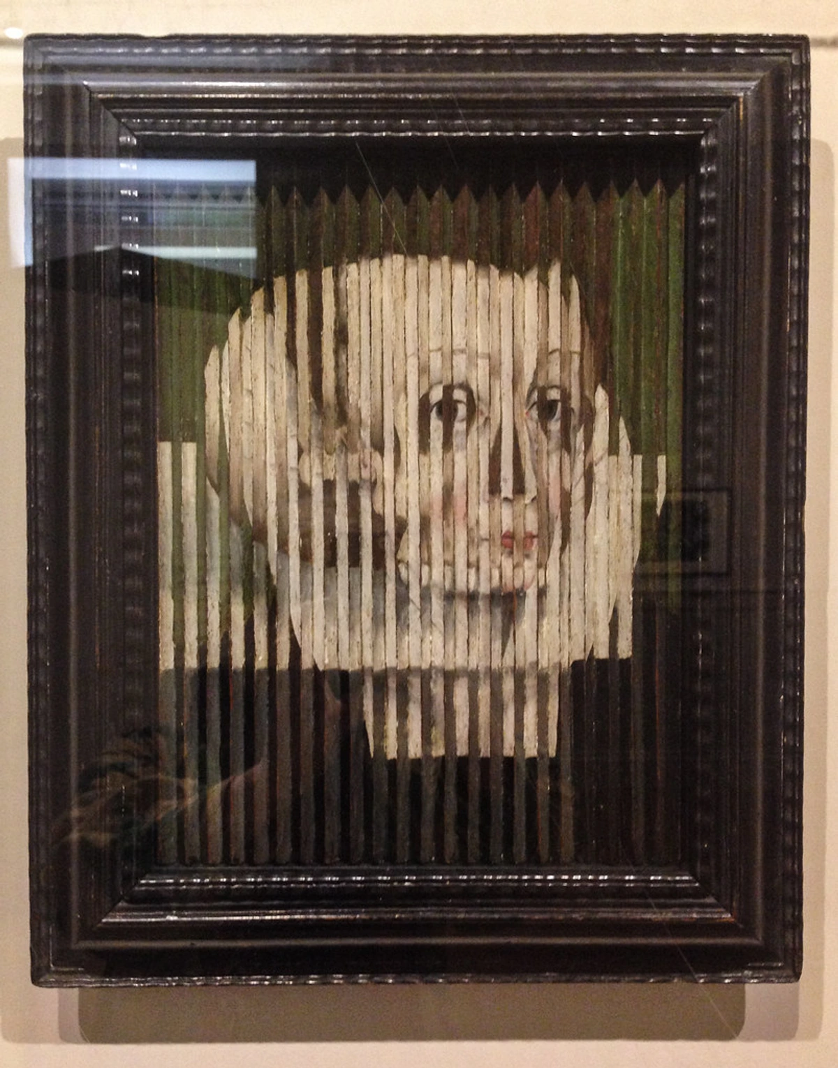
- Anamorphosis: A clever technique where an image appears distorted and unrecognizable until viewed from a specific vantage point or reflected in a curved mirror or cylinder. While more common in earlier art history (think Holbein's The Ambassadors), Op Artists sometimes employed similar principles to create hidden or transformative imagery that only resolves under particular conditions, challenging the viewer's fixed perspective.
- Lenticular Printing: Though primarily a printing technique, its principles align perfectly with Op Art's goals. By creating an image composed of different interlaced slices, and then viewing it through a lenticular lens, multiple images or an illusion of depth and motion can be achieved as the viewing angle changes. Pioneered by artists like Yaacov Agam, it embodies the dynamic, interactive spirit of Op Art in a reproducible format.
- Repetition and Gradients: Subtle shifts in shape, size, or color arranged in a sequence can create illusions of swelling, receding, or continuous motion.
- Optical Mixing: This technique, reminiscent of Pointillism but with a more dynamic intent, involves placing small dots or lines of different pure colors very close together. Your eye, rather than seeing individual colors, 'mixes' them optically to create new, vibrant hues or a shimmering, vibrating effect that isn't physically present in the paint itself. It’s a remarkable way to engage the viewer's perception in the creation of color.
- Afterimages: As we've discussed, by inducing retinal fatigue through high-contrast patterns, Op Artists can make your own visual system generate complementary colored afterimages when you look away. This extends the artwork's experience beyond its physical boundaries, making your own biology part of the illusion.
- Stroboscopic Effects: Through carefully arranged sequences of shapes or lines, artists can create the illusion of rapid, sequential movement, much like how a strobe light makes continuous motion appear as distinct, frozen moments. This is particularly effective in works designed for sequential viewing or with subtle shifts in the viewer's position, creating a sense of animated flicker and dynamism.
The goal? To trigger that fascinating visual response in your brain that makes you question what you're truly seeing. It's less about representing reality and more about creating a reality of its own, solely for your visual system. I find it endlessly fascinating how a static canvas can achieve such dynamic effects, almost like a silent conversation between the artwork and your perception.
Beyond the Canvas: Op Art, Digital Frontiers, and Immersive Experiences
While predominantly a painting and printmaking movement in its heyday, the core principles of Op Art possess a surprising and profound resonance with contemporary digital art, computer graphics, and new media. The meticulous grid-based compositions, the systematic use of repetitive patterns, and the singular focus on pure visual data make it a natural, almost prescient, precursor to algorithmic art, fractal art, and the generative art forms we encounter today. It’s almost as if these pioneers were sketching out the future of visual computing on canvas, long before the pixels even arrived, essentially laying crucial groundwork for interactive and immersive art forms.
Indeed, early Op Artists even dabbled with rudimentary mechanical or electronic means to amplify their illusions, hinting at a future where art and technology would merge to produce even more dynamic visual experiences. The exploration of geometric forms and repeating patterns, for instance, directly mirrors the foundational principles of early computer graphics and later, the complex visualizations of fractal geometry. This early connection isn't just a historical footnote; it highlights Op Art's forward-thinking embrace of systematic visual structures, a characteristic that makes it eternally relevant to new media practices. Think about contemporary digital artist Refik Anadol, whose mesmerizing data sculptures and immersive environments often echo the dynamic, pulsating, and mind-bending qualities of Op Art, pushing its core principles into entirely new technological realms. Today, we see its direct influence in everything from mesmerizing screen savers and interactive website designs to cutting-edge virtual reality experiences and large-scale projection mapping, where static forms are truly brought to life through technology. Even the burgeoning world of NFTs (Non-Fungible Tokens) and generative art, while often viewed with a healthy dose of skepticism due to market speculation, owes a conceptual debt to Op Art's algorithmic approach to visual creation. It has fundamentally shaped how we approach creating dynamic visual content in the digital age, proving its prophetic vision.
Key Characteristics of Op Art: Beyond the Illusion and Into Its Essence
While the illusion of movement is undoubtedly the most striking and immediately captivating characteristic of Op Art, it’s a mistake to dismiss it as merely visual trickery. This is an art form built on rigorous intellectual inquiry, meticulous planning, and a profound understanding of visual perception. For me, these are the qualities that truly define the movement's enduring power:
- Abstraction as a Foundation: As mentioned, Op Art is fundamentally abstract. There are no recognizable objects or figures; the subject is the visual experience itself. The artwork explores lines, shapes, and colors for their intrinsic optical qualities, reducing art to its most fundamental visual components.
- Precision and Order: Unlike the spontaneous, often chaotic brushstrokes of Abstract Expressionism, Op Art is defined by an almost obsessive degree of precision. Lines are crisp, shapes are exact, and colors are applied with meticulous, almost clinical, care. This isn't art for the messy, free-spirited painter; it demands a surgeon's touch, a draftsman's rigor, where every single element of the composition is almost architecturally planned and executed to achieve the desired, often dazzling, optical effect. It’s a testament to patience and methodical execution.
- Interaction with the Viewer: The artwork isn't passive; it demands active participation from you. Your eye movements, your distance from the canvas, and even how long you stare, all influence the visual experience. The art literally changes as you observe it, making you an integral part of its activation.
- Impersonal and Objective: While the effect is highly personal, the creation process is often objective, even scientific. Artists like Victor Vasarely approached their work with a methodical, almost mathematical rigor, focusing on optical laws rather than emotional impulse.
- Lack of Narrative or Overt Emotion: Unlike many art movements that seek to tell a story or express profound emotional states, Op Art largely eschews narrative and overt emotional expression. Its 'subject' is the visual experience itself, a purely perceptual and intellectual engagement. This isn't to say it lacks impact, but its impact is felt in the brain's processing of visual data, rather than through empathetic connection to a depicted scene or figure.
- Minimalist Aesthetic (Often): Especially in its early black and white iterations, Op Art often embraces a minimalist aesthetic, reducing elements to their core components to maximize visual impact. It proves that sometimes, less truly is more, especially when you're trying to mess with someone's mind. The controlled repetition and restricted color palettes (especially early on) align with minimalist principles of economy of form and a focus on essential visual information.
- Anonymity of Touch: Unlike movements that celebrated the artist's brushstroke, Op Art often sought to minimize the artist's visible hand. The execution was often so precise, so 'perfect,' that the finished piece felt almost machine-made, emphasizing the optical effect over personal expression. It’s about the visual logic, not the painter's gesture. This systematic approach, where the artist acts almost as an engineer of perception, ensures the optical illusion takes center stage, making the artwork feel objective rather than emotionally driven.
- Systematic Production: Many Op Artists employed modular units and repeatable patterns, often working with assistants or even exploring mechanical means of production. This wasn't a detraction from their artistry; rather, it was a conscious decision to emphasize the underlying concept and the optical effect itself, making the artwork potentially reproducible and accessible, a truly democratic approach to art-making that echoed industrial design principles.
- Symmetry and Repetition: The meticulous use of symmetry and repetitive patterns is fundamental to Op Art. These precise arrangements create a sense of order and structure, yet it's within these very structures that the dazzling illusions of movement and instability arise. This controlled repetition is what often gives Op Art its hypnotic quality.
- Rhythm and Movement (Implied): While static, Op Art compositions inherently possess a strong visual rhythm, created by the repetition and variation of lines, shapes, and colors. This rhythm, much like in music, generates a feeling of implied movement, guiding the viewer's eye across the canvas in a dynamic, often pulsating, dance.
Comparing Op Art Techniques
To give you a clearer picture, here's a breakdown of some core Op Art techniques and their primary effects:
Technique  | Description | Visual Effect |
|---|---|---|
| Geometric Patterns | Repetitive arrangements of precise shapes (squares, circles, lines, grids), often with subtle variations. | Pulsating, vibrating, rhythmic movement, tessellations, apparent expansion/contraction, creating a hypnotic effect. |
| High Contrast Colors | Juxtaposition of strong colors, especially black/white or complements. | Flicker, vibration, afterimages, illusory depth, shimmering boundaries. |
| Manipulated Perspective | Converging/diverging lines, size distortion on a 2D plane. | Curvature, bulging, receding, false 3D space, warping effects. |
| Moiré Patterns | Overlapping grids or fine lines creating new interference patterns. | Wavy lines, shimmering, secondary patterns that appear to move or undulate. |
| Chromatic Aberration | Using specific color pairings (e.g., red/blue) that optically clash. | Color separation, shimmering, vibrating boundaries, disorienting buzz. |
| Line Variation | Changes in line thickness, spacing, or direction within a pattern. | Swelling, rippling, undulation, apparent motion, bending of straight lines. |
| Depth Cues | Strategic use of perspective, size, and overlap to suggest 3D space. | Illusory recession, projection, objects appearing to float or hover. |
| Repetition of Forms | Systematic recurrence of identical or slightly altered shapes and lines. | Rhythmic oscillation, perceived shift in position, visual beat, hypnotic effects. |
| Curvilinear Forms | Precise use of waves, arcs, and undulations. | Fluid movement, organic swelling, rippling, or gentle recession. |
| Optical Mixing | Small dots or lines of different colors placed close together. | New perceived colors, vibrant shimmer, dynamic blending by the viewer's eye. |
| Ambiguous Space | Deliberate avoidance of clear depth cues; conflicting perspective lines. | Shifting foreground/background, forms that appear to advance and recede, visual instability. |
| Anamorphosis | Distorted images that appear normal only from a specific viewpoint. | Hidden or transforming imagery, resolution of distortion from a unique angle. |
| Lenticular Printing | Interlaced images viewed through a special lens for depth/motion effects. | Multiple images, perceived depth, animated motion as viewing angle changes. |

Precursors to Op Art: A Historical Glimpse into the Seeds of Illusion
To fully appreciate Op Art's audacious visual experiments, to understand why it captured the collective imagination, it’s incredibly insightful to cast an eye back to its intellectual and artistic ancestors. While it famously burst onto the scene in the 1960s, the seeds of optical manipulation were sown much, much earlier in art history, demonstrating a long-standing human fascination with how we perceive. Think about the intricate Islamic geometric patterns from centuries past, which explored complex tessellations and abstract forms, or the mathematically precise Moorish architecture with its dazzling optical effects. Then, much later, movements like Cubism with its fragmented and fractured perspectives, challenging conventional ways of seeing, or the rigorous geometric abstractions of early 20th-century artists who were already exploring line, shape, and color for their intrinsic qualities rather than representational purposes, all laid crucial groundwork.
The influential Bauhaus school, with its emphasis on functionality, rational design, and a highly scientific approach to artistic education, also played a truly crucial role. It actively encouraged artists to systematically experiment with how fundamental visual elements could profoundly affect perception. Alongside this, movements like De Stijl (with artists like Piet Mondrian championing pure geometric forms and primary colors) and Russian Constructivism (focused on abstract, functional art for a new society) further pushed the boundaries of abstract design and systematic composition, directly feeding into the intellectual climate from which Op Art would emerge. But the lineage, to my mind, goes even further back in time. Consider artists like Georges Seurat, whose Pointillist technique directly explored the principle of optical mixing by placing tiny dots of pure color side-by-side. Even the meticulous scientific drawings of Renaissance masters investigating the intricacies of linear perspective and human perception, or the dramatic theatrical illusions of Baroque art, and the playful visual trickery found in Rococo décor, all contained seeds of optical manipulation. Furthermore, the advent of photography profoundly altered how artists perceived reality, pushing painting to explore non-representational forms. While these weren't Op Art in their intent, they certainly paved the way, like early explorers charting a visual continent waiting to be fully discovered. It's a continuous, fascinating thread of human fascination with the mechanics of how we see and interpret the world.
Other Influential Movements and Thinkers: Bridging Art and Science
It's not just pre-existing art movements that laid the crucial groundwork for Op Art; a deeper understanding emerged from scientific inquiries into human perception. Fields like Gestalt psychology, with its profound focus on how the mind intrinsically organizes sensory information into meaningful wholes, provided an invaluable scientific framework for Op Artists. Specifically, Gestalt principles such as figure-ground organization (how we distinguish objects from their backgrounds), proximity (our natural tendency to group nearby elements), similarity (how we group like elements), and closure (our impulse to perceive incomplete figures as whole) were not just acknowledged but directly exploited by Op Artists to create their dynamic illusions.
Beyond psychology, the meticulous color studies of Josef Albers, particularly during his time at the Bauhaus and later at Black Mountain College, profoundly influenced many Op Artists. Albers’ systematic approach taught them to understand how colors interact and affect perception in predictable ways, masterfully creating illusions of depth and vibration. Think also of the work of E.H. Gombrich, who explored the psychology of pictorial representation, and his emphasis on the viewer's active role in 'making sense' of an image. It was truly a perfect storm of artistic exploration converging with rigorous scientific inquiry, a fascinating dialogue between art and the burgeoning understanding of human cognition.
M.C. Escher: The Precursor of Impossible Realities
While not strictly an Op Artist, the Dutch graphic artist Maurits Cornelis Escher (M.C. Escher) is an indispensable figure when discussing visual paradox and the manipulation of perception. Working decades before the Op Art movement gained prominence, Escher's woodcuts, lithographs, and mezzotints explored impossible constructions, tessellations, and intricate transformations that profoundly challenged conventional notions of space, gravity, and reality. His fascination with mathematical concepts, perspective, and the interplay of positive and negative space created dazzling illusions that directly resonated with the later Op Art sensibility. Works like Relativity, Ascending and Descending, and his various transformation prints, where birds morph into fish, or geometric patterns interlock seamlessly, are not merely clever; they are profound investigations into the mechanics of perception. His work, much like Op Art, demands active intellectual engagement from the viewer, forcing the brain to reconcile visual contradictions and delight in the impossible. For me, Escher was a solitary genius charting a course toward perceptual art long before the movement had a name.
The Genesis of Illusion: A Brief History of Op Art
Where did this dazzling movement come from? Op Art didn't just appear out of nowhere; it evolved from earlier abstract traditions, particularly those focused on geometric abstraction and the Bauhaus school's emphasis on optical effects and systematic design. Its true moment in the spotlight, however, arrived in the vibrant, rapidly changing cultural landscape of the 1960s.
It emerged as a distinct movement in the late 1950s and gained significant traction throughout the 1960s. Think of it as a logical, somewhat clinical counterpoint to the raw emotionality of Abstract Expressionism that preceded it. While Abstract Expressionism celebrated the spontaneity of the artist's hand, Op Art championed precision, optical science, and a more objective aesthetic. It resonated with the era's fascination with science, technology, and space exploration, offering an art form that felt utterly modern and forward-looking. This shift marked a significant pivot in the broader narrative of the ultimate guide to abstract art movements from early pioneers to contemporary trends.
The pivotal moment, the one that truly launched Op Art into the public consciousness and sparked both fascination and controversy, was the 1965 exhibition 'The Responsive Eye' at the Museum of Modern Art (MoMA) in New York. This landmark show, meticulously curated by William C. Seitz, featured a diverse host of artists from around the globe who were all deeply exploring optical phenomena. It was an absolute sensation, drawing massive crowds and generating intense discussion in both the art world and popular media, though certainly not without its detractors. Many viewers found it exhilarating, a refreshing break from the introspective angst of Abstract Expressionism. However, it also received sharply mixed critical reviews – some found it too gimmicky, overly decorative, or even 'too scientific,' arguing it lacked the 'soul' of traditional art, equating it more to commercial design than profound artistic expression. Despite this, it undeniably propelled Op Art onto the international stage, transforming it from an avant-garde curiosity into a widely recognized, albeit controversial, movement. Suddenly, the public was captivated by art that moved without moving, art that made you feel like your eyes were delightfully playing tricks on you. The exhibition truly democratized a certain kind of abstract art, making it accessible, engaging, and undeniably exciting for a wide audience, solidifying its place in the annals of art history.
The Groupe de Recherche d'Art Visuel (GRAV): A Collective Approach
While individual artists like Vasarely were instrumental, collective efforts also played a significant role in the development of Op Art. The Groupe de Recherche d'Art Visuel (GRAV), formed in Paris in 1960, was a particularly influential collective of artists, including François Morellet, Julio Le Parc, and Horacio Garcia Rossi, among others. GRAV artists championed anonymous, reproducible, and interactive art, striving to break down the traditional barriers between the artwork, the artist, and the viewer. They created large-scale, often kinetic, installations and participatory environments designed to engage the public directly, challenging conventional art consumption. Their work, though often straddling the line between Op and Kinetic Art, was deeply rooted in the systematic exploration of optical phenomena and movement, aiming to provoke a direct, physical, and psychological response from the observer. They truly believed art should be an experience, not just an object.
From there, Op Art quickly permeated popular culture, influencing everything from fashion and advertising to interior design. It was, for a time, everywhere you looked, proving that even seemingly intellectual art could capture the zeitgeist, becoming a visual shorthand for modernity and illusion. The movement's precise, reproducible nature also lent itself well to mass production, allowing its aesthetic to reach a broader audience than many other avant-garde styles. It became a symbol of the era's dynamic changes and its embrace of new visual technologies.
Hans Hofmann and the Push-Pull Theory: A Precursor to Op Art's Dynamics
While not an Op Artist himself, the influential Abstract Expressionist painter and teacher Hans Hofmann articulated a concept crucial to understanding Op Art's visual dynamics: his "push-pull" theory. Hofmann believed that through the skillful juxtaposition of colors, shapes, and lines, an artist could create an illusion of spatial tension and movement on a flat canvas, where elements seem to advance ("push") or recede ("pull"). He wasn't explicitly creating optical illusions, but his rigorous exploration of how forms and colors interact to create perceived depth and motion profoundly influenced generations of artists, including many who would later be associated with Op Art. His teachings at his art schools in Munich and later in New York and Provincetown emphasized the inherent energy within pictorial elements and the dynamic interplay that could be achieved through abstract means – a conceptual groundwork that Op Art would later exploit for purely optical effects.
Master Illusionists: Key Artists of the Op Art Movement
While many artists dabbled in optical illusions, a few stand out as true pioneers and masters of the Op Art movement. Their work not only defined the style but pushed the boundaries of visual perception. It's like they were the alchemists of aesthetics, turning simple lines and colors into pure visual magic.
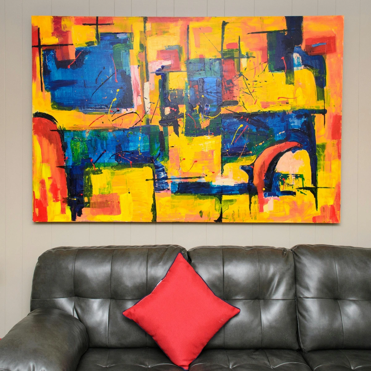
Richard Anuszkiewicz: The American Colorist
No discussion of Op Art, particularly its vibrant colorist branch, is complete without mentioning Richard Anuszkiewicz. An American painter, he emerged as a leading figure in the Op Art movement, renowned for his intensely vibrant and meticulously planned color juxtapositions. As a devoted student of Josef Albers, Anuszkiewicz deeply absorbed the systematic approach to color theory, deploying it to create stunning visual effects that often seem to pulsate, glow, and even shift from within the canvas. His groundbreaking work meticulously explores how colors interact and influence each other, often creating powerful secondary optical phenomena and a palpable sense of internal luminescence that profoundly challenge our perception of depth, light, and form. His pieces often feel like peering into a kaleidoscopic dimension, where color itself becomes a dynamic, almost living, force of nature, asserting its own presence independent of traditional representational forms. Iconic works like his Iridescent Chromatic series, where vibrant squares seem to pulse and recede, or his Temporal Series perfectly exemplify his mastery of color interaction, where seemingly simple geometric lines erupt with internal light and perceived movement, transforming static compositions into energetic visual events that demand active observation.
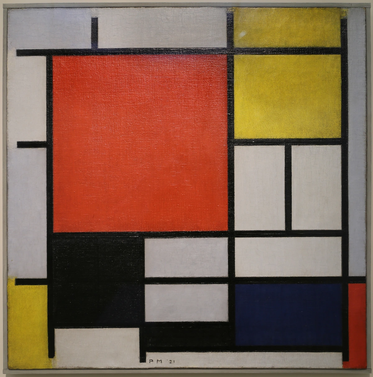
Julian Stanczak: The Architect of Light
Another truly significant American artist in the Op Art canon is Julian Stanczak. After escaping a Siberian labor camp during WWII, Stanczak found profound solace and expression in art. His remarkable work is characterized by meticulously arranged lines and carefully modulated fields of color, which collectively create incredibly subtle yet powerfully dynamic optical effects. He was particularly adept at conjuring illusions of movement, vibration, and an ethereal translucence, making his static canvases seem to breathe with an inner light and energy. Stanczak often referred to his unique approach as "perceptual art," keenly emphasizing the viewer's active, prolonged role in experiencing the subtle shifts and energies embedded within his compositions. He believed that the artwork was completed only within the eye and mind of the observer, a profound co-creation. His unwavering dedication to exploring the nuanced intricacies of visual perception is truly inspiring, often employing carefully modulated color gradients, razor-sharp lines, and carefully chosen hues to achieve a mesmerizing sense of pulsating energy, ethereal light, and profound depth. Through seminal works like Dual Gaze, where intersecting lines create an illusion of vibrating planes, Constant Flux, or Opulence, Stanczak masterfully demonstrates how precise arrangements of color and line can evoke a profound sense of shifting light and internal dynamism, compelling prolonged and active observation from the viewer. His subtle manipulations often reveal new visual discoveries with each prolonged gaze."perceptual art," keenly emphasizing the viewer's active, prolonged role in experiencing the subtle shifts and energies embedded within his compositions. His unwavering dedication to exploring the nuanced intricacies of visual perception is truly inspiring, often employing carefully modulated color gradients to achieve a mesmerizing sense of pulsating energy and depth. Through seminal works like Dual Gaze, Constant Flux, or Opulence, Stanczak masterfully demonstrates how precise arrangements of color and line can evoke a profound sense of shifting light and internal dynamism, compelling prolonged and active observation from the viewer.

Carlos Cruz-Diez: Chromatic Investigations
While often categorized broadly as Kinetic Art due to his interactive installations, the Venezuelan artist Carlos Cruz-Diez was profoundly invested in the optical phenomena that form the very essence of Op Art. His iconic "Physichromies" are sophisticated structures featuring parallel vertical strips of color that, through a masterful understanding of visual interaction, create powerful optical illusions of movement and constantly changing hues as the viewer moves past them, compellingly demonstrating color's independence from static form. His equally famous "Chromosaturations" are not just artworks but truly immersive architectural environments, chambers of pure, intense, monochromatic color meticulously designed to make viewers experience color as an evolving, ephemeral reality existing in space and time, rather than a mere static pigment on a surface. He wanted people to feel color, not just see it. His groundbreaking investigations into the subjective and objective properties of color pushed the boundaries of both Op Art and Kinetic Art, establishing him as a true visionary who understood that color could be a living, breathing entity that constantly transforms with light and movement. His unwavering commitment to making the viewer an active, indispensable participant in the artwork truly set him apart, blurring the lines between pure perception and physical reality, and inviting a profound introspection into how we actually perceive color.
Josef Albers: The Master of Color Interaction
Though primarily associated with the Bauhaus and his profound contributions to color theory, Josef Albers is a pivotal figure whose systematic investigations into color interaction deeply informed and influenced many Op Artists. His iconic series, "Homage to the Square," begun in 1950 and continued for over two decades, is a monumental testament to his lifelong dedication to understanding how colors influence each other's perceived hue, lightness, and intensity when juxtaposed. These deceptively simple compositions of nested squares, rendered in meticulously chosen color combinations, reveal astonishing optical phenomena: colors appear to advance or recede, change in temperature, or even seem to vibrate. Albers wasn't interested in personal expression but in objective optical facts – how color behaves. His rigorous, almost scientific, approach to teaching and art-making provided a critical theoretical and practical framework for Op Artists seeking to systematically manipulate visual perception. He taught them that a color is never seen in isolation, but is always relative to its context, a principle central to many Op Art illusions.
Victor Vasarely: The Father of Op Art
If you're going to talk about Op Art, you absolutely must start with Victor Vasarely. Often hailed as the 'father of Op Art,' this Hungarian-French artist spent decades meticulously developing his own brand of geometric abstraction, which eventually led to the fully realized optical illusions we associate with the movement. I sometimes imagine him as a mad scientist of form and color, patiently experimenting until he cracked the code of visual trickery.
Vasarely's early work explored abstract patterns, but by the 1950s, he was deeply immersed in creating art that evoked a sense of movement and three-dimensionality on a flat surface. His iconic series, such as Vega and Gestalt, feature bulging or receding spheres and cubes, created purely through precise arrangements of color and shape. He wasn't just painting a picture; he was engineering a visual experience, striving for what he called "plastic unity" – a profound synthesis of architecture, art, and life. This concept wasn't merely theoretical; he actively integrated his works into architectural projects, believing that art should be an integral part of our environment, transforming public spaces into dynamic visual experiences. His systematic approach, often using a "plastic alphabet" of interchangeable modular forms, made his work almost proto-algorithmic, allowing for endless variations and applications, truly democratizing the optical experience.
He envisioned an art that was accessible to all, producing multiples and integrating his designs into architecture and industrial products. His belief that art should be for everyone, not just the elite, truly resonates with me. If you want to dive deeper into his world, check out our guide to Victor Vasarely. His systematic approach and the modularity of his designs even hinted at an early form of 'art algorithms,' where pieces could be endlessly reconfigured and reproduced, embodying a truly democratic vision for art.
Jesús Rafael Soto: Vibration and Dematerialization
Another pivotal figure whose work often bridges Op Art and Kinetic Art is the Venezuelan artist Jesús Rafael Soto. Though his most famous works involve actual physical movement (making them squarely in the Kinetic Art realm), his earlier and foundational pieces, particularly his "Penetrables" and "Vibraciones" series, are deeply rooted in Op Art's principles. Soto was fascinated by the dematerialization of form, the transformation of solid objects into pure energy, and the perception of vibration. He used precisely arranged, often parallel, lines or rods (sometimes suspended from the ceiling in his "Penetrables") to create optical ambiguities that made solid structures appear to dissolve, vibrate, or shift as the viewer moved through or past them. His "optical constructions" are meticulously crafted to produce a sensation of pure light and energy, where the visual experience itself becomes the primary subject. Soto’s rigorous approach to creating art that truly comes alive through the interaction with the viewer’s movement makes him an indispensable figure in understanding the broader spectrum of perceptual art that emerged in the mid-20th century, blurring the lines between static illusion and actual physical dynamism.
Bridget Riley: The Queen of Optical Illusion and Dynamic Fields
Another towering figure, perhaps the undisputed Queen of Optical Illusion, is the British painter Bridget Riley. Her early work, often stark black and white compositions, is arguably the most iconic and immediately recognizable representation of the movement's dizzying, pulsating effects. When I first encountered her masterpiece Movement in Squares (1961), I honestly felt a little seasick – in the absolute best possible way, of course! It’s truly a testament to her unparalleled mastery of line and contrast, creating an astonishing illusion of fluid, undulating motion from utterly static elements.
Riley's artistic approach has always been intensely focused on the pure, unadulterated visual experience. She meticulously explored how simple elements like lines, waves, and dots, when arranged with absolute precision, could generate dynamic visual fields that seem to shimmer, sway, or recede. She famously began with a limited palette, primarily black and white, before later incorporating vibrant colors to create even more complex and immersive optical effects, as seen in breathtaking works like Fission (1964), Cataract 3 (1967), and Blaze 1 (1964). Her evolution into color brought entirely new dimensions to her perceptual investigations, allowing her to explore chromatic tensions and harmonies. Her works are, without a doubt, a masterclass in understanding balance in art composition and the dynamic interplay of visual forces.
Her creative process is often described as scientific, and indeed, she famously employed assistants to help execute her precise designs, ensuring the flawless technical precision necessary for the illusions to work. But don never let that precision mislead you; there's a profound, almost mystical, artistic sensibility at play, guiding every curve, every line, and every shade to create an almost overwhelming sensory experience. She meticulously explored not just the stark contrasts of black and white, but later how subtle chromatic shifts could generate even more complex and immersive optical effects, consistently proving the endless possibilities inherent in pure visual elements. Her decisive shift to color, notably in the mid-1960s, was a natural progression, allowing her to investigate entirely new forms of optical vibration, spatial ambiguity, and emotional resonance without abandoning her systematic approach. Works like Diagonal Curve (1966), Late Morning (1967-68), and her subsequent stripe paintings demonstrate her evolving mastery of color's dynamic potential. To learn more about her captivating work and journey, I highly recommend exploring our comprehensive Bridget Riley guide.
Yaacov Agam: The Transformative Artist
Another visionary artist whose work is deeply intertwined with the principles of Op Art and Kinetic Art is the Israeli artist Yaacov Agam. Agam is widely known for his "polymorphic" or "transformable" works, which change dramatically as the viewer moves around them, or which can be physically reconfigured by the viewer. While his art often involves physical interaction and movement (placing it squarely in the Kinetic Art realm), the profound optical illusions and shifts in perception are absolutely central to his aesthetic. His "Agamographs," for instance, are groundbreaking lenticular prints that present entirely different images or patterns when viewed from different angles, creating a truly dynamic, evolving visual experience that demands physical engagement. Agam's philosophical approach profoundly emphasizes the concept of change and the fourth dimension (time) in art, viewing a static artwork as inherently incomplete until it is animated by the viewer's movement or interaction. His work radically challenges the traditional fixed viewpoint of art, inviting a playful, active, and deeply personal engagement with an ever-transforming visual reality. It's a testament to his belief that art should be a continuous dialogue.
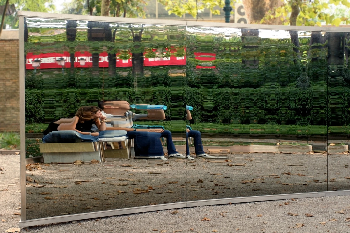
Op Art vs. Kinetic Art: The Illusion of Movement vs. Actual, Physical Movement
This is where things can get a little delightfully confusing for some people, as both Op Art and Kinetic Art centrally deal with the irresistible concept of movement. However, there's a truly crucial distinction that often trips people up – it’s the fundamental difference between perceiving something as if it moves and something actually moving in physical space. This nuance, I believe, is absolutely vital for fully understanding and appreciating these two related, yet distinct, artistic movements. So, let’s unravel this fascinating difference, shall we?
- Op Art (Optical Art): This movement creates the illusion of movement, vibration, or depth through static visual elements. The artwork itself does not physically move; the movement happens purely within your perception, in your mind's eye. Think of it as a sophisticated visual trick, a masterful manipulation of your brain's visual processing.
- Kinetic Art: In contrast, Kinetic Art involves actual, physical movement. These artworks are sculptures, installations, or objects that incorporate motors, wind, magnets, light, or viewer interaction to create literal, physical motion. It's art that truly moves, shifts, or changes its physical configuration in real space.
I often explain it like this: Op Art is a silent film of motion, a suggestion of dynamism that unfolds in your head, while Kinetic Art is a live dance performance, an undeniable physical manifestation of movement. Both engage with movement, but in fundamentally different ways, offering distinct sensory experiences. And for me, this distinction is key to appreciating the ingenuity of both. For a deeper dive into the latter, you can check out our article on Kinetic Art.
Key Differences: Op Art vs. Kinetic Art
Feature | Op Art (Optical Art) | Kinetic Art |
|---|---|---|
| Movement Type | Illusory movement (in the viewer's perception). | Actual physical movement. |
| Artwork State | Static, two-dimensional (mostly paintings, prints). | Dynamic, three-dimensional (sculptures, mobiles, installations). |
| Mechanism | Optical phenomena, precise patterns, color contrasts. | Motors, wind, light, magnetism, viewer interaction. |
| Primary Medium | Painting, printmaking, graphic design. | Sculpture, installation, performance art. |
| Artist Focus | Perception, illusion, visual psychology. | Physical mechanics, transformation, temporal experience. |
| Example Artists | Victor Vasarely, Bridget Riley, Richard Anuszkiewicz. | Alexander Calder, Jean Tinguely, George Rickey. |
The Broader Impact of Op Art: Beyond the Gallery and Deep into Culture
Beyond its immediate, often dazzling, optical effects and its intellectual rigor, Op Art has left an indelible and far-reaching mark on various aspects of culture and design. It was never merely confined to the hallowed halls of galleries; its foundational principles resonated widely, proving that a purely visual art form could profoundly influence the world around us. Its clean lines, bold graphic impact, and inherent reproducibility made it particularly adaptable to commercial applications, effectively blurring the lines between so-called 'fine art' and 'applied design,' and embedding itself deeply in the collective visual consciousness of an entire era. It truly democratized abstract aesthetics, making complex visual ideas accessible, fashionable, and undeniably cool.
Fashion, Textile, and Graphic Design: A Visual Revolution
Op Art's bold, graphic patterns were a natural, almost inevitable, fit for the vibrant, youth-driven counterculture of the 1960s. It absolutely exploded into the world of fashion, with avant-garde designers like Paco Rabanne creating futuristic, geometric ensembles, and Rudi Gernreich incorporating its dizzying motifs into clothing, particularly during the iconic Mod era. Mainstream brands quickly followed suit, with sharp, geometric prints, mesmerizing black and white swirls, and high-contrast color blocks dominating everything from dresses and skirts to accessories, and even swimwear. It was chic, it was daring, and it was utterly modern – a compelling visual shorthand for the futuristic optimism, space-age fascination, and psychedelic leanings of the decade. The very idea of clothing that seemed to move with the wearer was revolutionary!
Beyond clothing, Op Art's distinctive aesthetic found its way into interior design, textile patterns for upholstery and drapery, pervasive advertising campaigns, and even iconic album covers (just think of The Rolling Stones' Their Satanic Majesties Request). The idea of creating a dynamic, interactive visual experience was hugely appealing, and its clean, often reproducible nature made it perfect for mass consumption. It demonstrated that abstract art could be popular and permeate the mainstream without losing its artistic integrity, leaving a lasting mark on visual culture and consumer aesthetics. It truly became a symbol of the swinging sixties, a visual shorthand for a new era of dynamic change and an embrace of playful visual technologies. Think about Mary Quant's iconic Mod fashion, where Op Art patterns were splashed across miniskirts and dresses, or the striking album covers of bands like The Grateful Dead, which often incorporated psychedelic optical illusions. Its influence was truly ubiquitous, demonstrating how an intellectual art movement could become a mainstream sensation.
Op Art's Influence on Other Art Movements
While distinct, Op Art's rigorous approach to form and perception influenced later movements. Its objective, systematic nature found echoes in aspects of Minimalism and even elements of Conceptual Art, where the idea and the viewer's experience take precedence over the artist's hand. It also paved the way for Hard-Edge Painting, a style characterized by sharply defined geometric forms and clear lines, which emerged concurrently and shared Op Art's emphasis on precision and optical clarity. This style, with artists like Ellsworth Kelly and Frank Stella, focused on pure, flat fields of color separated by crisp, clean edges, creating a sense of objective presence and often subtle spatial ambiguities without the explicit illusionistic intent of Op Art, yet sharing a similar aesthetic rigor. It encouraged a focus on the fundamental building blocks of visual communication, a legacy that continues to inform contemporary artistic practices.
The Critical Eye: The Controversial Reception of Op Art
While Op Art undeniably captivated the public, it wasn't without its critics. Indeed, few movements generated such polarized opinions. Some in the art establishment dismissed it as merely 'gimmicky,' 'decorative,' or even 'too scientific,' arguing it lacked the emotional depth or intellectual rigor of other abstract movements like Abstract Expressionism. They argued it was more about optical tricks than profound artistic statements, a kind of visual parlour game. The commercial appeal, ironically, was often held against it, with critics wary of its rapid integration into popular culture.
The Commercialization Controversy: Art for the Masses?
One of the most intense criticisms leveled against Op Art, ironically, stemmed from its very success: its rapid and widespread commercialization. Many purists within the art establishment viewed its quick adoption by fashion, advertising, and interior design as a sign of its superficiality, arguing that it diluted its artistic integrity. They feared it was becoming mere 'decoration' rather than 'high art,' a readily reproducible style that prioritized market appeal over profound artistic statement. This tension between accessibility and perceived artistic gravitas was a central point of contention, highlighting a recurring debate in art history about the boundaries between fine art and popular culture.
However, this very commercial appeal and widespread popularity, influencing everything from advertising to fashion, ironically solidified its place in art history. It became a powerful bridge between high art and popular culture, challenging the very definitions of what 'serious' art could be and forcing a re-evaluation of the role of visual perception in art. For me, the fact that it sparks such passionate debate is a testament to its enduring power – art that makes you think and feel, even if that feeling is a slight dizziness or a sense of disorientation! It proved that art could be intellectually stimulating and accessible simultaneously, a notion that profoundly challenged traditional art world hierarchies. I find that deeply fascinating.
Op Art's Enduring Legacy and Cultural Impact
The 1960s might have been Op Art's heyday, but its influence certainly didn't stop there. This isn't just a fleeting trend; it's a movement that left an indelible mark on art, design, and even our everyday lives. I often spot echoes of Op Art in the most unexpected places, proving its lasting power. It created a visual language that transcended the gallery, embedding itself in the fabric of popular culture.

Architectural Integration and Public Spaces
Op Art's principles also made a significant impact on architecture and public art. The use of geometric patterns, contrasting colors, and manipulated perspective lent itself perfectly to creating dynamic facades, interior spaces, and large-scale murals that seemed to shift and change as you moved around them. Imagine walking through a city square where a building's surface appears to ripple or bulge, or a floor that seems to undulate beneath your feet – that's the influence of Op Art at play, transforming static structures into interactive visual experiences. Victor Vasarely himself championed the concept of 'integrated art,' where art, architecture, and urban planning were conceived as a unified whole, blurring the lines between art object and environment. He envisioned cities as dynamic visual experiences, and his large-scale murals and architectural integrations proved how effectively Op Art could transform public spaces. This vision transformed bland concrete structures into vibrant, dynamic facades, injecting optical energy directly into our daily lives and making the urban landscape a canvas for constant perceptual engagement. Imagine the dullness of everyday life suddenly punctuated by a pulsating, shimmering wall!
Op Art and Technology: The Algorithmic Connection
It’s impossible to ignore the profound, almost prophetic, connection between Op Art and the world of technology. Long before computers became ubiquitous, Op Artists were essentially working with visual algorithms, systematically generating complex patterns and illusions through pre-defined rules and processes. This inherent algorithmic thinking makes Op Art a direct ancestor to computer graphics, generative art, and even the mathematical explorations of fractals. The methodical approach of artists like Vasarely, who developed "plastic alphabets" of modular forms, foreshadowed the modularity and repeatability central to digital design and coding. This isn't just a stylistic link; it's a conceptual kinship that highlights Op Art's enduring relevance in a technologically driven world, showing how artistic vision can anticipate scientific and computational advancements.
Contemporary Echoes and Digital Frontiers
Even today, contemporary artists continue to draw profound inspiration from Op Art's principles. With the advent of sophisticated digital art tools, projection mapping, truly immersive installations, and advanced printing techniques, the possibilities for creating complex optical illusions have only expanded exponentially. Artists can now achieve levels of precision, animation, and interactivity that would have been unimaginable to the pioneers of the movement, creating breathtaking immersive and interactive experiences in virtual reality, augmented reality, and various new media platforms. My own work, while not strictly Op Art, often consciously explores the interplay of color harmonies and geometric forms to create a similar sense of visual energy and movement, fostering an active dialogue with the viewer and proving that the fundamental principles of optical engagement are truly timeless. It’s a powerful testament to how these ideas continue to evolve and inspire, finding new voices and new mediums for expression in the 21st century.
It’s a testament to Op Art's fundamental appeal – its ability to challenge our perception and delight our eyes – that it continues to be relevant and inspire new generations of creators across disciplines. The core principles of manipulating line, color, and form for profound visual effect are timeless and universal.
Collecting Op Art: Bringing the Illusion Home and Curating Perception
If you've found yourself captivated by the mind-bending allure of Op Art, you might be wondering how to bring a piece of this dynamic movement into your own space. Collecting Op Art, whether originals by its pioneers or contemporary works inspired by its principles, can be an incredibly rewarding experience. It's about acquiring an artwork that actively engages with your perception, becoming a constant source of visual intrigue and a daily conversation starter about the nature of sight itself. It's a truly unique way to curate your environment, adding an element of dynamic, interactive art that challenges and delights.
What to Look For When Collecting Op Art
- Originals by Key Figures: Pieces by artists like Victor Vasarely, Bridget Riley, Richard Anuszkiewicz, Julian Stanczak, or Carlos Cruz-Diez are highly sought after. Research their market, provenance, and condition carefully. These are often significant investments.
- Limited Edition Prints: Many Op Artists, particularly Vasarely, embraced printmaking to make their art more accessible. Silkscreen prints (serigraphs) are common and can be a more affordable entry point into owning work by master artists, provided they are authenticated and from a reputable edition.
- Contemporary Op Art: The movement's principles continue to inspire today's artists. Look for contemporary creators who are exploring optical illusions, geometric abstraction, and perceptual effects through painting, digital art, sculpture, or installations. This can be a fantastic way to discover emerging talent and acquire unique pieces.
- Condition and Precision: Given the meticulous nature of Op Art, the condition of the work is paramount. Sharp lines, unblemished surfaces, and vibrant, unfaded colors are essential for the optical effects to function as intended. Any damage or degradation can significantly impact its visual power and value.
- Display Considerations: Think about how the piece will interact with its environment. Op Art often benefits from ample space and controlled lighting that allows its illusions to reveal themselves without distraction. Consider how the artwork will engage viewers as they move around it – an essential aspect of its interactive nature. For more on this, you might explore articles on the art of display: how to light and position abstract art for maximum impact.
Collecting Op Art is an invitation to ongoing visual dialogue, a chance to own a piece of art that truly comes alive through your engagement. It’s a profound reminder of the subjective and dynamic nature of perception itself.
Creating Your Own Op Art: A Journey into Visual Play and Personal Perception
Feeling inspired to try your hand at creating some optical illusions? While the masters like Vasarely and Riley developed incredibly complex techniques, the basic principles of Op Art are surprisingly accessible. You don't need to be a mathematical genius, just someone with a keen eye and a bit of patience. I remember my first attempts were wonderfully chaotic, but even then, the core idea of playing with perception was thrilling – the idea that I could make a flat surface appear to move was truly captivating. It's an incredibly satisfying way to connect with the very mechanics of sight, and you might surprise yourself with what you can achieve!
Here are some simple ways you can start experimenting:
- Start with Grids: A simple grid of squares or circles is your best friend. Vary the size, spacing, or color within these grid units to create subtle shifts that generate an illusion of depth or movement. Even a slight change can have a dramatic effect.
- Black and White Power: Begin with black and white. The high contrast naturally creates the strongest optical effects. Experiment with alternating black and white stripes, concentric circles, or checkerboard patterns. You'll be amazed at how dynamic two simple colors can be.
- Explore Line Variations: Instead of uniform lines, try making them thicker, thinner, or wavy in certain areas. This can create a sense of bulging or receding forms without any actual shading. Think of it as drawing movement.
- Complementary Colors: Once you're comfortable with black and white, introduce complementary colors (red and green, blue and orange, yellow and purple) placed side-by-side. The visual 'vibration' you get is a classic Op Art effect.
- Use Digital Tools: Software like Adobe Illustrator or even simpler graphic design apps can be fantastic for creating precise geometric patterns and experimenting with color combinations. It allows for quick iterations and perfect symmetry, which is often key to these illusions. For more general advice on abstract art creation, consider exploring how to how to abstract art or the role of design in art.
The key is experimentation and observation. Pay attention to how small changes in your pattern or color scheme affect the overall visual experience. You'll soon discover your own optical tricks! Remember, it's not about perfection, but about playing with perception itself. Why not take a leaf out of the Op Artists' book and see how your art can literally move someone (without actually moving)!

Frequently Asked Questions About Op Art
I get a lot of questions about Op Art – it's a movement that really sparks curiosity and sometimes a little delightful confusion! Given its visually challenging nature, it's natural to have a few lingering queries. Here are some of the most common ones I hear, and my thoughts on them, distilled for clarity and deeper understanding:
What is the main characteristic of Op Art?
The defining characteristic of Op Art is its deliberate use of optical illusions to create a dynamic sense of movement, vibration, flashing, or hidden images on a static two-dimensional surface. It fundamentally aims to manipulate the viewer's visual perception, prompting an active, often physical, response (sometimes even a delightful dizziness!), rather than depicting recognizable subjects or expressing overt emotional narratives. It's about how your eyes and brain interact with the artwork, turning passive observation into a truly active visual and intellectual experience, often making you question the very reality of what you're seeing and how your mind constructs it.
Who are the most famous Op Artists?
Without a doubt, the most famous Op Artists are Victor Vasarely (often hailed as the 'father of Op Art,' a true visionary who systematically developed its principles) and Bridget Riley (renowned for her mesmerizing black and white compositions and later, vibrant color works that seem to pulsate with life). Other hugely significant figures include Richard Anuszkiewicz (a master of intense color interaction and visual luminescence), Julian Stanczak (the architect of subtle light and perceived movement), Carlos Cruz-Diez (known for his profound chromatic investigations and immersive installations), and Jesús Rafael Soto (whose works often bridge Op Art and Kinetic Art through his exploration of vibration and dematerialization). These artists, through their unique approaches, collectively defined the core aesthetic and intellectual rigor of the movement, pushing the boundaries of what static art could achieve.
When did Op Art start and what inspired it?
Op Art emerged as a distinct movement in the late 1950s, building upon earlier traditions of geometric abstraction (like the Bauhaus and Russian Constructivism) and scientific investigations into optics. It gained significant international popularity throughout the 1960s, notably after the pivotal 1965 'The Responsive Eye' exhibition at MoMA in New York. Its inspirations were multi-faceted: a deep scientific interest in optics and visual perception, a desire to create a more objective, viewer-interactive art form, and a conscious departure from the emotional spontaneity of Abstract Expressionism that dominated the preceding decades. It also perfectly resonated with the era's fascination with science, technology, space exploration, and the burgeoning understanding of human psychology, offering an art form that felt utterly modern, forward-looking, and intellectually stimulating. It was, in many ways, an art of the future, questioning the very act of seeing.
Is Op Art a type of abstract art?
Yes, absolutely! Op Art is a pure and rigorous form of abstract art. It intentionally does not represent recognizable objects, people, or scenes from the real world. Instead, it focuses entirely on formal elements like line, shape, and color, and their intrinsic optical qualities, to create its profound visual effects and illusions. The subject is the visual experience itself, unburdened by external narrative or emotional storytelling, making the visual sensation the core content of the artwork.
How does Op Art make you feel or react?
Op Art typically evokes strong, often visceral, visual sensations such as shimmering, vibrating, pulsating, or a profound sense of depth and movement on a flat plane. For many, it can be an exhilarating, mind-bending, and almost hypnotic experience, drawing them into a heightened state of perceptual awareness. However, for some, prolonged viewing might cause mild discomfort, dizziness, or even a touch of nausea (a small, albeit fascinating, price to pay for such visual adventure!). The reaction is highly personal and depends on how your unique visual system processes the illusions and the specific artwork itself, making each encounter a truly unique, subjective event – a private dialogue between your brain and the canvas.
What is the typical color palette of Op Art?
While Op Art is famously associated with stark black and white compositions, especially in its early iterations (think Bridget Riley's iconic pieces), the movement also embraced a vibrant and calculated use of color. Artists frequently employed high-contrast color pairings, particularly complementary colors (like red and green, blue and orange, yellow and purple) placed side-by-side to create a heightened sense of vibration, shimmering, and illusory movement. Richard Anuszkiewicz, for example, was a master of using intense, saturated colors to create dazzling, pulsating visual fields that seem to glow from within. The choice of colors was always incredibly deliberate and scientifically informed, aiming to exploit how our eyes perceive and interpret chromatic interactions rather than for traditional emotional expression. So, while the stark elegance of monochrome is certainly a hallmark, a full spectrum of carefully chosen, contrasting, and often vibrant colors is equally characteristic, deployed with surgical precision to achieve specific optical effects.
What materials did Op Artists typically use?
Op Artists, prioritizing precision and clean optical effects over painterly expression, often favored reproducible mediums that allowed for sharp lines and clean, unmodulated color fields. Acrylic paints, known for their smooth application, vibrant colors, and quick drying time, were incredibly common. Silkscreen printing (serigraphy) and other graphic techniques were also widely utilized for their ability to create perfectly crisp lines and repeatable patterns. Many artists also relied heavily on drafting tools such as rulers, compasses, protractors, and even stencils to achieve the meticulous geometric precision essential for their illusions. The focus was less on visible brushstrokes or painterly texture and more on the pure optical effect of the finished surface, almost like scientific diagrams coming to life. They were, in a way, the engineers of visual perception, meticulously crafting works that demanded optical engagement rather than emotional interpretation. This technical rigor and emphasis on clean lines also made their work highly suitable for commercial applications and mass reproduction, further expanding its cultural reach and embedding their aesthetic into the very fabric of popular culture. It's truly fascinating how a focus on precision could lead to such widespread accessibility.
What is the difference between Op Art and Kinetic Art?
The key difference, as we discussed earlier in the article, is fundamental: Op Art creates the illusion of movement, vibration, or depth on a static artwork, manipulating your perception. The movement happens purely in your mind's eye. In contrast, Kinetic Art features actual, physical movement within the artwork itself, achieved through motors, wind, light, or other mechanisms. Op Art tricks your eyes; Kinetic Art physically moves. It's the difference between a perceived dance and a literal performance.
What are some common themes or messages in Op Art?
Unlike many art movements that carry overt social, political, or emotional messages, Op Art’s primary "theme" is usually the act of seeing and perception itself. It’s an inquiry into the nature of visual reality, challenging the viewer to become aware of how their brain constructs what they see. Common underlying messages include: the subjectivity of perception (what one person sees might differ slightly from another), the power of illusion, the interplay between order and chaos (through precise geometric structures that create dynamic effects), and a celebration of pure visual phenomena. It's less about conveying a specific narrative and more about provoking an immediate, visceral, and intellectual engagement with the mechanics of sight. It encourages a deeper introspection into our own visual processing.
How does Op Art relate to Minimalism?
Op Art shares some significant aesthetic and philosophical similarities with Minimalism, particularly in its emphasis on geometric forms, repetitive structures, and a reduction of elements to their core components. Both movements often feature an impersonal, objective approach to creation, prioritizing concept and structure, and focus intently on the viewer's direct perceptual experience rather than narrative or emotion. However, the crucial distinction lies in their ultimate goal: Op Art's primary aim is the creation of illusion, dynamic movement, and a 'trick' within the static form, whereas Minimalism often seeks to highlight the object's inherent physical properties, its literal presence, and a more restrained, often serene, visual impact. Op Art wants to activate your retina, Minimalism wants you to contemplate the object itself, a subtle but profound difference in artistic intent. While a minimalist piece might draw you into a quiet contemplation of its form, an Op Art piece might make your eyes dance involuntarily, a truly different kind of engagement.
What are the common visual effects created by Op Art?
Op Art commonly creates effects such as: flicker and vibration (from high-contrast lines or colors), illusory movement (like waves or pulses), apparent depth and curvature (making flat surfaces seem to bulge or recede), afterimages (residual images on the retina), and hidden patterns that emerge with prolonged viewing or slight shifts in perspective. The goal is always to create a dynamic visual experience where the artwork seems to come alive in the viewer's eye.
Where can I see Op Art today?
Major art museums around the world often proudly feature Op Art pieces in their permanent collections, showcasing its enduring appeal. Notable institutions include MoMA in New York, the Tate Modern in London, the Centre Pompidou in Paris, The Museum of Contemporary Art in Chicago, and various national galleries. Dedicated retrospectives and temporary exhibitions celebrating pioneers like Vasarely or Riley, as well as new explorations by contemporary artists, also occur regularly. You might even find contemporary art influenced by Op Art in galleries, public spaces, digital art installations, or even in my own gallery if you decide to buy some of my art. It's truly a global phenomenon that continues to resonate. I always encourage people to seek out these works in person; the photographic reproduction often fails to capture the true, disorienting power of the optical illusion. The scale, the subtlety of color shifts, and the direct interaction with your movement simply can't be fully conveyed on a screen.
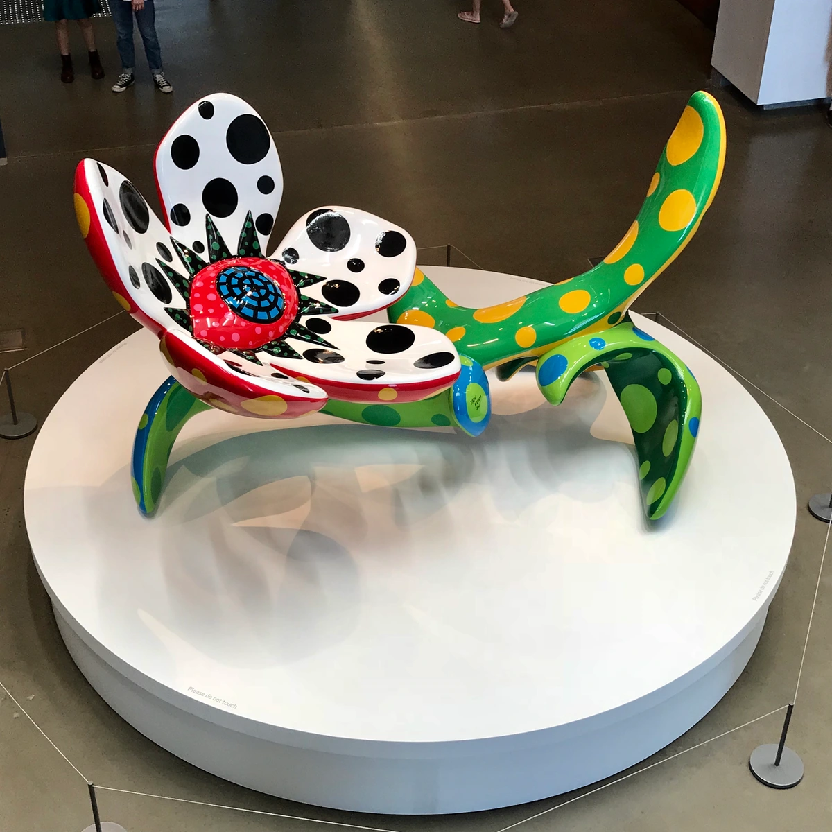
How is Op Art perceived by different people?
The perception of Op Art can be incredibly varied and subjective, which is part of its charm! While many find the illusions exhilarating and fascinating, some individuals might experience mild discomfort, dizziness, or even a slight nausea, particularly with high-contrast, rapidly shifting patterns. This is often due to the way specific visual systems process conflicting information, and it's a testament to the art's powerful physiological impact. The experience is deeply personal, influenced by factors like visual acuity, neurological processing, and even mood. What one person finds captivating, another might find disorienting – and both reactions are valid, proving just how actively our brains construct what we see!
What are the common criticisms of Op Art?
While wildly popular, Op Art certainly faced its share of criticisms, especially in its nascent years. The most common critiques often labeled it as 'gimmicky' or 'superficial,' arguing that it prioritized optical tricks over deeper artistic meaning or emotional expression. Some critics found it 'too scientific' or 'decorative,' suggesting it lacked the 'soul' or spontaneity of movements like Abstract Expressionism. The rapid commercialization of Op Art patterns in fashion and advertising also drew scorn from purists who felt it diminished its status as 'high art.' Essentially, many felt it was too accessible, too reproducible, and too focused on purely visual effects rather than profound concepts. However, I believe these very criticisms underscore its revolutionary nature, challenging traditional notions of what art could be and how it could engage an audience.
What styles influenced Op Art?
Op Art drew heavily from earlier traditions of geometric abstraction, particularly those associated with the Bauhaus school, Russian Constructivism, and De Stijl. The systematic, scientific approach to color theory, as championed by artists like Josef Albers, was also a significant influence. Furthermore, the optical mixing techniques of Pointillism and the fragmented perspectives of Cubism can be seen as distant relatives, all contributing to the rich intellectual lineage of this dazzling movement. Its roots lie in a long history of artists experimenting with perception and geometric forms.
Are there any controversies or criticisms of Op Art?
Absolutely! While popular, Op Art faced significant criticism, particularly in its early years. Many art critics dismissed it as 'gimmicky,' 'decorative,' or 'too scientific,' arguing it lacked the emotional depth or intellectual rigor of movements like Abstract Expressionism. Its commercial success also sometimes drew scorn from purists. However, these controversies arguably cemented its place in art history, forcing a re-evaluation of what 'serious' art could be and demonstrating the power of art to engage a broad audience intellectually and perceptually.
What is the philosophical underpinning of Op Art?
At its core, Op Art is deeply philosophical in its inquiry into perception and reality. It challenges the notion that what we see is a fixed, objective truth, demonstrating instead that our visual experience is an active, often subjective, construction of the brain. It asks us to question the reliability of our senses and to become aware of the mechanisms by which we perceive form, depth, and movement. Philosophically, it aligns with ideas that emphasize the viewer's role in the creation of meaning, moving away from a purely authorial artistic intention towards a co-creative experience where the artwork is activated by the observer. It's a visual argument for the subjective nature of reality itself.
Is Op Art still produced today?
Absolutely! While its historical peak was certainly in the vibrant 1960s, Op Art's profound influence is far from over. Its core principles of manipulating perception and engaging the viewer actively are arguably more relevant than ever in our hyper-visual, technologically driven world. Contemporary artists continue to create works rooted in optical illusions and perceptual play, often integrating cutting-edge technologies. Modern Op Art can be found in dazzling digital art, generative art, projection mapping, immersive installations, and even virtual and augmented reality experiences. The foundational ideas of Op Art, after all, laid crucial groundwork for many of these contemporary visual technologies. Its influence is also still profoundly visible in graphic design, fashion, architecture, and even UX/UI design, proving its enduring power to captivate and challenge our visual senses across diverse disciplines. Even the burgeoning, though often contentious, world of NFTs (Non-Fungible Tokens) and generative art shows a conceptual lineage to Op Art. While I view the speculative market around NFTs with a healthy dose of skepticism, the underlying principle of algorithmically generated, unique visual compositions, often based on repetitive patterns and systematic variations, resonates deeply with the precise, methodical approach of Op Art pioneers like Vasarely. It's a fascinating, if sometimes bewildering, evolution of systematic art into digital ownership. It truly is a living legacy, constantly finding new forms of expression and proving its timeless adaptability.
What is the typical size or scale of Op Art works?
Op Art can vary dramatically in size, from intimate canvas paintings and small-scale prints designed for personal contemplation to monumental murals and large-scale architectural installations that transform entire public spaces. Early works, particularly those intended for gallery exhibition, were often of easel size. However, artists like Victor Vasarely and the GRAV collective envisioned Op Art integrated into daily life, leading to ambitious architectural projects and public artworks that commanded immense scale. The choice of size often depends on the artist's intent and the desired immersive effect, with larger works naturally creating a more overwhelming and encompassing optical experience. So, whether you're looking for a subtle visual puzzle or a commanding statement piece, Op Art offers options across the spectrum of scale.
Where can I buy Op Art?
Original Op Art pieces by master artists can be found in major art galleries and reputable auction houses worldwide. For contemporary works influenced by Op Art, smaller galleries, online art platforms (like Artsy or Saatchi Art), and artist studios (like my own!) are excellent places to explore. You can also discover high-quality limited edition prints and other reproductions that bring the spirit of Op Art into your home. If you're looking to acquire a piece that sparks a visual conversation and actively engages your space, consider exploring my work to buy or visiting a specialized gallery that focuses on geometric abstraction and perceptual art. Remember, owning Op Art isn't just acquiring a beautiful object; it's bringing a piece of dynamic visual inquiry into your daily life.










Conclusion: The Unending Dance of Perception and the Future of Visual Art
So, there you have it – Op Art in all its dazzling, mind-bending, and intellectually stimulating glory. It’s a powerful movement that serves as a constant, vibrant reminder that seeing is never, ever a passive act, but rather a dynamic, interpretive dance between our eyes, our brain, and the meticulously crafted visual information presented before us. Op Art takes seemingly simple elements – lines, shapes, and colors – and transforms them into something vibrantly alive, something that pulses, shifts, and profoundly engages with our very gaze. For me, it embodies a deep, almost philosophical, understanding of how we perceive the world, and it actively encourages a deeper appreciation for the subtle, yet incredibly powerful, illusions that shape our visual experience every single day, making us acutely aware of the profound, active role our mind plays in constructing what we call 'reality.' It’s a glorious, delightful subversion of the ordinary!
Op Art's legacy, as we've explored, extends far beyond its specific historical context of the 1960s. It laid crucial foundational groundwork for the evolution of abstract art and continues to inspire contemporary artists working with cutting-edge digital media, light installations, and immersive experiences. It’s truly not just art you look at; it's art you feel, think with, and actively participate in, demanding a conscious engagement that makes it profoundly impactful and eternally relevant. This active participation, this dynamic co-creation between artwork and observer, I believe, is its enduring magic and its greatest gift. If you've thoroughly enjoyed this journey into the art of illusion and its myriad connections, I invite you to explore more about abstract art and the endless possibilities of visual perception, perhaps even questioning what you thought you knew about the objective nature of reality. And who knows, perhaps you'll even consider taking a piece of this visual magic home – a dynamic conversation starter that continues to challenge and delight. You can find more of my work to buy or come visit me in my gallery and experience the magic of abstraction for yourself at the Den Bosch Museum.