How Famous Artists Secretly Shaped Graphic Design
Ever looked at a logo or ad and felt something? I explore how famous artists and movements like Bauhaus, Cubism, Surrealism, De Stijl, and Pop Art secretly shaped the graphic design you see every day.
How Famous Artists Secretly Shaped Graphic Design (A Personal Look)
Have you ever looked at a sleek logo, a striking advertisement, or even the layout of a magazine page and felt... something? A sense of balance, a jolt of energy, a moment of intrigue? As an artist, I spend a lot of time thinking about how visuals communicate. But it wasn't until I started digging a little deeper that I realized just how much the world of graphic design owes to the 'fine' artists who came before. It's like a secret handshake between the canvas and the billboard, and that blows my mind a little. It makes me see the world, and my own art, through a slightly different lens.
It's easy to think of art history as something separate – paintings in quiet galleries, sculptures on pedestals. But the truth is, the ideas, experiments, and breakthroughs happening in studios and salons weren't confined there. They seeped out, influencing everything from architecture to fashion, and perhaps most profoundly, the visual language of commerce and communication we now call graphic design. Why did designers look to artists? Maybe it was for innovation, to break from tired traditions, to lend a sense of prestige, or simply because artists were already pushing the boundaries of visual communication in ways that felt fresh and relevant. It's a fascinating cross-pollination, isn't it? Like two different species evolving together, even if one doesn't always acknowledge the other.
So, let's take a little journey together, shall we? We'll peek into how some of the most famous artists and movements didn't just change the art world, but quietly (and sometimes loudly) laid the groundwork for the design you see every single day. It's a fascinating connection, and one that makes me look at everything from a cereal box to a website layout with a renewed sense of wonder. It also makes me think about my own process – how the art I make today might, in some small, unseen way, influence something completely different down the line. It's a humbling thought.
The Foundations: Art Movements as Design Blueprints
Think of art movements as giant waves of creative thought. Each one brought new ways of seeing, new techniques, and new philosophies about what art could be. And many of these philosophies were surprisingly practical, offering ready-made toolkits for designers.
Bauhaus: Form Follows Function (and Design Follows Art)
If there's one movement with a direct, undeniable link to graphic design, it's the Bauhaus. This German school, founded in 1919, wasn't just about painting or sculpture; it was about integrating art, craft, and technology. Their motto, "Form follows function," became a cornerstone of modern design. It's a principle that feels almost obvious now, but back then, it was revolutionary. It stripped away the fussy, the unnecessary, the purely decorative, and said, "What does this need to do? Let's make it do that, beautifully and efficiently."
Bauhaus artists and designers stripped away ornamentation, focusing on clean lines, geometric shapes, and functionality. They experimented with typography, creating sans-serif fonts that were legible and modern. They embraced the grid system for layout, bringing order and clarity to posters, advertisements, and publications. Look at any minimalist website or corporate logo today, and you're seeing the ghost of the Bauhaus. It's incredible how enduring those simple, clean principles are. It makes me wonder how much of what I consider 'modern' in my own work is just a direct echo of these early 20th-century ideas.
It wasn't just theory; they produced actual designs that looked radically different and modern. Their influence on typography, layout, and the very idea of a unified visual identity is immense. Artists like László Moholy-Nagy and Herbert Bayer were instrumental in this, pushing the boundaries of photographic and typographic design. Moholy-Nagy, for instance, championed the use of photography and photomontage in design, seeing it as a powerful tool for communication. He used photomontage to create dynamic, layered compositions that combined images and text for maximum visual impact, a technique still seen everywhere from magazine spreads to social media graphics. Bayer developed universal typefaces and standardized paper sizes, aiming for maximum efficiency and clarity. If you're interested in diving deeper into this, exploring the Bauhaus Effect is a must.
Cubism: Shattering Perspectives, Reshaping Layouts
Before the Bauhaus, something revolutionary happened in Paris: Cubism. Led by giants like Picasso and Braque, Cubism broke objects down into fragmented geometric forms, showing multiple viewpoints simultaneously. At first glance, this might seem purely abstract and unrelated to practical design. What does a fragmented guitar have to do with a magazine cover? It feels chaotic, right? Like trying to see everything at once and ending up seeing nothing clearly.
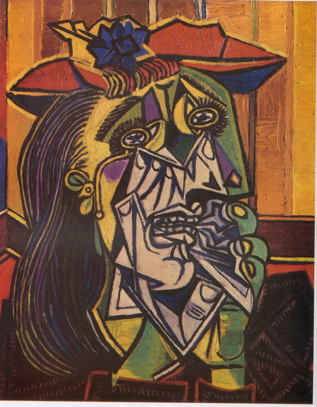
But think about it: this fragmentation and reassembly directly influenced layout design. It encouraged designers to play with space, overlap elements, and create dynamic, non-linear compositions. The use of collage in Cubism also directly fed into design techniques, bringing together disparate elements (like newspaper clippings or found objects) to create a new whole. This is something designers do constantly, whether physically or digitally. Think of a busy magazine spread or a website homepage that layers text, images, and graphics – that's a descendant of Cubist collage. It's the artistic ancestor of Photoshop layers! Juan Gris, a key Cubist, even incorporated text and numbers into his paintings, blurring the lines between image and information – a fundamental aspect of graphic design.
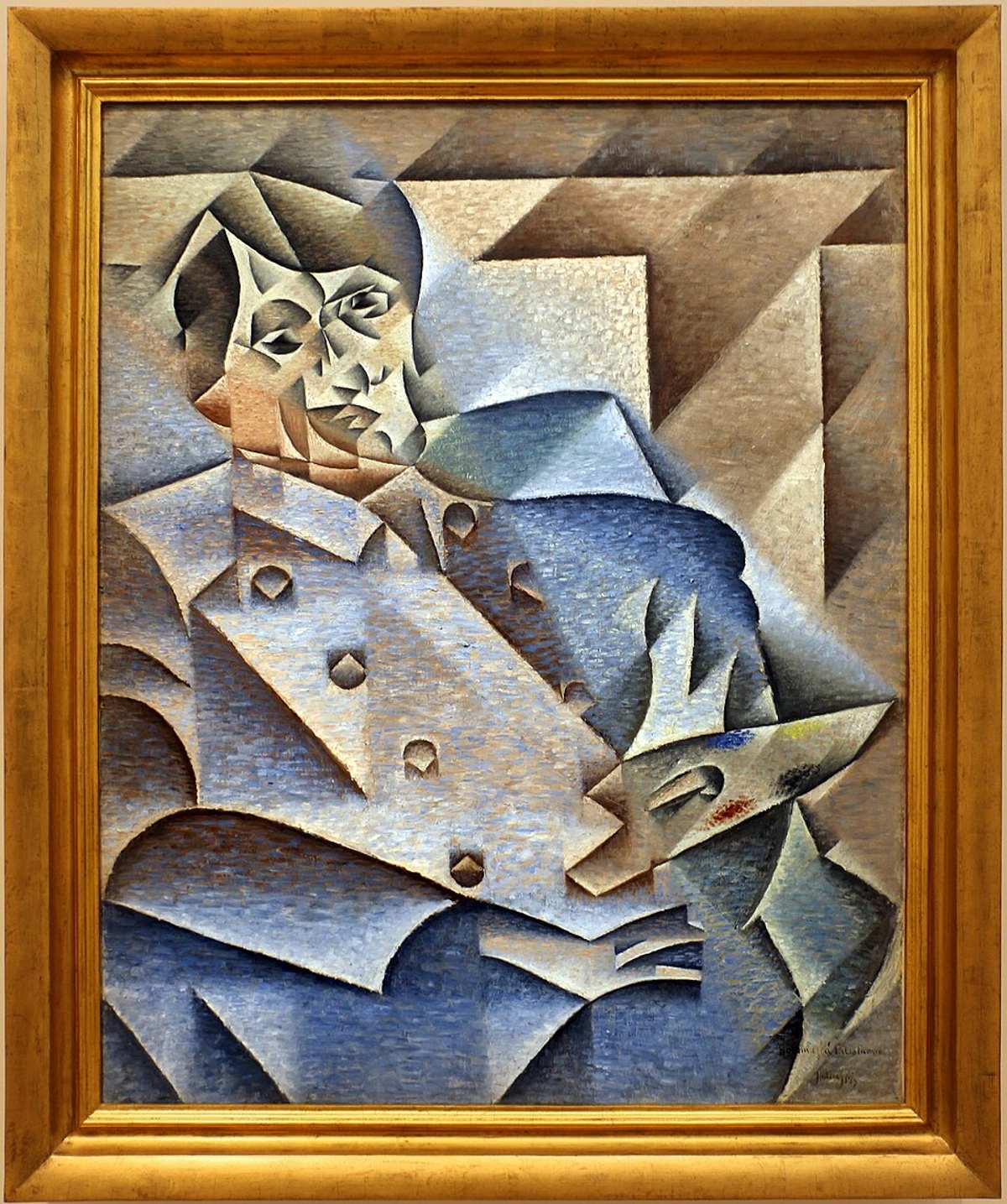
Cubism gave designers permission to break free from rigid, symmetrical layouts and explore more expressive, layered compositions. It's a principle I see echoed in some abstract art today, including my own – that idea of breaking down and reassembling reality to find a new truth, or perhaps just a new way of seeing. It's about challenging the expected view.
Surrealism: Tapping the Unconscious for Visual Impact
Surrealism, with its dreamlike imagery and unexpected juxtapositions, might seem even further removed from the practical world of design. What does a melting clock have to do with selling anything? But artists like Salvador Dalí and René Magritte opened up a whole new visual vocabulary. They delved into the bizarre, the illogical, the stuff of dreams, and somehow made it visually compelling. It's the art equivalent of that weird dream you can't shake all day.
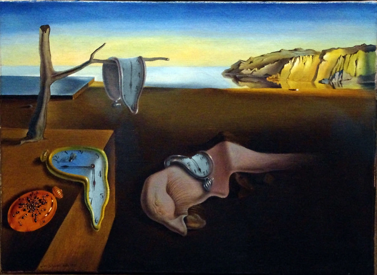
Their exploration of the subconscious, their use of visual puns, and their ability to create unsettling yet memorable images proved incredibly influential in advertising and illustration. They taught designers the power of the unexpected, the ability to grab attention and create a lasting impression by presenting familiar objects in unfamiliar ways. Think of any ad that makes you pause and think, "Wait, what?" – that's Surrealism at work. Magritte's simple, striking imagery, like the apple obscuring a face, is pure visual communication genius. It bypasses logic and speaks directly to feeling or curiosity.
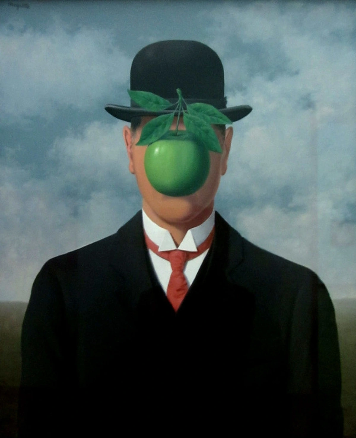
Surrealism gave designers permission to be weird, to be illogical, and to tap into emotion and intrigue rather than just presenting information directly. It's a reminder that visuals can work on a deeper, more intuitive level. It's about creating a feeling, a question, a moment of pause in a busy world.
Beyond the Big Three: More Artistic Blueprints
The influence didn't stop with Bauhaus, Cubism, and Surrealism. Many other movements offered distinct visual languages that designers eagerly adopted. It's like a buffet of visual ideas, and designers were hungry.
Art Nouveau: Flowing Lines and Organic Forms
Emerging in the late 19th century, Art Nouveau was a reaction against academic art, embracing decorative arts and aiming to create a total work of art, from architecture to furniture to posters. Its key characteristics are: flowing, organic lines inspired by nature (plants, flowers, female form), a sense of movement, and often intricate ornamentation.

In graphic design, Art Nouveau manifested in elegant, sinuous typography, decorative borders, and illustrations that integrated text and image seamlessly. Think of the iconic posters by Alphonse Mucha, with their graceful figures and elaborate floral motifs. This style brought beauty and a sense of handcrafted elegance to mass-produced prints and advertisements. It showed that commercial art could be beautiful art, not just functional.
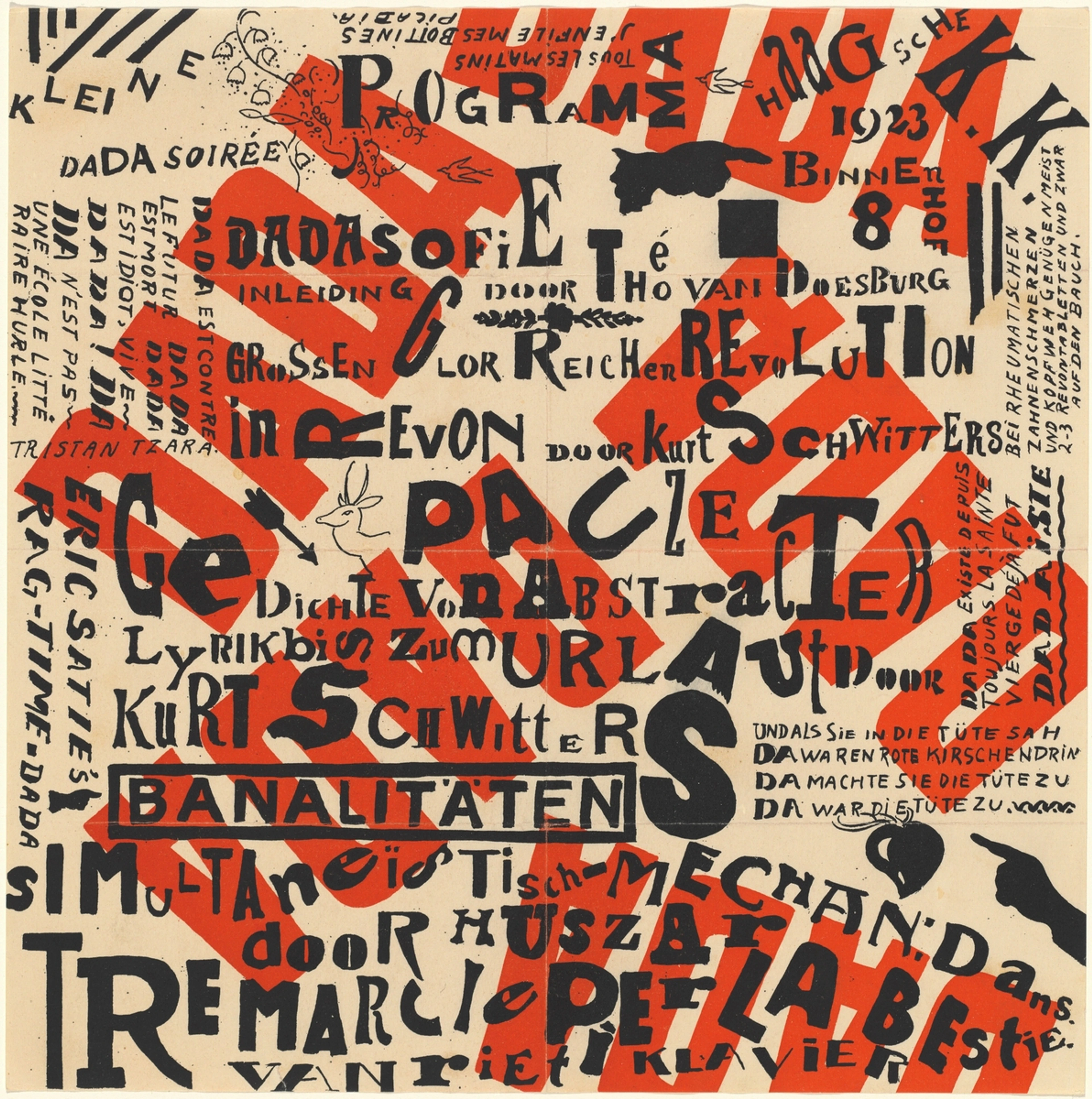
Futurism: Speed, Technology, and Dynamic Layouts
Born in Italy in the early 20th century, Futurism was obsessed with speed, technology, cars, airplanes, and the dynamism of modern life. They rejected the past and celebrated the future. Key design principles included: dynamic compositions, fragmented forms (influenced by Cubism), bold typography, and the use of diagonal lines to convey movement and energy.
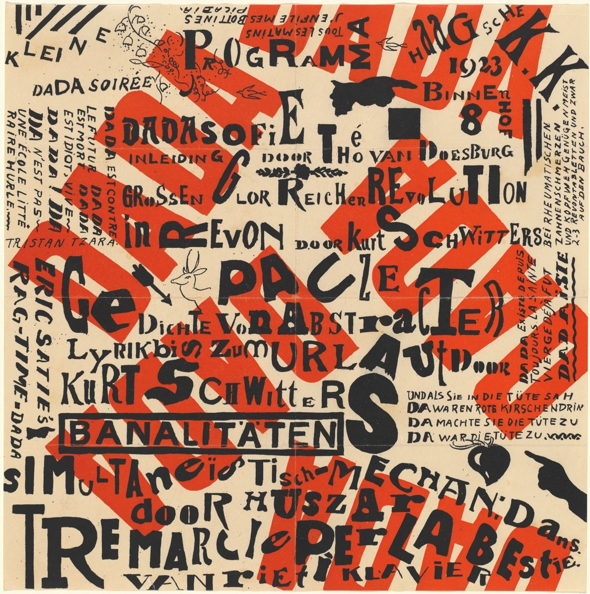
Futurist artists like Filippo Tommaso Marinetti experimented wildly with typography, creating **


