
Primary Colors: The Ultimate Guide to Unlocking Art's Foundational Hues and Mastering Color Mixing
Ever wondered what makes red, yellow, and blue so special? This definitive guide dives deep into primary colors (RYB), masters color mixing, demystifies pigment vs. light (CMYK, RGB), explores their rich history and psychology, and offers essential practical tips for every artist. Transform your creative practice today!
Primary Colors: The Ultimate Guide to Unlocking Art's Foundational Hues and Mastering Color Mixing
Ever stared at a fresh palette, perhaps feeling that familiar mix of excitement and a touch of bewilderment at the sheer number of colors? I certainly have. But amidst that colorful chaos, three hues always stand out, simple yet assertive: a vibrant red, a sunny yellow, and a deep blue. These, my friend, are the primary colors. And if you're anything like I was, you might think they're just there. But trust me, they are the foundational magic, the absolute core of everything colorful you'll ever create. It’s a concept so fundamental, so seemingly obvious, that it’s easy to overlook its profound implications for art, for mastering color mixing basics, and for how we truly perceive the visual world. For me, understanding primaries wasn't just a technical lesson; it was an 'aha!' moment that completely changed how I approached my canvas, transforming complex color theory into something beautifully logical. It was like suddenly understanding the alphabet of my visual language, realizing that these three simple elements held the key to infinite expression, capable of painting worlds. This article is your foundational guide, a place to learn exactly what are primary colors and primary colors for painting, and to truly kickstart your journey.
What Makes Colors Primary? The Unmixable Originals for Artists
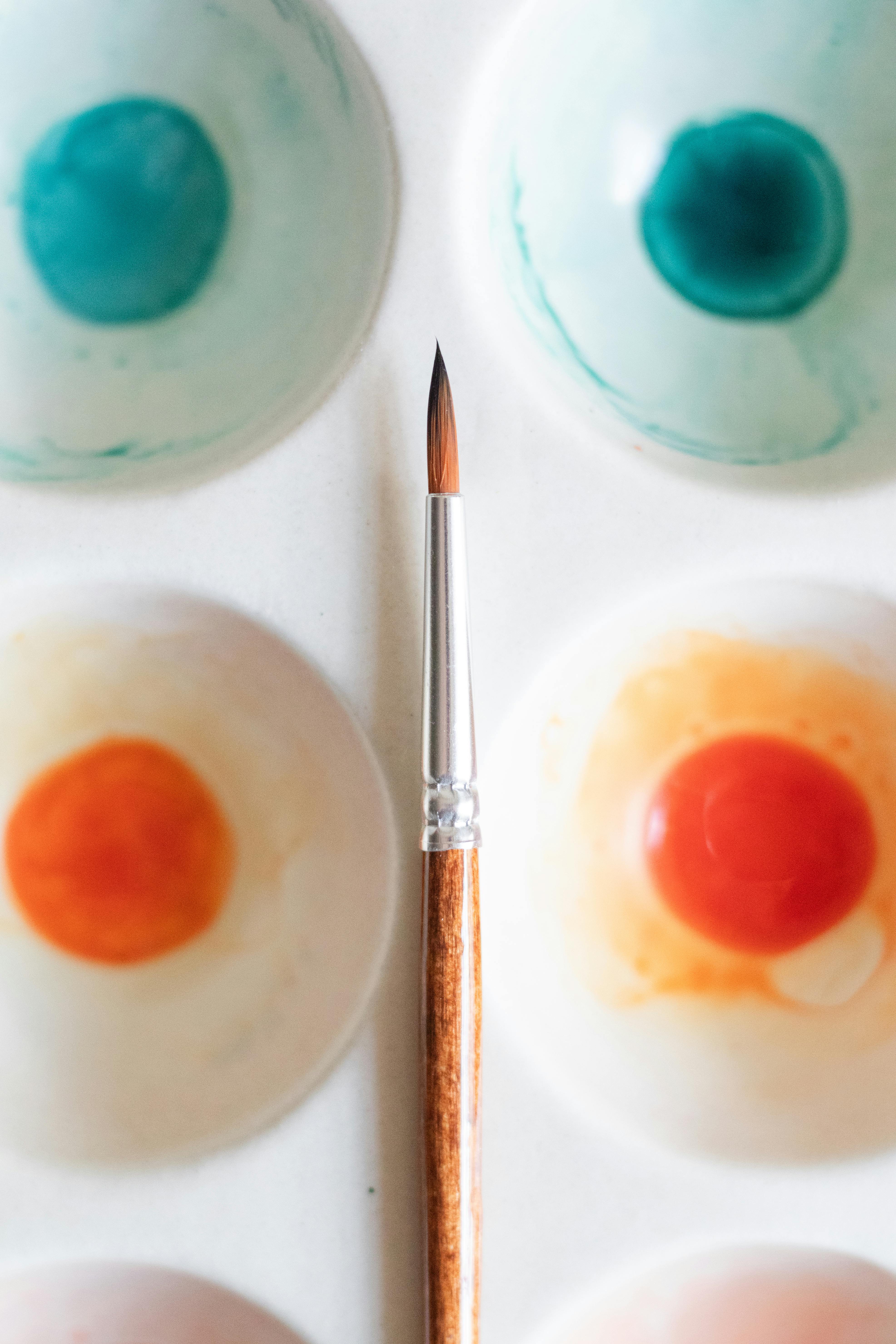
In the vast, wondrous world of art, especially when we're talking about pigments—think the paints on my palette, the dyes in fabric, or even traditional crayons—the primary colors are almost universally recognized as red, yellow, and blue (RYB). Now, you might be thinking, "Almost?" And yes, that's where the beautiful nuances of color science come in. But for us artists, slinging paint and bringing tangible visions to life, RYB are our unwavering starting point, the essential primary colors for painting.
Why are they "primary," anyway? This is where the 'aha!' moment really clicks. They are elemental building blocks. Imagine them as the three root ingredients in a cosmic kitchen; you can combine them in countless ways, but you can't create red, yellow, or blue from anything else. You simply can't create a true, vibrant red, yellow, or blue by mixing any other colors together. Try as you might to blend greens and oranges; you'll never achieve that pure, raw intensity of a primary. They are the unmixable originals, the pure hues from which every other color flows. When I say "hue," I'm talking about the pure color itself—red, blue, green—distinct from how light or dark it is (value, think brightness or darkness) or how intense or dull it is (saturation, think vividness or purity). They exist in a spectrally pure form that, when applied as pigment, primarily reflect their own specific wavelength of light, unlike mixed colors, which are essentially a blend of reflected wavelengths. In essence, they don't 'share' component hues with other colors that could be combined to form them. This is their defining characteristic: the inability to be replicated by combining other colors. This principle is foundational to effective color theory in art and color mixing basics.
Subtractive Color Mixing: How Pigments Absorb and Reflect Light
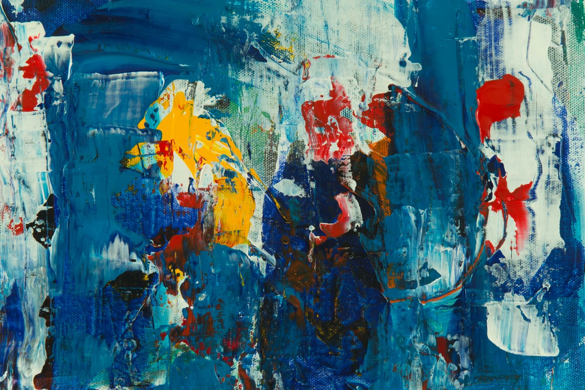
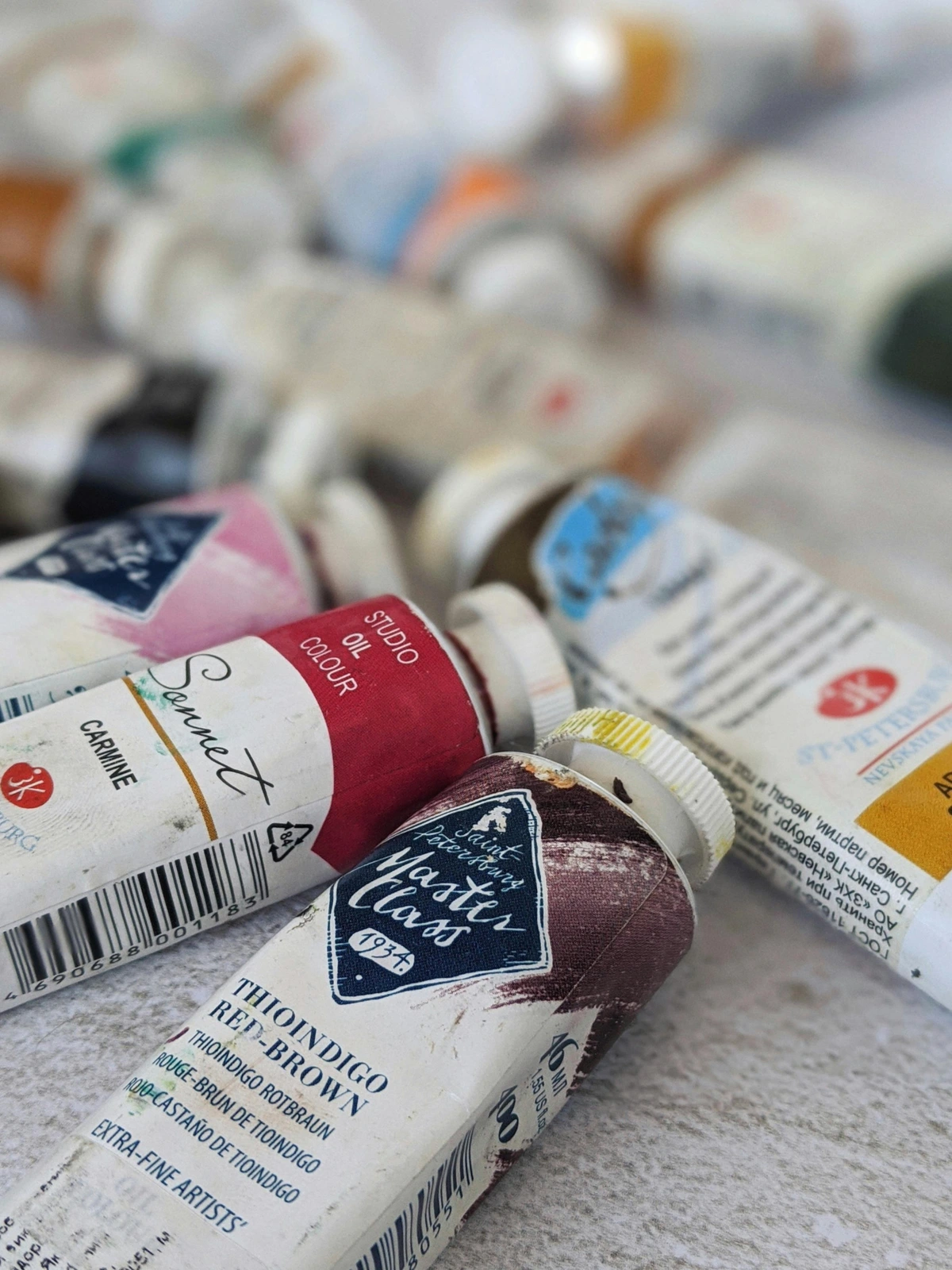
When we talk about pigments, we're deep in the realm of subtractive mixing. This means that pigments create color by absorbing certain wavelengths of light and reflecting others back to our eyes. Think of it like this: a red pigment acts like a tiny sponge, absorbing most wavelengths of light except for red, which it reflects back to your eye. The reflected red is what you see. Blue pigment absorbs everything but blue, and yellow everything but yellow. When you mix red and yellow paints, for example, the red pigment absorbs blue and green light, and the yellow pigment absorbs blue light. The only light left to reflect is orange, which is why you see orange! This constant absorption (subtraction) of light is why mixing all three primary pigments (ideally) results in a very dark brown or black—nearly all light has been absorbed. The purity of your primary pigments significantly impacts the vibrancy of your mixes; an impure primary will absorb a broader range of light, leading to duller, less true secondary and tertiary colors. This is why investing in quality pigments for your foundational colors is so important. Also, consider their opacity (how much they cover what's underneath) versus transparency (how much underlying layers show through). Opaque primaries create solid, bold mixes, while transparent ones allow for luminous layers and glazes. When I look at an intense abstract piece, the depth and vibrancy often stem from how consciously the artist has handled these subtractive principles. For more on the materials, check out a definitive guide to paint types for artists.
A Journey Through History: How RYB Became Our Artistic Foundation
The dominance of red, yellow, and blue as pigment primaries isn't just arbitrary; it's steeped in centuries of artistic tradition and practical discovery. Long before scientific color models became precise, artists intuitively understood that these three colors provided the broadest range for mixing. Think back to ancient civilizations like the Egyptians, Greeks, and Romans; they sourced reds from iron-rich ochres, vibrant yellows from plant extracts, and deep blues from rare minerals like lapis lazuli. These were among the most stable and vibrant pigments available, forming the backbone of their artistic and decorative practices. Crucially, these foundational hues could be combined to yield a surprisingly vast spectrum of other shades, forming the backbone of Renaissance palettes and beyond. Early chemists and artisans, like those developing dyes and paints, experimented tirelessly, solidifying RYB's practical utility. The limitations of historical pigments often meant that a truly pure red, yellow, or blue was hard to come by, making RYB the most effective practical system for artists for centuries. It's truly the cornerstone of traditional color mixing basics.
Figures like Leonardo da Vinci, in his Treatise on Painting, delved into color mixing, noting red, yellow, and blue as fundamental. Though his understanding was empirical rather than purely scientific, his keen observation laid groundwork for future artists. Later, Isaac Newton's groundbreaking work in the 17th century illuminated the spectrum of light, but the world of pigments, with its subtractive nature, evolved along a different, equally vital path. Johann Wolfgang von Goethe, with his Theory of Colours in the early 19th century, challenged Newton's purely physical approach, arguing for the subjective human experience of color and its profound psychological and physiological impact, influencing artists like J.M.W. Turner. While he didn't propose new primaries, his work underscored the emotional power of the colors artists were already using. The RYB model, while not perfect in a purely scientific sense (as we'll explore later), became the established practical guide for painters, dyers, and artisans, a legacy passed down through studios and academies. It's the system that generations of artists, including myself, learned to navigate to unlock the universe of color.
Despite its long history, the RYB model does have its limitations. While it works well for many mixtures, it struggles to produce truly vibrant secondary colors like clean purples and greens. This is because traditional red and blue pigments often contain subtle undertones of their neighbors on the color wheel, leading to slightly desaturated mixes. For example, many traditional reds lean orange, and many blues lean green, which can make mixing a pure purple or a brilliant green challenging. This is why modern color science eventually sought out purer primary pigments, as we'll see when we discuss CMYK, but the historical endurance of RYB speaks volumes about its practical efficacy with the materials available at the time.

Navigating the Nuances: Color's Dynamic Nature
Just knowing the mixing recipes for primary colors for painting is one thing; truly seeing them in action is another. It wasn't until I started actively observing color temperature and color relativity that the full nuance of primaries began to unfold for me. Color isn't just a static entity; it's a dynamic, shifting phenomenon that will transform your understanding of how artists use color. This is where the magic of perception truly comes alive, and where your palette becomes an extension of your intuition.

The Subtle Heat and Chill: Understanding Color Temperature within Primaries
Even within a single primary color, there are subtle variations that lean either warm or cool. Think of it like this: a cool red and a warm red aren't just different shades; they're like two different personalities that behave uniquely when mixed. This understanding truly elevates your color mixing basics. It's like knowing not all sugar is the same—granulated, brown, powdered—each affects a recipe differently. It's these subtle undertones that unlock true mastery.
Here’s how I think about the temperature variations within our primary colors:
Primary Hue | Warm Variation (leaning towards its warm neighbor) | Cool Variation (leaning towards its cool neighbor) |
|---|---|---|
| Red | Cadmium Red, Vermilion (fiery, pushes forward, leans orange) | Alizarin Crimson, Quinacridone Magenta (subdued, recedes, leans blue) |
| Yellow | Cadmium Yellow, Indian Yellow (sunny, inviting, leans orange) | Lemon Yellow, Hansa Yellow (sharp, acidic, leans green) |
| Blue | Ultramarine Blue (rich, almost purple warmth, often denser/opaque) | Phthalo Blue, Cerulean Blue (crisp, airy, distant, leans green, often more transparent/intense) |
Understanding these inherent temperatures within your primary colors (red, yellow, blue) is a game-changer for mixing. A warm yellow mixed with a warm blue will yield a different green than a cool yellow mixed with a cool blue. For example, a Cadmium Yellow (warm, leaning orange) and Ultramarine Blue (warm, leaning purple) might give you a more muted, earthy olive green, because the orange and purple undertones slightly neutralize each other. In contrast, a Lemon Yellow (cool, leaning green) and Phthalo Blue (cool, leaning green) will likely produce a much brighter, more vivid emerald or sap green, as their green undertones amplify each other. This phenomenon, known as hue shift, adds another layer of control to your color mixing basics and is how I achieve some of my most vibrant palettes in abstract painting. Think of it like baking: using different types of flour (even if both are wheat) will subtly change the texture and rise of your bread. Each primary has its own "flavor" that impacts the final mix.
The Shifting Sands of Perception: Color Relativity and Accessibility
This is where it gets truly fascinating. Color relativity means that a color's appearance can drastically change depending on the colors surrounding it. A pure primary red might look warmer next to a cool blue, but cooler next to a fiery orange. A yellow could seem brighter against a dark background or duller against another vibrant yellow. Primaries, with their inherent intensity, are particularly susceptible to this phenomenon. This dynamic interplay is something I constantly explore in my abstract pieces, using context to amplify or subdue a hue without actually changing the pigment itself. It's a powerful tool in an artist's arsenal, fundamentally impacting understanding balance in art composition. Have you ever noticed how a yellow dress seems to glow in sunlight, but appears duller under fluorescent lights? That's color relativity at play! Imagine a lone red square on a blue canvas versus the same red square on a yellow canvas; its very essence seems to shift.
As artists, it's also important to consider color blindness. Roughly 1 in 12 men and 1 in 200 women experience some form of color vision deficiency. While you can't change their perception, understanding how certain primary combinations (like red and green, which can appear similar for those with protanopia or deuteranopia, the most common forms of red-green color blindness) can be difficult to distinguish can inform your artistic choices. Relying on strong contrasts in value (lightness/darkness) and saturation (intensity) in addition to hue ensures your artwork remains visually engaging and communicative for a wider audience. This mindful approach to color makes art more accessible to all, reinforcing that the impact of color goes beyond mere visual appeal.
Optical Mixing and Broken Color: When the Eye Does the Work
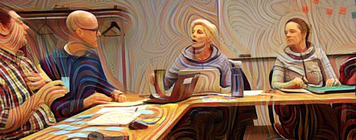
Beyond mixing pigments on a palette, there's a fascinating phenomenon called optical mixing. This is where small dots or strokes of pure colors (often primaries) are placed close together on a canvas, and our eyes, when viewing from a distance, blend them to perceive a new color. Think of artists like Georges Seurat and the Pointillists. They didn't mix green on their palette; they placed tiny dots of yellow and blue next to each other, allowing your eye to do the mixing and create a luminous, vibrant green. It's a beautiful example of what are primary colors at play, not just in the tube, but in our very perception. This technique, often called broken color, was famously used by Impressionists and Post-Impressionists to create shimmering light and atmospheric effects, adding a vibrant, almost ethereal quality to their work. It’s like how tiny red, green, and blue pixels on your screen blend to create the full spectrum you see—a concept that makes you wonder what primary colors are doing in digital screens, or even in the realm of digital art where color principles are simulated. (I'm a little skeptical about some of the hype around NFTs, but the underlying color science is solid, no matter the medium, physical or digital.)

The Magic Unleashed: Crafting the Spectrum from Three Primary Colors
This is where the fun truly begins! With just red, yellow, and blue, your artistic possibilities become endless. It feels a bit like alchemy, taking these three fundamental elements and, by combining them in various proportions, creating an entire, breathtaking spectrum. This is where understanding primary colors for painting really comes alive.
Secondary Colors: The First Harmony
When you mix two primary colors in roughly equal parts, you get a secondary color. This is pretty intuitive, a delightful transformation:

- Red + Yellow = Orange
- Yellow + Blue = Green
- Blue + Red = Purple (or Violet)
I remember as a kid being absolutely fascinated by this. It felt like genuine magic, turning two distinct colors into something entirely new. Even now, sometimes I'll deliberately try to mix the perfect secondary, marveling at the process. It's the first step in expanding your palette without needing more tubes of paint, the real kick-off to mastering color mixing basics. Try a quick exercise: mix red and yellow to create five different shades of orange, noting how subtle changes in proportion alter the hue. It's truly eye-opening! It's like a basic recipe, but with endless variations just by adjusting the spices.

Tertiary Colors: Adding Depth and Nuance
Take it a step further: mix a primary color with an adjacent secondary color, and you get a tertiary color. These are the more nuanced, sophisticated hues that truly start to fill out your palette and add complexity. The beauty here is in the subtle shifts—a red-orange can lean more towards fiery red or a mellow orange, creating an incredible range of expression. The quality and specific 'temperature' of your initial primary and secondary pigments will significantly impact the resulting tertiary hue, leading to endless variations. For instance, mixing a warm yellow (like Cadmium Yellow, leaning orange) with a cool blue (like Phthalo Blue, leaning green) will give you a different green than mixing a cool yellow (Lemon Yellow, leaning green) with a warm blue (Ultramarine, leaning purple). This 'hue shift,' where the exact combination slightly alters the outcome, is something to continually experiment with. A vivid Lemon Yellow mixed with a brilliant Phthalo Blue, for example, might yield a sharp, almost electric green (think a spring leaf green), whereas a warmer Cadmium Yellow and Ultramarine Blue might give you a deeper, more muted olive or forest green. These tertiary hues, with their nuanced emotional weight, are essential for crafting vibrant palettes in abstract painting.
- Red-Orange (often feels energetic, like a fiery sunset)
- Yellow-Orange (optimistic, vibrant, like a fresh citrus peel)
- Yellow-Green (fresh, new growth, sometimes acidic)
- Blue-Green (often called Teal or Aqua, depending on proportions—calming yet sophisticated, like deep ocean waters)
- Blue-Purple (or Indigo—mysterious, profound, often melancholic)
- Red-Purple (or Magenta/Crimson—passionate, dramatic, regal)
They are named by combining the primary and adjacent secondary, with the primary listed first. It's a handy trick to remember the recipe! This is where the spectrum truly blossoms, and you start to see how infinite the possibilities are for creating complex abstract worlds.

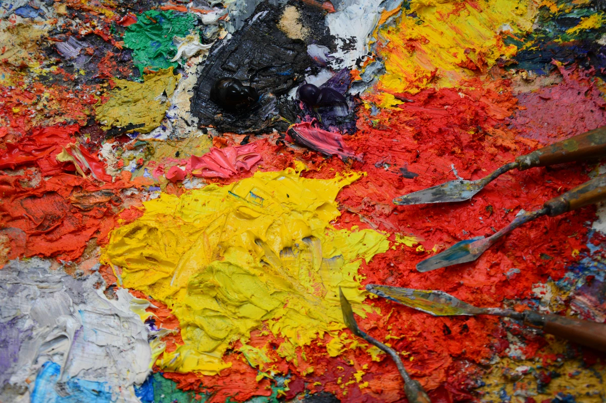
From Pure Hues to Earthy Tones: Mastering "Mud" Intentionally
Ah, "mud"—the bane of many a beginner painter! For years, 'mud' was my four-letter word in the studio, until I realized it held its own kind of magic. When you mix all three primary colors together (or a primary with its complementary secondary, like red and green), you get those rich, earthy browns, olives, and muted grays. These aren't mistakes; they're essential for grounding your vibrant compositions, for creating realistic shadows, textures, and natural tones that make your bright colors sing even louder. I once created a very dynamic, almost neon abstract piece, but it felt like it was floating. Adding a deep, intentionally mixed reddish-brown 'mud' to the shadows immediately anchored it, giving it a gravitas I hadn't realized was missing. It made the vibrant pinks and electric blues pop even more. By carefully adjusting the ratios—perhaps adding more red for a warm sepia, more blue for a cool neutral gray, or more yellow for a mossy olive—you can create an incredible range of sophisticated, muted tones. The trick is to achieve these muted tones intentionally. Try adding a tiny bit of white or gray to a mixed color to see how it mutes and softens the hue without making it truly "muddy." It's about learning to create mud intentionally, transforming accidental mess into deliberate nuance. These muted tones carry their own psychological weight, often evoking feelings of earthiness, stability, age, or melancholy, adding profound depth that pure primaries can't. This approach is key to my approach to color mixing: creating vibrant palettes in abstract painting.
Navigating the Nuances: Common Color Mixing Challenges and Solutions
Even with the simplest primary colors, mixing can present hurdles. Here are a few I've personally wrestled with, and how I learned to navigate them, all critical for your color mixing basics journey:
- Overmixing & Dullness: Ever mixed a color until it just looked dull? That's often overmixing, crushing the pigment particles too much or incorporating too much air. My solution? Stop just before you think it's perfectly blended; a little texture can be beautiful. Sometimes a seemingly "muddy" initial mix can surprise you with unexpected depth if you leave it alone. Try leaving subtle streaks of unmixed color for a lively effect! Practical Exercise: Try mixing a vibrant orange from red and yellow. Now, take a portion and deliberately overmix it until it dulls. Observe the difference in saturation. What did you learn?
- "Muddy" by Accident: Beyond intentional mud, accidental muddy colors often happen when you try to mix too many colors at once, or when you use a brush that hasn't been properly cleaned between colors. Keep your tools clean and try to stick to a maximum of three pigments for any specific mix. Consider having multiple water jars for watercolors or separate rags for different color families in oils/acrylics. If a mix goes muddy unintentionally, try adding a tiny bit of its complementary color to neutralize it, or even a touch of white to lighten it and see if it can be salvaged for a muted background tone. It's a common struggle, don't get discouraged!
- Binder Impact: The medium matters immensely! A binder is the substance in paint that holds the pigment particles together and adheres them to a surface. Different binders behave differently. For example, gum arabic in watercolors allows for translucent washes and layers, requiring a different mixing approach than the linseed oil in oils, which offers longer blending times and subtle gradations. Acrylics, with their polymer binders, dry fast, demanding quicker decisions and often layering. Adapt your mixing technique to your chosen binder. For instance, thicker acrylics might benefit from mixing on the palette, while watery acrylics or oils might be mixed directly on the canvas using wet-on-wet techniques. For essential supplies, check out best watercolor sets for beginners or essential watercolor supplies for beginners.
- Achieving Vibrant Greens or Purples: Sometimes, a yellow and blue give you a dull green, or a red and blue a muddy purple. This often comes down to the temperature of your primaries, as we discussed earlier with hue shift. A cool yellow (like lemon yellow, which often leans slightly green) and a cool blue (like phthalo blue, also leaning green) usually make a cleaner, brighter green. Conversely, a warm red (like alizarin crimson, leaning purple) and a warm blue (like ultramarine, leaning purple) can yield a richer, more vibrant purple. Remember, not all reds are inherently warm, nor all blues cool; it's about their specific undertones and how they interact. A Cadmium Red Light, which is very warm, will produce a different purple with Ultramarine than a cool Quinacridone Magenta would. Experimentation is your best teacher here! Practical Exercise: Take a warm yellow (Cadmium Yellow) and a cool yellow (Lemon Yellow). Mix each with the same cool blue (Phthalo Blue). Compare the greens you get. Repeat for a warm red (Alizarin Crimson) and a cool red (Cadmium Red Light) mixed with the same warm blue (Ultramarine Blue) to make purples. What surprising differences do you see?
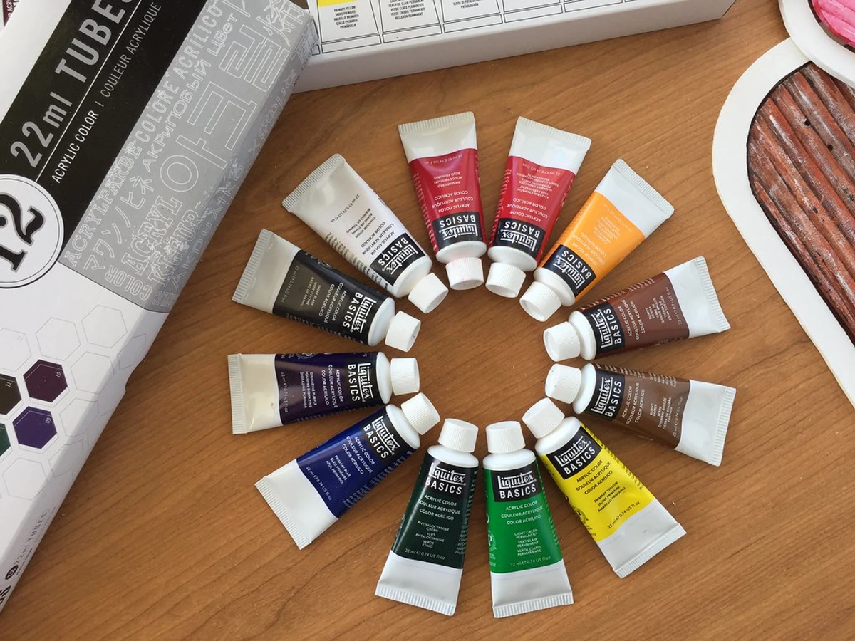
- Pigment Quality and Granulation: Beyond just temperature, the specific pigment itself matters. Artist-grade pigments generally have a higher pigment load (more concentrated color), better lightfastness (resisting fading over time – crucial for longevity!), and more consistent granulation (how the pigment particles settle, creating texture). For example, some Ultramarine Blues are known for beautiful granulation, creating a lovely speckled texture when dry, while Phthalo Blues are usually very smooth. Understanding these characteristics allows for more predictable and expressive mixes. Don't be afraid to read the pigment information on your paint tubes! It's like knowing the quality of your flour before you bake. Practical Exercise: If you have different grades of primary paints (e.g., student vs. artist grade), mix a secondary color with each. Observe the vibrancy, consistency, and any textural differences. Can you feel the difference in how they mix?
The Color Mixing Spectrum: A Quick Guide to Primary Colors for Painting
Here’s a simplified table to keep things clear and to offer a little personal reflection, a mini-cheat sheet for your color mixing basics journey:
Starting Colors (Primaries) | Resulting Color (Secondary) | Example | My Personal Take |
|---|---|---|---|
| Red + Yellow | Orange | Sunset, Campfire | Warm, energetic, a burst of optimism. Orange always feels bold, a bridge between two fiery spirits, and often takes center stage in my more dynamic pieces, signifying growth and adventure. It’s impossible to ignore, often screaming "LOOK AT ME!" in an abstract composition. |
| Yellow + Blue | Green | Forest, New Leaf | Calm, natural, growth, the quiet hum of nature. From vibrant spring greens to deep forest olives, green reminds me of renewal and quiet strength, essential for grounding abstract landscapes or bringing a sense of life to any composition. The right green can completely shift the mood, offering peace or vivid energy. |
| Blue + Red | Purple | Twilight, Plum | Mysterious, regal, deep introspection, quiet power. Purple often feels spiritual to me, or like the calm before a storm—complex, inviting, and sometimes a little melancholic, perfect for adding depth to the emotional language of color in abstract art. It’s a color that demands contemplation, a hushed whisper in the visual symphony. |
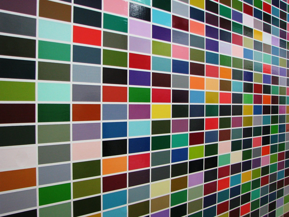
Demystifying Different Color Systems: Light, Print, and Pigment
Even after years of painting, I still encounter questions or stumble across my own lingering assumptions about primary colors. It's a journey, not a destination, right? Here's where we untangle some common confusions and shed light on different color systems, moving beyond just what are primary colors in a paint tube. What are primary colors depends entirely on whether you're working with light or pigment. This section is crucial for anyone trying to master the definitive guide to understanding light in art or the art of display: how to light and position abstract art for maximum impact.

[credit], [licence]
[credit], [licence]
Common Misconceptions About Primary Colors (and Why They're Wrong!)
Before we dive into other systems, let's clear up some widespread misunderstandings I've bumped into over the years, especially regarding primary colors for painting:
- "You must only use RYB pigments": While RYB are the traditional artist's primaries, modern pigments and color science have shown that CMY (Cyan, Magenta, Yellow) inks often offer a wider and cleaner color gamut (think of it as the full range of colors that can be reproduced, like the full range of notes a piano can play) for mixing, especially in printing. Many professional artists now use CMY-based primary sets (like Quinacridone Magenta, Phthalo Blue, Hansa Yellow) to achieve incredibly vibrant and clean mixes, allowing them to truly unlock the psychology of color in abstract art: beyond basic hues. It’s about choosing the right tool for the job. You wouldn't use a screwdriver to hammer a nail, right? The same applies to choosing your primaries for maximum effect. These modern primaries, for example, yield far cleaner and more vibrant purples and greens than traditional cadmiums or ultramarines might. Why? Because their spectral purity allows for more precise absorption of unwanted light, leading to a much broader and more intense range of mixed hues. This is a game-changer for those chasing truly luminous colors.
- "Primary colors are always the most vibrant": While primaries are intense and pure, vibrant doesn't always mean "best." Sometimes, a carefully mixed secondary or tertiary color, especially one that takes into account color temperature and relativity, can be far more impactful and expressive in a composition than an unadulterated primary. It's all about intentionality and what the piece demands.
- "Mixing all three primaries always creates black": In theory, mixing perfect primary pigments will result in black (due to full light absorption). In practice, with real paints, you'll almost always get a very dark, often muddy brown. This is because real-world pigments aren't perfectly pure, and light absorption is never entirely complete. Embrace the beautiful browns you can create—they are the backbone of natural shadows and earthy tones! Practical Exercise: Mix equal parts of your red, yellow, and blue primary paints. Observe the resulting dark brown. Now, try adjusting the ratios slightly; notice how it shifts to a warmer reddish-brown or a cooler bluish-brown. See how much control you can exert over "mud"?
- "Black and white are primary colors": No, for pigment, black and white are not primary colors. While they're incredibly important in art—white lightens, black darkens, and both define contrast—they don't function as building blocks for creating other hues in the same way red, yellow, and blue do. Black pigment is the absorption of all colors, making it the absence of reflected color in this system. White pigment is the reflection of all colors. In essence, they don't add new hues to the mix; they manipulate the value (lightness or darkness) and saturation of existing hues.
- "All reds are warm, all blues are cool": As we explored in color temperature, even within a single primary, there are warm and cool variations. A cool red (like Alizarin Crimson) has blue undertones, while a warm blue (like Ultramarine) has red undertones. This nuance is critical for advanced mixing, and ignoring it is like trying to compose music with only one note—you're missing a whole symphony of possibilities.
Printers' Palette: CMYK Explained
"But my printer uses Magenta, Cyan, and Yellow!" This is a fantastic point, and it highlights a crucial difference between traditional artist primaries (RYB) and the world of printing. Printers use CMYK: Cyan, Magenta, Yellow, and Key (black). These are also subtractive primaries, but they represent a more modern, scientifically optimized set for printing. They can produce a significantly wider gamut when mixed with inks compared to traditional RYB. Why? Because magenta and cyan are spectrally purer than traditional red and blue pigments. This means they absorb unwanted light more cleanly, allowing for cleaner, more accurate secondary and tertiary mixes, which is crucial for precise color reproduction in printing. The K for black is added because mixing CMY perfectly to get a true, rich black is difficult, and dedicated black ink is more economical and produces sharper text. For artists working digitally or preparing files for print, understanding CMYK is essential for ensuring color accuracy across different mediums. It's a system built for efficiency and precise reproduction, a direct descendant of the principles artists discovered centuries ago, but refined by science. If you're designing digitally, especially for print, working in a CMYK color space ensures your on-screen colors will translate accurately to paper, minimizing surprises. It's the practical application of advanced color theory for the masses.
The Light Fantastic: RGB for Screens & Digital Art
And now for the truly mind-bending part—the world of light! When you're talking about light, the primary colors are Red, Green, and Blue (RGB). Think about your TV screen, computer monitor, or phone display. These are additive primaries—meaning when you mix them (or add them together by shining them on a surface), you get white light. It's the opposite principle to pigments. Our paint primaries, RYB (or CMY), are subtractive; ideally, mixing them all absorbs all light, giving you something close to black or a very dark brown. With RGB, you're adding light. When red, green, and blue light are fully combined, they create white light. Two different systems, both fundamental, and both crucial for understanding the full spectrum of color! What are primary colors depends entirely on whether you're working with light or pigment. It's a distinction that once stumped me, but now, it’s a huge 'aha!' moment for understanding color as a whole. You might also encounter other color models like HSL (Hue, Saturation, Lightness) or LAB (CIELAB) in digital contexts; these models describe color in ways that are more intuitive for human perception, but they are built upon the foundational principles of RGB (for screens) or CMYK (for print).
For digital artists, knowing RGB is as fundamental as knowing RYB for painters. Digital painting software utilizes these RGB primaries within color pickers, allowing artists to select specific shades to evoke certain feelings, just as they would with physical paints. Understanding color spaces (like sRGB or Adobe RGB) in digital art, which define the range of colors that can be displayed or reproduced, is also crucial, as these spaces are built around specific primary red, green, and blue points. While digital representations of color can be incredibly precise, offering new avenues for sharing art, even in realms like digital publishing, the tactile experience and subtle nuances of physical pigments still offer something uniquely human and expressive.
Quick Reference: Different Color Systems
To keep these distinctions clear, here's a quick summary of the main color systems:
System | Primaries | Nature | Application | When Mixed (ideally) |
|---|---|---|---|---|
| RYB | Red, Yellow, Blue | Subtractive | Traditional Pigments/Paints | Black/Dark Brown |
| CMYK | Cyan, Magenta, Yellow, Key (Black) | Subtractive | Commercial Printing Inks | Black |
| RGB | Red, Green, Blue | Additive | Light (Screens, Monitors) | White |
The Artist's Secret Weapon: Primaries in Practice and Psychology
Once we grasp the mechanics of mixing, the true power of primary colors lies in how they shape our visual language and evoke profound emotional responses. For an artist, especially one working in abstraction like myself, understanding primary colors goes far beyond simple mixing recipes. It's about wielding their power strategically, understanding their inherent impact on a composition, and how they interact with each other to build an entire visual world. This knowledge transforms simple pigments into a potent language. The profound importance of primary colors for artists cannot be overstated.
Building Visual Language: Color Harmony and Impact
These colors carry an inherent strength, a raw intensity that can completely dominate a composition or provide crucial balance. They are the bedrock for all color relationships. When you grasp primaries, you naturally begin to understand color harmony—how colors work together to create a pleasing or intentional effect. For instance, you can identify complementary colors (opposites on the color wheel, like red and green) which, when placed together, create intense visual vibration, a powerful contrast that makes both colors appear more vivid. When a primary is mixed with its complementary secondary (e.g., Red with Green, Yellow with Purple, Blue with Orange), they neutralize each other, leading to those rich earthy tones we discussed earlier, effectively desaturating the mix. Then there are analogous colors (neighbors on the wheel, like yellow, yellow-orange, orange) that create serene, harmonious palettes.
Beyond these, you might explore:
- Monochromatic schemes: Using different values and saturations of a single hue for subtle elegance.
- Triadic color schemes: Three colors equally spaced on the color wheel, like red, yellow, and blue themselves, or orange, green, and purple, for vibrant balance.
- Split-complementary schemes: A base color plus the two colors adjacent to its complement, for rich but less jarring contrasts than a direct complementary pair.
- Tetradic (or Rectangular) schemes: Four colors arranged into two complementary pairs, forming a rectangle on the color wheel, for a rich and varied palette.
The possibilities for how artists use color are endless, but they all circle back to these fundamental relationships, rooted in the primary colors for painting.
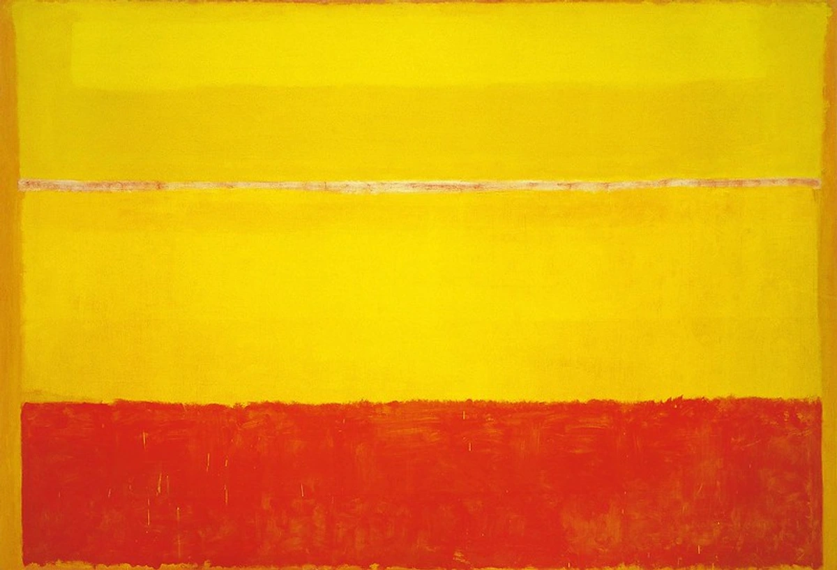
Emotional Resonance: The Psychology of Primary, Secondary, and Tertiary Hues
Primaries aren't just technical; they're deeply psychological. They evoke powerful, often universal emotions and associations that can transform any piece into a profound statement:
- Red: Passion, energy, danger, love, warmth. It's a color that demands attention, often igniting a fiery response. It can make a bold statement, drawing the eye and stirring intense feelings. For me, it's the heartbeat of a composition, as I explore in the fiery heart: how red ignites passion and energy in my abstract compositions.
- Yellow: Joy, optimism, caution, intellect, sunlight. It's an expansive, luminous color that brings light to any palette, often associated with happiness and enlightenment, though sometimes with warning. My own work often leans into the vibrant optimism of yellow, as discussed in the psychology of yellow in my art: joy, optimism, and light.
- Blue: Calm, depth, sadness, serenity, stability. It's a grounding, often introspective color that can evoke vastness or quiet contemplation, bringing a sense of peace or profound emotion. For me, it's a journey into quiet introspection, often embodying depth, as I reflect upon in the psychology of blue in abstract art: calm, depth, and emotion.
But the emotional language extends beyond the primaries. Secondary colors, like orange (a blend of red's energy and yellow's joy), often feel celebratory and creative. Greens (yellow's optimism, blue's serenity) evoke nature, balance, and renewal. Purples (red's passion, blue's mystery) can be regal, spiritual, or melancholic. And the subtle complexity of tertiary colors and earthy tones? They add layers of sophistication, age, grounding, or a quiet melancholy that can make a vibrant piece truly sing. Understanding these inherent emotional qualities helps you to wield primaries not just as physical pigments, but as potent communicators of mood and message. It's all part of the emotional language of color in abstract art.
Primary Colors in Design: Beyond the Canvas
The power of primary colors isn't confined to fine art. In graphic design, branding, and illustration, these foundational hues are strategic tools for communication and emotional connection. Think about it: McDonald's iconic red and yellow—energy, hunger, joy, speed. IBM's deep, authoritative blue—trust, stability, professionalism. These choices aren't random; they tap into the universal psychological impact of primaries to convey brand personality at a glance. Designers leverage their bold impact for clarity, hierarchy, and to create memorable visual identities. A strong primary palette can cut through visual noise, making a design instantly recognizable and impactful across various media.
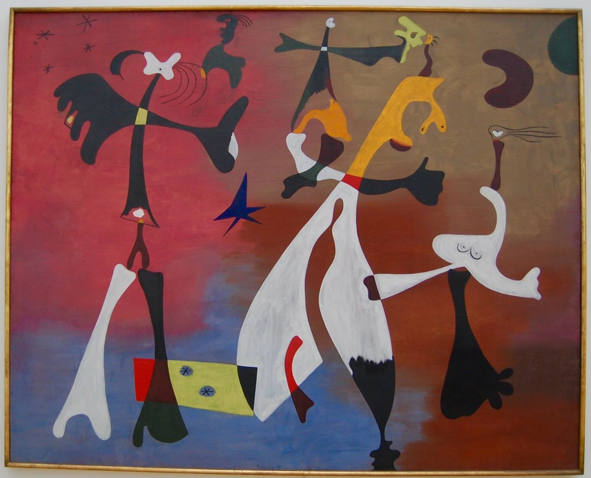
Iconic Palettes: How Artists Mastered Primaries Throughout History
History is replete with artists who recognized the raw power of primaries, transforming them into iconic works and even defining entire art movements. They stand as testaments to what are primary colors' enduring impact.
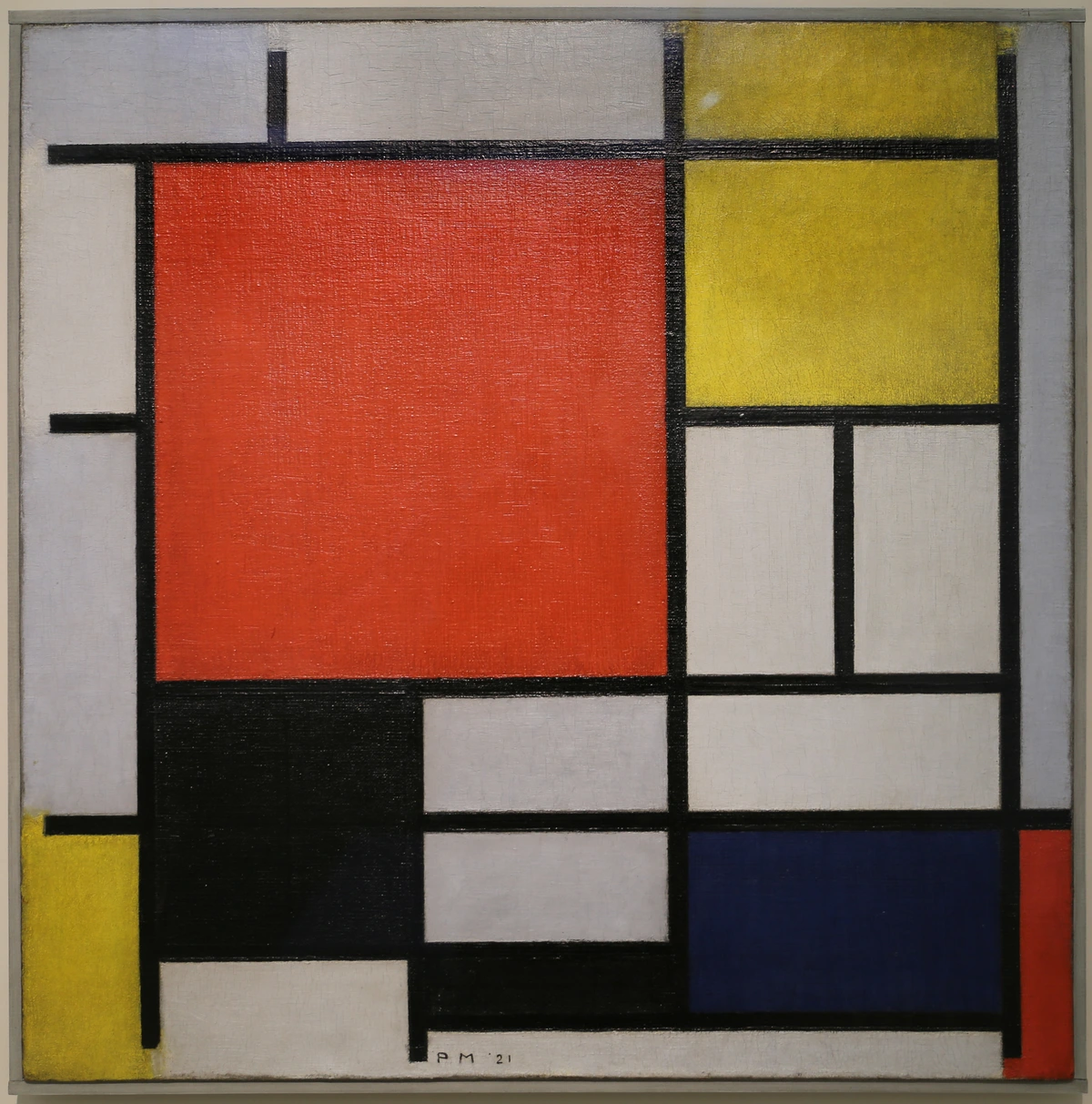
- De Stijl: Think of Piet Mondrian. He almost exclusively used
primary colors(along with black and white) to create compositions that felt utterly balanced and dynamic, despite their limited palette. The stark contrasts and geometric precision of his red, yellow, and blue squares, framed by black lines, created a universal aesthetic that profoundly influenced modern design and architecture. He applied these colors with meticulous flatness, emphasizing purity and order, demonstrating the sheer power of these fundamental hues to create geometric harmony and universal appeal. You can dive deeper into the ultimate guide to abstract art movements and the definitive guide to understanding abstract art.
- Pop Art: Artists like Roy Lichtenstein embraced primaries for their bold, graphic impact, mirroring the commercial printing processes of the time. His comic-strip inspired works often used unmixed red, yellow, and blue, along with black outlines and Ben-Day dots, to create flat, impactful images that resonated with popular culture, using
primary colors for paintingwith a distinctly modern twist. Yayoi Kusama also often uses boldprimary colorsin her vibrant, repetitive patterns and sculptures, creating an energetic and playful pop aesthetic, proving how these fundamental colors can be both serious and whimsical.

- Fauvism: Think of Henri Matisse or André Derain. The Fauves (meaning "wild beasts") used
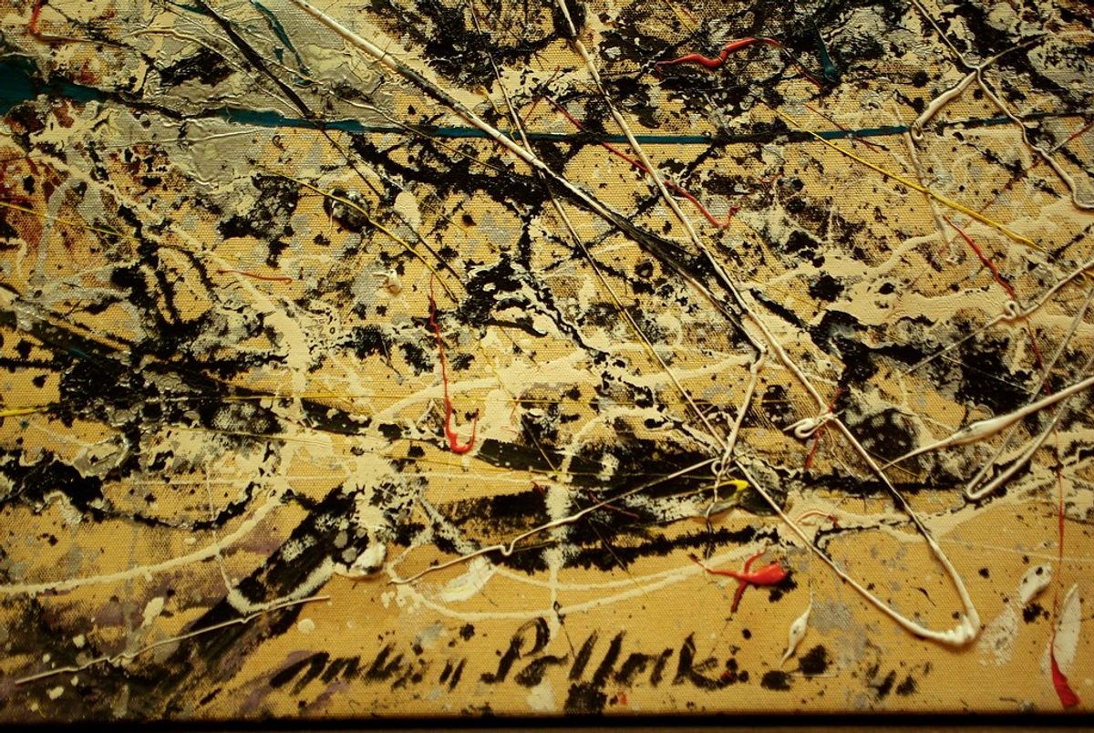
primary colors, and other vibrant hues, not for realistic representation, but for emotional expression. Their canvases exploded with unmixed, intense reds, yellows, and blues, applied directly from the tube to create jarring, powerful contrasts that conveyed raw feeling, as seen in Matisse's "Red Studio" or Derain's vibrant landscapes. It was a liberation of color, letting primaries roar and redefining the art of composition: guiding the viewer's eye. - Impressionism: While not strictly limited to primaries, Impressionists like Claude Monet understood the power of optical mixing. They would often apply unmixed dabs of primary and secondary colors side-by-side, allowing the viewer's eye to blend them from a distance, creating luminous effects and vibrant, broken color that captured the fleeting qualities of light and atmosphere. It's a subtle, yet profound application of primary principles.
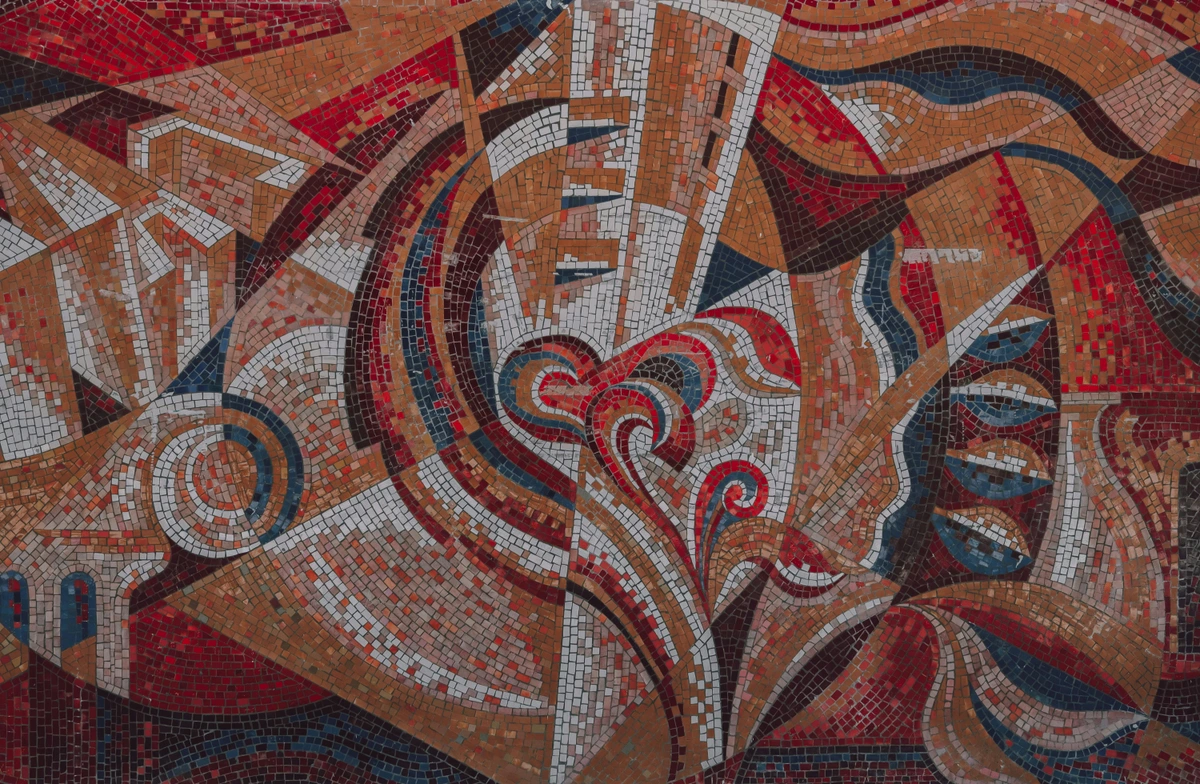
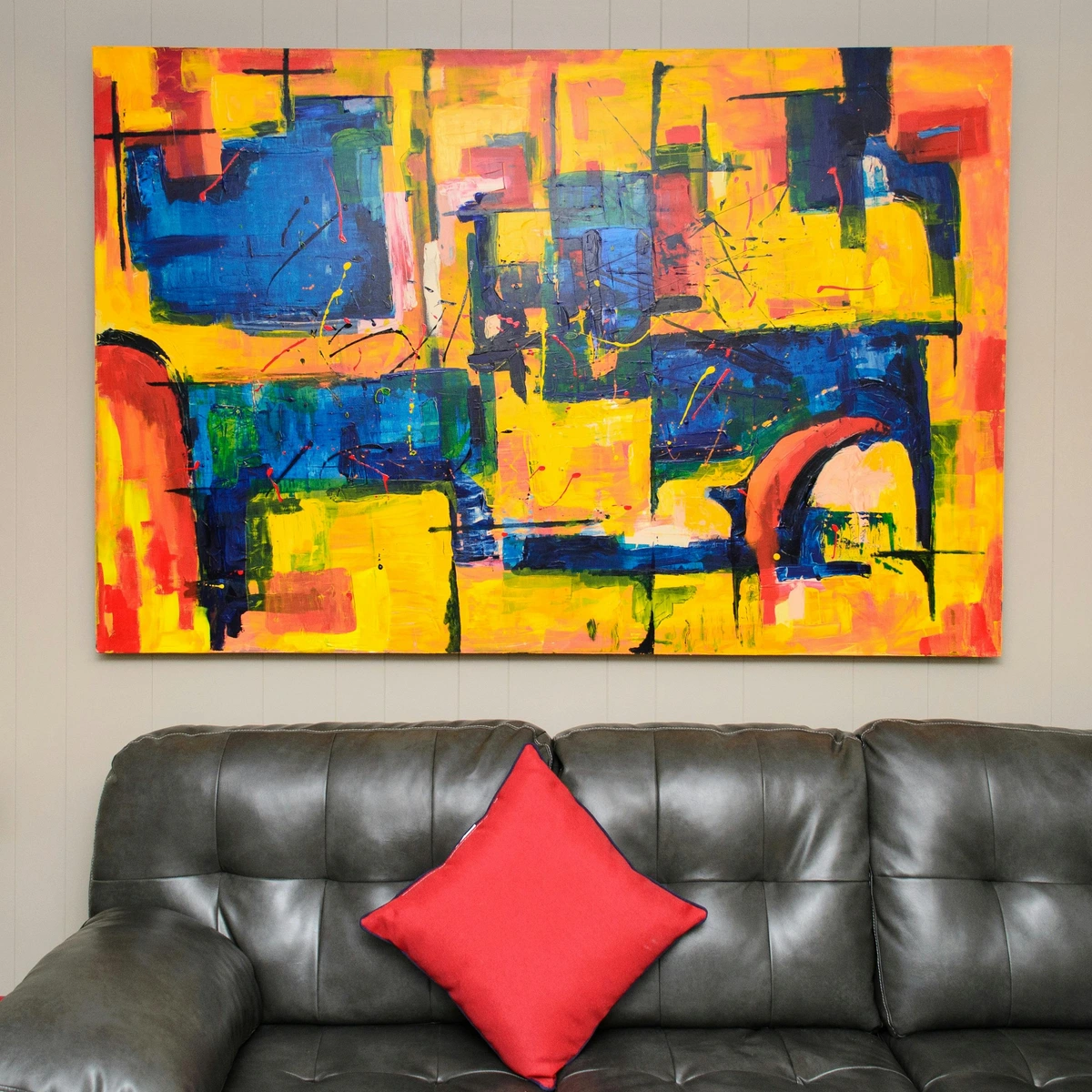
- Contemporary Abstract Art: Many contemporary abstract artists, myself included, frequently return to primaries for their raw power. They can be used to establish a vibrant underpainting, create stark contrasts, or even form the dominant color scheme for a minimalist yet impactful piece. They allow for profound expression without getting bogged down in an overly complex palette, proving their timeless relevance for creating complex abstract worlds. My own art often utilizes these bold, foundational colors to build complex emotional landscapes.
[credit], [licence]
When I'm creating, sometimes I'll start with just the primaries, letting their raw energy guide me. They're fantastic for establishing strong contrasts or injecting a burst of pure, unadulterated emotion. They are, in a way, the loudest voices in the color conversation. And it’s not just about what they are, but what they do. They create the entire ecosystem of color, offering endless possibilities. This deep dive into their application in practice helps bridge the gap between theoretical understanding and tangible artistic impact, setting the stage for more technical discussions about other color systems.
Embarking on Your Primary Color Adventure: Practical Tips for Mastering Primaries
If you're just starting out, or even if you've been painting for a while, I have a few tips that have helped me harness the power of primary colors in my own work. Trust me, these are born from much trial, error, and exhilarating discovery! But how do you truly harness this power without getting lost in the weeds? These tips are central to truly understanding what are primary colors and how they function. So, roll up your sleeves and let's get started!
- Start with a Limited Palette: Your Color Bootcamp! Seriously, try painting an entire piece with just red, yellow, blue, and maybe white and black. You'll be astonished by the range of colors you can achieve and how much you learn about mixing. Imagine creating a vibrant abstract landscape—a sunny yellow sky fading into an orange horizon, deep blue mountains, and lush green foreground—all from just these three
primary colors for painting. It's a revelation! This exercise is fantastic for honing your skills in the art of mark-making: expressive lines and gestures in abstract painting and exploring texture: my favorite techniques for adding depth to abstract paintings. Give it a try this week and see what unfolds on your canvas! - Experiment Fearlessly: Embrace the "Muddy" Lesson: Don't be afraid to make 'mud.' Every muddy mix is a lesson learned about what not to do, or perhaps, what to do if you're aiming for those rich, earthy, grounding tones we discussed. Keep a sketchbook just for
color mixing basicsexperiments. It's your personal lab for discovery. For example, try to create a full range of greens from just one warm yellow and one cool blue, then try again with a cool yellow and a warm blue to see the variations. And remember, the order in which you addprimary colorscan subtly shift the resulting hue, so play around with that too! What surprising mixtures can you discover today? - Quality Pigments Matter: Invest in Your Core: You don't need the most expensive paints, but decent artist-grade primaries will give you much cleaner, more vibrant, and predictable mixes than student-grade paints, which often have fillers. Artist-grade pigments usually have a higher pigment load (more concentrated color), better lightfastness (resisting fading over time—imagine pouring hours into a vibrant piece only for its red or yellow to fade significantly after a few years—a truly heartbreaking studio disaster!), and more consistent granulation (how the pigment particles settle, creating texture). For example, some professional Ultramarine Blues are known for beautiful granulation, creating a lovely speckled texture when dry, while Phthalo Blues are usually very smooth. Investing in lightfast primary pigments is crucial for the longevity of your artwork. I always recommend investing a little more in your core
primary colors. They're your foundation! For more on this, check out a definitive guide to paint types for artists. Upgrade one of your primary tubes this month and feel the difference! - Observe the World Through Primaries: A New Lens: Once you understand them, you'll start seeing red, yellow, and blue everywhere. How do they combine in a sunset? What
primary colorsmake up that specific shade of green in the leaves? How does a cool red differ from a warm red, and how does that affect its mixing? How does one primary appear next to another, altering its perception through color relativity? It's a fascinating way to deepen your visual understanding and unlock the subtleties of color temperature and relativity within even a single primary hue. Try to identifyprimary colorsin famous artworks, such as those discussed in the definitive guide to the history of abstract art: key movements, artists, and evolution. Take five minutes today to identify the primaries around you! - Consider Color Blindness: Designing for All: As artists, we want our work to be accessible. Roughly 1 in 12 men and 1 in 200 women are colorblind. While you can't change their perception, understanding how certain primary combinations (like red and green) can be difficult to distinguish for some can inform your choices, especially if conveying critical information through color. It encourages thoughtful consideration of contrast, value, and saturation over relying solely on hue. How can you make your next piece more universally impactful?

Frequently Asked Questions (FAQ) About Primary Colors: Unraveling Common Queries
Here are some common questions I encounter about primary colors and color mixing basics that I'm happy to shed some light on. Consider this your quick-reference guide to the trickier bits of primary color theory:
What are the 3 primary colors in art (pigment)?
For traditional art using pigments (paints, inks, dyes), the three primary colors are Red, Yellow, and Blue (RYB). These are considered the foundational hues from which all other colors can be mixed.
Can you make red, yellow, or blue by mixing other colors?
No, in the context of traditional pigment mixing, you cannot create a pure red, yellow, or blue by mixing any other colors. They are the 'unmixable originals' and are the elemental building blocks of the RYB color system.
What's the difference between RYB and RGB primaries?
RYB (Red, Yellow, Blue) are subtractive primaries used for pigments (paints, inks). When you mix them, they absorb light, and theoretically, mixing all three creates black. RGB (Red, Green, Blue) are additive primaries used for light (screens, monitors). When you mix them, they add light, and mixing all three creates white light.
Why do printers use CMYK primaries instead of RYB?
Printers use CMYK (Cyan, Magenta, Yellow, Key/Black) because these are scientifically optimized subtractive primaries for ink. CMY pigments are spectrally purer than traditional RYB paints, allowing for a wider and cleaner range (gamut) of colors to be reproduced accurately in commercial printing. Black (K) is added for richer blacks and sharper text economically.
[credit], [licence]
How does color temperature affect mixing primary colors?
Color temperature (warm vs. cool undertones within a primary, e.g., warm red vs. cool red) significantly affects mixing. Mixing a warm yellow with a warm blue will produce a different green than mixing a cool yellow with a cool blue (a phenomenon called 'hue shift'). Understanding this allows for much greater control over the resulting secondary and tertiary colors, creating more vibrant or nuanced palettes.
Are black and white primary colors?
No, black and white are not primary colors for pigments. They are crucial for manipulating the value (lightness/darkness) and saturation of colors, but they don't function as foundational hues from which other colors are mixed. Black pigment is the absorption of all colors, and white pigment is the reflection of all colors.
How does color blindness impact artistic choices?
Color blindness affects how certain color combinations are perceived (e.g., red and green can be difficult to distinguish for those with protanopia or deuteranopia). Artists can create more accessible art by relying on strong contrasts in value (lightness/darkness) and saturation (intensity) in addition to hue, ensuring the artwork's message and visual interest are clear to a wider audience.
A Final Thought on the Power of Simplicity
It's truly amazing how something so simple—just three pure colors—can unlock such an infinite universe of artistic expression. The primary colors are a constant reminder to me that profound complexity often stems from elegant simplicity. They are the backbone of my own vibrant, abstract worlds, allowing me to build vast emotional landscapes from just a few tubes of paint, and they can be the same for yours. The ability to create any color from these three foundational hues is the profound importance of primary colors for artists. So, I encourage you to pick up your brushes, experiment fearlessly with these foundational hues, and discover the infinite universe of color that awaits you. What beautiful spectrum will you paint first? What new worlds will you unlock?
Key Takeaways:
- RYB (Red, Yellow, Blue) are the
primary colorsfor pigments in traditional art, unmixable originals from which all others are made. (Why it matters: This is your fundamental starting point for all painting and traditional art.) - CMYK (Cyan, Magenta, Yellow, Black) are the scientifically optimized subtractive primaries for printing, offering a wider color gamut and cleaner mixes than traditional RYB. (Why it matters: Essential for accurate color reproduction in design and print media.)
- RGB (Red, Green, Blue) are the
primary colorsfor light (digital screens), where mixing them creates white. (Why it matters: Crucial for understanding all digital art, screens, and lighting in art.) - Understanding color temperature (warm/cool undertones) and color relativity (how colors influence each other's perception) within primaries is crucial for nuanced mixing, along with the concept of hue shift. (Why it matters: These concepts unlock advanced control and expressive power in your palette.)
- Secondary colors (Orange, Green, Purple) are made from mixing two primaries, and tertiary colors (e.g., Red-Orange) from a primary and an adjacent secondary. (Why it matters: This is how you expand your basic palette into a rich, complex spectrum.)
- Intentional "mud" (mixing all three primaries or a primary with its complementary secondary) creates essential earthy tones for depth and grounding, offering unique psychological weight. (Why it matters: "Mud" is not a mistake; it's a powerful tool for realism and emotional depth.)
- Experimentation with a limited palette and quality pigments (considering pigment load, lightfastness, granulation, and binder impact) are key to mastering
color mixing basics. (Why it matters: Practical application and good materials are vital for tangible progress.) - Different color systems (RYB, CMYK, RGB) serve different purposes, whether for paints, print, or digital screens, though digital color still simulates the physical experience. (Why it matters: Knowing which system you're in prevents frustration and ensures color accuracy across mediums.)
- Always consider factors like color blindness when making artistic choices to ensure accessibility. (Why it matters: Art should be for everyone; thoughtful color choices make your work more universally impactful.)
Go forth, experiment, and paint your own beautiful spectrum! Your artistic journey is waiting, built on the solid foundation of color mixing basics.
If you're curious about how I use these principles in my own work, feel free to explore my art or learn more about my artistic journey.