
Mastering Color: The Ultimate Guide to Hue, Tint, Tone, and Shade in Art with Zen Dageraad Visser
Unlock true color mastery with Zen Dageraad Visser's ultimate guide. Demystifying hue, tint, tone, and shade, this article reveals how these concepts transform your artwork, evoke emotion, and build rich, complex compositions. Dive into theory, history, practical mixing, pigment choices, and psychological impact.

Mastering Color: The Ultimate Guide to Hue, Tint, Tone, and Shade in Art with Zen Dageraad Visser
Ah, color! For me, it's the very heartbeat of my abstract art, the emotional language I speak through every brushstroke. Yet, even after years of swirling pigments on my palette, I vividly remember how easily confused I could get with terms like hue, tone, tint, and shade. They sound so similar, almost interchangeable, don't they? It's like trying to remember the difference between a whisper, a sigh, and a murmur – subtle but profoundly distinct in their effect. But believe me, understanding their distinct differences is like unlocking a secret level in your artistic practice. It's fundamental, foundational, and frankly, quite exhilarating once it clicks. In this ultimate guide, I'll take you through the theoretical underpinnings, historical context, practical applications, and even the psychological impact of these essential color concepts. My goal? To ensure you'll never look at a pigment the same way again, giving you the tools to infuse your art with unprecedented depth and emotion. Consider this your definitive journey into the nuanced world of color, straight from my studio to your canvas.
Indeed, we see color everywhere, from the subtle shift in a cloud-dappled sky to the intense burst of a sunset. But how often do we really break it down? As a curator of my own artistic journey, I've come to appreciate that these seemingly small distinctions are what allow me to create depth, express emotion, and build the vibrant, complex worlds I strive for in my work. It's not just about picking a color; it's about giving it life, weight, and light – a nuanced conversation on canvas. So, let's dive into that conversation, exploring the path from pure hue to a symphony of tints, tones, and shades.
The Grand Foundation: What is Hue?
Before we dive into the fascinating world of modifications, let's establish our baseline: hue. Simply put, hue is the pure, unadulterated color itself – red, blue, yellow, green, violet. It's what we typically think of when we name a color. No white, no black, no grey added. Just pure, vibrant pigment, straight from the tube (or, in my case, a very carefully chosen blend on my palette). Think of it as the color's unmasked personality, raw and direct, its fundamental identity before it's dressed up or down. Scientifically, hue is determined by the dominant wavelength of light that a color reflects or emits. Essentially, an object absorbs certain light wavelengths and reflects others; the color we perceive is the wavelength that is reflected. This understanding, first systematically described by Isaac Newton when he famously split white light into its spectrum with a prism, is the bedrock of all color theory. Newton showed us that white light contains all colors, laying the scientific foundation for understanding these pure forms. While Newton focused on the physical properties of light, later theories, like Ewald Hering's opponent-process theory, explored how our eyes and brain perceive color in opposing pairs (like red-green, blue-yellow), giving us another lens through which to understand color relationships.
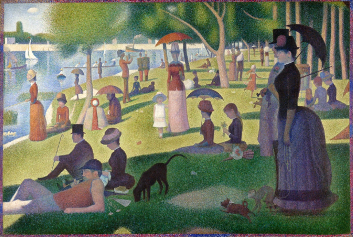
Think of the color wheel:
- Primary Hues: Red, Yellow, Blue. These are the foundational colors, impossible to create by mixing others. They are your starting blocks.
- Secondary Hues: Orange, Green, Violet. Formed by mixing two primary hues (e.g., Red + Yellow = Orange). These are the first delicious blends.
- Tertiary Hues: Red-Orange, Yellow-Orange, Yellow-Green, Blue-Green, Blue-Violet, Red-Violet. Created by mixing a primary hue with an adjacent secondary hue. These expand your palette with even more specific, pure colors.
All these are pure hues, your starting point. When I'm creating a new piece, I often begin with a pure, vivid hue, letting its inherent energy guide my initial strokes. A pure red might scream passion, a pure blue, serenity. Then, I begin to play, transforming that single vibrant note into a rich, layered composition that speaks volumes, guiding the viewer's eye and sparking emotion. My approach to color mixing is fundamentally built upon this understanding.
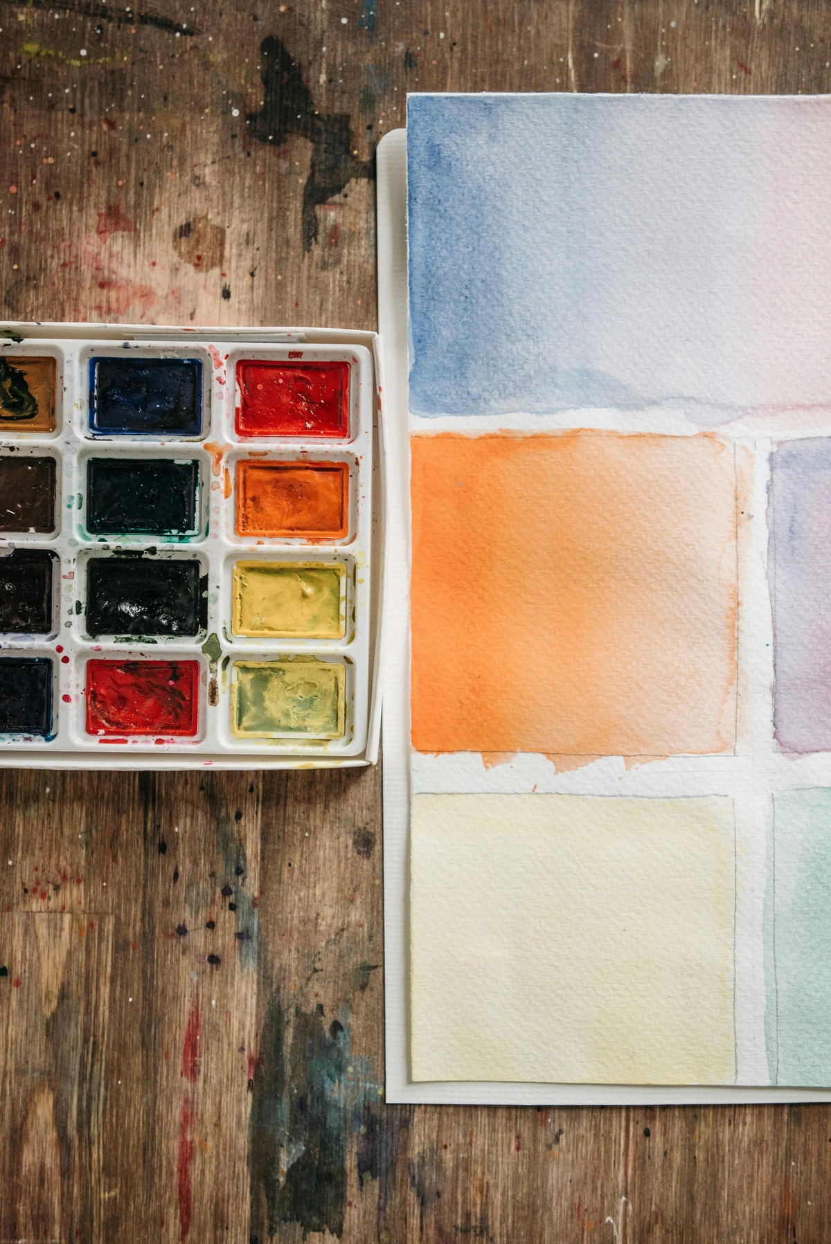
Tints: The Art of Lightness and Softness (Adding White)
Let's talk about tint. This one is perhaps the easiest to grasp, a gateway into color manipulation, if you will. A tint is created by adding white to a pure hue. Think of it as lightening the color, making it softer, more ethereal, almost airy – like the sun gently kissing a vibrant flower. When you mix white into a blue, you get a lighter blue – a sky blue, perhaps a baby blue, a periwinkle. It's still blue, but it has a different character, a different mood. Tints primarily increase a color's value (lightness) and often decrease its saturation (intensity or chroma) by diluting the dominant wavelength, making it feel more delicate or spacious.
I often use tints to introduce a sense of spaciousness, a gentle glow, or a delicate softness in my abstract compositions. Imagine a vibrant yellow that I want to soften just a touch, to evoke the first blush of dawn rather than the harsh midday sun. A tiny whisper of white, and suddenly, it's transformed, whispering rather than shouting. This is how I achieve those luminous qualities you see in some of my dreamier pieces, like a delicate veil across the canvas. Artists throughout history, from Rococo painters to Impressionists like Monet (whose "Impression, Sunrise" famously uses delicate tints to capture the fleeting light of dawn), have masterfully used tints to capture fleeting light and create delicate atmospheres, often manifesting in the serene beauty of pastels. My own approach to color theory relies heavily on tints to create luminosity and a sense of gentle unfolding.

Shades: Creating Depth and Drama (Adding Black)
Now, for the opposite end of the spectrum: shade. If tints are about light, shades are about gravitas – like the profound stillness of the ocean floor. A shade is created by adding black to a pure hue. This process deepens the color, making it darker, more intense, sometimes even more mysterious or melancholic. A shade of red might become a deep burgundy or a rich maroon. A shade of blue could be an indigo or a midnight blue. Shades primarily decrease a color's value (darkness) and often decrease its saturation by absorbing light, though some deep shades can still feel very intense and rich (like a jewel tone) if the black is mixed carefully. The key here is that the black deepens the color, giving it weight and often making it feel more potent.
It's important to distinguish a shade from a deep hue. A deep hue (like Ultramarine Blue or Dioxazine Purple) is a pure color that is naturally dark due to its pigment properties. A shade, however, is any hue that has been deliberately darkened by the addition of black, regardless of its original lightness. So, while a deep hue can function as a dark color, a shade is the result of a modification process.
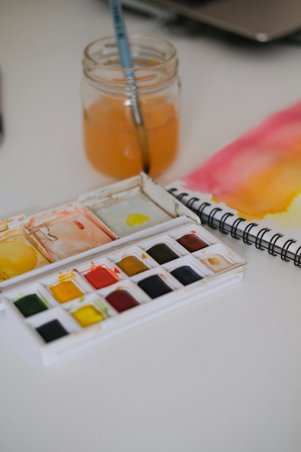
Shades are fantastic for creating contrast, gravitas, and a sense of grounding in a piece. I often turn to shades when I want to build a sense of depth and emotion in my art. They can make a color feel heavier, more serious, or simply more profound. Think of the deep, rich blues and purples in some of my more contemplative pieces – those are shades doing their crucial work, giving the composition a powerful anchor, almost pulling you into the canvas. You see the masters of chiaroscuro, like Caravaggio (e.g., his famous "The Calling of Saint Matthew") or Rembrandt, using shades to create dramatic light and shadow, giving their works immense power and psychological depth. For modern abstract artists, a well-placed shade can create a focal point or a quiet, introspective area within a vibrant composition.
The Allure of Chromatic Black: A Deeper Dive
Artists sometimes avoid pure black straight from the tube, as it can occasionally deaden a color, making it feel flat or muddy because it absorbs light too uniformly. Instead, many, myself included, prefer to mix a 'chromatic black' using deep blues, reds, and greens. This creates a rich, dark color that still vibrates with life, producing more nuanced and vibrant shades. It's like painting with a deep night sky that still hints at distant stars, rather than just a flat void.
For example, a mixture of Ultramarine Blue, Alizarin Crimson, and Viridian can yield a stunningly deep, vibrant black that maintains the luminosity of its component hues, making for a much richer shade. Other effective combinations include Phthalo Green with Alizarin Crimson, or Ultramarine Blue with Burnt Umber. Each blend offers slightly different undertones, making the resulting shade unique. It's a subtle but powerful shift in technique that prevents your darks from falling flat.
When comparing tube black (like Mars Black or Ivory Black) to chromatic black, the differences are profound:
Feature  | Tube Black (e.g., Mars Black, Ivory Black) | Chromatic Black (e.g., Ultramarine + Burnt Umber) |
|---|---|---|
| Composition | Single pigment (often carbon-based or iron oxide) | Mixture of multiple deep, dark pigments |
| Vibrancy | Can appear flat, 'dead,' or opaque, especially in thin layers | Richer, more luminous, 'vibrates' with underlying colors |
| Undertone | Often has a strong blue (Ivory Black) or brown (Mars Black) bias, but less complex | Highly controllable; can be warm or cool depending on the mix's components (e.g., more Burnt Umber for warmth, more Phthalo Blue for coolness) |
| Mixing Behavior | Can sometimes 'muddy' other colors if not careful | Blends more harmoniously, creating nuanced shades |
| Depth | Can create deep darks but may lack internal complexity | Creates profound, complex darks with perceived 'inner light' |
| Transparency | Often opaque | Can vary from semi-opaque to transparent, depending on pigments (e.g., Phthalo Green is transparent, Ultramarine is semi-opaque) |
It's a small change, but mixing your own chromatic blacks is one of those 'secret' techniques that can elevate your shades from merely dark to truly profound. It's about painting with darkness that still breathes.
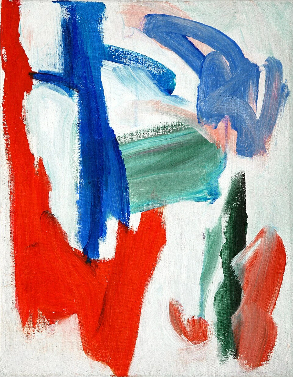
Tones: The Muted Middle Ground of Sophistication (Adding Grey or Complement)
And then we have tone. This is where things get really interesting, and where many artists, myself included, spend a significant amount of time. A tone is created by adding grey (which, as you know, is typically a mixture of black and white) to a pure hue. This process mutes the color, making it less vibrant or saturated (less 'chroma'), but typically without extreme shifts in lightness or darkness. Tones bring subtlety, sophistication, and a certain realism or naturalism to a palette. They can feel more organic, less 'loud,' more harmonious – like the rich, nuanced colors of an ancient tapestry or a misty morning landscape, or the quiet rustle of autumn leaves.
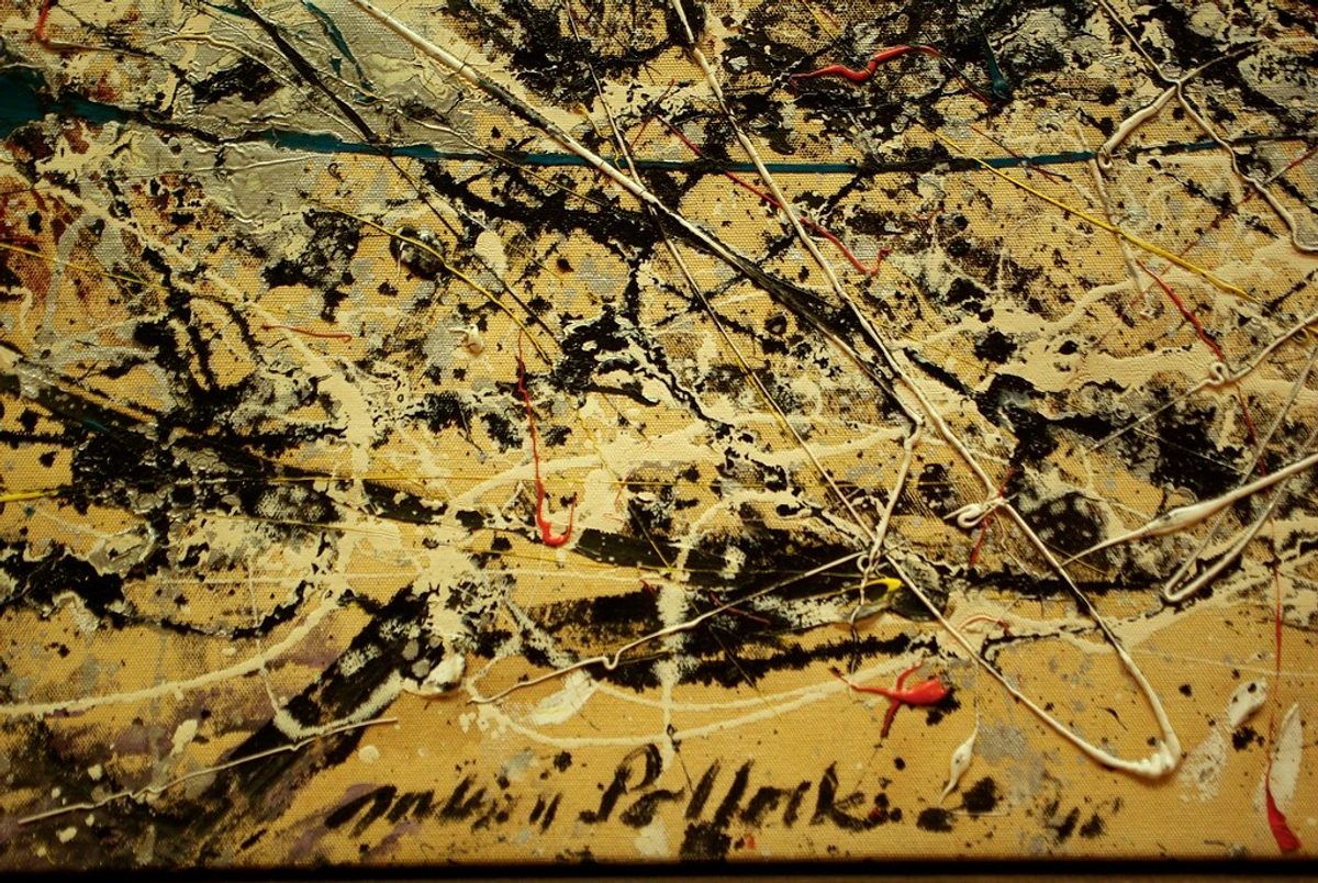
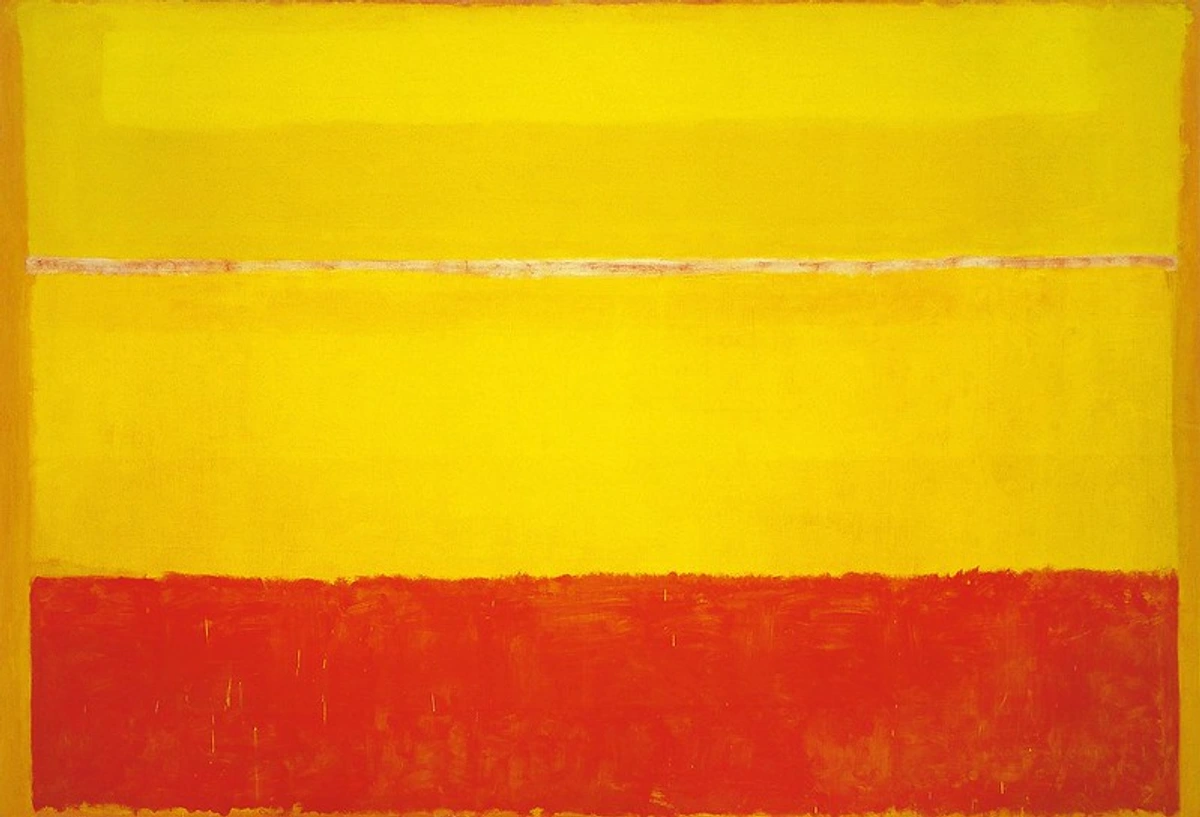
For an abstract artist, understanding tone is paramount for creating harmony and preventing a painting from becoming too overwhelming. Tones allow me to bridge the gap between bright tints and deep shades, creating a visual flow that's engaging but not jarring. They give my colors a complexity, a slightly subdued beauty, much like the colors found in nature on an overcast day, or the subtle variations in twilight. Tones are crucial for achieving atmospheric perspective, making distant objects appear softer and less saturated, or for creating a cohesive, unified color harmony within a piece. When you look at artists like Mark Rothko, the way he uses varied tones within his expansive color fields is mesmerizing. He creates incredible emotional resonance through these subtle shifts, inviting deep contemplation. My own work frequently employs tones to create quiet, introspective spaces that invite the viewer to linger, allowing for moments of visual rest amidst the more intense passages.
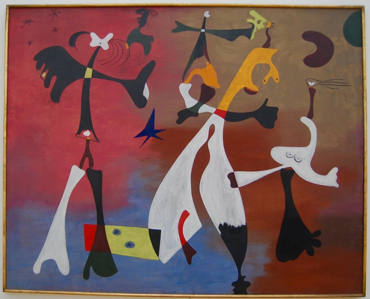
Muting with Complements: Another Path to Vibrant Tones
While adding grey is the direct route to creating a tone, there's another powerful method that yields even more vibrant, integrated muted colors: using complementary colors. Complementary colors sit opposite each other on the color wheel (e.g., red and green, blue and orange, yellow and purple). When mixed, especially in equal proportions, they tend to neutralize each other, producing a wide range of sophisticated greys and browns. This happens because their light wavelengths essentially cancel each other out when combined, much like mixing primary colors of light creates white.
However, if you add a small amount of a color's complement to that color, it will subtly mute or desaturate it, effectively creating a tone. The magic here is that the resulting tone retains a subtle chromatic connection to the original hue, making it feel much more alive and integrated than a simple grey-mixed tone. This is often my preferred method for creating rich, complex shadows and nuanced mid-tones that sing quietly on the canvas.
Here are some examples of how small additions of complements create beautiful tones:
- Red + Green (small amount): Adding a tiny bit of green to red will make the red less vibrant, leaning it towards a sophisticated, earthy red-brown. You can get beautiful brick reds or muted crimsons this way. Think of the rich, subtle tones in Renaissance portraits or the depth in a sunset landscape.
- Blue + Orange (small amount): A touch of orange added to blue will slightly dull the blue, creating a more natural, subtle indigo or a stormy sky blue. This is wonderful for evoking natural light conditions, a deep twilight, or the quietude of a cool shadow.
- Yellow + Purple (small amount): Yellow mixed with a hint of purple can create more organic, less jarring yellows, ideal for natural light effects, antique gold tones, or the subtle glow of a distant field.
This technique is incredibly versatile because the resulting tone maintains a subtle chromatic connection to the original hue, making for a much more vibrant and integrated muted color than a simple black-and-white grey might. It's a favorite technique of mine for creating rich, complex shadows and nuanced mid-tones that sing quietly on the canvas.
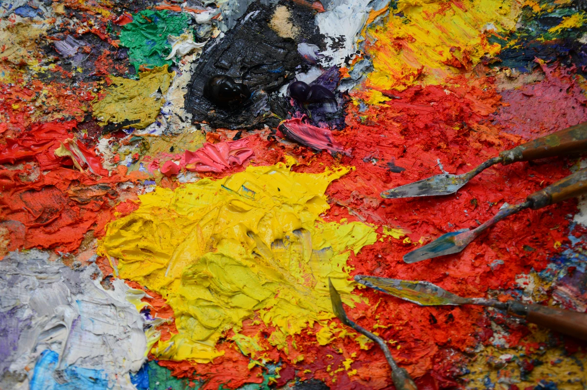
Value, Saturation, and Hue Shifts: The Delicate Dance of Color Properties
So, how do tints, tones, and shades directly affect a color's fundamental properties? It's a delicate dance, and truly understanding these shifts is key to masterful color manipulation. Let's break down three core properties:
1. Value (Lightness/Darkness)
This refers to how light or dark a color is, independent of its hue. Imagine converting a color photo to black and white – the different grey tones represent the values. Without sufficient value contrast, even the most vibrant colors can fall flat – imagine a musical piece played entirely at the same volume.
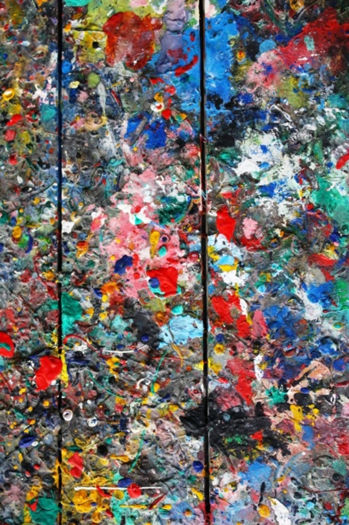
- Tints increase value (make lighter). Imagine a pure red transformed into a soft, airy rose-pink. Its lightness has increased dramatically, almost floating, giving it a sense of distance or delicacy.
- Shades decrease value (make darker). That same red, when shaded, might become a deep, velvety maroon, significantly darker, grounding the color and adding gravitas.
- Tones tend to pull the color towards a mid-range value, as grey itself is a mid-value neutral. So, they can either slightly increase value (if starting with a very dark hue) or decrease it (if starting with a very light hue), or keep it similar to the original if the hue is already mid-value. The primary effect is not extreme lightness or darkness, but rather muting.
2. Saturation (Intensity/Chroma)
This refers to the purity or intensity of a color. A highly saturated color is vivid and bright, while a desaturated color appears duller or greyer. 'Chroma' is often used interchangeably with saturation. Pure hues are generally at their highest saturation, screaming for attention; a tone whispers, inviting a closer look.
- Adding white (tint) often decreases saturation, making the color appear softer and less intense. A vibrant cobalt blue becomes a gentle sky blue, losing some of its 'punch'.
- Adding black (shade) can also decrease saturation as it darkens the color. However, some deep shades can still feel very intense and rich (like a jewel tone) if the black is mixed carefully or if the original pigment is very strong (e.g., Phthalo Blue, Dioxazine Purple). The black can absorb some of the color's vibrancy but doesn't always completely neutralize it. The trick is mindful, gradual addition.
- Adding grey (tone) most directly and significantly reduces saturation. This is the primary characteristic of a tone, resulting in a muted, desaturated color.
3. Subtle Hue Shifts
It's worth noting that adding white, black, or grey can sometimes subtly shift the hue itself. This happens because pigments have 'undertones' – subtle hints of other colors that reveal themselves during mixing. For example:
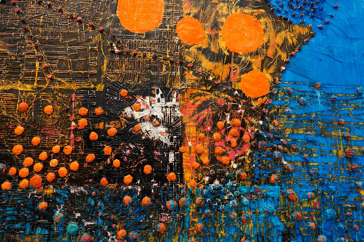
- Adding black to a pure red might lean it towards a cooler, more purplish red depending on the black pigment's blue undertones (like Ivory Black) and the red's own undertones. A Vermillion Red, for instance, might shift differently than an Alizarin Crimson. It's like trying to guess what your friend had for lunch by the subtle undertones in their mood – a delightful, if sometimes perplexing, art!
- Conversely, adding white can sometimes 'cool' down a warm color, making a cadmium yellow appear less fiery and more lemon-like, especially if the white pigment itself (like Titanium White) has a cool bias. Adding a cool white to a warm yellow can even subtly shift its hue towards green, creating a more acidic or crisp yellow. Similarly, a warm black added to a cool blue might push its hue towards green.
This is a nuance you discover through dedicated practice and observation, and it adds another layer to the infinite possibilities of color mixing. Think of it as how a chef adjusts seasoning – tiny additions for a profound impact.
The Nuance of Color Temperature: Hot and Cold Colors
Beyond value and saturation, understanding how tints, tones, and shades affect a color's temperature is a powerful tool. Colors aren't just light or dark, vibrant or muted; they also feel warm (like reds, oranges, yellows, which seem to advance) or cool (like blues, greens, violets, which seem to recede). This perceived temperature profoundly impacts the mood and energy of your artwork, a concept deeply explored by thinkers like Goethe, who focused on the psychological and emotional impact of color.
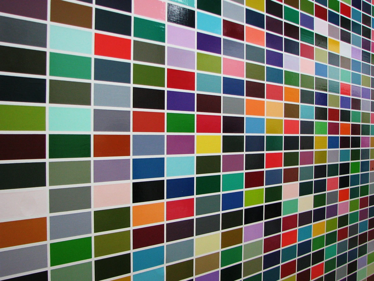
- White (Tints) and Temperature: Adding white often has a cooling effect, especially on warm colors. A pure fiery red, when tinted, might become a soft pink that feels much cooler. This is because white pigment has high reflectivity and a broad spectrum, which can dilute the warmth and intensity of a single hue's dominant wavelength, making the resulting tint feel more distant or ethereal. Imagine a bright Cadmium Yellow becoming a pale, crisp lemon yellow with the addition of Titanium White, which itself carries a cool bias.
- Black (Shades) and Temperature: The effect of black on temperature is more complex, depending on the black pigment itself and the hue it's mixed with. Some blacks have a bluer undertone (like Ivory Black), which will further cool a color. Others might have a warmer, brownish undertone (like Mars Black or Chromatic Black mixed with Burnt Umber), which could slightly warm a cool color or lend a rich, earthy warmth to a red. A deep shade of yellow might become an olive green with a cool black, but a more muted ochre with a warm black. This is where those chromatic blacks truly shine, as their component hues inherently bring their own temperatures, creating richer, more vibrant darks.
- Grey (Tones) and Temperature: Just like black, the grey you add to create a tone can have a warm or cool bias, affecting the overall temperature of the muted hue. A grey mixed with a touch of blue will cool a color, while one mixed with a touch of orange or red will warm it. This allows for incredible control over the emotional resonance of your toned colors – a dusty rose can feel either invitingly warm or serenely cool depending on the grey's subtle leanings. A grey composed of Ultramarine Blue and Burnt Sienna, for example, can be pushed warmer or cooler with more of one or the other.
Manipulating color temperature with tints, tones, and shades is how artists can create a sense of glowing light, chilly shadows, or a comforting, embracing warmth within a composition. It's a subtle trick that adds immense depth and allows you to guide the viewer's eye through a landscape of sensation.
The Difference at a Glance: A Quick Summary
To make it crystal clear, here's a concise overview of how these foundational color concepts diverge and what impact they have on your canvas:
Term | What's Added | Primary Effect on Hue | Example (from Red) | Affects Value | Affects Saturation |
|---|---|---|---|---|---|
| Hue | Nothing | Pure color, baseline | Pure Red | Baseline | Highest |
| Tint | White | Lightens, softens, makes ethereal | Pink, Light Red, Rose | Increases | Generally Decreases |
| Shade | Black | Darkens, deepens, adds intensity or mystery | Burgundy, Maroon, Crimson | Decreases | Can Decrease (often maintains intensity) |
| Tone | Grey (Black + White) or Complement | Mutes, desaturates, adds sophistication or naturalism | Dusty Rose, Brick Red, Terracotta | Varies (subtle shift towards mid-value) | Significantly Decreases |
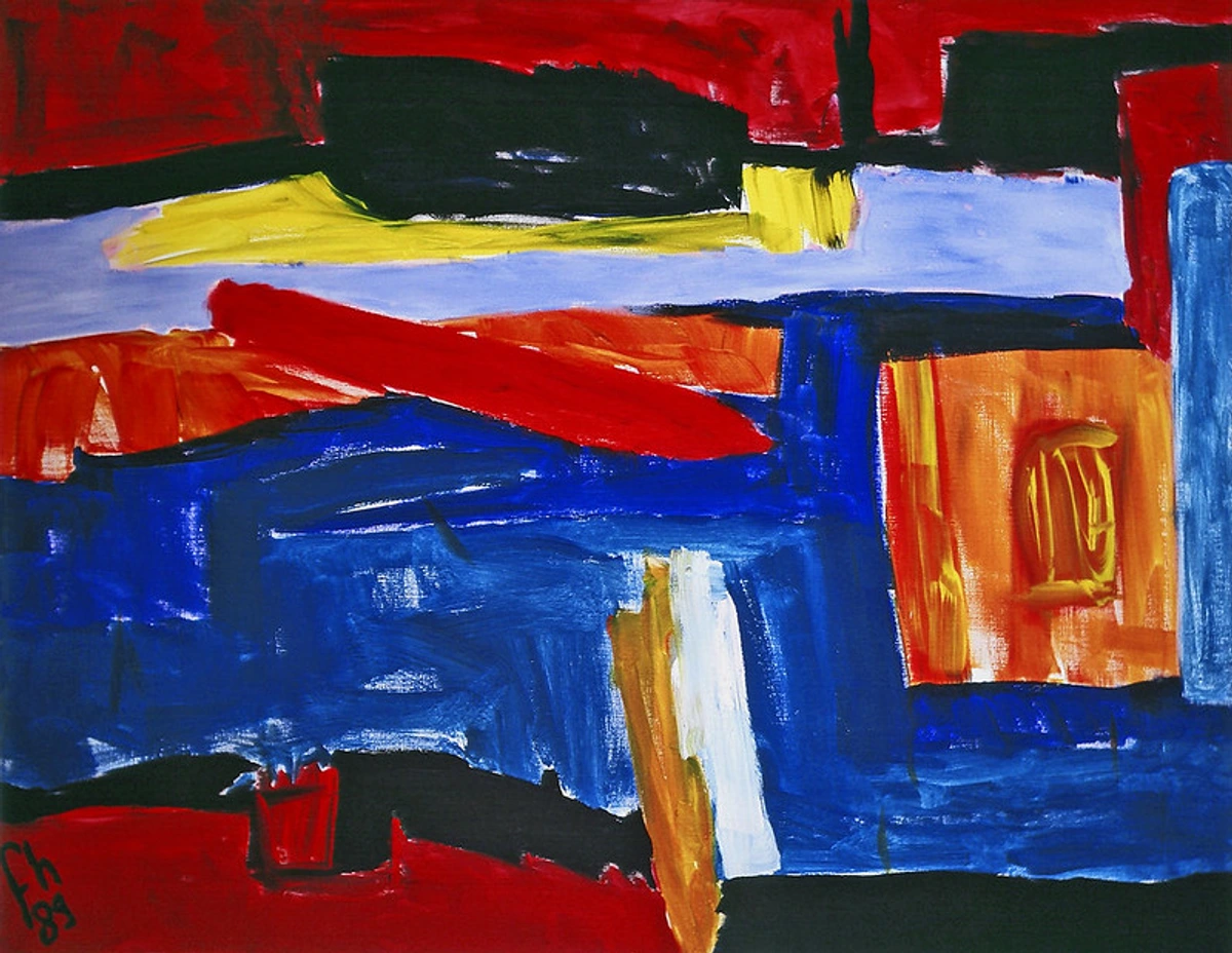
Your Essential Pigment Palette: Building Your Foundation
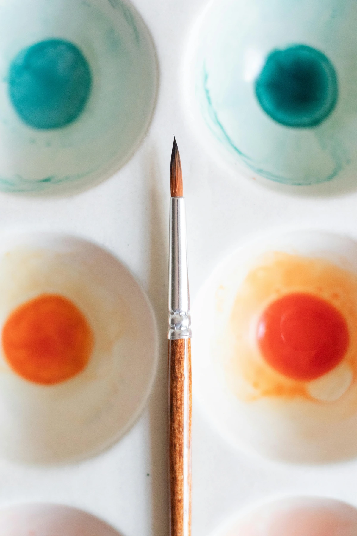
While almost any pigment can be transformed into a tint, tone, or shade, having a foundational set of colors that mix well and offer a good range of characteristics is incredibly helpful. Think of these as your core team, your starting lineup for endless color possibilities, and how they contribute to your understanding of tints, tones, and shades:
- White (For Tints): Essential for lightening. My go-to is Titanium White for its opacity and strong tinting power, but sometimes I reach for Zinc White when I need a more transparent, luminous tint that's less assertive. Experiment to see how different whites affect your hues – Titanium White often has a cool bias, while Zinc White can feel a touch warmer and more delicate. Understanding these differences is key to creating specific kinds of soft, luminous tints – a cool white with a warm red will create a different pink than a warm white with the same red.
- Black (For Shades): For deepening. As we've discussed, I highly recommend mixing your own Chromatic Blacks. However, if you use a tube black, Mars Black offers a warm, opaque dark, while Ivory Black is often cooler with a blue bias. Knowing their inherent undertones helps predict how they'll impact your hues and affect the temperature of your shades. For example, a cool blue shaded with a warm Mars Black might lean towards a muted teal, whereas with a cool Ivory Black, it would simply deepen to a rich, cool indigo.
- Primary Hues (Red, Yellow, Blue): Having a warm and cool version of each primary gives you immense flexibility for tints, tones, and shades. The subtle temperature difference can dramatically change the character of your resulting colors.
- Warm Red: Cadmium Red or Pyrrole Red (leans orange). When tinted, these yield warmer, peachier pinks. When shaded, they produce richer, often browner maroons.
- Cool Red: Alizarin Crimson or Quinacridone Red (leans purple). Tinted, these create cooler, purplish pinks. Shaded, they offer deep, velvety burgundies.
- Warm Yellow: Cadmium Yellow Medium or Hansa Yellow Opaque (leans orange). Tints will be creamy and sunny. Shades might lean towards olive or ochre.
- Cool Yellow: Lemon Yellow or Hansa Yellow Light (leans green). Tints will be crisp and sharp. Shades can produce cooler, more acidic greens or browns.
- Warm Blue: Ultramarine Blue (leans violet). Tints will be softer, purplish blues. Shades will be deep, often warm indigos.
- Cool Blue: Phthalo Blue (leans green). Tints will be clear, bright sky blues. Shades will be intense, often greenish midnight blues.
- Earth Tones: Pigments like Raw Umber, Burnt Umber, Yellow Ochre, and Raw Sienna are fantastic for creating rich, natural tones and for mixing into chromatic blacks. They often have an inherent subdued quality that makes them excellent for muting vibrant hues without making them feel dull. Their natural warmth and coolness also provide versatile options for nuanced tones and shades, especially when used to desaturate without adding overt grey.
- Deep Greens/Violets: Viridian or Phthalo Green are excellent components for chromatic blacks, as is Dioxazine Purple, which can create incredibly deep, vibrant shades that retain their chromatic identity rather than becoming flat. These pigments are naturally dark and intensely saturated, making them ideal starting points for vibrant shades that still feel alive.
Having these pigments allows you to explore the full spectrum of tints, tones, and shades, creating an infinite array of nuanced colors that respond beautifully to each other on the canvas.
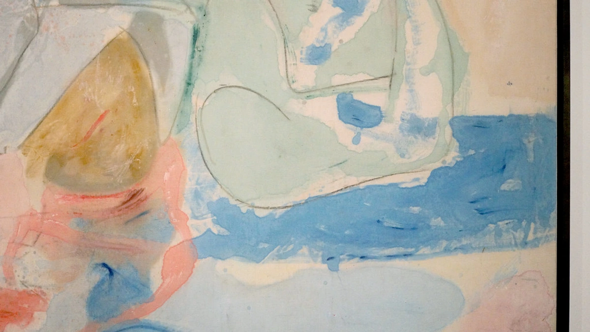
How I Apply Tints, Tones, and Shades in My Studio: Practical Mixing Techniques
In my studio, these aren't just theoretical concepts; they're daily tools, shaping the narrative of every canvas. When I'm working on a new abstract art piece, I'm constantly adjusting colors to achieve specific effects. It's a dynamic, intuitive process, almost like a conversation with the canvas itself:
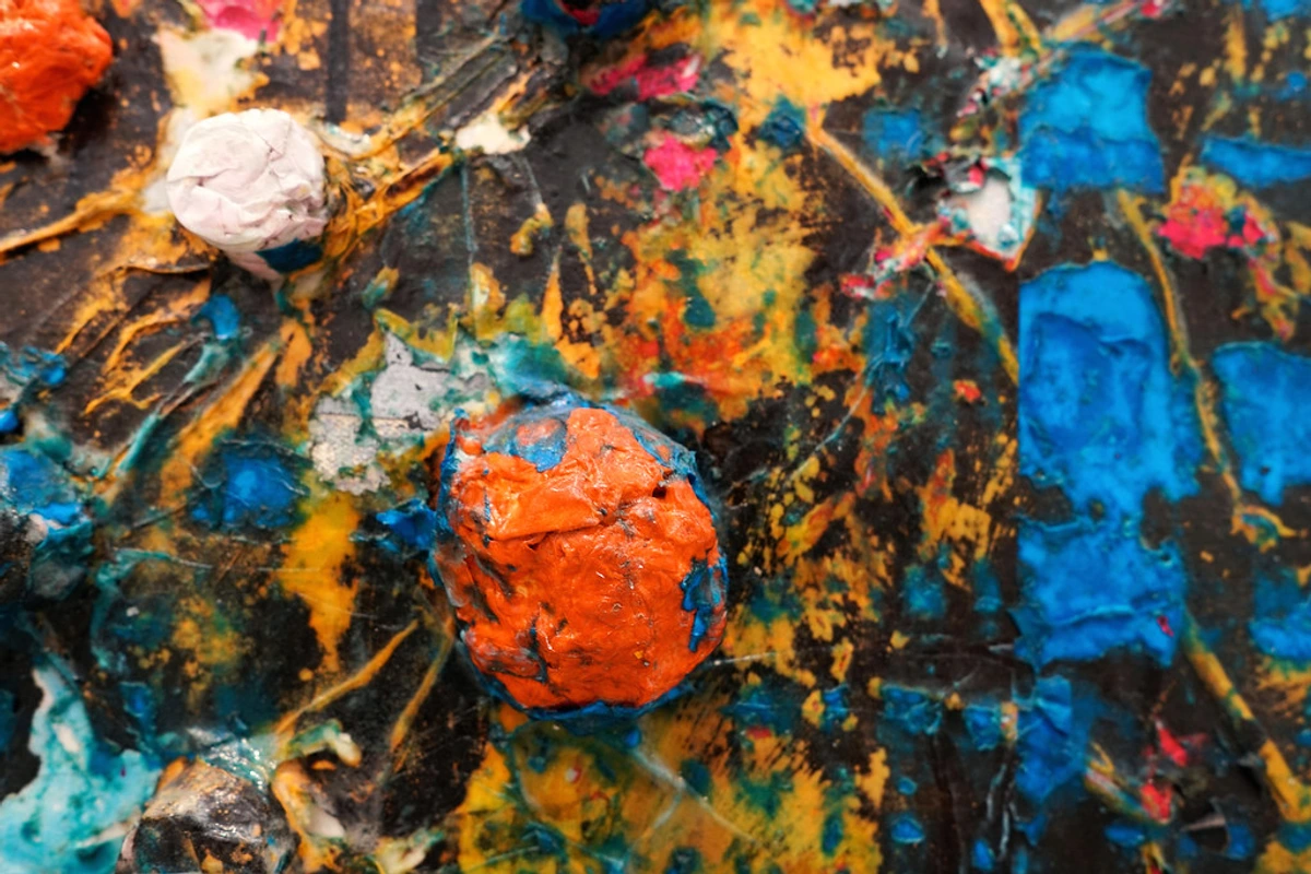
- Building Luminosity with Tints (Monochromatic & Analogous Harmonies): A bright, pure yellow (a hue) might be too jarring for a certain area, creating too much visual noise. So, I'll create a subtle tint by adding a tiny touch of white to give it a dreamier, softer quality. Just a whisper of white can transform a bold yellow into a luminous lemon or a delicate cream, softening the edge and creating a sense of distance or a gentle glow that invites the eye rather than demands attention. Think of a pale, luminous lemon yellow against a deep indigo – the tint creates that gentle lift, almost like a faint light emanating from the canvas. This is particularly effective in monochromatic (using tints of a single hue, e.g., a pure blue, soft sky blue tints, deep midnight blue shades, and dusty blue-grey tones) or analogous harmonies (using tints of neighboring hues) to create subtle, flowing transitions. My advice for you, when creating luminosity with tints, is always to add white gradually; it's easier to add more than to take away.
- Anchoring with Shades (Complementary & Triadic Harmonies): Conversely, a particular section might need more grounding, more power. I'll mix in some chromatic black (my preferred blend of Ultramarine Blue, Alizarin Crimson, and Viridian, or sometimes Phthalo Green and Alizarin Crimson for a different undertone) to create a deep shade of blue, almost like the deepest part of the ocean. This adds weight and drama, creating a strong anchor for the composition, pulling the viewer into its depths. It's how I evoke the profound stillness of the ocean floor in contrast to a vibrant, energetic surface, or create areas of intriguing mystery that hint at hidden narratives. Shades are crucial in complementary or triadic harmonies, where they can temper the intensity of a pure hue or provide a powerful counterpoint. For example, a vivid red hue could be anchored by a deep emerald green shade.
- Harmonizing with Tones (Overall Palette Cohesion): This is where the real dance happens, bringing everything together. By carefully adding grey (often a neutral grey I've pre-mixed from black and white, or a chromatic grey from complements), I can make a vibrant orange less aggressive, more inviting, allowing it to sit harmoniously next to a soft green or a cool blue without clashing. It's about creating balance and a nuanced emotional language of color. These toned colors create visual pathways, allowing different elements to coexist and interact without overpowering each other, much like different instruments playing together in an orchestra. When I'm unsure if a tone fits, I'll often paint a small swatch on a scrap of canvas or paper and place it directly on the painting, stepping back to assess its overall impact. Tones are the glue that creates overall palette cohesion, making even complex harmonies feel unified.
Zen's Mixing Tip: The Mindful Additions
My key piece of advice for mixing? Always start with the pure hue, and add a very small amount of white, black, or grey at a time. It's much easier to gradually lighten, darken, or mute a color than it is to reverse an over-mix – trust me, I've learned that the hard way! Keep your palette knife or brush clean to avoid muddying colors, unless that's your specific intention. And remember, the temperature of your added white or black can influence the final color; some whites are cooler, some blacks warmer. Experiment with different whites (Titanium White is opaque and cool, Zinc White is transparent and warmer) and blacks (like the chromatic black blends we discussed) to see how they subtly shift your hues. The magic is in the mindful additions!
This deliberate manipulation of a single hue through tints, tones, and shades is a powerful technique. It allows for a richness and complexity that a limited palette might otherwise miss. It's how a color can whisper or shout, depending on my artistic intention. It's a journey into the infinite possibilities of a single color, really. And if you're ever in Den Bosch, you'll see these principles in action in my work, where every color tells a story.
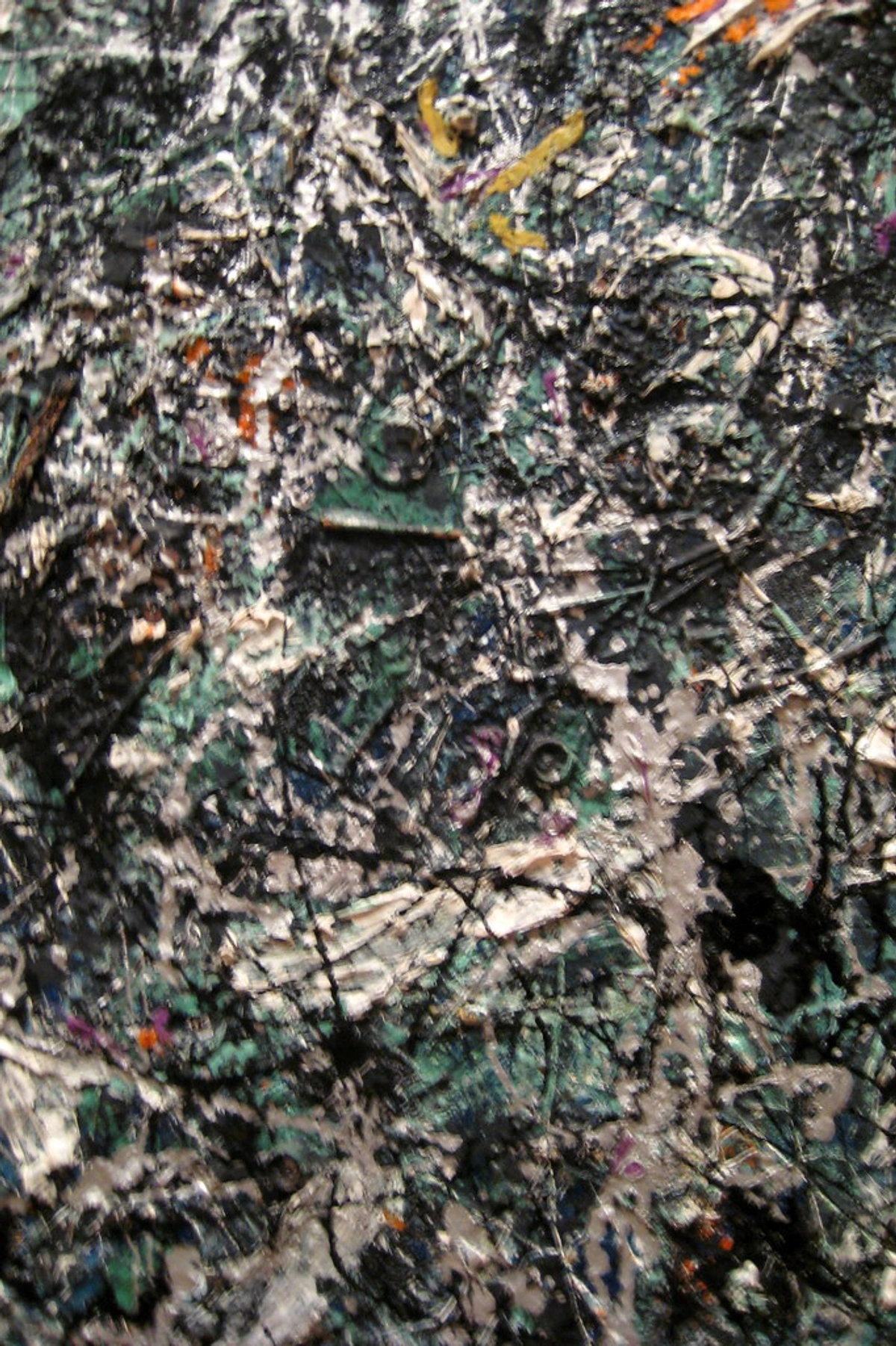
Integrating Tints, Tones, and Shades into Color Harmonies
Understanding tints, tones, and shades isn't just about modifying single colors; it's about expanding your entire approach to color harmony. A basic color harmony scheme, like a monochromatic or complementary palette, can be incredibly powerful, but it gains immense depth and sophistication when you introduce these variations. Think of them as the nuanced vocabulary within the grammar of color harmony, allowing you to orchestrate your palette:
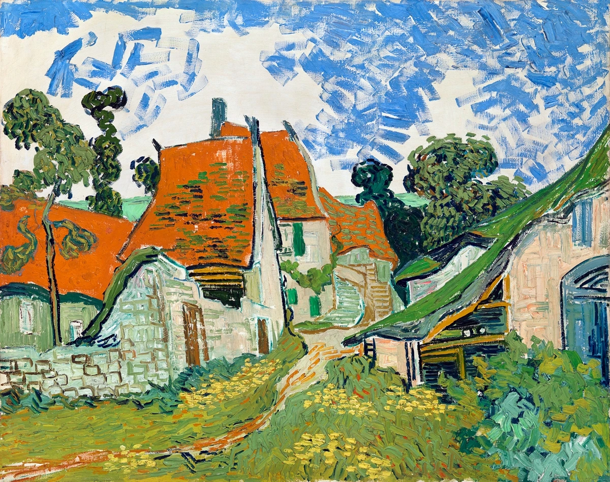
- Monochromatic Harmony: Starting with a single hue, you can create an entire painting using only its tints, tones, and shades. This creates incredible unity and subtle variation. Imagine a monochromatic blue painting: pure cobalt blue as a focal point, softened with light sky blue tints, deepened with midnight blue shades, and muted with dusty blue-greys. The result is rich and contemplative, despite using only one hue.
- Analogous Harmony: This scheme uses colors next to each other on the color wheel (e.g., blue, blue-green, green). By applying tints, tones, and shades to each of these analogous hues, you can create a lush, flowing landscape of color. A vibrant green hue might be flanked by a soft blue-green tint and a deep forest green shade, all within a harmoniously flowing palette.
- Complementary Harmony: Using colors opposite each other (e.g., red and green) provides high contrast and energy. Tints, tones, and shades allow you to manage this intensity. You can use a pure red hue for impact, then pair it with a muted, toned green (perhaps a sage or olive green) rather than a vibrant one, allowing for sophisticated contrast without jarring the viewer. Or, use a soft pink tint against a deep forest green shade to create a compelling, less obvious tension.
- Triadic Harmony: This scheme uses three colors equally spaced on the color wheel (e.g., red, yellow, blue). While powerful, it can be overwhelming with pure hues. Introducing tints and tones to two of the colors, while allowing one to remain a vibrant hue or a deep shade, can create balance. For instance, a strong red hue, a muted, pastel yellow tint, and a rich, deep blue shade can form a compelling triadic composition that feels sophisticated rather than primary-school simple.
By layering tints, tones, and shades within these systems, you move beyond mere color selection to truly orchestrate your palette, creating compositions that are both unified and endlessly interesting. It's like moving from playing single notes to conducting a full symphony.
Common Pitfalls to Avoid When Working with Tints, Tones, and Shades
Even with a clear understanding, a few common traps can trip up artists. Knowing these can save you a lot of frustration, believe me, I've fallen into most of them myself!

- Over-reliance on Pure Black: As discussed, pure black (especially carbon-based pigments like Lamp Black or Mars Black) can sometimes 'kill' a color, making it flat or lacking depth because it absorbs light too uniformly. Experiment with chromatic blacks (mixed from deep blues, reds, and greens, like Ultramarine Blue + Burnt Umber or Phthalo Green + Alizarin Crimson) or deep complementary colors to create more vibrant, living shades. For instance, a deep forest green mixed with a touch of crimson can create a nuanced dark that feels far richer than pure black.
- Creating 'Mud': Mixing too many colors, especially without understanding their underlying hues and values, can lead to muddy, lifeless tones that drain the vitality from your palette. My advice? Start with a limited palette, keep your palette clean between mixes, and learn the complementary relationships of your colors. Remember that black and white aren't always neutral; Ivory Black often leans blue, Mars Black leans brown, and even some Titanium Whites can have a cool bias. These undertones can subtly affect your final tone. When in doubt, less is often more. Avoid mixing more than three pigments for a tone unless you truly know what you're doing. Over-mixing on the canvas can also lead to a dull, overworked surface, so trust your instincts and know when to stop.
- Neglecting Value Contrast: You might have beautiful hues, tints, and shades, but if their values (lightness/darkness) are too similar, the painting will lack impact and readability. Step back frequently to assess the overall value structure of your piece, perhaps even viewing it in black and white or by squinting your eyes (this blurs details and emphasizes light/dark relationships) to ensure sufficient contrast. Without strong value contrast, even the most vibrant colors can fall flat – imagine a musical piece played entirely at the same volume.
- Ignoring a Color's Temperature: Adding white to a warm color (like yellow or orange) can sometimes make it feel cooler. Conversely, adding certain blacks (e.g., those with a blue bias) can cool down a warm hue significantly, while others might warm it. Be mindful of how your additions affect the perceived temperature of your colors – it's a subtle but powerful aspect of emotional expression in art. For example, a warm yellow tinted with a cool white might become a crisp lemon, while a cool blue shaded with a warm black could become a rich, earthy midnight blue. Observing these shifts is crucial.
- Too Much or Too Little Saturation: A painting with only highly saturated hues can feel overwhelming, like a room full of people shouting. Conversely, a piece with only desaturated tones can feel dull or monotonous. The mastery lies in the balance and strategic use of both, allowing the eye to rest in toned areas and then engage with bursts of vibrant color. Think of it as controlling the volume of your visual symphony – knowing when to play loudly, softly, or with quiet resonance.
Beyond the Canvas: Tints, Tones, and Shades in Atmospheric Perspective
While we've primarily discussed these concepts in the context of abstract art and general color theory, their application extends deeply into representational painting, particularly in creating a sense of atmospheric perspective. This technique is used to create the illusion of depth in a painting by imitating the effect of the atmosphere on the appearance of distant objects.
As objects recede into the distance:
- Tints dominate: Distant objects appear lighter, more ethereal, and less distinct. The air itself acts like a veil, adding white to the colors, effectively tinting them. Mountains on the horizon, for example, often appear as soft, pale blues or purples, even if they are covered in dark green trees up close.
- Tones become prevalent: The saturation (chroma) of colors decreases significantly. Distant objects appear muted, desaturated, and less vibrant because the atmospheric particles scatter light, reducing the intensity of the colors. That vibrant green forest becomes a soft, toned grey-green in the distance.
- Value contrast lessens: The difference between the lightest and darkest areas of distant objects is reduced, making them appear flatter and less three-dimensional. Shades become less pronounced, and highlights less brilliant.
By consciously applying tints and tones (and observing the reduction of strong shades) to your palette as you depict distance, you can create incredibly convincing illusions of space and atmosphere, whether you're painting a sprawling landscape or hinting at vastness in an abstract piece. It's yet another way these fundamental color concepts sculpt our perception.
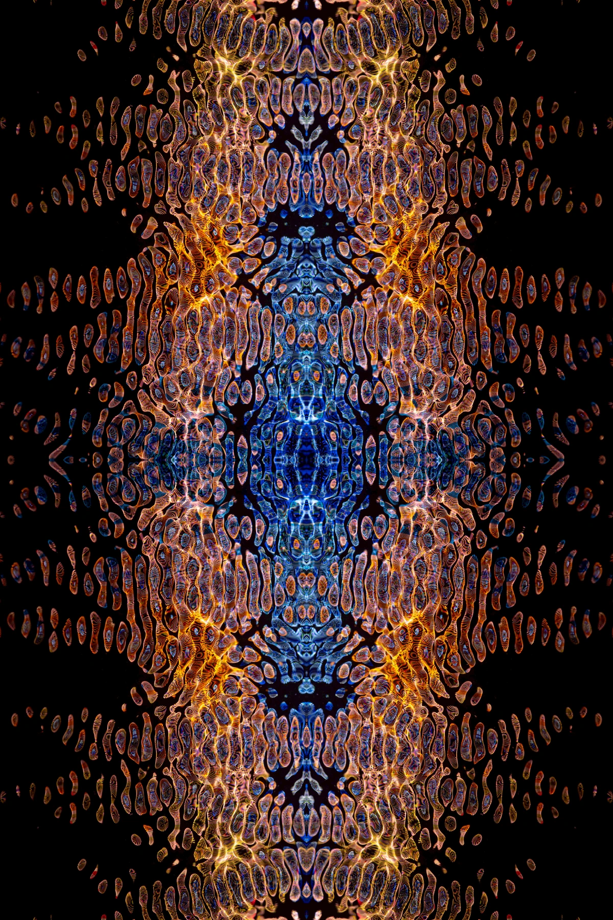
The Psychology of Tints, Tones, and Shades
Color psychology is a fascinating field, and the modifications we make to a hue dramatically alter its emotional impact. This is something I'm acutely aware of in my abstract art:
- Tints: Associated with lightness, innocence, youth, and gentleness. Think of pastel colors – they evoke calmness, sweetness, and a certain ethereal quality. A tinted sky blue feels peaceful, while a tinted red (pink) can be playful or romantic. My own use of tints often aims for this sense of optimistic light or gentle unfolding, perhaps conveying vulnerability or new beginnings. For a serene or hopeful composition, consider a palette rich in soft blues, greens, and yellows, all leaning towards their tinted forms. They whisper quiet joy.
- Shades: Convey depth, seriousness, mystery, and often a sense of gravitas or power. Deep jewel tones (shades of ruby, emerald, sapphire) suggest luxury and richness, but also stability and authority. Darker shades can also evoke melancholy, introspection, or even a subtle threat or the unknown. My application of shades can create a grounding force, a quiet intensity, or a dramatic tension in my compositions, pulling the viewer into a contemplative space. If you want to evoke mystery or profound contemplation, a palette dominated by deep, rich shades, perhaps with a single spot of vibrant hue for contrast, can be incredibly effective. They speak of ancient secrets and powerful depths.
- Tones: Communicate subtlety, sophistication, naturalness, and sometimes nostalgia or earthiness. Because they are less saturated, tones can feel more approachable, organic, and harmonious. They are the workhorses of realistic representation but also vital for creating a cohesive and sophisticated palette in abstract work, allowing complex colors to coexist without jarring the viewer. Toned colors often provide the 'rest areas' for the eye, inviting thoughtful engagement and a sense of quiet maturity. To achieve a sophisticated, earthy, or nostalgic feel, focus on a palette primarily composed of tones – think muted greens, dusty purples, and warm terracotta reds. They offer a comforting, quiet embrace.
Understanding this psychological impact allows you, the artist, to wield color not just visually, but emotionally, guiding the viewer's experience on a deeper level. It transforms your canvas into a conversation.
Historical Echoes: The Evolution of Color Understanding
Our distinctions between hue, tint, tone, and shade didn't just appear overnight; they are the culmination of centuries of artistic practice and scientific inquiry. It's fascinating to trace how artists and thinkers have grappled with the mysteries of color:
Early Foundations: From Ancient Philosophies to Newton's Spectrum
Before scientific understanding, color was often tied to philosophical or mystical interpretations. Ancient Greeks, for instance, often considered white, black, and red as the fundamental colors. It was a qualitative, rather than quantitative, understanding. The scientific foundation for understanding hues really took a leap in the 17th century with Isaac Newton. His famous prism experiments in 1672 demonstrated that white light is composed of all the colors of the rainbow. He systematically broke down light into its constituent parts – the spectrum – which gave us a concrete, scientific basis for hue. Before Newton, the prevailing belief was that colors were created by modifying pure white light. Newton showed that white light contained all colors. This revelation profoundly influenced how people, including artists, began to think about the nature of color, moving towards a more analytical understanding of its pure forms.
Goethe and the Emotional Spectrum of Color
A century later, the German poet and scientist Johann Wolfgang von Goethe challenged some of Newton's purely scientific views with his Theory of Colours (1810). Goethe was less interested in the physics of light and more in the phenomenological experience of color – how humans perceive and react to it. He explored how colors affect emotions and how they interact in the human eye. While his scientific methods differed from Newton's, his work laid crucial groundwork for understanding color in terms of its emotional and psychological impact. His observations directly informed how artists understood the affective qualities of tints, tones, and shades – how value (lightness/darkness) and saturation (purity) profoundly impact our perception of hue, moving beyond mere physical properties to subjective experience.
Albers and the Interaction of Color
Moving into the 20th century, Josef Albers' seminal work Interaction of Color (1963) profoundly shifted our understanding. Albers, a teacher at the Bauhaus and Black Mountain College, demonstrated through countless optical exercises how colors are rarely seen in isolation but are constantly influenced by their surroundings. One classic exercise involved placing a single square of color on different backgrounds, showing how its perceived hue, value, and saturation dramatically changed. His studies implicitly explored the effects of tints, tones, and shades, showing how a single pure hue could be perceived differently when placed next to various modifications of color. His work is a powerful reminder that the 'truth' of a color is always relative, emphasizing the crucial role of context that tints, tones, and shades provide in any composition.
The Pigment Revolution: From Earth to Synthetic Lab
Parallel to theoretical advancements, the very materials artists used evolved. For centuries, pigments were derived from natural sources – ground minerals, plants, insects. This limited the range of pure hues and often meant natural variations in tinting strength or opacity. The 19th and 20th centuries, however, saw a revolution in synthetic pigment development. The introduction of vibrant, stable synthetic pigments like Cadmium Yellows, Phthalo Blues, and Quinacridone Reds vastly expanded the artist's palette, offering previously unimaginable intensities and purities of hue. Furthermore, the advent of pre-packaged tube paints in the mid-19th century made it significantly easier for artists to access and mix colors, facilitating the rapid creation of tints, tones, and shades without the laborious process of grinding their own pigments. This historical progression of pigments directly influences the vibrant, diverse palettes we use today.
Art Movements and the Mastery of Modulation
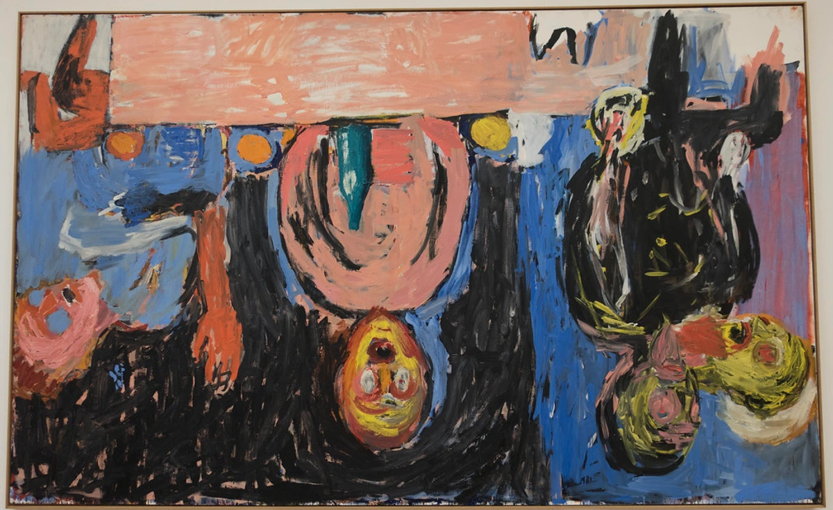
Throughout art history, various movements have implicitly or explicitly championed the manipulation of tints, tones, and shades:
- The Renaissance and Chiaroscuro: Masters like Caravaggio and Rembrandt, with their dramatic use of light and shadow (chiaroscuro), were, in essence, experts in shades. They plunged backgrounds into deep, rich shades to make highlights pop, creating intense drama and sculptural form through extreme value contrast. Think of the deep, velvety shadows in Caravaggio's "The Calling of Saint Matthew," where intense darks amplify the luminosity of the figures, crafting a sense of profound spiritual weight.
- Impressionism: Monet and his contemporaries were fascinated by light. They used delicate tints to capture the fleeting moments of dawn or dusk, depicting atmospheric effects by subtly lightening their hues with white, creating airy and luminous scenes. Monet's "Impression, Sunrise" is a prime example, where soft, tinted oranges and blues merge to evoke the ephemeral glow of a rising sun over the harbor, a masterclass in applying white to mimic light.
- Post-Impressionism: Artists like Vincent van Gogh pushed these ideas further. While he famously used bold, pure hues, he also employed rich shades and varied tones to add emotional weight and texture to his work. Think of the deep, contemplative blues and greens in his night scenes, like "The Starry Night," often achieved through thoughtful shading and toning that builds rhythmic texture and emotional depth. My own work, I like to think, builds on this tradition of emotional color.
- Fauvism: Led by artists like Henri Matisse, Fauvism famously embraced shockingly bold, pure hues, often applied directly from the tube without much mixing. However, even in their vibrant palettes, the interplay of light and dark, subtle tints, and deeper shades created powerful contrasts and emotional impact, albeit in a more direct and less naturalistic way. Their work is a testament to the raw power of unmodulated color, but still relies on relative value shifts to create visual excitement.
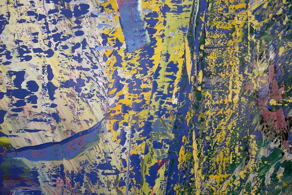
- Abstract Expressionism: Artists like Mark Rothko, whom I deeply admire, and Clyfford Still are masters of tone. Their expansive color fields, often using large areas of muted, desaturated colors, rely heavily on subtle tonal shifts to create immense emotional depth and spiritual resonance. Rothko's "No. 14 (White and Greens in Blue)" demonstrates how slight variations in toned green and blue create a profound, almost breathing, atmospheric space. Gerhard Richter's abstract paintings also frequently feature complex interactions of tints, tones, and shades, creating both harmony and discord, often through layered veils of toned color.
These historical examples show that understanding tints, tones, and shades is not just a technical exercise but a key to unlocking diverse forms of artistic expression and conveying profound meaning. It's the silent language beneath the shouted colors.
Digital Color Manipulation: Applying the Concepts to the Screen
While our hands-on experience in the studio revolves around physical pigments, the principles of hue, tint, tone, and shade are equally fundamental to digital art, photography, and graphic design. The tools might be different, but the underlying concepts are identical, offering you the same precise control over your visual language:
- Hue Adjustments: In digital software, the 'Hue' slider allows you to shift the pure color of an image or selection. This is directly manipulating the baseline hue, changing a red to an orange, or a blue to a purple, for example, without affecting its lightness or saturation.
- Tints (Lightness in Digital): When you adjust 'Brightness,' 'Exposure,' or add white in a digital color picker, you're essentially creating tints. Increasing brightness lightens the color, making it softer and more ethereal, mirroring the effect of adding white pigment. Think of using a digital airbrush with a low opacity white to create subtle highlights.
- Shades (Darkness in Digital): Conversely, decreasing 'Brightness,' 'Exposure,' or adding black in a digital color picker creates shades. This deepens the color, adding gravitas and intensity, just like adding black pigment. You can also achieve this by reducing the 'Lightness' value in an HSL (Hue, Saturation, Lightness) or HSV (Hue, Saturation, Value) color model.
- Tones (Desaturation in Digital): The 'Saturation' or 'Vibrance' sliders are your primary tools for creating tones digitally. Reducing saturation pulls the color towards grey, muting its intensity and creating a more sophisticated, natural, or subtle effect. You can also use 'Color Balance' tools to subtly shift hues while desaturating, mimicking the effect of adding complementary colors for more vibrant tones.
- Value Contrast (Digital): The 'Contrast' slider in photo editing software directly manipulates the range between the lightest (tints) and darkest (shades) parts of an image. Increasing contrast makes whites whiter and blacks blacker, enhancing the overall impact of your composition's value structure.
Understanding these parallels empowers you to apply your traditional color theory knowledge to the digital realm, allowing for more informed and artistic adjustments than simply guessing. For digital "chromatic blacks," you would use very dark, desaturated colors with subtle chromatic undertones (e.g., a dark, desaturated blue-green or a deep plum) rather than pure #000000, which can appear stark and flat on screen.

Frequently Asked Questions About Tints, Tones, and Shades
As you delve deeper into color theory, you'll naturally have questions. Here are some common ones I often hear, or have asked myself over the years:
Q: What's the easiest way to remember the difference between hue, tint, tone, and shade?
A: Think of it like this: Hue is the pure color. Tint adds White (lightens). Shade adds Black (darkens). Tone adds Grey (mutes or neutralizes, or a complement). The initial letters W, B, G can be a helpful mnemonic. Alternatively, think of Tints as 'lighter, softer versions', Shades as 'darker, deeper versions', and Tones as 'greyer, softer, more subdued versions' of a pure hue.
Q: Can adding black really maintain high saturation in a shade?
A: Yes, in some cases! While black generally reduces saturation, when you add a small amount of a very intense black (like Mars Black, or especially a chromatic black) to a highly saturated, powerful hue, it can deepen the color without completely 'killing' its vibrancy. Think of a deep, rich indigo (Phthalo Blue with a touch of a warm black) or a velvety forest green (Phthalo Green with a deep red); these are shades that still feel incredibly intense and saturated. Pigments like Phthalo Blue, Dioxazine Purple, and certain Cadmium Reds are known for retaining their intensity even when significantly darkened. The key is in careful, gradual addition and the quality of your black pigment.
Q: How do tints, tones, and shades relate to color harmony?
A: They are absolutely essential! Tints, tones, and shades allow you to expand a basic color harmony (like a complementary or analogous scheme) into a rich, complex palette. For example, in an analogous scheme, you might use a vibrant blue hue, then a soft blue-green tint, and a deep blue-violet shade, all working harmoniously. They provide the 'vocabulary' to articulate the 'grammar' of color harmony, allowing you to create depth, contrast, and subtlety within any chosen scheme. Without them, harmonies would often feel flat or simplistic, lacking the visual interest and emotional depth that these variations provide.
Q: Can I mix my own grey for tones?
A: Absolutely, and I encourage it! Mixing your own grey from black and white allows you to control its temperature (adding a touch of blue makes it cooler, a touch of red warmer). You can also mix 'chromatic greys' from complementary colors (like blue and orange, or red and green) which create even more nuanced tones that will vibrate beautifully with the other colors in your painting, avoiding a flat, 'dead' grey. These custom greys allow for tones that feel truly integrated into your unique palette and prevent your neutral areas from feeling boring.
Q: How do I know when I've achieved the 'right' tint, tone, or shade?
A: This is a fantastic question, and the answer lies in observation and context. There's no single 'right' answer, as it depends entirely on your artistic intention and the other colors in your composition. Ask yourself: Does this color achieve the lightness I want (tint)? Does it convey the depth I'm aiming for (shade)? Does it feel appropriately muted and harmonious with its neighbors (tone)? Test the color both in isolation and within the context of your painting. Step back frequently, view your work from a distance (or squint), and trust your eye. Often, a color feels 'right' when it supports the overall mood and message of your piece without drawing undue attention to itself – unless that's your intention. It's a feeling that develops with practice and keen observation, almost like learning to taste the right amount of seasoning in a dish.
Q: What's the difference between a shade and just a 'deep hue'?
A: A 'deep hue' would be a pure color that is naturally dark, like a deep Ultramarine Blue or a Dioxazine Purple, without any black added. It's inherently dark due to its pigment properties. A shade, on the other hand, is created by specifically adding black to any pure hue, making it darker than its original state. So, while a deep hue can function as a dark color, a shade is the result of a deliberate modification process with black.
Q: Are there specific pigments known for strong tinting, shading, or toning properties?
A: Absolutely! Some pigments naturally excel at these manipulations:
- Strong Tinting: Pigments with high opacity and intense chroma, like Cadmium Yellows and Cadmium Reds, hold their color beautifully when white is added, creating vibrant tints. Phthalo Blues and Greens also produce incredibly strong, luminous tints.
- Strong Shading: Naturally dark and highly saturated pigments like Dioxazine Purple, Phthalo Blue, and Phthalo Green maintain much of their chromatic identity even with significant black added, making for rich, deep shades. Adding transparent blacks like Lamp Black (judiciously!) can also create intense darks without fully dulling the hue.
- Strong Toning: Earth tones like Raw Umber, Burnt Sienna, and Yellow Ochre are inherently muted and create beautiful, natural tones. Their subtle warmth or coolness makes them perfect for desaturating vibrant hues without making them feel flat. Mixing your own chromatic greys from complements is also a fantastic way to create vibrant, integrated tones.
Conclusion: Your Palette, Unleashed
There you have it – a deep dive into the foundational concepts of hue, tint, shade, and tone. What might have once felt like confusing jargon, I hope, now feels like a powerful toolkit, ready to unleash new possibilities in your artistic practice. These aren't just technical distinctions; they are the very language through which you can create luminosity, drama, subtlety, and profound emotional depth in your art. They allow you to go beyond simply picking colors and empower you to truly sculpt with them, transforming a flat surface into a living, breathing world. It's about finding the perfect whisper, the perfect sigh, the perfect murmur in your visual conversation, painting with the full emotional spectrum, just as I strive to do in my own work.








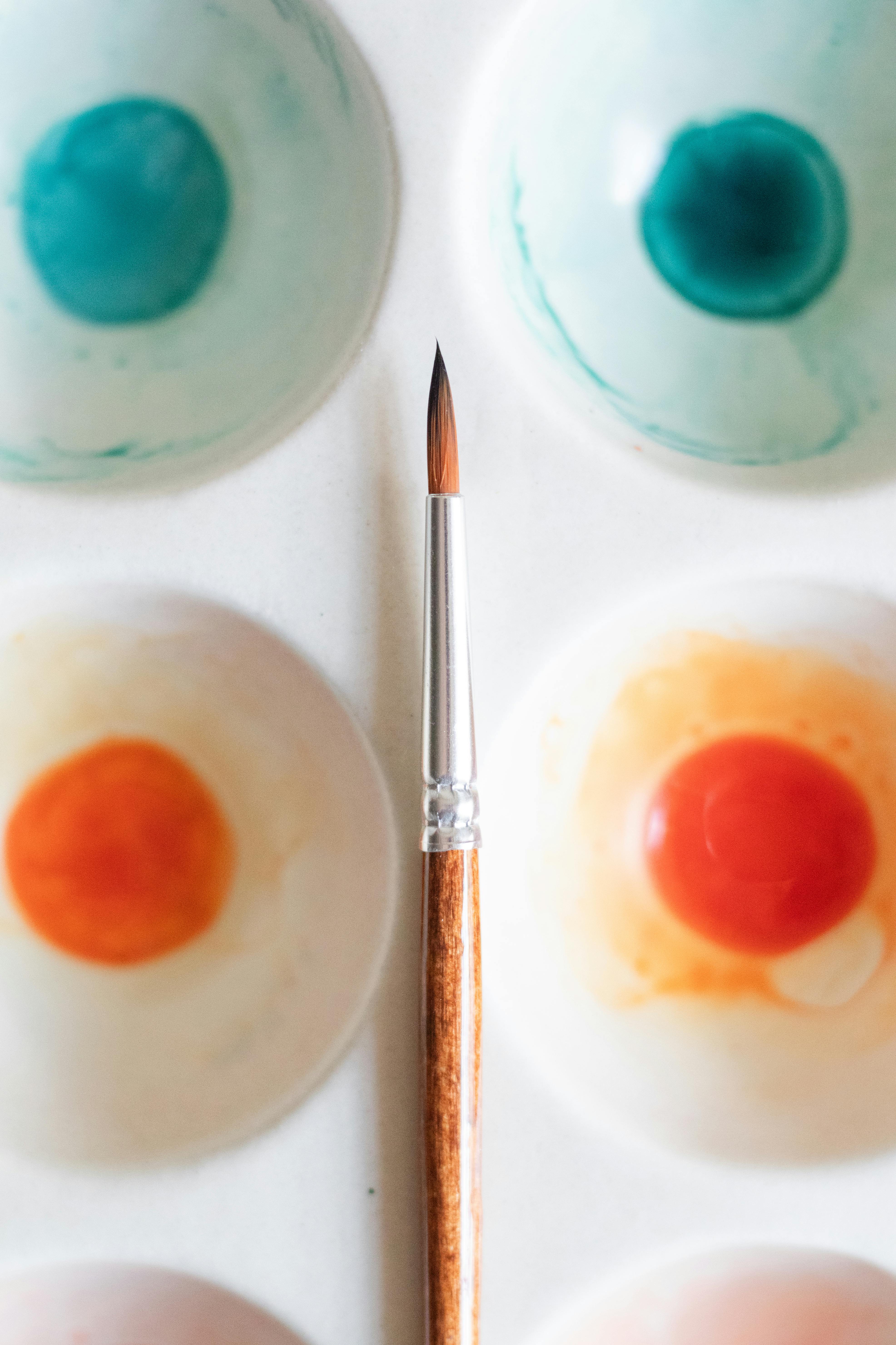


Remember, the journey of an artist is one of continuous learning and experimentation. Don't be afraid to get messy on your palette, to mix and observe, to make mistakes and discover unexpected beauties. Each tint, shade, and tone you create is a step further into your own unique artistic voice. So, go forth, experiment, and let your palette sing with all the vibrant, nuanced expressions you can imagine. Your canvas awaits!