How to Use Red in Abstract Painting: A Personal Guide to Taming the Fiery Heart
A deep dive into using the color red in abstract art. Learn about red pigments, composition techniques, and the psychology of this powerful color from an artist's personal perspective.

How to Use Red in Abstract Painting: A Personal Guide to Taming the Fiery Heart
Red is a bully. There, I said it. It pushes other colors around on the canvas, demands your attention, and if you give it an inch, it will take over the entire composition. For years, I was actually a little scared of it. I’d add a tiny dab of cadmium red, and suddenly my quiet, contemplative blue and grey piece was screaming at me.
But here’s the thing about bullies: once you understand them, you can learn to work with them. And red, for all its bluster, is one of the most rewarding, emotionally resonant colors in an artist's toolbox. It’s the color of life, of passion, of rage, of love. To ignore it is to paint with one hand tied behind your back. So, let’s talk about how to not just use red, but how to collaborate with it.
The Psychology of Red: It's Not Just One Thing
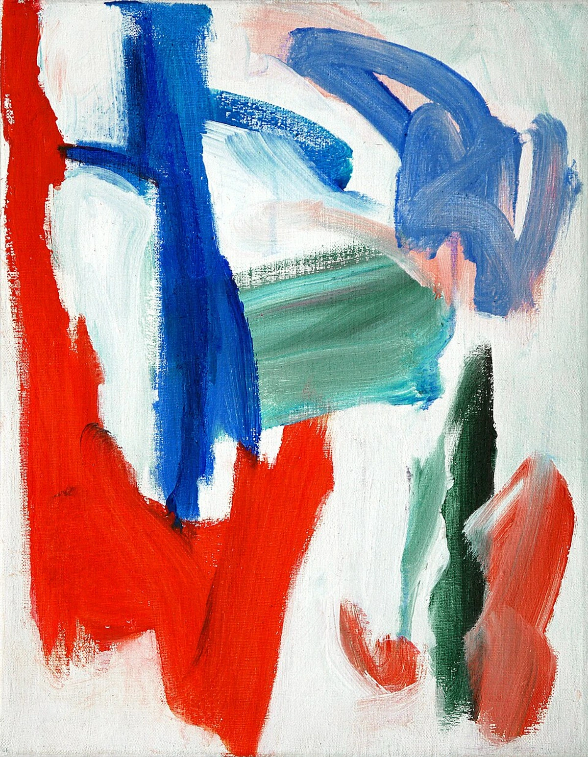
We’re often told red means anger or love, but it's so much more complicated than that. Think about it. There's the warm, inviting red of a fireside blanket, and then there's the alarming, electric red of a stop sign. The same color can feel like a warning or a welcome. In abstract art, you have the power to control that narrative.
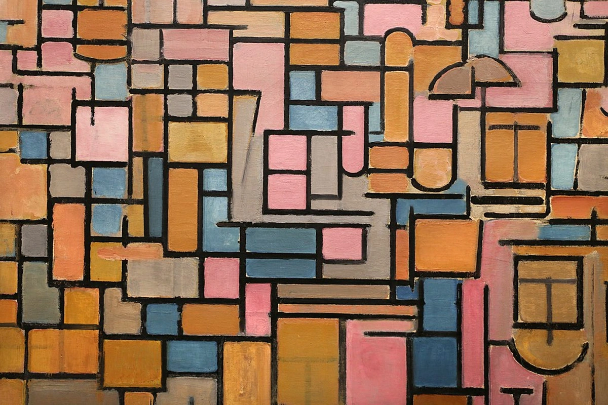
For me, red is pure energy. It’s the first jolt of caffeine in the morning. It’s the beat of a drum. When I put red on a canvas, the painting wakes up. The challenge is keeping that energy from spiraling into chaos. I’ve written more about this in my article on the fiery heart of red in my compositions, but the key is intention. What do you want the red to say? Understanding the psychology of color in abstract art is your first step to mastering it.
Choosing Your Weapon: Not All Reds Are Created Equal
Walking into an art store and looking at the reds can be overwhelming. They all look… red. But their personalities are wildly different. Picking the right one is like casting an actor for a role. You wouldn't cast a comedian in a tragic role, right? (Well, sometimes it works, but you get the point). Here’s a quick rundown of some of my go-to reds.
Pigment Name  | Personality | Opacity | Lightfastness | Toxicity | Notes & Best Use For |
|---|---|---|---|---|---|
| Cadmium Red | The Loud Friend. Bright, warm, powerful. | Opaque | Excellent | Moderate | Great for bold statements and blocking in color. A true power player. |
| Alizarin Crimson | The Mysterious Stranger. Deep, cool, bluish. | Transparent | Good | Low | Perfect for glazing and creating deep, rich shadows. It has a classic, moody feel. |
| Pyrrole Red | The Modern Hero. Clean, vibrant, versatile. | Semi-Opaque | Excellent | Low | A fantastic all-rounder. It mixes cleanly and is more lightfast than older pigments. |
| Quinacridone Red | The Subtle Diplomat. Rose-like, transparent. | Transparent | Excellent | Very Low | Wonderful for delicate washes, pinks, and creating a luminous glow. |
| Naphthol Red | The Impulsive Artist. Intense, slightly cool. | Semi-Transparent | Good | Moderate | Can be a bit finicky to mix, but its sheer intensity is sometimes exactly what you need. |
| Scarlet Lake | The Romantic. Bright, warm, slightly orange. | Semi-Transparent | Fair | Low | Excellent for creating bright, transparent reds and warm pinks. |
| Vermilion | The Traditionalist. Bright, pure, historic. | Opaque | Good | High | Traditional pigment with a rich history, but contains mercury. Use with caution. |
My advice? Start with two: one warm (like Cadmium or Pyrrole Red) and one cool (like Alizarin or Quinacridone). Seeing how they behave and mix will teach you more than any book. If you're new to this, my guide on how to mix paint colors is a great place to begin.
Advanced Pigment Chemistry
Understanding the chemistry behind red pigments can help you make more informed choices. Cadmium reds contain cadmium sulfide, which gives them their incredible opacity and brightness but also makes them toxic - hence why many studios now offer cadmium-free alternatives. Quinacridone pigments are modern organic compounds known for their exceptional lightfastness and transparency.
Pyrrole reds, developed in the mid-20th century, represent a breakthrough in pigment technology. They offer the intensity of traditional cadmiums without the toxicity concerns. This is why I often recommend them to students - they're powerful but safer to work with, especially if you're painting in a space without perfect ventilation.
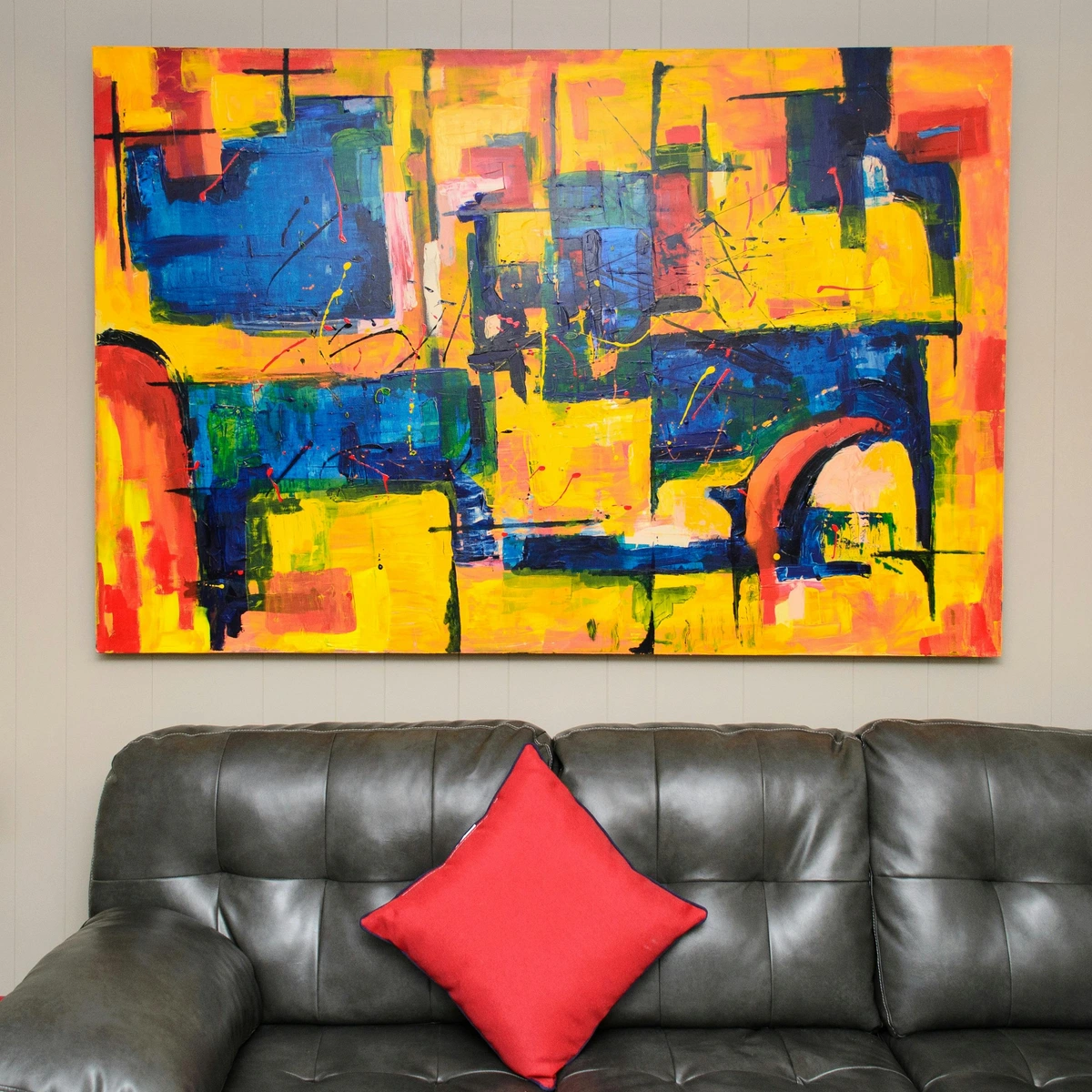
Lightfastness is crucial for artwork longevity. A pigment rated "excellent" will show minimal fading over decades, while one rated "poor" might change noticeably in just a few years when exposed to light. This is particularly important for reds, as some historically beautiful reds (like rose madder) have notoriously poor lightfastness.

Techniques for Taming the Beast
Once you have your paint, how do you actually use it without it taking over? This is about strategy and balance. Red is a heavyweight, so you need to be deliberate.
Historical Context: Red in Abstract Art
Red has been a powerful force in abstract art since the early 20th century. Think of Mark Rothko's luminous red fields that seem to breathe and pulse, or Piet Mondrian's bold red squares that break the strict geometry of his neoplasticism. In the Abstract Expressionist movement, artists like Willem de Kooning used red aggressively, almost violently, to convey raw emotion.
What's fascinating is how different artists have tamed red in their own ways. Rothko used thin glazes of red over warm grounds to create depth and luminosity, while de Kooning applied it thickly and gesturally for maximum impact. Understanding these approaches can give you a vocabulary for working with red in your own practice.
I remember visiting a Rothko chapel in Houston, surrounded by those massive red paintings. The way the red seemed to change as light shifted throughout the day was profound - it wasn't just a color, but an experience. That taught me that red in abstract art isn't just about visual impact, but creating an emotional atmosphere.

1. Red as a Spotlight
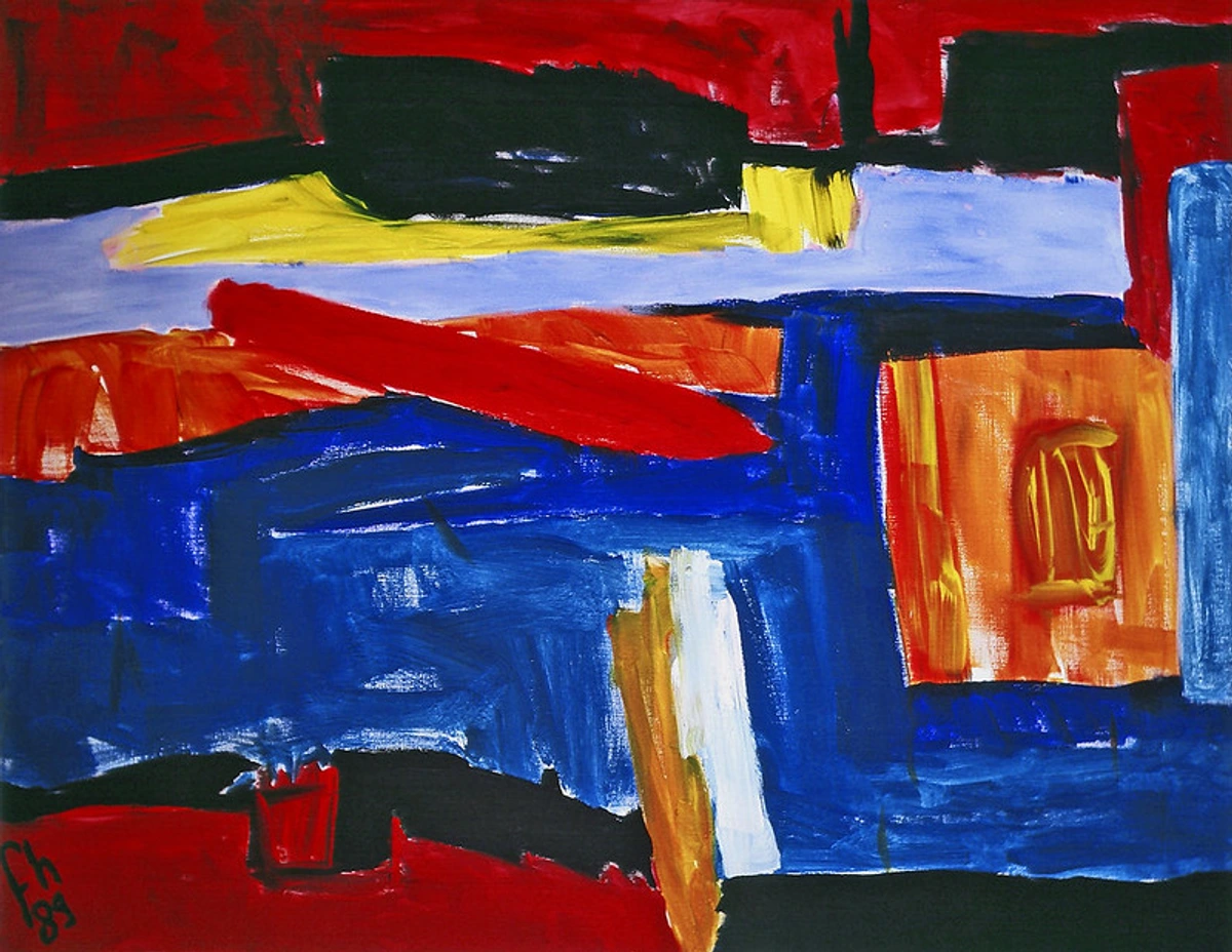
Sometimes, the most powerful way to use red is sparingly. A single splash, line, or shape of red in an otherwise neutral or cool-toned painting acts like a magnet for the eye. It creates a focal point and injects a sudden burst of energy. Think of Piet Mondrian’s journey. Before he got to his famous grids, he painted works like Evening; Red Tree. That tree isn't just a tree; it's a pulsating heart in a cool, blue landscape. It’s a perfect example of the meaning of the red tree in art.
2. The Flood: Creating a Red-Dominant Field
This is the advanced level. Making a painting that is mostly red without it being flat or aggressive is a real challenge. The secret? Texture and value variation.
Value Variation Strategies
Creating Depth Through Darks and Lights: Even within a red-dominated painting, you need variation. Pure, flat red can read as flat. By introducing darker reds (adding a touch of black or purple) and lighter reds (adding white or orange), you create the illusion of depth and space. I often start with a mid-toned red as my base and then build darker and lighter areas.
Temperature Shifts: Warm reds (leaning toward orange) advance spatially, while cool reds (leaning toward purple) recede. By strategically placing warm and cool reds, you can create a sense of depth even within a monochromatic red painting. This is one of my favorite techniques - it's like creating a landscape using only reds.
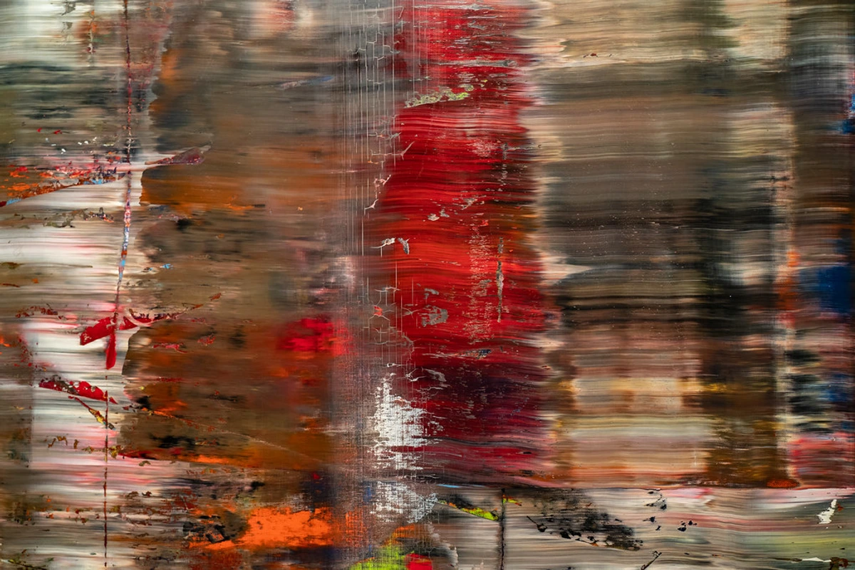
- Vary your reds: Mix in a tiny bit of blue, or orange, or even green to create slightly different shades of red. This creates depth.
- Play with texture: Use thick impasto strokes next to thin, glazed layers. Scrape into the paint. This breaks up the solid field of color and makes it interesting. My favorite methods are in this guide on exploring texture techniques.
- Glazing: A thin, transparent layer of a cool red (like Alizarin Crimson) over a lighter, warmer red can create an incredible sense of luminosity. It’s one of my favorite tricks, and you can learn more about the art of glazing.
3. Red's Relationships: Color Pairings
Red doesn't exist in a vacuum. Its entire personality changes based on who it's hanging out with. Understanding a little color theory in art can go a long way.
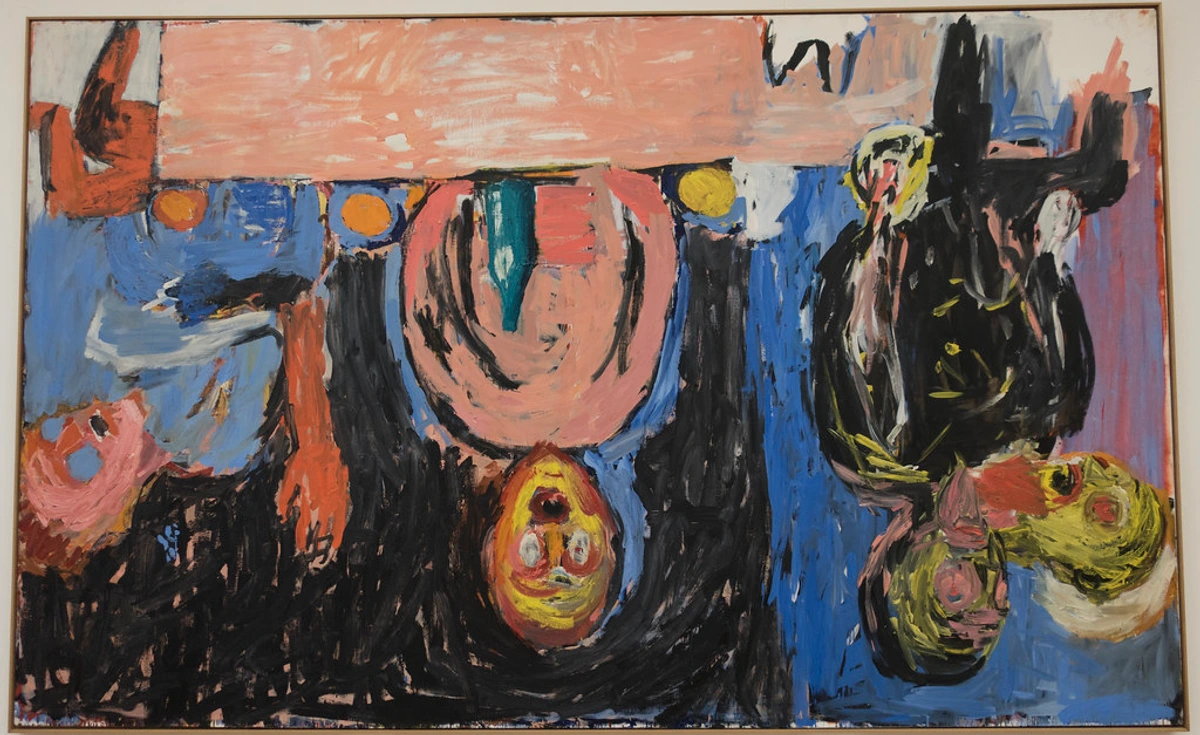
- Red and Green: The classic complementary pair. They make each other vibrate. It can be jarring (Christmas!) or beautiful and earthy, depending on the shades you choose.
- Red and Blue: A primary power duo. This combination feels classic, bold, and authoritative. It can also create a beautiful tension between warm and cool.
- Red and Black: Dramatic, intense, and sometimes a bit ominous. It’s a combination that screams for attention.
- Red and White: Creates pinks and tints. It softens red's aggression and can feel anything from delicate and romantic to pop-art bold.
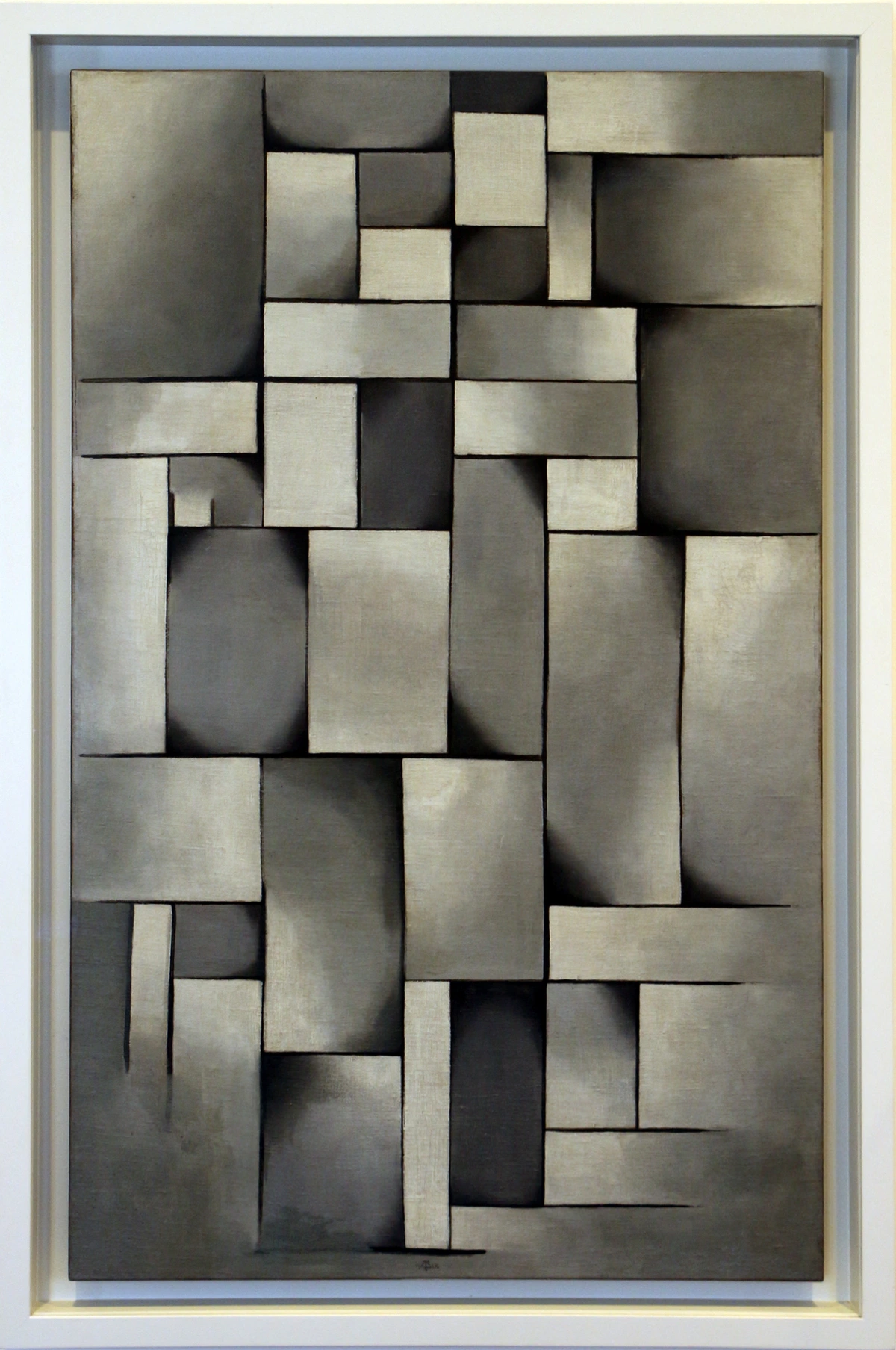
- Red and Neutrals (Grey, Beige): This is one of my favorites. A sophisticated combination where the red can truly sing without competition.
FAQ: Your Red Questions Answered
Q: What's the single best red paint for a beginner?
A: I'd recommend a good quality Pyrrole Red. It's a versatile, mid-range red that mixes cleanly, is very lightfast, and isn't as overpowering as a Cadmium. It’s a reliable workhorse.
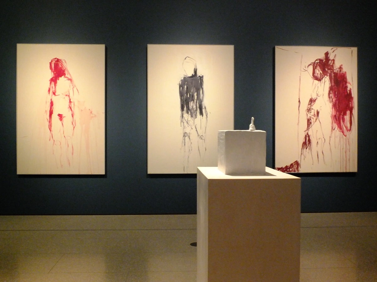
Q: My red always looks too aggressive. How can I tone it down?
A: You have a few options. You can physically mix it with another color—a touch of its complement, green, will mute it and create beautiful, complex browns. A bit of white will make it pink. Or, you can tone it down through composition by surrounding it with calming neutrals or dark, grounding colors.
Q: How does lighting affect how red appears in my paintings?
A: Lighting dramatically affects red perception. Warm light (like incandescent bulbs) will make reds appear more orange and vibrant, while cool light (like fluorescent or daylight) will make them appear more purple and intense. Natural daylight is often the most accurate, but gallery lighting can completely change how your reds are perceived. This is why it's crucial to view your work under different lighting conditions before finalizing a piece.
Q: Can I mix a pure, primary red?
A: No, you can't. Red is a primary color (along with blue and yellow), which means you can't mix it from other colors. You have to buy it in a tube. This is a fundamental concept in how to mix paint colors.
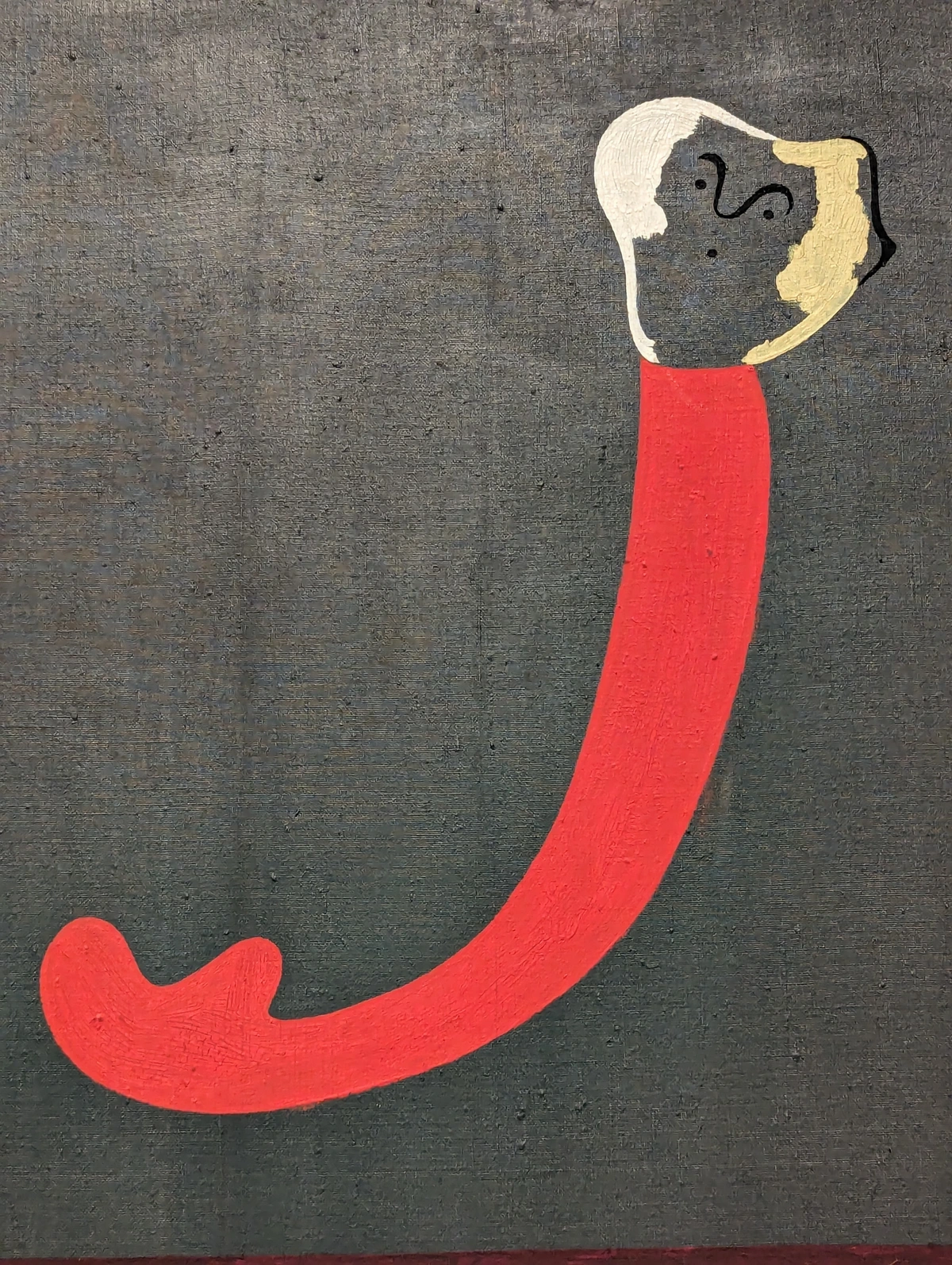
Q: How do I fix mistakes when working with red?
A: Red is notoriously difficult to cover because it's so strong and often staining. For acrylics, you can sometimes lift it while it's still wet with a damp brush or cloth. For oils, you can wait for it to dry and then apply a thick layer of lighter paint over it. Prevention is key - work slowly and test red mixtures on scrap paper before applying them to your main piece.
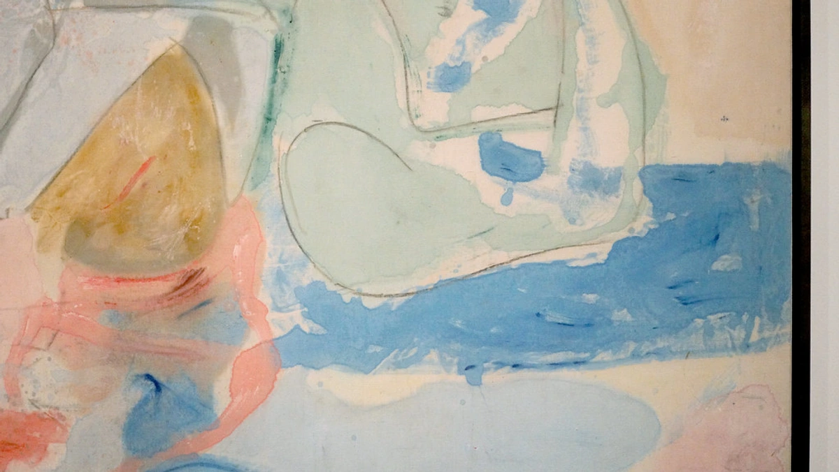
Q: What color makes red pop the most?
A: Its direct complement, green. Placing a pure red next to a pure green will create the strongest possible contrast and make both colors seem more vibrant. Be careful though, this effect can be intense!
Q: How do I create the illusion of distance with red?
A: In traditional perspective, cool colors recede and warm colors advance. But in abstract art, you can play with this. To make red appear to recede, use it in its cooler, darker versions (deep burgundy, wine reds) and place it in the background. To make it advance, use bright, warm reds in the foreground. You can also use size - smaller red elements can appear farther away than larger ones.
Practical Exercises for Mastering Red
Sometimes the best way to learn is by doing. Here are some exercises specifically designed to help you understand and master red:
Exercise 1: The Red Monochrome Challenge Create an entire painting using only red and white (to create tints) and red and black (to create shades). This forces you to explore the full range of possibilities within a single color family.
Exercise 2: Emotional Red Series Create three small paintings, each focusing on a different emotion associated with red: passion, anger, and joy. Use different techniques and red variations for each to see how the same color can convey different feelings.
Exercise 3: Red Spotlight Practice Create several small compositions where red serves as the focal point against different backgrounds: cool blues, warm oranges, and neutral greys. Notice how the red's personality changes in each context.
Final Thoughts: Don't Be Afraid
My journey with red has been one of moving from fear to respect to collaboration. Red taught me to be bolder, to be more intentional with my marks, and to understand that the most powerful tools are often the most challenging to wield.
So, my advice to you is this: buy a tube of red you've never used before. Put it on your palette and just see what it does. Let it be a bully. Let it scream. And then, quietly, show it who's in charge. You might be surprised by the conversation you have.
The Evolution of Your Relationship with Red
What's fascinating about working with red is how your relationship with it evolves over time. When I first started, every red painting felt like a battle. Now, after years of practice, red and I have a dialogue - sometimes it's argumentative, sometimes it's harmonious, but it's always engaging.
I keep a sketchbook specifically for red experiments. When I'm stuck or frustrated with a piece, I'll open it and just play with red on paper, no pressure, no expectations. This practice has taught me more about red than any formal training ever could. Red becomes less of a problem to solve and more of a conversation partner.
Remember that every artist who has ever worked with red has faced these same challenges. From Renaissance masters to contemporary abstract artists, red has always been both seductive and difficult. The difference is simply how much time you're willing to spend learning its language.
If you're interested in seeing how I've used these ideas, you can see some of my work available for purchase here. Or, take a trip through my artistic journey on my timeline. Happy painting.
Further Reading and Resources
If you want to dive deeper into working with red and color theory, here are some additional resources that have been influential for me:





Books:
- "Interaction of Color" by Josef Albers - A classic exploration of how colors affect each other
- "Blue and Yellow Don't Make Green" by Michael Wilcox - Excellent for understanding pigment mixing
- "Color and Light: A Guide for the Realist Painter" by James Gurney - Though focused on realism, the color theory principles apply to abstract work
Online Resources:
- The Winsor & Newton pigment database for detailed information about specific pigments
- Various color theory calculators and tools that help visualize color harmonies
- Museum collection websites, where you can examine how master artists used red in their paintings
Red in Contemporary Art Practice
Contemporary artists continue to push the boundaries of how red is used in abstract art. Some are exploring red in digital media, where the color behaves differently than in traditional paint. Others are combining red with unconventional materials - metals, plastics, textiles - to create new visual experiences.
What excites me most is seeing how younger artists are reinterpreting red's traditional associations. They're not bound by historical symbolism but are creating new meanings and contexts for this powerful color. This is the future of red in abstract art - constant evolution and reinterpretation.
No matter where your artistic journey takes you, I hope red becomes a trusted companion rather than a feared opponent. It has so much to offer if you're willing to listen and learn from it. Happy painting!