Master Paint Mixing: Avoid Mud, Create Vibrant Colors & Nuance
Unlock the artist's secret to color mixing. Dive into primary colors, pigment properties, color bias, tints, tones, and shades to mix any vibrant hue without frustration. Your ultimate guide starts here.

How to Mix Paint Colors Without Making Mud: An Artist's Guide
I remember it vividly. I was maybe 15, armed with a brand-new set of acrylics, absolutely convinced I was about to create a masterpiece. I wanted a specific, dusky purple. So, I squeezed out some blue, a dollop of red, a touch of white... and then a bit more blue. Then, thinking it needed depth, a speck of black. The result? A color I can only describe as 'sad, industrial grey.' It was mud. Utterly disappointing, soul-crushing mud.
If that sounds familiar, you're in the right place. Mixing colors feels like it should be intuitive, but it often ends in frustration. It's the secret handshake of painting, the thing that separates fumbling from fluency. But here’s the secret: it’s not magic, it’s just a little bit of knowledge. Think of this as me passing you the map I wish I’d had back then, so you can skip the mud-making phase and get straight to the good stuff.
The Unseen Architect: Why Color Theory Is Your Best Friend
Before you even think about getting your hands dirty, let's talk about the 'why.' So many people skip color theory because it sounds like a boring college lecture. But trust me, understanding a few basic principles is like learning to read a map before a road trip. You could just wing it, but you'll probably end up lost in Mudville again. I've been there more times than I care to admit.
Your Navigational Chart: The Color Wheel
Before we dive into individual colors, let's talk about the tool that makes understanding their relationships so much easier: the color wheel. Imagine a circle where colors are arranged in a logical sequence. It visually demonstrates primary, secondary, and tertiary colors, and crucially, shows you who's neighbors and who's opposites. It’s the visual map to our theoretical road trip.
The Three Unmixables: Primary Colors
Everything, and I mean everything you mix with paint, starts here. The primary colors are the foundational building blocks of every other color you'll ever create. For pigment mixing (what we're doing with paint), these are:
- Yellow
- Blue
You cannot create these three colors by mixing others. They are the source. Simple as that. It's worth noting that light primaries (Red, Green, Blue) are different, but for painting, these are your bosses.

Mixing It Up: Secondary and Tertiary Colors
This is where the fun begins, and where the possibilities explode beyond those three basics. When you mix two primary pigment colors, you get a secondary color. It’s truly that simple:
Primary Mix  | Resulting Secondary Color |
|---|---|
| Yellow + Blue | Green |
| Red + Yellow | Orange |
| Blue + Red | Violet (Purple) |
Go a step further and mix a primary color with a neighboring secondary color, and you get a tertiary color. Think yellow-green, blue-violet, red-orange. These are the nuanced, complex colors that make paintings come alive, giving them that depth and subtlety. Suddenly, you're not just painting with six colors, but with a whole spectrum of possibilities, which is how I create the complex abstract worlds in my own work.
The Silent Influencers: Pigment Properties
Here’s a crucial piece of the puzzle that often gets overlooked: pigments themselves have personalities. Some are transparent, some are opaque, and some are strong stainers. Understanding these properties will save you a lot of grief (and wasted paint).
- Opacity: How much a color covers what's underneath it. Opaque colors (like Titanium White) are strong coverers.
- Transparency: How much light can pass through a color. Transparent colors (like Phthalo Blue) are like colored glass.
- Staining Power: How strongly a pigment dyes the surface or other pigments. High staining colors can be hard to remove or lighten.
Mixing a highly opaque color with a transparent one, or trying to lighten a high stainer, can drastically affect your results and often contributes to that 'muddy' feeling if you're not expecting it. I learned this the hard way trying to get a delicate glaze with an opaque red – disaster!
The Practical Magic: Let's Get Mixing
Alright, theory class is over. Let's get to the messy, wonderful part. The actual act of mixing paint is a physical skill, a dance between intention and material.
Your Workspace: The Palette
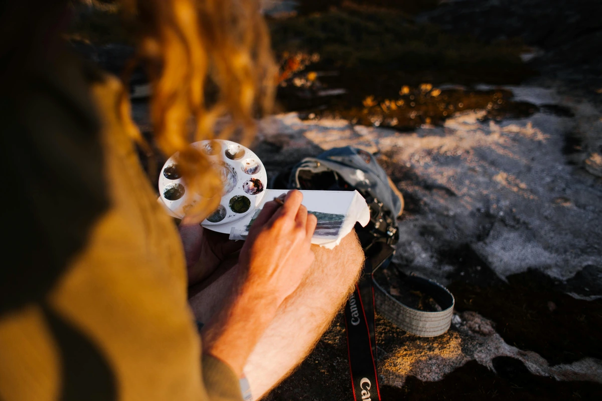
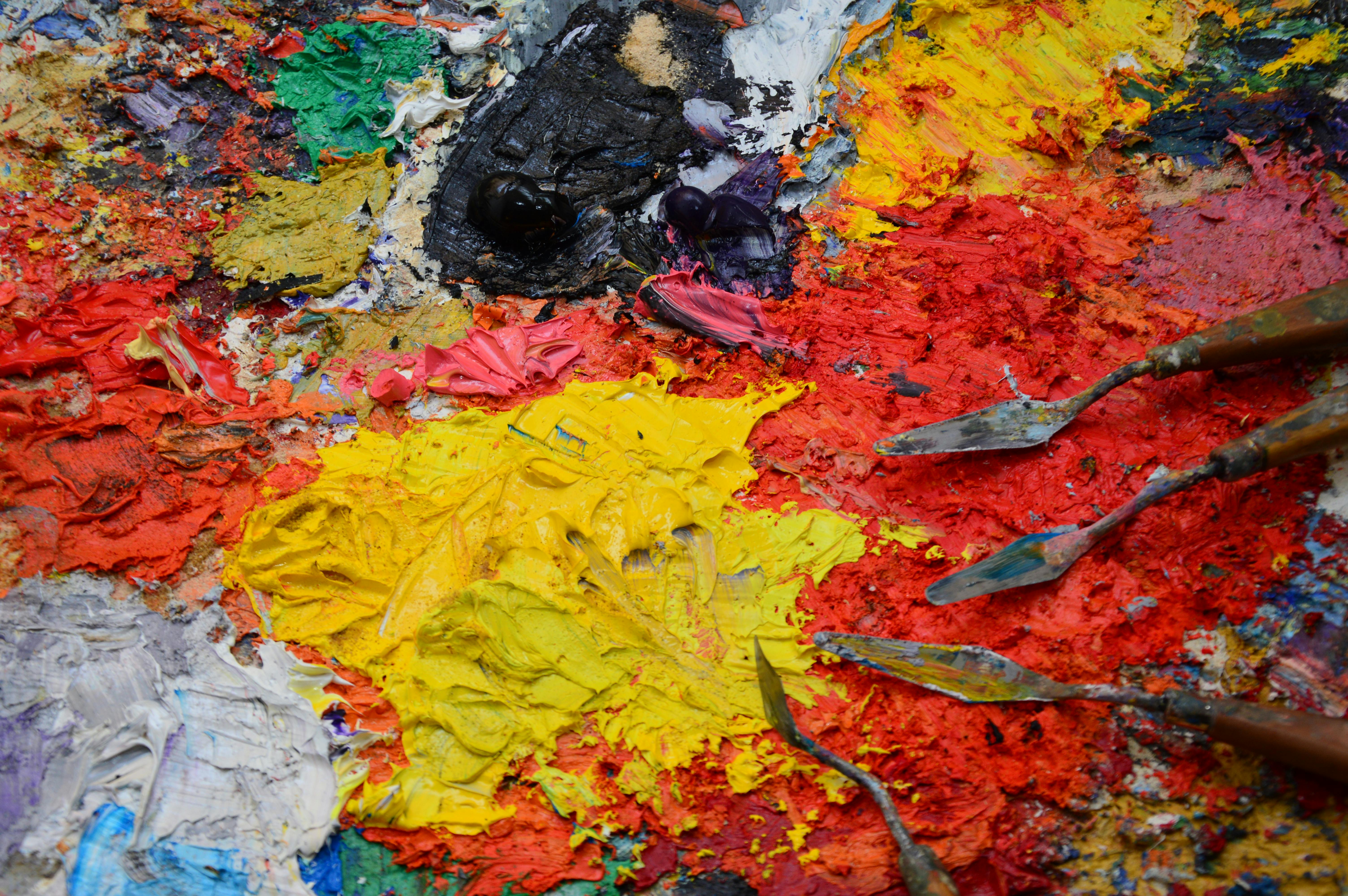
Your palette is your laboratory. It can be a fancy wooden one, a sheet of glass, or even a disposable paper pad. The goal is to have a clean, dedicated space. I personally love using a palette knife for mixing. It scrapes the paint together more cleanly than a brush and saves your bristles from a lifetime of abuse. Speaking of brushes, make sure yours are clean between mixes – a dirty brush is a mud-maker's best friend.
The Golden Rule of Mixing
If you remember nothing else, remember this: Start with the lighter color, and slowly add tiny amounts of the darker color.
Why? Because dark, strong pigments (like blues and reds, especially those with high staining power) will absolutely bully lighter pigments (like yellow and white). A tiny speck of Phthalo Blue can overwhelm an entire mountain of white paint. I’ve wasted more Titanium White than I care to admit by learning this lesson the hard way. Go slow. It’s easier to add more dark paint than it is to take it away. Trust me on this one; your wallet will thank you.
Step-by-Step Mixing
Let’s put that golden rule into practice. This is my go-to process for almost any color I want to mix:
Step | Action | Why it Matters |
|---|---|---|
| 1 | Squeeze out your base colors onto your palette, leaving space between them. | Organization is key to preventing accidental mixing and keeping your colors pure. A messy palette often leads to muddy colors, and who wants that? |
| 2 | Scoop a generous amount of your lighter base color into the middle. | This is your starting point, your 'canvas' for the new color. You'll be tinting or adjusting this mass of paint, ensuring you have enough to work with without running out midway through a stroke. |
| 3 | Add a tiny speck of the darker/stronger color to the edge of the pile. | This is where the 'slowly' part of the golden rule comes in. Adding only a tiny amount gives you maximum control. It’s far easier to add more dark pigment than to try and recover a color that’s gone too dark. Think of it as whispering to the paint, not shouting. |
| 4 | Mix thoroughly until the color is uniform. | Prevent streaks and ensure you get a true sense of the final hue you’ve created. Don't be afraid to really work the paint with your palette knife until there's no marbling or unmixed pigment. |
| 5 | Test the color on a scrap piece of paper or canvas. | Paint often dries a slightly different shade than when wet, especially acrylics. Always test on a surface similar to your final artwork to get an accurate representation. This little step can save you from a lot of frustration later on. |
| 6 | Adjust by adding more of the dark or light color in tiny increments. | Repeat until you have the exact color your heart desires. This iterative process is the heart of color mixing mastery. It's about patience, observation, and tiny adjustments until it feels just right. Sometimes it takes two adjustments, sometimes twenty! |

Level Up: Avoiding Mud and Creating Nuance
Once you've mastered the basics, it's time to explore the subtle nuances that elevate a painting from good to captivating. This is where we delve into the concepts that transform raw pigments into expressive hues. This is the artist's secret weapon, the point where you move from merely mixing to truly orchestrating color.
Tints, Tones, and Shades
This is the secret language of professional artists, and understanding this trio is crucial for creating depth and realism, or even just a more sophisticated abstract piece. For a deeper dive, check out my guide on the difference between tone, tint, and shade.
- Tint: Any color + White. This lightens the color. (e.g., Red + White = Pink). Tints generally appear brighter and softer.
- Shade: Any color + Black. This darkens the color. (e.g., Red + Black = Burgundy). Shades can add drama and depth, but be careful not to make them too dull.
- Tone: Any color + Grey (or by adding its complementary color). Adding grey or a complement desaturates the color, making it less vibrant and more complex. This is the key to creating natural, subtle colors, as pure, highly saturated colors are rare in nature. For instance, adding a tiny bit of green (red's complement) to red will create a muted, earthy red tone rather than a bright, pure red. This is how you achieve those sophisticated, naturalistic qualities in your work.
The Infamous 'Mud' Problem
Ah, mud. My old nemesis. 'Mud' is what happens when you mix too many colors together, especially when you inadvertently mix complementary colors (opposites on the color wheel, like red and green) without a clear plan. The colors effectively cancel each other out, resulting in a dull, desaturated, often brownish-grey mess. Your painting ends up looking lifeless, and your artistic soul sheds a tear. I've been there, trust me, it's a rite of passage.
Here’s how to avoid making muddy colors:
- Keep it Clean: Regularly clean your brushes and palette knife between mixes. Contamination from lingering pigments is the #1 cause of mud. A quick wipe and rinse can save you a world of hurt (and wasted paint).
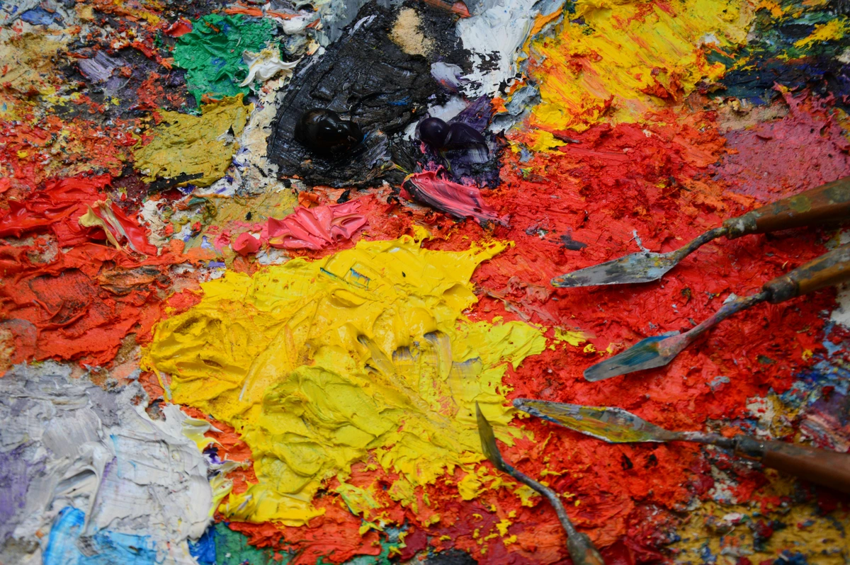
- Use a Limited Palette: Challenge yourself to paint with only 3-4 colors plus white. You'll be amazed at the range you can achieve, and it forces you to be a more intentional mixer, deeply understanding how your chosen pigments interact. I often find myself doing this for a color study.
- Mix Neutrals on Purpose: Instead of accidentally making brown, create it intentionally by mixing a tiny bit of a color's complement. A touch of red into green will create a beautiful, earthy green. A bit of blue into orange creates rich browns. This is how you control the 'mud' and turn it into something beautiful, sophisticated, and intentional. Think of it as controlled chaos.
Harmonizing Your Palette: Intentional Color Combinations
Once you grasp how individual colors behave, the next step is to make them sing together in a composition. This is where color harmony comes in. It's about choosing colors that naturally create a pleasing visual experience. The color wheel is your guide here, helping you identify relationships like:
- Complementary Colors: Opposites on the color wheel (e.g., red and green, blue and orange, yellow and violet). They create high contrast and vibrancy when placed next to each other, but can turn to mud if overmixed. Learning how to use complementary colors in painting is a game-changer.
- Analogous Colors: Colors that sit next to each other on the color wheel (e.g., blue, blue-green, green). They create calm, harmonious palettes. My guide on what are analogous colors explores this further.
- Triadic Colors: Three colors equally spaced on the color wheel (e.g., red, yellow, blue). These offer vibrant, balanced compositions.
Understanding these relationships allows you to create a cohesive color palette for abstract painting that feels intentional and impactful, rather than accidental.
The Hidden Personality: Color Bias
Here’s a pro tip that blew my mind when I first learned it: not all primary colors are created equal. You’ll often find a 'warm' and 'cool' version of each pigment. For example:
- A warm red (like Cadmium Red) leans slightly towards orange.
- A cool red (like Alizarin Crimson) leans slightly towards violet.
- A warm blue (like Ultramarine) leans towards violet.
- A cool blue (like Phthalo Blue) leans towards green.
Why does this matter? Because mixing a cool red (leaning violet) with a warm blue (also leaning violet) will give you a much cleaner, more vibrant violet. If you instead mix a warm red (leaning orange) with a cool blue (leaning green), you're inadvertently introducing tiny bits of all three primaries, leading to a duller, muddier violet. It’s like having a secret ingredient that either enhances or dulls your dish. Try a small experiment yourself: mix a 'warm' blue with a 'warm' yellow for a vibrant green, then try a 'cool' blue with a 'cool' yellow and see the difference in vibrancy. Understanding this bias is the key to mixing truly clean, vibrant secondary and tertiary colors every single time.
Frequently Asked Questions (FAQ)
How do you make brown paint?
YouYou can make brown in a few ways, all stemming from mixing your primary colors. The simplest is to mix all three primary colors (Red + Yellow + Blue). The ratio is key here: more red and yellow will give you warmer browns, while more blue will lean it towards a cooler, deeper brown or even a rich grey. Alternatively, you can mix a primary color with its complementary secondary color (e.g., Red + Green, or Blue + Orange, or Yellow + Violet). These combinations are essentially just another way of combining all three primaries. Experiment with ratios to get rich ochres, siennas, or deep umbers.
How do you lighten a color without making it chalky with white?
Adding white can sometimes make a color appear chalky or pastel. To lighten a color while maintaining vibrancy, try adding a lighter, analogous (neighboring) color. For example, to lighten a red, instead of just adding white, try adding a touch of yellow or orange. To lighten a green, add a little yellow-green. This shifts the hue slightly but keeps the color lively and transparent-looking, avoiding that flat, chalky effect.
Can I mix different brands of acrylic paint?
Yes, for the most part, you can mix different brands of professional or student-grade acrylic paint together without any issues. The main differences you'll notice are in consistency (some are thicker, some more fluid) and pigment load (professional paints tend to have more intense pigment). While generally safe, be aware that mixing very different consistencies might slightly alter your paint's texture. I often mix brands depending on the specific color or property I'm looking for.

How do I make grey without using black?
Black can often create a 'dead' or flat grey. For a more dynamic and interesting grey, mix equal parts of two complementary colors (like red/green or blue/orange) and then add white. This process of desaturation creates a rich, complex neutral that still contains hints of the colors it's made from. To control the hue of your grey, you can slightly favor one of the complementary colors; for instance, a touch more blue in your orange-blue mix will give you a cooler grey, while more orange will result in a warmer grey. This allows you to create truly nuanced greys that respond beautifully to other colors in your painting.
How do I keep my mixed colors consistent?
Oh, the bane of every artist's existence! It's incredibly difficult to perfectly recreate a specific mixed color later. My best advice: mix more than you think you'll need! If you're working on a large area, do one big batch mix. Also, consider creating a color study where you document your 'recipes' for future reference. I keep a little sketchbook with swatches, noting the approximate ratios of each pigment used. It's a lifesaver for larger projects or commissions!
What about digital color mixing?
While this article focuses on physical paint mixing, it's worth noting that the principles of color theory (primary, secondary, complementary, analogous colors, tints, tones, shades) apply universally, including in digital art software like Photoshop or Procreate. Digital tools often offer a color wheel and sliders for hue, saturation, and value, which are direct digital equivalents to the concepts we've discussed for physical pigments. Understanding the 'why' behind traditional mixing will make you a much more intuitive digital colorist as well.
Go Make Some Beautiful 'Mud'
The real secret to mastering color mixing is just... doing it. A lot. Embrace the experiments. Celebrate the weird, unexpected colors you create. That 'sad, industrial grey' I made when I was 15? These days, a color like that might be the perfect, subtle tone needed to make a vibrant color next to it absolutely sing in a composition. It's all about intentionality. The journey from accidental mud to purposeful nuance is incredibly rewarding.







There are no mistakes, only discoveries. So get your paints out, start small, and see what happens. The magic isn't in a secret formula; it's on your palette, waiting for you to bring it to life. And once you've found those perfect colors, you'll find endless inspiration for your next masterpiece, perhaps even one you'd be proud to see hanging in a place like the Den Bosch Museum or even offer as a print for others to enjoy in my shop.