Mastering Acrylic Color Mixing: Your Comprehensive Guide to Vibrant Hues & Banishing 'Mud Mountain'
Unlock vibrant acrylics! This comprehensive guide blends deep color theory, pigment science, and practical techniques to help you master mixing any hue, understand value and temperature, and permanently banish 'mud' from your palette. Discover the secrets to truly luminous colors and expressive art.

Mastering Acrylic Color Mixing: Your Comprehensive Guide to Vibrant Hues & Banishing 'Mud Mountain'
Let's be honest. We’ve all been there, right? That moment you try to mix the glorious, specific color dancing in your mind's eye, only to end up with… well, a sad, brownish-grey sludge. I call it 'Mud Mountain.' My studio has seen entire ranges of them over the years, a sprawling landscape of well-intended, yet frustrating, failures. I remember one time, I was so convinced I had the perfect stormy grey for a dramatic sky, only for it to dry looking suspiciously like dirty dishwater. It’s a true rite of passage, this feeling of frustration when your artistic vision doesn't quite translate to the canvas.
But what if I told you that getting the color you see in your head onto your canvas isn't some mystical secret guarded by old masters? It’s a beautiful blend of science, intuition, and a whole lot of giving yourself permission to just mess it up. This isn't just about avoiding 'Mud Mountain'; it's about unlocking the sheer joy and expressive power that comes with truly understanding your paints. This is my comprehensive guide to getting the colors you actually want, without the frustration, and perhaps, even finding a little unexpected magic in the process.
Beyond the Tube: The Mindset of a Master Color Mixer
Before we even talk about red and blue, let's get our heads straight. Mixing paint isn't just a technical skill; it's a mindset. You have to be willing to experiment and, yes, waste a little paint. Every 'wrong' color is a data point, a lesson in what not to do next time. Think of yourself as a friendly scientist in a lab, only your apron (not a lab coat, unless you’re feeling fancy) is probably already covered in glorious smears of color. That willingness to explore and accept unexpected results is fundamental to how I approach creating vibrant palettes in my own abstract work, which you can read more about in my article on my approach to color mixing: creating vibrant palettes in abstract painting.
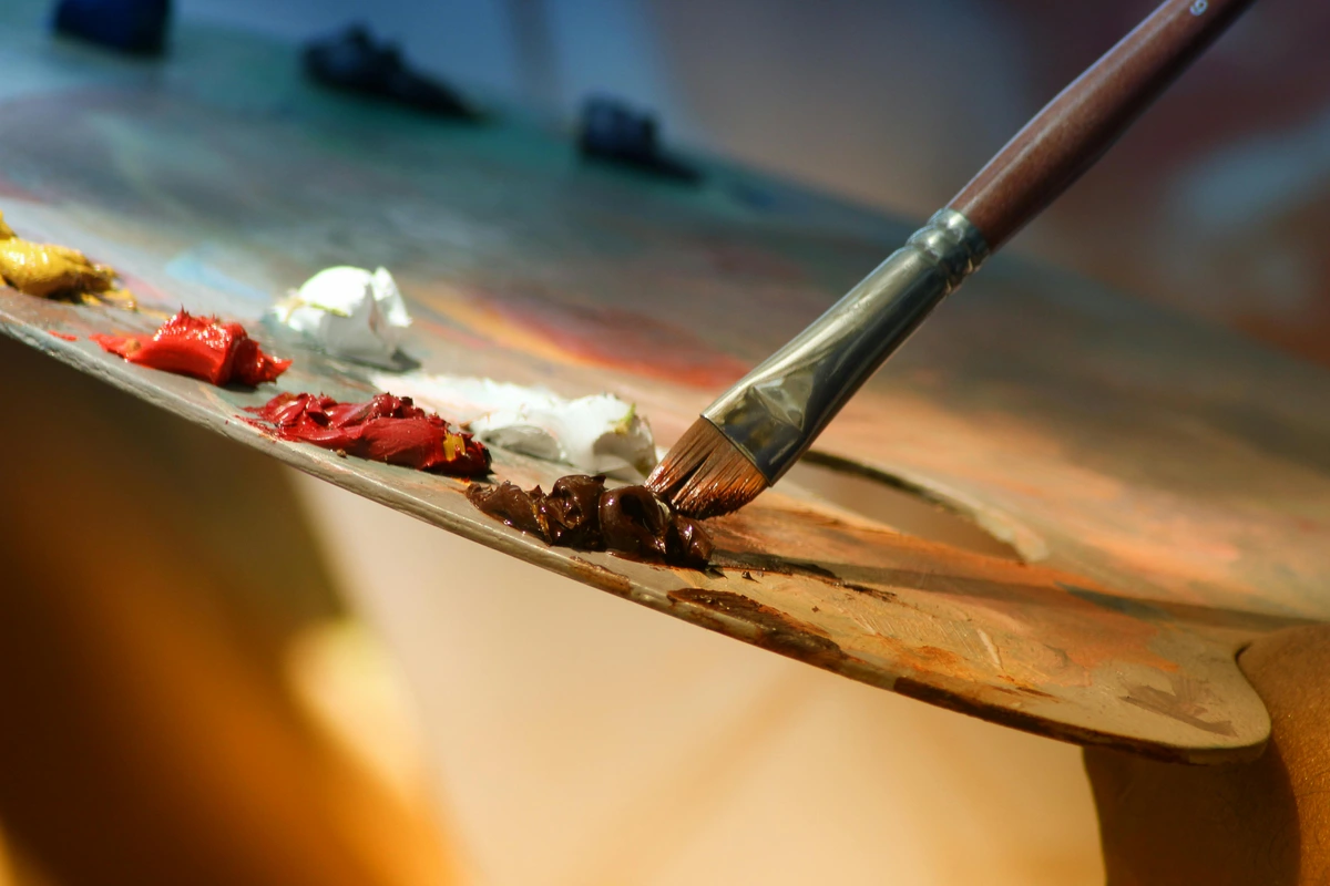
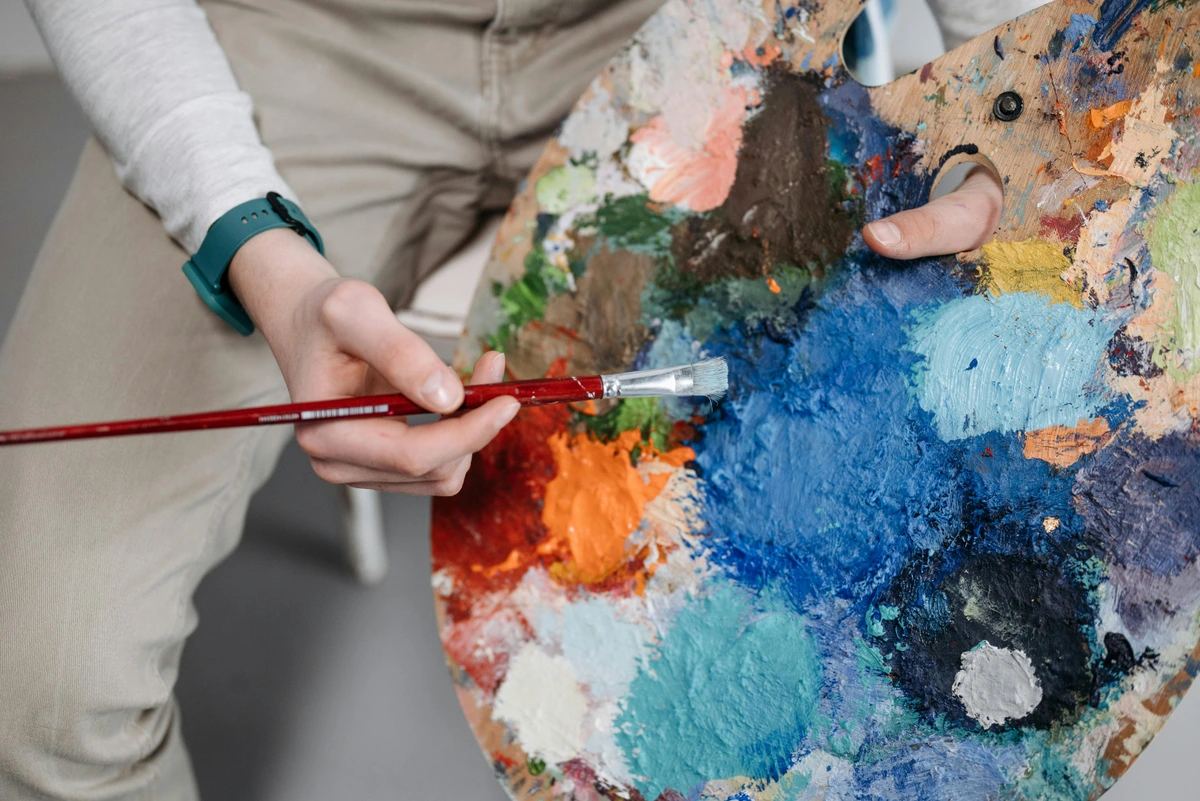
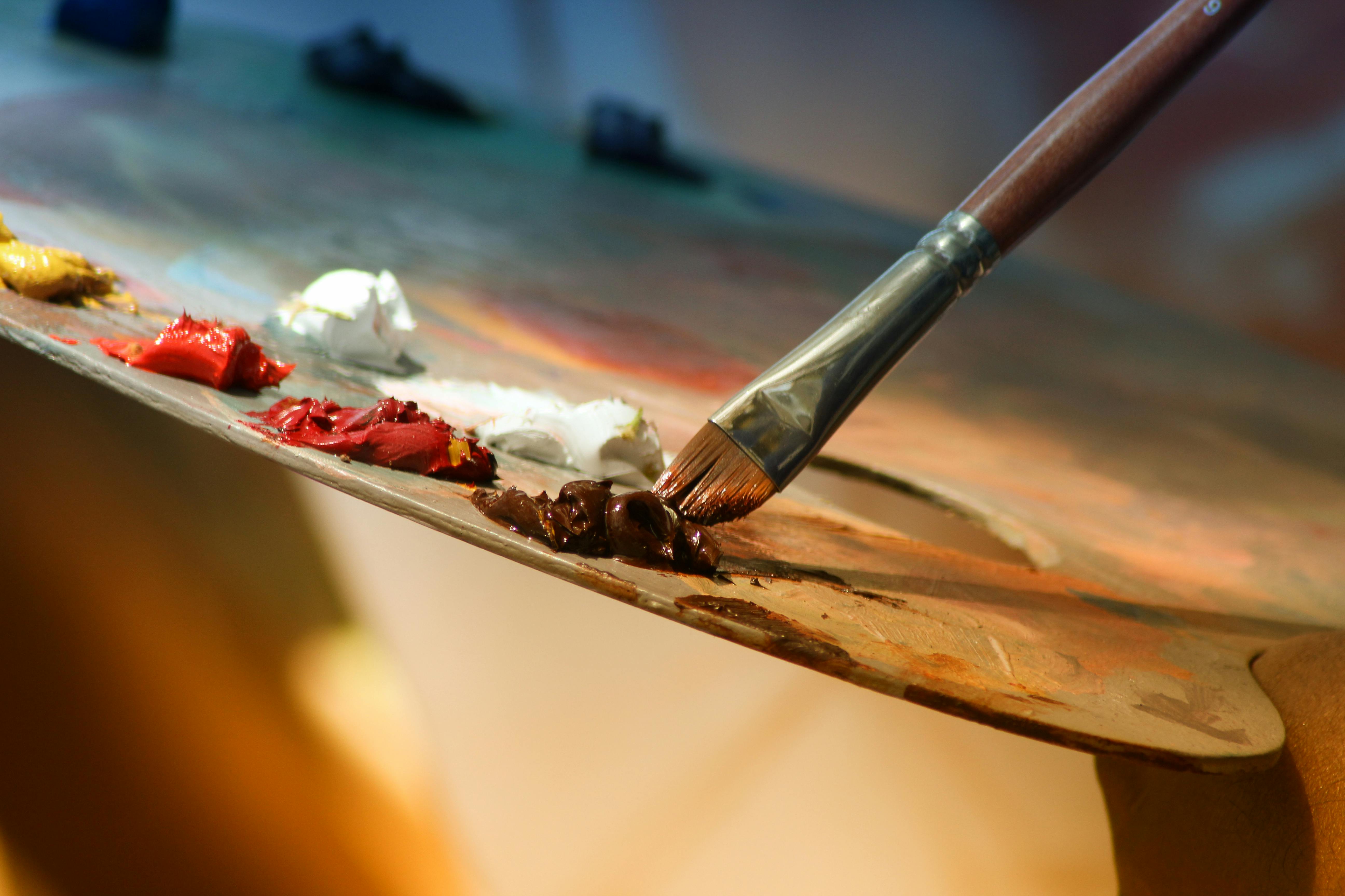
Your palette is your canvas's best friend, your co-conspirator in color adventures. Whether it's a fancy stay-wet palette or just a disposable paper one, this is your playground. A good palette knife is also a game-changer for mixing clean colors. The true secret, I've found, is to approach each mix with curiosity rather than rigid expectation. What can this color do? What happens if I just add a tiny speck of that? This open-ended exploration is where the real magic happens.
The Artist's Toolkit: Tools, Pigments, and Their Quirks
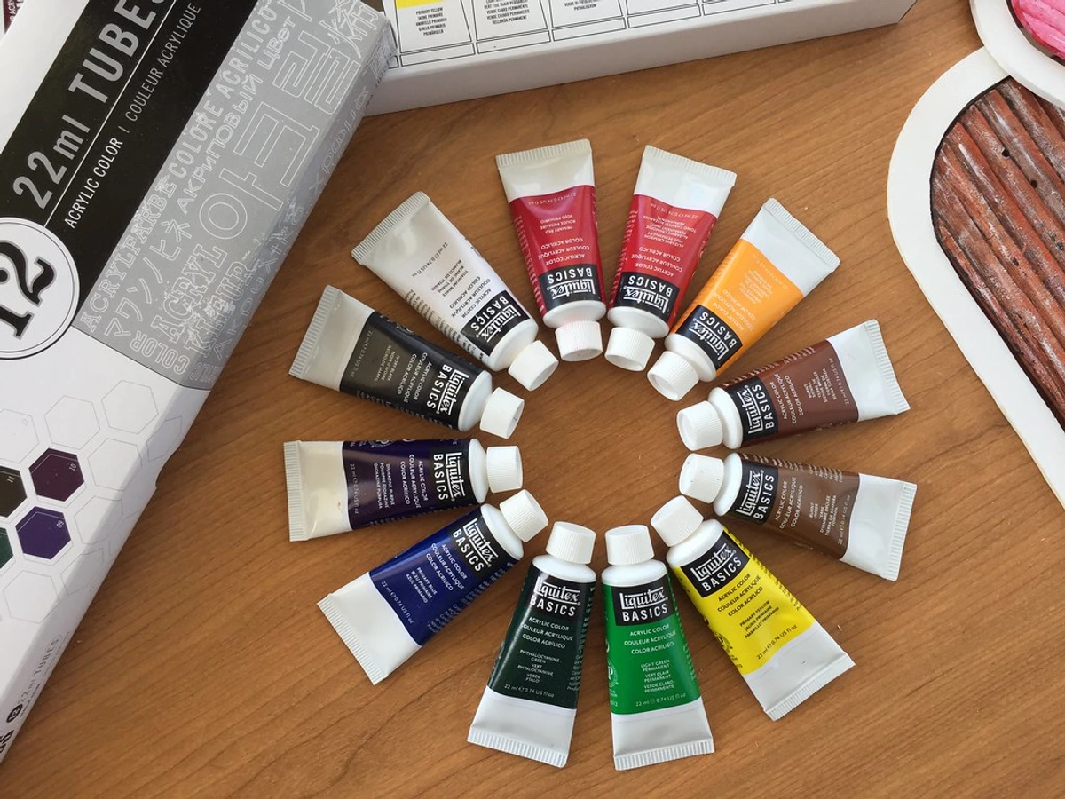
While your skill and eye are paramount, having the right tools certainly helps. The quality of your paint matters immensely. Student-grade paints have less pigment and more binder, which can result in weaker, less vibrant colors when mixed and often poorer lightfastness. Professional paints like Golden or Liquitex offer more punch, greater pigment load (meaning more pure color per tube), and superior consistency, making them a joy to mix and work with. The specific viscosity (thickness) and binder (the polymer emulsion that holds the pigment and forms the paint film) of your acrylics can also subtly affect how they blend, impacting drying time and workability compared to, say, oils or watercolors. I've even compared Golden vs. Liquitex if you're curious, and my article on different paint types for artists covers this in more detail.
Pigment Types: Understanding Your Palette's DNA
When we talk about pigments, it's helpful to distinguish between organic and inorganic types, as they behave quite differently. Understanding these inherent qualities helps you predict how a pigment will behave when mixed, preventing unexpected 'mud' or enhancing desired effects like glazing or opacity.
- Organic Pigments: These are carbon-based compounds, often synthetic today, though historically derived from plants or animals. Examples include Phthalos (blues and greens), Quinacridones (reds, violets, oranges), and Dioxazine Purple. They are known for their:
- High Tinting Strength: A little goes a very long way.
- Vibrancy and Transparency: Often jewel-toned and luminous.
- Potential for Staining: They can embed deeply into surfaces (and brushes), making them harder to clean.
- Inorganic Pigments: These are mineral-based, often natural earth pigments or synthetic mineral compounds. Examples include Cadmiums (reds, yellows, oranges), Earth Tones (Ochres, Siennas, Umbers), and Titanium White. They tend to be:
- Opaque: Excellent for coverage and building solid forms.
- Good Lightfastness: Often very stable and fade-resistant.
- Lower Tinting Strength (generally): Require more paint to achieve the same color saturation as organics.
Historically, artists faced far greater challenges with pigment consistency and permanence. The Impressionists, for example, gained their vibrant palettes partly due to new synthetic pigments becoming available, allowing for richer colors previously unattainable. Imagine trying to mix a truly vivid purple before the advent of certain synthetic organic pigments – it was a far more complex and often fleeting endeavor. Today, we stand on the shoulders of scientific advancements, which give us incredible stability and intensity in our acrylics.
Acrylic Mediums: Beyond Just Paint
Acrylic mediums are a game-changer for expanding your mixing possibilities and achieving diverse artistic effects. They can modify consistency, transparency, drying time, and finish without compromising color integrity. Using a retarder or slow-drying medium, for instance, can significantly extend the open working time of acrylics, giving you more freedom to blend and mix directly on the canvas without the frustrating rush. My article on best acrylic mediums for abstract artists delves deeper into these. Ultimately, investing in quality materials makes the entire mixing process more rewarding and predictable, providing you with a reliable foundation for your artistic explorations.
Color Theory 101: Your Essential Cheat Sheet for Acrylic Mixing
You don't need a PhD in art history, but a tiny bit of color theory goes a long, long way. It’s the grammar of painting, the foundational language that allows us to speak in hues and shades. For a deeper dive, my definitive guide to color theory in abstract art covers all the essentials.
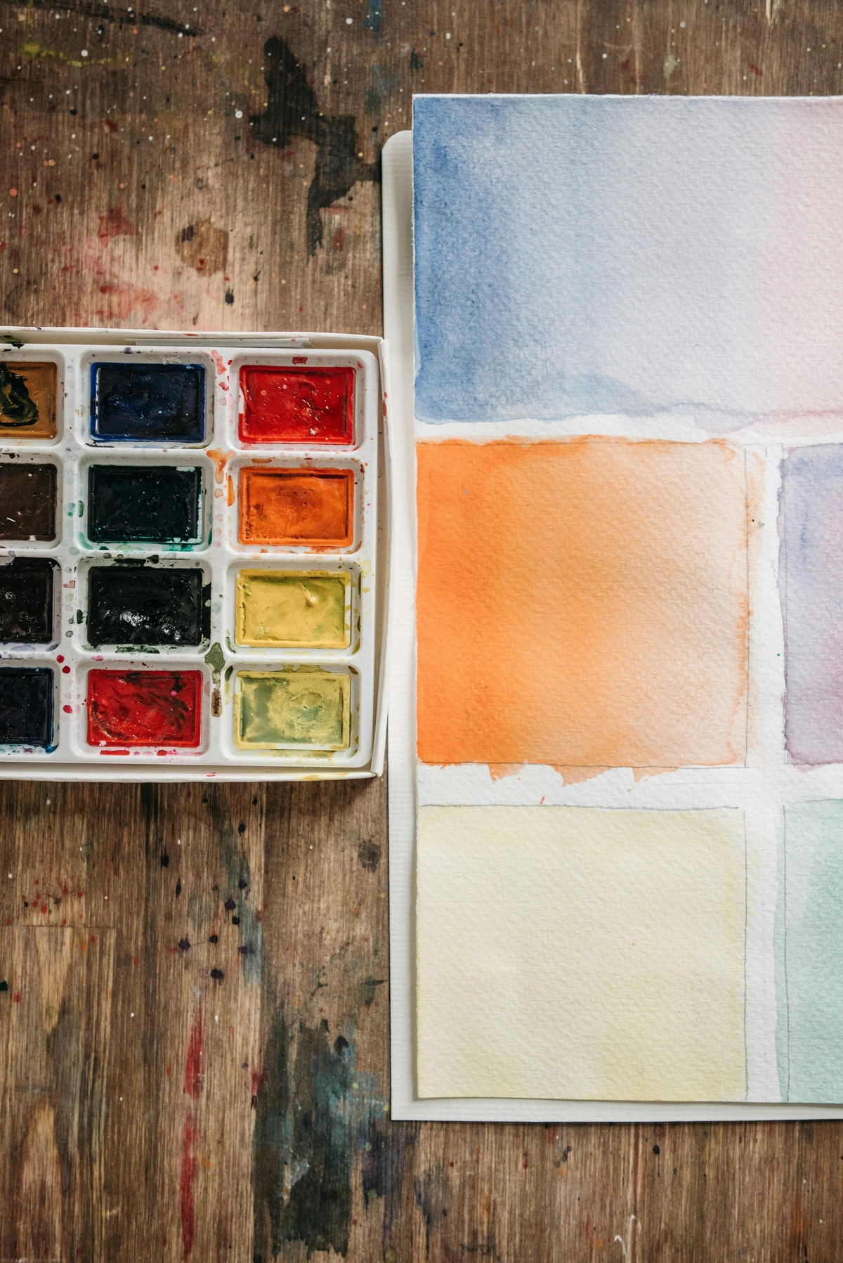
Before diving into mixing, it's incredibly helpful to visualize the color wheel. This circular chart organizes colors based on their relationships, showing you at a glance which colors are primary, secondary, tertiary, and which are complementary. It's your map to the world of color, and once you grasp it, those vibrant hues become much less intimidating. Building your own color wheel is also one of the best ways to understand these relationships intuitively.
Understanding Primary Colors: The Foundation of Acrylic Mixing
Everything starts here. Red, Yellow, and Blue. These are the Big Three. You can't mix these colors from other colors; they are pure, fundamental pigments. This is why they are called primary. Think of them as the parents of every other color on your wheel, the foundational building blocks from which all other visible colors can be derived. If you want to dive deeper into their significance, I've written extensively about what primary colors are.
Mixing Secondary Colors: Your First Steps in Hue Creation
This is where the magic begins. When you mix two primary colors together, you get a secondary color. It’s that simple. While the ideal ratio is often 50/50, remember that pigment strength varies significantly between brands and even between specific pigments within a brand. Pigment strength refers to a paint's ability to dominate a mixture, either through its tinting strength (how much it can lighten or darken other colors) or its inherent opacity. A strong pigment like Phthalo Blue will easily overpower a weaker yellow, so always add the stronger pigment in smaller increments to the weaker one.
Mix This Primary...  | With This Primary... | To Get This Secondary... |
|---|---|---|
| Red | Yellow | Orange |
| Yellow | Blue | Green |
| Blue | Red | Purple |
Mastering Tertiary Colors: Adding Nuance to Your Palette
When you mix a primary color with a neighboring secondary color, you get a tertiary color. Think of them as the grandchildren in the color family. These are colors like Red-Orange, Yellow-Green, or Blue-Violet. These are the colors that start to give your paintings nuance and complexity. A Red-Orange, for instance, is excellent for creating warm sunsets or adding vibrancy to a portrait's blush, while a Yellow-Green can capture the fresh tones of new spring leaves. I get really into how to use these in my article on secondary and tertiary colors and how I use them to create complex abstract worlds.
The Three Pillars of Vibrant Color: Value, Temperature, and Saturation in Acrylics
Okay, here’s where we move beyond the first page of the textbook. Understanding value (how light or dark a color is), temperature (how warm or cool a color feels), and saturation (the intensity or purity of a color, sometimes called chroma) is the difference between flat color and color that sings, between a painting that just sits there and one that truly pops. These are the nuances that can make or break your ability to escape 'Mud Mountain' and create truly vibrant works. For artists aiming for truly authoritative color mixing, a brief nod to the Munsell Color System can be helpful. It defines color in three dimensions: Hue, Value, and Chroma (Munsell's term for saturation), offering a precise way to describe any color.

Mastering Light and Dark (Value) & Avoiding Chalkiness
Your first instinct to darken a color is often to add black. Please, try not to do this. Adding black often just kills the color, making it dull, lifeless, and turning vibrant hues into muted, desaturated tones. This happens because black pigment absorbs nearly all light, flattening the light-reflecting qualities of other colors, reducing the color's inherent luminosity and vibrancy. Instead, try adding a touch of its complementary color (the color directly opposite it on the color wheel) or a dark, rich color like Ultramarine Blue, Burnt Umber, or even Payne's Grey. A deep violet or dark green (like Sap Green) can also be incredibly effective for deepening a hue while retaining its vibrancy and life. For example, to darken a red, try adding a tiny bit of its complement, green. This is a powerful technique that helps neutralize a color while adding depth, which I explore further in how to use complementary colors in painting.
Likewise, be careful with pure white. Adding it indiscriminately can make your colors look chalky and washed out, reducing their vibrancy and luminosity. White pigments (especially Titanium White) are very opaque and can quickly overpower other pigments, diluting their inherent color strength and making them appear desaturated, often creating a pasty, opaque finish. I remember one early painting where I wanted a soft pink sky, but kept adding Titanium White, and it just turned into a flat, chalky mess. Instead, try adding a bit of a light, warm yellow to your white for a softer, more luminous lightening effect. Or, consider simply using a lighter version of the color you're working with, perhaps a mix with another light, non-white pigment. Zinc White, for instance, is far more transparent than Titanium White and can be used for subtle glazes and tints without overpowering the underlying color. The transparency or opacity of your acrylic paints will also significantly affect how value shifts appear, especially when layering. Opaque pigments will lighten or darken more assertively, while transparent ones will allow underlying layers to show through. This is also where understanding what is the difference between student and artist-grade paint comes in handy, as artist-grade paints typically have a higher pigment load and truer colors.
The Intensity Meter (Saturation & Chroma)
While value deals with light and dark, saturation (often called chroma) deals with the purity or intensity of a color. A highly saturated color is vivid and bright, while a desaturated color is duller, leaning towards grey. You can lower a color's saturation by adding a tiny amount of its complementary color or a neutral grey. This is crucial for creating atmospheric depth or subtle shifts without resorting to 'mud.' Imagine a vibrant red next to a slightly desaturated red (like a dusty rose); the vibrant one will pop even more, creating dynamic tension. It's like turning down the volume on a color, allowing it to recede or support brighter elements. Conversely, if you want to increase saturation, ensure your base pigments are already highly saturated and pure, and avoid adding white or black, which will always desaturate a color. Remember that simultaneous contrast also plays a role here: a color's perceived saturation can change dramatically based on the colors surrounding it. A muted color will appear even duller next to a highly saturated one.
Warm vs. Cool Colors (Temperature) & Color Bias Explained
This concept truly blew my mind when I first grasped it. Not all reds, yellows, or blues are the same. Each primary color has a warm version (which leans towards orange/yellow, evoking feelings of energy and closeness) and a cool version (which leans towards green/purple, often suggesting calmness and distance). Knowing which one to use is absolutely key to mixing clean, vibrant colors instead of mud. This is often referred to as 'color bias' – the subtle leaning of a pigment towards one of its neighboring primary colors on the color wheel. This bias often stems from the pigment's chemical composition; for instance, Cadmium Yellow (warm) often contains more red-leaning particles than Lemon Yellow (cool), which might have subtle green undertones. For an additional layer of precision, each pigment also has a Color Index Name (e.g., PY35 for Cadmium Yellow, PB15 for Phthalo Blue). These codes provide a universal, unambiguous way to identify specific pigments, regardless of brand or marketing names, giving you precise control over your mixes.
Color | Cool Version | Warm Version | My Notes & Psychological Impact |
|---|---|---|---|
| Red | Alizarin Crimson | Cadmium Red Light | Alizarin (leans purple/blue, more subdued, suggests depth, sophisticated, often transparent). Cadmium Red (leans orange/yellow, fiery, advances, suggests passion/energy, typically opaque). Both are often organic pigments (derived from carbon compounds). |
| Yellow | Lemon Yellow | Cadmium Yellow Medium | Lemon (slightly greenish, crisp, recedes slightly, fresh). Cadmium Yellow (warm, orangey, sunny, evokes joy, advances). Cadmiums are inorganic pigments (mineral-based), known for their opacity and strong tinting strength. |
| Blue | Phthalo Blue (Green Shade) | Ultramarine Blue | Phthalo (cool, intensely greenish blue, transparent, suggests vastness, often quite staining). Ultramarine (warm, purplish blue, classic, serene, recedes, granular). Both are often inorganic pigments, but Phthalo is synthetic organic. |
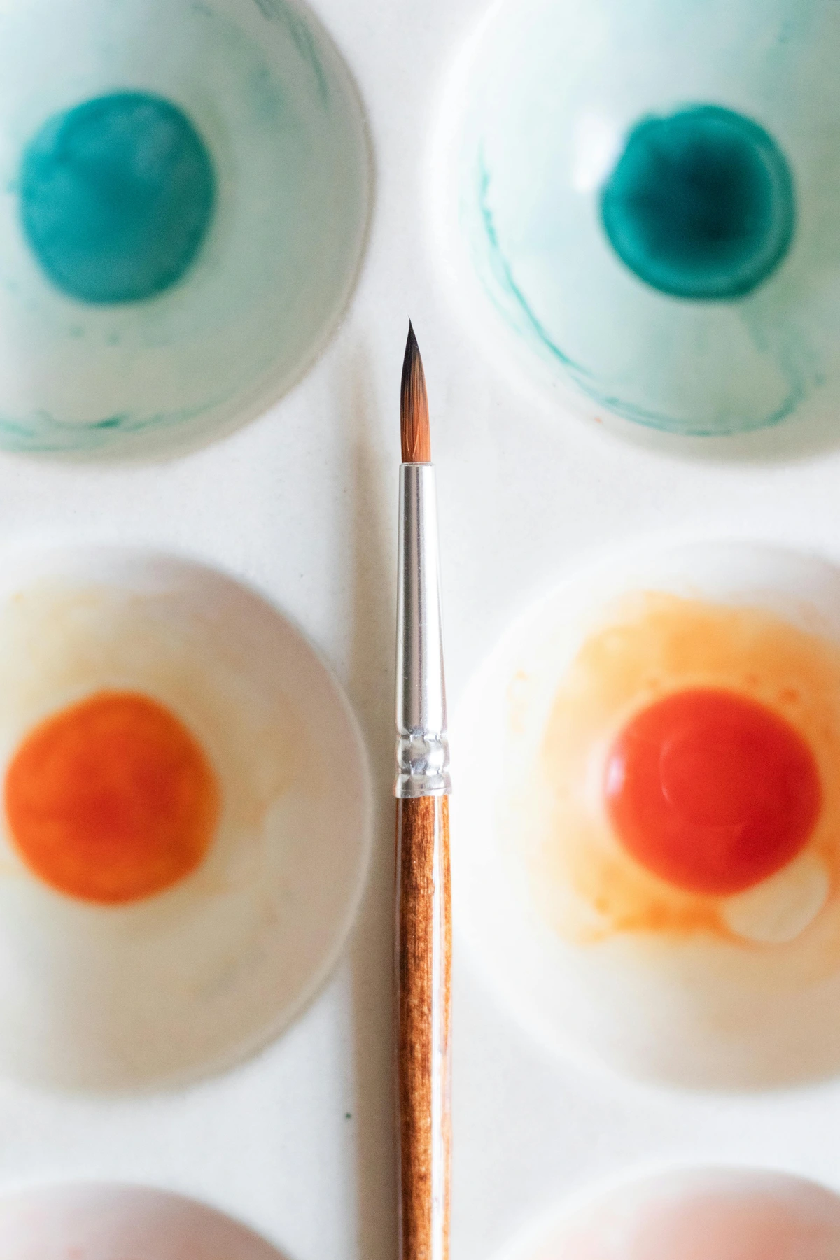
If you want a truly vibrant purple, mix a cool red (like Alizarin Crimson) with a warm blue (like Ultramarine Blue). Why? Because Alizarin Crimson already leans slightly towards blue/violet, and Ultramarine leans slightly towards red/violet. They are already predisposed to creating a rich, pure purple. Think of them as pigments that are already 'friends' on the color wheel, naturally moving towards purple. If you mix a warm red (Cadmium Red) and a cool blue (Phthalo Blue), you're inadvertently introducing a hint of yellow and green into the mix (Cadmium leans yellow, Phthalo leans green). These subtle undertones act as small amounts of complementary colors, which will neutralize and dull your purple, leading you straight to Mud Mountain. This is the core reason for the 'mud' phenomenon: unwanted complementary colors neutralizing your intended hue. The same principle applies to mixing vibrant greens (mix a cool yellow with a warm blue) or oranges (mix a warm red with a warm yellow).
Hue Shift and Lightfastness: What Happens Over Time
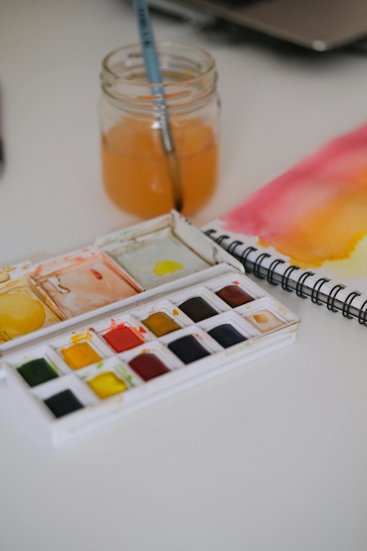
Acrylics, being polymer-based, can exhibit a phenomenon known as hue shift – where the color changes slightly as it dries. Most commonly, colors dry darker, but some pigments might shift slightly in hue or saturation. This drying shift occurs because the water in the acrylic emulsion evaporates, causing the polymer binder to become more dense and transparent, which in turn allows the pigments to appear darker and often more saturated than when wet. This is why test swatches (more on this below) are so critical! Some reds and yellows are particularly prone to drying darker than they appear wet. This phenomenon is why test swatches are not just a good idea, but a vital step in my process.
Moreover, an authoritative article needs to touch on lightfastness. This refers to a pigment's resistance to fading, discoloring, or darkening when exposed to light (especially UV light) over time. Professional-grade acrylics will typically have an ASTM (American Society for Testing and Materials) rating. Understanding these ratings is vital for creating lasting artwork:
- ASTM I (Excellent): Pigments show no appreciable change after extensive light exposure. These are considered permanent and suitable for museum-quality work. (e.g., most earth pigments like Burnt Sienna, Ultramarine Blue, Cadmiums).
- ASTM II (Very Good): Pigments show slight change after extensive light exposure. Generally considered permanent for most fine art applications. (e.g., some Quinacridones, Phthalos).
- ASTM III (Fair/Poor): Pigments show noticeable changes relatively quickly. Not recommended for permanent artwork, though sometimes used in student-grade paints or for temporary works. (e.g., some organic reds or violets).
Using paints with poor lightfastness, especially when mixing, means your beautiful, vibrant colors could fade or alter dramatically over the years. Always check the lightfastness rating on your paint tubes, especially for pieces you intend to keep or sell.
Crafting Harmonious Palettes: An Introduction to Color Harmony
Beyond mixing individual colors, understanding how colors relate to each other is crucial for creating cohesive and impactful artwork. This is the realm of color harmony. Whether consciously or intuitively, artists use color harmonies to guide the viewer's eye, evoke emotion, and create a sense of unity. If you want a deeper dive into the emotional impact of these relationships, I explore it in the psychology of color in abstract art.
Harmony Type | Description | Psychological Effect & Use Cases |
|---|---|---|
| Analogous | Colors next to each other on the color wheel (e.g., Yellow, Yellow-Green, Green). | Creates a serene, comfortable, and unified feel due to low contrast. Often found in nature (think a forest landscape), excellent for subtle transitions, peaceful moods, and establishing a dominant color scheme without harshness. They tend to make a painting feel cohesive and gentle. |
| Complementary | Colors directly opposite each other on the color wheel (e.g., Red and Green, Blue and Orange). | Creates high visual contrast, excitement, and energy. When used together, they make each other appear more vibrant and intense. Ideal for creating focal points, dynamic compositions, and making elements 'pop.' However, use sparingly or with desaturation to avoid overwhelming the viewer. Explore this in my article on how to use complementary colors in painting and beyond the spectrum. |
| Triadic | Three colors evenly spaced around the color wheel (e.g., Red, Yellow, Blue). | Offers a vibrant, balanced, and energetic palette without being overpowering, as long as one color dominates and the others accent. Excellent for creating playful, cheerful, or bold compositions, providing good contrast while maintaining overall harmony. Requires careful balancing of saturation and value to prevent discord. |
| Monochromatic | Different values and saturations of a single hue (e.g., light blue, medium blue, dark blue). | Creates a subtle, sophisticated, and deeply unified feel. Excellent for evoking a specific mood, focusing on form and texture, and providing a sense of calm or introspection. It allows the viewer to appreciate the nuances of a single color in its various forms. |
| Split-Complementary | A base color and the two colors adjacent to its complement (e.g., Blue with Red-Orange and Yellow-Orange). | Offers a similar level of visual tension and dynamism to complementary but with less intensity, allowing for more diverse combinations while maintaining harmony. It's often easier to work with than a strict complementary scheme, providing richness and contrast without the potential for jarring clashes. |
Understanding these basic relationships, which I delve into further in my guide to color harmonies, will elevate your mixing decisions beyond individual hues to a holistic approach to your canvas.
Color in Context: Perception & History
Color isn't just about what's on your palette; it's about how your brain perceives it, and how artists throughout history have leveraged this. Think about the Impressionists, for example. They understood optical mixing – the phenomenon where small dots or strokes of pure color placed side-by-side blend in the viewer's eye to create a new, vibrant color, rather than being physically mixed on the palette. Georges Seurat took this to an extreme with Pointillism, creating luminosity by relying entirely on the viewer's eye. This interplay of colors also involves simultaneous contrast, where the appearance of a color is altered by the colors adjacent to it. A grey square will look cooler next to a warm red and warmer next to a cool blue. Understanding these perceptual quirks gives you another layer of control over your final artwork. For a deeper dive into Seurat's groundbreaking work, check out who is georges seurat.
Another crucial aspect is the impact of lighting conditions. The colors you mix on your palette under cool studio lights will look subtly different under warm gallery lighting or natural daylight. This is why artists often recommend checking your work under various light sources to ensure your colors hold up. And remember our earlier discussion on pigment history? The very palette you work with today is a testament to centuries of scientific and artistic evolution, giving us permanence and vibrancy unimaginable to artists of the past. My article on the history of acrylic painting explores this fascinating journey.
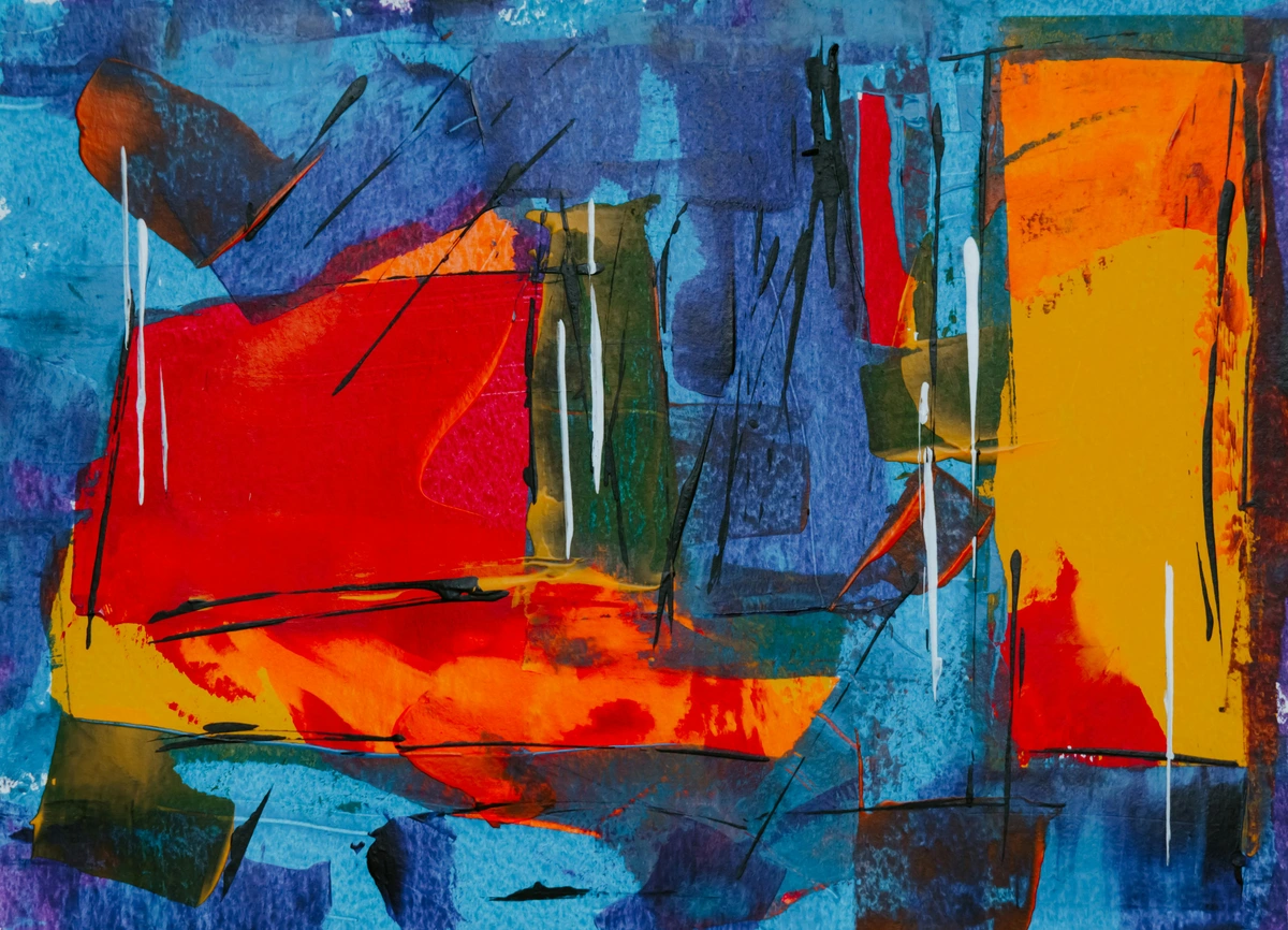
Let's Get Practical: Step-by-Step on Your Palette
Theory is essential, but putting it into practice is where the real learning happens and where you truly hone your artistic intuition. Here's how to approach mixing on your palette for the best results and, crucially, to keep 'Mud Mountain' at bay:
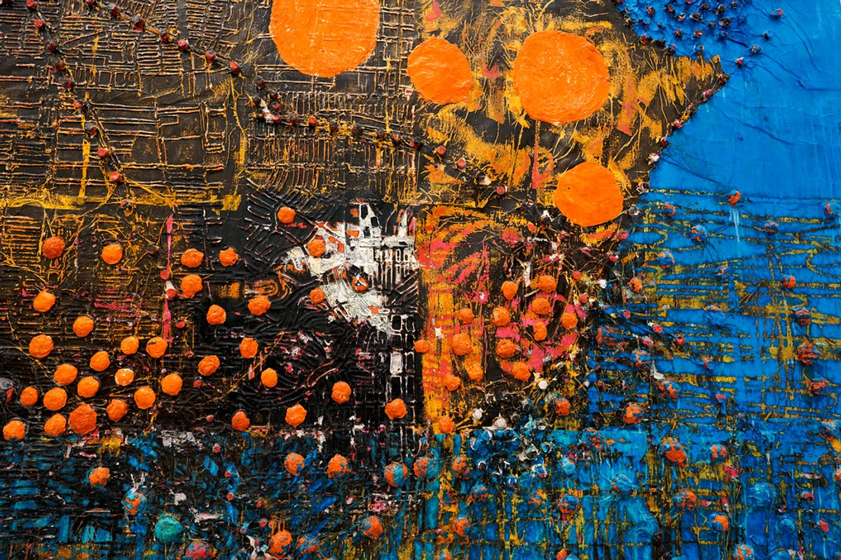
- Start Small with the Lighter Color: Always begin by placing your lighter color on the palette first, and then add tiny amounts of the darker color to it. You can always add more, but you can't take it away. It's much easier to darken a light color than to lighten a dark one. This is especially true with highly pigmented acrylics, where a small dab of dark can quickly overpower a larger amount of light.
- Employ a Palette Knife for Clean Mixes: Use a palette knife to mix your paints. It blends the paint more thoroughly and evenly than a brush and, crucially, it saves your brush bristles from getting gunked up with paint. This helps keep your best acrylic paint brushes in good shape for the actual painting. Make sure to wipe your knife clean between colors to avoid unintentional contamination, which is a prime culprit for 'mud.' For more advanced palette knife techniques, check out mastering the palette knife: advanced techniques for abstract texture.
- Mind Your Ratios & Viscosity (and Avoid Overworking): Even minuscule changes in the amount of one color can drastically alter the final outcome. Be precise with your additions, adding paint in small dabs and mixing thoroughly before adding more. You can even try to systematically record your ratios (e.g., 2 parts white, 1 part red) if you need to replicate a specific color later. Also, consider the viscosity (thickness) of your paints. Heavy body acrylics will mix differently and retain brushstrokes more readily than fluid acrylics. A thick paint might need more effort to blend smoothly on the palette and can create richer, impasto textures, while a fluid paint will mix quickly and is ideal for washes or glazes. This is also where overworking can lead to mud; mixing endlessly breaks down the pigment particles and dulls their vibrancy. Keep your mixing purposeful and swift.
- Create a 'String' or Gradient: To truly see a color's potential, create a 'string' or gradient. Start with your pure mixed color, then slowly add white (or another color) in small, consistent increments next to it, creating a range of values. This isn't just for practice; it's a key technique for how to blend acrylic paint on canvas and understand its full expressive range from light to dark.
- The All-Important Test Swatch: Acrylic paint often dries a shade darker (or sometimes slightly different) than it appears when wet due to the polymer binder losing water. This hue shift is a common acrylic quirk. Always paint a small test swatch on a scrap of paper or the edge of your canvas and let it dry completely to see the true, final color. There's nothing more frustrating than thinking you have the perfect hue, only for it to shift on you once dry! Trust me, I've learned this the hard way more times than I care to count.
- Consider Your Surface: The surface you're painting on (its color, texture, and absorbency) can subtly affect how your mixed color appears. A rough, absorbent canvas might make a color look slightly duller or more textured than a smooth, primed panel. This is especially true if you haven't properly prepared your canvas with gesso.
How to Match a Color: The Artist's Eye in Action
One of the most requested skills is color matching. Whether from a reference photo or real life, here's my approach to getting a convincing match, not necessarily a perfectly identical one (which is often impossible due to pigment differences, but a match that reads correctly in context):
- Squint Your Eyes: This helps you simplify the color into its fundamental value (light/dark) and dominant hue (red, yellow, blue, etc.), removing distractions from saturation and subtle variations. It's like turning down the 'noise' to see the core color.
- Identify the Dominant Hue: Is it mostly red, blue, or yellow? Start with that primary or closest secondary. Don't worry about perfection yet, just get into the right neighborhood.
- Determine Value: Is it light, medium, or dark? Adjust with white (cautiously, remember our chalkiness warning!) or a dark complementary/earth tone (as discussed above). This is often the most critical step for getting a convincing match. Creating value studies where you replicate a scene purely in shades of grey can really strengthen this skill.
- Assess Saturation: Is it bright and intense, or muted and dull? Add a tiny bit of its complementary color to desaturate if needed, or a neutral grey. Be gentle here; a little goes a long way. This is where color concordance comes in: remember how surrounding colors influence perception. A color might appear less saturated next to a highly vibrant one.
- Check Temperature: Does it lean warm or cool? Add a warm or cool version of its neighboring primary. For instance, if you need a warm green, start with a warm yellow and a cool blue. Remember our color bias lesson! Pay attention to the subtle temperature shifts even within shadows or highlights in your reference.
- Compare Constantly: Place small dabs of your mixed color right next to the target color. This constant comparison is key to making micro-adjustments until you get it right. It's less about perfect vision and more about methodical observation and iterative refinement. Consider it your personal masterclass in what is a color study in art.
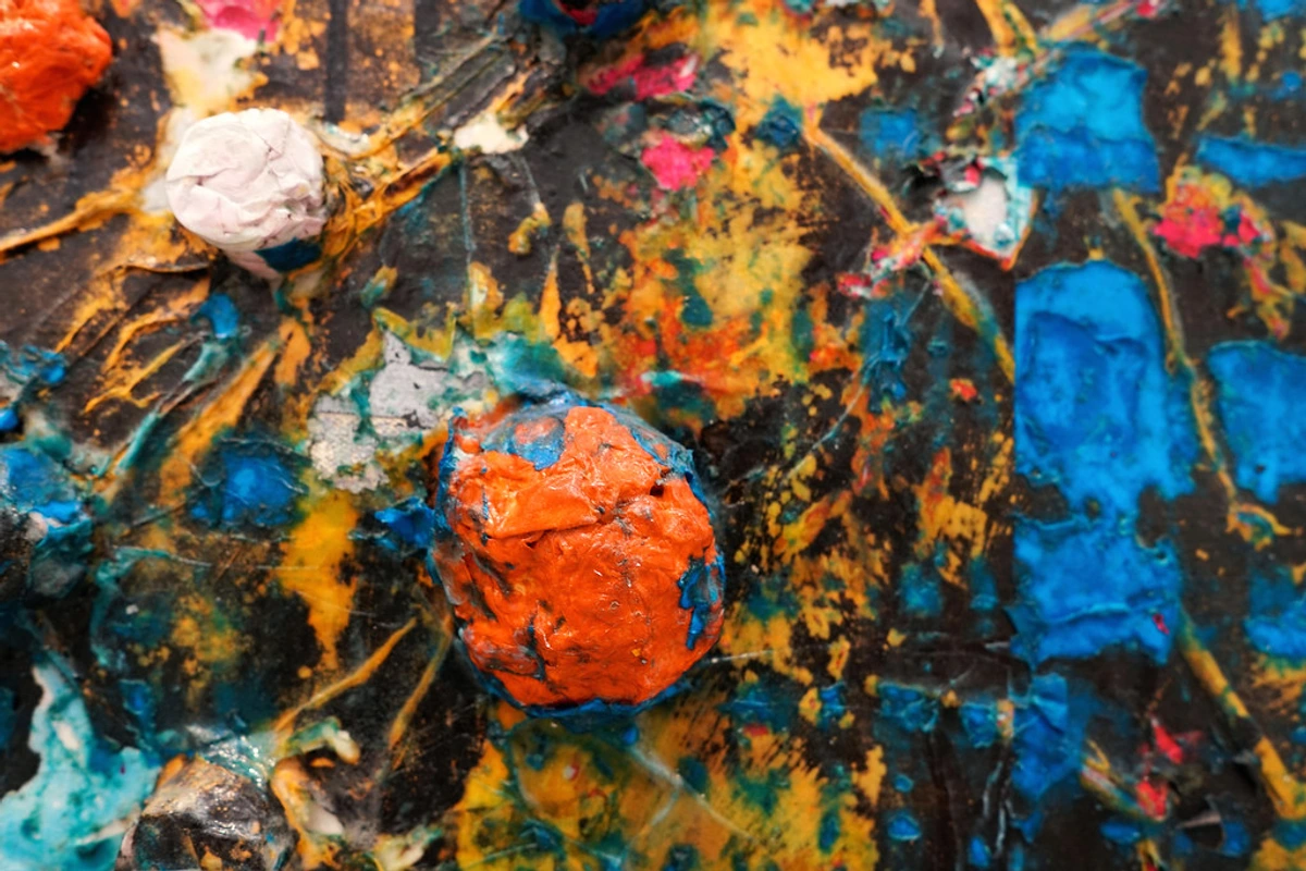
Common Mixing Recipes I Actually Use
Here are a few go-to mixes that people often ask about, all built upon the color theory we've just discussed:
How to Mix a Rich Brown: Beyond the Tube
Don't buy a tube of brown! Mix it! The best browns come from mixing complementary colors. Red + Green is a fantastic start, as is Blue + Orange, or Yellow + Purple. Tweak the ratios to get everything from a sandy tan to a deep, earthy chocolate. For a warmer brown, lean more towards orange/red. For a cooler brown, lean more towards blue/green. The beauty of mixing your own brown is the subtle underlying hue it retains, giving it far more life and complexity than a pre-made tube brown, which often feels flat. For example, a red-green brown will have a slightly reddish cast, while a blue-orange brown will be warmer and richer. By controlling the dominant complementary color, you can subtly bias your brown to be warm, cool, or more neutral, perfectly integrating it into your palette.
How to Mix a Believable Chromatic Grey: The Nuance of Neutrals
Mixing black and white gives you a flat, lifeless grey. For a much more interesting 'chromatic' grey, mix complementary colors (like purple and yellow, or red and green) and then add a little white to control the value. The result is a grey with subtle color and depth, often feeling more natural and harmonious within a painting. This works because the complementary colors, containing opposing hues, effectively neutralize each other while retaining just enough undertone to create a rich, complex neutral. For example, a grey made from Ultramarine Blue and Burnt Sienna (which is essentially a dark orange-red) can create a beautiful, warm chromatic grey perfect for shadows. You can even mix a touch of a primary into your complementary mix to lean the grey towards a specific temperature or hue. This makes your neutrals sing!
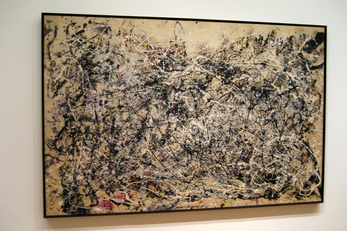
Primary Pair (Warm/Cool) | Resulting Chromatic Grey Hue Bias | Ideal Use |
|---|---|---|
| Ultramarine Blue (Warm) + Burnt Sienna (Warm Red-Orange) | Warm, Earthy Grey | Shadows, landscapes, grounding elements, adding depth to warm palettes. |
| Phthalo Blue (Cool) + Raw Umber (Cool Yellow-Green) | Cool, Slightly Greenish Grey | Distant objects, atmospheric effects, cool shadows, balancing warm areas. |
| Alizarin Crimson (Cool Red) + Viridian (Cool Green) | Neutral to Slightly Purplish Grey | Sophisticated shadows, muted backgrounds, creating subtle contrast without high chroma. |
| Cadmium Yellow (Warm) + Dioxazine Purple (Cool Purple) | Subtle Brown-Grey (Warm undertone) | Creating aged textures, organic elements, or desaturating vibrant compositions while retaining warmth. |
How to Mix Skin Tones: The Ultimate Color Puzzle
This is incredibly complex, as 'skin tone' is a vast spectrum, and no single recipe works for all. But a universal starting point is a base of Titanium White, a bit of Cadmium Red, and a touch of Yellow Ochre. From there, you can cool it down with a tiny speck of blue or green for realistic shadows and undertones, or warm it up with more red or even a touch of Raw Sienna or Burnt Sienna for different complexions. The key is small additions and constant observation, always comparing your mix to your subject. Remember the importance of value here; skin tones have a wide range of lights and darks, not just a single color. For darker skin tones, avoid adding too much white; instead, focus on warming with browns and reds (like Burnt Umber, Alizarin Crimson), and cooling with deep blues or purples for shadows (Ultramarine Blue, Dioxazine Purple). Even light skin tones have warm (red/yellow) and cool (blue/green) undertones depending on the lighting. This is a journey of careful mixing and endless nuance, and honestly, one of the most rewarding challenges in painting.
FAQ: Your Mixing Questions, Answered
Even with the best intentions and the most meticulous mixing, questions can arise. Here are some common concerns and their answers:
How do I keep my mixed acrylic paint from drying out on the palette?
Acrylics dry fast, often frustratingly so! You can lightly mist your palette with water from a spray bottle. Using a stay-wet palette is also a fantastic investment for longer painting sessions, as they use a damp sponge and special paper to keep paints moist. Or, you can add a slow-drying medium or retarder directly to your paint – these mediums extend the open working time of acrylics significantly. There are many great acrylic mediums designed for this purpose, offering various effects beyond just extending drying time.
Why do my colors turn to 'mud'? The Science Behind the Sludge
This usually happens for two main reasons. Firstly, you've overworked the paint on the canvas or palette, causing the pigment particles to break down and blend indiscriminately, leading to a dull, greyed-out mixture. Imagine stirring a soup too vigorously – the ingredients lose their distinctness. Secondly, and more commonly, you've unintentionally mixed too many colors together on the palette, particularly if you're mixing complementary colors when you intended to create a pure hue. Remember that complementary colors neutralize each other; if you mix too many, you end up with a dull neutral. Aim to mix only the colors needed for your target shade, ideally limiting your palette to a maximum of three base colors when trying to achieve a specific hue. Also, ensure your palette knife is absolutely clean between colors to avoid unintentional contamination, which can introduce unwanted complements! Always consider the color bias of your pigments; a cool blue and a warm red might have yellow/green undertones that will neutralize your purple.
What's the difference between value and saturation?
This is a common point of confusion, and frankly, it tripped me up for ages! Value refers to how light or dark a color is (from pure white to pure black). Think of it as the brightness setting on your TV. Saturation (or chroma) refers to the intensity or purity of a color – how vivid or dull it is. Think of it as the color intensity setting. You can have a high-value (light) color that is highly saturated (bright lemon yellow), or a low-value (dark) color that is highly saturated (deep indigo purple). Likewise, you can have a light, desaturated color (a pale, almost grey-blue) or a dark, desaturated color (a muted olive green). Understanding this distinction is key to creating depth, contrast, and visual interest in your paintings.
Can I mix different brands of acrylic paint?
Generally, yes. You can mix different brands of artist-grade acrylics without issue. The main difference you might notice is in their consistency (some are thicker, some are more fluid), pigment load, and how they behave. Student-grade paints, however, may have less pigment and more fillers, leading to less vibrant or predictable mixes when combined with professional paints. Always do a small test mix if you're unsure, especially if working on a significant piece.
What's the fastest way to learn color mixing and develop my 'artist's eye'?
Create your own color wheel and color charts. Seriously, this is gold. Start with just your warm and cool primaries, plus white. Systematically try to mix every single color on the wheel, including secondary, tertiary, and various values and saturations. Make gradients, and create charts of how each primary interacts with the others. It's a fantastic, hands-on exercise that will teach you more than a dozen articles ever could. This active experimentation is your personal masterclass in what is a color study in art.
For developing your 'artist's eye,' constantly observe colors in the world around you. Squint to see values. Notice subtle temperature shifts in shadows on a cloudy day. Analyze master paintings for their use of harmony and contrast (take a virtual tour of a den bosch museum if you can't go in person). The more you look, the more you see. It's a muscle that gets stronger with exercise.
A Final Thought: Embrace the Happy Accidents
Look, you're going to make mud again. I still do! Just last week, I was aiming for a particular muted ochre and ended up with a gorgeous, unexpected earthy purple that is now the star of a new piece. But the journey of learning to mix color is one of the most rewarding parts of painting. It connects you directly to the work, to the very essence of creation. Sometimes, the 'wrong' color you mix by accident is far more interesting and leads to unforeseen breakthroughs than the one you were meticulously trying to create. It's a testament to the unpredictable beauty of the artistic process.





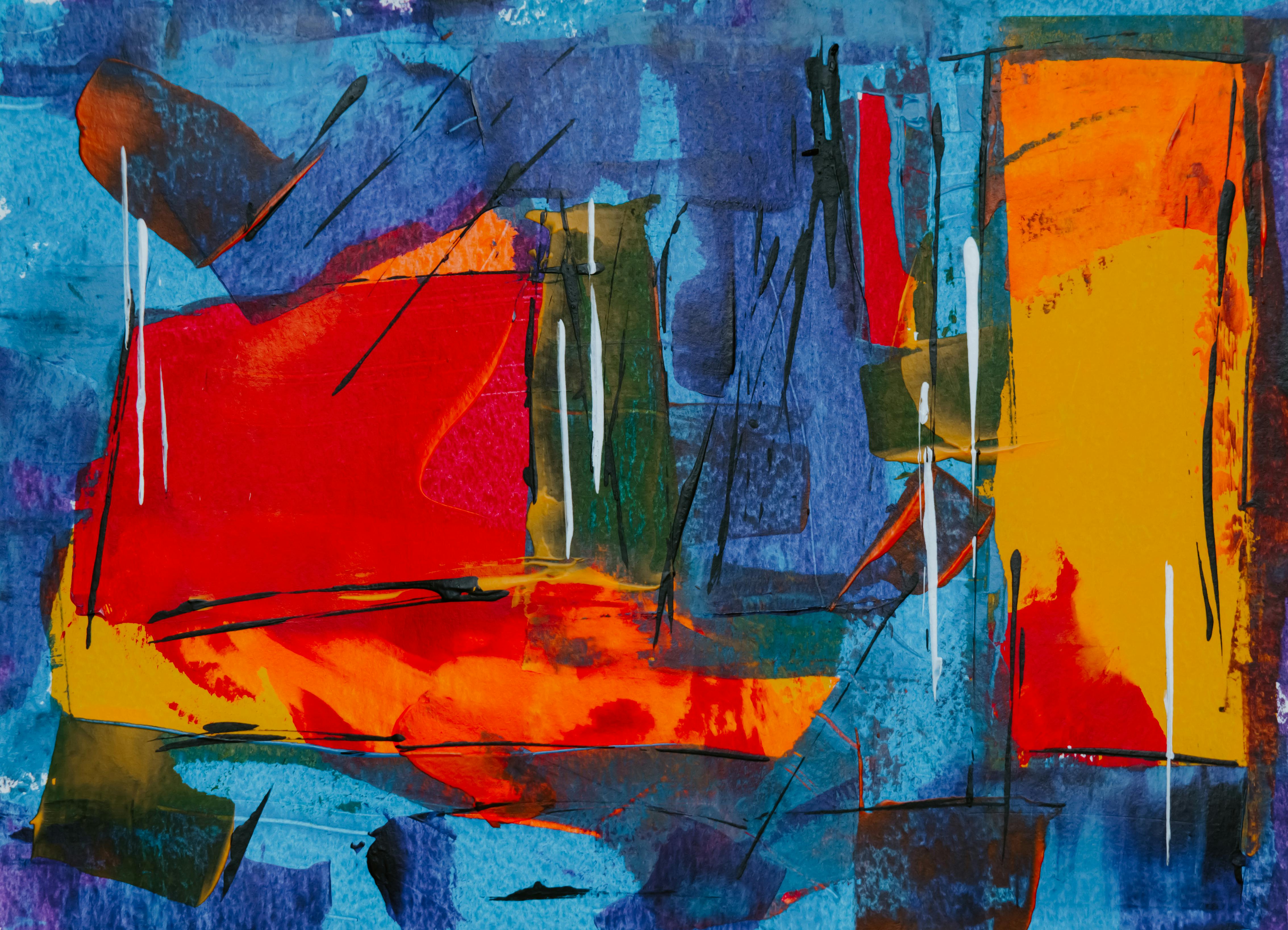


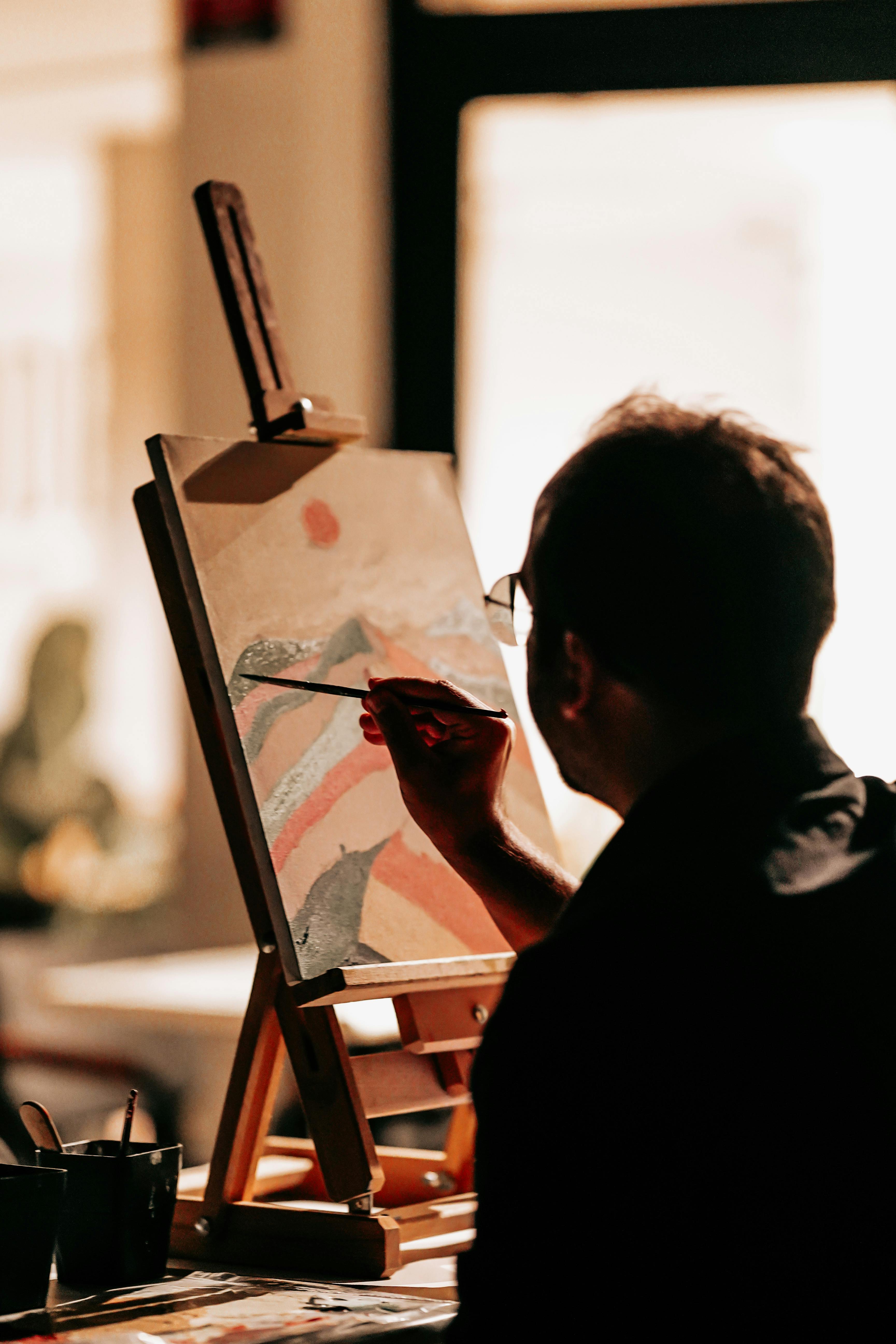


This exploration is at the heart of my own artistic process, which you can see in the works I have for sale and in my journey documented on my timeline. So don't be intimidated by your palette. See it as a place of infinite possibility, a canvas for boundless experimentation. Now go make some color, make some 'mud,' and make some magic. You've got this.