Abstract Art & Home: Crafting a Joyful Color Palette That Sings
Unlock your abstract art's potential to inspire your home's color palette. Discover personal insights, color psychology, and the 'Joy Factor' to create cohesive, soulful decor that truly resonates. This guide offers a comprehensive approach to integrating your art with your living space.
Beyond the Canvas: Weaving Your Abstract Art into a Home Color Palette That Sings
There's a specific kind of thrill, a delightful bewilderment, that comes with bringing a new piece of abstract art into your home. It's more than just an object; it's a new presence, a burst of energy, a silent conversation waiting to happen. But then, as the initial euphoria settles, a whisper of panic might creep in: "Now what about the rest of the room? How do I make this vibrant, untamed beauty feel truly at home, rather than just... visiting?" I remember once trying to match a gloriously chaotic abstract, teeming with electric blues and fiery oranges, to a bland beige sofa. The result? A silent, passive-aggressive argument where the art clearly won, leaving the sofa looking like a forgotten ghost. Lesson learned, and hilariously, it cost me a weekend of repainting (and the mortification of admitting my folly).
My own creative journey, both on canvas and within the walls of my 's-Hertogenbosch studio – a space where the northern light shifts dramatically and often inspires distinct color temperatures and moods – has been a constant experiment in this very challenge. The truth, I've found, is that crafting a cohesive color palette around abstract art isn't about following a rulebook; it's about learning to listen. Listening to the canvas, to the light, to the quiet hum of your space, and crucially, to that intuitive spark within you that knows what feels right. This dance between art and environment, between my internal creative impulse and the external space it inhabits, is what I've spent years exploring. Today, I want to guide you in orchestrating that same harmony in your own home, making your abstract art not just an observer, but a true resident. It’s an art form in itself, a dance between intention and intuition. Join me as I share some hard-won lessons, a few more laughable missteps, and hopefully, some insights to help your home’s palette resonate with your art.
This guide will walk you through transforming your space, ensuring your abstract art feels deeply integrated and celebrated, and helping you curate a cohesive home color palette that truly sings.
So, let’s peel back the layers and discover the vibrant language hidden within your art and home.
Decoding Your Abstract Masterpiece: Listening to the Canvas and Its Nuances
Before we even dream of paint swatches and fabric samples, let's truly listen to your abstract art. I know, "listen" sounds a bit esoteric for a painting, but I mean really engage with it. What stories are its colors telling? What emotions does it stir within you? This isn’t just about identifying a shade; it’s about understanding its essence.
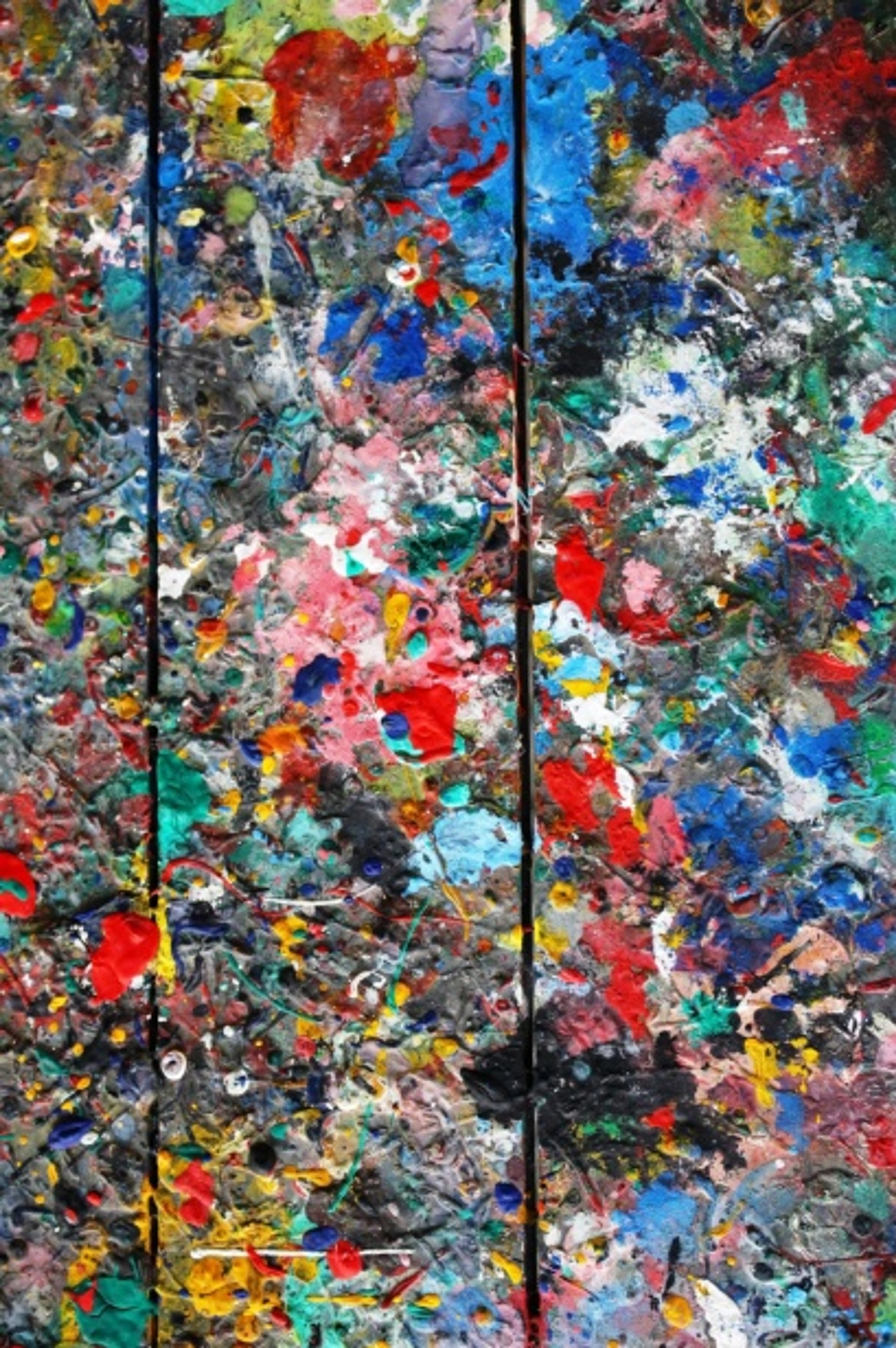
Abstract art, by its very nature, bypasses the literal and dives straight into feeling. It invites an internal dialogue. What kind of energy does your piece project? Is it a vibrant hum of joy, a profound silence of calm, a jolt of raw energy, or perhaps an intriguing mystery? These emotional resonances, guided by the psychology of color, are your primary clues. For instance, deep blues and greens often evoke calm and serenity, perhaps reminiscent of a vast sky or a tranquil forest. However, a heavy hand can also lean towards melancholy or detachment, reflecting the coldness of deep waters or feelings of isolation. Conversely, vibrant reds and oranges burst with passion and energy, like a blazing fire or a sunset, yet too much can feel aggressive or overwhelming. The magic lies in understanding these nuances – how does your art use them? I often find myself spending countless minutes, sometimes hours, simply observing a new creation, almost waiting for it to reveal its true intentions, or at the very least, gently nudge me towards the perfect throw pillow. My canvas, for example, might feature a dominant deep indigo with sharp cadmium yellow accents, suggesting a dynamic yet sophisticated mood for a room: the indigo grounding the space with a sense of calm depth, while the vibrant yellow provides energetic punctuation and focal points.
Beyond the Obvious: Unpacking Your Art's Color Language
To truly craft a harmonious home color palette, look deeper than the first glance. Your abstract piece holds a rich tapestry of hues, some shouting, some whispering. These identified colors will serve as our palette's building blocks as we translate them into our home's design.
- Dominant Colors: These are your anchors. The hues that command the largest visual space or make the most immediate impact. Think of the broad strokes, the expansive fields of color, or the hues that visually 'pop' most aggressively.
- Subtle Tones (Value & Saturation): This is where the magic often hides. Look for muted shades, the soft grays, creams, or even the raw canvas peeking through. These quiet colors are crucial for grounding your palette. Also, pay attention to the value (how light or dark a color is) and saturation (its intensity or purity). A highly saturated red in the art might call for a muted, lower-saturation version in your decor to prevent overwhelming the space and keep the art as the focal point. For example, instead of a bright red sofa, consider a deep burgundy or a muted rose hue for larger pieces, reserving a vibrant cherry red for small accents like a decorative bowl, a single cushion, or a specific piece of art on a shelf. High saturation often brings energy and vibrancy, while a lower saturation (more muted) can create a sense of calm, sophistication, or depth. Blending these wisely prevents your room from feeling either too flat or too frenetic, ensuring your palette breathes with the art. If your abstract has a faint, almost transparent desaturated lavender, imagine a pale lilac throw blanket or a lavender-tinted glass vase. A soft, mossy green from the background could inspire a large, comfortable armchair, creating a sense of natural harmony.
- Accent Colors: These are the delightful surprises, often smaller, bolder pops of color that inject energy or contrast. They might be tiny but mighty, perfect for small accessories that tie the room together, appearing in sharp lines, small dots, or unexpected bursts – think a vibrant yellow throw pillow against a neutral sofa, a small ceramic vase in a striking teal, or even the color of a single book on a shelf.
- Texture and Light: The Unseen Influencers: How does the paint's texture — thick impasto, smooth washes, rough brushstrokes — play with the colors? Does it create shadows that deepen a hue, or glints that brighten it? Thick impasto might create deeper shadows and a sense of raw earthiness; you could echo this with a textured linen sofa, a rough-hewn wooden table, a natural jute rug, or even a textured plaster accent wall. Conversely, smooth, translucent washes might inspire sleek, reflective surfaces like lacquered furniture or sheer, flowing fabrics that allow light to play through them. And how does the natural and artificial language of light in your room interact with the art throughout the day? A color can shift dramatically from morning sunlight to evening lamplight, affecting its perceived warmth or coolness. For instance, in a room with warm, amber lighting, earthy reds and golds in your abstract might intensify, feeling even more inviting. In contrast, cool, bright daylight could draw out icy blues or silvers, shifting the mood towards crispness. Understanding the color temperature within your art (is it predominantly warm or cool?) will also guide your decor choices to achieve balance, perhaps by introducing a cool metallic accent to balance a warm painting, or a plush, warm rug to ground a cool-toned abstract. When considering color, also pause to examine the existing architecture and natural light of your space. A room with abundant cool northern light might handle warm wall tones differently than a south-facing room bathed in bright, warm sun. These foundational elements profoundly influence how any color is perceived.
Understanding these nuanced elements is like truly mastering the emotional language of color. It allows you to extend the conversation initiated by your art directly into your living space, creating a truly harmonious dialogue. So, what story is your masterpiece truly whispering to you, beyond the obvious? Or, perhaps, what stories do you want it to whisper to your guests?
Crafting Your Home's Color Narrative: Translating Art to Space
Now that your art has whispered its secrets, it’s time to translate that dialogue into the vibrant narrative of your living space. This is where the real fun begins – and yes, occasionally, a moment of delightful despair! Remember, it's about crafting an environment that feels like an authentic extension of you and your art, telling its unique color story. I remember the first time I realized a subtle hue from a painting could inspire an entire room's mood – it felt like unlocking a secret code!
The Foundation: Your Main Wall Color and the Art's Scale
The walls are usually the biggest commitment, the grand stage upon which your art performs. My years of experimenting (and repainting!) have taught me that "safe" doesn't mean "stale" and "bold" doesn't mean "brash."
- Embrace Neutrals (The Silent Partner): For many of my own bold, abstract creations, a carefully chosen neutral background is my secret weapon. Think crisp whites, warm off-whites, a soft gray, or even a nuanced beige. These allow your abstract art to truly breathe and command attention, creating a gallery-like atmosphere. It’s like giving your painting a dedicated spotlight, ensuring no other element steals its thunder. It's a classic for a reason: it allows the art to be the undisputed star.

- Pick a Subtle Hue (The Harmonious Embrace): Alternatively, find one of those quieter, less dominant colors from your abstract piece – perhaps a muted sage green, a dusty blue, or a soft terracotta. Using this for your walls creates an incredibly enveloping, harmonious feel. It’s a more sophisticated, nuanced approach, making the room feel like it's breathing the same air as the artwork's mood and color story. The key here is cohesion, not camouflage; you want the room to resonate with the art, not disappear behind it. For example, if your abstract features a dominant deep teal with subtle hints of ochre and a whisper of dusty rose, consider painting your walls a soft, muted ochre or a pale, desaturated rose. This creates an enveloping, harmonious feel that whispers rather than shouts. When considering a wall color, also remember the scale of your artwork and the room's function. A large, commanding abstract piece can carry a more saturated wall color in a spacious living area, while a smaller, more intimate piece might be best highlighted against a neutral backdrop to prevent it from being visually lost, especially in a bedroom where calm is often prioritized. For a bedroom, you might gravitate towards the softer, more tranquil shades found in your art, while a vibrant dining area could pull from its bolder elements. Moreover, consider the overall color balance – if your art is predominantly cool-toned, a warmer neutral or a subtle warm accent in the room can create a beautiful equilibrium. This intentional layering ensures your home's palette feels rich and considered, a true extension of your art's visual language.
Expanding the Palette: Applying Color Principles to Furniture and Textiles
This is where you truly get to play with the definitive guide to understanding color harmonies. How colors interact can dramatically shift the mood of your space. A simple color wheel can be your best friend here, showing you the relationships between hues.
Harmony Type | Description | Mood Evoked |
|---|---|---|
| Analogous | Choose colors that sit next to each other on the color wheel, drawing them directly from your abstract art. If your piece features vibrant blues and greens, for instance, you might opt for a muted sage green sofa, ocean-blue curtains, and scatter pillows in varying shades of teal, aqua, and emerald. Think gentle gradients, not harsh shifts. | Calm, flowing, sophisticated, serene |
| Complementary | For the truly brave souls – this is where colors opposite each other on the color wheel come into play. If your art prominently features a bold blue, a judicious touch of orange (perhaps in a throw pillow, a vase, or a small accent chair) can create incredible visual pop and energy. Remember my orange wall? Less is more here! A small, rust-toned vase or a coral throw pillow can provide that exciting spark, allowing the blue to truly sing without feeling like an aggressive confrontation. I once used a tiny splash of a vibrant coral in a mostly cerulean and sage abstract, and echoing that with a single, small ceramic piece in the room transformed it from merely harmonious to truly captivating. | Dynamic, energetic, high-contrast, bold |
| Monochromatic | Using various shades, tints, and tones of a single color from your artwork. If your abstract is a study in blues, explore light blues, deep navies, and mid-tone indigos throughout the room. It’s subtle, elegant, and often incredibly soothing. To add depth, play with varied textures and finishes – a glossy navy lamp next to a matte navy wall, or a fuzzy light blue throw on a deep indigo velvet sofa. | Elegant, calming, unified, sophisticated |
The Power of Negative Space: Letting Your Colors Breathe
Once you’ve strategically applied your colors, remember that silence can be just as impactful as sound. Just as an abstract painting relies on carefully considered negative space (those areas without direct paint) to allow the eye to rest and the composition to breathe, your room benefits immensely from it. Don't feel the need to fill every wall or surface with color or objects. I once found myself cramming every surface with colorful trinkets, only to realize the art itself was suffocating. Removing half of them allowed the room, and the art, to truly sing. Embrace:
- Uncluttered Walls: Let a single, powerful piece of art be the star on a vast, neutral wall. This amplifies its presence and allows its color story to unfold without competition. A blank wall adjacent to a vibrant piece is not empty; it's a deliberate breath, allowing the eye to rest and the art's impact to be fully absorbed.
- Open Floor Space: Resist the urge to cram furniture into every corner. Allow pathways and open areas to create a sense of calm and flow, making the room feel more expansive and inviting.
- Thoughtful Groupings: Instead of scattering small items, group them purposefully. A collection of vases in a corner, inspired by your art's accent colors, can be more impactful than individual pieces spread thinly. This deliberate use of emptiness can be just as impactful as the colors you choose, preventing your palette from feeling overwhelmed or chaotic. It allows the colors to speak, rather than yell.
The 60-30-10 Rule: Your Secret Weapon for Balance
This timeless interior design principle is more than just a rule; it’s a lifesaver for achieving equilibrium in your color scheme. I’ve found it invaluable in preventing that overwhelming "too many cooks in the kitchen" feeling, especially after my early, enthusiastic (and slightly disastrous) experiments.
- 60% Dominant Color: This is your primary hue, often your main wall color or the color of your largest furniture pieces (think sofa, main rug). It sets the overall tone and anchors the space.
- 30% Secondary Color: This provides contrast and interest. Think curtains, accent chairs, smaller rugs, or even a statement piece of furniture. It should complement your dominant color but offer enough variation to keep things dynamic. This could be a harmonious shade from your art or a carefully chosen subtle contrast.
- 10% Accent Color: This is where you infuse those vibrant, unexpected pops directly from your abstract art. Throw pillows, decorative objects, small pieces of art, or even a book spine collection. This 10% is your playground for bold experimentation, a low-stakes way to add excitement and personality.
Let’s apply this. Imagine an abstract painting featuring a vast, calming field of deep indigos, punctuated by lively aquamarines, and a surprising flash of sun yellow. To apply the 60-30-10 rule:
- 60% Walls & Major Furniture: Your 60% could be a serene, warm off-white on the walls, providing a gallery-like backdrop. This allows the art's deep indigo to command attention. Or, for a bolder approach in a spacious room, a muted, desaturated indigo from the art's quieter tones could be used for a feature wall and a large area rug.
- 30% Secondary Elements: This could be a rich indigo velvet sofa (if walls are off-white) and accent chairs in a harmonious aquamarine, drawing from the art's secondary tones. This layer creates depth and visual interest without competing with the art.
- 10% Punchy Accents: Then, for the 10%, those vibrant yellow throw pillows, a small ceramic sculpture, or a collection of books with yellow spines become your playful accents, directly echoing the art's unexpected burst of color. This careful layering creates a serene yet stimulating atmosphere, where the art's vibrant yellow provides moments of unexpected delight against a calming backdrop. It’s where my inner child (who still loves that vibrant orange, just not on an entire wall) gets to shine, adding a surprising splash of yellow to an otherwise serene blue and green scheme.
Common Pitfalls to Sidestep: Lessons from My Own Artful Blunders
Ah, the joy of learning through... spirited misjudgment! While creating a beautiful color palette is a deeply personal journey, there are a few common traps I’ve stumbled into (and seen others navigate) that are worth highlighting. Consider these my cautionary tales, delivered with love and a knowing smile, because honestly, who hasn't tried to force a fuchsia sofa where it clearly didn't belong?
- The "Match Everything" Mania: It’s tempting, when you adore a vibrant abstract piece, to try and replicate every single color in your decor. Resist this urge! Your home will quickly look like a paint sample chart exploded, or worse, like a clown's birthday party decided to take up permanent residence. Trust me, I've been there – my early attempts looked like a rainbow had a very enthusiastic, slightly manic party in my living room. Instead, choose one or two dominant colors and one or two accent colors, allowing the rest to exist purely within the art itself.
- Ignoring Proportion and Visual Weight: A tiny splash of bright fuchsia in your art doesn't mean your sofa should be fuchsia. The proportion of a color in the art should guide the proportion of that color in the room. You can visually estimate the area each color occupies, or for a precise approach, use a color picker tool on a digital image of your art. Large doses of bold colors need ample space to breathe, or they become overwhelming. Think of it like a recipe: if your painting is 70% deep blue, 20% burnt orange, and 10% vibrant yellow, you wouldn't make your entire room burnt orange! Instead, the deep blue would inform your larger pieces, the orange would be a secondary accent, and that vibrant yellow would be a delicate, impactful spark. A vast, calming field of blue in your art could inspire a magnificent sectional sofa in a similar deep blue. But if that electric lime green is just a tiny, energetic fleck in the corner? That might inspire a single, delicate glass vase or the piping on a neutral cushion – not an entire lime green feature wall or a boldly patterned rug.
- Forgetting the Mood: Remember the emotional resonance of your art? Don't let your decor contradict it. If your abstract piece, with its soft, flowing lines and muted pastels, exudes serene calm, avoid pairing it with jarring, high-energy decor elements like neon lights or busy geometric patterns that clash with that feeling. Conversely, if your abstract features jagged lines and clashing, high-contrast colors evoking tension or dynamism, then bolder furniture choices and a more energetic room design could be a perfect complement. The goal is harmony, not discord. What story do you want your room to tell, and does it align with your art's narrative?
- Underestimating the Power of Lighting: We touched on this, but it bears repeating. Paint swatches look different in the store than they do in your home, and they’ll look different still at various times of day. Always test paint samples on your wall and observe them over 24 hours. The wrong light can make a perfect color look entirely 'off', turning a sophisticated charcoal into a drab gray, or a vibrant teal into a muddy green. Trust me, I've had more than one "aha!" moment (and a few "oh no!" moments) when a carefully chosen swatch betrayed me in different lighting.
- Buying Before Testing: That gorgeous mustard yellow cushion online might look divine, but until it's physically in your space, interacting with your art and your light, it's a gamble. Small accessories are easy to return, but larger purchases? Not so much. Always bring samples home! Touch them, look at them in different lights, and let them sit for a day or two. Your intuition will thank you, and your wallet will likely forgive you sooner. This simple act of sampling can save endless frustration (and return trips, which are almost as bad as repainting).
Personal Touches and Practical Magic: Making It Uniquely Yours
I often think of my home as a giant, evolving abstract painting – constantly being layered, adjusted, and reflected upon. It's never truly "finished," much like my creative process in the studio. And that, I believe, is the beauty of it. It's an ongoing dialogue, sometimes a delightful whisper, sometimes a gentle nudge, but always a conversation.
Don't Be Afraid to Experiment (But Start Small)
My advice? Don't repaint your entire living room on a whim (unless you relish the joyful chaos of perpetual renovation, which, bless your heart). Start with smaller elements. Bring in a new cushion, a vase, a blanket. See how it feels. Live with it for a few days. Does it enhance the art? Does it make you feel good? Because ultimately, that's what a home is about. It's your sanctuary, your canvas. And remember that crucial step from the pitfalls section: always sample colors and materials in your actual space under different lighting conditions before making big commitments. It's a practical magic that saves much heartache.
Let Your Art Be the Muse for Everything Else
From your choice of rug to the specific finish on a lamp, your abstract art can inspire every decorating decision. It's not just about walls and furniture. Consider:
- Decorative Objects: Vases, sculptures, books, candles – choose items whose colors or textures subtly echo elements in your art. I once used the deep, subtle veins of a particular abstract piece to inspire my choice of a dark wood lamp base, and the effect was surprisingly unifying.
- Hardware and Finishes: The metallic gleam of a lamp or the tone of a wooden frame can be chosen to harmonize with the warmer or cooler tones in your painting. A brushed brass can warm up a cool-toned abstract, while a sleek chrome can emphasize its crispness.
- Greenery: Even plants can contribute! Consider the color of their leaves, or the pots they're in. A vibrant green plant can echo greens in your art; a minimalist white pot can provide negative space. The story behind the art, or the artist's intent – perhaps a feeling of longing, a celebration of resilience, or a moment of quiet contemplation – can also be a profound muse, adding another layer of personal connection to your decor choices. Knowing the artist's journey can really deepen your connection to a piece, and I’ve shared a bit of mine on my timeline.
- Shape, Line, and Pattern: Abstract art often features compelling shapes, dynamic lines, or subtle patterns. Let these elements guide your decor beyond just color. For instance, if your art has sweeping, curved lines, consider echoing them with a rounded coffee table, an elegantly arched floor lamp, or even the gentle curve of a mirror frame. If there's a strong geometric pattern, introduce subtle geometric accents in textiles, wallpaper, or perhaps a collection of art books neatly arranged. This interplay creates a richer, more cohesive visual narrative that speaks to the deeper structure of your abstract.
If you're looking for more guidance on decorating your home or even specifically on abstract art for every room, I have many more thoughts to share. To help visualize your ideas, consider creating a physical or digital mood board. An excellent online color palette generator like Adobe Color can be a fantastic way to extract key tones from a photo of your artwork and see how colors, textures, and objects interact before making any commitments. Sometimes, just seeing things side-by-side reveals the truth your intuition already knew.
My Personal Secret: The The "Joy Factor"
When all else fails, and you're staring at swatches wondering if "greige" is actually a color or just a profound existential dilemma, ask yourself this simple, almost disarmingly honest question: "Does this bring me joy?" It might sound overly simplistic, a sentiment usually reserved for greeting cards, but for me, art and home are inextricably intertwined with emotion. I once chose a muted, 'sensible' taupe for a wall, only to find myself inexplicably glum every time I looked at it. It didn't bring me joy. A week later, a soft, ethereal blue, directly inspired by a small section of a beloved painting, transformed the space and my mood entirely. If a color makes you smile, if it makes you feel deeply good to be in that space, then it’s the right color. It's about creating a space that truly resonates with the heart of the home, a place where your soul can exhale. Embrace that feeling, for your home is, after all, a reflection of your soul's canvas.
Key Takeaways: Your Home, Your Masterpiece
Before we dive into some frequently asked questions, let's distill the essence of weaving your abstract art into a harmonious home palette:
- Listen to Your Art Deeply: Go beyond obvious colors; understand emotional resonance, subtle tones, textures, and how light interacts with it.
- Build Your Palette Strategically: Start with wall colors (neutrals or subtle art hues), then expand to furniture and textiles using harmony principles (analogous, complementary, monochromatic). Consider the art's scale, room function, and existing architecture.
- Master the 60-30-10 Rule: Use it as your guiding framework to ensure balance and prevent overwhelm, allowing your art's accents to truly pop.
- Embrace Negative Space: Give your colors (and your eyes) room to breathe. An uncluttered space amplifies the art's presence.
- Learn from Pitfalls: Avoid matching everything, respect scale and proportion (use visual estimation or tools!), consider the mood, and always, always test samples in your actual home and lighting.
- Infuse Personal Touches: Let your art inspire every detail, from objects and finishes to the very story you want your home to tell. Don't forget the power of lines, shapes, and the artist's intent!
- Trust Your Joy: Ultimately, if a color or element makes you happy, it's the right choice. Your home is a reflection of your unique spirit.
Frequently Asked Questions About Home Color Palettes & Abstract Art
Curiosity, like art, is boundless! Many of you have reached out with questions about navigating the nuances of color and integrating your abstract pieces. Let's dive into some common questions, because honestly, who hasn't stared at a wildly colorful abstract and wondered, "Now what?"
Q: Should my entire home have the same color palette as my abstract art?
A: Not necessarily! While a cohesive flow is lovely, different rooms can absolutely have different moods. Your living room might draw heavily from one dominant piece, while a bedroom might take inspiration from another, or even have a completely different feel reflective of its function. The key is creating cohesion within each individual space and a gentle transition between them. Think of your home as a beautifully curated collection of short stories, each with its own charm, rather than one monolithic epic novel. Does every chapter in your favorite book have the same tone? Probably not, and your home can be just as diverse.
Q: What if my abstract art has too many colors? How do I choose?
A: Ah, the glorious, joyful chaos of a truly vibrant piece! This is where your skills of observation, honed earlier, come into play. Don't try to use every single color from the painting. Instead, identify:
- One or two dominant shades: These can inform your larger decor elements.
- One or two striking accent colors: These are perfect for those small, high-impact accessories.
Try squinting at your artwork – what colors become most prominent? Those are often your best bets for larger elements. For a more systematic approach, consider creating a physical mood board with paint chips that match the art's colors, or use an online color palette generator like Adobe Color to extract key tones from a photo of your artwork. Often, the remaining colors in the art can be appreciated as pure texture or visual interest within the artwork itself, without needing to be replicated in your decor. Think of it as inviting only the art's VIP colors to your room's party, not the entire entourage.

Q: My abstract art is very muted or monochromatic. How do I build a palette around that?
A: A muted or monochromatic abstract piece is a fantastic foundation for a sophisticated, serene palette! Instead of vibrant color pops, focus on texture, value contrasts, and subtle shifts in tone. If your art is a study in grays, consider varying shades of charcoal, slate, and silver in your textiles, paired with the warmth of natural wood or a soft cream. Play with different finishes – matte walls, glossy accents, fuzzy throws, or even brushed metals – to add visual interest without introducing jarring color. For instance, if your art features cool grays with a hint of navy, pairing a matte charcoal wall with a velvet navy sofa and a brushed brass lamp creates a sophisticated interplay of textures and subtle sheen, letting the art's quiet elegance truly unfold. The goal is to deepen the art's quiet elegance, letting its subtle beauty truly unfold. Think of it as a quiet symphony, where every subtle note contributes to the overall rich experience.
Q: Can I mix abstract art with other art styles or decor styles?
A: Absolutely, and I wholeheartedly encourage it! Eclecticism, when thoughtfully executed, creates incredibly rich and personal spaces. The trick is to find common threads – perhaps a shared color, a similar line quality or texture, or a unifying theme that connects disparate pieces. A bold, geometric abstract can become the vibrant anchor in a clean, modern minimalist space, its sharp lines echoed in furniture. Conversely, a softer, organic abstract might beautifully complement a bohemian interior, adding color and depth without overwhelming its natural textures. Even in a classic, traditional setting, a contemporary abstract can inject unexpected modernity and personality. A consistent color palette across varied decor elements can also help unify a mixed-style room. Remember too, the scale of the abstract piece can influence how it integrates; a very large, commanding abstract might dominate a room, while a smaller piece can be more easily woven into a mixed-media display. It's all about intentionality, balance, and that intuitive "does this bring me joy?" factor. Don't be afraid to let different eras and styles have a polite, intriguing conversation in your home.
Q: How do I ensure my palette doesn't become too busy or overwhelming?
A: This is a classic concern, and one I’ve wrestled with myself after a few... enthusiastic color experiments! My tried-and-true advice:
- Embrace Negative Space: As we explored, don't fill every wall or surface. Give your eyes (and your soul) places to rest. A blank wall adjacent to a vibrant piece is not empty; it's a deliberate breath, a visual pause.
- Anchor with Neutrals: Use a neutral base for your largest elements – walls, large furniture – to prevent visual overload. This creates a calm foundation, allowing other colors to truly sing.
- Vary Intensity: Use softer, lower-saturation versions of your chosen colors for larger areas, reserving the brightest, most saturated pops for small accents. This creates visual depth without being jarring.
- Consider Visual Weight: A large area of a dark, saturated color will feel heavier than a large area of a light, muted color. Balance these weights thoughtfully to create equilibrium in the room. This is especially important if your abstract art itself has a very busy or clashing palette. By anchoring the room with neutrals and using softer versions of the art's colors for larger elements, you allow the art's intensity to be appreciated without overwhelming the space.
- Listen to Your Gut: If a space feels busy, cluttered, or chaotic to you, it probably is. Take a step back, remove one element, and see how that feels. Sometimes, subtraction is the most powerful addition, the quietest stroke that completes the composition. Trust that inner voice, it's often the wisest decorator.
Bringing It All Together: Your Home as a Living Canvas
Creating a harmonious color palette around your abstract art is truly less about adhering to rigid formulas and more about engaging in an intuitive, joyful dance between your art, your home, and your unique personal taste. It’s about curating an environment that feels like an authentic extension of you, a place where your art doesn't just passively hang on a wall, but actively lives and breathes, deeply integrated within its surroundings. It's your personal decorating your home journey, a continuous act of self-expression.
This process, this thoughtful alignment of your art and living space, leads to a home that is not just decorated, but felt. A space that inspires, calms, or energizes you, reflecting the very essence of your chosen art. So, take a deep breath, brew your favorite coffee (or perhaps a sophisticated tea, if the mood strikes!), and let your abstract art be your most profound guide. It truly holds more answers than you might initially think. It’s about trusting your intuition, letting your space evolve, and ultimately, asking that simple, profound question: 'Does this bring me joy?' If it does, then you’ve found your palette. I'd love to hear about your own color journey and challenges in the comments below! And if you find yourself needing that perfect piece to kickstart your home's new color narrative, please feel free to browse my latest creations here. Or, if you're ever near my beautiful city, you can always visit my museum in 's-Hertogenbosch to experience how my colors interact in real life, up close and personal. This grand, evolving journey, much like art itself, is never truly finished, but forever unfolding, inviting you to add new layers and discover new harmonies.