Mastering Vibrant Hues: The Ultimate Guide to Avoiding Muddy Paint & Crafting Chromatic Neutrals
Unlock vibrant art! Discover why paints turn muddy, master mixing techniques, leverage chromatic neutrals, and fix dull colors for stunning, clean results. Learn from a pro how to keep your palette alive.

Mastering Vibrant Hues: The Ultimate Guide to Avoiding Muddy Paint & Crafting Chromatic Neutrals
Ah, mud. My oldest, most persistent nemesis in the studio. If you've ever picked up a brush, you've almost certainly made it. It’s that truly disheartening moment when your beautiful, carefully chosen colors — perhaps a luminous sunset orange next to a deep twilight blue, just like I once envisioned — collapse into a noncommittal, sludgy brown-gray. I remember staring at a canvas, the vibrant sunset I’d envisioned reduced to a dull, sickly brown. I’d mixed my fiery oranges with a deep indigo to create a richer shadow, only to discover I’d accidentally created a chromatic graveyard – a lifeless, dull mix devoid of any real character. It happens, and it can feel like a punch to the gut of your creative spirit.
But here’s a secret I learned the hard way: making mud isn't a sign of failure. It's not a flaw in you. It's a rite of passage, the painter's equivalent of a musician hitting a wrong note, or a sculptor chipping away a bit too much stone. It means you're experimenting, you're pushing colors around, you're learning. This guide isn't just about avoiding mistakes; it's about mastering color, transforming frustration into nuanced control, and even learning to wield those 'muddy' tones with purpose. The real trick isn't to never make mud (good luck with that, even seasoned pros do it sometimes!), but to understand why it happens and how to control it. Once you get that, you can even learn to make intentional, beautiful mud – or as I prefer to call them, chromatic neutrals. But I'm getting ahead of myself. Let's start with keeping things clean and vibrant.
Why Do My Paint Colors Turn Muddy? The Core Principles of Color Collapse
It’s not some dark magic, I promise. The reasons are usually pretty simple, and they almost always boil down to a loss of chroma (the intensity or purity of a color; think of a vibrant neon sign versus a washed-out, faded photograph) and value (its lightness or darkness; like the difference between bright midday sun and deep twilight). Essentially, your colors lose their identity and vibrancy, collapsing into a noncommittal hue. This most often occurs due to one thing: overmixing. Specifically, overmixing the wrong colors, or simply mixing for too long. For a deeper dive into how colors interact, you might find our guide on how artists use color insightful.
Here are the main culprits I've encountered in my own studio, often through painful experience:
1. Unintentional Complementary Mixing: The Biggest Offender
This is probably the most frequent culprit, a real classic. Think of the color wheel. Colors directly opposite each other are called complementary colors. Red and Green, Blue and Orange, Yellow and Purple. When you mix these pairs, especially in roughly equal proportions, they neutralize each other. To neutralize means to dull down or reduce the intensity of a color. It's a fundamental principle of how pigments work: their wavelengths of light essentially cancel each other out when mixed (a process known as subtractive color mixing, where pigments absorb certain wavelengths of light and reflect others), resulting in a perceived gray or brown. A tiny, deliberate touch of orange in a vast blue sky can create a beautiful, complex gray that adds depth. But mix them in equal parts, and you get... mud. You're trying to blend a vibrant poppy (like Cadmium Red) into a summer field's green background (perhaps Viridian Green), for instance. You keep scrubbing with the brush, trying to achieve a seamless transition, and suddenly, they're not just blending; they're fighting, neutralizing each other until they're one homogenous, lifeless mass. This is why understanding your pigments is crucial – some combinations are just naturally prone to mud.
2. Dirty Brushes & Palettes: The Domino Effect of Contamination
Oh, this is where my inner lazy artist sometimes lets me down. I remember once, I was trying to lay down a pristine, bright yellow for a sunlit field. I swear, the brush looked clean! But a ghost of a deep purple, lingering from the previous session, was still hiding deep in the bristles. The moment it touched the yellow on my palette, it was over. Instant, sickly olive green-brown. That brush you just used for a deep, dark blue (like Phthalo Blue)? If you dip it straight into your bright Cadmium Yellow, you're not just introducing blue; you're introducing its potential complement and instantly dulling it down. What's worse, if you're working with transparent or semi-transparent pigments (especially delicate watercolors or quick-drying acrylics), those residual dirty pigments can contaminate subsequent mixes more drastically, leading to unexpected and unwanted hues throughout your painting. This contamination can spread quickly, much like a domino effect, leading to unintended, dulling hues throughout your painting! Certain pigments, like Phthalo Green or Quinacridone Magenta, are known for being staining pigments, meaning they deeply penetrate the paper fibers (in watercolor) or adhere strongly to other pigments, making them very difficult to lift or remove if they've accidentally muddied an area. This is in contrast to non-staining pigments like Cobalt Blue or Yellow Ochre, which tend to sit more on the surface and are easier to manipulate or lift.
Pro Tip: Always have at least two water pots for watercolors/acrylics (one for initial rinse, one for clean rinse) and plenty of rags for oils. Get into the habit of wiping your palette knife or brush between every color dip. Trust me, your future self (and your vibrant colors) will thank you. For a complete guide, check out our tips on cleaning and caring for your paint brushes.
3. Overworking the Canvas: The Point of No Return
Oh, this is a big one for me, especially when I'm chasing perfection. Sometimes, you just need to put the brush down and walk away. Continuously pushing wet paint into wet paint on the canvas is a guaranteed recipe for a muddy mess. Each stroke pulls more pigments from underneath, mixing them haphazardly, and before you know it, you've lost all clarity and crispness. For certain mediums, like acrylics, this is particularly unforgiving due to their fast drying time; you're not just muddying the hue, you're also homogenizing all those distinct values you've carefully laid down. I've ruined more than one promising passage by simply being unable to stop fiddling. For oils, while you have more open time, the principle of knowing when to stop, especially with techniques like alla prima, is just as vital. That first confident stroke often holds the most magic.
4. Low-Quality Paints & Pigment Load: When Less is Just... Less
Look, we all start somewhere, and student-grade paints are fantastic for learning. I've even reviewed paints like Liquitex Basics before. But cheaper paints often have fewer pigments and more fillers. This means the colors are inherently less saturated, less lightfast (meaning they'll fade and dull over time due to light exposure), and more prone to getting muddy much faster, especially when mixed. A professional-grade Cadmium Red, with its high pigment load, will behave very differently and maintain its vibrancy much longer than a student-grade equivalent that's packed with extenders. Think of it like comparing a pure, concentrated juice to a heavily diluted one. I remember once trying to get a vibrant green with a cheap student yellow and blue, and no matter how careful I was, it just kept turning into a murky pond water color. It was a clear demonstration of how pigment concentration (or lack thereof) can sabotage your efforts before you even start. If you're curious, I highly recommend checking out a more in-depth guide to the difference between student and artist grade paint.
5. Neglecting Value & Color Temperature Shifts: Beyond Just Hue
Mud isn't just about color hue; it's also about value, and often, color temperature (the perceived warmth or coolness of a color, independent of its actual temperature). When you overmix, colors often lose their distinct lightness or darkness, collapsing into a similar mid-tone gray. A vibrant light yellow mixed with a deep dark blue will result in mud not just because they're complements, but because their differing values have been homogenized. Understanding and maintaining distinct values is crucial for keeping colors clean and creating depth. Likewise, blindly mixing a warm yellow (like Cadmium Yellow) with a cool blue (like Phthalo Blue) will produce a very different green than mixing a cool yellow (like Lemon Yellow) with a warm blue (like Ultramarine Blue). The unintentional 'mud' often happens when these temperatures clash without conscious intention. Imagine trying to blend a pale, warm yellow with a deep, cool blue – the significant differences in both lightness and coolness create a visual struggle that can easily turn muddy if not managed. Try this on your palette and see what happens! Keep an eye on value in art to maintain clarity.
6. Color Theory Nuances Beyond Basic Complements
While complementary colors are the most direct path to mud, other color relationships can also lead to dull results if not handled with care. For example, mixing analogous colors (colors next to each other on the color wheel, like blue-green and blue) that are too similar in value and temperature can create a flat, indistinct area rather than a harmonious transition. Or, trying to blend a highly saturated color with a much duller earth tone without sufficient thought can quickly desaturate the vibrant color into a muted mess. It's not just about opposites; it's about the entire spectrum and how you navigate its relationships. Understanding these subtle interactions, and perhaps delving into systems like Munsell or Itten's color theories (which provide systematic ways to understand color relationships across hue, value, and chroma), is a mark of true color mastery. For a deeper understanding, explore our definitive guide to color theory.
7. Environmental Factors: The Unseen Influencers
Sometimes, mud isn't entirely your fault! Factors like high humidity can slow drying times, leading to extended wet-on-wet mixing opportunities that increase the risk of overworking. Conversely, very dry conditions can make paint dry too quickly, making smooth blending difficult and encouraging scrubbing. Even the quality of your water for watercolors or the solvent for oils can introduce impurities or affect how pigments disperse, subtly impacting the final vibrancy of your mixes. It's a small detail, but it can make a difference.
The Psychological & Emotional Impact: Why Clean Colors Matter
Beyond the technical aspects, colors profoundly influence our emotions and perceptions. I've found that understanding this connection can subtly guide my mixing decisions. Vibrant, high-chroma colors like bright reds, yellows, and blues often evoke feelings of energy, joy, excitement, and directness. They grab attention and can make a piece feel dynamic and alive. My own abstract art often leans into these vibrant hues to create an immediate, impactful connection. You can see examples of this energy in my artwork for sale or learn more about my journey on my timeline.
On the other hand, muddy or desaturated chromatic neutrals, when used intentionally, can convey a sense of calm, introspection, sophistication, or even melancholy. They provide quiet spaces, allowing the eye to rest and giving vibrant areas more impact. Imagine a vivid red against a rich, complex gray – the gray makes the red sing, rather than compete. Without these intentional muted tones, a painting can feel chaotic and overwhelming, like a room full of people all shouting at once. The contrast creates a visual harmony, a story where moments of quiet allow moments of intensity to truly resonate. It's a dance between the loud and the soft, the immediate and the contemplative. This interplay is a core element in shaping the viewer's experience, often seen in my work displayed at the den-bosch-museum. If you're curious about how color impacts emotion, our article on the psychology of color in abstract art offers more insights.
My Go-To Strategies for Avoiding the Mud Pit (and Embracing Vibrant Hues)
Enough of the gloom and doom of mud! Let's talk about the joy of truly vibrant, intentional color. Here are the battle-tested strategies I employ in my studio (or at least, try to employ when my discipline is winning) to keep my colors singing and prevent them from turning into a sad, muted mess.
1. Your Palette is Your Laboratory, Not the Battlefield
This is the most important shift you can make, and it took me years to truly internalize: mix your colors on the palette, not on the canvas. Your canvas is the final stage, the grand performance. Your palette is the rehearsal room, the experimental lab. Just like a scientist meticulously recording experiments, you should have a pretty good idea of what a color is and how it will behave before it gets on the canvas. I lay out my colors, create distinct piles of my key mixtures, and even sometimes create a small swatch chart directly on my palette with different ratios. That way, when I'm in the flow, I can grab a clean, pre-mixed, perfectly understood color instead of frantically trying to create it on the canvas and making a mess.

A palette knife is your absolute best friend here, especially for oils and acrylics. It mixes paint far more cleanly and efficiently than a brush, and it's super easy to wipe clean between colors. You get pure pigment without the brush holding onto residual color. I honestly don't know how I painted without one for so long.
2. Embrace the Limited Palette: Less is Truly More
I know, I know, all those tubes of paint look so delicious and full of promise. But restricting yourself to a limited palette — say, three or four primary colors plus white — is one of the fastest, most effective ways to level up your color mixing skills and avoid mud. You're forced to learn how to create a huge range of hues from just a few starting points. This makes you more intentional, more observant of color relationships, and far less likely to just throw random colors at the canvas hoping for the best. It's a game-changer for understanding how colors truly interact and how to create stunning color harmonies from scratch.
Palette Example  | Core Colors (typically) | Key Benefits | When I Use It | Potential Pitfalls |
|---|---|---|---|---|
| Simple Primary | Cadmium Yellow Light, Cadmium Red, Ultramarine Blue, Titanium White | Bright, versatile. Forces you to mix all your own greens, purples, and oranges, teaching deep color understanding. Great for fundamental color theory. | When teaching beginners, practicing my color mixing, or creating vibrant, high-key abstract subjects. | Can feel restrictive initially; requires active mixing for all secondary colors. |
| Zorn Palette | Yellow Ochre, Cadmium Red Light, Ivory Black, Titanium White | Muted, earthy, sophisticated. Fantastic for skin tones, atmospheric landscapes, and subtle contrasts (tonal shifts, slight temperature variations). The limited range forces focus on value control. | For portraits, landscapes with a subdued or historical mood, practicing value control, or when I want a sophisticated, classic feel. | Limited chroma, can produce muddy results if not careful with proportions; may not achieve super vibrant colors. |
| Modern Primary | Hansa Yellow, Quinacridone Magenta, Phthalo Blue (Green Shade), Titanium White | Clean, incredibly vibrant. Produces exceptionally bright and clear secondary mixes due to purer pigments, often with a slightly cooler bias. | For contemporary art, graphic styles, highly saturated subjects, or when exploring intense luminosity and modern color combinations. | Can be overwhelming in saturation if not balanced with neutrals; colors can be very intense and dominate the composition. |
3. Layers, Patience, & Knowing When to Stop (and Optical Mixing)
If you're working with fast-drying mediums like acrylics, this is non-negotiable. Acrylics dry fast, so use that to your advantage. If an area isn't working, or you feel it's starting to get muddy, stop. Don't keep pushing the wet paint around. Let it dry completely. Then, you can paint right over it with a fresh, clean color. Trying to blend wet acrylics on the canvas for too long is a one-way ticket to Mudville and often results in colors losing their integrity and becoming dull. It's like pressing reset. For oils, you have much more time, which can be a blessing and a curse. This is where techniques like alla prima (wet-on-wet) require a confident, deliberate touch: you lay a brushstroke down, and you leave it. Don't fiddle, don't overblend. Alternatively, you can work in layers, letting them become tacky or dry between sessions, which is the basis for techniques like glazing. This layered approach is also crucial for watercolors, where too much scrubbing on wet paper almost guarantees a muddy result.
The key is patience and knowing when to resist that urge to just add one more stroke. If mud does happen, sometimes the best correction is simply to let it dry and paint a clean, opaque layer over it, or to apply a thin, clean glaze to shift the hue. For oil painters, remember that avoiding mud in your underpainting layers is absolutely crucial for the success and vibrancy of subsequent layers. This also leads to the concept of optical mixing, where instead of physically blending colors on the palette or canvas until they form a single hue, you place small, distinct dabs or strokes of pure color next to each other. The viewer's eye then blends these colors from a distance, creating a more vibrant and luminous effect than if the pigments were pre-mixed. Think of Georges Seurat's Pointillism; he achieved incredible vibrancy by letting the eye do the work, a genius way to avoid dullness through layering.
4. Mastering the Subtle Art of Chromatic Neutrals (aka Intentional Mud)
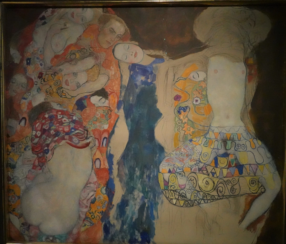
Remember when I said you could make intentional mud? This is where painting truly becomes sophisticated. Chromatic neutrals are those rich, complex grays, browns, and muted tones that still retain a hint of color, avoiding the flatness of pure black or gray. They're essential for realistic shadows (which are rarely just darker versions of a color), for creating atmospheric perspective, or for adding subtle, nuanced depth to abstract compositions. The distinction is key: unintentional mud is accidental, ugly, and flat; chromatic neutrals are deliberate, beautiful, and full of life. They're the secret sauce of the Old Masters, who knew how to balance luminous hues with sophisticated desaturation to create incredible depth and realism. Think of the subtle, vibrant grays found in a Rembrandt shadow, or the complex, atmospheric blues and greens in an Impressionist landscape – these aren't accidental dullness, but carefully crafted chromatic harmonies. In my own work, a well-placed chromatic neutral can make a vibrant red feel even more intense, creating a dialogue rather than a competition between colors.
Here’s how I approach them:
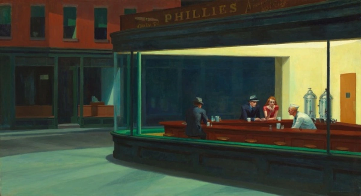
- Controlled Complementary Mixes: Instead of mixing complements 50/50 (which yields mud), try mixing them in an unbalanced ratio – say, 80% blue and 20% orange. You get a complex, desaturated blue-gray that is far more interesting than a simple gray. Experiment with these ratios to create a spectrum of beautiful muted tones. Also, consider the color temperature: mixing a warm red (like Cadmium Red) with a cool green (like Phthalo Green) will give a different, often more interesting, chromatic neutral than mixing two warm or two cool complements. This creates visual vibration.
- Earth Tones as a Base: Colors like Burnt Sienna, Raw Umber, and Yellow Ochre are fantastic starting points for chromatic neutrals. They are already somewhat desaturated and mix beautifully with small amounts of primary colors to create sophisticated grays and browns. I find them indispensable.
- Adding White (Carefully): White will lighten a mix, but can also cool it down and desaturate it further. Use it to adjust value within your chromatic neutral, but be mindful of how it shifts the overall color temperature and intensity.
- Layering vs. Mixing: For transparent mediums like watercolor, you can create chromatic neutrals by layering thin washes of complementary colors over each other, allowing the eye to do the mixing. This maintains luminosity.
Chromatic neutrals are what give your vibrant colors a place to truly shine; they provide the quiet moments that make the loud ones impactful. For more on how I approach color, check out my approach to color mixing.
5. Cleanliness is Next to Godliness (in the Studio)
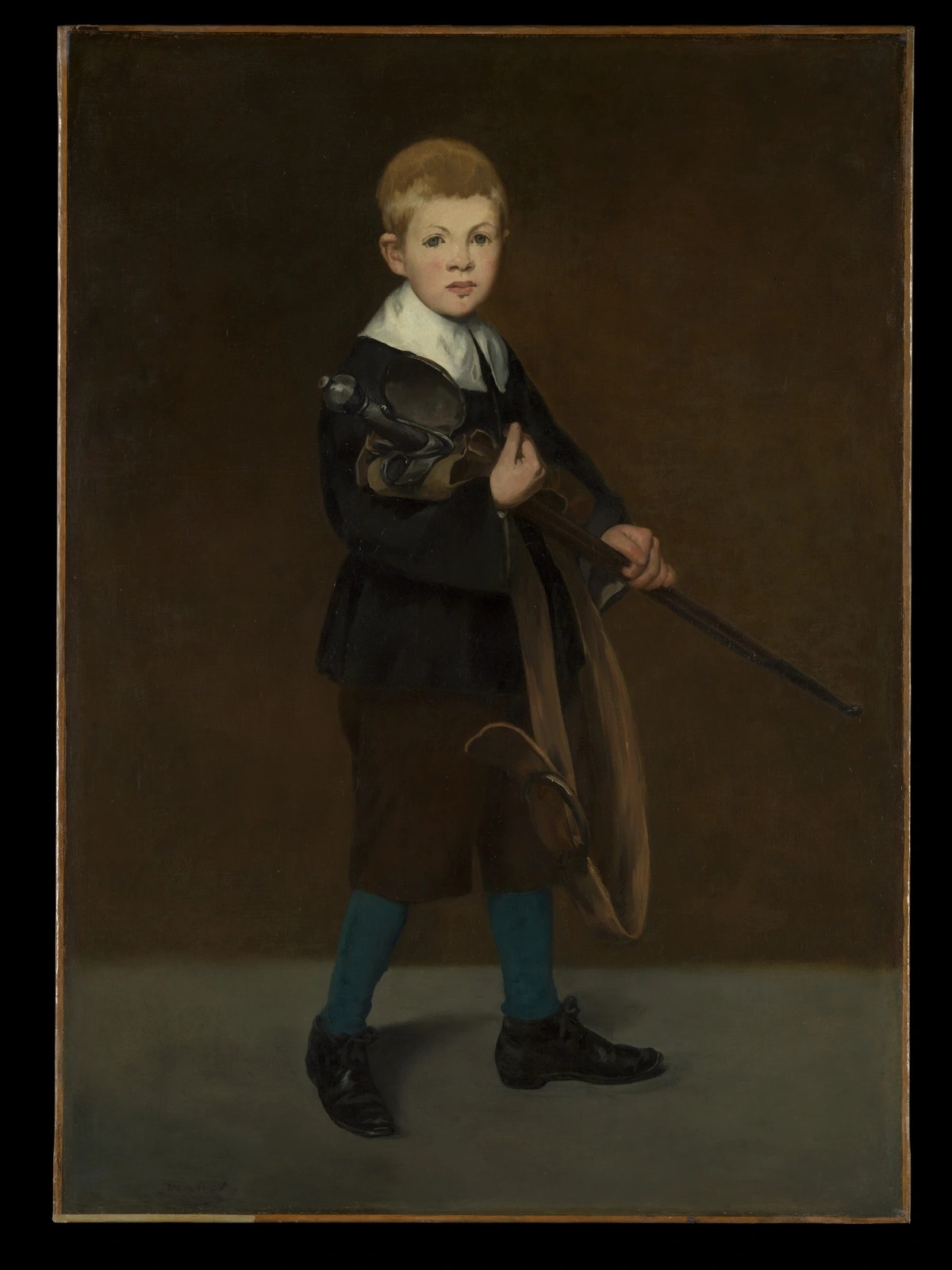
This goes beyond just wiping a palette knife. Make a ritual of cleaning your brushes thoroughly after each session. I know, it’s tempting to leave them for 'later,' but a crusty brush is a mud brush waiting to happen. Invest in good brush soap and commit to the process. Trust me, your colors (and your wallet, as brushes last longer) will thank you. An organized workspace with distinct areas for clean and dirty tools also goes a long way. Check out our guide on cleaning and caring for your paint brushes for a deep dive.
6. Know Your Materials: The Power of Pigment & Paint Quality
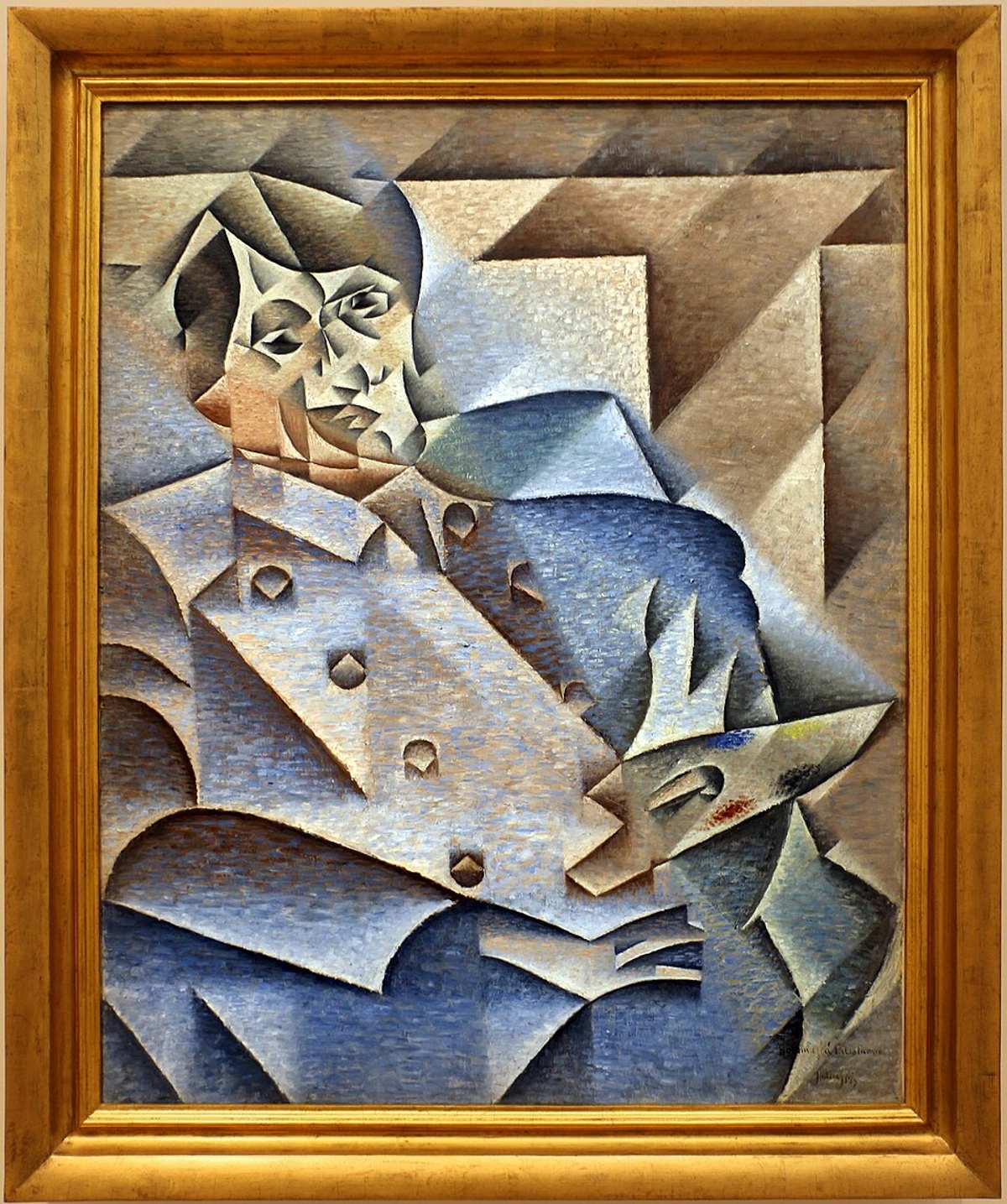
Understanding the properties of your individual pigments can be a game-changer. Some colors are naturally more transparent (like Phthalo Blue), some more opaque (like Cadmium Red). Some granulate beautifully (Ultramarine), while others are staining (Quinacadrones, as we discussed). Knowing these characteristics helps you anticipate how they'll behave in a mix and avoid accidental mud. For instance, highly transparent colors can 'grab' and amplify any underlying muddy layers, making them difficult to correct. Investing in high-quality, artist-grade paints, when you can, means working with purer pigments that offer greater intensity, better lightfastness, and more predictable mixing behavior. If you want to know more about the different types of paint and their unique binders (the 'glue' that holds pigments), check out our definitive guide to paint types.
Understanding Your Mediums: Tailoring Your Approach to Prevent Mud
This is where things get really fascinating, because the consistency of your paint and how quickly it dries play a huge role in how colors interact and, yes, whether they turn to mud. Different painting mediums demand different handling, and understanding your binder – that's the 'glue' that holds the pigment particles together and determines the paint's characteristics – is key.
- Oil Paints: Thicker, slower-drying oils (bound with linseed oil or other drying oils) allow more time for blending, which can be a blessing for smooth transitions, but also more time for accidental overmixing into mud. The opacity of many oil paints, however, allows for easy layering over muddy sections once they're tacky or dry, offering a second chance. However, their slow drying also means contaminants can spread further if you're not diligent. You can extend this even further with oil painting mediums, but more time on the canvas means more opportunity for pigments to neutralize.
- Acrylics: Fast-drying acrylics (bound with an acrylic polymer emulsion) demand quick decisions. Their rapid drying can lead to mud if you try to blend wet-on-wet for too long on the canvas. The key is confident, decisive application, or utilizing acrylic mediums to extend drying time, offering a bit more wiggle room for blending. Alternatively, embrace their layering capabilities, allowing each layer to dry before applying the next. Our guide to basic brushstrokes for acrylic painting can help with confident application.
- Watercolors: With their high water content and transparency (bound with gum arabic), watercolors are arguably the most prone to mud. Overworking on wet paper or scrubbing too many layers without allowing previous washes to dry almost guarantees a dull result. The transparency means every layer contributes to the final color, and dirty layers stack up quickly. The paper surface also plays a massive role; highly absorbent paper can make lifting difficult, trapping muddy pigments. You've got to respect the drying time and master delicate washes.
- Gouache: Being opaque (also gum arabic bound, but with more pigment and often chalk), gouache offers more forgiveness than transparent watercolors. You can often paint light over dark and opaque over opaque. However, overworking wet layers can still lead to muddy consistency and dull colors if you're not careful, as the pigments can blend into a paste rather than a vibrant mix.
Even the texture of your canvas or paper can impact how your colors mix and dry, adding another layer of complexity to avoiding mud. Different mediums demand different handling, and a true understanding of your materials is a cornerstone of clean color.

Repairing Muddy Colors: Turning Back the Clock
Even with the best intentions and all the strategies in the world, mud happens. It's not a disaster, but an opportunity to learn and course-correct! Don't despair. Here are some strategies I use to rescue a passage or even an entire painting from the dreaded dullness, turning a moment of frustration into a learning experience.
Technique | Applicable Mediums | Best For | Potential Drawbacks & My Experience |
|---|---|---|---|
| Stop, Dry, Then Opaque Over | Acrylics, Oils | Severely muddy areas, starting fresh, or completely rethinking a section. | Requires patience, can add texture/build-up if not careful. For me, it's a reset button when I've really messed up a wet area. |
| Glazing for Subtle Shifts | Oils, Acrylics (transparent mediums), Watercolors | Shifting hue, adding luminosity, unifying colors, or subtly altering a muddy area's appearance. | Only works if underlying mud isn't too dark/opaque; requires drying time between layers. I use it to bring back vibrancy over a slightly duller patch. |
| Scumbling for Texture & Light | Oils, Acrylics (opaque mediums) | Creating atmospheric effects, broken color, softening transitions, or adding a 'veil' of clean color over a muddy area without fully covering it. | Can add texture, may not fully hide very dark mud; requires a light touch. Great for misty effects or breaking up a flat tone. |
| Lifting | Watercolors | Removing pigment from wet or re-wetted areas, especially for highlights or to lighten a muddy wash. | Can disturb paper surface, may leave stains, difficult with staining pigments. It's a delicate dance, and not always fully effective with deep mud. |
| Re-establish Values | All | Bringing back depth, clarity, and contrast where mud has flattened the image. This is more about clean application after the mud. | Requires careful observation and clean color application. Often involves painting over the muddy area with precise, clean strokes to redefine forms. |
My Essential Mud-Proof Principles: Quick Reference Guide
For those moments when you just need a quick reminder, here are the absolute essentials – my personal Dos and Don'ts for keeping your palette vibrant. It's a mental checklist I try to run through every time I pick up a brush.
Do's
- Mix on the Palette, Not the Canvas: Get your color right before it touches your artwork. Use a palette knife for clean, efficient mixing – it’s a game changer.
- Clean Your Tools Religiously: A dirty brush or palette knife is a mud magnet. Wipe constantly, wash thoroughly. This is non-negotiable.
- Embrace the Pause: If it's getting messy, step away, let it dry, then return with fresh eyes (and fresh paint!). My best mud-fixes often happen after a break.
- Go for Quality (When You Can): Better pigments mean cleaner, more vibrant, and more predictable mixes. You'll thank yourself for the investment.
- Think in Layers: Especially with acrylics and transparent mediums, build your colors rather than scrubbing them into oblivion. Allow layers to dry; patience is a virtue here.
- Mind Your Temperature & Value: Consciously consider the warmth/coolness and lightness/darkness of your colors in every mix. Don't be afraid to experiment, but do so with intention!
Don'ts
- Don't Overmix Complementary Colors in Equal Parts: This is the fastest route to dull, desaturated tones. Use them sparingly and intentionally for chromatic neutrals, not for accidental brown goo.
- Don't Rush Drying Times: Especially with fast-drying mediums like acrylics or transparent watercolors. Patience is key to clear, luminous layers. Rushing leads to frustration and mud.
- Don't Underestimate the Power of Clean Water/Solvent: A fresh rinse can save a whole painting from contamination. Change that water more often than you think!
- Don't Fear a Limited Palette: It forces you to learn color relationships deeply, which is invaluable. Embrace the challenge, and watch your understanding grow.
- Don't Blend Indefinitely on the Canvas: This is almost always a recipe for losing clarity and creating a muddled mess. Work with intention, lay it down, and then stop.




Common Mud-Making Myths - Debunked!
Myth 1: You can't use black without making everything muddy.
Reality: This is a classic worry! Black, when used intentionally and sparingly, can create deep, rich shadows and powerful contrasts without muddying. The key is how you use it. Instead of just using tube black, try mixing a tiny bit of black into a rich dark blue (like Ultramarine Blue) or a deep green for a beautiful, nuanced shadow that still retains color. You can also achieve incredibly dark, vibrant blacks by mixing complements like deep red and green, or blue and orange. (For instance, mixing Ultramarine Blue and Burnt Umber can create a gorgeous, deep chromatic black). It's the careless, over-mixed black that causes trouble, especially if mixed with too many complements. Black can be your friend, if you treat it with respect.
Myth 2: Some colors are inherently "muddy" or "bad" for mixing.
Reality: While some pigments are naturally lower in chroma (like many earth tones, which are often semi-transparent inorganic pigments), no color is inherently "bad." The combinations and proportions of colors create mud. A Raw Umber might seem dull on its own, but it can be the perfect starting point for a complex chromatic neutral when mixed judiciously with a bit of blue or red. Even the most vibrant colors can turn to mud if overmixed with their complements. It's about understanding each pigment's properties and using them thoughtfully. There are no bad colors, just misunderstood mixing opportunities. My personal philosophy is that every color has its place, it's just about finding its role in the grand symphony of your palette.
Myth 3: You have to keep blending until there are no visible brushstrokes.
Reality: This is a common misconception, especially for beginners aiming for hyperrealism. Often, visible brushstrokes add energy, texture, and interest to a painting. Continuously blending on the canvas is a prime way to create mud. Learn to love the expressive quality of distinct marks, or rely on layering with dry time in between if a smooth finish is your goal. Embrace the brushstroke; it's part of your artistic signature! Remember, sometimes the subtle variations created by visible brushstrokes actually enhance the sense of light and form, rather than detracting from it. For me, the journey of the brush across the canvas is as much a part of the story as the final image.
Frequently Asked Questions About Avoiding Muddy Colors
Q: Why do my watercolors get muddy so easily?
A: Watercolors are particularly prone to mud because they are transparent and reactivated by water. Overworking wet layers, not letting washes dry between applications, using dirty water, or scrubbing too much can all push pigments into a dull, mixed-up state. Also, using highly staining pigments without care can make corrections difficult. Patience, clean water, and confident, deliberate layering are your best friends here. Think of building up your washes gently, like adding thin veils of color, rather than scrubbing them into submission.
Q: Can muddy colors be fixed completely?
A: Often, yes! For opaque mediums like oils and acrylics, you can let the muddy layer dry and paint cleanly over it. For transparent mediums like watercolor, it's trickier but sometimes lifting (gently removing wet pigment), or applying a clean, light glaze once dry, can help. The key is to stop adding more mud and strategize your recovery. Sometimes, embracing a slightly muted chromatic neutral (as opposed to accidental mud) is a better solution than forcing a vibrant hue back. I've found that sometimes a 'mistake' can lead to an unexpected, beautiful tone if you lean into it with intention.
Q: Is it possible to avoid muddy colors entirely as a beginner?
A: Realistically, probably not entirely – and that's okay! Making mud is a rite of passage for every artist. The goal isn't perfection from day one, but understanding why it happens and learning strategies to minimize it. Start with a limited palette, focus on clean tools, and practice mixing on your palette. With time and practice, you'll gain control and even find beauty in the subtle tones you create. The journey of mastering color is a lifelong one, full of delightful discoveries (and occasional messes!).
Q: How does ambient light in my studio affect color mixing?
A: Significantly! Different light sources (e.g., warm incandescent, cool fluorescent, natural daylight) can alter how you perceive colors and mixes. What looks clean under warm light might appear dull under cool light, and vice versa. Try to work under consistent, neutral light whenever possible. If you can't, check your mixes under various lighting conditions to avoid surprises. My advice is to always have a consistent light source, ideally one that mimics natural daylight, to ensure your colors appear as you intend them, both in your studio and out in the world.