
Living Room Abstract Art: An Artist's Deep Dive into Curating Your Space
Explore a personal artist's guide to choosing, placing, and styling abstract art for your living room. Discover your vibe, master scale, framing, and color, and truly curate a space that reflects your soul.
Living Room Abstract Art: A Personal Artist's Guide to Choosing, Placing & Styling
Welcome, fellow art explorers, to my deeply personal ramblings and perhaps, just perhaps, a little wisdom on the quest for living room art. This isn't just about picking a picture; it's about curating a feeling, sparking conversation, and truly letting your space reflect your inner world. This guide will walk you through understanding your unique vibe, mastering scale and placement, choosing the perfect frame, harnessing the power of color, and integrating art seamlessly into your decor. Ready? Let's dive in. The living room. Oh, the living room. For many of us, it’s the beating heart of the home, a place where stories unfold, laughter echoes, and quiet evenings settle in. It’s where you truly live. And yet, when it comes to decorating this sacred space, especially with art – and specifically abstract art, which happens to be both my passion and my specialty – I’ve often found myself staring at a blank wall with the same bewildered expression one might have when trying to solve a cryptic puzzle without all the pieces. I remember one particularly disastrous attempt involving a vibrant, chaotic piece I bought on a whim. It screamed "look at me!" while my living room whispered, almost desperately, "serenity now." It was like trying to fit a disco ball into a minimalist zen garden. My own living room, for a long time, was a testament to indecision, a canvas of "maybe next week" and "I'll think about it later." From wrestling with the perfect size and finding its sweet spot on the wall, to decoding its colors and ensuring it harmonizes with your existing decor, each step is a mini-adventure in self-expression. It’s funny, isn't it? As an artist, you'd think I’d have this art-choosing thing down. But selecting for yourself, for your own sanctuary, is a whole different ball game. It’s not just about what looks good, is it? It’s about what feels good. What piece of abstract art will hum gently with your mornings, or spark conversations during gatherings? What truly belongs there, beyond mere aesthetics? Abstract art, with its boundless interpretations and emotional depth, offers a particularly rich avenue for this curation. It doesn't tell you what to see, but rather invites you to feel, to imagine, to connect on a deeper, more personal level. After much trial, error, and a few "what was I thinking?" moments (that still make me cringe a little), I've gathered some thoughts and a process I hope might help you on your own quest to make your living room truly sing. So, before we even touch a tape measure or a paintbrush, let's dive into the most important canvas: your own unique living room vibe.
It's Not Just a Pretty Picture: Understanding Your Vibe (and Yourself)
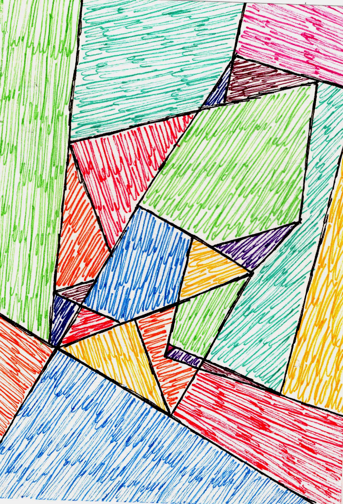
Ever stared at a blank wall and felt a pang of artistic paralysis? Before you even think about pixels or paint strokes, take a moment. Close your eyes, if you must, and feel your living room. What do you do here? Is it a tranquil reading nook? A vibrant social hub for endless conversations? A quiet space for deep introspection? Your chosen art should echo that primary purpose, or perhaps, subtly challenge it in an intriguing way. For instance, a bold, energetic abstract in a tranquil reading nook can spark unexpected inspiration, a gentle jolt of creativity without sacrificing peace. Conversely, a quiet, contemplative monochromatic piece introduced into a vibrant social hub can offer a surprising pocket of reflection, a moment of calm amidst the chatter. Abstract art, perhaps more than any other form, lends itself to this introspection. It's a mirror without a definitive image, reflecting back whatever you bring to it, evolving with your mood, and offering a constant source of fresh interpretation. I once bought a piece simply because it was "popular." It looked great in the gallery, all sleek and modern, but in my home, it felt like an uncomfortable guest, constantly reminding me of its unsuitability. It didn't resonate with the quiet hum of my space, and I found myself making excuses for it. I realized then that understanding your personal aesthetic and the existing atmosphere of your room is paramount. Are you drawn to the bold simplicity of minimalism, the eclectic layering of bohemian chic, or the raw edges of an industrial look? Your abstract art should integrate into this narrative, not fight against it. Consider this:
- For a Cozy, Inviting Vibe: Think abstract art with soft, blended colors, perhaps warm earth tones or muted pastels. Look for organic, flowing shapes, or pieces with rich, subtle textures that invite touch. Imagine soft brushstrokes or blurred edges that create a sense of calm. A lyrical abstraction with gentle curves and a soft palette could be perfect.
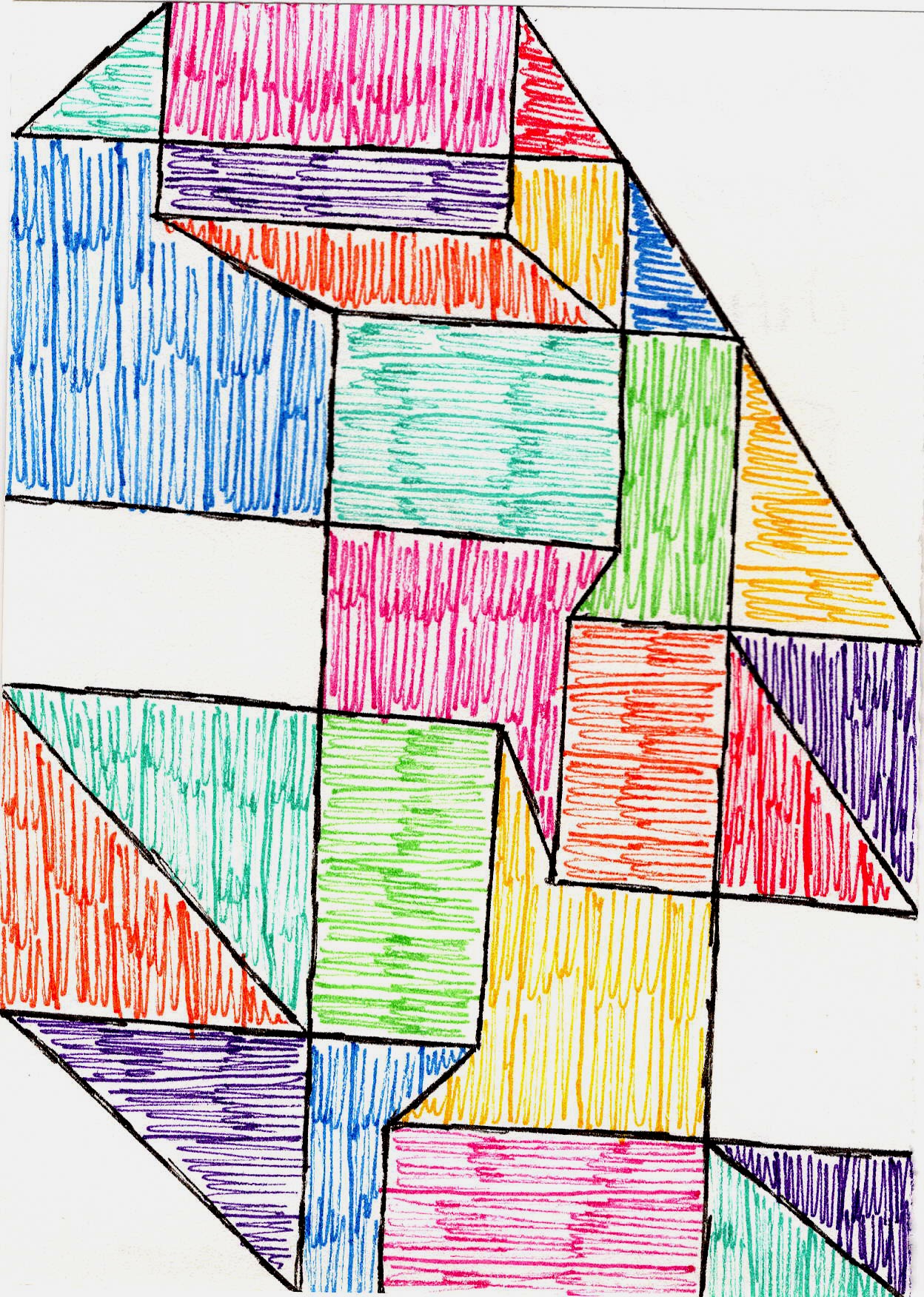
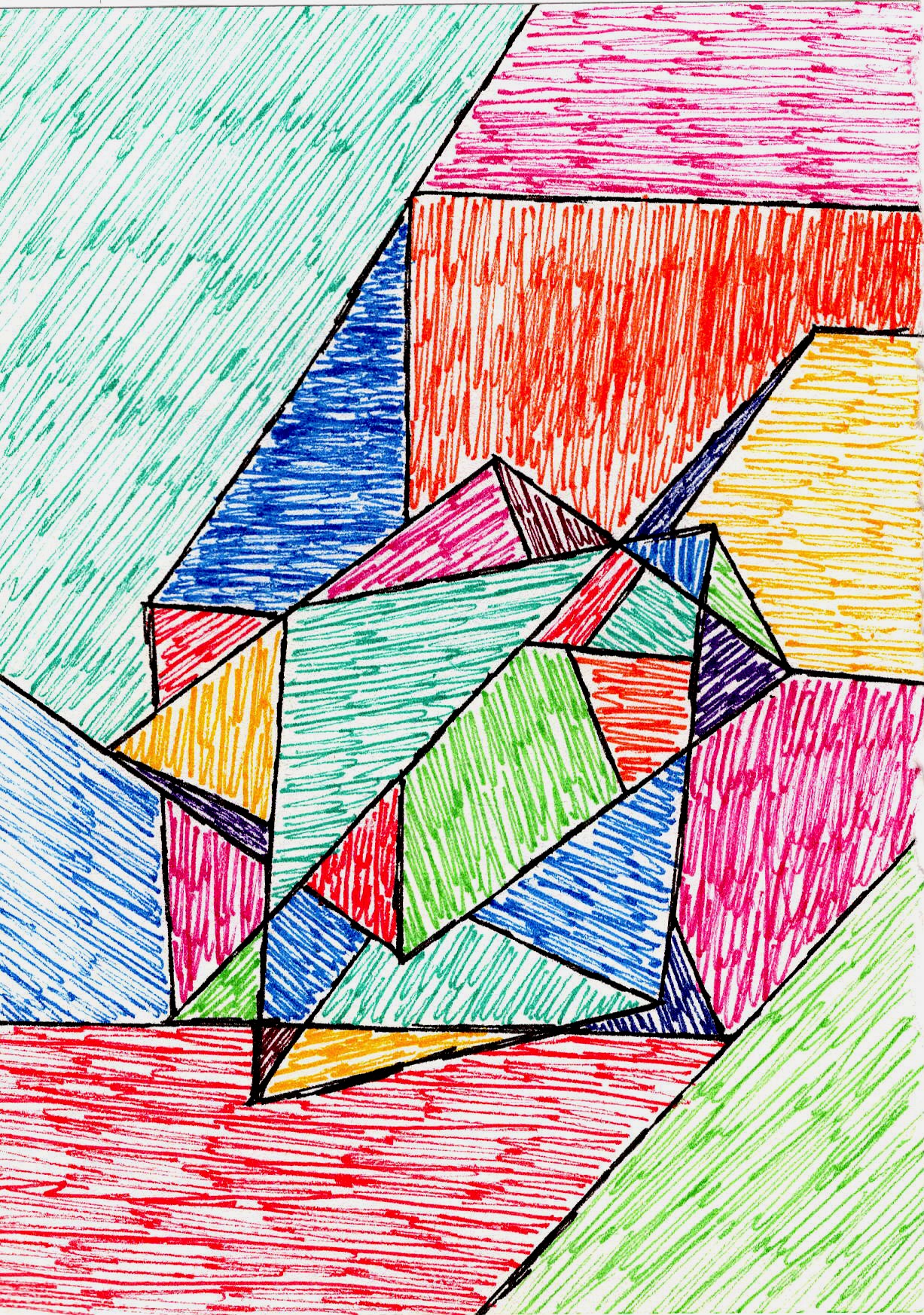
- For an Energetic, Dynamic Space: Lean towards bold, contrasting colors, perhaps vibrant primaries or secondary hues. Geometric abstractions with sharp lines, dynamic compositions, or energetic brushstrokes can inject a sense of movement and excitement. A gestural abstract, full of expressive marks and vibrant contrasts, could ignite the room's energy.
- For an Intellectual, Reflective Ambiance: Monochromatic pieces with subtle tonal shifts, complex layered compositions, or art that plays with light and shadow can invite contemplation. Think subdued palettes, intricate patterns, or pieces that reveal their depth upon closer inspection. A minimalist geometric piece, with its precise forms and thoughtful composition, can evoke a sense of calm intellectual inquiry. What’s more, your space and your taste aren't static. Just as we evolve, so too can our homes. The art you choose today might be a cherished fixture for years, or it might be a stepping stone, a temporary expression that leads you to new discoveries as your style and life stages change. This fluidity is part of the joy. For a deeper dive into making your abstract art part of your home's story, check out my guide to curating flow and feeling or consider choosing art that truly resonates with your space and soul. So, what’s the dominant feeling you want your living room to evoke? And how can a piece of abstract art become an echo, or a playful counterpoint, to that feeling? Once you’ve tapped into that core feeling, the next step shifts from the internal to the tangible: finding a piece that physically commands its space with grace and purpose.
Size Matters (Yes, Really): Finding the Right Scale
Have you ever brought home a piece of art, only to find it's either swallowed by the wall or overwhelms the entire room? Oh, the dreaded "too big" or "too small" syndrome. It's like that moment when you order clothes online – you think you know your size, but then it arrives, and you're either swimming in fabric or it's a glorified handkerchief. I once hung a tiny, delicate piece above a grand, sprawling sofa, convinced its subtlety would be profound. Oh, the misguided confidence! It just looked tragically lost, a lonely postage stamp on an endless beige envelope, practically weeping in its solitude. Art in your living room is no different. The most common blunder? Art that's too small for the wall or too dinky above a large sofa. It gets lost, whispers when it should speak, and just looks... sad. A good rule of thumb I stumbled upon (after a few sad whispers of my own) is that art above a sofa or console table should be roughly two-thirds the width of the furniture piece. If it's a single piece, it should typically take up about 60-75% of the intended visual space it occupies on the wall. Think of this "intended visual space" not as the entire wall, but as the segment of the wall that interacts directly with your furniture arrangement, like an invisible frame around your designated art zone. To visualize this, stand back and mentally draw a rectangle on your wall where you envision the art. This is your "intended visual space." Now, measure the width of your furniture (like a sofa). Take two-thirds of that width. This is your target width for the art. Then, visually assess that width within your mentally drawn rectangle. Is there enough "breathing room" (about 6-8 inches or 15-20 cm above furniture) without the art looking cramped or tiny? It's about leaving some breathing room, allowing the art to be the star without monopolizing the entire stage. For a practical example, if you have an 8-foot (approx. 240 cm) sofa, aim for art that is roughly 5.5 to 6 feet (approx. 165-180 cm) wide to create a balanced focal point. When I create a large-scale abstract, like my 'Azure Whispers' series, I’m often picturing it as a focal point in a spacious living area, considering how its movement will draw the eye across a room, or how its presence might anchor a vibrant corner, truly owning that visual space. Don't forget about ceiling height either! A room with very tall ceilings can often accommodate much larger, more vertically expansive pieces, allowing the art to draw the eye upwards and emphasize the grandeur of the space. Conversely, in cozier rooms, art might need to be more strategically scaled to maintain intimacy without overwhelming the eye. For expansive walls, don't shy away from large-scale abstract art. It can make an incredible statement, almost becoming a window into another world, inviting you to step into its depths. On the flip side, if you're working with cozier dimensions, fear not! There are fantastic strategies for maximizing impact in compact areas without overwhelming the space. 
credit, licence Now that you've considered scale and wrestled with those dimensions, how does the idea of a specific size make you feel within your unique living room – grand, cozy, or just right?
The Crucial Edge: Framing Your Abstract Art
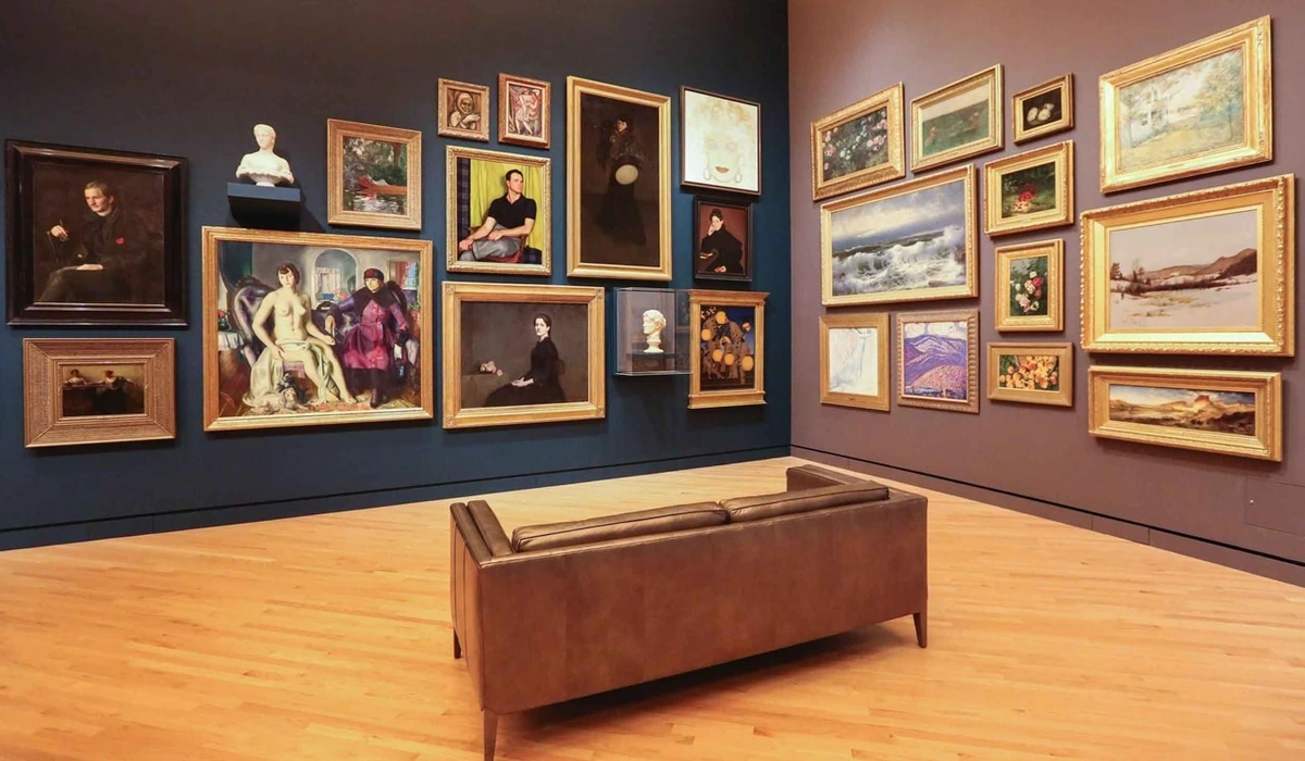
Beyond the canvas itself, the frame is an often-overlooked element that profoundly influences how art integrates into your space. A frame isn't just a border; it's an extension of the artwork and a crucial component of your overall decor. A simple, modern floating frame can emphasize the art's contemporary feel, allowing the edges of the canvas to appear suspended, almost defying gravity. While a more ornate, perhaps gilded, frame might add a touch of classic sophistication, even to an abstract piece, creating an intriguing contrast. Consider the material, color, and thickness of the frame – a slim black line can create a visual pause, drawing the eye directly to the art, while a natural wood frame might seamlessly blend the piece into its surroundings, offering warmth and texture. For instance, a thin, brushed metal frame can perfectly complement a sleek geometric abstraction, reinforcing its precision. A natural, unfinished wood frame might beautifully ground an organic, textured piece, bringing warmth and an earthy connection. Or consider a dramatic, wide shadow box frame that gives a smaller, delicate abstract piece significant presence, almost turning it into a sculptural object. And then there's the frame's finish – a subtle detail with immense impact. A sleek, glossy black frame can amplify the vibrancy of colors and introduce a modern sharpness, perfect for a high-contrast abstract. Conversely, a matte white or natural wood finish can soften the artwork's presence, allowing it to blend more organically into a calm, minimalist space. Don't underestimate the power of a distressed or vintage-style frame; it can introduce a beautiful, unexpected layer of history and texture, creating a compelling dialogue even with a very contemporary abstract piece. I once experimented with framing a vivid, energetic abstract in an antique, somewhat battered gold frame. My initial thought was "this is going to be a disaster," but the contrast was surprisingly captivating, a playful wink between centuries, making the art feel both rebellious and deeply rooted. Another often-overlooked aspect is frame depth. A deep frame (like a shadow box) can add gravitas to a piece, making it feel more sculptural and allowing space for textured artwork. A shallow, flush frame, conversely, creates a more immediate, direct interaction with the canvas, emphasizing its flatness. This subtle choice influences how the art recedes or projects from the wall. And what about matting? This often-overlooked detail (the border between the art and the frame) plays a significant role in how a piece is perceived. A wide, neutral mat can give a smaller abstract piece more presence, creating a visual breathing space that allows the eye to focus. Conversely, a piece framed without a mat, especially a larger canvas, can create a more immediate, immersive experience, drawing you directly into the artwork. It's the final flourish that tells a piece's story, quietly orchestrating its presence in the room, inviting a moment of pause before you even truly see the art itself. And beyond aesthetics, remember the practicalities: the weight and hanging mechanism. A large, framed piece can be surprisingly heavy. Ensure your wall type can support it and invest in appropriate anchors. This isn't just about display; it's about safety and the longevity of your artistic investment. There's nothing quite like the subtle horror of realizing your prized abstract is slowly, inexorably pulling away from the wall. 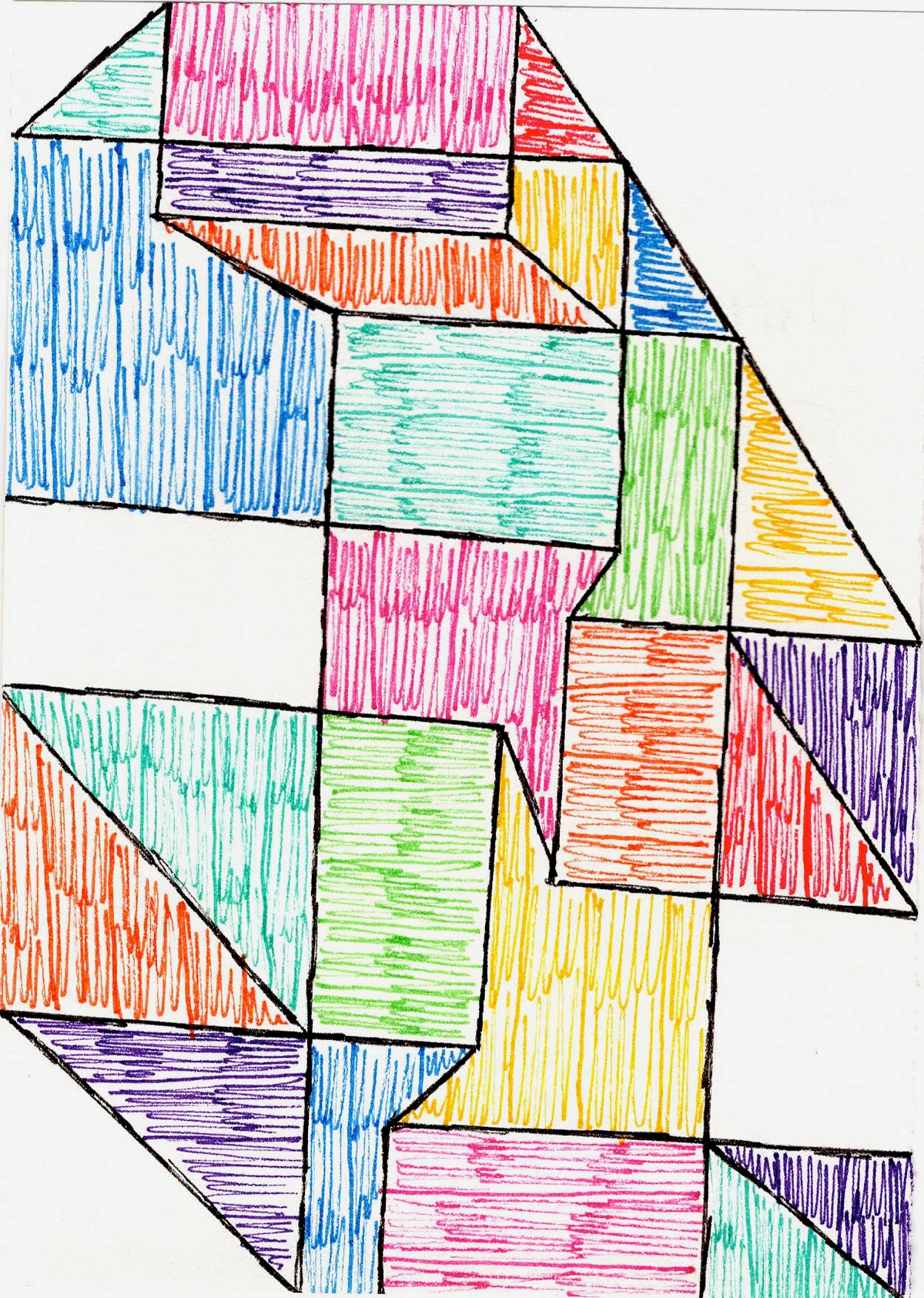
credit, licence How can the right frame (and perhaps the right mat) elevate your chosen piece from merely a picture on a wall to a truly integrated part of your living room's story, making it sing with newfound presence? Which finish will tell the most compelling story for your unique abstract and space?
The Art of Placement: Where to Hang Your Heart on the Wall
So, you've wrestled with size and found "the one." Now, where does it go? This is where my perfectionist tendencies really kick in. I've spent an embarrassingly long time holding a piece of art up, stepping back, squinting, tilting my head, and then repeating the whole process five times. I once thought a piece looked perfect just above the mantelpiece, only to realize, hours later, that it was subtly, irrevocably crooked, mocking me with its askew glory every time I walked into the room. It took a spirit level, some deep breaths, and a renewed sense of purpose to get it right. But proper placement can truly transform how a piece is perceived and how it interacts with the rest of your space. And what about those charming, yet tricky, architectural quirks? Sloped ceilings, narrow alcoves, or odd wall divisions can be challenging but also offer unique opportunities. Embrace them! A vertical abstract can dramatically enhance a narrow pillar, or a smaller, carefully chosen piece can define a cozy alcove, turning a potential design headache into a feature. Consider walls interrupted by radiators or heating units; a horizontal abstract placed just above can draw the eye away, making the heating element less prominent. For walls with multiple windows, instead of trying to fill every gap, consider a dynamic gallery wall that intentionally incorporates the windows as part of the composition, or a single, impactful piece on the most dominant wall. In rooms with unusual shapes or angles, a bold abstract can act as a visual anchor, simplifying the perceived complexity of the space, or even playfully mirroring the angles for an intriguing effect. Placing Art Above a Fireplace: This is a classic focal point, but often comes with its own quirks.
- Mantelpiece Height: If you have a mantel, ensure there's enough space between the mantel and the bottom of the art (typically 6-12 inches or 15-30 cm) to allow it to breathe without feeling cramped. The art shouldn't be wider than the mantelpiece itself.
- Scale with Fireplace: Consider the overall scale of your fireplace. A grand, ornate fireplace can handle a larger, more commanding abstract, while a sleek, modern, or smaller unit might call for something more understated or a carefully curated pair of smaller pieces.
- Balance: If the fireplace is asymmetrical, art can be used to restore visual balance. A strong abstract can act as a counterpoint to an off-center feature. Here’s a quick guide to getting it just right: | Placement Scenario | General Rule | Specifics & Tips | | :----------------- | :----------- | :---------------- | | Eye Level | Center of art at average eye level | Generally 57-60 inches (145-152 cm) from the floor for a comfortable viewing experience. This is crucial for standalone pieces. | | Above a Sofa/Console | Create a cohesive unit | Leave about 6-8 inches (15-20 cm) between the bottom of the frame and the top of the furniture piece. This 'gap' allows for visual breathing room. | | Gallery Walls | Balance is key | Think about balancing shapes, colors, and sizes. Start with a central anchor piece and build outwards. Remember to use consistent spacing between pieces for a polished look. | | Unexpected Spaces | Be adventurous | Don't limit yourself to just main walls. Consider corners, shelves, or even leaning large pieces against a wall. A small abstract on a bookshelf can add depth and personality. | Ah, the glorious, chaotic symphony of a gallery wall! They look effortless, but trust me, they require a bit of planning. For a comprehensive walkthrough, my article on curating your perfect gallery wall is a real lifesaver. And if you're feeling adventurous, don't limit yourself to just walls; explore creative ways to display abstract art in unexpected spaces. Once your art is perfectly placed, its colors can truly begin to speak.
credit, licence Once perfectly placed, how does your art feel in its chosen spot? Does it breathe, does it sing, and does it invite you deeper into its world, feeling completely at home amidst your unique architectural narrative?
Color, Emotion, and My Inner Palette
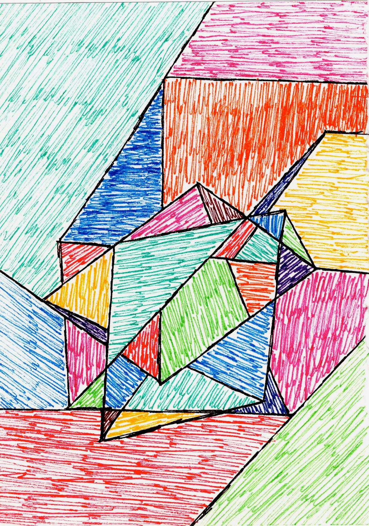
How do you want your living room to feel? Color is my language. It's how I express the inexpressible, how I translate emotion onto a canvas. I remember one crisp autumn morning, the light hitting my studio just so, revealing an unexpected vibrancy in a piece I'd thought was finished. Suddenly, a subtle shift in a muted ochre, kissed by a sliver of sunlight, transformed its entire emotional resonance, bringing forth a forgotten memory of warmth and childhood wonder. This is the magic of color. When choosing abstract art for your living room, consider the colors already present, but don't be afraid to introduce a new splash – sometimes that unexpected hue is precisely what the space craves. It's about crafting an atmosphere, a visual symphony that resonates with your soul. Do you want a piece that calms and soothes, perhaps with cool blues and greens? Or something that energizes and invigorates with fiery reds and oranges? Sometimes, a vibrant piece can be the perfect counterpoint to a neutral room, providing that much-needed pop and focal point. Beyond just matching, consider how colors interact in more subtle ways. When we talk about color, we often delve into its fundamental properties:
- Hue: This is the pure color itself – red, blue, yellow, green, and so on.
- Saturation: This refers to the intensity or purity of the color. A highly saturated color is vivid and bright, while a desaturated color is muted and closer to gray.
- Value: This describes how light or dark a color is. Adding white increases its value (making it a tint), while adding black decreases it (making it a shade). Understanding these helps you choose art that aligns with your desired emotional resonance. Do you want analogous colors (colors next to each other on the color wheel, creating harmony like a gentle gradient) for a harmonious, flowing feel, or complementary colors (opposite on the color wheel, generating a dynamic, striking contrast that demands attention)? Beyond analogous and complementary, explore triadic (three colors evenly spaced on the color wheel, like red, yellow, and blue, creating a vibrant, playful balance) or tetradic (four colors, forming a rectangle on the color wheel, offering rich complexity and multi-faceted energy) schemes. These can introduce more complexity and vibrancy, creating a dynamic visual narrative without chaos, much like a carefully composed piece of music. And don't forget temperature (warm vs. cool). A highly saturated red will feel very different from a muted, desaturated red, just as a dark navy conveys a different mood than a pale sky blue. Understanding these relationships can elevate your space beyond simple decoration. For instance, a dominant cool blue with sharp yellow accents might create a feeling of calm yet alert introspection, like a quiet dawn. Or perhaps warm earth tones interwoven with hints of crimson could foster a sense of grounded passion, a cozy fireplace for the soul. I remember an early abstract piece of mine, 'Crimson Reverie,' where I deliberately blended deep reds with soft mauves and ochres. My intent was to evoke the bittersweet nostalgia of a fading sunset, and seeing it now, I still feel that gentle ache of beauty and longing. In another piece, 'Verdant Echoes,' I played with various shades of green, from deep forest to bright lime, to capture the invigorating, ever-changing essence of a spring forest, aiming to bring a sense of natural vitality into any space. This intentional use of color harmony or dissonance by an artist is crucial. Sometimes, a jolt of contrasting color is exactly what's needed to create visual tension and excitement; other times, a subtle gradient of analogous hues fosters a deep sense of peace. It's all part of the visual symphony. I've written extensively on the psychology of color in abstract art and de emotionele taal van kleur, delving into how different hues can truly transform a space and your mood. It's not just about matching your cushions; it's about creating an emotional resonance that speaks to you every day.

credit, licence What emotional chord do you want your living room to strike, and how will your chosen abstract art help compose that feeling, truly resonating with your inner landscape and bringing its unique color story to life?
Style Synergy: Making Art and Decor Friends
Does your art truly "belong" in your living room, or does it feel like an awkward guest, constantly out of place? Your living room probably has a distinct personality, even if you haven't given it a label. The abstract art you choose should be a good friend to that personality, not an awkward acquaintance. Abstract art is particularly versatile and can act as a bridge between different design elements, offering a unifying thread or a surprising counterpoint in eclectic spaces. Beyond just aesthetics, your art can be a brilliant conversation starter, inviting guests to share their interpretations and fostering a more interactive living room experience. It’s a subtle cue, a whispered invitation to connect.
- Minimalist Marvels: If your aesthetic is "less is more," then art should be a focal point, clean and impactful. Think bold, monochromatic forms or subtle textured pieces, like a striking black and white geometric abstraction or a canvas with a single, deeply textured line. My own "Zen Dageraad" series, with its clean lines and bold color blocks, often finds its perfect home in these serene spaces, providing impact without clutter. You'll find great tips in my article on art for minimalist interiors and decorating with abstract art in a minimalist living room.
- Bohemian Bliss: For those who love layers, textures, and a global-inspired vibe, abstract art can add a fantastic modern edge. Look for organic shapes, vibrant yet earthy palettes, or layered textures – a piece with swirling, nature-inspired forms in rich ochres and deep greens, for instance. My guide on decorating with abstract art in bohemian chic interiors is packed with ideas.
- Industrial Chic: Raw beauty meets bold expression. Abstract art with strong geometric forms or a focus on texture can perfectly complement exposed brick and metal. Abstracts with strong, clean lines, metallic sheens, or compositions that mirror architectural elements, perhaps a piece with exposed brushstrokes and a muted, urban color scheme. My early works, often experimenting with stark contrasts and raw textures, have found surprisingly harmonious homes in these robust environments. Check out my thoughts on decorating with abstract art in industrial chic interiors.
- Timeless Bridge & Eclectic Charm: Don't underestimate abstract art's power to bridge styles. A modern abstract piece can inject contemporary energy into a traditional setting, creating a sophisticated dialogue between old and new. For example, a stark, bold geometric abstract hanging above a classic Rococo console table can be a startlingly beautiful juxtaposition, creating visual tension and immediate intrigue. In an eclectic space, where different eras and styles happily coexist, abstract art can serve as a unifying element, pulling diverse themes together with its universal language of form and color, or it can be a playful counterpoint, adding an an unexpected twist. It's about finding that surprising harmony, that unexpected connection that makes a space truly unique. Sometimes, the most compelling design statements come from intentional disruption – a vibrant, energetic abstract deliberately placed in an otherwise sedate, traditional room can awaken the space, creating a focal point that challenges expectations and sparks conversation. In open-plan living spaces, where kitchen, dining, and living areas flow into one another, abstract art can be a masterful unifier or a subtle delineator. A large, cohesive abstract piece can visually 'anchor' the living zone, giving it a distinct identity while maintaining visual continuity with the surrounding areas. Or perhaps smaller, complementary abstracts could subtly guide the eye from one zone to another, acting as visual breadcrumbs. Furthermore, if your room leans heavily on neutrals or monochromatic tones, a vibrant piece of abstract art can be the perfect "pop of color," drawing the eye and infusing the space with energy without overwhelming it. It's all about finding harmony, allowing the art and your decor to have a conversation, rather than a shouting match. Sometimes that conversation is quiet and reassuring; other times, it's a vibrant, exhilarating debate.
credit, licence How will your chosen abstract art not just decorate your living room, but truly elevate it, sparking conversations and speaking to its unique character, turning your space into a curated narrative that tells your evolving story?
Beyond the Canvas: The Art of Creation and Interpretation
To truly appreciate the abstract art destined for your living room, it helps to peer, even briefly, into its creation. For me, creating abstract art is a dance between intention and intuition, a private conversation between my inner world and the evolving canvas. It often begins not with a sketch, but with a feeling, a fleeting thought, or a fragment of a memory, which I then attempt to translate into form and color. Then comes the layering – washes of color building upon each other, energetic brushstrokes, moments of deliberate chaos, and then periods of quiet contemplation, allowing the piece to slowly reveal itself, sometimes in ways I hadn't anticipated. It's a journey of discovery, much like the one you undertake when choosing art for your home. And speaking of space, don't forget the power of 'negative space' – the often-unpainted areas or the intentional voids within an abstract composition. These aren't just empty; they are vital, guiding the eye, creating balance, and allowing the artwork to breathe, much like the quiet pauses in a piece of music. Beyond the visual, there’s the tactile language of texture. Is the paint thickly impastoed, inviting touch and casting captivating shadows that shift with the light? Or is it a smooth, layered glaze, creating an illusion of infinite depth? Texture isn't just a byproduct of the medium; it's a deliberate choice, adding another sensory dimension to the artwork and a quiet dialogue with your living room's fabrics and finishes. When I create, I'm constantly aware of how the texture of the paint, the canvas, or even the underlying gesso will affect the final impression. A thick impasto creates shadows and highlights that shift with the light, almost making the art a living entity. A smooth, glazed surface, however, can create a sense of ethereal depth. This tactile quality is another silent language your abstract art speaks. Understanding a little about the diverse world of abstract art can also profoundly guide your choices, transforming mere selection into a more informed and personal discovery. Beyond style, consider the crucial impact of the medium itself. Is it a vibrant acrylic, with its quick-drying luminosity and sharp, bold colors? A rich, slow-drying oil, offering deep textures, profound color shifts, and a timeless, classic feel? Or a dynamic mixed-media piece, perhaps incorporating collage, pastels, or unexpected materials, adding a tactile depth and intriguing visual story? The texture and application of the medium deeply influence how a piece feels and how it interacts with light in your living room, adding another layer to its personality. And don't overlook the internal scale of the artwork itself – the size and relationship of elements within the composition. This isn't just about the overall dimensions of the canvas, but how the elements within the artwork relate to each other. A large canvas might feature delicate, intricate patterns, like tiny, swirling galaxies within a vast cosmic space, inviting close inspection and drawing the viewer closer. Conversely, a smaller piece could hold a single, monumental form, a powerful, solitary peak in a compact landscape, demanding immediate attention and projecting an expansive presence despite its size. This internal rhythm is another layer of how art speaks to its surroundings. Are you drawn to the bold, emotional gestures of Abstract Expressionism, with its energetic splatters and raw, intuitive brushstrokes, like a visual diary of an artist's soul? Or perhaps the clean lines and purity of Geometric Abstraction, reminiscent of a Mondrian, with its precise shapes and distinct boundaries that create a sense of order and balance? Then there's Lyrical Abstraction, focusing on spontaneous, flowing forms and often softer, more atmospheric color fields, inviting a meditative contemplation. Or Color Field painting, characterized by large expanses of solid color, aiming to immerse the viewer in a sensory experience, often evoking profound emotional responses through sheer scale and hue. Each movement carries its own spirit and might resonate differently with your living room's established mood. While personal resonance is paramount, discerning the quality of abstract art involves a subtle eye. Look for a compelling composition, even in apparent chaos – does the piece feel balanced, or intentionally off-kilter in an engaging way? Observe the interplay of colors and textures; is there depth, a conversation between hues that keeps drawing you back? The artist's intent, even if unspoken, often shines through in the execution. A well-executed abstract piece often rewards prolonged viewing, revealing new nuances each time you engage with it, inviting you deeper into its world. This connection goes beyond just aesthetics; it's about appreciating the artist's journey, their emotional expression, and the thoughtful dialogue they have with their materials. For those who delve deeper, understanding the provenance – the history of ownership and origin – and the artist's unique story can add immense layers of meaning and value to a piece, transforming it from mere decor into a cherished historical object. Furthermore, in today's market, considering ethical art acquisition is increasingly important: actively supporting living artists, understanding copyright, and recognizing the distinct value of original pieces over mass-produced reproductions contributes to a thriving, fair art ecosystem. 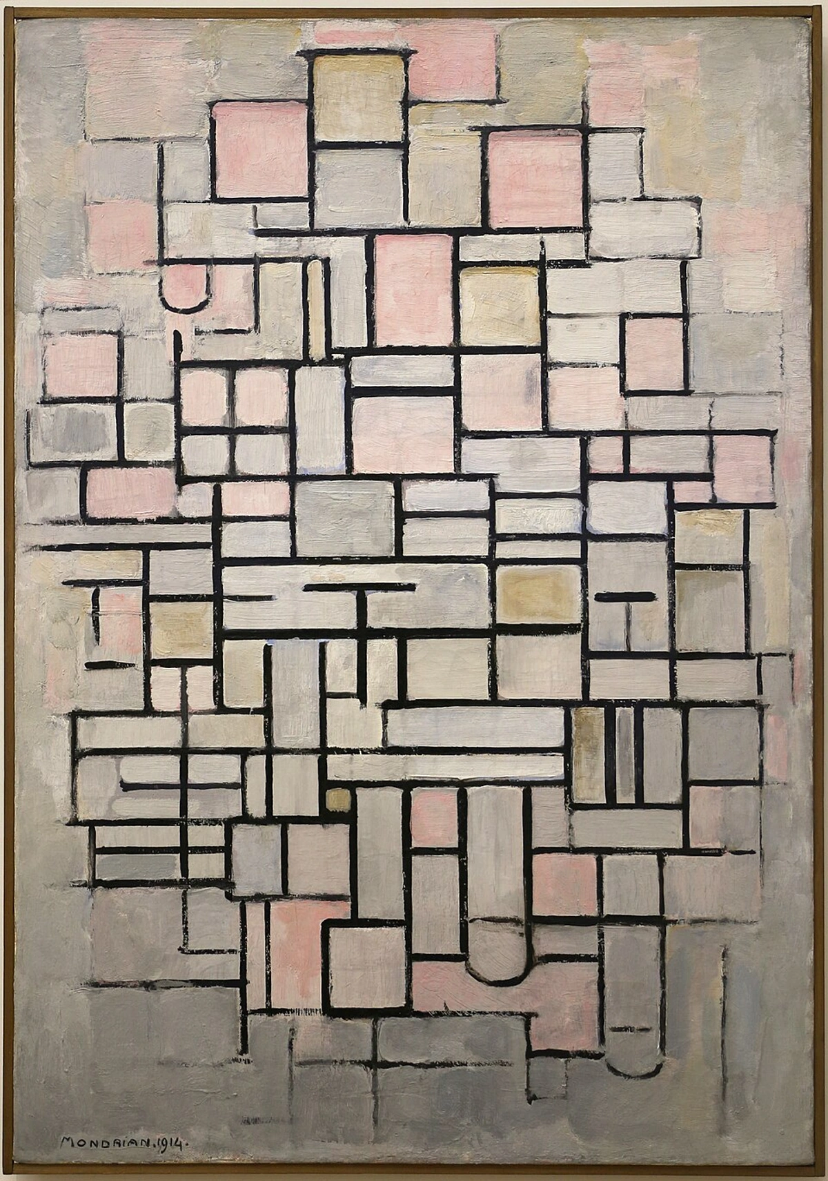
credit, licence
For a deeper dive into the nuances of artistic intent and composition, my articles on the psychology of color in abstract art and the emotional language of color delve into these elements, and for a full historical perspective, consider de definitieve gids voor de geschiedenis van abstracte kunst. 
credit, licence How does knowing a little about the artist's process, the history of abstract movements, or the very materials and textures used, deepen your connection to a piece, transforming it into more than just decoration but a silent, evolving conversation partner in your living room, imbued with its own unique story and provenance?
The Final Ingredient: Trusting Your Gut (and Maybe My Art)
Ultimately, choosing abstract art for your living room is a deeply personal endeavor, a journey that's as much about self-discovery as it is about aesthetics. There are guides, rules, and suggestions (like mine!), but the most important thing is how you feel when you look at a piece. Does it make your heart sing a little? Does it evoke a memory, a feeling, a thought, a sense of quiet wonder, a gentle hum within your soul? That visceral connection is the true compass. Don't rush the process. Live with your blank walls for a bit, if you have to. Visit galleries, browse online, let pieces speak to you, and don't be afraid to change your mind. And when you find "the one," whether it's one of my abstract creations or something else entirely, you'll know. It's like finding a good friend for your space – it just clicks, settling in as if it always belonged. And remember, art is an evolving journey; what resonates today might lead you to something new tomorrow. Your home is a living canvas, always ready for its next brushstroke, a quiet testament to your evolving story. If you're ever in the area, feel free to visit my museum in 's-Hertogenbosch to see how I integrate abstract art into larger spaces, or explore my artistic journey and inspirations to understand the stories behind my work. What story do you want your living room to tell, and how will the art you choose become its most cherished narrator, reflecting the beautiful, ever-changing landscape of your own soul?
FAQ: Your Burning Living Room Art Questions, Answered (My Way)
Q: What if my partner and I disagree on a piece of art?
A: Ah, the classic domestic dilemma! I've been there, virtually. My advice? Compromise is key, but so is understanding why each person loves or dislikes a piece. Is it the color? The subject? The feeling it evokes? Try to find common ground in style or palette, or consider a gallery wall where each of you gets to pick a piece that reflects your individual taste, creating a harmonious mosaic of shared (and individual) preferences. Sometimes, two smaller pieces that you both like are better than one large piece that only one of you loves and the other tolerates. It's all about mutual respect and finding that sweet spot of shared appreciation.
Q: How often should I change my art?
A: As often as your heart (and budget!) desires! There's no rule. Some pieces become cherished fixtures, anchors that ground your space for years, while others might be seasonal or temporary expressions, rotating in and out as your mood or style evolves. If you're bored, or your aesthetic path takes a new turn, go ahead and switch things up. Art should bring joy and inspiration, not feel like a stagnant obligation.
Q: Should all art in a living room match?
A: Absolutely not! While a cohesive theme or color palette can certainly create harmony, a truly interesting and personal room often features a wonderfully curated mix of styles, mediums, and even eras. It tells a story of your journey, your interests, and your evolving taste. Just ensure there's a subtle thread of connection – perhaps a recurring color, a similar frame style, or a shared emotional quality – to tie it all together into a conversation, rather than a cacophony.
Q: What about lighting for my living room art?
A: Lighting can transform a piece, making it pop or fall flat. Good art lighting isn't just about brightness; it's about enhancing texture, color, and depth without creating harsh glare or distracting shadows. I could go on about this forever, about the nuances of spotlights vs. ambient light, but luckily, I've got a whole article dedicated to how to choose the right lighting to enhance your abstract art collection. It's crucial, trust me!
Q: How can I find impactful abstract art on a budget?
A: Finding great art doesn't have to break the bank! Beyond looking for high-quality prints from emerging artists (like myself!) and limited editions, explore local art fairs, student exhibitions at art schools, and online platforms specifically curated for independent artists, such as Etsy's art section, Saatchi Art, Artfinder, or UGallery. Websites like Art of Where or Society6 also offer high-quality prints and products from a vast array of independent creators. Consider also commissioning a smaller, more affordable piece directly from an artist – a fantastic way to acquire unique art within your budget. When considering prints, delve into the difference between limited editions (numbered, signed, higher value due to scarcity) and open editions (unlimited reproductions, generally more affordable). Giclée prints, for instance, offer exceptional quality and longevity. Don't overlook the power of creativity. Sometimes, even framing a beautifully textured fabric, a high-resolution abstract photograph you took, or even your child's vibrant, uninhibited drawing can create a stunning visual impact without the hefty price tag of an original. Think about DIY framing – a simple, well-chosen frame from a craft store can elevate a print or a unique textile. Or consider "found art" – interesting pieces of wood, metal, or natural objects arranged in an abstract composition can be surprisingly powerful. The key is to prioritize pieces that genuinely resonate with you, regardless of their price tag or traditional art-world provenance. Remember, a smaller, impactful piece you adore is always better than a large, expensive piece you only tolerate.
Q: What if I don't 'get' abstract art?
A: Ah, the age-old question, often whispered with a slight sense of artistic inadequacy! First, take a deep breath. You don't need to 'get' abstract art in the same way you 'get' a photograph or a realistic painting. Abstract art isn't usually trying to tell you a literal story or show you a recognizable scene. Instead, it invites you to feel. Think of it like music: you don't necessarily 'get' a symphony, but you feel its emotions, its rhythms, its energy. Abstract art works similarly with colors, shapes, lines, and textures. Don't overthink it. Just observe how it makes you feel. Does it calm you? Energize you? Make you curious? Spark a memory? A simple exercise: stand before a piece of abstract art for a full minute, without judgment or expectation. Just breathe, and notice any shift in your mood, any color that catches your eye, any movement you perceive. If it evokes any kind of response, you're 'getting' it. And that, my friend, is more than enough. It's about opening a dialogue with the artwork, not solving a puzzle.
Q: How do I care for my abstract art to ensure its longevity?
A: Excellent question! The longevity of your abstract art largely depends on its medium. For acrylics, which are durable and light-resistant, a gentle dusting with a soft, dry cloth is usually sufficient. Avoid direct sunlight to prevent fading over many years. For oils, which can be more delicate, ensure they are fully cured before cleaning (this can take months or even years!). Use a soft, lint-free cloth, and for stubborn dirt, consult a professional art conservator. Always keep art away from extreme temperature changes, high humidity (which can cause warping or cracking), and direct sources of heat. Proper framing with UV-protective glass can also significantly protect paper-based prints and delicate works from light damage. And remember, never use harsh chemical cleaners on any artwork! Regular, gentle care ensures your cherished pieces continue to tell their story for generations.
Conclusion: Your Living Room, Your Story
So, there you have it. My somewhat rambling, deeply personal, and hopefully helpful thoughts on choosing abstract art for the living room. It’s a journey, not a destination, filled with self-discovery and aesthetic revelations. Through all my trials and triumphs with my own living room walls, I've come to believe that the art we choose isn't just decor; it's a silent, powerful narrator of our lives, reflecting our deepest sentiments and aspirations. Your living room is your story, thoughtfully composed with fabric, furniture, and above all, the art you choose to share its walls. Make it a story you love to tell, a canvas that evolves with you, and a space that whispers your truth every single day. And if you ever feel stuck, remember: your intuition is your best guide, and the right piece is out there, waiting patiently to sing its unique song in your home, just for you. If you're ever in the area, feel free to visit my museum in 's-Hertogenbosch to see how I integrate abstract art into larger spaces, or explore my artistic journey and inspirations to understand the stories behind my work. What story do you want your living room to tell, and how will the art you choose become its most cherished narrator, reflecting the beautiful, ever-changing landscape of your own soul?


