Abstract Art Lighting: An Artist's Guide to Illuminating & Preserving Your Collection
An artist's comprehensive guide to abstract art lighting. Master natural & artificial illumination, color temperature, CRI, CRM, beam spread, and practical techniques to make your collection sing, preserve its beauty, and avoid common mistakes. Learn to illuminate your art like a pro.
Abstract Art Lighting: An Artist's Guide to Illuminating & Preserving Your Collection
Oh, light! It's one of those things we often take for granted until it's not quite right. Like that one time I tried to bake a cake with the wrong oven temperature – technically it was still a cake, but it wasn't the cake. And that's exactly how it can feel when your abstract art isn't lit properly. As an artist, I pour my soul into every stroke, every color choice, every texture. But once it leaves my studio, its life continues, and a huge part of that life is how it's seen. And how it's seen, you see, is almost entirely up to light.
It's a subtle dance, this interplay between art and illumination, and honestly, it’s one of the most rewarding parts of owning a piece. Getting the lighting right isn't just about making your art visible; it's about making it sing, revealing hidden depths, and ensuring it truly resonates with your space and your soul. In this guide, we'll journey through why light is more than mere illumination, exploring the subtle dance between natural and artificial light, delving into critical technicalities like color temperature, CRI, and CRM, and equipping you with practical techniques and insights to ensure your abstract art truly shines. We’ll also touch upon how art, much like the abstract pieces often displayed at my museum in 's-Hertogenbosch, transforms under the right kind of illumination.
The Unseen Hand: Why Lighting is a Game-Changer for Abstract Art
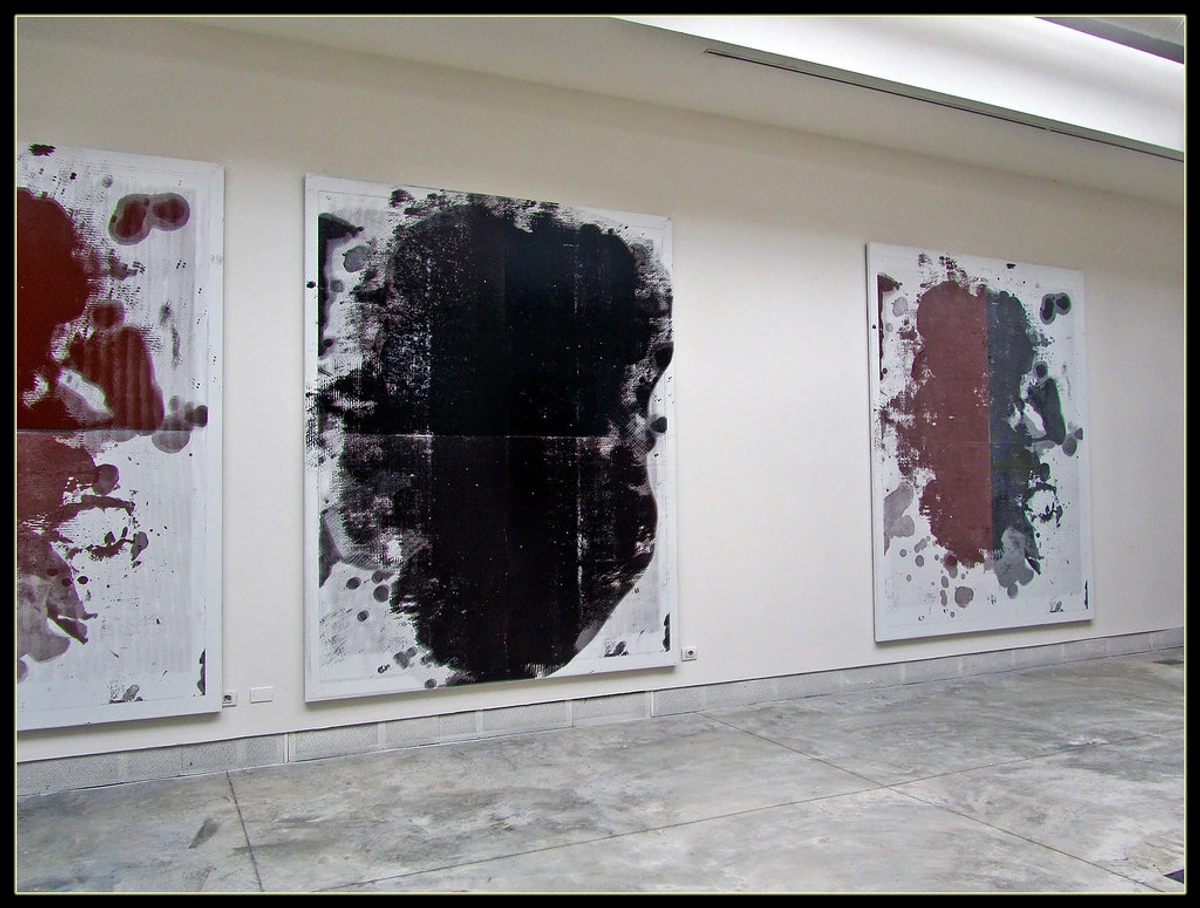
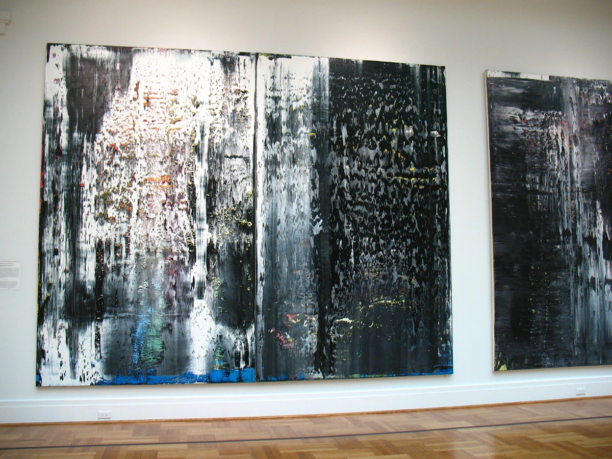
Abstract art, by its very nature, is a conversation starter. It doesn't depict a clear object; instead, it invites interpretation, emotion, and personal connection. And here's the thing: light is a key player in that invitation. A shift in illumination can transform a vibrant painting into a moody whisper, or bring a subtle texture to the forefront that you never noticed before.
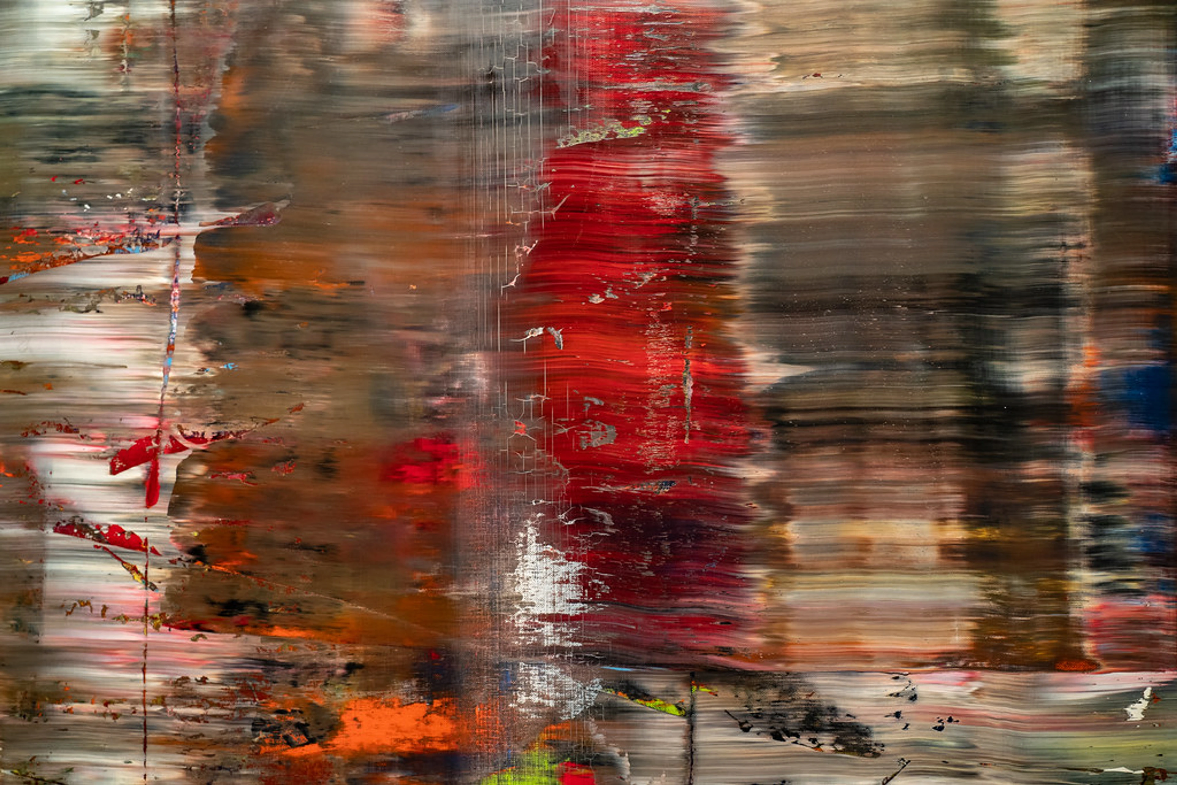
I’ve spent countless hours in my studio, experimenting with how light plays on my canvases. It's a fundamental part of the language of light: how illumination shapes my abstract compositions. This is a language I've spent a lifetime learning, observing how light interacts with my pigments, my textures, transforming a canvas from a static object into a living, breathing entity. In my studio, light isn't just a utility; it's a co-creator. It dictates how a brushstroke is perceived, how colors interact, how shadows deepen and recede. It’s not just about brightening a canvas; it’s about activating its internal dialogue. I've often seen how a specific angle of light can emphasize the tension in a jagged line or soften the edges of a swirling form, essentially dictating the narrative of the artwork. For instance, a subtle shift in light can transform a bold, energetic brushstroke into a contemplative whisper, or reveal a hidden layer of color that completely alters the emotional resonance of the piece. I've seen my own works change character from morning sun to evening lamplight, and it's always a revelation. You see, abstract art often has layers, subtle shifts in tone, and varied textures that are designed to catch and reflect light in unique ways. Without the right light, you're only getting half the story.
This profound impact of light isn't a modern discovery. Long before abstract art took center stage, artists intuitively understood light's power. Think of the dramatic chiaroscuro of Caravaggio, where intense contrasts of light and shadow create emotional depth and guide the viewer's eye, or the subtle, glowing portraits of Rembrandt, where light sculpts form and reveals inner life. These masters, though figurative, paved the way for understanding light as a transformative force. So, when the Impressionists became obsessed with capturing fleeting light, their groundbreaking approach to light and color profoundly shaped the trajectory for later artists, including modernists who experimented with gallery lighting for their revolutionary forms. They were all building on a centuries-old artistic truth: light is fundamental to the visual experience. Without careful consideration, a piece can feel flat, its dialogue muted, its soul hidden.
Imagine staring at a beautiful, complex abstract piece. Now, imagine a shadow falling across it, or a bright glare obscuring half the canvas. It's like trying to listen to a beautiful symphony with half the instruments muted. Proper lighting allows your art to speak its full truth, allowing those intricate details and emotional currents to flow freely.
Decoding the Light Spectrum: Natural vs. Artificial Illumination
When we talk about lighting art, we're essentially choosing between two main sources, each with its own personality and quirks.
Natural Light: The Fickle Friend
There's nothing quite like natural light, is there? The way the morning sun streams into a room, washing everything in a soft, ethereal glow. For art, it can be breathtaking. The ever-changing nature of natural light means your art will look different throughout the day, offering a dynamic viewing experience.
However, natural light is a true double-edged sword. While beautiful, it's also incredibly unpredictable and, frankly, a bit of a bully. Direct sunlight, especially, carries UV (ultraviolet) rays that can cause irreversible fading and damage to your precious artwork over time. Beyond just fading vibrant pigments, these insidious rays can embrittle canvas, degrade binders, and even cause the structural integrity of the paint layers to weaken. Think of it like a persistent tan, but for your canvas – not a good look in the long run. Glare can also be a huge issue, turning your masterpiece into a reflective surface rather than a window to another world.
So, my personal rule of thumb? Embrace natural light, but with caution. Avoid direct sunlight on your art, especially during peak hours. If a room has gorgeous natural light but it hits your art directly, consider UV-filtering window treatments or simply find another spot for that particular piece, especially if you want to preserve the role of texture in abstract art: a sensory exploration for decades.
Artificial Light: The Controlled Maestro
This is where you truly get to curate the very essence of your art's appearance. Artificial lighting gives you control over almost every aspect, allowing you to highlight, dramatize, and protect your collection. But not all artificial light is created equal. The two big players you need to understand are Color Temperature and CRI (Color Rendering Index). As you curate your lighting, consider the overall Color Temperature Consistency of your space. Mixing drastically different color temperatures in the same area can create a visually jarring effect, detracting from the harmony you're trying to achieve.
Understanding Color Temperature, CRI, and CRM:
- Color Temperature (measured in Kelvins - K): This describes the 'warmth' or 'coolness' of the light. Lower Kelvin values (2700K-3000K) produce a warm, yellowish light, similar to incandescent bulbs. Higher values (4000K-5000K) create a cooler, bluer light, akin to daylight. For most abstract art in a home setting, a warmer temperature (around 2700K-3000K) is often preferred as it creates a cozy, inviting atmosphere and complements a wide range of colors without distorting them. However, if your abstract art features a lot of cool blues, greens, or whites, a slightly higher temperature (up to 3500K) might make those colors pop even more.
- CRI (Color Rendering Index): This is absolutely critical for art! CRI measures how accurately a light source reveals the true colors of an object compared to natural light. The scale goes from 0 to 100, with 100 being perfect. For art lighting, you ideally want a CRI of 90 or above. Anything lower and colors can appear dull, muted, or just plain wrong. Imagine my vibrant cerulean blues looking muddy or slightly greenish under poor CRI – a true artist's nightmare!
- CRM (Color Rendering Measure): While CRI remains the industry standard, CRM offers an alternative, often more comprehensive way to assess color fidelity. Developed by the IES, CRM utilizes a wider array of color samples, including saturated and pastel hues, providing a more nuanced evaluation, especially crucial for advanced LED technologies where traditional CRI might sometimes fall short in capturing certain color nuances. For example, if an artwork features highly saturated neon pigments or very subtle pastel washes, a high CRM might better reveal their true vibrance and delicate gradations than CRI alone, offering a more faithful rendition of the artist's original intent. For most home applications, a high CRI (90+) is your primary goal, but knowing about CRM can be helpful as lighting technology evolves.
The Metamerism Mystery: When Colors Play Tricks
Even with a high CRI, colors can sometimes appear differently under various light sources – a phenomenon known as metamerism. It's when two colors match under one light condition but not under another. For abstract art, especially pieces with subtle color shifts or carefully mixed pigments, this can be a quiet frustration. My advice? Don't obsess, but be aware. If a piece looks 'off' in a certain spot despite good lighting, try a bulb with a slightly different spectral distribution (even within the same color temperature). Sometimes, it's just the art asking for a specific kind of light to reveal its full truth.
Feature | Warm Light (2700K-3000K) | Cool Light (4000K-5000K) |
|---|---|---|
| Feeling | Cozy, inviting, intimate, traditional | Crisp, modern, energetic, focused |
| Best for | Earth tones, reds, oranges, yellows, traditional decor | Blues, greens, purples, contemporary or minimalist decor |
| Consideration | Can make blues and greens appear slightly subdued | Can make reds and yellows appear slightly muted or dull |
With an understanding of these fundamental properties, let's explore the practical ways you can apply artificial light to bring your masterpieces to life.
Illuminating Your Masterpieces: Types of Artificial Lighting Techniques
Ready to turn your space into your own personal gallery? Now that we've got the science down, let's talk about the practical application. There are several ways to bring artificial light to your art, each with its own pros and cons.
Accent Lighting: The Spotlight on Your Soul
This is your primary tool for making your abstract art truly stand out. Accent lighting is designed to draw attention to specific elements, making them the focal point of the room. This aligns perfectly with the art of display: how to light and position abstract art for maximum impact.
- Picture Lights: These are the classic choice, mounted directly to the frame or wall above the artwork. They provide a soft, even wash of light across the canvas. Modern picture lights often come with adjustable heads and integrated LED technology, making them energy-efficient and long-lasting. You can find them in plug-in versions for easy installation or hardwired options for a seamless, built-in look, offering a very traditional, elegant aesthetic.
- Track Lighting: This is my personal favorite for flexibility. Track lighting involves multiple light fixtures mounted on a track, which can be repositioned and aimed individually. This is fantastic if you're like me and love to rotate your collection or frequently rearrange your space. It allows for incredible versatility and can light multiple pieces or a large single artwork with ease. Within track systems, you can choose various fixture heads, from narrow-beam spots for dramatic focus to wider-beam floods for an even wash, adapting to the specific needs of each artwork.
- Recessed Spotlights (Gimbal Lights): These are installed into the ceiling, offering a clean, minimalist look. The light source itself is hidden, making the illumination appear almost magical. Gimbal versions allow you to adjust the angle of the light, making them perfect for highlighting art from above without obtrusive fixtures.
- Wall-Mounted Spotlights: Similar to track lights but often single fixtures. These can be great for individual pieces or for creating a dramatic effect from a specific angle.
- Wall Washers: For larger pieces or entire walls where you want a uniform, soft glow across a broader surface, wall washers can be incredibly effective. These fixtures are designed to evenly light a vertical surface, creating a subtle backdrop that enhances the art without harsh spotlights.
- Diffusers & Lenses: To fine-tune your accent lighting even further, consider fixtures that allow for diffusers or lenses. Diffusers soften the light, reducing harsh shadows and creating a more gentle, even illumination, which can be ideal for delicate watercolors or prints. Lenses, on the other hand, can help precisely control the beam spread, sharpening the focus on a particular detail or ensuring a clean edge to your light cone, avoiding unwanted spill. It’s like having a little bit of magic in your toolkit to sculpt the light exactly as you envision.
Ambient Lighting: Setting the Mood
While accent lights draw the eye to your art, ambient light is the gentle hum that makes the entire room feel alive, creating the foundational mood. While not directly focused on your art, ambient lighting is the general illumination of the room and plays a crucial role in how your art is perceived. Imagine trying to appreciate a masterpiece in a dimly lit cave – not ideal! Ambient light creates the overall atmosphere. Think of ceiling fixtures, floor lamps, or table lamps that provide a general, comfortable level of brightness. You want enough ambient light so the room doesn't feel like a black box, but not so much that it competes with your accent lighting for dominance, but rather supports it, allowing your abstract pieces to truly stand out within their environment.
Task Lighting: More Than Just for Reading
While accent and ambient lighting sculpt the immediate environment of your art, task lighting serves a different, though complementary, purpose. Task lighting is specifically for activities like reading or cooking. While it's not typically used to directly light art, well-placed task lighting can indirectly contribute to the overall brightness and mood of a room, allowing your abstract pieces to be better appreciated from different vantage points and ensuring the space feels inviting and functional.
The Nitty-Gritty: Practical Considerations for Lighting Your Art
We've journeyed from the philosophical to the technical, and now, let's dive into the finer points – the subtle adjustments that transform good lighting into truly exceptional display. This is where art and science truly intertwine, revealing how the smallest detail can make the biggest impact.
Beam Spread: The Art of Focus
This refers to how wide the light cone is. A narrow beam spread (often 10-25 degrees) creates a dramatic, focused effect, almost like a theatrical spotlight on a single, compelling detail – perfect for emphasizing a thick impasto texture or a specific, intricate mark in a small abstract piece. Conversely, a wider beam (35-60 degrees) provides a softer, more even wash, ideal for larger canvases where you want uniform illumination without harsh shadows, allowing the entire composition to be appreciated.

Placement & Angle: Avoiding the Glare Monster
This is perhaps the most critical aspect after choosing the right bulb. The goal is to illuminate the art, not cast shadows or create blinding glare. A common guideline is to position the light source at a 30-degree angle to the artwork. To visualize this, imagine the light coming from above your art. If you draw an imaginary line from the center of your light source to the center of your artwork, and another imaginary line straight down from the light source, the angle between these two lines should be around 30 degrees. This 'sweet spot' effectively minimizes direct glare returning to the viewer, while also preventing the artwork itself from casting distracting shadows on its own surface, letting the true colors and textures of your abstract piece sing. However, for a particularly textured piece, like many of my mixed media works, you might even play with a slightly steeper angle (say, 40-45 degrees) to create more dramatic chiaroscuro effects – the interplay of light and shadow – that emphasize the tactile quality and bring the surface to life. This is much like how artists use light and shadow dramatically in their compositions, but now you're applying that artistry to your home lighting!
The Impact of Wall Color and Surrounding Decor
Your artwork doesn't exist in a vacuum, and neither does its light. The color of your walls and the surrounding decor can dramatically affect how your art is perceived. Light reflects off surfaces, and a brightly colored wall can subtly (or not so subtly) tint the light hitting your artwork, altering its perceived colors. A dark wall, conversely, might absorb more light, requiring a slightly more intense illumination for the art to pop. Consider your room's palette as an extension of your art, ensuring harmony between the two.
Considering Different Abstract Styles
Just as you wouldn't wear the same outfit to a formal gala and a casual picnic, different styles of abstract art respond uniquely to light.

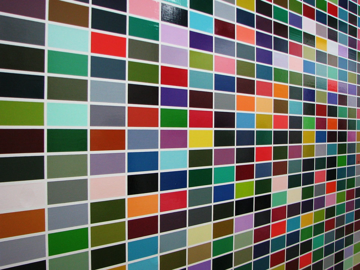
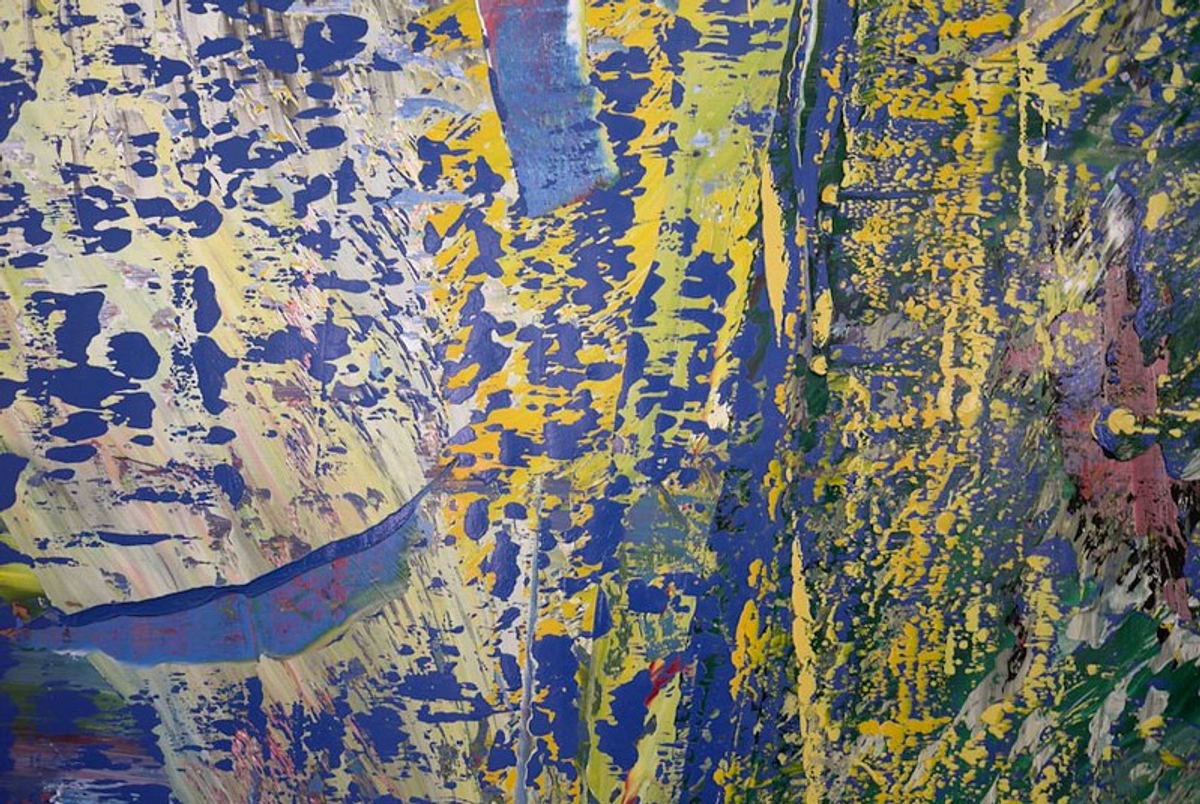
- Minimalist, Geometric & Color Field: For pieces with broad, flat expanses of color or precise geometric forms, uniform illumination with a wide beam spread and high CRI is paramount to showcase the subtle shifts in tone and color purity. Here, even a slight angling of light (a 'grazing light') can sometimes emphasize the canvas texture itself, which might be desired or undesired depending on the artist's intent. Too much angle might create unwanted shadows on a perfectly flat surface, so careful positioning is key.
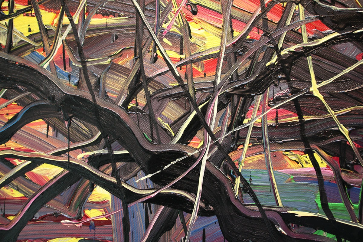
- Expressionist, Lyrical & Impasto: Heavily textured or highly gestural works thrive on a slightly more angled light (closer to 40-45 degrees, as mentioned) to exaggerate shadows and highlights, bringing the tactile quality of the paint to life. This emphasizes the artist's energetic hand. A focused spotlight can create dramatic peaks and valleys, while a slightly wider wash might soften the intensity but still reveal the physical brushstrokes.
- Monochromatic or Subtle Palettes: These pieces often benefit from precise, controlled lighting that enhances their inherent subtlety. A slightly cooler (3500K) light might bring out the nuances in a gray or white abstract, revealing hidden undertones, while a warmer light (2700K) can make subtle earth tones feel richer. For works with metallic or iridescent pigments, direct, focused lighting can make them shimmer and change appearance from different angles, showcasing their unique reflective qualities.
- Vibrant & Multi-colored: High CRI is non-negotiable here. A neutral to warm (2700K-3000K) light will generally allow the full spectrum of colors to pop without distortion, making your bold abstracts truly electrifying. However, if your artwork predominantly features cool blues, greens, or purples, a slightly cooler light (3500K) can enhance their vibrancy, making them appear even more vivid.
Intensity & Dimmers: Flexibility is Key
Having the ability to adjust the brightness of your art lighting is invaluable. Dimmers allow you to change the mood of the room and, consequently, how your art is perceived throughout the day or for different occasions. A subtle glow for an intimate evening, or a brighter illumination for a daytime viewing session. This flexibility ensures your art always looks its best, adapting to the ambient light and your personal preference.
Light Levels (Lux): The Silent Guardian of Your Art
Beyond just brightness, consider the actual light level or lux your art is exposed to. While not a common home measurement, excessive lux over time can contribute to fading, even without UV. Sensitive materials like textiles, watercolors, or photographs require lower lux levels (typically under 50 lux), while more robust oil or acrylic paintings can tolerate higher levels (up to 150-200 lux) without immediate harm. While you don't need a light meter at home, understanding this concept encourages a mindful approach, especially for irreplaceable pieces – think of it as a gentle reminder not to blast your cherished works with unnecessarily intense light for extended periods.

The Viewer's Perspective: A Dynamic Relationship
Beyond the art itself, consider where the viewer stands. The way light interacts with a piece changes drastically depending on your vantage point. Test your lighting from your favorite armchair, from the doorway, and from close up. Glare might be invisible from one spot but blinding from another. For a piece intended to be appreciated from a distance, a broader, more encompassing light might be suitable. For an intimate piece that invites closer inspection, a more focused light that reveals minute details might be preferred. The art should be equally inviting, regardless of how you choose to approach it.
Considering Your Budget: Illuminating Without Breaking the Bank
While high-end museum lighting can be a significant investment, creating stunning illumination for your abstract art doesn't have to drain your bank account. Smart choices can help you achieve a gallery-worthy display on any budget:
- Start with Smart Bulbs & Existing Fixtures: If you have recessed cans or track lighting already, upgrading to high-CRI, dimmable smart LED bulbs (like those mentioned in the FAQ) is an affordable first step. They offer incredible flexibility without needing new fixtures.
- Affordable Track Lighting: Many home improvement stores offer track lighting kits that are relatively inexpensive and provide excellent flexibility for aiming light at multiple pieces.
- Picture Lights: Smaller, plug-in picture lights can be quite budget-friendly and offer a dedicated solution for individual pieces.
- DIY Solutions: Sometimes, simply repositioning a floor lamp with an adjustable head and a good quality LED bulb can make a dramatic difference. It's about clever placement and understanding light principles, not just expensive equipment.
Test, Test, Test: The In Situ Imperative
This isn't just a suggestion; it's a commandment, practically etched into the artist's code! General guidelines are a starting point, but every room, every piece of art, and every light fixture behaves uniquely. My absolute best advice? Play with it! Don't be afraid to try different bulbs, adjust angles, dim them, brighten them. Observe how your art appears throughout the day and night before committing. Stand back, squint, get close. Your relationship with your abstract art is deeply personal, and its lighting should be too. It's an iterative process, much like creating the art itself, and finding that perfect harmony is incredibly rewarding.
UV Protection & Heat Emission: Protecting Your Investment
As mentioned, UV rays are the enemy of longevity for artwork. While natural light is the primary culprit, some artificial lights can also emit harmful UV. Modern LED lights are generally excellent in this regard, emitting virtually no UV or heat. This is a huge advantage over older halogen or incandescent bulbs, which generated significant heat and could potentially damage delicate pigments or canvases over time. Always opt for LEDs specifically designed for art or display lighting to be safe.
Finally, think about maintenance and sustainability. Even LED lights can gather dust, which dulls their output. Regularly cleaning your fixtures and ensuring they remain properly aimed will keep your art looking its best for years to come. Moreover, modern LED lights aren't just great for art preservation; they're also remarkably energy-efficient and long-lasting, reducing your carbon footprint and your electricity bill. It’s a win-win for your art and the planet.
Common Lighting Blunders I've Seen (And Made!)
We all learn from our mistakes, right? I've certainly had my share of 'aha!' moments when it comes to lighting. Here are a few common pitfalls I've observed, so you can hopefully avoid them:
- Too Much Light / Too Little Light: It's a Goldilocks situation. Too much light can wash out the colors and create a sterile, overexposed look. Too little, and your art vanishes into the shadows, a tragic waste of beauty. Experiment with dimmers to find that 'just right' sweet spot.
- Ignoring Glare: The absolute worst! Nothing ruins the viewing experience faster than a blinding reflection on the canvas. Adjusting the angle of your lights (remember the 30-degree rule!) is your first line of defense. Anti-glare glass for framed pieces can also be a lifesaver.
- Wrong Color Temperature: I remember one time, early in my career, I was so proud of a new piece – a vibrant abstract dominated by cool blues, greens, and stark whites. I hung it in a client's dining room, and they had these lovely, traditional warm-toned incandescent picture lights. The result? My crisp blues looked murky, the whites were yellowed, and the entire feeling of the painting was skewed. It was a stark lesson in how light doesn't just illuminate, it interprets. Ensure your light's color temperature complements, rather than clashes with, your artwork's palette. For my own art, I often gravitate towards neutral or slightly warm lighting to truly bring out the depth of the colors without distorting them. However, if your abstract art features a lot of cool blues, greens, and grays, a slightly cooler light (e.g., 3500K-4000K) can actually make those hues pop and feel more vibrant, aligning with the artist's original intent. If you’re looking to add a new piece to your collection, feel free to explore my current collection of abstract art for sale and imagine how these principles might apply!
- Forgetting the Rest of the Room: Your art doesn't live in a vacuum. Good art lighting integrates seamlessly with the overall abstract art for every room: curating flow and feeling in your home. Consider the ambient light and other elements in the room. Remember, warm ambient light can enhance a cozy atmosphere, but if your accent light on a cool-toned abstract is also warm, it might create a distracting conflict rather than support. You want the art to pop, but not at the expense of the room feeling unbalanced or awkwardly lit.
- Neglecting the Frame: If your abstract piece is framed, consider how the light interacts with the frame itself. A poorly lit frame can cast distracting shadows onto the artwork or create unwanted reflections, pulling the eye away from the masterpiece within. Furthermore, consider the finish of your frame – a glossy frame might reflect light differently than a matte one, potentially creating unwanted glare or hotspots. The frame is meant to contain and complement the art, not compete with it or detract from its role in creating a focal point: how to position abstract art to transform any room in the room. A beautifully lit frame can enhance the art's presence; a poorly lit one can make it feel awkward or isolated.
- Light Pollution or Spill: This happens when light intended for your artwork spills over onto other surfaces, creating unwanted hot spots, or when other light sources in the room create distracting glare on your art. Strategic placement and narrower beam spreads are your first defense. Consider using snoots or barn doors on your spotlights – these are accessories that attach to the fixture to precisely control and contain the light beam, directing it exactly where you want it and nowhere else. It's about keeping the focus on your masterpiece, not on the wall beside it.
Bringing it All Together: My Personal Approach to Curating Light
As an artist, I often think of light as another medium. It's the final stroke, the invisible varnish that can make or break a piece's presentation. When I'm considering how to light my own home, or advising others on their collections, I start not with lumens or Kelvins, but with feeling. What mood do I want to evoke? What aspect of the artwork do I want to emphasize?
For my own works, which are often rich in color and texture, I love light that enhances depth. I'm drawn to warm-neutral LED spotlights with a high CRI because they truly allow the colors to breathe and the textures to reveal themselves without distortion. I'll often angle the light to create subtle shadows that emphasize the physical presence of the paint on the canvas. It's a bit like giving the painting a gentle hug, inviting you closer.
My ultimate advice? Experiment! Move your lights, adjust their angles, dim them, brighten them. See what happens at different times of day. Stand back, squint, get close. Your relationship with your abstract art is deeply personal, and its lighting should be too. Don't be afraid to play around until you find that perfect harmony.

FAQ: Your Lighting Questions Answered
Q: Can I use smart bulbs (Wi-Fi enabled) for art lighting?
A: Absolutely! Smart bulbs are fantastic for art lighting because many offer adjustable color temperature and dimming capabilities from your phone. Just ensure they have a high CRI (90+) to accurately render your art's colors. This gives you ultimate flexibility and control over your art's presentation with minimal effort. Talk about living in the future!
Q: How many lights do I need for one piece of art?
A: For most single artworks, one dedicated accent light is usually sufficient. For larger pieces (over 40-50 inches wide), two lights might be better to ensure even illumination and prevent shadows from the center. For a curating a gallery wall with abstract art: tips for a dynamic display, track lighting is often ideal as it allows you to aim multiple fixtures at different pieces or areas of the wall.
Q: What's the best way to light art behind glass?
A: Art behind glass (or acrylic) is particularly prone to glare. The 30-degree rule for light placement is even more critical here. Also, consider anti-reflective glass or museum-quality acrylic for framing, which significantly reduces glare and offers UV protection. You might also need to slightly increase the light intensity to compensate for any slight light loss through the glass. Also, while modern LEDs emit very little heat, older halogen or incandescent lights could cause significant heat buildup behind glass, potentially damaging delicate works. Always prioritize cool-running LEDs. One more subtle consideration: with some types of glass or acrylic, you might encounter Newton's Rings – rainbow-like interference patterns caused by close contact between surfaces. While not directly a lighting issue, proper framing techniques with spacers can prevent this, ensuring your art remains pristine under optimal light. Additionally, acrylic and glass can build up static electricity, attracting dust to the artwork's surface. Regular, gentle cleaning with appropriate products designed for art or display surfaces can help mitigate this, keeping your piece clear and vibrant.
Q: Should I light every piece of art in my home?
A: Not necessarily. Think about which pieces are truly focal points or those you want to draw special attention to. Some smaller pieces might be perfectly fine with ambient light. It's about curation and intention, not just bright lights everywhere. Each piece should feel like it has a purpose in your home, and the lighting should underscore that purpose. It's much like how you choose the right art piece, focusing on its how to choose the right size art for your space: a decorators guide – it's about making a deliberate choice.
Final Thoughts: Let Your Art Shine!
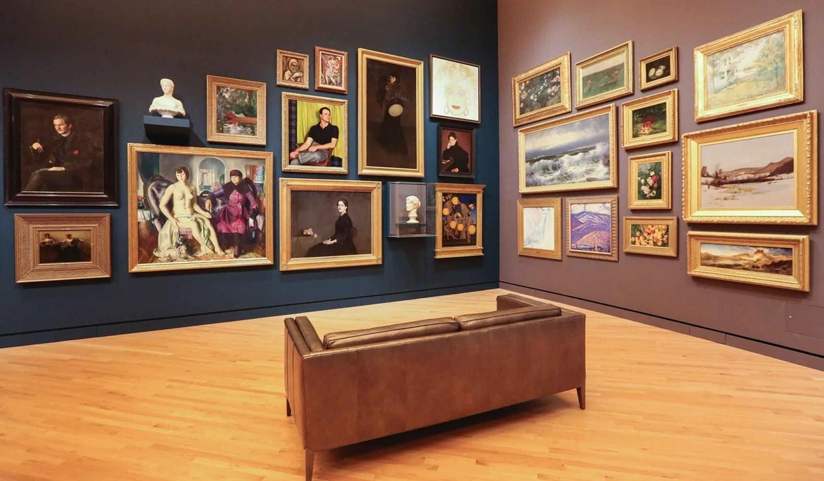
Lighting your abstract art collection is more than just a technical task; it's an act of appreciation. It's about understanding the nuances of your chosen pieces and giving them the stage they deserve. It's about enhancing your own enjoyment and inviting others to see the beauty you've found – whether in a cozy home setting or a grand institution like my museum in 's-Hertogenbosch.
So, go forth, my fellow art lover! Play with light, experiment with angles, and don't be afraid to adjust. Your art will thank you for it, revealing new stories and emotions with every carefully placed beam. And who knows, maybe you'll discover a new favorite detail in that painting you've walked past a thousand times. That, to me, is the real magic of light.


