
Art Sizing Secrets: A Decorator's Intuitive Guide to Perfect Placement
Unlock the profound impact of art sizing with this personal guide. Learn rules like 2/3rds, master gallery walls, and trust your gut to make your space truly sing.
How to Choose the Right Size Art for Your Space: A Decorator's Personal, Introspective Guide
I remember standing in my living room, a freshly acquired (and adored) piece of abstract art in my hands, completely stumped. It was beautiful, vibrant, everything I’d hoped for… until I held it up against the wall. Suddenly, my cozy corner looked either dwarfed by a giant canvas or, worse, like a vast desert with a tiny, lonely postage stamp stuck in the middle. The sheer panic! It’s funny, isn’t it? We spend so much time finding art that speaks to us, and then the practicalities of making it fit can feel like an entirely different, overwhelming puzzle. But after many a misstep and eventual triumph, here’s the secret I've learned: choosing the right size art isn't about rigid rules, but about understanding balance, flow, and, most importantly, how you want a space to feel. It’s a bit like cooking – you need to know the ingredients and basic techniques, but the best dishes, much like the most harmonious art installations, always have a dash of personal intuition and a sprinkle of heart. This isn't just a guide; it's a peek into my own decorating diary, complete with the lessons I've picked up along the way. In this journey, we'll blend practical guidelines with that indispensable gut feeling, ensuring your art truly belongs. It’s about creating a narrative, a whisper, or a shout that resonates perfectly within your home.
Why Scale Isn't Just a Number: The Deep Impact of Art Sizing
Think about a powerful speech. The words are important, yes, but so is the delivery, the pause, the crescendo. Art in your home is similar. I once placed a truly breathtaking piece – full of intricate details – in a vast, empty hallway. Instead of creating a moment of awe, it simply got lost, like a brilliant whisper swallowed by a stadium. The right size amplifies its voice, draws you in, and sets the mood. It doesn't just fill a wall; it actively engages with the viewer, influencing the perceived scale of the room itself and your psychological response to the space. Too small, and it recedes into the background, a whisper lost in a cavernous room, perhaps even making you feel a touch of existential dread about the emptiness. Too large, and it can overwhelm, shouting when it should be harmonizing, making the room feel confined or chaotic. It's a delicate dance, this push and pull of visual weight and negative space, but when done right, it makes your space sing, breathing new life into the entire room. If you're interested in making your art the star, I've written more about creating a focal point elsewhere. So, how do we translate this understanding of art's voice into tangible decisions? Let's dive into some practical approaches.
My Personal Guidelines for Art Sizing: A Few Friendly Nudges
Alright, let's get down to the practical bits. While my inner rebel likes to challenge conventions, some foundational principles truly help. Think of these not as commandments, but as helpful friends guiding you, much like a trusted confidante giving gentle, sometimes firm, advice.
1. The Sofa, The Bed, The Console: The 2/3rds Rule (Mostly)
This is perhaps the most famous guideline, and for good reason: it works! When hanging art above a piece of furniture like a sofa, bed, or sideboard, the art (or the combined width of a gallery grouping) should ideally be about 2/3 to 3/4 the width of the furniture piece below it.
Why this magic number? It creates a sense of visual cohesion and prevents the art from looking like it's floating aimlessly or, conversely, completely overshadowed. Our eyes naturally seek proportion and balance, and this ratio often mimics harmonious relationships found in nature and classical design, making it inherently pleasing. It's an unspoken agreement between the art and the furniture, a silent conversation where neither dominates, but both enhance.
I remember once trying to hang a small canvas over a massive sectional sofa – it looked absolutely ridiculous, like a tiny thought bubble above a giant's head. Lesson learned: scale it up! For more on specific room decoration, you can check out my thoughts on how to decorate your living room or how to decorate your bedroom.
2. Walls Aren't Just Backdrops, They're Stages
Consider the entire wall, not just the space above the furniture. A large, empty wall can feel daunting, like a blank page staring back at you, daring you to make a mark. Do you fill it with one grand statement piece, or a thoughtfully curated gallery wall? Remember that the medium itself can influence scale; a heavy, sculptural piece might command more presence than a lightweight print of the same dimensions.
- Statement Piece: For a wall with no furniture, a single large piece can be breathtaking. It should command attention without consuming the entire wall. Leave some breathing room – negative space is your friend! I often think of it like a pause in a song; it lets the main melody resonate. Or, imagine a lone dancer on a grand stage; the empty space around them isn't empty at all, but a canvas that amplifies their movement and presence. The goal isn't to fill every inch, but to create a visually interesting composition, a compelling story.
- Verticality vs. Horizontality: If you have high ceilings, don't be afraid to go taller with your art, or stack pieces vertically to draw the eye upwards, creating a wonderful sense of grandeur. For wider walls, consider horizontal pieces or a collection arranged to emphasize width. The interplay between the wall's dimensions and the art's orientation is critical; a tall, narrow piece on a wide, low wall can feel just as awkward as a wide piece on a narrow, tall wall. It's about finding that delightful visual conversation.
Remember, the goal isn't to fill every inch, but to create a visually interesting composition. It’s a dance between the art and the wall itself. If you're pondering more generally about how to tackle blank canvases (the wall kind, not the art kind!), you might find my article on how to decorate a wall helpful.
3. The Gallery Wall Gambit: Harmony in Numbers
Ah, gallery walls! My artistic playground, where I get to orchestrate a symphony of styles and sizes. They offer incredible flexibility but also present a unique sizing challenge. The key is to treat the entire grouping as one single unit for sizing purposes, almost like a single, large artwork itself.
- Overall Shape: Decide if you want a rectangular, organic, or asymmetrical grouping. This helps you visualize the "footprint" of your art collection. Sometimes I even lay it out on the floor first, shifting pieces around until that elusive "aha!" moment strikes.
- Spacing: Consistent spacing between pieces (I often aim for 2-4 inches, or 5-10 cm) is crucial for a cohesive look. I find this creates a visual rhythm, allowing each piece to breathe while still being part of a larger whole. Too close, and it's a muddled choir; too far, and they're soloists shouting across a chasm.
- Anchor Piece: Often, a larger piece acts as the anchor around which smaller pieces revolve. This helps maintain balance and gives the eye a starting point, a visual home base.
- Unifying Elements: Beyond just size and spacing, consider a shared color palette, a common theme, or even similar frame styles to tie disparate pieces together into a harmonious display. It’s like gathering eccentric friends for dinner; finding a common thread makes the whole experience much more enjoyable.
If you're delving into creating one of these beauties, I highly recommend checking out my step-by-step guide on creating a salon style hang. It's all about method to the madness!
4. Small Spaces, Big Impact: Defying Expectations
Conventional wisdom might tell you to put small art in small rooms. My experience? Sometimes, the opposite creates the most dramatic and interesting effect. A large, bold piece in a compact space can be surprisingly effective, making the room feel more expansive and intentional, rather than cluttered. It actively draws the eye, establishing a strong focal point that distracts from the room's actual dimensions and adds an unexpected layer of sophistication. I confess, I used to be so afraid of this, convinced it would make a room feel tiny, but oh, the joy of being proven wrong!

It's a bit like wearing a statement necklace with a simple dress – unexpected, but totally chic. Just ensure it doesn't block pathways or overwhelm furniture completely. The key is balance, even in a defiance of traditional scale. I've mused quite a bit about this in my articles on collecting art for small apartments and abstract art for small spaces.
5. The "Feeling" Rule: Trust Your Gut (My Favorite!)
All rules aside, this is where the art truly connects with your soul, and frankly, my favorite part of the whole design dance. Sometimes, a piece just feels right in a particular spot, regardless of whether it perfectly adheres to the 2/3rds rule or any other guideline. How do you know when it "feels" right? It's that moment when your eyes settle on it, and everything in the room seems to click into place. The art might draw you in, make you smile, or evoke a sense of calm or excitement. Perhaps it's an heirloom that deserves a prominent spot despite its modest size, or a massive canvas that just needs to fill a specific void in your heart (and on your wall). Ask yourself: "Does this piece spark joy here, right now, in this space?" or "Does it create the precise mood I crave for this corner of my world?" If the answer is a resounding yes, a little internal hum of contentment, you're on the right track. This emotional resonance, this gut feeling, is often more powerful than any measurement.
This is where art goes beyond decoration and truly becomes part of your home's story, a silent, colorful narrator. If it makes your heart sing, and you genuinely love how it looks and feels, then you've chosen the right size. Don't let a tape measure dictate pure joy; let it be a guide, not a dictator.
6. The Rule of Thirds for Dynamic Composition
Beyond the 2/3rds rule for furniture, there's a broader compositional principle that guides artists and designers alike: the Rule of Thirds. Imagine your wall (or even a single large artwork) divided into nine equal sections by two equally spaced horizontal lines and two equally spaced vertical lines. The idea is to place points of interest—the focal point of your artwork, or the center of a grouping—along these lines or, even better, at their intersections.
While it’s not about art size directly, it profoundly affects how a size is perceived within a space. Placing your art slightly off-center according to this rule can create a more dynamic, engaging, and professional-looking display, guiding the viewer's eye through the composition rather than allowing it to settle too statically in the middle. It creates a subtle tension, a visual journey that's far more interesting than a predictable bullseye. I find this particularly liberating when working with a single, standalone piece on a large wall, giving it an undeniable presence without it feeling stiff.
Beyond the Canvas: The Silent Influencers of Perceived Scale
While we often focus on the physical dimensions of the art piece itself, there are other silent players that dramatically influence how size is perceived. Over the years, I've learned to give these as much thought as the artwork itself, because sometimes the context is just as loud as the art.
The Material Story: How Medium Affects Presence
Not all art is created equal, especially when it comes to its visual weight.
- Heavyweights: A thick, impasto oil painting, a robust mixed-media piece with textural elements, or even a deep-hued abstract with rich, saturated colors inherently feels heavier and can command more space than its exact dimensions might suggest. A large canvas with bold, abstract art might feel dominant, even in a larger space. Even the color palette plays a role; a vibrant, high-contrast piece will always feel more expansive and demand more attention than a muted one of the same physical size.
- Lightweights: A delicate watercolor, a minimalist line drawing, a sleek giclée print, or a black and white photograph often has a lighter visual footprint. These might need a more substantial frame, a wider mat, or to be grouped with other pieces to achieve the desired impact in a larger setting. They whisper where others shout, and sometimes a whisper needs a bit more amplification to be heard.
- Sculptural Elements: Three-dimensional art, even when wall-mounted, projects into the space, adding another layer to the sizing consideration. It asks for more physical and visual room to breathe, casting shadows and interacting with light in a way a flat canvas cannot. Ensure there's ample room around it for viewing and movement, almost as if it's a quiet guest who needs their personal space.
The Frame's Embrace: An Extension of the Art
The frame isn't just a border; it's an extension of the art and a significant contributor to its perceived size and formality. I’ve seen the wrong frame completely diminish a piece, and the right one elevate it to a masterpiece.
- Substantial Frames: A wide, ornate, dark, or deeply textured frame adds significant visual weight and makes the artwork feel larger and more prominent. This can be a brilliant trick for a slightly-too-small piece that needs to hold its own in a grander room, like a subtle optical illusion. Consider also the frame material – a chunky wooden frame conveys more earthy presence than a sleek, polished metal one.
- Minimalist Frames: A thin, light-colored, or gallery-style float frame allows the art itself to take center stage, making it feel less imposing and more "at one" with the wall. These are perfect for pieces that speak for themselves or in minimalist aesthetics.
- Matting: A generous mat around a smaller piece can give it necessary breathing room and expand its overall presence, effectively increasing its perceived size. It's like giving the art its own little stage, pushing it forward visually.
The Unspoken Rule: Avoiding Wall Overcrowding
It's tempting to fill every blank space, that anxious little voice in our head always whispers "fill the void!" But a cluttered wall can diminish the impact of even the most beautiful art. Each piece needs room to breathe, a bit of 'negative space' around it to truly stand out and tell its story without interruption. Think of it as silence between musical notes – it allows the melody to resonate. An overcrowded wall can feel chaotic, making no single piece truly shine; they all just become noise. Sometimes, less truly is more, allowing a few thoughtfully placed pieces to create a powerful statement rather than a jumbled collection. I've been guilty of this myself, gathering too many treasures and not giving each the respect of space it deserves.
Integrating with the Room's Character: Beyond Just the Wall
Art never exists in a vacuum. Its impact is profoundly shaped by the room it inhabits, and how it interacts with the surrounding elements – from architectural details to the very light that dances upon its surface. It's a conversation, a subtle negotiation.
Architectural Features & Furniture Style
Consider the existing architecture and the style of your furniture.
- Tall Windows or Doors: Art placed near these might need to be proportionally taller or deliberately counter-balanced to avoid feeling dwarfed or creating an unbalanced vertical line.
- Fireplaces or Built-ins: These often serve as natural focal points and can dictate the ideal size for art placed above or within them. Usually, a piece that is just smaller than the width of the mantel or recess feels right.
- Heavy, Traditional Furniture: Can often support larger, more substantial art with ornate frames, aligning with a sense of grandeur.
- Sleek, Modern Furniture: Tends to pair well with cleaner lines, simpler frames, and perhaps slightly less imposing, though still impactful, sizes. The contrast itself can be a design statement.
The Impact of Art Orientation: Portrait vs. Landscape
The orientation of your artwork—whether it's displayed vertically (portrait) or horizontally (landscape)—is a silent, yet powerful, factor in how it interacts with your space.
- Portrait (Vertical): Vertical pieces inherently draw the eye upwards, emphasizing height. They can make low ceilings feel taller or fill narrow wall spaces beautifully, creating a sense of elegance and aspiration. I sometimes use these deliberately to add a surprising sense of lift to a room.
- Landscape (Horizontal): Horizontal pieces draw the eye across a space, emphasizing width. They are excellent above long sofas, beds, or sideboards, and can make a narrow room feel wider or create a sense of calm expanse. They invite a more leisurely, panoramic gaze.
- Square: Square art offers a unique sense of balance and stability, making it versatile for many spaces, often creating a strong, grounded focal point.
Choosing the right orientation depends not only on the art itself but on the proportions of the wall and the furniture it's complementing. It’s about creating a visual dialogue.
Room by Room Musings: Where Do I Even Start?
Now that we've covered the foundational principles and the nuances of presentation, let's explore how these ideas play out in different areas of your home. Different rooms have different vibes and functions, and your art choices should reflect that, much like different musical pieces suit different moods.
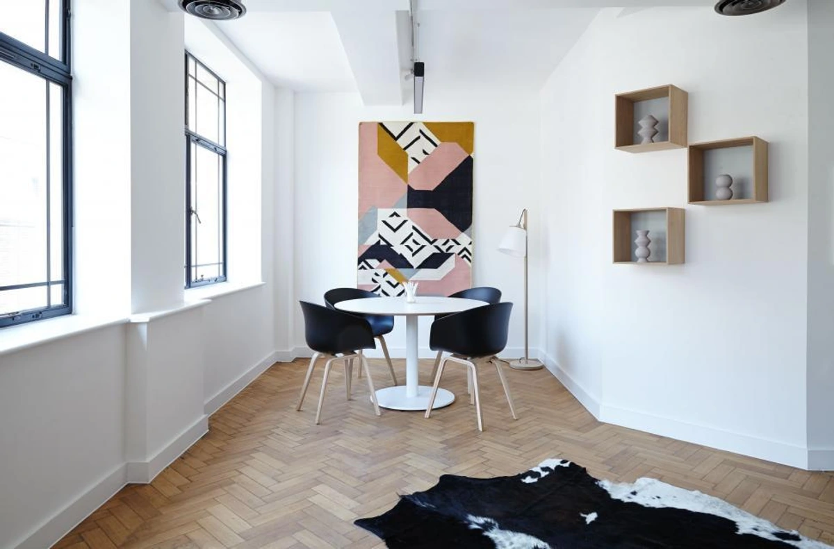
- Living Room: Often a social hub, this is where you can be bold, even a little daring. Think larger statement pieces or a vibrant gallery wall above a sofa or fireplace. It's a prime location for creating a focal point, a conversation starter, or a grand, silent observer.
- Bedroom: Serenity is key here. While a large piece can be wonderful above a bed, ensure it doesn't feel imposing or unsettling – unless, of course, that's the precise mood you're cultivating for your personal sanctuary. More often, a medium-sized piece or a calm diptych/triptych can create a peaceful atmosphere.
- Dining Room/Kitchen: These spaces often benefit from art that sparks conversation or simply adds warmth. Consider the eye-level when seated; for dining areas, you might lower the art slightly to be at eye-level with someone enjoying a meal. A horizontal piece might work beautifully above a buffet or a series of smaller, complementary pieces near a kitchen table.
- Hallways & Entryways: Don't neglect these transitional spaces! They are perfect for unexpected delights and setting the tone for your home. A tall, narrow piece can elongate a hallway, or a small, intriguing abstract can be a pleasant surprise in a cozy nook or art for awkward spaces. Consider them a visual journey, a prelude to the rest of your home's story.
- Home Office: Here, art can be inspiring or calming. Consider smaller pieces grouped on a shelf or a single, focused piece above a desk that helps define the space without overwhelming it, especially if you're prone to visual distractions (like me!).
- Bathroom: Surprisingly, bathrooms are excellent places for art! Smaller, impactful pieces or a compact gallery wall can add personality. Just ensure they are protected from humidity if they're delicate works.
Remember, it's about creating flow and feeling throughout your home. I delve deeper into this in my article Abstract Art for Every Room. Ultimately, each room offers a unique canvas for your personal expression, a space to test your intuition.
Practical Tips & Tricks (Because Sometimes We All Need a Little Help)
Before you commit, here are a few simple ways to "try on" your art for size, because sometimes the best insights come from simply seeing it in place, not just imagining it:
- The Newspaper/Painter's Tape Method: Cut out a piece of newspaper or butcher paper to the exact dimensions of the art piece (including the frame!). Tape it to the wall where you envision the art. Live with it for a day or two. This is an absolute game-changer for visualizing scale. For example, if you're considering a 40x60 inch abstract piece for a specific wall, mock it up. You might find it feels just right, or perhaps surprisingly overwhelming – a much easier discovery to make with paper than with a drill! I wish I’d known this trick years ago!
- Consider the Frame: Don't forget that a frame adds to the overall dimensions and visual weight. A thick, ornate frame will make a piece appear larger than a thin, minimalist one. If you're wondering about how to frame oversized artwork, I've got some insights there too.
- Eye-Level is Key (Mostly): Generally, the center of your art should be at eye-level for an average person (around 57-60 inches, or 145-152 cm from the floor). However, this rule is more flexible when hanging over furniture or as part of a gallery wall. Consider whether the art will primarily be viewed while standing or seated; for dining areas, you might lower the art slightly to be at eye-level when seated. Trust your eye, and be prepared to adjust!
- Lighting: How light hits the piece can also affect its perceived size and presence. A well-lit piece will naturally draw more attention and appear more prominent. You can learn more about lighting and positioning abstract art for maximum impact.
Quick Reference: Art Sizing Guidelines
To help you get started, here's a handy overview of the most common guidelines and why they often work:
Guideline | Recommendation | Why it Works |
|---|---|---|
| Above Furniture | 2/3 to 3/4 width of furniture | Creates visual balance, prevents art from looking lost or overwhelming the furniture. |
| Eye-Level (Standalone) | Center at 57-60 inches (145-152 cm) from floor | Natural viewing height for standing, promoting comfortable engagement. |
| Gallery Walls | Treat as one unit; 2-4 inches (5-10 cm) between | Ensures cohesion and visual rhythm, allowing each piece to breathe while contributing to a larger statement. |
| Small Room, Large Art | Yes, if well-proportioned and doesn't impede movement | Creates drama, can make the room feel more expansive and intentional, a confident design choice. |
| Negative Space | Essential for art to breathe and stand out | Prevents clutter, allows the eye to rest, and emphasizes the art's form and message. |
| Art Orientation | Match wall/furniture proportions; consider desired visual effect | Vertical emphasizes height, horizontal emphasizes width, square provides stability and focus. |
My Journey with Scale: A Confession and a Revelation
I've made my fair share of sizing missteps, believe me. There was the time I was so in love with a small abstract I'd painted (a piece now perhaps available for sale!), that I tried to make it the centerpiece of a huge, empty wall. It looked lost, utterly swallowed. I pouted for a bit, then realized it was perfect for a narrow hallway, a delightful little secret instead of a failed grand statement. It's funny how a moment of frustration can turn into a revelation about a piece's true calling, teaching you about its inherent voice.
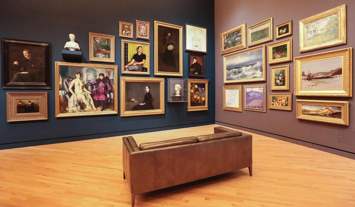
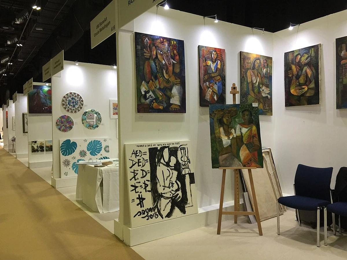
Even in professional settings, like the meticulously curated spaces of my den-bosch-museum or grand art fairs, scale is a constant, humbling consideration. Each piece has its breathing room, its dialogue with the space, and its role in the larger narrative. It’s a constant learning curve, even for those of us who live and breathe art. My timeline as an artist is filled with these little discoveries, moments where theory meets practice and sometimes just bumps its head.
Ultimately, choosing the right size art is about creating harmony. It's about finding the sweet spot where the art, the furniture, and the wall all communicate beautifully, a kind of silent poetry. It’s about making your space feel like you, authentically and unapologetically. And when you get it right, that feeling? It’s pure magic. So go ahead, measure, tape, contemplate, and then, above all, feel. Your home, and your art, will thank you for this thoughtful dialogue.
Frequently Asked Questions
Q: What if my art is too small for my space?
A: Don't despair! You have a few options, each a little trick I've used myself:
- Frame it larger: Add a wider mat and a substantial frame to give it more presence and visual weight. This is a classic for a reason!
- Group it: Combine it with other smaller pieces to create a gallery wall or a curated collection, transforming several whispers into a harmonious chorus.
- Relocate it: Find a smaller wall, a cozy nook, or even a bookshelf where it can shine as an intimate, personal piece. Not every artwork needs to be a grand statement; some are meant for quiet contemplation.
Q: Can I hang a large piece in a small room?
A: Absolutely, and I often encourage it! A large piece in a small room can create a dramatic, intentional look, making the space feel more expansive and purposeful rather than cramped. Just ensure it doesn't impede movement or completely overwhelm key furniture. It’s a bold choice that can pay off beautifully, transforming a compact area into a deliberate statement, a confident visual anchor.
Q: How high should I hang my art?
A: A common guideline is to hang the center of the artwork at eye-level for an average person, typically 57-60 inches (145-152 cm) from the floor. However, this is flexible. When hanging above furniture, allow 6-12 inches (15-30 cm) of space between the bottom of the art and the top of the furniture. For gallery walls, aim for the overall center of the grouping to be at eye-level. Remember to consider your primary viewing position – if it's primarily viewed while seated (e.g., in a dining area), you might adjust it slightly lower for comfort. Trust your eye above all else.
Q: Should art always be centered over furniture?
A: While centering is a common and often aesthetically pleasing choice, it's certainly not a strict rule. You can create interesting asymmetry and visual intrigue by hanging art slightly off-center, especially if balancing it with another decorative element, a lamp, or a plant on the other side. My own home often features intentional asymmetry; it adds a touch of the unexpected. Trust your eye for overall balance and don't be afraid to experiment with what feels right.
Q: I have low ceilings. Can I still hang large art?
A: Yes, but with some considerations to maintain visual harmony. If hanging above furniture, ensure the top of the art still has at least 6-12 inches of space from the ceiling (or closer if the piece is very wide) to avoid making the ceiling feel even lower. For standalone pieces, prioritize a wider, horizontal artwork over a very tall, narrow one to maintain visual balance and prevent the ceiling from feeling "pushed down." Alternatively, consider floor-standing art, leaning pieces against the wall, or even vertically oriented gallery walls that emphasize width rather than extreme height to draw attention downwards or across the space. The trick is to play with the perceived expanse, not against it.
Q: What if I have very little wall space?
A: This is a common challenge, and one I've faced in smaller studios! Get creative:
- Lean art: Against a wall on a console or cabinet, or even directly on the floor for very large pieces. This adds a casual, sophisticated vibe.
- Shelf displays: Arrange smaller pieces on shelves, mixed with books or other decor. This allows for fluid rearrangement and layering.
- Unexpected spots: Utilize narrow strips of wall next to doorways, in corners, or even on the inside of a door. Think vertically with tall, narrow pieces, or consider using the ceiling for unique, lightweight installations if you're truly adventurous. The most overlooked spaces can often yield the most delightful surprises.
Q: How does art orientation (portrait vs. landscape) affect space?
A: It's a subtle but significant impact! Portrait (vertical) art tends to draw the eye upwards, creating a sense of height and making ceilings feel taller. It's excellent for narrow walls or to emphasize vertical architectural lines. Landscape (horizontal) art, conversely, guides the eye across a space, enhancing a sense of width and calm. It works beautifully over long furniture pieces like sofas and beds. Square art offers visual stability and a grounded presence, often acting as a strong, balanced focal point. Consider the existing lines of your room and furniture when choosing an orientation to complement or deliberately contrast them.


